#lense flare
Text


The sun rises by Yuri Morozov
#nature#sunrise#lense flare#sunflowers#photography#green#plants#trees#landscape#pink#sky#skies#clouds#yellow#sun#purple#flowers#sunflower field#purple clouds#pink clouds#nature photography#scenery#pastel sky#cottagecore#curators on tumblr
815 notes
·
View notes
Text
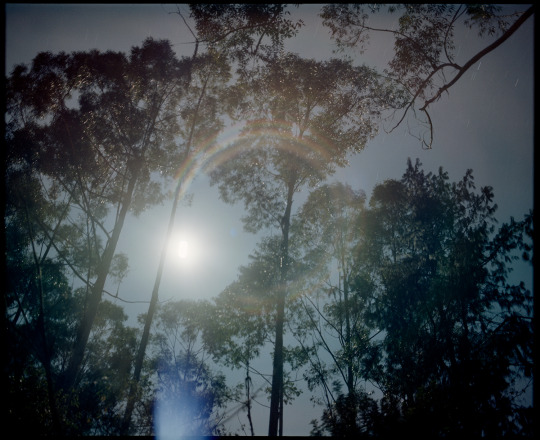
moon halo | Mamiya RB67 | Portra 400 | 2023
#daniloz#analog photography#120mm camera#120mm film#120 film#mamiya sekor lens#mamiya#mamiya rb67#kodak#kodak portra 400#nature#night photography#long exposure#moon#tree#halo#moonlight#lense flare#medium format photography#medium format camera#medium format
39 notes
·
View notes
Text
5 notes
·
View notes
Text


For a moment I thought he was dreaming everything and ready to get mad.

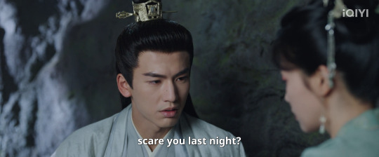
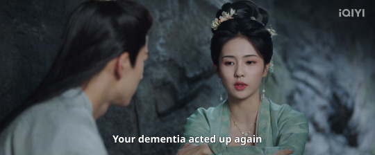
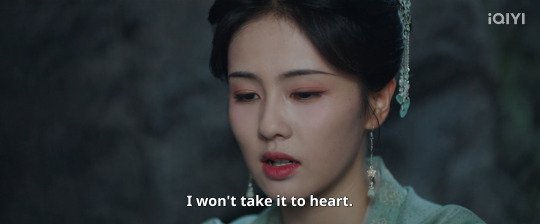
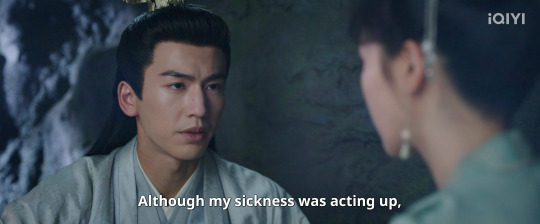

GASP.!
And then it gets weirdly romantic, what?


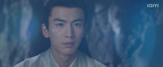

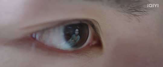

(This was a choice)
Just for how long did they look at each other until the guys showed up?
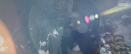

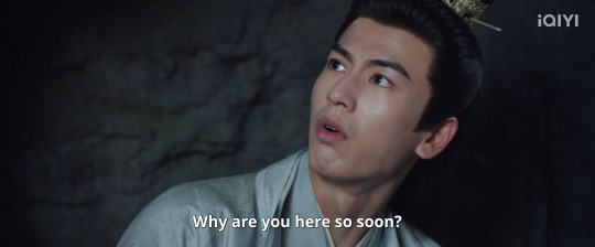
hahahaha

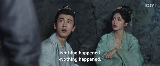
#Story of Kunning Palace#Bai Lu#Zhang Linghe#excuse my bad quality screenshots#episode 32#easy on the lense flare#awkwardness
26 notes
·
View notes
Text
A lot of comic artists struggle with this to some degree, but Simone Di Meo should really work on his same face syndrome. The faces of Mistress Harsh, principal Stone, Ms. Hall and White Rabbit were all exactly the same.
Damian could also look more like Damian and less like Tim.
And considering that this book is probably going to have a lot of action it wouldn't hurt if he made the fight/action scenes less confusing. It's often hard to tell where the characters are, what is going on and what is important and what is not.
I also fear that Williamson giving Di Meo so much room for the art might have contributed to this issue feeling kind of empty. There were several pages with no or almost no dialogue, and while the art is pretty, nothing really interesting or important happened on them.
Someone like Patrick Gleason was able to pull off a silent issue like Batman and Robin #18 because he is great at letting the facial expressions, postures and actions of the characters speak for themselves.
Judging by the first two issues of Batman and Robin (2023) I don't think Di Meo could do the same. Pretty much all the characters have a constant (kind of smug) smile on their lips for no reason or they have a very neutral facial expression that doesn't tell us much about them and their feelings.
#The art is pretty#I'm not saying he can't draw#But I'm not sure if he's a good storyteller#It feels both too much but at the same time kind of empty?#If that makes sense#Lots of colors#Lense flares and blurs#But not a lot of emotions#Or plot
30 notes
·
View notes
Text
Maybe it’s just because there’s only so many ways to draw a type of thing, but I have seven thoughts about Elemental (2023) after watching it again lol.
1. It showcases a lovely balanced relationship between artists. Ember, of course, has an eye and hand for glass making, and Wade sees the potential and ability she has; how her light shines through to the world and him, figuratively and literally. Meanwhile, Wade’s way with words is more subtle, but really reaches in deep and converts visual art into emotion; it takes a good writer and speaker to convey feeling into accessible ideas. And Ember recognizes his talent, and lets it touch her.
They bring light into each other’s lives; without each other, they were fine and functioning and almost happy, but when they have the other, that’s just the icing on the cake.
2. The art style looks worse without motion. Both characters are constantly unconsciously moving in every shot; Ember flickers and Wade drips. Plus, the way light works with them and around them doesn’t translate well to a still image (especially with Ember; it’s hard to draw without outline, and I think it helped with visibility and stability on the screen, but in stills it looks awkward.).
A lot of fan art I’m seeing seems to struggle with this outline/still problem, again more with Ember than with Wade, but a lot of artists have added their own spin and style and made it work. I think the problem is directly related to how it’s difficult to capture water, fire and light ‘sources’ like the moon via photo. So if the art style for that particular aspect is turning you off, and you’ve only seen stills, I’d suggest you watch a bit of video or a good gif set (there’s already quite a few) before deciding whether it’s worth watching or not.
3. Speaking of art, this movie really reminded me of Studio Ghibli movies. Maybe there’s only so many ways to draw something, or maybe it’s just the Howl’s Moving Castle (both book and film) and Ponyo fan in me, but Ember for sure took a lot of visual inspiration from Calcifer, it’s the red outline and such, and Wade the waves from Ponyo. It was fun to see! Also tbh I saw some Dr. Seuss CGI movie shapes in their bodies.
4. Ember and Burnie breaking the cycle. When Burnie left Fire Land for Element City, he was following his dreams (and he even started enough of a trend that his whole neighborhood because a new fire town). But his Sad disagreed with him. As a last attempt at connection, Burnie bowed a Bok Sa (sp?), a very deep bow, to his father, to show respect and love. His Dad did not return the gesture, spurning his son and his dreams, and turned away.
When Ember leaves for the glassblowing internship, she performed a Bok Sa for her Dad (and it’s so intimate guys. Like it’s almost embarrassing to look at because it’s raw and passionate and I really admire the creators for Not restraining it). Burnie sees a chance to show his daughter that he loves her, and that he respects her dreams (despite his and Cinder’s sacrifice of emigration from Fire Land, which is a big theme in this movie), and so he holds back the hurt his father laid upon him, so many years ago. He does a Bok S- back. It’s wonderful. I’m not sure he would’ve done that at the beginning of the movie, but his love for his daughter won out in the end.
(I just wish that the mother-daughter relationship received a little more canon consideration as well, but I appreciate the movie for the relations it did focus on.)
5. The city fucks up in a big way, and of course it’s up to the people affected to solve it, at least in the short term. Despite water being a huge hazard and supposedly already gotten rid of in fire town, there’s still a water train that passes regularly and always displaces enough water to kill a fire person. And in terms of the dam, there’s so much bureaucracy that Gale (the city safety officer?) found it easier to (nearly) shut down a business than to get a health hazard (the broken dam) fixed.
And when Ember covers up the hole, she leaves it! Her tempered glass doesn’t get support, and it eventually cracks and floods Fire Town, nearly killing lots of residents and leading to Wade’s evaporation.
6. Feel free to add on but I’m surprised that no globe has really talked about the disability angle yet. I i afraid I don’t have enough experience being physically disabled to talk about it in a nuanced enough way but oh well. It’s there. The way the fire people needed different transportation (also there was a fire person in a wheelchair. How things that are safe for others could kill them (Cinder nearly died while carrying ember because a guy dripped on her, which is a thing that others would find mildly inconvenient). How Wade’s nephew casually mentioned that Ember could die if she stepped off her mobility aid (the floatie) and proceeded to mess with it. And of course the shame, embarrassment and fear of being excluded & discriminated against.
7. More Men Should Cry!!! It literally saved Wade’s life lmao.
#elemental spoilers#elemental#elemental (2023)#pixar’s elemental#wade ripple#ember lumen#yes I have brain rot#also all the fire people (afaik) had lighter colored flares coming out of the corners of their eyes#the older ones had little crows feet red/dark orange lines too#it’s a nice touch#also I’m surprised that no one has really talked about the disability angle yet. I don’t think I have enough exp being physically disabled#to talk about it in a nuanced enough way but it’s there#the way the fire people needed different transportation (also there was a fire person in a wheelchair in one scene!)#how things that were safe for others could kill them (Cinder nearly died because a guy dropped on her which is a thing other people could#live with easily though they would be annoyed)#how Wade’s nephews messed with ember’s mobility device (a floatie) and flippantly mentioned show she could die without it#etc. and of course the shame fear and embarrassment of being excluded and discriminated against#which can be interpreted though so many lenses#AND
20 notes
·
View notes
Text
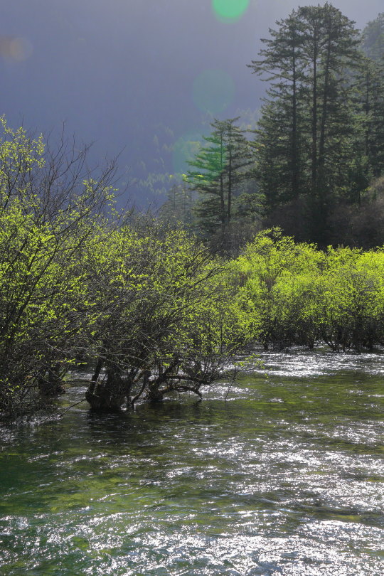

source
#water#plants#trees#green#naturecore#river#lake#photography#nature#blue#landscape#mountains#woods#orb#sun glare#lense flare
791 notes
·
View notes
Text

blinded | Leica M6 | Kodak Portra 800 | 2023
#daniloz#analog photography#35mm#nature#35mm film#35mm photography#leica#35mm color film#kodak#leica m6#sunrise#lense flare#summicron 35mm#kodak portra 800
11 notes
·
View notes
Text
So there's this Star Trek p*rn parody (censoring the word so the post will show up in the tags) and it might just be the best piece of media I have ever watched.
Cut off the actual spicy part but the beginning is fucking hilarious!
Big thank u to @startrekintodarkness for pointing out its existence
#star trek#star trek the original series#star trek movies#(i forget what we call them as i am not interested in them)#spirk#THE ISSUE'S MY LEG!#and the planet fucking exploding at the end i can't xD#oh and the goddamn lense flares ofc#original posts fresh from quark's pussy
13 notes
·
View notes
Text
the only notable difference at the end of the day is that robots will have lense flare when looking at bright lights actually. that is the only difference between us ever /j
#xero says things#AND EVEN THEN THO.#THERE'S STILL THINGS SIMILAR TO LENSE FLARES WITH HUMAN EYES.#i have very mild astigmatism so certian lines are like BEWMMM LIGHT BEAM#and smaller ones are always blurry and make my head hurt#and i would argue that can be just as annoying as a robot not being able to look at a bright light bc of lense flare
5 notes
·
View notes
Note
whos the lady in your icon and why isnt she graced with a pair of shades or horned glasses library style just makes me sad in my heart
My icon is the 1965's rendition of Betty Crocker, my personal favourite of the lineup. Her expression is stern but not unkind, and she keeps the distinctive curl of her hair. Her pearls add an air of dignity, as well, and an accessory her peers lack.
#ic#ask#reddeliciousauce#I imagine a pair of reading glasses would create a lense flare were it not an illustration.#That and they would hide her lovely eyes.#1972 has a brooch and 1986 has a neckerchief but I don't find them as visually appealing.
2 notes
·
View notes
Text


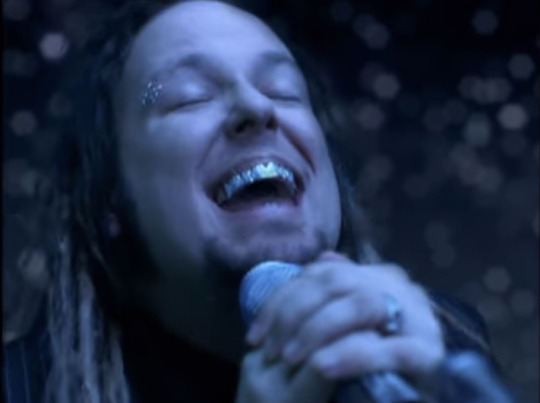


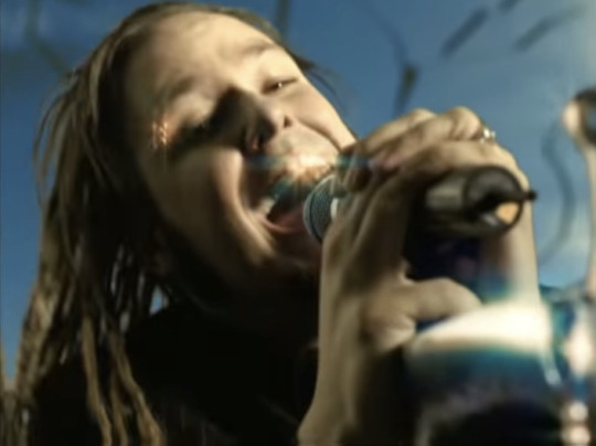


Nobody asked for this, but here are my favorite shots of JD’s grillz from the Coming Undone music video.
#this post is for me because my brainworms need feeding#I want him to bite me like a feral fucking cat#also those eyebrow rings are still very sexy#honestly early 2000s JD has a grip on my entire self#also side note this mv is fucking awesome#the bad cg is fucking cool sue me I like old bad computer shit#and the color scheme is very sexy#I love lense flares#and then there’s my MAN#LOOKING ALL FINE AND SHIT IN THE VOID#okay I’m done#jonathan davis#korn#nu metal
20 notes
·
View notes
Photo
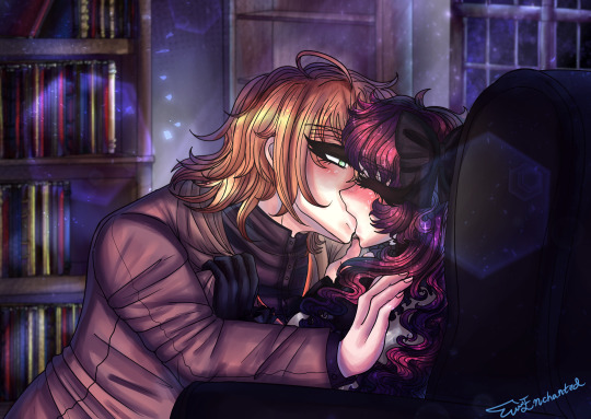
~ GAME OVER ~
CG redraw with Yume of one of Tei’s bad end CGs! I hate lighting 🙃
#Tei#nameless the one thing you must recall#Nameless#OC#original character#self insert#otome#otome game#cheritz#cg redraw#redraw#Dreamarian#male yandere#yandere#nameless spoilers#I HATE LIGHTING I HATE LIGHTING#I took so long to do that background so many books like eck#*THROWS MORE DUST SPARKLES AND LENSE FLARES ON THE PIC*
29 notes
·
View notes
