#light shades
Text


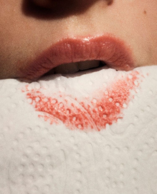

You don't even know my name, do ya? ౨ৎ
#bubblegum pink#lipstick stains#blueberries#cat#commes des garcons#cute receipt#butter#clean#live laugh love laufey#light shades#super shy#newjeans#cherry#barbie#pastel moodboard#blue#watercolour art#superflat
20 notes
·
View notes
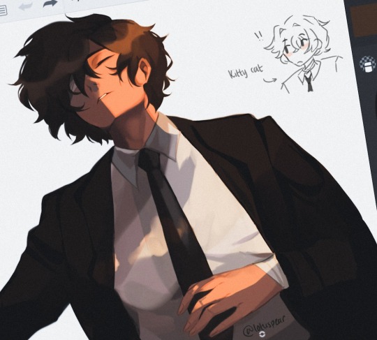
Text


Life drawing
2 notes
·
View notes
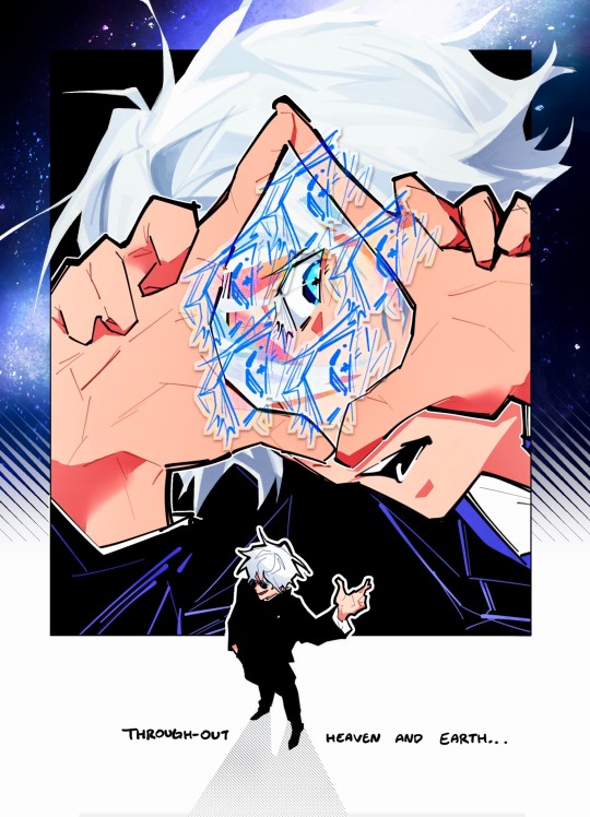
Text
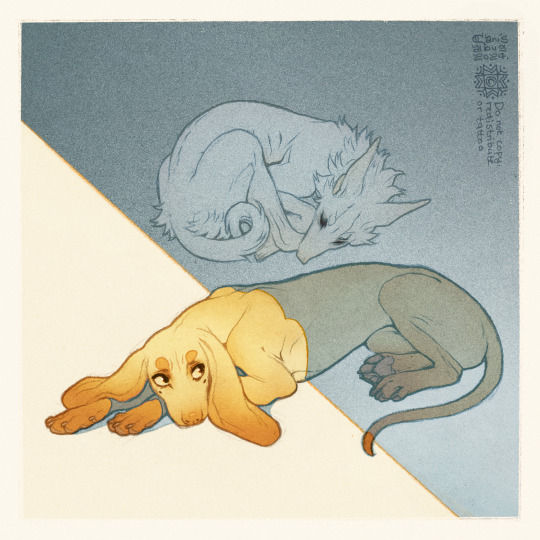
✦ Siesta ✦
#own art#own characters#CanisAlbus#art#artists on tumblr#Vasco#Machete#sighthound#dogs#canine#animals#Vasco's golden fur looks it's best in direct sunlight#Machete prefers shade because he burns easily and his eyes are sensitive to bright lights#I love light yellow I see yellow and I go HRAAAH
14K notes
·
View notes
Text
girls will be like “this shade of green 😍” about every shade of green they see, and they’re right
#i love women#the girls who get it get it#green#green aesthetic#cottagecore#cottagecore aesthetic#moody maximalism#eclectic#shades of green#light green#dark green#forest green#emerald green#teal#sage green#literally all shades of green
35K notes
·
View notes
Text
How To Incorporate A Lamp Shade To Improve Your Interiors

Principles of harmony, proportion, size, space, color, and texture are fundamental to interior design. Even while you should be thinking about the overall design of the space in order to make it seem coherent, it is the little details that really make a difference.
Original Source, https://www.fenchelshades.com/blog/post/how-to-incorporate-a-lamp-shade-to-improve-your-interiors
0 notes
Text
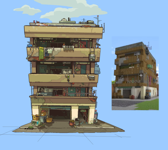
Bdubs home-away-from-home 1pt persp
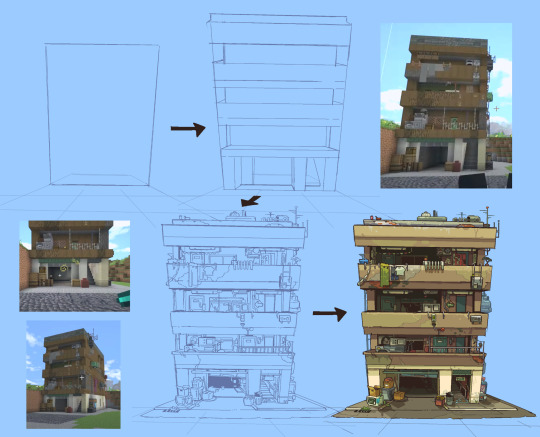
Try my hand at colouring a build for once- I seldom do it both lineart and colours take too long . Experimentation on creating depth by shadow.
Other than the actual mc build itself, structure inspired by Adamo-Faiden architecture, particularly Bonpland 2169 andddd their collaboration with CHAMBER OHiggins 1625
#stufffsart#alienssscapes#character concept stufff#bdoubleo100#bdoubleo#Bdubs#hermitcraft season 10#hermitcraft#hermitblr#mcytblr#the shading in implying a light source is a bit out of wack hopefully not too noticeable#this will sound like the most nerd shit ever but (longing) i wish i was rich enough to have an a+u subscription 😔
3K notes
·
View notes
Text

Inverted default outfit colors
#liteeart#0329#march 2024#sona#furry#dragon#dark colors are pretty nice cause you can do more visible shading and lighting on it vs white
3K notes
·
View notes
Text
This is very unfinished but I needed everyone to see the vision I had
#I’m going on hiatus because I need to focus if imma keep my job#so no. ore drawing traumatized gay boys for a while#I have no idea what direction I want to take this in and I really need to learn lighting and shading#but I needed everyone to see my vision before I disappear#all for the game#jean moreau#aftg#the sunshine court#the foxhole court#fanart#my art#also I’m totally gonna make a Kevin one#wip
3K notes
·
View notes
Text

im just a big fan of silly, nonverbal, genderless, sometimes homicidal, feral little protagonists
#i wanted to color but i didnt want to shade so flat color time#ultrakill#v1 ultrakill#hollow knight#hk ghost#dead cells#dead cells beheaded#hyper light drifter#hld drifter
4K notes
·
View notes
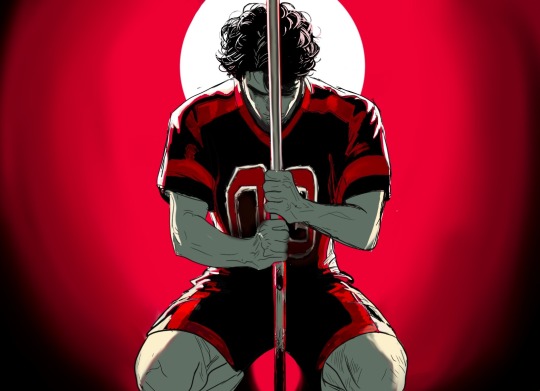
Text
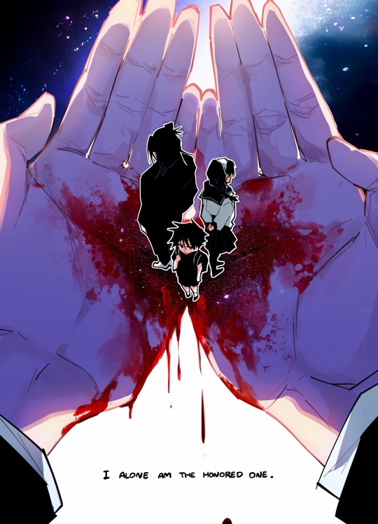
lonely at the top
#jujutsu kaisen#gojo satoru#jjk#season 2 is fucking wiiiild bro holy shit#the FRAMING goddamn#i tend to be a bit mixed on anime adaptions but jjk s2 is really hitting it out of the ballpark#the scene at the end of ep 4!! the lighting!! the way the crowd parted to show gojo#and how his eyes are shaded like they are in season 1 now…..omg#hidden inventory arc rlly is the arc of all time holy shit#my art
7K notes
·
View notes
Text
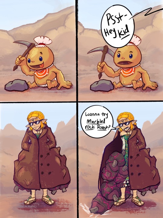
I guess DARE wasn’t a thing in Goron City
#saw someone call zelda the gorons drug dealer and I couldnt get the image of her in a trenchcoat peddling marbled rock roast to children#like one of those shady guys selling wristwatches in cartoons out of my head#anyway that’s where this came from#trying to figure out comics and shit. not my strong suit so sorry if its rough.#figuring out an optimal level of detail is hard :( first I’m like oh i’ll just leave it black and white and then i’m like maybe ill add#color and then i’m like well now it needs shading and THEN it needs lighting and THEN IT NEEDS A BACKGROUND AND THEN IT NEE#anyway i should. probably stop rambling bye#loz#tears of the kingdom#totk#totk spoilers#i mean sorta. not huge spoilers. slight spoilers for goron arc I guess#zelda#myart
6K notes
·
View notes
Text
old dazai lighting practice i found in my drafts that i have no intention of finishing so u guys can have it
#bro this is so fucking old u can tell bc i had no idea how to draw hands💀💀😭#still looks ok tho i think. i genuinely had no idea where the light source was while i was doing this#btw this was my attempt at painting if u guys were wondering if i only knew how to do cell shading😍😍 ur incorrect! i can render!! (poorly)#october me was a different artist forreal#also ignore that little doodle off to the side i was testing out a pen#bungou stray dogs#bungo stray dogs#bsd#osamu dazai#dazai osamu#lotus draws
2K notes
·
View notes
Text
I think 90% of my gripes with how modern anime looks comes down to flat color design/palettes.
Non-cohesive, washed-out color palettes can destroy lineart quality. I see this all the time when comparing an anime's lineart/layout to its colored/post-processed final product and it's heartbreaking. Compare this pre-color vs. final frame from Dungeon Meshi's OP.


So much sharpness and detail and weight gets washed out and flattened by 'meh' color design. I LOVE the flow and thickness and shadows in the fabrics on the left. The white against pastel really brings it out. Check out all the detail in their hair, the highlights in Rin's, the different hues to denote hair color, the blue tint in the clothes' shadows, and how all of that just gets... lost. It works, but it's not particularly good and does a disservice to the line-artist.
I'm using Dungeon Meshi as an example not because it's bad, I'm just especially disappointed because this is Studio Trigger we're talking about. The character animation is fantastic, but the color design is usually much more exciting. We're not seeing Trigger at their full potential, so I'm focusing on them.
Here's a very quick and messy color correct. Not meant to be taken seriously, just to provide comparison to see why colors can feel "washed out." Top is edit, bottom is original.
You can really see how desaturated and "white fluorescent lighting" the original color palettes are.
[Remember: the easiest way to make your colors more lively is to choose a warm or cool tint. From there, you can play around with bringing out complementary colors for a cohesive palette (I warmed Marcille's skintone and hair but made sure to bring out her deep blue clothes). Avoid using too many blend mode layers; hand-picking colors will really help you build your innate color sense and find a color style. Try using saturated colors in unexpected places! If you're coloring a night scene, try using deep blues or greens or magentas. You see these deep colors used all the time in older anime because they couldn't rely on a lightness scale to make colors darker, they had to use darker paints with specific hues. Don't overthink it, simpler is better!]
#not art#dungeon meshi#rant#i'm someone who can get obsessive over colors in my own art#will stare at the screen adjusting hues/saturation for hours#luckily i've gotten faster at color picking#but yeah modern anime's color design is saddening to me. the general trend leans towards white/grey desaturated palettes#simply because they're easier to pick digitally#this is not the colorists fault mind you. the anime industry's problems are also labor problems. artists are severely underpaid#and overworked. colorists literally aren't paid enough to do their best#there isn't a “creative drought” in the anime industry. this trend is widespread across studios purely BECAUSE it's not up to individuals#until work conditions improve anime will unfortunately continue to miss its fullest potential visually#don't even GET ME STARTED ON THE USE OF POST-PROCESSING FILTERS AND LIGHTING IN ANIME THOUGH#SOMEONE HOLD ME BACK. I HATE LENS FLARES I HATE GRADIENT SHADING I HATE CHROMATIC ABBERATION AND BLUR
2K notes
·
View notes
Note
BdoubleO’s crescent moon base? Or Pearl’s season 9 alien-scape?
cant believe ive never drawn this one before
#the alien-scape got requested a few times and its been on my list anyway but that'll probably take longer. lol#also tried to use very limited shading and lighting here idrk why. i think its neat#bdoubleo100#hermitcraft#hermitcraft season 8#my art
2K notes
·
View notes
Text
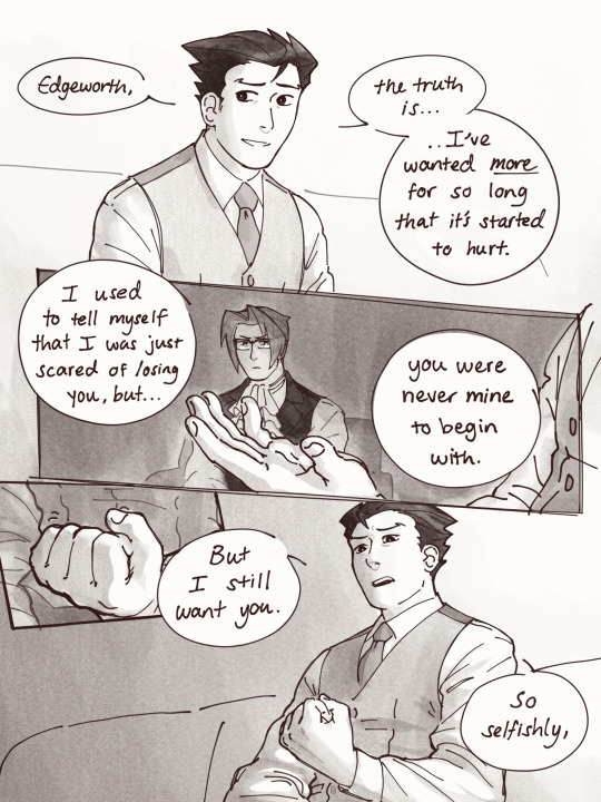

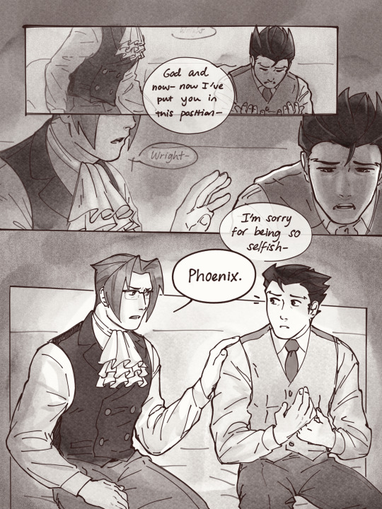
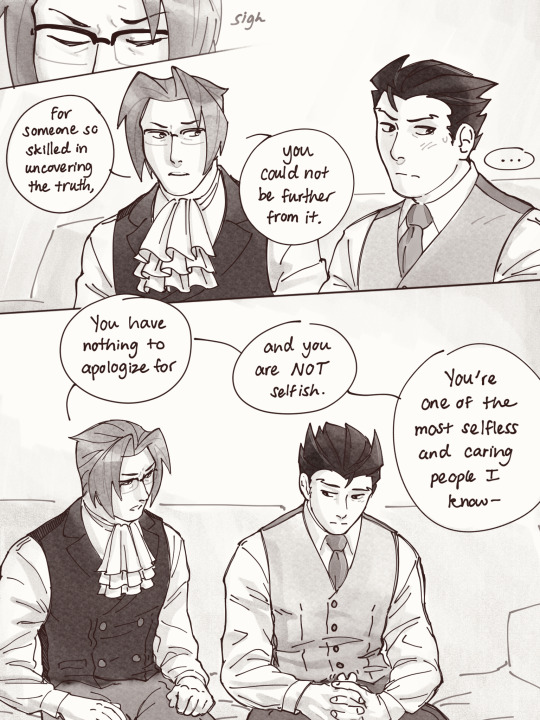
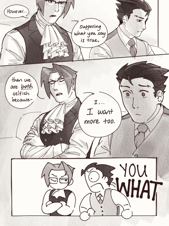
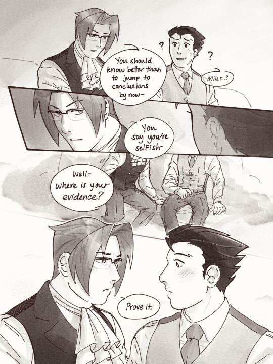
“Take my hand” pages 5-11
1 - day 2 - truth - 3
#nmweek23#narumitsu#wrightworth#phoenix wright#miles edgeworth#i spent all yesterday shading and lettering these your boy is so tired BUT IT WAS WORTH IT#in which i cram way too much into way too little and yet way too many pages for a single day#my sincerest apologies to them on their day but i will make it up to them i PROMISE#‘prove it’ you’ll NEVER GUESS what happens next :^))))) (<-guy who is extremely predictable)#phoenix is so strong because if miles looked at me like that i’d be going crazy and im like a known enemy of edgeworth#see you guys in like 5-7 business days on part 3 o7#fan art#aa#fan comic#rendevok#OH OH ALSO there’s like a whole fucking essay i could write about these pages esp wrt light and also The Hands but youll have to ask for it#just know that if you see something… there was probably a reason for it!#ok thats it fr this time
3K notes
·
View notes
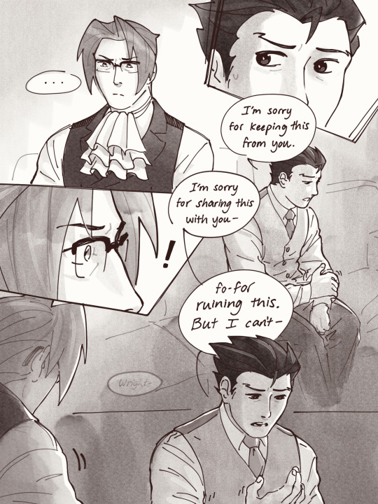
Note
your shading is AMAZING specially when its conveying organic forms..... do you have any tips for people who dont know wrf going on (with shading)
ok so HI. hi. my old tutorial pisses me off so i will make a new one
i made a guy whose sole purpose is to be shaded so dont worry he likes it. and his name. his name will be mr. Boob. mr boob does not have to be blue
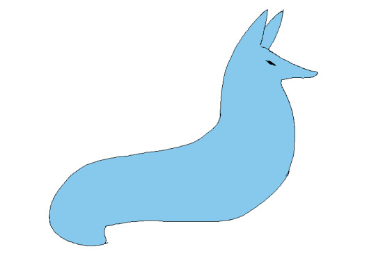
theres probably way better explanations of how to do it but unfortunately trying to "emulate" shading does ask you to somewhat understand ur character in a 3d way. like what would the 2d shape be if you "sliced" it? mr boob is made of so many circles. his tail also does a kind of weird perspective foreshortening thing because its pointing at you. is this being conveyed
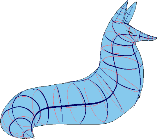
you obviuously dont have to draw a horrendous grid on your characters skin to do this . BUT it helps you put down (or at least envision) the lines of the form shading :
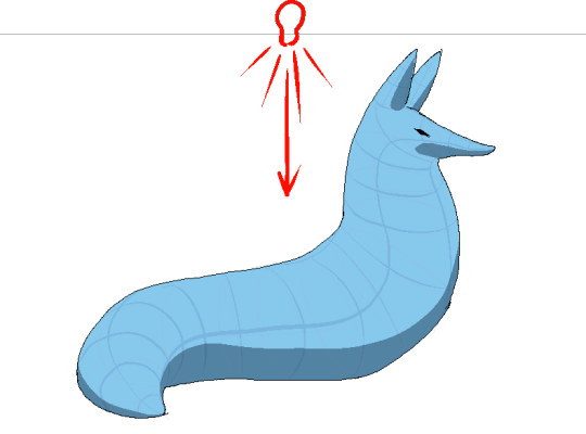
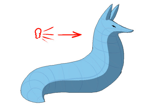
dont worry about cast shadows or the shading color because this is FORM SHADOW time only. think about what surfaces of the character are obviously facing away from the light source and put down the "separation line" of the shading based on that. thr most important thing is that youre trying to separate light from dark
im going to pick the first one for cast shadows bc it will be the most obvious to me
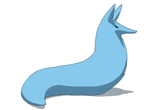
ok so. his ears and snout are blocking other surfaces of his body from the light, which means a shadow is cast!!!! bam. i saw someone describe cast shadows as what the light's pov "can't see." his entire body is putting down a cast shadow on the ground too

im impatient so i blended the form shadows now. its usually the easiest to just NOT blend cast shadows as a way of conveying that they are still cast shadows. but you can still blend them if you want to show "distance" between the obstruction and the surface its blocking. but its just a way of saying form and cast shadows should not be treated the same even if their softness coincides
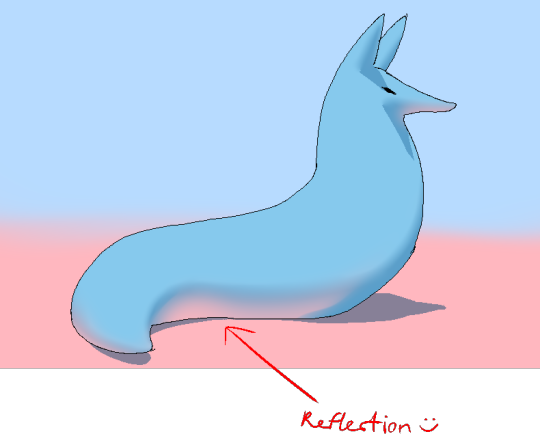
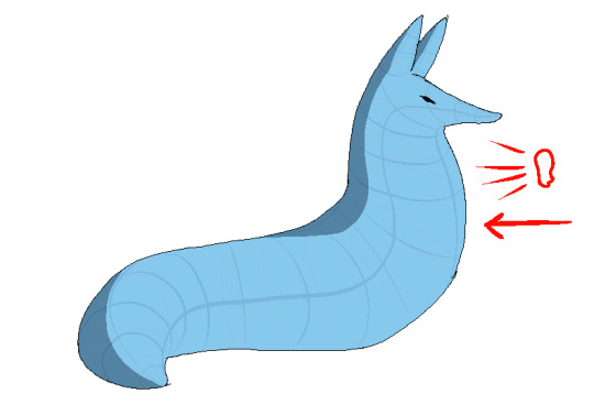
im going to lump reflection and ambient light together because theyre like. similar. reflections dont just happen in mirrors
since the sky is blue, making the ambient lighting, i tinged mr. boobs existing shadow to be a bit blue. (*this is kind of important because it can help you decide a shading color, which should USUALLY be based on the environment) (unless your character is just in the transparent void then it doesnt matter)
since the ground is pink, i made pink light bounce off of him. pointed and labelled. i dont rlly know how to go more in depth than that

contact shadows are literally shadows formed from direct-touching contact. very little light can reach in there, even from how reflections disperse, which means youre free to use the darkest color available (black). in this case mr. boob is making contact with the floor. because he is sitting on the floor.
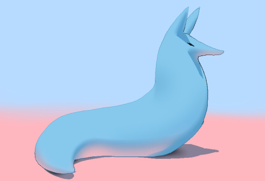
i touched him up a bit and wow!!!!!!!!!! look at mr. boob!!! he is so beautifully sculpted.
and one more thing
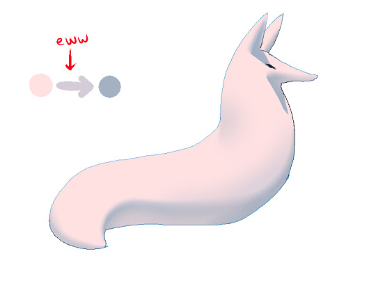
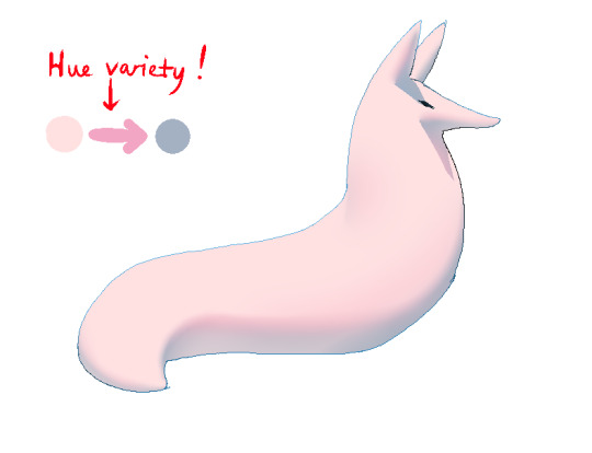
thats right. i made mr boob PINK. hes fucking ruined now. just kidding i would never say that to him
what im trying to convey here (its the easiest with really light colors) is a transitional color. this can also show subsurface scattering depending on how you use it which is fun to look at. the mistake i made on my last tutorial was "Just pick a warm saturated color!" which is really wrong in examples like Blue mr boob. because it would be weird to use a warm color to transition from blue to blue.
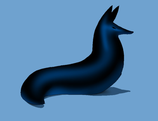
if you have a character that isn't bright enough then obviously the shadows wont be as visible. its BEST to bring more attention to highlights and reflections to reveal the form a bit. they play the biggest role with darker colors
thats all i can think of. fun things to look up:
structuralization + contour lines + foreshortening etc. 3d lingo
form shadows
cast shadows
ambient light
contact shadows
subsurface scattering
im also just speaking out of my ass otherwise. i didnt look up any of these terms until the end now im inferring and hoping i got them right
and remember every time you shade mr boob will be rooting for you
2K notes
·
View notes
Last Seen Blogs