#like... the first reviewer was polite concise and complimentary
Text
So today I had an upsetting encounter with a reviewer on ff.net who thought it was appropriate to use their review to complain about/harass/vaguely threaten a different reviewer who’d commented on the same story, learned about ff.net’s user blocking feature that I was previously only vaguely aware of, and reported said harassing/vaguely threatening review for abuse. We’ll see if anything comes of that.
I really wish I could delete non anonymous reviews on ff.net because I am so uncomfortable leaving that review in place. I’ve updated my profile to note that reviews being used to start/continue feuds with other reviewers is disrespectful and I’d prefer it not happen on my stories, but there’s not really anything further I can do about it beyond the blocking and reporting.
The whole thing is really upsetting and I just really hope I handled this the right way. *sigh*
Like... there’s a reason why I prefer how AO3 handles comments - author replies being public being pretty high up there. Because ff.net replies are private messages, I refuse to reply to comments. It makes me intensely uncomfortable not having those replies be public, especially because of scenarios like this. If I did reply, anything I said could, and probably would, get taken out of context.
(Though I originally turned off PMs due to all the spam on ff.net, the possibility of private messages being used as another avenue for harassment is definitely high on my list of reasons why PMs will never be turned back on.)
#the worst thing is that the person who did it probably thought I'd appreciate how complementary they were at the start of the review#like... the first reviewer was polite concise and complimentary#and I have no idea if reviewer two's complaints had merit#(nor do I care at this point)#but there's a time and place for that sort of thing and it's not when you're reviewing/commenting on someone else's fanfic#the tone by the end of the review was pretty hostile and directed at the other reviewer#which raised the uncomfortable question of whether or not they thought I was a sock puppet for that user#and they signed the review as 'admin' like they were trying to make it appear they had admin authority in ff.net#basically it was entirely unsettling and upsetting#and my brain is anxiety spiraling a little over this which is really annoying#as I'd like to sleep now
2 notes
·
View notes
Text
Red in Film
The interpretation of color requires much subjectivity. Objectively, the color red is 700 nm in wavelength (Nave, “Spectral Colors”). However, to each culture and individual its usage can provoke a different psychological reaction each time it is used, especially in art and media. In comparative advertisement studies, a red object can be interpreted as symbolizing; lust, excitement, love and power (Aslam, 2006)(Labrecque & Milne, 2011). But when taken into the context of art and supposed symbolism, it can seem like every object’s color is meaningful. This is especially done in modern film, in obvious ways.
The red rose is the first color seen in Pleasantville. It is shot in black and white until this scene. It is also used as a stand out color in Sin City. This film is shot in black and white. Only red objects are colored. Red is obviously being used as color discordance. For these films, because it is contrasted with no color, it seems that red obviously means something. A powerful example of this is in Spielberg’s Schindler’s List. Amongst a crowd in the ghettos walks a young girl with a red dress on. The film is in black and white, except for her dress in one of two scenes. Red appears again much later in the film, when the girl’s dress in smushed in a wheelbarrow along with many other dead bodies. One can interpret the color as each or every mix of emotional responses but the matter of the fact is that this color is being used strategically, for pathos.
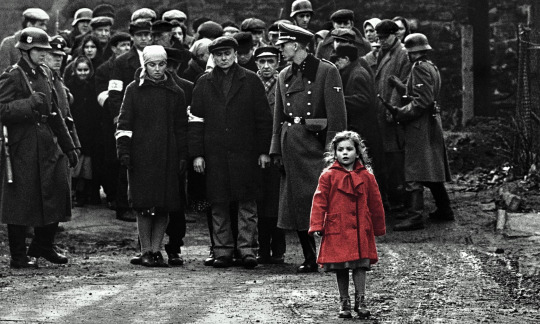
Schindler’s List (1994) still
Can this singular interpretation be applied to every red object, then? Red is used as the primary color for mail boxes in England and the Netherlands. Is the color used to evoke a strong emotion or the feeling of lust? No, the design created in 1924 by Sir Giles Gilbert Scott was meant to evoke a feeling of “public and legitimate order”(Scruton, “Why Lampposts...”). In Spain, they are silver. In France and Sweden, they are yellow. It looks like different countries have not even agreed on a single meaning on the icon. Just as easily as it can be interpreted, red’s meaning can contract itself. Singularity does not really exist in the name red. There are places were red is used with its symbolism in mind, but not as shock value. The alarming color was utilised as a way to balance an image. Piet Mondrian used red, along with the other two primary colors, to find harmony in composition. Mondrian, Theo van Doesburg and other Neoplasticists believed that the proportions alone can stimulate an equilibrium (Alley, 532-3). Many Pop artists have also stuck to primary colors to balance a composition.Jean Luc Godard, a filmmaker partially inspired by both movements, does this in his films as well. Godard was a member of a film movement called the Nouvelle Vague, or the French New Wave. He along with early pioneers; Agnes Varda, Jacques Rivette and François Truffaut, experimented with new forms of editing, narrative and visual style. Many films from this movement consist of long, documentary-like takes. Because each take is so long, the person in charge of the set must make each take visually appealing. I think this meant reanalyzing the concept of a scene and its composition. Varda reimagined the long take by using shadows and the shapes of humans and objects to create an image. Moving images become a staple in this film movement and will be seen in other international films for decades to come.
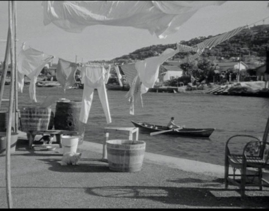
La Pointe Courte (1955) still
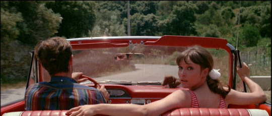
Value and shapes were used to shape a scene until directors began to use colored film. I bring Varda up as we can interpret the way Godard uses color the same way earlier films in Nouvelle Vague used value. His first colored film was called; Une Femme Est Une Femme. He uses the same tonal techniques for the rest of the 60’s but the most flamboyant would be Pierrot Le Fou.
Pierrot Le Fou (1965) still
Unlike how red is used in Sin City, the red used here is used to color a scene. What should be interpreted is feeling evoked when looking at the tonal composition. This shot uses the green from the background and the red objects as complimentary colors. One can relate Anna Karina’s red to womanly passion but Jean Paul Belmondo, the male lead of this film, also later wears a red shirt. So, the inconsistency of red’s usage in objects here should lead the viewer to looking at the shot as a whole. The coloring of each object is so concise that one can interpret each shot as a composition.
Pierrot Le Fou (1965) still
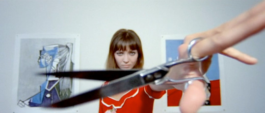
This is also a very shot from the film. Red is acknowledged as being a very vibrant tone and little of it is used in this composition. The red of her dress and the background shape the Punctum, the pair of scissors in her hand.
Trois Couleurs: Red (1994) still
Another director that plays with this idea in his trilogy; Trois Couleurs. In Krzysztof Kieślowski’s final film of the Three Colors trilogy, he uses the color red to frame the film’s narrative. According to Krzysztof Kieślowski and spectators, each film is supposed to symbolize the colors of the french flag (Binoche, “Conversation with...”). The meaning associated with each color of the flag frames the overarching theme of the movie. In this case, it is fraternity and interconnectivity. A red telephone wire can lead the eye to the subject, as its psychological purpose is acknowledged. However, the object’s meaning doesn’t have a particular role in the narration.
Red is a very powerful color and has been since we have been able to interpret the wavelength. It is the color of blood and hunger, life even. Red is also a mere pigmentation combined with other colors in a harmonious way. Yes there are examples of red being used to its symbolic limit, but there are also ways that red has been utilized in composition to diffuse its intensity.
Overall when observing film, art, or even life itself, it is important to allow yourself to not submit to a cliche but to interpret the work how you wish.
Abby Phillips
Worked Cited
Nave, R. Georgia State University Department of Physics and Astronomy. "Spectral Colors". HyperPhysics site. Retrieved October 20, 2017.
Scruton, Roger. “Why Lampposts and Phone Booths Matter .” Why Lampposts and Phone Booths Matter , 1996, www.city-journal.org/html/why-lampposts-and-phone-booths-matter-12001.html.
Ronald Alley, Catalogue of the Tate Gallery's Collection of Modern Art other than Works by British Artists, Tate Gallery and Sotheby Parke-Bernet, London 1981, pp.532-3
Aslam, M.M (2006). "Are You Selling the Right Colour? A Cross-cultural Review of Colour as a Marketing Cue". Journal of Marketing Communications. 12 (1): 15–30.
Piotrowski, C.; Armstrong, T. (2012). "Color Red: Implications for applied psychology and marketing research" (PDF). Psychology and Education: an Interdisciplinary Journal. 49 (1–2): 55–57.
Labrecque, L.I.; Milne, G.R. (2011). "Exciting red and competent blue: the importance of color in marketing". Journal of the Academy of Marketing Science. 40 (5): 711–727.
MacCabe, Godard, & Godard, Jean-Luc. (1980). Godard; images, sounds, politics (British Film Institute cinema series). Bloomington: Indiana University Press.
Pastoureau, M., & Gladding, J. (2017). Red : The history of a color. Princeton, New Jersey: Princeton University Press.
Conversation with Juliette Binoche On Kielsowski, Trois couleurs: Bleu, Krzysztof Kieslowski, Juliette Binoche, Miramax,199.
5 notes
·
View notes
Last Seen Blogs

ask-siro
Ask a victini

cemrestuff
cemrestuff
pwdre-ser
That the Starres Eat

tagouthunting
Tag Out Hunting

longproodpady
Untitled