#logo interpretation
Text


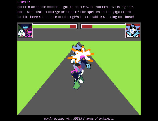
hi utdr halloween newsletter. i love you
if you ship kr/alsei go away. thanks 👍
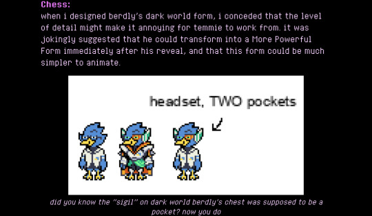
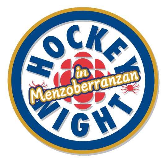
#specifying my Anti Kr/alsei Stance bc i Know people are gonna be weird abt kris wearing ralsei’s clothes.#the art gallery#deltarune#also the revelation that berdlys pixels on his shirt was a pocket. it makes me so so happy#he’s got a POCKET PROTECTOR !!! the blue is the pen and the yellow is the plastic of the pocket !!!! I am genuinely happy to know this#i loved seeing the interpretations of it being a logo of his own face but i adore it being a pocket protector#utdr newsletter
697 notes
·
View notes
Text


231109 (cr. dahinmaru)
#jiheon#baek jiheon#fromis9#fromis 9#femaleidolsedit#femaleidol#kgoddesses#idolady#kflops#fromisnet#*g#useroro#forvy#hiszabina#aleksbestie#my baby whom i love so dearly#they said in the channel that creating images while mantaining the logo was ok so#lmk if i interpreted wrong!!
139 notes
·
View notes
Text
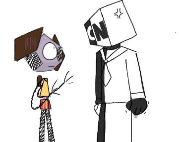
oopsie...
#I DREW THAT WITHOUT A REFFERENCE LETS FUCKING GO!!!!!!#im so proud of myself#is that egocentric?#idk but I love this#it's been so long since I drew rob's head in a different angle#don't ask what Cartoon Network i mad about#because idk#but you can have your own interpretations if you want!#i also did cn's logo without a refference for the shape#but that isn't that hard compared to rob's head#it's basic geometry apparently#the amazing world of gumball#tawog#tawog rob#my art#(idk why but i feel a little scared to post this for some reason)
61 notes
·
View notes
Text
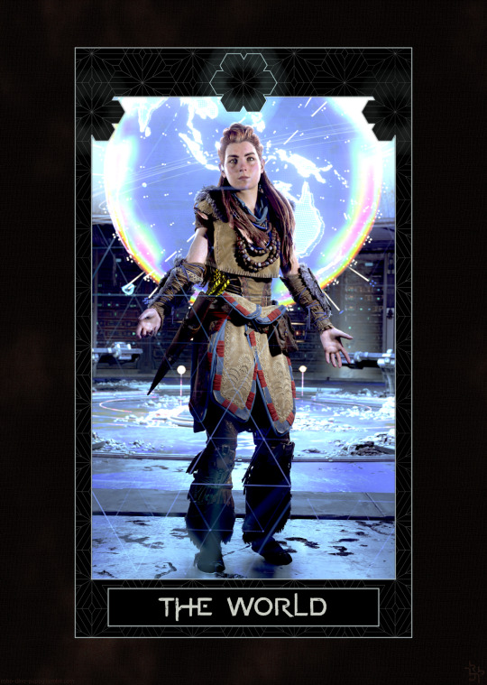
horizontober 2023 | 18: tarot
#horizontober2023#horizon forbidden west#hfw#hfwbs#aloy#pls don't come at me if this isn't a good interpretation of this tarot card bc i've never studied tarot T_T#but i looked it up and this is the one that spoke to me (that i thought i'd be able to do in photomode lol)#i actually got pretty into designing the border but it needs a lot more work and then i realized i saved my wip as a flattened image >.<#so....... all my layers are gone. fuck me.#still! i can recreate it without too much trouble (the pattern is an svg in inkscape)#and my quest to make svgs of the whole alphabet imitating the logo 'brushstrokes' on the horizon font continues#i think i've done most letters by now? just missing like q x y z and a few others#i also have a few variants (esp r/h/n) with different ascenders/descenders and some with the gaps in the vertical strokes#if anyone wants a word/title you're welcome to ask me and i'll see what i can do if i have time!
108 notes
·
View notes
Photo
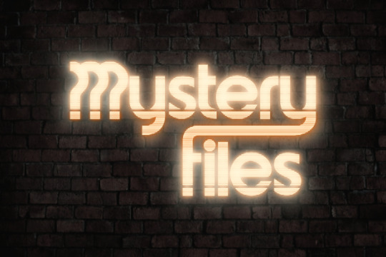
Mystery Files premieres May 19 📁
Patreon Premiere: May 11
WATCHER LOGOS - NEON STYLE
(original logo design belongs to Watcher)
#watcher#watcher entertainment#watcher fanart#watcher logos#mystery files#my edit/ art#(their logos my interpretation)
96 notes
·
View notes
Text
I am once more breaking into your house and sitting on your couch and eating cream puffs to rant about one of losses of the modernization of Captain Marvel’s character as a ‘childish, vaguely annoying kid in an adult boy’ is taking away the concept of children being wise and responsible.
The whole reason Billy was chosen was because, even as a homeless child, he was more kind and more worthy than most adults. He was not a desperate last resort, Bill was chosen for who he was as a person who had nothing and still remained so good. And those parts of Billy: his empathy and understanding of suffering, his resilience, his determination to be kind in a cruel world, that transfers over and is what Marvel is made of.
Even taking out the whole Wisdom of Solomon thing which I take as granting Marvel superhuman knowledge of magic and above average intuition and insight, Billy himself has plenty to offer in the brains department. Billy’s greatest strength is his heart, of having a good understanding of people and being a great moral compass and mediator.
Reading some of the older Cap comics, we can see Marvel acting cheerful, kindly, occasionally naïve but rarely out and out childish. Captain Marvel was a shining beacon, someone to be admired and looked up to and often that same respect expanded to Billy because he had those same qualities.
The appeal of Marvel being a child in a magical adult body is less ‘tee hee look at this kid be a weird adult’ and more the affirmation that kids have worth before their 18th birthday. Kids reading those comics can see that Billy is just as brave, honorable, smart as Marvel and appreciate seeing a child being able to have worth in an adult’s world (this argument applies to the Robins and most of the kid heroes too). But also! Billy not only is ‘adult-like’ but he has qualities that adults don’t have that contributes to who he is as a hero.
Kids often have a simpler way of looking at the world, less able to see and process the shades of grey of things. Sometimes that’s a good thing. There is something lost in the transition from childhood to adulthood, that understanding of social norms and ‘that’s how things are’. As a child, Bill still holds firm to principles that some of his adult coworkers may see as flexible and that adds such a fascinating dynamic to interactions with Billy and the rest of the League. There’s that great part from Injustice in which Marvel and Billy are internally arguing and Bill says something to the effect of “That sounds like the Wisdom of Solomon, I don’t have that, I’m 12″. While Bill and Marvel are the same and not is a weird mixed up fashion, Billy just straight up can’t or won’t understand Marvel’s adult rationalizations of complex issues.
Robin going on a rant and losing her point halfway through? It’s more likely than you think so I’ll wrap up. I have no problem with Cap acting silly, being relatable, but Marvel is Billy and Bill’s circumstances mean that he’s not gonna be a super hyperchaotic, kinda stupid child. He has his own worth, his own wisdom outside of Captain Marvel and that adds a unique voice to the JLA’s table consisting of not only adults, but adults of wealth and means. There’s no right way to interpret a character, especially one with such a long, convoluted history like Cap but, idk. There’s a sense of fulfillment in seeing a kid being seen as worthy for his own efforts and not just being used for comic relief.
#billy batson#I've had this rant circling in my head like the windows logo for ages#Its one of my favorite parts about the character#Ive been slowly making my way through 75 years of Shazam and Im really appreciating those interpretations#like yeah hes a kid! but hes a genuinely good kid who deserves his powers!#and moreover as Billy hes not a chaotic nutbar but a responsible kid and is respected for it#i do like Cap having the freedom to live out some of the childhood Billy was denied#so let him be weird and kinda cheesy and goofy#but goddamn Marvel/Billy is one of the most respected heroes out there and that aspect is very very important to me#I'm gonna add a panel from the 75 year which just fucking gets me ok#like thats my cap#no flak for people who like chaotic Big-esque Marvel like in the movie#but thats not my preference
519 notes
·
View notes
Text
Giant cornplate post here but I'll get my thoughts out anyways. I really like how even visually Mac and Winn are contrasting yet similar. Winn's main color is yellow and Mac's is purple, which are contrasting colors. Yet, they both wear green. And then both of them having glasses but they're different shapes (circle vs square). and ouuughhoguhgh. theyre good friends. i like them.
#clemramble#sorry this is a massive cornplate post . idc. ive posted my thoughts privately and now you all get to hear them#i always wonder if the color choices were done on purpose. i mean winns is obviously. being based off the windows logo#but macs based off a dutch bunny and not the macOS logo . soi always ponder if the purple was an active choice or if it was just coincidenc#not that itd change anything if it was or wasnt . their designs are clemheaven to me anyways#but yeah . you could also write about the same thing with their personalities#mainly in the way they talk in broadcasts. from what i interpret winns a lot more nervous and more casual whereas mac is well. its mac#i also think its funny that despite being nervous and stuttery winn gets to the point faster than mac. like if you read an alarming rate of#aptitude. mac takes 15 years to get to the point which is one reason it gets cut off so easily#and then in the hires and heroes blogpost it goes to do that again and then gets interrupted by winn#but even then winn does sometimes go off tangent just a tiny bit but is much more eager to get back to the point. i presume because of bein#nervous#i just think its all so good. i think they play off of each other in a funny way but not one that would be annoying to either of them#something something. contrasting enough to be different but similar enough to be best friends#sorry this is a kind of long tag post about mac and winn. i just like them alot and i need to get that out there. i hope you all can enjoy#my thoughts#...even if they turn out to be wrong.
8 notes
·
View notes
Text
wouldn’t it be wild if they were using that scene to spite the gay kiryu allegations. in the middle of pride month
#if so. put your damn rainbow logo profile pic away rgg studios#if you interpret the scene that way. wow wouldn’t that be shitty#rambling#rgg summit#I need to shut up I’m actually going insane
20 notes
·
View notes
Text
i am the complete opposite of those gatekeepers of interests. you wanna know what song that was? linked. where i got that strawberry top at? linked. what that pizza place on my story is called? ill show u on google maps w menu prices bby. what brush i used? im already sending you the screenshot, pookie. tell me what you think show me how it goes. we sharing interests and skills FUCK yea
#nukki.txt#shitpost#i am serious tho#like everyone deserves to enjoy stuff#its not copying or unoriginal its a shared experience#and just as we are all the same each of us are all unique and will consume media differently#so fuck yea i wanna hear ur interpretation of stuff i like#its a compliment if ppl ask for what ur into!#not exactly the same as mimicry is the highest form of flattery but damn close#like oh we twinning kewl#idk im finally feelin kinda better and just thought abt those weird folks that do this#like blurring logos of restaurants or whatever#like ??? just tell them! let people try the taqueria you went to! asshat#mutuals#this is a certified lovecore post in a way#lovecore#fufillment comes in many forms eddboy
6 notes
·
View notes
Text
The nobles of house Do'Urden watching minor houses fighting:

Every other member of house Do'Urden watching minor houses fighting:
#Drizzt read through#the description of everyone in the compound running out and shouting what I interpreted as play by plays got me#don't ask me how long I spent editing this. lmfao. I did not mean to spend that much time on editing that logo
5 notes
·
View notes
Text
there’s so much to unpack here
#guy who famously had no problems with empiricism karl marx#'religious mystics'#and that is um. one way to interpret what is being done with 'logos' in the gospel prologue
11 notes
·
View notes
Text
Continuing and drawing band/interpret logos - Linkin Park
#traditional art#music#traditional sketch#sketchbook#sketch#band#linkin#linkin park#Linkin park numb#art#artistsoninstagram#artist#interpret#drawing logos
10 notes
·
View notes
Photo
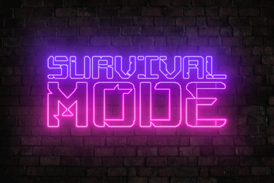
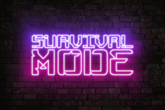
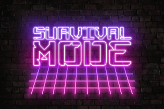
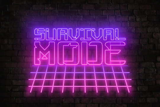
Survival Mode
WATCHER LOGOS - NEON STYLE
(original logo design belongs to Watcher)
#watcher#watcher entertainment#watcher fanart#watcher logos#survival mode#my edit/ art#(their logos my interpretation)
43 notes
·
View notes
Text
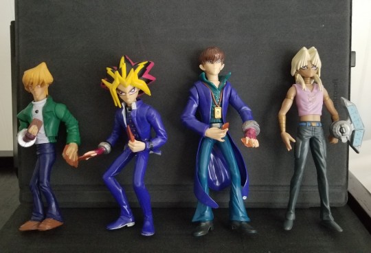
They're so ugly I love themmmmmm
#kaiba has a button on his back implying some sort of kung fu grip action#but i can't get it to work 😔#joey also has a button on his back and a battery stopper strip thingy slot#but also a little lightbulb on his chest?????#🤔🤔🤔#is it supposed to be a metaphor for the heart of the cards or something#or did every toy in the 2000s just have to have some sort of electrical component to it#and so they said 'fuck it lightbulb joey wheeler'#it is a mystery#the marik one is obviously from a toy line released much later than the other 3#the duel disk has a little button on top that lets it spin open lmao#god i wanna see the production behind these things#like who was in charge of designing these what poor artist was tasked w trying to interpret the ygo hair in a 3d space#which heads of their departments looked at these foul beasts and said#'yeah these look totally fine. slap the company logo on the packaging and ship these out'#they're all hard plastic save for kaiba's coattails which are more like a rubber mold#i kno VERY LITTLE about the toy design/manufacturing process and pipeline from one of my old teachers#but he didn't really talk about it much cause it was a sketching class geared more towards animators and illustrators#god i should've asked him more questions about it i loooooove toy productionnnnnn#he always scared me tho 😔😔😔
5 notes
·
View notes
Text
6 Logos Word Study Tools to Explain Your Sermon Ideas
In the early days of my preaching, I wish I knew the power of these 6 Logos Word Study Tools. They will captivate your congregation, injecting each sermon with a mixture of fascination, delight, and clarity to simplify the message of the Bible. Embrace these 6 word study tools, and your preaching will surpass my early efforts.
Here’s the problem with inexperienced preachers studying key…

View On WordPress
0 notes
Text
WK 02 | Aesthetic
In class, we explored the aesthetics, focusing on what makes a logo visually attractive. In this class, I learned the importance of color palette selection in logo design. A well-chosen palette can significantly enhance a logo's attractiveness and aid in recognition.
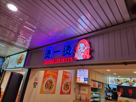
For instance, in my analysis of the Malatang restaurant's logo, I noted the neon hues colors, red and blue. The lecturer said this choice reflects the vibrant atmosphere of the restaurant. This combination of colors is also for the youthful target audience who enjoy spicy hot pots. As reflecting the preferences of the main consumers, the logo was crafted to resonate with their energetic vibe. This logo highlighted the importance of tailoring designs to specific audiences for maximum impact.
Additionally, I observed that many logos, particularly in the Asian food or noodle restaurant sector, tend to follow clichéd design patterns with round shapes using rough lines. To stand out in a crowded market, I learned that it is crucial to explore innovative design approaches.
In Studio class, I noticed some characteristics from designs while drawing stores' logos; simplicity, clarity of concept, and related color usage. Adhering to these rules resulted in visually appealing logos.


One article said "Aesthetics is about communication. Are you telling your story effectively? Do people experience your design in a way that’s effortless, immediate, and powerful?"(Oliver Sprigg, 2020). It means we should consider whether the design is telling one story effectively to make it beautiful and communicate with people.
(244 words)
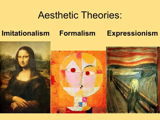
Images :
Aesthetic Theories: Imitationalism, Formalism, and Expressionism from: Cherifa Bochra Soltani "Aesthetic Theory: Understanding Beauty, Art, and Human Perception" 20 Sept. 2023
https://medium.com/@soltani_bochra/aesthetic-theory-understanding-beauty-art-and-human-perception-dd25c348bd86 Accessed 17 February 2024.
Burger king logo :
Burger king sign from: Nick Burd "About the Burger King rebrand"
14 Jan 2021.
https://nickburd.medium.com/about-the-burger-king-rebrand-5b92dc46d7bc Accessed 17 February 2024.
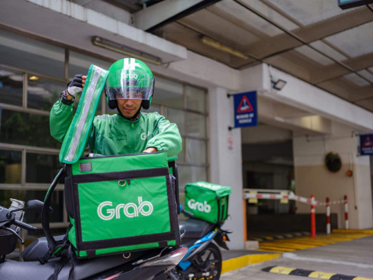
Grab logo :
The driver of Grab from: Grab Editorial "Our delivery-partners helped to redesign our GrabFood delivery bag" 28 June. 2023.
https://www.grab.com/sg/inside-grab/stories/our-driver-partners-helped-to-redesign-our-grabfood-delivery-bag/ Accessed 17 February 2024.
LEGO logo :
Lego logo from : "The new logo PNG in 2024" N.d.
https://www.edigitalagency.com.au/logos/new-lego-logo-png/ Accessed 17 February 2024.
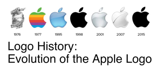
The Apple logos :
The history of Apple logo from: "Logo History: Evolution of the Apple Logo - 3 Cats Labs Creative" 3 Aug. 2020.
https://3catslabs.com/logo-history-evolution-of-the-apple-logo/ Accessed 1 April 2024.
References :
Sprigg, O. "How to Choose a Design Aesthetic for Your Brand (with Examples)", 30, Apr. 2020, https://looka.com/blog/how-to-choose-a-design-aesthetic-for-your-brand-with-examples/ Accessed 17 February 2024.
0 notes
Last Seen Blogs

rindou-ffxiv
SS置き場

pinkdreamerpsychiczipper
Sin título

jonathanrcakes
JonathanRCakes
yui-kuromori
Cosmic Whore