#lore olympus edit
Text

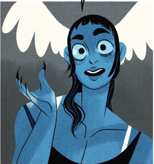
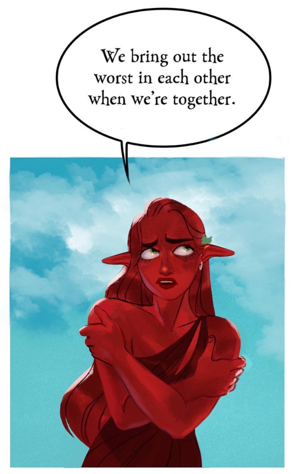
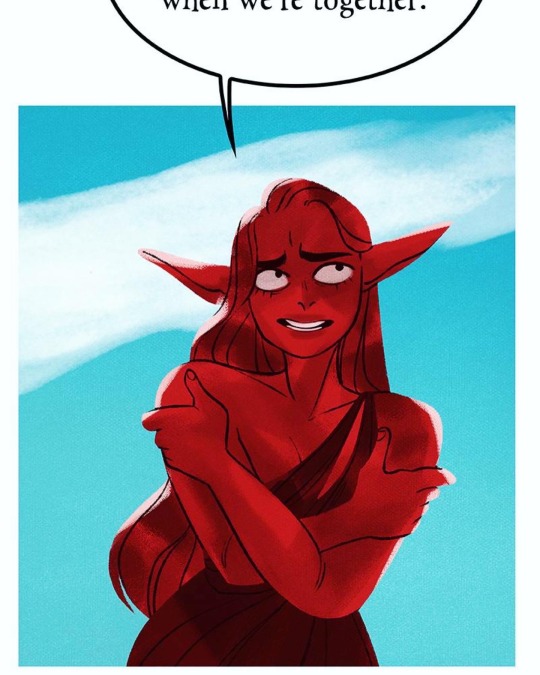
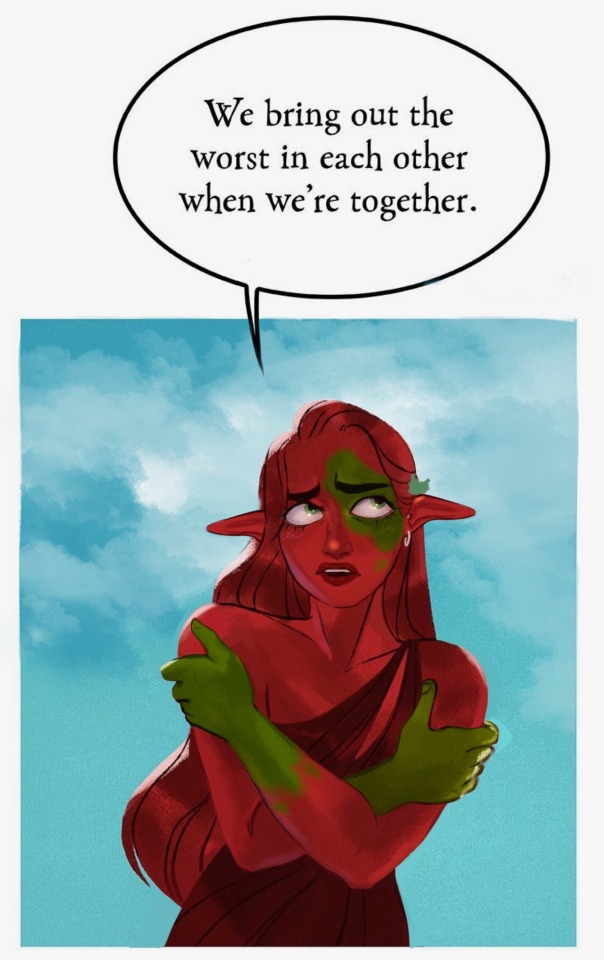
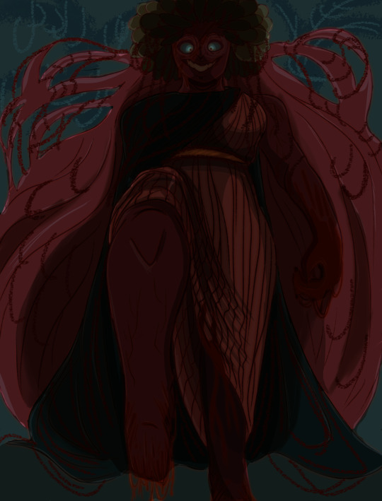
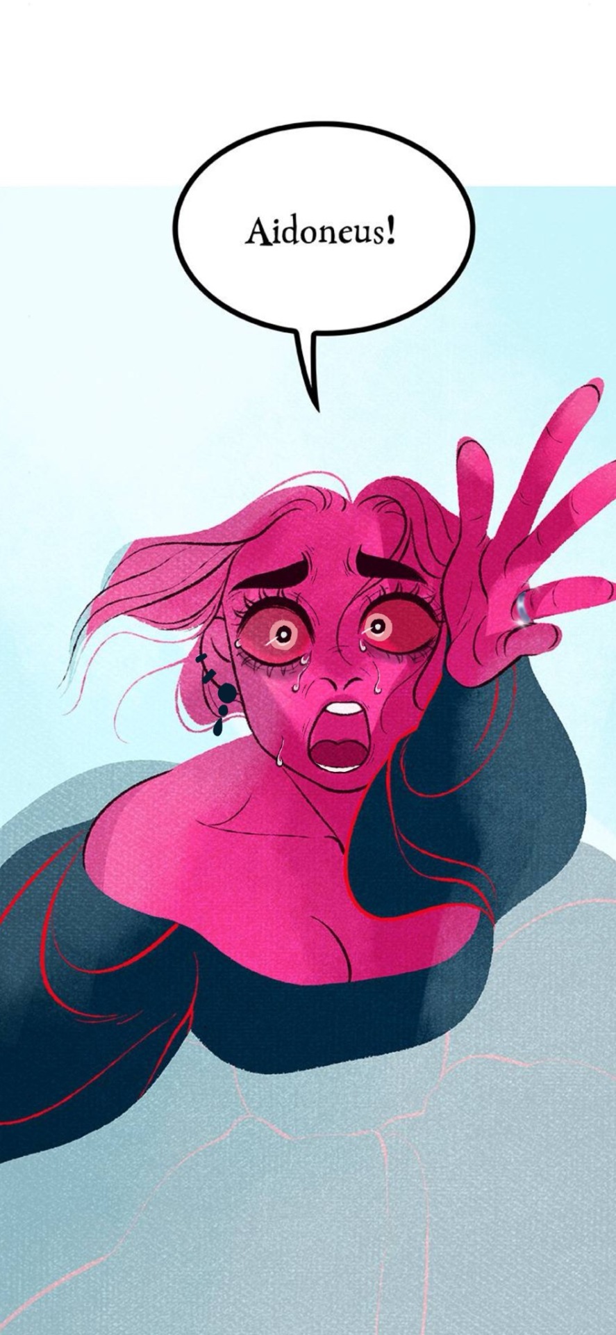
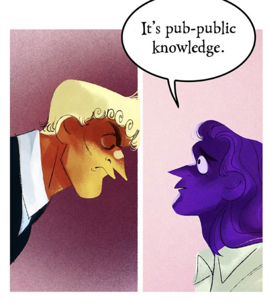
And when she awakens from her wrath, to the world she screams, soaked in red
Inspired by the latest episodes of Lore Rekindled
#artwork#lore olympus edit#lore olympus critical#lo persephone#anti lore olympus#lore olympus persephone
526 notes
·
View notes
Text
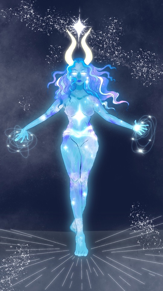
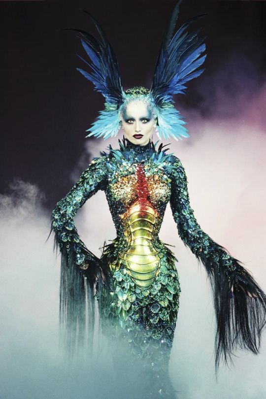
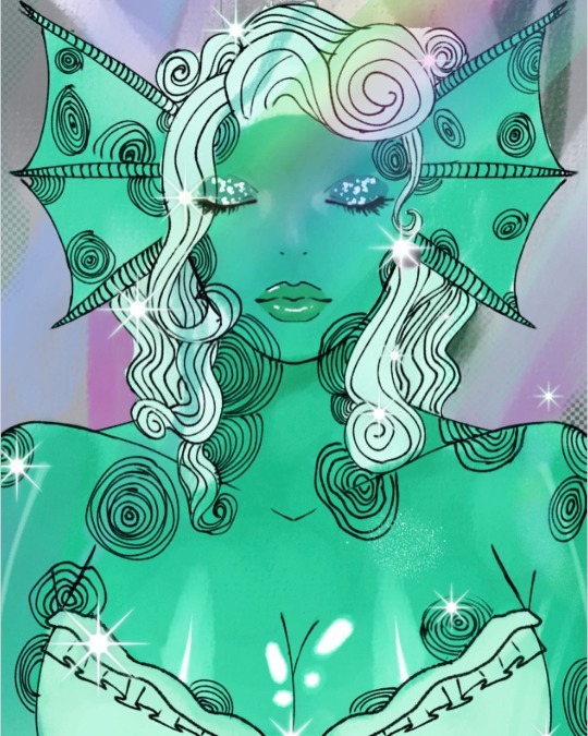
A star is born 🌟
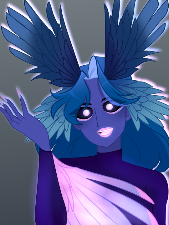
I just had to redesign Hera’s fertility goddess form. In all ways possible, I wanted her to be opposite of Kronos, hence the total makeover.
I based her color palette off of a neutron star! Neutron stars are technically dead stars and she was “dead” there for a minute so I figured that would go hand in hand.
Hope you like my redesign (click for better resolution) ✨
#anti lore olympus#lo critical#anti lo persephone#lore olympus#unpopular lo#unpopular lore olympus#anti lo#lore olympus critical#lore olympus criticism#lo critique#lore olympus redraw#lore olympus hate#loreolympiad#unpopularloreolympus#lore olympus art#lore olympus hera#lo hera#lo hate#lore olympus finale#lore olympus edit#lo art#my art#my artwork#illustration#art#lo redesign
241 notes
·
View notes
Text
Dread Queen Minthe edit.
#anti lore olympus#lore olympus#lore olympus critical#lore olympus criticism#lore olympus edit#lore olympus persephone#webtoon#minthe lore olympus#lore olympus minthe#minthe#dread queen
454 notes
·
View notes
Text
Zeus was tirelessly waiting for Hera's return
A very long overdue edit I never got to finish, there's more to this but I don't have the energy to continue it.
191 notes
·
View notes
Text
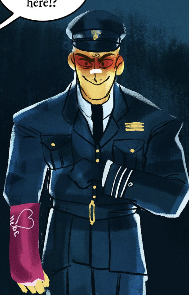
LORE | REKINDLED EPISODE 1 - DEATH WALKS ALONE
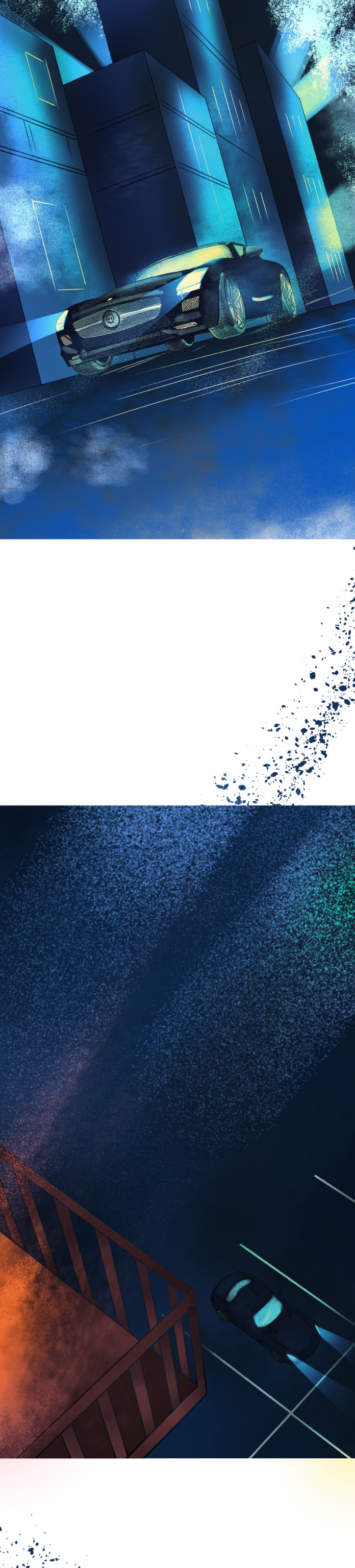
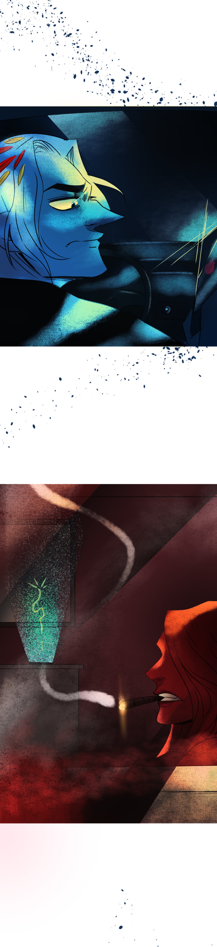
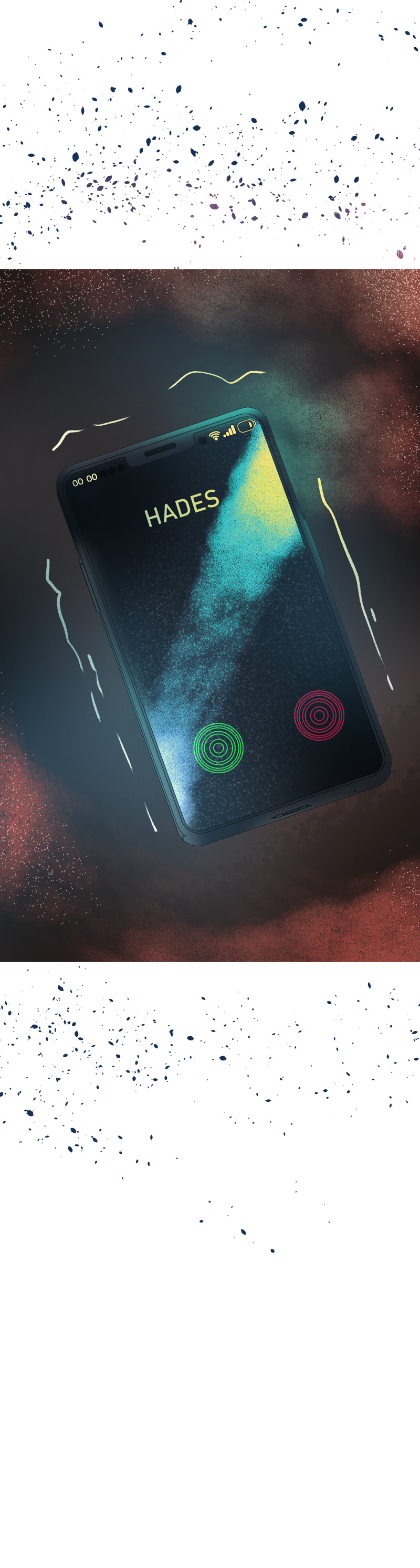
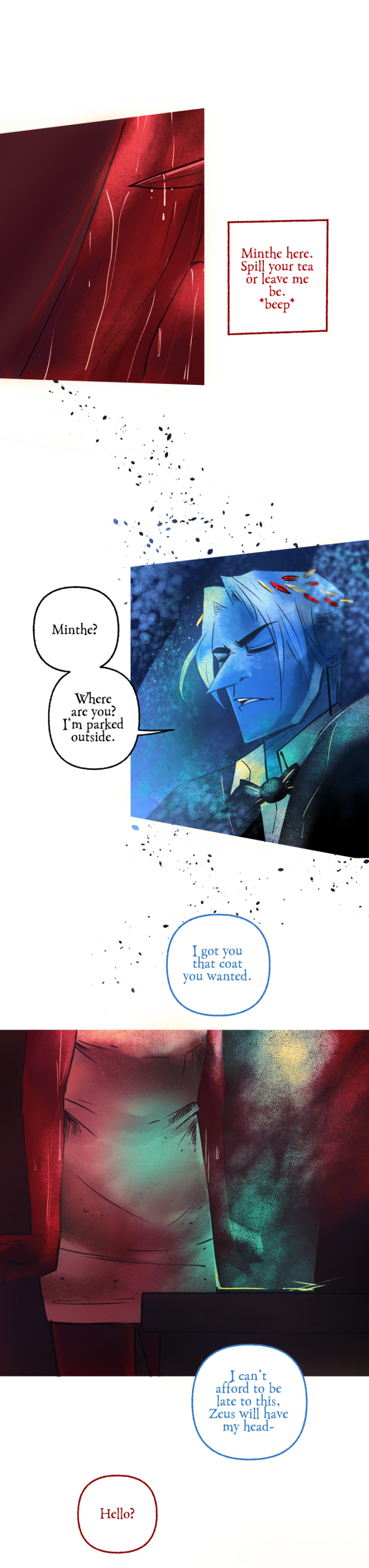
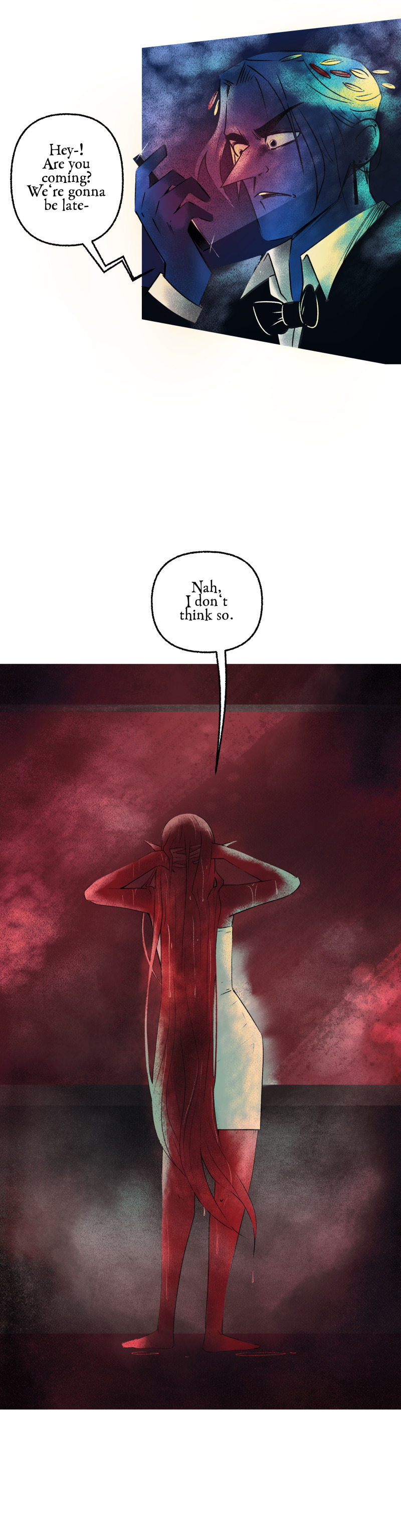
LORE | REKINDLED begins here!
Next episode
#lore olympus critical#anti lore olympus#lo critical#lore olympus edit#lore olympus fanart#lore olympus au#lore rekindled
890 notes
·
View notes
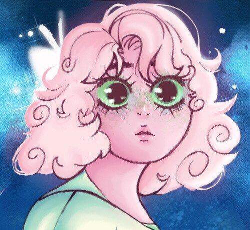
Text
LO Morpheus Redesign💤
Honestly one of my favourite redesigns I ever did so far. I always wanted to give more fun (and feathers) for Morpheus' design.
Her head wings are based off of Mugler's "La Chimère" outfit.
The colour scheme is based off of dreamy scenery images I've collected for inspiration.
I kept the long nails since I honestly love it but added little more colour to them.
Mugler inspo:
#lore olympus critical#anti lore olympus#lo critical#antiloreolympus#lore olympus edit#lore olympus redesign#lo morpheus
119 notes
·
View notes
Text


Morpheus edit <3 mainly gave her back her blue eyes, original rounded face, her lips and wings. Disclaimer: I am not trying to imply a trans woman has to look like this to be a "real woman" or that trans women can not appear more masc. I just find it really weird that Morpheus originally had a rounder face and nose and they changed her design to look more like the stock lo man body/appearance. I think this is more typical LO inconsistency and wasn't meant to be malicious but when she's the only trans character,,, it feels a bit transphobic,, 😭
#anyways how they massacred my girl#i like her outfit though#anti lore olympus#lo critical#lore olympus edit#webtoon#i do a bit of speaking <3
150 notes
·
View notes
Text
a Persephone panel edit!
I love Persephone with short hair honestly, it was cute (just maybe in a different style so she doesn't look like a Rachel self insert) and I loved her lighter colors in the pilot and earlier seasons compared to the highlighter pink we see now. Also wanted to add some green in there, since goddess of spring and all.
Lore Olympus, the panel, and the LO interpretation belong to Rachel Smythe and her crew!
#anti lo#anti lore olympus#lo critical#lore olympus critical#lo rant#lore olympus criticism#lore olympus edit#lore olympus redesign#lore olympus rewrite
245 notes
·
View notes
Text
hi have a panel edit (:
i really wished minthe had gotten some kinda aesthetic change from being a plant
#my art#art#digital art#fanart#lore olympus#lore olympus art#lore olympus edit#lore olympus minthe#lore olympus critical
72 notes
·
View notes
Text
⚜️Lore Olympus redraw⚜️


I decided to giver her her features back since LO keeps forgetting her wavy hair and the patterns on her body. I also tried to do something new with her dress. Though that may change soon
Tag list🪸: @miss-seanymph-pani @bimmiscourt @monstertreden @viostar2095 @nicasdreamer @vilereign @tinyy-tea-cup
#amphitrite#lore olympus criticism#anti lore olympus#lore olympus#webtoon#rachel smythe#lore olympus Amphitrite#lore olympus redesign#lore olympus edit#lore olympus redraw#amphitrite x poseidon#greek myths#greek gods#greek mythology#greek myth retellings#greek myth art#greek myth aesthetic
57 notes
·
View notes
Text
"She laid waste to the village"
Aka, Persephone act of wrath, but makes it "she did it for real"
#artwork#artists on tumblr#art#lore olympus#lore olympus critical#lo persephone#anti lore olympus#lo#lore olympus edit#lore olympus redraw#lore olympus redesign
92 notes
·
View notes
Text
Here’s some more art and panel redesigns 🤭 life is pretty hectic rn so I don’t have a whole lot of time to work on very heavy text posts but I do still try to do art stuff where I can
Some notes:
Here’s a fun drinking game: take a shot every time Rachel forgets to draw Hades and Persephone’s wedding rings
Here’s another fun drinking game: take a shot every time one of the characters looks emotionally constipated in what is supposed to be an emotionally charged scene
Please don’t actually, I don’t want to be responsible for anyone here getting alcohol poisoning
Also I redesigned Artemis!
I designed her to look much younger than any of my current designs and future designs because I feel like very often in the myths she is depicted as a young girl or a young “maiden”
I did stick to the antler cliché bc duh. However, similarly to how male deer, moose, elk, etc. can shed their antlers, so too can Artemis! And as a fun bonus they never grow back the same 😀
Also as a personal head cannon (bc I wanted to incorporate the moon somehow) I had her eye be gouged out in a shooting accident with Apollo. Zeus then took a bit of the moon and fashioned Artemis a new eye and it follows the lunar cycle!
I hope you enjoy my art/redesigns 💖
#anti lore olympus#lo critical#anti lo persephone#unpopular lo#lore olympus#unpopular lore olympus#anti lo#lore olympus critical#art#lore olympus redesign#loreolympiad#lore olympus criticism#lore olympus hate#lore olympus art#lo critique#lore olympus artemis#lo artemis#lore olympus edit#lo females#lo critic#lo criticism#illustration#my art#sketch#Artemis redesign
123 notes
·
View notes
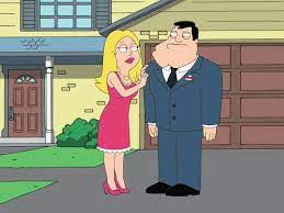
Text
I decided to make Hades stand up and…. Rachel wtf is this?!! She’s literally crotch height and he doesn’t even fit in the frame!!!


I had to crop half of the original panel and move it down just so his head would fit.
#the context of the scene doesn’t make this any better#Rachel please watch something other than Lolita#I’ve e waited over 4 months to be able to post this shit#anti lore olympus#lore olympus#lore olympus critical#lore olympus criticism#lore olympus persephone#lore olympus edit#webtoon#lore olympus hades#rachel smythe#lo persephone
259 notes
·
View notes
Text
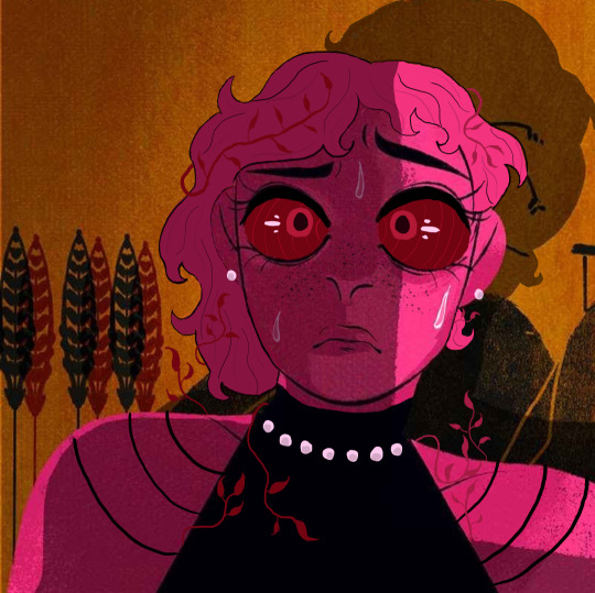
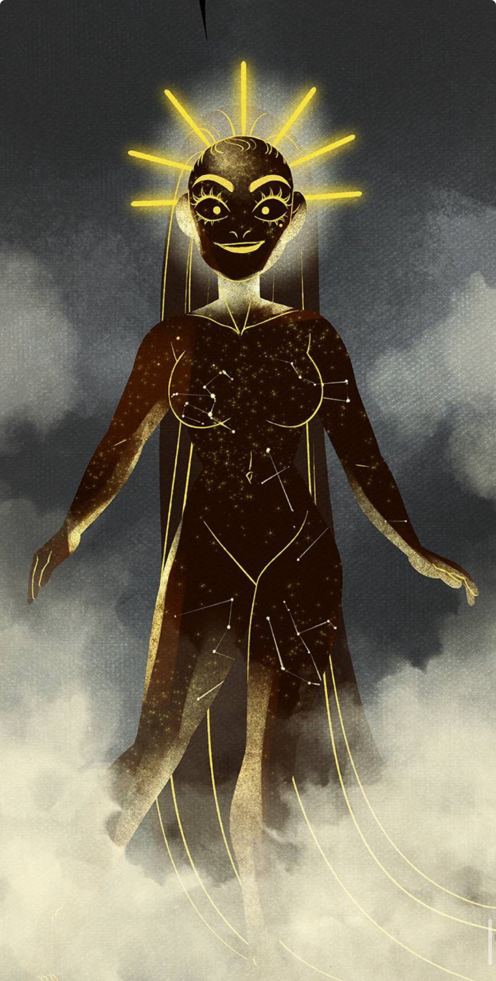
Distressed queen
I'm convinced the og panel is actually from some patreon sexy time scene, because what is this-

45 notes
·
View notes
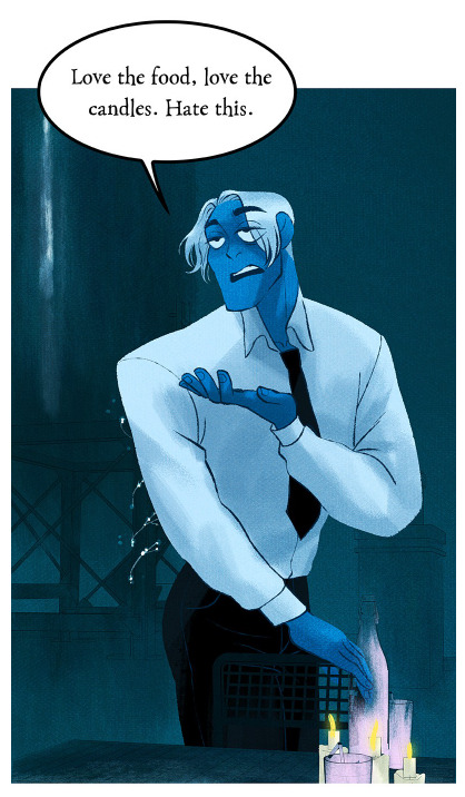
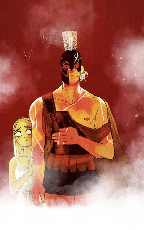
Photo
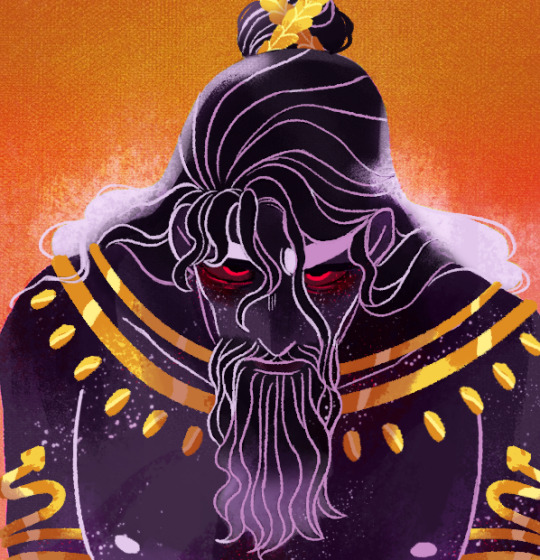
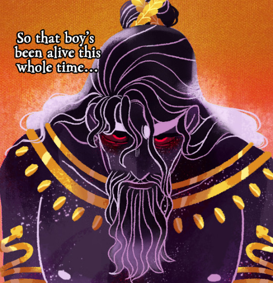
Edit of my redesign of Kronos. He’s referring to Zeus after freeing his brothers.
#lore olympus redesign#lore olympus#lo#Lore Olympus edit#lore olympus kronos#lore olympus titans#he's pissed
405 notes
·
View notes
Text
LO Art Analysis (or: A Real Example of Why You Shouldn't Use Multiply for Everything)
I've obviously been spending a lot of time recreating LO art and in that time, I think I've really cracked open some of modern LO's problems with its art. This is a lengthy post so turn on some lo-fi, grab some popcorn and strap in.
One thing in particular that I'm very eager to talk about (and go off about) is Rachel's use of color language and shading.
THERE WILL BE BRIEF FASTPASS PANELS AHEAD IN THIS ANALYSIS. YOU'VE BEEN WARNED!
One of the key things that most people seem to agree on when it comes to LO's current art quality is the lack of color language. Back in S1, we had colors that seemed to jump off the page, with gorgeous rendering that created panels that were vast and beautiful to take in. It didn't matter if the anatomy was wonky or if the backgrounds were translated directly from Google Sketchup, the color and compositions made up for its flaws and created unique vignettes that individually contributed to what we found so special about LO back in those days.


That last one especially is still hands-down one of the most well-known and influential LO panels out of the entire series. Many a phone background its graced (my own included, I've literally had this as my phone background for like 3 years now) and it serves as a beautiful standalone example of the mood and emotions LO used to convey. You don't need to know the context of the scene, you don't need to know the characters, the mere posing and color choice alone is enough to invoke a reaction from the viewer. It doesn't even have a lot of shading or final rendering, the composition and texturing is all it needs.
So why does a simple panel like that work, but panels like these don't?

I have such beef with this panel because it does the complete opposite of what the famous Tower 4 panel achieves - it puts on full display everything wrong with LO's current art style, from its character posing to its color language aaaall the way to its final rendering.
First off, the character posing and framing. I finally figured out what RS' male characters have been suffering from lately, and it's a phenomenon that I'm sure many of you will be able to recognize right away.

Seth Macfarlane Syndrome.
You might not watch Family Guy, you might not watch American Dad, or the Cleveland Show, but you'll know exactly what I mean when I talk about Seth MacFarlane Syndrome. It's the stiffness, the lack of movement or bend in joints, the boring posing of characters standing with their arms flatly at their sides and their entire body facing the same direction, eyes unblinking - and when they speak, heads slightly tilting, mouths always being conformed to the same default shapes, while the arms do something random and unrelated to create the illusion of natural movement.


This has been an issue in LO for a while now, incredibly flat posing that lacks any sort of dynamic curvature to it, but it's best exemplified by that Ares panel above because holy shit does he ever look like Stan Smith in it. Boxy shoulders with arms that appear to be WAY too short hanging off the side, elbows flattened, hands straightened out, no natural shaping whatsoever.
But that's not the crux of the issue I want to touch on today.
No, the worst offense of this panel is that it indirectly proves what I've been suspicious of for a while now.
To explain real quick for context, there's this thing in digital art called Blend Modes. It's essentially a basic function in digital art that allows you to change the properties of layers for the purpose of shading, rendering, whatever have you. Most of these Blend Modes are the same across all digital art programs, things like Multiply, Screen, Color Dodge, etc. are all fairly basic tools in the digital artist's toolkit but all have an INCREDIBLY high ceiling of mastery - meaning, blend modes are easy to use on a basic level, but require a lot of skill and understanding of color language to utilize to their full potential. Using them right can transform a passable piece of work into a great one - on the flipside, using them wrong can take a passable piece of work and piss all over it.
The one I want to focus on in this post is Multiply. I use this blend mode myself quite often, it basically 'multiplies' the properties of the layers below it, taking whatever colors are below and 'doubling' them to create darker tones. This makes it a go-to for shading.
But the issue with Multiply is that it often ends up being used when it's not supposed to be. Or rather, people starting out will often use it as a substitute for shading when you'd be better off using your own hand-picked colors. I've got characters with skin tones that I can shade with the same color set to Multiply, zero issues, because the base tone is one that doubles well, it creates a nice rich tone on top that's perfect for shading.
But do you know the one color that DOESN'T multiply well?
Yellow.
Yellow is NOT a color you can just multiply, not without the final result looking flat and almost putrid. Most people will thus recommend you shade yellow with other colors along the same side of the color wheel, including oranges and reds. This is precisely why knowing color theory is such an important skill even in digital art, because using Blend Modes improperly can create flat tones that can ruin a final composition.
Going back to that Ares panel...
Again, I've had this suspicion for a while, especially when looking at panels of Persephone (*pink is ALSO a color that doesn't multiply well)
So I put it to the test. I took the original panel, sampled the yellow, and overlaid it with Multiply to see what I'd get.
Fam.
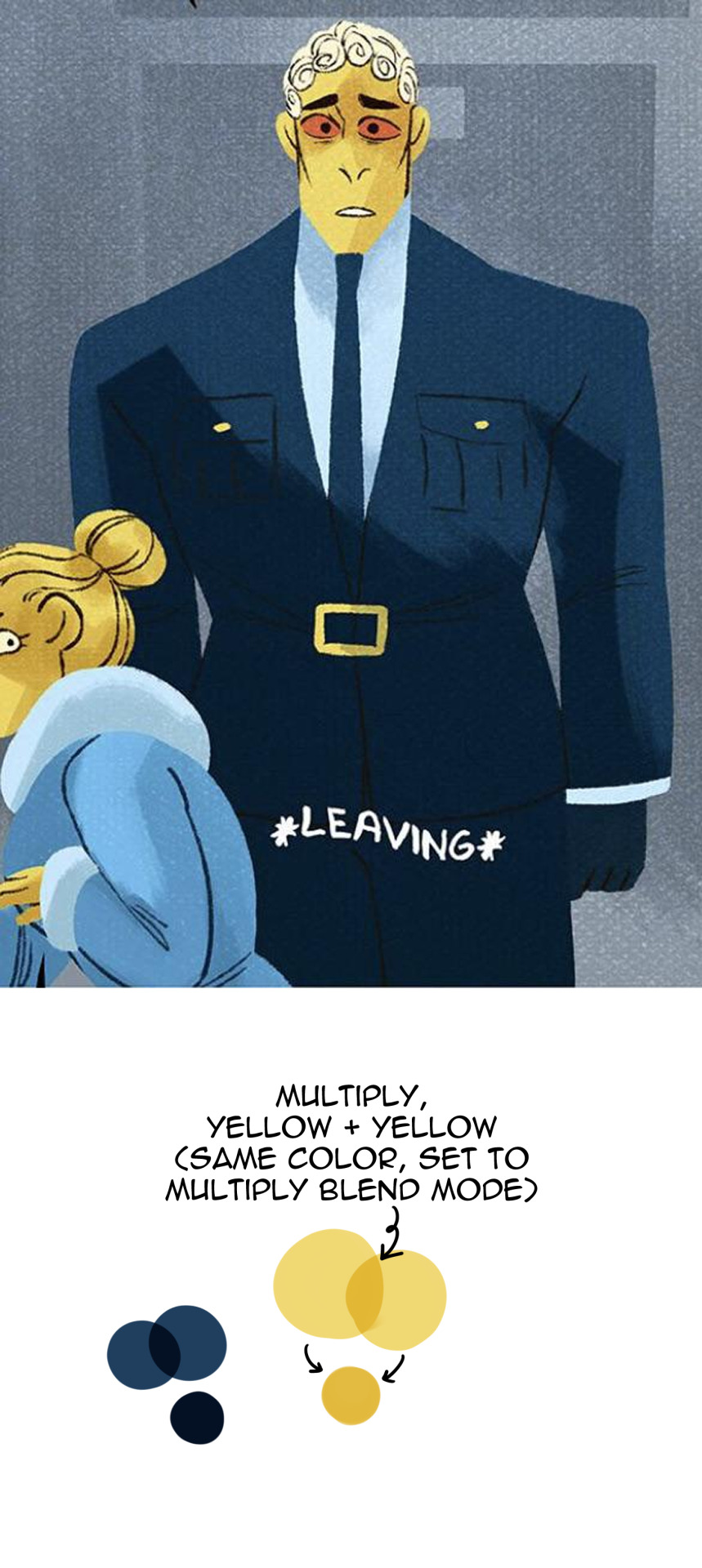
That putrid deep yellow that I mixed above is literally NEXT DOOR NEIGHBORS WITH WHAT I EYEDROPPED FROM THE PANEL. Copy and paste that and eyedrop it yourself if you want to see it with your own eyes. It's pretty obvious she did the same thing with Hera as well, you can tell her skin tone has been set to multiply and repainted with the same color, same as with her jacket.

They are using Multiply layers for everything as the default. This is not how Multiply is intended to be used - it's lazy shortcutting that's resulting in flat, boring, ugly compositions.
RS has stated herself that she 'changed' how LO is drawn to help 'streamline' the process for her assistants. This isn't streamlining. This is cutting corners.
Streamlining would be having color palettes to refer to during the coloring and shading process. I use them myself for characters that I CAN'T multiply-shade, I literally have characters whose skin tones are too light and yellow-toned for it - using Multiply would wash out their tones and make them look flat and sickly so I have to use a separate color from a different part of the color wheel to shade them (usually a darker tone of red/orange).
Rachel, babe, this isn't streamlining, this is just taking shortcuts to the point of sabotaging your own work. You can't sit there and tell me THAT looks good and is worth the 'streamlining' when panels like THESE used to exist:
Turn off the Multiply layers and color your characters for once, please, I'm begging you. This is such a rookie move for someone who claims to be a professional (and regularly brags about the awards she's won); not to mention a tragic fall from grace because we know Rachel can and has produced better work than this in the past. She knows color language, she knows how to paint, so why is she resorting to shortcuts like this? She has an entire team of people and yet she's still consistently behind enough in her buffer - or just doesn't care enough anymore - that she's resorting to lazy amateur tactics like using Multiply for everything.
And on the off chance that she ever sees this, Rachel, it's not even that hard to use proper colors. You've done it before, you should already have the color palettes available to you.

(P.S. One handy-dandy experiment to tell if your Multiply layers are failing you is the desaturation test. You'll notice that drawings being made primarily with Multiply layers will look a lot 'flatter' when desaturated, because the shading is just the same color on top of itself and 'doubled', there isn't any actual value or depth in the shading itself. These are the exact same panels I showed before, RS' on the left and mine on the right, they've just been desaturated to show the difference that proper color choice can make when defining values and tones in shading!)

471 notes
·
View notes
Last Seen Blogs
hellmagg
myself, I
distoretion
Distoretions Random Musings

saphico
Saphico

goodfemalecharacters
so it goes

zmb
Z