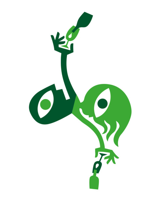
#max kisman
Text

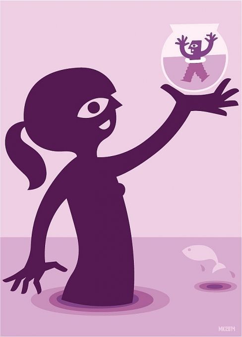
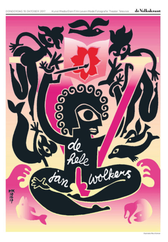
Poster Max Kisman for “Zwart op Wit” (Black on White) exhibition in the Moving Gallery Utrecht ( March April 2024)
.
#moving gallery utrecht#max kisman#daan rietbergen#martijn sandberg#jean-pierre lebars#rozemarijn westerink#guido de boer#thomas castro#grapical art#2024
18 notes
·
View notes
Text

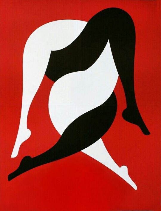
Netherlands, 2013 // designer: Max Kisman.
3 notes
·
View notes
Text
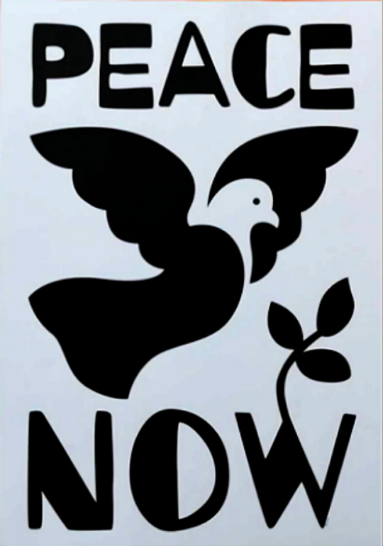
PEACE NOW by Max Kisman
#free poster to print and I'm happy seeing them more and more even if they don't support just one cause aside from#“are you distraught and powerless in everything happening right now? me too if only there was peace”#peace#dove of peace#max kisman
0 notes


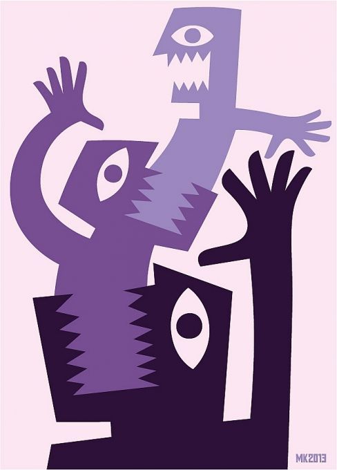
Text


This weeks textbook reading on Chapter 11: Typographic Design Education wet over much of what we have learned and the project we have done in 245 and 246 so far like the flowering type project which I did last semester in 245 as well as other project were included in this chapter like the Typographic hierarchy grid project and using existing letterforms to make new letters and symbols similar to what we did with our 27th letter project. This semester we did a project similar to what is in the textbook under the section type and image in the third dimension when we used Augmented Reality to enhance our posters for the UDA immersive poster competition. There were a good bit of projects mentioned in the text that I did not get a chance to do in either typographic design one or two that seem really interesting such as the typezine project on your favorite typeface which seems really fun. There is also a project about making your own typeface and that "an alphabet can be anything, and anything can be an alphabet"(Max Kisman) Where students make their own typefaces out of whatever materials they find. Both of these sound really interesting and may even be projects I do personally later down the road.
This week in class we really got to work on laying out everything for our process books, I felt really behind because I had decided to hand letter some of my type for my book with ink and a thick square flat brush and so I didn't get as much work done importing images so my book still feels like its in the early stages of being put together and I know with a deadline coming up I will be putting in a lot of time working on it this weekend so that I can work on finalizing details next week and make sure that I stay on track.
0 notes
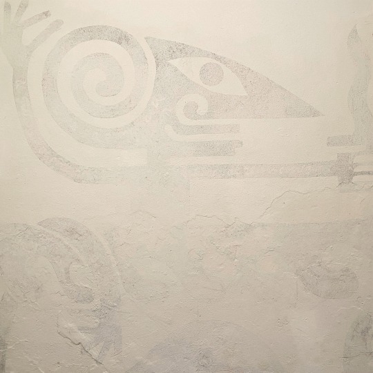
Photo
© Max Kisman
Een experiment van drie maanden: ‘Niemand kon er iets aan doen dat het september werd’
https://www.volkskrant.nl/nieuws-achtergrond/een-experiment-van-drie-maanden-niemand-kon-er-iets-aan-doen-dat-het-september-werd~b5e78176/
0 notes
Text
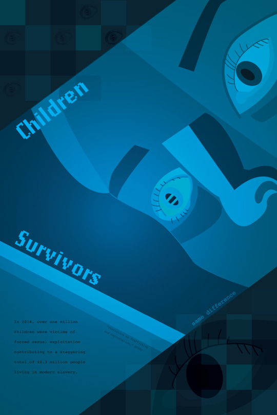
This past week marked the conclusion of our Same Difference posters. As I reflect on this project, I feel a sense of pride for the confidence that I have gained for the Adobe Software. I may not have the strongest software competency, but I finally see how graphic design can still implement all of the techniques that I love about painting and drawing such as creating shadows and highlights, utilizing color theory, illustrating, and layering. I also feel more comfortable beginning files and jumping right into planning out my grid since ARTS 245.
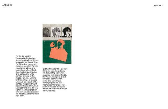
I have learned a great deal of lessons from this past semester in particular that I will use for creating my process book. One of those being that a strong beginning sketch is one of my greatest assets. The more I can plan out on paper as far as the foundation, the more confident I feel in building out my file. I can also scan these images in for reference. With the combination of pencil and mousepad, I could essentially bring any concept to life. For example, my favorite typographic artwork from this week's reading was Max Kisman's mind/machine project built on the idea that "an alphabet can be anything and anything can be an alphabet. Students created letter forms using faces, and the result was extremely lovable and eccentric.
More abstractly, I learned the importance of concept in graphic design. In my marketing classes, we always mention that a successful strategy is built on the clear positioning of a product and the value it serves to consumers. A brand must be clear and not confusing for customers to understand. Designs are the exact same way. They are creative solutions for conveying a concept, and everything must be clearly explainable and intentional from the color to the typeface.
0 notes
Text

#exhibition#art on paper#works on paper#moving gallery utrecht#ronny delrue#hans lemmen#salomé roodenburg#sarah van der pols#dutch gallery#max kisman
23 notes
·
View notes
Text
3 notes
·
View notes
Photo

LAST DAY! Save 10% on EVERYTHING! Enter code “MAY2018” at checkout! Paradiso Posters, 1968-2008 / Available at www.draw-down.com / Housed in a former church in the centre of Amsterdam, Paradiso has long been the cherished concert venue for a wide variety of cutting edge musical acts which have invariably been promoted through a standard format poster. These #posters are reproduced here in this extensive survey, which illustrates both the wide-ranging musical agenda that the venue has followed and the graphic skills of a range of different designers including Martin Kaye, Max Kisman, Niels Meulman, #ExperimentalJetset #Parra and Machine. Clearly presented, illustrated throughout with color reproductions, and introduced by an explanatory essay, this publication will thrill both music and graphic design aficionados alike. Over four decades of design work, organized in a loosely chronological order, create a capsule collection of #Dutch music-related design from 1968 to 2008. Designed by #MaxKisman #graphicdesign #ParadisoPosters
#graphic design#posters#poster design#experimental jetset#max kisman#parra#paradiso posters#Dutch design
7 notes
·
View notes
Photo
1 note
·
View note
Last Seen Blogs
ungodly-amounts-of-godly-trauma
war of the woobified

echoice-in
Untitled

virtualrisingstar
Untitled

ecconocenos-blog
Conócenos
veryconfusedpotatoo
A fox that loves Fnaf :3