#mediaquery
Text
Unleashing the Power of Responsive UI Design in Flutter
Unleashing the Power of Responsive UI Design in Flutter
Are you looking to develop a mobile app with a user interface that works seamlessly across different devices and screen sizes? Look no further! With Flutter’s powerful features, you can easily create a responsive UI that adapts to any screen size or orientation.
What is Responsive UI Design?
Responsive UI design refers to the ability of an…
View On WordPress
#Flutter#Flutter Development#layout builder#LayoutBuilder#MediaQuery#mobile development#responsive design#responsive UI design#UI design
0 notes
Text
Preventing Product Image Height Shrinkage: Latest Solutions

Introduction
When designing product pages, a common challenge arises when the underlying text starts wrapping, causing the product image's height to shrink. This can result in a less aesthetically pleasing layout and potentially compromise the visual impact of your product presentation. In this guide, we'll explore effective solutions to address this issue, ensuring that your product images maintain a consistent and appealing height even as the accompanying text wraps.
The goal is to find solutions that not only prevent image height shrinkage but also contribute to an overall visually pleasing and responsive design. By implementing the latest techniques in web development, you can strike a balance between text wrapping and image presentation, creating a seamless and engaging user experience for visitors to your product pages.
CSS Flexbox Solution
CSS Flexbox is a powerful layout model that provides a flexible and efficient way to handle the arrangement of elements in a container. In the context of preventing product image height shrinkage, CSS Flexbox offers a solution by allowing the container to adjust its items' size dynamically. This means that even if the text within the container wraps, the Flexbox layout can maintain the height of the product image.
Let's delve into a practical example of using CSS Flexbox for a product card layout:
CSS/* CSS Styles for Product Card with Flexbox */
.product-card {
display: flex;
flex-direction: column;
}
.product-image {
flex: 1;
/* Additional styling for the image */
}
.product-description {
/* Additional styling for the text */
}
In this example, the product card container is set to a flex container using display: flex;, and the items (product image and description) are stacked in a column direction with flex-direction: column;. The key part is the flex: 1; property applied to the product image, indicating that it should take up all available space within the flex container. This ensures that the image maintains its height even as the text within the description wraps.
HTML
Read the full article
0 notes
Text
How to make your HTML responsive using display grid. 💯✅
To make your HTML responsive using display grid, you can follow these steps:
#beginners#css#html#web#responsiveDesign#webDesign#gridLayout#mediaQueries#webDevelopment#frontEndDevelopment#codeSnippet#programmingTips
1 note
·
View note
Text
[solved] Disable font Scaling on Flutter application
[solved] Disable font Scaling on Flutter application
To disable font scaling in a Flutter application, you can make use of the MediaQuery class to retrieve the text scale factor from the device and use it to control the font size in your app. By doing so, you can prevent the system-wide font scaling from affecting the text display in your app.
Here’s a step-by-step guide to disable font scaling in your Flutter application:
1. Obtain the text scale…
View On WordPress
0 notes
Text
Flutter Widget Catalog: An In-Depth Exploration of Flutter Widgets

Flutter, Google's open-source UI toolkit, has gained immense popularity among developers for its cross-platform capabilities and extensive widget library. The widget library is one of the key strengths of Flutter, offering a wide range of ready-to-use components that enable developers to create stunning and interactive user interfaces. In this blog post, we will take a deep dive into the Flutter widget catalog, exploring some of the most commonly used widgets and their functionalities.
What are Flutter Widgets?
Flutter widgets are the building blocks of a Flutter application's user interface. They are reusable UI elements that can be combined and customized to create visually appealing and interactive interfaces. Widgets can be classified into two main categories: Stateless and Stateful widgets.
Stateless Widgets: Stateless widgets are immutable and do not change their appearance based on user interactions or external data. They are ideal for representing static UI components. Some commonly used stateless widgets include Text, Image, Icon, and Button.
Stateful Widgets: Stateful widgets, on the other hand, can change their appearance or behavior based on user interactions or external data. They maintain their state and update their UI whenever the state changes. Examples of stateful widgets include Checkbox, TextField, Slider, and DropdownButton.
Layout Widgets: Layout widgets in Flutter help in organizing and positioning other widgets within the user interface. They provide a way to structure the UI elements in a specific layout pattern. Some popular layout widgets include Row, Column, Stack, Container, and ListView.
Material Design Widgets: Flutter provides a set of widgets that follow the Material Design guidelines, enabling developers to create visually consistent and aesthetically pleasing UIs. These widgets include AppBar, FloatingActionButton, BottomNavigationBar, Card, and Snackbar.
Cupertino Widgets: Cupertino widgets are designed to mimic the iOS-style interface, providing a native look and feel for iOS applications developed using Flutter. They include widgets like CupertinoNavigationBar, CupertinoButton, CupertinoTextField, and CupertinoDatePicker.
Animation and Gesture Widgets: Flutter offers a rich set of animation and gesture widgets that allow developers to create engaging and interactive user experiences. Some notable widgets in this category are AnimatedContainer, Hero, GestureDetector, and DragTarget.
Custom Widgets: In addition to the built-in widgets, Flutter allows developers to create their own custom widgets tailored to their specific needs. Custom widgets provide flexibility and reusability, allowing developers to encapsulate complex UI components into a single widget.
Testing and Debugging Widgets: Flutter provides a range of widgets specifically designed for testing and debugging purposes. These widgets assist in identifying and resolving UI-related issues during development. Widgets like Semantics, TestWidgetsFlutterBinding, and MediaQuery are commonly used for testing and debugging purposes.
Conclusion: In this blog post, we have explored the Flutter widget catalog, highlighting the different types of widgets available and their functionalities. Flutter's extensive widget library empowers developers to create visually stunning and highly interactive user interfaces for their applications. Whether you are building a simple static UI or a complex custom widget, Flutter offers a wide range of tools and components to meet your needs. By leveraging the power of Flutter widgets, developers can save time and effort while delivering top-notch user experiences.
0 notes
Text
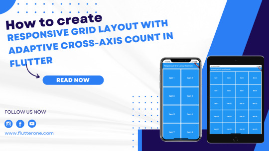
How to create a responsive grid layout with adaptive cross-axis count in Flutter?
Introduction:
A responsive grid layout with an adaptive cross-axis count is a powerful technique in Flutter for creating dynamic and flexible grids that adjust based on the screen size. This allows your app to provide an optimal user experience on various devices, accommodating different screen sizes and orientations. In this step-by-step guide, you will learn how to create a responsive grid layout with adaptive cross-axis count in a Flutter app. By following this tutorial, you will be able to build a grid that automatically adapts its column count based on the available screen space, ensuring a visually appealing and user-friendly layout.
Content:
1. Set up a new Flutter project:
Ensure that you have Flutter installed and set up on your machine. Create a new Flutter project using the following command in your terminal:
2. Implement a responsive grid layout:
In the Dart file where you want to implement the responsive grid layout, import the necessary packages:
Define a stateful widget for your grid layout:
In the GridView.builder widget, use SliverGridDelegateWithFixedCrossAxisCount as the gridDelegate to define the initial cross-axis count.
3. Determine the adaptive cross-axis count:
To make the grid layout responsive, you need to determine the adaptive cross-axis count based on the available screen space. You can achieve this by utilizing the MediaQuery class.
Add the following code inside the _ResponsiveGridState class:
Modify the crossAxisCount property in the SliverGridDelegateWithFixedCrossAxisCount widget to use the adaptive count:
4. Customize the grid items:
Inside the itemBuilder function of GridView.builder, build your grid items based on the index. You can use widgets like Container, Card, or any other desired widget to represent each grid item. Customize the appearance and content of each grid item based on your app's requirements.
5. Use the responsive grid layout:
In the Dart file where you want to use the responsive grid layout, import the necessary packages and add the ResponsiveGrid widget to your widget tree.
6. Test the responsive grid layout:
Save your changes and run the app using the following command in your terminal:
7. Observe the responsive grid layout in action:
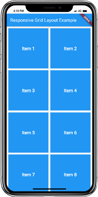
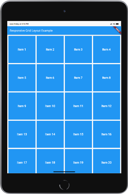
Upon running the app, you will see the responsive grid layout with the adaptive cross-axis count. The grid will automatically adjust its column count based on the available screen space, providing a visually appealing and user-friendly layout.
Sample Code:
Output:
Mobile and Tab view
Conclusion:
Congratulations! You have successfully implemented a responsive grid layout with an adaptive cross-axis count in your Flutter app. By following this step-by-step guide, you have learned how to build a dynamic and flexible grid that adjusts based on screen size, ensuring an optimal user experience on various devices. Utilize this technique in your Flutter app to create visually appealing and user-friendly layouts that adapt to different screen sizes and orientations.
Read the full article
0 notes
Link
Requisitos Requisitos: Escolaridade: Nível superior em informática, ciência da computação, engenharia da computação ou áreas afins. Desejável inglês intermediário Experiência: Uso de préprocessadores CSS (SASS e LESS) Uso de softwares de controle de versão como GIT e SVN Conhecimentos avançados: HTML5, HTML responsivo, HTML semântico, CSS3, Bootstrap 3 e 4, mediaqueries, javascript, Bibliotecas Javascript como jQuery, Consumo de serviços REST, Recortes de elementos gráficos de PSDs para uso no front end Diferenciais: Customização de temas em Drupal Customização de temas em WordPress Shellscript Experiência em desenvolvimento de service workers Escolaridade mínima Não informado Jornada de trabalho Jornada de Trabalho: Segunda a sexta feira das 09:00 às 18:00 Benefícios Salário: A combinar Benefícios: Em caso de contratação CLT, benefícios: VR (R$ 26,86/dia), VA 10% do salário bruto, VT (em condições normais de trabalho, presencial), Seguro de vida, Plano de saúde Àrea: Informática / TI / Tecnologia Cidade: Fortaleza
0 notes
Text
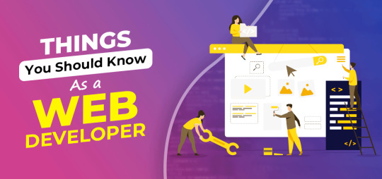
Is it compulsory to know basic computer knowledge for learning web development course please answer?
Is it compulsory to know basic computer knowledge for learning web development course please answer?
Yes, it is compulsory that an aspirant should know the basic computer knowledge for doing web development course but simultaneously, to become a Web Developer, you should have an understanding HTML, CSS, Bootstrap, MediaQuery & JavaScript. Web Developers built those sites, making sure they functioned properly & performed in ways that allowed for a great user experience. Web development course is…
View On WordPress
#Animation course#Animation course in Delhi#animation institute#animation institute in delhi#best animation course#best animation course in delhi#best animation institute in delhi#graphic designing course#graphic designing course in delhi#graphic designing institute#graphic designing institute in delhi#web designing course#web designing course in delhi#web designing institute#web designing institute in delhi
0 notes
Text
How to focus on studies without getting distracted?
.
.
Create a suitable study environment.
Set clear, precise goals.
Create a study schedule.
Avoid all possible distractions.
Wake up early.
Eat healthy.
Take breaks.
.
.
#aurosoft #aurosofttechnologies #html #css #javascript #bootstrap #react #angular #figma #photoshop #adobexd #java #php #python #sql #git #mediaquery
0 notes
Text
Flutter 3.0 Release : The Latest Features & Updates

Finally, the wait for new technology in development is over. The new Flutter 3.0 is released and every developer is excited to use this latest technology feature in their mobile app development projects. Many exciting features have been added in Flutter 3.0 & support for Android, iOS, Windows, Linux, and web apps are extended.
Since Flutter is a widely used, most popular mobile app development framework. It is useful to know what Flutter 3.0 has brought for developers and business persons who want to create powerful apps.
If you are trying to hire flutter app developers or use flutter in your tech field you must understand what is Flutter 3. Here is a blog that provides a complete guide about the features and updates of the latest release Flutter 3.0.
What is Flutter 3.0?
Flutter 3.0 is the latest version of Flutter. It is a framework or a google UI SDK for developing cross-platform mobile apps. Using the flutter framework developers can create a unique mobile experience for up to 6 OS platforms with a single code base. It provides unbeaten productivity to developers and empowers startups to turn their innovative app ideas into fully-functional mobile applications at ease.
The previous version of Flutter 2.10 supported Android, iOS, and Windows. But the Flutter 3.0 provide stable and extensive support for Android, iOS, Windows, macOS, Linux desktop apps, and web apps.
It has features like compilation and builds support, input and interaction models, platform-specific integration, better accessibility, and multi-lingual support. Flutter 3 is an enhanced version that has come with many improvements to existing features.
Latest features in Flutter 3.0
Support for Foldable Phones
The latest version of Flutter 3.0 provides support for folded mobile devices. It has the latest features and widgets which allow developers to build responsive and dynamic mobile apps for folder mobile phones. This feature is added after the collaboration with Microsoft.
Flutter 3 has a list of MediaQuery which consists of a range of DisplayFeatures that tells the bounds and states of device elements. It has a widget called DisplayfeatureS subScreen, it displays the positions of screens without overlapping the bounds of DisplayFeatures.
These were not available in the previous version of flutter. Now it is very interesting to see how developers will use this feature in developing apps for foldable phones that are still evolving.
Menu Cascading & Support for MacOS System
It has fresh inputs for platform-specific integration. It provides better accessibility and interactive models for compilation. The purpose of this update is it allows better flexibility to developers so they can efficiently utilize the operating system.
Improvements in Firebase Integration
In the latest version of Flutter 3.0, there is a new widget called [FlutterFire UI] it provides developers a reusable user interface for profile screens and authentications. This feature of improvement in Firebase support with flutter was already in demand for a long time.
Web and mobile application services are provided by Firebase. Around 62% of Flutter app developers use Firebase in their mobile app development projects. This integration of a new feature in the form of the widget will give more capability for user interface reusability.
Flutter Casual Games Toolkit
Flusteris one of the most popular cross-platform mobile app development frameworks. Developers use Flutter for creating business and customer-centric features. But now they can create mobile games using flutter technology.
Flutter 3 has a casual games toolkit. This kit has a wide range of templates, best practices, and dedicated support for creating lightweight mobile games for multiple operating systems. However, this games toolkit allows developers to build high-power or 3D games like PUBG. For casual game lovers, there is an option of creating game-like paintball or angry bird.
Dart 2.17
Flutter 3 has a new Dart SDK called version 2.17with some new updates and add-ons. The Dart 2.17 offers new language features which contain [enums], better flexibility for defined parameters, and enhanced parameters forwarding to superclasses.
It has updated tools with a new version of the [package:lints]. This tool offers to check Dart code against Flutter’s conventional development practices and also it comes with many updates in its core tools focusing on improving the productivity and speed of the flutter developers.
Material 3 Support in Material You
Flutter 3 provides n new support in the [Material You] feature with the enhanced version of material 3.0. It has new visual effects and design elements that offer developers and flutter app development companies to take good advantage of the Material You feature of Flutter.
using Flutter 3 developers can get better adaptability and a cross-platform design system that provides them with dynamic color schemes and improved visual components.
Enhanced Performance in Flutter 3.0
The performance speed of Flutter 3 is faster than the previous version. It has suitable changes in opacity animation performance for simple case scenarios which will be used in creating simple animation-based UI elements. These updates give advantages for both developers and businesses.
For instance, when an Opacity gadget contains a solitary delivering crude, its save layer technique is rejected.
This capacity was not accessible in the past Flutter version. However, in the most recent version, there is a component that predicts the delivery trouble of pictures according to the executed tasks.
Aside from this, the Flutter group is planning to execute this streamlining technique in more case situations in the forthcoming deliveries. It implies it will additionally work on the speed and execution of Flutter application advancement in not so distant future.
Variable refresh rate support for IOS
It has improved rendering capacity. It provides support for variable refresh rates and ProMotion displays on iOS platforms with improved refresh rates. In the previous version, Flutter 2.10 has a 60Hz refresh rate, But in Flutter 3, the rendering capacity has increased up to 120Hz. This update help developer with a seamless scrolling experience while watching fast animations.
Web Image Decoding
Flutter 3 includes new APIs that automatically detect images from the main thread asynchronously. It is executed through the in-constructed picture codecs of the program which improves the picture translating speed by 2x and furthermore guarantees the fundamental string is rarely obstructed and eliminates all garbage documents made up before.
Exciting Features in Flutter 3.0
Theme Extension
Flutter 3 comes with rich theme extensions. Allows developers to combine anything with the ThemeData material library using theme extensions. If you have custom widgets outside of the [MatrialThemeDat] property that require custom attributes, you can use this updated feature to simplify the complexities of creating custom theme attributes for your widgets.
Material You 3.0
Material You is one of Flutter’s best features. Now offers more visual effects and design elements for text and typography. The Flutter development team has tried to provide an adaptive cross-platform theme system that can help you turn a simple-looking Flutter application into an attractive Flutter application.
Flutter Casual Mobile Game Toolkit
In previous versions of Flutter, there was no support for developing mobile games in the Flutter app. In addition to this latest version, Google has provided special support for the creation of mobile games. The Flutter Casual Mobile Game Toolkit provides many templates and techniques for developing mobile games and useful tutorials for creating the next generation of everyday games with Flutter app development.
0 notes
Text
What you'll learn
Build a Complete, Real World Website with Flutter Web and FirebaseBuild beautiful, fast and good quality website with Flutter WebBuild a sleek portfolio to impress any recruiterBecome proficient in one of the fastest growing technologiesBuild a website without learning HTML, CSS and JavascriptHave you discovered Flutter and enjoyed the experience creating fast and beautiful apps? However, you want to create a website but do not want to learn another web framework or language? Well, this course Create A Beautiful Developer Portfolio, is for you!Flutter is not only great at creating fast and beautiful apps, it is now venturing into websites and desktops. Therefore, Flutter would be an excellent framework where you code once and build anywhere. The course includes 7+ hours of HD video tutorials and build your programming knowledge while making a sleek looking portfolio website for prospective recruiters and employers.By the end of this course, you will be ready to build your own fantastic looking Flutter Web websites and become a fully fledged Flutter developer.Sign up today, and look forward to:Over 7 hours of HD video content, everything you will ever need to create a clean looking portfolio
Building a website that use Firebase Hosting, FutureBuilder, Cards, Responsive Design, your own RSS Feed and so many more
All the knowledge you need to start building any website you wantLevel up to be A Flutter Web Developer with This CourseSo by the end of the course, you'll understand:Fundamental concepts in Flutter e.g. Widget tree, state management, animations, theme data and many more
Fundamental programming concept in Dart e.g variables, constants, finals, lists, maps, futures and many more
Responsive Design: How to make use of MediaQuery and Responsive builders to build for screens as big as 1080p to as small as an iPhone SE screenRSS Feed: you are able to update your blog sections using RSS feed and Medium as a blog sourceDon't just take my word for it, see what my past students had to say about my courses:"First of all, hands off to the Instructor for making the course so lively and understandable. As a beginner, I didn't expect to understand the concept so well. Also, the assignments given have helped a lot to self-evaluate myself. Overall...a great experience!" - Ash"Haris is covering stuff that you won't find in other Flutter courses. He does so in a funny, engaging way. Pretty advanced stuff but easy to understand. Amazing how much he knows about Flutter and how well he delivers it." - Willard Jansen"I thought the course was great." - JW Truver"Yes, the way you present the class is great. The examples that you use to compare real life situations with programming is the one which I found the most engaging. As a beginner, I was able to understand about programming concepts better than I imagined. Thank you for that!" - Aiswarya Deepak"He's fast, funny, and straight to the point." - Jeffrey HeislerWho this course is for:If you are interested in web development and wanted to try building one without HTML, CSS, or JavascriptIf you have mobile development in Flutter and want to expand your skills as a web developerIf you are a traditional web developer, and you want to try creating a website in another way
0 notes
Photo

Day 35 of 100DaysOfCode Flutter Edition
TIP: Use the MediaQuery API to implement screen-based breakpoints In Flutter, the simplest form of procedural layouts uses screen-based breakpoints.
If you're familiar with CSS, it's similar to @media
0 notes
Text
Responsive Web Design
WHY THE NEED FOR A RESPONSIVE WEB DESIGN ?
Prior to 2010, majority of websites were designed for desktop, laptops and other ‘large’ screen devices, but due to the proliferation of smart phones, tablets, and other mobile devices, users started opening websites on their phone browsers which wasn’t responsive enough at that time. Then, web developers came up with the idea of creating website in a more responsive manner, that will be compatible with different screen sizes.
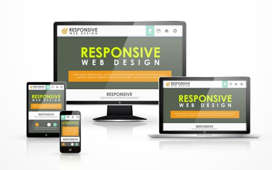
A responsive website is flexible in nature, and it is all about creating web pages that looks good on all devices. It is an approach that proposes that web design should respond to user’s behaviour and platform based on screen size and orientation. To design a website, there should be a width either in pixels or percentages, but to design a responsive website, the width must always be in percentages because it is the fraction of a unit. Media queries are utilised in creating a responsive web design and it is more like an ‘if statement’ that tells the website the type of display that should be delivered based on screen size and other parameters given in the media query. There is usually a breaking point when the design starts being inconsistent with the screen size. These breaking points (values) are noted and serves as the basis for the media query.
4 notes
·
View notes
Text
[solved] How to make flutter app responsive according to different screen size?
[solved] How to make flutter app responsive according to different screen size?
In today’s world, it’s essential for mobile apps to be responsive and adapt to different screen sizes. If you’re developing a Flutter app, you’ll need to make sure that it looks and functions well across various devices, from small smartphones to large tablets. Fortunately, Flutter provides several tools and techniques to help you achieve a responsive design for your app.
1. Use MediaQuery:…
View On WordPress
0 notes
Photo
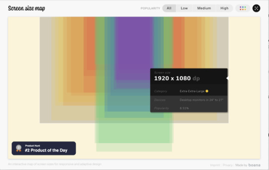
An interactive map of screen sizes for responsive and adaptive design. It's a great visualisation but remember, there is no spoon.
https://www.screensizemap.com/
1 note
·
View note
Text
Responsive Website Portfolio
How I went about doing it.
It was king of a nightmare trying to make my website responsive because even though I was aware of achieving responsive design through media queries but I didn’t know really where to start.
I went on W3schools so that I could understand the basics of using Media queries. The @media tag is used to let the browser know that the following code should only come into effect when the screen size reaches the width that you have set. The (max-width: 600px) tag means that when the screen is smaller than 600px, the CSS will then become active and any changes you have made inside these brackets will override the code above.
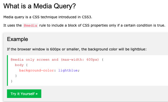

This is a really good article that I came across, they go more in depth on media queries and it discusses what can be done with this. I was mainly looking for ideas on how to edit my own website so that it would work well.
My own Website.
To make my own website work I introduced media queries and started to implement them into my CSS, I mainly focussed on my nav bar and the portfolio section because these were the two main sections that would, when shrunk down they would break and make the whole website look messy so I would make them smaller as the screen size got smaller making sure not to make the nav bar or the portfolio section look disjointed or out of place.


These are the various screen sizes that needed editing and fixing to stop the website looking bad when squeezed to a certain point. I enjoyed doing this because it was new to me and I learned how to manage the CSS so that it could be viewed on multiple sized screens from phones to tablets and ofcoure desktops and laptops.
Problems I had.
I made the mistake of starting at the smallest screen and working my way up which could confuse you a lot and hamper the way that the original screen will look once you try and fix the main code. once I did this I was left with a huge amount of code that I got lost in because it quickly became me just trying to fix everything and salvage what was left of my website.
I then learned my lesson once I read the article above and started from the top then gradually made the screen smaller and if anything broke I was able to adjust and carry on.
0 notes
Last Seen Blogs

problemsolverslife
ProblemSolvers.Life

lightgalactica
lightgalactica

ouryoungone-blog
Our Young One

lovatoautogas
Lovato Auto Gas

theloogaroo-blog
The Loogaroo