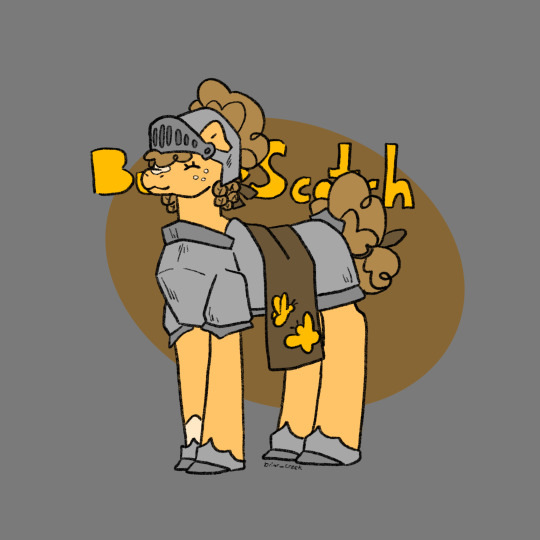
#mlp butterscotch
Text

Sweet as can be! 🍭
305 notes
·
View notes
Text
RarePair time


Look under the cut!
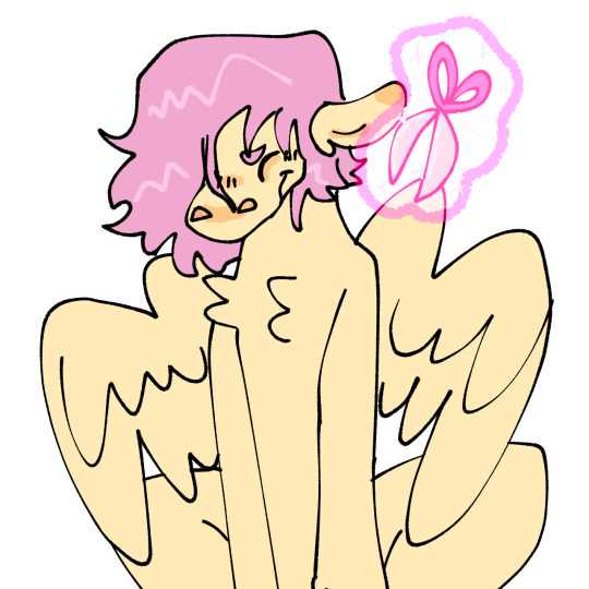
#fluttershy will always be transmasc in my eyes#princess celestia#fluttershy#butterscotch#mlp butterscotch#celestshy#celestishy#flutterlestia#butterlestia#trans ponies#transmasc#established relationship#my little pony#mlp fim#my little pony friendship is magic
651 notes
·
View notes
Text
BUTTERSCOTCH :D

79 notes
·
View notes
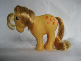
Text

#001 - Butterscotch
#mlp#my little pony#mlp g1#butterscotch#mlp butterscotch#1982#yellow#art#mlp art#retro#vintage#artists on tumblr
1K notes
·
View notes
Text
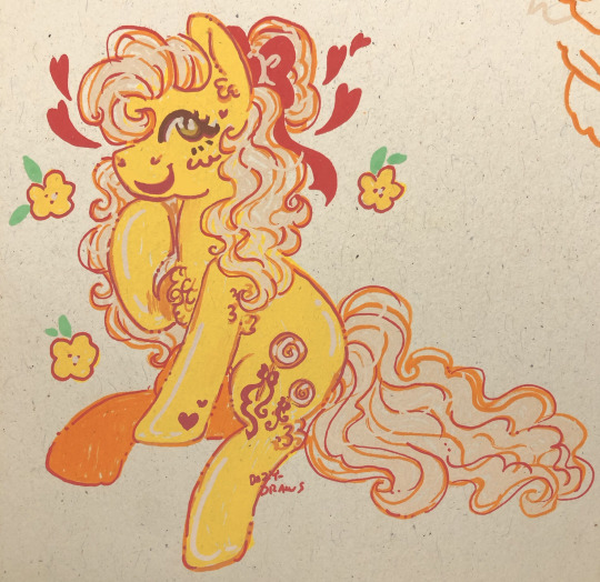
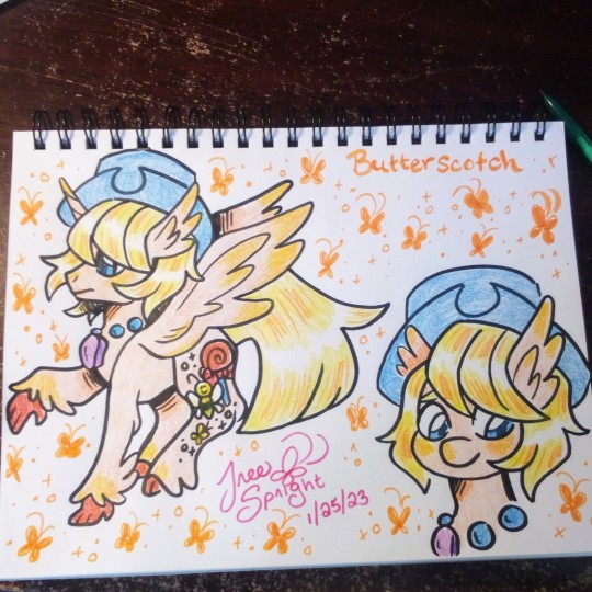
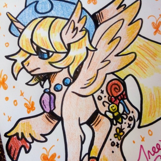
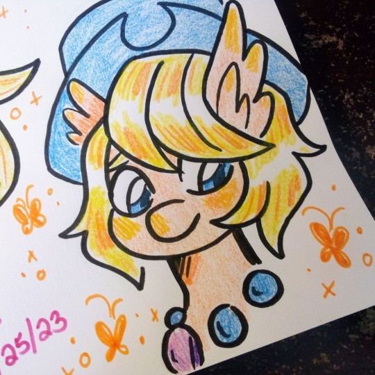
🧡Day 9 - Butter Scotch - Knight🧡
‘Our first girl shows up as our knight in shinning armor
#80s mlp#mlp#mlp art#mlp fan art#mlp fim#mlp fandom#mlp gen 1#mlp redesign#g1 mlp#mlp g1#my litte pony friendship is magic#my little pony friendship is magic#my little pony fim#g1 my little pony#my little pony g1#my little pony and friends#my little pony#butter stotch#mlp butterscotch#butterscotch mlp#butterscotch g1#g1 butterscotch#butterscotch#briarponies#gen1#ponytober#ponytober 2023
21 notes
·
View notes
Text
Sunny Side Down Butterscotch
Also, if you're like me and draw with a samsung galaxy tablet, Samsung doesn't sell replacement nibs so buy a Staedtler. Or any Wacom EMR stylus really.
20 notes
·
View notes
Text
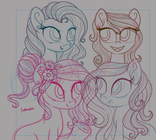
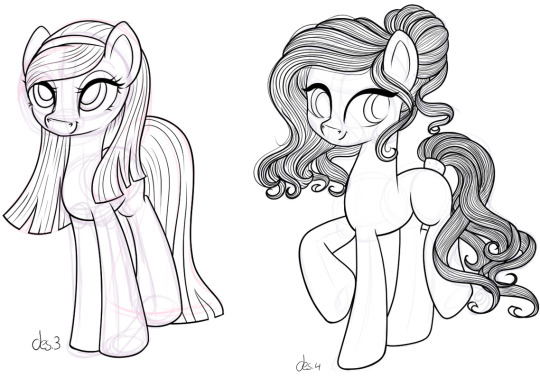
lineart of four ponies: Butterscotch and some other ponies which I didn't name as yet. Fun Fact: Butterscotch's mane was inspired by a design(des.4) that I did last year for a whole different pony.
#my little pony#art wip#my little pony g3#artist on tumblr#mlp g3#mlp butterscotch#butterscotch#lineart
16 notes
·
View notes
Text
The Creation of the First Pony🐴🧡

#mlp#mlp gen 1#bonnie zacherle#mlp minty#mlp cotton candy#mlp blossom#mlp snuzzle#mlp butterscotch#mlp blue belle#mlp 40th anniversary#magic art book
14 notes
·
View notes
Photo
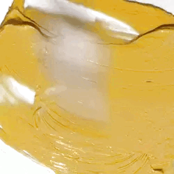


🍯 Butterscotch stimboard! 🍯
🍭 🍯 🍭 | 🍯 🍭 🍯 | 🍭 🍯 🍭
#mlp#my little pony#g3#stim#stimboard#mlp g3#mlp stim#mlp stimboard#my little pony g3#my little pony stim#my little pony stimboard#butterscotch#mlp butterscotch#my little pony butterscotch#g3 butterscotch#butterscotch g3#orange#yellow#wax#wax melting#dough#baking#food#/food tw#fur#blanket#texture#slime#glitter#paint
117 notes
·
View notes
Text
Concept art of Hippogriff vers Butterscotch
#art#my art#2023#2023 art#colored pencil#colored pencils#highlighter#highlighters#mlp#my little pony#g1 mlp#g1 my little pony#g1 butterscotch#mlp butterscotch#my little pony butterscotch
12 notes
·
View notes
Text
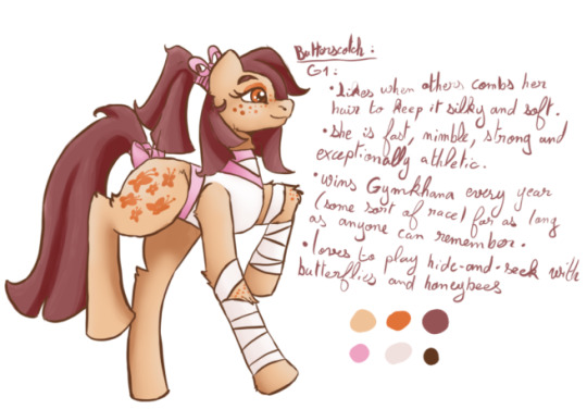
Hesitating between different kind of changes on the pillars (still having trouble deciding myself, may post a few "test draw" I did to explain, to not make a too long post), I decided to make some light work by redesigning quickly a few G1 characters.
Butterscotch was the first I did ! :DD I found loads of things on her and, if she was in my AU (should reaaaaally search a name on that pony type-change AU), I think she could have a really nice episodes with Rainbow ! (Like, the Gymkhana race is about to start, Rainbow gets really competitive after hearing she could already have a really nice time (though nowhere near Butterscotch) and begins to overtrain, refusing to listen to advice, rest and to admit that she can't get better than Butterscotch within a week. Kind of a crash and burn for Rainbow until she met Butterscotch who isn't like she imagined. She isn't spending all her free time training like crazy by running as fast as she can. Instead, she has a planning which oversees which exercise she will do, what day, how long but who also help her to go enjoy herself in-between. Sport is her hobby and became her job, not her life. Rainbow finally takes some time to rest with the help of her friends (Twilight concocting a training table to help her not lose what she gained all while recuperating, Pinkie taking her to fun activities, ...) and finally does the race (not winning, but able to enjoy it).)

Blue Belle is the second I begun but the last I finished. I had LOADS of trouble for her. I began with some designs where she was very farm-themed, but didn't like it before settling on this ! I... don't have much to say about her x'DD
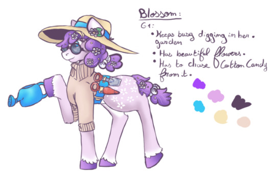
Blossom :DD She kind of has a old-mare vibe, I don't really know why? I gave her the sun-hat because I have read somewhere that another pony gave her one (couldn't remember where) and I thought it fit quite well :DD
(1/2 Cotton Candy, Snuzzle and Minty in next post, bc it's long x'DD)
#mlp g1#g1 my little pony#my little pony g1#mlp redesign#mlp au#mlp blossom#mlp butterscotch#mlp blue belle#mlp pony#my little pony
10 notes
·
View notes
Text
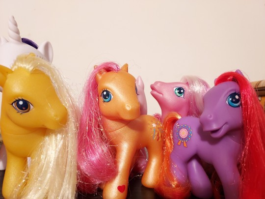
I was talking to a friend the other night about the differences in eye quality per gen, and they pointed out this hasty sample picture of some of my g3s looks like they're all posing for a selfie! So I thought I'd share it since they all look so cute
#mlp toys#mlp g3#mlp butterscotch#sparkleworks#round 'n' round#crystal lace#mlp crystal lace#round n round#my little pony#ramblingonandon
7 notes
·
View notes
Text

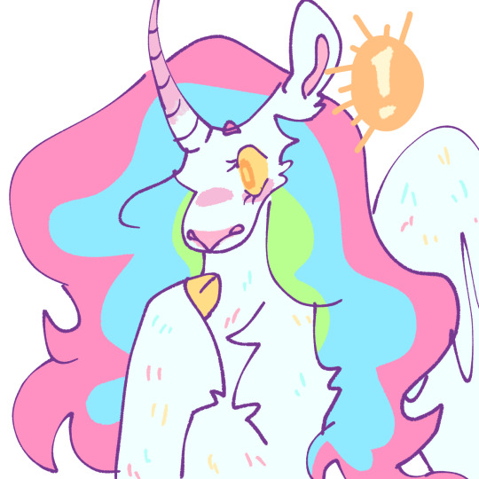
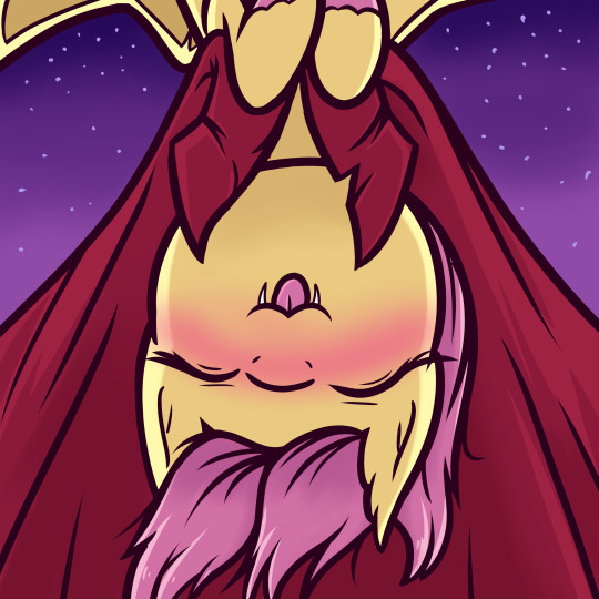
Outings can be difficult when your vampire husband is allergic to sunlight (and you're a sun goddess) but you make it work
#mlp fim#mlp art#my little pony friendship is magic#my little pony#fluttershy#flutterbat#butterscotch mlp#mlp butterscotch#celestia#princess celestia#butterlestia#celestshy#celestishy
31 notes
·
View notes
Text
Where it All Began...
Welcome to Episode 1 of the Rump Design Games!
Our first contenders up on the stand come to us from Year One (1982-1983) in the Collector Ponies collection.
Joined by my cohost Pony Flickerman I’ll be bringing you the hard truths about generation 1′s most beloved gals.
Please note "ugliness" denotes whether they're good looking symbols or not (1 being truly hideous and 5 being gorgeous godsent miracles/not ugly at all).
Let’s get crackin’.
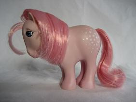
Butterscotch (aka Caramelo)
Spirit of the Pony: 1/5
Does the Palette Fuck: 5/5
Ugliness: 4/5
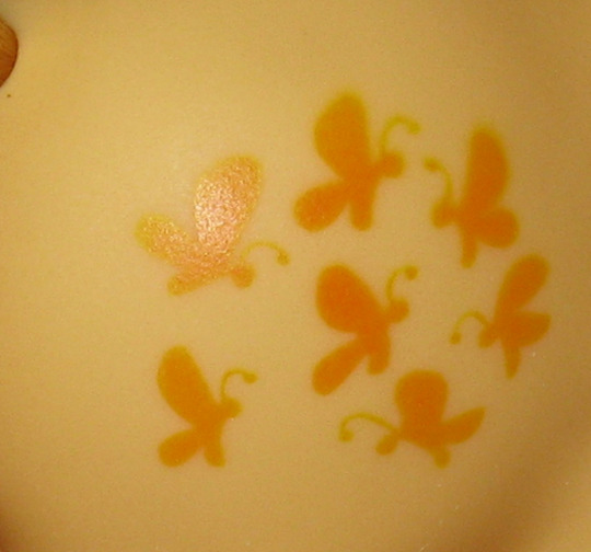
Aside from the "butter" in her name (and her lack of a backstory, suck my dick Hasbro) there's nothing to denote why her Rump Design should be a group of butterflies. When I think butterscotch I think of desserts or candies, my first thought isn't bugs. The palette fucks hardcore and while the butterflies have scoliosis I wouldn't consider them ugly.
Blue Belle
Spirit of the Pony: 1/5
Does the Palette Fuck: 3.5/5
Ugliness: 5/5
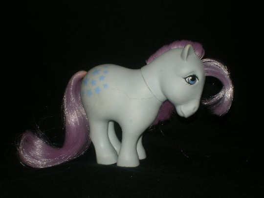

What the fuck do stars have to do with bluebells (the flower) or belles (like a belle of the ball, you get the picture). Her stars aren't even blue, they're lavender, PERIWINKLE at best. Objectively the colour palette fucks well but the name and Rump Design do not seem to correlate.
Minty
Spirit of the Pony: 1/5
Does the Palette Fuck: 5/5
Ugliness: 5/5
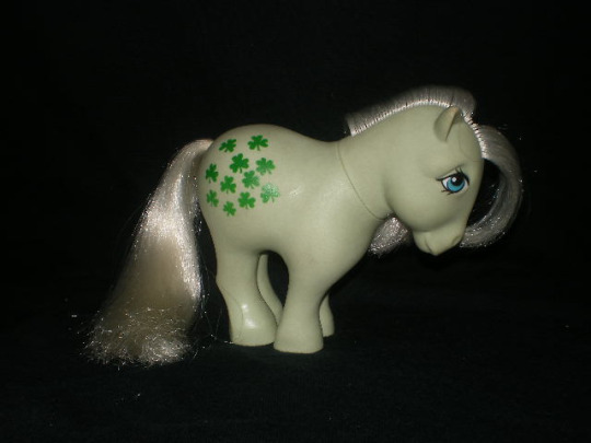

Pony Flickerman: [in a strained tone] Clovers...
Mint and clovers are not synonymous, surprisingly enough. Despite my favouritism for Minty as a character (being the only 35th anniversary pony I purchased) her Rump Design makes absolutely zero fucking sense. Mint and clovers are not even in the same family.
Snuzzle
Spirit of the Pony: 5/5
Does the Palette Fuck: 5/5
Ugliness: 5/5
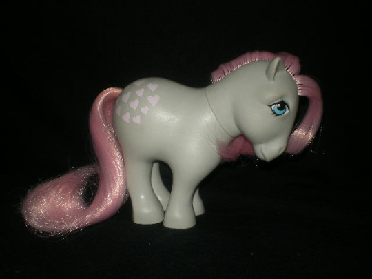

The first of any of these ponies to have a Rump Design that makes a lick of sense related to their name. Snuzzle is such a loving and affectionate gesture, you snuggle, you nuzzle, you snuzzle. Fun fact, Snuzzle is the only grey pony from g1. The pink matched up with the grey fucks hardcore. They are making sweet, sweet love to each other as we speak.
Cotton Candy
Spirit of the Pony: 1/5
Does the Palette Fuck: 5/5
Ugliness: 2/5

Pony Flickerman: NO, NO what are they SUPPOSED TO BE? She is NOT an appaloosa.
What cotton candy and forty white dots have to do with each other is beyond my mortal comprehension. Maybe you could bullshit it and say it's meant to evoke sugar but it is most certainly not evoked here. All of her faults aside, the colour palette is lovely, it doesn't clash and it's pleasing to the eye.
Blossom (aka Lillia/Florzinha dos Campos/Capullo/Perla)
Spirit of the Pony: 5/5
Does the Palette Fuck: 5/5
Ugliness: 4/5


While I'm not a personal fan of this stylizing of flowers it's still an objectively cute design that does evoke blossoms. Simple win.
Final Scores
Butterscotch: 10/15
Blue Belle: 9.5/15
Minty: 11/15
Snuzzle: 15/15
Cotton Candy: 8/15
Blossom: 14/15

#Rump Design Games#My Little Pony#mlp g1#Mlp Butterscotch#mlp Blue Belle#mlp Minty#mlp Snuzzle#mlp Cotton Candy#mlp Blossom
5 notes
·
View notes
Text
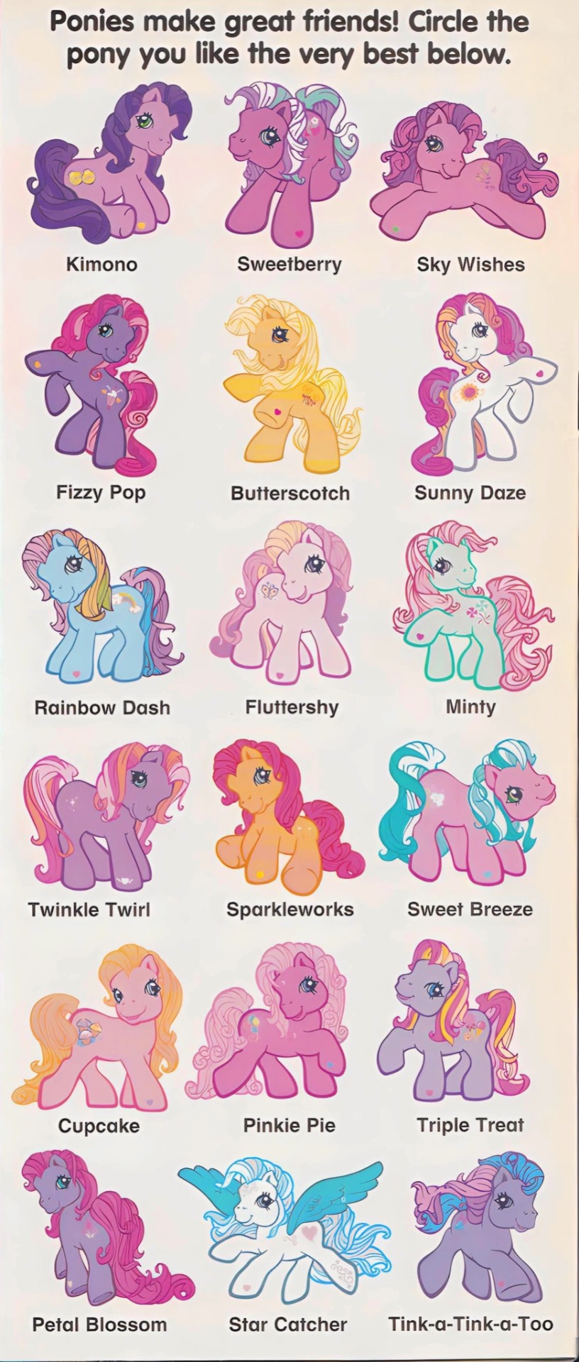
who’s your favourite?
#my little pony#mlp#mlp g3#my little pony g3#nostalgiacore#mlp gen 3#toycore#mlp scans#my little pony scans#pony scans#my little pony gen 3#sweet berry#sky wishes#fizzy pop#butterscotch#sunny daze#rainbow dash#fluttershy#minty#twinkle twirl#Sparkleworks#triple treat#pinkie pie#mlp starcatcher#starcatcher
2K notes
·
View notes
Text

💜Butterscotch💜
I’m gonna try to post one every day
Tumblr is behind my Instagram (briar_creek) by a few days so y’all get three today
They’re also cropped better on Instagram but they’re better quality here lol
#mlp fim#mlp#mlp gen 1#butterscotch mlp#mlp butterscotch#80s mlp#mlp redesign#mlp fandom#mlp art#mlp fan art#briarponies#gen1#earth pony#saddle pony#year 1
15 notes
·
View notes
Last Seen Blogs

affreuxdisiak
Affreuxdisiak
luffyrose
☆♤Ribbit♤☆

spirituallifehome
Spiritual Life Home

fablesecrets
FableSecrets

mrstevenhuang
Steven Huang