#my art style is that no one looks the same in any two panels
Photo
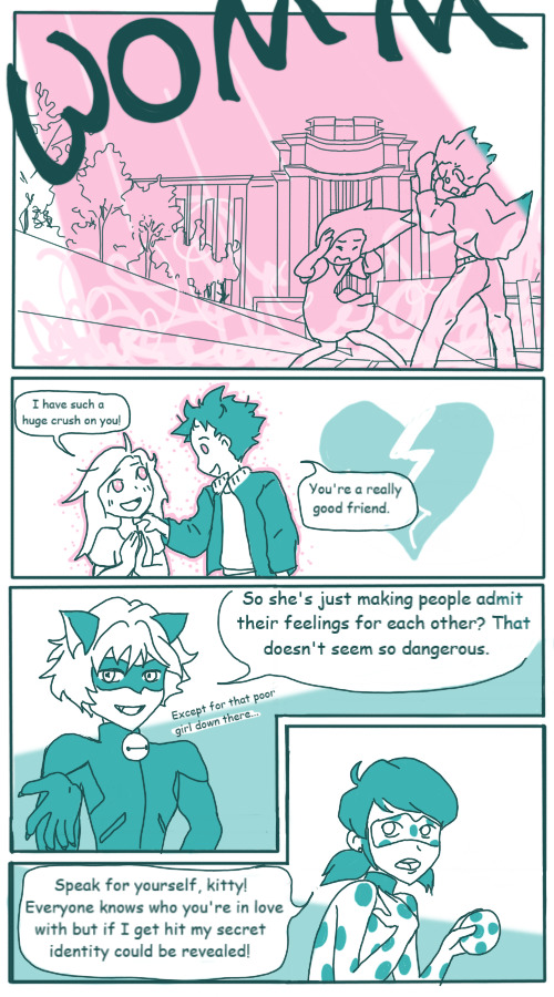
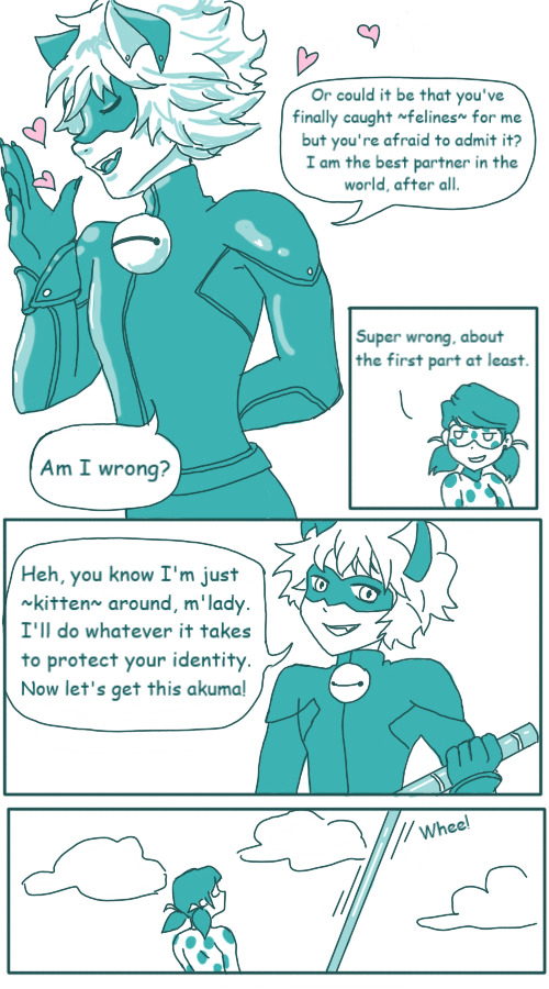
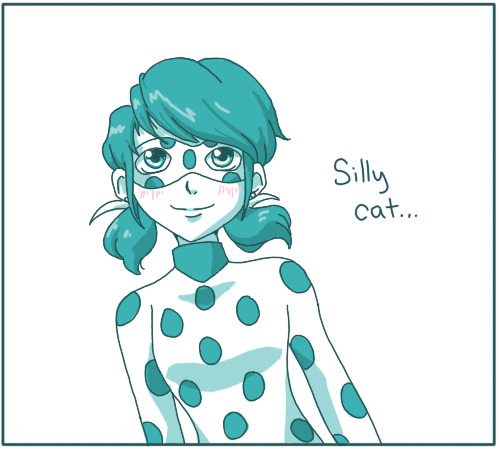
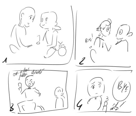
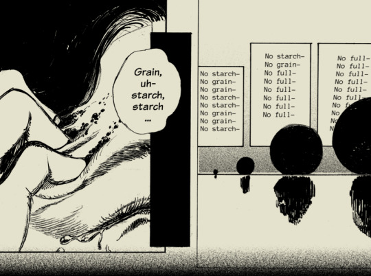
Page two of my Confessions comic, a ridiculously self-indulgent love square story that came to me in one day but will probably take me ten years to draw.
Prev | Next
#miraculous ladybug#ladynoir#lovesquare#confessions comic#sandra draws#girl you ain't slick#you've got the feels#my art style is that no one looks the same in any two panels#ladybug#chat noir#did you even draw chat noir if you haven't been full-body cringing at your own cat puns
4K notes
·
View notes
Text
So a few days ago I saw someone (elsewhere) questioning Zutara fans’ excitement about the scarf scene. It wasn't a mean comment, more general curiosity. And well, I didn't have time to get my thoughts out then. But they haven't gone away, so I'm getting them out here:
Here’s what everyone need to understand about Zutara shippers. We were baited baaaad during the initial run of the show–from the magazines to the shorts to the trailers and how they were cut. And Zuko and Katara’s relationship on the show certainly underwent a lot of development and featured objectively emotional–if not overtly romantic–moments between the two. We were well fed, and we had reason to hope. Right up to the end, we had reason to hope.
The shipping wars were the shipping wars, of course, with all the usual tensions; there are always going to be overzealous fans of each (and any) pairing willing to get toxic. Generally, I think Kataang fans were always jealous of Zutara’s popularity and Zutara fans, post finale, were jealous of Kataang’s, well, canon status. But really it operated much the same as any other large fandom’s shipping wars.
And then came Bryke and the panel where they showed and mocked Zutara fan art, some of which had been created by teens if not straight up children. Then came their, “Come on, kids! It was never going to work. Zutara is just dark and intriguing.”* And the pièce de résistance, their telling Zutara shippers (specifically girls/women) that they were doomed to have failed romantic relationships. Like, what? The thing with the art was arguably cruel, and the rest of it was oh, so condescending. Just all around not well done.
The after effect was that Zutara went from being simply a fanon pairing to a wrong pairing. The ATLA fandom at large became a far more hostile place for Zutara fans, who were now more commonly deemed delusional and viewed as lesser fans. The vitriol only got worse when the show came to Netfilx and the next wave of antis rolled up with their co-opting of legitimate socio-political terms to paint Zutara not just as wrong but morally corrupt if not evil. It’s all very puritanical.**
So Zutara fans need to be reminded that we weren’t delusional, and we aren’t alone. It’s why it means so much to know that Dante Basco and Mae Whitman shipped their characters. And that so many other VAs came out as Zutara supporters too: Jack De Sena, Michaela Jill Murphy, Grey DeLisle, Janet Varney--even the cabbage man. For it to be revealed that it was discussed in the writers room; that the writers fought over it; that it WAS a canon possibility. (And that writers Joshua Hamilton and John O’Bryan are perfectly comfortable admitting their preference for Zutara.) To know that the Elizabeth Welch Ehasz described Zuko and Katara as an “Avatar-style Mr. and Mrs. Smith,” in the script for The Southern Raiders, and used the phrase “Zutara-feuling synchronicity and cooperation” to describe their action sequences. To see Giancarlo Volpe, a Kataanger, admit Zutara might been the better pairing in retrospect and choose a quiet scene between them (to see their “chemistry”) as what he’d most look forward to in the live action adaptation. It’s why we cling to the artwork done by Korean animation director. We aren’t delusional. We aren’t alone.
But try telling that to the general fandom, right? Most are ignorant of a lot of this, particularly Hamilton and O’Bryan’s revelations re: the writers room. A lot of Zutara fans don't even seem to know. But being baited by Netflix on their official accounts? Oh, people see that. And we are reminded in a big way that we aren't delusional and we aren't alone. And everyone else has to remember it too.
So, of course, we're having fun clowning over the scarf scene. And I think most Zutara fans know we are clowning. I don't think most expect to get canon Zutara in live action because of one little scene or the fact that their Netflix icons are facing each other. (I headcanon that that was totally the doing of Zutara shipper on staff, though, lol. Because there are a lot of us, and we are everywhere.)
And this is okay. Zutara has been doing just fine as a fanon ship. Meanwhile, NATLA might actually do Kataang justice. It always worked better as a future ship. (Really all the pairings do. But I especially don't ever need to see another 12 year old kissing let alone making out, in animation or live action, ever again.) There's a reason Padme and Anakin don't get together in Phantom Menace, after all. Also, there's always the chance they could give us Dante's or Mae's headcanon of them basically suppressing their feelings and choosing duty over love/right person-wrong time. And the odds of getting some more moments to clown over are high enough.
Anyway, TLDR: Zutara has been made to feel like an out-of-nowhere crack ship and the live action crumbs remind us that it is not. And this is at least partially why we are enjoying it. (Because, also, it's just fun!)
*Side tangent: I’ve never gotten this dark and intriguing comment. Even during Season 1, the height of the capture fic era, Zutara was always a ship fundamentally about hope, predicated on Zuko's redemption. (Back in the day, there were also plenty of antis arguing that there was no way Zuko would ever be one of the gaang.) And they say “intriguing” like it’s a bad thing? Are we not supposed to be interested in the relationships of their characters???
**There have been some very good think pieces written lately on late stage capitalism and consumption as morality. Worth googling.
334 notes
·
View notes
Text
The Mishandling of LO’s S3 Mi(n)season Hiatus - Part 3 1/2
Here we go, Part 3 of my analysis of the current FP episodes - a three-parter episode set leading up to the midseason finale of LO.
Part 1
Part 2
Truth is, I had actually forgotten a lot of the weird (and very stupid) shit that happened in this episode, that I thought Episodes 251 and 252 had already offered up the worst that this three parter set could dish out. Boy, was I wrong, because when I went back to check out Episode 253, I was reminded of a reality that my brain had wiped out in an attempt to protect my withering psyche-
I also forgot just how long this episode is. It's so long that I frankly can't even fit it all into this post, so this is gonna be part 3 1/2.
Anyways, let's just get on with it. This is the final stop on our trip into absolute nonsense.
CAUTION: THIS IS PART 3 OF A 3 PART SERIES IN WHICH I WILL BE SPOILING MUCH OF EPISODES 251-253. THIS WILL BE A LONG POST. BRACE YOURSELF.
Well, it's the midseason finale, and what better way to open it up than with the final title card-
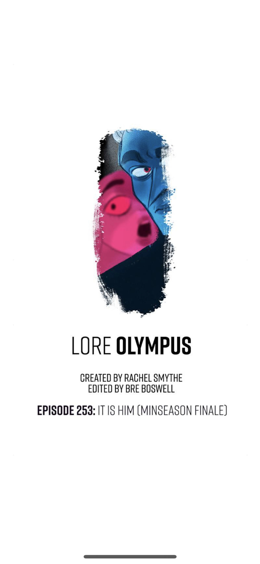
Typo and all. It wouldn't be an LO episode without one. Granted, IIRC this typo has been edited out, but the version of the screenshots I have from it feature it in all its original unedited glory. So enjoy that.
And yes, just like the last two times, the title itself only applies to the final cliffhanger, which is an absolute doozy especially for those who were there to experience it in real time.
This is already a bit of a wild opening compared to the last two episodes, but it's quickly revealed that this is laying the foundation for the prophecy that Psyche gave to Apollo back in Episode 252. In true LO fashion, the story can't actually be linear in any regard, we're always segmented from pieces of information at a time. Loyal fans will call this a "writing style", I call it Rachel just trying to get another 70 cents out of me.
That said, I will say the art here is fairly decent, but I think that just goes to show that LO's one of worst features these days - ironically enough - is its coloring. What began as its strongest feature has now become one of its biggest weaknesses due to the sheer laziness in its rendering and the colors become more and more saturated into the grotesque over time. So at this point, you pretty much have to rob these characters of their colors to make them look decent, and of course at that point it just further highlights Rachel's same-face problems. She definitely tried to make them look distinguishable here, at least, with Hestia and Poseidon being the most unique.
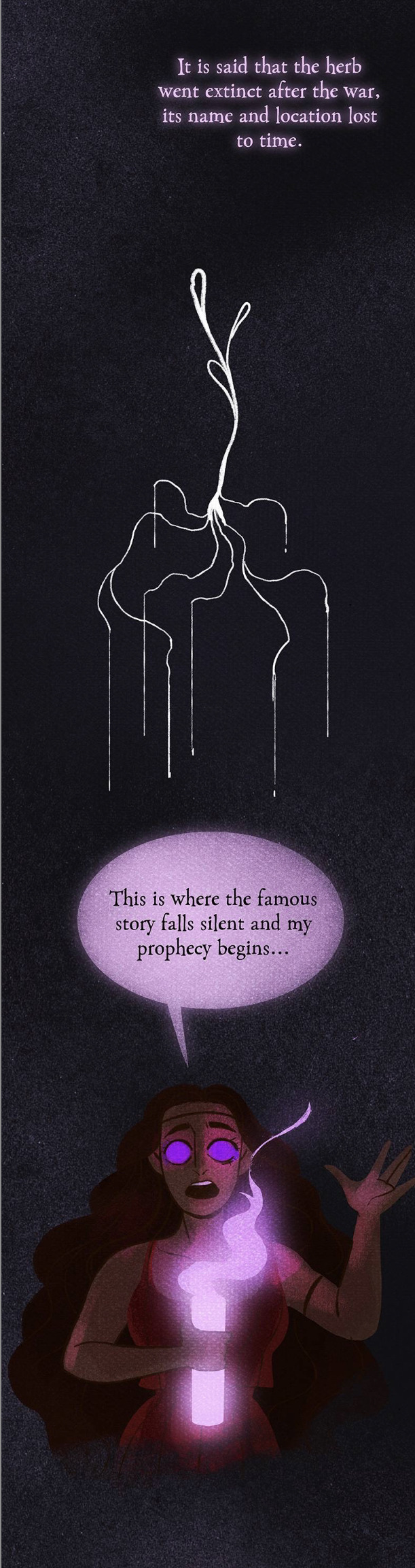
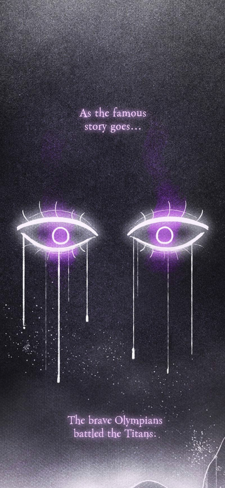
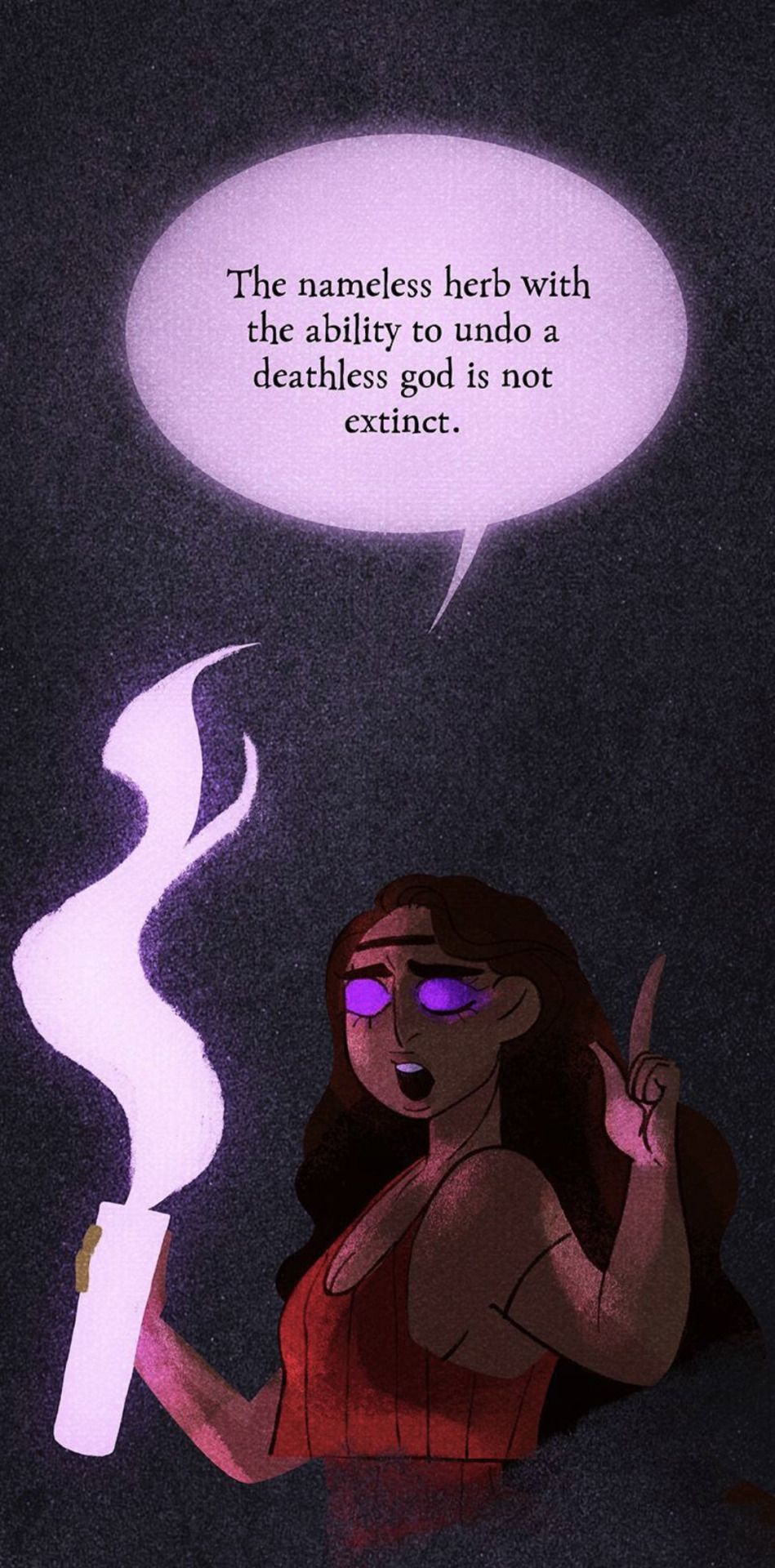
Now, this isn't the first time that we've heard of this herb being referenced - it was stated by Hades that Hera was the one to originally poison Kronos with the herb after gaining his trust - but to see it suddenly just pop up and play a role again out of nowhere already gives me a bad feeling in my stomach. It feels like yet another plot device - especially when presented in this type of format - that Rachel is suddenly using to try and seem "unique" in her writing, much like the strange narration we got back during the "Run For Your Life" sequence. It's just once again LO lacking any specific identity, it's always trying to be a million other things at once.
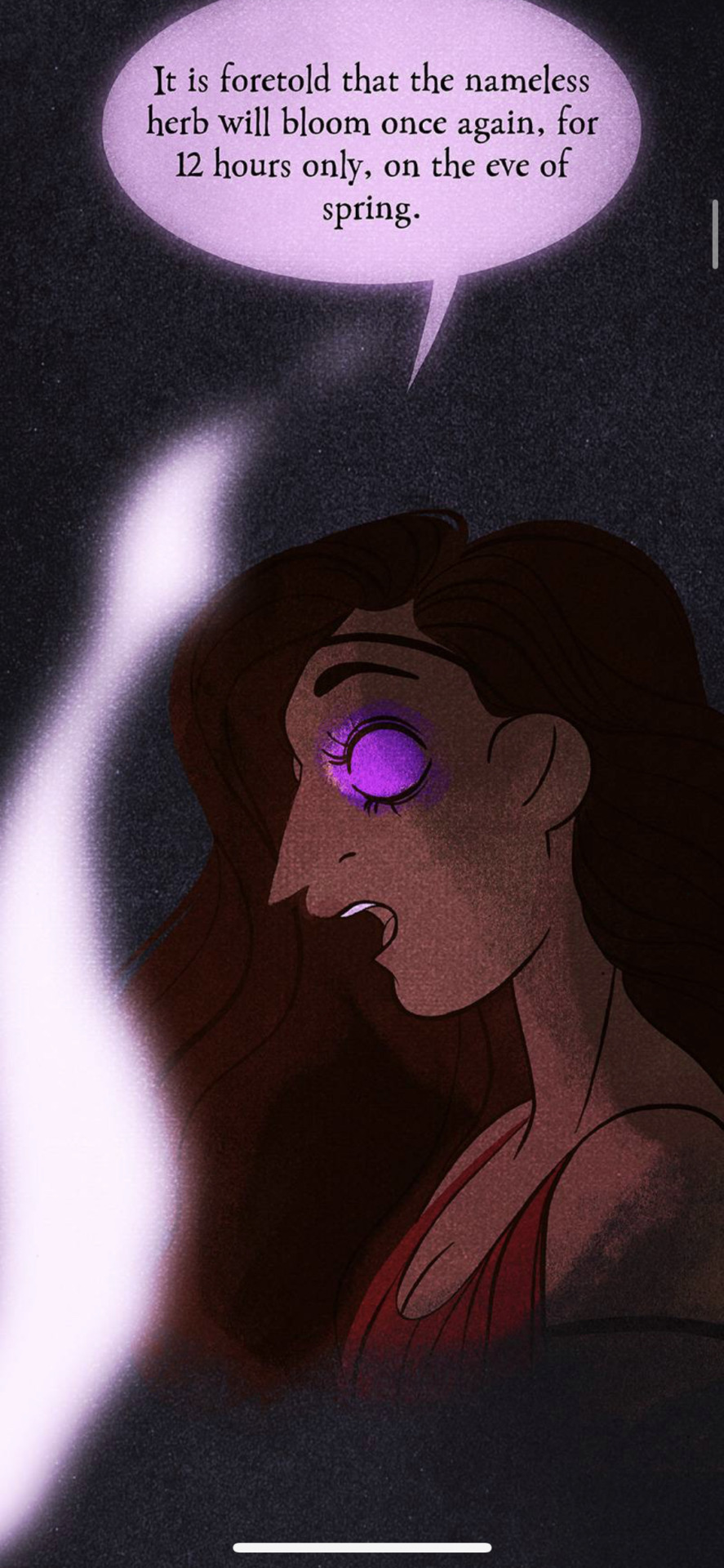
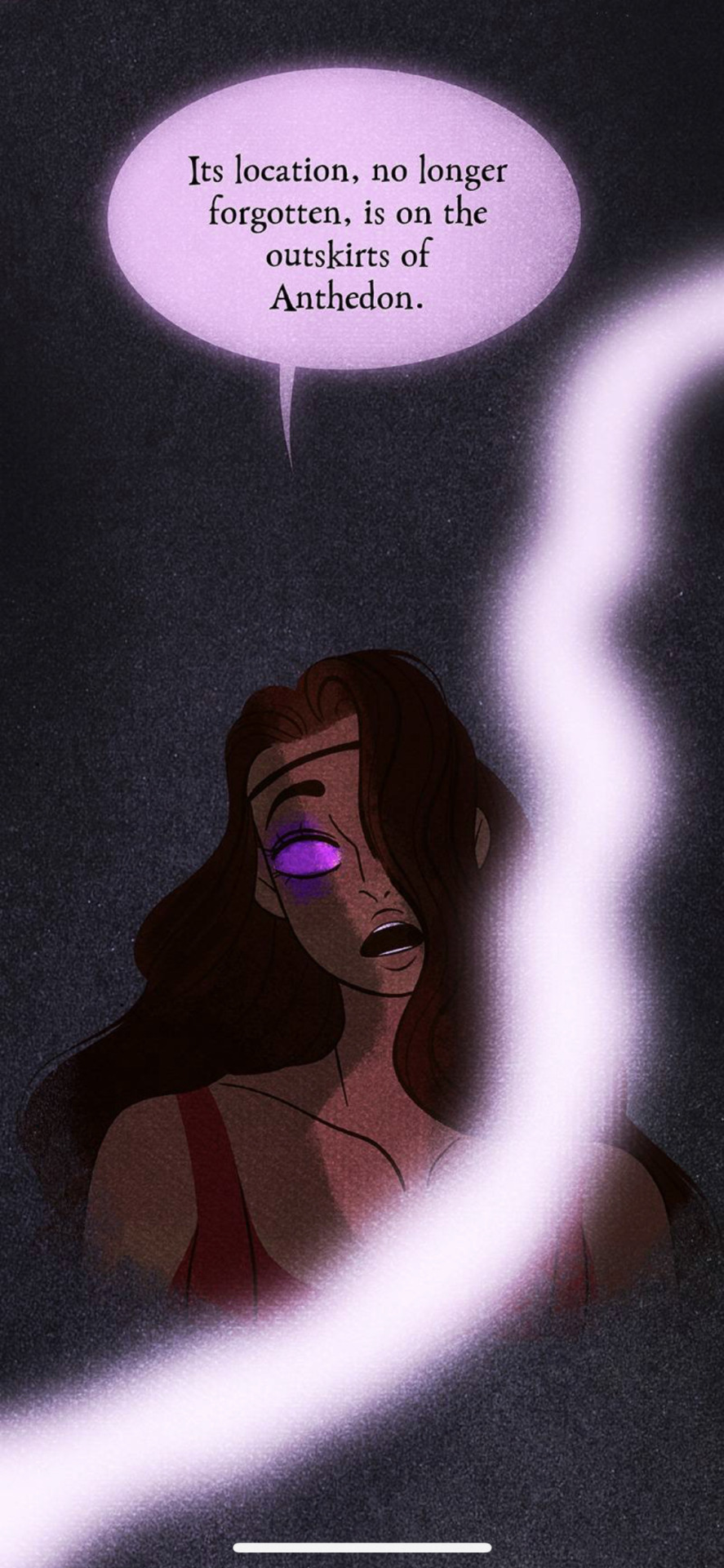
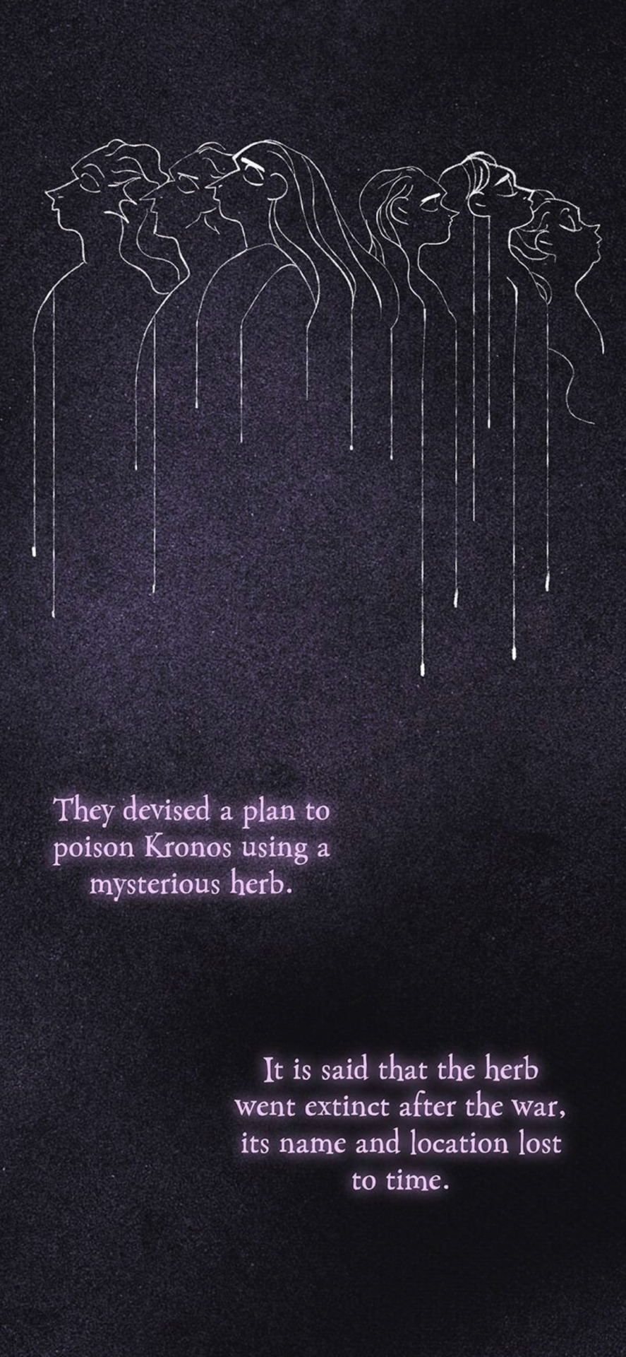
I will say, much of this in and of itself is panel filler. Why? Because the location of the herb doesn't matter. You'll see what I mean in a moment, but the mentioning of Anthedon plays no role here, it's just yet another obligatory "see, I know how to Google things!" lip service moment from Rachel "self-proclaimed folklorist" Smythe.
Anyways, Eros is perplexed by this but Psyche immediately catches on, knowing right away that Apollo is going for Zeus. And this is where we get yet another one of the dumbest sequences in this comic.
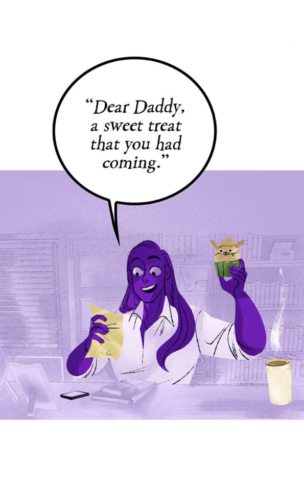
(see what I mean that the location of the herb doesn't matter? Because Apollo already got it and laced it into the cupcake).
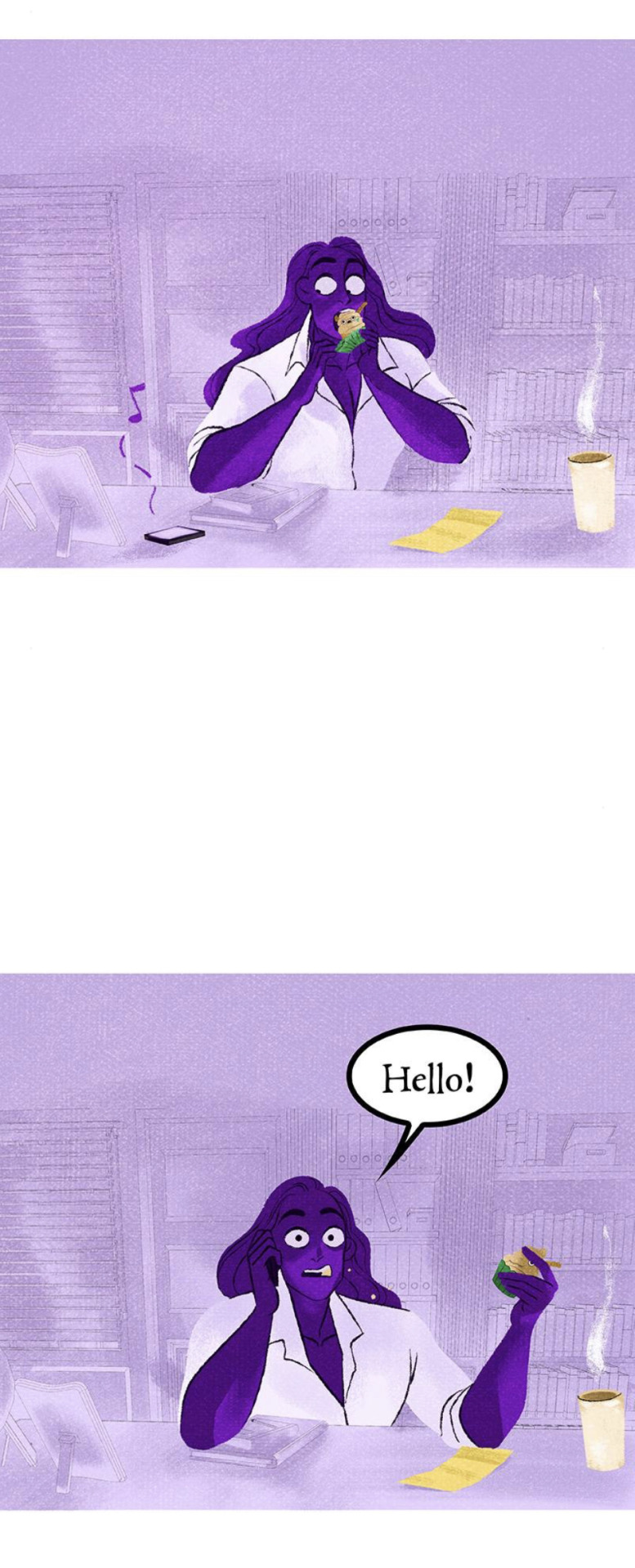
Now, first of all, the fact that Eros and Psyche believe Kassandra's prophecy is already hilarious in and of itself, because ... well, because it literally defeats the point of her establishing it as a curse in the previous episode. Unless it only works on mortals? It never stated as such, so we literally just have to go with it and pretend not to notice that.
But most of all, of course LO had to play this off as some joke. Like, "hahaha how awkward! I've already eaten the cupcake!" and he still doesn't seem to really be in shock. Zeus has seen what this herb has done to gods before him, and yet his reaction to this is akin to a dad getting upset that he stepped LEGO's that he asked his kid 20 times to pick up off the floor. The whole "record scratch" style formatting of this followed by Zeus' lack of reaction just really makes me not care about any of this, because clearly the story doesn't care either.
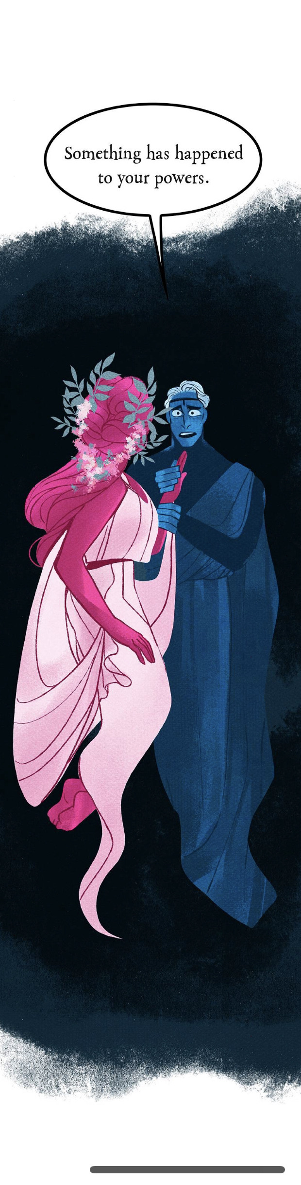
But we don't see who he makes these calls to because the comic, of course, can't spend any longer than 10 panels on a single scene, so we cut to Hades and Persephone.
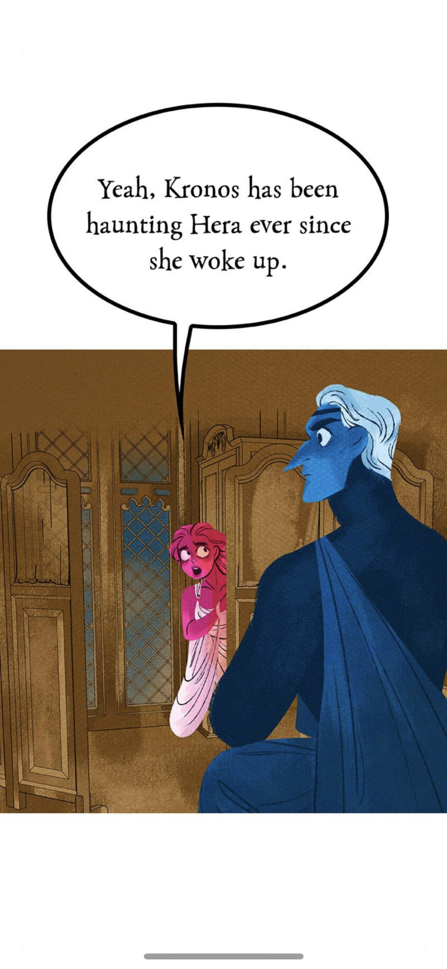
Again, I don't know what the point was of having Hera relay this information to Persephone for her to relay to Hades, aside from the fact that Rachel needed to act smart with Therapy Speak that didn't even apply to Hera's situation (as we talked about in the last part). They gotta make Persephone the center of everyone's world though, so it's Persephone who's delivering this info and trying to come up with the solution.
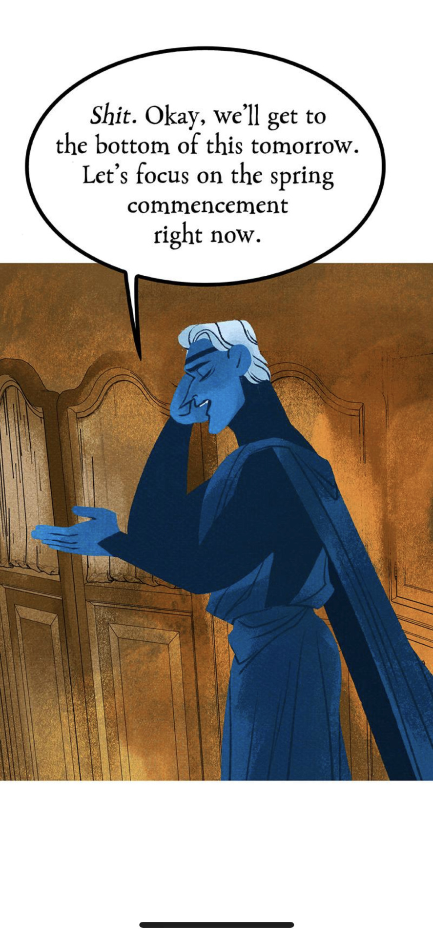
Hades, though, wants to focus on his wife's birthday the commemoration of spring.
SIR. THE WOMAN YOU WERE IN AN AFFAIR WITH SINCE BEFORE YOUR WIFE WAS BORN IS CURRENTLY GRAPPLING WITH YOUR FATHER WHO ABUSED HER AND IS NOW HAUNTING HER. THIS IS NOT THE TIME FOR FLUFFY ROMANCE TIME. THERE IS A CHILD BEING HELD CAPTIVE IN TARTARUS AND LITERALLY NO ONE SEEMS TO CARE.
Anyways, apparently (for some reason) Hades is the one who has to go meet Demeter out front. Even though Hades has literally NOTHING to do with this ceremony, it's not his domain, but Persephone literally says "yep, that's correct" when he asks if he needs to go out to meet Demeter.
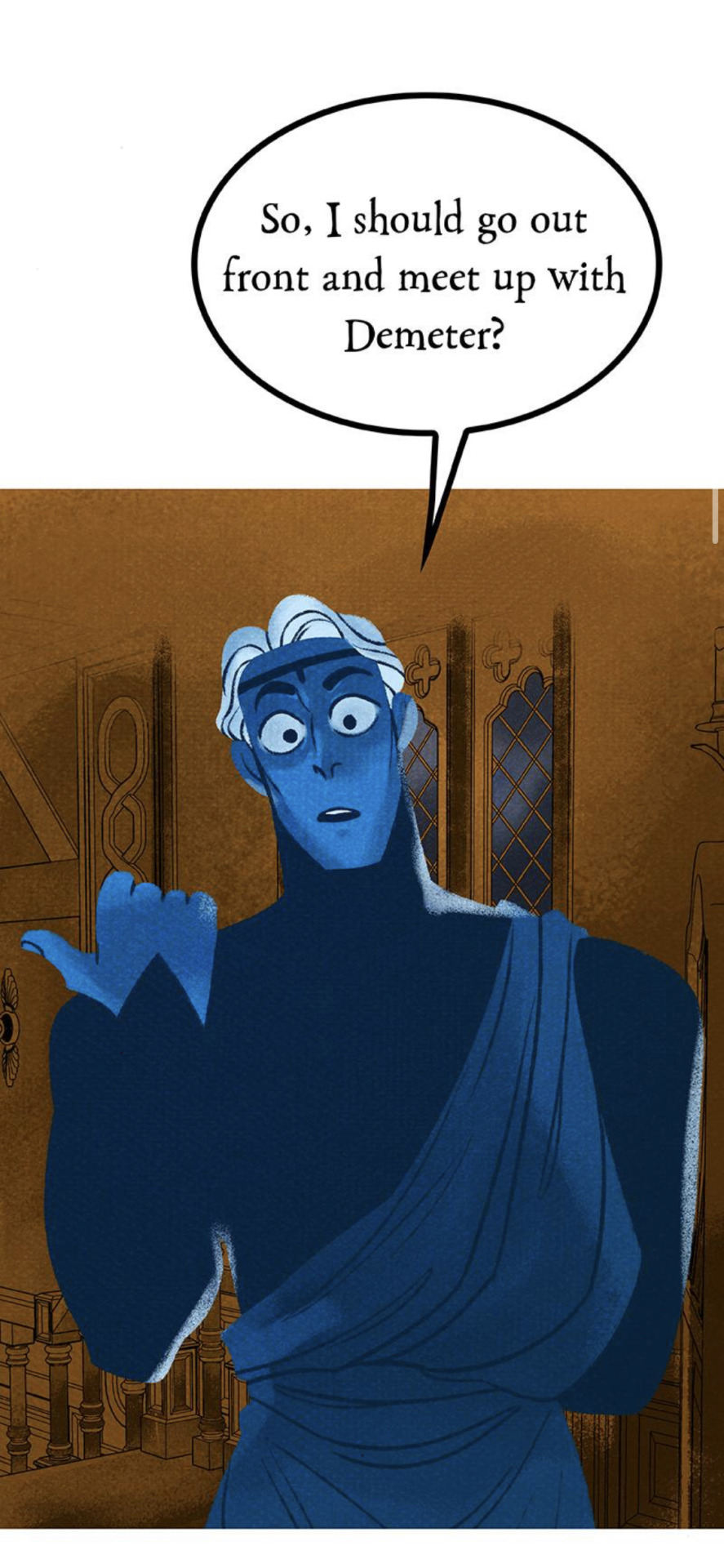
This just feels like such a pointless conversation and I don't get what the point of this exact exchange is. Again, this isn't Hades' domain, so I don't see why he needs to be the one to go meet with Demeter.
But then, of course, to make matters worse, this man has the absolute audacity to pretend like he's never done anything wrong to Demeter. As if she should be obligated to be cool with sharing a bench with this man who literally terrorized her for years and then essentially groomed her daughter.
I hate him so fucking much and I can't believe we're supposed to be rooting for him. He has not undergone ANY of the character development necessary for me to want to care about him.
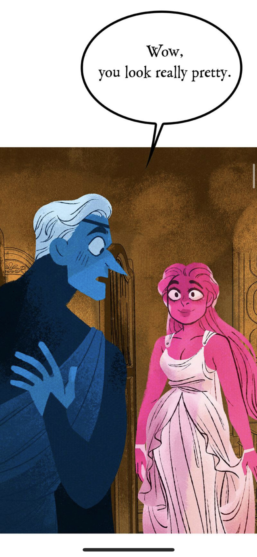
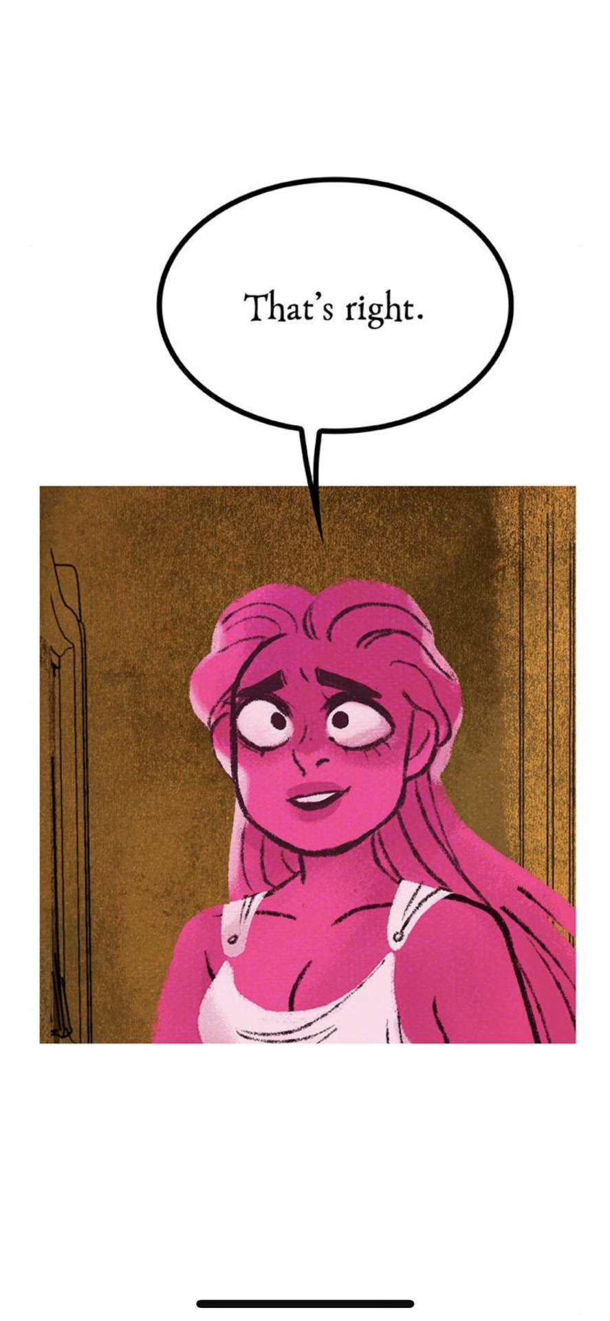
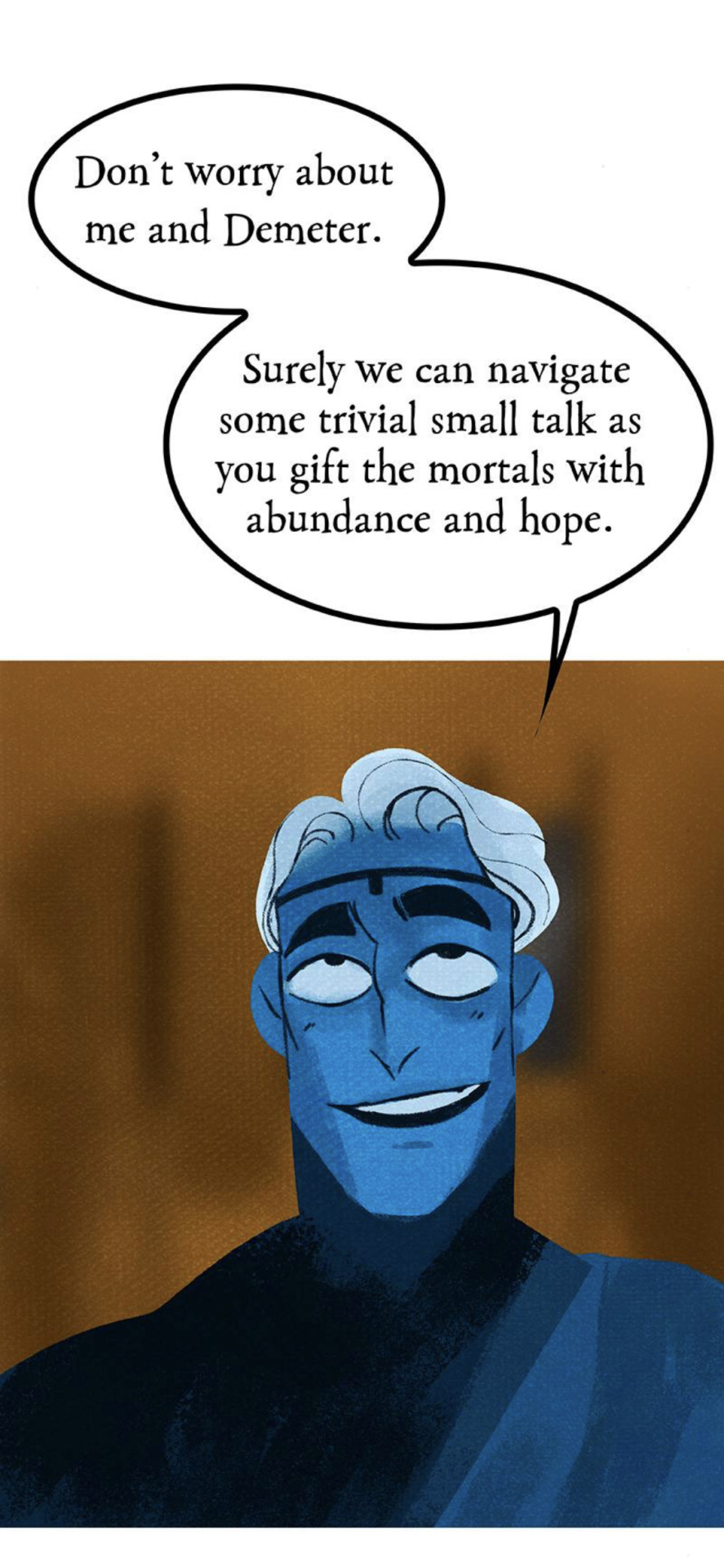
Anyways, Hades has a seat with Demeter, and the conversation is very brief before Hades says that he has a gift for her. And what is it, exactly?
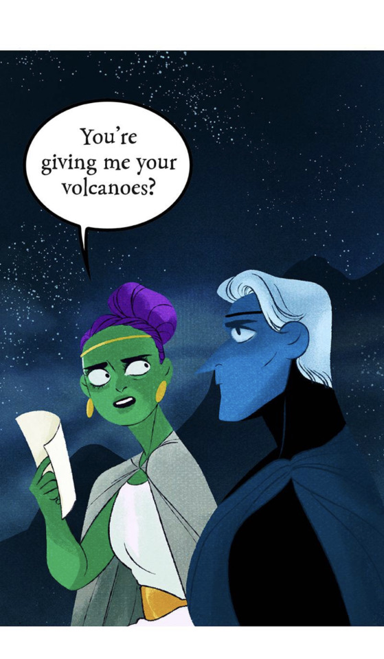
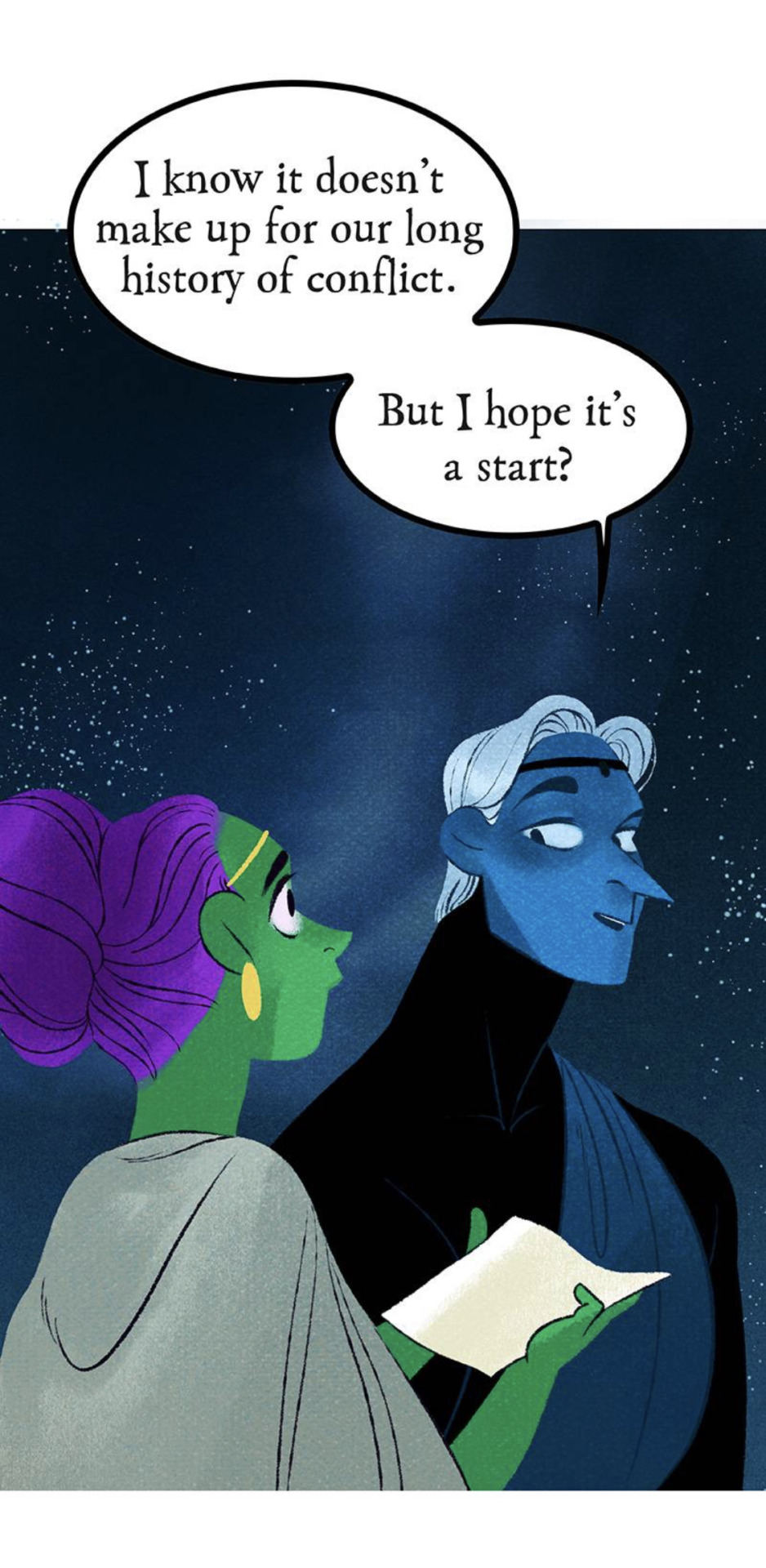
Oh great, Hades. Sure wish you would have had this consideration hundreds of years ago. I fail to see what good this does for her now because it doesn't change the fact that he still cost her the role of Queen of the Mortal Realm and treated her like shit for hundreds of years. This comes across as such a shallow and empty "apology" because it's barely even a "gift", rather something she was OWED back then that he didn't want to hand over for his own selfish reasons. He still comes out the winner here because he's gotten to spend thousands of years being a rich slave-driving oligarch while Demeter has had to maintain the Mortal Realm on her own even without the glory of having a title.
I especially detest this "twist" because it's less of a twist and Rachel finally accepting the fact she couldn't come up with anything better than what her fans had to come up with for her. If this had been the fact the whole time, we would have seen it established back when we first got those flashbacks showing Hades being a total prick to her over the volcanoes. Instead, Rachel dragged it out for weeks and weeks until finally dumping this "twist" that her fans had been talking about all that time. This is yet another one of those "Rachel used her fanbase to come up with her ideas" moments. I know that that seems a little mean and presumptuous, but the fact of the matter is that the writing in this story is such an absolute mess that you just know Rachel's writing by the seat of her pants and has to rely on her audience's headcanons to actually fill in the gaps of her story. Most of the time when people commend her for the "great storytelling" in LO, what they're referring to are things they came up with entirely on their own because of how easy it is to just make assumptions about LO's storyline. Rachel benefits off the story being as vague as possible because then her fanbase will fill in the gaps with their own assumptions and give her all the credit for an idea they came up with.
By the way, to the "self-proclaimed folklorist" who wrote this, the volcanoes were really just entrances into the Underworld. Hades did not own them. They were owned by Hephaestus. And I would argue that the volcanoes were only seen as "entrances" into the Underworld because, fun fact - if you jump into a volcano, you die!
Hades frames his reasoning as feeling like Demeter was pushing him out of the Mortal Realm, but this makes no sense because none of that is on her. He claims that he felt like an "outsider" but the reality is that he made himself that way. He resigned himself to being King of the Underworld, he ate the pomegranate and made the deal with Erebus, and even he stated that he could still actually leave the Underworld, just not for long periods of time. So he was the only one keeping himself away from the Mortal Realm, not Demeter. We even see that in the VHS tape flashbacks where Hades stumbles onto Demeter's property and she lets him sleep it off in her home. So this whole sob story about how he felt "pushed out" by Demeter is such a bad take from someone who's routinely known to make himself out to be the victim. Because Hades can't have an actual reputation for a reason, no, this is a "retelling" told by someone who got all their Greek myth info off Tumblr circa 2016 and the front page of Google, so Hades has to be the misunderstood uwu sad underdog. Even though he routinely does things that reinforce the reputation he has within the comic, like being a slave driver, abusing lower class nymphs, and grooming teenagers.
Minthe showing up for a split second in the background is the best this comic has been since S2. We stan our girl Minthe, fucking run girl, do what Persephone couldn't do. She's the real hero of this story (。・∀・)ノ゙
And honestly, I'm sorry, but Demeter really SHOULDN'T be taking the high ground on this. She has more than enough reason to be upset. For a comic that tries to celebrate feminism and holding abusive men accountable, it sure is willing to make the women - often victims of the men - the real villains who have to "do better". Except for Persephone of course. Persephone is married into the system now, she doesn't have to "do better", she's a "boss babe" for being abusive and petty and undeserving of her status because she's the self-insert Y/N character.
So the ceremony for commencing Spring begins. I gotta say, for the final major scene of the mi(n)season finale, the art is severely underwhelming. You can really tell the difference between S3 and S1 art here, there's barely anything extra done to make this scene even half as impactful as the most basic of scenes from S1.
Like, it's fine, but it still feels so half-baked and rushed to attempt to replicate the kind of art that's been gone from the series for years now. The full sequence itself is actually quite lengthy, with a lot of nymph hands just moving around and playing instruments, but it's about as bland as any other panel, so it makes the sequence itself feel dragged out and boring.
This is about as pretty as the sequence gets and it's still not even as good as the original Dread Queen transformation. There's barely any rendering in the skin, and they couldn't even be bothered to make the hands look normal. It's like it's trying so hard to be "original LO" but is fundamentally missing the point of what made the original LO so captivating.
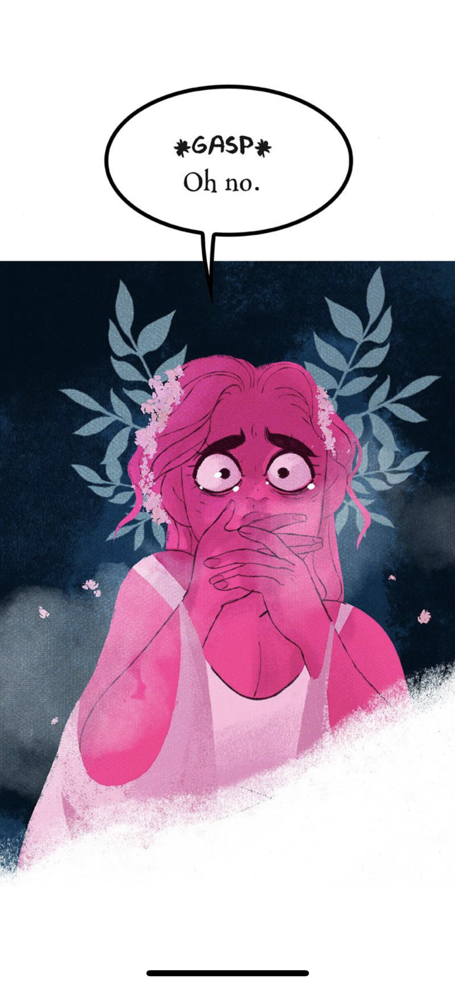
But oh noooo, looks like Persephone did a bad!
Are they actually gonna give her some kind of flaw? Are we gonna FINALLY gonna find out what she traded to Erebus?
No. We're just gonna make her the cause of winter.
Spaghettios.
And that's where I'm leaving this review for now because, as mentioned in the beginning, this episode is a LOT longer than I remember it being. There's still a whole ass segment with Apollo that we need to cover and I don't want to leave it out but I also don't want to do it entirely in text format and I've hit that pesky image limit. So I'll be posting that second part as soon as I can!
That said, I really can't stand this "subversion" by making Persephone the reason for winter.
First of all, because this is a common problem in a lot of H x P "retellings", as many of them fundamentally miss the point of why Persephone is the "Goddess of Spring".
Persephone was not born the "Goddess of Spring". She was born Kore (Κόρη), a maiden born from Demeter. It wasn't until after she was taken by Hades that Demeter, in her grief, took away the harvest and created winter. It was the return of Persephone every six months that brought about the spring, hence, she earned the name, "Goddess of Spring". What these retellings COMPLETELY MISUNDERSTAND is that the gods aren't 'born' with their titles, they're granted these titles by the mortals who comprehend them and write of them as harbingers of their respective elements, stories, and messages. Zeus wasn't "born" the God of the Sky and Heavens, he was granted that title after he overthrew Kronos and took the Heavens for himself. Hades wasn't "born" the God of the Underworld and the Dead, he was granted that title after he became the ruler of the domain of death.
Where these retellings really fuck up is constantly trying to "subvert" the H x P myth in an attempt to romanticize it, thus undoing the point of why Persephone is called "The Goddess of Spring". A Touch of Darkness also made this mistake by putting a "twist" on Persephone's character by having her start out as someone who couldn't make things grow. But if she sucks at making things grow, then why is she still referred to as The Goddess of Spring? In LO, Hades is referred to as "Grandpa Winter" and the seasons already seem to exist as we saw in this episode through the ceremony, so why has she been called "The Goddess of Spring" this whole time?
But I also can't stand this "subversion" because it fundamentally misunderstands the very myth it's trying to "retell". By giving Persephone the "curse" of creating winter, it further robs Demeter of her own agency in this story, more than it already has. It wasn't enough to make Demeter a helicopter mom, it wasn't enough to drive an actual rift between her and her daughter, they had to take away Demeter's entire role in the story and the creation of the seasons and give it to Persephone.
And this is, surprisingly enough, NOT the first time the comic has done this. There are many traits associated with different gods that have been given to Persephone and Hades. The volcanoes belong to Hades rather than Hephaestus, Persephone is "more beautiful than Aphrodite", Thanatos' and Psyche's butterfly symbolism is given to both Hades and Persephone, Aphrodite's symbolism of roses is given to Persephone, the list goes on. Every single plotline has to involve Persephone as the hero, and every single attribute that's commonly associated with other gods has to be granted to H x P in some way to make them better and more interesting than every other cast member in the comic, and yet they still come across as vapid and boring protagonists with nothing to show for themselves.
So to give the ONE thing from the source material that made LO what it is, it comes across as so unbearably cruel.
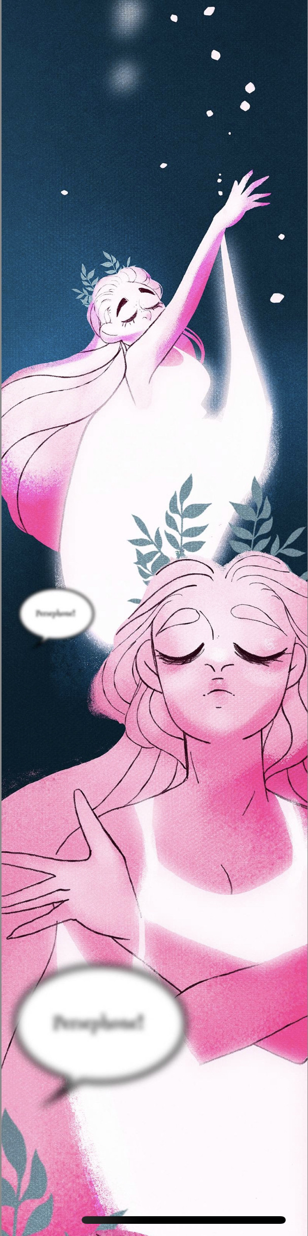
But then again, we should have seen this coming. After all, Rachel does not cite this as a retelling of The Hymn to Demeter. She simply refers to it as its more unofficial name: The Taking of Persephone.
Look, I get it, the story is meant to be told from Persephone's POV (or at least through the lens of her being the main character) so I can understand why Rachel may have chosen to reword this to make it more clear. But it's really depressing that she went to such an extent with making it about Persephone that she had to rob one of the most integral character of her moment and retribution. Especially when one of the only books in her cited "research" that's primarily about Persephone is, shocked, The Hymn to Demeter, which is listed at the very bottom of every "research" list you can find in LO's history.
LO should have just stayed as self-indulgent fluff. This isn't "subversion", this isn't a "twist", it's just yet another item on the list of making Persephone the most Important One of all. Even when it attempts to be a 'flaw', it fails tremendously by acting as yet another aspect of her being a Mary Sue, because her 'flaw' has come at the cost of another character's story, identity, and strengths. What was originally a tale of grief, retribution, and standing up against a patriarchal system, has now been warped into a consequence of a muddied plot that doesn't have anywhere left to go. For a story that claims to be "feminist", it has ironically missed the original point of its source material entirely, and completely robbed itself of the feminine strength it could have had if it hadn't tried to be "subversive".
I don't really have anything much more to say than that. I could leave it here for good, but we do still have that extra segment to talk about that covers the actual final cliffhanger in this episode, so... we'll see you on the other side.
195 notes
·
View notes
Note
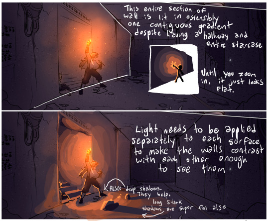
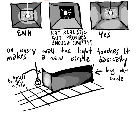
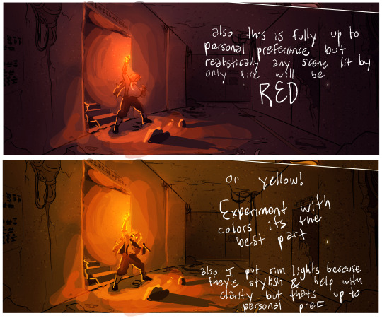
Lighting critique of a recent panel ! Dark ambient lighting is a favorite art subject of mine, so i figured this would be a good time to give some input !
ii say as if we havent been in the undergroound chapter for like a month in which it didnt occur to me to pay attention to lighting
Oh well loool here it is nowwwwwwww hope you dont mind the input
Huh.
Okay, so first off, thanks - this is cool and your lighting looks very nice. I look forward to seeing what you make!
Second - I really hope sending this kind of ask isn't a habit of yours, because unsolicited artistic criticism comes across as remarkably rude.
Art criticism for the purposes of improvement is a social contract entered between two artists, typically in a scholastic environment. An artist presents their work to other artists whose opinions they trust and value, and those artists weigh in with their thoughts. Critical to the process is that the presenting artist is showing their art for the purpose of improvement, and they're prepared to receive that input because they're actively asking for it.
In contrast, I make this comic so people can read it, and while I certainly don't mind if they take it apart to analyze it or find ways the writing and art could be improved, I, the creator, am not asking for that and - more importantly - will not really benefit from it.
For instance, in this case, my style of background lighting and shading is optimized most specifically to accommodate for the fact that I need to make a lot of these pages quickly, and correspondingly cannot give everything 110%. Any individual panel could absolutely be more polished, but I often shade these backgrounds in batches of ten pages or more, each page with an average of six panels that need individual shading. So that's sixty individual backgrounds I need to shade in one go. It doesn't make your advice wrong, or even unhelpful for an artist setting out to learn this kind of technique - but it does make it unhelpful for me. This is something you realistically had no way of knowing, and I don't hold it against you! But this is why I have a short list of artists and writers whose input I actually ask for sometimes, and that list is composed of people who know me, my creative priorities, and how my process works. Because they know what I'm working with, their advice stands a much better chance of being actually helpful to me.
Criticism, like all art, has an audience it is designed for. In art school environments or artistic coworker situations, the audience for the criticism is the artist being critiqued and the other artists who are learning from the communal experience they are all agreeing to share. This is the exception and not the rule, however. Outside of this space, the audience for criticism of a work of art is typically the subset of the audience for that work of art that are trying to learn something from the experience or understand what did and didn't work for them. This group can discuss what they did and didn't like, what they would have changed, what parts worked for them that may not have worked for other members of the audience, etc. This space of critical analysis forms the backbone of most fandoms and can be incredibly interesting and rewarding to play around in.
The audience for that kind of criticism is not the creator of the art. In the same way a creator can never be fully immersed in their own fandom audience, this form of communal critique from the audience side of things does not work when directed at the creator. In the context of this work of art, we exist in very different spaces and operate under different parameters. If there's one thing I learned from back when I used to check in on the fan discord community, it's that most conversation in this space operates under the assumption that the creator will not see it or take it personally. I cannot be in the audience of my own audience.
All that to say, thanks for the thought, but please be careful doing this in the future - tumblr is the land of kneejerk hostility and poor reading comprehension, and I don't want to see you getting shredded for a kind intention. And I hope some people find this impromptu tutorial helpful!
412 notes
·
View notes
Text


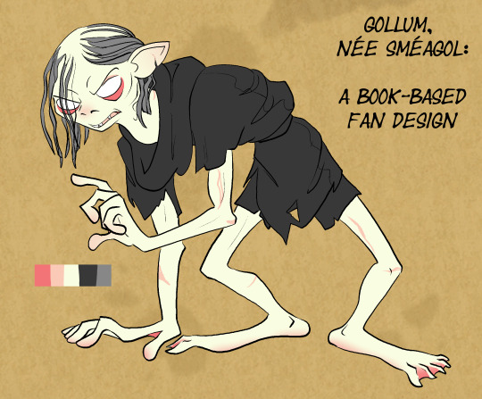


I feel weird giving out unprompted permission statements because I'm making a big assumption that anyone's going to want to use my work. That said I also know people do like to build on other people's art and can't always work up the nerve to ask, so: Anyone is free to use this design if they want to for any reason- I don't own this character anyway. (Although I am hopeful that you do not, you know, monetize it, because i cant do that and if you do that its not fair ;_; ) Feel free to remix, improve, use as basic inspiration, etc. I would appreciate a tag/mention if you use it so I can see what you did!
This design has evolved a little since I first started drawing it, and I will see people reblogging the original design notes and think 'oh no! those are out of date and I don't have new/accurate ones!'
Reblogging the old one is still an honor- and the first take on a design just sometimes has a different appeal because it's less refined and more chaotic (especially with a character that should be chaotic), so I suspect some people will just prefer the older drawings & they'll still get shared, which is great! But I felt as if the project was a little bit incomplete without an update, since I think I've reached the point where if you see that old post & then come to my blog and look at my current content, there's a noticeable difference.
Also I kind of like making design notes.
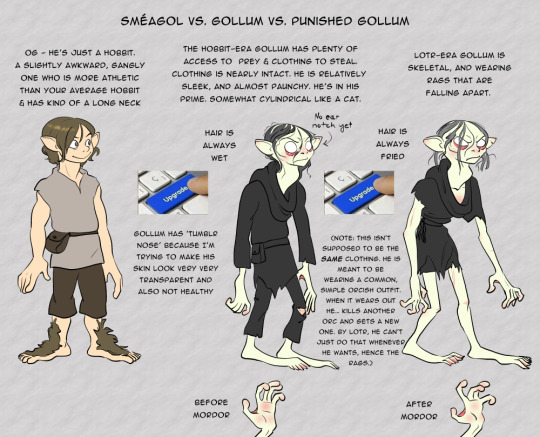
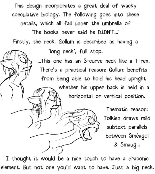
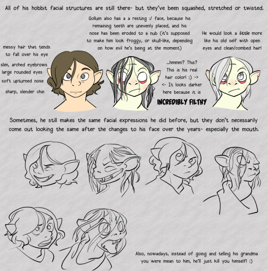
If anyone's wondering why things changed, the answer's really simple- 90% of it is just the result of him settling into having more consistent anatomy and facial structure so that I can keep him looking accurate across different angles and poses. If you look at the old drawings you may notice that Gollum has an inconsistently shaped squishy head. That's fine for a concept post but doesn't work as well for maintaining him across different comic panels or in an animatic, at least not the way I work.
In the same vein, while my art is still & will always be heavily stylized, I started giving him more structured semi-sorta-realistic anatomy so that he wouldn't look entirely out of place next to less bizarre-looking characters such as Aragorn. (I feel that's also helpful in nudging Gollum into the uncanny valley where he ought to be, rather than leaving him so abstractified that there's a risk you won't see anything wrong with him having noodle arms.)
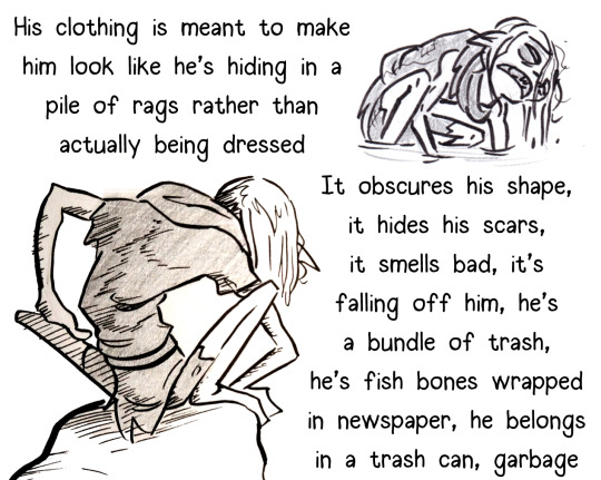
He also acquired the new-style 'garbage bag' outfit because I found a reference in LOTR to his arms and legs being bare/exposed (it's in one of my favorite passages, the 'an eagle would think Gollum was dead if it came by right now' passage in The Two Towers):
Not even an eagle poised against the sun would have marked the hobbits sitting there, under the weight of doom, silent, not moving, shrouded in their thin grey cloaks. For a moment he might have paused to consider Gollum, a tiny figure sprawling on the ground: there perhaps lay the famished skeleton of some child of Men, its ragged garment still clinging to it, its long arms and legs almost bone-white and bone-thin: no flesh worth a peck.
#long post#blobart#lotr#lotr gollum#lotr fan redesign#i really do love that passage because it says so much and implies more#sam and frodo are sitting there invisible because they are being protected by the gift of love and honor galadriel gave them#gollum who has been busting his butt to hide all of his life#issplatted out there like a frog entirely exposed. he has nowhere to hide and no protection- not even proper clothing#and even a carrion bird would think he was 1) dead 2) of no value#...and then we have tolkien drawing the allusion to a starved/abandoned child#it's eerie and deeply empathetic at the same time#It's also funny. why would there be an eagle here pondering gollum#same energy as 'a fox wondered why these hobbits were bobbling around in the woods' and then the fox disappears forever#also same energy as 'there was a thrush nearby. bilbo was in such a bad mood that he tried to kill it'#body horror#eye horror#unsanitary/#bones?....#tw: gollum#there#I will be doing a morning reblog of this because i only do this once every two years so postblock it if once was enough
281 notes
·
View notes
Text
Sacred Realm updated which means im actually so excited to be making this omg
Hi there Sacred Realm fans! :D
It is I, the one who makes the analysis posts on various comics on the internet. (With permission course) Because I love doing them and they bring me joy.
If you are unaware of what Sacred Realm is, it's a Legend of Zelda AU about a new Link who gets a little medallion that makes him a badass, also it can hold the spirits of heroes from across the realms (Including my fave boy ever okay)
Before I begin, I'll get the important stuff done, This is done with permission from @zelda-the-sacred-realm, and all art from the comics belongs to the comic artist. Please do me a favour and go and check it out because it's a wonderful comic and extremely well-drawn and written.
Now, grab some popcorn, and a drink and please enjoy me rambling about a comic that I enjoy so much. :D
Lets begin!
First, some sass

Damn, possessed Link got a mouth on him. Low key I love him, he looks like he could go for round two like right now. Wouldn't be surprised if he went for the hero of time next.
My eyebrows shot up at this.
Time KNOW's
let me repeat that
TIME KNOWS. HE KNOWS WHATEVER IS IN THE MEDALLION CAUSING THIS.
(More on this later)
He knows he knows he knows he knows he knows
I can hear the mocking voice of Link while he is saying this. Time has experience with this particular entity before.

Okay, so here is when it gets interesting.
Possessed Link or this entity I suppose, referring to Time and in turn Hylians as 'Your Race' Tells me a couple of things.
This thing in the medallion isn't a Hylian spirit. So as much and as fun as a dark link theory is, I dont think it could be.
Time arguing that we're not perfect, again referring to Hylians sounds very much like an "I'm speaking with a god speech"
I present my theory on what is in the medallion.
An extra spirit, a god of some description, from the spirit realm. Out to get revenge on Hylians.
Time has been to the spirit realm, in his games. (I am under the assumption that those still occur in this canon please do correct me if I'm wrong here.)
I'm convinced that this thing in the medallion is a deity of some kind because of the eye colour. I can't get over it.
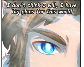
This style of blue, with no pupils.
We've seen it before.
On Hylia.
From Chapter 2 fate PT2
And here is the first time we see it on Link for comparison, With Sky's alongside him for comparison for what Hylian eyes look like.
From Chapter 2 Fate PT3
The colour isn't exact so it can't be Hylia herself I dont think, but, i believe that there is a spirit trying to escape the sacred realm and is using Link to do it.
Okay, enough of my conspiracy theories moving on!
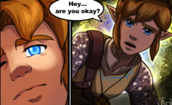
Link you gotta wake up!
Sky thinks so, I love the coloured speech bubble, what a good idea.
OH BOY I LOVE THESE PANELS
You know those scenes in video games when you're fighting off something that's trying to possess you and you have that ominous-sounding echo that seems to reverberate through your head. But is also muffled at the same time?
(If I find a game example I'll link it)
This. Put that noise you think off over this.
KICK ITS BUTT LINK GET IT, GET BACK IN HERE.
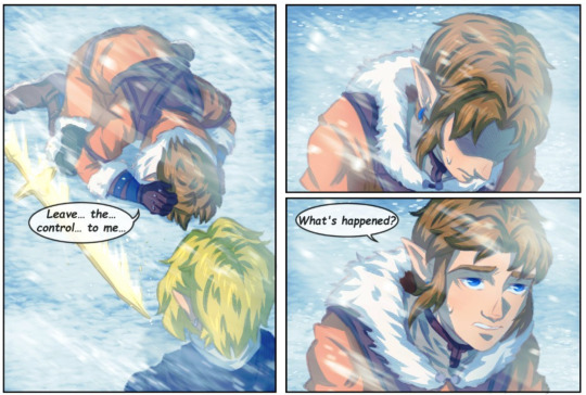
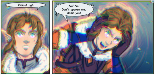
These five panels tell so much when it comes to how much effort Link has to go through to fight off the medallion possession. I wonder if its going to be easier or harder for him to fight it off as he gains spirits in the medallion.
You can really feel his struggle and I just love it. The visual storytelling is incredible in this comic and I will fan girl about it all day because I just love it so much

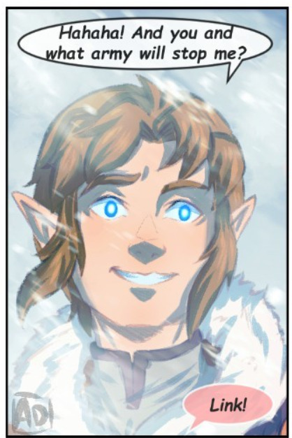
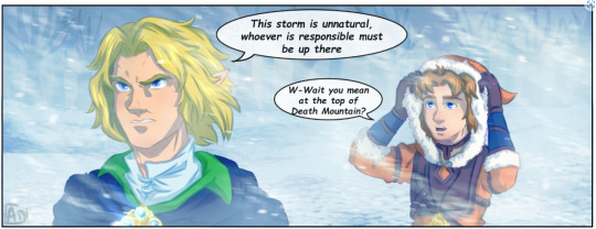
I'm thinking he says this to gauge just how bad this possession is. time seems like the guy who would, especially as he already seems to know what this is.
I wonder if he really is the hero of realms?
Yes, Time. Yes, he is.
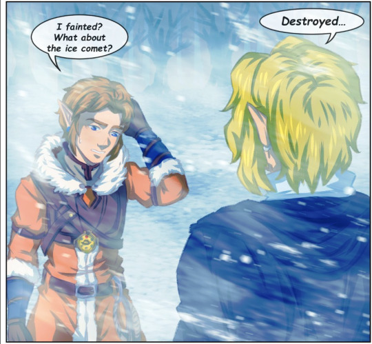
The face he dosent remember any time he's possessed by the medallion is a little worrying.
Makes me think that could be used later.
Like, Link dosent remember fighting this ice comet now. What if he fights an enemy while possessed, breaks the possession then has to relearn how to defeat it because as possessed link he's not gained any information.
Man Link is a cinnamon roll sometimes and I love him dearly okay.
Alrighty, thats me finished with my rambling. Thank you so much for sticking with me through this! And thanks again to @zelda-the-sacred-realm for the permission to do these i really appreciate it.
Please please go and check out the rest of the comic if you haven't it's amazing :D
Thats me finished for this chapter, so I'll be headed out!
Hope you have a wonderful day! :D
#comic analysis with major#ramble corner with major#zelda sacred realm#zeldathesacredrealm#sacred realm#loz sr#sr realms#sr time#sr sky#me gushing over the art for ages like#my g its so amazing#i love this comic#im so happy i get to make these for this one too#Writing these brings me almost as much joy as Sky does#And that's saying something#because in every iteration dear god does he bring me joy#Anyway#Link gets possessed by a god in the medallion theory 101#yall cant stop my agenda#im kidding#ztsr#hero of time#hero of sky#hero of realms#i dont think there are any tags i forgot#:D#i hope you enjoyed!#sacred realm analysis
63 notes
·
View notes
Text


ALL THAT GLITTERS IS NOT GOLD!!
But these wallpapers are...
If Truth Be Gold <3
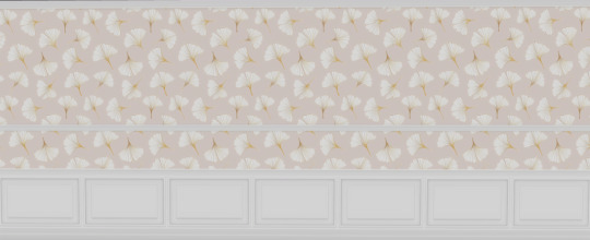
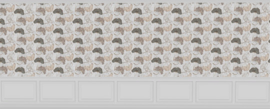
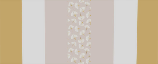
Gold accented wallpaper kits.
The top two kits are done in the 4 Peacemaker wood tones that I use the most often (pictured under the cut) in 2 different background variations, one uses the background colour of the pattern (image 1, C) the other is just plain white (image 2, W) Did we need this many choices made from the same 10 patterns? Of course not, but I am a sucker for more options, I suspect you are, too, or you wouldn't even be looking at this post! <3
There are 3 additional styles using these patterns, version 1 (image 3) is white paneling without the chair railing, version 2 (image 4) is white paneling with chair railing added and version 3 (images 5-14) is just the pattern slapped on a wall followed by the 3 accent colours that have been colour picked from the main pattern. All 3 of these versions have the same patterns and accent colours, so you're safe to grab just 1 version or all 3 if you wish.
I have made the main swatches a preview picture, so you know what each pattern looks like and what colour options each comes with. I have also colour coded all of the swatch icons to make it easier to find the whole set. I have honestly tried my best to make these kits as simple to use as possible, giving us builders more free time to create more houses or *shock gasp horror* actually get some much needed sleep!
BONUS WALL ART:
Story time!!
About 15 years ago I flew to New York to do touristy stuff. I hired a local to show me the city. While we were walking through the city I discovered a love of highly detailed things that most people wouldn't care to notice and had to take pictures of it ALL, which made us late to events and reservations. As a New Yorker, he was always in a rush, as a tourist, I was not. I am convinced that by the time I left he was plotting how to make my death look like an accident. 😂 These art pieces are an homage to that trip <3 There are 40 swatches all done on a box canvas so you can use them as is or add a frame of your choosing!
You can download the gold if you...
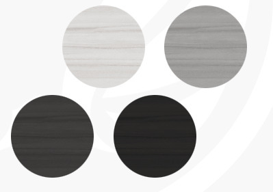
These 4 wood tones (credits to @peacemaker-ic for the preview that I chopped the s**t out of) are available in Panels C & W:
DOWNLOAD
All of my kits are BGC
All wall heights included
To remove unwanted patterns please see this mini-tut
Want to add your own paneling colour? Try my recolour of Peacemakers Wainscoting here
As with all of my creations, if you find any issues, please let me know.
@emilyccfinds @sssvitlanz @kittiesccfinds @heathersccfinds @public-ccfinds @alwaysfreecc
223 notes
·
View notes
Note
Hi! So, I really love the way you draw comics (that strike-back comic sheet of felix' looking at the srntimonsters is incredible). Do you have any... Tips for making them? Like, how do you think where each "square" will be placed, how to fit things in one page etc etc... How exactly did you learn to make comics like this (including all aspects)? Do you mind sharing?
Thank you !
Actually, I don't know if my comics are correct, if the composition is good etc... I went to art school but it had nothing to do with illustrations and comics (I was mostly doing logos, advertising posters etc...).
I posted my first comics on Deviantart, I was drawing Super Mario comics and it wasn't great. I was contacted by someone who took comic book classes and she made me a PDF with lots of tips and told me how to improve my comic book pages. And it was very helpful.
I can share with you some tips she gave me. Here are some tips given to me by "lepouvoirduflan" on deviantart :
-Read a lot of comics, even comics you don't like. It will allow you to discover a lot of different styles.
I have been drawing comics since I was a child. At the beginning, I was inspired by Asterix and Tintin comics.
More recently, a comic book that I really liked: "Be prepared" by Vera Brosgol. There is also "Lettres Perdues" by Jim Bishop. I wasn't a fan of the story but the drawing style and use of colors is incredible.
"Les sœurs Grémillet" by Gi Gregorio and Barbucci. "Les carnets de Cerise " by Joris Chamblain and Aurélie Neyret. I do not remember the story but the drawings and colors are very nice.
In a less childish style there is "Jerôme K. Jérôme Bloche " by Alain Dodier, Serge Le Tendre and Pierre Makyo.
There are also the W.i.t.c.h. comics that I like a lot in terms of composition.
If you understand French, you can watch this very interesting youtube channel about comics: https://www.youtube.com/@lefilsdebulle/videos
-Tips for comic book page composition:
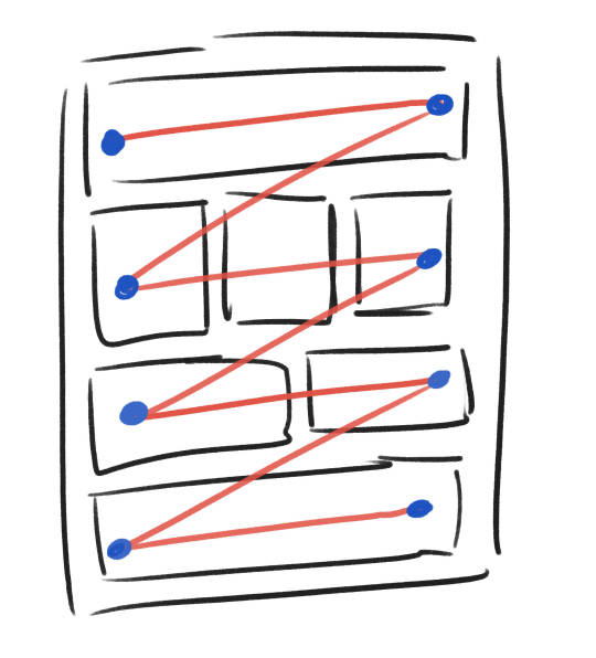
Except that if you decide to do manga, you have to apply the Z rule. You must be able to read the panels from left to right and from top to bottom
Other examples with comic book pages:
-Speech Bubbles:
I think speech bubbles are one of the most complicated things to incorporate into a comic page.
The reading must be fluid and there is an order to respect when several characters speak in the same panel.
Speech bubbles are also subject to the Z rule.
The speech bubbles must revolve around the characters.

Speech bubbles are of course subject to exceptions
They may be misaligned or not follow the Z rule, usually when the character is in a confused, scared, dreamy situation. But even if they are oddly placed, the speech bubbles are placed in a logical way.
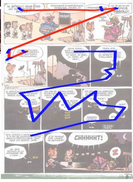
-There is not only one way to compose a comic page, there are many! That's why you have to make several sketches.
When I make a comic page, I write the dialogue and describe the action that takes place there. Then I make square panels and very rough drawings.
Then I work on the composition of the page and how I will place the panels.
Then I did something cleaner. I changed the place of the first two panels (the comic is not finished yet, things can still change). I left room for the text but I still need to draw the speech bubbles.

I hope this helped you!
151 notes
·
View notes
Note
Any chance you have seen and/or have thoughts on Across the Spider-Verse?
I literally just got back from Across the Spider-Verse and sat down at my computer, so this is about as fresh as a take as I can manage.
Short version: it's an astonishingly and relentlessly ambitious film that aims to outdo every other Spider-Man movie, every other multi-verse movie, and even its own first entry in the Miles Morales trilogy. And it succeeds.
Full spoilers below the cut. You have been warned.
The Visuals
Before I get into anything about the story, I want to first give full credit to the directors Joaquim Dos Santos, Kemo Powers, Justin K. Thompson, and the entire team at Sony Pictures Animation. If you saw the first Spider-Verse movie and aren't an animation nerd, you probably were impressed but didn't realize how revolutionary it was. I'll let Movies With Mikey explain the details, because it's easier if you can see what people are talking about:
youtube
When your first entry wins an Academy Award by thumbing your nose at Pixar, the reigning king of animation, and the principles of animation set down by the Nine Old Men, you have every right to sit back on your laurels.
For Across the Spider-Verse, the Sony Pictures Animation team clearly decided: fuck that. If the first film had wowed audiences by combining a half-dozen styles of animation on the screen at the same time, the second film would drown you in dozens and dozens of Spiders-Men and -Women (and -Animals) drawn in every style imaginable: Da Vinci's yellowing parchments and sketchy penicls, harsh cell-shading, punk rock collage art, 90s-style comic panels full of impossibly rippling muscles, crappy hand-drawn animation from the 1967 tv show, and then for a tip of the hat to Who Framed Roger Rabbit and the man who should have been Spider-Man - live action.
The backgrounds show the same love: from the off-set printing of Miles' world (my favorite detail is that you know that Miles gets sent to the wrong Earth when the color scheme shifts from purple to green), to the dripping painterly pastels of the Gweniverse, to the riotous greens and yellows of Mumbattan, to the clean Pixaresque light blooms of the Spider-Society's technological utopia (which looks a hell of a lot like something out of Brad Bird's dreams).
I am thoroughly in awe of the mentality behind the animation in this film, the absolute determination to challenge one's own limits and exceed one's past accomplishments.
The Story
If there is a single world that defines Across the Spider-Verse, it's "canon." The moment Miguel O'Hara uttered that word, my spidey-senses started tingling and I realized that Lord & Miller came to this film with a sermon. See, if there's one message from the first Spider-Verse movie it's that "anyone can be Spider-Man." But if there's two messages is that "you can't save everyone" - the idea that the thing that unites all Spiders-Folk from across the multiverse, it is a common understanding of loss, a tragic origin that drives each hero to impossible efforts to never let it happen again.
Across the Spider-Verse's message is: "why?" I cannot begin to explain the absolute vibranium balls it took to question not just a core premise of your previous movie, but one of the core premises of the entire multi-media multi-corporate franchise. And yet, Lord & Miller show nothing but confidence executing this turn.
FULL SPOILERS OF THE BIG TWIST AHEAD in 3:
3
2
1
At the beginning of the film, which makes the brilliant move to start by telling Spider-Gwen's story since we already know Miles, we are introduced to Miguel O'Hara (the Spider-Man from 2099) as a badass who leads a secret organization dedicated to protecting the mutliverse...but who secretly is also here to protect "canon."
At the turning point of the film, when Miles is finally invited to join the Spider-Society, we are let in on a dark truth: the safety of the multiverse depends on the suffering of Spiders. Just as Uncle Ben must die, so must a gallant police captain - although almost subtextually, Spider-Gwen hints that so too must the Gwen Stacys who "fall for Spider-Man" - to keep Spider-Man emotionally isolated and solely dedicated to his mission of protecting New York. Trying to avert this lonely fate, to live a happier life, brings about the destruction of all that is.
Through an act of unabashed heroism in Mumbattan - saving the life of a gallant police captain and an innocent child - Miles has inadvertently endangered an entire universe. And unless he allows his own father, the gallant captain, to die as well - the same fate will befall his own. Miles, being a good son and a good person, refuses to accept this and takes on the entire Spider-Society to get home and save his father.
In the chase, we are let in on a second, dark truth: Miles wasn't invited to join the Spider-Society because he is one of the anomalies they hunt, because he was never supposed to be Spider-Man. (You see how this builds on both the speech from Miles' mom about not letting white society tell him he doesn't belong AND the message from the first film?) The Kingpin's collider experiments allowed an Alchemax spider to cross over from Earth-42 to Earth-1610...and as a result, Earth-42 never got a Spider-Man.
When Miles accidentally is sent to Earth-42 instead of his actual home, he learns what that meant. Without Spider-Man, Captain Jeff Davis (Brian Michael Bendis is a real mensch like 99% of the time, but man did he fuck up with that one) died instead of his brother Aaron. Because the intended Spider-Man of Earth-42 was...Miles Morales. Instead, he has become a dystopian Brooklyn's Prowler, a living reminder of the damage the accident of Earth-1610's Miles' creation has caused. This is why you don't violate "canon."
Except...as we learn, Miguel O'Hara is wrong and our Miles is right. When Gwen is sent back to her own universe, which she has been running away from because she knows that it means confronting both her father the gallant captain and the inevitability of his death, she learns that George Stacy quit the force rather than take his promotion: Captain Stacy doesn't have to die. Nor did Captain Singh. Nor does Captain Davis. (For that matter, Miles doesn't have to lie to his family and live a double life as Spider-Man, as we see from his accidentally-misdirected confession.)
We are not the prisoners of the "canon."
Ever since Amazing Fantasy #15, "with great power there must also come great responsibility" has been the indisputable truth of Spider-Man. At this point, it's become a meme: "the Parker luck." Over and over again, Peter Parker must suffer for our sins - Uncle Ben dies, Captain Stacy dies, Gwen Stacy's death ushers in a whole new era of comics and the phenomenon of "fridging," his marriage to Mary Jane has to be done away with because the Spider Office are apparently psychological eternal adolescents, Aunt May has died and almost died so many times everyone's stopped caring.
And that's the problem: we've been playing the same hit for 61 years and it's gotten old. In the process, creators and audience together have condemned Spider-Man to a Sisyphean existence of eternal backsliding, unable to move on, build a life for himself, mature, die and give way to new Spiders. Hell, the best thing that's happened to Peter Parker in the last several decades was an AU in which he has a super-powered wife and daughter and can settle into a middle age of teaching at the Xavier School.
That's the sermon that Lord & Miller came to preach: just as in 2018 it was time for a new Spider-Man, now it's time for new stories that have the courage to try something different.
A Side-Note About the Multiverse
As with the animation side of the story, Lord & Miller could have sat back on their laurels when it came to the concept of the multiverse. After all, they were the ones who made it cool and sent Marvel Studios scrambling to catch up (still haven't succeeded at that, by the way). I don't think Everything Everywhere All At Once needed the creative help, but it absolutely helped sell the movie to producers that a multiverse movie could make millions and win Oscars. (Funny how that works.) Instead, Lord & Miller took it up a notch by asking "what is the purpose of a multiverse?"
Hot take: I don't like the Spider-Verse events. For all that they've given us some amazing Spider designs - and we saw them all up on screen in Across the Spider-Verse - no one cares about the stories. That's because the naked purpose of the comics was to market test Spider designs, see which ones generated buzz, and then make spin-off comics about those Spiders.
Across the Spider-Verse uses the concept of a multiverse, the shiny Macguffin that multi-billion dollar corporate conglomerates will hope will the ticket to riches, to strip Spider-Man down to the essentials by showing every conceivable variation and asking us what they all have in common. Is it suffering, or a commitment to doing the right thing?
Conclusion:
Holy shit, is firing Lord & Miller the biggest mistake Disney has made since Walt refused to recognize the animators' union in 1941.
#marvel#marvel meta#into the spider verse#across the spider verse spoilers#across the spider verse#miles morales#peter parker#spiderman#spider-man#spider-man meta#spiderman meta
107 notes
·
View notes
Text
THE GHOST OF PICS: MECHS PAST
And with THAT tortured pun, December's Patreon-backed @tfwiki picture batch is all stuff we've kinda needed forever, all stuff from the prior century, and all stuff from outside the US market!
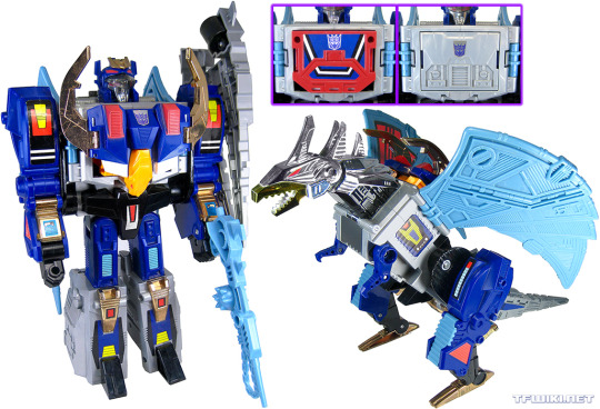

We start with Takara's original DEATHSAURUS, Decepticon leader in 1989's Victory, who just had his Legacy Haslab toy start showing up on doorsteps. And of course, new separate pics for his Breast Animal partners EAGLEBREAST and TIGERBREAST (yes, get them giggles out, go ahead).

Let's jump back a year to 1988's Super-God Masterforce, and the Godmaster RANGER. This mold is the only one of the three Powermaster Autobot cars to get recolored for its Takara release. Sadly, the MIB copy I bought back in 1996 was missing its gun, thus my general reluctance to add a pic to the wiki. But lord, that tiny, crunchy book scan we were using suuuucked. Made Ranger look white when he's a very light stony blue. Still using the scan though, just now in an inset panel to show off the gun I don't have.

And now we bounce ahead to 1990's Zone, and the Micro Transformer base SKY HYPER, piloted by Deadwheeler. I took these pics forever ago at some BotCon, and have long lost the notes as to who owned this piece a few hard drives back. This sample was also missing the three ramps, thus both the length of time it took for me to get comfy going ahead and adding these to the wiki, and the new book-scan inset to show the missing ramps.

Let's shift over to the European market, with 1992's THUNDER CLASH, the leader of the Autobot Turbmasters. His gravity-feed missile launcher was, like all the Turbomaster and Predator launchers, very much not US choke-gate compliant.
Fun fact: Thunder actually did get a Japanese release! He and Skyquake were straight imported to Japanese stores in Hasbro packaging, with just some necessary legal info changed to Japanese on the boxes. This was the Operation: Combination year, where Takara released the small Turbomasters and Predators in 2-packs.
And now we're going much further back, and much further south. No, that's not Brawn, that's OUTBACK, the 1987 Mexican version by IGA. Apparently, IGA was unwilling or unable to pay for the new '86 Mini Vehicle molds, thus they made their own versions by simply recoloring the '84 originals and slapping them on new cards for the '86 characters. Sometimes with alternate decos to boot!
Sadly, I don't own this toy, and like Sky Hyper, this was a BotCon pic taken with original owner info lost to time. (I always try and credit the toy owner when they let me take pics.)


Now here's the ones I'm super-happy about. These are two of the three Eletrix, ESPORTE and PORSCHE, exclusive to Estrela's 1985 Brazilian Transformers line! These toys transform and walk/roll forward via remote control, attached by a wire over 4 feet long. I'm keeping an eye out for the third one, Jipe.
None of the '85 Brazilian toys have any faction markings, but the Autobot-style packaging leads one to assume "all good guys". As do the bios of many of the toys in the line... but the Eletrix lack bios, sadly. Which is weird, as Estrela made up new bios for some toys in the line, and just straight-translated others from their Hasbro bios.
These molds were released in the US, but as the "Pow-R-Bots" in Village Toys' TF-wannabe line Convert-A-Bots. Like Estrela, Village licensed them from Japan's Yonezawa Toys, where they were the Remote Change Robo Series. All of these releases use the same plastic colors, but give them new stickers for branding and language.
I bought these two MISB (cellophane still there!) earlier this year, but was a little gunshy about opening them, worried the electronics might have somehow rotted. Schrodinger's Electronics. But no, since they didn't come with batteries, no corrosion, and they work as well as a 1984-mold cheap electric gear-powered toy can (that is to say, loudly).
And of course, since I got the boxes, I took the opportunity to take 600dpi scans of the box art unique to Estrela's packaging!

Man, I love going through these older, not-US corners of TFdom, and hope you learned something new about the vast TF universe. And if you'd like to help make that just a little bit easier and get more pics out a month, consider joining my Patreon! "gregstfwikipics" there, every little bit helps, plus at higher pledge levels you can pick a theme for the month!

#transformers#transformers victory#haslab#deathsaurus#thunder clash#thunderclash#takara#hasbro#tfwiki#masterforce#super-god masterforce#transformers zone#micromasters#robots in disguise
35 notes
·
View notes
Text
J2 Gold Panel SFCon 2023
If they could take any outfit from any character they've played on any of their shows which would it be?
Jared says he'll answer for Jensen and Jensen will answer for him, and for Jensen he says lederhosen. And for Jared, Jensen answers the white Lucifer suit, and y'all Jared gets so excited that Jensen got it right it's adorable!
Jared also reveals that he actually does have the white Lucifer suit! Because who else is it gonna fit, that was tailor-made for him. So he has a storage unit that's filled with his and Jensen's spn stuff- it's interesting cause when mentioning the storage unit Jared kinda sounds like he starts to say it's one they've shared for many years but instead cuts himself off and asks Jensen if he still has things in there which by the sounds of it he does. I don't know it just stood out to me cause I don't consider 3 years ago to be many years ago.
Anyways, among the spn stuff that they have is things like scripts, s1 and s2 crew gifts, outfits, and the MOL sconces which Jensen also used in The Winchesters.
Jared also has like an ashtray on a pedestal thing that he loves, and he has an outside area where he likes to have the occasional cigar (says he hasn't had one in the past year) but one day they had a big storm in Austin and it had fallen and he was worried about it but it didn't break. x
The next fan doesn't have a question they just would like for them to wish their dad a happy birthday. 🎂
What if they had gotten John back instead of Mary?
Jared jokes that in his opinion the problem is that John spent so much time, so many years facing zombies he might be a little slow 😂. But also Sam would have had to be all angsty a lot.
Jensen says it probably would have been more of a character arc for Sam with dad rather than what Dean went through with mom; it would have been a similar style of art but it would have been more Sam and John.
Jared says that's a good point, and that it might be that for the first 10 seasons, Sam was so angsty the writers decided they need to get Dean angsty.
.................................I'm gonna bite my tongue. x
This next fan makes the mistake of handing Jared her phone so they can see a picture of her boyfriend cause people say that her boyfriend looks like Dean and now that he's growing out his beard he looks like Jensen. At the same time they were looking at the photo a text notification came in from her dad asking about the panel so y'all can guess what happened...Jared replied to it 🤣
Fan should have known better than to give these two little devils access to her phone, they both start messing around on it trying to figure it out so they can take a selfie. The fan shows Jared where to find the camera but he doesn't realize it's on video mode until he tries to take the pic 😂
They are so mischievous I love them 📱
When did they realize this was gonna be big?
Jared quips this morning; Jensen answers it was definitely a sliding scale because there wasn't an episode or a season. That he was talking about this the previous day at the VIP but he thinks around s6 was when they first realized they might not get canceled, and that was 5 seasons with every season not thinking they were gonna renew the show and after season 5 it was like 'oh I think they like the show, I think they're gonna keep it around.'
Jared agrees, and says that's very true also that was when Kripke left and they wondered if it meant they were done but then in s6 the family came back and kept them going so he has the same answer.
Then they say at the same time they renewed their contract for two years.
Jared also adds that for him when Kripke finished his first 5 seasons as the showrunner he was thinking it meant they were done and on the way out but he doesn't recall the first season or the first time this happened but the first time they did Hall H at comic con and looked out and saw it was a lot of people and their faces were on the backpacks.
Jensen mentions they did a lot of marketing for s1, more than they had ever been a part of, but that doesn't always mean success they can market the hell out of things and it be a total flop so it was hard not to get excited about seeing their faces on the side of WB studios, it was really cool but they kept it in check so there was a lot of those things along the way that was really cool and could be a really big deal but he doesn't think they ever let themselves buy into that until they already had 5 seasons under their belt. x
Another non-question, the fan is wearing a shirt that originally didn't include Jared but they didn't like that so they added him with an iron-on decal and her husband thinks it looks like Leatherface so it's basically her showing Jared her shirt x
If Sam and Dean had wings what would they look like?
Jared thinks his would be colorful, that one thing he loved about the show is that the angel wings were intimidating but he hopes Sammy's angel wings would be more inviting. That's lovely 💛
Jensen says Dean's would look like car doors opening. x
And that was the last question but before they leave the stage Jared announces that Jensen bought him an early birthday present which is the shirt he's wearing and they'll be auctioning it off later for charity. Jensen says he literally went and bought Jared shirts yesterday because he knew he was going to show up to the con and not have any- what a sweet husband 🥰
And for anyone curious the shirt reportedly made over 4k at auction! Also after the auction, Jensen signed the shirt but before doing so he smelled it and said it smelled good because Jared always smells good due to him using a lot of cologne, and he loves it. You know how much you have to love someone and their smell, to sniff their sweaty shirt that they've been running around in all day and think it still smells good ❤️
J2 Gold Panel SFCon 2023
73 notes
·
View notes
Note
do you have any tips for getting better at drawing anatomy? your poses are always so fluid and realistic
first of all THANK YOU!!! that makes me happy to hear!
under the cut because i got long winded... i hope something in here is useful! some of it may stray from the point, and i have no idea what stuff you already know.
in my experience a lot of it is about paying attention to form/volume. at one point or another i realized i vastly prefer art that emphasizes this, as opposed to flatter more stylized anatomy, as far as things i want to emulate in my own work go (flat styles can be cool when other people do it; this is a huge thing with art i think, developing a sense of discernment when it comes to the art you Want To Make versus the art you like but wouldn't want to mimic...)
so i add contour lines to everything i draw as i sketch because it helps me figure out where the object is in space, in relation to the viewer. doing this immediately establishes where the subject is in relation to the "camera" because lines curving one way mean you're looking up at something, and vice versa. if you've ever seen the coil method of foreshortening before, it's the same principle.
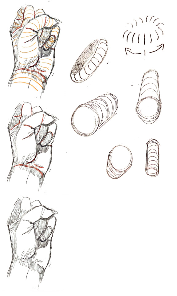
while construction lines won't always be there in a finished piece, you can communicate form in the curves of your lines. the round end of a sleeve is a countour line, so are fabric folds (although they have their own volume too), etc.
the feeling of looking up at someone, or their arm moving towards you, or their back turned away from you, that's where a lot of tension and dynamism comes from--some of the "fluidity."
another thing is to focus on weight, and how things interact when they touch... if you grip someone's arm, how does the skin fold/warp under pressure? can you actually draw it doing that, instead of leaving the arm being grabbed unaffected? stuff like that. a huge inspiration for this (and i think it shows in some of the artistic choices i've been making lately) is margot maison's work. like, check out this panel from bora the brain:
or this one of mine, where i just grabbed my own arm like that to see how it felt and what the skin did...

these are both examples of smaller details but the same principle applies any time you're drawing two people touching, or even a bent leg where the thigh and calf meet. i'm more interested in how skin/fat moves around than i am in getting the nitty gritty details of muscle groups and bones right. knowing the muscles and bones certainly HELPS; my personal favorite bones are the radius and ulna in the forearm, and keeping the way they move in mind Is useful because it reminds you that the arm isn't a uniform tube shape, it's a flat rectangle type thing, and it'll look wider or narrower depending on the angle... etc. see pronation/supination gif below:

they get recomended all the time but the morpho books are my favorite reference for doing actual intentional anatomy practice & in redrawing stuff from them a ton of tricks for constructing bodies have stuck in my head. like, here i was focusing on how they simplify the shoulder/armpit in relation to the ribcage:

(you can download most of 'em for free off of libgen btw.)
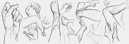
you can also get something kinda special drawing bodies from life. if you don't have other people to draw, your own hands/legs work too, and it's good for foreshortening and perspective because you're always seeing them in relation to your own viewpoint:
granted both this and the morpho studies are things i find fun to do. on the off chance that you're someone who finds studies tedious or boring, rather than pushing through it you might want to paint a character you like onto the pose you're practicing or something like that to keep yourself invested?
i also use references gratuitously. usually many pictures at once, where i'm combining them to get the pose i want. either just referencing different photos as i draw different things or literally editing them together depending on what it is. over time, i've gotten better at coming up with dynamic and interesting poses without a ref, because using them has built up my understanding of the body (it's actually way easier IMO to draw a dynamic pose without a ref than it is to draw a dude just standing there without one ?!)
there's sort of a push and pull for me between accuracy/realism ("can the arm Actually bend that way???") and exageration/stylistic liscense ("if it doesn't, does it look cooler like that?") where it helps to KNOW if you're drawing something that isn't technically "anatomically correct."
there's also a lot to be said for tracing over photos for practice!

thank you for the question, i love to talk about these things ^_^
17 notes
·
View notes
Note
sigma for the ask game?
Sigma!!!!
Favorite thing about them:
The same thing as the bsd author: I really like how “normal” Sigma is!!! It makes him very sympathetic. The way he fought with everything he had during the Sky Casino arc to protect what was most important to him made me emotional.
Least favorite thing about them:
Nothing I can think of? I guess his outfit could use some improvement but I'm starting to think I'm very nitpicky with this kind of stuff lol.
Favorite line:
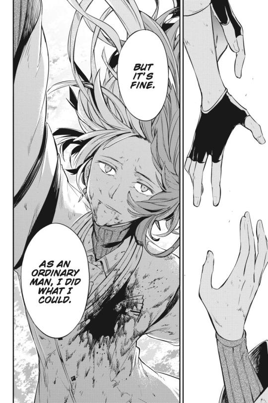
I feel like I'm always going for the most predictable lines but like. I really like this one. I wish nothing more for my life than to do what I can as an ordinary man.
brOTP:
Everything I ship with him romantically I think would work really well platonically too!! Not much more I can't think of since he hasn't interacted with a lot of characters, but I have a hunch that him and Kunikida would get along well lol.
OTP:
I really like sigzai, it's my personal “liked it before it got popular” pffttt. I do understand the criticism in saying that Dazai was mostly manipulating him, but I think that's the cool part? Like them starting out with Dazai manipulating him and Sigma being mostly aware of it but unable to impede it, yet Dazai gradually growing in love of Sigma's resilience and will to live. I think they're very nice even if they didn't start out healthy, but like, why would you be looking for healthy relationships in the toxic yaoi franchise?
I also throughout enjoy siglai. It's like, the cooler funnier version of kuniki/dazai for me lmao. I find the “I have literally NO CLUE why I love you and will keep loving you despite wishing I didn't” and “if I don't spend 25/7 annoying you I will explode” vibes really compelling.
nOTP:
Nothing. Look, unless it's something that actively bothers me, I hardly have any notps in general, I'm a multishipper at heart.
Random headcanon:
I really like the concept of transfem Sigma within canon who's like. “I haven't gotten the chance to transition because I was born like two years ago and my life has been a mess, but AS SOON AS THINGS CALM DOWN— ”
Unpopular opinion:
... I don't like the idea of him joining the ada? I mean, I don't hate it, but I would have rather had it where he didn't, even though it's evident that the plot is going in that direction. I just wish he could keep working as casino manager because he looked so at home at the Sky Casino, it makes me wish he would go back. And the odd thing is that I acknowledge that it's been established in the manga itself that that was not the right place for him (Dostoyevsky in chapter 107: “[You realized that] a lonely ‘home’ isn't enough. What you need isn't a place, but trust.”) and that he should join the ada; I just feel like they made his love and attachment to the Sky Casino so strong and moving in its respective arc, the idea of him having a life outside of it just feels wrong. I think he's really good at manager jobs in general, I'd even be happier with him like. Opening a hat shop or something.
Song i associate with them:
-ERROR by niki, also the Namine Ritsu cover by cillia. The illustration of Ritsu in the cover even seems to resemble Sigma a lot for me eheh. I feel like the lyrics fit Sigma's inner conflict between feeling like he isn't supposed to exist and still wanting so deeply to live a lot!!!
Favourite picture of them:
Favourite panel from the manga:
Favourite illustration:

Favourite illustration in the anime art style:
Send me a character?
#Thank you for the ask!! <33#sigma#bsd#mine#people asks me stuff#Peoples no one has asked me (canon) ss/kk yet. Just sayin'
11 notes
·
View notes
Note
Do you have any recommendations for comics on tapas? I'm rather new to the app so I wondered if you had any. Sorry if someone already asked!
Oh, so many! Tapas was one of my OG homes waaay back in the day, when I was still getting into drawing comics (back then it was gag-a-days). I spent a lot of time reading comics on there and it was one of my first introductions to comic platforms in general (next to SmackJeeves, RIP).
Rock and Riot - 1950's LGBTQ+ gangster teenagers getting into shenanigans and turf wars. Very cute and fun and adorable <3
Monster Pop! - Monster girls who are besties! This one has some real gorgeous art especially if you like the original vibes of S1 LO, lots of bright beautiful colors and lineless shapes. The creator of this comic, mayakern, now develops comfortable and eco-friendly skirts with her wife and pals for plus-sized folks! (they have pockets!)
A BETTER PLACE - Young girl Hannah and her little brother Theo find something cool in the woods. Children becoming gods. This was one of those comics that had some REALLY cool "you had to be there" time travel elements that aren't quite as immersive in hindsight (I was one of those people who were there and DAMN it was awesome), but it's still absolutely worth the read and it operates as a sort of prequel to another one of Harry Bogosian's comics on the platform.
Fail by Error - This comic is long since done with, its creator having moved on to bigger things, but at one point in time, this was the titan series on Tapas, before the platform became predominantly BL's and isekais. Fail by Error was truly one of the best of the best of Tapas-hosted comics from its golden era of comedy comics. Also the creator made art for me once and I still have it! <3

(my babieees <3)
RandoWis - funny gag strip is funny ! He also draws an MMO-themed comic that - coincidentally - when I double checked, looks like it stopped updating in 2021 until two days ago. So yeah, good time to check that one out too!
Undying Happiness - Naomi takes a chance on love and decides to meet up with a guy she met online. He turns out to not look like the guy in the photos in the most hilariously absurd way.
Deep Fried Pudge - Okay, this is a really weird inclusion because like... this comic isn't good. This comic is painfully bad. Like, "roll your eyes into the back of your skull at your dad's stupid jokes" bad. This comic has not stopped updating daily since 2012. It literally just had its 11 year anniversary. Every update is just a single panel either making some pun or just stating very innocent, inoffensive opinions. There are four thousand of these things. And every single one is done with the same art style and joke structure as before, the comics from today look and feel like a 7 year old made them the exact same way they did 10 years ago, as if trapped in a hellish time capsule of its own design, and I love it, I freaking love it. Its existence quite literally defies human nature. Reading it and attempting to comprehend why it exists is like staring into the eyes of some Eldritch god that chose peace over chaos. Pudge will outlive all of us. Pudge will outlive the universe. All hail Pudge.

#there are definitely tons more that i haven't unlocked in my brain#i spent so much of my formative webcomic years on tapas man#i miss the way it used to be#like yeah ok it has actual branding and its own originals catalogue now#but what it is today is only a fraction of what it used to be in terms of its community and culture#i haven't been on tapas since 2020ish and like#it was a good decision to leave#but damn i miss it sometimes#there are some genuinely amazing hidden treasures on it that either got buried or just stopped updating but are still 100% worth reading#webcomic recommendations#tapas#tapastic#webtoon recommendations#ama#ask me anything#anon ama#anon ask me anything
57 notes
·
View notes
Text
Nick Mag Highlights - Nick Mag Presents: Danny Phantom (Fall 2005)
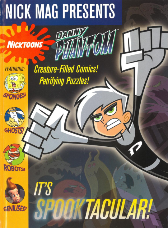
Well, well, well, fancy meeting you here. Welcome back to my blog and the words that inhabit it. Today, Halloween comes early this year when we read through another exciting issue of Nickelodeon Magazine Presents, this time all about Danny Phantom. Boo! Trick-or-Treat! Deck the halls!
And not only is this edition of Nick Mag Highlights spooky, it’s also… pretty chill. Y’know? Just takin’ it easy, reading a handful of comics and probably a crossword puzzle or something. As much as I love researching the kind of stuff Nickelodeon Magazine includes in its articles, sometimes it’s nice to sit back and take things at face value and just see what the state of Nickelodeon was like at any given time, and these short-and-sweet issues of Nick Mag Presents are the perfect venue for just that.
But why exactly am I tackling this purportedly Halloween-themed issue in August? Well, mainly it’s because that new Danny Phantom graphic novel just came out… two weeks ago (oops). And I really enjoyed it! So I’ve since been in a big Danny Phantom mood lately. I even ended up re-watching the whole first season and had a blast doing so. This show was a real obsession of mine as a kid, so maybe this blog post is also a way for me to give it its dues.
This issue can be found online here, read along… if you dare!
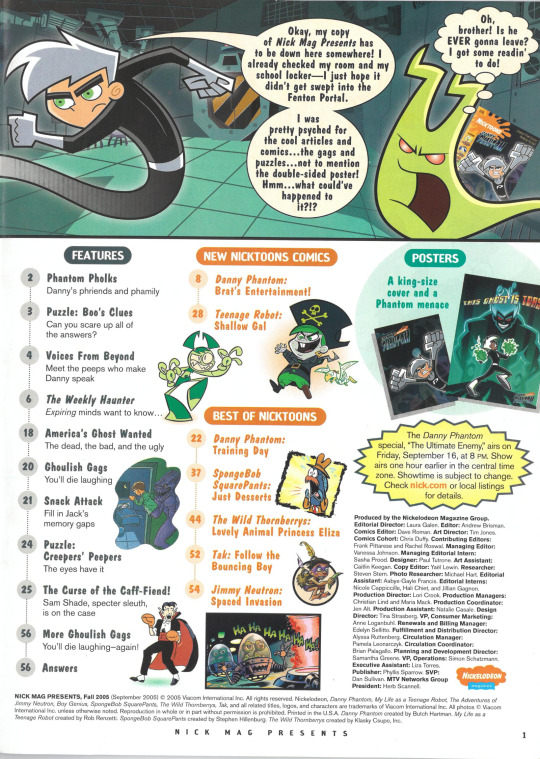
Another Nick Mag Presents, another humorously wordy introduction. If you’re unfamiliar, basically all these Presents-styled issues have a panel on the first page with a character essentially advertising the book to you and talking about all the comics and activities included inside. This one here features Danny and an understandably perturbed ghost, for example.
Since these issues were usually sold in stores as opposed to through a mail subscription, I suppose this is the issue’s way of hooking you in and explaining to you why you should buy it. I think a kid would probably be more inclined to just flip through the book and arrive at the same conclusion, but I guess this approach doesn’t hurt anybody.
But anyway, let’s see here… aw, only two wholly new comics? The Fairly Oddparents-themed issue I took a look at previously had five original comics. That’s a bummer, but at least we’ve still got variety… SpongeBob, My Life as a Teenage Robot, and The Wild Thornberrys, oh my! Even Tak makes an appearance here, two years before the premiere of his actual Nickelodeon cartoon, meaning this was an attempt to interest readers in the then-recently released video game: Tak 3: The Great Juju Challenge. Not sure if that worked.
And if you’ll take a look at that yellow, spiky bubble with words on the right there, this September 2005 issue is meant to coincide with the then-upcoming two episode-long Danny Phantom special, “The Ultimate Enemy”, which featured Danny taking on a more powerful version of himself from the future. Seems like the included removable poster is even themed around that very episode! Let’s just hope that poster is still left intact, eh?
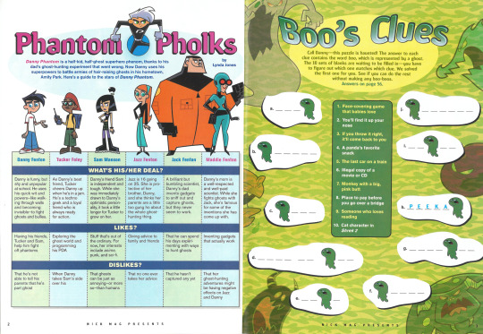
So first up, we’ve got a page to get you up to speed on the main cast if you’re new to the show. It’s even got some new factoids for the already familiar superfans! For example: Did you know Sam is into anime? I sure didn’t.
Oh, and if you’re wondering where series villain Vlad Masters is, don’t worry, they go over him later on in the book.
On the right you’ll find an easy if not slightly amusing word puzzle, which tasks you with solving questions where each answer contains the word boo. Simple enough for a kid while still being worth the time, methinks.
Although all the stock ghost art on the page gets me wondering, how come most of the ghosts in the show manifest as typical-looking cartoon ghosts while others manifest in a human form? I guess maybe it comes down to the strength of your spirit. Who’s to say?
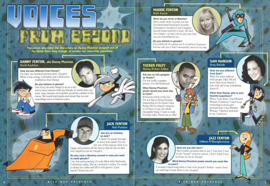
You’ve met the characters, now it’s time to meet the voices behind them! I’ll always take a side of interviews with my Nickelodeon Magazine, and this is no exception. The questions are cute, and I had fun reading them. Not much to say.

So we’re finally here at the first comic of the issue, and… not really a fan of this one! Yeah, sorry to start this retrospective off on a sour note but this isn’t really doing it for me. The main villain of this one is Youngblood, who already isn’t exactly one of my favorite villains from the series. But here they’ve got him and all the other characters stuck in a pretty by-the-numbers plot where Danny and co. get stuck babysitting the brat while he tries to maim them, with them of course unable to fight back lest they face the wrath of his parents (who are humongous lizard monsters, for some reason).
If you’re even a little familiar with cartoons you’ve probably already seen quite a few takes on this formula already. And even if you like Youngblood as a character they don’t have him doing his usual pirate shtick he’s remembered for, so I’m not sure what anyone is getting out of this, really. What's especially not helping is that this goes on for ten pages, further dragging out an already tired concept.
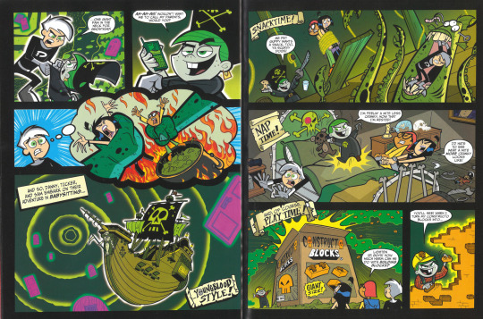
So there you have it, I guess. Done-to-death story with accordingly done-to-death jokes, a lame villain, and about two pages of action. I will say though, Danny and Tucker’s babysitting poster on page 2 did get a smile out of me, at least.
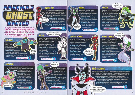
You’ve met the characters, and you’ve also met the voices behind them, now it’s time to meet… the rest of the characters! The villain ones! These guys really made the show for me, cause the team behind the show really just seemed to understand the assignment and made all of them really unique and memorable.
So we can see they’ve been ranked in terms of how dangerous they all are, which is a fun idea. ‘Course you’ve got Vlad at the top of, but then there’s Technus just behind him? I can’t say I remember him being notably more dangerous than any of the other baddies, I’m fairly certain he gets swept up at the end of his specific episode just like all the rest. I’m pretty sure Valerie gave Danny a bigger run for his money, and she’s down at #3.
Woah now, I’m starting to scrutinize the power levels of cartoon characters. Cartoon characters from a show I haven’t even fully watched all the way through since I was a kid, no less. Better put a stop to that before it gets ugly.
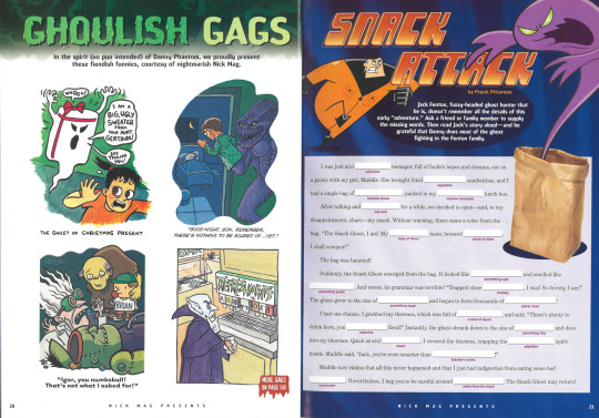
Cool little cartoons on the left there, that one on the top right is properly devious and I’m all for it. All the art is quite lovely too.
The right is… well, it’s Mad Libs, there’s no other way around it. Y’know the Mad Libs website refers to itself as “the world’s greatest word game” but I seriously think they need to take that up with Scrabble, or hell, even Hangman. Yeah I was never a big fan of this kind of fill-in-the-blanks stuff, but I guess it’s a pretty inoffensive activity to include.

Check out Danny’s dad rocking that emo hair.
And now we’ve made it to the second and last new comic for the issue, and unfortunately it’s only a two-pager. But hey, if my thoughts on the previous ten-page comic said anything, it was that I prefer quality over quantity. And this one is… okay. It’s funny enough, does what all it needs to with the concept, and it definitely doesn’t overstay its welcome. I’m again surprised by the lack of action in both of these comics, considering Danny Phantom is an action show, after all, but it’s not like the show wasn’t a comedy either, so it’s not that weird.
I guess while we’re here I could nitpick it a bit. The lineart here courtesy of series creator Butch Hartman* is a bit wonky at times. There’s the aforementioned emo hair Danny’s dad is wearing, but my main gripe is that dog robot just doesn’t really fit in with the rest of the artstyle. It being the only new original character design for this comic as well doesn’t seem like a coincidence to me. I guess the team was fine with whatever Hartman drew because he made the show after all, so surely he knows what he’s doing, right?*
*Insert obligatory comment about how much of a loser Butch Hartman is here.
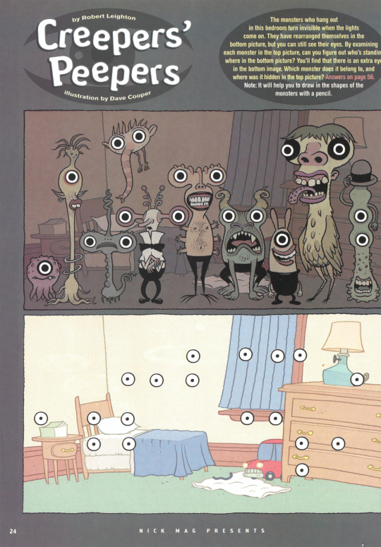
Just want to give a shoutout to this pretty creative puzzle here. It actually stumped me a little when I first read it! Those monster designs are pretty entertaining too. Solid activity overall.
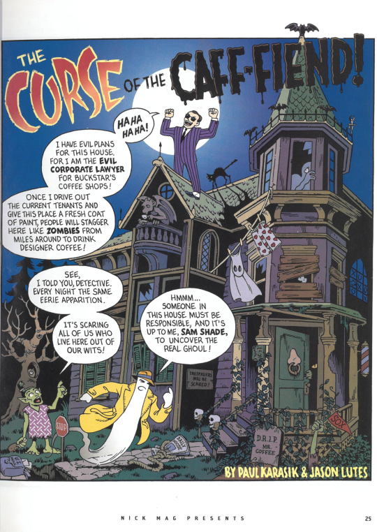
Next up it’s an installment of Sam Shade, which was a short-lived recurring series in Nickelodeon Magazine. Apparently the series ran from 2002 to 2005, so this may be one of the last times a Sam Shade comic was ever printed in a Nick Magazine.
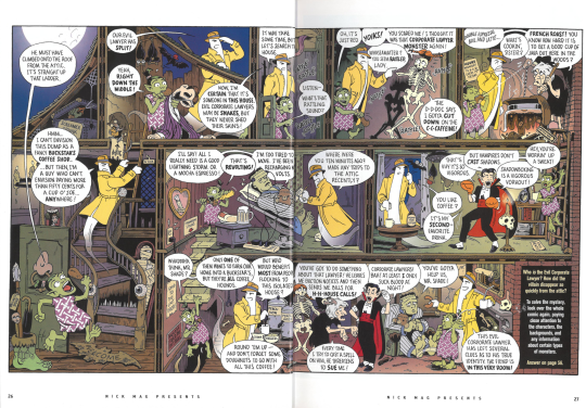
These comics mainly consist of the titular Detective Sam Shade trying to solve some mystery, sleuthing around the area in a series of detailed, wordy scenes. Likewise, you as the reader are as well tasked with scouring the pages for clues to help deduce the culprit. Each panel here smoothly moves into the next, making for something like a Where’s Waldo puzzle but with an actual narrative. It’s a really good idea! A shame this series didn’t last longer.
Hey, is that Carl from Jimmy Neutron on the bottom right there?
Pretty nice My Life as a Teenage Robot comic here. Although that’s kind of unfortunate in a way, since that means I haven’t got much to talk about! It’s pretty much a 1-to-1 translation from animation to comic here. The artstyle and writing are both on point, it’s all just in a shorter, more paper-y format.
I wonder why the aliens’ speech bubble has flowers in it. Is that a theater reference, maybe?
The design of these fiery aliens are particularly awesome - simple but effective. I’m surprised they used such a cool design in a comic that was going to be seen by way less people as opposed to using it in the cartoon. Man, this show is so cool, even its supplementary media is stylish!
But anyway, do you want to know how this story ends? Read it yourself!

Ohh man, I distinctly remember this comic. I don’t remember what issue of Nickelodeon Magazine this one is sourced from, but whichever one it was, I had it. The story’s nothing to write home about really, It's another take on the age old tale of “Squidward yells at SpongeBob and Patrick for doing something annoying, so they inadvertently ruin his life”. Squidward must have a really good lawyer for him to be able to bounce back from all the crap SpongeBob and Pat get him into.

This version of the usual story has S. Bob and P. Rick making a cake in Squidward’s image. Mr. Krabs ends up mistaking it for the real Squidward, bringing it to the Krusty Krab, and having it run the cash register, obviously to disastrous results. It’s all pretty par for the course, and there’s some funny lines to be had.
Weirdly though, unless I’m blind, I can’t seem to find any credits for this one. Not in the comic itself or at the back of the book. I’m pretty sure the artist(s) behind this one did more SpongeBob SquarePants comics though, and I wouldn’t be surprised if the same writing team had a hand in them too. I distinctly remember one where all the characters turn into desserts. Or maybe it was an alternate universe where they’re all desserts? Something like that. Maybe I’ll find it and cover it on this blog someday!
And up next, it’s a Wild Thornberrys comic of all things (said with feigned surprise, having read the table of contents moments ago). And I’m just now realizing none of these comics have anything to do with ghosts, or horror, really. Quite the magazine you’ve got just in time for October, Nickelodeon!
But hey, it’s not right to judge a piece of art specifically by the context in which it is presented. Especially when it was originally published in a magazine that likely came out years earlier, probably not even around the month of October. Desperate times call for desperate measures and all that, even when it comes to filling the pages of a magazine.
This comic is especially cool, anyway, as you can no doubt tell from its distinct shakeup in style!

The story has Eliza receiving some gifts from her Japanese friend, Mayumi (who was probably in the show, presumably), one of those gifts being a homemade manga. And while I’m not exactly an expert on the Japanese arts, I certainly find this art convincing and really appreciate the attention to detail. I bet any kids that were fans of manga around this time must have felt pretty seen to have one of their hobbies referenced in a rather unlikely place, and with such attention to detail no less.
One thing I can also appreciate is that this story really isn’t something they could have pulled off in the show itself (unless they studio really wanted to have an anime-themed episode and go through the undertaking of doing an episode in an entirely different, foreign animation style all on their usual budget), so overall this is a really fun idea done quite flawlessly. My only gripe is we don’t get to see a manga-styled Nigel Thornberry, but what can you do?
Oh boy, the Tak comic, cool. Now, I know these games have their fans, but I can’t say I’m one of them. I did watch the show a bit though, but I’ve heard it has nothing to do with the games, so I guess that makes me rather unprepared to tackle this two-page comic on an intellectual, researched level. I will say though that I think the Sam Shade comic from earlier pulled off this style of free-flowing, no-panel storytelling to a much greater effect. The amount of Taks they threw around the page makes it feel really busy and cramped, and they had to essentially remove the second character Tak is traveling with from the story since I guess they were strapped for page space.
But yeah, the colors are nice at least, and Tak media is especially hard to come by nowadays, so I suppose if I were more into the property, I might be more into this.
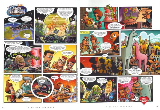
Last comic of the day, and it’s Jimmy Neutron. At least this one kinda fits the theme, I mean, aliens are almost in the same horror-league as vampires, zombies, ghosts, and all that. This is a pretty quality one to end off the book with, and in regards to Jimmy Neutron, this is one of the better ways these characters have been translated to 2D. Although the incredibly warm colors and harsh shadows throw me for a loop. Pretty good overall!
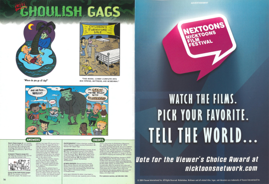
Before we wrap things up, I would like to mention that advert for The Nicktoons Film Festival on the right. I totally forgot these used to be a thing! From 2004 to 2009 Nickelodeon hosted a film festival and let viewers vote for their favorite animated short, along with letting proper animation people who know what they’re talking about vote on their favorites, too. Lots of great up-and-coming cartoonists took part in these festivals. This one in 2005 actually featured a short by J. G. Quintel that eventually was used as a basis for his own Cartoon Network show, Regular Show! You can check the short out below:
youtube
Neat bit of history there, yeah?

Even though I’m still a bit disappointed this issue didn’t include more original content, I still think this ended up being a fairly entertaining walk down memory lane. And hey, I hope you had a good time too. I’m doubly disappointed, however, that the archive of this issue didn’t come with that tear-out poster! Now we’ll never see it in its full hi-def glory.
As always, thanks for stopping by and checking out another bit of Nick history with me. Have yourself a good one, and I’ll see you all next time!
28 notes
·
View notes
Text
I hate what AI art has done to my enjoyment of art. I also hate AI art for multiple other reasons, but that is one of them.
Now instead of enjoying a piece for composition or colour or plain just "this looks pretty" I am instantly suspicious. Sus, one might say. I go through the piece with a fine toothed comb. Is there an inconsistent detail? A mistake a human wouldn't make so far in the process? A weird hand?
Most of AI art trying to pass as art (that I've seen) is heavily rendered, meaning a real artist should've spent hours or days on that thing, chipping away, seeing the piece, which means more opportunities to correct mistakes made in sketch or any other part of the process; it also implies that the artist has some experience and skill, and knowledge of their medium. Art tools, references, etc. Whether you like or dislike their style, their designs or concepts is another matter entirely. This is pure art analysis.
Let's expand:
- Inconsistent details: This is not "this comic artist forgot to copy a detail from panel to panel". This is forgetting bilateral symmetry. This is having fish from the same species have different fin placement. This is weird windows in a normal building, this is breaking a pattern up for no discernible reason. This is a line not connecting with another. This is a detail that shouldn't be there, be there. The AI is good at replicating how something looks, but is bad at paying attention to concepts in the foundation, and it shows with these little details. Concepts that are easily understood by humans by just looking at references and doing sketches.
- A mistake/uncanny wrongness: when you look at a piece for so long, at the same time your back suffers from the unhealthy posture you torture it with, you start seeing mistakes, or things you want to change, or improve, or remove. Like "that pose could be better" or "I forgot this in the background", or "this colour doesn't look good", or "this pattern is too concentrated, I'd better space this element out". An AI doesn't have observational skills or these thought processes. It's also hilariously bad at replicating text. If something feels uncanny, I have to think "did a human make this decision?" or "is the anatomy even correct? the perspective? the colours? the fucking text? it's the fucking text isn't it."
I would offer more specific examples of these, but I try to avoid AI art the second I feel the uncanny wrongness, I have the tag filtered. Once a detail is wrong in a wrong way (I'm not talking an artist accidentally drawing two right hands, I'm talking fingers coming out of fingers) I start to see other mistakes or uncanny decisions. It boils down to the little details.
AI is "trained" (stealing, copying) on multiple other pieces of art. But it copies without understanding. When an artist copies they're trying to understand, they are studying what they copy, and usually they are appreciating what they study. That's why they're called "studies", and they're often properly credited. When they borrow another's style (like Rembrandt) people often say "drawn in a Rembrandt style". AI doesn't do studies, doesn't understand, doesn't credit the thousands of artworks they've stolen from. Because it's thousands, millions. If you tell an AI to generate a painting in a Rembrandt style, you bet your ass the AI is using Rembrandt AND thousand other pieces from different people. But the person posting the AI art says "piece from X AI software in a Rembrandt style!", and that's even if they disclose that it's AI. They don't know which pieces and which artists have been stolen from for that piece. Hey, maybe the AI didn't even copy real Rembrandt pieces. Maybe it's not even Rembrandt style.
I am no longer able to enjoy heavily-rendered, semi-realistic pieces. And the moment AI art encroaches on other styles, we're fucked. Suspicion is such a killjoy, a party shitter and pooper. I hate feeling suspicion every time I see a piece, and I hate feeling right even more.
There's no soul behind AI art. There's no effort or skill. There's no "hours and hours of practicing hand poses". There's no observation. There's no appreciation. There's no intention. There's no love. There's only greed.
#i am not a professional artist but i have eyes#sorry just thinking about it makes me angry. miffed‚ even.#fuck ai art#rant
7 notes
·
View notes
Last Seen Blogs
karenfordonte
Caring For Donte

fuckyeahpipesofpan
Pipes of Pan

scaffoldingpro
SCAFFOLDING PRO

badolmen
A Little ASD
and A Pinch of Lesbian
psychgazer
PSYCHGAZER