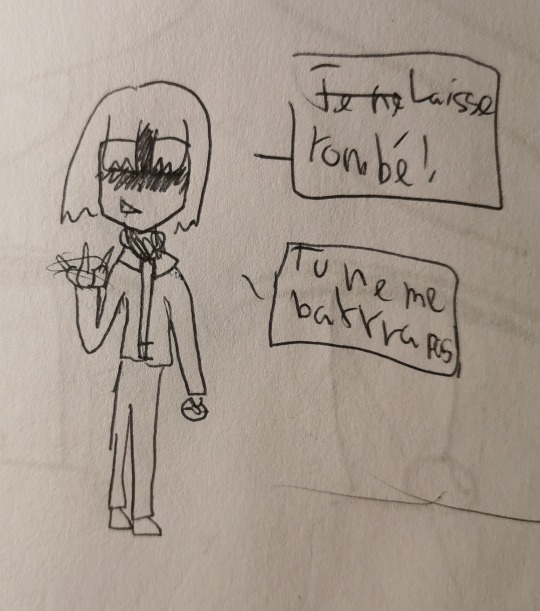
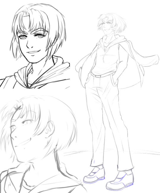
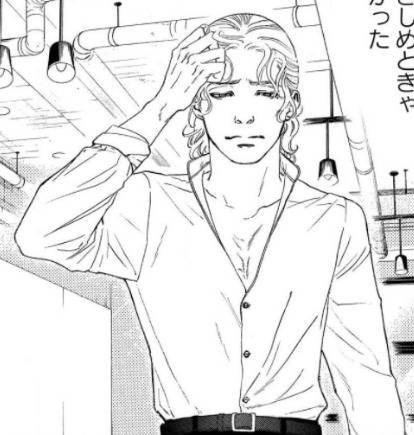
#no redraws we go first sketch like men
Photo
19.05.23 - A small update!
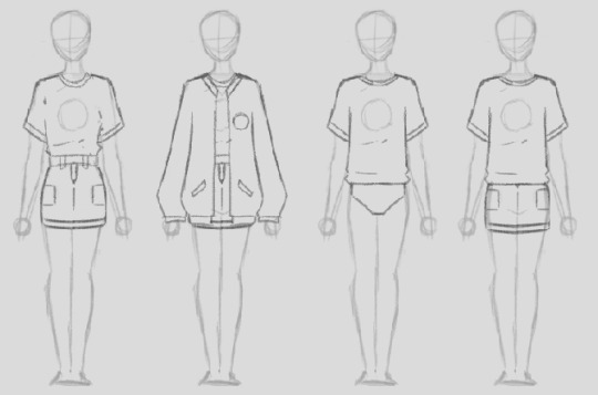
When designing stylized and animation-friendly characters first, for a game that will likely contain more detailed versions of these same designs... you eventually hit the wall of ‘how?!’
The heavy inks are a strong contender, But as always, the scary part is nailing down the final designs! After all, they’re gonna be the same even as i improve on drawing them. I have more than enough to do as is, and i wont be able to redraw character portraits forever! Some of these already have serviceable sprites in-game, but most are already a couple of iterations old. Such is the horror of working on longer projects!
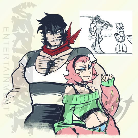
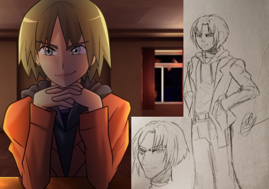
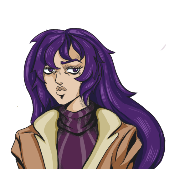
Anyway, here’s a few sketches. Portrayed here is our main character being bothered Alta, the smug, self-declared king of botany.. who happens to have a liking for strong monster-wrangling men like yourself!
Second picture is our lovely shopkeeper Selma, who is your go-to woman for any fishing-related needs! She is a goth moray eel mutant, and mother to the precocious, cheerful Sara- who at times seems to be taking the business more seriously than her mother.
I’m looking forward to spriting Alta and Sara, as i have a vague idea of how i want them to move. Selma will probably need some further concepting, as i dont think i’ve animated someone as wide as her before. I really enjoy her design, and i want her to look cool as well!
Without a doubt though, i think Alaska will be the most challenging and demanding. Now THERES a can of worms- Selma will probably be great in preparation for that.
I hope you all are well! Summer is approaching now, and its very welcome. Its been great seeing the ground again after the sheer amount of snow we had this winter.
-Hauk
#fangst#gamedev#update#fishing#game#rpg#platformer#action#Character Concept#concept art#character art#GameMaker#talking about stylization and animation#girl help
29 notes
·
View notes
Note
hi I hope this doesn’t sound like a demand lol but I love how you draw jupiter and I hope you draw him more
your art is so cool by the way I really like your character lineup 🥺
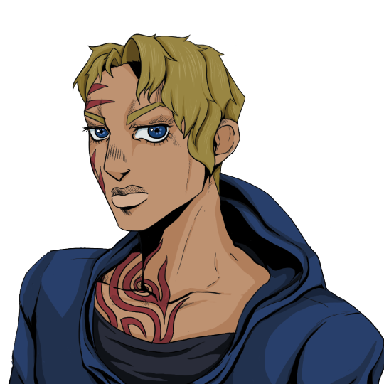
Thank you so much!! I literally never draw Jupiter, on account of my inability to draw 1. adult men and 2. beards, BUT it’s something I need to / want to get better at. The only other time I’ve drawn him was that lineup which I did super quick, so it was fun to try and think of an actual design so I can try to draw him more!
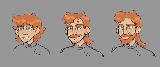
[ID: Three half-colored digital sketches of Jupiter North from Nevermoor. They show him as a kid with messy hair, a young adult with a mullet and mustache, and an adult with longer hair and a fuller beard. End ID.]
Details on my Jupiter design / headcanons (?) for his life under the cut:
I started with the middle— in my layers, I dubbed him to be “teen” Jupiter, originally intending for him as a senior scholar, but as time went on I figured he was more like, early 20s young adult Jove. The Wunsoc sweater is just still there on the adults because I didn’t want to redraw <3
I feel like Wunsoc, especially with Dearborn and Murgatroyd prowling the halls, holds its student’s appearances to a certain standard. Sure, society members are representatives of the society for the rest of their lives once they graduate, but their time in school is their first introduction to that life. It's their debut as society members. We see this in a lot of stuff with Holliday, in Hollowpox and in the one Silverborn snippet, how she's manufacturing an image for Mog and co. and physical appearance plays a part in it.
Going with this: I feel like Wunsoc would expect their students to keep their appearance clean and approachable somewhat. Jupiter gives me a vibe of the kid who had a crazy growth spurt, and was able to grow a beard before graduating– BUT I don't know if Wunsoc (really just the Scholar Mistresses) would be crazy for that. So I imagine that he's relatively clean-shaven for the most part, nowhere near modern Jove, and then starts to grow out his facial hair a bit more as a senior scholar where I imagine things would lax a bit, and then just commit fully to growing a beard once he properly graduates.
So young adult Jupiter is perhaps in his early 20s, a somewhat recent Wunsoc graduate. I'm a mullet Jupiter truther, where his hair is longer in the back, and had to represent that. Younger Jove's is messier and more fun; he's not too concerned about his image as he hasn't quite reached that laundry list of titles and accolades yet.
Present-day adult Jupiter is still rocking the mullet style, just now it's longer and styled a bit more professionally. But let's be real– it doesn't stay this way. It totally gets easily messed up from his hats, and Jove loves to have fun and entertain people, Plus, he's a busy man, constantly stressed and running around. While the hair here might be great for say, a formal meeting or a magazine cover, the hair most folks end up seeing him with tends to be a bit more wild. He definitely starts to resemble his younger self's hair more after a rowdy night or a stressful endeavor.
Kid Jupiter– not much to say here, tbh. I figured I'd stick with the longer hair he has as an adult, kinda rowdy. Not a mullet yet, though! I was thinking of the part in Nevermoor where he starts talking about the rules he broke and stuff he got up to as a Wunsoc student, and how Hawthorne started taking notes, and made his hair similar to the rowdy hair of our favorite bestie. However, while Hawthorne's hair is curly, I'm of the belief that Jupiter's hair is definitely pretty straight. So no curlicues for him </3
Hopefully now that I've started to nail down a design for Jupiter, I can draw him more!! I always have soooo many Nevermoor ideas circling around in my brain. I love thinking about designs for various characters and the reasonings behind different aspects of their appearance.
#asks#nevermoor#nevermoor fanart#jupiter north#I have an issue of drawing super small on super large canvases so. sorry for blurry screenshot lol#my references board was just. ewan mcgregor and domhnall gleeson lol. heavy on him tbh#if you saw this in the discord I moved the eye highlights. no reason other than vibes. idk how they work tbh it’s just for fun.#I can always expand on my general philosophies (?) for when it comes to drawing characters progressing thru time#/ at different stages of their lives. I have lots of thoughts.#it's easier to apply to adult characters like squall + jupiter and then characters with active development throughout the series like mog#meanwhile other characters like 919 and etc haven't really been through anything Revolutionary yet that I feel would change how I draw them#anyways I'd love to elaborate if anyone has any Qs. was gonna include in this but didn't want to hide it under a cut after a jupiter ramble#i really need to post more nevermoor art. I look on here and realize I've actually barely done much lol.#but also I'm the busiest person alive and never draw and just think abt it so. oops. 🤷
31 notes
·
View notes
Text
My obsession with Trip really goes way back huh
Welcome to: Owl exposes their art evolution through their many itterations of Trip from Pokémon Best Wishes!
It all started circa 2011. Unfortunately, only one drawing featuring Trip survived the intense purge of any art from this dark period of my life. All I can tell you is that I also drew in 2011 a full on comic about him and you'll have to believe me on that one.
My very first digital art, in 2013, was also representing Trip with a random OC of mine (I think her name was Evangeline or something to that effect). I actually posted it years ago on a Pokémon Forum. Yeah, didn't get a whole lot of love. It is to note that this one is the SECOND drawing I made digitally of Trip. The first one is most likely still sieging in my father's old laptop.
Fun fact, this was drawn on Paint.NET using a mousepad.
I also found in a sketchbook another one I drew during this time period, this time with some other characters. It's kinda wild how my artstyle was fluctuating at the time.
I then came back to drawing mostly traditionally. I got a bunch of blank sketchpads in 2014 at an art store and instantly got to work and drew the entire cast of Best Wishes for some odd reason. I also found another one. While it's undated, I'm assuming it's from the same timeperiod because of the artstyle. Gosh I liked drawing twink bodies for men huh? That... contrasts a lot with the amount of JoJo looking characters I like to draw these days.
I found some odd sketches from 2015 here and there. It's mostly a try at a realistic portrait and a sketch I made with ink. I remember being very proud of those two when I first made them. I have no clue who this other character with him is meant to be though. Maybe it's still Evangeline or something. Really goes to show how much I changed my view on dynamics and such I suppose. I called it "Rolling Trainer" cause I am a genius who got way into Vocaloid in middleschool.
Next is 2016. It was lodged in a very short sketchbook I used during an internship. I LOVED oniisuu's art style and tried to do chibis like them a LOT. Also I left in the text so that we can all appreciate the cringe :DD As you can see, I sort of thought my obsession for Trip was just hate for some reason since I really didn't like Best Wishes? Like don't get me wrong, there are a LOT of things wrong with Best Wishes but with age I realized that the reason I was so angry at how it was handled was because I loved the characters and thought they deserved better treatment. So it's kind of funny to look back and see how I just genuinely thought I hated this random minor character when I'd draw him pretty much all the time.
After that, I think I took a pretty big break or just lost most of my art of him because the next I found was in 2019. It has a very self aware note next to one of the drawings and the next one has an ink illustration. We can really see how my proportions improved over the years and how my style became more defined, going more towards "semi-realistic". I personally like the shortcut on the arm. I don't think I used a reference so that makes it pretty nice honestly. Also, as you can see, that's when I started drawing Trip with his hair going a bit up for his fringe. I have NO clue why I've been doing this since recently even though it's NOT in his design but it's there.
I found another art made, I think, in 2020 this time. I had been drawing pokémon falling down for a fabric pattern and just drew every pokémon I liked from each generation, a pretty nifty thing I might show in its entirety as it spans over 10 pages or so, and I drew some trainer characters for each gen. And of course, y'all know who I drew for gen 5. I love how my note next to him is just so tired with living. I also redrew the above illustration with watercolors. Doesn't look great but eh.
I also did a redraw of one of my earlier digital art (2013) this time kinda showcasing what I like to do in term of dynamics these days. So huh prepare thyselves for 17 year olds Trip and Eva.
Buff women. Anyways, I got some small digital sketches for 2021, nothing special I never completed them. I might finish the one on the right because I genuinely like the dynamism behind it, how flowy it is, the perspective and also one of my old hc that his hoody has no sleeves.
And finally, the moment we've all waited for, 2022. I am currently 21 and this monster still has not left my head. He's here to stay so I might as well embrace it and return to my good old brain rot. It kinda all came back when I just doodled him on the back of a receipt as stupid as it is, and really, that's a good summary of the kinda place I usually draw Trip on. He always comes back, unannounced, into my life and I draw him randomly onto any surface available.
I hope you found this dive into my art journey motivational or just funny or something. One thing is sure: I'm not stopping drawing Trip. He's been living rent free in my brain for 11 years, at this point, he's staying, it's too expensive to try to evict him, I tried. So huh, if ya want more Trip content I guess follow my blog??? I'm currently making a sprite replacer for BW to turn the MC into Trip and maybe might do a sprite replacer for BW2 as well (though that'd mean redrawing all the costumes at Pokéwood... UUGHHGHGHGHHSDGHDFJSDGfyzeggf) and I also like to shitpost about him and write stupid fanfics about him sometimes so don't hesitate. I'll see you all later, take care of yourselves!!
#art#art journey#sketchbook#sketchbook tour#sketchbook flip through#Pokemon Best Wishes#pokemon best wishes#pokemon fanart#pkmn#pokemon#Trip#Shooti#Shooty#Pokemon Anime#Traditional Art#Digital Art#art motivation#Ok I might be obsessed#living rent free in my head#I wish I could evict him#pokemon trainer#pkmnart#pokeart#rival trip#owl does art
16 notes
·
View notes
Text
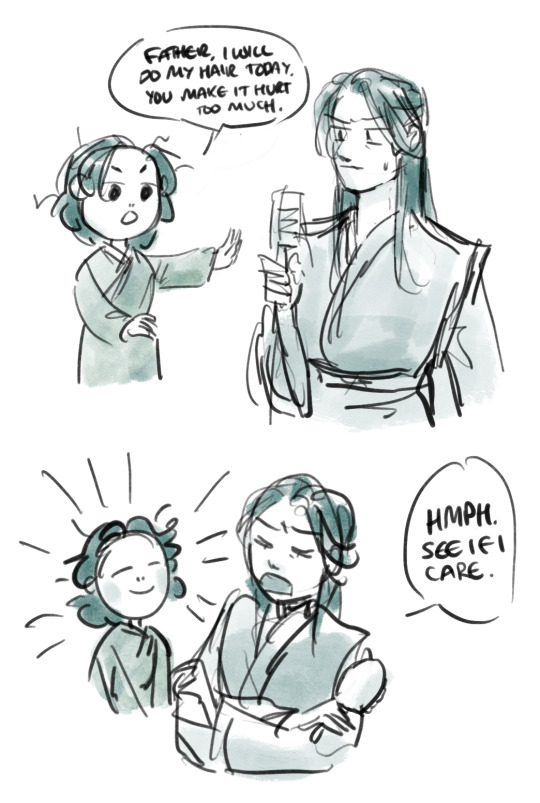


Shen Qingqiu can’t help but find Shen Yuan’s attempts at independence highly amusing.
From the same AU:
X X X X
#Shen yuan is sqq’s son#no redraws we go first sketch like men#scum villian#comic#my art#original shen qingqiu#shen yuan#svsss
471 notes
·
View notes
Text
Salt-Fic September Day 8: Stolen
Marinette was incredibly excited. She had heard about a design contest being held in Gotham. It was being sponsored by the Waynes, who told her about it since they were so close. Marinette had met the Waynes when her family went on a trip to Gotham to visit an old family friend, Alfred. Damian and Marinette became quite close on the trip and they soon began a long-distance relationship.
---------------------
When the Wayne family decided to sponsor the design contest, Damian told Marinette all about it. “We will obviously not be judging the contest because of the conflict of interest. We are just sponsoring the reward, a full expense trip to Gotham.” Marinette was ready to start designing right then.
---------------------
She decided to create an outfit based off of Robin. She spent day and night working on the design in her sketchbook. She hardly ever put her sketchbook down for the next several weeks. This didn’t escape Lila’s notice. Lila was curious what Marinette was so obsessed over. Then she saw the information for the design contest in Gotham. She was sure that was what Marinette was obsessing over. In one of the rare moments that Marinette left her sketchbook, Lila took a look at her sketch that she had been working on. When she saw the Robin inspired look in the book, she knew the design was for the Gotham contest.
---------------------
Lila hated to say it, but the design was really good. Too good for Marinette. Lila waited for a better moment to try and take the sketch. The moment came that Saturday. Marinette was in the park working on her design when an akuma appeared. Lila wasn’t sure where Marinette rushed off to in such a hurry, but she wouldn’t question it. Marinette had left her sketchbook on the bench and raced away when the akuma alert sounded. Lila took the opportunity and grabbed the book. It was the perfect crime, cause the park was now empty and Marinette had never even seen her. It would be hard for Marinette to prove that Lila had stole the design.
---------------------
Lila’s plan now was simple. She would enter the contest using this design and most likely win with a design this good. Then when she went to Gotham, she would find Damian Wayne and get him to fall in love with her. Then Lila would have the fame and fortune that she always dreamed about. For once that useless Marinette had done something good for Lila. Lila was over the moon, excited for the bright future in front of her. Meanwhile Marinette was freaking out.
---------------------
Marinette was in a panic. She had no idea where her sketchbook had gone. Not only was her contest entry in there, but she had several commission sketches in there too. When Damian was video called her that night to chat, he saw Marinette tearing her room apart in a complete panic. It took a minute to get her attention, but when he did, Marinette told him everything. “I just can’t believe it. I don’t even have enough time to redraw the sketch and work on the commission assignments. I have to focus on the commission requests. I hate that I won’t be able to enter the contest.” Damian wished that Marinette would be able to enter the contest, but he knew she was right. She didn’t have time to completely redo the sketch.
---------------------
Lila felt comfortable with her chances of winning. She had just submitted her entry and was now waiting for news. A few weeks later, she received word that she had won the contest. She was ecstatic. She started planning for her trip, but kept it quiet to keep Marinette from getting suspicious. Little did Lila know; everything was about to come crumbling down around her.
---------------------
Bruce was having a long day. Everything was monotonous and boring. He decided to at least look at something interesting and see the design that won the contest. He wished Marinette had been able to enter, but Damian had told him what had happened. Just as he pulled out the winning sketch, Damian and Jason walked into his office. Jason saw the sketch in hand, “Oh, is that the winning design?” Bruce nods his head and the two boys come look at the design too. What they saw quickly infuriated them all.
---------------------
The design seemed normal, and based off of Robin’s costume. But the more they looked at it, the more familiar the style seemed. They could have sworn that this was made by Marinette. Then they saw the proof. In the collar of the design was the golden embroidery that Marinette always used to sign her work. Rage coursed through all three of the men when they realized this person had stolen Marinette’s design and tried to pass it off as their own. Damian saw that this sketch was submitted by Lila Rossi, and recognized that as the name of the girl who had been tormenting Marinette for months. At first, they were just going to take away the prize from this Lila Rossi, but then they realized that they could also get some vengeance for Marinette. With that in mind, the group got to work planning.
---------------------
A few days later, Lila was in class regaling the class with a new story when everything went wrong. The classroom door opened right before lunch and in walked three men. Everyone immediately recognized them as part of the Wayne family, Bruce Wayne and two of his sons, Jason and Damian. At first Lila was confused, and wondered if this was part of the contest prize. If it was, then she was excited. But it was quickly realized that was not the case.
---------------------
Bruce asked, “Which of you is Lila Rossi?” Lila stood up and shyly said, “I’m Lila Rossi.” Lila expected that they would congratulate her for her win. But instead she heard, “We have come to tell you that your prize has been taken from you. It has come to our attention that you used a stolen design as your entry. As such, your prize has been revoked and given to the second-place design. You have also been banned from all future events that my family may sponsor.” The class was in shock at what was just said. Including Marinette. She had no idea what had happened or that the family was coming. She quickly figured out what happened, and that Lila must have been the one who stole her sketchbook.
---------------------
Alya stood up, ready to defend her friend from what she thought were baseless accusations. “Why would you say that. Lila would never cheat. What proof do you have?” Bruce turned to face the young journalist. “Quite simply, we saw a design element that we are familiar with. The design was made by Marinette Dupain-Cheng. The embroidery that Marinette puts in every design to sign her work was in the collar of the design.” Bruce pulled out the design and showed the embroidery to the class. Alya was in a hard spot. She didn’t want to believe that Lila was a liar, but the proof was staring her in the face. Alya knew that Marinette did use that embroidery, and Lila’s name was clearly listed as the person who submitted the design.
---------------------
Lila tried to fix things, but it didn’t work. The class quickly realized that Lila had lied about everything. Lila became the class outcast and the class made amends with Marinette. Lila ended up transferring away, to try and find a new place where she could gain control of a class again. Marinette never heard from her again. Damian and Marinette also became closer as time went by. While Marinette was upset that she hadn’t been able to enter the contest, she was glad things happened the way they did. While it had been rough, and Marinette had been upset, all of that had caused Lila’s downfall and Marinette couldn’t be happier with the outcome.
Hope you guys liked it! @maribat-central-official
#saltfic september#salt september#ml#ml salt#ml fic#ml fanfic#ml salt fic#ml salt fanfic#lila rossi#Lila exposed#lila exposed fic#lila salt#lila gets exposed#ml class#ml class salt#class salt#miraculous ladybug#miraculous fic#miraculous fanfic#miraculoustalesofladybugandcatnoir#miraculous salt fanfic#miraculous salt#miraculous salt fic#maribat#ml x dc#miraculous x dc#maridami#daminette#damimari#damian x marinette
579 notes
·
View notes
Text
10 Dance Vol. 6 Special Edition overview
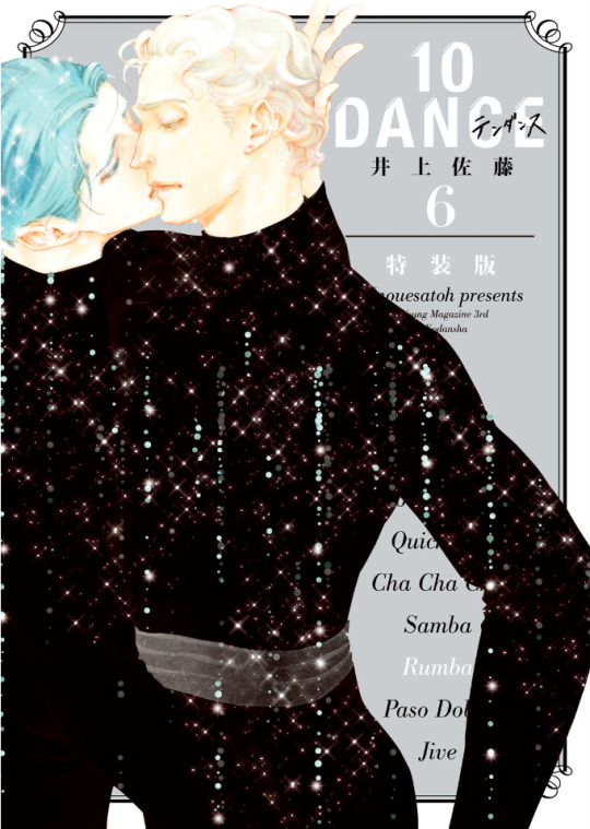
Volume 6 of the 10 Dance manga was released in Japan on March 18th, 2021. As with volumes 4 and 5, there are both regular and special editions available. In this post, I will provide an overview of the release, including observations on changes that were made to the chapters compared to how they were printed in the magazine, plus summaries and select scans of content from the special edition booklet.
It is often the case that when chapters come out in the manga magazines, they aren't always fully polished, and since I became highly familiar with this run of chapters from the summaries I made, several things immediately jumped out at me as I went through the book. First of all, though chapter 29 was split into two parts and released in subsequent months in the magazine, these two halves were combined into one chapter, with no indication they had ever been separate. I assume that they were always intended to be one chapter, but since the full chapter was not completed before the deadline (and it was a month when 10 Dance was being given the cover image, so not possible to delay its release), it was simply split over two months instead.
For visual changes, the most common alteration was scenes that originally had little or no screentone having it added in:

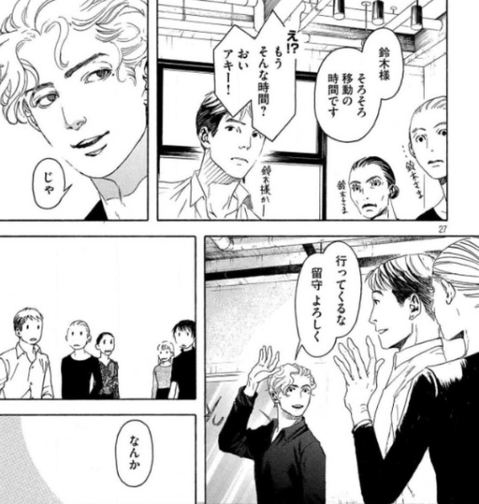
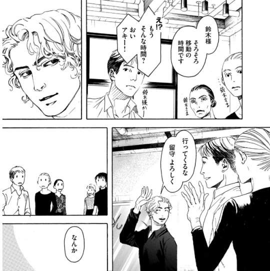
There were also some instances of either slight panel redraws, or complete replacements with new panels. None of these were from particularly important scenes, so it could just be Inouesatoh or someone on her team didn't like the look of the original panels and wanted to change them. The following example has a bit of both, with Suzuki in the upper left corner being replaced, and his eyes being redrawn in the lower panel:
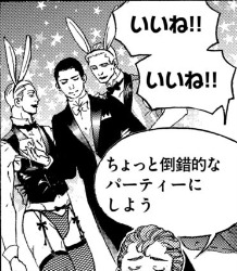
Personally, the most amusing addition I noticed was when Max was thinking about throwing a party. Originally, we didn't see what he was envisioning, but in the volume, an addition has been made in the background: the New Year's piece Inouesatoh drew with sexy men dressed as cows, except now they're bunnies!

As for dialogue, it appeared to be almost the same in both versions throughout. Some minor exceptions include a spot I found where the dialogue was put in a different order, swapping Sugiki’s lines between this panel and his first line on the following page (in addition to another altered panel example):

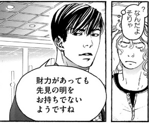
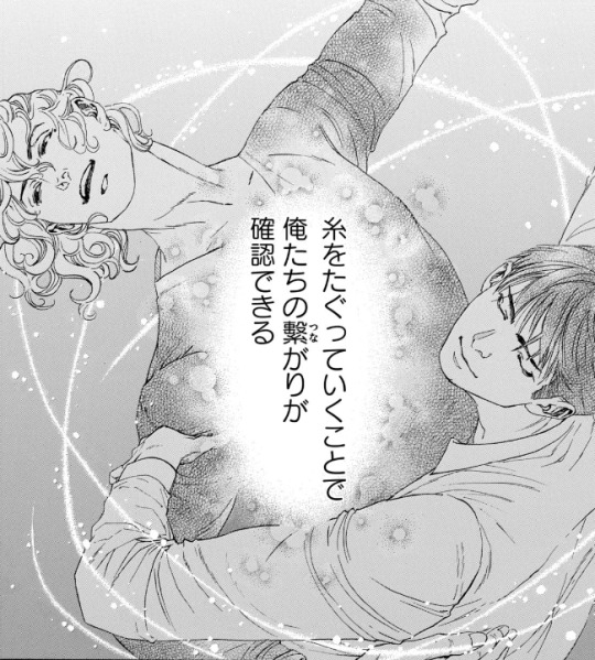
As well as in this shot of Suzuki describing how they tug at the thread that connects them through their dance. Whereas before it put the word “dance” next to the part about tugging on the thread to specify what was meant by that, it was deleted in the volume. And while it was originally described as “affirming that we’re connected”, this was also tweaked a bit to be, “affirming our connection”.

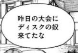
There were a couple instances of character names being different from when they appeared earlier in the story. In this volume, two characters who were last mentioned back in volume 2 (Lucas Calvo, one of the champions at the table in Blackpool, and Deeks, who Ernie said hated Sugiki because he "stole" his girlfriend), either from typos or intentional changes, weren't the same as before. Lucas' last name was written with a 'g' sound (ガルボ) instead of a 'c' (カルボ), and this change carried over to the volume. On the other hand, Deeks' (ディクス) name got transposed as Disc (ディスク) in the magazine, but was fixed in the volume.

There was a typo that unfortunately made it through to the volume (but could perhaps be fixed in future printings). In chapter 34, when Norman is testing Suzuki's skills, he flashes back to Sugiki taking the national title from him several years earlier. The text in this scene, written in English, incorrectly states that Suzuki won the championship, rather than Sugiki.

The volume also includes the usual additions that are not present in the magazine, such as the under the cover flap comic, and Inouesatoh’s notes about each chapter.
The cover flap comic (which looks very much like a sketch, compared to previous ones that have had more complete art), features the Shinyas during a practice session earlier on in the series in December, where Suzuki complains that Sugiki’s Latin just isn’t sexy. Sugiki suggests that he can practice being sexy by wiggling his butt around to write a message in the air. Suzuki worries that if he starts writing out “love” or something, he’ll have to run away and escape. Sugiki gets started, and Suzuki calls out each letter that he can make out from his elegant butt bouncing. After figuring out he’s written “M-E-R-R-Y”, Suzuki guesses that he’s writing “Merry Christmas”. Sugiki gets mad that he said it aloud before he finished writing his message, and says he’s going to leave. Suzuki says, “Wait, I love you,” as narrative text says that this somehow turned into a love story in one panel.
And here are some tidbits I found interesting/amusing from the chapter notes:
She thinks readers who are fans of pecs will like Saichi.
She’s not sure if readers will love Max or hate him, but she personally likes him (sorry Sensei, I kinda hate him lol)
As of chapter 32, a portion of the art is now done digitally.
The epic “last dance” scene from 33 was something that she had planned since the beginning of the series, and it ended up being 8 times the cost for a typical chapter.
Special edition booklet:
The special edition comes with a 48 page hardcover booklet that includes a variety of different extras, divided into 8 sections called “heats”.
Heat 1 is a newly drawn, 12 page parody manga. Back in September 2020, Inouesatoh put out a request on Twitter for fans to send in their suggestions for an erotic side story. Putting the characters in a high school setting was the most requested scenario, so she chose this idea as the basis for the story. The title is “And All That Jazz” (the premise makes this somewhat confusing to summarize, so keep in mind that I’ll mostly be describing their actions based on the soul rather than the body, but will use quotation marks if it’s about other characters and who they think they’re addressing. It’ll all make sense, I promise...I think :P)
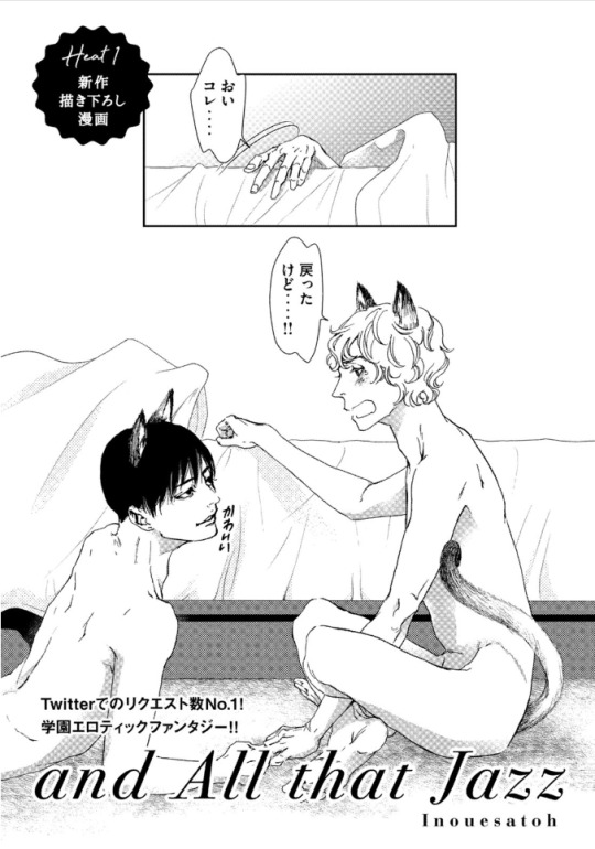
(The title page actually depicts the ending of the story, so I’ll come back to it later). It starts with Suzuki narrating his introduction, saying that he’s a transfer student to the Standard Academy. He really doesn’t get along with a guy named Sugiki, but for some reason, the two have now switched bodies with each other. Sugiki opens his shirt and inspects his new physique in front of other students, as Suzuki yells out asking what the hell he’s doing to his body. They look at themselves wearing each other’s expressions, Sugiki seeming surprised his mouth can gape open like that, and Suzuki wondering what happened to his body’s facial expression muscles. The bell rings and Sugiki heads off to class, as Suzuki is baffled that he can act so calm about this.

Sugiki perfectly reads a passage aloud in English class, something everyone (including the teacher, who looks like Norman) find unusual coming from “Suzuki”, as they wonder where his usual hearts are. Suzuki makes the decision to enjoy living as Sugiki for a bit, and is shown getting flirty with several girls. He notes that the more serious personality in his regular body is also strangely popular, though with a very different crowd.
A student named Alberko (Alberto in a girl’s uniform) shows up and says that “Sugiki” was supposed to have lunch with her(?) today. Suzuki says that he thought Alberko was going out with Dorou (a masculine alteration to Dolores’ name). Ernie and Suzuki watch as his harem falls apart with Alberko running amok. Ernie comments that both “Sugiki” and that transfer student have been acting weird all week, and he asks if something happened. Suzuki internally reflects back to one week earlier, when he was relaxing in bed in the infirmary. Sugiki comes in and accuses him of skipping class, and Suzuki tells him to mind his own business. He thought this would turn into one of their usual fights, but he can’t believe that actually happened instead...

After school, Sugiki asks Suzuki if they can go home together today. As they’re walking, Suzuki asks if Sugiki realizes what it was that made them switch places, and Sugiki says he does. Suzuki says that in that case, they know how they need to fix it, and they should go over to his house. Sugiki asks for clarification of whose house exactly he means by that.
As they start to get undressed, Suzuki says that he always thought his mom and sisters were annoying, but after a week apart he really misses them. Sugiki promises that he’ll make sure he can see them soon. Suzuki claims that he’ll be the one making Sugiki come, and Sugiki asks how he can talk like that when he was the one who looked like he was about to cry when Sugiki first touched him in the infirmary.
Sugiki peeks into Suzuki’s pants and wonders if he won’t get hard unless he touches him. Suzuki thinks it’d be weirder if he could get hard while looking at his own face, and wonders if Sugiki has AI in his crotch or something (Sugiki contends that it’s not his body). They fool around with each other until they finish, and Suzuki wonders why they didn’t change back yet. Sugiki suggests that maybe it needs to be just like the last time to count as a complete set, when they went at it until they fell off the bed, so both agree that they need to go for one more round. This then ties back to the title page, where they’ve finally managed to get back into their old bodies, but have now sprouted cat ears and tails.
Heat 2 of the booklet is 8 pages long, and contains short comics and illustrations that were not previously included in the volume releases. The comics include “How to 10 Dance”, a one-page comic with the Shinyas demonstrating the tango. Their privates end up touching, and Sugiki seems highly amused, gleefully asking Suzuki how it feels. Suzuki says that he was the one who got all bent out of shape over that back in volume 1, and tells him to lay off the sadist mode since they’re not dancing Latin right now. The second comic is “2nd Step”, and shows a glimpse of how the Shinyas were with each other after Suzuki gave the go-ahead for kissing. In fact, Sugiki ends up kissing him so much that Suzuki’s lips get sore and swollen. Sugiki then tries to kiss his neck as an alternative, but Suzuki’s not having it. The third comic depicts Suzuki’s first time in a public bath, where he realizes that Japanese people aren’t fully shaved everywhere like he is. Some of the old guys talk to him and slap their balls with their towels, and Suzuki, seeming a bit confused, gives his own balls a slap, too. After the comics are a selection of illustrations that were never used in the volumes, including this one from a Real 10 Dance event in 2018:

Heat 3 is 18 pages, and contains a variety of colored versions of both chapter covers and scenes from the manga, a couple of which I’ll share below:

Heat 4 includes 3 pages of insight from the professional dancers who consult for the manga, in which they explain the moves shown in specific panels.
Heat 5 is a single page look at Inouesatoh’s work space.
Heat 6 is 3 pages worth of advertisements that have been used to promote the series, including things like ads that were posted in subway stations:

Heat 7 is a single page look at the storyboard for chapter 1 of the manga.
Heat 8 is a single page showing the covers for foreign editions of the manga (Taiwanese, Korean, North American, and French).
Finally, there’s one last page with a thank you message from Inouesatoh, including an absolutely precious illustration of the Shinyas in happier times.
And that’s that! This really is an incredible release, and I’d definitely recommend picking up the special edition if you can. CD Japan offers direct international shipping, and I’ve also seen that Kinokuniya lists it as “available to order” currently (though they don’t appear to have stock on hand, so might take longer).
33 notes
·
View notes
Note
Are straight up inking after just getting a skeleton sketch down?! Are you a fucking god????
funfact this is actually the first time i’ve ever done a skeleton sketch 8^y
normally, my “sketch” and “inks” are one in the same. just go in and clean up the “sketch” to look nicer instead of redrawing the whole damn thing. faster that way. efficient
no sketch layers we die like men
6 notes
·
View notes
Text
Art style challenge: reflection
So, during this very challenging months and 3-4 weeks of social distancing I was stuck. Drawing became boring and I was in state of stale purgatory and it was annoying me. However, my sate of monotony came to a halt whenever I watch “Cheer Up!”, a show/DnD campaign created by Wrapped Lamp that was set in the world of JoJo, but in a bleak setting. It's wonderful, and the characters are brilliant. (This a link of the first episode on YouTube: https://www.youtube.com/watch?v=dVF6ShkYqU0 )
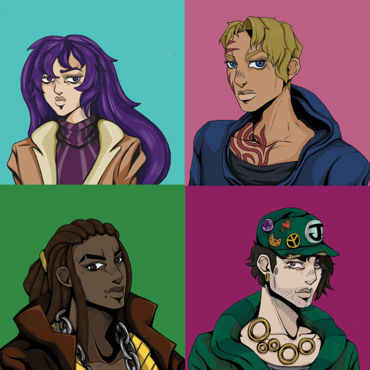
As I was watching the show I decided to challenge myself, I have never drawn in Hirohiko Araki’s style before. I have never tried to draw like that because it is a simple but complex approach to illustration that is very hard to draw, let alone replicate, but I tried and I proud of the results. So because of this I set myself some rules:
1. The illustrations must be based on the player/character icons in “Cheer Up”
2. They must look like protagonists that could be in the anime but are not copies of existing Jojo characters. (Because that's cheating)
3. Each illustration must be done within 3 days. (A personal thing for me, I get bored of drawing the same illustration for more than 3 days, if you want try this you don't have to follow this rule)
With these rules, Photoshop and google images by my side I was ready. And this is how it went!
(I am putting each reference of every character in groups of eyes, face, hair and body because I had to to a lot of research for this style, I have put the main influencers down there were more but are not important)
My process
At the start of all my attempts I create a beginning sketch of original icons. I am going in blind so doing this shows me how they created it without tracing it, sort of like life drawing. I then made a rough line drawing to see what the design looks like without making it official. I sometimes draw a second outline to figure out the details and then I compose the final line work but I also have the original art, the many characters in Jojo Bizarre Adventure and real life examples at all times. Paint the hair, skin, clothes and then create the shading and then they are done.
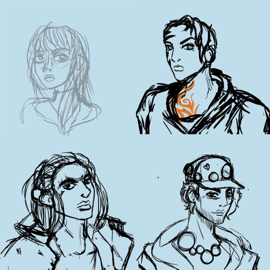
The first sketch

rough line work

The final outline with the shading
I also chose to try not to use part 3 as reference material. I personally dislike the seasons animation and character design. I don't know what happened in that season but they look terrible. It took me 3 tries to finish Stardust Crusaders and the art work was the main reason.
The Characters
Isadora
Played by jay (Stabbyness)
Isadora was the first character I drew. I chose her because the next live “Cheer Up” episode was in 3 days and with that time I decided to give myself a fighting chance by drawing her first (I find women easier to draw than men).
With Isadora I had to also decide what Jojo season they would be in from the start, I wanted consistency because they are the protagonists. I decided to do a mix of part 4 but was mainly based in part 5. For me I liked the colour shading of part 4 but loved the structure and graphic style of part 5. This made shading and highlights easy and consistent.
Because I had never drew anything like Jojo I had to use multiple characters as a frame of reference, (I did not copy the originals, if I did then there would be no point of doing this challenge in the first place). I thought it would be good to show how many characters I referred to to help with this process.
Isadora was the easiest to draw out of the 4. She has a traditional female design, her only challenge was her eyes. As the first one this one was done in time and and looked good at the time. However now that I have got the hang of drawing in this style I want to redraw her again to show myself how much I have grown during this challenge.
Characters that i used for art style reference
Eyes: Trish Una, Narancia Ghirga and Yukako Yamagish
Face: Trish, Erina Pendelten, Yukako
Hair: the whole part 5 crew (I had know idea how draw Jojo hair at this point)
Body: Joylne Jostar, Yukako
Donna
Played by Will (bigmovingtarget)
Donna was the hardest overall draw. She is a wonderful character but she does not typical female build. She is a MMA fighter, a tattoo, wears a hoodie and jaw that could cut glass. This created some problems, Araki characters rarely wear hoodies and his female characters are not normally drawn with strong features, they don't ever have a massive tribal tattoo. Also Araki’s female cast have a very small range of hair styles so I had to look at the male cast for inspiration and information because donna is an unusual design!!
Her tattoo was very difficult and I was in a pickle for the whole first day. The original icon has only a few red marks on her face and the thumbnail of “Cheer Up!” (created by Six) depicts Donna with her back to the camera and looking with side of her face without the tattoo!
This was driving me crazy.
In the end I had to reference real life tribal tattoos and the famous tattoo from the movie “Dusk till Drawn”. I like the result.
Her hoodie was also an unusual problem because I couldn't find a single character in the cast sporting a hoodie at the time of drawing her. So I wanted to draw her with a hoodie that the cast would wear. So when I was looking at fashion editorials I found Billie Eilish wearing the perfect hoodie and had to try to replicate it. (Elle 2019 interview, just incase you want to find it. Its the red coat!!) I also referenced part 1 and part 2 for her body because the those characters where drawn to fight, they are not frail and fawn like in appearance and think that is perfect donna.
Characters that i used for art style reference
Eyes: Josuke Higashikata, Yukako, Lisa Lisa and Gyro Zeppeli
Face: Gyro, Jolyne and Lisa Lisa
Hair: Enrico, Yoshka Kira, Caesar Anthonio Zeppeli and Koichi Hirose
Body: Lisa Lisa, Gyro, Leone Abbacchio and Jolyne

Jack
Played by Christian
Jack was easy to draw because he looked like a Jojo character. Like Isadora, Jack has a typical male design for Jojo. This meant I had a pool of reference material for him and had finished him in 2 days, the only real problems where his hat, stubble and jewellery. Lucky most of Araki’s cast have jewellery and chains and Jotaro Kujo has hair as a hat! Jack was heavily based on Jotaro Kujo but I made sure that he wasn't a copy!
Stubble...stubble doesn't exist in Jojo.
Jojo’s Bizzarre Adventure has magnificent beards or clean shaven men, and sometimes they have facial hair. This was the main issue with this character because with stubble you don't have Jack. So I had to take the beard of Joseph JoStar and looking at real life stubble finally got his lovely 9 o'clock shadow that we have now.
Characters that i used for art style reference
Eyes: Joseph Jostar (part 2), Jonathan Jostar
Face: Leone, Jotaro Kujo and Burno Bucciarti
Hair: Jotaro and Robert E. O. Speedwagon
Body: a mix of the cast of part 5 with a little bit of Johnny Jostar (like Isadora)
This one was the start of really using real life as a reference. Although really started using them in Donna illustration, drawing men has always been a challenge for me so drawing from real life actually made it more like Araki’s style. I realised that Jojo art style is based in realistic body proportions. I honestly think that this looks better than the other 2 because of the life drawing I had to do.

JJ
Played by Arimnaes
This was the last Icon I had to draw. I left this one last because I needed the practice to give this guy any chance of working.
his face and body were not the issue because most of the main casts (in their respective seasons) have similar features but slightly different body heights and proportions. However, JJ’s hair was a difficult.
In my research I found a total of 2 characters that could have his ethnic style or texture for his hair. They were Enrico Pucci and Muhammad Avdol, and no one else. This ended in failure because their hairstyles are wacky and imaginative and JJ’s dreads just flat out don't exist in the Jojo universe. If they have his hairstyle then I must of missed it because I wasted a whole day solely on research!!! Anyway, after that that I looked at male braiding and box braiding to figure out the hair line. Although I had the hair problem with Enrico I personally loved his design, he was drawn with an attitude and I thought it worked for JJ.
Characters that i used for art style reference
Eyes: Enrico, Bruno, Joseph, Gyro and Giono Giovanna
Face: Enrico, Muhammed Avdol, Johnny and Bruno
Hair: Giono and Josuke,
Body: Enrico, Bruno and Caesar
Reflection
Although the process was difficult, I had fun drawing these characters and have gained new techniques in drawing that I struggled in the past. I can draw stylised shading, tattoos, clothes and male characters better than I could before. I also learnt that I can draw surprisingly quickly and had finished both Isadora and jack in 2 days. After this challenge i also gains a new appreciation for Araki and the show Cheer Up and the number of literal hours it must of taken them to create an immersive show.
However now I have to find something else to do whilst being stuck indoors!
#jojo bizarre adventure#art challenge#art style challenge#cheer up#surprise round#dnd#art pdp#fanart#blog reflection
9 notes
·
View notes
Text
Jojo’s Bizarre Adventure: Bizarre Beach! Torn Between Scylla and Charybdis!
JJBA part 4 fan fic. Chapter 3: Ride with the sun, defeat the whirlpool!
Summary: During his stay in Morioh, Jotaro needs to come up with a subject for his doctoral thesis in marine biology! Strange happenings in the waters of Morioh beach piques Jotaros interest, making him investigate strange sightings of a mermaid, followed by injured surfers! In hopes of finding a subject for his thesis he teams up with Kishibe Rohan and Joseph Joestar to solve the mysterious happenings! Is it the work of an actual mermaid or is there a Stand user lurking around the corner?!
Number of chapters: 9
Chapter 1
Chapter 2
Chapter 3
Chapter 4
Chapter 5
Chapter 6
Chapter 7
Chapter 8
Chapter 9
Total word count for all chapters: 12 749.
Chapter 3 word count: 978.
Authors note: this is my first fan fic, I tried my best and hope you will enjoy it!
You may also read it on my Ao3:
https://archiveofourown.org/works/20937995/chapters/49778429
The boat's engines roared as it made its way out into the water, Jotaro trying to head for the place where waves got big enough for surfing, which was pretty close to where to coast guard was patrolling.
“Do you have any plan for how to lure out the Stand user?” Rohan asked, waves splashing around them as he drove the boat.
“Yeah,” Jotaro answered. Jotaro did, in fact, not have a plan. As the recent attacks seemed to be random he still had no clue as to how it happened but was hoping their very presence would be enough.
“Around here, stop,” he said as they arrived close to where Jotaro had seen the wave the first time yesterday.
Rohan killed the engines, “Okay, now what?”
Jotaro was silent.
Rohan was silent.
Jotaro remained silent.
“… the plan, Jotaro-san…?” Rohan asked, impatiently, with his paper and pen ready.
Star Platinum appeared behind Jotaro, “Ora!” and began to smash the water next to the boat with his fists, making the boat rock violently, “ORA ORA ORA ORA ORA ORA!!!”
Rohan clenched his hands to the boat, trying to not lose his drawing equipment, “You fool, is THIS your plan?!”
“Yeah,” Jotaro calmly answered thinking that it might provoke the Stand user to show up, believing it being attacked.
“Woaah-aaah nooo!” Rohan said as the rocking made a bunch of his papers fly overboard and into the water. Star Platinum stopped, Jotaro sighed looking disappointed into the water that was starting to settle down into calmer waves. And that’s when he saw it. Her.
“M-mermaid!” he said shocked, pointing down into the water.
“Mermaid?!” Rohan lunged over to Jotaros side, looking down into the water, starting to immediately make a sketch on his paper.
A few meters down, there was a slightly blurry image of a woman, with long dark hair and a tailfin.
Both men silently watched in awe over this bizarre happening, only hearing the writing of Rohan's pen and gentle waves, when the mermaid suddenly glow up in green light and the water started to splash violently around them.
“A Stand!” both of them said in chorus, as the water around them started to turn into a whirlpool, dragging the boat along.
Meanwhile, at the beach, Joseph had been waiting patiently and observing the boat with a pair of binoculars. Suddenly he saw the boat making strange movements, the water around it getting more violent.
“T-that’s it, they’re getting attacked! I should be able to find the Stand user now!” he shouted and put his hands to the ground, “Hermit Purple!” long purple thorns appearing from his hands, starting to create a map in the sand in front of him, showing the area of the seafloor where the Stand user hides; a quite rocky area with some corrals close to it.
“Jotaro!” Rohan desperately shouted hugging his papers and pen with an arm and holding the boats steering wheel with his free hand, “the engines won’t make it out of the whirlpool!” he was flooring the gas pedal with no effect.
Jotaro looked into the water but could no longer see the mermaid Stand; it had disappeared just about the same time as the whirlpool was conjured. What options did he have? Stopping time would not help them escape the whirlpool. Their best option would be…
“We have to find the Stand user, now! And beat the crap out of it!” Jotaro shouted over the sound of the mighty whirlpool.
“But we have no idea where it is! The mermaid just disappeared!” Rohan shouted back.
“OH MY GOOOOOD!” Joseph shouted as he saw the boat spin around into what seemed to be a whirlpool, “They won’t be able to make it back!” the old man sweated looking at the boat through the binoculars. He knew where the Stand user was, it was not far from the boat, and his grandson and favourite mangaka in the boat needed that information now. He looked down in the sand at the map Hermit Purple had drawn.
“Well well…” he said, dropping his coat on the ground next to him revealing his no longer very buff body wearing a t-shirt with a commission drawing made by Rohan saying ‘I LOVE CAESAR SALAD’ next to a blonde guy, “To think it would come to this, but this old man still has some tricks up his sleeve… I hope,” he said, not wholly certain, but this was no time for doubt. He pulled up one of the papers Rohan had given him and the bottle of ink.
“Hermit Purple!” he shouted, making the purple vines crush the bottle of ink, soaking themselves in the black ink and then quickly redrawing the map on the paper, with exactly the right amount of ink for it to dry out instantly. He then folded the paper into a paper airplane, took a deep breath, and focused. He pictured in his mind the place where to boat currently was, eyes closed, and starting to control his breathing, building up energy inside him. This was a technique he had not used for years; an ancient breathing technique to manifest sun-like energy through the body, and its name was…
“HAMON!” he shouted, starting to glow in a golden light bright as the sun. He took a stance, ready to throw away the airplane into the air. He felt the ripples of life around him and the soul of an old best friend lending his strength one last time. Now was the time, he opened his eyes.
“SUNLIGHT YELLOW OVERDRIVE! GO!” with all his energy built up, he unleashed it into the airplane, sending it towards the boat with tremendous speed and force. Panting, he stood at the beach for a second, seeing the airplane speeding away, then collapsing down to his knees.
“Give it all you got, Jotaro-kun!”
#jjba#jojos bizarre adventure#jotaro#joseph joestar#fan fic#jjba fanfic#jjba fan fic#fanfic#writeblr#writing
4 notes
·
View notes
Text
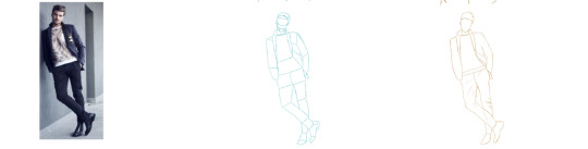
Practicing poses from reference images
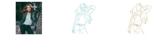
Now that I have started my journey of digital character design I need to explore being able to draw different poses for my characters. Here I am going to be getting several reference images and trying to redraw them. This part is to mainly focus on the poses so the drawings don’t need to have loads of detail in them. Firstly I started off by doing mens poses and tried to pick 3 that were different from each other so I was able to get more of a variety.
With this first attempt on the male pose I tried to do it free hand. I still decided to stick with the same technique of breaking it down into shapes which can be seen in the blue sketch of the pose. I then went on and did an outline of the pose. I think this turned out well but I didn't add in any hair and feel like the head looks out of place.If I was to do it again I would have it so that the head was done a bit better.

In the next attempt I decided to break it down into different shapes but I did this over the actual image to make it easier for me. I then went and did the outline of the pose in orange. I feel like this one went better but I feel like I should of left the face blank as we aren’t focusing on detail a the moment and are only focusing on on the pose.

The final attempt at the male poses is my best and favorite attempt. I decided to leave out the details of the face which I think was a really good idea. I really like the pose and think it is a pose that I would actually use in my game.
Here is the sketches with a darker background just so they are easier to see.
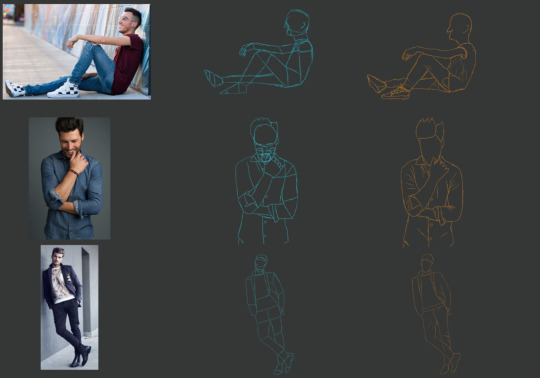
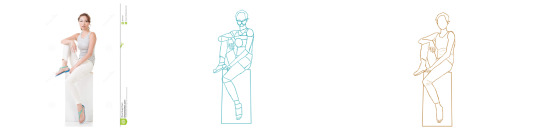
Now we are going to be moving onto female posses,These shouldn't be too much different to the male ones. This is just gonna be different as you have to incorporate female features.Here we have the first pose and I took the stuff I learnt from doing the male poses. I decided to keep the details out and mainly focus on the posses aswell as the clothing. I think that this one went well and that it would be the kind of pose that I would actually use in my game.
This next pose I think is also a nice pose which I might actually be able to use for my game as well. I still stuck tot he breaking it down to shapes before doing the outline as I find this to be a blot easier for me;.

Finally we come to the last pose which is the most complex out of the womens one as we have the lady sat down . I feel like the drawing actually came out quite well.

0 notes
Note
(1) Hello I am back!! I'm sorry it's been long, these past couple of weeks have had me swamped with homework :( and yet I still didn't do it all 🤡 also get ready for a bunch of messages because 1.) responses and 2.) my thoughts on Lockscreens. Spoiler: I am Emotional haha. Aww, thank you :') I used to think it was weird to give yourselves nicknames but I'm past that now haha. Another one I go by sometimes is "Lizard" because I stick my tongue out a lot when I'm talking??
(2) and people think I'm cold blooded because I get really cold easily and like to bask in the sun. I mostly just did traditonal sketches and a lot of screencap redraws. I want to get into art again, but I'm taking it slow for now and focusing more on my writing. And I feel that too LOL. I'm going to start a blog dedicated to reblogging x reader fics that I like because I'm too embarrassed to do so on my main blog (I tell all of your followers 🤡)
hey Honeymoon! as long as you’re taking care of yourself, that’s all I care about 💞 i’m gonna post my responses into two parts. a Lockscreens segment after you send in the rest of your thoughts and a get-to-know-you part for now!
(also I’M FROM CA TOO AND WHY ON EARTH ARE YOU SENDING ME MESSAGES AT 3AM OML)
ngl, i feel like the best person to give you a nickname is yourself! i jokingly gave myself the nickname ‘Daddy’ and that’s literally become my “rave” personality LMAO. but i can understand why some people think it’s weird 🤷 honestly lizard is a bad-ass nickname !! i’m the same way - being in the cold makes me sooo sleepy and i’d rather bask in the sun 😂
i’d love to see your artwork or writing sometime! please feel free to send it over 🥰
(3) Honestly even with all my issues it's kind of nice being a hopeless romantic! Like you said it gives me the chance to day dream haha. Maybe I have my head in the clouds a lot but sometimes it's nice to be there. There's so many, but I think it's a tie between enemies to lovers and friends to lovers. I love the drama and comedy from the former but I'm so Soft for the latter, and that's highkey how I want my relationship to start.
(4) I think building that bond with someone before you even start dating them is really sweet, and having that connection by the time you commit to each other is 💓 I'm sorry you've been having writers block, that's the worst :( if it helps, the past two chapters have turned out amazing, I love them so much!! I think the closest I got to hardcore shipping something that wasn't canon was RinHaru? But there was also a lot of tension and affection in their relationship so I could see it being canon
there’s nothing wrong with having dreams! just so long as you can ground yourself at the end of the day.
enemies to lovers is always the funniest for me to read TBH. because it’s such an inevitable cliche haha. friends to lovers though -- oooo my heart.
the best relationships start with friendship. it’s the most authentic imo. like for me, it’s exhausting bearing my heart open to new people each time i want to get involved with someone romantically. but having someone who already knows you inside out??? swoon. what about a trope you dislike?
ah tyty, i’m glad you enjoyed them! the writers’ block wasn’t too bad for these chapters. i’ve had them typed up for a few weeks now :’)
rinharu is so cute though! but Harukoto (or whatever the ship name is tbh) is super cute too. but maybe i just really like the best friend to lovers trope LMAO
(5) I just looked at their insta and !!!!!!!!!! that's so cute! I like bokuaka but I've never looked into it as much as others, but their art made me have Feelings lol. I think that is a good view to have on family tbh. I've developed a relationship with my blood family and we're close, but there's something special about the relationships and love you have for people you choose to stay with. I love Tiana!! I think she's a really underrated Disney character :(
(6) She really encompasses Disney's message of working hard to achieve your dreams, and she's a strong, independent woman without being closed off and rejecting her feelings. I think it's so cute and cool that she had that much of an impact on you :D Oof, I get that 💀. Men are gross 🤢 I don't get it very often because I live in SoCal and tbh to a lot of other people brown just equals mexican lol. They're right but I really don't look full mexican. Portuguese and Islander people can tell though
bokuaka art makes me have ~ feelings ~ i also really like @/liann1009 and @/maddox_rider on IG! (tbh idk if they have a tumblr whoops) liann1009 does a lot of OiHina whereas maddox_rider does bokuaka which is ridiculously cute too 🥰
DUDE OMG YES!!! Tiana and Kita (from Atlantis) are under-rated QUEENS who deserved better!! we need representation out here in this b*tch!!!
idek why, but some people think i look hispanic 🙃 but yes bby, men are gross and should be better!! i have yet to meet a man who deserves to stand on equal ground to me, imma be real. (2d men don’t count but y’know). does it bother you when people mistake your ethnicity?
(7) Thank you!! Ngl it's kind of scary wondering about what the industry is going to be like because I'm sure I will run into a lot of biased people and sources, but learning to navigate that is just part of the job. Of course there's people who will read biased sources and attack you too, but you can't always escape those people :/ and thank you love, you're so sweet 💕 That's really admirable! It takes a lot of work and creativity to start a business, I'm sure you'll be successful 😊
(8) what kind were you thinking of? and psych is super cool too! Having that understanding of people and the world can be really eye opening and fun :D It's okay, he was one of my favorite teachers but looking back he was an asshole. He had his good/funny moments and did a lot for me, but he also abused some of editors in my journalism class, and some friends of mine :/ He wouldn't appreciate their work, sometimes insult them, and even encouraged my friend to not sleep for the sake of the paper
i’m positive that you’ll do just fine once you get out there! it seems like you have a pretty thick skin :)
i really wanted to open a business to help support under-represented groups receive an education - with major focus on minority groups such as orphans/foster children, veterans, and the homeless. there’s so much logistics that tbh i’m too ~stressed~ to think about so i’m tabling that for awhile :’)
bruhhh fuck that teacher. drop his addy, i just wanna talk real q 💞 if you can’t support all of your students, then there is no point in being a professor!! there is literally 0 reason to be rude when you’re in a position of power, especially when it involves someone’s passion, career, and/or education.
(9) I just remembered that there's a limit to how many asks you can send in a certain amount of time so if these suddenly stop I'm sorry! I'll come back when I can haha. I wouldn't say I'm all that great tbh, but I'm proud of a lot of my works LOL. My favorite part about it is using makeup and tools to just turn into something else. Wounds are always fun, but making yourself a gargoyle or some other creature is what makes it so interesting to me.
(11) I'm OBSESSED with the makeup and costumes from LOTR. It's my biggest inspiration. I can go on about it haha. That's so cool!! Being a part of the whole production, especially all sides to it, sounds so fun. Do you have any favorite memories from your time in high school? I'd love to hear them if you have any :O Confession: I have never seen any of those asdfkljvk. I know I really should though and it's on my to do list ! I've heard really great things about all of them !
imma be real, i didnt know there was a limits on asks LMAO. i did hear that they sometimes get eaten though, so i really hope that doesn’t happen 😅
we all start somewhere. your first step will never look like someone else’s, nor should it. as long as it’s something that you can look back upon and be proud of and know that you’ve grown from, that’s all that matters!
just imagining someone using makeup to turn themselves into a gargoyle has my head spinning 🤣 like ya girl can barely do her eye-makeup, let alone anything as intense as that! what’s been the most difficult project?
DUDE, I LOVE MEDIEVAL-HISTORICAL WORKS! like the dresses from that Mary from Reign wears has my heart so softtttt. dfsnosdf. please!! tell me some of your fav things about LOTR 💖
omg high-school was so long ago, i don’t think i have any favorite memories from it 🙃 i think the opening night of a production would be the best. listening to the audiences reactions as the performers left their hearts on-stage, seeing all the pieces fall together, that was always absolutely incredible. wbu, what did you enjoy about hs?
i have very strong opinions on those musicals LMAO. i can talk about them forever 🤩
0 notes
Photo

Game Development 2 - Part Three
This post was originally published on February 12th, 2020
I don’t think character design is a particular strong point of mine, so I really wanted to take the time to assemble something I would be really proud to sculpt. When we initially began, most of the focus was on anatomy of the character - so we began looking up research and references of faces that we would want to reference.
I began looking at references of girls that were a bit younger. With the thematic of my project, I think this is an important aspect that needs to be communicated to the player - both through anatomy and through style. I collected some imagery of woman that had very “young” features like large eyes - such as Mars Argo and Frances Bean Cobain - as I thought they communicated this idea really well in their anatomy. Despite being 32, you would probably guess from her facial proportions that she’s in her early twenties.
I think that she has a really interesting face that would be nice to play around with - but at the same time, I wouldn’t want my model to fall intro the trap of feeling too animated against realism - so I’m really going to have to play to find a nice medium.
Another thing that is notable about her face is the way she sometimes applies her makeup - sometimes applying things like white to her waterlines to make her eyes appear larger. This got me thinking about the way that I will need to apply makeup to the model. While sculpting will be really important, makeup can really offset facial features, so I’m going to need to really pre-plan the way I do this long with the rest of the characters outfit.
So because of this, I began looking at different makeup looks and styles to try and compliment the themes I want to show in my game.
When I began thinking about the way I wanted to show the makeup and the outfit of the character, I knew I wanted to do something stylized and dated. The idea with the game will more be a retrospective on idolization of the past and times shifting, so I wanted the way the character looks to represent this. I began looking at makeup that felt very graphic and fun, but dated. Things that are very iconic and recognizable - I began looking at face makeup from the 60′s and 70′s.

In terms of the design of the makeup, I wanted it to feel like a nice medium between the past and the present. As someone who does their own makeup daily, I designed a few looks I wanted to try and then tested them out on myself. I thought that it would probably translate better onto a 3D model to practice the designs in 3D rather than in 2D so I had a better understanding of shape and what the makeup was doing to my features.
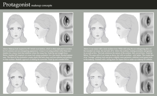
I think I liked the first look the most as it was really graphic and fun. Interestingly, the way that the eye-shadow is blocked in and the eyeliner is shaped basically creates a new lid, which creates a very large and unnatural looking eye. I thought that this would be really fun to play with. I like the softer looks as well, but I felt the more graphic look was more impactful - but most importantly, it feel the most obvious. In the other makeup looks, I was changing my anatomy with more subtly - redrawing my crease, blending and giving the look an overall more natural feel. With the graphic look it becomes heavy and unnatural, which makes the makeup easier to read in terms of knowing that is real and what isn’t when you come closer to it. Ultimately, I’ll just have to see how this translates when it comes to the final model.
At the same time, I also began looking at some of the fashion styles I wanted to replicate. I think with the ideas I had in the basis of my story - being set in California and kind of having a surf vibe to it - I thought it would be most appropriate look at a time period when this kind of culture was iconic - so I began looking for inspiration from specifically the 70′s and the 90′s - which are both iconic and unique in two separate ways.

I began looking at all kinds of things - t-shirts, bombers, shorts, skirts, patterns, rollerblades - everything I could to bring together the kind of style I wanted so that I could reference these for a board of sketches. Once I collected a good level of inspiration I really wanted to just begin sketches.
I often find when I’m doing these initial sketches I get really frustrated at the way I draw versus what I would like to accomplish. When I first began work trying to create a template for the fashion I found I was getting really frustrated, so I looked into some of the concept work in some of the video game art books I already have for inspiration.

A lot of them began with using silhouettes and colourless sketches to create a baseline aura for the character. Using these as a reference helped me create ideas on paper that were similar to what I wanted to accomplish from a character sheet and helped me feel more confident. It was really good to see how these ideas were started in industry and helps me get to a point where I wasn’t frustrated with every detail.
As I kept practicing, I finally got to a place where I created a template that I was happy to work from that didn’t feel too stiff or rigidly referenced while maintaining the seven-and-a-half-head anatomy that I needed. It helped me feel a lot more confident in the work and allowed me to create a wider range of designs and really experiment with different looks.
I wanted to work with a range of different styles and fits to the clothing, including in some ways that I wouldn’t consider wearing clothing. I think one thing that’s really important when considering clothing female characters is the fit of the clothes, and how you want clothes to wear and rest to meet an aesthetic. Luckily, as a woman (and an avid fan of RuPaul’s Drag Race!), I’ve had more than enough experience in this. When I did my character sketches, I really wanted to break down the look and feeling - so I went into annotation of what I was trying to accomplish with each look; why are some aspects oversized, why I specifically specify a men’s fit, why I used certain fabrics and what cultural aspects they come back to.

I felt very inspired by some of the reference imagery of the cultures of California, so I didn’t limit it to cute-skirt-and-a-totally-rad-top-I-found-on-depop. I also began looking at things like Chicana culture and other forms of fashion and expression used by minorities in California (as at this point, my character didn’t particularly have a set ethnicity or style).
Because a lot of the fashion was very graphic back then as well, I also coincided some of my designs with some graphic designs as well that I would hopefully be able to use. I referenced a lot of graphic designs, fonts, quotes and lyrics that I felt appropriate for the designs I wanted to produce:
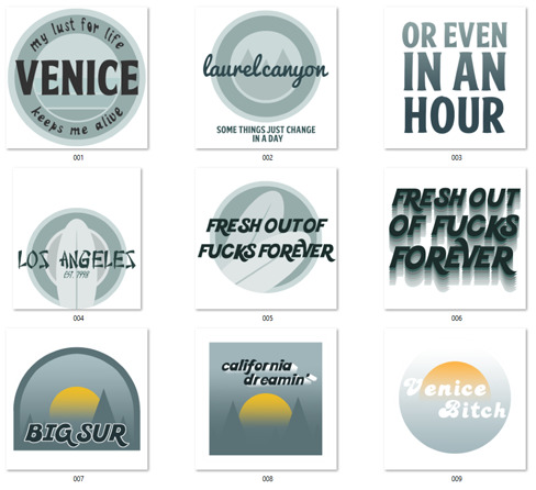
These decals were intended to be able to be used in a few different areas if I wanted to - on shirts, as patches for jackets or for jeans and skirts too.
Some of these designs were intended to be for either a front patch or a shirt design, other were things like back patches for jackets and other. I also created some designs and quotes that ran off of the backs of each other, so that I could use multiple patches with the same theme in one outfit (”some things just change in a day” / “or even in an hour”).
I referenced a lot of Californian and surf culture inspired typography. I used typefaces from different cultures as a means of getting in that “melting pot” Americana aspect that I discussed in one of my previous posts - if I don’t end up using it, I’ll definitely use it somewhere - like on environmental signage. I do really like the way it looks up against things like the surfboard so it’s definitely something to keep in mind.
In the end, I created a big large board of designs that I was considering - each with annotation and explanations to the style, fit and design choices.

I then took some of my favourites and went into more detail - did a back and a front and really tried to develop my idea and sow what I was really trying to do with the fabrics and break everything down. I was inspired by some of the concepting done in the second Alice game, where they did very specific breakdowns of everything that was relevant to the design process and referenced everything. I also think by having boards in this style, I’ll be able to communicate my design work a lot more clearly and effectively and hopefully it will look a lot cleaner in a portfolio.
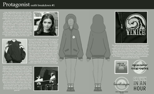
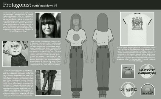
I then made a final render of the front and back of my design just for the clarity of having a definitive design.
To help me get the project on it’s feet, Danny scanned my face so that I can work from it as a base in ZBrush. I’m really excited to be able to work with the data and manipulate it. I’m not sure how it’s going to go, but I’m just going to fire through it and hopefully it’ll be an easy process.
Although, I have struggled with learning ZBrush - but I really want to push myself this time to create something I can be a lot more proud of.
0 notes
Text
Project essay
Harvey
Westwood
28 November 2017
Harvey Westwood.
Graphic communication
Beginning of the project will put into groups where we chose individual poems to analyse and pick apart under the categories of summary context meaning syntax Synaptics and structure this small project I chose the poem meeting at midnight by Robert Browning this poem shortly describes a man’s journey to get to his love through secrecy. In this short analysis I learnt how not just the poem can influence My design stuff for context where the poem was written in June 2016 at the same time that same-sex marriage was starting to be legalised in America this puts a twist on how we may receive this poem has not been a poem between a male and female but maybe of two men or two women. Learning different ways to approach a brief allows me to come up with different ideas and find inspiration.
After this I’ll began the first of my two briefs which was international poetry day I was to design an aid to interactive poster advertising a selected Poet learning what I have from the previous poetry task I set out to look for a poem to deconstructive and was I came up with the poem Valentine by carol ann Duffy this poem is about how one person presents and onion as a valentines present to there other half and the poems context is of our how they describe the onion to be this beautiful and romantic item. To start this project I wanted to look at the onion in a lot more detail I started by doing some simple sketches of an onion and start describing and thinking of ways to be using this item in the form of design. What are gathered from the poem was that the onion was converted to romantic items such as a rose and the moon I wanted toIncorporate this into my design I initially thought of editing a flower to look like it was blossoming and onion or two rearrange the night sky so that the moon was an onion on further thought looking at this I didn’t want to make too much of an artistic approach to the way that I was designing this work knowing that my skill set my photo shop was intermediate are not experts I do not wish to bite off more than I can sa incorporate this into my design I initially thought of editing a flower to look like it was blossoming and onion or two rearrange the night sky so that the moon was an onion on further thought looking at this I didn’t want to make too much of an artistic approach to the way that I was designing this work knowing that my skill set my photo shop was intermediate are not experts I do not wish to start editing or making something that wouldn’t look professional. Otherwise I looked at researching was experimenting with wordlists where I described the onion in which I found the word layers this point was very important to me because I found that I could use this word in particularly to revolve around how I wanted to design. Shortly after this we did a small project where we used the risograph printer, within this project we use the scrap piece of paper and material to make a quick and simple collage design which we would then scan in to the risograph Printer to get a feel for how it works and what are the facts and designs they can create. What I gathered from this technique was that the printer allows you to merge different layers of design and colours where you have stuck down the photo and some text may look like they don’t belong together but through the riser graph they have merged in a duotone print. This immediately made me want to incorporate what I’ve looking into with the National poetry Day poster. When designing to use the riser Graaf what I forgot to consider was how the dark colours within the photo get turned to complete black when transferred through the printer my designs came over the contrast and therefore lacked context as to what the images were. After this I proceeded to look at different ways to approach this brief fixated on this duotone style breaking image down to two tones.
As the middle to the development stage of the project I made scamps using a simple read technique where I arranged three assets of type and one of image the type would consist of the poem name the poets name and the word onion then I would also include a photo of an onion edited with a euro to own filter After creating these initial designs and they’re just like in text I thought there was something missing and that the design felt a bit shallow and empty large spaces of colour and shape came with no context of a reason. Looking back at research I came across F you K yo after creating these initial designs and they’re just like in text I thought there was something missing and that the design felt a bit shallow and empty large spaces of colour and shape came with no contacts or reason. Looking back research I came across Fuku’s work from this I saw that text within a column arrangement worked well when being next to large shapes I then moved on to scampi out where I would arrange this text I found that if I wrote out the poem in paragraphs I could then columnise this within the poster. This led to my final design which worked of three tones yellow blue and white the palate was designed to keep very simplistic. I was happy with how the final piece going out, in the future I would of liked to of proceeded with this duotone design and maybe looked at different colour pallets to see how that would’ve worked.
Another project that run alongside this national poetry day project was an editorial piece where we designed A cover page and two double page spread for a magazine called architect. Working in class we deconstructed double bass friends that had been made by other companies such as Vogue and others. From this I learned that in editorial design I had to use the grid method as my backbone. When looking at other peoples work I clearly saw that the grid method of 3 x 3 was where most of the text and image sat on. After this I went out on a shoot around Birmingham photographing buildings and other key bits of architecture and construction I loved for clear lines within the photos of maybe the angle of a rooftop need to align other bits of design to these lines within the photo this way the photo with seamlessly work with the huge blocks of time I found to be difficult as the viewer couldn’t really tell that the text was lining up with the lines with in the photo after this I went for a different approach I worked with: structures where I would edit my photos to work with them and then the text would line up after that into columns of the own. With this I focused on experimenting and learning how to use drop caps avoiding mistakes by leaving out a widower at the end of the paragraph and also working with point Size and type hierarchy. This project I feel enlightened me to a completely new world of design I now have a new found respect for editorial design. If I had more time I would reshoot taking more photos and work on using lines with in photos that lineup with my arrangement of type within double page spreads.
Other tasks that I had throughout this five week period were the type Anatomy is more task took up 2 to 3 hours where I looked at key terms describing the anatomy of type such as counter serif leg spine and more. This knowledge will benefit me more when I come to designing my own typefaces in the future. After that we then received letterpress blocks where we had to measure out the individual letters and redraw them as accurately as we could. This allowed me to look at how angles and curvature is strongly influence the way the typeface is read. We also did another project where we focus our attention on storytelling through drawings and scams and how they can be useful when designing already knew the stamps were very important through the design process but this project was based on finding different ways to scamp, we sketched out single drawing that showed story. This was to show how mood boards and scans could be used to plan out ideas and also teachers want to include when stamping and making mood boards.
In the future I wish to learn more about different printing methods. I also wish to explore more photographic designs and do more club different briefs with other members of his garden such as illustrators and photographers. I have seen is introduction to visual communication as a brief insight to different parts of design.
1 note
·
View note
Last Seen Blogs
chisoria
chisoria

losangelesmedicalmalpracticelaw
Los Angeles Medical Malpractice Lawyer
bilgebirgalaksi-blog
Bilge Hatun Aydın

rancheritosbogota-blog
Rancheritos Bogotá
alimenthy
Agent of chaos