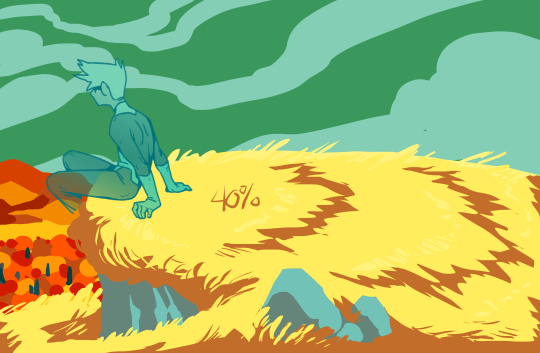
#not me forgetting my own process while making this tutorial
Text
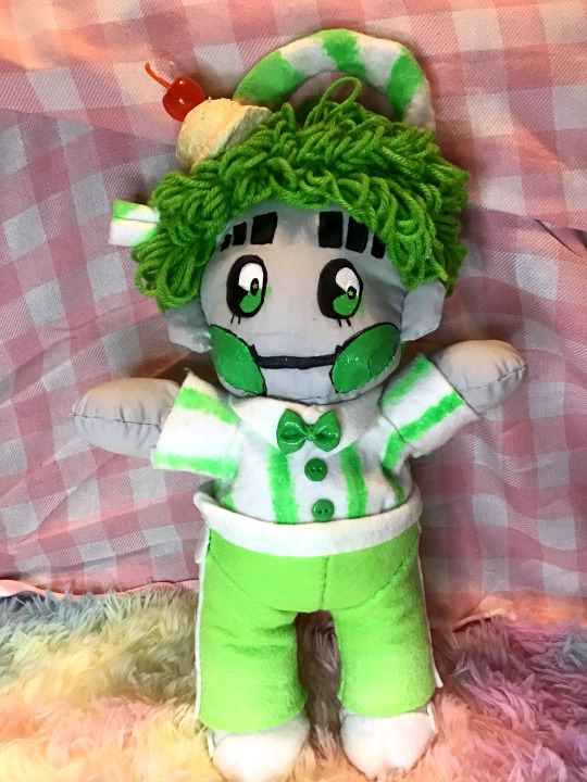
1010 Malt Shop - Green Plushie
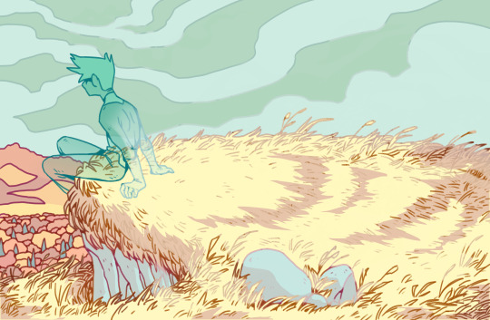
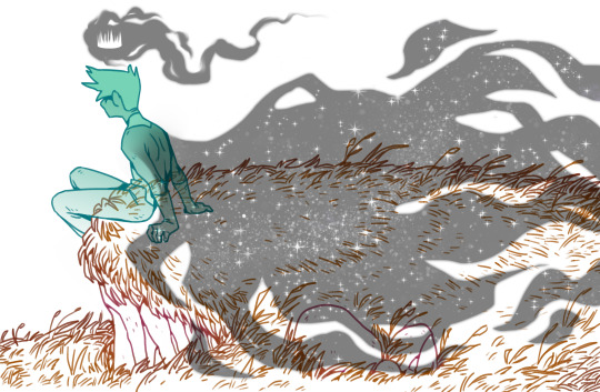
It's done. It's finally done. 1 week of blood, sweat, and tears (mostly blood), and he's done.
But I don't have a good enough camera nor photography skills to really capture his true charm ;w;
(Boring self reflection + more pics under the cut)
Anyway, this is the project I've been working on lately. No particular thing really prompted this. Like most things I do, it was started on a whim and finished with will power. I don't really have much experience with plush making or sewing, so despite his obvious faults, I still think he turned out pretty nicely for an amateur.
As per usual, I didn't have enough foresight to document the process, but I can nonetheless talk about the experience and point out some details of it.
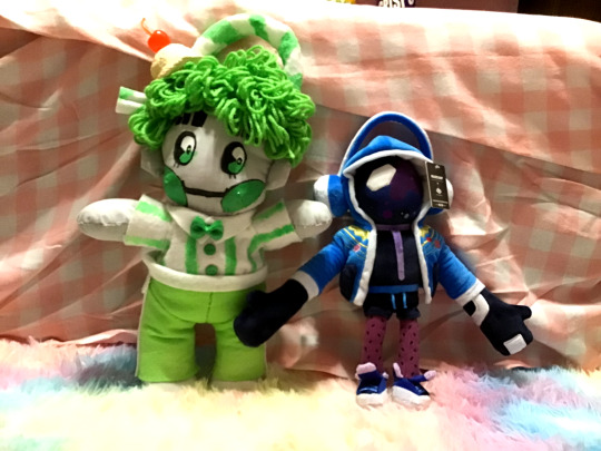
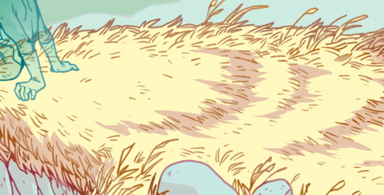
Firstly, he's a pretty large lad. Here he is compared to the official DJSS plush and one of the test prints I did of "Melon Float."
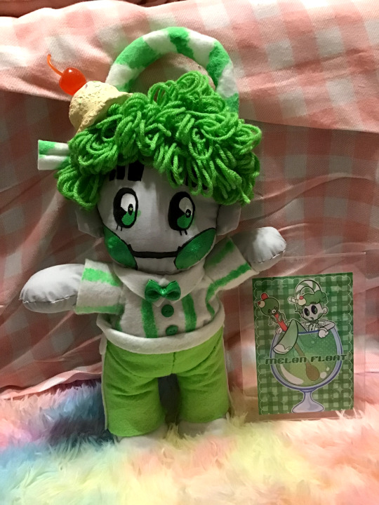
Counting his straw, he's about 16 inches tall. I wasn't counting on him being so big, so I don't really know what I'm gonna do with him now...
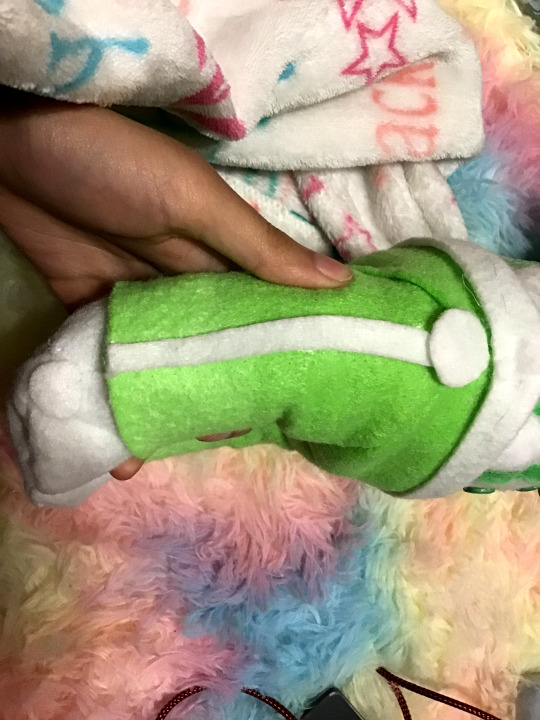
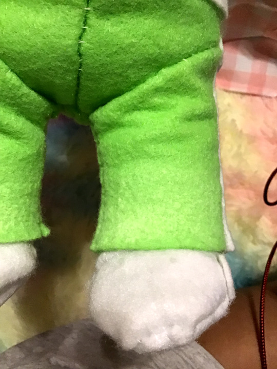
I say this took a week, but I probably could have quartered that time if I had a working sewing machine, but since I didn't, the majority of the time was spent just sewing the thing together. (Btw, pattern over here.) The only fabric details that weren't hand-sewn are the circle/stripe details on his pants and shoes, and the bow/buttons on his shirt, which were all glued on.
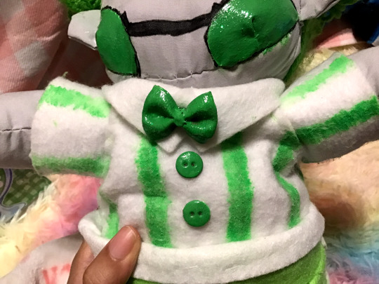
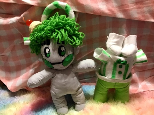
The base pattern didn't come with any clothes, so I just adapted the body patterns into clothes. Structurally, he's basically wearing a second skin~ I did think about making the gloves for the sake of accuracy, but at that point, the only skin he'd be showing is his face, and I wanted to keep some soft parts out since his clothes are so stiff. They're so stiff, they can stand on their own and be stacked on top of each other without falling over.
(The plush has a harder time standing than his clothes do...)
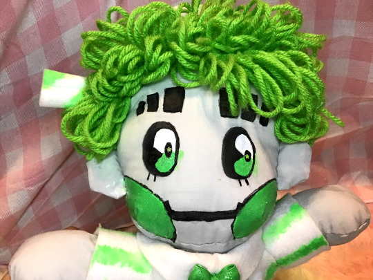
Speaking of the clothes, let me say right now that it bothers me more than anyone else that the paint details don't color-match his pants. I was so high on the euphoria of starting this project that when I was out getting supplies, I saw some glow-in-the-dark paint and thought it'd be a great idea since he's a robot and all. The color on the bottle looked close enough at the time, and the original plan was that only the face would be painted with the other details being felt, but on top of me forgetting that effects paint takes a long time to build up layers, the green also dried differently than I thought it would, so it threw everything off, but I didn't have the patience to suck it up and repaint everything with a better color match. I did try to add a light gradient with my pastels like in the original art work, but it turned out so light that it's barely perceivable and totally not worth the clamminess I get when I touch chalk.
I think the most time-consuming part was his hair. While sewing the body together took 2 days, the clothes 2 days, and painting 1 day, the hair took about 3 as I had to figure out essentially how to do it myself on the fly. The first day was mostly trial and error. I did find a couple of online tutorials about how to get this loopy yarn hair, but the ones that I found both required tools that I didn't have. Eventually, I figured out a way to make it work, but I feel like it was less than efficient:
Basically, his hair is made with chunks of yarn that are tied together, and each chunk is individually sewn into place. I didn't count, but I think there are 13-14 hair chunks total to give him a full head. I do like how I made his bangs uneven to mimick how I draw his hair, but I couldn't quite pull off having his distinct hair-part and I couldn't figure out how to give the illusion of half his hair being straight without it looking weird. (I did try cutting the loops to let the strands be straight, but I didn't like the look of it, so I kept them all loopy).

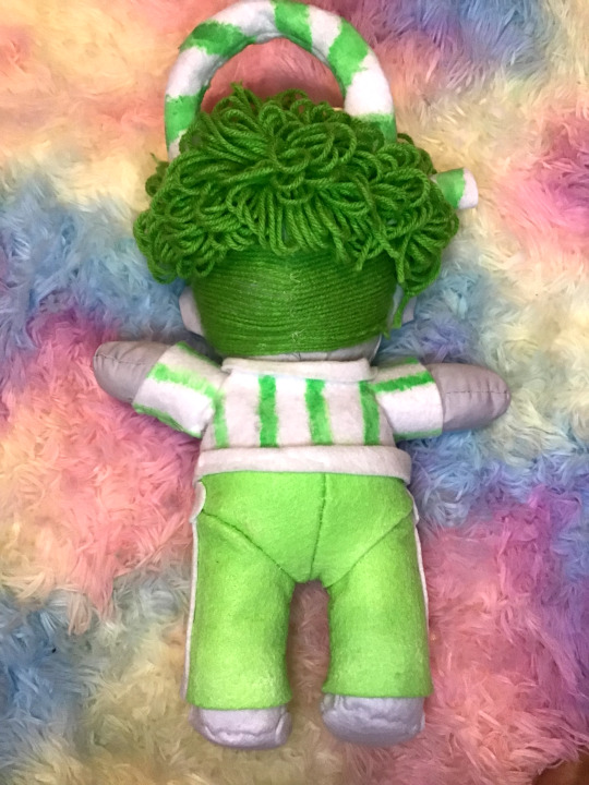
This is a weird thing to say out of context, but I'm especially proud of the back of his head. Originally I was just going to paint on his undercut (which I'm glad I didn't because this paint REALLY hardens the cotton), so I got the bright idea to sew on individual strands of yarn for it. I think the effect is great, but I would not wish it upon my worst enemy, because to get the effect, I had to sew on each. strand. individually. The day I made the face poll, and said that was going to be a break day? I wound up doing this instead, and it took just as long to sew in those 20+ strands of yarn as it did the rest of his hair.
To segway into that poll, as you can see, I went with option 2 with some slight edits. Just the white/green eyes looked a little plain to me, so I added my usual dark pupil and added a green-star glitter to the center. I'm the one that has to live with this thing for the foreseeable future, so I made some executive decisions. Unfortunately, there were a few errors while painting, which you can clearly see in the above pictures OTL. I did try to seal off my painting areas with tape, but it still bled and stained in a few places. I don't really know if it's possible to clean the stains without ruing the rest of the face, but if you have any ideas, I'd love to hear them.
There are a few extra details that I guess are worth pointing out: he's actually wired. I put in some armature wire so he'd be able to move his limbs despite the stiff felt but... I didn't secure them that well, and the wire for his arms got displaced, so I currently can't bend them ;3;. I'd have to open him up again to replace it, and I REALLY don't want to undress him again to get to his back. The worst thing about this plush is that his clothes are so stiff that he's actually very hard to dress.
The wire in his legs is mostly still in place, so he can at least (kinda) sit.
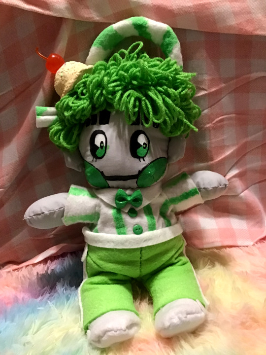
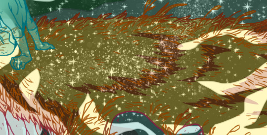
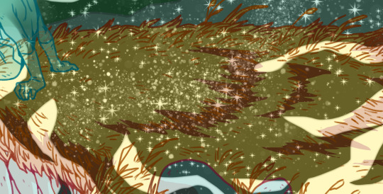
I think the last thing worth talking about is the ice cream accessory. It was really simple to make (it's just air dry clay over foil + extra pieces), but it's cute, so I wanted to point it out~

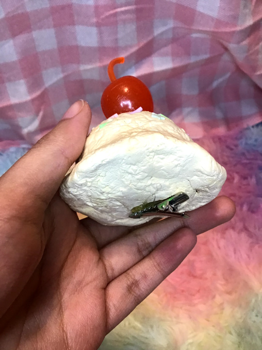
It's a hair clip, so it can be taken on and off. Theoretically, it could be worn by a person, but it's a little heavy to be wearing it all day~ The camera/lighting really blew out the colors, but I think it turned out to be a nice creamy french vanilla color like I really wanted~
Other details like the glitter on his eyes/cheeks can't really be captured on my shitty ipod camera, but rest assured that he is pleasantly sparkling~
I think my biggest takeaway from this project has been materials: I thought that using felt would be a great alternative to having to buy an entire yard of fabric for a one time project, but besides the paint, it was the hardest material to work with. If I have to pick and choose, next time I think the body will be felt, and the clothes will be cotton, or maybe I'll actually invest in some fleece, so it can be soft all the way~ Since the clothes are removable, I could theoretically make him his default sailor suit and just replace the straw with his proper hair loop to convert this into a "canon" design plush, but we'll see what the future holds. I did get the felt colors to make my *other* babygirl, but given this experience, I may hold off on making him until a much later date.
#gbunny makes#plush#nsr#no straight roads#green 1010#1010#1010 malt shop#short story time: so I think i've said this before#but i originally started the malt shop series because i just wanted to make a pink white!1010 and it just evolved from there#and i wanted a pink version of him because in the off chance that i ever decided to 'make' something of him#i wanted it to fit in with the rest of my things#which are mostly pink#well the day finally came when i wanted to make something#that said#i made green because 1: i thought the contrast would actually work better for my pink things#since green and pink a complimentary colors#and 2: all of green's hair accessories would give me more things to make#and thus more skills to use/improve on#since it's my first 'original' plush i wanted to practice as many techniques as possible so the next one can be even better!#this experience has taught me that i DEF need to sew in his head accessories BEFORE the hair#and if i'm going to add an undercut using this method#I also need to do that before the hair#i'm telling you. sewing the base was the easiest part#it's all the hair that was the biggest hurdle for me
45 notes
·
View notes
Text
Bookbinding Fanfiction: A New Adventure Begins
and thus I rise from the dead (with no new fics of my own making though). Anyway, I'm gonna talk a bit about my process binding Salvage by @muffinlance. Thanks @necrotic-bones for (unknowingly) inspiring me to get into this (they were to first to ask to fanbind Salvage and I wanted to do it as well)
Before I begin, here are the guides/tutorials that I used:
- How To Make A Book From An AO3 Page by @armoredsuperheavy
- Bookbinding Resources Master List by members of the Renegade Bindery discord server (found through the previous guide)
- r/bookbinding has a nice beginner’s introduction to bookbinding
- the Case Bound Book series by DAS Bookbinding on youtube is very helpful as well, I specifically used Part 6 Casing In
I also found this amazing program, called Bookbinder (on quantumelephant.co.uk), that takes your pdf and formats it into proper signatures and flips every second page for you etc, so that you can print it at home (if you have the proper printer for it)
this post is probably going to be kind of long, so the entire thing is under the cut, but here’s a preview:

Anyway, I think it's been close to over two weeks since the start of my bookbinding projects, but they’re both done! I first did a kind of test run with a collection of detroit become human fanfics, which taught me four things:
- don't forget to choose natural white paper at the print shop (books never use pure white paper)
- the edges will be irregular and that is ok, do under no circumstances try to level them by hand as you will definitely not succeed in getting smooth edges, just leave the signatures as they are, trust me
- thin endpapers are horrible to smoothly glue down, so take some paper that's a bit thicker and it'll be easier
- finish watching a tutorial before doing the thing, eg. I forgot to put extra paper between the endpapers and the first two and last two pages of the DBH collection got a bit of a wave now, oh well
I might make another post properly detailing my first fanbinding journey with the DBH fics, but second things first: Salvage
Chapter 1: The Beginning
I did dip my toes into bookbinding a few years back, but did them japanese style with an open spine, so doing a proper case bookbind with a spine and all was new to me, ArmoredSuperHeavy’s guide helped a lot
Chapter 2: Getting Materials
Step 1: Read both guides mentioned above, then go to the city to find what you need, don't really find what you need, order a bunch of shit instead
Step 2: Only partially read through the bookbinding guide and forget to order half the stuff you need, try to make do with what you have (big mistake)
Step 3: Try to make bookcloth yourself with this guide, don’t follow it properly and fail at making it, find out that buying bookcloth is dirt cheap (comparatively)
Step 4: regret buying all that cloth and unnecessarily expensive thin paper for the backing
Step 4: buy cheap bookcloth while sighing through the pain of being inconvenienced by your own stupidity, patiently wait for all of your stuff to arrive
Step 5: harvest and format your choosen works according to @armoredsuperheavy‘s guide, run it through the bookbinder program
Step 6: let a website print your script for you since your printer is barely good enough to print one (1) page if you’re lucky, let alone 64 (DBH) or flippin’ 103 (Salvage), front and back
Step 7: wait some more
Chapter 3: Binding the Book
Now sadly I barely took any pictures (read: none), except for the finished product, so I wont go into too much detail, I’ll mostly talk about my thoughts behind choosing the colors and design with a slight detour into the layout and formatting of the fic
The Design:
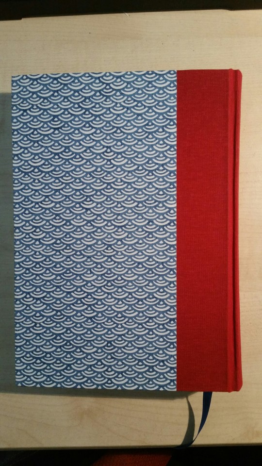
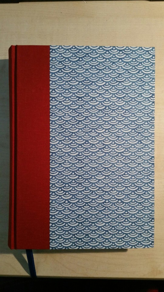
I knew that I wanted the book to be blue (since Salvage takes place at sea) and that I wanted to find some paper that had some kind of blue wave design on it, I went on ollilypaperware and found this really nice chiyogami paper with a blue wave/scale design on it:
I wanted the round parts to point upwards, but I got it all turned around while glueing it down and now they point downwards instead, but thats fine
I wanted the spine to be blue as well, but when I looked at my red bookcloth (I ordered a few different colors since shipping was a bit expensive and I wanted to get my money’s worth) and thought “red like fire, oh OH that would look fucking awesome and reflect the content of the fic much better”, so I used that instead, I also bought some blue, purple and yellow ribbons in the city and used the blue one for a bookmark by gluing it into the spine
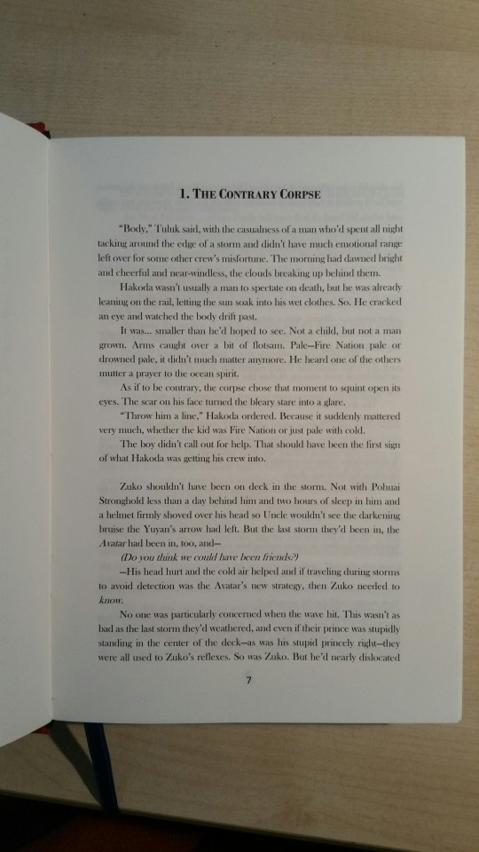
Because of that I made a kind of template, I used Baskerville Old Face for the body, Garamond for the front matter (AO3 tags, summary etc) and Bodoni MT for the front title and chapter titles
The Formatting:
Now I did format a few works before ordering the materials, the materials were getting quite expensive and I wanted to make sure that I had more than just one fic I wanted to bind, I made a whole list and all
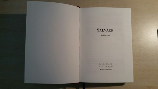
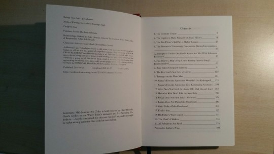
I pretty much just followed SuperArmoredHeavy’s guide on how to harvest and format AO3 fics and my layout is the same, meaning the first page is just the title, then title and author in bigger font with the AO3 tags and the summary on the back, then the fic and lastly the author’s notes in an appendix
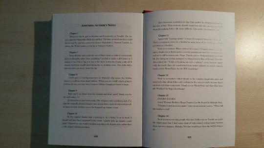
Chapter 4: The Finished Book
My trial run was a great success in terms of learning what to do and what not to, which means that my Salvage fanbind is the best it could be (except for the endpaper at the back, which I slightly failed at gluing down smoothly, but its behind two empty pages and at the end of the book, so I dont really mind, no one will see)
I’m incredibly happy with the finish and hope that the exterior does the interior justice, but without much further ado, here are the promised pictures:

972 notes
·
View notes
Note
Hey !
I have followed you on Twitter for a while and I really love your work (on the French side) (yes, I'm asking in English anyway)
So, you keep posting the evolution of your art style and skills (really impressive byw) using the pokemon fanart and some of your recent/ Sam stuff.
I was wondering if you had some resources for coloring digital work. Your colors are always wonderful, and I'd like to progress so... asking you, seems logical.
Thank you for sharing your passion, I'm able to shine at parties, talking about things I barely know ahah !
Stay awesome, and have a good life :)
Haha thanks, I appreciate a lot 💚
I don't have anything 'cause I developped everything I do all by myself so the 5 tips I can give for digital coloring are :
1) don't be afraid of testing stuff. Just do a plain flat color as a base on a new layer, shadowing on another and try even unatural colors, brushes etc until you like the result
2) you're a digital artist, meaning you have a shit tons of digital tools such as photo rendering (from the most complicated photo touch up to the simplest instagram filters) use them, using filters can help you get a smoother colo and can change EVERYTHING for the best, you would be surprised. Again, try stuff, find what your softwares can do by testing stuff.
3) Find something you enjoy doing, a color palette you like, a type of coloring you like (for exemple hyper realism or hyper cartoonish? Whatever you like doing the most).
4) Remember you can't be good at anything and use that. I used to be terrible at colo, in fact I'm still pretty bad at realism, that's why I took the opposite way with flashy saturated colors and ironically my colo became what people love the most about my stuff when it used to be the thing I hated the most about my art when I forced myself into doing an artstyle that impress me but that I have no fun doing myself. So find your weakness, aknowledge it and use it to find your strength.
5) This apply to every form of drawing. Thinking is more important than practicing. Save arts you like, observe them, try to understand what you see "oh they used this specific color to shadow this, oh the shadow has this specific shape, oh the light source is here" etc etc, it works for everything, line, sketching etc... Learn to think by yourself rather than following tutorials because most of them will teach only one way to do one thing with one specific angle and light and all so learning to observe and think, decompose and recompose an object will make you improve A LOT. For exemple, if you have to draw a hand, take your hand and look, it's not one object, it's 17 different objects interacting with each others and having their own volume and perspective (3 for each fingers, 2 on the palm of the hand, basically). That's something you can practice everywhere at anytime. You have to wait in line in a shop? Observe a random object or person and try to understand how you could recreate that, what colors you can find in light and shadow etc...
And of course be patient and kind to yourself.
I'll probably start posting more step by step and process very soon, I have a hard time recording myself 'cause I tend to do a lot of pauses (ADHD disaster) and I often forget to put back the recording haha but I'll try. Lots of stuff coming soon.
If it's too hard to understand you can dm me here or on X in French, I don't mind. Have a nice day ✌️💚
7 notes
·
View notes
Note
hii it's unorcadox ^_^ how does your editing process work!!! like how do you choose what images to use, how to combine them, how to get the right "feel" etc. 👀 very curious abt ur answer
Damn, great question! Also, love your edits, Orca! (also a bit jelous abt your productivity, wish i had so many great ideas) So i present to you: a wall of text! (cw really long!)
So, many people see a great base image and then immideately get an idea of what they wanna do w/ it. I'm not like that, i ususally have an idea of an edit in mind, and then search for sometimes a few hours for a base image that may work. I have a whole tutorial-worthy process of how i always find what i need, but i digress… Most of the times, tho, i get something better than what i had in mind. I love this process, cause it's like tresure hunting for me. (ofc it's not always like that, just most of the time. Since i have a giant collection of base images i may sometimes use them). I choose my images based on the mood i wanna portray. It's always supposed to be looking kinda dreamlike and unreal, but it can also be creepy, dark, bright, etc.
When editing my favourite style of edits - fake dreamlike places - I try to make them look as real as possible, regarding color, lighting, etc, while still making them look blatantly fake regarding the composition, subject matter, etc. Ofc i don't try to perfect my lighting, since it can take away the feeling i strive for, so it's kinda based on my own feelings idk. I get really inspired by the surrealists' painting. Artists like Brent Wong, for example. Liminal spaces are already weird, so why not make them even weirder, by making the geometry non-Euclidean and subject matter impossible in the real world. Also unlike surrealist painters, i have a luxiry of making the scene like "more real" by combining actual photos in photoshop. Ofc people have been making surreal art w/ 3d programs forever now, but it still doesn't give off the same feeling real picture does, yk.
Uhh... what was i talking about... Ah, yes! I firstly make a collage, that i have in mind by this point, and sometimes it just... doesn't work out! i had discarded so many great ideas, cause they weren't turning out good. But if it works, i add shadows and highlights. I look at real liminal space photos and try to really analyze them. Like, what makes them work? the color, the quality, the blurriness? Then i add effects that works to my edit. Every edit needs it's own level of compression, sharpness, blurriness... You just gotta feel it.
Really important step. I leave my edit for a few hours, so i forget how it looks, and then return later. All the imperfections, things that don't work, etc pop out immediately. I read somewhere that the process of creating and the process of analyzing are two completely different things, and i couldn't agree more. It's annoying when you have a finished edit, and you really wanna show it to the world, but you have to wait... But it's better, than being embarrassed later that you posted something unfinished and you can't fix it now.
Ofc i make text edits as well, but they basically serve the same purpose and not that interesting to describe, cause process is the same just with a few steps skipped.
There wasn't such question, but i still wanna talk about it, cause it kinda answers "how do you get the right feel". Well, why do i make edits? Well, the world sucks ass (i don't agree w/ this statement for the most part, like friends are great, nature is buitifull, but then there are parts that just... yk...) and for me weirdcore is a sort of an escapism. I can't traverse dreamworlds mindlessly, alone or come across magical events in real world, sadly. But I can make them however i would like them to look and feel, with my characters (like deer), and my own thoughts about them, that no one except me knows. It's kinda like i actually've been there, and i took a picture. Or hell, maybe i've never been here myself, but those deer were, or invisible creatures, that are not in the shot. And i know them personally, cause i made them, they are a part of myself! And it really helps, and i'm so glad these pictures resonate with so many more people here too! I had been making these pictures without realising why for a year. I had some thoughts and heard dozens of opinins of other pople, but i hadn't had a full picture. And then a video by SuperEyePatchWolf about liminal spaces comes out, and i get it now, it was really eye opening, for me at least. It explains really well why we love unreality so much.
27 notes
·
View notes
Text
I haven't figured it out yet, but male eyes give me so much trouble. They're either far too feminine or clunky.
The problem with learning on my own, is many of my resources are meant for drawing females, which is fine! I love drawing women, too. But when looking for detailed eye tutorials I get 10000 for women and 5 for men. 4 of them being a style that isn't close to mine. So, I made due with what I have.
Sometimes, I find an artist whose style I like, and I try to mimic what I see. I try again and again while thinking of their process and how I can create something that is my own style.
I find I rely too much on rendering to make something look good. Ideally, I would like to look at my sketches / line art and be able to share them. Right now, at my novice skill level, I'm not quite there. 😅 But I can see my progress even from 6 months ago and I love that for me.
Anyways. My last hurdle is learning the program. I find that every time I boot up CSP I learn something new. I do my best not to forget when I learned though which happens a lot . It's a learning curve, for sure, but I'm curious to see how far I've come in July when I hit the 1 year mark.
4 notes
·
View notes
Note
Hey, maybe this is a stupid question, but I've seen you say that a mod of yours does not "contribute to the script limit" sometimes. Which is great! But is there any way for a user to tell if a mod counts towards the limit or not? Or maybe even a way to change a script so that it doesn't count? (for their own use only, of course)
I was writing a more detailed response to this for way over an hour and then Tumblr's new editor decided to be stupid and yeet everything 😭 I'm sorry but I'm going to have to summarize what I was writing as I don't have the energy to re-write that, just let me know if you have any other questions on here or head to Creator Musings for help (server is better though as there's more creators and easier to respond to questions about modding). Also not a stupid question!
This script limit of over 250 (called a recursion error) happens because of too many scripts adding stuff to the same area (the main culprit is interactions) with an old method called inject_to. New method was discovered semi-recently called add_on_load_complete, which can be used for a good chunk of the areas people want to add to and doesn't have a limit. There are some areas that can't use the new method but are niche, so the chances of the over 250 limit being reached for it is extremely rare, if not impossible at this time.
There's no way to tell if a script uses the old way/is part of the problem without opening it up, testing while already at the limit, or inferring by what a creator has said. Generally anything made with Mod Constructor (both versions), Neia's create a career maker, old script mods and some new will generally be using the old way to add interactions. There are a rare few who use MC but manually make their scripts or use other workarounds to avoid that limit (like I think Kiara did something recently for her careers, unsure about her other stuff), but that's like 2 to 3 people.
Creators who I know use the new method for the majority, if not all, of their mods' interactions and more include Frankk (except his old fame mod, he plans to update it eventually), Lot51, Simsonian Library, TwelfthDoctor1, Kuttoe, Keke/NeedCoffee4That, LeRoiDeTout, Adeepindigo, ItsKatato, Lumpinou (some of the older mods need updates), ChippedSim, and there might be one or two others I'm forgetting. Tmexi, Deaderpool, Base, and Turbo I'm not sure about but more than likely are, though even if they aren't they only have a few mods and/or one big mod so it shouldn't be anything to worry about.
The easiest way to fix it is to add the interactions (and loot injection, though that's not very common) the mod has to an XML Injector snippet so that the original script can be deleted.
The other way to fix it is by editing the script itself but has a larger learning curve and can be more difficult, and there are no tutorials yet on the topic of the new method, so I'd recommend joining my server for creators that I linked above if you go that path.
XML Injector (download the documentation it has as well) and some tutorials about using the injector (skip the parts about creating interactions, just read the sections about the snippet):
Tutorial 1
Tutorial 2
Neither tutorials cover objects or regular interactions but the process is mostly the same, and the documentation and it's examples should explain the rest.
If you take the scripting route you'll need a workspace and decompiler (links under the TDESC section).
81 notes
·
View notes
Note
Your work reminds me of Euclase, who used to be in the fandom long ago before she went pro. Except it looks like you do paintovers and smudging, which is like Petite-Madame, another great artist who used to be in the fandom. You fit in the middle, but either way it's lovely to see beautiful art being made for our favorite characters.
Oh hey, thank you! 😊💜
I have been in fandom when they were around still and I definitely took some inspiration from their art! I admire Euclase's painterly soft but still very precise realism and the work of color/glow in her later spn paintings and I have definitely looked at a few of her tutorials to figure out my own style (this one for example). I also always loved Petite-Madame's Destiel art, especially the highlighting, and well, I will never forget her beautiful Twist and Shout fanart.
About the latter part of the ask, I actually don't do smudging at all :D I tried it once here, but the smudge tool really overwhelms me. I instead blend with the pipette tool and a soft brush (or, if I keep it more painterly, with a textured brush). It just personally works better for me! And about the paintovers, I actually had to google what that means, but I think as I understand it I don't do that either (I think?) xD I did paintovers back in 2014/2015 when I first eased my way into digital art but did then stop painting completely since it felt like I was cheating and it catapulted me into a 5-year long art block until I felt brave enough to pick up a pen again (sorry if that's too personal and I am being awkward) 😅 I do sometimes stay very close to a reference or a screenshot of the show but I don't paint over it, I just try to recreate it and make it more pretty (in my personal perspective, that's of course very subjective) :D I also try to "loosen" up more with the 'realism' aspect of things lately, and just keep it more textured and painterly, or do some doodles and sketches, and go more nuts with the colors, because I always have the feeling that my perfectionism limits me in what I allow myself to paint (I say while I work on a painting that references a screenshot of the show, but I am trying, I swear, if you look at my latest art! Sometimes a more 'realistic' attempt at painting sneaks into it but I definitely want to be more flexible and upload more stylized stuff as well 😂)
I think when we are talking about styles, I also have to mention other awesome artists in this fandom that I take a big chunk of inspiration from and that influence my own style and processes as an artist :D For example, Winchester-Reload, who obviously is just 💚💙 with her paintings and shading (those cheekbones!!! the beards!!!) and especially the facial expressions and emotions transferred by her art, Diminuel with the highlights and blush and absolutely adorable cuteness, and Clickbaitcowboy with his peak gender art and the way he draws bodies and does stylized illustrations that look very realistic at the same time (how??? sir your art is so pretty). Also Scenteddean, Artmetica, C-Kaeru, Feredir, Werepires, Free-To-Be-Impaled, Naughtystiel, and so so so many more artists who created beautiful art for this fandom and who are just so talented <3
Sorry if my answer was a little bit on the long side! Again, thank you so much. I think it's such a great compliment to be associated with Euclase's and Petite-Madame's styles whose art I definitely looked up to growing up in the fandom 😳 And thank you for being so lovely, I hope my 4 am answering attempt does your ask justice 😭💜
10 notes
·
View notes
Text
Here’s to 20
A few days ago I turned 20.
It was a weird feeling.
I was actually dreading my 20th birthday, because it meant officially entering adulthood and I was not ready for that. Plus, now that I'm in uni all of my friends are somehow younger than me (and I'm a December baby, so that's saying a lot), so I was the first to reach this milestone, which scared me even more. I braced myself and, just like Dante stepped into the dark wood at the beginning of his Inferno, I prepared to venture into the unknown twenties, ready to face my own private hell. To my surprise, it was a really nice day: I was not scared, I enjoyed myself a lot, everything went smoothly and the world did not end. So of course I started wondering: what was I so scared of?
After a bit of deep thinking, I had a Rachel Green moment and I realised I was behind schedule: I was scared of turning 20 because it meant that the life I imagined for myself while growing up, the one where at 20 everything is perfect and I always know exactly what to do, was not going to happen; it'd just remain a fantasy in my head.
It started when I was 12: my best friend's older sister turned 15 and I was so in awe of it. I remember thinking that, once I turned 15, my life would be just like theirs, because they were so old, mature, cool. I was so so so sure that at 20 my life would be perfect because I would have it all figured out at 15, because 15 is the age you become old... right? WRONG. I turned 15 and I was still a baby. Fifteen was the age I found myself screaming at the tv while rewatching the Little Mermaid: Ariel was talking about being 16 and sooo mature and I got really upset because no?? she was not old?? she was still very much a child and her dad was lowkey right for wanting to protect her.
I'm not gonna lie, I was really confused after my 15th birthday: how could people be defined as grown-ups at 15? Why was I lied to, why did society make me believe I was gonna be an adult at 15? And I know I wasn't the only one thinking this: my friends, my parents, even newspapers were saying that, until a few years ago, people used to look way older than they were, so I couldn't help but wonder what went wrong with our generation?
Did we collectively forget to take a special potion?
Did we collectively miss one chapter in the growing-up book?
Was there a step-by-step tutorial on Youtube that we were supposed to watch?
Maybe we all just expected to magically become adults overnight, so none of us did anything to actually become an adult?
I don't really have the answer to this, however, I have the answer to what my problem was and, technically, still is.
I was talking to my friends about my terror of the big 2-0, and this friend of mine kept saying that in 30 years I'll wish to be 20 again, because 20 will feel so young. The thing is, my problem is not that I feel old... I just don't feel old enough. I don't think I've processed the fact that I'm not a teenager anymore, in my head I'm still 16... I don't feel 20 at all. And I am angry and sad, because the only reason I'm stuck at 16 is that deep down I feel I've been robbed of my teenage years. Everyone says I'm currently in the best years of my life, and I'm missing them because I just cannot move. My head is filled with voices that keep screaming at me to just let it go and be present, and no matter how much I try, I just can't. I can't move super fast like everyone else.
My teenage years are an ex-lover who decided to ghost me, and I need, crave, closure.
And since I'm looking for closure, I keep trying to find my teenage years everywhere I go.
And since I'm too busy trying to find my teenage years, I'm missing my twenties.
And when I'll be older, I'll probably start looking for my twenties, and it will just become a never-ending cycle of delusional and vain searching and not living.
Ferris Bueller said it best: "Life moves pretty fast. If you don't stop and look around once in a while, you could miss it".
And I'm tired of missing out.
I can't really blame myself for not being able to move on though: time stopped within a minute, and it never started running again.
One minute I was drinking with my friends, the other I get a text saying there's a quarantine happening.
One minute I am cheering because I have two more weeks to study for my physics test, the other I'm begging to go back to school.
One minute I have my teenage years, the other I am alone in another country blowing 20 candles out.
But I want to change things.
So this is me, being finally old enough and letting go of my teen years. To quote Abbie Lee Miller, "You were great, but you didn't stick out to me".
And I now apologise to my 20s.
I'm sorry if I dreaded you, because you've been treating me pretty nicely for now.
I'm sorry if I ignored you, you are probably way cooler than teenage years anyways.
I'm sorry if I haven't been present, I promise I'll try to not waste you from now on.
so here's to 20, one of the best birthdays of my life.
12 notes
·
View notes
Text
Hi, folks! Today I have a couple sneak peeks of what's coming up soon here. First of all, damn, you really liked that Tattooer project, huh. Thank you so much for the interest and love, and I have to say, there's more coming soon! So that part of the process that involves removing the alpha channel and then adding it back using some actions in Photoshop? Yeah, forget about that. A really cool simmer here told me about a neat little trick with the most recent version of Blender that preserves the transparencies during the texture baking process, so expect an update on the entire project and tutorial in the coming days.
Obviously I've been working on new stuff to add and update to the Tattooer project while I was there, so here goes a sneak peek under the cut!
I was not happy at all with the first face tattooer thingy version I did, hence why it says it's experimental, so I had to make a new and improved version.

Surely that face does not look impressed, does she? Well, I decided to sit down for a few hours and put into practice what I've learned in this fantastic free masterclass on youtube remapping the Sims 2 face so it matches the Sims 4 face UV mapping. If you want to learn about UV mapping and unwrapping in Blender, I totally recommend watching that video, such a life changer! I've tested texture baking with this new version using a few S4 makeup cc and honestly, I'm quite happy with the results for now!
And finally, as a bonus, I came up with a new way to make our own tattoos from scratch, as easily as possible.
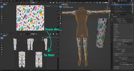
This one is focused on the arms and legs, which usually are the most problematic parts of the body to texture. Unfortunately this project will also require just a little bit more knowledge about how to use Blender, but I think it can still be really useful! It's basically a cylinder that automatically wraps around the arms and legs, kinda like a sleeve, and then you can just bake the texture from the cylinder directly into the Sim body. You could wrap that cylinder around other parts of the body, but don't expect it to look as good as around the arms and legs… So for those cases I will also add a square plane object that also adapts to the shape of the body. It works literally like those tattoos you could find inside those Cheetos chip bags back in the day lol. Want to know the coolest part about this? As you can see on the image, those objects' UV maps are extremely simple. No more messing around with that weird original S2 UV map, trying to stretch and match your texture to fit it in Photoshop. You can just slap your texture in, bake it, and it will mostly look good and seamless, just like that!
So yeah, this is what I've been working on these past couple weeks. I can't wait to properly share them all! Can't say exactly when it's going to happen, though. I've been pretty busy lately with my studies, and also got sick, yay. But oh well, let's just say "coming soon", at least for now.
6 notes
·
View notes
Text
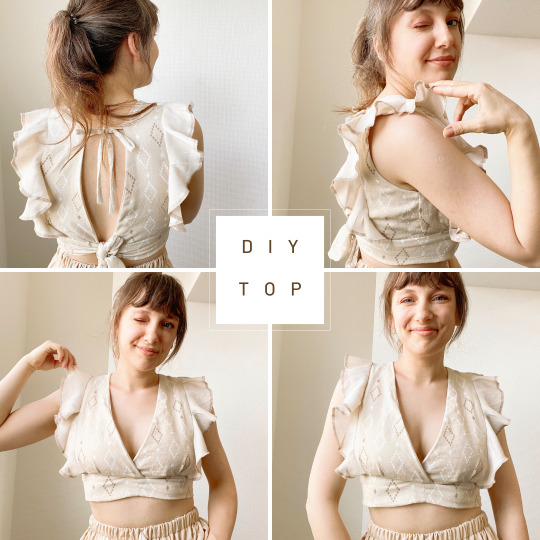
DIY Tie Back Top with Ruffle Shoulders: Your Perfect Summer Sewing Project!
Hey there! I am beyond excited to share with you my latest sewing project - a stunning DIY tie back top with charming ruffle shoulders. 🎀✂️
This easy-to-follow tutorial is perfect for both beginners and seasoned sewists alike. In the first part of the video, I'll guide you through customizing the pattern to ensure the perfect fit for your body and style. It's a fantastic opportunity to showcase your creativity and make a top that's uniquely you.
Once you have your customized pattern ready, we'll move on to the sewing process. I'll take you step-by-step through sewing the ruffle shoulder details and creating the tie back closure. With detailed instructions and helpful tips, you'll be amazed at how effortless it is to achieve professional-looking results.
The tie back feature adds a touch of playfulness to the top, while the ruffle shoulders exude femininity and charm. It's the perfect summer staple that can be dressed up or down for any occasion. Pair it with your favorite jeans, skirts, or shorts for a chic and stylish ensemble.
I invite you to watch the full video tutorial on my YouTube channel for a comprehensive guide to creating this fabulous tie back top with ruffle shoulders. Don't forget to hit that "like" button if you find the tutorial helpful and subscribe to my channel for more inspiring sewing projects.
Let's make this summer a season of creativity and self-expression through sewing! Share your thoughts, questions, and your own beautiful creations in the comments below. I'd love to hear from you and see the incredible tops you make.
Join me on this sewing journey and let's celebrate the joy of creating together. Happy sewing, lovelies! 🌺🧵
youtube
#sewing tutorial#ruffle shoulder top#summer sewing#sewing project#sewing inspiration#diy fashion#sew with me#sewing fun#fashionableDIY#modern sewing#Youtube#sparrowrefashion
2 notes
·
View notes
Text
All the Best Paper Pumpkin Kit Alternates
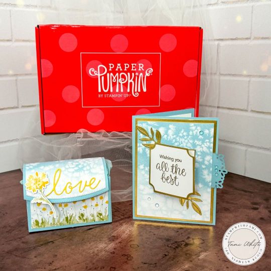
DECEMBER KIT ALTERNATE PROJECTS
It’s time for our APPT – “A Paper Pumpkin Thing” blog hop and it is full of inspiration. This month we’re sharing alternate ideas featuring the December 2023 “All the Best” Paper Pumpkin kit. Take the blog hop below for more inspiration.
Today, I'm excited to share not one but two delightful projects created with leftover pieces from the December "All the Best" Paper Pumpkin Craft Kit. While the original kit projects are stunning on their own, I love exploring alternative ways to use the materials. These coordinating projects are perfect for adding a personalized touch to your crafting repertoire.
-
Pull Tab Flip Card: A Step-by-Step Guide My first project is the eye-catching pull tab flip card. This interactive card not only showcases the versatility of the "All the Best" kit but also introduces a fun and engaging element. The step-by-step PDF tutorial provides clear instructions, and to make it even more accessible, I've included a template for the card. Accompanying the tutorial is a helpful video demonstrating the techniques used in creating this charming pull tab card.
-
Purse Style Treat Box: Repurposing Creatively For my second project, I've transformed kit leftovers into a purse-style treat box. This adorable box is not only a practical way to package treats but also serves as a charming gift in itself. The blog post features another comprehensive PDF tutorial, guiding you through the process of crafting this delightful treat box it also includes a template. Don't miss the video demonstrating the assembly of the box for help putting it together.
-
Love of Spring Paper Pumpkin Add On: A Special Touch Have you noticed the elegant "love" embellishment on the treat box? I used the new Love of Spring Paper Pumpkin Add On dies for that special touch. These Paper Pumpkin "add on" dies coordinate with the January to March kits, but as this project showcases, their versatility extends to numerous other crafting endeavors.
-
Videos Galore: Watch and Learn To make your crafting experience even more enjoyable, I've included not only the tutorial videos for each project but also a kit unboxing video from Stampin' Up. Get a closer look at the materials, inspiration, and possibilities that come with the "All the Best" kit. Whether you're a visual learner or simply enjoy watching the creative process, these videos are a valuable addition to your crafting journey.
Join me today on this crafting adventure as we repurpose leftovers from the December "All the Best" Paper Pumpkin Craft Kit into two beautiful and coordinating projects. Explore the step-by-step tutorials, templates, and videos to bring these creations to life. Don't forget to check out the Love of Spring Paper Pumpkin Add On for that extra touch of elegance. Happy crafting!
INSTRUCTIONS AND HELPFUL VIDEOS
INSTRUCTIONS
ALL OF THE BEST TREAT BOX TUTORIALDownload
ALL OF THE BEST PULL TAB CARD TUTORIALDownload
HELPFUL VIDEO TUTORIALS
HOW TO MAKE THE TREAT BOXHere's an older video I created sharing how to make this pull tab flip card.
HOW TO MAKE THE TREAT BOX
Here's an older video I created sharing how to make this treat box.
PRODUCTS I USED TO MAKE THESE
PRODUCTS I USED
DECEMBER PAPER PUMPKIN UNBOXING VIDEO
Send a wish to all your loved ones with the December Paper Pumpkin Kit! It comes with nine card fronts, three each of three designs, and nine coordinating envelopes. It has paper pieces detailed with gold foil, embellishments, an all-occasion stamp set, and an acetate box where you can store your finished cards! You can gift the kit itself or the finished product in the acetate box; either way, it's the perfect last minute gift for any occasion.
SUBSCRIBE TO PAPER PUMPKIN
LEARN MORE ABOUT PAPER PUMPKIN
STAMPIN' UP CATALOGS
CURRENT SPECIALS
PHOTOS
I created all of these projects and my PPX video projects from 1 pieces of a single kit.
Not one but two delightful projects created with leftover pieces from the December "All the Best" Paper Pumpkin Craft Kit. While the original kit projects are stunning on their own, I love exploring alternative ways to use the materials. I created this purse treat box and pull tab flip card alternates for today's blog hop.
These are the cards and clear card box assembled per this month's kit instructions.
This view of the box shows it from all angles. I even repurposed the tissue paper from the kit for the inside of the treat box.
The pull tab flip card is a fun interactive card design. I used the Love of Spring Dies for the gold foliage on the background.
I have complete instructions for this interactive card and the box above, as well as helpful videos.
I used the printed card fronts for the background on the box. The word "Love" comes from the Love of Spring Dies.
I used the Basic Borders Dies for the edgelit die cut on the front flap.
I'll be posting the instructions and a video for the wreath circle video shortly, check back.
Want to save these ideas for later? Pin them to your favorite Pinterest board.
Have you tried these designs? I love to see your creations! Be sure to share them on #shareyourcrafts post every Saturday on my Facebook Page.
BLOG HOP
Blog Hop Index
Read the full article
0 notes
Text
Thoughts on Development
As an aspiring indie game dev, I've dabbled in many things, and will dabble in many more. I felt inspired to put words to text on my experience in trying to create games.
I'm not sure whether I'm the minority or not on this subject, but I have found that I prefer coding something from the ground up as opposed to using a service that automates parts of it. I've used Unity and RPG Maker off and on in the past, and while many of my favorite games (looking at you, ISaT) are made in RPG Maker, neither seems to have the right feel for me.
I think part of it is the learning curve of the GUI, which in theory should make things easier. I'm sure that for many people it does. Perhaps even the vast majority! But at the end of the day, I've spent so long learning what menu items do what, forgetting where to find certain functionalities, and hunting down tutorials and documentation on buttons and features that I could have really gotten into the meat of something already.
Unity has so much going on (especially for a person who will only ever make 2D games) that if there's any time at all between dev sessions, I find myself forgetting things. None of this is to knock Unity for its mechanical aspects! It's simply my own style and how I interface with the world.
RPG Maker has less of that issue, but more of another issue altogether: its rigidity. If you want to make a turn-based game in the style that the software is built for, you're golden. Want to make a walking sim with no combat, no menus for leveling up, etc? Want to have a skill tree? What about custom status effects with timers and cooldowns? Prepare to don your religious attire and worship the creators of plugins (or forge your own path and learn to code them yourself), because you have to break the system to do things that I expected a bit more flexibility on (All Hail Yanfly our Lord and Savior.) Somehow in spite of this, I've spent more time dev-ing in RPG Maker than anything else at this point. Eventually I think I found a rhythm, and got very invested in those projects.
At this point though, I've been learning various languages for game dev to try and find one that suits my style. I've dipped my toes into Python, Ruby, and even Common Lisp, and each have their own strengths and also things that didn't quite mesh with me. While this process certainly involves reinventing the wheel sometimes, it's fun to really fundamentally understand the mechanical nature of the game being created because I coded it. I'm curious to dabble in more things, as I find learning to be incredibly enjoyable. At the same time, learning forever does not an indie game make, so I will put dabbling on hold for a while so creation can occur.
1 note
·
View note
Text
Beginning development
I have chosen to focus on creating the post processing I want for my game before the gameplay for a very specific reason. I don't want my game to feel wrong with them. I want to design the entire game with a focus on making it look like an N64 game which will be a lot easier if I add that post processing in the beginning.
I am going for the retro CRTV look.
As far as I can tell, there is a few things going on here that I can emulate in my game. The first is that the screen is like a convex lens, so I'm going to have to add some form of lens distortion to my camera. The aspect ratio for most of these TV's was 4:3, which will also require a change to the camera. Lastly some chromatic abrasion and film grain to complete the look.
Chromatic abrasion and film grain can both be edited directly from the post process setting so they were the easiest.
For the aspect ratio, I just ticked 'constrain aspect ratio' and set it to 4:3. I also reduced the FOV to 65 to add to the look.
youtube
I found this video based off the backrooms game and the VHS effect in that. It goes over how to add a post process material to sharpen the visuals. It also gave me the idea to add a slight blur to the screen using the blur box as a widget. Another thing mentioned in this tutorial was how to add weight to players moving or turning. I attached the camera to a spring arm and added lag. It would be good to note that this wont work if you have the set control pawn rotation enabled for the camera and disabled for the spring arm, which is how mine was originally. I spent a good half an hour trying to figure out what was wrong with it. The last thing I added was a lens flare just by adding a lens flare image to the post process.
youtube
For the lens distortion I found this bodycam effect on YouTube which bends the camera like it was a VHS. I reduced the values to make it fit the VHS look a bit better because it did look more like a police bodycam.
I was watching a play through of the indie horror game 'The convenience Store' and saw they used scan lines which I had completely forgotten about. I looked for tutorials on how to create them but could only find a time lapse of someone else making their own effect.
youtube
I ended up
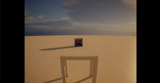
Now my game looks like its being recorded by someone holding a VHS, I need to make the the game look like it's being played on an N64.
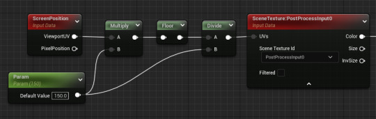
To get a slightly pixelated look shown with N64 games I created a post process material and used this code. I find myself forgetting to change the material to post process which usually ends up stopping it from working but that's easily fixable, it can just take a while to figure out what's wrong if you leave it too late.


Dithering is an effect commonly used in digital art namely pixel art that applies a sort of noise to images creating an interesting effect. This was how older consoles represented lighting.
Using a more styallised form of shading used originally to reduce processing power for older consoles. I will be doing this by identifying how light a place is and adding these PNG's above depending on it. Ranging from 0% (black) to 100% (white).
0 notes
Text
So... now that I had to take a few months off of creating, I got into a deep slump regarding my art. I had time to step away from it and observe it critically, and honestly I didn’t like what I saw at all.
I was ashamed of everything I posted online, I looked back and realized that I barely liked any of my finished pieces at all, regardless of the energy I put into them. Eventually I broke down and after a while had a therapeutic talk with my (also artist) sister-in-law. She slapped a few videos about impostor syndrome at me and had a lenghty talk with each other. I realized a few things about my art and being an artist in general, which I want to try put into words, so bear with me.
Back then when I was only drawing for myself, for my own pleasure, I didn’t think much about how other people perceive my art. I had fun in the process and I had fun looking at the finished piece, regardless of how many mistakes it had. Then later I got more conscious about being an artist in general... because everywhere around me I saw that as an artist, you MUST keep on challenging yourself, push your limits, do studies, keep practicing to the point of exhaust, that it’s BAD if you keep drawing the same thing over and over even if it makes you happy, you have to get out of your comfort zone and just go higher and higher and HIGHER and nothing is ever enough.
And I believed this.
So when I got a bit conscious about my art, I asked a few people for constructive criticism. Just for consideration, this was a naive girl who just enjoyed doing art, who was proud of her achievment of being a self-taught artist, who was proud of her continuous improvement and opened herself for criticism, because she thought it will be for her benefit.
The result was devastating.
Don’t get me wrong; I really was BAD at art. But I’m very bad at taking criticism in general, I feel bad about producing bad art and hurting people’s eyes with it. So I would rather stop creating completely, because I think, “okay I tried, I failed, let’s forget I ever wanted to be an artist”. And the criticism I got just made me feel even worse. It was YEARS ago and it still HURTS. It still makes me numb. It still makes me doubt myself. It makes me think I’m an impostor. That I shouldn’t have started drawing at all. Things were being said like... “You have no idea what you’re doing” “you should go back to the basics” “just draw circles and cubes until you figure it out” “you use a thousand colors but the picture is just a mess” “you keep mixing shading styles, you should stick to either cel-shading or soft shading, because it hurts the eye” and so on.
So I broke down. And when I got myself together, I started forcing myself to improve. I read thousands of tutorials, watched hundreds of videos, I did a lot of studies, color theory, anatomy, lights and shading, anything you could possibly imagine. It didn’t help. It just made me even more unsure of what I want and what I should try to achieve. I wasn’t just drawing for myself anymore. I was drawing to avoid hurting other people’s eyes with my horrible art.
Of course I got positive feedback as well. But I disregarded them all. I thought, “they don’t know what they’re talking about” or “they’re just trying to be nice and hide what they’re really thinking”. I kept pushing and pushing, I tried to create art which was palatable for others, art that I thought others expect from me. And in the process I forgot what I even enjoyed doing.
Only after thinking a lot, I realized that the art I enjoy making might actually hurt people’s eyes. Because it’s not the overly detailed cute moemoe pinup anime art that you see on tumblr or pixiv with 850 lighting and touch-up effects. I’m not good at it. I’m not a good artist. I’m a storyteller, and I enjoy using my art to tell stories more than just making a random pretty art of a random pretty character. I COULD do it, yeah. But it would take me weeks or even months, unlike other people who can finish those type of super pretty art in just a few hours. So does it worth it? Especially if I don’t even enjoy the process? I don’t think so.
I don’t really have the free time I had years ago when I tried to constantly improve and push my limits. And I don’t even have the same mindset as before. Why should I keep pushing myself? Why should I keep feeling uncomfortable about my art? Why should I always try to improve and draw things I don’t enjoy? Is it not enough if I just ENJOY creating? Why should I keep caring so much about other people’s opinion? Just because my art doesn’t have so many details as the ones posted online? Just because my art hurts other’s eyes? But what if it still makes me happy? Is it not enough?
Honestly if I had to choose between making myself happy with creating bad art or trying to satisfy those people who said I have no idea of what I’m doing, then I would choose myself. No matter how I bend myself, they will probably still keep hating my art. Maybe they even hate me too. So why should I care about people who purposely crushed a naive girl’s confidence, who said I should never be happy about my art, because that’s not the way an artist should be. So really, I hope they eventually stumble upon my blog and I keep hurting their eyes with my art. They deserve it, because they basically told me I should never be happy as long as I keep creating.
So yeah, that’s how it is right now. I’ll keep posting art. I don’t care if the light source is bad. I don’t care if it’s not dynamic enough. I don’t care if I missed coloring a spot. I don’t care if it doesn’t have 130 shading layers and pretty after effects. You know, I used to say about my art that “as long as there’s just 1 person that I can make smile with my art, I’ll be satisfied”. It’s time to include myself. Maybe that 1 person will be only me. And that’s enough.
#personal#long post#artblock-y ramble#imposter syndrome#idk if its imposter or impostor we say impostor in my language
1 note
·
View note
Note
I have been experimenting with transparency art (thank you so much for your tutorial!), but my biggest question is: how on earth do you get it to overlay on other colors? Its absolutely mind bending
With much patience and frustration 😫 (>>>The previous tutorial<<)
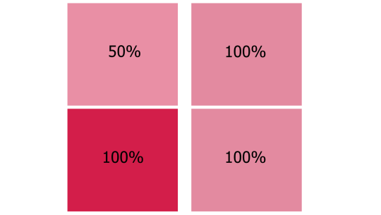
The key to making transparency work with colours, is getting the colour saturation and opacity levels to visually match.
Let’s lay down the basics. I've got these two coloured boxes and I want one of them to be transparent. But I also want them to stay the same colour until someone clicks on them, right?

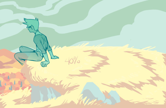
Of course, the problem is that as soon as we drop the opacity, the colour saturation also drops and we get this:

So what you have to do is hyper-saturate the colour of the low opacity area until it matches the full saturation one.
Or as close as you can get. If you can't get it exact, colour-pick from the 50% opacity area and recolour the 100% area so they match. This works best with colours that are already muted or pastel.
That's the basic principle. It gets 10x more complex when you start adding multiple colours and backgrounds... Full tutorial continued under the cut (this is going to be a LONG post) vvv
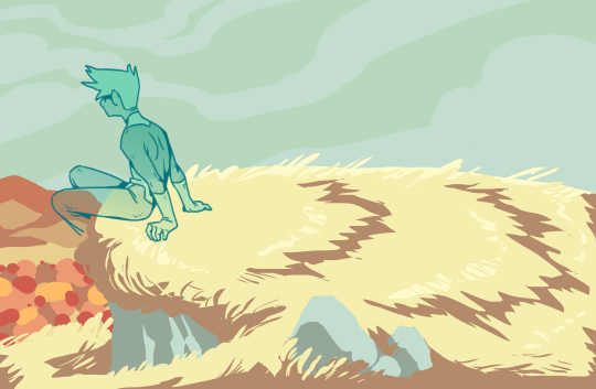
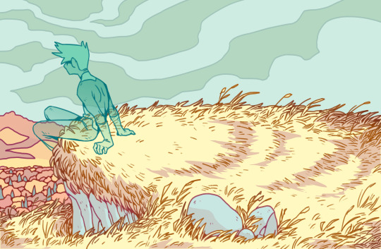
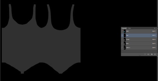
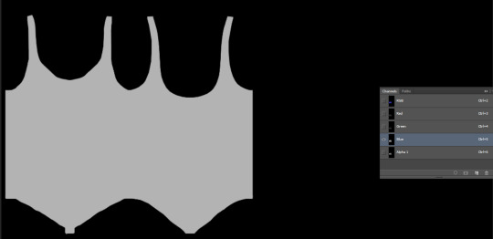
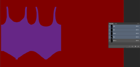
I'm going to use my Hill King ectober piece because it's a good example of how this transparency trick works on complex pieces.
The first step is to plot out approximately what colours/mood I wanted to end up with in the final piece.
Next I push my saturation ALL the way up.
And then drop the whole background opacity to 40% (Keeping all your background layers in a single folder is the easiest way to do this) I fiddled around with the individual colours, pushing their saturation and hues until I was satisfied with this sort of pastel look.
And here we are with the lineart added in. A few things needed to be retouched to accommodate the lines and that’s normal. If you have to change a few things make sure to pull your colours from the 100% version and not colour-pick from the low opacity.
Now to make the transparent section. This part may vary depending on your drawing program. I'm using Krita but I'll try my best to make the process applicable to other programs.
This is where it gets complicated:
Save two versions of your image.
One with lineart and colours at 100% full saturation.
One with the low opacity colours and NO lineart.
Make sure you have a white background under everything so that they are NOT transparent yet. Saving the two versions as flat images is VERY IMPORTANT. Do Not merge all your layers. Just save as a PNG.
Your two versions should look like this:
On a new layer draw your cut-away shape. This is the area that you want to be transparent at the end. I used an eraser for the stars and crown so they show up as the colours underneath. If you can, make the edges of your shape just a little bit blurry. Hard edges will show up and reveal your trick.
Duplicate this layer so that you have at least two copies.
You are now going to cut your shape out of the low opacity flat image. In Krita that means setting the cut-away shape layer to ‘Erase’ and merging it down with the low opacity layer. With other programs it might mean selecting your cut-away shape and manually ctrl+x cutting the shape out or using some kind of clipping mask.
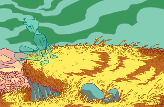
If you’ve done it right, you should be able to see your high saturation layer with the lineart underneath.
By dropping the opacity of your high saturation layer it should blend in seamlessly with your background. In this case, I drop it down to 40% to match. You’re going to get this funky little ghost effect with the lineart from underneath.
If I had kept my lineart as part of the original low opacity image when I saved it, it would have ended up looking like this:
Now, remember how I said to make a duplicate of the cut-away shape? That comes back here. The cut-away section of lineart is stuck at 40% opacity. If we simply plop our lineart back on top of everything at it’s current opacity, it stands out too much. (In my opinion, this might be perfect for your piece!)
But I want it to blend in a bit, more like this:
So I take my lineart and my cut-away shape and do the exact same thing as before. Except this time I keep my shape at 50%. In Krita, with the Erase layer, this means it only erased 50% of my line’s opacity. I have zero idea how this would work with a clipping mask, sorry :(
Which gives us this:
(Use a black background under the see-through area to show it off)
And that’s it! We now have transparent colours that blend seamlessly with the full opacity sections and lineart that is clear but doesn’t distract from either version!
Turn off all your background layers and save as a .png image (this won’t work with a .jpg!). Upload your pic to tumblr and see if it works. If the transparency doesn’t show up correctly you may have to scale your image down to a smaller size! Tumblr is very picky like that.
This process isn’t perfect and it sure takes a lot of time but the effects can be super cool and totally worth the effort! If you’ve made it all the way to the end of this LOOOONG tutorial you are a BAMF! Put a little ‘yeehaw!’ in the notes for yourself and Happy Arting!
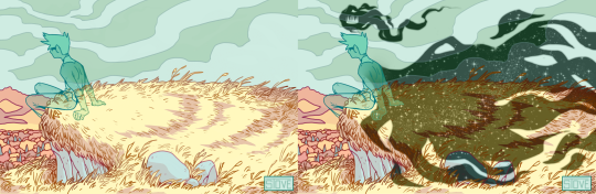
#tutorial#art tutorial#transparency tricks#transparent art#stove replies#long post#art ref#do you ever sit and realize you're kind of pioneering a wildly niche art technique?#idk maybe there's people out in DeviantArt who know what's up#faq#34420#not me forgetting my own process while making this tutorial#this tutorial has been a LONG time coming#krita
3K notes
·
View notes
Text
Specular Maps Tutorial
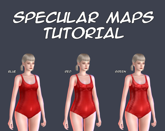
There is no so many information about these maps and most of this information is too difficult for my understanding, so I decided to make my own tutorial about them.
This tutorial shows you how to make your own specular maps from scratch without using EA’s maps as a base. You can read it under the cut.
Note: English isn’t my native language and I’m pretty bad in writing in it, so sorry for any mistakes. Still hope this tutorial will be understandable for you.
First of all I recommend you to check out this tutorial for specular maps. It’s for build CC and it’s in Russian (still can translate it with google), but it has some nice examples. It also helps me a lot to understand the process.
That you need? Any image editor that supports dds format and alpha channels. In my case it’s Photoshop C6. You also need to download dds plugin for it.
Let’s start!
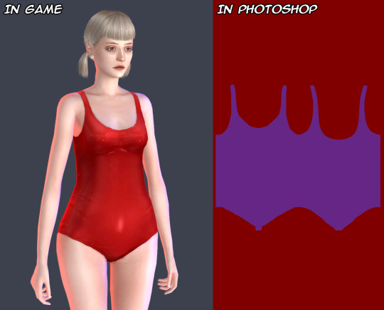
I’ll be working with this EA’s swimsuit.
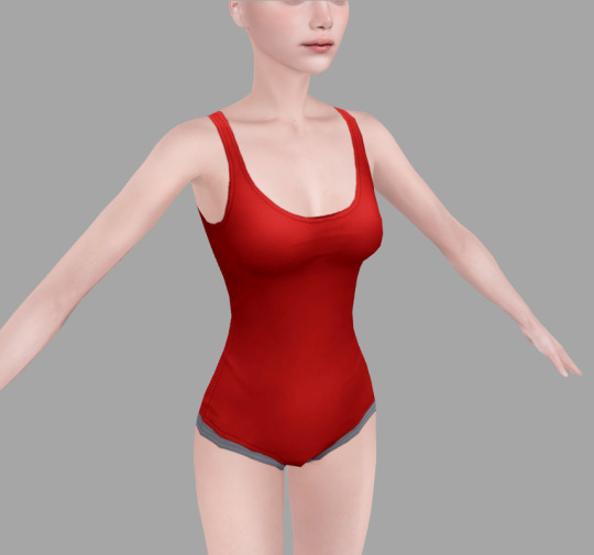
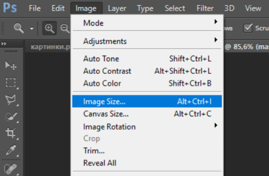
1. Open your texture in Photoshop. For now, we need change image resolution. If you make non-hq texture the size for your normal map should be 512*1024 pixels, if hq then 1024*2048 pixels.
Easy way to doing it is to go to «Image->Image Size», copy the first value and past it in the second. Don’t forget to check out «Costrain Proportions». It should be turn on.

2. Now make new layer under the layer of texture and fill it with black color, lets name it «background» and the texture as «main texture». Then create the another new layer, name it «mask». It should be the plain white copy of the «main texture» like in pics below.
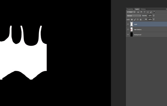

Easy way to doing it in Photoshop:
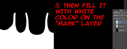
3. Save the file as psd format. This is our base for the specular maps.
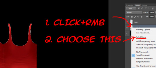
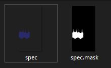
4. At the first we should make mask map. This map is needed for avoiding speculars from others CAS items to overlap your own. Examples can be found here.
For mask map you need to delete «main texture» layer, merge remaining layers in one and save file in dds format. Name it «spec.mask».
The saving settings which I use for dds plugin.
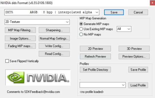
Note: If you want to make your specular map without any shines you need to save your mask map as DXT1 and spec map as DXT5, otherwise your specular maps will be broken in Studio.
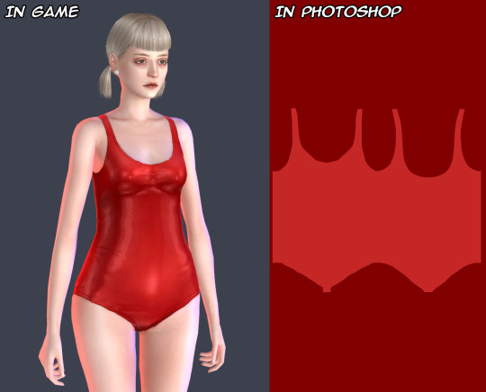
5. Close your psd file without saving and open it again. Now we start to make the spec map. It’s responsible for the shine.
There is two ways. You can work with plain texture or with texture itself. The first option is good for clothes with normap maps, the second can be pretty useful for make up, stockings, gloves and ect (the CAS items which can’t have normal maps).
In this tutorial I’ll be working with plain texture.
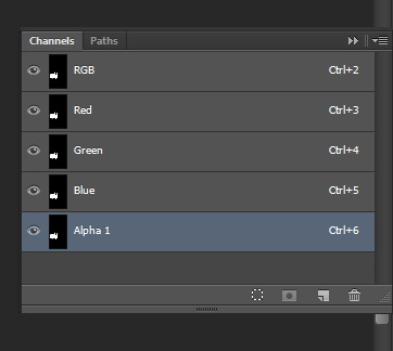
Merge all textures again. Select the layer and copy it (ctrl + A and ctrl + C).
Go to channels and create Alpha channel. Paste your layer in this Alpha channel (ctrl + V).
Should be looking like this.

I will use lighter shades of gray to make the tutorial more obvious. But for my CC I personally use more darker shades to make CC barely shine.
Choose “Brush Tool” with black color and put it’s Opacity to 50%.
Note: You also can use “Paint Bucket Tool” or “Brightness/Contrast”, but they don’t always work fine, so be aware of that.
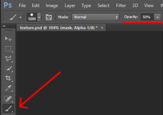
The choosen color should be black! (#000000 color code)
Make the size of brush big enough to color in channels in one touch.
Go to channels. I decided to color in Alpha channel in 50% Opacity.

Red channel in 80%. (Put Brush Tool’s Opacity in 80%. Make sure the color is still black.) The same way with Green channel.
For Blue chanel I chose 30% Opacity.
Make all channels visible. The result should be looking something like this. Making different shades of gray in different channels causes the diffent results in game, so I recommed to test this channels more to get more interesting results.
Note: Make shure that the area around your texture is still black while Alpha channel invisible and red while all channels is visible! Otherwise the whole body of your sim and any CC without mask map will be shiny!
6. Save your file as dds format, name it “spec”. You can close your psd file without saving it or saving it as another file, if something goes wrong.
Your specular maps should be lookig like this.
Note: If you name your spec map as “myspecmap”, the mask map also should have the same name, but with “.mask” in the end ( for example: “myspecmap” and “myspecmap.mask”). Otherwise Studio won't see your specular maps.
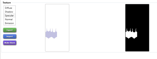
7. Open your CC in Studio and put your specular maps back. Choose one of the files, the other file will be placed there automatically.
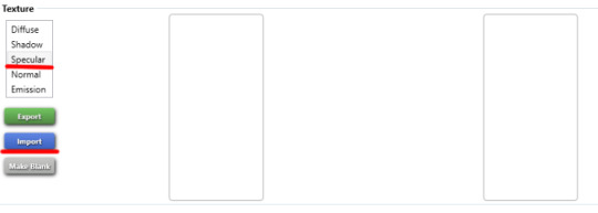
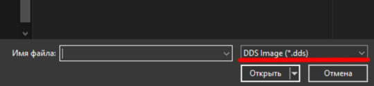
Don't forget to change to dds format while looking for your maps.
Should be looking like this. The first map is transparent and the second is black and white. It’s important!
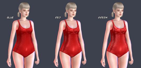
8. Lets check out our maps in game! I also made others specular maps to feel the difference between their effects.
If Blue channel is lighter than others RGB channels. Result of the tutorial.
If Red channel is lighter than others RGB channels.
If Green channel is lighter than others RGB channels.

For a better view.
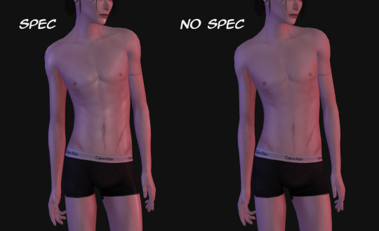
And another example how specular maps can be used. You can make speculars with wet skin vibes for your sim. I used skindetails by obsurus-sims and by me.
Note: Make shure not posting for public such СС and use it only for personal uses or with creator’s permission! Let's respect the work of others creators!
That's all! Maybe in future I'll add more information about specular maps and some tricks. But for now the language barrier still is problem for me :(
Hope it’ll help you somehow! Wish you good luck and inspiration for your future creations!
475 notes
·
View notes
Last Seen Blogs
maybekrazi
Maybekrazi

c-k-mack
Canon Schmanon! Ship who you like!

do-i-even-exist
ambivalent

s2mon-amour
unicórnio tumblr S2

divine-art-online-blog
Untitled