#noto-font
Text


56 notes
·
View notes
Text
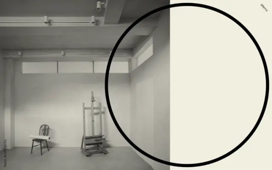
Noto Architects
#Noto Architects#architecture#design#studio#architects#London#portfolio#type#font#Friedel Pro#2023#Week 34#website#web design#inspire#inspiration#happywebdesign
9 notes
·
View notes
Text
Hi everyone! As you may know, this tournament includes all emoji up through the Emoji 14.0 update to the Unicode standard! The newest emoji, though, are the ones from Emoji 15.0, approved in September of last year! These aren't available on all platforms yet (emoji rollouts are slow), so they're not a part of this tournament, both to ensure that more people can participate, and because I don't have them on my phone yet, so it would be hard to see what I was doing! (I run this whole tournament from mobile, since that's the easiest platform to type emoji on.) The updates are decided by the manufacturer, so I have to either wait for my phone's maker to get around to it or root my phone just to install new fonts on it (since it's not zFont compatible). (I'm really tempted toward the latter but I'm scared of breaking it.)
So, out of curiosity, I wanted to ask about how many of you guys have these newest emoji! The Emoji 15.0 additions include the pink, gray and light blue hearts, the shaking face and the wifi symbol! I'll paste them here so you can see if they display for you: 🩷🩵🩶🫨🛜!
13 notes
·
View notes
Text
because i’m ridiculous i’ve picked a thematically appropriate page divider
#i just wanted to test what it would look like and it's incredibly cute so there she is!!!!#apparently this disco ball is an emoji on noto emoji font??? no idea what that is#but the aesthetic is immaculat#*immaculate
3 notes
·
View notes
Text


Peace and love on planet Earth
#sodalite speaks#Wahhhh they're so cute!!!#I love you Noto Emoji Font I love you Noto Color Emoji font!!
0 notes
Text
it is so dfucking hard to find free use web fonts that include traditional chinese, let alone a font that's legible, fits with other languages, and isn't an ugly basic bitch font
#fuck you NoTo your design is so basic it burns#I appreciate the hustle to make sure there's a consistent fallback font for all unicode glyphs but like#its ugly as fuckin sin and I hate it#if you want traditional chinese web fonts you either gotta dumpster dive to ultimately pay out the nose#or you gotta settle for one of five butt ugly basic bitch fonts#marclemore's thots and preyers
1 note
·
View note
Text
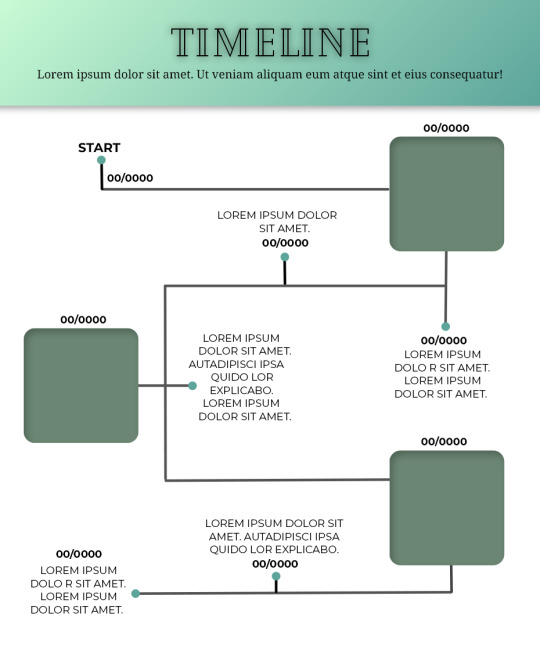
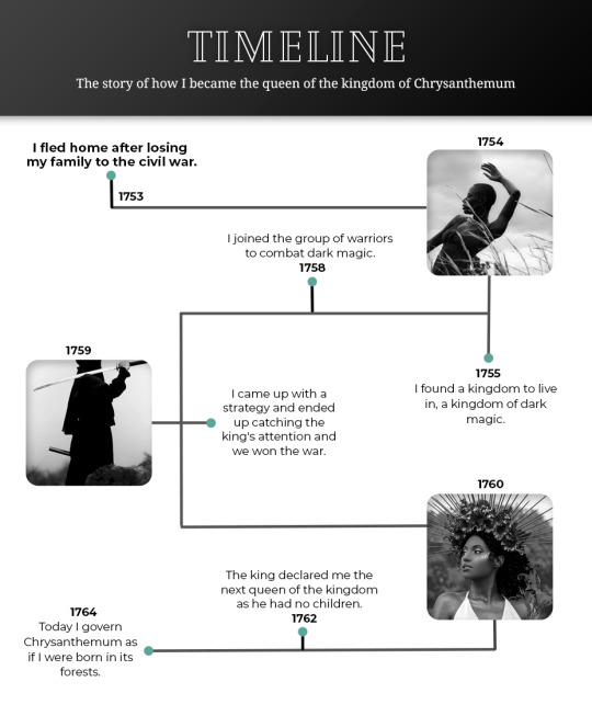
Template #008 by dailyresources
— Timeline Template
Please do not repost / redistribute or claim as your own.
Please, like or reblog if you download.
You may edit as much as you like, it is fully customizable.
This is a free template. PSD File.
Credit is very much appreciated.
Photos by pexels.
Any issues, don’t hesitate to contact me!
Fonts: Cheque, Noto Serif and Montserrat.
Enjoy ❤
Download Link: [mediafire] or [payhip]
Support me on [ko-fi]
#templates#timeline template#timeline#free template#psd template#free resources#graphic template#photoshop template#photoshop resources#evansyhelp#dearindies#chaoticresources#allresources#hisources#yeahps#my creations#*mine#*
153 notes
·
View notes
Text
the official jan Misali styleguide
so uh I decided to compile together a bunch of rules that I've come up with over the years for myself for how I write videos. this is not comprehensive and is unlikely to be genuinely useful to anyone (very few of these are things I'd consider to be "good advice" for anyone else who wants to make videos, they're mostly just how I personally do things), but here we go anyway!
text
text should be typeset in Noto Serif by default, using other fonts for their specific aesthetic effects on a case by case basis, always presented in contrast with Noto Serif
text should be white, on a black background, with keywords highlighted in teal (#008472)
text should use justified margins, unless this looks bad or is too hard to do with the specific program being used
the pronoun "I" should always be capitalized
proper names should usually be capitalized, but may be left in lowercase to convey a less formal tone when appropriate
the name "jan Misali" should be written with a lowercase "jan" and a capitalized "Misali", following toki pona capitalization conventions (and in general, all toki pona text should follow toki pona capitalization conventions, only capitalizing proper names)
brand names with irregular capitalization such as "YouTube" should always be in lowercase ("youtube") as a sign of disrespect
words may be capitalized for Emphasis, but this should be avoided sentence-initially
avoid capitalization for any other purpose (such as sentence capitalization or all caps) unless this is done to imitate a specific style meant to contrast with the default Misalian style
in addition to the aforementioned teal-coloring and capitalization, words may also be marked as emphasized using italics
these three styles of emphasis should be used for different purposes: teal for keywords (emphasis primarily to aid in reading), italics for spoken stress ("normal emphasis"), and capitalization for the Other Kind (meant to get the reader to slow down and pay attention to the Specific Wording of the emphasized section, but without drawing immediate visual attention to it in the way teal text does)
punctuation should only be used when it is strictly necessary for the text to be parsed or when it conveys meaningful information about how the text would be read out loud (the apostrophe does not count as punctuation for the purpose of this recommendation; it is included as part of the spelling of words it appears in)
the word "amateur" should be spelled "amature" without explanation
numbers should be written out in full as words, unless they're being used for alphanumeric codes, entries in a numbered list, years, or a video about math
text should be written word for word as it would be pronounced out loud, including filler words ("um"s and "like"s) and contractions, following the manner of speech outlined in the next section
narration
everything should be written in a formal but conversational tone, with hesitations, filler words, and stutters carefully inserted to make it sound less "written", as though the narration is one continuous unscripted infodump
however, nothing should ever genuinely be unscripted. everything should be phrased very carefully to convey information precisely and efficiently in a way that is easy to understand
there should be some sort of attempt to pronounce non-english words authentically, especially with proper names (unless there exists a common-enough anglicized pronunciation that you can be confident is more likely to be understood)
nothing should be written in a way that assumes that the audience knows less about the subject matter of the video than the narrator, except in very rare cases where this assumption is appropriate (such as when using an explicitly educational style, or when the subject is so niche that acting as though everyone already knows about it would be actively detrimental). information should always be presented as though it's a recap of common knowledge ("right?"), something that the narrator only learned relatively recently ("apparently"), or something that the narrator is unsure of ("I think")
jokes should never get "in the way" of the actual video. they should serve a purpose just like everything else. (the key question to keep in mind here is "if someone doesn't find this funny, what could they take away from it instead?". the answer should be something like "it would just be information presented in an unusual way" or "it would just be an awkward transition between two unrelated topics" or something. if the answer is "nothing, it would just be a joke they're not getting" then it had better be a really funny joke to justify its existence.)
calls to action should be avoided. the video should respect its audience members to make decisions for themselves, and only directly tell them what to do in exceptional circumstances
440 notes
·
View notes
Text
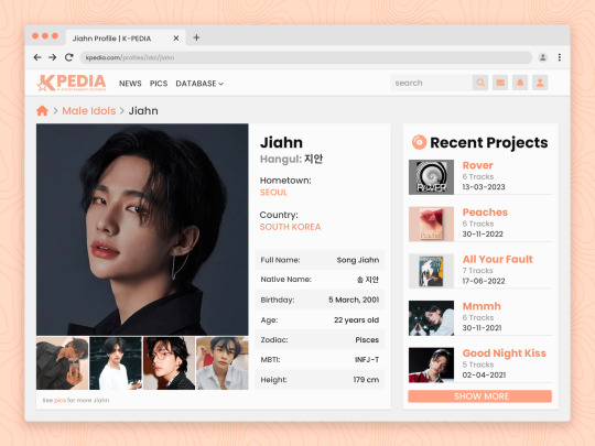
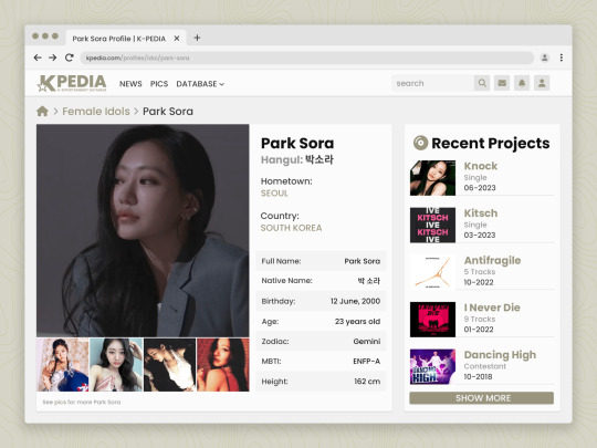
SEARCH ME — character psd template
a character profile template that looks like a fictional celebrity profile database inspired by kpopping.com! this template is perfect for a celebrity-inspired character with plenty of space to list out notable or recent "career" items and up to five photos.
all photos and text are fully customizable. this template is recommended for those with intermediate experience with photoshop.
DETAILS:
fonts used: Poppins, Noto Sans Korean, and Font Awesome 6 Solid (Free)
sample images are credited to their rightful owners
do not copy, steal credit, or monetize this graphic template (see full guidelines)
customization, including removing elements of this template to add to another, is permitted so long as the other template owner(s) allow it as well
this is a premium template; please do not share with others
please like/reblog and credit me by linking back to my blog if you use this template
optionally, please tag me or send me a link so I can see how you've used this!
* download from payhip
#roleplay resources#template#resources#rp resources#psd character#character psd#psd#roleplay psd#rp#template psd#dailyresources#completeresources#* mine#* chara
355 notes
·
View notes
Text
Making Accessible Interaction Banners - a Guide by Binoo "ChildrensWard"
Interaction or "DNI" (do not interact) banners are a staple of the age regression community, but too often are they made without taking accessibility in mind, whether it's because they're unreadable, have excessive eye strain, or aren't marked with alt text.
Therefore, in the hopes that I can help people out with this, I decided to write a mini guide on how to make your banners accessible for as many people as possible!
Under the "read more" cut, this guide will cover the following:
Fonts, and how to choose the best ones
Text, and what your interaction banners should say
Colour contrast, and why it's important in making your graphics accessible
Eye strain, and why it generally should be avoided
Alt text and image descriptions, and how to write them
And an example of an interaction banner I made using the criteria I've written in this guide!
So, without further adieu, let's get into the real meat of this guide!
Fonts
Fonts are easily the most important thing about an interaction banner! It's how you're going to best convey the contents of your banner in a way that's readable to the viewer. Here's a quick and firty rundown of the different kinds of fonts, as well as which ones you should (and shouldn't!) use for your banner:
Body Copy fonts are your basic Sans and Sans Serif style fonts that you'll most often find on books and websites, because they're some of the easiest fonts to read in smaller text (10-14pt) due to their lack of details. Examples of Body Copy fonts include PT Serif, Arial, Comic Sans, Roboto, and Helvetica Now.
Display fonts are often used for headers and subheaders and include features such as being thick, having unconventional letters, and, on occasion, being in all caps. However, these fonts should not be used for body or small text, as they will be very hard to read. Examples of Display fonts include Futura PT, Elephant, Noto Serif Display, and Shoreditch.
Script and decorative fonts are subtypes of display fonts, with the former having a handwritten quality to them, while the latter are considered to be the fun display fonts. However, you should be very careful with using either of these fonts- not only can they be hard to read on their own, but neither should be used specifically for body or small text in any circumstance. For the sake of readability and accessibility, however, I'd be more inclined to avoid using these fonts.
Text
Aside from the fonts that your text will be written in, the text itself is also a mandatory aspect of your banners. After all, it's what banners are entirely based on, and it's the very thing that tells you who can and can't interact with your posts.
However, there's something important to keep in mind, and that is how much text you're trying to cram into your banner because you're trying so desperately to fit your entire DNI criteria onto it.
What I think is important when it comes to making your banners is to keep any text you have on there as short as possible. If you bombard your banner with all this specific criteria, then you're more likely to make your readers confused, whether or not they happen to be a screen reader user.
When making your banners, ask yourself the following questions when deciding on your criteria:
How likely is it for someone interacting with the age regression or similar communities to fit this criteria? Have I come across a good number of people who fit this criteria that makes it worth mentioning?
Is this criteria at all relevant to the content I'm presenting? Do I need things like inter-community discourse terms from other communities on my banner if I'm making content specifically for age regression?
Is there any "unspoken" criteria that everyone agrees upon that doesn't need to be included? These might include nazis, racists and white supremacists, homophobes and transphobes, ableists and eugenicists, misogynists, anti-choice, etc.
If your answers show that the specific criteria is not relevant, then it's best to leave it out to keep the information on your banner more clear and concise.
Colour Contrast
While colour contrast is something often talked about in web development circles, it's also an important skill to learn when making any sort of graphic design- which is what interaction banners essentially are. Without taking colour contrast into mind, you're left with a banner that may not be easy for most people to read; let alone those with low vision or blindness. We also need to think about things like people who may be using old or outdated monitors, people reading on smaller screens (like a smart phone), and bad lighting and glare. As Contrast Rebellion puts it: aesthetics are important, but aren't the ultimate goal of design.
Okay, so you've understood the reason why colour contrast is important, but how do you put it into action? How do you know your colours of choice are readable?
Well lucky for us, there's many resources out there that help us in choosing the right colours! Here are a few of my favourites:
CSUN: Color Contrast - An introduction article on colour contrast, why it's important, and some examples of good and bad colour contrast choices.
Random A11y - If you don't have any colour combinations in mind, Random A11y is here to help! With it's vast amount of randomly generated colour contrast combinations, you'll have plenty of options to work with. Don't like the combination you're given? Just click on the "new colours" tab to generate a new palette!
Colour Contrast Analyzer - This is a free program for Windows and Mac that helps you with colour checking with a variety of different features; including multiple ways to select colours (CSS color formats, RGB slider, colour picker tool), and a colour blindness simulator.
Accessible Colors - If you don't want to or can't download the program above, then this website works just as fine with checking colours, too! Just enter in the hex codes of your colours, the font size and weight, and which level of conformance you'd like your colours to pass.
Eye strain
A bit of a sore topic for some, but I feel I must put it bluntly for people to understand: making your colours easy on the eyes of the viewer should be your top priority over your aesthetic. Some people, like myself, have certain health conditions that are triggered by eye strain, and by continuing to slap extremely contrasted rainbows on your banners, you're continuing to put disabled people through worsening symptoms, all because you feel the need to retain your aesthetic.
Many of the same resources shared in the Colour Contrast section can also help you to rule out any eye-straining palettes. Also, a general rule of thumb to keep in mind is: if a colour palette is eye straining enough to cause you some mild problems, then it's enough to cause someone with a disability more severe symptoms.
Alt text and image descriptions
I think a lot of us find writing alt text to be daunting- I know I did for a long while, which is why I never wrote any for my posts until recently. But really, once you get the hang of it, it can be very simple and easy to write! Even so, people who don't know how exactly to write alt text often fumble with this- either writing too much or too little, not being clear enough, or just copying the image caption and calling it a day.
Here's some tips and tricks on writing better alt text:
Alt text generally follows the Object-action-context rule. In the words of Alex Chen at Medium: The object is the main focus. The action describes what's happening, usually what the object is doing. The context describes the surrounding environment.
Be specific and concise, and even consider the content of the post or webpage it's on as well. You'll also want to consider the function or purpose of the image, and what you want your viewers to gain from it.
Keep your alt text short, as long descriptions with too much flowery language and filler words can be distracting when using a screen-reader. Generally, most screen-readers will cut off alt text at around 125 characters.
Avoid using "image of..." or "picture of...," as HTML codes will already identify your images as such. However, in this case, mentioning what type of image it is can add context.
Always check for spelling mistakes, as this can affect the user experience, causing interruptions and confusion.
Not related to interaction banners specifically, but avoid including alt text for decorative images that are used to make your post prettier. In this case, insert the word "null" in your alt text fields.
Image descriptions are a little different in the fact that they're allowed to be more descriptive than alt text, considering screen readers won't be able to cut off any alt text at 125 characters. Even so, it's still best to keep your image descriptions as short as possible to save from redundancy and confusion.
Please remember that writing alt text and image descriptions can take a lot of practice and trial-and-error, so don't give up if you can't get it right the first time! Write and rewrite it as much as you need to, or even consider changing your interaction banner altogether if you think it can't be described in words concisely.
An example
Taking what we've learned above, let's take this banner I made just for this post as an example of these characteristics put into action.
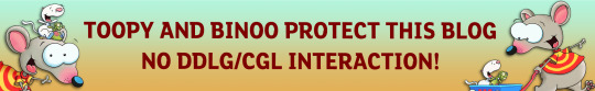
In this example, I have chosen the hex colour #4D0000 for my text colour, and the colours #B5F3DC and #E3B158 for my background. According to CCA, the contrast ratios for my colours of choice are 12.8:1 and 7.9:1 respectfully, which both meet the minimum contrasts of 1.4.3 for AA and 1.4.6 for AAA.
I have chosen the font FS Lola Bold, which is a type of display font that's best for headers and subheaders, but not so much any body or small text. I don't have to worry about this though, because I don't have any small text in my banner.
I've also kept my criteria to a simple "No DDLG/CGL interaction," because I feel that this is the most relevant information regarding the content of my blog and the posts I make. Short and simple, yet specific to who I don't want interacting with me. I also like the idea of my favourite fictional characters protecting my blog, which is why I've included another short sentence for it!
Here's an example of what the image description or alt text for this banner could look like:
[Image description: Banner that reads "Toopy and Binoo protect this blog, no DDLG/CGL interaction!" On it are the titular characters from the show. /End ID]
And if I were to have both alt text alongside an image description, then the alt text could be as simple as what the banner reads, which would be:
"Toopy and Binoo protect this blog, no DDLG/CGL interaction!"
Remember, you don't have to go into every little detail with your image descriptions or alt text, because then it can become very confusing for certain people to decipher! Keep it simple and state the minimum.
Closing words
I think that's everything that I wanted to cover in this post. Of course, there's more to accessible design than just text and fonts alone, but when it comes to interaction banners, it's usually the focal point of the images, which is why it's so vital that people with disabilities can also read your banner- especially when they contain important information about your personal boundaries.
Age regressors often pride themselves for the image we've set up for our community, that it's safe for everyone to join and no one will be judged or excluded for who their are. But the reality is, we still have lots of work to do before we're ever at that place, and making our community more accessible is just one of these steps that we should all be encouraged to take. Besides, what kind of message are we sending if we don't take the steps to make our space as accessible as possible? How do you think it'd feel to realize that a community you wanted to join is actively hostile towards you because of the refusal to learn how to accommodate for them? Especially when we have such a huge demographic of disabled people in the community, we can and should be doing better to accommodate for everyone as much as we possibly can.
Learning accessibility is a skill that requires time and practice, and I don't expect anyone to be perfect at it the first time around. The aim of doing these things isn't to make sure that every single thing is 100% accessible in every single way imaginable and with no mistakes whatsoever; but to instead encourage, develop, and incorporate good accessibility practices into our every day lives.
Thank you for reading,
- Binoo
#age regression#agere#agere community#sfw age regression#sfw agere#age dreaming#agedre#sfw agedre#dni banner#interaction banner#accessibility#a11y#long post
124 notes
·
View notes
Photo
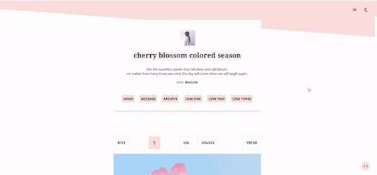

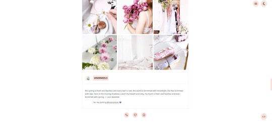

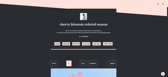
Theme #05: Sakurairo by @pneuma-themes
No matter how many times we cry, we will laugh again.
Live Preview (Temporary) / Static Preview: [Index] [Permalink] / Get the code: [pastebin] [github]
This theme was conceived around the idea of having a SVG element as a decorative element. Turns out better than I expected honestly, am quite proud of myself. Suitable for all kinds of blogs, but will also do well with image-heavy blogs.
Features:
Customizable post width and font size. The live preview uses 600px posts and 13px font size.
Three custom links.
A 64 x 64px icon.
Customizable photoset gutter.
Built-in lightbox for photoset posts.
Built-in light/dark mode which persists once toggled.
Mostly NPF friendly.
Toggle-able tags.
Notes:
Usual disclaimer and discretion on NPF posts apply.
Credits:
Icon: @acuite
NPF v3.0 fix, minify spotify player, AA Icon fonts: @glenthemes
Toggle tumblr control: @seyche
Minified soundcloud player: @shythemes
Fonts: Noto Sans, Noto Serif @ Google Fonts
Responsive video script: @nouvae
customAudio.js: @annasthms
photoset.css with lightbox: @annasthms and @eggdesign
Please like and reblog if you like this and or are using it!
#themehunter#theme hunter#allresources#dailyresources#chaoticresources#*theme: sakurairo#*mine: all#*mine: theme#i am free from code block!! ...probably#now to go back and hibernate for god knows how long
503 notes
·
View notes


Photo
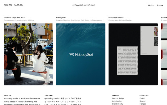
https://upcoming.studio/
#upcoming.studio#design#studio#Tokyo#Hamburg#portfolio#white#typography#type#typeface#font#Inter#Noto Sans JP#2022#Week 35#website#web deisgn#inspire#inspiration#happywebdesign
0 notes
Text
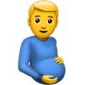
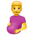
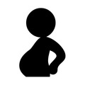
Rating Pregnant Men Emojis
Apple - 3/10
Art feels flat somehow. He feels like a stock image. Not sensing any paternal pride in his dead eyes. This is still technically an emoji some tech-illiterate grandpa could use after having a big meal.

Google Noto Color Emoji - 7/10
This one feels like it's on the right path. He's gentle, it feels like he's connecting to the baby. I like how he's not staring at me. Anatomy still leaves a little to be desired but it's still a solid emoji imo.

Samsung - 5/10
It's like the google noto one but worse. Oddly shiny. His expression feels less like a gentle smile and more like a smirk. Anatomy is fine but a little flat. I don't feel good about this one but at least it's not staring at me.

Microsoft - 1/10
What the fuck. Why is he looking at me. Why does he look way too happy. Where is his elbow. His belly looks like a staircase. This is awful. Combines the worst traits of the previous emojis somehow. Hate it.
Whatsapp - 2/10
His baby bump looks like he's hiding a watermelon and he's staring at me again. His expression feels uncertain, possibly afraid. But I like his moustache so he gets an extra point.

Twitter - 0/10
Somehow even more flat than the previous ones. This looks like my first attempt at drawing a human posing. Just bad anatomy all around (why do his hands look like paws??). He's not looking at anything. Flat, emotionless, not communicating anything, might as well be abstract.

Facebook - 1/10
This style is reminiscent of every mobile game ad I've ever seen. Slightly more detail =/= better. I feel like he's gonna ask me to match 3 baby supplies and the ad is gonna fuck it up badly so he's out in the cold while his wife is with a generic chad and he's gonna ask me to download his app to fix his life.

JoyPixels - 0/10
I don't hate it as much as I hate the Facebook one but it definitely feels worse somehow. It feels like it tried to be the google noto color one but it didn't stick the landing. It feels like a bootleg emoji.

Toss Face - 8/10
I'm grateful for the simplicity and lack of hyper realistic details here. He's a little pregnant emoji guy. What else is there to say.
Noto Emoji Font - 9/10
"MR GAME AND WATCH PREGNANCY" -my partner when I showed him this one. Anyway besides looking like a guy with a beer belly it's straight to the point. People will see what they need to see with this one.
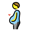
Openmoji - 8/10
I'm not a fan of the style here, but I love the addition of the heart. He loves his baby. Other emojis could learn from this one.

Emojipedia - 0/10
My partner thinks he's sneaking food into the theatre. I think he's taking a shit.
139 notes
·
View notes
Text
In un paesino un gruppo di persone si divertiva con un uomo noto come lo "scemo del paese", un povero cristo che viveva svolgendo piccoli lavori e di elemosina.
Ogni giorno queste persone incontrando lo “scemo” al bar si divertivano dandogli la possibilità di scegliere tra due monete da 1 e 2 euro e una banconota da 5 euro e lui puntualmente sceglieva sempre le due monete anziché la banconota, e ciò è inutile dirlo era motivo di derisione.
Un giorno, un signore che guardava il gruppo divertirsi alle spalle del povero uomo, lo chiamò in disparte e gli fece notare che è vero che prendeva due monete ma che le stesse insieme valevano meno della singola banconota, a questo punto lo “scemo” rispose: “Signore lo so bene, non sono così scemo. La banconota vale due euro in più, ma il giorno in cui la sceglierò, il gioco finirà e non “vincerò” più le 3 euro al giorno.”
Questa storia finisce così ma non prima di aver tratto alcune conclusioni:
1) Chi sembra fesso, non sempre lo è;
2) Coloro che presumono di essere più intelligenti, spesso sono i fessi della situazione;
3) Un’ambizione smisurata può finire per tagliare una fonte di reddito sicura.
Ma la conclusione più interessante che possiamo trarre da questa storia è che ciò che conta non è quello che gli altri pensano di te, ma quello che tu pensi di te stesso.
Perché, guardate, il vero intelligente non è colui che sembra esserlo ma colui che lo dimostra.
9 notes
·
View notes
Text

RINO GAETANO: UCCISO DAI POTERI FORTI
Era amico della figlia del medico personale di Licio Gelli: era lei la fonte di tante rivelazioni che poi sarebbero finite nelle sue canzoni, in un gioco tanto pericoloso da costargli la vita?
Sono gli interrogativi che l’avvocato salernitano Bruno Mautone solleva, nel suo secondo libro sulla strana morte di Rino Gaetano, fino a chiedere alla magistratura romana di riaprire le indagini sulla scomparsa del cantante, morto nella capitale il 2 giugno 1981, a soli trent’anni di età, dopo esser stato investito da un camion. Impressionante l’elenco delle “stranezze” che Mautone riassume nel pamphlet, “Chi ha ucciso Rino Gaetano?”, edito da Revoluzione nel 2016. Davvero moltissimi i riferimenti, nelle canzoni di Gaetano, a episodi imbarazzanti della politica italiana. Desta scalpore, inoltre, l’infelice sorte di un grande amico del cantautore crotonese, altra possibile fonte di informazioni riservate: una morte-fotocopia (incidente stradale) altrettanto prematura. Il giovane, che lavorava presso consolati stranieri, fu sepolto al Verano accanto all’artista, ma poi disseppellito e trasferito in un altro cimitero. Curiosità: l’autore dello spostamento dei resti mortali, scrive il blog “Scomparsi”, ha una identità «che coincide con un personaggio storico dello spionaggio italiano, collegato addirittura al “Noto Servizio”». Si tratta di apparato riservato dello Stato «che compiva atti di intelligence in modo autonomo rispetto ai servizi istituzionali», prima il Sid e poi il Sismi e il Sisde, «spesso sfociando in atti illegali e gravissimi». Specialità inquietante del “Noto Servizio” «risultò essere, con atti sequestrati e acquisiti dalla magistratura, l’uccisione di persone ritenute “scomode” con incidenti stradali». Nel libro, Mautone ricostruisce le vistose anomalie dell’incidente che causò la morte di Gaetano, travolto da un camion e poi morto dissanguato, nella notte, a bordo di un’ambulanza militare, dopo che il ricovero fu rifiutato dal pronto soccorso di diversi ospedali. Una vicenda su cui inutilmente chiesero di fare luce, subito dopo, due senatori del Msi, Araldo di Crollalanza e Tommaso Mitrotti. Dal governo Forlani, un muro di silenzi e omissioni: il liberale Renato Altissimo, autore della risposta, non precisò l’ora dell’incidente sulla Nomentana, non disse chi allertò i soccorsi e come, né perché intervenne un’unica ambulanza nonostante fosse ferito anche il camionista coinvolto nell’incidente, esanime sull’asfalto, accanto all’artista intrappolato nella sua Volvo. Nella risposta di Altissimo, inoltre, «non si precisa perché l’unica ambulanza intervenuta fosse un mezzo poco attrezzato dei vigili del fuoco e perché Rino, una volta prelevato con una gravissima ferita cranica, venne condotto fatalmente in un ospedale privo del reparto di traumatologia cranica».
Non si fanno neppure i nomi dei medici che avrebbero curato o cercato di curare il ferito in quelle condizioni, né si fa cenno ai presunti motivi che spinsero altri ospedali, pur allertati, a non approntare nessuna forma di soccorso. Non si dice nemmeno chi convocò il medico traumatologo, fatto accorrere al Policlinico, né il nome dello specialista e degli altri sanitari coinvolti. Tanta evidente vaghezza finisce per moltiplicare i sospetti: «Sin dai primi momenti, la morte prematura dell’artista calabrese suscitò interrogativi e dubbi». Oltre alla storia dell’amico impegnato in uffici diplomatici, che di lì a poco avrebbe seguito Rino Gaetano nel cimitero maggiore della capitale (per poi esservi rimosso), Mautone rimarca una clamorosa dichiarazione rilasciata da Rino dopo i trionfi sanremesi al giornalista Manuel Insolera: il festival della canzone viene paragonato in modo esplicito ad «un ordine massonico». In un articolo della “Stampa” di Torino, pubblicato il 3 giugno 1981 all’indomani della morte del cantante, si rileva come i testi di diverse canzoni facessero riferimento alle scabrose cronache della P2. A Mautone non sfugge che Rino Gatano è statoesplicitamente citato da Stefano Bisi, gran maestro del Grande Oriente d’Italia, nel suo discorso ufficiale di insediamento, il 6 aprile 2014, utilizzando un verso del cantante per sottolineare la necessità di concordia: «Vi ricordo che cosa cantava Rino Gaetano: “Chi nuota da solo affoga per tre”».
«Una notizia di grande interesse – aggiunge il blog “Scomparsi” – è rappresentata da una stretta frequentazione di Rino: nel cerchio delle sue più care amiche si annovera la giornalista Elisabetta Ponti, figlia di un medico, Lionello Ponti, che risultò inserito nella lista della P2 ed era il sanitario di fiducia di Licio Gelli». Il libro di Mautone, poi, mette a fuoco i costanti, fittissimi riferimenti (cifrati) con cui Rino Gaetano alludeva, nelle sue canzoni. Nella canzone “La zappa, il tridente, il rastrello” compare direttamente “una mansarda in via Condotti”, che – si scoprirà poi – ospitava il vertice della P2. Decisamente inquietante, poi, il brano “La ballata di Renzo”, inciso nel 1970 ma uscito soltanto nel 2009, postumo. Sembra l’anticipazione, profetica al millimetro, della fine che attendeva l’artista – una sorta di contrappasso dantesco. “Quando Renzo morì, io ero al bar”, cantava Rino. L’incidente, poi l’odissea in ambulanza: “S’andò al san Camillo, e lì non lo vollero per l’orario”. Altro ospedale: “S’andò al san Giovanni, e lì non lo accettarono per lo sciopero”. E quindi l’epilogo, con persino il sinistro riferimento cimiteriale: “Con l’alba, le prime luci, s’andò al Policlinico, ma lo respinsero perché mancava il vice capo. In alto c’era il sole, si disse che Renzo era morto. Ma neanche al cimitero c’era posto”
Rino Gaetano piaceva molto ai giovani. Li faceva riflettere sulla società che li circondava: era scomodo. La sua morte è stata utile al sistema per addormentare i giovani...poco dopo la sua morte infatti il sistema aiuterà l'affermarsi di un tossico ubriacone che insegnerà ai giovani a spegnersi come massimo della ribellione tra una dose di eroina e due litri di alcol come un non plus ultra della vita spericolata e a diffidare di chi cerca di andare oltre le cose...i giovani lo hanno eretto idolo in varie generazioni dagli anni 80 a oggi...alle droghe e all'alcol ha aggiunto il siero come massimo del servilismo edonista a un sistema che si può fregare solo annullandosi come esseri pensanti... embè eh già..
Guardate Maurizio Costanzo (membro della ex-loggia massonica P2) come e' irritato della presenza del cantante...
https://www.youtube.com/watch?v=0Y7eE3gNepI
53 notes
·
View notes
Last Seen Blogs
conitodefresa
Prrrrrrrrrrrrr

makeupbyjini-blog
Makeup by Jini
bacchicbitch
Untitled

feral-ballad
my heart, a feverish pomegranate
deaf-sakura
yeah sakura was mean. so what?