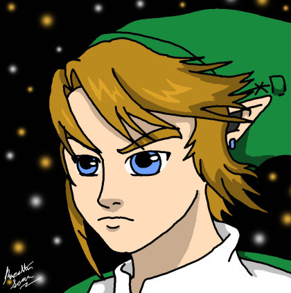
#or rather an illustration with background again as its been a lot of portraits the past weeks
Photo

#illustration#summer#digital art#illo#felt like drawing a landscape illo#or rather an illustration with background again as its been a lot of portraits the past weeks#ich will auch besitos
3K notes
·
View notes
Text
All this over the Japanese liking a game they don't like...
Ghost of Tsushima opens with a grand wide shot of samurai, adorned with impressively detailed suits of armor, sitting atop their horses. There we find Jin, the protagonist, ruminating on how he will die for his country. As he traverses Tsushima, our hero fights back the invading Mongolian army to protect his people, and wrestles with the tenets of the Bushido code. Standoffs take advantage of perspective and a wide field of view to frame both the samurai and his opponent in something that, more often than not, feels truly cinematic. The artists behind the game have an equally impeccable reference point for the visuals: the works of legendary filmmaker Akira Kurosawa
“We really wanted to pay respect to the fact that this game is so totally inspired by the work of this master,” director Nate Fox said in a recent interview with IndieWire. At Entertainment Weekly, Fox explained how his team at Sucker Punch Productions suggested that the influence ran broadly, including the playable black-and-white “Kurosawa Mode” and even in picking a title. More specifically, he noted that Seven Samurai, one of Kurosawa’s most well-known works, defined Fox’s “concept of what a samurai is.” All of this work went toward the hope that players would “experience the game in a way as close to the source material as possible.”
But in embracing “Kurosawa” as an eponymous style for samurai adventures, the creatives behind Ghost of Tsushima enter into an arena of identity and cultural understanding that they never grapple with. The conversation surrounding samurai did not begin or end with Kurosawa’s films, as Japan’s current political forces continue to reinterpret history for their own benefit.
Kurosawa earned a reputation for samurai films as he worked steadily from 1943 to 1993. Opinions of the director in Japan are largely mixed; criticism ranges from the discussion of his family background coming from generations of samurai to accusations of pandering to Western audiences. Whether intentional or not, Kurosawa became the face of Japanese film in the critical circles of the 1950s. But he wasn’t just a samurai stylist: Many of the director’s films frame themselves around a central conflict of personal ideology in the face of violence that often goes without answer — and not always through the lives of samurai. In works like Drunken Angel, The Quiet Duel, or his 1944 propaganda film The Most Beautiful, Kurosawa tackles the interpersonal struggles of characters dealing with sickness, alcoholism, and other challenges.
His films endure today, and not just through critical preservation; since breaking through to the West, his visual ideas and themes have become fodder for reinterpretation. You can see this keenly in Western cinema through films like The Magnificent Seven, whose narrative was largely inspired by Seven Samurai. Or even A Fistful of Dollars, a Western epic that cleaved so closely to Kurosawa’s Yojimbo that director Sergio Leone ended up in a lawsuit with Toho Productions over rights issues. George Lucas turned to Kurosawa’s The Hidden Fortress in preparation for Star Wars; he’d eventually repay Kurosawa by helping to produce his surreal drama Dreams.
Ghost of Tsushima is part of that lineage, packing in action and drama to echo Kurosawa’s legacy. “We will face death and defend our home,” Shimura, the Lord of Tsushima, says within the first few minutes of the game. “Tradition. Courage. Honor. These are what make us.” He rallies his men with this reminder of what comprises the belief of the samurai: They will die for their country, they will die for their people, but doing so will bring them honor. And honor, tradition, and courage, above all else, are what make the samurai.
Except that wasn’t always the belief, it wasn’t what Kurosawa bought whole cloth, and none of the message can be untangled from how center- and alt-right politicians in modern Japan talk about “the code” today.
The “modern” Bushido code — or rather, the interpretation of the Bushido code coined in the 1900s by Inazō Nitobe — was utilized in, and thus deeply ingrained into, Japanese military culture. An easy example of how the code influenced Imperial Japan’s military would be the kamikaze pilots, officially known as the Tokubetsu Kōgekitai. While these extremes (loyalty and honor until death, or capture) aren’t as present in the myth of the samurai that has ingrained itself into modern ultranationalist circles, they manifest in different yet still insidious ways.
In 2019, to celebrate the ushering in of the Reiwa Era, the conservative Liberal Democratic Party commissioned Final Fantasy artist Yoshitaka Amano to depict Japanese Prime Minister Shinzo Abe as a samurai. Though described as being center-right, various members of the LDP have engaged in or have been in full support of historical revisionism, including the editing of textbooks to either soften or completely omit the language surrounding war crimes committed by Imperial Japan. Abe himself has been linked to supporting xenophobic curriculums, with his wife donating $9,000 to set up an ultranationalist school that pushed anti-Korean and anti-Chinese rhetoric. The prime minister is also a member of Japan’s ultraconservative Nippon Kaigi, which a U.S. congressional report on Japan-U.S. relations cited as one of several organizations that believe that “Japan should be applauded for liberating much of East Asia from Western colonial powers, that the 1946-1948 Tokyo War Crimes tribunals were illegitimate, and that the killings by Imperial Japanese troops during the 1937 ‘Nanjing massacre’ were exaggerated or fabricated.” The Nippon Kaigi, like Abe, have also pushed for the revision of Japan’s constitution — specifically, Article 9 — to allow Japan to reinstate its standing military.
This has been a major goal for Abe as his time as prime minister comes to a definite close in 2021. And from 2013 onward, the politician has made yearly trips to the Yasukuni shrine to honor the memory of war criminals, a status of which his own grandfather was accused, that died with the ethos of the modern Bushido code. Abe’s exoneration of these ideals has continued to spark reactionary nationalist sentiment, as illustrated with the Nippon Kaigi and their ultranationalist ideology. These traditionalist values have encouraged xenophobic sentiment in Japan, which was seen in the 2020 Tokyo elections with 178,784 votes going to Makoto Sakurai, leader of the Japan First Party, another ultranationalist group. Sakurai has participated in numerous hate speech demonstrations in Tokyo, often targeting Korean diaspora groups.
The preservation of the Bushido code that was highly popularized and utilized by Imperial Japan lives on through promotion by history revisionists, who elevate samurai to a status similar to that of the chivalric knight seen in Western media. They are portrayed as an honor-bound and noble group of people that cared deeply for the peasantry, when that was often not the case.
The samurai as a concept, versus who the samurai actually were, has become so deeply intertwined with Japanese imperialist beliefs that it has become difficult to separate the two. This is where cultural and historical understanding are important when approaching the mythology of the samurai as replicated in the West. Kurosawa’s later body of work — like the color-saturated Ran, which was a Japanese adaptation of King Lear, and Kagemusha, the story of a lower-class criminal impersonating a feudal lord — deeply criticized the samurai and the class system they enforced. While some films were inspired by Western plays, specifically Shakespeare, these works were critical of the samurai and their role in the Sengoku Period. They dismantled the notion of samurai by showing that they were a group of people capable of the same failings as the lower class, and were not bound to arbitrary notions of honor and chivalry.
Unlike Kurosawa’s blockbusters, his late-career critical message didn’t cross over with as much ease. In Western films like 2003’s The Last Samurai, the audience is presented with the picture of a venerable and noble samurai lord who cares only for his people and wants to preserve traditionalist values and ways of living. The portrait was, again, a highly romanticized and incorrect image of who these people were in feudal Japanese society. Other such works inspired by Kurosawa’s samurai in modern pop culture include Adult Swim’s animated production Samurai Jack and reinterpretations of his work like Seven Samurai 20XX developed by Dimps and Polygon Magic, which had also received the Kurosawa Estate’s blessing but resulted in a massive failure. The narratives of the lone ronin and the sharpshooter in American Westerns, for example, almost run in parallel.
Then there’s Ghost of Tsushima. Kurosawa’s work is littered with close-ups focused on capturing the emotionality of every individual actor’s performance, and panoramic shots showcasing sprawling environments or small feudal villages. Fox and his team recreate that. But after playing through the story of Jin, Ghost of Tsushima is as much of an homage to an Akira Kurosawa film as any general black-and-white film could be. The Kurosawa Mode in the game doesn’t necessarily reflect the director’s signatures, as the narrative hook and tropes found in Kurosawa’s work — and through much of the samurai film genre — are equally as important as the framing of specific shots.
“I don’t think a lot of white Western academics have the context to talk about Japanese national identity,” Tori Huynh, a Vietnamese woman and art director in Los Angeles, said about the Western discussion of Kurosawa’s aesthetic. “Their context for Japanese nationalism will be very different from Japanese and other Asian people. My experience with Orientalism in film itself is, that there is a really weird fascination with Japanese suffering and guilt, which is focused on in academic circles … I don’t think there is anything wrong with referencing his aesthetic. But that’s a very different conversation when referencing his ideology.”
Ghost of Tsushima features beautifully framed shots before duels that illustrate the tension between Jin and whomever he’s about to face off against, usually in areas populated by floating lanterns or vibrant and colorful flowers. The shots clearly draw inspiration from Kurosawa films, but these moments are usually preceded by a misunderstanding on Jin’s part — stumbling into a situation he’d otherwise have no business participating in if it weren’t for laid-out side quests to get mythical sword techniques or armor. Issues like this undermine the visual flair; the duels are repeated over and over in tedium as more of a set-piece than something that should have a component of storytelling and add tension to the narrative.
Fox and Sucker Punch’s game lacks a script that can see the samurai as Japanese society’s violent landlords. Instead of examining the samurai’s role, Ghost of Tsushima lionizes their existence as the true protectors of feudal Japan. Jin must protect and reclaim Tsushima from the foreign invaders. He must defend the peasantry from errant bandits taking advantage of the turmoil currently engulfing the island. Even if that means that the samurai in question must discard his sense of honor, or moral righteousness, to stoop to the level of the invading forces he must defeat.
Jin’s honor and the cost of the lives he must protect are in constant battle, until this struggle no longer becomes important to the story, and his tale whittles down to an inevitable and morally murky end. To what lengths will he go to preserve his own honor, as well as that of those around him? Ghost of Tsushima asks these questions without a truly introspective look at what that entails in relation to the very concept of the samurai and their Bushido code. This manifests in flashbacks to Jin’s uncle, Shimura, reprimanding him for taking the coward’s path when doing his first assassination outside of forced stealth segments. Or in story beats where the Khan of the opposing Mongol force informs Shimura that Jin has been stabbing enemies in the back. Even if you could avoid participating in these systems, the narrative is fixated on Jin’s struggle with maintaining his honor while ultimately trying to serve his people.
I do not believe Ghost of Tsushima was designed to empower a nationalist fantasy. At a glance, and through my time playing the game, however, it feels like it was made by outsiders looking into an otherwise complex culture through the flattening lens of an old black-and-white film. The gameplay is slick and the hero moments are grand, but the game lacks the nuance and understanding of what it ultimately tries to reference. As it stands, being a cool pseudo-historical drama is, indeed, what Ghost of Tsushima’s creators seemingly aimed to accomplish. In an interview with Famitsu, Chris Zimmerman of Sucker Punch said that “if Japanese players think the game is cool, or like a historical drama, then that’s a compliment.” And if there is one thing Ghost of Tsushima did succeed in, it was creating a “cool” aesthetic — encompassed by one-on-one showdowns with a lot of cinematic framing.
In an interview with The Verge, Fox said that “our game is inspired by history, but we’re not strictly historically accurate.” That’s keenly felt throughout the story and in its portrayal of the samurai. The imagery and iconography of the samurai carry a burden that Sucker Punch perhaps did not reckon with during the creation of Ghost of Tsushima. While the game doesn’t have to remain true to the events that transpired in Tsushima, the symbol of the samurai propagates a nationalist message by presenting a glossed-over retelling of that same history. Were, at any point, Ghost of Tsushima to wrestle with the internal conflict between the various class systems that existed in Japan at the time, it might have been truer to the films that it draws deep inspiration from. However, Ghost of Tsushima is what it set out to be: a “cool” period piece that doesn’t dwell on the reasonings or intricacies of the existing period pieces it references.
A game that so heavily carries itself on the laurels of one of the most prolific Japanese filmmakers should investigate and reflect on his work in the same way that the audience engages with other pieces of media like film and literature. What is the intent of the creator versus the work’s broader meaning in relation to current events, or the history of the culture that is ultimately serving as a backdrop to yet another open-world romp? And how do these things intertwine and create something that can flirt on an edge of misunderstanding? Ghost of Tsushima is a surface-level reflection of these questions and quandaries, sporting a lens through which to experience Kurosawa, but not to understand his work. It ultimately doesn’t deal with the politics of the country it uses as a backdrop. For the makers of the game, recreating Kurosawa is just black and white.
172 notes
·
View notes
Text
An Enchantment of Ravens by Margaret Rogerson (Book Review)

Gonna be real honest, the first time I saw this book I was attracted to it because I recognized the cover art's artist. It's the same artist who does Sarah J. Maas works, I think it's Charlie Bowater? But I'm not exactly sure. Then I looked up the synopsis and wasn't exactly hooked, so I continued scrolling.
I actually forget what finally convinced me to order this book, possibly all of the amazing ratings I'd been seeing. For example, one of the reviews I read said that Rogerson was BORN to write, so I figured I shouldn't miss out on the hype and go ahead and try it out.
Overall thoughts is yeah, it's a fun, light read. Especially if you're a fan of fae, which I am. (fan is a bit of a soft word for how obsessed I am with the fae lol.) One of the problems with the story is just how short it is-- I literally read it in one sitting. Due to the lack of length, it felt a little lacking in the building of certain aspects. Reading this book was an odd combination of pieces that felt too fast and others that felt way too slow. The ending especially felt rather rushed-- the magnitude of big threats wasn't felt all that much with how quickly the story wrapped up.
I absolutely adored the descriptions in this novel, they were very vivid and illustrated. I could really see the world and its characters in my mind's eye. I also found myself laughing A LOT whilst reading this one. I loved all of the intricacies with the fae, like if you're polite to them they HAVE to be polite back. Also, the fae we get to know best throughout the novel-- Rook, is hilarious because of his childish tendencies. Seriously, he just thinks he can has what he wants and throws temper tantrums when he doesn't get them, and while that sounds unattractive, it's adorable and hilarious the way it's shown in the novel. Basically, Rook doesn't know any better when it comes to interacting with humans. Actually, all the fae are very childhish in ways, haha. One of my notes is literally "lol, all the fae are children."
Another thing that I really enjoyed about this book was Rogerson's take on the Fae, and how, despite all the amazing things in their lives, they're empty inside. They have no emotions, which is something they envy the humans for. They're all not the glamorous beings portrayed in many other fae novels. Instead, they're all vain and glamoured beings-- not nearly as beautiful as they show themselves to be. In fact, these Fae glamour everything, including their food to make their lives seem as perfect as possible. Since they're empty inside, Fae are unable to create, which is why they are so fascinated by humans, and their dabbling in the arts.
The romance in the book was borderline instalove, which I hate-- because then you get no time to really get attached or root for the relationship. Borderline, not totally. See, the attraction and connection springs up real quick, but the romance such doesn't happen for a long while, so I was pretty excited when the romance kicked in.
Again, my biggest issue with the novel was how short it is. I think most of the other issues I have with it come with its length. Like there's this whole larger set up in the background about an issue with the world that I expected to be somehow resolved, but it wasn't, which left me feeling a little disappointed any empty. Also, the plot was rather predicable for me-- all the big twists I saw coming from about 200 pages away (which is about the length of the book.
All in all, a very enjoyable, light read 7/10 stars. There's a fun romance, and interesting and exciting plot. However, I'd advise not to expect too much depth going into the novel. It's there to tell one story, and it does that job well. It brushes on ideas that hint at greater depth in the world, but those are never truly resolved or used to their greatest potential.
Synopsis:
A skilled painter must stand up to the ancient power of the faerie courts—even as she falls in love with a faerie prince—in this gorgeous debut novel.
Isobel is a prodigy portrait artist with a dangerous set of clients: the sinister fair folk, immortal creatures who cannot bake bread, weave cloth, or put a pen to paper without crumbling to dust. They crave human Craft with a terrible thirst, and Isobel’s paintings are highly prized. But when she receives her first royal patron—Rook, the autumn prince—she makes a terrible mistake. She paints mortal sorrow in his eyes—a weakness that could cost him his life.
Furious and devastated, Rook spirits her away to the autumnlands to stand trial for her crime. Waylaid by the Wild Hunt’s ghostly hounds, the tainted influence of the Alder King, and hideous monsters risen from barrow mounds, Isobel and Rook depend on one another for survival. Their alliance blossoms into trust, then love—and that love violates the fair folks’ ruthless laws. Now both of their lives are forfeit, unless Isobel can use her skill as an artist to fight the fairy courts. Because secretly, her Craft represents a threat the fair folk have never faced in all the millennia of their unchanging lives: for the first time, her portraits have the power to make them feel.
17 notes
·
View notes
Text
Welcome all!
If you’re reading this, I’m assuming you’re familiar with my work as either an artist, cosplayer, writer or any of the other creative things I do. Recently, I had been asked about some of the work that I do, and I thought a fun way to just that was to fill out a few questionnaires. Here I talk about some of the high and low points of doing what I do, what inspires me, and my process of creativity.
For those who are only interested in certain segments, I’ve broken the article into the following sections for you to easily maneuver your way throughout the piece: Art, cosplay, writing, and questions asked by you.
I know I’m no professional and compared to a lot of others I don’t have as outstanding an amount of followers, but if this article can help inspire at least one artist to try something new or learn something they didn’t know, well, that’s good enough for me! I hope you enjoy!
Art
When did you get into art?
I’ve been drawing as long as I can remember, but I do recall middle school in particular being the time that I really started pursuing art. I had to choose between volleyball and art club after school, and guess which one I picked. It wasn’t just academics either. My notebooks were full of fan art of mostly Link and Zelda, but you could find some Kirby, Pokémon, and Naruto scattered in there as well.
Show us your oldest piece of art you have on hand.
Yeah. It’s… Something.
What defines your artistic style?
I think the faces of the characters I draw distinguish my art. I always have a certain way of drawing the eyes, ears, and other features. I always give my females more prominent eyelashes than males as well. Certain clothing as well — The way I draw capes and hoods are distinct. Not to mention when designing my own clothes, I tend to use similar patterns.
Do you practice other styles/have you tried other styles in the past?
I occasionally dabble outside my comfort zone. I’m not necessarily a huge fan of the “Cal-Arts” style, but I’ve tried it every now and then, especially when creating fan art for shows like Steven Universe, The Amazing World of Gumball, and Amphibia. I don’t really do it too often, but I’ve made a piece for my portfolio mimicking several art styles from a variety of different shows just to demonstrate that I can do it if I’d like to.
What levels of artistic education have you had?
Honestly, just high school. I thought I was going to college for digital illustrations but it turned out communication/graphic design was totally different. I actually got into that because I could draw when not many other people in that field could. Of course, I’m always interested in learning outside of school. I learn through watching other artists on social media, seeing how they create their work. Just watching a speed draw can help so much! The way I learn the most, however, is just by doing. Practice, practice, practice!
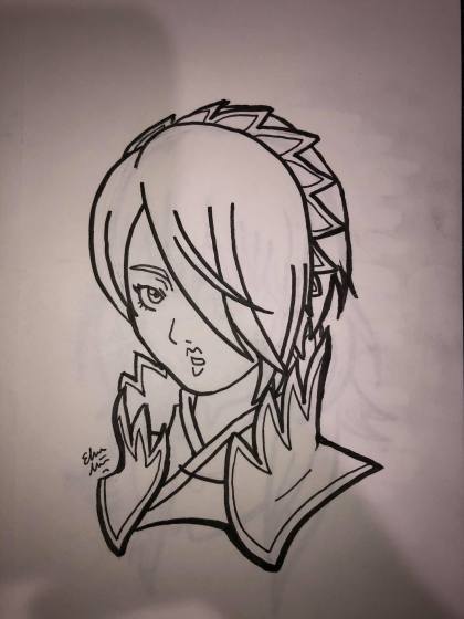
Show us at least one picture you drew or sketched recently that you did not put on a public site.
I’ve been doing a lot of Fire Emblem doodles for my new sticker line, so here’s Setsuna. Honestly, I just like drawing bust portraits like this.
What is your favorite piece that you have done?
I can’t just pick one! I’ve drawn over 900 things since I first joined DeviantArt (and I’ve been drawing even before then), you want me to pick just one? Haha, I’ll narrow it down to three of my favorites (in no particular order):
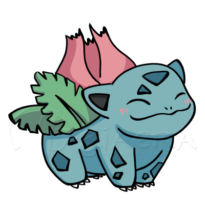
I love this one because it was like the first cute drawing of Ivysaur I’ve ever done. Ivysaur was always a tricky pokémon for me to draw, but this was the first time I feel like I nailed it. Ivysaur also happens to be one of my absolute favorites, so that’s a plus.

This is Minerva, a Guardian from my fantasy stories. Every time I drew her prior, I could never quite get the look I wanted. This was the one that I really liked and so I colored it and am very happy with how it turned out.

I don’t know why I just love this drawing I did of Dimitri from Three Houses. I think its the eyes and hair. And the color contrast — especially in the original ink sketch (that I hung up over my craft table.) I just love it.
What is your least favorite piece that you have done?
Again, you want just one? Haha, too many failures. I’ll be fair, though, and post three of those as well.
Here’s one from my early days. I was trying so hard to get the hair all detailed like and instead it came out looking like gross looking veins. Not to mention how atrocious the proportions were. Oh man, I’m sorry past me, I know you tried.
Here’s one I was so proud of: I copied the official art for Twilight Princess and thought it came out amazing. So amazing I titled the piece “Awesomeful Link.” Yeah. Um. Nope.

Here’s a more recent one that I’m not too pleased with. I was so excited about the latest batch of Steven Universe episodes (which I would later learn were a big bunch of filler episodes and that didn’t make anything better) I drew Pearl reciting her ‘big line’ of the trailer. I tried to mix styles and I tried something different with the eyes and all in all it just came out… Meh.
What do you like most about your art?
I like the faces that I draw. They’re always the most fun and I think they come out the best. I especially love the eyes, I go into so much detail on them (even though they’re usually so small when I print them.) I’ve had issues in the past where I made all of my characters look like they had the same face, but I feel I’ve been doing a lot better at individualizing the face of each character and that makes it all the more fun as well.
What do you like least about your art?
The hands. Sometimes I draw them well, but I still struggle hard and sometimes it really shows. For chibi drawings, I don’t really care as much, but on my more “serious” art, I get a little bummed when I’ve got a wonky hand hanging off their wrists. Feet also sometimes give me a bit of trouble, but usually only when I do poses that involve more movement, which is why I sometimes make my art stiffer and I don’t like doing that either.
Have you ever considered taking commissions?
I do take commissions. In fact, I’d love to take more if it were possible.
Are you looking to pursue a career in art?
I do it part-time right now. I’m satisfied doing commissions and artist tables at local conventions. I think I’d like to pursue writing more than art, but I do love art just as well, so part-time is perfect for me.
What do you like drawing the most?
As I mentioned before, faces. I love drawing facial expressions, I feel like it’s the very core of a character. It’s the first thing I notice when I look at anyone’s art, so I always go all out on my own. I also like drawing hair and wrinkles in clothing. I used to be really obsessed with wrinkles and it would always look like my characters didn’t iron their laundry, but I’ve definitely toned it down since then, haha.
All in all, I like drawing human characters the best — or humanoid. Elves, fairies, merfolk; I love them the most. I like drawing animals too, but not as much as people.
What do you like drawing the least?
Once again my answer is hands. They are still as difficult to draw as the day I started.
Backgrounds are also not enjoyable for me to draw. It’s an important part of a piece, but I get so bored drawing anything that’s not a character — which is why you’ll probably notice in a lot of my art that I do a lot of very minimal backgrounds. I’ve been trying very hard not to just take stock photos anymore (with the exception of my Mythical Month art as they’re meant to be stickers,) and I’ve been using games like Skyrim and Breath of the Wild as inspiration with their gorgeous scenery.
Do you draw more fanart or original art? If fanart, what fandom do you draw the most of?
I post a lot more fan art than original — at least I used to, but I also think I have expanded in sharing my original art more and more with my Mythical Months/Mondays. I guess maybe I’d say about half and half.
What medium/program do you use the most in your art?
Digitally I always use Photoshop. Always. As for traditional art, I’ve been using Copic knock-offs (I’m still learning, so I’d rather not waste the money) and the Sakura Micron pens for my ink sketches. I’ve really been enjoying them, actually, it’s very therapeutic. However, no matter digitally or traditionally, I always, ALWAYS start with a pencil. I like mechanical pencils, I don’t like traditional #2 pencils anymore. The thin lead helps me keep control better.
How would you rank your art? (poor, mediocre, good, etc.)
I always say I think my art is “above average.” I know it’s not bad, but I think it could always use improvement. I don’t know if I’ll ever get to a place where I think my art is phenomenal, but I’m content with it, it makes me happy, and that’s all that matters.
List at least one of your “artspirations.”
My art style was greatly inspired by Naruto, Fire Emblem, and Zelda. I always liked more proper body proportions with that hint of anime inspiration. I like bigger eyes on my characters because they help convey emotion so much better, but I also don’t like the oversized baby eyes outside of the occasional chibi style. Avatar: The Last Airbender was also a great influence since the creators did exactly what I like to do and execute it wonderfully.
What do you think you could stand to improve on?
I feel like I can always improve on everything that I do in my art. There are things I’m good at, but I don’t feel like I’ve mastered anything in particular. Then there’s hands and feet again which I definitely need to work on. Lastly, motion. I want to be able to draw more fluid character motions. I’ve been working on it with my original art that I don’t post online, but hopefully I’ll start incorporating it into all my work.
Do you have a shameful art past? (recolor sprite comics, tracing art, etc.?)
Ugh, yes, YES! I admit I was so bad at first, but I also think that’s just how we learn. I used to do a lot of tracing. I started first just full-on tracing images off my computer — That’s right, I’d put the paper up to the computer and trace it like that. Then I started using bases, which was better because at least I had to draw all the details like hair and clothing by myself. Then I finally worked up the courage to stop using them completely. I’d use references, but I would force myself to figure it out by eye rather than copy it straight from the source. I’m happy to say I haven’t been tracing since my late middle school- early high school years.
Cosplay
How many years have you cosplayed?
My first cosplay was when I was fourteen, and I’m twenty-five at the time of writing this article, so eleven years now. Wow.
How did you get into cosplaying?
I honestly don’t know. I was invited to a convention where I heard people dressed up and was like “hey, I want to try that!” I guess it was because I didn’t really do Halloween as a kid and I was so deathly terrified of costumed characters as a toddler that I never took an interest until high school.
How many cosplays have you done?
That’s funny, you want me to remember how many cosplays I’ve ever done. A lot. According to my photo collection, I’ve done about 60 different cosplays (59 exactly if I’m counting correctly.)
What was your first cosplay and why did you choose it?
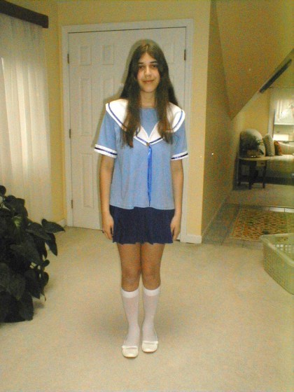
My first cosplay was Osaka from Azumanga Daioh in her blue summer uniform. Azumanga Daioh was my second ever manga series and my cousin and I were so obsessed with it. She even went as Yukari with me to the convention (though only, like, two people knew who we were.) Tomo is probably my favorite character, but I related personally more to Osaka, being the air-head that I am. I also didn’t have to really style my hair (because that was an era before I used wigs.)
What is your favorite cosplay you’ve done so far?
It’s a tie between my Trainee Link (Hyrule Warriors) costume and my Royal Guard Link (Zelda: Breath of the Wild) costume. Both are alternative costumes for one of my all-time favorite characters that I hand made all the really detailed pieces all from scratch. Link has always been a special character for me to cosplay, but these two are my favorites.
What is your least favorite you’ve cosplayed?
Rapunzel (Tangled). I was obsessed with her at the time which is why I wanted to cosplay her originally, but my dress was not the best and I didn’t look good as her. At least I think so. It was the only costume that made me feel insecure.
What cosplay is the most uncomfortable or troublesome?
Okay, I love this costume and character to pieces, but my gosh the struggles I go through for Pearl (Steven Universe). Blue Diamond (Steven Universe) is the worst in terms of how long it takes me to put my makeup on, but Pearl is right behind her at about 2 hours being my best time. However, the thing that makes Pearl more troublesome to wear is one thing and one thing alone: armsocks.
They look great and prevent you from having to dab makeup all over your body, but I literally couldn’t even hit the home button on my cellphone and it’s not like I could just take them off like gloves. They’re attached at your middle and putting them on is a hassle on its own. Getting your fingers into each tiny socket is so time-consuming. Now imagine this while also being coated in body paint. Plus, having white be the color of the stockings, you have to be conscious of everything you touch because it will stain and show. Because of all this, I refuse to use the restroom dressed as Pearl, and while that is “in character,” it is not healthy and totally NOT recommended you do that.
What is your most comfortable cosplay?
During the winter, Ravio (Zelda: A Link Between Worlds) for sure. It’s like wearing a giant snuggie. However, in summer, it does get hot very quickly (which is why I literally only wear biker shorts and a tank underneath if I ever do take it out on a hot day), so I only wear it in summer if I know there will be AC. Heatstroke is a real thing. Miss Frizzle (Magic School Bus) is probably the best all-year cosplay in terms of comfort. It’s just a dress, stockings, and a wig really.
But in all honesty, most of my cosplays are relatively comfortable. There’s really nothing that I’ve been so uncomfortable that it’s made my physically ill or scarred me physically. My health is important to me, and should safety should always come first.
How do you research the cosplay before you make it?
I look up lots of reference images. I need an image of the front and back, though if it’s not available, I just improvise based on the images I do have on hand. After that, I kind of just wing it.
Do you sew your cosplays yourself?
A good majority of them, yes. There are a few exceptions to this, though: My Disney princesses are all bought since I use them in performances and want them to be durable if children come and tug on the outfit. Pearl, also being a performance cosplay, I did buy as well. For her second reformation outfit (the sleeveless with the ribbon) I got specially commissioned to look and fit me just right whereas her movie/future appearance (jacket and mom-jeans) I literally found at a thrift store.
I also love to find costume pieces at thrift stores. Whether I use them as is or make alterations, they make life so much easier when you make a good find for a cheap price. Leni Loud (Loud House) is probably my favorite thrift/sew hybrid. I found a base dress, altered the top and added strap sleeves, put lace around the edges, found a blingy pair of sunglasses, bought earrings and painted them, and made bows for sandals I already had. The most expensive part of that cosplay was the wig I bought from Arda (and it’s always worth it to buy from them in my opinion.)
When I make a costume completely from scratch (like Ravio, Thranduil, any of my Link cosplays) are when I really love the costume and character and want to take on a challenge and bring it to life myself. They also tend to have pieces that can’t be altered from your everyday clothing, but that just makes me work harder and learn more!
How did you learn to sew?
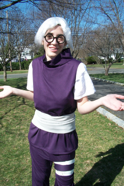
My grandmother taught me how. Osaka was my first cosplay, but my mom altered it from a tee shirt we found at a thrift store and a lucky skirt find. Kabuto Yakushi (Naruto) was the first cosplay I made from scratch (and I won best novice at the convention I wore it to — even with my terrible wig, haha.) She showed me how to use patterns when we made that and my Ayame Sohma cosplay, but after that, I scrapped using patterns and I basically just eyeball everything now. It’s totally not recommended, but I’m a little weirdo and just prefer to do things the way I do. Still, I wouldn’t be able to use a sewing machine if it weren’t for her. Thanks, Nanny!
Do you make your own props?
Most of them. I don’t really use props too often as I find them cumbersome to lug around a convention (which is how I thought of the Fire Emblem, Gravity Falls, and Skyrim book boxes to store your stuff and add some extra flair to a costume.) The few props I have made include Link’s sword, his trainee shield, his original shield from Zelda 1, and Soren’s Wind Tome (which I used for Laurent (Fire Emblem: Awakening) because I didn’t finish Soren (Fire Emblem: Path of Radiance) yet…) Then there’s my prized cosplay prop; Victreebel for James (Pokémon). That was all thanks to my fleece hat business in high school that taught me the skills to build that thing.
I actually think the only prop I store-bought was my Hylian Shield because it was so lightweight and easy to carry, plus I was dreading doing all those details at the time. Maybe one day I’ll make it from scratch, but for now, I’m content with my store-bought.
Do you style your own wigs?
Yes. I have been improving my styling skills a lot more since I first started. It was always a more difficult task for me, but I’ve been practicing more and more. The first one that I attempted on my own was my short-haired Rapunzel. That was basically just giving it a haircut, though. My first real styling challenge was Breath of the Wild Link. It took a long time, but I actually had fun figuring out his hair.
For most of my costumes, it’s really just the bangs that need that extra pop, to which I use Got2B gel and spray. Does the trick every time and keeps everything in place. For those who are wondering, though: No, I did not style Pearl’s wig. I am not ready for that kind of gravity-defying styling. That was all E-Bay.
What skill has been most useful for making your cosplay?
Well, sewing mostly, but other skills that have come in handy for me personally have been painting, crafting, makeup, styling, and overall decorating. Probably other stuff too, just nothing more I can think of off the top of my head.
What is the hardest thing when making a cosplay?
Probably figuring out how things connect. This is the main reason I’m timid when it comes to armor. I’ve been getting better, but I’m still having trouble figuring out how everything attaches and how to put on these kinds of costumes, which is why my Skyrim Elven Armor has been put on hold.
What was the biggest screw up you’ve had making a cosplay?
I’m not sure if I had any major crisis’ when it comes to making cosplays, but I’ve certainly had my fair share of irritating mishaps and mistakes. I can’t tell you how many times I’ve accidentally sewn the sleeves on a costume inside out about 4 times before I finally got it right.
I’ve cut holes in my clothing, I’ve sewn sleeves on too tight, and I’ve even completed a hat that took hours just for it to wind up being too small when I put a wig on. I guess most of the major issues I’ve had with sewing are measurement issues, so my advice to you is to always measure and try on your costume as you go. Don’t wait until the day of the con to try out your new cosplay.
How often do you injure yourself while making a cosplay?
Not too often, I occasionally prick my finger with my sewing needles, but I haven’t had too many serious injuries. I think the worst was when I slashed my thumb with the exacto-knife when making my first shield for Link. Needless to say, there was a lot of blood.
Do you try to stay cheap or do you splurge on materials?
I am a frugal soul; if I can save, I will. That’s why I thrift so much. However, on a costume I’m really passionate about, I will spend more to ensure the quality. For example, I spent a little more going to a more shimmery material for Royal Guard Link. It cost about $50 for the blue and red material, which to me, is a lot (and that was with coupons). However, the results were 100% worth it. PS, Michaels and Joann’s ALWAYS have coupons. I totally recommend downloading both apps.
I also stand by that with wigs and contacts. I love Arda, their quality is great, but they are more expensive than Amazon. Contacts I don’t mind spending more for as well since the quality is VERY important in this case; they are going on your eyes, after all.
However, as I said, I am absolutely not opposed to going cheap. If you can make it work, make it work. My Nyo!Austria (Hetalia) cosplay came out very cute and it was literally made from bedsheets. From using mostly thrifted and recycled materials, a lot of my cosplays came to around an overall price of around $30. Some of these costumes include Mega Gardevoir (Pokemon), Tomoyo Sakagami (Clannad), Spyro (Spyro the Dragon), and Luan Loud (Loud House.)
Cosplay can be totally affordable, you just have to be creative and think a little outside the box sometimes to make it work.
Have you ever cosplayed with a partner or group?
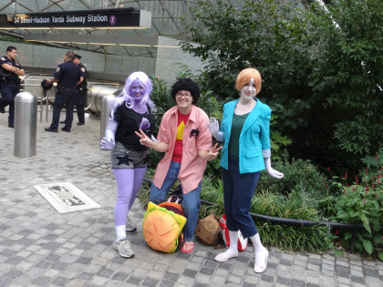
Yes, a few times. I’d love to do more group cosplays, but we all have to think of something we all like. Luckily, two of my very good friends decided they would dress up as Steven Universe and Amethyst to go with my Pearl this year for Comic-Con and it was such a great experience! I’m trying to convince them to do others as well, such as The Loud House and The Magic School Bus with me as well, haha.
Do you try to act in character?
Always: but I don’t always succeed. It really depends on the character. Pearl I could roleplay for days. It’s probably because I connect so much with her and performing as her doesn’t hurt either. Dee Dee Magno Hall says her favorite lines to say are peoples names, and after giving it a shot myself, I totally see why. I even practiced Garnets “Stronger than you” monologue in Pearl’s voice and tone (in case no one volunteered to sing during our karaoke event) and it always makes my friends laugh.
The characters that stump me a little more are the more serious characters I choose to portray; Link, Laurent, Thranduil (the Hobbit), Belle (Beauty and the Beast), just to name a few. I’m kind of a goofball/airhead so those characters clash with my personality a little bit, but I am getting better. Blue Diamond is surprisingly the easiest of these types to stay in character for.
That being said, I love being the outgoing, oddball characters. Like I said, Pearl is second nature to me, as well as Anna from Frozen. Back in my Hetalia days, Austria and America were my go-to guys. I could act as them forever, and my friends and I literally lived as them for a while with how much we role-played. Most of the Disney Princesses it’s pretty easy for me to stay in character, especially (like I said before) Anna, Sofia the First, and Merida.
How do you react to cosplayers dressed as a character from the same anime/game/etc?
If there are some good character opportunities, I will role-play on the spot, but more often than not I will ask if we could all get a picture together. There were so many fun interactions with other Steven Universe cosplayers when my friends and I did our little group, but one of my favorite interactions was probably when I was dressed as Laurent and I stumbled across a Miriel cosplayer and I just shouted out “MOM! I FINALLY FOUND YOU!”
Do you try to duplicate your character’s expressions, walk, movements, etc?
I can talk the talk (mostly), but I have more trouble walking the walk. I’ve been trying to replicate movements better, but facial expressions I have trouble with (ironic as it’s my favorite part of drawing.) I’m not as photogenic as I’d like to be, as you could probably tell by most of my pictures being the same face, but I definitely am striving to improve on that.
What was your funniest experience of acting in character?
Okay, there’s a lot that I could share, and eventually, I want to do an article solely on cosplay “in-character” experiences, but the one I HAVE to share right now is a recent experience when I was dressed as Ariel from The Little Mermaid.
I was performing at the family day event my church helps out at my pastor’s air force base as Ariel, and after my sing-a-long, my makeup was a little smudged. I asked a volunteer where the restroom was so I could touch up before I headed back out to the crowds. I thought he’d take me to a private restroom, but he brought me to the public one where there were families waiting outside. They noticed and the dad joked “See? Even princesses have to go.” to which I laughed and gave my best Ariel shrug to play along. I went inside, fixed my makeup, and went back outside.
It wasn’t long, so the family was still outside the men’s room. As I walked by, the man’s son shouted out “Ariel, congratulations on going pee-pee!” to which I bursted out laughing. Everyone was. I mean, if you gotta congratulate a princess on using the bathroom, you picked the right one! After that, I did explain that I was just putting on makeup but I appreciated his enthusiasm and thanked him for it.
Do you compete in cosplay contests?
All the time. I love them. Whether I win or lose, I always get something out of it. I learn tips from other cosplayers, get to meet so many interesting people, and those times I do win I get prizes which is always nice as well. Most importantly, though, the memories that are made there are the very best part.
Have you won anything?
I have won quite a few. I have three trophies, a medal, a few certificates, and have won a cash prize as well. My first win was my second convention as Kabuto where I won the best novice trophy. My most recent win was for Ravio in August of 2019 with best in show. It’s amazing, I never thought I would get this far, but I’m so grateful for everything I’ve been a part of.
Again, it’s totally not about winning, but I’ll admit that it does feel really nice to have my hard work appreciated. Just as drawing, I still feel like I have a lot of room for improvement in my cosplay, so winning a few contests here and there definitely helps my low self-esteem.
Do you prefer skits or walk-ons?
I’ve only ever done walk-ons. I’ve never had anyone to do a skit with and I don’t think I could pull one off on my own. I’d love to do one eventually, but for now, our panels are good enough.
How many friends have you made because of cosplay?
Quite a lot. My Instagram is full of cosplayers I’ve met at conventions and I love seeing their cosplays and drawings, it’s all so inspiring!
Do you attend photoshoots and meet-ups outside of conventions?
Occasionally. I’ve never done a professional photoshoot (though one day I’d like to,) but I have attended a few meetups. I’ve done one for Steven Universe, Once Upon a Time, Disney, and I actually accidentally walked into a Fire Emblem: Awakening one dressed as Laurent, so that worked out.
What is the funniest reaction you’ve gotten cosplaying from people outside of the community?
The best one was when I was dressed as Link and my friend and I were on the subway. There was a mom and her kid sitting across from us and she pointed to me and said to her child, “Look, an elf! You see? Santa’s got his helpers out all year round, so you have to be good!”
I also had another wonderful experience outside of a con dressed as Link, though it’s not as funny but more just a sweet memory. It’s quite a bit, but luckily I’ve already written about it for Zelda Universe so I’ll just link it here for anyone who’s interested.
Name a few cosplays you’re planning to do next:
I’ve got to get Soren (Fire Emblem: Path of Radiance) done soon. I’ve been wanting to do this cosplay forever and I did start it, but I need to finally finish it. Dimitri (Fire Emblem: Three Houses) is also on my list to do next. Not sure about who else I want to do for sure, but some ideas that have floated around in my head have been Tilly Green (Big City Greens), Anna with her Frozen 2 look, Princess Peach (Super Mario), and a Thalmor Mage (Skyrim.)
What is your dream cosplay?
Princess Zelda from Twilight Princess. I’m still too scared to try to cosplay her. I bought a cheap starter costume that I was going to build off of and it wasn’t turning out the way I wanted, so I put it off again. One day I’ll feel confident enough to make her costume, but until then I’m totally satisfied with my Link cosplays.
What do you take into consideration when picking a character to cosplay?
Honestly, I just have to love them as a character and the costume itself has to seem do-able. I mean, I’m totally not opposed to buying cosplays if I really want to be a particular character, but like I said, making it means all the more to me. It’s my display of affection towards that character, the creators behind them, and the series as a whole.
Is cosplay serious business for you?
Yes and no. No because I don’t do it for money, likes, or internet fame. I do it because it’s fun and what I like to do. Yes because I go all out when I cosplay. I do everything I can to get the look the way I want it and I put my blood, sweat, and tears into it when I make them by hand.
What is your favorite thing about cosplay?
Everything: Dressing up as a character I love, roleplaying them, taking photos, just everything! I would do it more often if I could!
How do you want to grow as a cosplayer?
I want to learn how to make more. I want to build armor, I want to learn new makeup and hairstyling techniques, and so much more. I’m happy where I am, but I know I can be better. I will watch others and learn from them and push myself to try new things!
Are you willing to answer questions and help other cosplayers?
Absolutely! I may not be a top dog of cosplaying, but if I can help someone with something I’ve learned along the way, I’m more than happy to help!
Writing
When did you start writing?
I started in middle school as well, I used to write a Nintendo fan fiction called “The Kirby Show,” where Kirby and his friends would get into wacky sitcom scenarios. They were really just knock-offs of the television shows I used to watch back in the day, but hey, everyone’s gotta start somewhere.
As for my original writing, I started that more in high school. I still wrote a lot of fan fiction at that point, but I was starting to develop my own characters as well. I thought it about time to think of my own creations, and I did. I remember I was in my Godmother’s car when I thought of the main three characters and since then the cast has expanded so much, their stories are much better developed, and the lore is much more solid.
When you were a beginning writer, what did you write primarily? What do you write now, primarily? (i.e. romance, fan-fiction, poetry)
As mentioned before, I started out writing stories about characters that were not my own. Now I do all original writing — well, aside from my work at Zelda Universe. There I get to write about all the unique aspects of one of my favorite game series of all time, so there’s that as well. Writing there has helped me start writing little fandom topical posts for my own blog, such as top 10’s, reviews, and other things along those lines.
How often do you write?
I make it a habit to try and write at least a half-hour a day. If I’m really on a roll, I could write up to a few hours a day before I get burnt out. Even though I’m not always writing, I’m always developing the stories in my head.
When is your favorite time of the day to write?
I always write a half hour before I go to bed. The later it is, the more ideas keep rolling in. With my early hours for work now it’s harder to stay up late, but that doesn’t stop the ideas. I just gotta push myself a little harder to start earlier to have more time before I need to go to bed.
Do you have a writing muse? If so, who/what?
Not in particular. I always just write about what I like and incorporate different aspects of my life into it. I guess I’m my own muse in that sense? I don’t know. I just write what I do know.
What is your most popular lit piece?
Out of all my public pieces, I’d say either my “Animal Crossing Diaries” series or my “Endless Ocean” screenplay. “Vagabond” gets some decent attention as well, which is nice, but honestly, I’d be happy if there was just one person enjoying my work, so I really can’t complain.
What is the piece you are currently writing?
Out of my public blog works, “Vagabond,” from my Zelda Universe collection I’m working on a character piece on Colin from Twilight Princess.
What is the piece you most recently finished?
On my blog that would be my “Top 10 Favorite Fire Emblem Characters” list. For Zelda Universe, it’s actually a piece about Fire Emblem as well — It was DS week, I could write about whatever DS game I wanted to, of course I have to sneak in some Fire Emblem.
What piece are you most proud of?
While “Vagabond” definitely needs some more work, out of all the pieces I’ve posted publicly, that one is the one I am the proudest of. If anything just for Kurt and Maerwynn. They are two of my favorite characters to play around with and I’m so happy that somehow I was allowed to think these two up.
In my more private works, my fantasy story is my pride and joy. I feel so blessed to have been able to come up with these characters, and I do hope that someday I will be able to share them, whether on a television screen as I’ve always dreamed of in a novel of some sort. One day, maybe.
What piece are you most disappointed in?
It’s not so much disappointment, but rather I’ve grown so much in my work, it’s very hard for me to look back at my first romance story. It’s a little cheesy and the dialogue is a bit clunky, some of the actions that my characters had performed totally go against what their characters have become now after spending a lot more time with them. It’s something I would love to revisit and maybe even go public with, but it’s going to take a lot of work.
From all of your stories, who is/are your favorite character(s) and why? (try to limit it to 3)
Since I only published “Vagabond” online, I’ll stick to characters from this story in particular.
Maerwynn is definitely a favorite because she’s got a lot of qualities that I wish I was bold enough to enact myself. She speaks her mind without a care of what anyone else will think, even if it’s blatantly rude. She goes for her goals, even if they may seem ridiculous, and she pursues them with great passion and ferocity. Even with this rough and tough exterior, she’s still got a softer side that she’s just discovering in her new life at the palace. Now, I wouldn’t ever recommend being like Maerwynn ALL the time, but there’s definitely is a time and place where we could all be a little bit more like her, I think. Her confidence is the thing I admire most about her.
Kurt I connect with as well. Again, he says all the things that we all wish we could get away with at one point or another, but he knows he can because he’s royalty. However, he’s got so much going on underneath the surface as well with the complications of his past. He’s learning to open up, connect with others, and understand his feelings. Despite feeling restricted by the laws of his kingdom and the traditions of the royal family, he finds his own way to feel free and be himself.
What is the best compliment you ever got on your writing?
My best friend who I’ve been sharing these stories with for as long as we’ve known each other told me the nicest thing not to long ago. I always laugh at myself for going so crazy in-depth with the lore and characters of my fantasy world, but she told me how she’s admired that and the love and care I put into each little thing was what made it so great. It really meant the world to me to hear that and I can’t thank her enough for all the love and support throughout the years!
What is your main goal in writing?
I don’t know if there’s one main goal in particular, but I suppose if I had to pick just one, it would be to show good through the works of my characters and hope and pray that it inspires others to be like them. Kindness is growing scarce in the world, and if I can just inspire a little bit of it in someone, I suppose that’s all I can ask for.
Have you ever been published?
No, but I am aiming for it. Once I complete Vagabond, give it another revise myself, and hopefully find an editor to give it another look over, I’d love to find someone to publish my book or even self publish on a platform like Amazon. Just something to get my work out there.
Questions asked by you
Who is an artist that you look up to?
There are a few artists online that I follow who I just adore their work. Three that come to mind in particular are Bianca Roman-Stumpff, Bellhenge, and TheStarfishFace. Their art is so different from mine, but I think that’s probably why I love it so much (if that makes sense?) They each have such a unique style and great subject material, I highly recommend giving them a look!
What did you think of “Frozen 2”?
I loved it. No secret that I’m a huge Frozen fan, so I was bound to like it. I was actually really nervous about how it was going to end, but I can say (without spoilers) that I am 100% satisfied with how it concluded. Also, Kristoff finally gets the spotlight that he deserves, thank you, Disney.
However, as much as I did love it, I do totally admit I do see flaws in it that could have been improved on. That being said, there was that in the first movie too and I stilled loved it. The characters have enough charm to keep the film entertaining throughout and I just adore them!
What does your family think of your art?
My parents have always encouraged me about my art and I know my grandmother loves it; I gave her a sweater with the art she liked of mine last Christmas and my mom says she wears it all the time. The rest of my family knows and supports my art as well, I never really had any issue with my small art business and the family.
Any memorable cosplay experiences at a con?
So many. I’ve shared a few before, but I think I’d like to make a whole article on the great cosplay experiences I’ve had! There are so many to talk about and stories to share.
Is there a type of art that you would like to get into? I’ve seen a lot of people doing wood carving and burning, but that looks insanely difficult.
I’ve actually been considering wood burning, haha! It does look difficult, that’s why I’ve been hesitant, but maybe in the future I’d give it a shot. I think they’d make my Skyrim wood pieces look legit.
I’m really up for trying anything. If money wasn’t a thing, I’d have tried a lot more by now. In the future, I’d love to try needlepoint as well!
Recently, I had been asked about some of the work that I do, and I thought a fun way to just that was to fill out a few questionnaires. Here I talk about some of the high and low points of doing what I do, what inspires me, and my process of creativity. Welcome all! If you're reading this, I'm assuming you're familiar with my work as either an artist, cosplayer, writer or any of the other creative things I do.
2 notes
·
View notes
Text
Ariel & Fox - Persistance
“Meeting” Scene
Part 1
More writing with Fox & Ariel. This time Ariel screws up and gets (figuratively) scalped.
“I’d cite cleverness for finding you, but this one would protest regardless,” Fox said as he came up behind Ariel. He had a basket in hand with a kitten poking its head out. It meowed loudly when she looked at it.
Ariel scrambled, usually not so off in her own mind that she could hear anyone approaching, and took out her earbud, stuffing the phone into her bag after clicking power button. She was still in a fairly good mood, so despite her previous irritation with him she chuckled. Plus, he’d brought a kitten, and how could she be mad at that?
She carefully picked it up from the basket and sat it down on her lap. As her legs were crossed that gave the little cat a lot of room to wander. Instead, after a few long strokes along its back, it found a perfect place to lie down: the center of her lap. She couldn’t blame it, that’d certainly be the warmest place to go, but it was a little awkward. Ariel took to gently petting around its chin and by its ears, which earned her pleased purrs. The sound made her smile, though the gesture only moved her lips. True teeth smiles were rare.
“So,” she finally said, glancing over at Fox for the first time since he offered the kitten. “Is this a check up? Or just an investigation to sate your curiosity?” A tiny part of her felt a bit disheartened that if she told him everything, he’d just leave. The rest thought it a brilliant idea. For the time being, she just waited for him to answer.
“Some of both. With the Breach, there is a great deal of ambient magic that may have adverse effects on you.” He planted the butt of his staff in the packed snow and looked out over the ridge. “I must admit it’s a bit of a damper to realize you’re not important enough to warrant inclusion in prophetic visions.”
“Okay, you’ve lost me already,” Ariel admitted, quirking a brow as she looked up at him. “You mean what I know about this place?” That confusion partially rectified, she turned her gaze to watch the goings on in camp again, idly petting the kitten’s head. “Look, it’s… weird. I doubt I could explain it to you even if I tried. And they’re not ‘prophetic visions’. Stuff like that doesn’t happen at home. Mages don’t exist and ‘magic’ is just sleight of hand.”
Fox stood silently, then turn his head towards her. “Perhaps it would be easier if you explained the situation as you understand it, as I can’t see any way knowing people you’ve never met before isn’t magic. Well, I’m assuming it’s not letters and portraits.”
At that, Ariel actually laughed, the movement startling the kitten enough for it to give a tiny murrp chirp. “Well, in a way it kind of is,” she admitted, carefully stroking the kitten a few times to help it settle down.. This was going to be a hell of a task; explaining video games to a person that’s never seen a pictograph? “It’s an illustrated story. Interactive, as well. You can talk to everyone and make decisions that affect their lives, as well as Thedas. It’s supposed to be just a story, a complete fiction…” she paused, gesturing widely to the area. “And yet, here I am.”
“Hmm.” Fox turned to look back over the ridge and leaned into his staff. “So someone else was a prophet and made this story to tell their prophecy and you, after reading it, arrived here to tell it.”
Ariel watched him with increasing skepticism and bewilderment. What can I possibly say to get him off this prophecy kick?? “It’s not a prophecy. I’m not a ‘chosen one’ don’t start with that shit,” she finally managed. She tried again to explain. “It’s… imagine that you got dropped into the world of Swords and Shields. It’s like that, but with no magic and tech you wouldn’t know the first thing to do with.”
“It wouldn’t make me the chosen one, no, but it would make me the prophet for the Chosen One. I’m afraid I’m not familiar with that novel, so I can’t make a proper analogy, but simply because it is a fiction to you does not mean our cuts do not bleed.” He paused. “Nor yours, it would seem.”
So apparently not everyone in Thedas had read Master Tethras’s novels. Good to know. Though it hadn’t helped her in the current situation. “Oh, believe you me, I learned that real quick…” she quipped back. The idea that she seemed callous to their plight came into her head and she quickly added, “I’ve been making sure to offer whatever I know when Venna needs help. I... she wants me to be a part of the war table, but the rest of the advisors are against it. I don’t know how I feel about it, honestly, so I won’t push for it. She just comes and talks to me when she can’t make a decision.”
“Why not simply tell her what she will choose?” Fox asked.
“Because I don’t know that,” Ariel answered. “That was who you played. The character you were interacting with Thedas through. First it was the Hero of Ferelden, then the Champion of Kirkwall, and finally the Herald. You want to call anyone the ‘chosen one’, it’s Venna. I can just tell her what the general effects of her actions will be in the future and she can weigh which ones she wants to pursue based on that.”
Fox’s lips moved as he muttered silently. “Are you saying that this prophecy of yours accounted for different choices by these heroes?”
“It’s not a prophecy…” Ariel grumbled.
“If it has given you knowledge of the possible future, how is it not a prophecy?”
“It’s an interactive story,” she sighed. “But I guess it doesn’t really matter to you all. It’s your future. But, to answer your earlier question— yes. It does. The Warden could come from several different backgrounds, as can the Herald. That alone has a small bearing on the plot and how you interact with the world. Elves have to work much harder to garner respect; a kossith would be even less respected. Dwarves are just kind of seen as oddities, despite there being a ton on the surface now.” She paused, pursing her lips as she weighed the point of actually continuing the examples. In the end, she just shrugged and barrelled forward. “The Warden could have died if they hadn’t assisted Morrigan in a ritual to keep them from being destroyed by the escaping Archdemon’s soul as they killed it. The Champion could have sided with the Templars and culled the entire Kirkwall circle, becoming a rallying cry for Templar aggression. The Herald can chose to bring the broken Templar order to heel and rebuild it properly under the Inquisition or ally with the ‘free’ mages in Redcliffe and have a hand in creating the College of Enchanters, which attempts to rival the circles as a place for mages to study.” She looked over at him with a tired chuckle. “Lots of things can change.”
“I would rather you stopped thinking of our lives as a fiction or a story, simply because it is easier for you.” Fox’s tone had none of the warmth and lightness it usually did. “How the prophecy was presented to you doesn’t matter in the scheme of things. We are real. That is what matters.”
“Oh,” was the only thing that Ariel could think to say for a moment. Oops, being the main thing that echoed in her brain. Well, here you are again, royally fucking shit up. At least apologize! Came the internal chastisement. “Right. I’m sorry. I didn’t… it wasn’t meant to … make it seem like I didn’t care. I do. I’m not some heartless bitch.” She chuckled again, though the sound was mirthless and blinked away the sheen in her eyes that had developed from the panic. “Sorry…” she murmured again, though apparently this time to the kitten as she returned her attention to it.
He didn’t acknowledge her apology. “I’ve heard Rutherford speak quite a bit about recruiting the Templars. Does that lead to a more favorable outcome, then?”
“It’s up to interpretation,” Ariel admitted, taking a few heavy breaths as she continued to try and calm herself. In the back of her mind she was running over how furious she’d probably be if she was talked about like a fictional character when she was standing right there. The idea of Fox being that mad at her made her want to quake in trepidation. The only thing keeping her grounded and not in tears was the kitten in her lap. It wouldn’t like having a salt water bath. “But I think so. And when Venna has asked me, I encourage her to go to the Templars. But not to ally with them. Their leadership is in shambles. They need a place to rebuild and be under watchful eyes. And Cullen is—” she cut herself off, brows furrowing as she weighed the reasons to tell him the full reason why it would probably be particularly helpful with them. Eventually, she shook her head. “He is doing something different. And they could all benefit from the change.”
“And your prophecy told you nothing of me, is that correct?” Fox asked, still not looking at her.
“Nothing,” she answered quickly, suddenly getting the feeling that her habit of talking too much might be dangerous.
“Did it tell you what became of those children from these Southern Circles? Because I can assure you, Redcliffe Castle is not home to even most of them.”
Ariel swallowed and slowly shook her head even though he probably wasn’t going to see the latter. “No, it didn’t even really talk about that,” she replied. After a moment, she looked over at him, concern finally overtaking her panic enough to show on her face. “Do you know something about them? Venna could help. If you just tell her. Haven could keep them safe.” In the back of her mind she knew that was partially a lie, considering they were going to be attacked, but in the event there’s no way that they wouldn’t have put the children first in the tunnel during the escape. The journey to Skyhold would be hard, but they could make it and they’d be safe there.
“Haven is completely indefensible. A tactical nightmare. It is no fortress and Commander Rutherford would know better if he were suited for any kind of command and you’re mad if you think I’d bring any child back into the view of a Templar, former or conscripted by Inquisition.” Lightning magic crackled across his shoulders before reaching his staff and fizzling out on the enchantments.
Okay. Back to panic. She held on to her outward veneer just enough to not cry. As an adult, one couldn’t do that just to destress. Especially not in a place as dangerous as Thedas and a furious mage standing next to her. She took several long, slow breaths and gently pulled the kitten closer to her just in case a stray bolt hit them it would hit her instead. “The Inquisition will have a fortress,” she said slowly. “Skyhold.” She purposefully left the last portion unanswered. She’d rather not have to deal with absorbing any more magic than necessary and certainly didn’t want to find out how much more powerful Fox was than Venna.
“It may be that the College of Enchanters as they call themselves cannot help the Herald seal the Breach, but I hardly feel favorable to them when they left scores of children twice orphaned. I came South to help. I did not expect the need to be so dire.” He shook his head and his shoulders relaxed. “It would be best if you told me who the Inquisition needs alive. I may not be able to stay my hand, otherwise.”
“Well, Commander Rutherford would be a good start to that list,” Ariel offered, offering a breathless chuckle as she finally felt the hairs at the back of her neck settle as he stopped interacting with his magic. “Venna is really the only one that has to be alive, honestly. She has the anchor and as far as I’ve ever seen one needs to be alive to use it. To actually deal with the one that ripped the veil open she’ll need just about anyone she can get. That’s not to say you won’t have plenty of people to steer your rage towards. The Inquisition will have many, many enemies. I’d just… like to see you live long enough to really help those kids.”
Fox chuckled, but it wasn’t cold and damning; he was back to his casual warmth. “I am much hardier than you would expect. Don’t worry. I only enter battles I plan to win.”
“You’ll find that I worry about people I care about,” Ariel said, not realizing what she said until it had already passed her lips. She quickly scrambled to correct herself.“I mean, I worry. It’s just something I do.” She offered a nervous laugh and stood up, pulling up the kitten with her and placing it on his shoulder. “I probably don’t deserve whatever else you brought me, so I’ll… I should go.” A tiny smile was all she could produce before turning around and grasping her back, making a quick check over it to be sure everything was inside and the zippers were pulled. “Thanks for the kitten time,” she said before heading off down the rocks. She needed to be alone. Time to test the wards that Solas had begrudgingly given her. She’d had more than enough of dealing with any people for the day. At least she wasn’t sick on top of it.
3 notes
·
View notes
Text
Starting my Lookbook-Title page
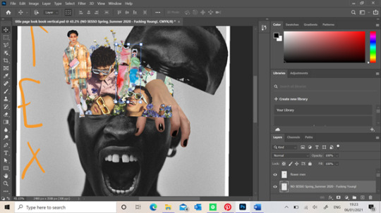
Title pages are important as they need to show enough content that will not only portray their own message but additionally have something that would engage a person to read on willingly. It was important I did this yet not getting too carried away with it at the same time. My original idea which I had drawn out before hand is to portray the mess inside a males mind with the use of multiple images layered on top of each other near the head region of the model. I also want to add some dripping art illustrations using the Pen tool which I have also drawn in my last page to tie the book pages together. Here is my progress of this first page.

I used this portrait from the Phase One photography blog website because I felt as though it was good representation of emotion rather than a standard apathetic face. I also liked how the colour of the picture was black and white as this benefited my message being more visible. My main focus of this page was the middle of the models head and the content I will put inside their “mind” rather than the whole of the models face. I had to duplicate this image twice so I could cut the top of his head off and use it as a lid. I did this using the Polygon Lasso Tool going around the areas I wanted and then right click the selected area so I could inverse the image making the selected area still on the page rather than the background. I was now able to move the top of the head once making it into its own layer but now I was left with a gap where the image once was. This is why I needed a copy of the image so I could select some of the background of the image using the Marquee Tool and enlarging it to slot in this gap. I also clicked on the Image heading ,running across the bar at the top, and adjusted this slightly using the Brightness/Contrast feature so it could blend into the background without any harsh lines as I realised some areas of the images background were different shades. Using the Smudge and Blur Tool also helped me get rid of any harsh lines from the Lasso Tool.

I decided I wanted to add more primary images into this trend rather than majority of them being found of the internet. I decided to take a bunch of pictures of my hand positioned in a claw shape that could help portray an eerie environment to the page. I wanted my hand to look as though it was climbing out of the models head as if it was escaping itself to portray this concept a little better. I felt as though a hand crawl of the hand helps symbolise this escape and needs some people may feel in their life. I think majority of my work may be overemphasised as I find it hard to portray escapism and psychedelia through images without every image looking similar.

When working on my flyer I picked up this idea of cutting the bottom half of a model and turning the image upside down to shift the dynamic of the page a little more. I wanted to do this again but with this image of No Sesso SS20 collection so when I added it into the models head it made the work look as though a person has opened the models head and seen all its clutter. I didn't want these images to look neatly placed but as though they are all crammed together to help portray a persons mind better and how busy and drastic a humans thoughts can be. I used the Masque Tool again and then inverted the image so I could use the Lasso tool to cut around the the models legs and remove the background.
Here you can see where I've positioned this previous result. I've added my hand into the image aswell using the Lasso tool to remove the background. I have also added a Louis Vuitton campaign photo which takes up majority of the space. What I liked about this image was that the models not only had different poses which helps make make the work look more messily put together, but they were surrounded by flowers. When reading the article their intentions were to show the new popularity of men who aren't afraid of showing their “feminine” side, removing any toxic masculinity which I liked the concept of. I wanted to add this image to this particular page make it look as though it were the models thoughts which were completely different to his angry exterior. And I think how his head is now opened up and looked as though it is spilling out of his mind shows how dangerous bottling up these emotions can be and showing these trapped feelings doesn't cause anyone harm. Not only this but this image matched the colour palette quite easily as there is so many different colours in the palette rather than a few similar shades. I felt like I needed some more fashion content onto this page which is why I added the image on the left. The printed co-ord is by Wooyoungmi’s SS20 collection and helps gives the reader a glimpse of the potential garments within this trend.
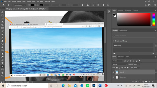


I decided to create a mood board on Pinterest for this module as it find this app useful when finding relatable images to one another. When researching psychedelic art, I came across the Etsy artist Anna Sorokina that had created loads of abnormal editorials which I loved the idea of including in my work to show the abnormality of someone's thoughts when hallucinating into certain places within their mind. A piece of her work which inspired this stage of work is below. I started with a image of the ocean which I found of google. I realised a lot of these types of art were set in front of different landscapes which is what makes then so abnormal and what I might do throughout this lookbook. I used the Marquee tool to cut out thin, long rectangles of the ocean that could look like tears when I add them into the models eyes. I then used the Eraser tool to cut around any unwanted areas of the ocean around the models eyes so it looked more realistic. I realised that where these “tears” were positioned, they would flow over another models face. I decided to progress further with this step and use the Eraser tool again to neatly cut some of the ocean so the sunglasses on the models face were visible. This made it look like the tears were flowing behind the models eyes now which I loved the look of. I also kept the ocean image that filled the lenses area of the models face and used a filter on the right of the screen to make the ocean blend behind the lens. You can see above that the sunglasses still had their lenses colour but if you look closer you can still see the textures of the waves within the ocean image. Overall I loved this outcome of this section of the page as it further explains the emotions a man may not portray to others and keep trapped within themselves.

When looking at my work from far away, all the images blended in nicely which is what I wanted however not to the extent where you can’t see the different images. I decided to use the Pen/ Brush Tool to outline certain images with the colours from the colour palette so they were visible slightly. Also when adding the Louis Vuitton image on top the hand, a certain area fell over the top of my hand which I didn't want. I had to duplicate the image of the Louis Vuitton models and Marque the area I wanted and then used the Eraser tool to cut around the areas which covered parts of my hand. Doing this made it look like my hand was pressing into the flowers and reaching out over the models head. This could portray certain dark tendencies or triggers within a mind that influencing the need to escape. For instance a person may break their diet by eating some chocolate which was triggered by seeing it in their cupboard. Although this doesn't sound like the standard form of escapism you may picture in your mind, knowing the chocolate will give a person a short feeling of happiness from its taste, it is considered as escaping their everyday habits. As I stated earlier, I also wanted to add some sort of trippy art which I had already made in the back page of the book so I decided to add some coming out of the models mouth. When I finished this, I didn't really like how it looked against the other pieces of work so I decided against keeping this in my title page.

Here is the final result of the title page without any typography which I will complete in InDesign. I enjoyed creating this page because I hadn't really seen the any other lookbook laid out like this from the examples I've looked at. When showing this work to the tutors, I was slightly worried that there wasn't much dark psychedelia which is often perceived by a person however I didn't want to over think this as I know I will show this in the other pages of my look book. However, I will add aim to show some of this through the typography of the title name. One of my tutors also complimented my layout of the photoshop page, saying he hadn't seen anyone use a square page layout yet. Although I didn't plan on doing this any way and I just didn't know the ideal page size, it worked in my favour. This is because he said this size would be suitable for an Instagram post. I realised as because we aren't printing these out unlike previous years, it would be interesting if these where posted on social media instead as a way of showing the lookbook. As the world of work is taken over by technology, this could've been a cool way to show my look book to others if it was to be shown to businesses looking at trends, moving the fashion industry forward.
0 notes
Text
𝑶𝒘𝒏 𝑹𝒆𝒔𝒆𝒂𝒓𝒄𝒉 - 𝑨𝒓𝒕𝒉𝒖𝒓 𝑹𝒂𝒄𝒌𝒉𝒂𝒎 & 𝑾𝒂𝒍𝒕𝒆𝒓 𝑪𝒓𝒂𝒏𝒆
Thursday 12 December 2019
As part of our project, it was emphasised that we needed to do research of own artists that have inspired us in our narrative and integrate styles of their work into our own. As my narrative is inspired by the original story of Little Red Riding Hood, I began to do some research into the Grimm’s dark version of it. This led me to an illustrated fairy tale book by Grimm, which I acquired to further deepen my investigation and see the illustrations on paper for myself.
[Some of my favourite examples of his work and a self portrait he did of himself.]
Rackham was an English Book Illustrator who was considered one of the leading literary figures during The Golden Age of British Book Illustration. His work is recognised through his use of robust ink drawings combined with watercolour. His best known works are found in Fairy Tales of The Brothers Grimm, Rip Van Winkle and Peter Pan in Kensington Gardens. In his early life, Rackham was born in Lewisham as one of 12 children. Then in 1884, when he was 17, he was sent on a voyage to Australia to improve his fragile health, accompanied by two aunts. At the age of 18, he worked as a clerk at the Westminster Fire Office while beginning to study part-time at Lambeth School of Art.
I found out about this artist from seeing his name credited on the cover of the Fairy Tale book. I really like the way he coloured his illustrations and the amount of detail in every corner he put into them. His work is significant because of his fantastical drawings, relating to my fantasy genre narrative and also because he produced his work in 1890 onwards near to the end of The First World War. It was during this period that there was a high demand and boom in the market for high quality illustrated books which were given as Christmas presents. In North America and in Britain, Rackham’s work became even more popular after his death, still used today in a variety of newer editions of the books he illustrated for. Now his original paintings are keenly sought after in auction houses.
The techniques he used with watercolour and Indian ink was delicate and unfortunately sometimes lost in the final print of his work. Technological disandavtages of the time meant that Rackham would ink over his illustrations twice to make sure it shows up when printed. He would sketch out the overall shape and idea in pencil and then ink it in while getting rid of the pencil in the background. When the ink had dried he would faintly go over the top and colour it in with it slightly translucent watercolour and slowly build up tone and colour over multiple layers. After that, he would ink over the lines again. This way of working has been described as Nordic inspired or traditional Japanese woodblock in the early 1900’s.

[Source: "‘O waken, waken, Burd Isbel", from Young Beichan, Child ballad number 53 by Arthur Rackhham.]
[Source: "The Three Bears", illustration to English Fairy Tales, written by Flora Annie Stee and illustrated by Arthur Rackham.]
Rackham’s use of translucent watercolour over ink gives his work a ‘grunge’ look, further emphasised by the way his illustrations have been printed though this may not have been intentional due to a lack of technological resources. Most of the texture in his work has been built up in his ink work rather than his watercolour. A good example of this is the illustration “The Three Bears” just above. It is clear that he has used ink to create the fur texture on the bears in a way that makes them stand out from, a still very detailed, background. It appears that he only uses watercolour in his illustrations as a splash of colour to seperate things out rather than putting the emphasis on it. This may have been because he knew the ink would how up more in print rather than the coloured parts, so he clearly spent more time on the part that would show up more.
In the illustration “O waken, waken, Burd Isbel”, there is a very strong and brightly saturated red which stands out dramatically from the rest of the drawing. It is used to highlight the small figure at the end of the girl’s bed. This may be to illustrate evil intentions from the character. The way it is dressed from head to foot in the dramatic colour and its small featured red horns at the top of his head shows connotations of the devil. For a 18th-19th century audience viewing this, they would have likely immediately felt negatively towards a character which quite literally seems to have the appearance of a demon. The way the colour separates the character from the rest of the piece, infers to the viewer that he is not connected in any way with his surroundings. This tells us that he is from some other ‘world’ or place that would not fit into the familiar human reality we are used to.
The light and dark values in Rackham’s work appears to be achieved through his inking methods rather than in his water colouring process. He usually seems to keep characters light unless they’re antagonists (such as a very dark and textured wolf he illustrated for Little Red Cap), or some sort of animalistic creature.
Overall, I believe the theme of Rackham’s work fits in with our fantasy genre project. The way he works with radiation all mediums has appealed to me and made me really want to pick up my watercolours again. After learning more about him and his process, I am now inspired to lean off of digital art as a medium on its own and begin to work with things outside of my comfort zone in order to achieve nicely water coloured illustrations like he did.
[My personal favourite illustrations of his and a photograph of his portrait.]
Walter Crane was a British artist and book illustrator. During his time and up until today, Crane has been considered the most influential children’s books creators of his generation. His work characterised a lot of children’s nursery rhymes and fables, making his work portray a ‘fantasy’ theme as some looked out of the ordinary in terms of character design and style. Unlike Rackham, he involved himself in far more things so his name is more widely known and out there. For example, he was part of the arts and crafts movement (which was an international trend which stood for traditional craftsmanship using simple forms of medieval or folk style celebration) and produced an array of paintings, illustrations, children’s books and ceramic tiles.
He was the second son of the painter, Thomas Crane and his siblings, Thomas and Lucy were very creative as well as Thomas became an illustrator and Lucy became a noted writer. During the artist’s career, he had a lot of problems with the press as they controversially portrayed him as things that he was not. But he was a good student and politically minded (as a socialist), especially when it came to the arts.
He appeared to have two styles. One for his many children’s books illustrations and one for his own personal maturer art. His illustrative designs are almost cartoonised in a way as they have a visible outline to every object and detail in the frame. Compared to Rackham’s, his work is not nearly as textured, as his lines are very neat and organised. Whereas he also uses watercolours like Rackham, his colours are far brighter and they don’t have that same transparency. They look like block colours, almost looked to be done digitally though we know that wasn’t possible. There is little to no tone within his work, as there are no obvious shadows being cast in the illustration below. This may be to emphasise instead the detail of his line work and not make the piece too dark. Because of the lighter colours in the illustration just below (which is a scene depicting the story ‘Beauty and The Beast,’) it gives it a playful, almost humorous aura. If there were extreme shadows though, this would likely change to be somewhat horrorfying, which is not appropriate for a children’s illustration.
[Source: Beauty and The Beast illustration by Walter Crane.]
What I like personally about his works are his adaptability. When he wants to draw an illustration for a children’s book, he uses this lined, detailed but simple style using ink and water colour. But when he worked more maturely, he used oil paints to create the most busiest and textured paintings. It’s this sort of adaptable quality that I want for my own art and illustrations, allowing myself to be able to work more maturely or childishly, depending on what the illustration is appropriate for.
0 notes
Text
20 Best New Portfolios, September 2018
Hello Readers. It’s September, so as soon as your kids are off to school, maybe you can finally have a five-minute power nap. Take that power nap with equal parts gusto and relief, dear Reader. You’ve earned it.
Last month, one of you asked for less “ultra-modern” designs, and the design gods have seen fit to provide. We still have some of that ultra-modern goodness — because apparently now that it’s been started, we can’t make it stop — but I managed to find and sprinkle in a few more classic-feeling designs. Enjoy.
Note: I’m judging these sites by how good they look to me. If they’re creative and original, or classic but really well-done, it’s all good to me. Sometimes, UX and accessibility suffer. For example, many of these sites depend on JavaScript to display their content at all; this is a Bad Idea, kids. If you find an idea you like and want to adapt to your own site, remember to implement it responsibly.
45royale
45royale is one of those sites that combines minimalism with a healthy love of gradients.The layouts are simple, and the type is good, but it’s the use of color that truly makes this site stand out.
Platform: WordPress
RedElegant
RedElegant embraces a classic and more corporate-client-friendly aesthetic with just a touch of that material design feel. It’s the sort of design you’d expect to see at a bank.
Interesting side note, the WordPress theme used seems to be a heavily customized version of the Twenty Seventeen default WordPress theme. The extent of the customization makes this site impressive, as I would never have guessed this if I hadn’t looked at the source.
Platform: WordPress
5e Rue
5e Rue combines a fairly minimalist and classical feel with light hints of more modern artistic flourish, and a bold use of blue. The serif heading type overlaps with illustration-style bits in a way that creates a beautiful yet staid experience. It puts me in mind of a classic Parisian café, and not just because the studio itself is in Paris, okay?
Platform: Static Site
Co-Partnership
Co-Partnership has gone for the solid background with the big sans-serif text, and just a little bit of asymmetry. Well, there’s nothing at all wrong with using a tried and true formula.
I particularly like what they do with their logotype. The ever-shifting branding is a nice touch of art direction on an otherwise very simple site.
Platform: WordPress
Object
Object goes hard on the use of color as art direction. Just about every page has a different palette, and the overall effect is quite pleasing. While I’ll admit that the “hero” section on their home page is a bit of an eye-gouger, the overall effect is a pleasant one.
Platform: WordPress
60fps
60fps specializes in motion design, so it’s to be expected that their site will be a bit JavaScript-heavy. Even so, the animation used feels understated, even while making its presence known so clearly. With unique-feeling layouts and good typography, the whole experience is one of the better ones I’ve seen in the “presentation site” category.
I just wish they would stop with the scroll-jacking. I’m not a fan.
Platform: Static Site
Hochburg
Hochburg uses a very light touch with animation and a very simple, minimalist, and grid-based look. One thing I do rather like about the home page is this very light animated static effect to highlight portfolio pieces when you hover on them. It’s just a good-looking plain old dark layout, and I love it.
Platform: Contao CMS
Rimini Berlin
Rimini Berlin is interesting for in that the entire site is an accordion element. Sure, the implementation is a bit too JS-dependent for my taste, but it does preserve navigational context on this one-page site in a fairly clever way. Give me a pure CSS implementation, or at least some simple fallbacks, and I’d have nothing to complain about.
Platform: WordPress
ED.
ED. goes for full minimalism, and a classic three-ish-column approach. In fact, I’m kind of a fan of the way the columns shift around a bit when you click on a project, even if I’m unsure about this trend of letting your branding clip onto the content of your site. It’s a simple effect, but it works, and allows for a certain flexibility in this simple layout.
Platform: WordPress
Intervaro
Intervaro goes for full minimalism with a touch of material design, by which I guess I mean drop shadows and a fixed navigation bar. That’s Material Design, right? And Material Design is the new corporate aesthetic?
Whatever, it’s a simple and good-looking portfolio site. Bonus points: they implemented a rather fantastic-looking dark mode for users who find that easier on their eyes.
Platform: WordPress
Modest Department
I find myself fascinated by the choices made on Modest Department’s portfolio site because they went with very intentionally small thumbnails for everything. Is it to fit with the name? Is it to save people’s bandwidth? Either way, it does both.
The small thumbnails and wide spacing naturally draw the eye in and make you really look at what they’re showing you. It would be inadvisable for an extended browsing experience, but it’s great for a quick portfolio. It’s not great for those with visual impairments, but they could zoom in, and clicking on a thumbnail gets you a full-sized video in any case.
Platform: WordPress
Koto
Koto’s studio portfolio has gone with a one-column portfolio site, relying on their use of color and branding to help them stand out. And it works. Every element feels very intentionally placed despite the almost extreme simplicity. And I can’t fault the way they use illustration-style elements.
Platform: WordPress
Jane Studios
With all of the comparably simple sites on this list so far, we were due for another artsy one. Enter Jane Studios, a site so minimalist, artsy, and generally PowerPoint-like, we might have reached peak modern design. I’ll never be a fan of that in-all-the-corners navigation, but the rest of the site is an excellent example of its kind,
Platform: WordPress
Raxo
Raxo gets a spot on this list only partly because I’m a sucker for horizontal layouts like the one they have on their home/landing page. The rest of the site is a fairly simple and business-like affair with a strong but not overwhelming use of solid red.
Once again, I’m going to complain a bit about the navigation, though. Hamburger icons are bad enough on a desktop site, but it’s not even a hamburger icon anymore. It’s a circle. Come on. The rest is pretty good, though.
Platform: Static Site
RubyAnne Designs
RubyAnne Designs, which is abbreviated very awesomely as “RAD”, is an architecture firm. Unlike many architecture sites, this one skips a lot of the fluff and just shows you the houses already. The aesthetic is nearly brutalist, but don’t let that stop you from checking it out. It’s a fantastic example of a simple, clean, and not at all overdone architecture portfolio.
Platform: SquareSpace
Robin Mastromarino
Robin Mastromarino is an interaction designer, which means you should expect lots of animation. The animation is fairly low-key, though, and doesn’t detract from this delightfully clean and well-structured site.
The click-and-drag slideshow probably works better on mobile than it does on the desktop. Well, mobile is a huge market, so that works.
Platform: Static Site
Célia Lopez
Célia Lopez’ portfolio lands squarely in artsy territory with lots of 3D-ish graphics and that aesthetic form that’s just so “modern” that I feel like inventing a new word for it. Supermodern? Anyway, as presentation sites go, this one looks absolutely lovely. I love the heading type, especially.
Platform: JS App(?)
Hamish Stephenson
Hamish Stephenson’s flim and photography portfolio is dark, simple, and… smooth? Look, it feels smooth. Maybe that’s just because Samuel L. Jackson stares out at you from the portrait section of the site, but it just looks “cool”, in that dark and honey-voiced narrator sense of the word. Like old jazz.
Man, blurry background elements have never gotten so much praise, but here we are.
Platform: WordPress
Sebastian Chen Speier
Sebastian Chen Speier’s one-page portfolio is fairly post-modern, minimalist, and basically defines the phrase “dead simple”. It does that whole hover-over-text-to-see-a-preview thing, but with a twist: click, and you’ll get different preview images. It’s not the most intuitive setup, but it’s worth checking out for the novelty alone.
Platform: Static Site
Helder
The Helder agency site is of that school of thought that holds bold text in high regard. It’s all bold. All of it. Then there’s the strong color changes (that still somehow work), the stark imagery… it’s just a design that doesn’t hold back. And yet, it still looks kind of reserved for all that.
Platform: WordPress
Add Realistic Chalk and Sketch Lettering Effects with Sketch’it – only $5!
Source p img {display:inline-block; margin-right:10px;} .alignleft {float:left;} p.showcase {clear:both;} body#browserfriendly p, body#podcast p, div#emailbody p{margin:0;}
20 Best New Portfolios, September 2018 published first on https://medium.com/@koresol
0 notes
Text
20 Best New Portfolios, September 2018
Hello Readers. It’s September, so as soon as your kids are off to school, maybe you can finally have a five-minute power nap. Take that power nap with equal parts gusto and relief, dear Reader. You’ve earned it.
Last month, one of you asked for less “ultra-modern” designs, and the design gods have seen fit to provide. We still have some of that ultra-modern goodness — because apparently now that it’s been started, we can’t make it stop — but I managed to find and sprinkle in a few more classic-feeling designs. Enjoy.
Note: I’m judging these sites by how good they look to me. If they’re creative and original, or classic but really well-done, it’s all good to me. Sometimes, UX and accessibility suffer. For example, many of these sites depend on JavaScript to display their content at all; this is a Bad Idea, kids. If you find an idea you like and want to adapt to your own site, remember to implement it responsibly.
45royale
45royale is one of those sites that combines minimalism with a healthy love of gradients.The layouts are simple, and the type is good, but it’s the use of color that truly makes this site stand out.
Platform: WordPress
RedElegant
RedElegant embraces a classic and more corporate-client-friendly aesthetic with just a touch of that material design feel. It’s the sort of design you’d expect to see at a bank.
Interesting side note, the WordPress theme used seems to be a heavily customized version of the Twenty Seventeen default WordPress theme. The extent of the customization makes this site impressive, as I would never have guessed this if I hadn’t looked at the source.
Platform: WordPress
5e Rue
5e Rue combines a fairly minimalist and classical feel with light hints of more modern artistic flourish, and a bold use of blue. The serif heading type overlaps with illustration-style bits in a way that creates a beautiful yet staid experience. It puts me in mind of a classic Parisian café, and not just because the studio itself is in Paris, okay?
Platform: Static Site
Co-Partnership
Co-Partnership has gone for the solid background with the big sans-serif text, and just a little bit of asymmetry. Well, there’s nothing at all wrong with using a tried and true formula.
I particularly like what they do with their logotype. The ever-shifting branding is a nice touch of art direction on an otherwise very simple site.
Platform: WordPress
Object
Object goes hard on the use of color as art direction. Just about every page has a different palette, and the overall effect is quite pleasing. While I’ll admit that the “hero” section on their home page is a bit of an eye-gouger, the overall effect is a pleasant one.
Platform: WordPress
60fps
60fps specializes in motion design, so it’s to be expected that their site will be a bit JavaScript-heavy. Even so, the animation used feels understated, even while making its presence known so clearly. With unique-feeling layouts and good typography, the whole experience is one of the better ones I’ve seen in the “presentation site” category.
I just wish they would stop with the scroll-jacking. I’m not a fan.
Platform: Static Site
Hochburg
Hochburg uses a very light touch with animation and a very simple, minimalist, and grid-based look. One thing I do rather like about the home page is this very light animated static effect to highlight portfolio pieces when you hover on them. It’s just a good-looking plain old dark layout, and I love it.
Platform: Contao CMS
Rimini Berlin
Rimini Berlin is interesting for in that the entire site is an accordion element. Sure, the implementation is a bit too JS-dependent for my taste, but it does preserve navigational context on this one-page site in a fairly clever way. Give me a pure CSS implementation, or at least some simple fallbacks, and I’d have nothing to complain about.
Platform: WordPress
ED.
ED. goes for full minimalism, and a classic three-ish-column approach. In fact, I’m kind of a fan of the way the columns shift around a bit when you click on a project, even if I’m unsure about this trend of letting your branding clip onto the content of your site. It’s a simple effect, but it works, and allows for a certain flexibility in this simple layout.
Platform: WordPress
Intervaro
Intervaro goes for full minimalism with a touch of material design, by which I guess I mean drop shadows and a fixed navigation bar. That’s Material Design, right? And Material Design is the new corporate aesthetic?
Whatever, it’s a simple and good-looking portfolio site. Bonus points: they implemented a rather fantastic-looking dark mode for users who find that easier on their eyes.
Platform: WordPress
Modest Department
I find myself fascinated by the choices made on Modest Department’s portfolio site because they went with very intentionally small thumbnails for everything. Is it to fit with the name? Is it to save people’s bandwidth? Either way, it does both.
The small thumbnails and wide spacing naturally draw the eye in and make you really look at what they’re showing you. It would be inadvisable for an extended browsing experience, but it’s great for a quick portfolio. It’s not great for those with visual impairments, but they could zoom in, and clicking on a thumbnail gets you a full-sized video in any case.
Platform: WordPress
Koto
Koto’s studio portfolio has gone with a one-column portfolio site, relying on their use of color and branding to help them stand out. And it works. Every element feels very intentionally placed despite the almost extreme simplicity. And I can’t fault the way they use illustration-style elements.
Platform: WordPress
Jane Studios
With all of the comparably simple sites on this list so far, we were due for another artsy one. Enter Jane Studios, a site so minimalist, artsy, and generally PowerPoint-like, we might have reached peak modern design. I’ll never be a fan of that in-all-the-corners navigation, but the rest of the site is an excellent example of its kind,
Platform: WordPress
Raxo
Raxo gets a spot on this list only partly because I’m a sucker for horizontal layouts like the one they have on their home/landing page. The rest of the site is a fairly simple and business-like affair with a strong but not overwhelming use of solid red.
Once again, I’m going to complain a bit about the navigation, though. Hamburger icons are bad enough on a desktop site, but it’s not even a hamburger icon anymore. It’s a circle. Come on. The rest is pretty good, though.
Platform: Static Site
RubyAnne Designs
RubyAnne Designs, which is abbreviated very awesomely as “RAD”, is an architecture firm. Unlike many architecture sites, this one skips a lot of the fluff and just shows you the houses already. The aesthetic is nearly brutalist, but don’t let that stop you from checking it out. It’s a fantastic example of a simple, clean, and not at all overdone architecture portfolio.
Platform: SquareSpace
Robin Mastromarino
Robin Mastromarino is an interaction designer, which means you should expect lots of animation. The animation is fairly low-key, though, and doesn’t detract from this delightfully clean and well-structured site.
The click-and-drag slideshow probably works better on mobile than it does on the desktop. Well, mobile is a huge market, so that works.
Platform: Static Site
Célia Lopez
Célia Lopez’ portfolio lands squarely in artsy territory with lots of 3D-ish graphics and that aesthetic form that’s just so “modern” that I feel like inventing a new word for it. Supermodern? Anyway, as presentation sites go, this one looks absolutely lovely. I love the heading type, especially.
Platform: JS App(?)
Hamish Stephenson
Hamish Stephenson’s flim and photography portfolio is dark, simple, and… smooth? Look, it feels smooth. Maybe that’s just because Samuel L. Jackson stares out at you from the portrait section of the site, but it just looks “cool”, in that dark and honey-voiced narrator sense of the word. Like old jazz.
Man, blurry background elements have never gotten so much praise, but here we are.
Platform: WordPress
Sebastian Chen Speier
Sebastian Chen Speier’s one-page portfolio is fairly post-modern, minimalist, and basically defines the phrase “dead simple”. It does that whole hover-over-text-to-see-a-preview thing, but with a twist: click, and you’ll get different preview images. It’s not the most intuitive setup, but it’s worth checking out for the novelty alone.
Platform: Static Site
Helder
The Helder agency site is of that school of thought that holds bold text in high regard. It’s all bold. All of it. Then there’s the strong color changes (that still somehow work), the stark imagery… it’s just a design that doesn’t hold back. And yet, it still looks kind of reserved for all that.
Platform: WordPress
Add Realistic Chalk and Sketch Lettering Effects with Sketch’it – only $5!
Source
from Webdesigner Depot https://ift.tt/2PZj4xF
from Blogger https://ift.tt/2Q2qvnw
0 notes
Text
20 Best New Portfolios, September 2018
Hello Readers. It’s September, so as soon as your kids are off to school, maybe you can finally have a five-minute power nap. Take that power nap with equal parts gusto and relief, dear Reader. You’ve earned it.
Last month, one of you asked for less “ultra-modern” designs, and the design gods have seen fit to provide. We still have some of that ultra-modern goodness — because apparently now that it’s been started, we can’t make it stop — but I managed to find and sprinkle in a few more classic-feeling designs. Enjoy.
Note: I’m judging these sites by how good they look to me. If they’re creative and original, or classic but really well-done, it’s all good to me. Sometimes, UX and accessibility suffer. For example, many of these sites depend on JavaScript to display their content at all; this is a Bad Idea, kids. If you find an idea you like and want to adapt to your own site, remember to implement it responsibly.
45royale
45royale is one of those sites that combines minimalism with a healthy love of gradients.The layouts are simple, and the type is good, but it’s the use of color that truly makes this site stand out.
Platform: WordPress
RedElegant
RedElegant embraces a classic and more corporate-client-friendly aesthetic with just a touch of that material design feel. It’s the sort of design you’d expect to see at a bank.
Interesting side note, the WordPress theme used seems to be a heavily customized version of the Twenty Seventeen default WordPress theme. The extent of the customization makes this site impressive, as I would never have guessed this if I hadn’t looked at the source.
Platform: WordPress
5e Rue
5e Rue combines a fairly minimalist and classical feel with light hints of more modern artistic flourish, and a bold use of blue. The serif heading type overlaps with illustration-style bits in a way that creates a beautiful yet staid experience. It puts me in mind of a classic Parisian café, and not just because the studio itself is in Paris, okay?
Platform: Static Site
Co-Partnership
Co-Partnership has gone for the solid background with the big sans-serif text, and just a little bit of asymmetry. Well, there’s nothing at all wrong with using a tried and true formula.
I particularly like what they do with their logotype. The ever-shifting branding is a nice touch of art direction on an otherwise very simple site.
Platform: WordPress
Object
Object goes hard on the use of color as art direction. Just about every page has a different palette, and the overall effect is quite pleasing. While I’ll admit that the “hero” section on their home page is a bit of an eye-gouger, the overall effect is a pleasant one.
Platform: WordPress
60fps
60fps specializes in motion design, so it’s to be expected that their site will be a bit JavaScript-heavy. Even so, the animation used feels understated, even while making its presence known so clearly. With unique-feeling layouts and good typography, the whole experience is one of the better ones I’ve seen in the “presentation site” category.
I just wish they would stop with the scroll-jacking. I’m not a fan.
Platform: Static Site
Hochburg
Hochburg uses a very light touch with animation and a very simple, minimalist, and grid-based look. One thing I do rather like about the home page is this very light animated static effect to highlight portfolio pieces when you hover on them. It’s just a good-looking plain old dark layout, and I love it.
Platform: Contao CMS
Rimini Berlin
Rimini Berlin is interesting for in that the entire site is an accordion element. Sure, the implementation is a bit too JS-dependent for my taste, but it does preserve navigational context on this one-page site in a fairly clever way. Give me a pure CSS implementation, or at least some simple fallbacks, and I’d have nothing to complain about.
Platform: WordPress
ED.
ED. goes for full minimalism, and a classic three-ish-column approach. In fact, I’m kind of a fan of the way the columns shift around a bit when you click on a project, even if I’m unsure about this trend of letting your branding clip onto the content of your site. It’s a simple effect, but it works, and allows for a certain flexibility in this simple layout.
Platform: WordPress
Intervaro
Intervaro goes for full minimalism with a touch of material design, by which I guess I mean drop shadows and a fixed navigation bar. That’s Material Design, right? And Material Design is the new corporate aesthetic?
Whatever, it’s a simple and good-looking portfolio site. Bonus points: they implemented a rather fantastic-looking dark mode for users who find that easier on their eyes.
Platform: WordPress
Modest Department
I find myself fascinated by the choices made on Modest Department’s portfolio site because they went with very intentionally small thumbnails for everything. Is it to fit with the name? Is it to save people’s bandwidth? Either way, it does both.
The small thumbnails and wide spacing naturally draw the eye in and make you really look at what they’re showing you. It would be inadvisable for an extended browsing experience, but it’s great for a quick portfolio. It’s not great for those with visual impairments, but they could zoom in, and clicking on a thumbnail gets you a full-sized video in any case.
Platform: WordPress
Koto
Koto’s studio portfolio has gone with a one-column portfolio site, relying on their use of color and branding to help them stand out. And it works. Every element feels very intentionally placed despite the almost extreme simplicity. And I can’t fault the way they use illustration-style elements.
Platform: WordPress
Jane Studios
With all of the comparably simple sites on this list so far, we were due for another artsy one. Enter Jane Studios, a site so minimalist, artsy, and generally PowerPoint-like, we might have reached peak modern design. I’ll never be a fan of that in-all-the-corners navigation, but the rest of the site is an excellent example of its kind,
Platform: WordPress
Raxo
Raxo gets a spot on this list only partly because I’m a sucker for horizontal layouts like the one they have on their home/landing page. The rest of the site is a fairly simple and business-like affair with a strong but not overwhelming use of solid red.
Once again, I’m going to complain a bit about the navigation, though. Hamburger icons are bad enough on a desktop site, but it’s not even a hamburger icon anymore. It’s a circle. Come on. The rest is pretty good, though.
Platform: Static Site
RubyAnne Designs
RubyAnne Designs, which is abbreviated very awesomely as “RAD”, is an architecture firm. Unlike many architecture sites, this one skips a lot of the fluff and just shows you the houses already. The aesthetic is nearly brutalist, but don’t let that stop you from checking it out. It’s a fantastic example of a simple, clean, and not at all overdone architecture portfolio.
Platform: SquareSpace
Robin Mastromarino
Robin Mastromarino is an interaction designer, which means you should expect lots of animation. The animation is fairly low-key, though, and doesn’t detract from this delightfully clean and well-structured site.
The click-and-drag slideshow probably works better on mobile than it does on the desktop. Well, mobile is a huge market, so that works.
Platform: Static Site
Célia Lopez
Célia Lopez’ portfolio lands squarely in artsy territory with lots of 3D-ish graphics and that aesthetic form that’s just so “modern” that I feel like inventing a new word for it. Supermodern? Anyway, as presentation sites go, this one looks absolutely lovely. I love the heading type, especially.
Platform: JS App(?)
Hamish Stephenson
Hamish Stephenson’s flim and photography portfolio is dark, simple, and… smooth? Look, it feels smooth. Maybe that’s just because Samuel L. Jackson stares out at you from the portrait section of the site, but it just looks “cool”, in that dark and honey-voiced narrator sense of the word. Like old jazz.
Man, blurry background elements have never gotten so much praise, but here we are.
Platform: WordPress
Sebastian Chen Speier
Sebastian Chen Speier’s one-page portfolio is fairly post-modern, minimalist, and basically defines the phrase “dead simple”. It does that whole hover-over-text-to-see-a-preview thing, but with a twist: click, and you’ll get different preview images. It’s not the most intuitive setup, but it’s worth checking out for the novelty alone.
Platform: Static Site
Helder
The Helder agency site is of that school of thought that holds bold text in high regard. It’s all bold. All of it. Then there’s the strong color changes (that still somehow work), the stark imagery… it’s just a design that doesn’t hold back. And yet, it still looks kind of reserved for all that.
Platform: WordPress
Add Realistic Chalk and Sketch Lettering Effects with Sketch’it – only $5!
Source p img {display:inline-block; margin-right:10px;} .alignleft {float:left;} p.showcase {clear:both;} body#browserfriendly p, body#podcast p, div#emailbody p{margin:0;}
https://www.webdesignerdepot.com
The post 20 Best New Portfolios, September 2018 appeared first on Unix Commerce.
from WordPress https://ift.tt/2Pz0Emu
via IFTTT
0 notes
Text
Wildlife in Context – The Short Lens Approach to Wildlife Photography
I was on my stomach in the grassy tundra of the coastal plain of Alaska’s Arctic National Wildlife Refuge. In front of me, some 10 meters away, a Pomerine Jaeger sat relaxed on the tundra. 50 meters beyond it, a small band of caribou, some 20 animals, grazed slowly across the landscape. The light was hot and bright, not ideal, but there was a story to be told here. The bird had flown in with the herd, as did two or three other Jaegers which still cruised about over the caribou. They were not interested in the caribou themselves, but Jaegers prey on small mammals which are kicked up by the hooves of the migrating caribou.
In my image, I wanted to show that relationship so a long lens zoomed in tight, was not going to tell that story. I pulled back, composing so that the caribou were visible beyond the bird, almost lost in the heat waves coming off the summer tundra (above).
Often, you don’t need a lens as long as your leg to tell the wildlife story that matters. Huge telephotos are sexy, don’t get me wrong, I love my 500mm f/4 and drool regularly over other long glass in online camera catalogs. That said, long lenses can be extremely limiting. They help you get close, but close isn’t always what you need to tell a good wildlife story, in fact, it’s often counter-productive.
Telephoto lenses are key in wildlife photography – or not?
There is a myth, prevalent among wildlife photography enthusiasts, that an effective image is a close image. Headshots or tight, full-body portraits, with perfectly clean backgrounds are the formula for good images… or, not.
While there is a place for wildlife portraiture, that style leaves out one very important element; the story. To include the story, you’ve got to have context. To get context you need to back off. Like my Jaeger on the tundra, the location and the environment matter. To tell the story within the image, it’s ALL that matters.
Rather than give a bulleted list of tips, I thought it might be more illustrative to show you a few images that I think tell an effective story, something less superficial than a portrait. (As a side note, you can use your beloved super-telephoto to make these types of images, you just need to make sure your composition reflects the context. So go crazy, spend your kid’s college tuition on that lens, just be sure to use it judiciously.
Gentoo Penguin, South Georgia Island
I was guiding on an expedition cruise to Antarctica and South Georgia Island a few years back and spent some time with a group of nesting Gentoo Penguins high on a ridge above a protected bay on South Georgia. I’d been using my 500mm to make some headshots, but realized that wasn’t getting at the core of the story.
This was a unique place to nest, these birds were waddling more than a half mile and 500 vertical feet to get to their rocky nests high on the hillside. THAT was the story, the context. So I slapped on a wide angle zoom and composed with the penguins in the foreground and the blue water of the South Atlantic in the background. The weather and fog only add to the sense of place. When one Gentoo raised its bill to call, I snapped the image above.
Skua, South Georgia Island
Showing context doesn’t necessarily mean being distant. As I was working on photographing the penguins in the previous image, a Skua, an opportunistic predator that snatches eggs and chicks from careless penguin parents, appeared. It landed nearby, so I lay down flat on my stomach (trying not to think of the reddish brown penguin poop that covered the hillside) and waited. The curious bird, perhaps wondering if I was about to expire and provide an unexpected meal, approached.
The curious bird, perhaps wondering if I was about to expire and provide an unexpected meal, approached. Eventually, it leaned forward and almost pecked the glass on the front of my lens. As it did, I composed to include a pair of nesting penguins in the background and clicked the shutter. Curious predator, wary prey, and interaction are all wrapped up nicely in the resulting photo.
Sandhill Cranes, Fairbanks, Alaska
If there is one thing that matters to Sandhill Cranes on migration, it’s having company. On their way south, these birds congregate in huge flocks at stopover locations where they refuel for the next stage. Many eyes mean a better chance of avoiding predators. While in flight, their long V-shaped flocks provide extra lift to each of the birds in line. In other words, for an image to show the real nature of a Sandhill Crane in migration, it’s got to show more than one.
In this case, I was out shooting in the early morning hours at Creamer’s Field State Game Refuge, not far from my home in Fairbanks. It was a foggy morning and the huge flocks of cranes and geese were restless. They kept lifting off in groups of a hundred or so, before settling again. This image shows how they gather, and a bit of the habitat. To me, it screams of migration.
Caribou, Arctic National Wildlife Refuge, Alaska
I was camped with a couple of clients on a photo tour a stone’s throw from the Arctic Ocean on the coastal plain of the Arctic National Wildlife Refuge. We’d been concentrating our photographic efforts to the late night hours when the arctic light was low and sweet. So I was fast asleep when around midday, I was woken by a distant splashing. Curious, I clambered from my tent and looked out over the river to the south of our camp. Hundreds, no, thousands, of caribou were crossing the river a few hundred yards from our camp.
I grabbed a camera and ran down to join my clients who were standing, watching, and photographing. It took three or four hours for all the caribou to pass. With the last few bands of animals, the light finally improved, and I was able to make this image. The caribou moving across the coastal plain with the distant Brooks Range in the background tells something of the animals, as well as a story about the Refuge itself.
King Penguin, South Georgia Island
Early in the morning, I landed in a zodiac on the shore of Saint Andrews Bay on South Georgia Island. I’d skipped breakfast to make the early morning landing. The storms that had plagued our trip to that point were holding off for the moment. But a bruised sky lay to the south, threatening more weather to come.
While everyone else scurried off to the main penguin colony a quarter mile away, I lingered around the landing area to make a few images. I concentrated on this single King Penguin, who was standing alone on the beach with a few resting Giant Petrels and fur seals. My favorite of the resulting images, this one, reminds me of a museum display, more than an isolated individual, it says something about the ecosystem the penguin shares. And the soft sunlight and purple sky help set the stage about the storm-battered Southern Ocean.
Composition Techniques
Brown Bears living in southeast Alaska spend a lot of time wandering beaches where it’s easy to walk and foraging is productive. In this image, my group and I spotted this bear walking toward us down the beach. I wanted to show some of that context, the forest in the background, the gravel shore, and the water’s edge are all important parts of this bear’s life.
Creating images of wildlife in context is a more of a creative than a technical discipline. As I think about it, it’s really more like landscape photography than anything else. There are many articles here on dPS about camera settings, exposure, and sharpness, so I won’t trouble you with you that. But I do want to take a moment to talk about composition.
As I noted, these images are often similar to landscapes. The setting is just as important as the animal you are photographing. Consider the balance of the image, and the aspect of the life of the critter you are trying to show. Do you want your animal to appear as a just another part of its world, or the dominant part? Both can work.
Below are a few images of bears. All show some context, but in some, the bear is the unquestionable subject, while in others the animal is part of the landscape. Neither composition strategy is right, nor wrong. Rather, it depends on your goals for the image and its ultimate use. Most of these images have sold for publication, and editors have selected them for different reasons. But in every case, the context and setting were the selling points.
This Brown Bear in Katmai National Park was grazing peacefully in this sedge meadow. In this case, I wanted to show the bear in a larger setting, so I pulled back, showing the mountain in the background and the vast, green tundra.
This is the same bear as the previous image. I made this image just moments after the one above, when the bear, curious at our appearance across the river, rose to give us a look. The composition still shows her in the meadow, the flowers, the sedges, the tundra hill in the background, but she is suddenly, very clearly the subject.
This aerial image of a Brown Bear searching for clams on a muddy shore in Katmai National Park, Alaska is an extreme example of wildlife in context. Yet, it tells a story. Coastal bears in Katmai spend a lot of time digging clams. It’s a lot of work, there is an enormous amount of ground to cover. This image is effective at telling that story.
Small in the frame, yet clearly the subject, I photographed this Brown Bear walking along the shore of a river.
Final Note
This is not “spray and pray” photography. Unlike birds in flight, or other fast moving subjects where you shoot a rapid burst of images in the hopes that one will end up sharp and pleasing, showing animals in their environment is more of a mind-game. Spend time composing. Consider the wildlife, their ecology, and place in their environment. Play with the balance of elements in the image, the focal length, and depth of field. Only then, once you’ve weighed your options, should you start shooting.
When photographing wildlife, by all means, make some clean, close-up shots, but don’t stop there. Think deeper about the story at hand, about the environment in which the animal lives, and its relationship to it. Don’t be afraid to go wide, or ease back that zoom.
Are you a wildlife photographer? Have you tried making this type of image? If so, please share your stories and images in the comments below.
The post Wildlife in Context – The Short Lens Approach to Wildlife Photography by David Shaw appeared first on Digital Photography School.
from Digital Photography School https://digital-photography-school.com/wildlife-context-short-lens-wildlife-photography/
0 notes
Text
Wildlife in Context – The Short Lens Approach to Wildlife Photography
I was on my stomach in the grassy tundra of the coastal plain of Alaska’s Arctic National Wildlife Refuge. In front of me, some 10 meters away, a Pomerine Jaeger sat relaxed on the tundra. 50 meters beyond it, a small band of caribou, some 20 animals, grazed slowly across the landscape. The light was hot and bright, not ideal, but there was a story to be told here. The bird had flown in with the herd, as did two or three other Jaegers which still cruised about over the caribou. They were not interested in the caribou themselves, but Jaegers prey on small mammals which are kicked up by the hooves of the migrating caribou.
In my image, I wanted to show that relationship so a long lens zoomed in tight, was not going to tell that story. I pulled back, composing so that the caribou were visible beyond the bird, almost lost in the heat waves coming off the summer tundra (above).
Often, you don’t need a lens as long as your leg to tell the wildlife story that matters. Huge telephotos are sexy, don’t get me wrong, I love my 500mm f/4 and drool regularly over other long glass in online camera catalogs. That said, long lenses can be extremely limiting. They help you get close, but close isn’t always what you need to tell a good wildlife story, in fact, it’s often counter-productive.
Telephoto lenses are key in wildlife photography – or not?
There is a myth, prevalent among wildlife photography enthusiasts, that an effective image is a close image. Headshots or tight, full-body portraits, with perfectly clean backgrounds are the formula for good images… or, not.
While there is a place for wildlife portraiture, that style leaves out one very important element; the story. To include the story, you’ve got to have context. To get context you need to back off. Like my Jaeger on the tundra, the location and the environment matter. To tell the story within the image, it’s ALL that matters.
Rather than give a bulleted list of tips, I thought it might be more illustrative to show you a few images that I think tell an effective story, something less superficial than a portrait. (As a side note, you can use your beloved super-telephoto to make these types of images, you just need to make sure your composition reflects the context. So go crazy, spend your kid’s college tuition on that lens, just be sure to use it judiciously.
Gentoo Penguin, South Georgia Island
I was guiding on an expedition cruise to Antarctica and South Georgia Island a few years back and spent some time with a group of nesting Gentoo Penguins high on a ridge above a protected bay on South Georgia. I’d been using my 500mm to make some headshots, but realized that wasn’t getting at the core of the story.
This was a unique place to nest, these birds were waddling more than a half mile and 500 vertical feet to get to their rocky nests high on the hillside. THAT was the story, the context. So I slapped on a wide angle zoom and composed with the penguins in the foreground and the blue water of the South Atlantic in the background. The weather and fog only add to the sense of place. When one Gentoo raised its bill to call, I snapped the image above.
Skua, South Georgia Island
Showing context doesn’t necessarily mean being distant. As I was working on photographing the penguins in the previous image, a Skua, an opportunistic predator that snatches eggs and chicks from careless penguin parents, appeared. It landed nearby, so I lay down flat on my stomach (trying not to think of the reddish brown penguin poop that covered the hillside) and waited. The curious bird, perhaps wondering if I was about to expire and provide an unexpected meal, approached.
The curious bird, perhaps wondering if I was about to expire and provide an unexpected meal, approached. Eventually, it leaned forward and almost pecked the glass on the front of my lens. As it did, I composed to include a pair of nesting penguins in the background and clicked the shutter. Curious predator, wary prey, and interaction are all wrapped up nicely in the resulting photo.
Sandhill Cranes, Fairbanks, Alaska
If there is one thing that matters to Sandhill Cranes on migration, it’s having company. On their way south, these birds congregate in huge flocks at stopover locations where they refuel for the next stage. Many eyes mean a better chance of avoiding predators. While in flight, their long V-shaped flocks provide extra lift to each of the birds in line. In other words, for an image to show the real nature of a Sandhill Crane in migration, it’s got to show more than one.
In this case, I was out shooting in the early morning hours at Creamer’s Field State Game Refuge, not far from my home in Fairbanks. It was a foggy morning and the huge flocks of cranes and geese were restless. They kept lifting off in groups of a hundred or so, before settling again. This image shows how they gather, and a bit of the habitat. To me, it screams of migration.
Caribou, Arctic National Wildlife Refuge, Alaska
I was camped with a couple of clients on a photo tour a stone’s throw from the Arctic Ocean on the coastal plain of the Arctic National Wildlife Refuge. We’d been concentrating our photographic efforts to the late night hours when the arctic light was low and sweet. So I was fast asleep when around midday, I was woken by a distant splashing. Curious, I clambered from my tent and looked out over the river to the south of our camp. Hundreds, no, thousands, of caribou were crossing the river a few hundred yards from our camp.
I grabbed a camera and ran down to join my clients who were standing, watching, and photographing. It took three or four hours for all the caribou to pass. With the last few bands of animals, the light finally improved, and I was able to make this image. The caribou moving across the coastal plain with the distant Brooks Range in the background tells something of the animals, as well as a story about the Refuge itself.
King Penguin, South Georgia Island
Early in the morning, I landed in a zodiac on the shore of Saint Andrews Bay on South Georgia Island. I’d skipped breakfast to make the early morning landing. The storms that had plagued our trip to that point were holding off for the moment. But a bruised sky lay to the south, threatening more weather to come.
While everyone else scurried off to the main penguin colony a quarter mile away, I lingered around the landing area to make a few images. I concentrated on this single King Penguin, who was standing alone on the beach with a few resting Giant Petrels and fur seals. My favorite of the resulting images, this one, reminds me of a museum display, more than an isolated individual, it says something about the ecosystem the penguin shares. And the soft sunlight and purple sky help set the stage about the storm-battered Southern Ocean.
Composition Techniques
Brown Bears living in southeast Alaska spend a lot of time wandering beaches where it’s easy to walk and foraging is productive. In this image, my group and I spotted this bear walking toward us down the beach. I wanted to show some of that context, the forest in the background, the gravel shore, and the water’s edge are all important parts of this bear’s life.
Creating images of wildlife in context is a more of a creative than a technical discipline. As I think about it, it’s really more like landscape photography than anything else. There are many articles here on dPS about camera settings, exposure, and sharpness, so I won’t trouble you with you that. But I do want to take a moment to talk about composition.
As I noted, these images are often similar to landscapes. The setting is just as important as the animal you are photographing. Consider the balance of the image, and the aspect of the life of the critter you are trying to show. Do you want your animal to appear as a just another part of its world, or the dominant part? Both can work.
Below are a few images of bears. All show some context, but in some, the bear is the unquestionable subject, while in others the animal is part of the landscape. Neither composition strategy is right, nor wrong. Rather, it depends on your goals for the image and its ultimate use. Most of these images have sold for publication, and editors have selected them for different reasons. But in every case, the context and setting were the selling points.
This Brown Bear in Katmai National Park was grazing peacefully in this sedge meadow. In this case, I wanted to show the bear in a larger setting, so I pulled back, showing the mountain in the background and the vast, green tundra.
This is the same bear as the previous image. I made this image just moments after the one above, when the bear, curious at our appearance across the river, rose to give us a look. The composition still shows her in the meadow, the flowers, the sedges, the tundra hill in the background, but she is suddenly, very clearly the subject.
This aerial image of a Brown Bear searching for clams on a muddy shore in Katmai National Park, Alaska is an extreme example of wildlife in context. Yet, it tells a story. Coastal bears in Katmai spend a lot of time digging clams. It’s a lot of work, there is an enormous amount of ground to cover. This image is effective at telling that story.
Small in the frame, yet clearly the subject, I photographed this Brown Bear walking along the shore of a river.
Final Note
This is not “spray and pray” photography. Unlike birds in flight, or other fast moving subjects where you shoot a rapid burst of images in the hopes that one will end up sharp and pleasing, showing animals in their environment is more of a mind-game. Spend time composing. Consider the wildlife, their ecology, and place in their environment. Play with the balance of elements in the image, the focal length, and depth of field. Only then, once you’ve weighed your options, should you start shooting.
When photographing wildlife, by all means, make some clean, close-up shots, but don’t stop there. Think deeper about the story at hand, about the environment in which the animal lives, and its relationship to it. Don’t be afraid to go wide, or ease back that zoom.
Are you a wildlife photographer? Have you tried making this type of image? If so, please share your stories and images in the comments below.
The post Wildlife in Context – The Short Lens Approach to Wildlife Photography by David Shaw appeared first on Digital Photography School.
from DIYS http://ift.tt/2qu9Yvc
0 notes
Last Seen Blogs
that-one-pic
sus

alienguts
a friendly ghost.

mercerrosen
The Journaling of Graham 725
runtyink
Runty Ink

bbercesteesworld
Berceste