#package design
Text
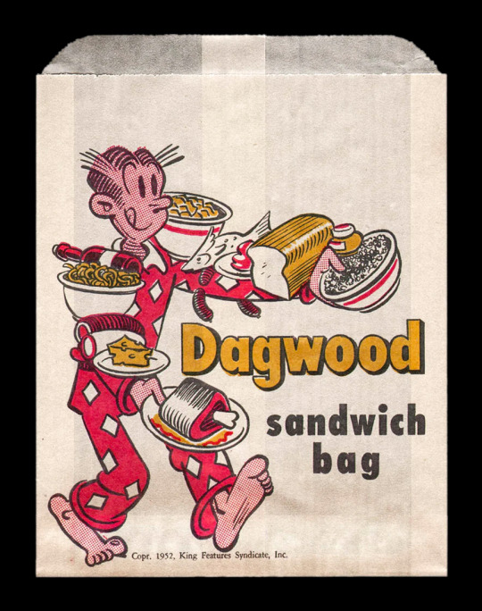
Vintage Dagwood Sandwich bag.
#vintage illustration#vintage advertising#vintage typography#package design#vintage packaging#dagwood#dagwood sandwich
346 notes
·
View notes
Text

58 notes
·
View notes
Text

tuna in olive oil package label
47 notes
·
View notes
Text
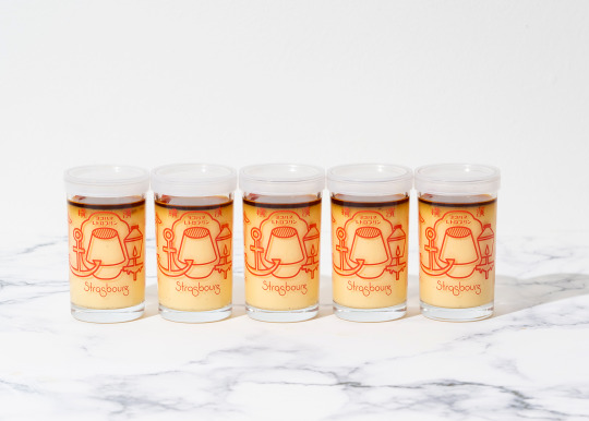

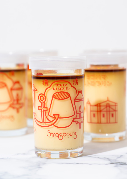
横浜のパティスリー、ストラスブール関内店のヨコハマレトロプリンの瓶のデザイン。
#package design#graphic design#illustration#japanese design#菓子#art direction#branding#japanese confectionery#japanese sweets#洋菓子#pudding#プリン#イラスト#横浜#yokohama#strasbourg#ストラスブール#patisserie
124 notes
·
View notes
Text

Y'all, that shit is neither enlarged OR detailed.
96 notes
·
View notes
Text
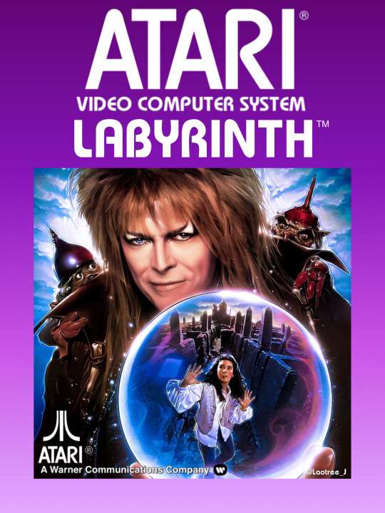

#retro design#vintage packaging#80s aesthetic#impossible games#80s movies#atari 2600#package design#labyrinth#david bowie#jareth#goblin king
62 notes
·
View notes
Text
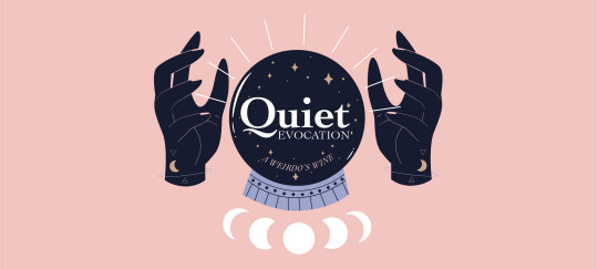
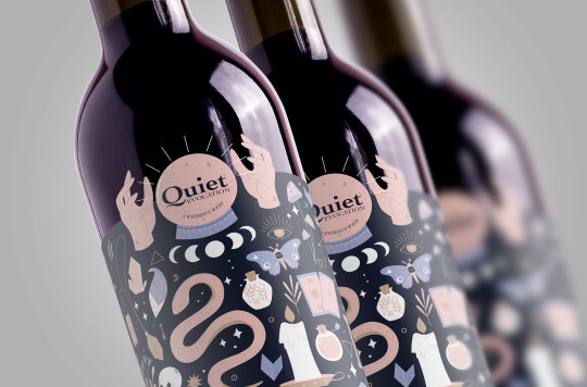


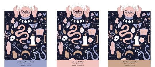
Quiet Evocation: identity and package design (brandy stewart, 2021)
273 notes
·
View notes
Text


Some of my work for Nine Inch Nails' first instrumental album Ghosts I-IV, released 15 years ago today. I served as art director, designing the Grammy-nominated deluxe packaging and taking some of the album's textural photography.
Read about my creative process on the album and the themes of its photography
Select prints from this era are available signed direct from me here.
#nine inch nails#rob sheridan#trent reznor#nin#desert#photography#photographers on tumblr#package design#album design#design#ghosts i-iv
87 notes
·
View notes
Photo
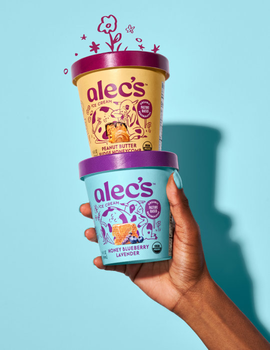
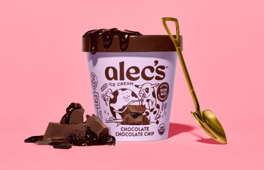
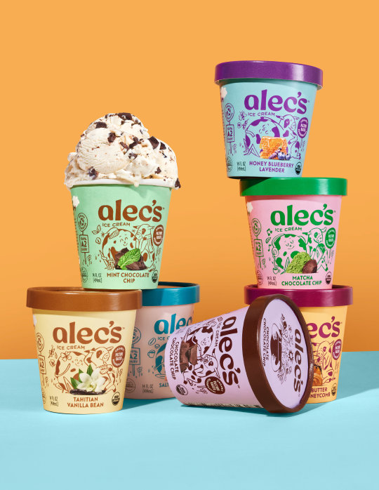

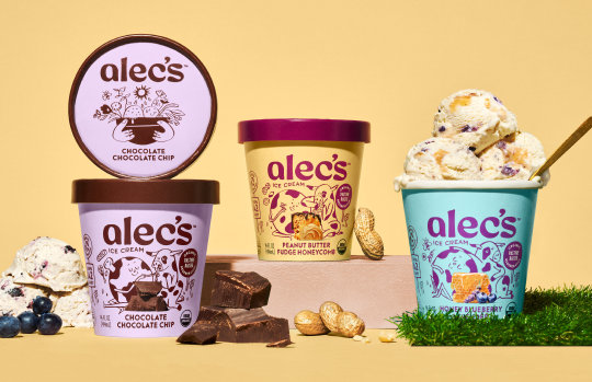
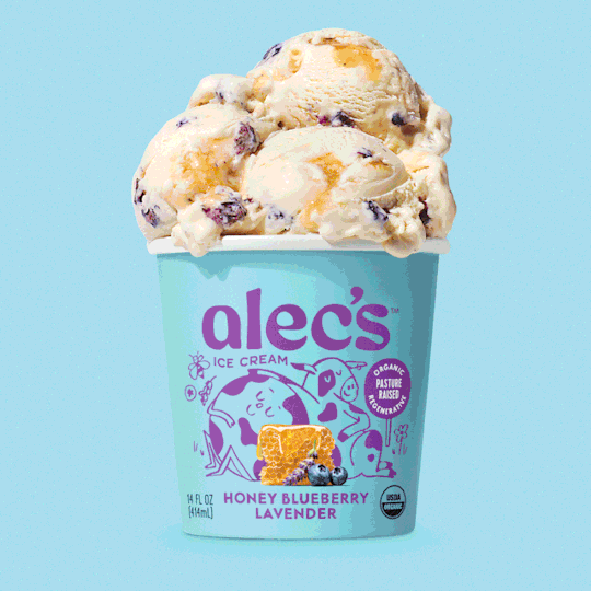
Brand Identity for Alec’s Ice Cream by Hatch
Alec’s Ice Cream is the first of its kind – regenerative A2 milk that’s good for the planet and tummies. They came to Hatch because their pack and mission were getting lost on shelf. We set out to educate and delight consumers, all while highlighting their ice cream that was out of this world delicious. We might say the result was super*naturally good!
Hatch used playful illustrations to exude a magical flavor sense, and textured layers speak to the regenerative soil. The bright colors are hopeful, with fun and inviting typography. The photography (by RC Rivera) features decadent flavor combinations and showcases the premium texture. When you bring it all together, it’s a show-stopping brand.
Hatch Team: CD Nicole Flores, Sean Morse, Ryann Woods, Richard Eriksson, Brenda Bender, Laila Moire-Selvage Photography: RC Rivera (on pack), Yuya Parker (case study images)
TDB: instagram • linkedin • facebook • newsletter • pinterest
#thedsgnblog#design#graphicdesign#typography#illustration#packaging#package design#branding#identity#logo#hatch#ice cream
81 notes
·
View notes
Text
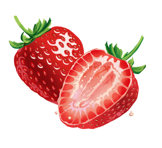
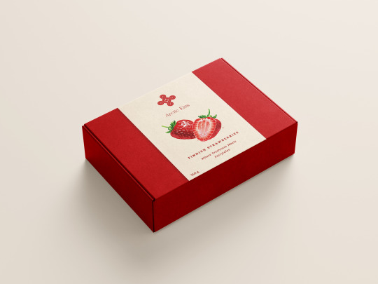

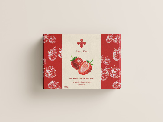
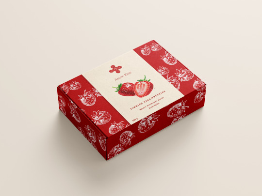
Many people don't know that I was supposed to be strawberry farmer. Which box do you like better?
12 notes
·
View notes
Photo
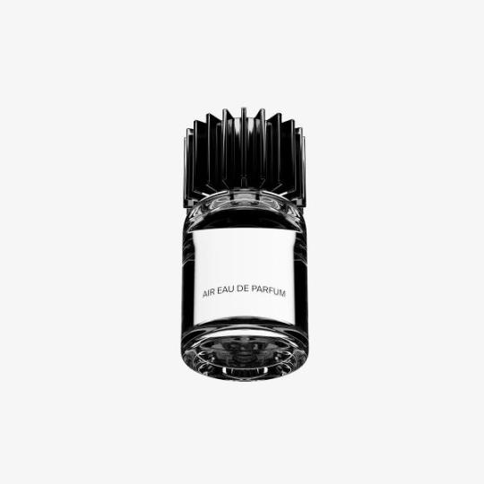
Studio Mouthwash / For Air company / Brand identity (2022)
64 notes
·
View notes
Text

Possum Brand vintage crate label.
#vintage illustration#vintage labels#crate labels#vintage crate labvels#typography#vintage typography#vegetables#fruits#fruits & vegetables#yams#package design#vintage packaging#sweet potatoes
12 notes
·
View notes
Text


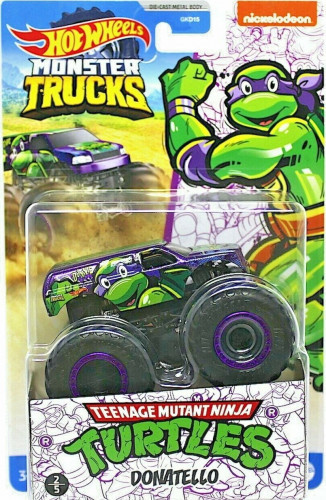
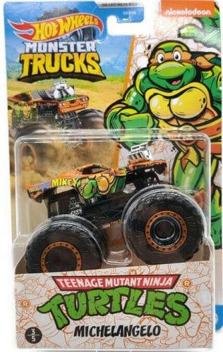
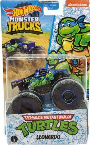
#adult collectibles#adult collectors#teenage mutant ninja turtles#tmnt#nickelodeon#krang#leonardo#donatello#michaelangelo#raphael#hotwheels#monster trucks#monster jam#the foot clan#diecast#box art#truck art#package design
9 notes
·
View notes
Text

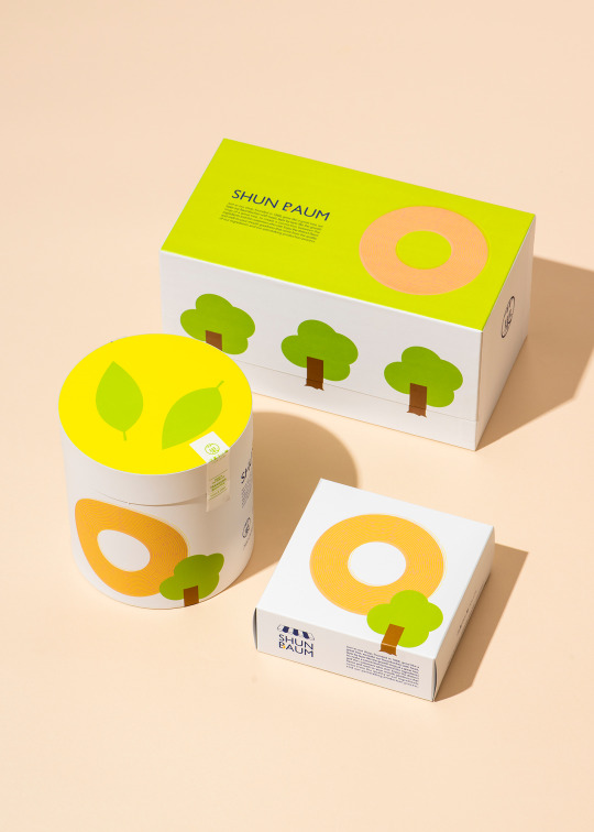
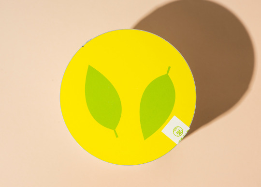
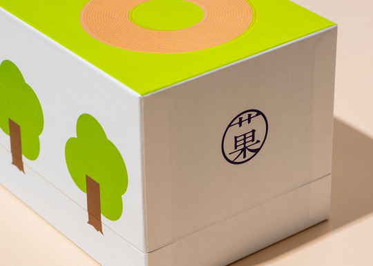

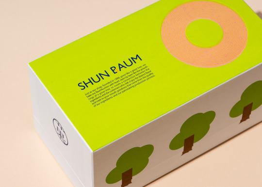
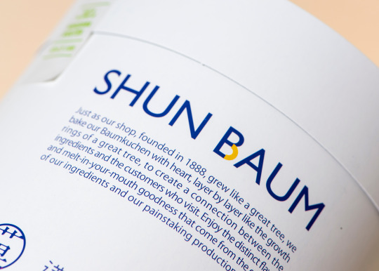

岡山の洋菓子工房ベルジェさんのバウムクーヘン、SHUN BAUMのパッケージデザイン。
#package design#graphic design#菓子#branding#art direction#japanese design#japanese confectionery#japanese sweets#baumkuchen#バウムクーヘン#patisserie#okayama#岡山#浅口#金光町#baked goods#shuttle#Shinichi arita#verge#ベルジェ#シュンバウム
16 notes
·
View notes
Text
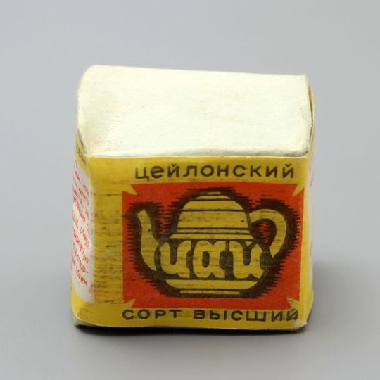
Russian tea packaging
12 notes
·
View notes
Last Seen Blogs


ecritetmort
all writing is political

gedankenglas-blog
Gedankenglas

sakukyio
e.

severeglittersheep
Welcome to hell.