#pannel coloring
Text
How I color manga panels: a tutorial
I'm no expert at doing recolors, I'm simply an artist who's occasionally too lazy to do my own lineart, and uses that of my favorite mangaka's so I can focus on other styles to simply have fun with my colors. I always try and choose panels or pages that are high quality, to avoid too much pixelization. Often I end up sourcing these from scanners or google images.
As far as programs, I use Krita (a free software). This all can be done with the standard brushes and tools that come with the software. But for some of the coloring, I have brushes from brush packs i like to use, as well as a few brushes I have customized myself. The main ones I use are from David Revoy, so if you want a recommendation for a great free brush pack, that's mine.
For this example I'll be using this panel from Chapter 58 of Moriarty the Patriot (I believe this would be Volume 15 of the manga) that I posted earlier here.

I'm not including the step where I crop the image, but I personally chose to remove some of the white borders that are needed for a traditional volume's page borders. Since I'm doing digital art, I don't always include them.
My next step is always to outline and fill the individual base layers. This includes the speech bubbles, each character, any independent props, the panels themselves and the backgrounds. There's no correct way to do this, but personally I use a brush to outline the object, then fill tool to well. Fill it, as well as the rectangle tool for the panels or straight lines I need to do.
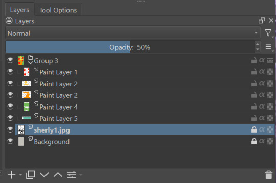
For layers, I usually put all of these color base layers in a single group that's set to multiply, and change the opacity of the base panel so that I can fill the blacked out areas with a solid color easily, here you can see I was working with the base panel at 50%, but honestly i just kind of turn it down to whatever I think looks good.
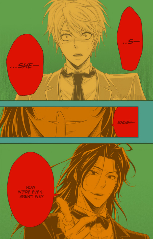
The colors I use for this step are usually brightly saturated rainbow colors so it's easy to tell the different elements apart from each other. So you end up with something that ends up looking rather horrific like this:
From here, I usually create a copy of the base panel to put over the top of the colors. This way I can have transparency for the colors on some of the blacked out parts, but don't loose some of the nuance of the shading entirely. Moriarty the Patriot is a very black heavy cell style, which is the style I find the "panel above, panel below" method works best on. However as I work on the colors, I tend to toggle between having it on or off.
It's about here where I start doing my coloring. Of course this will depend on your coloring style and art habits, however personally, I like to start with the characters. I use those colored layers as the base layer I can clip my coloring layers to.
I will often turn off the layers that I'm not currently using so I don't have to deal with eyestrain, and will change the base layer to something more suitable (often a grey or light tan) so my color theory doesn't get all messed up. The bright colors in previous steps are to make sure they're visually separate. Now they've been established, I don't have to worry about that.

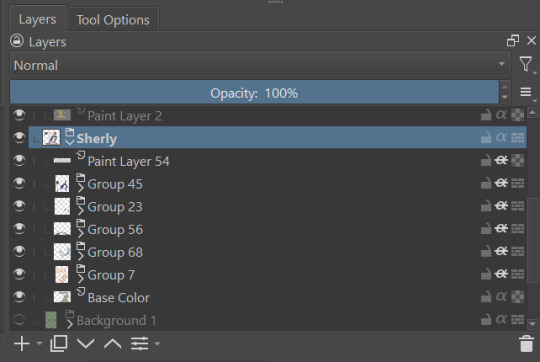
I don't usually label my layers, but for the sake of the tutorial I have to make it clearer which layer grouping is which.
I find in this step because of the multiply layer the colors can be a bit washed out, so I tend to either use much more saturated colors than I usually do, or switch to another layer style like Linear Burn of the overall color group to make the colors pop more. Ultimately though this comes down to personal preference. If your coloring style is very de-saturated, you might not have any problems with it. (I do suggest making your base color white, so the coloring of the base panel isn't off, you'll see in the screenshots above I forgot to when working on Sherlock. Ignore my mistake)
For the parts of the image where it's primarily blacked out (such as Sherlock's hair or coat) I don't bother shading at all, and only do the highlighting, as the black takes care of the darkest tones anyways.
During my coloring, I also add a separate grouping above everything for adding rendering and details above the panels. This includes things like the eye highlights (which I always do in pure #000000 white) and making certain parts of the heavily blacked out areas pop more.
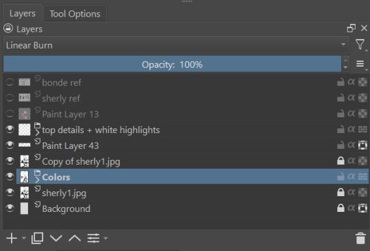
(those refs and paint layer 13 are what I'm using to color pick off of, and keep the shading colors consistent throughout the piece. There's probably a better way to do it, but I just paste them directly into the image and then delete them at the end, paint layer 43 is a color dodge layer, and so has to be outside of the layer grouping to work)
Comparison of the art without:

And with the top details and white highlights:

It's a pretty subtle difference, but I find it's the little things that truly make the piece. Especially with the strands going over the face, they need just a bit more to make them really pop. I also just really like my fancy eyes which is hard to do without the top layer.
Insert several hours of coloring here, and about another hour just trying to figure out what gradient to use for the background, and you end up with the the base colors. From here I usually mess with overlay layers as well to get the colors to all look fancy and nice together without having to do color theory (pro tip /lh).
I forgot to grab screenshots while doing the background, but for the top panel I essentially just used the [deevad 5c screentones] brush and a transparency mask to add a screentone gradient, and totally didn't google "splatter overlay" or something like that and picked something off of google, and added some borders.
Because both the base manga panel and manga panel over the top are both not at full opacity, if there is text in the page or panel (such as this one) I like to copy the just the text part of the panel and add it as full opacity in the "colors" folder to make sure it's legible and matches up the rest of the colors.
And after all that, its basically done. I'll sometimes continue to mess around with certain aspects to make sure I like how it look, but that's essentially it. This is when I add my signature, and then it's queued to post!

#krita#long post#eyestrain#art tutorial#tutorial#digital art#my art#manga recolor#manga edit#manga pannel#manga coloring#sherlock moriarty the patriot#moriarty the patriot fanart#yuukoku no moriarty#moriarty the patriot#james bonde#james bonde mtp#artists on tumblr#art resources#art help#art tips#drawing tips
60 notes
·
View notes
Note
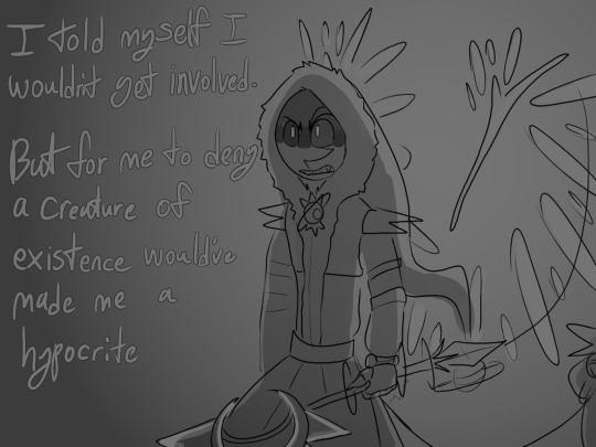
a lil art tip, u can do whatever u want, u don't have to do the mirror thing, the art is in the decisions the artist makes, to represent exactly what they want, and sometimes you don't need to draw everything
Of course, I totally agree!
This is just me being stubborn since I’m trying to get better at perspective. I’m just hoping all the extra effort will make drawing perspective in the future feel less like doing math >:)c
#honestly I’m just in an art funk#a sEVERE ONE#and it’s making me look at the Subnautica comic and go >:c#cause it’s the same 4 angles!!! the same colors!!! I want to make it more interesting to look at!!#I know with comics it’s sort of 🤚👋✋🫸🫳🫴🤏🤌🫰✌️#(that’s me gesturing vaguely cause I don’t know how to say what I’m thinking)#but if I am looking at the panels and thinking /wow this is a drag/ I feel like people are gonna feel similarly#maybe that’s just me being very adhd and wanting everyone to feel as entertained as me :/#idk#feels like perspective + some fun panneling will make it better so I’ve been studying
58 notes
·
View notes
Text

“How are you getting all of this stuff? Just who exactly are you?”
A comic I made for the most recent chapter of The Devil's Eyes and His Voice Behind by @darlingatlas
#I love this fic series so much!!#its so good!#i read this part and i just couldnt get it out of my brain#i just needed to draw it#I've never drawn a comic before but im pretty happy with this#i could have portrayed some parts better but eh#jason todd#matt murdock#daredevil#speachs scribbles#Red is the Color of Sinners#ignore those last two pannels i dont like them
59 notes
·
View notes
Note
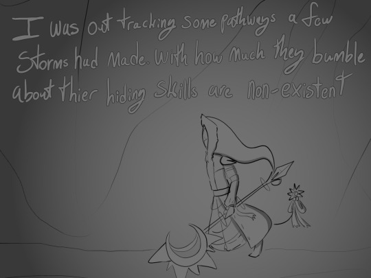
Lord Saturn, since we haven’t heard much about him, what’s your Sun like?
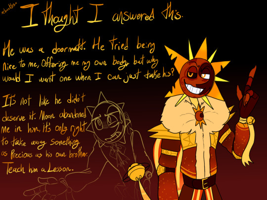
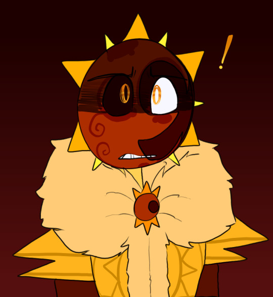
#So Saturn#what was that about everything being gone?#Lord Saturn#Storm Slayer AU#SAMS AU#Colored Paw Prints#Howls from the Abyss#As I was drawing that last pannel Bust your kneecaps came on#I swear Saturn has control over my musicplaylist#Being able to have the perfect songs come on when drawing him
30 notes
·
View notes
Photo

im not finishing this
#scaramouche#sketch#genshin impact#i hate coloring anime#this is the art tag#blanket permission to finish this if you want#my fav archon quest so far#that mha fancomic is doing damage to me the last pannel looks like mha style...#genshin 3.2 spoilers
104 notes
·
View notes
Text
i have no excuse, explanation or reasoning for this, but i did need a cover for the ship playlist. (actually, i have a very long explanation but i wanna actually write that fic. juno you're my realest one for constantly putting up with arknights spin the wheel ship bullshit)
#arknights#own art#carnedusk#carnelian#dusk#arknights dusk#arknights carnelian#i just realised i didnt color carnelian's skin on the top pannel im gonna be fucking sick#hey morning kj im begging you to edit this post with a fixed version omfg
53 notes
·
View notes
Note
7 and 26!
hehehehe THANK YE JOJO
7. what color brings you peace?
Ooooh... tough... probably a deep blue... or perhaps a lighter but muted blue, or like a purplish blue. something like a sunset... yeah. (and no the blue totally has nothing to do with like... naval uniforms or anything 😳😳😳) or idk... maybe something akin to the warmth of firelight... yeah...
26. what movie would you want to live in?
Christ would anyone be totally surprised at this point if I said pride and prejudice 2005 OR!!!! LOTR (specifically the shire)??? what can I say I'm a hoe about those sorts of things
soft asks to get to know people
#WHAT CAN I SAY I LOVE NICELY DECORATED ROOMS#DOESN'T HAVE TO BE THE MOST DECADENT AS LONG AS IT'S NOT GREY MODERNIST BULLSHIT GOD BLESS#and I'm a sucker for warm wood panneling and cream colored walls and god. CONTRAST. contrast is great.#ask games
2 notes
·
View notes
Text
Thats not even the only page I planned out, i have a whole second one layed out and a few pannels I wanna draw but need to make a page for
#its terrifyingly fun to sift through the manga to scrapbook together a new page for an au#its even scarier how easy it is to reline a whole pannel to color it i did that whole page in one sitting watching cartoons on the couch#so like ^^ get ready for more fake manga pages#(may even see if i can find enough good pannels for a pla edit)
7 notes
·
View notes
Text
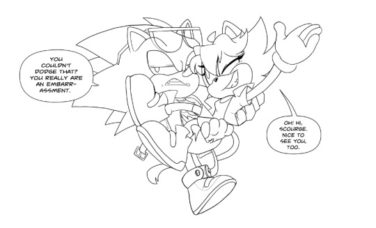
dearly beloved losers
#𝗶 𝗱𝗶𝗮𝗴𝗻𝗼𝘀𝗲 𝘆𝗼𝘂 𝘄𝗶𝘁𝗵 𝗯𝗲𝗹𝗴𝗶𝗮𝗻 ✧ ( ooc. )#( pannel edit because i didnt want to draw today )#( ill be coloring this tomorrow cuz i love how this looks esp scourge )
3 notes
·
View notes
Text
This may be decisive but I have decided to buy a copy of four swords to colour in because i think it'd be fun
Heres a tester i spent like 20 mins on with some cheap pencils and printed paper.
What are yalls opinions on treating a manga like a colouring in book?
#four swords#four swords manga#loz fsa#manga#fsa#not sure if im gonna colour whole pannels#or just the characters#good learning experience#i guess#to colour in#or to not colour in#that is the question#better question maybe is#color or colour#im Australian so I say colour
6 notes
·
View notes
Text
I'm once again obsessed with these old men and want to know what their deal is.
#tw blood#zskk#zenki soukoku#zenku soukoku#<- still don't know the difference#fukumori#bungo stray dogs#bsd#bungo stray dogs fanart#bsd fanart#bsd fukuzawa#bsd mori#fukuzawa yukichi#mori ougai#president fukuzawa#manga coloring#manga recolor#manga edit#manga pannel#old man yaoi#<- am i wrong#my art#digital art
125 notes
·
View notes
Text
I love looking at vintage interiors and buildings and cars n things because everything is so bleak and bland now :'( wheres my enclosure enrichment
#my dad wants to get rid of the wood panneling and weird wallpaper in favor of slabs of plain color#all for the sake of “itll look cleaner” NO I WANT TO HIDE THE DIRT AND NICOTINE STAINS#if you take away my patterns and woodgrain i will die of deprivation#ny says
1 note
·
View note
Text
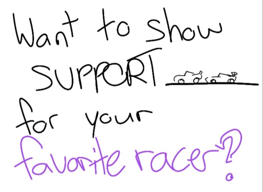
When. When you. You're. When you're. When you you're. With several racers and the merchandising team decides to use it as a marketing strategy:
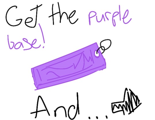
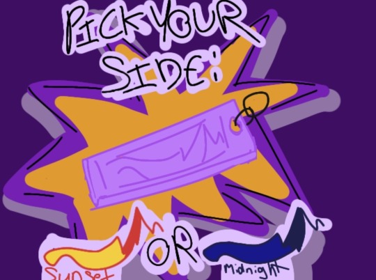
#if this needs to be tagged for eyestrain let me know-#imagine this on your tv or youtube ad teehee#giggles. im so.eee!!!#self ship#selfship#selfshipping#selfship gush#selfship art#the sunset is for Lightning and the midnight is for Jackson#i was thinking about coloring the back of the first two pannels to match but got lazy HDNDJDNGNT#kicking my feet in the air over my own art. i gotta do this more often#its. supposed to be like a little keychain thingy
0 notes
Note
How did you meet Beam?
Lord Saturn: Heheh, it’s a silly story
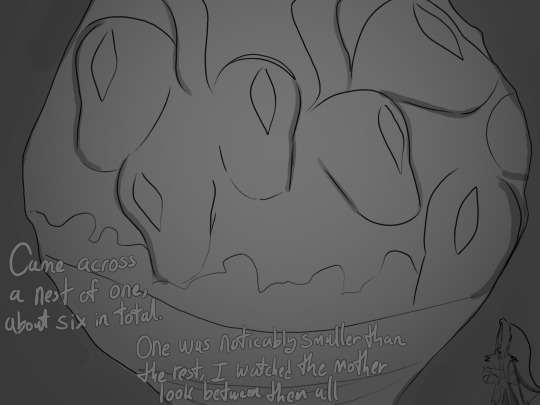
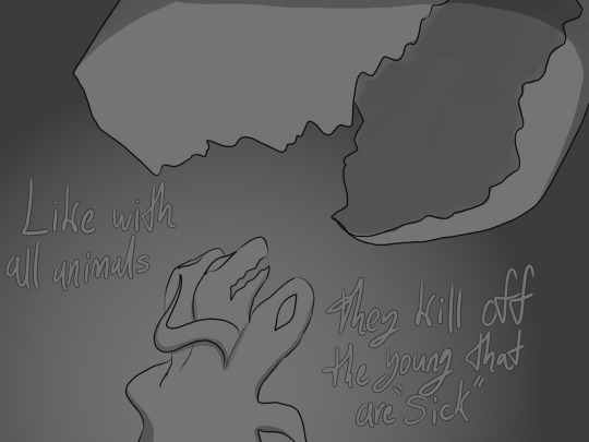

Lord Saturn: I argue that I was cutting them off at their source before any real damage could’ve been done.
#Howls from the Abyss#Storm Slayer AU#Lord Saturn#Beam#Colored Paw Prints#When I was drawing the last pannel Blinding lights by the weekend came on#It strangely fits haha
29 notes
·
View notes
Text

1 note
·
View note
Text

WOODLAND Ranch
Hello hello! 🐎
Welcome to Woodland Ranch! During this collection, we well go ranch/rustic but with a little bit of cozyness and elegance at some point !
I will add some build pieces and buy pieces each month as I don't have as many time as I would like to to create an entire build set in one month, so lets get some pieces every month!
You will now have 31 pieces to decorate the bedroom, and nice windows, closed or opened versions! You also have wooden panneling, wood and painted version. Same swatches for the panneling and flooring, in case you want a color block room! Speaking of flooring, there are two flooring, and one is made to be a ceiling item, with little beams like the panneling!
You can find the items by searching for WOODLAND RANCH or Pierisim in game.
Some items share the same textures so make sure to have the packages finishing by "texture" in your mod folder :)
All base game compatible.
unmerged and merged version available.
public release 15 of September.
DOWNLAOD
#maxis match#ts4#ts4cc#pierisim#ts4 maxis match#pierisim cc#ts4 cc maxis match#ts4 download#ts4 cc finds#ts4 finds#ts4ccmm#ts4 cc#ts4 custom content#ts4 cc mm#sims 4 mmcc#mmcc#ts4 mm#sims 4 maxis match#s4 maxis match#sims 4 maxis cc
6K notes
·
View notes
Last Seen Blogs
duskn-archive
夕暮れ
kowaikuma
💀⛓🖤💉🩸

mysticpainterneckpasta
Sin título
eugeokirigaya
Kirito's Husband
xueyangs-pinky-finger
xue yang’s pinky finger >
100s of people’s lives