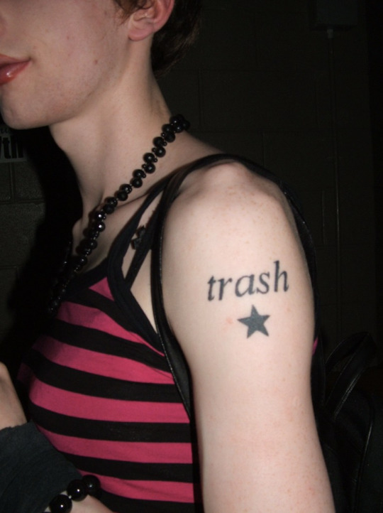
#peak 2007
Text

꧁★꧂
151 notes
·
View notes
Text
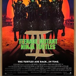
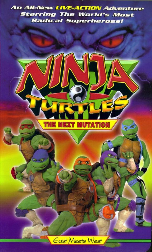
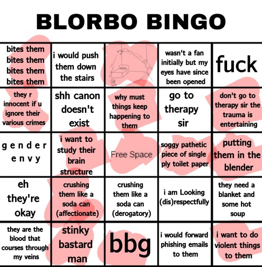
The Evolution of the Ninja Turtles' Designs

As I'm sure many of you know by now, this year marks the 40th anniversary of the Teenage Mutant Ninja Turtles.
What initially started off as an intended one-off parody of the dark and gritty comics of the early to the mid 1980s (particularly the works of Frank Miller like Ronin and especially Daredevil) would grow to become one of the most successful media franchises in history.
The one-off quickly became a full-on series, running for a total of 30 years from 1984 to 2014.
It also led to the creators of the Turtles, Kevin Eastman and Peter Laird, to start their own comic publishing company, Mirage.
And apart from that, this franchise has seen multiple of other comic runs from the likes of Image, Archie and IDW.
Four animated series (with a fifth one coming out this summer).
Ten feature-length films (7 being released in theaters, while 3 were released direct-to-DVD).
A live-action TV show that nobody likes to talk about....
And a boatload of video games, toys, food products, and just about any other kind of merchandising you can think of!
And it's honestly impressive just how consistently popular the TMNT brand has reminded over the four decades they've existed in pop culture.
Even more so is how much of a spotless track record they've had when it comes to the quality of their products.

Okay a mostly spotless track record....
But today I'm here to talk about one of the coolest things to notice when looking at this franchise. And that's the visual evolution of the Turtles.
I'm gonna be looking at the designs of the Turtles from the original Mirage comics and the animated outputs of the franchise to see just how much the Turtles have visually changed.
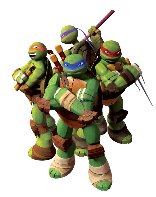
Starting this off we have the Turtles from the Mirage comics, the 1987 cartoon, the 2003 cartoon and the 2007 film.

The reason I decided to lump these four iterations together is because they all share something in common....
What that's you may ask?
Well, a while back, I watched a video by YouTuber Just Stop called "Death by Nicktoon", where he looked at the many Nicktoons that were unfairly snubbed and sent to the Nicktoons channel to die a slow and painful death.
And one of those Nicktoons was one of the next TMNT series I'll be talking about pretty shortly.
When talking about that series, Just Stop mentioned the Silhouette Test.
As I'm sure many of know by now, the Silhouette Test is major component when it comes to character designing.
Essentially the saying goes that you know a character has a good design if their silhouette is easily recognizable.
And Turtles do pass this test.....but only as a group.
Because individually, these versions would all fail that in an instant.
And that's the thing they all have in common.
Within the pieces of media each of these groups come from, all they look exactly the same.
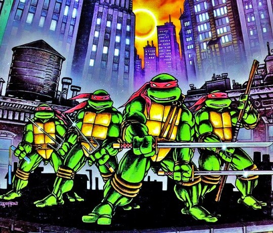
Out of all of them, the Mirage Turtles have this issue the worst.
During the early years of the comics, the Turtles basically acted damn-near identical to each other.
And if you were trying to find another way to differentiate them from each other, I don't know what to tell you.
As I mentioned earlier, these Turtles look exactly the same and the fact that they were in black and white for a good chunk of the comics didn't help matters either.
But when they were in color, the Turtles were all depicted wearing red masks.
Really, the only way you could actually tell which Turtles is which is by their respective weapons.
Leonardo wields the dual katanas.
Raphael wields the twin sais.
Donatello wields the bō staff.
And Michelangelo wields the dual nunchucks.
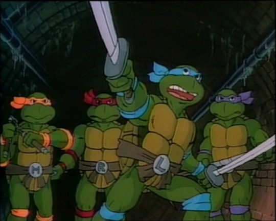
But when the 87 cartoon rolled around, the crew behind that show knew the Turtles needed some retooling in order for a wider audiences to get into the brand.
Thus, they did two things that have become staples in the Turtles franchise since then.
They gave each of the Turtles their own distant personalities. Leonardo was the calm, brave and strategic leader, Donatello was the tinkering, inventing genius, Raphael was the cynical and wisecracking smartass with a slightly bad attitude, and Michelangelo was the fun-loving, Cowbunga-shouting goofball.
They gave each of the Turtles different colored masks. With the expect of Raphael (who was still rocking the red look), Leonardo got a blue mask, Donatello got a purple mask, and Michelangelo got a orange mask.
And although their visually more distinct when compared to the Mirage Turtles, they still suffer from the same problem where physically, they look exactly the same.
Plus the fact that a lot of promotion and merchandising for this show often depict the Turtles as having the same expressions didn’t help either.
However, there was another visual element added to the Turtles' designs.
They gave each of the turtles belts with buckles that had the initials of their respective names.
But if you had put these Turtles in black and white and took away their weapons and belts, you most likely wouldn't be able to tell who was who.
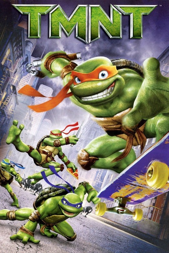
The same can be applied to the 2007 Turtles as well....minus the belts since they don't have those.
But in the case of the 2003 Turtles, this is where things get interesting....
These Turtles do share the same issues as the three other iterations listed above, being that they look exactly the same to each other, minus the colored bandanas and trademark weapons (which I'm still surprised they carried over from the 1987 cartoon given that Turtles co-creator Peter Laird, who was heavily involved in the 2003 cartoon, is kind of infamous for having a bit of a hate-boner towards that series).
However, there is another visual element to these Turtles that would help differentiate them from each other.
This would mark the very first time in the franchise's history where the Turtles were given different skin colors....or more appropriately, shades, as each of Turtles' skins were a different shade of green.
Leonardo was forest green.
Michelangelo was blue green.
Donatello was olive green.
And Raphael was emerald green.
But with that being said, if you put these Turtles in black and white just like the others iterations above and took away their respective weapons, it would be the same output as before.....
Or maybe not....
You see, for the last two seasons of the show: Fast Forward and Back to the Sewers, the entire cast received major redesigns, and this led to two notable changes with the Turtles.

Their eyes. In the first five seasons, the Turtles' eyes were depicted as being fully white when they had their masks on. And when they were off, their eyes were just simple black. But in these last two seasons, the Turtles' eyes were now colored and were made visible through the masks. The Turtles all had green eyes....except for Donatello, whose eyes were brown for some reason.
Their heights. In the first five seasons, the Turtles all stood at about the same height, that being 5'2. But in the last two seasons, they were each given different heights. Michelangelo was the shortest at 5'4, Leonardo was the second shortest at 5'5, Donatello was the second tallest at 5'6, and Raphael was the tallest at 5'7.
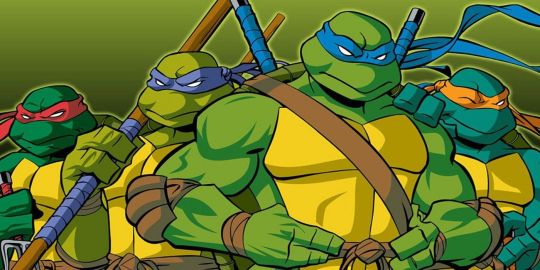
Next we come to the Turtles from the 2012 series, and this is where everything changed....
For the very first time in the franchise's history, the Turtles were each given unique and distinct looks from each other.
No longer did they look like the same character copy-pasted three times, each of Turtles actually looked different!
If you saw these guys in black and white and took away their weapons, you could definitely tell who was who!
Some of the visual elements of the previous cartoons were carried over such as the colored masks (which have becomes staples of the franchise since the 1987 cartoon), having their skin colors being a different shade of green, having colored eyes and standing at different heights.
But what really sets these versions apart from the others is the fact that each Turtle has a different physical build!
Leonardo is the most well-rounded when it comes to physical builds, he has fern green skin, cobalt blue eyes, and is the second tallest of the Turtles at 5'1.
Raphael is slightly more bulkier and has more defined muscles than the rest of his brothers, has dark green skin, emerald green eyes, a crack on the right side of his shell, and is the second shortest of the Turtles at 5'0.
Donatello has a lean and gangly-like build, brownish green skin, reddish brown eyes, has a gap in the middle of his teeth, and is the tallest of the Turtles at 5'6.
And Michaelangelo has a more stout and pudgy build, light green skin, baby blue eyes, freckles on his face, and is the shortest of the Turtles at 4'10.
Now come to the Turtles from Rise of the Teenage Mutant Ninja Turtles....
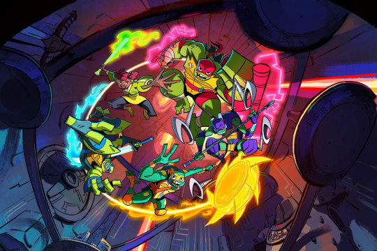
Out of all the iterations of the Turtles before and since, these guys are by far the most visually distinct of them all!
It honestly feels like the crew looked at the designs of the 2012 Turtles and said, "Hey! Let's do what they did.....but even better!"
Marking yet another first for this franchise, this would mark the first time the Turtles were all different specific species of Turtles rather than being the same unspecified species for the umpteenth time.
And them being different species are greatly reflected in their designs.
Also, according to several artists on the show, each of the Turtles were designed around a shape, and the use of the shapes also reflected their respective personalities.
Raphael is an alligator snapping turtle, which is why is he's an absolute unit in this series, with a hulking and muscular build to match! This Raphael is the second biggest and tallest he's been in this franchise, standing at a whooping 6'0! And since he's an alligator snapping turtle, Raphael also has jagged and fractured points on his elbow, knees and shell. His choice of species reflect three major aspects of his character.....
His status as the brawler/muscle of the team.
In this iteration, HE'S the leader of the team.
He's the oldest of the Turtles. Oh yeah, marking yet another first for this franchise, this would mark the first time that the Turtles were all made different ages rather than being quadruplets like every other iteration. As previously mentioned, Raphael is eldest of his brothers at 15.
Raphael was designed around squares, to reflect his offensive and defensive fighting style.
His mask, in contrast to half of his brothers, is depicted as more of a bandana (or a possibly a durag). Plus it has the longest tails out of the group, reflecting his status as the oldest brother.
He also wears red bands on his elbows and his thighs, a red belt with his Turtle Emblem off to the right side, and his bandages on a few parts of his body and specifically around his ankles and hands, reflecting his prowess as a fighter and that he's the Turtle most dedicated to training.
Raphael also has bright green skin and a sharp tooth sticking out of the right side of his mouth.
Leonardo is a red-eared slider, which is why he has those markings all over his body and shell and the red markings over his eyes. His choice of species would also reflect his future status as the leader of the Turtles, since red-eared sliders are the most well-known species of turtles. He also has a lean and athletic build, reflecting his status as the team's resident speed fighter.
Leonardo was designed around triangles, to reflect his witty and sharp nature.
The marks on his body are also triangular as well.
Leonardo also has lime green skin and wears blueish grey fingerless gloves and toeless footwear, a blue belt with a strap that overs his right shoulder, a set of pouches, and he has his Turtle Emblem on the left, and is the second tallest turtle at 5'5 (the same height as his 2003 iteration).
Donatello is a Asian softshell, which plays a big part in his personality. Out of all the iterations of Donatello, this one is far more aggressive than most of his prior iterations, even the Mirage version! I mean bro, this Donatello is practically a psychopathic scientist. This is because Asian softshells are known for being incredibly aggressive and one of the few species of turtles that are carnivorous.
As for his physical build, it's quite similar to Leonardo, which is possibly because of the fact they're twins, both being 14 years old.
Though Donatello's is even more leaner and thinner than Leonardo's, giving him a build akin to a swimmer. That's because Asian softshells are known for being some of the couple of turtles that live on land that are semi-aquatic.
Another similarity Leonardo and Donatello share are their mask tail lengths.....well, sort of....
The length of Leonardo's mask tails is squarely in the middle, reflecting his status as the middle child.
Donatello's however are little harder to tell.....
At first glance they appear to be quite short. However, when looking closely, you can see that the tails look folded. So there's a strong chance that his mask tails are both as long as Leonardo's, since they're twins.
(Also, it's fashioned in a similar way to Raphael.)
Donatello was designed around rectangles, to reflect his more practical and blunt nature and his technological prowess.
He also has purple, rectangular markings on his body as well.
Donatello wears purple fingerless gloves and toeless footwear, a silver tech-gauntlet on his left wrist with a blue touchscreen, purple knee and elbow pads, a purple belt with matching pouches, and the Turtle emblem placed on the center. He also has jade green skin and stands at 5'3.
But the most notable aspect of Donatello's design is his mechanical shell.
This not only reflects his technological prowess, but also reflects an aspect of his species and his character.
Asian softshells are known for their shells being on the weaker side when compared to other turtles species. It's in the name. So Donatello wears one for obvious reasons.
It reflects his inferiority complex. Throughout this series, it's shown that he heavily relies on technology due to him feeling inferior to his brothers. That was sort of already from the beginning given that he majorly lacks the same natural protection they do, but thanks to them getting mystical powers, that was made even worse.
Michelangelo is a ornate box turtle, which is why he's the smallest and shortest of the Turtles, standing at 4'7 (being the shortest any of the Turtle iterations have ever been). Him being a box turtle also reflects a major part of his personality, that being his friendly and kind personality, as box turtles are known for being one of the friendliest and gentle species of turtles.
Michelangelo was designed around circles, to reflect his bouncy and kinetic nature.
He also has orange spots on his body and orange markings on his shell, which also serve as an another nod to his species.
Michelangelo also has blue green skin and wears orange wristbands and toeless footwear, and orange knee pads with red faces on them (a dead face on the right and a smiley face on the left), and a dark orange chest harness over his left shoulder with the Turtle emblem placed over his heart.
He also wears a pair of magenta and cyan stickers on his plastron (a triangle and a lightning bolt), to reflect his artistic nature.
Michelangelo also has the shortest mask tails of his brothers, to reflect his status as the youngest.
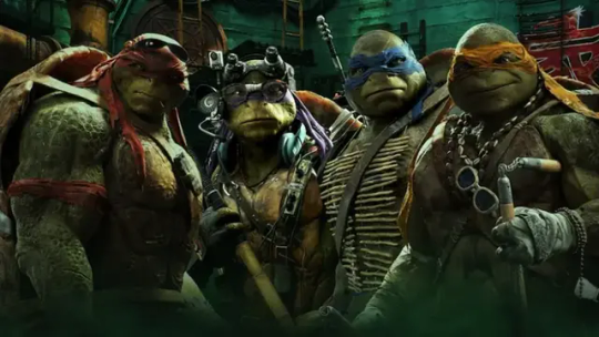
Finally we come to latest incarnation of the Turtles, Teenage Mutant Ninja Turtles: Mutant Mayhem....
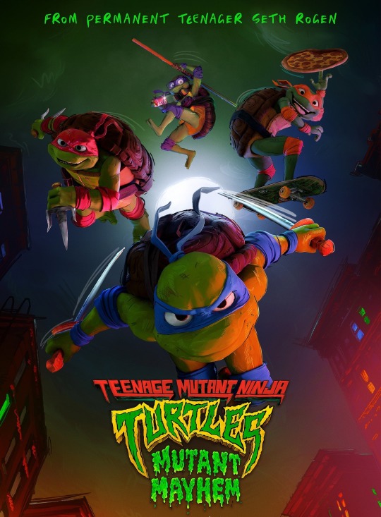
Although they're not nearly as visually unique as their previous iteration, they still do a good job at making each of the other visual distinct from each other.
One thing to note is that the just like the 1987 Turtles, they all have initialed buckles again.
Leonardo has a well-rounded build like his 2012 iteration with French lime green skin, has shurikens on his belt, and is the second tallest of his brothers at 5'5
Donatello has a leaner build similar to his 2012 iteration with bitter lime green skin, wears glasses, headphones, and a fanny pack, carries a phone on his belt, and is the second shortest at 5'4.
Raphael is the biggest and bulkiest of his brothers with bright green skin, has his mask fashioned in a bandana-like style akin to Rise Raphael, has a pouch on his belt, and is the tallest at 5'7.
Michelangelo is the skinniest with sea green skin, wears braces and is the shortest at 5'1.
Well that's all for now folks!
The reason I wanted to do this (apart from wanting to do something for the Heroes in a Half-Shell's Big 40), was because although I've seen people talk about the looks of the various iterations of the Turtles before, but only in the sense of that specific iteration.
So I thought I would be interesting to instead do a timeline of their visual appearances to show just how much they've changed over the decades.
Anyway, I'm gonna go to bed.....
Peace.
#teenage mutant ninja turtles#tmnt mirage#tmnt 1987#tmnt 2003#tmnt 2007#tmnt 2012#rise of the teenage mutant ninja turtles#tmnt mutant mayhem#character design#design evolution#though in all honesty rise is peak character design for this franchise
43 notes
·
View notes
Text
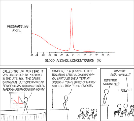
Apple uses automated schnapps IVs.
Ballmer Peak [Explained]
Transcript Under the Cut
[A graph with "programming skill" on the Y-axis and "blood alcohol concentration" on the X-axis. The Y-axis slowly goes down, but spikes at 0.1337%.]
[Cueball is making a presentation with the graph.]
Cueball: Called the Ballmer Peak, it was discovered by Microsoft in the 80's. The cause is unknown but somehow a B.A.C between 0.129% and 0.138% confers superhuman programming ability.
Cueball: However, it's a delicate effect requiring careful calibration – you can't just give a team of coders a year's supply of whiskey and tell them to get cracking.
Spectator: ...Has that ever happened?
Cueball: Remember Windows ME?
Spectator: I knew it!
34 notes
·
View notes
Text
Purple Pieman: You read my diary?!
Sour Grapes: In my defense, at first, I did not know it was your diary. I thought it was a very sad handwritten book.
#incorrect quote account#incorrect quote#incorrect quotes#strawberry shortcake incorrect quotes#strawberry shortcake 2007#strawberry shortcake 2003#strawberry shortcake characters#strawberry shortcake#purple pieman#the peculiar purple pieman of porcupine peak#sour grapes#strawberry shortcake account#meme account#meme
72 notes
·
View notes
Text
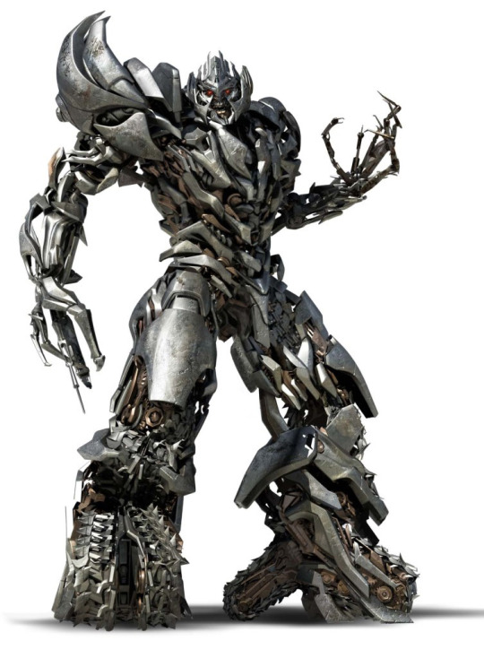
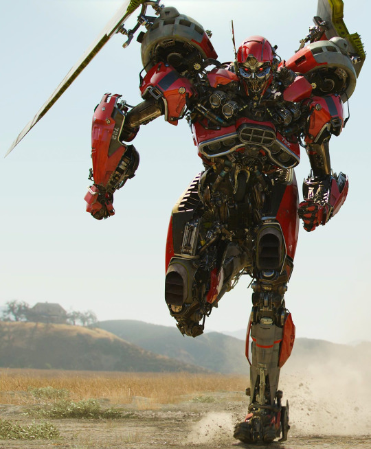
Peak Character Design: Live-Action Transformers: Autobot Edition
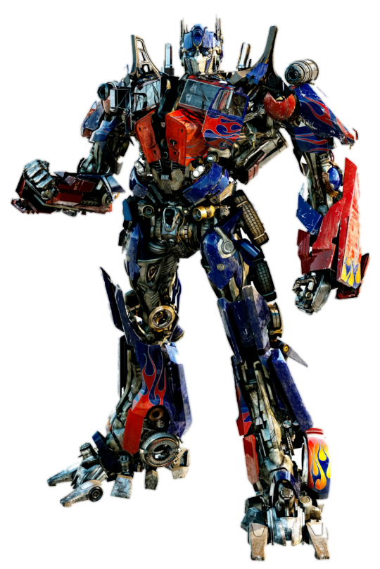


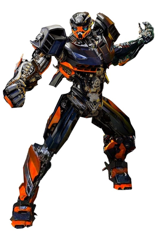
#Transformers#Transformers 2007#Transformers: Revenge of The Fallen#Transformers: Dark of The Moon#Transformers: Age of Extinction#Transformers: The Last Knight#Optimus Prime#Bumblebee#Ironhide#Ratchet#Jetfire#Mirage#Hound#Grimlock#Hot Rod#Arcee#character design#peak design#peak character design#Autobots
37 notes
·
View notes
Text
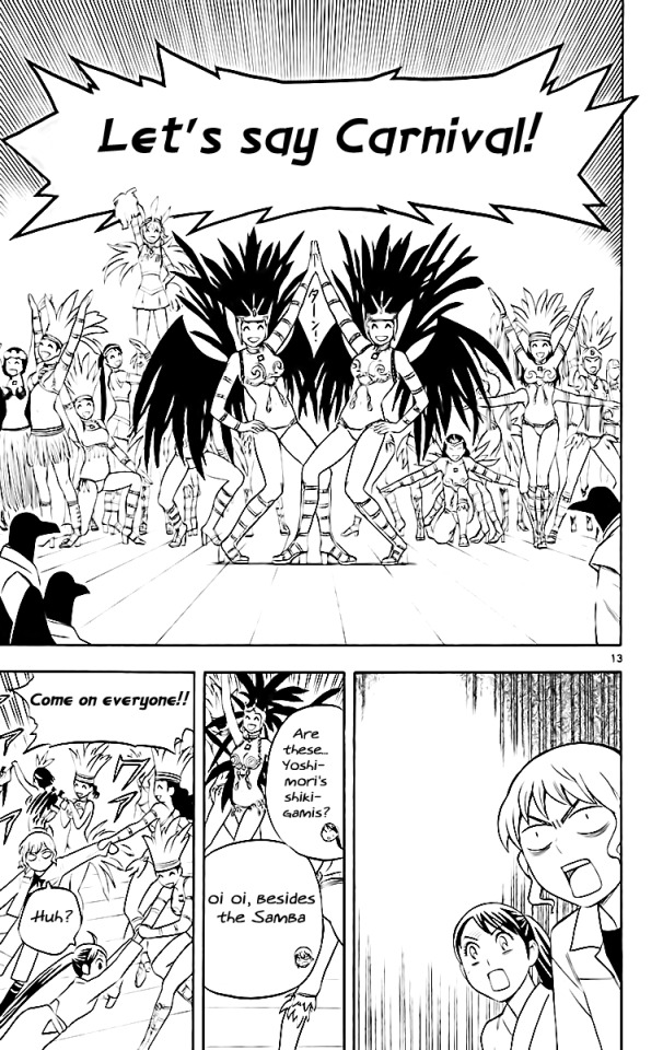
SHE WAS MEMEING???
#just thinking thoughts...#I mean silver spoon used samba dancers as a punchline too somewhere#but also. this is SO hip with the times. the timing is literally exactly at the peak of meme hotness.#maybe even slightly before since the date is for the volume and this was one of the earlier chapters#so it probably came out sometime late 2007???#so surreal to research history and have DVD corner bounce moments like this.#kekkaishi
11 notes
·
View notes
Note
for the warriors ask game :D
🗺 : first map you ever watched?
🖼 : first amv/pmv you ever watched?
(I used to watch MAPs religiously those are my jam)
yay thank you! warriors ask game except the questions are all weird and niche as hell!
know: my memory is bad. i've been into wc for... well over a decade now, so these are probably not accurate xP my first warriors video was i believe a spoof video about ashfur and squirrelflight, but my first map and amv? uhhh unsure!
🗺 : first map you ever watched? - i didn't actively watch maps as a small kid, or at least i don't think i did? the first map that i entirely remember watching was during my second major warriors phase by the time i was closer to... 15 maybe?? as opposed to my earliest memories of wc which are from when i was 10 or younger lol. little fang, which is making me genuinely super misty eyed to rewatch, it's just so so good, from the style to the designs to how well it gets into jayfeather and his family with only animation and music, the composition of every part is so good, the designs, all of it. the sole reason little fang is one of my favorite songs to this day
it might, miiight, have also been evelyn evelyn? that one was certainly one of the first maps i ever watched that stuck with me. the dovewing kinnie has entered chat
🖼 : first amv/pmv you ever watched? - i cannot remember. i watched sooo many amvs as a kid. not my FIRST amv, probably, but one of the earliest i recall is ashfur's revenge, which is delighting me so much to rewatch. this one was formative for me, i miss the style of flash-animated warriors amvs that (obviously:() aren't around anymore.
i also have such a soft spot for tigerclaw is not one of thunderclan,
one i was thinking about the Entire Time i was writing the exile scene in spottedfur's pride lol. i still love it so much, this is my first time rewatching it in like... a decade, im sure. its so good. im kind of blown away as i rewatch these that they ARE as good as they are, cuz i feel like it's common in the warriors fandom to treat old amvs as some cringeworthy lost art (in general i have strong opinions on how (unintentionally)cruel the internet starts being to things as soon as they enter "nostalgia" territory) - but there's still, like, genuine talent in these. there's a reason these amvs were as popular as they were, and not because we were all cringe 10 year olds who didn't know better, lol.
also reminds me of tigerstar and the dog pack(be prepared) - which is one i have the most vivid memory of watching on my family computer, hehe. in general i love corvus katana's stuff, past and current
oh my god i will never get this ask posted because i keep remembering ones that helped, like, form a lobe of my brain growing up. HOW TO SAVE BLUESTAR'S LIFE YOU WILL ALWAYS BE FAMOUS!!!! I AM TOTALLY NOT CRYING REWATCHING IT. YOU ARE. YOU ARE. cant believe i had a phase where i hated bluestar - i think everyone did because they spontaneously realized she was imperfect, immoral even at times, and made mistakes but hadn't developed the media comprehension to realize she was... actually meant to be complex and troubled and not just a perfect leader. god. bluestar. god. god. g
(im also gonna use this question as a chance to gush about old amvs that i remember that are unfortunately lost to time:
a hollyleaf one to hurricane by thirty seconds to mars (!!!! THIS ONE WAS SO FORMATIVE BUT IM LIKE 80% SURE ITS LOST MEDIA), bluestar heart heart head (PLEASE tell me im not the only one who remembers this one!!! i was devastated to learn it wasn't iconic or reuploaded anywhere (as much as i also think, again, in the nostalgia-sense, people act entitled to things like old amvs or people's art or whatever else)), NIGHTCLOUD GIRL WITH ONE EYE CHANGED MY LIFE?and... probably more of course that aren't coming to me now xP
i. didnt expect to ramble as much as i did with this? i just can't put into enough words how formative warriors amvs and the like were for me growing up :'DD they were my major start for digital art and animation (something i did a lot when i was younger but fell out of over time, but god i'd love to animate again, maybe do a classic wc amv to spottedfur's pride or something lol)
thank you for the question! I am so incredibly normal about warrior cats.
#babbles#wc#warriors#warrior cats#long posts#i knew i had a tag for ask games but uh. dont remember it soz#i poke at it a few times here but i do have strong opinions about how vapid nostalgia culture can be#especially w regards to the early internet where if something is deemed a universal enough experience#people stop caring about the person behind it and it just feels like ppl think its public domain#like a product of collective nostalgia and not a piece of art a person made#see every wacky comment on these amvs like 'Lol remember when THIS was peak animation?? like if youre still here in 2019!!!!'#or there being like a gritty lps popular reboot meant to ~deconstruct~ it#stuff like that. its why even though i was 100% a webcore furry 2000s kid i can never get into the culture surrounding it on tumblr#it feels too ironic for me even if it doesn't mean to be - i would rather art be treated like... art and not as 'haha remember THIS?'#everytime some kid from 2007's old art gets reposted for nostalgiawave animecore whatever i cringe a bit im sorry#unless it's for like. 1) w permission somehow 2) genuinely liking the art itself and not through a lens of 'this is kiddy nonsense lol'#idk i have many opinions. ANYWAY. WARRIOR CATS
7 notes
·
View notes
Note
Nando but in particular twink ass bald McLaren nando
#thank you cofi!!!!#2007 bald fernando is so so so funny to me#he is like peak war criminal era fernando#the peach....i think about the peach incident about once a week.....#hes just such a menace to society and so pathetic and i love him <3#i love the ron dennis cut i think its so funny that he made him bald#like what is the obsession of team principals making their driver duo into twins 😭😭#also with mclaren fernando in general. his relationship development with ron dennis is hilarious to me#catie.asks.
13 notes
·
View notes
Text


happy birthday 2 meeeeeeeee
#the way this would fit right in with shirts i bought at emo shows in 2007…. peak aesthetics#reverse bear trap my beloved#the scorp necklace is also new#𓂉
6 notes
·
View notes
Note
Hello!
Sorry to bother you, but you seem to be one of the more informed Bleach fans.
So the thing is, since Bleach started airing its new anime, my Twitter feed has over-filled with it (apparently liking any manga/anime equals liking Bleach...) and the waves of IH fans, who seem to enjoy it exclusively through bashing IR. I know my first mistake is having Twitter, but the author of the absolutely fantastic manga I'm into is posting extra material there, so I'm ready to bear the consequences XD
Tbh, I've never finished reading Bleach. I think I made it to Fullbringer arc, but at that point, I've finally realized that I can just stop reading something that doesn't bring me enjoyment and for a while at that.
I did ship IR back then (for obvious reasons), but I have long since moved past Bleach to better pastures, though I still love the aesthetic. (And Rukia, I probably would've finished Bleach if it was at least 30% more Rukia, no Ichigo necessary XD)
But recently, I've encountered the post that discussed how Kubo himself didn't like the old anime. I remember fandom drama being large enough that it affected him, though I know no specifics as I've always inhabited the peripheral areas of the fandom.
So my question is, is there like a big meta post, following the evolution of Kubo's relationship with his work or just some large meta posts analyzing the events of those times? I definitely don't want to dive deep back into the fandom, but I've always enjoyed reading those large meta analyses.
Again, only if that won't be too bothersome for you, you just have a lot of interesting posts yourself, so I thought you may know something like this or point me in the right direction.
Have a good day!
Hi! To be honest, I kind of feel like a dinosaur in the fandom now... I've started reading it as a kid and joined the fandom when I was in middle school and now I'm in college with a part job but to sum it up, I've seen most of the drama of the fandom back then.
The thing is that the dudebros on Twitter who act like they know everything about B/each and what was going on in the fandom back then fail to realize the fandom was made of an overwhelming majority of IR shippers (and for good reasons) or just neutrals (who didn't really ship anything in particular) but understood IR's appeal.
But lmao, not the dudebros and these stans making up things to feed their own lies AGAIN when no, K/ubo didn’t have issues with the old anime, it was rather the “fan” who asked the question who was bitter about it from the way they asked their question. He supervied it and he even gave positive feedback, including this tweet about ep.342 (which features filler stuff made by the studio) where he said the episode was really pretty (he had also reacted to IR trending worldwide on Twitter back then while the anime episode aired).
K/ubo also said he was very involved in the anime in an interview in 2006, including the filler arcs for example with the character designs of the zanpakutos later on in the anime etc.
K/ubo also did say concerning that the H/ellverse and D/iamond D/ust R/ebellion movies aren’t canon (which makes sense, especially for H/ellverse after that recent Hell oneshot) but rather parallels to the canon story while Fade To Black IS canon (and the movie was promoted as “a movie you should go watch with your S/O" lol) so it tells you how invested he was in the old animated series. There is a whole thread on Twitter showing you K/ubo appreciated the anime, musical and live action adaptations and how IR were portrayed there if you want to check it.

Also, the “omg IR shippers are bullies and bad people!!!!” narrative which includes these accusations about IR shippers making K/ubo run off Twitter is FALSE (it happened 6-7 years ago), he deleted his account because a p*rnstar was impersonating as him there. SJ and him took legal action and that led to him deleting his account (he made a new account a while after), so it was not due to IR shippers and fandom drama as those people claim.
Apart from that, the manga’s cancellation official announcement from SJ was sudden which explains how rushed the ending was (well, at least the part where it doesn’t answer to many questions aka if U/rahara, G/rimmjow, N/el, Y/oruichi, I/sshin, R/yuuken were alive and some of the plot holes) but the fact it was that bad was K/ubo being petty and doing that out of spite because SJ cancelled the manga. I don’t know if you can say it’s a meta about his “relationship with his work” exactly but rather how his writing went downhill because he lost the plot of his own story: you can read this pretty interesting post (this blog has pretty interesting B/each analysis posts, including this one about the ending itself). B/each’s sales started to dip at one point but it got really bad at L/ost A/gent arc and and it got worse and worse after that because he spent way too long on unimportant plots and fights (the way we all way too many chapters with that fight of his favorite character against a giant hand...) while dropping important subplots/character arcs that had pontential such as K/arin becoming a s/hinigami (which was heavily hinted in the L/ost A/gent arc and which probably explains the fillers focused on her and H/itsugaya) or R/angiku having a piece of the S/OUL K/ING in her soul before A/izen stole it from her. He also got physically sick and tired of writing this story but SJ had initially given him enough time to end the story and what did he do? Waste time until SJ had had enough and made the cancellation announcement. You have a summary of that whole mess in this post.
The post-ending claims (from K/ubo himself and from those stans) about K/ubo planning the manga’s ending since the start (chapter 1) are also false.
K/ubo is great at characters design btw (though he had the same face syndrom at one point in TYBW when drawing his characters... especially when he was drawing T/oshiro in his bankai form) but as for the storytelling, he was only good if you stop at SS, after that... Well, we know how it went. It doesn't mean we didn't get good things from the following after that tho, it just means that things gradually started to go wrong until it became too much.
I hope this answer helps you to understand the situation better. Have a good day as well!
#answered#hidinginthebog#anti bleach ending#anti bleach fandom#those fans are so loud rn but lol let's not forget THAT poll from 2007 aka when the manga was at its peak 👀#also his changing answer about live action is funny but that shows how he can change his version on some stuff#b/each twt was a mistake bc the things i see there... that's why i don't interact with the fandom there#also v/iz post their own agenda with mistranslations etc. lol
31 notes
·
View notes
Text
For a coeliac, I sure do have a habit of falling in love with movies and TV about making pie.
#twin peaks#pushing daisies#waitress#waitress 2007#also yeah i watched waitress on keri russell's birthday by complete accident?#cool#this is the second time that's happened to one of my posts
5 notes
·
View notes
Text
Love how Justin Timberlake made a country album like 10 years ago and everyone was like "ew what are you doing" but Beyonce decides to dabble outside her target genre now and everyone is like "YASSS, QUEEN". to which my point is: Who Run the WORLD??
#you need to understand#i don't even like beyonce that much#@ me idc she peaked in 2007#justin timberlake#actually i'm not even a JT fan like that#why am i posting this
2 notes
·
View notes
Text
Nancy who's had a aversion (not a fear) of rats since 1985, having to sit through Ratatouille over and over because it's her and Jonathan's daughter's favourite for some reason
#Nancy wont admit to being afraid of rats but the reality is she's afraid of rats but Jonathan won't say that because he's not stupid#in my own personal headcanon their second daughter is 5 ish in 2007 so like peak movie rewatch obsessed age#also like their secondborn is a certified weird girl#both the girls are weird girls (look at their mother) but the second is much more upfront about it#anyways me and the future kids#stranger things#jonathan byers#jancy#nancy wheeler
15 notes
·
View notes
Text
Strawberry got that berry rizz
#video#strawberry shortcake#strawberry shortcake characters#strawberry shortcake 2007#strawberry shortcake 2003#strawberry shortcake x orange blossom#incorrect quote account#licorice whip#the peculiar purple pieman of porcupine peak#purple pieman#peppermint fizz#orange blossom#angel cake#ginger snap#huckleberry pie#strawberry shortcake x huckleberry pie#strawberry shortcake x angel cake#strawberry shortcake x ginger snap#strawberry shortcake x peppermint fizz#polyamorous#polyam shipping#licorice whip x purple pieman#meme#meme account
49 notes
·
View notes
Text
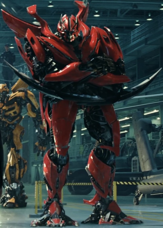
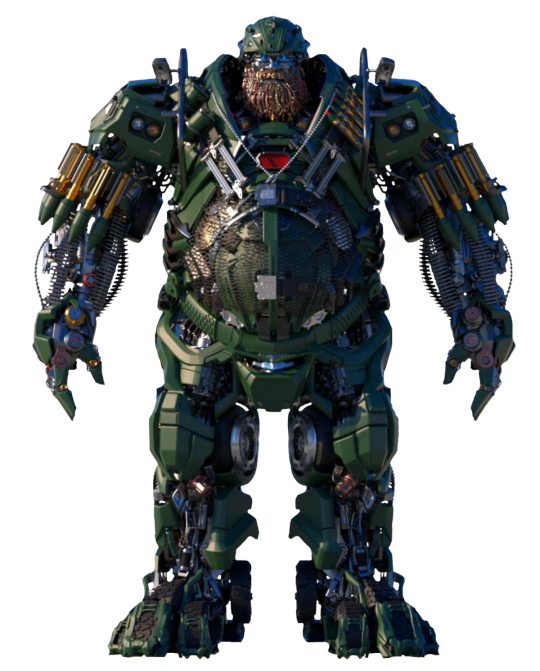
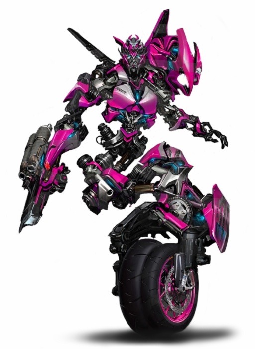
Peak Character Design: Live-Action Transformers: Decepticon Edition
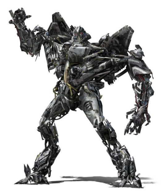
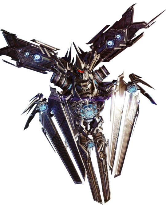
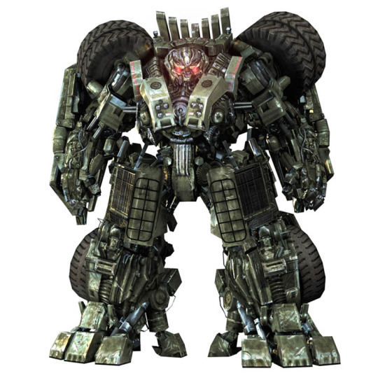
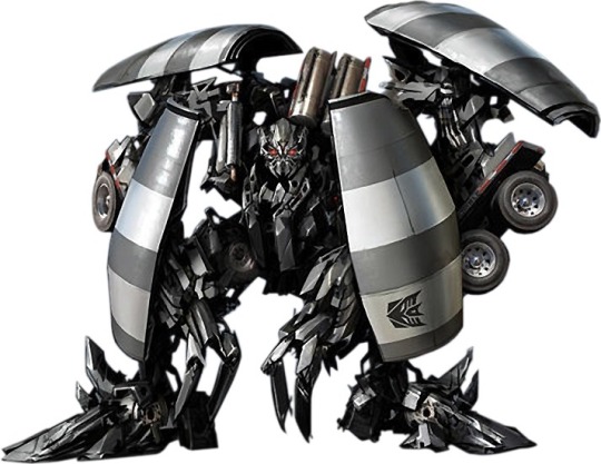


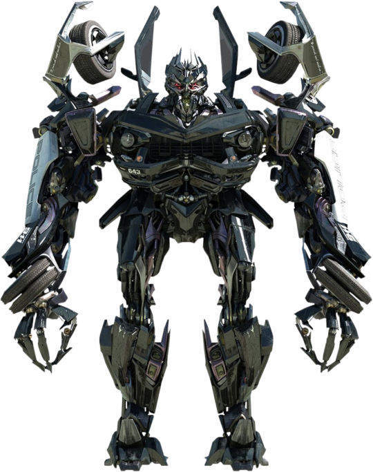
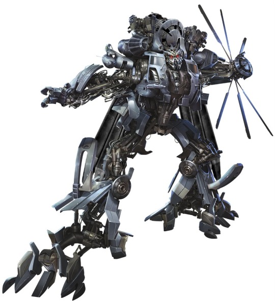
#Transformers#Transformers 2007#Transformers: Revenge of The Fallen#Transformers: Dark of The Moon#Transformers: Age of Extinction#Transformers: The Last Knight#Bumblebee 2018#character design#peak character design#Decepticons#Megatron#Starscream#Long Haul#Mixmaster#Scavenger#Overload#Soundwave#Barricade#Blackout#Shatter
40 notes
·
View notes
Text
started watching house md and just finished the pilot
#house md#but whatever him and Jim Carey have going on is peak 2007 queer core#I would also like to add he’s homophobic womanizer but honestly it adds to the fag vibes
4 notes
·
View notes
Last Seen Blogs

selphian-princess-blog
R o y a l ;

sasaudi-blog
sasaudi
parkerplug420
weed available
lenny-the-leprechaun
Can't believe it's 2012 already
the-earpiest-earp
The Earpiest Earp