#photo-illo
Photo
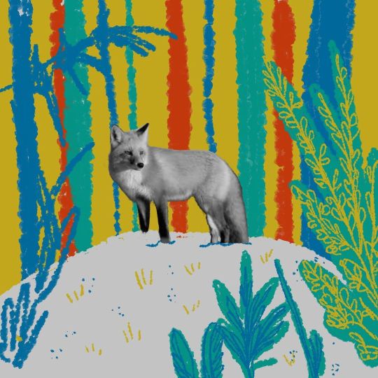
A new year’s goal: post more unfinished work
1 note
·
View note
Text
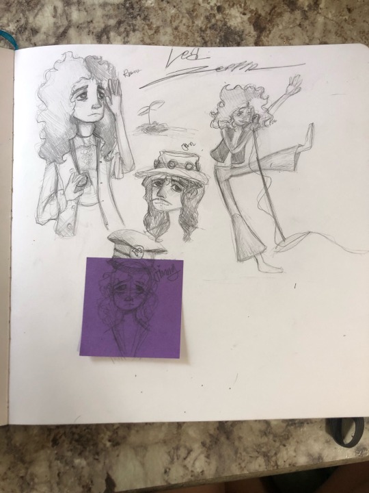
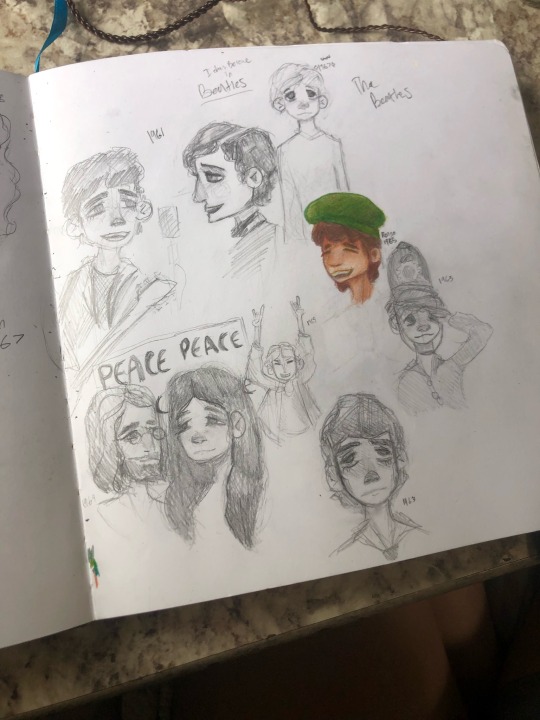


A little peak into the chaos that is my sketchbook
#geez#this is why I don’t post sketchbook photos lol#it’s quite messy#art#dark crystal#illo sketchbook#led zeppelin#the Beatles#ocs
7 notes
·
View notes
Video

flickr
Pink Zeppelin - The Vector Version by Tina & Joe
Via Flickr:
IN THE FUTURE... is how these things usually start, but this is IN THE PAST... A nuclear conflagration ended the world as we knew it in 1980. The creature above is one of the monstrous mutations and diabolical scientific experiments run amok that battle it out for survival in the radioactive wastelands of America's Northeast. This fellow is Pink Zeppelin -- the horrifying result of the fusion of a Led Zeppelin fan with a Pink Floyd fan. In the ruins of New Jersey he/they/IT jealously guards the remains of a record store and the precious vinyl albums within. After guns, ammunition and food, the most precious commodity in this hellscape is vinyl records. I have drawn PZ a number of times, but I decided to put the Affinity suite of software to the test and do a vector version of my monster. There are some raster elements within courtesy of Affinity Photo, but I tried to keep it vector as much as possible.
#Affinity Designer#Affinity Photo#Joe Williams#Science Fiction#cartoon#ILLUSTRATION#Willceau Illo#VECTOR#New Jersey#digital illustration#digital art#monster#flickr
0 notes
Text
💜💜💜💜💜💜💜💜💜
0 notes
Text

illustration from The Practical Encyclopedia of Good Decorating and Home Improvement (1970) with a sweet Eames lounger and ottoman.

→ more interiors (photos, not illo)
via flickr/sandiv999
#1970#mid century modern#interior decor#vintage interior design#eames chair#eames lounge chair#vintage illustrator#illustration#vintage#illustrator#vintage illustration
86 notes
·
View notes
Photo
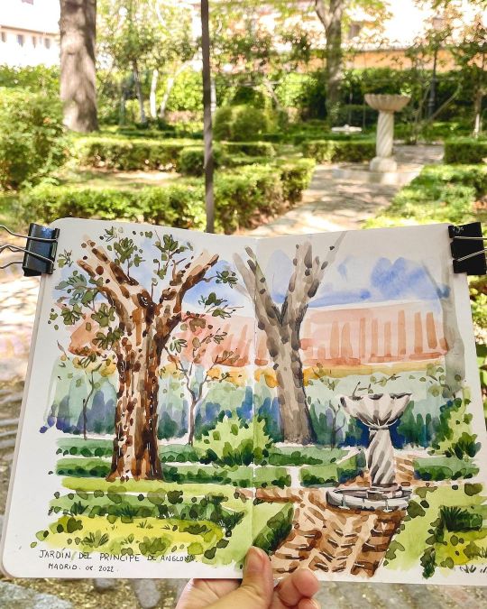
Pintando el Jardín Secreto en Madrid el verano pasado, con @uskmadrid. Había subido el Reel pero no la foto, que muchos me decís que os gusta más. 😊 Painting the Secret Garden in Madrid last summer, with @uskmadrid. I had uploaded the Reel but not the photo, many of you tell me that you like it better. 😊 . . . . #pleinairpainting #pleinair #paintingoutside #paintingoutdoors #urbansketchers #usk #uskmadrid #sketchbook #travelbook #travelsketch #travelsketchbook #travelsketching #watercolorillustration #acuarela #illustration #illustrationartists #illustragram #illo #ilustracion #madrid @stillmanandbirn https://www.instagram.com/p/CqA73SaoOGH/?igshid=NGJjMDIxMWI=
#pleinairpainting#pleinair#paintingoutside#paintingoutdoors#urbansketchers#usk#uskmadrid#sketchbook#travelbook#travelsketch#travelsketchbook#travelsketching#watercolorillustration#acuarela#illustration#illustrationartists#illustragram#illo#ilustracion#madrid
12 notes
·
View notes
Text


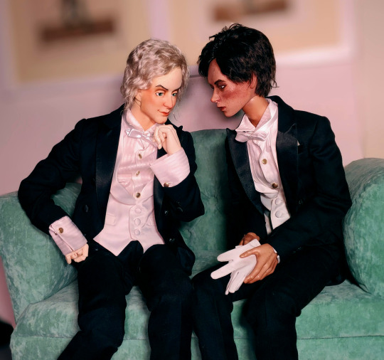
The jointed hands and the Dollshe body fighting me this whole photo attempt.
Lejeune: I have juicy gossip :-}
Niccolo: I'm just here because my cousin dragged me here.
an attempt to recreate a Leyendecker illo

Also shameless plug: Lejeune preorder ends on the 21st!
11 notes
·
View notes
Text
It's back to work on pages (and patreon) now that I've managed to get a Halloween illo out. Hooray?? Yah, that's a hooray.
Like to think Audric's banana costume is still canon while Elias goes all out and dresses up full devil time.
Since that illustration was done to match Maia's first year halloween illo, maybe next year i'll complete the pattern and do another candid photo-style halloween pic. Audric and (NAME REDACTED) need to dress up for real, too.
We'll see how quickly I can get through more pages!! i'm ready for updates to resume... but in the meantime, my ask box is open while I work if anyone wants to send character/lore asks.
#solivaga#back to pages... i've drawn so much eli in these already#and yes that three page spread I talked about has remained such#I guess the week it goes up i'll have to decide if its the only update for the week or what lol
5 notes
·
View notes
Photo


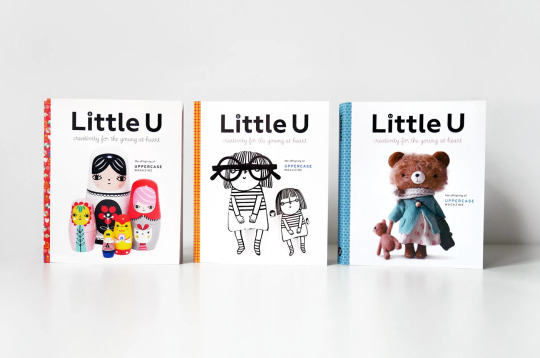
[image set: Three photos. 1) Four issues of Uppercase Magazine from 2022, with bright covers featuring various artists' work in different mediums. 2) Eight books from the UPPERCASE Encyclopedia of Inspiration series: Feed Sacks, Yarn - Thread - String, Print/Maker, Art Supplies, Ceramics, Stitch-Illo, Vintage Life, and Botanica. All books feature vivid, closeup shots of their subject matter. 3) Three books in the Little U series, "the offspring of UPPERCASE magazine." They feature charming photos and illustrations on the cover: colourful painted nesting dolls; a line drawing of two childlike figures, one of them wearing glasses - an actual pair of glasses resting on the picture; and a handmade teddy bear wearing a scarf, coat, and dress with a side bag and holding a smaller teddy.]
I was so sad to hear about Uppercase Magazine (founder Janine Vangool - literally a one-woman operation) getting hit with bad news recently from her fulfilment company. Details are on the site but basically she needs to find a new place for her inventory of magazines and books. To help reduce stock while she searches for a new fulfilment partner, she's doing a sale on everything on her site.
Uppercase is a creative community institution! Based out of Canada, the founder has done so much for the creative community worldwide for over a decade. She publishes some of the most wonderful magazines and books "for the creative and curious", and she also works hard to operate her business in a thoughtful, sustainable way, contributing to important social and environmental initiatives.
I remember sending copies of Uppercase back issues to an artist friend in Sapporo, Japan who loved the magazine so much. I also bought the Art Supplies book from the Encyclopedia series earlier this year and it's honestly such a treasure trove of creative inspiration and reference. You really need to hold this book in your hand to fully appreciate it - the foldable dust jacket with multiple design pattern options is so beautiful and neat!
Please signal boost and support by checking out on the website! I think the sale may go till closer to the end of Jan, 2023 since the fulfilment company's ultimatum is Feb 1, so there's some time to browse.* There are full previews of everything, and it's such a treat and feast for the eyes and imagination just scrolling through the site.
https://uppercasemagazine.com/collections/scrooged
* Update: A Dec 27, 2022 newsletter from Janine says the sale "will continue into early January (probably January 5th) and then I will concentrate on transitioning to a new fulfillment company (to be determined)".
#uppercase magazine#small businesses#books#magazines#signal boost#creative community#inspiration#reference
3 notes
·
View notes
Text

Last Illo?
Chosen Topic: Do it Yourself
Here are my analog drafts

Do It Yourself
Collage:
Paper Cutouts:
Final Topic and creative concept
Do it yourself. I wanted to create a grundgy aestic that modern hip-hop artists are inspired by generational psychelic rock and roll artists used. I used analog type and trippy typography. The photos are taken by me of my album cover. I initially was drawn towards collage but I really wanted to dwell deep into this.
Keywords
Moody
Rockstar
Trippy
APP
Software: Photoshop
Analog
0 notes
Text

Illo-9 Shapes
Topics of Interest
Scan Lines. Disrupting, spacy, tech
Rays. glorifying, radial, religious/political
Triangulation. Block-like, formulaic engaging
Final Selection, Scanlines
Because I’m interested in the digital implications scanlines carry. Even if they're not disrupting something tech-like they make me think artificial.
Scanlines
A graphic technique that consists of intersecting something with thick, usually uniform, horizontal lines. This can give whatever the scan lines are overlaid on, an airy un-solid, or techy feel.
Keywords
Obscured
Digital
Cinematic
Implied
Interrupted
Creative Concept
I'm interested in taking the Idea of scan lines and applying them with a tongue-in-cheek twist. What if I implied scanlines on a photo-realistic object by removing all the content the scan lines touched? Or had the scan lines be a window into a different scene entirely? The idea of a candle missing most of its stick in segments could be a powerful and interesting image.


Design Decisions
I went on a couple of detours with this one but eventually rained it back into the original concept. I drew up my roughs and then started searching for stock images. Ran into body candles and thought the notion of a person-shaped candle with segments missing was an excellent idea. Maybe if we had more time but I felt like my message got lost pretty fast with all those factors. But that’s how this happened.

With my final, and much simpler concept I was able to spend time making the segmented candle look more believable. After creating it, the image invoked a feeling of scarcity and grit, so I leaned into that direction with the caption.
I'm not going to deny it, this Illo was a pretty disorganized scattered project. I could have benefited from a stronger starting concept.
Programs
Adobe Photoshop
0 notes
Text
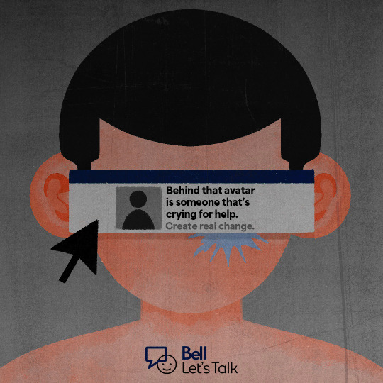
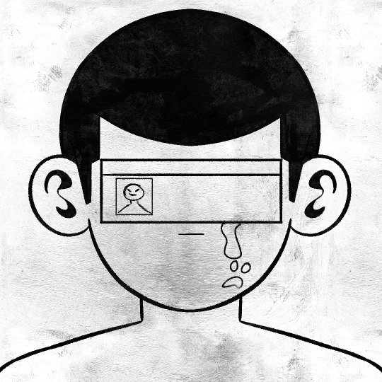
PSA CAMPAIGN | BELL LET'S TALK MENTAL HEALTH ILLUSTRATION
Topics of interest
Propaganda | Manifest, distort, manipulate
Typically a familiar style of messaging of mine, wouldn't push that many boundaries that I've attempted before.
Culture Jamming | Mockery, anti-capitalism, mass media
Also another style of messaging I tend to lean towards, for this instance I haven't created a design criticizing a corporation yet, could be a great exercise to tackle my usual form of narrative and pointing it towards capitalism.
PSA Campaign | Informative, spread awareness, do good
Never attempted before, a bit outside my comfort zone as it would have to take my usual narratives and bring it into a more positive light. This would also be a good chance to start illustrating since there a lot of PSA campaigns that use illustrations instead of photos and type to spread awareness.
CHOSEN TOPIC -> PSA CAMPAIGN
This is it, the final three weekly explorations! Although I really wanted to attempt propaganda, I believe the decision to only being able to work with PSA campaigns will benefit me in the long run and ensure that my batch of designs/illustrations are unique from one another. My goal for these last three weekly explorations are to ensure that they visually and compositionally look different from the past 7 I've posted. So it felt great to power on my drawing tablet and actually illustrate for once.
Creative Concept
Despite never having experience with designing or illustrating a piece of work for a PSA campaign, it never felt too distant from what I have had previously designed (whether that be in school or for clients). However, it did take some time to figure what I was actually going to inform the viewer of. Throughout last week Mackenzie allowed me to take a sneak peek of her illo, during that week I was helping her with her process and giving critiques when needed. At the end I was really inspired by her design this week and the messaging it has. So, I decided to base mine of mental health and how sometimes when you're online you never really know if someone is doing okay. I've been a huge follower of Bell Let's Talk as I think it's a great resource for those that are struggling with mental health and is fighting for the overcoming of the stigma when it comes to mental health. I thought this was the perfect time to incorporate their logo within the composiotion as the subject matter suited the organization.
Description
With the goal that I've set on myself for these last three explorations, that meant that I'll have to be full on illustrating or incorporating other elements that aren't just type and images with a bit of illustrating. For this week I wanted to keep it flat yet convey depth the shading technique that I used, my reasoning behind that is based on corporate art styles and the more (subtle) recent shift towards blending 2D flat styles with 3D shading.
Since this is based on mental health online, I added elements that symbolize the presence of the internet. Such as the pop up window in the middle of the composition representing Facebook with a dark blue and grey colour scheme and a cursor to guide the eye towards that same popup element. Texture was added by me with a brush rather than texture overlays to give it more of a grunge and "real" aspect to the design.
There are tiny little things I would add to this illustration that I may add and repost later on but for now I think it gets the message across. Definitely a bit more illustrative than last time but a solid start to inspire me to push even harder for the final two illos.
KEYWORDS FOR INSPIRATION
Stranded
Isolate
Forward
Dry
Pit
Tear/Shed
ROUGH -> PROCREATE
FINAL -> PROCREATE + ADOBE PHOTOSHOP
1 note
·
View note
Text
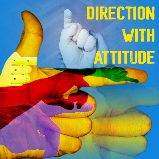
Weekly Illo 4 Pointing Fingers
Research Topics:
Vanitas (Universal, Warning, Respect, Social Construct)
Fingers Pointing (Declare, Direction, Attitude)
Provocative Gestures (Projection, Compulsion, Excitement)
Characteristics of Movement:
Pointing fingers brings a very well known gesture that’s normally momentary into the ever present form of illustration; the most representative of which was a World War 1 poster from 1914 that addressed the viewer directly.
Although in other contexts, pointing was considered rude due to the accusatory nature of the gesture. Most pointing fingers are used to indicate direction, selection, or to distinguish from other subjects.

Key Words:
Order/Clarity = Vagueness
Guidance/Sensibility = Encoding
Instruction/Attitude = Decoding
Reference/Demand = Accuracy
Expression/Discipline = Restraint of Emotions
Creative Concept:
I wanted to represent the sense of direction that pointing fingers gave; and since I worked in photo-shop, I was partially inspired by what photos I implemented.
I would have one hand pointing in a specific direction with multiple pointing hands overlapping and giving texture and colour to the same space of separation. Doing so would represent an assumed unilateral agreement between the owners of these pointing fingers. I also thought about adding a conflicting direction, to better represent the idea of direction through contrast.
The typography would take place in the upper right between the thumb and the pointer finger; using two of my keywords “Direction” and “Attitude”.
Design Decisions:
I was pressed for time and thought this Illustration would be better through use of photo-shop.
I used clipping masks, layer masks, and colour burn layers to get the overlapping hands. For each hand I applied a separate colour fill above as an adjustment layer and clipping mask. I then merged the two layers and applied the merged layer as a clipping mask to the main hand.
For the background, I adjusted the hue of the hand before applying a layer-mask with a radial gradient, giving way to a similar hue background.
I filled the remaining space with a copy of the main hand but with a linear gradient on the layer-mask.
0 notes
Photo
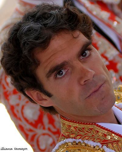
El destino, no está escrito... ‼
Vivir, vencer y ganar.. 💪 ✌️
#JoseTomas #Torero #Toreo
#Photo © Illiana Illos
#JTomaselflacodeGalapagar
#JT @jtomaselflaco #Artista
0 notes
Text
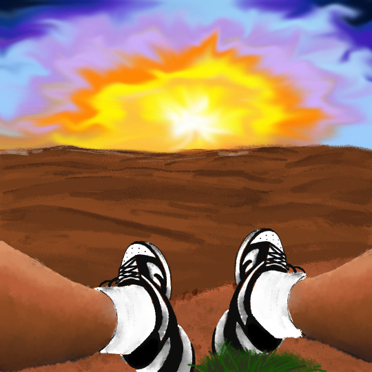
Term Project 6: Natural Landscape
Being Psychedelically Sun Burned
It appears I had taken a similar route from my last illo into this week's (Last time I will draw the dessert or talk about Oman). This was a scrapped illo for last week which I think is more fitting in this week's topic. I decided to do a nostalgic one. Perhaps a trip to my past life in Sunny Oman. This is a photo I took a couple of years ago at the Wahiba Sand Dunes. We often come here during holidays or weekends to spend time and take a break from the busy mundane lifestyle in the heart of Muscat. The beautiful scenery of Oman and its hill sandy side is breathtaking. Some context behind this picture is me patiently sitting on this sandy hill to watch the golden hour and the sun set into the horizon. This is a true spectacle indeed. I implemented a combination of smooth and rough strokes on my tanned skin under the sun. As well as to show the presence of texture on the sandy hills in the distance. The main focus takes you to the colour palette and the exaggerated sky. I made it look very trippy and psychedelic purposefully. Meanwhile, seeing the natural beauty of your surroundings, it however is not a mistaken being in that scorching hot environment. Only one could imagine! I did something unique where I combined warm and cool hues together which kind of worked well together. Whereas it would have an opposite colour palette for separate day and night scenery.
1 note
·
View note
Text
Week 7 Illo "Raster"
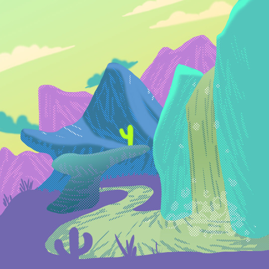
This week’s Illo was done in a raster based software program (Photo-shop), meaning the image is saved as individual pixels and has a fixed resolution; instead of a vector program that saves mathematical equations to reproduce the shapes.
I went with the concept of an off-colour canyon, using primarily cool colours. The shapes were done in a way that mimicked the erosion from the waterfall.
For this I largely used the lasso tool to recreate the shapes from a sketch, and coloured them in on separate layers.
Afterwards I used the quick selection tool to make clipping masks for the shading and use of a screen-tone brush.
I tried to be light on the gradients for this one and include foreground elements that blended in with the violet.
0 notes
Last Seen Blogs
wgbbuildersltd-blog
WGB Builders Ltd

bloodyphoenixgrm
Welcome to the Hollows Gate
tobethin-sad
fuck I'm fat
paage
[ insert profound title here]