#photopea is a great resource
Note
Hello!! I'm sorry if this is a weird question, but what is your sort of thinking/editing process? I'm pretty new to editing and I want to understand the choices made for a edit better, especially the filters, png placements, textures etc! Anything would be really helpful but I understand if you cant ^^ Thanks for reading and I hope you have a great day! <333

Hii ! I'm not that good at explaining , but i can try to explain how i do things !
I find masks on pinterest or this carrd i also have my most used ) fav resources in this post!
I use photopea && ibis paint. For the png placement.. i mainly put the mask in the middle and if i wanna add things like ribbons or other pngs i put it like.. to the side but on top of the first mask if that makes sense? theres a lot of ways to place pngs though, i recommend you look through tumblr for edits and you can give urself an idea on designs and even take inspo ! ( rmbr to cr if the creator asks 04 insp credit , you can also search up ' rentry inspo ' on pinterest and a lot of rentry graphics will come up ! )
For the filters ) coloring, you can use polarr (and app) or psds ! you can search up free psd or psd on tumblr.. its sort of like a filter ? it works mainly on photopea & photoshop.. so just download the psd and import it onto photopea ) photoshop ! hopefully that makes sense idk.. @/kiochisato , @/essthereal , @/ii-nandesu , @/heartsymphonia are who i mainly use psds from !
if you want to learn how i my animated graphics you can go to this post!

36 notes
·
View notes
Text
RESOURCES FOR ARTISTS VOL 1
In the spirit of gratitude for the plethora of free resources out there for artists that I've been gleefully ransacking my entire life, I want to share some of them that I've compiled.
smithsonian open access: this is a HUGE one! lots of images that are absolutely free to use, as well as an incredible set of 3-D resources. Their collection spans the same breadth that their multiple museums do-- natural history, gems, fine art, aerospace/engineering stuff, etc. so do not sleep on this.
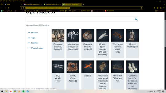
(screenshot is the 3-D digitization page, one of my fav sections)
2. The League of Moveable Type is a resource for free fonts, but not just any free fonts-- professionally designed free fonts. Some of the bigger sites can be a lot of wading through sub par stuff, but every single thing here was very carefully and lovingly designed, and is free.
3. Unsplash is full of great free to use images. Seriously, huge collection. Portraits, textures, 3-D renderings, you name it and it's probably here and free to use. ALSO cool because images will note whether their creator is for hire if you like their work. You can also submit your images to this platform. (I think it has a premium section but I haven't needed to engage with it yet)
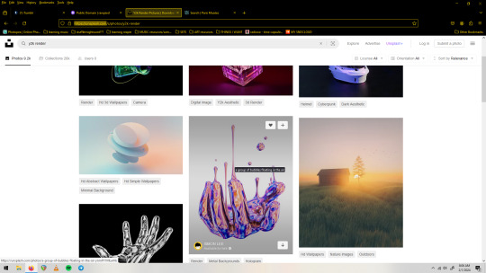
(screenshot of unsplash.com with a search for 'y2k render')
4. rawpixel's Public Domain collection. They've been high quality scanning public domain images for a while. They're free to use under a CC0 license, which is basically without restriction. They've got lots of categories, I personally love the Graphic Design and the Vintage Illustration sections.

(screenshot of the 'patterns' section of the Public Domain collection on rawpixel)
5. Photopea is a free Photoshop alternative that runs in your browser. It's got a few quirks(especially if you run a non-chromium browser, but stay strong anyway) and is ad-supported, but really powerful and robust. It also opens PSD files, supports smart objects and basically all of the Photoshop asset filetypes(.abr .grad .pat etc), as well as has filters, even a couple that Photoshop itself has gotten rid of in their more recent versions. You can use the fonts on your machine, export transparent pngs, and do generally anything that the big guy does. You can also donate a small amount to remove ads and support the singe person(!) who created and maintains it.
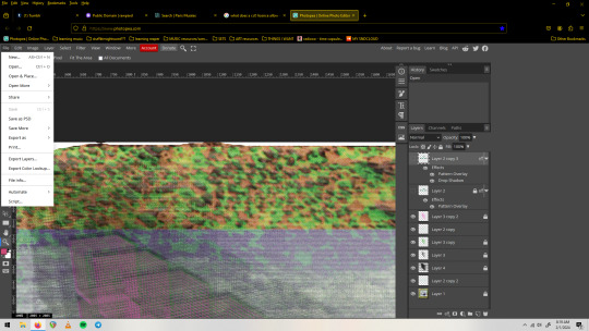
(screenshot of a .psd file with smart objects/smart filters open on photopea. The 'file' dropdown menu shows exciting options such as 'export' and 'save as psd')
6. Brusheezy.com is a great place to get free brushes, vectors, and photoshop assets in general(which can all be used in Photopea, btw).
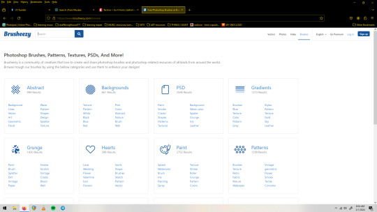
(screenshot of the 'categories' page of brusheezy.com)
7. dafont.com Last but not least, I will include this huge font site but assume most people already have it on their radar. Free fonts! No account needed to download! Tons of categories! Many are demo/limited versions, so pay attention especially if you plan to use numbers or special characters as those are often the things left out of the free to use demo versions. It's nice to have a lot of options but to the discerning eye a decent amount of the fully free fonts here will fall a bit short/feel unpolished. That's not to discourage you from it, as I have a huge collection of types from here and routinely check it when I need something specific.
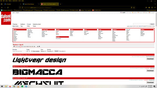
(screenshot of dafonts.com with the 'sci-fi' section pulled up)
So that's what I've got right now for visual art resources, I hope you can find something useful in here. Feel free to share this list and keep an eye out for the next one! Thanks to everyone out their with a love for sharing in their hearts, it's really inspired me to make some things with no other intention than to put them into the world as tools for others!
#free resources#resource list#art resources#free stuff#free collections#royalty free#free to use#shareware#for the people#dafont#brusheezy#smithsonian#rawpixel#unsplash#league of moveable type#public domain#cc0 license#fonts#textures#patterns#brushes#vectors
35 notes
·
View notes
Text
↬ OC Verse Trading Cards
Here it is! The reason (well, one of the reasons) for why I've been so inactive lately. I saw this super cool trading card template by @squea and @buttertrait and thought it was super fun, so I wanted to make something similar for my mutuals and myself. And, as you can see, I rediscovered my love for art deco on the way, so it's very art deco lol
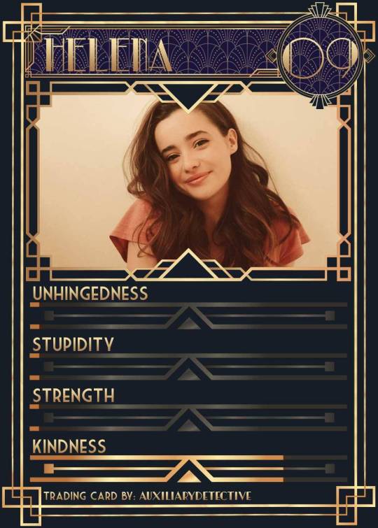
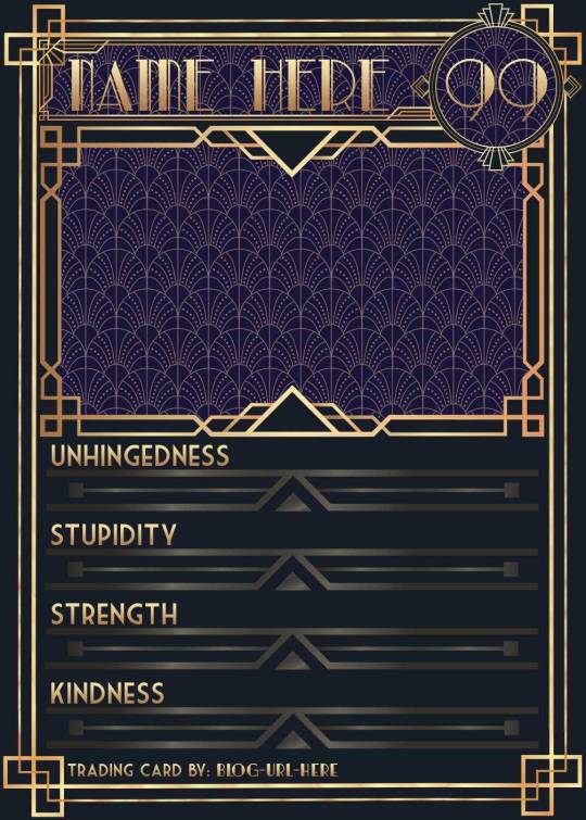
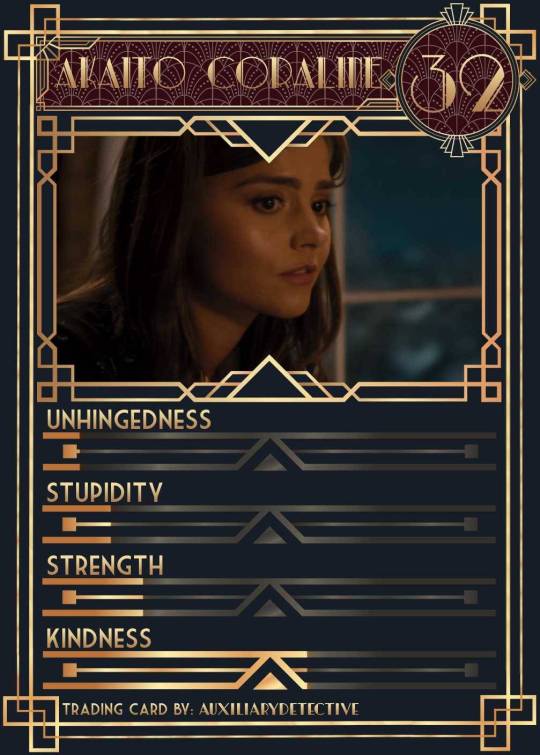
You can find the template to make your own cards here - and I explicitly encourage you to make your own, because I was kinda hoping I would get to see cards of you guys' OCs and we could collect them all in a binder like this one. It would be really fun! (The number next to the name is the power level btw - I wanted to imitate a set of Star Wars trading cards I used to collect as a kid) Make sure to @ me when you do and tag your post with #ocversetradingcards!
I tried to make the template as accessible as possible so that even beginners should be able to use it without any issues. So, I color-coded the layers!
The red layers are ones you shouldn't touch. They make up the main frame of the card. The orange layers are ones where you can play around with the colors, but that's for advanced photoshop/photopea users. The green ones are the ones where you put in text! Edit those freely. Blue ones are ones you have to select and move as a batch - if you don't know how to do that, check below the cut ^^
You'll need to download these fonts:
Park Lane (name & power level)
Market Deco (main text font)
Artisual Deco Black Italic (blog url)
Below the cut, you'll find a tutorial for the template and a list of the image resources I used - Quick info for everyone, including the more experienced Photopea users: Save your image at 50% quality. The template is a big file and the exported image will also be pretty big if you don’t save it at a lower quality. 50% is what you can see above and I think it's a nice size-quality ratio.
Tutorial Time
Opening the File
Step one: Get either Photoshop or Photopea. Photoshop costs money, Photopea is free and runs in your browser. Take three guesses which one I use. Yeah, it's Photopea. As such, this tutorial will be Photopea-centric, and I also have no clue what the Photoshop interface looks like, so I can't really help you if you work on Photoshop. But I'm told they're essentially the same, so...
Step two: Download the fonts listed above from the links in this post.
Step three: Click on the link above to go download the template. It's a bit of a big file, so I put it into a zip file for you. Don't worry, you don't need a special program to open it. Photopea will do that for you.
Step four: Open Photopea. Click on "File" -> "Open..." and select the "TradingCardTemplate" zip file.
Step five: Click "File" -> "Open..." again and select the zip files for the fonts. This will import them to Photopea. There are also preview images included in at least one of the zip files for the fonts, so just close the windows for those projects when they pop up by clicking on the little "x" next to their file name. You only need the "TradingCardTemplate.psd" tab to be open in your Photopea window.
Great! Now you're all set to edit!
Editing the name, power level and blog url
I decided to group these together because they function essentially the same way
Step one: Select the typing tool. It's the little "T" symbol in the toolbar on the left side of your screen.
Step two: Select the layer of the text you want to edit. The blog url one is in plain view. For the name and power ones, you need to open the corresponding folders first. They're the green layers in the folders!
Step three: Click on the text you want to edit. It's easiest to aim for the middle, that way you have the least chances of missing. The typing tool is a bit finicky with that sometimes, especially if the text is small.
Great! Now you can use your keyboard to delete the placeholder text and replace it with your own! The power level will only fit two digits and picking "00" will look bad. Your OC should have at least some power. They need it to breathe.
Changing the size of the name text
As you might be able to tell, the basic text size only works for fairly short names. So, you might have to make it smaller for your OC's name to fit
Step one: Enter your OC's name as described above.
Step two: Select the text as you would anywhere else in your browser.
Step three: Above the little tag where it says "TradingCardTemplate.psd", there's an options bar. You'll find a box there labelled "Size" with a box that says "150px" and a down arrow next to it. Click on the down arrow and a slider will pop up. Play around with that slider until your text has a good size. Then click on the checkmark.
Step four: Switch to the transformation tool. It's the cursor with the directional cross next to it, at the top of your left-hand tool bar. Move your text so that it aligns well with the left side of the frame but make sure it's below the middle.
Step five: You now have to select two layers at once. The text layer and the frame for the name tag. Do do that, either press and hold your control key on your keyboard while selecting the other layer or toggle the control key using the on-screen keyboard at the bottom left of the toolbar. If you use the toggle, don't forget to untoggle it after.
Step six: On your horizontal toolbar above your project window, click on the icon that's a horizontal line with two boxes centered on it.
Congrats, your text should now be centered!
Adding in your OC picture
Step one: Open the "Picture" folder and select the layer beneath "Add picture here". This will make sure your picture will be in the right spot. Also make sure to click on the eye next to the "Pattern" layer tag to make it go invisible.
Step two: Select "File" -> "Open & Place..." and pick a nice image.
Step three: Once the image has been imported, make sure you change the zoom percentage to 100%, that way the image doesn't look pixely or weird. Click on the checkmark.
Step four: Resize your image so your OC fits nicely into the frame. The image should fill the entire space inside the frame and can stick out as much as you want.
Step five: Right-click (or press and hold, if you're on mobile) your image' layer and select "Clipping Mask".
Perfect! Now your image should no longer stick out of the frame. Feel free to adjust your image's coloration, brightness etc. by selecting "Image" -> "Adjustments" and your preferred action.
Changing your stats bars
This works the same for each bar and I tried to make it as simple as possible.
Step one: Open the corresponding folder.
Step two: Select the set of three blue layers together. You can do this by selecting one layer normally, then selecting the other two while holding your control key or while having it toggled using the built-in on-screen mini keyboard at the bottom left of your screen. If you use the toggle, don't forget to untoggle it after.
Step three: Switch to the transformation tool (the one at the top of your left-hand toolbar, it's a cursor with a directional cross) and move your layers. By moving them to the right, you'll reveal more of the gold underneath the overlay. More gold = higher level of the corresponding stat.
Great job! Now adjust the bars to your liking.
Saving your project + card image
To save the project: Click on "File" -> "Save as PSD". This will download the current project under the same name as the file that you downloaded it as. So, it will be called "TradingCardTemplate (1)" or something similar. Make sure you change the name in your files so you know which is which. Alternatively, you can also change the name of the project by double-clicking the little square that currently says "TradingCardTemplate" and type in your new name. If you save again now, it will show the new project name! Make sure to save your project if you want to be able to recover it and/or work on it later!
To save the card image: Click on "File" -> "Export as >" and pick your preferred image file type. I suggest JPG for best results. Make sure to turn the quality slider to 50%, then hit the save button. This will download an image file of your chosen type, under the same name as the project name. To change that name, refer to the bullet point above or go to your files :)
Advanced: Changing the BG color of the pattern
Step one: Select the pattern background of either the name tag, power score or picture and turn it to 100% opacity.
Step two: Color-pick the current background color of the pattern.
Step three: Click "Image" -> "Adjustments" -> "Replace Color..." and click on the colored rectangle in the new pop-up. Replace the default color with your color-picked color. Now use the Hue, Saturation and Lightness sliders to get a new color that you like. Note down your slider values for later so you have them for the other elements.
Step four: Color-pick your new color and select the corresponding solid background layer. For those layers, click "Edit" -> "Fill..." and make sure you have "Foreground" and "Normal" selected, your Opacity is 100% and you have "Preserve Transparency" checked.
Step five: Don't forget to turn the opacity of your pattern layers back down to 60%.
Congrats! You have your colors changed! Repeat this process for the other two patterned elements.
Extra advanced: Changing the card's background color
NOTE: I DON'T recommend this. You can do it, but it's a lot of work.
Step one: Select the background layer and change its color to the new color you want. You can do it with the "Hue/Saturation..." adjustment, with the "Fill" edit as described above, or whichever way you want. Color-pick your new color.
Step two: Open the smart object PSDs for the frames for the frames for the picture, the name tag, and the power counter by double-clicking on the preview image of the layer.
Step three: Select the lowest colored layer of each and change its color to the same as your new card background color. Click on "File" -> "Save (Smart Object)". Close the project windows.
Step four: Open the folders for the various stat bars and select the "Color Overlay" layers. Change their colors the same way you did for the other layers. Warm colors and high-saturation colors will most likely not look good here and you might need to find a different way of making the stat bars look good. Playing around with the "Brightness/Contrast" adjustment layers above might help, but I can't promise anything. This is the main reason why I don't recommend changing the card background color. The stats bars are adjusted to the background color.
There we are! Either your card looks very pretty now or you understand why I don't recommend this. Either way: Good job!
Resources from Freepik:
Corners by tartila
Power counter frame
Picture frame by pch.vector
Stats bar by tartila
Pattern

Taglist (we're bringing out all fandoms today): @starcrossedjedis @oneirataxia-girl @daughter-of-melpomene @bravelittleflower @box-of-bats @fluffle-system @wheresmybloodynauglamir @nanukanal @supermarine-silvally @cody-helix02
#ocversetradingcards#artsy#photopea adventures#oc: akaito coraline#oc: helena#holy freaking shit i finally did it#look everyone!!!
18 notes
·
View notes
Note
Do you have any advice or resources for making gifs? I want to contribute to the small fandom economy. Your sets are so pretty.
ahh thank you so much!! 🥰 my advice would be to really just focus on the basics at first. giffing is a skill that takes time to learn. image software can be confusing to use, and it would be way too overwhelming to try and learn everything all at once. but once you have a handle on the process of getting a scene and turning it to a gif, it's much easier to learn new things and start using them right away!
for resources, you have two options of software, photoshop and photopea. i started out in photopea, and it's great! it's totally free to use and there are some great tutorials in this tag.
i currently use photoshop, cause you can also get photoshop without paying, and it has more features overall. here's a great tutorial by nat @saw-x that covers the whole giffing process and has a lot of good links to everything you'll need, including free photoshop. (and whenever someone links a 'photoshop action' you should absolutely use it, it will make your life so much easier.)
once you've gotten started, the best place to find gif tutorials is the usergif resource directory. almost anything you want to do can be found there! and if you have any questions you can always ask me (or many other gifmakers) i'm always happy to help :-)
9 notes
·
View notes
Note
heyo, i've been following your works for a long time now and i genuinely love your creations, you put so much effort into them - they're so brilliant and polished, it's remarkable and inspiring.
i edit often but i am more used to working with gifs of live action media — comics is a whole new territory for me but i would still like to get into it. could i please ask for your tips and recs on how i can get started?
it's alright if not! thank you for what you do and have a nice day. x
Aw, thank you very much! <3 I'll make a list of some different tips I think might be useful (but as with all things, experimenting is the best experience!), and also some links to different resources I often use for edits. Some of these you'll probably be familiar from gifs, but others will hopefully be new!
Gifmaking is a really good basis for making graphics; most of the same principals apply, particularly with colouring and playing with light with art! One of the best ways to make edits work together imo is having consistent colour themes to make all the edits look related and to work with one another, and those elements mirror in graphics and gifs.
The main thing that I think is different is the use of art. A lot of the time with art, you have to cut it out of panels by yourself, and sometimes colour something in yourself, if it's a sketch or something. You can use the subject selection tool in Photoshop/Photopea, but this really only works if there's a very clear background and subject; something more detailed or with multiple subjects doesn't work so well. I like to select using either the lasso tool or the polygonal tool, and then create a layer mask once my subject is fully selected! It's timeconsuming, but worth it to have those sharp and detailed pieces.
Using large pieces of art I think is really important for making sure edits are sharp. I generally try to only use stuff above 1000px, but generally anything below 700px is really difficult to use, especially if you're colouring in a sketch by hand.
Hand-colouring is another thing that's real difficult and time-consuming, but is worth it! Multiply and soft light are your best friends. Multiply for the blocks of colour, and soft light I like to use for adding a bit more depth for things like hair, or blush, etc. But play around with the different layer styles, you can get some interesting affects!
It's also useful to build up a little catelogue of styles or designs you like to incorporate into your work. A lot of graphic designers post their work to Pinterest, for example. Here's my own pinterest board of graphics I like!
And here are some of the resources/websites I use. Behance for general PSDs, fonts, textures. Search 'freebie' in the search bar to get those free resources! Dafont and freefonts.io are the two websites I use most to find fonts! Texturelabs is a great resource of free textures to use; white images generally go on multiply level, dark ones go on screen. Resource Boy has a bunch of free textures and pngs on there that you can use, I recently downloaded 70 different chain pngs from here. Designsyndrome is mostly paid stuff, but they do have a number of free pngs and effects that are cool to use. Comicartfans is a really handly website where a lot of people upload art from professionals. It works as a buying and selling site, but I use it often to find art by searching a character name in the searchbar. Unfortunately, not all of these are high quality, but generally you can use these to find larger resolutions by finding an artist's personal website.
As always, feel free to ask if you want something explained, or if you want to find out how I did a certain affect! I'll always be happy to share where I got stuff, most of this hobby functions via word of mouth :3
9 notes
·
View notes
Text
EDITING RESOURCES!
actually, this has been sitting in my drafts for a while and i never quite had the energy to fix or format it but yeah. basically this is a catalogue of editing resources i personally use and/or am acquainted by!
for clarity's sake, i am by no means some great editor. i'm here for the fun and the pretty colors, and while i have been editing personally for a few years, i'm not the most knowledgeable person for this. i created this list first for personal reasons but figured everyone else might find it useful as well. so, yeah, just in case i miss a particular resource or don't add something you like, try to keep that in mind.
this will (attempt to) follow the format of me stating the resource (and if possible, a link) and some personal thoughts and critiques on said resource, especially for those unfamiliar with it.
EDITING SOFTWARE/APPLICATIONS
✧ Adobe Photoshop
is...is this even a question. of course, a natural given part of editing is adobe photoshop, it's universal and well-known, and pretty much is associated with any form of the word "edit." atlhough i can say, it's a bit dizzying for beginners but there are plenty of tutorials everywhere + it's very versatile, you can go from making gifs to drawing art, just nice to use all around.
✧ Photopea
now, photopea, in layman's terms, is just photoshop made online. so you can save yourself the download and the loooooong adobe loading screen with photopea. personally, i use this to color my gifs and for most simpler projects, because i vehemently refuse to wait 2 hours for photoshop to open so i can make a gif lol. it has a simpler interface, easy enough to understand so long as you read the labels. highly recommended for three types of people: those who can't afford ps, those who find ps hard to understand, and those who are both :D /j
✧ Picsart
the golden lamp of the editing community, simply because picsart provides A LOT of user-submitted materials through the form of "stickers" making everything so much more accessible to anyone who needs it. easy to use, easy to grasp, piscart captures editing down to a tee and is great overall! although i will warn you, a number of its resources are locked behind the gold paywall (not the user-submitted ones though) and it has issues with lag and ads in some devices. lastly, some of those stickers you find are fanart, and not all of these artists are okay with people altering or editing their work without permission, and most times, the credit never reaches them anyway. so please be mindful of what you use, artists spend a great deal of time working on their craft, just like us :)
✧ Pixlr E
i have never personally used it but its UI is greatly similar to photopea, simple and eye-pleasing. a great number of editing blogs use this for their work and it's a very capable software for editing.
✧ Ibis Paint X
technically NOT an editing software lmao, but it serves its purpose and it does it well, although it takes some effort. ibis paint x is intended for drawing, but i, as well as a good amount of other editors, can repurpose certain parts of it for editing purposes. it's a great app, from personal experience, and i'll leave some tips regarding it down below!
✧ Polarr
FANDOM-SPECIFIC RESOURCES
i have never seen so many filters in my entire life /hj just your day-to-day edit software, however polarr shines where most apps are weak, it has an extreme amount of mostly user-made filters, which you can find on literally everywhere.. i'm sure you'll enjoy using it~
✧ bsd mayoi wiki
I DO NOT SUPPORT GENSH.INRESO.URCE.
they have made statements regarding hoyoverse's sumeru that are not only dismissive but incredibly harmful for people of color like me, who are having their culture fetishized and skin color villainized by the direction sumeru is taking. dditionally, if you continue to interact with said blog, refrain from interacting with me. i will not be associated with it anymore.
@genshingraphics is an alternative blog for those who are seeking the same effect.
yes, this much is a given but i see a ton of people using the bsd wiki version of the mayoi cards (which are not transparent) when you can access the transparent versions, as well as the chibis, and their different modes in the sprite viewer. A+ for accessibility!
✧ cookie run wiki
okay, i know what you're thinking. there are already separate wiki pages for ovenbreak and kingdom, et cetera, but this one allows you to access both of them in compilation. remember to check a character's gallery, most times it contains official art not featured in game!
✧ ghibli screenshots
quality? amazing. official? yes. free to use? absolutely! little history lesson from your local cat! around the end of 2020, studio ghibli officially released over one thousand high definition screencaps of their films, making all of these images freely accessible to the public. this was a big thing because now you were legally allowed to use all these images so long as it isn't for monetary profit. everything from the big names like spirited away and howl's moving castle to the underrated gems of when marnie was there and tales from earthsea, the official studio ghibli website gives you access to the best quality content of their greatest works, all completely free!
✧ @.bsdwanscreenshots / @.bsdscreenshots
just as it says on the tin, beautiful quality screenshots of the bungou stray dogs anime + wan!
✧ @.teyvatcompendium / @.genshinsnapshots
like the others, in-game images and screenshots in high quality! they're beautiful to look at too~
✧ @.kodokuna-tamashii
they make enhanced screenshots of multiple animes! please remember to like and reblog the screenshots you'll use as appreciation for their hard work! i'm sure this'll be useful to everyone~
GENERAL RESOURCES
✧ list of transparent/png blogs
✧ list of stimblrs (this is outdated to an extent, so please check the dnis of them just in case.)
✧ @.allresources
✧ list of reverse image search software (directed at people listed in tip #7)
✧ aesthetics wiki
✧ pride flags (deviantart)
✧ unsplash ; pixabay ; pexels (stock photos! good for moodboards, aesboards, backgrounds, etc.)
✧ remove.bg
✧ coolors ; list of color palette blogs
✧ waifu2x ; resizeimage.net (in case you need to upgrade or downgrade image sizes!)
✧ how to add gradient/html-colored text on tumblr posts (only desktop but this can be bypassed by using puffin—a mobile web browser—and using the "request desktop site" feature.)
NEKO'S TIPS AND TRICKS:
✧ if you're new to tumblr, i suggest going through this comprehensive guide for new tumblr users. it helps ensure your privacy and prevents unsettling events from happening, because tumblr's userbase and features vary immensely from other sites.
✧ to add a cut / read more on your tumblr post on mobile, simply type ":readmore:" without the quotes and hit enter. you can find the same feature on the post's meatballs menu on the website/desktop. if you're posting something that may be triggering / an extremely long post, please put a read more so it doesn't clog everyone's dash. adding dots on every line does NOT work on tumblr.
✧ if you ever want to put a particular tag on top [e.g. credit or something important you want to say] put the words between quotation marks (" "). it should show up at the very top of the tags.
✧ commas don't work on tumblr tags, however users have found a way to bypass this—like how you can see commas in my tags—with a special type of character that resembles a comma. it's this ( ‚ ).
✧ desktop themes exist! it's comprised mostly of HTML and there are a big amount of amazing theme makers out there. most of you may not pay attention to desktop themes but adding a personal touch to your blog might brighten your day :)
✧ now, onto some edit-specific tips. if you're making reply icons on ibis paint x, i suggest creating the icon first, then going to the tools and choosing canvas. there, pick resize canvas and input the size you want your replycons to be! remember to turn off the keep aspect ratio switch, and when saving, make sure to use "save as transparent png" so the white background won't look off-putting.
✧ tumblr's average icon size is 128*128. however this size can make your edits look blurry or bad in quality which is why most editors choose bigger sizes for optimal clarity. headers are 640*360 for mobile and 3000*1055 for desktop. you will also notice that your edits tend to look blurred on the posts and only increase quality when tapped, this is because tumblr downgrades the display sizes of images. don't worry! this has no effect whatsoever towards the actual edit's quality, as it only changes how it appears on people's feed. clicking the edits showcases its genuine quality!!
✧ so you want to use fanart for your edits. i'll preface you with the fact that i don't use fanart and continuously refuse to do so, for reasons stated in this post here. anyway, in this post, i provided you 5 different reverse image search software, to aide in searching for the artist of a fanart. when using fanart for edits, crediting is required. and if you can't find the artist despite going through all the image search software i provided, you do not use the art. crediting sites such as pinterest, pixiv, etc. are useless. tag the actual artist. if you find they don't allow edits or resposts, delete the edits. if you can't see it on their bio/carrd/whatever, ask them. this isn't asking, this is basic decency towards content creators just like us.
✧ some genuine advice: the first few days of starting up can be...hard. there might be little traction, there might be none at all. requests will be slow as people start to grasp your edit style and understand your character. it can be a little discouraging because you feel like you're flopping, but stick through! make edits you enjoy, ask for promos, and my tidbit: while waiting for requests, try and edit for all your sources! it's a nice way to put your name on all the tags and it also draws more attention to your blog! another thing is making lots and lots of self-indulgent edits! have fun with it, as always~
✧ tag your posts! i am literally begging you to tag your posts bc tagging well is the only way to get better reach on tumblr! the only way to reach people's "for you tabs" as well as properly show up in tumblr's search function, regardless of how broken it is. some tips! if you're making a stimboard, tag every single stim! from food stims to clay stims, be as specific as necessary. tagging them also helps people who are filtering particular content from their dashes as it gives them the ability to block that tag! tag your aesthetics, fandoms, everything! please please tag well, it may be exhausting and repetitive but it lets your post be seen by ppl outside your followers which can lead them to following you for more content!
✧ curate your experience. make that dni! expand that blacklist! use that block button! delete those hateful anons! overuse the tag filtering feature! unfollow people who make you uncomfortable! refuse that request if it's rude and hurtful! as your senpai or senior or whatever, both seemingly tumblr-wise and edit blog-wise, no one else can control what you see, what you make, who you interact with, but yourself. so don't hold back or beat around the bush! making your blog a safe space for everyone is important, but never forget to make it a safe space for yourself, hm? ♡
✧ be kind to yourself. i know it's easy to get swept up in all the drama and discourse, especially for those of you who are new and unaware. just like any other community, editors have some rough edges too, we all have some bad times but please don't let it overshadow the good ones. you'll make mistakes, that much is inevitable, you're only human after all. correct them, fix them, take care never to repeat them, move on. you'll get tired and burnt out, and that's perfectly normal, you're still a person behind that screen after all. rest, find things you enjoy, distract yourself, discover something new. don't despise yourself for every little thing. this goes for other people too. we all have our faults, and we find ways to make up for it. your mistakes aren't who you are completely, no? and everything can be a learning experience. i know you're kind, so be kinder to yourself. i know you're trying your best, so take care of yourself as well. keep going, i'm proud of you!
and that's a wrap, folks! i hope this at least helped some of you and feel free to send me an ask just in case anything isn't working. i do not claim to own any of these resources, please give credit to their respective owners. this was made to help editors, new and old, so please preserve that ideal and use these in good faith. thank you to everyone who kept up with it and i hope everyone finds this somewhat useful!
#there! finally done!!#also i posted this late out of spite toward the rude anons#promo reblog in a bit~#୨୧ * important#this was hell to make and organize to pls appreciate it#if this flops well idc
278 notes
·
View notes
Note
What do you use to make your comic edits? I really like them!! And is there like a process you follow? Like do you storyboard the rough idea first? Sorry if you've answered this somewhere before
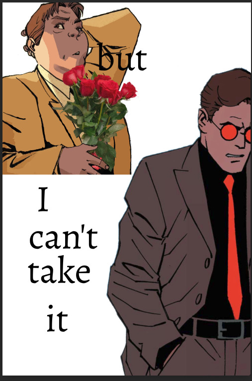
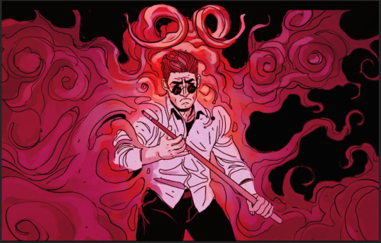
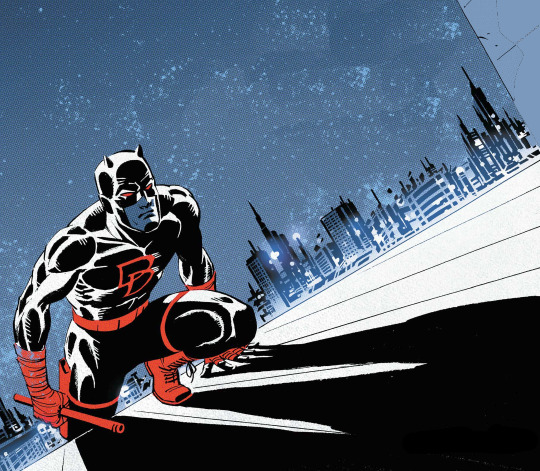
Ohhhh man this is going to have to go under a cut due to pictures. Luckily whenever I make an edit I tend to DM my friend process pics while screaming about how horrible they look and how I can't figure out how to fix them. 💀 So some of the record exists!
I use a mix of three different programs. To be honest even though it's free, Photopea.com is my go-to for most functions, especially since they have a large pool of fonts to choose from which means I don't have to go into the font mines and download 500 different ones just to see what's going to look best. I also use Paint Shop Pro, which is the program I learned how to make edits (icons, back in the day) on when I was like 14. I have a newer version now since I finally had to retire the 15-year-old one on my broken laptop, and I still don't really know my way around it that well. It's not the most user-friendly software, but it is a lot better than Photopea at resizing images to make them larger. I also use Clip Studio Paint whenever I need to draw anything for an edit.
When I need resources, I often use dafont.com for fonts. I have a bunch of texture packs from various places on the internet, but my go-to nowadays for new stuff is pexels.com where you can get stuff with a royalty-free license. I also occasionally use my own photos for textures (took a bunch of wall photos in Italy- my dad thought I'd lost my mind). I don't use brushes all that often but there are other free resource spots.
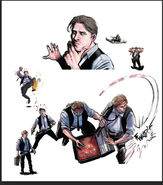
As for process, I usually start with comic panels that I like visually and cut out the characters, then figure out what I want to do with them. For Kill Krew, I knew I wanted to use a bunch of the tiny Foggies, but I didn't know that I wanted to make it a story per se until I finished the first section of the edit where Foggy's holding a bunch of papers and I decided to make it kind of like he was authoring his own memoir. Then I just followed the events in the comic. For my volume 5 edits I did have more of an idea for the story I wanted to tell from the start and looked for comic panels that would fit it. (By the way: never forgiving the volume 5 editors for allowing so many different artists. It pained me to have to use a couple different artists in one edit.)
Anyway though kind of like when I'm writing fic, I just start with pretty much a blank canvas, plop the characters on, and hope they arrange themselves into something that looks cool. This is a very early draft of one of them next to a slightly more advanced draft:
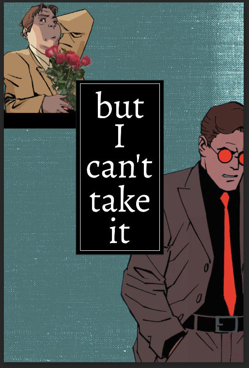
A lot of the work honestly goes into choosing the background and marrying it to other elements such as the text and the cutouts. I use a lot of rectangles for this, as you can see in this Kill Krew one next to a near-final draft below. This is also the phase where elements get resized, whether for story-telling reasons or design reasons.
I also fool around a lot with layers and coloring. An unexpected layering choice can totally make or break an edit. See the original comic coloring (left) versus my coloring change (right):

Or this original panel (left) versus a combination of a picture of a starry sky and a coloring layer (right):

Font is also hugely important to me. I try to find ones that fit thematically AND also look great on the image. Like bad coloring or a bad background, an ugly font can also kill an edit. Choose wisely lmao.
Another thing to watch out for in an edit that's multiple images is to make sure they all look nice together and like they're part of one set. I find this probably the hardest, since different source images (comic panels in this case) often have different coloring requirements, but you want the colors to mesh well between different images. It's tough! And if you make extremely long edits like I do occasionally it's hard to even see what they look like together. Sometimes when I'm looking at them stacked in Photopea it looks like a tiny, tiny photostrip and I have to figure out what's working and what isn't. It's tough out there!
Anyway I think that's all I got! Hope that gave you some insight lol I'm glad I had these process pics because I usually just kind of go into a fugue state while making them and come out covered in blood!
7 notes
·
View notes
Text
Gif tutorial by Alinelovelace
Alright, I'll be doing 3 things here today:
1.) Sharing the programs and websites I use
2.) Showing y'all a tutorial on how I make my gifs (this is my first tutorial, so if anything doesn't make sense, don't hesitate to message me, send me an ask, or comment on this post!!!!!)
3.) Sharing some resources by insanely talented gif makers (because I learned how to make gifs by following tutorials)
It's probably important(?) to mention that I use a Windows laptop
A.) Programs and websites:
ezgif: to make my gifs and do light editing
You can make gifs with video clips or screen caps. I'm not advanced enough to use screen caps, though they're supposed to make gorgeous gifs. I use ezgif to make the actual gif and edit the timing (which I end up having to tweak on Photoshop but...)
I also like ezgif because no watermarks!! I will do anything in my power to get rid of watermarks from websites and editing programs because they bother the hell out of me!
Photoshop: for the rest of my editing
This is where I recolor and add text.
A great alternative to Photoshop is Photopea, which I've used before I "obtained" Photoshop. It's FREE and online, so you don't have to download anything! I highly recommend it if you really want to get into gif coloring !!!!
Currently, I get my videos from torrents (bc I have a wide selection for my family to watch on our tv). But I used to use the Xbox game bar on Windows to record the clips I wanted on online streaming sites (unfortunately there's not a whole lot up and running anymore), then cropped and cut them. If anyone's interested in that, I could probably post a separate tutorial for that another time :)
There's also screen cap websites out there and YouTube. And probably dozens of other ways to get videos that I don't know about!
Video cutter
If you use full length episode videos and don't know how to crop them on your laptop (like me)
★★★★★★★★★★★★★★★★★★★★★
B.) Tutorial:
I'll be remaking the first gifset I ever made since I've learned A LOT since then! It should be pretty simple since there's only one set of subtitles.
Another time, I could do an edit tutorial like my That 70s Show ones. It's just taking the same concepts as this tutorial though, and playing around with colors, fonts, and font placement.
1.) Find your video/screen caps:
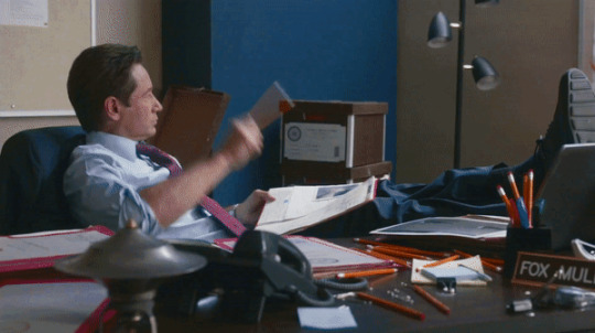
Since I no longer have the video from my first gifset, I just googled "Mulder throwing pencils season 10" on YouTube. After finding the video, I copied the link and pasted it into a YouTube to MP4 site ((this site has never given me popups or tried to get me to download something that isn't my video file)).
2.) If your downloaded video clip is short enough, you can just stick it into ezgif. If not, you may have to cut it using a website or a computer program.
Ezgif.com -> video to gif -> browse -> select your file -> upload video
3.) After clicking upload video, you should find yourself on this page:
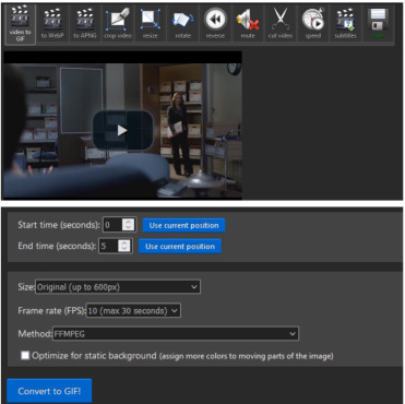
If you need to do any kind of video editing (cropping, rotating, resizing, etc) this is the place to do it! This is also where you make your gifs.
For the first gif, I don't need to change the start time, since I'm starting at the beginning of the video. 0 seconds is fine. But for the stop time, I'm going to play the video, pause where I want my first gif to end, then press "use current position" by end time.
I don't usually touch the settings for size, FPS, or method. If the gif doesn't have a lot of movement, I check "optimize for static background"
Then press convert to gif.
Here's the product I got. Since it's such a short clip, it moves a little fast for me.
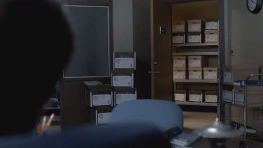
I'm going to click "speed" which is below the gif. You're brought to this page:
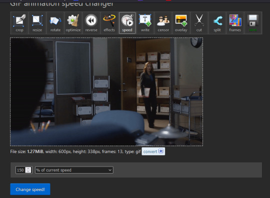
This is completely up to you for speed, but I find that between 60% and 85% end up looking good. If you don't like it, just change the number in the box and press "change speed".
I ended up with mine at 65% of current speed.

A little better, right?
The gifs that turn out best are 3 seconds to 10 seconds in my experience. This one is 1.5 seconds, so it's a little fast.
After that, rinse and repeat for every gif you need to make.
4.) Editing time! This is for Photoshop (if you use Photopea, I very much recommend this tutorial. It's very well explained!)
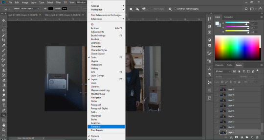
Go ahead and open all of your gifs once Photoshop is booted up. Then click window -> timeline
Now you have a handy dandy little timeline on the bottom.
The first thing you're going to do click play and decide whether or not your gifs are running at the speed you want. If yes, move on to next step.
If not: click on the three lines -> select all frames -> little drop down arrow. You should have a variety of times available to choose. Usually, I click other, then put somewhere between 0.04 and 0.08 seconds. Click play again. If you don't like it, try this step again.
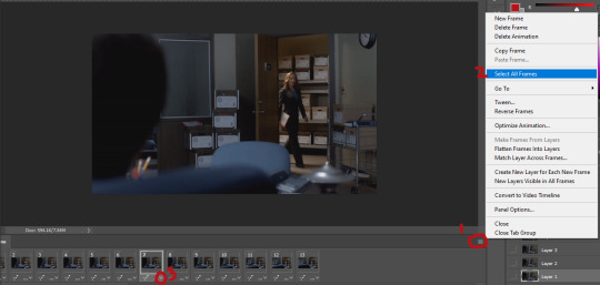
If you need to crop your gif, three lines -> select all frames. Press "c" on your keyboard and crop accordingly.
4a.) Color editing
This is where things get complicated. Just remember coloring is subjective and everyone does it differently. This is just an intro to the different tools most gif makers use to alter color.
You don't have to use all of these! I definitely pick and choose depending on how I want the coloring to look. When I'm making a gif set, my coloring isn't as adventurous as when I'm making an edit. It doesn't feel worth it to give away my settings for this gifset since it changes depending on the coloring and lighting of the scene.
All of these tools can be found under "create new filter adjustment layer"
• Brightness/Contrast
This one is the easiest in my opinion. It's pretty straightforward. The more you drag brightness the right, the brighter your gif gets. The more you drag contrast to the right, the higher the contrast is.

• Curves
This adjusts lighting with color values. It's another tool that's hard to explain. I just drag the little circles on the chart until it looks good

• Color Balance
Like every other setting, exactly what you do with this tool is up to you. Color Balance adjusts the overall tint of your gif. I recommend editing highlights, shadows, and midtones for the best results.
• Channel mixer
This one is one of the most complicated tools when making gifs in my opinion. It's best for getting rid of weird colored tints (think the blue coloring in Twilight). I'll just link a tutorial here for it. I don't make enough gifs to know how to explain it.
• Selective color
Hands down my favorite tool, though not only specifically for gif making. This tool allows you to select a color (reds, yellows, greens, cyans, blues, magentas, whites, neutrals, blacks) and edit each color group. For example: my skin in photos usually has a weird red tint. I can edit the reds in my photo using this tool to make it look less abrasive.
You just play around with the different colors and bars for each color until each color group looks good. I recommend hitting the highest value to see how the color changes/what parts of the gif are affected by the change.
In the instance below, I wanted to see how magenta affected the blue colors, so I dragged magenta to 100. Now, knowing what kind of color changes magenta will make to blue, I can adjust accordingly.
Messing around with the each color put me here:
• Vibrance
Another pretty self explanatory tool! Vibrance and saturation bars make the gif colors more colored and vibrant.
• Applying the filters to all frames
Shift click to select all the filters, and drag them above all the layers. They should now be applied to all the frames.
If not, select all frames with the three lines menu drop down like before -> click the little eye to turn off visibility, then click it again to turn it back on. You should be able to see everything now.
In order to carry the same colors from gif to gif, I take pictures of each setting and edit each filter adjustment layer accordingly. I side by side compare and make adjustments if the coloring doesn't match quite right. I'm sure there's a better way to do this, but I'm not experienced enough yet.


4b.) Subtitles
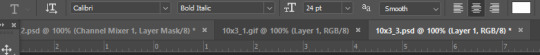
This part isn't too bad. For subtitle text, I use Calibri. Myriad pro bold italic and Arial are also really good options though!
• Text
Go to the sidebar and select text. Drag yourself out a box approximately where you want your subtitles. Type whatever you want. If you don't like where it is, click the move tool and drag it wherever you'd like.
Here are my text settings:
• Blending options
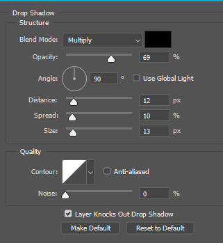
Right click your text layer and select "blending options" at the top. I edit stroke, which adds an outline. I also edit drop shadow, just because it adds a little depth to the text

• Applying to all frames
Drag the text layer to the top, just like you did with the adjustment filter layers when coloring. The same troubleshooting applies.
5.) Exporting
I know there's other ways to do this, but this is the way that makes the most sense to me.
Select all frames on the timeline -> file -> export -> save for web (legacy) -> save
With everything together, you go from:
To:

I had the subtitles in two parts because my first one had the subtitle in two parts (consistency).
Happy giffing!~~
★★★★★★★★★★★★★★★★★★★★★
C.) Resources:
This is a collection of resources both for Photopea and Photoshop
Photopea Resources:
Photopea giffing tutorial by @heroeddiemunson
Photopea gif coloring tutorial by @heroeddiemunson
Photopea removing yellow tint tutorial by @lacebird
Photopea gif making tutorial by @aragarna
Photopea gif making tutorial by @ashleyolsen
Photopea changing background color of gifs by @benoitblanc
Photoshop tutorials:
Giffing tutorial by @dqmeron
Subtitle tutorial by @itsphotoshop
Blurring gif backgrounds by @clubgif
Inverted colored text tutorial by @spaceslayer
Gradient text tutorial by @tawaifeddiediaz
Gif coloring tutorial by @logangarfield
Color consistency tutorial by @clubgif
Channel mixer tutorial by @zoyanazyalensky
11 notes
·
View notes
Note
Can I ask if you know of any good resources for learning how to make gif sets/edits?
I love all of your stuff and I really would like to start doing edits but I am not sure where to start.
Sure! Usergif here on tumblr has lots of great resources for learning how to do gifs, both in photoshop and photopea, that's a good place to start. They have basic tutorials on how to make gifs and then on colouring etc.
I'd definitely just advise reading and following a little of what others suggest and then just doing it. I certainly learnt by just doing gifs and making mistakes along the way, and eventually you kinda just learn.
Sorry this isn't more specific! But usergif is a great resource.
6 notes
·
View notes
Note
hello! big big fan of your work, it says a lot of things in words I would never know to use. I hope this is appropriate to ask, do you get that photo-copied look on your stuff? i've just tried to do similar before and it never comes out great, you've captured the look perfectly. sorry if you've answered this before (though i did try to look) or it was not appropriate to ask
totally fine to ask :-)
1. search for photocopy or xerox textures. there's tons of design/resource sites that have free overlays, but read the copyright. most overlays are fine for personal use but some aren't for commercial use or require credit
2. save those textures (best to make a folder to keep them organized)
3. in photopea/photoshop, create or open your design
4. in a new layer, over your design, open the texture you want to use. adjust the size of this layer to cover your entire design
5. set layer to "screen" or "lighten" & adjust opacity + fill to desired level
6. repeat with various textures as necessary
that will get you the general photocopy look (spotting, scan lines, fading) but if you want to make the text itself look more vintage, put a threshold layer over it, convert text to smart object, filter > blur > gaussian blur, adjust to your liking & this will give you linear looking ink bleed
additionally, you can select that smart object text layer, go to filter again, select distort > displace, select one of your texture layers for your "source" & adjust the levels of distortion. this gives your text some hatching + wavering to make it look less linear
there are tons of other methods you can use to get these warps on text. a bunch of designers on IG + YouTube post how-to videos + link or recommend resources
hope this helps!!
52 notes
·
View notes
Note
Hii, where did you learn how to make gifs? Yours are so cool
hihi anon!! i learned how to make gifs thru finding tutorials from my fellow gifmakers <3 arwen @benoitblanc and sai @ashleysolsen are personal life savers because i gif in photopea and their tutorials (sai's here and arwen's here) but theres many gif tutorials u can find around tumblr!! i feel like i always mention them but @usergif is a great blog full of resources for gifmaking that i go to often for inspo and seeing what other gifmakers are doing <3
4 notes
·
View notes
Note
For real do you have any tips for beginners without paid softwares and just a macbook pro how to make gifs? 🫡 Or any tips & links to tutorials, I'm overwhelmed when looking at most of them bc unfortunately I don't have the money for any fancy softwares but I still want to learn how to make gifs :)
Hi, anon, thanks for waiting -- I wasn't on my laptop when I got your ask, and it was easier to find the links and resources for these things when I'm on it.
I totally understand how confusing making gifs may be, especially if you want to make more than just a basic gif (which there are many sites you can do that, like ezgif), and all the tutorials and stuff require programs like photoshop. I'm one of them who uses photoshop to make gifs, my dad got a discounted but legal copy of CS6 years ago (but I had used other version of photoshop before hand, some not quite legal lmao) so I just basically installed those.
However, in the last year or two, there’s been a great alternative to photoshop, called photopea! The creator basically made a free, and usable port exactly like photoshop except you can use it right in your browser. It has a section where you can learn how to use its functions here: https://www.photopea.com/learn/
I haven't used it, and if you can find some photoshop tutorials, you could replicate some of the same effects some of these tutorials have. That said, I follow several blogs dedicated to photoshop and gif making, and some of them provided links on tutorials for photopea.
These are more intro to making ANY gif on photopea, so anyone who is new to gif making in general and not just to photopea itself:
https://lacebird.tumblr.com/post/647924923803828224/how-to-make-a-gif-with-photopea-hey-everyone
https://benoitblanc.tumblr.com/post/660887883832557568/ive-gotten-a-few-requests-for-a-photopea-tutorial
https://heroeddiemunson.tumblr.com/post/677466734842822656/kais-photopea-giffing-tutorial-so-literally-no
https://ashleysolsen.tumblr.com/post/660321458489327616/tfor-the-longest-time-i-made-my-gifs-on-ezgif
https://ofcamerasflashing.tumblr.com/post/616199053048430592/ this is a pretty basic intro to both ezgif (I use this site sometimes if I want to optimize and/or fix the timing of a gif after I've made it) and photopea
Here are more indepth tutorials on making creative effects or making it more artistic, including a google doc I found of a gifmaker who has a ton of those tutorials:
https://benoitblanc.tumblr.com/post/659439228896329728/emberoflife-kind-of-not-really-requested-a
https://benoitblanc.tumblr.com/post/659801624981782528/616yelena-requested-a-tutorial-for-how-to-change
https://benoitblanc.tumblr.com/post/659084376840273920/yelenabelovca-requested-a-tutorial-for-how-to
https://rresources.tumblr.com/post/667960089212223488
https://benoitblanc.tumblr.com/post/691148469876015104/i-found-several-psds-of-ac-gifs-ive-already-made
https://docs.google.com/document/d/1o81H_SeP02UJAR17jwkx4w_RHnZS18Qbn5NCQ83-8fs/edit
Also found this, it only works if you use chrome but I thought it might be useful: https://johannasbarker-moved.tumblr.com/post/678640846075215873/how-to-use-photopea-offline
Now, if you actually want to use photoshop, that'll be a different post -- there are ways to getting it without buying it and it also depends on which version you use (some have more current versions and some are like the same version of photoshop I have, cs6) and plenty of blogs and sites with tutorials on how to make gifs with photoshop! I do have a few of these reblogged on here somewhere, but I hope this was all helpful, anon!
19 notes
·
View notes
Text
rambling about writer stuff & general community stuff
that person who said a work with a large note count is the one most people will interact with based on the assumption of "oh it has 1k+ it must be good!" is absolutely correct. the only work of mine that consistently gets interaction even though I posted it forever ago is the one with the highest overall note count.
That is to say people are basically window shopping and only looking at what's "popular" and it can feel like such a mental hurdle to hear others be like ~notes don't matter🥰~ because you also wanna scream yes they fucking do!! and there's nothing weird or embarrassing about the fact that it matters to you, we all love attention it's literally a feature of our species that we love social interaction and attention there's nothing bad about that it's neutral as far as I'm concerned. If anything I think people who shame others for that are weird.
it's also mad discouraging for people to hear over and over "oh don't be silly and make yourself upset comparing yourself to someone else! Everyones work is good!" while yes that's true, it's also... incredibly unhelpful? 9/10 times people already know that, they've heard it enough. All it really serves to do is further push people into the line of thought that "there must be something wrong with me/my work/my art that nobody's telling me" and when you're stuck in a feedback loop of people saying that shit to you it feels like what Eric Andre said about holding hands with kids in a circle around someone chanting "NIGHTMARE NIGHTMARE NIGHTMARE" to fuck with them.
I think what happens is people get really caught up in the euphoria of popularity and then also do not wanna share it. That's not to say everyone acts like that because they don't there's plenty of larger blogs that are extremely helpful to others in their communities and do a really great job of being encouraging and giving meaningful, actionable advice but it's not the majority of bloggers. I think sometimes, more than we like to admit, it can be very very satisfying in a mean way to keep a faux barrier up.
I'm not saying anyone is intentionally cruel but it feels cruel to be the other person on the side of that faux barrier, frustrated that you seemingly can't do what they can. That's not the truth.
What people don't say is they use things like canva premium, picsart, photoshop/the free equivalent photopea, pinterest, templates from deviantart creators, capcut, ect to create a lot of the popular aesthetic looking posts you see. If it frustrates you that you don't know how to, you can find tutorials on youtube in an instant teaching you how to make those too now that you know the names of the apps or programs.
Writing resources like grammarly, scribens, online word counters, onelook, wordhippo, springhole.net, the ultimate guide to writing smut fic (on ao3 by QuinnAnderson), ect. those also aren't shared as often as they should be. each of those resources does different things but all are incredibly useful for writing anything, not just fanfic. (I cannot stress enough how helpful that smut guide is if you wanna get into writing that, definitely read through it).
I think this unwillingness to share things contributes to the overall slump a lot of fandom communities are in. You can't know where to start looking if you don't know what it is you're looking for. You also can't improve if tools that could help you aren't made available to you. It's beyond frustrating to be in the position of "I know what's popular but I don't know how I can do that too".
#like please do not think theres anything wrong with you or what you create there isn't#its just really difficult to carve out a foothold when you feel like you're clueless & nobodys willing to help#the unwillingness to share even basic resources does favors for nobody#so many people are mind blowingly talented but held back by things like being unable to get straight up helpful answers
2 notes
·
View notes
Note
it's totally possible to turn gifs into rp icons, i do it all the time! i use photopea and paste the gif address in, and then look through the frames of the gif to find the one i want to use! from there it's just cropping and psds :D (also, photopea is a great resource in general! it can do almost everything photoshop can, and it's totally free and on browser so you don't need to download anything)
☝️☝️☝️☝️☝️
7 notes
·
View notes
Text
i finally finished (mostly anyway, i’ll probably decide to change something) the art for Danny’s (main character of the game i’m making) house! references under cut.

first one is a house from OMORI (Sunny’s house maybe? it’s been a little while), second one is a house i found being sold but i edited out the garage (was gonna do it more cleanly but photopea crashed as i was finishing, & then i realized it wasn’t worth redoing bc this was just for copying the silhouette & stuff), here’s the original pic:
i’m also using the maps(?) they made of the interior layout to help with dimensions and room-placement within the house! i’m glad i found the listing, it’s a great resource.
#aaaaaaa might change the whole ass color scheme she’s supposed to live on a suburban street & idk if those have wood houses#pixel art#i gotta name this damn game so i can tag my posts about it lmao. i know no one really reads these but it’d be nice for archival reasons#name pending#<- new placeholder tag
1 note
·
View note
Last Seen Blogs
animegifss
Anime gifs

aapproach
The AApproach Blog
oriiduckko
"Diabolical Lil Dude"

not-getter77
SUH DUDE
chthonic-eldritch-terror
Your local forest being