#playing around with a new style and concept for drawing character portraits
Text
#mARTch 2024

text version (with more info!) under the readmore! please check it out if you're confused about anything <3
F.A.Q
do i have to draw every day?
no!!!! there are skippable days built into the event, please use them whenever you need them! i really don't want anyone getting a wrist injury!
can you share my art?
yep! i try to share entries to @bweirdevents daily during the event!! the tags can get busy tho so i might miss some posts OTL sorry
what are the tags?
#mARTch is the main tag, but this year you might find posts in #mARTch2024 too!
wait, i'm confused about a prompt...
full breakdown of all the prompts below ↓ with helpful hints if you're stuck!
_____
INTRO WEEK
this week is all about your artistic identity ... technically, you don't have to draw anything new this week if you have some art that already fits. the starter days are:
1 ⭐ self portrait
who are you? it doesn't have to be you IRL .. if you feel more comfortable drawing a fursona or mascot, that's fine too!
if you don't wanna draw, you can also just share old self portraits today and talk about why you drew yourself that way!
2 🤍 inspirations
see how this day doesn't have a star? that means it's optional and you don't have to do it at all!
but if you really wanna- tell us all about what inspires you to create art!
this could be anything from the people that inspire you, the shows you like, the pins on your big messy pinterest board, or concepts that you're drawn to! you can draw something about it, talk about it, or just post your inspirations! anything is fine
3 ⭐ fav thing to draw
what do you like drawing most? backgrounds? animals? one specific animal? bust of your oc facing left? cars? the same anime boy over and over and over? no judgement!! show us :)
_____
STUDY WEEK
this is the week we actually start drawing from reference!
polished art is not required at all, quick sketch studies are fine! please don't burn yourself out
4 🤍 plant
5 🤍 body
6 ⭐ animal
7 🤍 object
8 🤍 food
9 🤍 face
10 ⭐ hand
these ones are pretty self explanatory!
you can do them as realistic studies, or adapt them into your own art style, it's all fine! you can reference from your own photos or from resources on the web.. have fun!
_____
COLOUR WEEK
this is the week for playing with palettes and working on your colour theory skills!
if you're really struggling with these ones, don't worry about drawing scenes or characters, you can just have fun splashing colours around on an abstract canvas!
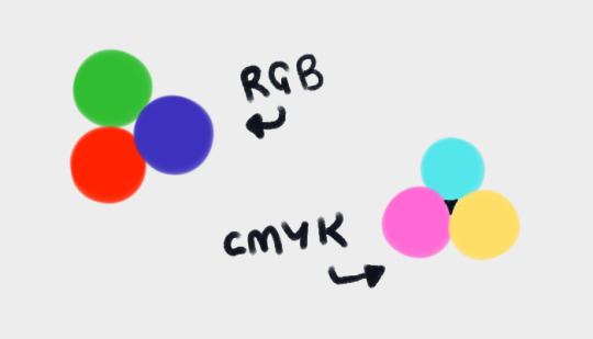
11 🤍 RGB
a set or primary colours typically used in digital/screen art - red, green and blue!
12 🤍 CMYK
a set of primary colours typically used in traditional/print art - cyan, magenta, yellow ... and key (black!)
for both of these days ↑ you can add in black and white.
and feel free to combine the two days into one, if you're struggling with a three-colour palette! use all six!
13 ⭐ WARM COLOURS
the warm side of the colour wheel, reds oranges and yellows!
14 🤍 MONOCHROME
monochrome doesn't mean black and white ... it means one colour! that can be any colour at all- shades of red, shades of purple, shades of green .. or yeah, grey if you really want!
15 🤍 COMPLIMENTARY
complimentary colours are the ones opposite each other on the colour wheel! they're kinda married

16 🤍 YOUR FAV COLOURS
pick any palette that works for you! where's your comfort zone? what looks nice to you? what colour combos do you always go back to?
17 ⭐ COOL COLOURS
the cool side of the colour wheel, purples, blues and greens!
_____
CREATIVITY WEEK
this week is all about vibes! try to create something that matches the mood of the prompt .. they're vague on purpose! don't overthink it, just draw from the heart!
18 🤍 SMALL
you could draw something that's really small, like an ant .. or draw on a canvas that's really small .. or use a really small brush .. get creative with it!
19 🤍 DANGER
try to capture the adrenaline .. the rush .. the fear that you associate with the word danger!
20 ⭐ SOFT
soft colours, soft textures, soft vibes ... whatever makes you comfy!
21 🤍 MIDNIGHT
darkness and secrecy .. spooky witchy vibes .. the tranquility of a forest at night .. the fun of a late-night party .. there's lots of ways you can take this!
22 🤍 POWER
what does this word make you think about? superpowers? control and oppression? literal electrical power? something else?
23 🤍 CHILL
chill as in calm? or chill as in cold? who knows .. it's up to YOU!
24 ⭐ LOUD
try to draw something that feels LOUD! BRASH! IN YOUR FACE! how can you convey sound through art?
_____
FUN + GAMES WEEK
this week is just for enjoying yourself! take it easy and have fun!
also .. another reminder! there are skippable prompts! if you're tired and struggling to get to the finish line, please don't hesitate to skip a day!!! or multiple days!! as many as you need!!!
25 🤍 TRY A NEW ART STYLE
copy the art style of a show you like, ask a friend if you can try their style, draw the eyes a new way, develop a totally new style on the spot... whatever you want!
26 🤍 DRAW WITH YOUR NON-DOMINANT HAND
righties, draw with your left!
lefties, draw with your right!
ambidextrous nation ... our time to show off!
27 ⭐ DRAW WITH YOUR EYES CLOSED
don't peek! try to draw something without looking!
if you really want, you can colour it with your eyes open after you draw the lines/sketch with your eyes closed... but please try not to cheat with the actual drawing part!
28 🤍 RE-DRAW SOMETHING OLD
find some old artwork you like, or something you feel like you can do better on now, and give it another go!
29 🤍 RE-DRAW A MEME
find a silly picture on the internet to redraw .. do you have any in-jokes with your besties?
30 🤍 DRAW A GIFT FOR A FRIEND
create something for someone you love <3
31 ⭐ FREE CHOICE
final day! you can draw anything you want today! show off your skills! draw something you've been meaning to draw! whatever!
_____
please refrain from reblogging this post after march ends - next year's prompts will be different, thank you!
if you have any additional questions, don't hesitate to shoot me an ask!
#🎨#mARTch#mARTch2024#events#art meme#art prompt#art prompts#art challenge#drawing prompt#drawing prompts#drawing challenge#march
861 notes
·
View notes
Text
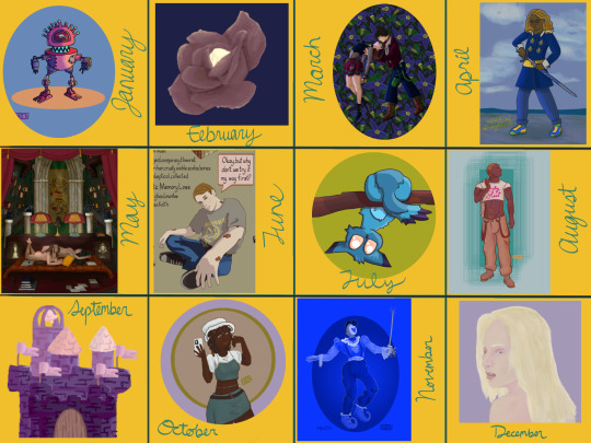
My art year in review!
I learned so much this year and made a ton of cool stuff! These are my favorites from each month, but it was so hard to choose. A lot of stuff didn't even get posted--I'll be sure to at least post the ones that made it to this list!
It's amazing to see how much I've changed and learned over this year, and to see the things that are emerging as part of "my style."
Here's to another year of delight, creation, connection and fun!
Some monthly reflections beneath the cut, but here's the highlights:
I participated in 3 art challenges, Artfight, OC-tober and Huevember.
I made fanart for the first time!
I created a piece I conceived of before I started drawing
Made some big breakthroughs in techniques and skills in April, July and November
January: My first branch into full character design, Rodd is the culmination of training on Hero Forge renders to make dnd portraits! I was doing this cool thing with neon rim lighting, I should bring that back!
February: I saw a piece on here with this amazing glowing effect, so I color picked it and experimented to figure out what relationship between the colors was making it do that! The answer was saturation. This rose is meant to be glowing from within, and I think I did a good job for my knowledge level at the time! As Chuck Tingle would tell us, it's beautiful because only I could have made it in that moment on the timeline.
March: I spent a million years on every detail of this one, it has at least 5 clipping overlay/saturation layers for lighting, multiple line work groups and I want to rework that background but! I never felt more accomplished than I did when I finished this one. I learned a lot, especially about things I could skip or simplify. And the symbolism really pops off ngl
April: I read Gideon the Ninth for the first time this month and I immediately needed to draw Jeannemary Chatur, Cavalier of the Fourth House, the worst teen to do it. She's the first fanart I ever made and posted! I also discovered a new pen tool with this one, which CHANGED THE GAME.
May: This one is an idea I had written down before I ever picked up the tablet and stylus. I thought I might commission someone to make it, the image of it came to me so clearly during our VTM session I just had to make it real somehow. Well I did it! This is one I will come back to redraw in like 5 years bc I love the concept so much. Also rife with symbolism and inside nods to the Low Kings.
June: I made a bunch of ref sheets in the run-up to Artfight in July. Caleb hadn't even been in my plans to upload, but I had time and inspiration! I will be uploading this and a few more of him <3
July: This is one of my faves from Artfight! This character is Blueberry, by way of OrchidEatsBread on artfight. I have still never played... rainworld? But I love me a slug cat. In July I drew a TON of people, it really drilled anatomy basics into me and how to get clothes looking like actual clothes a bit more. Also solidified some things I would consider "my style" at the moment, like no irises, and my approach to noses and mouths and fingers!
August: Another fanart for the Locked Tomb series, I never posted this!!! Will be rectifying that soon.
September: I got really into javascript and css this month, and I made this to be a landing page image on my neocities website XD I'll get back around to that eventually...
October: At the last minute, I discovered OC-tober and the prompts from @/bweirdart, a worthy follow up to the rush of Artfight two months previous. I developed so much stuff for the Low Kings, including this drawing/character, Amayah/Girl-Z, who has been a figment of my pintrest board for 2+ years.
Huevember: Chasing that OC-tober high, I found Huevember! I did not expect to actually do every day, but it proved to be an amazing exercise! I learned so, so much about color, discovered amazing new brushes and techniques and found I really enjoy working in those one day capsules! I loved a lot of the stuff that came out of this month, including my highest note post ever!!!, but this one is still my phone background and I'm maybe developing an OC world around it. We'll see what happens in 2024.
December: I got hit HARD with the writing bug this month, so this was my only choice for this month but I WOULDA CHOSEN IT ANYWAY. I unlocked something here that I'm really excited to visit again, in fact I'm working on a companion piece rn! This is also fanart btw, prepare for me to get even weirder about this guy in the coming months.
If you've read this far, thank you so much! I have so much fun writing these little reflections and making my posts on here.
xoxo, wren
4 notes
·
View notes
Note
ROZZ SHOW ME SHOW ME SHOW ME. Artist asks: #1, #14, #15!
1. Show me your most recent wip
I already showed some but I'm gonna do a few more because I might never post them haha
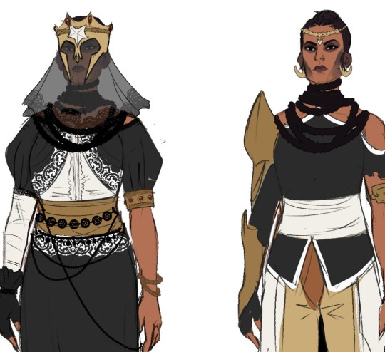
This one's from a casual class swap AU me and @diirthara-ma came up with! If I didn't get the vibe across this is Cassandra as a Necromancer and mortalitasi. I wanted to explore what might happen if she had been a mage and had embraced the nobility lifestyle 👀

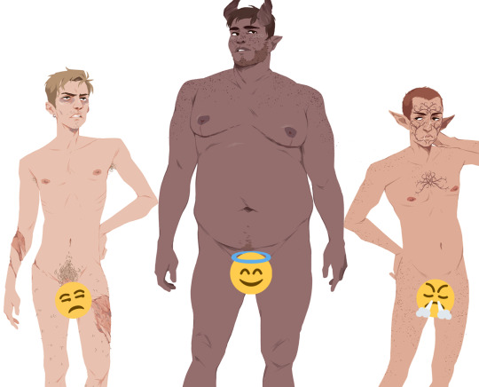
This one's just from a body lineup reference sheet I was messing with from a while back! It's a little outdated but here's Ivan Amell, Alexander Adaar, and Isha Lavellan
14. How has your art changed over the years?
I'm house sitting and away from my computer but that means I DO have access to really old pre-digital art 👀
PreK/Kindergarten: Most of my early art was exclusively Pokemon related. Here's a poster advertising a "Pokemon Klub" and a reference sheet I made for myself of Unkown

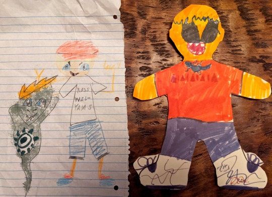
Elementary School: Still very into Pokemon and Digimon. Here's two self portraits from around 2nd and 3rd grade lol
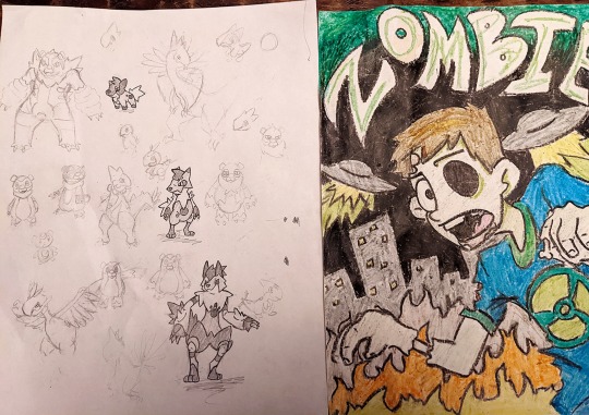
Middle/High School: I was still going hard on Pokemon and spent a couple years working on my own Fakemon region. Here's some of my concept art for my starters feat. my water starter which was a lifeguard/arctic wolf. Scott Pilgrim and shows like Adventure Time were also big influences at the time
I bought my first tablet when I was 15 and that really transformed my art habits. I switched almost exclusively to digital and began posting on social media. In retrospect, I would section out a couple big arcs for my art since then.
From 15-19 I was really motivated to make art a career and was excited about building a following. Within a year I gained a few thousand followers and was really excited that I was able to sell my art and commissions for money.
By early college I started to lose interest in grinding and was bouncing around several different career paths. At this time I started to try out a lot of new art styles and explore concepts I had always felt too intimidated by before. From 20-22 I didn't create much art that I was proud of or wanted to post. This is the hardest era of my art to look back on but it was also when I experienced a lot of growth. In particular, I started painting and using color in ways that I had never tried before and I started taking a lot less shortcuts when it comes to anatomy and rendering difficult poses. This was also when I began exploring original concepts and characters through RPGs like Dragon Age and D&D.
I associate age 23- the present with my art focussing almost exclusively on original concepts. I'm also very disengaged from social media outside of a small community of friends and artists I enjoy. This allows me to disentangle my motivation to create from external factors which has helped me enjoy sharing my art again. Most of what I draw is done through collaboration with @diirthara-ma and I take a lot enjoyment from other forms of creating like talking about characters, creating charts, moodboards, and playlists, as well as sculpting and miniature making (for D&D). I also enjoy the process of drawing a lot more and spend much more time just doing figure sketches or playing around with another artist's color pallete.
15. Biggest artist pet peeve?
This one's hard! I'd say that I have a bad habit of constantly desaturating my color palette for no reason throughout a piece and then having to resaturate everything again later.
I also got so chill about not posting I now have a hard time remembering to post my art. I also tend to forget I've drawn something if I don't post it so I constantly find old art in my folders I never did anything with lol
#thank you dread 😍😍😍#sorry this is so long and rambling but i had a lot of fun!!!#also be thankful i spared you the art from my BIG code lyoko phase because i did find some of that#are you gonna do this meme too dread??#my art#ask meme#wip
38 notes
·
View notes
Text
this love || yoongi angst

Summary: A story through the years detailing your relationship with Yoongi and all the ups and downs that came with dating an idol.
Warning: cursing, sexually suggestive content
Genre: angst, fluff, idol!yoongi, artist!yn
Pairing: Yoongi x female!reader
Premise: Based on the song ‘This Love’ by Taylor Swift. Reader is an artist.
Commission Request: @minyoongail
Word Count: 7,681 words
—
You met Yoongi when he was just a trainee, ready to take on the world and bursting with energy to get on stage. He had visions of grandeur- him living in a beautiful mansion, wearing name-brand jewelry, cruising in rare sports vehicles. When times were simpler, he’d promise that you’d be there with him, indulging in the glitz and glamour that came with his fame. He’d be an idol and you’d be his muse. Yet under all those pretenses, under all those empty promises, he was just Yoongi.
He was a guy who walked in and out of your life as easily as ocean tides come and go on the shore. He taught you how to fall in love, fall out of it, and rekindle it all the same. It was a sort of beautiful asphyxiation, being wrapped up in his lifestyle and learning to accept the consequences that came with dating a celebrity.
You wonder even now as you search his name on the internet, if you had any regrets. After all, you lost too much to be with him.
—
April 2013
A first meeting meant everything to you, especially when it came to your clients. You didn’t accept jobs from weirdos who didn’t respect your craft and you definitely hated impatient ones who badgered you to finish your pieces as quick as possible.
Big Hit was a happy medium and had hired you as a contract employee after reviewing your portfolio. Although the style of work they wanted from you was not at all what you specialized in, you were happy that they treated you like an actual employee and not some sort of machine. Plus, the pay was good.
You were asked to work on some cute animal characters for an upcoming boy group that you weren’t terribly familiar with, maybe stumbled on a vlog of theirs that you forgot about. You were intrigued by the slew of trainees that sat in front of you, their palms clenched out of anxiousness.
“I’m [Y/N], one of the digital artists that will be working with you guys from now on,” you introduce yourself politely to the seven bright-eyed boys in front of you.
You were in a room with other staff members, discussing the concept of the “Hip Hop Monsters” your graphics team was working on. This was a planned project lasting over a span of years and would eventually result in collectors edition items. It made you giddy just thinking of the royalties you’d earn from it all.
“I’d like it if the animals took after us,” one of the boys suggested shyly, slightly intimidated by the large number of corporate employees there were in the room for something that seemed so trivial. “I think our fans would like the characters more if they kind of resembled our personalities and stuff...”
You nod along to his suggestions, staring at his jersey to notice that the member who spoke up was Rap Monster. It was cute how they all wore clothes with their names on them. That’s one way to attract attention, you suppose.
“Any other suggestions you guys have for us?” you ask, jotting down notes and making rough sketches as they talk amongst themselves.
“I’d like it if,” a somewhat husky voice starts and you can’t help but stare into the guy’s eyes as he speaks, “my character was a turtle.”
You burst out into a fit of laughter along with the other staff members. He had said it with such a straight face and with so little enthusiasm, yet you could tell from his slight blush that he was serious. He was cute in the way that he wasn’t trying to be.
“You resemble one,” you grin at him, drawing out a small turtle with a cute beanie on your iPad, like the one he wore in front of you. You show it to him. “Something like this?”
“Exactly that!”
He breaks out into a gummy smile, one so bright that it hurt your heart to stare at him for too long. Now you were the one left flustered. He realizes how enthusiastic he was and got embarrassed once again, scratching the back of his head to avoid eye-contact.
“S-sorry, for shouting. It looks good.”
You bite your lip from forming too big of a grin. You still had to remain professional after all.
“You’re welcome,” you smirk slightly as he goes back to trying to look cool. You can’t help but doodle his name on your iPad even as the other members shared ideas for their own animals.
Suga, Suga, Suga.
You smile to yourself. It does have a ring to it.
—
June 2013
Yoongi sees you in the hallways sometimes and wants to say hi, but he can’t because other people are watching. Though, that isn’t the only reason.
He tells himself every day that he’ll muster up the courage to go talk to you, but every time he sees your face his legs turn to jelly. Yoongi was busy with debut stages recently, but he found some free time in his schedule to approach you.
Yoongi was never the shy type, more reserved if anything else, but you had something that enamored him- intrigued him. He wanted to know who you were other than the cute girl he was stuck in meetings with from time to time.
As you sat there on your desk, Yoongi lingered in an area nearby. He would give you his number today and if things didn’t work out then that would be that. There was no need to be all shy about this; it’s not like this is his first time asking someone out.
He strides over to you with feigned confidence and you look up after a minute, not noticing how his shadow loomed over you. He sees that you’re working on realistic portraits of the members and not the cutesy characters he usually sees you drawing.
“Hi,” he says curtly, trying to seem disinterested though he was the one that approached you first.
“Hello,” you smile up at him.
Suga.
“You draw really cool stuff,” he says to break the awkward tension. “You should show it to the CEO. I’m sure we’d have cooler concepts for our albums with your work.”
You look up at him, a happy glint in your eyes. He was complimenting you, although avoiding eye contact to seem a little less nervous than he really was.
“Well, I’m just a contract worker so I don’t think I really have the authority to start up new projects out of nowhere,” you say with a smile on your face at how flustered he looks. “I feel like you’re here to ask me for something. Am I right?”
He looks away for a split second, coughing to alleviate his nerves. He was a grown man for fuck’s sake, why was this so difficult?
“I was actually wondering if you could come give me some opinions about some art that I drew,” he lies through his teeth, just trying to find a way to get you in a more private area than the corporate floor teaming with watchful gazes. “I’ve been trying to start a new hobby.”
You chuckle slightly, seeing right through his words. You stand up to amuse him.
“I’d be happy to.”
He leads you to a studio filled with whacky knick-knacks and dim lighting, not necessarily the best place to draw. You know by now that he just said those things as an excuse to be alone with you.
“So where’s this masterpiece?” you tease slightly at his nervous expression. How did a guy who looked so deadpan have such a giddy personality?
“Well actually,” he starts off, palms already sweaty. “I-It’s not here right now, but I think I left it at the dorms. Maybe if we exchange phone numbers I can text it to you.”
He tried to appear nonchalant, but his hands moved as if he was doing a public speaking presentation. Yoongi thought he was doing great, though growing a little more nervous at how you were giggling.
“You know, Suga,” you start teasingly, “My number is in the company directory. Feel free to text me anytime.”
Yoongi slightly cringes hearing his stage name. He loves it, don’t get him wrong, but he didn't like hearing it come from you. He didn’t like the unfamiliar aspect that came with using his stage name- like you two only went by professional terms.
“Call me Yoongi,” he says with genuine confidence this time. “I like it better when my friends call me Yoongi.”
You nod, relieved that you could finally know this cute guy’s name. Truth be told, you were snooping around his conversations with other people to figure it out.
“So we’re friends?”
Yoongi nods, sitting down in his rolling chair.
“I’d like to be,” he grins, patting the sofa, hoping you’d take a seat with him.
And you do.
—
Present
It’s hard to work efficiently when you’re no longer in a corporate space. There’s no boss to check up on your progress nor is there a nosy coworker trying to see what you’re doing from the corner of their eye. You missed the hustle and bustle of an office floor, but it was nice exploring your creativity through freelance work.
You tap your digital pen onto the table repeatedly, looking at the reference image over and over again. It was a sick joke played by the universe to have been commissioned to draw your ex-boyfriend’s idol group, but you couldn’t refuse the hundreds of dollars the ecstatic fangirl was willing to give you. Truth be told, she might have offered too much pay, but you took up her offer anyway. Money is money.
Yet a face you’ve touched so often, a person you’d been with for years felt so unfamiliar to you. It wasn’t like you were drawing him realistically either. The client wanted anime-style figures that resembled them, looked enough like the boys to display it as her Twitter header. In the end, it’s still too difficult to draw. The rest of the members were lined up and sketched perfectly, but there was a blank area where Yoongi’s face should’ve been.
Your wrists hurt from the constant drawing and erasing so you set it down to massage your hand from cramping. In moments like these, you hated your job.
Ting.
A message notification popped up on your phone that laid beside your iPad. You usually left it silent when you were working, but you opened yourself up to distractions when drawing this particular piece. Whoever thought it was a good idea to specialize in celebrity artwork? You pick up your phone and smiled softly at the text.
hey, can I come over?
—
March 2014
“Happy birthday to you, happy birthday to you, happy birthday dear Yoongi, happy birthday to you~~”
You cheer on with the rest of the boys in their cramped dorm. Somehow you had gotten close enough with them to be at this level of comfort, sitting crisscrossed and shoulders touching with Jungkook and Seokjin. Yoongi blows out the candles and claps his hands, a little sad that another year passed by so quickly. He kept glancing at you who was focused on cutting the cake like the perfectionist you were.
He couldn’t help but feel like time was running out, like if he didn’t confess to you now then it would never happen. Yoongi took off the beanie he wore and ruffled his hair. He was feeling anxious all of a sudden.
“Dude don’t do that your dandruff is gonna get everywhere,” Hoseok whines. “The cake is gonna be decorated with your dead skin cells.”
“Go wash your hands,” Jin commands and Yoongi could only roll his eyes.
“Relax, I don’t even think we’re gonna have cake anytime soon when this slow-poke is taking forever to cut.”
He flicks your forehead as you glare up at him.
“I could so easily throw this in your face, but I choose not to,” you stick your tongue out at him and he scoffs.
“I’d like to see you try.”
All the members groan out of annoyance.
“Oh my god they’re having a lovers quarrel again,” Jimin yawned. “Aren’t you guys sick of arguing?”
Yoongi freezes at his words. Lover’s quarrel. That was a nice way to put it.
“They’ll stop arguing when Yoongi finally-”
Taehyung was cut off as Yoongi swipes three fingers worth of frosting from the cake and lathers it all over Taehyung’s face.
“You talk too much,” Yoongi shakes his head and soon chaos descended. Cake flew in places it shouldn’t have and ended when Namjoon knocked over a glass of water, managing to break it on the floor tiles. In the end, no one got cake.
Yoongi and you were laughing amongst yourselves at the kitchen sink, washing off some of the bits that got onto your shirts.
“I’m so sorry about your cake,” you say through your chuckles. “I’ll make it up to you some time.”
Yoongi only smiles.
“Yeah, you can treat me on a date,” he replies a little too boldly. You look at him in shock, not quite processing his words.
“A date?”
He nods.
“We should go out sometime.”
You purse your lips to prevent the huge grin about to be displayed on your face.
“We should.”
—
Present
It was subtle, the way it all started. You trace over the features you drew so far, only getting to his eyes. Yoongi and you were innocent lovers for a while, keeping your trysts a secret from everyone in the company except his managers and the members. A few of your friends knew, but none of them knew BTS well enough to be all that surprised. It wasn’t all that rare to go out with a celebrity in your line of work.
You almost miss those days when he was unrecognizable. After your friends realized who he was after he hit it big globally, you felt like a secret of yours was displayed to them. Your love was supposed to be private, but his fame left very little room for privacy. You missed when you were the only one that knew of him and maybe it’s selfish to think that way, but you were past the point of being selfish.
You text back.
yeah, can't wait to see you
—
Jan. 2015
Yoongi lays you down on the couch gently. His hands caressing your sides underneath the thin material of your shirt as he pulls you in closer to his kisses. This felt different from other nights, different in that there was nothing around to stop what would come next.
He pulls away from you slightly, panting from the lack of oxygen.
“Are you sure?” he asks, drawing circles on your hip with his thumb. He was only supposed to come over to help you unpack some stuff for your new apartment and here you were, pinned on the couch and sweating from the close contact.
You nod back in response, not finding the right words to get him to continue. He pulls your shirt over your head, peppering kisses on your neck and atop your breasts. He fixates on your neck languidly, biting as he sees fits.
There was a pause as you felt him press up against you and you knew then that there was no making it to the bed. You would have your first time with him on this newly moved-in couch.
The clothes dropped to the ground as his touches get more impatient, more desperate. It all passes by like a blur and you could only remember the pleasure that came with his long fingers, the satisfaction you felt when he was inside you. The climax of it all made you realize that you loved him, truly and without regret. He holds you in his arms when you come undone, flashing a satiated smile as you look up at him. It’s like the stars were in his eyes.
“How do you feel?” you ask him, worried he was already drowsy. You didn’t want to have to sleep on the couch naked.
“Satisfied,” he says with a smile on his face.
You can’t help but swoon, his eyes fixated on you. At least for now, he was yours He wasn’t Suga, a rapper. He was Yoongi, your boyfriend.
It didn't matter to you that he was struggling to make a name for himself in this cut-throat idol industry or that he would spend countless nights cursing as one of his numerous tracks get rejected. None of that was in your mind. Only he swam through your thoughts. Only him.
“I love you,” he sighs out. He was the first to say it.
“I love you too,” you reply back and he holds you tight against him.
He’s nuzzling himself in your hair, his chest pressed up against you so his heartbeat can synch with yours. He loves this, can’t get enough of it. He catches your lips and once again you are whisked in the pleasure of it all. This is it. This is what love is.
—
Present
The piece is finally finished and you send it off to your client, hoping she doesn’t ask for revisions because you can’t handle another second of drawing his stupid face. His soft skin, his tiny moles, his gummy smile...
It's not like you hate him. It’s just... a certain contempt lingers after a breakup from a long-term relationship. It’s the type of resentment that can’t really be explained. You don’t want to see him, but you catch yourself watching his videos on Youtube. You don’t want to think about him, but you hope he thinks about you. You don’t see yourself ever getting back together with him, but you don’t have his phone number blocked.
It’s a sort of paradox you catch yourself in and you wonder if you could ever get out of it. Will Yoongi ever escape your mind?
can't wait to see u too babe
—
Aug. 2016
Yoongi hugs you from behind, his face scrunched at the nape of your neck where several marks were made from last night’s events. Your eyes stayed focus on the TV in front of you, still impressed by your own ability to afford one in your bedroom at your salary.
“BTS' SUGA drops new music video for his song and mixtape Agust D...”
The news anchor drones on and you could barely hear her through the sounds of Yoongi’s soft snores. His hold on you grew tighter as he hears his stage name from an unfamiliar voice and it makes you giggle slightly at how different the edgy music video being displayed was from the same person wrapping you in his arms so tightly.
“Babe, wake up. I have work to do,” you whisper into his hair and he only shakes his head back in response.
“No,” he mutters, pulling you into him closer. You roll your eyes, managing to pry off one of his hands as you sit up on the bed.
“Don’t you have studio stuff to do today?” you ask him, searching for a shirt to wear.
He shakes his head as his eyes start to flutter open. You both reeked of alcohol since you opened a bottle of wine last night to celebrate the release of his first solo work. He was proud of it and you were proud of him.
“Can you turn that off, I’m getting a migraine,” he whines, covering his head with a pillow. You opted to wear Yoongi’s shirt instead of your own since you couldn’t be bothered to walk to the other side of the bed to find it. You smiled at his laying figure, cooped in a fetal-like position. He was still naked, but you were with him long enough to no longer be phased by that sort of thing.
“From one bottle of wine?” you tease slightly. “I think you’re losing your touch, Agust D.”
You chuckle as he throws the pillow on top of his head towards you.
“Don’t call me that,” he pouts, “It feels like you’re making fun of me.”
You stand up from where you were, stretching out your back as you make your way to the door.
“That’s because I am,” you smirk, “You know you’re saved on my phone as Sugar?”
He gives you a glare.
“It’s Suga,” he says, attempting to add some intimidation to his voice. It doesn’t work because all you do is stick your tongue out at him.
“Whatever sugar.”
He chuckles lightly and watches the silhouette of your figure exit his view. Yoongi can’t help but mindlessly follow after you.
As you exit towards the kitchen, you can’t help but hear the television from the bedroom.
“Suga has recently been caught up in a dating scandal with Suran, the solo artist, who sang with him in a song...”
Your head snaps up from those words, your skin crawling with goosebumps. You make it into the kitchen but with a heavy heart and no appetite.
“What’s wrong?” he asks, passing by you to pour himself some water.
“Nothing,” you say, though you sounded bitter. He caught on quite quickly. You were jealous again.
Yoongi heaves out a deep sigh and sets the glass of water down. He comes over to your angry figure and gives you a soft hug, laying his head on top of yours as if to comfort you. You try to pull away but he keeps you close.
“I’ll tell them to drop the rumors, okay?,” he says, genuinely enough to make you believe him. “I don’t want us to fight so early in the morning.”
“You promise?”
He pulls away.
“I promise,” he says, brushing a hair away from your face. “Let’s not think about those rumors right now. You and me both know they’re not true.”
You were never one to forget so easily.
—
It was around 2016 when you had stopped working at Big Hit. They halted the Hip Hop Monster brand and your contract was expiring with them anyway. You went from living a kush office life to struggling freelance worker in a matter of a second. It also meant that Yoongi and you would be spending less time together. His busy schedules couldn’t permit him to stay with you longer than a few hours and his presence slowly started to disappear from his side of the bed.
It was like a sinking ship, what you had with him. The pain starts off slow, unnoticeable. You’ll still laugh and keep up appearances as time passes, but you could tell there was an ominous atmosphere that wasn’t initially there in the relationship. Your screams start to grow silent as more problems start to stack on top of each other. It’s then when you hit the iceberg. It’s then when it all starts to fall apart.
He was still good for you, you convinced yourself, even as the currents swept you out under your feet.
—
Dec. 2016
“What the fuck do you mean you’re not coming?” you yell through your phone. You were sitting on the floor of your living room, holiday decorations strewn around the apartment. He promised he’d come spend a day off of his winter promotions to be with you.
“You know how hectic the end of the year gets with promotions,” he says in quiet hushes. “I can’t do anything about it. This is my job.”
You suck in your cheeks to prevent yourself from yelling. From the sound of it, he was in public.
“Yoongi, I called out of talking to a really high-paying client,” you say through gritted teeth. “And I still came home. Why am I the only one making sacrifices?”
He sighed at the other end. He didn’t have the patience to deal with you today.
“Look, can you stop being so fucking needy. I don’t need this right now.”
He couldn’t tell from the phone call, but your heart broke at the word. Needy. He thought that you were needy.
“I’m already stressed out as it is,” he continues through the phone. “I don’t need you up my ass all the time.”
“I’m not gonna wait for you,” you reply, tears threatening to spill over. “I’m going to sleep and you’re gonna get rid of all the shit you have in my apartment. I’m sick of you, Yoongi.”
He scoffs.
“I’m sick of you too.”
Yoongi hangs up, about ready to hit the wall when Jimin comes to calm him down. Small things that were never meant to be taken seriously built up until it was ready to crash down.
When Yoongi comes at night to visit you, he sees that you’re asleep on the couch. He sits next to you, pulling you into his arms.
“I’m sorry baby,” he whispers quietly. “I’ll do better.”
You nuzzled closer to him, comforted by words you forget the next day. Even when you woke up with a bad neck and Yoongi snoring onto your skin, you couldn’t find a way to stay mad at him. You knew, deep down, that some way or the other you’re gonna find yourself arguing about the same thing next week.
—
Present
Junghoon comes to pick you up. Junghoon, your boyfriend.
He’s a little uptight and too stern for his own good, but has a good heart and a knack of giving great gifts. You met him from working in the same industry, a 3D graphics designer for several video game companies. He was a new addition to your life, your relationship only about three months old.
You were warming up to him slowly, thankful for finally having a consistent presence in your life. He always made time for you, never used work as an excuse, and didn’t act cold just for the sake of acting cold. Junghoon was sweet in the way that Yoongi used to be when he wasn’t such a massive celebrity.
It was a relief to have someone like Junghoon in your life that didn’t walk in and out of your door without much of a thought to even say goodbye. Your life with him has been a tad bit dull, but you don’t mind all that much. Junghoon’s made you feel secure in ways that Yoongi couldn’t.
—
May 2017
“Your boyfriend is winning a whole ass award across the world and you’re having ramen with me?” Chaerin sighs. It’s typical for a best friend to judge the actions of the other.
“Yeah and?” you reply snarkily, swirling your chopstick around to find the perfect clump of noodles. “I’m not the top social artist according to Billboard, what’s it have to do with me?”
She rolls her eyes at you.
“I don’t know, you could at least watch him win the award?” she suggests. “The live stream is literally happening right now. Your boyfriend is making history and you don’t even care!”
You look at the clock on the restaurant wall. It was nearing 2 o’clock and your client meeting would be starting soon. You were in high demand as a graphic artist recently and as far as you were concerned, that was the only thing on your mind at the moment. You stare back into your bowl, suddenly losing your appetite.
“The apartment is lonely without him,” you admit sadly.
He bought one for himself and had you move in. ‘It’s easier to not get noticed by the tabloids,’ he convinced you. The modern sleekness of his penthouse was a nice change to your lifestyle, but you missed the comfiness of your small studio apartment. It was often too cold when he wasn’t around.
“You could watch it with me?” Chaerin suggested. “Yoongi’s probably so sad that his own girlfriend doesn’t even want to watch him win such a major award.”
You bite down on your chopstick harshly.
“Well he didn't even want me to come with him so I don’t wanna hear anymore about him from you.”
Chaerin squinted her eyes in your direction.
“Well I mean I get where he’s coming from. He’s still an idol, [Y/N],” she scolds. “It would be a massive risk to take you with him.”
You shook your head disapprovingly, pushing the bowl away from you.
“I’m not an idiot, Chae. It’s not like I was asking to be on the red carpet with him, I just wanted to be there waiting in the hotel room after the show. Two nights ago he suddenly backs out and says I shouldn’t come.”
Chaerin’s jaw dropped out of shock. That wasn’t what she was expecting at all.
“Did he say why?”
You stare down at your nails, your heart growing heavy as a long pause of silence takes place. It would be better to be honest, right? You shouldn’t have to pretend like everything’s okay when it clearly isn’t.
“He said he wants space,” you say, careful not to get choked up. “So I’m giving it to him.”
You clutch your thigh instinctively, remembering how Yoongi had brought that up with you just nights before. You two weren’t happy and that he needed to figure himself out before the relationship gets any worse. It’s just a break or whatever bullshit he spouted.
She scoffs.
“What is wrong with you two?” she asks, genuinely concerned. “You are not the type of person to take a break in a relationship.”
You stare bitterly into the reflection of your soup.
“I just don’t think I’ve been happy for a while,” you reply, taking a sip of your water that was left untouched for a better half of the night. “I don’t think he is either.”
—
Sept. 2017
The break lasted for months and you wondered if it was really even a break at all. It felt more like a break up if you were honest. He’d text once in a while and video call you when he was free but other than that it felt like he became a stranger, just another celebrity billboard you walked past on your way to a client’s workplace.
You’d draw sketches of him countlessly, in fear you’d forget how his face looked in real life and not through a low-quality screen. You etched every baby hair, every small blemish he’d hide with makeup. It was your method of not forgetting who the real Yoongi was because honestly, you didn’t know anymore. You didn’t know him.
Trrrringggg.
The sound of your doorbell could be heard all throughout your apartment. You stood up from where you sat on the bed, leaving the sketchbook of his face on the comforter. You weren’t expecting any visitors, but surely enough, Yoongi stood in front of you with a lopsided grin on his face.
“Hey.”
You let him in, not uttering a single word. He looks different now. His hair was black, thank god, but his face was a little softer than you were used to. You remember him being so paranoid about turning bald just a few years ago and here he was, no bald spots to be found. He looked healthy.
“It’s been a while,” you respond, hugging your arms close to your chest, uncomfortable that he was in your presence. It was his apartment technically, but you lived in it more than he did. He opted to stay in the dorm ever since he issued that idiotic break.
“I miss you,” he says in a lowly voice and you almost believe him. Almost.
You scoff.
“It seems like you’ve been having fun without me though,” you say through gritted teeth. “I thought you still wanted space?”
He shakes his head and brings his hand to touch your arm.
“No,” he swallows his saliva. “I miss you.”
You could feel his sincerity, but you can’t help but not trust him. He’s been viciously cold to you, but you find yourself pulling him closer anyway.
“Don’t ever do that again,” you threaten. “It’ll really be over then, Yoongi.”
He sighs into your hair. He loves you. He does. But he doesn’t know why it’s so hard to express it.
“I promise [Y/N]. I won’t leave.”
—
Aug. 2018
He buys you flowers, your favorite kind. It’s a small gesture, but it has you jumping into his arms all the same. It shows that he still cares somewhat. It’s been a while since he’s last shown it.
He holds you closely, appreciating the softness of your body and how you curl perfectly into him.
“I want to stay like this,” you say mindlessly, just relishing in his presence.
You’re not mad at him today and he’s not frustrated with you. It’s a high point in your relationship.
“Me too.”
His words are simple but it warms your heart nonetheless. Yoongi looks at you with twinkling eyes and for a moment you think that this could last forever and that it will last forever. You kiss him slowly and he reciprocates.
It reminds you of your first time, slow and careful- like you were the last person he’d ever want to hurt.
His love, although painful at times, was good to you when you needed it to be.
—
July 2019
Yoongi’s gone again. He’s on tour, as usual, and not giving you any updates. You were getting sick of it. The constant waiting, the constant insecurities that ate you up inside. You weren’t built to endure this kind of torture.
Suga. Suga. Suga.
It rolls off the tongue but it feels disgusting coming out of your mouth. His stage name, a persona. He starts to resemble that name more and more as the days go by. You hear it so much now that it no longer registers as an actual word.
You call him.
He doesn’t pick up.
Again.
No answer.
You’re about ready to throw the phone at the wall until a soft ring was heard from the small device. You take the call immediately, smiling as if you passed the hardest difficulty of a video game. The grin would soon be wiped away, though.
“Why’d you call?” he grumbles from the other line, loud music blasting in the background.
“Why weren’t you picking up?” You sound bitter. You don’t care.
“I’m out right now,” he says, exasperation laced in his voice. “I’m not in the mood to talk.”
Clearly, he just wasn’t in the mood to talk to you. Yoongi was at a party or a club or wherever he could possibly be in the streets of Shizuoka at 10 p.m.
You just wanted to chat, check on him as a good girlfriend would. He’s been complaining that you haven’t been in a while. You thought this was what he wanted- for you to care.
“I just wanted to see if you were doing okay,” you sigh. “How’d the concert go?”
“Good,” he says, clearly distracted. “Some of us snuck out of the hotel rooms to let loose for a bit.”
You nod as if he could see you.
“So you’re partying?”
You could hear him laugh at the other end, but it wasn’t from your comment. Someone else was making him laugh. Someone with a light and dainty voice, whiny as she got closer to Yoongi.
“Yeah, I guess you could call it that,” he says, clearly distracted. “Listen I’ll call you back, okay?”
You feel a lump stuck in your throat. There are no words left to say. The foreign girl on the other end giggled harder at whatever Yoongi was saying and it felt like you were invading their privacy- as if she was his girlfriend and you were nothing. You hung up, your mouth feeling dry as the tears poured down.
You see a text from Yoongi just a few seconds into your wallowing. You sniffle as you read it.
don’t misunderstand. nothing’s happening rn i'm just having a bit of fun.
This time you really threw your phone at the wall.
You go to your iPad that’s sitting untouched on your desk. You open your drawing app and just let the anger in the stylus take you from there. You draw a rough sketch of a couple on the edge of a beachside cliff. The woman seems to be falling into the water as if she was pushed. The guy’s hand reaches out to her, but you can’t really tell if he was trying to grab her or if he was the one that let her go in the first place.
As the tears spilled onto the cool surface of the iPad, you sob harder. Nothing could be fixed and everything still felt broken. It was meaningless, sleeping in his bed and wearing his clothes when he was all the way in Japan snuggling up to girls that were probably much prettier and much more willing to understand his lifestyle.
You look around the penthouse he had bought for the two of you, beautiful wide panel windows and modern furniture. It mostly looks empty, everything nice and tidy as if no one lived here. It had such a stark contrast to that of his old life when he shared rooms with other members and had no place to really put his keyboard except the studio. You smiled at the memory of you all hovering around the small coffee table in the cramped living room eating ramen.
Maybe it was your fault for falling behind, for letting the world around you build up and not follow in Yoongi’s tracks.
—
Present
You guess it was then when the relationship had passed a point of no return. When everything that felt right had started to feel incredibly wrong. You tolerated his presence rather than bask in it. You heard him speak but couldn’t bother to listen. Maybe you were petty, but more than anything you were angry.
You were angry that he could break you that badly and you would still forgive him for it.
You stare over at Junghoon who’s cooking you up something on the stove. This is what you needed.
—
Nov. 2019
Yoongi was back from some big-name award show that you didn’t watch. You heard he won Artist of the Year or whatever, the accolades that he’s collected no longer having meaning as the days pass. Why be happy for him when he himself showed no signs of excitement? This was routine. He expected the awards at this point.
You walked towards him. Yoongi looked angry, though you have no idea why.
“Hey, I made dinner to celebrate,” you tell him. Yoongi’s sitting on the couch, scrolling through the congratulatory messages he received from other industry stars. He looked like he needed to get something off his chest.
“I’m not hungry,” he mutters. “Just leave it.”
“Are you sure?”
He scoffs. It was a simple question.
“Not in the mood.”
You give him a pointed look and sit next to him.
“Why are you never in the mood for anything?” you ask him. “It’s just food Yoongi. I just want to eat with you.”
You don’t see it properly but he rolls his eyes.
“Just drop it okay? Today’s a good day, I don’t need you to ruin it.”
You suck in your cheeks.
“Ruin?”
Yoongi sighs heavily.
“You know that’s not what I meant,” he starts, facing you. “Why do you have to be so dramatic over everything.”
You grit your teeth.
“Dramatic?” your voice quivers. “I didn’t know feeling hurt was being dramatic.”
His gaze softens and he touches your arm lightly.
“Sorry, I didn't mean it like that.”
You shake your head, feeling your eyes dampen at his words.
“I hate your apologies, Yoongi,” you say in a hushed tone. “They don’t mean anything anymore.”
He’s shocked, not really sure how to respond. You were never one to confront him, especially when he was angry. Instead, he holds your hand softly. He was terrible at comforting people.
“Yoongi are you really sorry?” you ask abruptly. It was a question you’ve been meaning to ask for years now.
His grip on you tightened and you can’t quite read his expression, but you can tell that it’s not a positive response. He looks conflicted and he shouldn’t have to be if he really was. You force him to let go of you.
“I am,” he says, knowing he answered a little too late for his words to not seem suspicious.
“I don’t think you are,” you reply sadly. “You say sorry more than you-”
say I love you.
He doesn’t let you finish the sentence because he knows. He knows what you’re trying to say.
“I am,” he says with more sincerity, but he looks at you with an unreadable expression. “I just don’t think it’s enough at this point.”
“What’s not enough?”
You were confused. Is he still talking about whether he's apologetic or not? Or is it something entirely different?
“I do love you,” he says with a certain conviction in his voice, “and I always will, but it feels like nothing’s working out.”
Yoongi doesn’t look at you and focuses on the leather of the fancy couch. He doesn’t say anything but you know what this means. He’s about to stand up, but you grab onto his wrist.
“This is your apartment,” you say before he could say anything to break your heart even further. “I’ll leave.”
“[Y/N], no,” he says. “You don’t have anywhere else to go. I’m just gonna stay over at the dorm. I just...”
Your eyes get blurry from the tears. Even now it felt like he was looking down at you. Nowhere to go. It was like he pitied you.
“...need to go clear my mind,” he finishes the sentence, standing up to grab his coat.
You shake your head and stand in front of him. He’s usually like this. A coward. A bumbling fool who would rather avoid problems than face them head on.
“I need you to stay, Yoongi,” you cry out. “I need you to actually stay for once and comfort me.”
He looks at you, mouth open but no words come out. He smiles sadly and walks toward you, kissing your cheek.
“I don’t think I can do that anymore, [Y/N],” he says and you watch him leave as easily as he walked in.
It’s not like he ever comforted you in the first place.
—
The break up happened silently over a late-night phone call a few days after he disappeared on you. You packed up your things, stayed over at Chaerin’s house, and braced yourself for what was to come. It should’ve happened sooner, you admit, but your heart still sinks when he speaks.
“I just don’t think either of us is willing to try anymore,” he says solemnly. “We’ve been on and off for the past few years and I don’t think it’s healthy for either of us to continue.”
You agree, just wanting the call to end quickly so you wouldn’t have to hear his voice any longer. It hurt to have to listen to him rationalize breaking your heart.
“I don’t think we should be together anymore, [Y/N],” he says, not even a tiny bit choked up. “I think we’ve... outgrown each other.”
You knew what Yoongi really meant. He’s outgrown you.
“I think so too,” you say rigidly. Short and simple. You left nothing to be desired. “Let’s break up.”
Yoongi looks at his phone, slightly disappointed. He wished you would fight back, maybe rekindle something in him that he’s lost over the years. Yet you were silent on the line and he just had to accept it- that there was nothing left to be saved.
“Take care, okay?” he says softly because in the end he still cares- he just doesn’t want to anymore.
“I will,” you reply, ultimately hanging up the phone. You collapse onto a bed unfamiliar to you. Yoongi would no longer sleep beside you, no longer reach over to hug your side and whisper sweet nothings in your ear. He was gone and you had to accept that maybe he was never yours in the first place.
His last words replay in your mind.
Take care.
That was the most concern he’s ever shown you in the past few weeks. You almost scoff at the absurdity of it all. You don’t notice how truly broken you were until the tears start streaming down your face. You see the image of him through blurry eyes and you wonder how you could let Yoongi leave such a permanent scar on your heart.
—
Present
“Do you like your eggs runny or no?”
Junghoon asks as you approach his figure. You hug him from behind and smile at his warmth. Safe.
“Just a little runny,” you reply.
He smiles and nods, turning off the heat and grabbing some seasoning from your cupboard. You detach yourself from him when you realized what he was grabbing.
“Babe that’s not salt. That’s-”
Sugar.
You stop yourself from saying it and Junghoon looks at you with concern. He chuckles at your stoic state and ruffles your hair.
“Cat got your tongue or what?” he asks, grabbing the right container this time. “Maybe I should’ve asked if you like your eggs sweet instead, huh?”
“I’ve never tried that combination before,” you say teasingly. “Why don’t you test it out for us.”
He clicks his tongue at you and splashes some salt on your face.
“I’ll pour sugar all over you if that’s what you really want.”
You laugh half-heartedly. A simple word shouldn’t affect you this much but you find yourself get more teary-eyed as it repeats in your head. It wasn’t fair to Junghoon that you were thinking of your ex in his presence. It wasn’t fair to you either.
You feel a vibration from your pocket and you pull it out to serve as a distraction from your wallowing thoughts. It’s a text.
From Sugar.
—
A/N: This was so hard to write because my mind has just been empty these days but I’m so glad it’s done now >_< Thank you to @minyoongail for requesting this story. I’ve been bumping to the Taylor Swift song now because of this commissions T^T I recommend you all to listen to it. I tried to write this in a different style from my other works so I hope this is still readable for you all LOL
I’m closing commissions temporarily to focus on the ones I have now and to also start writing my own stuff. Let me know how you feel about this, I appreciate all types of comments and criticisms <3 Look forward to Part 2!
#yoongi angst#yoongi fluff#bts angst#bts fluff#bts scenarios#bts scenario#suga angst#suga fluff#suga scenarios#suga scenario#yoongi scenario#yoongi scenarios#bts imagine#bts imagines#yoongi imagine#suga imagine#suga imagines#angst#fluff#kpop angst#kpop fluff#bangtan boys#bts#min yoongi#yoongi#yoongi x reader#yoongi imagines#bangtan angst#bangtan fluff#bangtan scenarios
507 notes
·
View notes
Text
My first impressions of Omori, no spoilers please
So, some people I follow have a really high opinion of this game Omori, which I just got on sale today. From what I can gather it’s about staying connected to your friends, depression, anxiety, isolation, and the juxtaposition of cute art and music with heavy themes. I played it for the first time today, and I’d like to share some stuff that stood out to me in no particular order. Early spoilers under the cut!
- Right from the opening cinematic, I kind of dig the colored pencil art style. It appears to be a flashback, and I feel like this is going to be important to the rest of the game tone-wise
- “White Space” is a pretty obvious metaphor for depression, but what I like about it is that it explores a side of depression that’s less constantly dark and miserable and more empty, numb, and apathetic. I’m guessing that Omori here is supposed to learn to get more in touch with his own feelings over the game. Sadly, I think I relate a little bit... moving on.
- A sketchbook full of creepy drawings drawn by a character with mental struggles isn’t a terribly new concept, but I’m not sure if I’ve ever seen the concept applied to the player character. I do like that it’s not easy to define what makes these drawings “creepy”. It’s a bit abstract; the artist didn’t just throw a lot blood and murder in there and call it a day.
- Took me a bit to figure out how to get out of white space since it’s not especially obvious what you’re supposed to interact with, but there’s not a lot of interactable things, so I figured it out. To get through our door, we pick up not a key, but a knife. O... kay.
- We go through the door and wow, that’s different. The game suddenly got kind of Earthbound-esque and really cute. Really kind of highlights the difference between Omori and these kids (literally in the case of their color schemes), but I’m glad they’re being so friendly towards him.
- Now we’re having a picnic and looking through a photo album. Did I see this “Basil” character in the opening? Wow, he literally turns up wearing a flower crown! And he’s so sweet and positive and... and he’s not going to get through this game unscathed, is he?
- one of the first things that I noticed about Basil after the flower crown is that his character portrait is really pale compared to the others. I think this might mean that the character is dead or otherwise no longer in Omori’s life. We’ll see if I’m right about that.
- before we go to Basil’s house, we are invited to play hide and seek with some of the other kids. I accept. Omori draws the short straw and is chosen as “it”, but his friends want to re-pick because Omori doesn’t like to be alone. Berly goes ahead with it anyway. O...kay.
- Holy shit, a Boss fight!! No, literally, we’re fighting a guy called Boss. Boss’s health gets low and he one-shots literally the whole party, making all Omori’s friends “toast” (no, literally) except Omori, who hangs on with 1 HP and kick’s Boss’s ass right back. This “Boss” character seems to have issues with isolation just like Omori himself... hmm. Basil forgives Boss, Boss seems content to just hang around in his own corner for now, and we move on to Basil’s house.
- During the boss fight, I notice that status effects in this game are represented as emotions (happy, sad, angry). They get explained a little later, but it stuck out to me that Omori’s status effect makes enemies and team members sad. Our player is being established as making his friends sad in his own self-perception. O...kay.
- Emotion status effects get explained in the next section where we walk through Basil’s garden. We also get several plots of different flowers that all seem to represent the traits of our different party members, plus Mari and Basil. Of all the flowers being grown here - gladiolus, sunflowers, cacti, etc - Omori himself is apparently being represented with white tulips because they’re white and plain, and that’s about it... ouch. This gets reinforced a bit when I get a diagram of the triangular relationship between happy, sad, and angry, and Omori is represented in the middle with “neutral”.
- we get another boss fight (not named boss this time) and the game introduces a new mechanic called follow up attacks that I’m not sure I get. I thought I got it, but it only seems to work sometimes, so I might be missing something.
- Aubrey and Kel mess up Basil’s photo album by fighting with each other (typcial) and now I’m doing a little minigame where I try to remember what order all these pictures went in. I’m not sure I got them all right, but the game proceeds anyway, so... okay then. The photo album is labeled “Basil’s memories”. I see what you did there!!!
- ah... yup, there we go. Basil has apparently been traumatized by something, but we’re not sure what yet.
- Back to white space! That was abrupt. And I can’t find the door... huh. Now what? I notice that there’s a new drawing in the creepy sketchbook. I’ve seen this thing on people’s posts about Omori before, so I guess now it’s going to be a Thing.
- I talk to the cat. “There’s always a way out,” he says, “but...” but what? I check the menu... oh. They’re really going there, huh. I guess stabbing yourself is one way to get out of depression, but, uh, let’s hope that there are other ways in the future.
- Omori wakes up! ... no, wait, he’s called “Sunny” now. Ironic, considering his disposition. So yeah, the white space and the more colorful place are both part of his dreamscape, apparently. Our mom mentions Kel on the phone, so apparently he knows a Kel IRL.
... and that’s the part where I saved and quit, but I think I’m definitely going to keep playing to see where the game is going with this. I’m already pretty intrigued.
29 notes
·
View notes
Photo

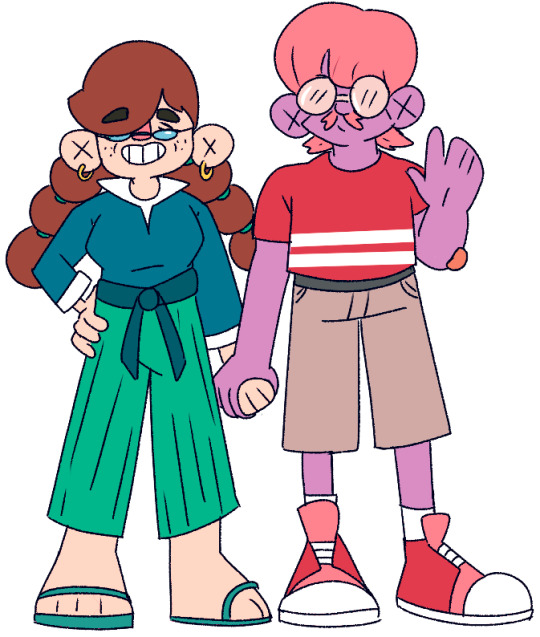


Teaser:
A computer game enthusiast, “E” travels blindly through time, changing her past and future only to arrive at an unfamiliar reality.
Synopsis:
E is an average girl who plays way too many PC games, as a result of this she has a somewhat zombie-like appearance. One day when playing she travels through time and visits her past, however, she is oblivious to the fact that she time travelled and is constantly glued to her PC screen through the entire phenomenon, not realising she’s permanently altering her past. A tragic event occurs in front of her just as she time travels back, this causes her future to change without her knowledge or memories of the experience ever occurring, thus leaving E to return to an unrecognisable life.
Plot/ Animation Techniques:
This story is about a young teenage girl oblivious to the world around her, which inevitably ruins her life and changes the lives of the people she cares about in the past.
The story unfolds with little clues and hints that the past E visit is her own and that the people that she encounters are her parents (for the audience to relate to the character E but at the same time feel for her too).
Hopefully, the software I use this time would be TV Paint compared to Photoshop from my last project, but I guess whatever software I use I want to convey to the story with a lot of lighting in my animation to symbolise the bigger picture, what is happening around the character and how it can affect the story.
Soundtrack/ audio:
For my two minute film I don’t feel like I should have audio as I want the audience to focus more on the background then the characters talking, I do though want a sort of chilling sound in the background that slowly sounds darker as the film progress.
All Character Sheet/ information of that character:
E : She 19 years old female, she enjoys playing PC games, isn’t really interested in making friends unless it’s online, and doesn’t really leave her room. Although she seems unsociable, she has a big heart for the people she cares about.
Like her parents!
Kara & Karl Jeffery (age 32 and 35) both of her parents care for and play with E so they support her dream of becoming a pro gamer, although they worry for their daughter when she doesn’t leave her room for 2 weeks. Kara is outgoing and Karl can be quiet, they are the perfect couple.
This is the younger version of Katelyn Jeffery (age 11) before she dyed her hair and formally goes by E. Katelyn was a joyful, outgoing child that was very curious about the world around her before she played video games.
Concept Art (Style Frames):
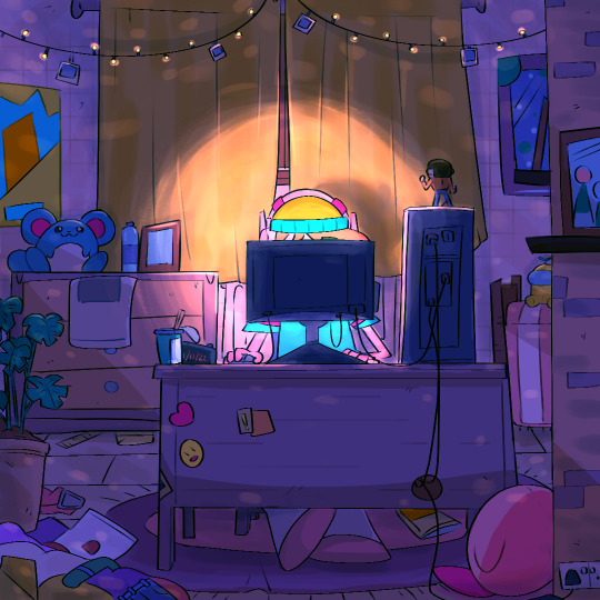
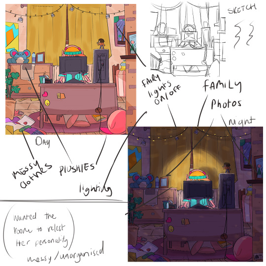
I wanted to convey the bigger picture when drawing this concept art with a sort of night and day as the character E isn’t fazed with the things around her and is glued to the screen, not realising the lights keep flickering.
Late Night Gaming The Full Story: ( new title: Absent minded space child)
The gamer girl known as “E” casually starts her day playing games in a very messy room with her favourite items in the background (Pokemon, family portraits, figurines, anime posters). One night as she prepares for a gaming session, a pop-up ad appears on her screen called “time travellers the game” (free 1-hour trial). E willingly downloads the game and opens the application. This then quickly shoots her 8 years back in time (the audience can know what year she visits as the calendar on her desk shows the date and time she time travels)
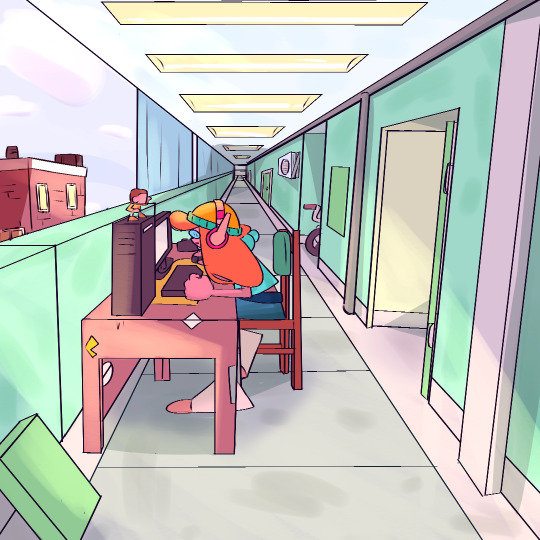
E is transported into a long hallway where a family of three (a mother, father, and young child) are exiting their flat.
They are startled to see a teenage girl on her PC in front of their door however though nothing of it and assuming she was the new neighbour's child (E also doesn’t pay any attention even oblivious that she just travelled in time as she is too invested in the game).
After the family leaves, E travels through time again, however, this time she moves forward in time where she is in a gaming store surrounded by other, oblivious gamer’s a father and daughter walk by.
E then travels to a few hours later but this time into the middle of a road at night where an ongoing taxi is heading her way, E still doesn’t notice her surroundings, however, can time travel out of the situation, unfortunately, the passengers in that taxi were harmed only leaving one survivor.
For the final scene E is in a foggy field wherein the far distance the audience can see figures in the background of fog surrounding two graves and a small silhouette. Finally, E returns to 2022 to a clean room where most of the items in the background are gone and revealing that the two people that died were her parents as the family portrait in the background is replaced with a shrine dedicated to them. E finally switches off the PC and heads out the door into the hallway to visit her dead parents.
(NOTE: a Dark twist can be E revealing that now she is in a wheelchair due to “the accident”).
2 notes
·
View notes
Text
Seven Types of Game Devs And The Games They Make
The Computer Science Student
The computer science student had to write a game for class in the fourth semester. The game must demonstrate OOP design and programming concepts, and solid grasp of C++.
This game is written not to be fun to play, but to demonstrate your skill to the professors - or to their poor assistants who have to read the code and grade the accompanying term paper. The core loop of the game is usually quite simple, but there are many loosely connected mechanics in there that barely don’t really fit. For example, whatever the core gameplay is, there could be birds in the sky doing some kind of AI swarm behaviour, there could be physics-enabled rocks on the floor, there could be a complicated level and unit editor with a custom XML-based format, and all kinds of weird shaders and particle effects.
And with all this tech infrastructure and OOP, there are just two types of enemies. That’s just barely enough to show you understand how inheritance works in C++.
The core gameplay is usually bad. Un-ergonomic controls, unresponsive game feel, flashy yet impractical 3D GUI widgets make it hard to play - but not actually difficult to beat, just unpleasant. The colours are washed-out, and everything moves a bit too slow. There is no overarching design, the moment-to-moment gameplay is not engaging, and the goal feels like an afterthought.
But that’s ok. It is to be expected. The professors are CS professors. They (or rather their assistants) don’t grade the game based on whether the units are balanced, whether the graphics are legible, or whether the game is any fun at all. They grade on understanding and correctly applying what you learned in class, documentation, integration of third-party libraries or given base code, and correct implementation of an algorithm based on a textbook.
The CS student usually writes a tower defense game, a platformer, or a SHMUP. After writing two or three games like this, he usually graduates without ever having gotten better at game design.
The After-Hours Developer
The after hours programmer has a day job doing backend business logic stuff for a B2B company you never heard of.
This kind of game is a labour of love.Screenshots might not look impressive at first glance. There is a lot going on, and the graphics look a bit wonky. But this game is not written to demonstrate mastery of programming techniques and ability to integrate third-party content, tools and libraries. This game was made, and continues to be developed, because it is fun to program and to design.
There is a clear core loop, and it is fun and engaging. The graphics are simple and functional, but some of them are still placeholder art. This game will never be finished, thus there will always be place-holders as long as the code gets ahead of the art. There is no XML or cloud-based savegame in there just because that is the kind of thing would look impressive in a list of features.
More than features, this games focuses on content and little flourishes. This game has dozens of skills, enemies, weapons, crafting recipes, biomes, and quests. NPCs and enemies interact with each other. There is a day-night cycle and a progression system.
While the CS student game is about showing off as many tech/code features as possible, this kind of programmer game is about showing off content and game design elements and having fun adding all this stuff to the game.
This game will be finished when the dev gets bored with adding new stuff. Only then, he’ll plan to add a beginning and an ending to the game within the next six months, and go over the art to make it look coherent. The six months turn into two years.
The after-hours developer often makes RPGs, metroidvanias, or rogue-like games. These genres have a set of core mechanics (e.g. combat, loot, experience, jumping) and opportunity for a bunch of mechanics built around the core (e.g. pets, crafting, conversation trees, quest-giving NPCs, achievements, shops/trading, inventory management, collecting trinkets, skill trees, or combo attacks).
The First-Time Game Jammer
The first-time game jammer wants to make his first game for an upcoming game jam. He knows many languages, but he does a lot of machine learning with torch7 for his day job, so he has decided to use LÖVE2D or pico-8 to make a simple game.
This guy has no training in digital art, game design, or game feel. But the he has a working knowledge of high-school maths, physics, and logic. So he can write his own physics engine, but doesn’t know about animation or cartoon physics. He doesn’t waste time writing a physics engine though. He just puts graphics on the screen. These graphics are abstract and drawn in mspaint. The numbers behind everything are in plain sight. Actions are either triggered by clicking on extradiegetic buttons or by bumping into things.
The resulting game is often not very kinetic or action-oriented. In this case, it often has a modal/stateful UI, or a turn-based economy. If it is action-oriented, it could be a simple platformer based around one core mechanic and not many variations on it. Maybe it’s a novel twist on Pong or Tetris.
The first-time game jammer successfully finished his first game jam by already knowing how to program in Lua, copying a proven game genre and not bothering to learn any new tools during the limited jamming time. Instead, he wrote the code to create every level by hand, in separate .lua files, using GNU EMACS.
The Solo Graphic Designer
The graphic designer has a skill set and approach opposite to those of the two programmers described above. He is about as good at writing code as the programmer is at drawing images in mspaint. The graphic designer knows all about the principles of animation, but has no idea how to code a simple loop to simulate how a tennis ball falls down and bounces off walls or the ground. He used to work in a team with coders, but this time he wants to make his own game based on his own creative vision.
The graphic designer knows all about animation tools, 3D modelling, composition. He has a graphic tablet and he can draw. He knows all about light and shade and gestalt psychology, but he can’t write a shader to save his life.
Naturally, the graphic designer plays to his strengths and uses a game engine with an IDE and a visual level editor, like Unity3D, Construct, or GameMaker.
The graphic designer makes a successful game by doing the opposite of what the coder does, because he does it well. The screenshots look good, and his game gets shared on Twitter. He struggles writing the code to aim a projectile at the cursor in a twin-stick shooter, but we live in a world of Asset Stores and StackOverflow.
The resulting game is a genre-mixing thingy full of set pieces, cut scenes, and visual-novel-style conversations. The actual gameplay is walking around and finding keys for locks, but it’s cleverly recontextualised with a #deep theme and boy does it look pretty.
The Engine Coder
The engine coder is like the CS student on steroids. He has nothing to prove. He knows his C++. He lives in a shack in Alaska, and pushes code to GitHub over a satellite connection. He also knows his Lua, C#, Python, and Haskell. The engine coder writes a physics engine, particle system, dialogue engine, planning-based mob AI, savegame system, a network layer and GUI widget library.
He has written five simple demos for the engine: A first-person walking simulator, a third-person platformer, a very pretty glowing orb swarm shader thingy, a non-interactive simulation of a flock of sheep grazing and a pack of wolves occasionally coming in to cull the herd with advanced predator AI, and a game where you fly a spaceship through space.
Somebody comments in the forums that it’s hard to even write Pong or Tetris in the engine. The Engine Coder is more concerned with optimising batched rendering and automatically switching LoD in the BSP tree so you can land on planets in space without loading screens.
The Overeager Schoolboy
The schoolboy has an idea for a game. He saves his money to buy Game Maker (or RPG Maker) and tells his all friends about his amazing idea. Then he makes a post about it on tumblr. Then he makes a sideblog about the game and posts there too, tagged #game development.
Unfortunately, the schoolboy is 15, and while he is talented, he doesn’t really know how to program or draw. He’s good at math, and he can draw with a pencil. Unfortunately, he wants to learn digital art, level design, and programming all in one go. He already knows all the characters for his game, and he writes posts about each of them individually, with pencilled concept art and flavourful lore.
Even more unfortunately, our schoolboy is hazy on how big the game is actually going to be, and what core mechanic the game should be based around.
After designing sprite sheets and portraits for ten characters you could add to your party, plus the Big Bad End Boss, he realises that he has no idea how to get there, or how to make the first level. He starts over with another set of tools and engine, but he doesn’t limit his scope.
In an overdramatic post two months later, he apologises to the people who were excited to play the game when it’s done. A week later he deletes the tumblr. He never releases a playable demo. He never gets constructive feedback from game developers.
The Game Designer’s Game Designer
The game designer’s game designer is not exactly a household name, but he has done this for a while. While you have never heard of him, the people who made the games you like have. All your favourite games journalists also have. Through this connection, many concepts have trickled down into the games you play and the way your friends talk to you about games they like.
The game designer’s game designer has been going at this for a while. When he started, there was no way to learn game design, so he probably studied maths, psychology, computer science, industrial design, or music theory.
The games fall outside of genres, and not just in the sense of mixing two genres together. They are sometimes outside of established genres, or they are clearly inside the tradition of RTS, rogue-likes or clicker games, but they feel like something completely new.
The games of the game designer’s game designer are sometimes released for free, out of the blue, and sometimes commissioned for museums and multimedia art festivals. Some of them are about philosophy, but they don’t merely mention philosophical concepts, or use them to prop up a game mechanic (cloning and transporters, anyone?). They explore concepts like “the shortness of life” or “capitalism” or “being one with the world” or “unfriendly AI” through game mechanics.
But they also explore gameplay tropes like “inventory management“ or “unidentified magic items“ or “unit pathfinding“.
Sometimes bursts of multiple games are released within weeks, after years of radio silence. Should you ever meet the game designer’s game designer, you tell him that you got a lot out of the textbook he wrote, but you feel guilty that you never played one of his games. So you lie and tell him you did.
17 notes
·
View notes
Text
10/10/2019 - MFA Design
I had wanted to begin this blog with a “Week 1″ submission as I intend to use it to keep a record of the work I do week by week over the course of the next few years as I make my way through the MFA Design degree I am taking part in.
However, it is already several weeks into the course and beginning this blog with Week 3 doesn’t sit right. Instead, a date will have to suffice and along with that a summary of the past few weeks work.
Week 1
A lot of this week involved getting situated on the course and learning the way around the building, library and the studios that the course would take part in. As well as a course break down and an overview of how this semester will be run.
Starting the first week I began thinking of concepts for bigger pieces I wanted to do and how I could gain the skills to complete them. Coming into this course I’m rather new to illustration and graphic design, the sectors of the degree I intend to specialise in, and while I know I want to build a portfolio of graphic work that shows off the potential of my illustrations I also know I must begin by gaining a good understanding of the fundamentals, for now, I believe those to be;
- Anatomy
- Figure Drawing
- Colour Theory
- Typography
- A Broader Capability With Different Mediums
Over the course of this blog, I am sure other areas of study will present themselves but these seem the aptest to focus on, to begin with.
Week 2
Having set up a meeting with the Illustration tutors for the following week I gathered a portfolio of the work I had done previously and continued to think of concepts for my future projects. I looked to other contemporary artists I follow for inspiration - Jen Bartel, Babs Tarr, Wilson Cowles, Ant Lucia and many more when thinking of these broader concepts. Each of these people is artists with great portfolios and inspiring careers so keeping them in mind when thinking of the portfolio I intended to build was key.
I want to build a strong character design repetiteur, develop a distinct style and also learn professional design skills that could also be useful in industry jobs. A few of the concepts I had envisioned might help me with this are as follows;
Movie Posters - With a Twist
While thinking about the potential pieces of work I wanted to create for this project my eyes fell on the copy of the Heathers movie that lay sitting on my desk borrowed from a friend to finally watch after years of never getting around to seeing it. It’s not a surprise why my focus was drawn to it - the design of this cover was bold and striking against the stark white background and the hand-painted illustration of the main characters is something I’d always admired in the poster designs for older movies. The trend making a resurgence with the advertising for media like Stranger Things - one of the several current series that plays on the feeling of nostalgia. It wasn’t necessarily this nostalgia that I intended to replicate in my work but rather the feeling a range of poster types can illicit - this example in itself just happening to capture one of them.
I had the idea of using the graphic design in the posters to develop some of my skills in that area while simultaneously providing an excellent platform to show off any character illustrations that may be done. It simply came down to the subjects at hand. Rather than recreating existing movie posters I had thought about the idea of taking myths, legends and other stories and generating posters and designs in a similar graphic fashion of the movie posters of today for the old stories from the past.
Kintsugi - or The Art of Golden Repair
Another concept for a project that came to me from an entirely different direction was a cross-medium project with a focus on the illustrative work and how it could be used in marketing. Where Kintsugi comes into this - is key.
Kintsugi is “the Japanese art of repairing broken pottery by mending the areas of breakage with lacquer dusted or mixed with powdered gold..” or other metals to create a beautiful new product. The practice eliciting ideas of finding the beauty in the broken - which has always been a wonderful notion to me.
The idea for this particular project came to me while watching a documentary on the beauty industry as a whole, while I don’t often take part in the use of makeup products myself I do find the industry fascinating, this got me thinking about the positive side of the industry. While the notion modern media marketing often portrays of having to wear makeup to be beautiful feels entirely wrong to me I also appreciate how people can use these products as a form of self-expression, to stand out and feel different. To make a statement.
Much like with a piece of pottery repaired with the Kintsugi method putting a piece of makeup on can also feel, to some, like a finishing touch that helps make their beauty stand out. That in mind, the concept for the project was to use this Kintsugi practice in a cross-medium fashion. Initially beginning with portrait illustrations which will then be shaped and printed in ceramics - the pieces themselves once crafted then broken, before being put carefully back together - the final pieces becoming the references for the second series of portrait illustrations. The golden lines complimenting the makeup which will also have been added to these portraits.
This project combines a lot of different work I have an interest in learning and feels to me much more unique. However, it is still early in the course and many more ideas may spring to mind before I set to work on my final project. These are simply notes of the concepts I am considering in Week 2 for reference futher down the line.
#Illustration#MFA Design#Graphic Design#Art#Week 1#Week 2#10/10/19#Kintsugi#Heathers#Movie Posters#Film#Makeup#Lipstick#Marketing
3 notes
·
View notes
Text
Art Direction of Tabletop RPGs
Dungeons and Dragons is good at being Dungeons and Dragons.
That shouldn't be a controversial opinion, and it's not worded as one, yet I have one friend who derisively labels it as a war game, and another friend who believes D&D is all you need in regards to TRPGs. These two are from distinct eras of my life, and have never met.[1]
My moderate view is such: Dungeons and Dragons is good. It's not the ultimate system, but if you want a western fantasy built on the framework of Tolkien, Fifth Edition is the way to go. You could use a different system, in theory, but no other system has the same reach and stability. Everyone knows D&D, which is valuable.
Its combat and mechanics are a good balance of grit and function, and it's mostly teachable. My friend's 'wargaming' derision is because he believes it doesn't support role-playing well. Something about the guy who wrote Dungeon World saying if it's not in the rules, it’s not in the game.[2] But I've always felt that D&D makes the right decision in not bogging it down with structure and dictating the 'correct' way to role-play.
However, if you want to do anything else (Sci-fi, non-european fantasy, superheroes, Slice of Life), best case scenario the seams will creak in the attempt. D&D is good at being D&D, and that's the limit.
I appreciate D&D. I'll play D&D, happily!
There's a reason I bristle when “DM” is used as the generic term.
That said, I've always had a sort of tonal disconnect when I play D&D, and it's because of the art.
Fair warning, what follows is a lot of personal interpretations and vague mumbling trying to relay a point. I’m not actually an authority on anything.
(Dungeons & Dragons owned by Wizard of the Coast . Image sourced from Wikipedia)
Dungeons and Dragons does not have pretty art. It’s technically well done, and far from ugly, but it’s not actually inspiring. Above we have the cover of the Player’s Handbook, the first thing most new players see. Setting aside that the focus of the cover art for what should be the book about Player Characters is a giant monster man[4], the cover is very orange. The actual people are composed of muted, neutral colors, and the background is vague and out of focus.
It’s not really conveying an air of fantastic worlds and larger-than-life characters (giant wearing a dragon skeleton aside). It coveys oppression, monotony, and “realism”.
(Pathfidner owned by Paizo. Image sourced from Wikipedia)
Pathfinder’s core rulebook, on the other hand, is colorful. Look at that big, bright dragon![5] Sensibly dressed Fighter Man’s brown clothes are still bright enough to pop him out from the green-grey dungeon background[6], and Fantastic Sorceress’s red dress is also bright and helps frame the Fighter as her hand glows with magic.
While both covers feature a woman with an orb of magic, D&D’s cover shows magic as contained and lighting a small space, while Pathfinder’s magic is big and trailing, hinting at movement.
Actually, D&D’s mage girl doesn’t have a cohesive movement. Is she falling from above? Jumping in from the left? Where is she going? It doesn’t really follow in a meaningful way.
Anyways: color. Yes, yes, I know the plague of brown and and muted tones is a much whined about criticism, and it might seem odd from someone calling himself SepiaDice, but neutral tones have their place; usually as background and supporting other colors to pop more.
Besides, Sepia has a noble history in film, the brown range isn’t a common image color, and Sepia is fun to say.[7]
Color choice is very important. Bright colors draw the eye and make visuals more distinctive. Bright colors also denote and bring energy to things. Dull colors are used for locations meant to be calm and sedate. If you want the characters and locations to seem fun and full of life, you fill it with bright colors.
Everything breaths, adventure can strike at anytime!
Dull colors, and it’s hibernation. People are around, but they don’t seem to enjoy it.
But let’s turn to the visual storytelling: what does each cover tell you about life in their setting?
D&D: lots of posing to look fancy, but there’s no real sense of energy. Jumpy Magerson’s weird Megaman hop has been mentioned, of course. The Giant has a look of dull surprise as he drops Jumpy Magerson,[8] as he holds a sword in the non-active hand. Foreground fencer man is wide open, holding his own foil up and away from where it might accidentally jab anyone. The locations is… orange? Looks like there might be lava geysers?
Patherfinder: A dragon roars at its enemies! Teeth bared, tongue coiled, tendons on display! Wings unfurled to make it seem larger! The fighter is yelling back at the dragon, his weapons mid-swing! Shoulder forwards to defend the rest of the body! The Sorceress is holding a firm stance as she casts a spell that crackles with arcane energy!
Pathfinder’s cover tells a story of epic combat, fizzly magic, and energy. D&D’s cover tells a story of two adventurers existing in a space also occupied by a giant.
Now, both of these systems have the same ancestry, as Pathfinder is an iteration on D&D 3.5.[9] But one sparks more joy when I look at it.
But let’s do another case study. I’ll need an audience volunteer, and my brother’s the only person immediately on hand.
I’m going to make him list three qualities of goblins real quick:
Green
Wimpy
Sneaky
Awesome. Don’t know if the green text translated, but those are what he wrote. Give him a hand!
So, with those three traits in mind, let’s look at a goblin picture from D&D Beyond:
(Owned by Wizards of the Coast. Source here)
Like, you can’t say D&D doesn’t call that a goblin, it’s literally on the goblin page.
This guy is yellow. He’s built like a four foot tall WWE Wrestler. He’s defending with his advancing arm as he rears up to smack ya!
(Okay, “Sneaky” is a hard one to argue.)
Moving on, what does Pathfinder call a Goblin:
(Owned by Paizo. Source here)
Look at this charming miscreant! Green. Big ole head. Good mix of of ugly and oddly adorable. Probably two feet tall, and happens to want your two feet, please, but you could step on him if you’d like.
He also looks like a Gremlin
(An adorable little chaos monster owned by Warner Brothers. Source)
Point is, Pathfinder’s more cartoony take on the classic monster feels more in the spirit of the thing. Every time I see one of those goofy faces, I feel like I’m in for an enjoyable time.
Bringing us back around to the point of this essay: the art direction of D&D bogs down my theater of the mind. The art in the rulebooks don’t inspire creativity or fantastic visions. It inspires… dull, lifeless people walking through dirt roads flanked by dead grass.
I don’t enjoy looking at D&D’s art. Relatedly, I don’t like looking at the art of Magic: the Gathering, whose style I can’t help by see in every D&D sourcebook cover I see. Neither game invokes an inviting world, but utilitarian ones that exist to give quick, forgettable visual flair to represent mechanical card effects.
To save making this long essay even longer and unfocused, I’ll save talk of actual ‘canon’ lore for another time.[10]
So why do I, a semi-professional funny man and sad dreamer who can’t actually draw, want to talk about rulebook art?
Well, I’ve always felt a disconnect when I play D&D. I make the characters, I roll the dice, I attempt to role-play, but I’ve always had an emotional gap between me and the character I’m playing. I like the concept, but when I use my theater of the mind, the character feels stiff and divorced from everything. Kind of like the 5th Edition rulebook.
Then I saw this:
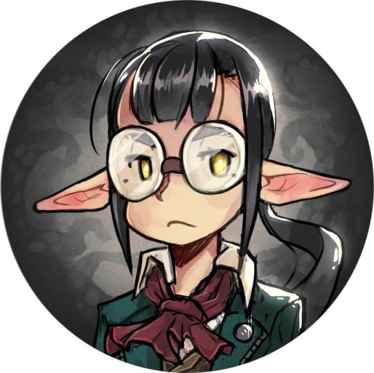
(Source tweet. All of this artist’s work is great and I wish I could hire them.)
This half-elf showed up on my twitter timeline, and my first thought was ‘How come my characters don’t look like that?’
Soon followed by ‘Why couldn’t they?’
Then I completed the trilogy with ‘Why haven’t I imagined my characters in a style appealing to me?’
As I was deep into contemplating what sort of aesthetic I consider my “brand”,[11] it was entering a mind primed to start overanalyzing.
So, how do I imagine my characters? In the neighborhood of the D&D art, if I have firm concept. Micah Krane always was mentally nebulous to me, just kinda being a generic half-elf dude. Trix (who was created for the brightly colored Pathfinder) is green-haired and wears a tail coat, but otherwise is also normal looking in my mind’s eye. In the last two D&D campaigns, Tybalt was also vague in appearance, and Teddi had Goat horns, but those were meant to stand out on a generic rogue character.[13]
But you know what I’ve never put on a character I’ve played? Glasses.
I hope that those who read my various media reviews[14] don’t need this overly explained, but I like glasses. I, myself, don’t wear glasses, but I find them to be great accessories in character design. Frames the eyes, come in a variety of shapes, adds bit of extra visual interest. I always point out Meganekkos and pay them extra attention.[15] I really, really like girls with glasses.
But I’ve never made one. Because there’s no cute design in D&D rulebooks. Just a range of handsome people to ugly halflings.[16]
That is the effect of art design in a system. It sets tone, expectations, and aesthetic for the players. It’s so ingrained that everytime I see art of players’ characters that break the standard, it always takes me aback. It’s inspiring to see artists who manage to divorce D&D the game from D&D the art.
I want to imagine fun, personally appealing characters. But the subtle direction of the insert art as I look through to rulebook, or the provided character portraits of D&D Beyond does not suggest things I like to see. It infects the mind, and leaves specific molds. People in practical, mundane clothes, walking down drab, uninteresting roads.
It’s the same lack of escapism that makes Western (Video Game) RPGs super unappealing to me.[17] Dark Souls, Elder Scrolls, Bioshock don’t look like fun places to be, they look tiring and full of splintery furniture waiting to do 1d4 nonlethal damage.
So I have to talk about anime now.
My mother was staying at my home a little while ago, and I turned on My Roommate is a Cat. This prompted her ask me about what about anime was appealing. I couldn’t form a competent answer for the question at the time, but it’s had time to churn in my head.
Anime is a good middle ground between cartoon and realism. It can broach deeper topics and more mature storytelling than children’s cartoons,[18] without sacrificing a light visual tone and fantastic imagery. Also, the fact that it’s produced by a non-American, non-European culture lends a degree of separation with cultural expectations and tropes. Enhances Escapism.
Luckily, in (very) recent years, after generations of exchanging video games and animation back and forth, Japanese Tabletop RPGs are starting to join in on the fun.
Which means I can look at Ryuutama.
(Image copied from DriveThruRPG. Brought over the pacific by Kotodama Heavy Industries. Buy this book.)
I love this system.
Watercolor art direction. Layout evokes a spellbook. Two Characters and a Dog take the focus on the cover, while the road signs and tiny shrine in the background invoke the emphasis on travel and wonder.
The interior art?
(Taken off the Ryuutama (english) website. Buy this book.)
Well, that makes the game just look like fun. Cartoony characters fighting cat goblins. Conflict, but it doesn’t make life feel like a constant struggle. A world I wish to inhabit. There’s also more detailed images of dragons and other world-establishing pictures mixed in to give the art range, but it’s this sort of charming that makes Ryuutama the first rulebook I actually sat and read cover to cover.[19] It’s a good system I already reviewed. Buy this PDF, maybe they’ll reprint the physical book.
Anyways, I’ll admit, the art’s a little too simple for D&D. Perfect for Ryuutama, and the end of the scale I want my mental image to be, but overshoots the sweet spot. And it’s difficult enough to find players for the much more popular 5e, so Ryuutama exclusivity would grind my playtime to zero.
Still, Ryuutama does a great job of setting it’s light, fantastic tone, where D&D has failed me. The art direction of the books, and years of exposure and defaulting to what I assume D&D should look for establishes a mental habit that’s hard to break. Wizards of the Coast has drowned nerd spaces with its particular kind of art, especially with MtG plastered all over hobby stores, deck boxes, dice, playmats, and even D&D sourcebooks.
That’s not even accounting for fanworks and the speculative fiction art in online spaces.
So what do I want to look like? Were I blessed with talent or with patient to actually learn to draw well, what would I be referencing?
What about what set my expectations of fantasy years before IndigoDice invited me to that fateful Traveller game?
(Screen cap of Tales of Vesperia grabbed from here.)
Well, okay, what I’m actually thinking about is Tales of Symphonia, but Vesperia’s graphics are kinda what nostalgia tells me Symphonia tooked like, as opposed to what it actually looks like.[20]
Look at that verdant town! Warm lighting, bright characters, leaves growing to depict life. A hotel built into a tree. This is a fantasy world that is unashamed about life thriving.
Forget solarpunk. This is my aesthetic.
As for the party members…
(Okay, Judith’s a little gratuitous, but The Definitive Edition lets me put her in a suit, and she’s awesome. Art stolen from here.)
Oddly enough, as far as JRPG outfits go, these are pretty tame with details.[21] Mostly bright, popping colors, even Yuri’s dark clothes are done in such a way to not feel grim and edgy, hints of personality, and I just enjoy looking at them.
The Tales series as a whole does a good job of taking European fantasy and applying Japanese whimsy to the design. Also yukatas. Every member looks like the hero of their own story, while still being part of a cohesive whole.
Which is, you know, the ideal way to operate as a TRPG party.
So, what’s the take away?
Artists, keep being creative. Pull inspiration in from things besides the rulebooks and Critical Role. Look at the other things you love and bring visual flare and whimsy to your art. Then share it. Ignite the passions of those of us who can’t do the draw-good thing.
Players, play with the tropes. I love doing it narratively and mechanically. My favorite rogue is still my neutral good stage magician who would never do a crime. Explore what’s possible in the freeform world of tabletop games, both in play and your Theater of the Mind.
Game designers, branch out with the art. And stop using Powered by the Apocalypse as a crutch.[22]
Hope this long ramble was enjoyable and cohesive. If you want more of this, my other works, and maybe to allow me to make an actual play podcast, consider supporting me through Patreon or Ko-fi.
Until next time, may your dice make things interesting.
[1] Though I would love to read a transcript of the two discussing it. It'd be a fun debate.
[2] I don't like Powered by the Apocalypse for precisely this reason. Every actual play I've heard with the system has players talking about their characters in the abstract, because they're just pressing the buttons on their character sheet.[3]
[3] I maybe should do a breakdown of PbtA one day.
[4] Which is pretty poor direction. Do an epic group shot of characters battling a horde around them.
[5] None of the D&D core books has a dragon on the cover. Come on, that should’ve been a gimme!
[6] Similar note as footnote 5.
[7] Also CornflowerBlueDice is too long to be catchy.
[8] I figured it out!
[9] I haven’t looked at at Pathfinder’s forthcoming second edition. Fifth Edition reclaimed it’s throne as The ubiquitous system after fourth lost its footing, so I don’t think there’s much point.
[10] TL;DR: I ignore it.
[11] Pulp Fantasy is too mundane. Steampunk is too victorian-y. Sci-fi fractals into so much. Solarpunk has appeal, but isn’t quite right.[12]
[12] Haven’t really found the term.
[13] Let’s not examine that I put more thought into female character design than male for the moment.
[14] Which you should. Validate my efforts!
[15] And desperately pray it’s considered innocent enough of a fetish that I don’t have to stop.
[16] Never liked halflings. Gnomes are fine. Halflings, in art, have always been off-putting and malformed.
[17] That and the emphasis of character customization kneecapping the Player Character’s narrative involvement. Can’t give them a personality if that’s the end user’s job!
[18] Even Avatar: The Last Airbender felt like it had to sneak the narrative depth it achieved past corporate.
[19] I do need to give it a reread, though. Relearn the system.
[20] It still looks good, especially the environment, but the characters are kind of… leaning towards chibi.
[21] This, specifically, is why I chose to highlight Vesperia over Rune Factory.
[22] Technically nothing to do with this essay, but I can’t stress this point enough.
2 notes
·
View notes
Text
FMP Evaluation 1/2
Utopia/Dystopia
I was interested in my flipside theme because it immediately reminded me of futuristic and apocalyptic cities. When I thought about a utopia and dystopia, I immediately pictured the city, atmosphere and colour palette.
Three pieces of research that I did which impacted and influenced my ideas were;
David Ambarzumjan;
David’s art was very impactful when I was researching my theme, and was also pert of the reason I chose it as I had previously been a fan of his work for a while before!
The juxtaposition between the natural and unnatural, the window within the image was exactly what I imagined.
Martin Wilner;
Wilner’s work was very impactful as it is very dystopian. This particular artwork is very surreal and I think that the word ‘surreal’ describes the idea of a dystopia very well.
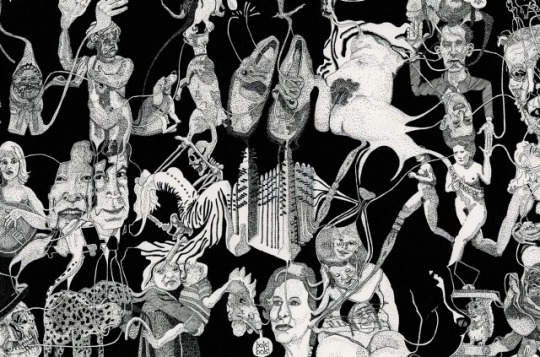
Deanne Cheuk;
Deanne’s work is somewhat utopian with its simple but vibrant colours. This impacted my work as it inspired new ideas for my utopian outcome.

One piece of wider world research that I did which links to my theme and outcomes is my research on angels and demons. I think this because my outcomes symbolise good and evil, which links to the idea of angels and demons, angels being good, demons being evil.
To sum up the concept and ideas behind my theme and outcomes; my theme links to the idea of good and bad as in my mind, a utopia is something good and a dystopia is usually associated with evil.
My two of my outcomes feature people/roles associated with evil and crime, and the three others feature people/roles associated good and safety.. My outcomes feature two different art styles for two reasons.
One of the reasons is that I wanted to show off my two strongest art styles, and the other reason being that the dystopian outcomes have more colour, which links to my opinion that villains in books have more depth and personality than the hero, the good character, and so therefore I made the dystopian outcomes more bold. This is also the reason why the utopian outcomes have only a little colour and looking somewhat realistic. This is because heroes usually are rather mundane other than being strong.
I have only experimented with digital art while creating my FMP outcomes, however, in college I have experimented with multiple materials, processes and techniques.
One of these processes involved working with Kentmere Photographic Paper, which is a type of paper used for photographs which is made using silver nitrate emulsion. The paper I used for this project was 5”x7” and I very much enjoyed the process and outcomes!


This process has taught me that not all outcomes have to look amazing, in fact none of them have to look amazing, as long as I don’t hesitate to try new methods and styles.
Over this whole FMP project, my final outcomes are definitely my strongest and most successful outcomes. I’m not surprised though as I knew from the beginning that my outcomes would be the work I put the most effort and thought into. I also think that this is because I was able to do my own thing and do it in my own style.
It was also very impactful to my learning as it taught me to work on my time management as I had almost ran out of time while drawing my last final outcome piece.
I started of this project thinking I was going to draw a city landscape, however, after making some sketches for my planning, I realised that I didn’t really like the outcomes as much as I had hoped I would’ve, so I went back to researching ideas which linked to my theme utopia/dystopia.
I researched the ideas of black and white, light and dark, day and night, enchanted forests and dark forests, and I eventually got to the idea of heaven and hell. This led me to do some research into angels and demons and that, in result, I got my theme, good and evil.
I thought about how I could turn the idea of good/evil into visual outcomes, and I decided to split it and draw a villain and a vigilante which links to evil and I drew an angel, a guardian and a warrior which links to the good.
Like I said earlier, this project, mainly the creation of my final outcomes taught me to work on my time management and working with a looming deadline pretty much forced me to learn! I am very very proud of all five of my outcomes! They are exactly how I hoped they would look when I got the idea!


If I could display my work anywhere in the world at any time, I would display it in the modern day on a website. This is because the idea of good has the same feel as the future, and evil reminds me of the past, so my work would be best presented directly in the middle of the far future and ancient years. I would display my work on a website as the internet allows us to learn about the past, and it’s also somewhat futuristic, depending when you look at it.
Ten words to describe all five of my outcomes collectively would be; symbolic, interpretive, effective, portrait, powerful, emotional, atmospheric, historic, expressional, compelling.
If I needed a soundtrack to go with my outcomes, I would choose the suicide squad soundtrack to go with the dystopian outcomes. This is because the movie is very similar to the vibe that my outcomes give off. I would use a soundtrack with songs used in meditation as the soundtrack for the utopian outcomes. This is because I find these artworks very relaxing to look at, and would be complimented well with soft, calm music playing alongside them.
I spent a lot of time making these outcomes. One of my dystopia outcomes took 8 hours to complete, the other took 16 hours to make. Each of the utopia outcomes took 4-5 hours, so in total I’ve spent around 39 hours making these outcomes. I spent around 10 hours a week planning and doing research for my project outside of college.
I work in my room on my bed when doing FMP and college work as it’s quiet, comfortable and it keeps out distractions.
0 notes
Text
Picasso and Bennet
Compare and contrast: Picasso and Bennett
In this essay I have chosen to consider two, I think completely different, artists that I like and admire for different reasons, Pablo Picasso, founder of Cubism and a more contemporary American artist Stephen Bennett. Bennett is a commercial portrait painter. Bennett uses bright colours to capture images of mostly native people from southern hemisphere countries and islands.
I will consider here the two artists and the contrasting approaches they took. I will outline what I think they are trying to say in their work, consider any similarities and highlight where there are key differences.
Picasso was talented in different mediums. He was a sculptor as well as a painter. And he was also a print-maker. He was born on October 25th, 1881 in Malaga, Spain. His father taught him to draw and paint as a child. By the time he was 13 his skills surprised his father. At school Picasso doodled in his books (as did the next artist Stephen Bennett that I will compare him to). In 1895 Picasso was in Barcelona and applied to join the school of fine arts. Although he was too young (14) he got a place because of the skill he showed at the entrance exam. He started to skip classes though to sketch the streets of Barcelona.
Picasso produced thousands of pieces of art during his life and influenced many other artists. He produced art in many styles before and after his Cubist period. His style moved from realistic in the early period of his life to more abstract. He went through different styles during his career from his Blue Period, Rose Period and his African period due to the look and influences of his art before he moved into the Cubist period. Interestingly in the African period Picasso was influenced by African indigenous tribal masks. Later I will outline the influence of native art and indigenous culture on Bennett.
Cubism was an avant-garde art movement developed around 1907-08. It started with Picasso’s Demoiselles D’Avignon. A couple of the faces in the painting reflect this African mask look. Picasso was incredibly innovative and was responsible for co-founding the Cubist movement alongside Georges Braque. Some say the term was coined in 1908, when the French art critic Louis Vauxcelles saw Georges Braque’s landscapes.
The subject and objects in Cubism are broken up into pieces and re-arranged on the canvas however the artist wants to place them. This gives the painting an abstract form. An example of this is ‘Girl with a Mandolin’ (1910). One of the main characteristics of cubism are that it has images of an object represented from different angles on the canvas at the same time. It is like you can see the back and front of an object at the same time. Cubism then brings the different views of objects or figures together. This approach means that paintings can appear fragmented and abstracted. Picasso aimed to show different viewpoints within the same space. This would suggest their three-dimensional form. In doing this the Cubists emphasized the two-dimensional flatness of the canvas instead of doing what other artists had been trying to do which was to give the objects in a painting the illusion of depth. So, in some images a woman’s face might look like both eyes are on one side of a face! A head’, said Picasso, ‘is a matter of eyes, nose, mouth, which can be distributed in any way you like’.
Cubism was partly influenced by the late work of artist Paul Cézanne in which he could be seen to be introducing the concept in painting things from slightly different points of view. And this art style stimulated other art styles. Picasso and Cubism inspired other styles like Futurism, Dada, and Constructivism in other countries and he continues to inspire artists. (Like me.)
Stephen Bennett is an American portrait painter. He was born in New York in 1961. He studied first at community college and then he went on to Fine Art at the State University of New York at New Paltz. From an early age, Bennett, like Picasso, constantly sketched the faces of his family, friends and people he encountered. During his college days in New York, Bennett focused on painting classes and studied the theory of colour. He has however always been focused on portraiture unlike Picasso who moved from one style to another frequently.
Before seeing his work I had painted a portrait of Chance the Rapper and when I saw Bennett’s work I could see some similarities in the way he used colour and the way I liked bright colour in my paintings. Bennett is a colourist . His portraits are in some ways an extension of the kinds of colour-filled portraits painted by artists like Van Gogh and Gauguin, who had also influenced Picasso, or slightly later the works of the French Fauves.
Bennett paints in great detail with fine brush strokes. This is completely different from Picasso who daubs paint and uses large brush strokes on many of his painting, in contrast to Bennett.
Bennett seeks out local people in developing countries to capture their faces. He shows some of their ritual jewellery and traditional clothes. Bennett’s portraits are mainly of people who live on various communities, continents, and small islands in the southern hemisphere. He paints large colourful paintings, some as big as 2.2 x 1.5 m. He says he wants to celebrate the world’s diversity through realism using bright colour. He observes people and he can bring out the beauty of a face by his play with colour. His aim is to work through until he captures 1000 portraits to reflect the diversity of these people.
Bennett, like Picasso before him, wants to promote peace. Picasso made political points though his paintings in Paris during the German occupation and in his portrayal of the horrors of Guernica. Bennett advocates tolerance through an art education and cultural exchange across the World. He founded Faces of the World, a non-profit corporation with a mission of “increasing cultural pride and affirming the importance of indigenous cultures who have been the true guardians of planet earth.” Money from the sale of his paintings of these indigenous people supports this foundation.
The styles of each artist are in sharp contrast. Where Picasso’s portraits like “The Accordionist” in Cubist style is abstract and fragmented the portraits of Bennett are bright with faces mostly front facing on flat planes but with realist detail. Picasso wanted to emphasize the difference between a painting and reality whereas Bennett seems to want to enhance reality by his detailed painting and use of colour.
Picasso moved through different styles, or periods, in his life, including Cubism, but Bennett is much more singular in his art style of portraits. People are invited to hire him for private portrait commissions of children, adults and family groups. A client can work with him choosing the style, size and colouring of a portrait. While Picasso was influenced by and collaborated with other artists, this is something that an expressive, experimental artist like Picasso did not do. Bennett adopts a modern approach where people sell their work and offer more customised packages through websites, instagram and other social media outlets.
To conclude, based on everything I have looked at, Picasso’s Cubist work and Bennett’s colourful paintings, we can begin to discuss the quality of the art work. I chose Bennett as he has more than impressed me with the hyper realist paintings that almost make me believe that these painting could be passed off as a photographic image. The detail in the wrinkles and so forth is amazing and catches my eyes constantly. Obviously the two artist have completely different styles but I’m stunned at the authenticity of his work. Picasso clearly took another approach to most of his work, his cubist pieces especially. One point to the cubism work, is the lack of detail, the abstract quality that entices the viewer. The cubism approach creates a form or even an indication of something special. It’s almost like a jigsaw or a puzzle where you are trying to piece all the parts together. I feel this also is a certain aspect to the work that Bennett loses when painting detail. In conclusion to detail ii would say I enjoy looking at bennets work a little more as I feel you can relate to the portraits a lot more, the characters of a painting now become human as the amount of detail involved.
Colour, colour is the number one priority in work, in my opinion. The colour for a piece will obviously depend on the composition of the work, clearly I’m a sucker for brightly coloured paintings, but the colours used in Bennets portraits are mesmerising, the vibratility of the colours exploding off of the work. It creates a sense of happiness or even pride. The problem is, that colour is completely dependent on the composition. As bright colourful paints clearly work for Bennets portraits, whereas the dull creams and black and whites also work for Picassos more geometric cubist work.
So, after everything I have researched my opinion is strong. I believe Picasso is one if not the most successful artist of all time, but Bennets work is much more ascetically pleasing to the eye than Picassos cubist work. Huge respect to both of them.
Picasso
https://www.tate.org.uk/art/art-terms/c/cubism
https://mymodernmet.com/what-is-cubism-art/
http://www.pablopicasso.net/cubist-period/
https://en.wikipedia.org/wiki/Cubism
https://www.theartstory.org/movement/cubism/
https://www.moma.org/learn/moma_learning/themes/cubism/
https://www.pablopicasso.org/cubism.jsp
Bennett
https://theportraitpainter.com/web/stephen_bennett/biography.htm
https://stephenbennett.us/
https://fineartamerica.com/profiles/1-stephen-bennett?gclid=EAIaIQobChMIx_D7lP_m7wIVBfuyCh2m4wqqEAMYASAAEgJXFfD_BwE
https://www.artistsnetwork.com/art-mediums/acrylic/acrylic-stephen-bennett-risk-reward/
0 notes
Photo
~Sexypink~ Leasho Johnson’s latest show! I can’t wait.
.................................
EXHIBITION STATEMENT
The title Out & Bad of the second solo show by Leasho Johnson at FLXST Contemporary comes from an expression popularized at the beginning of the new millennium by Dancehall DJs, as captured by the quotation above by scholar Nadia Ellis. Moreover, the Jamaican contemporary painter imbues the title of the show with significance as “queer black artist located on the outside looking in.” Leasho works on the periphery, which affords him the freedom to play with stereotypes and to create critical narratives about the borderline that separates the seen and the unseen. The artist is preoccupied with these contradictions, as they inspire, for him, the creation of spaces for worldmaking and knowledge production. While they enable Leasho to produce artwork that connects him to lived realities, they also allow the artist the opportunities to exorcise the ghosts embedded within the contradictions.
Articulating cultural codes of expression like fashion or style in Dancehall is, in my opinion, is quite easy. On the other hand, the challenge emerges when delving into Dancehall’s psychology, and its influences on the interiorities of its participants, and in Dancehall’s strong ties to the postcolonial state. I am interested in the fine lines between cultural expression, codes of conduct, and the psychology that binds them together. I am interested in what can’t be readily seen but nonetheless happens behind the eyes. Dancehall is a genre of music and culture that is in constant flux. The consistency of abject lives shows how much of it is driven by violence, sex, politics, history, and the many perceived stigmas and problems associated with black bodies. The core of my practice stems from my personal experiences with the Dancehall culture of Jamaica, a culture that I have loved and hated, embraced and feared. It continues to inform who I am. I understand my relationship to it as a queer experience that I willingly embrace through my imagination and my abstractions on canvas.
The centerpiece for the show The power & the glory (2021) takes from the artist’s interest in the intersections of fugitivity and blackness. Black gay love is greatly documented as a contemporary identity formation, yet unstudied or undocumented as lived experiences that existed on slave ships.* Leasho has been “frantically redrawing historical images and using them as street paper paste-ups, as means of historical critique and as reflections on the contemporary moment.” The artist as a historical documenter is seen in Leasho’s earlier works where he has repurposed Joseph Bartholomew Kidd’s (1808–1889) landscapes, John James Audubon’s iconic paintings of birds, Isaac Mendes Belisario’s street studies, and even the photographic portraits of Duperly and Son’s Daguerreotypes. In these works, Leasho attempt to reconnect himself and his art to historical moments by redrawing and reinterpreting these stylized “facts,” as most, if not all, do not depict black queer love—much less their humanity.
From its inception, The power & the glory continues on the trajectory of my previous work through my search for black queer love. In addition, I created another wall piece aimed to disrupt another depiction of “faux historic” imagery, that of the photograph L’Afrique Brise Ses Chaînes—Alexis & Jean Yves (1976) by Pierre & Gilles. Piere & Gilles are known for their hand-painted queer portraiture. In a poetic sense, this image fulfills one point of my search for historical documentation of same-sex love during the Trans-Atlantic slave trade era. In its fictionalization, it fulfills my hope of finding evidence but not without serious problems. The work perpetuates the power of the white gaze, objectification, colonial control, and ultimately the power over the black body. My paintings in the show reclaim the power of the black sitters by obstructing the viewers’ ability to recognize them—through their ambiguous appearances and interiorities.
The presentation of my Anansi painting series is a highly anticipated one for me. In this ongoing series, the characters have begun to collapse into vivid abstraction made by the conjunction of the hand-made medium, charcoal drawing, and subtractive stencil work. The concept of Anansi is an embodied metaphor for finding psychological space for black queer love: by embracing the mythology of the multi-legged creature’s anthropomorphism, its African origin, and also as a metaphysical marker for moments of queer intimacy. Viewed as an anthology, this exhibition features paintings Anansi #6, #7 and #8 (2020-2021) — my hope in creating this body of work is to shape a narrative around Dancehall, not just as a culture of “things that are not exactly as they seem,” but also as a site for invisible happenings.
The otherfication of the queer body in the black community, and in most cases through its invisibility, gives the artist room for re-imaginings that empowers through opacity.** Anansi, now as a frequent attendant of the Dancehall, is able to embed themselves in any role, male, female, or even as DJ by not being identifiable. Conceptually, Anansi is also not just an avatar representing survival within Dancehall culture but also represents a form of critique. Anansi describes unacquainted love between two male dancers, their anxieties, and their stolen moments in the “near-by-bushes.”
Out & Bad pulls together these concepts that I have been working on for the past two years, utilizing folklore and re-imaginings as a way of making the past and future, present to viewers. Out & Bad runs until May 23, 2021.
* Thomas A. Foster, Rethinking Rufus: Sexual Violations of Enslaved Men, (Athens, Georgia: University of Georgia Press, 2019).
** Édouard Glissant, Poetics of Relation, trans. by Betsy Wing (Ann Arbor, Michigan, University Michigan Press, 1997).
#Sexypink/Leasho Johnson#Sexypink/latest shows/ Jamaican Artist#Sexypink/Out & Bad#Leasho Johnson#Out & Bad#FLSXT Contemporary#dancehall#sexuality#folklore#Anansi#LGBTQI#Artists of color
0 notes
Text
10th December 2020
Experimental drawing/ illustration workshop
In todays lesson we made drawing and stitch pieces. We had to make 4 simple collage + stitch pieces based on 4 quotes from our books, to create disjointed narratives, stitching together different time lines/moments/thoughts. We then photocopied our outcomes creating further compositions which we will develop more at home. At the start of the lesson we looked at 5 artists who inspired our work...
Debbie Smyth
Smyth is a textile artist well known for her detailed and intricate stitched art. She creates these contemporary artworks by stretching thread between plotted nails that result in a beautiful picture. Each image is carefully plotted out before being filled out with thread and Smyth tends to use only black thread which makes for a minimal but effective piece. The sharp angles contrast nicely with the floating ends of the thread that Smyth leaves in sight, creating a sense of movement and free flow, suggesting that she doesn’t mind imperfections within her art. Although the process is rather complex and time consuming, Smyth tries to create a lighthearted feeling of energy and spontaneity with each piece being very thoughtful and considered. The majority of her work is large-scale pieces, drawing the viewer in with an eye-catching and impressive effect. Debbie has worked with many famous brands such as Adidas and Sony which has helped her to create a platform for herself and to boost her career. Her work is versatile and suits any environment that it is put in such as home, work, shops etc, which is why i think her work is so popular. Sewing is not a new skill to Smyth, as she learnt it at a very young age, but it wasn’t until school that she really discovered the potential for textiles and how much you could do with it. Artists that have inspired Smyth throughout her career are Michael Raedecker, Thomas Raschke, Anne Wilson, Laura Thomas, Chiharu Shiota and Hilary Ellis, because of their unusual way of using textiles/thread/line that draws her to them. Her artworks are also inspired by memories from her life. She loves drawing or photographing situations/events and bringing memories back to life in a piece of art and she likes to allow people to admire the overlooked/unappreciated things in life. I love her art as it is beautifully deceiving. At first glance it looks like 2D pieces with the thread stuck down flat to the canvas, however, as you move closer you realise it’s they're 3D pieces, drawing the viewer in, looking almost mesmerising.

Rossana Taormina
Taorimina is an Italian artist whose work is very similar to Anzeri’s with the concept of stitching onto old photographs from the past. However, unlike Anzeri, Rosanna tends to use photos of multiple people such as family/group pictures. She does stitched geometric shapes on top of the photos using simple coloured thread like white, to keep her art minimal and to fit with the antique theme, as i think bright colours would become overwhelming, and i believe Rossana wants both the original pictures and her additional stitching to be equally appreciated. Her art looks almost otherworldly, with the stitched elements connecting the people together, implying/leading us to assume that they all have a good relationship/bond. Taormina’s contemporary art regenerates and repurposes found photographs, maps, nautical charts, books and fabric, bringing them to life using various techniques, most of which involve textiles and stitching. She was inspired to incorporate stitching into her art as her grandmother was an embroiderer and so she wanted to carry on her legacy, which makes her work unique and has a personal connection to her and her family. For each photograph, she sees imaginary connections and imagines the life that the strangers may have once had, creating her own narratives for them, giving the abandoned and forgotten photos the attention and appreciation they deserve. Rossana once said, “My art is a loving collection of objects, an anthology of remains of forgotten existence. The object becomes a pretext to reactivate memories.” I like her work for its simplicity and antique look, bringing life to old photos, however i feel that her work is rather repetitive and uninteresting, not making it very memorable.


Maurizio Anzeri
Anzeri is an Italian artist whose works combines stitching with found imagery, usually of people, using the stitching as a way to hide their identity. He uses colourful thread to show their personalities, almost like an aura and sews irregular shapes and odd patterns, making each piece unique. I think the stitching elevates his work, adding texture and emotion, giving the images a whole new meaning. He gets all of his photos from places like flea markets whilst he is travelling, later turning them into beautiful art work. I love the fact that he uses photographs with history behind them, although their story is unknown, it allows the viewer to create their own narrative. The overall vintage and antique look combined with bright thread adds a modern twist to a dated image. These mixed media pieces look almost like portals to different dimensions where the past and future intersect. Anzeri gains his inspiration from places, books, moments, songs, nature etc suggesting that he is easily influenced by things in everyday life. He reveals their thoughts and feelings through colour and shape, capturing their natural beauty and emotions. He usually sews onto their faces, leaving just their eyes as a centre piece to the dense layers of thread, almost like they're watching you with beady eyes, adding a sense of intimidation and eeriness. I love Maurizio’s work for its rawness and contemporary style, inspiring our stitched work in class and encouraging us to experiment with patterns and colour to compliment our collages nicely.

Annegret Soltau
Soltau is a German artist whose work combines random faces with geometric over stitchings and odd cut up pictures of her as she once said,”I am using myself as a model because I can go the farthest with me.” A lot of her art looks unsettling with her self portraits stitched back together in unusual places/shapes consisting of animals and other peoples faces. Soltau almost creates new creatures, playing around with symmetry/asymmetry making for eerie and unnatural pieces. The way she has stitched each piece looks like they've had surgery that has gone wrong and all different facial features have been stitched back together, almost like Frankenstein, which adds to the uncanniness. Her work covers themes of identity, loss and transformation and her geometric over stitchings look like connections/wires wrapping around her face. She is very experimental artist whose harsh tearing and mismatched faces have been influenced by traumatic experiences in her early life. Her work has also been inspired by her own life as well as personal surroundings and society. I find her work very inspiring due to it’s pure honesty and rawness and i love it for its disturbing imagery, shocking the viewer and drawing them in.
John Stezaker
Stezaker is a British artist whose collages portray passageways through space and time, combining old black and white images of people with places/different people creating an unsettling atmosphere. His work is highly considered and simple but very effective, almost like portals/ wormholes to different worlds. This links in with our theme of multiverse and the idea of there being many different universes, Stezaker managing to capture this beautifully within his art. He gets his images from books, magazines and postcards, the ‘secondhand’ images adding to the overall dated and worn look to his work. He focuses on history and identity, overlapping shots of various famous stars creating a sense of unfamiliarity and uncanniness from something that was originally so normal. Stezaker’s work explores themes of surrealism and is unique to him, each piece creating a new narrative, open to interpretation by the viewer. John also combines images of men and women to add contrast and to reiterate that even though the images are different, they still complement each other nicely, detracting from the piece as a whole, allowing the characters to be admired. He influenced my classwork greatly as i kept my collages straightforward and simple, whereas, i would usually fill the whole page with colourful images, i stuck to a muted colour palette. I personally think his work is very charming and comforting, with a sense of familiarity to it, as he brings life back into old forgotten images. I love how minimal it is, not overcomplicating things, letting the images speak for themselves.
My own stitched pieces:


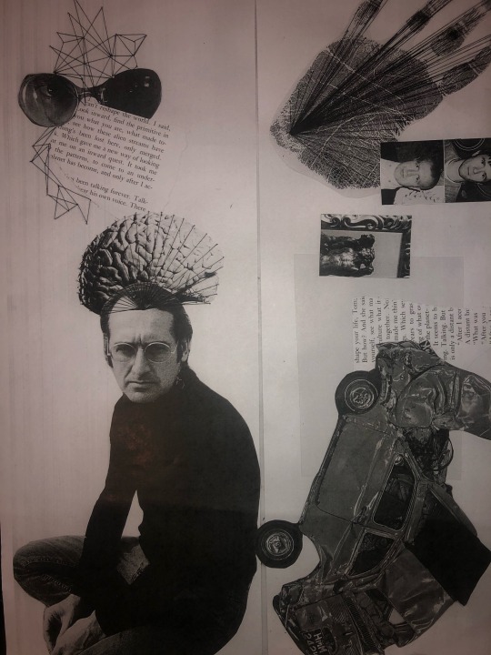

I used magazine cut outs to do collaged pieces based on words from our books. Next i used various coloured thread and sewed geometric/ patterns on the collages to forms connections between the images. Then we used the photocopier to change the colours of the images. My personal favourite is the black and blue because it makes the thread really stand out makes the images look really cool.
0 notes
Text
Logo design and branding trends for 2020
June 28, 2020
Logo design and branding trends for 2020
You have a brand new year 2020. With the dawn of the New Year, you have attractive sets of logo designs and branding themes. The logo designs fabulously unfold a mix of yesteryear themes with the brand new ones. You will be learning about some of the world’s best logo designs. Plus, the online guide also covers some of the fascinating branding trends for 2020. Let us move on to unveil each one of them:
A look at some of the world-famous logo designs for 2020:
3D gradients
3D gradients is a trend that is evolving with the latest 3D technology indeed. You can evolve and merge the latest 3D gradient to fit into the smartphone society. What is your understanding of the term ‘gradients?’
Gradients is an impressive way of converting a sober looking logo design into a flashy spectrum of hues. This can add energy, dynamism and value to your e-firm or virtual enterprise. Logo designers are therefore exploring the depths behind adding gradients. This way, you can lend a stunning 3D effect to your logo designs. You can look for tapered gradients. These are ones that start off from their fulcrum or center point going all the way to touch upon the contrasting set of shades. 3D gradient logos are tough to print but look fabulous on screens. Use gradients to create stunning 3D effects, shadows and depth like never before.
Throw-back logo designs
Expect to see the resurgence of throw back designs of logos that were used way back in the ‘80s. You can add unique aesthetics to the ‘80s based logo designs. For this, you must add a lot of chrome, neon and pixels to the logo prints. The glowing pocket rectangles can further add to the nostalgic effect of these designs. You can bring about the color in an unimaginable manner.
Plus, the throw-back logos add to the cool and retro effects too. Say for instance, you want to start a Music shop, why not include the image of a cassette rolling into action? Cassette collections and vintage arcade cabinet logos are becoming more and more popular. Joystick logos are also in trend for 2020.
Hand-drawn logos
Imperfection is the norm for today’s era. Hand-drawn logs are therefore comparable to ones that look raw and imperfect. But these logos lend a perfect touch to the originality of the firms depicting the same. These are more like sketched out pics with asymmetry lines, uneven patches, contour shading, pencil sketching, handwritten signatures and cross-hatching.
The logos are cool enough to gain momentum among web users who would love resonating with your firm. They can also associate you with the niche of products or services you plan bringing about. Raw and imperfect logos are getting grittier and brands continue to embrace the trend. These logos are chic, organic and home-grown too.
Logos with ultra-thin lines
For 2020, designers are bringing about newer innovations especially in the field of logo designing. Caricaturing the most unique logo designs act as the biggest USP for someone to strike the business with you for the very first time. This particular trend revolves around creating logos with ultra thin lines. You can make the lines spherical, square shaped or even rectangular.
These logos depict attention to detail, look complex and give web users with an ethereal feel too. These thin lines also lend a mysterious feel to the logo designs making them sleek and abstract. You can pull off these designs, with the limitless designing tools, the internet brings across the table.
1930’s vintage models
Old is gold. When you resonate yourself with the old school world, there are definitely elements of charm, grace and nostalgia added to the whole thing. Caricatures or printed vintage cartoons are logo designs, the ultra modern firms are looking at. These designs are simple, expressive and adorable, creating a positive appeal among brands and designers too.
You can have beer bottles, vintage cars and vintage styled guns, to add to the fab effect. In 2020, you can expect more of vintage inspired designs. These can be customized and can associate your audiences on a deeper emotional level.
Multi-layered and overlapping logos
In 2020 designers are striving hard to bring color, depth and meaning to logo designing. You discover multi-layered and overlapping designs wherein shapes and colors will be simple. While you have more layers, highlighters, shadows and overlapping hues to play with. This way, brands are able to communicate with their audiences even better. You can use shading and semi transparent backgrounds to create subtle and posh effects on logo designing.
Animations with more attention to detail
Logo designers are working around animated themes like never before. In 2020, you will be witnessing brands create logos by clubbing 2D and 3D animation effects. These logos can look complex and rhetoric in nature. The animations also depict moving parts in a noticeable manner. The logo creators are making use of the sophisticated technology to bring to your doorstep with more elaborate and artistic animation logos. They aim to take the web-viewers on their unique journey and then convey the story of the brand. 2020 makes animated logos, impressive enough to work on multiple platforms.
Typography with a difference
2020 is going to be a fascinating year for evolving logo designs. Logos revolve around elevated texts for words. This way, they bring the logo images to life. Hence, you can expect to see logos with funky and daring text fonts. These represent personalities as vivid as the brands themselves.
These are the top 8 logo designs for 2020. Now, helping you delve into branding themes for 2020.
Branding helps you position yourself at the markets. You can invoke these cool themes for branding and marketing purposes. You have almost everything covered in branding. It includes product logos, social media presence, website appeal, packaging and much more. Hence, you must take your branding campaigns seriously. Your clients and customers are going to love you when you portray your branding in a visually compelling manner.
Here are some of the astounding branding trends for the year 2020:
Look for warm toned gradients
Gradients do not need introduction. They are used for logo designing, product display and branding too. You can look for warm toned neon gradients. Can you imagine how the revamped Mozilla Firefox looks like? Feisty themes on branding heat up the flame. Go for neon textured gradients that look uber, fresh and provide you with the over-the-top vibes. Warm toned neon tones lend a warm and a refreshing appeal to your website too. So, why not go for it? You can take a beautiful portrait of a sunset and channel that into your brand persona.
Use metallic shades to portray materials
You can use vivid metallic shades to portray the niche of products and services you wish to sell. Monochromatic metallic shades unveil magic to the visual appeal of your website. Try camouflaging the branding trend with attractive quotes, caricatures and artistic designing. Monochromatic shades, like metallic black, white and silver can also add crispness and clarity to your webpage.
For 2020, metallic shades are cool, bold and modern. Again, what do you think adds brand value when you add metallic hues? You make your brand sparkle as you use a minimalist setting. Therefore, you add an aesthetic feel to your brand new web page. Say for instance, adding a dash of metallic to a black and white logo can really elevate the entire branding theme. Vibrant metallic colors also include shades like gold, dark platinum, lustrous rose gold and copper. You can use these shades on business cards, invite envelopes and even across packaging materials. You can seamlessly use these shades for your digital spaces too. Using metallic hues add to the luxury and decor of your web page. Hence, this is a fascinating branding trend for 2020.
Free-spirited typography
Break free from the stereotyped fonts and sizes of letters. Try using unique characters and unusual shapes while portraying your brand name. This way, you can make your brand stand out from the crowd. Say, you use a ‘beast mode’ style, you feel as if someone is screaming at you at the very glancing of it. This idea works well with brands who want to distinguish themselves and feel elevated too. If you want to portray a cool design for a Casual Friday theme, you can select the letter fonts accordingly.
Re-defined line Art
This is a branding trend for 2020 that definitely deserves a special mention after all. Think of adult coloring books. You have a black and white picture where color gradients can be inserted into. That is exactly how the branding technique has been themed.
Along with a black and white figure drawing, you have cool elements added to it. These include an interesting scenery, multi-dimensional concepts and a tattoo look-alike aesthetics. You also have the theme coupled with a DIY feel to it. Plus, you have a nostalgic charm added to the whole thing. Redefined line art is definitely one of the most exciting branding trends for 2020.
Add a dash of optimism for your brand designs
You can add sunny themes or happy-go-lucky vibes to the entire concept behind branding. Think of an ad covering summer collections or winter collections on fashion apparels. You have the online store filled with colorful yellows, oranges, saffron, goldenrod, etc. These sunny yellows and oranges add perfect elements to lifting the persona of your brands indeed. These are youthful and uplifting brand designs, you will be looking at in 2020.
You get these cool and feel-good shades camouflaged with simple and playful tones. This branding technique is definitely a fresh theme to wake up the youthful vibes and happiness quotient of your brand. The brand designs therefore portray warm and cheerful shades among firms wanting to make a statement out there. You can also add trendy background wallpapers, colorful graphics and youth loving fonts.
Visual storytelling
A good branding theme is beyond the creation of an iconic logo and packaging. You would want to convey an interesting story of your brand! How do you envelop the idea? You find printed and digital spaces opting for visual-intensive branding themes.
You have The Charley’s Choice website portraying a ‘How It Works’ theme. The idea is completely whimsical indeed. For a visual storytelling theme on branding, you add elements of humor, eye-catching photo visuals and great advertising. You can also reveal your brand story via printable. You can look for designing an artistic landing page too.
Earthy designs
Think of going green, taking to a vegan lifestyle, fighting against climate change and putting a full stop to plastic. These are themes that protect the Earth and your environment. Many brands are conceptualizing the idea via their branding themes too. Companies promoting a fleet of eco-friendly products can come up with brand designs and earthy tones, closer to nature. Add woodsy browns, low-saturated greens and autumn friendly shades to depict your products using vintage inspired designs. This way, your brand can look aesthetically appealing. You can take hands-on to using white typography upon these sophisticated hues.
You can camouflage the trend with natural packaging. You can also custom design products using hand-drawn plant illustrations. You therefore have a nature evoking theme that is too hard to resist. Food companies are already using the technique on a mass scale.
These are the top most branding themes and ideas for the year 2020. You can customize designs so that you help your business grow. You can add value to your consumers, business clients, suppliers and others who would want to reach out to you. A good logo design and a fabulous branding theme can take your business platform to penultimate heights.
About Us
For your daily dose of technological updates get connected to Mango Digital via https://mangodigital.solutions/ For every tech hangover, there is a Mangoer. Mango Consulting is one of the leading web design & development companies in the UK. We specialize in the field of mobile app development, content writing, IT support, digital marketing at very much affordable prices.
0 notes
Photo


This look was largely inspired by the stylistic trends of the first half of the 20th century, a period of time in which China experienced a significant urbanization (i.e. “modernization”) that came largely in the form of increased contact with (and consequent assimilation of) the Western world. Especially in port cities like Hong Kong and Shanghai, trade with the West facilitated not only the exchange of goods but also of cultures and ideas. According to Tani Barlow in her entry titled “Femininity” in The Palgrave Dictionary of Translational History, Chinese femininity during the interwar years (1919-37) was reshaped “to cohere around the desire for capitalist commodities,” essentially becoming an “acquisitive, middle-class, urban and commodity-focused feminine style” (390). This new capitalist desire "modernized” the Chinese conceptions of feminine beauty and fashion, centering them around the display of wealth and consumer culture, as can be reflected in the popularization of sumptuous dresses and flashy jewelry.
It should be noted, however, that this cross-cultural intersection did not entirely take place on an equal playing field. The tumultuous power dynamic between East and West served as a recurring theme in the writing of Eileen Chang (张爱玲 – first photo pictured above), a prominent Chinese writer at the time. Born to an aristocratic family and raised and educated in Shanghai, Chang wrote extensively about the city that was her birthplace as well as the Shanghainese people, who according to Chang possessed a “strange and distinctive sort of wisdom.” Many of her work feature romantic relationships between female characters who represented “traditional” Chinese ideals and male suitors who bore traces of the “modern” Western world.
For example, Chang’s “Love in a Fallen City” depicts the ostracized divorcee Bai Liusu who seeks matrimonial legitimacy and economic solvency from the England-educated womanizer Fan Liuyuan; in this story, Liusu is described as “old-fashioned” and a “real Chinese girl” (136), while Liuyuan is portrayed as a “modern man” (135). The dynamics of the two lovers paint an interesting portrait of crossing (transnational, cross-cultural, transhistorical, etc. in nature), as viewed through the lens of changing romantic human relationships. The romance between “traditional Chinese girl” Liusu and “hybridized un-Chinese man” Liuyuan wrestle with transactions of economy and power on an interpersonal level that is reflected in the geopolitical affairs of the “old-fashioned,” feminine East and the “modern,” masculine West. The question then becomes how the feminine East is able to draw the boundaries in such an imbalanced relation.
Our contemporary times see a return to the “desire for capitalist commodities” in the context of Chinese style, accompanied by, interestingly, a quasi-role reversal with regard to the East-West relationship. Given China’s rise to prominence in the 21st century, the United States now finds its position as the only global superpower threatened by China’s tremendous economic performance. This shifting power dynamic is not only represented in GDP but also in popular culture as well; in addition to being a milestone for Asian representation in American films and a smashing box office success, the 2018 movie Crazy Rich Asians (third photo pictured above) not-so-subtly touted Asia’s increasing economic relevance with its depiction of Asian characters living lives of luxury while simultaneously occupying positions of power. Furthermore, female Chinese stars such as actress Zhang Ziyi (fourth photo pictured above) are rapidly becoming globally recognized icons, appearing in Hollywood films and major fashion magazines such as Vogue. Gone are the days when the only way for a Chinese woman to gain stability and legitimacy was through marriage with a man; she can now earn millions by herself. The resurgence of the consumerist ideals from “Old Shanghai” now finds itself occurring in a new and different world, one in which China—and Chinese women—experiences greater power and agency.
0 notes
Photo
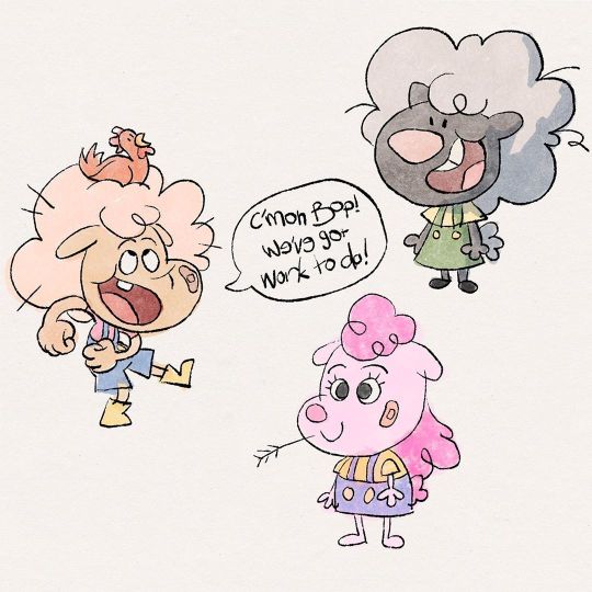
I’ve got a few personal projects on the go, and this is from one of them. I recently bought @maxulichney ‘s new watercolour brush set for Procreate, and played around with some character concepts with them, in a bit of a different style than I usually gravitate towards. So far, I’m loving them! Very keen to play with them more. #character #design #characterdesign #drawing #doodle #art #artist #artistsoninstagram #instaart #painting #ipad #procreate #visdev #visualdevelopment #figuredrawing #portrait #animation #tvanimation #games #conceptart #concept #sketch #digitalart #procreate #procreate5 #5comesalive #sheep #kidlitart https://www.instagram.com/p/B7S3U-mjO92/?igshid=1ud8hr194brip
#character#design#characterdesign#drawing#doodle#art#artist#artistsoninstagram#instaart#painting#ipad#procreate#visdev#visualdevelopment#figuredrawing#portrait#animation#tvanimation#games#conceptart#concept#sketch#digitalart#procreate5#5comesalive#sheep#kidlitart
0 notes