#portrait tutorial
Text
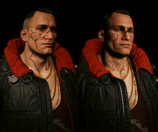
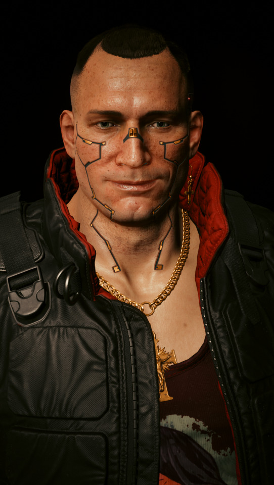
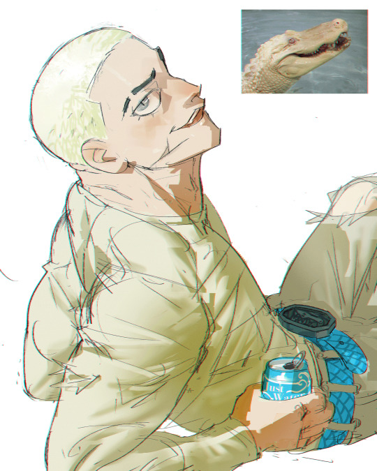
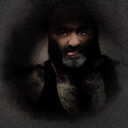
Cyberpunks’ Portrait Lighting Patterns with AMM
One of the fundamentals of portrait photography are lighting patterns. By having an understanding about position of light sources to our subject, we can create exciting and flattering portraits.
I’ll be mostly using Customizable Spot Light decor. Alternatively, you can use IGCS (Injectable Generic Camera System)’s Cyberlit mod for this.
As always, this is my dark studio at the top of Arasaka Tower (we’re in the major leagues!);
Game.TeleportPlayerToPosition(-1347.3859863281,140.73120117188,545.84606933594)
Types of Light Patterns for Portrait Photography
1. Broad Lighting (R)
Angle subject from the main light source, facing the bright side of the face.
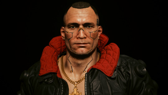
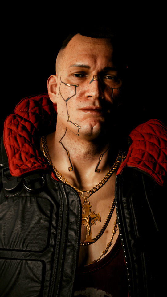
2. Short Lighting (L)
The opposite of Broad lighting. Darker side of the face is angled towards the camera.
3. Butterfly (Paramount) Lighting
Overhead light angled down. Dark shadows underneath the face and nose (depending on the nose shape).
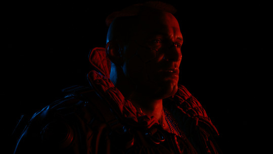
4. Split Lighting
90° to the subject.
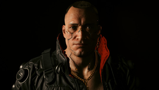
For true split lighting; (with Photoshop)
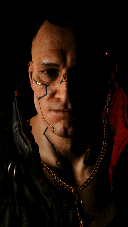
5. Loop Lighting
45° to the subject (slightly above eye level and slightly down).
6. Rembrandt Lighting
30° from the subject, a bit above their head and angled down. Triangle shaped on cheek (also depending on nose shape)
7. Back Lighting (Rim Lighting)
Bright outline that define the subject.
#Cyberpunk 2077#Jackie Welles#Portrait Tutorial#Appearance Menu Mod#Lighting techniques#Virtual Photography
111 notes
·
View notes
Text


Get access to my brushes, art tips, process videos, and files here https://www.patreon.com/ramonn90
#illustration#ramonn90#art#photoshop#patreon#digital art#portrait#character design#brushes#game art#animeart#art fundamentals#tutorial#tips about art
2K notes
·
View notes
Text
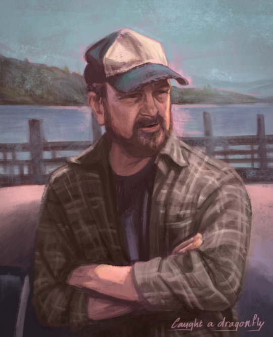
Bobby <3
#bobby singer#jim beaver#spn art#spn fanart#i know i keep drawing portraits but i do love doing them#anyway this is not for the tutorial#but a warm up for one#i want to show how i paint nowadays#like with underpaintings/colours (the pink shining through in this one)#inspired by traditional painting
1K notes
·
View notes
Note
do you perhaps……….. have a shading tut………. please yoyr art is stunning
it ended up evolving into a whole portrait tutorial hope thats ok
168 notes
·
View notes
Note
hi! I ADORE your art sm, and was wondering if you had, like, a ref sheet for zuko? im trying to figure out how to draw him :-)
thank youuu! and i did not have one but lucky for you i’m going Thru It (the artblock) and i’m prAYING that doodling zuko will cure it. i hope u can find this helpful too lol


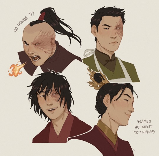
#id in alt text#my son my scrinklo scrimblo my one and only my rotten soldier my sweet cheese#learning the hard way that silly little portraits wit kinda monotonous expressions are my comfort zone hehe#im also working on the clothing tutorial for the other anon it just uhm. might take a bit#trying to break down my art process is DIFFICULT lads idk what i’m doing all of the time i’m serious#zuko#my art#ash replies#ask#also side note. this is the first time i drew ponytail zuko and u know what i take back everything i ever said about that hairstyle#its amazing it’s bold it’s a statement s1 zuko ur a misunderstood fashion icon#ahead of your time
3K notes
·
View notes
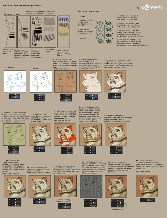
Text
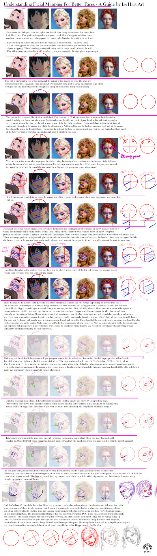
Facial Mapping Guide for Drawing Better Faces that took waaaay too long to put together..... (this is published on my Artstation linked on my LinkTree too in case the quality is too bad to see here)
Patreon: https://www.patreon.com/JaeHaruArt?fan_landing=true
LinkTree: https://linktr.ee/jaeharuart

#art#digitalart#digital art#tutorial#art tutorial#drawing tutorial#beginner tutorial#portrait drawing#portraits#anime style#anime#how to draw#how to draw a face#jaeharuart
435 notes
·
View notes
Text
Reposting this reel I made on IG, cause this subject has been on my mind lately. :)
The obsession with improvement in the online art world benefits nobody. It only creates an environment of insanely high standards and petrifying fear of creating anything less than perfect. If we are expected to be CONSTANTLY improving without rest or end, anything we create that doesn't reflect that improvement means we have failed.
It's pernicious and toxic.
Obviously if you WANT to improve, you should. But no artist is obligated to improve if they don't want to. Like, if you don't WANT to learn anatomy, don't lol. Being an artist, and making art, is not about 'improvement', and to pretend that it is -- that all artists should be constantly striving to improve and reach some unattainable pinnacle of skill -- is capitalism-induced brainworms and nothing more.
Deconstruct the idea that improvement is necessary to be an artist
Kill the art cop inside your head 🥰 (< I can say that on tumblr lol)
#my art#art advice#art tutorial#art improvement#btw I did not intend this but I actually don't really like how this lil portrait turned out very much LOL but you know what?#literally who cares :)
98 notes
·
View notes
Text
He’s real t me
#i cant colour gold. i cant. i have stares at multiple tutorials. i failed#hades game#hypnos hades#Hypnos my man my guy…#will attempt to draw his new portrait RAHHH#checkadii
96 notes
·
View notes
Text
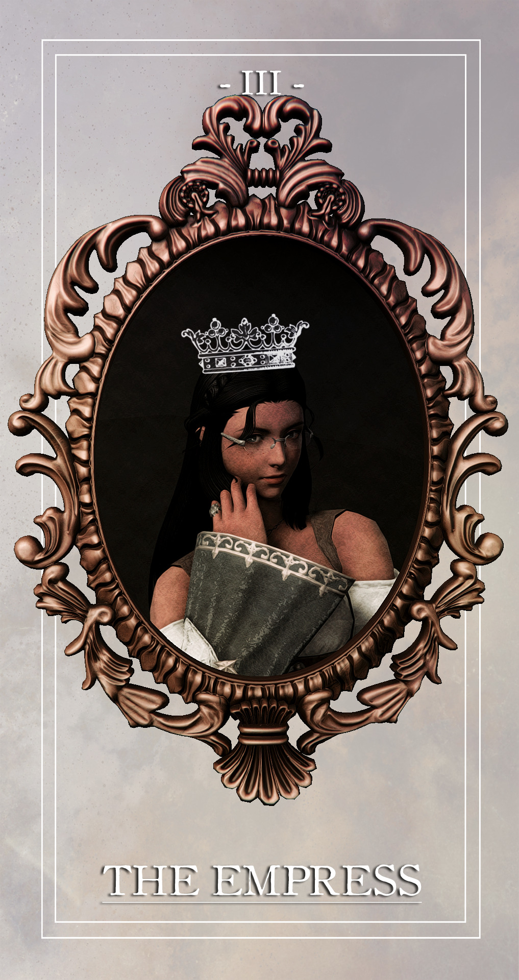
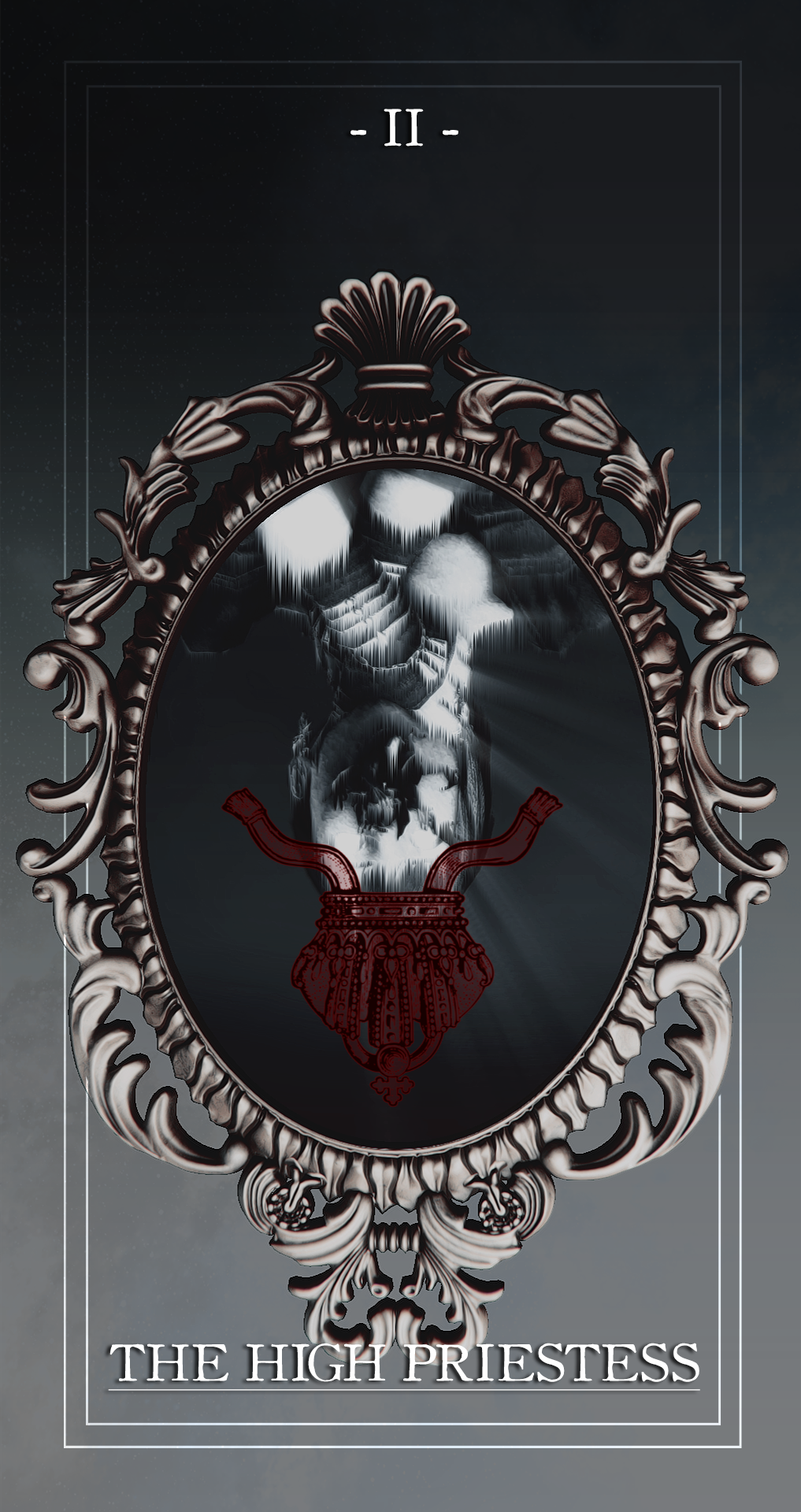


the major arcana, shuffled: 4/??
THE HIGH PRIESTESS;
⤉ spirituality, higher power, mystery, subconscious
⤈ hidden motives, secrets, repressed intuition, cognitive dissonance
THE EMPRESS;
⤉ motherhood, femininity, nurturing, harmony
⤈ smothering, negligence, lack of growth, insecurity
THE EMPEROR;
⤉ fatherhood, structure, authority, control
⤈ tyranny, domination, recklessness, rigidity
#mypost.#ffxiv gpose#ffxiv screenshots#ffxiv oc#ffxiv:tma#oh boy a 3 for 1 deal!!!#ty to fheythfully for your portrait tutorial!! :D#my game crashed when i was making this and i was about ready to pass away#the idea for this was 'haunted family paintings' with a dash of dorian gray#i intentionally fucked up the facial expressions with crimes & used photoshop filters to achieve the decaying effect of the reverse#for the people who don't know the tatlongharis (aka paris' maternal family via andromache):#the priestess is their aunt cassandra / the empress is their grandma hecuba / the emperor is their grandad priam#paris never met their grandma because she died way before paris was born#how did she die? priam accidentally caused her death but she (and cassandra) predicted she would die b/c they have the echo#so there you go :)#also i tried to match the crowns to the card names but i don't think i got close lol#body horror cw#just in case#notice how hecuba's face is all mangled while priam's flesh is wasting away. like the rotten corpse he is#as per usual flip your phone around to see the reverse sides#🏵️
59 notes
·
View notes
Text
Keep portraits from looking flat (via artwod_)
#art advice#how to shade#shading#art shading#art tips#art help#how to art#art appreciation#tiktok#art class#portrait#paintings#painting#digital painting#painting advice#painting tips#art tutorial#beginner artist#tutorials#tips#video#captions#captioned#closed captions
89 notes
·
View notes
Text
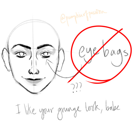

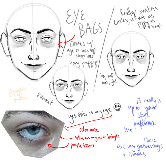
Eye bag tutorial?? Kinda?? that a friend asked for that I'm posting at 4 am cuz I can't sleep either
#art#digital art#art reference#art tutorial#artist#artists on tumblr#artists of tumblr#human art#human artist#human artwork#art tut#digital portrait#portrait
68 notes
·
View notes
Text
Relight saved my existence !!!
#this isn't an official post aksjsadds if that makes sense?? but i liked this screen so much lolol#im still gon post another set of screens of this beautiful lady so pardon me!! cuz she had the same exact outfit lol#I BEEN TAKING CAS PORTRAITS NON STOP OMG#at first i wasn't understanding how to use relight tbh#but i followed amoebae tutorial and now i been using it so easyy#softle0#ts4#simblr#the sims 4#my sims#show us your sims#showusyoursims#ts4 cas#ts4 aesthetic#ts4 screenshots#ts4 screenies#ts4 simblr#ts4cas#the sims community#the sims cas#imma be honest#like its 3 am??? nobody is up lmao
56 notes
·
View notes
Text
How to draw Stylized Headshot Step by step :

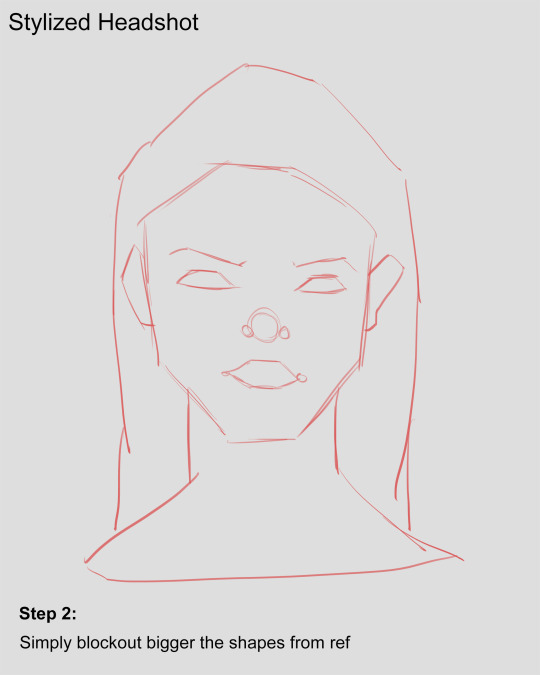
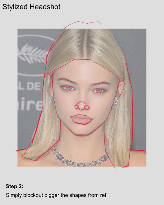


Hey! It's been a whileeeee.....and i came up with headshot tutorial since I've been working on my 3D project. I didn't get much time to make 2D fan arts like before. Well, i guess the time I'm investing into building my 3D portfolio and it gave me huge improvement in my art skills.
Hope you guys having a good time :) 🤟
#art#drawing#portrait art#art tutorial#drawing tutorials#tutorial#how to draw#How to#drawing tips#art tips#portrait painting#digital art tutorial#digital art#sketching tips#sketch#anatomy drawing#drawing ref#artists on tumblr#artwork#drawing reference#art reference#art tutorials#tumblr draw#stylized#stylized character#stylized portrait
101 notes
·
View notes
Text
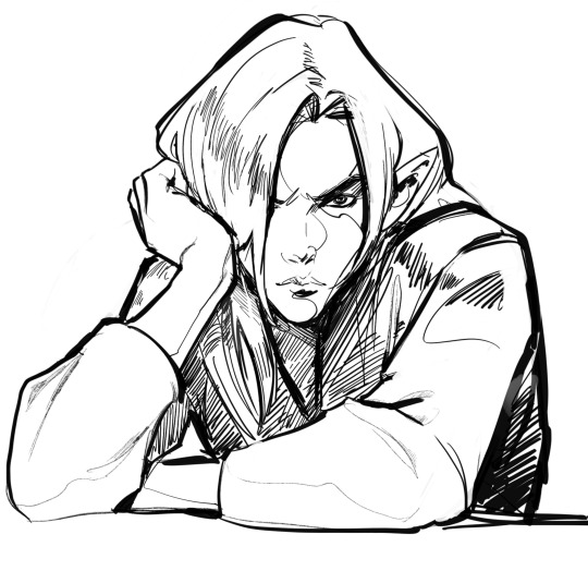
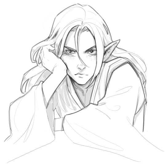
Let me share a sketch from patreon from July 8th:
SUDDENLY, it turned out that technique matters. First, I drew Shu on the left, and it was like: well… not bad, but somehow… hmm… um… not quite right. Not like those whose sketches I admire. With this brush, I create the line art for comics, which gives a crisp outline suitable for coloring. But for sketches, it's probably not quite fit… Then I just took a brush with transparency and re-drew roughly the same thing. And it turned out better! In my humble opinion. (though none of them looks exactly like Shu, but that's always the case with me) What's the conclusion? To achieve the desired result, you have to be persistent, but if it doesn't work, change your approach.
#sketch#art#arttip#procreate#pointed ears#art tutorial#portrait#doodle#black and white#myart#anndr#Martin Mine
71 notes
·
View notes
Text
i keep seeing a discourse in the art community recently about whether an artist should omit or change a character's features based on their style.
my take on that is you don't have to sacrifice a character's feature to fit your style; it's supposed to be the other way around.
in order for us to get rid of the same-face syndrome, we must be flexible in what we draw and how we stylize a reference.
i did a quick portrait study and added notes on each process. remember that this isn't a one-size-fits-all tutorial and feel free to only take what's best for you.


#art#art tutorial#digital art#artists on tumblr#digital drawing#portrait study#tutorial#art resources
17 notes
·
View notes
Text
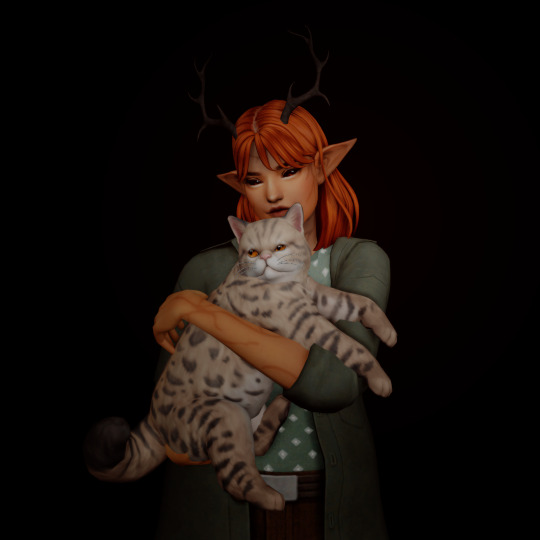
pidge + turnip ♡
#i was making a lil tutorial for a friend & thought it was cute :3#still making my way through building the save btw#it's just been slow going but i only have...3 households left to make?#and i have 2 more that i just haven't posted yet#the sims 4#the sims#sims#ts4 portrait#sim:pigeon#turnip the cat
88 notes
·
View notes
Last Seen Blogs
philosophy-of-herbarium
Philosophy of Herbarium
thangone
thingonedraws

doctorsliema-blog
Doctor Sliema Malta
fuckyeahgreggarakiteenapocalypse
FUCK YEAH GREGG ARAKI TEEN APOCALYPSE
gorilla-bull
Gorilla Bull