#post processed
Text
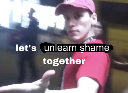
#i’ve been thinking abt that cringe post#i think the latent feelings behind ‘cringe’ are shame and sometimes envy/bitterness#same vibes as when six year olds say ‘those toys are for babies’ if they’ve been shamed for their age by older kids#anyway. i think part of the healing process is realizing that shame puts you at war with yourself bc part of yourself is a social being!#and that part of you wants community and acceptance (maybe love). shame is the absence of acceptance#unlearning shame means learning self-love and gaining the confidence to find your people#jerma#cw jerma#(someone asked me to tag lol)
54K notes
·
View notes
Text
So, my spouse has been exploring his gender lately; he also just built himself a new laptop. Today he told me that he in an attempt to process some genderfeels through metaphor, he made a post on a trans forum along the lines of: "I'm a lifelong Windows user and I think I'm pretty good at it. I want to find out what Linux has to offer but I'm afraid I wouldn't be any good at it. And how do you choose the right Linux distro, anyway? Do you have to try them all?"
The responses, he said, were a mix of useful advice about feeling out your gender and useful advice about choosing a Linux distro.
I love trans people so much
Edit 4/8, in case you don't see the reblogged additions -- my wife is now going by Eve!
#and i love my nerdy-ass spouse#sticking with he/him pronouns unless/until he says otherwise#also: so glad that my own gender process played out in front of him and that he's now comfortable figuring his out in front of me#trans tag#my posts#linux#trans
22K notes
·
View notes
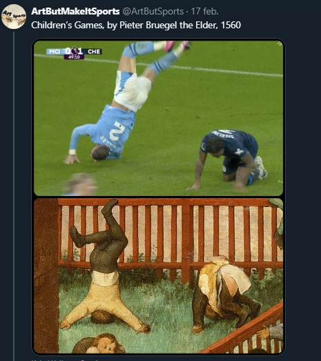
Text
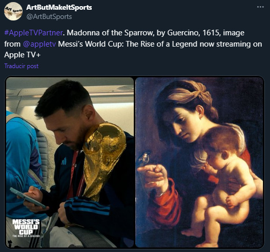
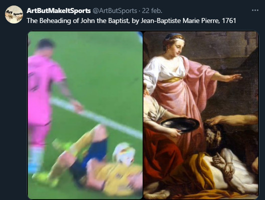
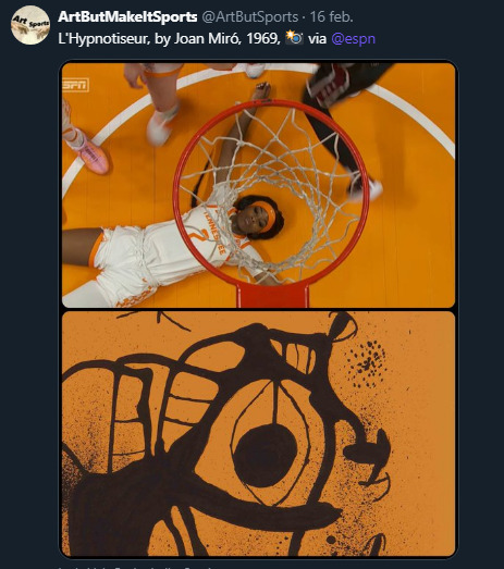
there is a crazy (in a positive way) dude on twitter who takes photos of athletes from different sports and finds them an art piece that fits exactly with the photo and the PRECISION he does it is amazing
8K notes
·
View notes
Text

#magic show on black background beautiful#surreal#dramatic lighting#cinematic#establishing shot#extremely high detail#photo realistic#cinematic lighting#pen and ink#intricate line drawings#by Yoshitaka Amano#Ruan Jia#Kentaro Miura#Artgerm#post processed#concept art#artstation#matte painting#style by eddie mendoza#raphael lacoste#alex ross#art
0 notes
Text
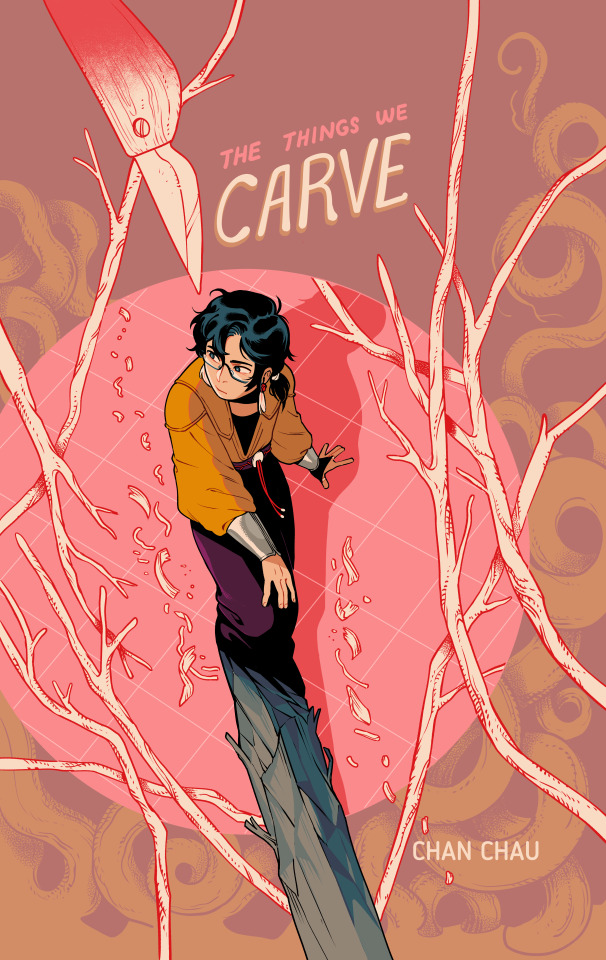
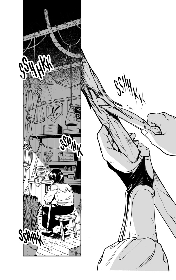
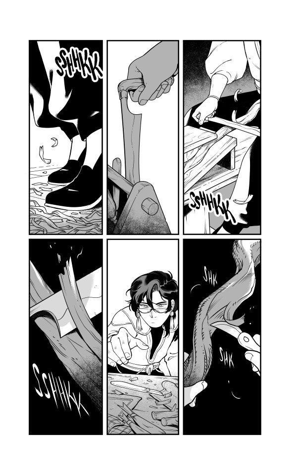
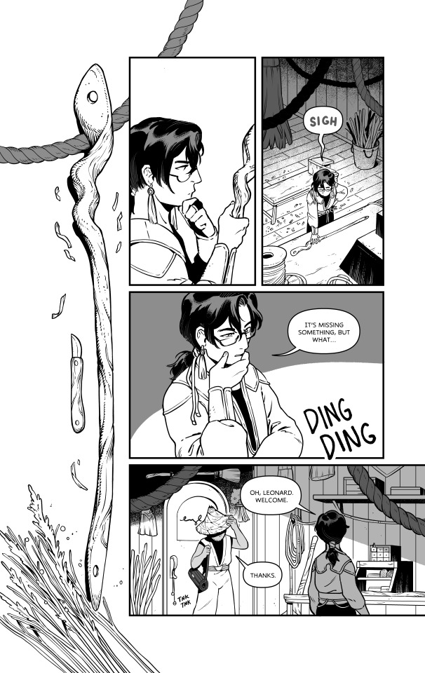
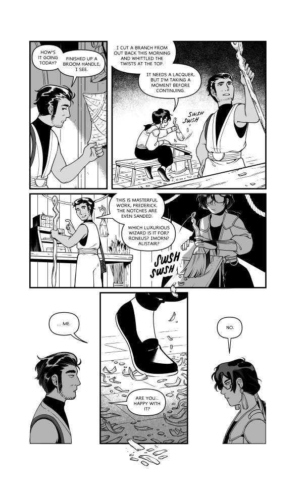
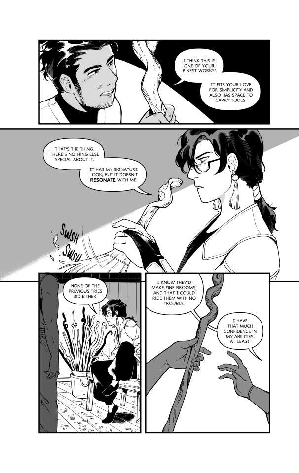
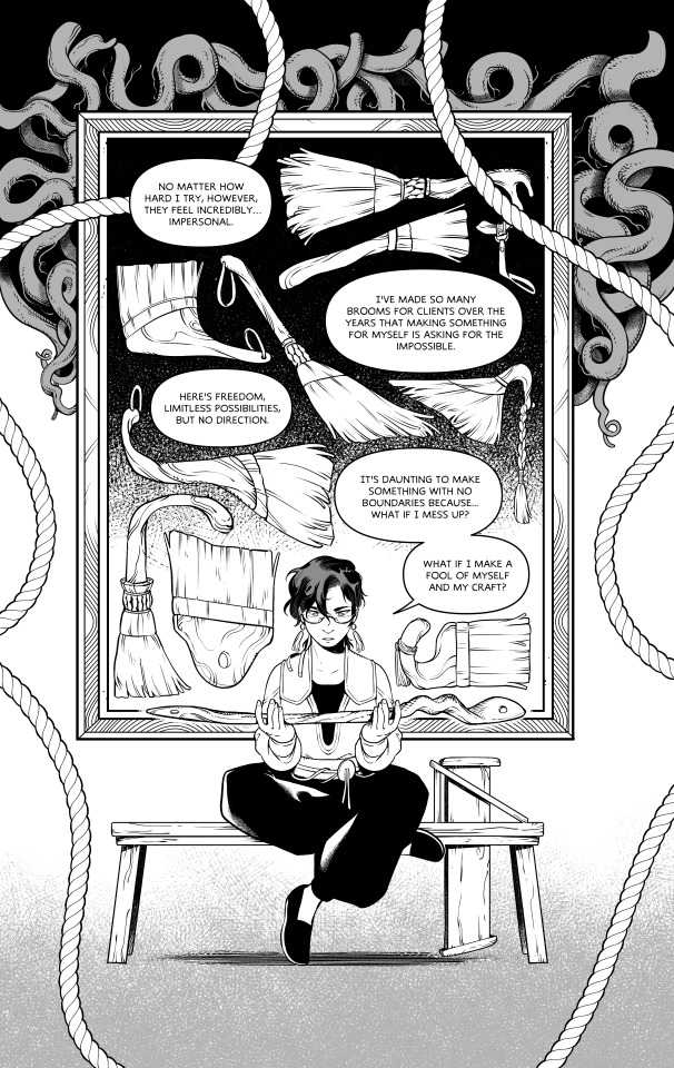
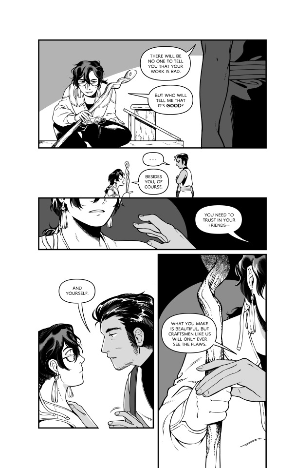
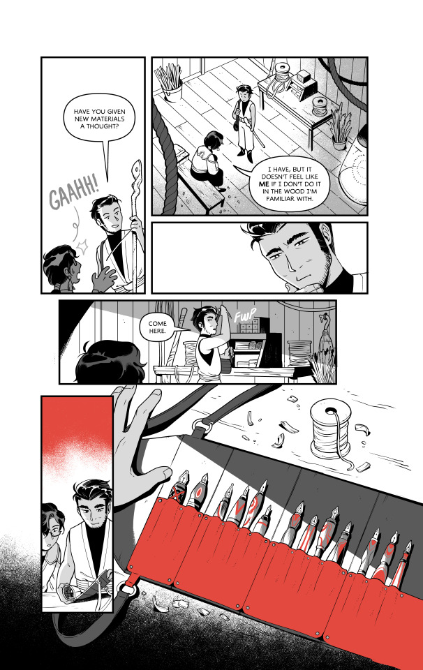
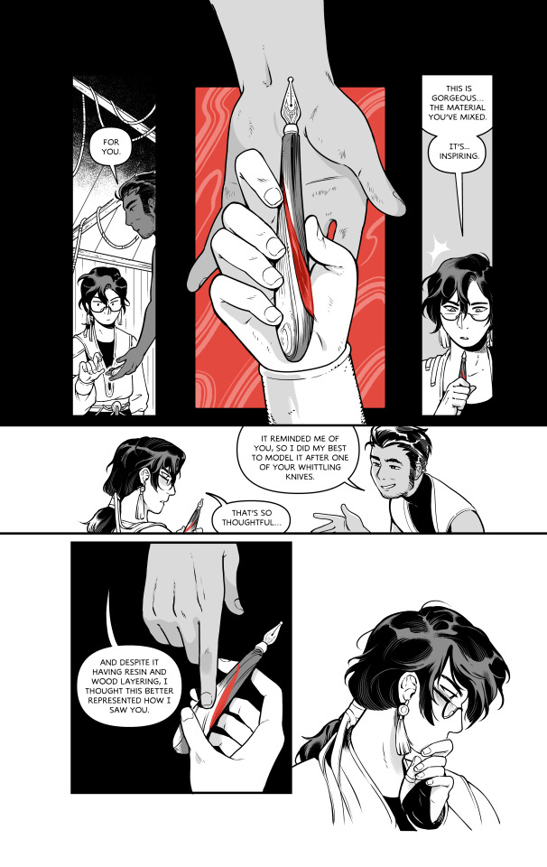
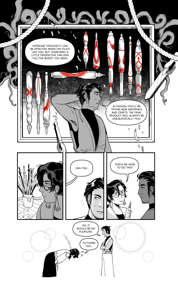
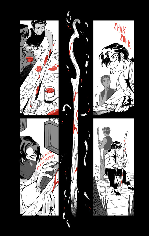

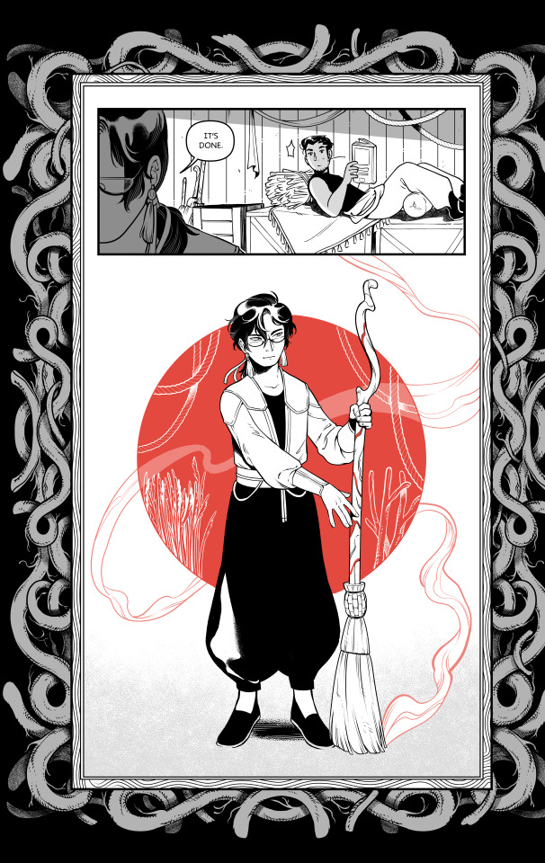
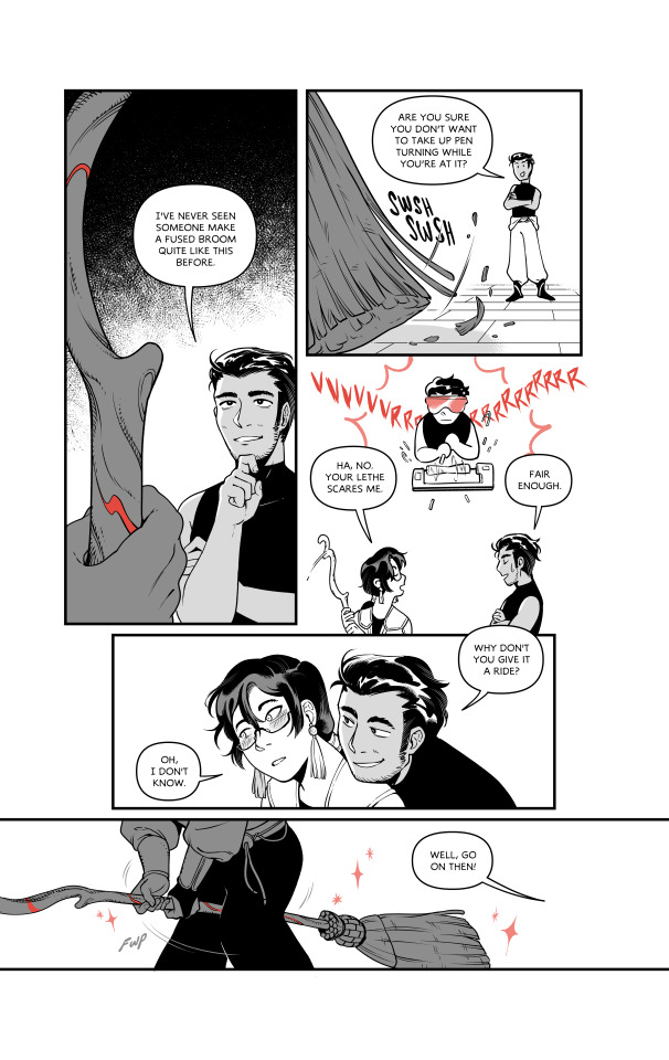
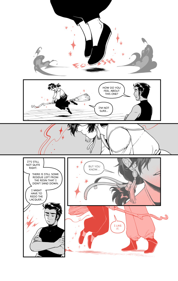
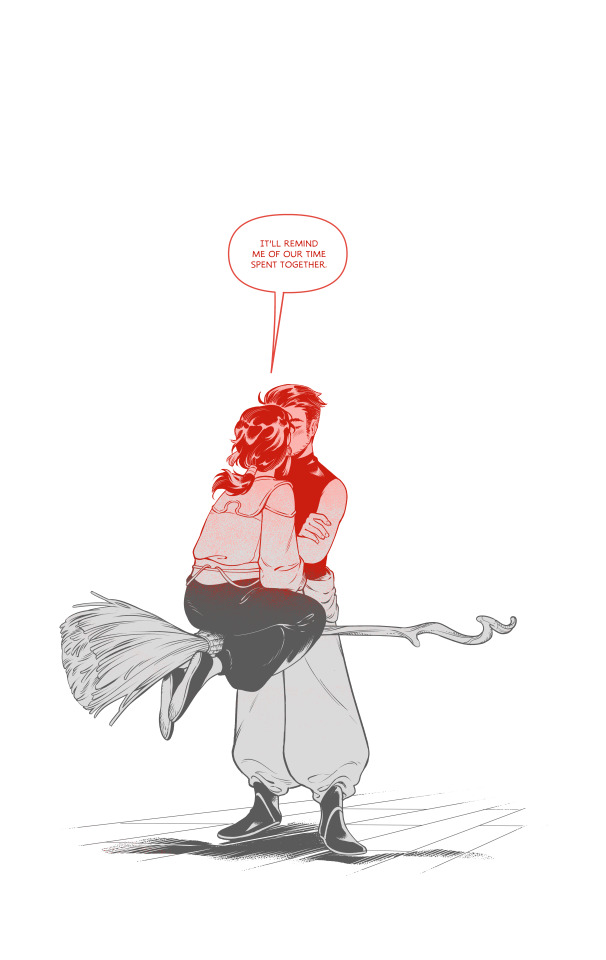
The Things We Carve
A broomsquire attempts to whittle something for himself and struggles until his pen-turning friend visits his workshop.
This is also available on Ko-Fi as a PDF! It is FREE / Pay-What-You-Want.
https://ko-fi.com/s/9f40f6db2e
#long post#long comic#art#broomsquire#broom making#pen turning#gay#i unno it's GAY#creativity#creative process#comics#comix
11K notes
·
View notes
Text
been thinkin about how my ethics professor back in undergrad was like.
look. there’s no such thing as perfect altruism. you’ll always get something out of helping or being kind to others, whether it’s a stronger relationship or returned kindness or just the feeling of having done good. there’s nothing inherently bad about getting something from doing good either, especially since it’s completely unavoidable. people being rewarded for putting love into the world doesn’t make the world a worse place. so just do as much good as you can and don’t worry about being “selfless” while doing it, because being truly selfless is in fact impossible.
and like man did that take the pressure off of Being A Good Person!! you’re allowed to enjoy helping people! you’re allowed to be kind without worrying that you’re maybe secretly just doing it for yourself!! it’s okay if you are doing it for yourself because you’re still being kind to others!!!!!
#like truly i think that was what finally finished the process of un-fucking my brain from all of the Catholic Trauma#i don’t know what made me think of this again or what possessed me to make this post but. voila.
53K notes
·
View notes
Video

flickr
At a tram stop. by Life in Shadows
Via Flickr:
"Peter Maynard", "Life in Shadows", Adelaide, Fujifilm X-T20, Schneider Kreuznach 135mm f3.5, Post Processed, Nik Efex.
#Peter Maynard#Life in Shadows#Adelaide#Fujifilm X-T20#Schneider Kreuznach 135mm f3.5#Post Processed#Nik Efex.#flickr
1 note
·
View note
Text
hes thinking real hard about eating a yummy sandwich

one with no crazy filters cause why not zzzz
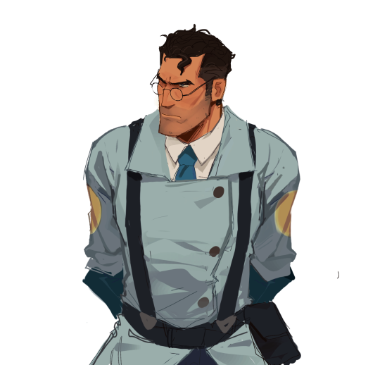
#tf2#team fortress 2#tf2 fanart#tf2 medic#blu medic#is this even anything#can you see that i figured out how amazing the lasso tool was halfway thru the process cause i feel i can and it’s HORRID#MORE ART SOON i hope i’m really trying to get back into working on stuff and not being lazy#i’ll prob post this one insta w a few changes cause idk if i’m completely happy w how this looks
4K notes
·
View notes
Text

im actually obsessed with 2-4 phoenix he is tired of all this bullshit. i love how he does not say a word for like 5 minutes after edgeworth enters the room
#hes on no hours of sleep running on anxiety barely processing what just happened#i think hes allowed to lash out a little#im trying to get more comfortable posting doodles here because ive been doodling a lot to cope w the stress lol#phoenix wright#miles edgworth#franziska von karma#farewell my turnabout#ace attorney#fanart#art
3K notes
·
View notes
Text
there are a lot of posts out there that are positive and healthy coping mechanisms for handling the holidays. this is not one of them :)
i think there's like. going to be times in your life you will be stuck in a social situation that you cannot escape from gracefully. i do not know why the internet doesn't believe these times exist. it's not always just that your physical safety is at risk - sometimes it's legit like "i just don't currently have the energy or time to put in the effort of responding to this." sometimes it's a coworker you hate so much. sometimes it's just like, fine, you know? like you know you can handle your aunt when she's cheerily horrible, but if you actually set a boundary around her, it's going to be weeks of fallout with your father.
i don't know why people think the answer is always just "cut them out!" or "don't let them get away with that!" because ... the real world is tricky and complicated. i think kind of a lot of us have an internal "radiation poisoning" meter for certain people. like - i'm talking about the ones who are absolutely giving you gradual ick damage. like, you can handle them, but you'll be exhausted.
and yes. you absolutely should listen to your therapist and the good posts about handling others and set good boundaries and take care of yourself. prioritize peace.
HOWEVER :) ...... since im often in a situation with a Gradual Sense of Ick person i cannot just "cut out" of my life (without losing someone else precious to me) - i have sort of developed the most. maladaptive form of mischief possible. because like, if i'm going to have to listen to this shit again, i like to have a little bit of private fun with it.
now! again, i am physically safe, just mentally drained by this man. you should only do this with people you are not in danger with. which leads me to my suggestions for when your Unfortunate Acquaintance shows up and says oh everyone pay attention to me.
my favorite word is "maybe!" said as brightly and happily as possible. whenever the Horrible Person starts in on a topic you do not want to go further with, particularly if they make a claim that you know to be inaccurate, do not respond to it. you and i have both tried to actually argue with this person, and it hasn't gone well, because this person just wants the drama of an argument. however, "maybe!" gives them literally nothing to go on. it is incredibly disarming. they are used to people having some response. they know they can't prove what they're saying, and maybe! treats them like the child they are. it dismisses them in the politest way possible.
i like to say maybe! and then, in their stunned silence, immediately change the subject. this is because i have adhd and i will have something unrelated to talk about, but if you can't think of topics fast enough, i recommend just pointing to something and saying, "isn't that lovely?" because fuck you let's bring in some positivity.
by the way. that second trick - of pointing to something and stating an opinion about it? - that just works on its own, like, 70% of the time. i picked it up from teaching preschoolers. it's an intentional "redirect". it stops children crying and it also stops grown adults from finishing their explanation on why women belong in kitchens. dual wielding!
keep it silly for yourself. i absolutely do not care if people think i'm fucking stupid (it's more fun if they do) and as a result i will purposefully misunderstand things just to see how long it takes them to realize i've completely removed them from the subject at hand. when they say "women aren't funny" i get to be like. "which women." "all women." "all women in america?" "no in the world." "like the mole people? the people in the world?" "what? no. like, alive." "oh are we not counting the mole people?" "what the fuck are you talking about." "you don't believe in the mole people?"
similarly, i play a personal game called "one up me." my Evil Acquaintance literally knows this game exists (my family & friends caught onto it and now also play it) and it always fucking gets him. i don't know why. you have to be willing to be a little free-spirited on this one, though. the trick is that when they make one of those horrible little bigoted or annoying comments they are always making, you need to go one unit weirder. not more intense, mind you - just more weird. "you don't look good in that dress." "yeah, actually, my other dress was covered in squid ink due to a mishap at the soup store." "you shouldn't wear such revealing clothes." "wait, what? oh shit. sorry, your son tears off strips when no one is looking and eats them. i swear it was longer before we left the building."
the point of "one up me" is to completely upend this person's narrative. we both know this person likes setting up situations where you cannot "win" and then they really like telling other people how badly you handled it. in a usual situation, if you respond "please don't say something that rude", you're a bitch. but if you let it happen, you're letting yourself be debased. they are not usually expecting door number three: unflappably odd. because what are they going to say when they're telling everyone how badly you behaved? "she said my son eats her dresses" ".... okay?"
if you can, form an allyship with someone whomst you can tagteam with. where they can pick up on your weird "soup store" story and run with it.
the following phrase is amazing and can be deployed for any situation: "oh, be nice :) it's the holidays!" i do not know why this works as often as it does. i'll say it for the most random shit. i think this is bc most of the time these people know they're being impolite, they just like to fight.
godbless. when in doubt, remember that you could always start stealing their pens.
the whole point of this is - if you can't escape. maybe see how long you can just be. like. a horrible little menace.
#this is objectively bad advice#don't listen to it protect yourself and do real work on yourself find one of the good posts i've made about this#but also. u know. if u want to have fun while u do the work of setting boundaries#.... it IS fun#i will say that my fear of him went SO down after i just started. fucking with him.#bc i used to get SO fucking upset#i'd spend WEEKS arguing with him. tearing my hair out. sick with anxiety and dread and anger about all of it#and now i just LITERALLY do not engage#instead i'm like '' haha :) mole people" and get the HELL out of any tense conversation#i kind of think some of these people are literally addicted to drama as a form of connection#they like the rush they get from arguing#but those arguments are incredibly damaging for me#so like..... i am in the process of literally rehabilitating this person to figure out how to find connection thru#NORMAL CONVERSATION#he doesn't get it yet#i also do talk to them like they're preschool kids lmafo . ''are you using a safe and kind voice right now?''#'' do you need a snackie? you sound a little upset. let's have some hummus and come back to playtime when we feel ready''
32K notes
·
View notes
Text

something something giant isopod sharing is caring pass the detritus
inprnt
#giant isopod#marine biology#artists on tumblr#inprnt#I tried coming up with a pun but nothing popped up#cackLES#there's also another print up on inprnt that I'm waiting to post when I have other stuff settled 👀#technically inprnt is getting to see stuff a little earlier haha#also been noticing how my process has changed haha it's interesting#like I'll spend waaaaaay more time now nitpicking/adjusting colors which is fine#but like before when I was still in old process mindset I'd get frustrated and think the colors weren't coming out right#when what I needed was to spend more time figuring it out
7K notes
·
View notes
Text
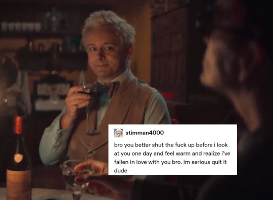
they're so in love im gonna throw up real quick
#in my defence i had warned you i was going to be the most annoying fucker on earth#what the fuck guys this is too much for my brain to process#they're so in love i want to jump from the balcony#LOOK AT THEM#this is after the blitz and aziraphale had the courage to say CROWLEY was going too fast#MY ANGEL IN CHRIST YOU'RE SO CLOSE TO GIGGLE AND TWIRL YOUR HAIR YOURSELF#michael sheen commiting to make the softest warmest most loving eyes every chance he gets#what and i cannot stress this enough the fuck#my dads (real)#tumblr text meme#tumblr text posts#good omens season two#good omens#aziracrow#ineffable husbands#user purrvaire
9K notes
·
View notes
Text
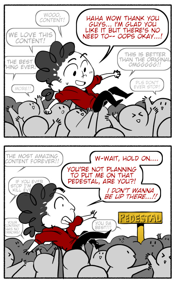

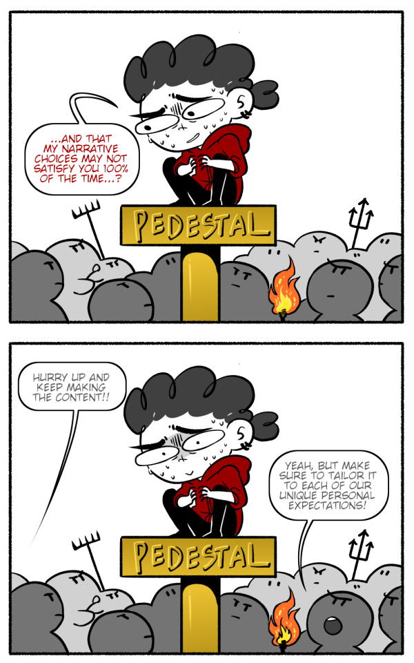
👌Content™
#comic#comics#funny#content creator#content creation#writing#drawing#fanart#artists on tumblr#arting#tumblr#before you presume the worst please understand that i draw a steven universe fancomic#and this post is about Very Strong Opinions people have in re: plotholes in a children's cartoon#but seriously dont put content creators on pedestals#dont put ANYONE up there#they will just fall off and hurt themselves and others in the process
10K notes
·
View notes
Text

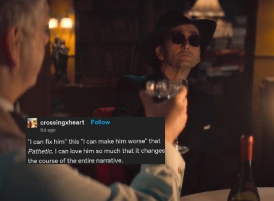
If this wasn’t on clickhole I think I’d pretty easily believe he actually said this
#neil gaiman#the sandman#good omens#it just feels like something he’d post on tumblr#in response to an ask about his writing process#clickhole#serious writing advice
5K notes
·
View notes
Text
My Favorite Cheap Art Trick: Gradient Maps and Blending Modes
i get questions on occasion regarding my coloring process, so i thought i would do a bit of a write up on my "secret technique." i don't think it really is that much of a secret, but i hope it can be helpful to someone. to that end:

this is one of my favorite tags ive ever gotten on my art. i think of it often. the pieces in question are all monochrome - sort of.

the left version is the final version, the right version is technically the original. in the final version, to me, the blues are pretty stark, while the greens and magentas are less so. there is some color theory thing going on here that i dont have a good cerebral understanding of and i wont pretend otherwise. i think i watched a youtube video on it once but it went in one ear and out the other. i just pick whatever colors look nicest based on whatever vibe im going for.

this one is more subtle, i think. can you tell the difference? there's nothing wrong with 100% greyscale art, but i like the depth that adding just a hint of color can bring.
i'll note that the examples i'll be using in this post all began as purely greyscale, but this is a process i use for just about every piece of art i make, including the full color ones. i'll use the recent mithrun art i made to demonstrate. additionally, i use clip studio paint, but the general concept should be transferable to other art programs.


for fun let's just start with Making The Picture. i've been thinking of making this writeup for a while and had it in mind while drawing this piece. beyond that, i didn't really have much of a plan for this outside of "mithrun looks down and hair goes woosh." i also really like all of the vertical lines in the canary uniform so i wanted to include those too but like. gone a little hog wild. that is the extent of my "concept." i do not remember why i had the thought of integrating a shattered mirror type of theme. i think i wanted to distract a bit from the awkward pose and cover it up some LOL but anyway. this lack of planning or thought will come into play later.
note 1: the textured marker brush i specifically use is the "bordered light marker" from daub. it is one of my favorite brushes in the history of forever and the daub mega brush pack is one of the best purchases ive ever made. highly recommend!!!
note 2: "what do you mean by exclusion and difference?" they are layer blending modes and not important to the overall lesson of this post but for transparency i wanted to say how i got these "effects." anyway!
with the background figured out, this is the point at which i generally merge all of my layers, duplicate said merged layer, and Then i begin experimenting with gradient maps. what are gradient maps?
the basic gist is that gradient maps replace the colors of an image based on their value.

so, with this particular gradient map, black will be replaced with that orangey red tone, white will be replaced with the seafoamy green tone, etc. this particular gradient map i'm using as an example is very bright and saturated, but the colors can be literally anything.

these two sets are the ones i use most. they can be downloaded for free here and here if you have csp. there are many gradient map sets out there. and you can make your own!
you can apply a gradient map directly onto a specific layer in csp by going to edit>tonal correction>gradient map. to apply one indirectly, you can use a correction layer through layer>new correction layer>gradient map. honestly, correction layers are probably the better way to go, because you can adjust your gradient map whenever you want after creating the layer, whereas if you directly apply a gradient map to a layer thats like. it. it's done. if you want to make changes to the applied gradient map, you have to undo it and then reapply it. i don't use correction layers because i am old and stuck in my ways, but it's good to know what your options are.

this is what a correction layer looks like. it sits on top and applies the gradient map to the layers underneath it, so you can also change the layers beneath however and whenever you want. you can adjust the gradient map by double clicking the layer. there are also correction layers for tone curves, brightness/contrast, etc. many such useful things in this program.
let's see how mithrun looks when we apply that first gradient map we looked at.

gadzooks. apologies for eyestrain. we have turned mithrun into a neon hellscape, which might work for some pieces, but not this one. we can fix that by changing the layer blending mode, aka this laundry list of words:

some of them are self explanatory, like darken and lighten, while some of them i genuinely don't understand how they are meant to work and couldn't explain them to you, even if i do use them. i'm sure someone out there has written out an explanation for each and every one of them, but i've learned primarily by clicking on them to see what they do.
for the topic of this post, the blending mode of interest is soft light. so let's take hotline miamithrun and change the layer blending mode to soft light.

here it is at 100% opacity. this is the point at which i'd like to explain why i like using textured brushes so much - it makes it very easy to get subtle color variation when i use this Secret Technique. look at the striation in the upper right background! so tasty. however, to me, these colors are still a bit "much." so let's lower the opacity.

i think thats a lot nicer to look at, personally, but i dont really like these colors together. how about we try some other ones?

i like both of these a lot more. the palettes give the piece different vibes, at which point i have to ask myself: What Are The Vibes, Actually? well, to be honest i didn't really have a great answer because again, i didn't plan this out very much at all. however. i knew in my heart that there was too much color contrast going on and it was detracting from the two other contrasts in here: the light and dark values and the sharp and soft shapes. i wanted mithrun's head to be the main focal point. for a different illustration, colors like this might work great, but this is not that hypothetical illustration, so let's bring the opacity down again.

yippee!! that's getting closer to what my heart wants. for fun, let's see what this looks like if we change the blending mode to color.

i do like how these look but in the end they do not align with my heart. oh well. fun to experiment with though! good to keep in mind for a different piece, maybe! i often change blending modes just to see what happens, and sometimes it works, sometimes it doesn't. i very much cannot stress enough that much of my artistic process is clicking buttons i only sort of understand. for fun.
i ended up choosing the gradient map on the right because i liked that it was close to the actual canary uniform colors (sorta). it's at an even lower opacity though because there was Still too much color for my dear heart.

the actual process for this looks like me setting my merged layer to soft light at around 20% opacity and then clicking every single gradient map in my collection and seeing which one Works. sometimes i will do this multiple times and have multiple soft light and/or color layers combined.
typically at this point i merge everything again and do minor contrast adjustments using tone curves, which is another tool i find very fun to play around with. then for this piece in particular i did some finishing touches and decided that the white border was distracting so i cropped it. and then it's done!!! yay!!!!!
this process is a very simple and "fast" way to add more depth and visual interest to a piece without being overbearing. well, it's fast if you aren't indecisive like me, or if you are better at planning.

let's do another comparison. personally i feel that the hint of color on the left version makes mithrun look just a bit more unwell (this is a positive thing) and it makes the contrast on his arm a lot more pleasing to look at. someone who understands color theory better than i do might have more to say on the specifics, but that's honestly all i got.

just dont look at my layers too hard. ok?
1K notes
·
View notes
Text
4321
#kagerou project#kagepro#mary kozakura#kano shuuya#kido tsubomi#seto kousuke#my art#critai mine#WAUGHHDH !!!!!!!#happy 15th from the jst timezone#IM NOT DONE YET I SITLL HAVE 2 DRAW AYANO#bro this file crashed sm times AUGHDHH#edit: WAGH I FOUND OUT THIS WENT ON THE RADAR WTF#i remember when i first posted this i didnt have time to explain the comp process for this 1 and not that it was anything big just#felt like i had to explain kano's framing bc it does look wonky#p much that it's actually the outline of the yobanashi graffiti title in his mv :-) !!!#not sum fucked up hole lol#everything else i think it's p self explanatory www was abt to do mekakushi code for kido but i felt like shissou word highlighted her#character more so i went w that..!!!#and originally i was to draw mary as a separate piece and have the meka trio in another but i didnt have time...#which is fine bc sidu did the same thing in their art book also LMAO#mary's og concept was also the curtain idea but behind her would've ben her mom + maybe seto (imagination forest stuff)#thank u for the nice tags :"-DDD
6K notes
·
View notes
Last Seen Blogs
xordvalley
art! wow

arebrain
Untitled

j-h0bi
[i'm your hope]

wifesfootslave
Untitled

mkmstore
Unbetitelt