#product designs
Video
youtube
This was such a wonderful video to see. GW gets a lot of (in my mind undeserved) flak for pretty much every the decisions they do. To see one of their ex product designer explain why certain decisions were made and how the company reasons were absolutely fascinating.
2 notes
·
View notes

Text

Your Best Digital Solution
Photography
Model Photoshoot, Product Photoshoot, Event Photoshoot, Wedding Photoshoot, Real Estate, Fashion and all types of photography we do.
Videography
Gimbal Shoot, Cinematography 4K, Tutorial Shoot, Event Shoot, Product Shoot, Wedding Shoot,
Fashion Shoot, Sport Shoot & all types of Videoshoot we do.
Graphic Designing
Social Media Posts, Banners, Pamphlets, Brochures, Visiting Cards, Catalouges, Product Designs, Flyers, Multimedia Designs and all types of Graphic Designing we do.
#Photography#Model Photoshoot#Product Photoshoot#Event Photoshoot#Wedding Photoshoot#Real Estate#Fashion and all types of photography we do.#Videography#Gimbal Shoot#Cinematography 4K#Tutorial Shoot#Event Shoot#Product Shoot#Wedding Shoot#Fashion Shoot#Sport Shoot & all types of Videoshoot we do.#Graphic Designing#Social Media Posts#Banners#Pamphlets#Brochures#Visiting Cards#Catalouges#Product Designs#Flyers#Multimedia Designs and all types of Graphic Designing we do.
0 notes
Text
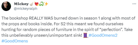


Whoa! 👀Amazing! ❤ (tweet thread)
plus :D

Edit:
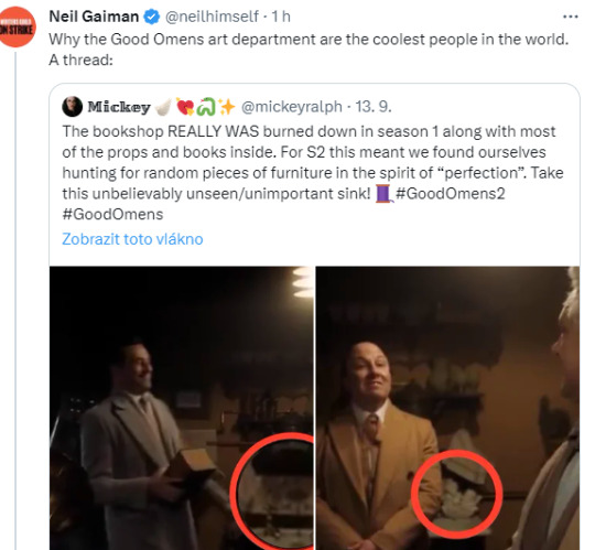
#good omens#gos2#season 2#aziraphale's bookshop#michael ralph#production design#bts#fun fact#aziraphale's sink#👀#gos3#season 3#neil gaiman
15K notes
·
View notes
Text

#he will always be famous#the amazing digital circus#tadc jax#tadc#lackadaisy#lackadaisy rocky#rocky rickaby#murder drones#murder drones n#serial designation n#md n#hazbin hotel#hazbin hotel angel dust#angel dust hazbin hotel#angel dust#jax tadc#n murder drones#rocky lackadaisy#jax the amazing digital circus#glitch productions#indie animation#meme#camiposts
8K notes
·
View notes
Text


Your destiny, once denied, stands now before you.
This is the only way it could have ended.
#my art#ultrakill#ultrakill spoilers#V1 ultrakill#earthmover ultrakill#it is implied that v1 was specifically designed to take these things down but they went extinct before it finished production#tw eye contact#tw eyestrain
8K notes
·
View notes
Text
11K notes
·
View notes
Text

they deserved to dance
#serial designation n#murder drones#nuzi#uzi doorman#murder drones fanart#murder drones n#md nuzi#glitch productions#murder drones nuzi#biscuitbites#md uzi#md serial designation n#md n#enzi#my stuff
3K notes
·
View notes

Text


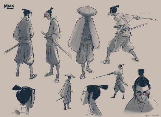
Mizu character design concept, expression sheet, & pose sheet concept art, by Ryan O'Loughlin, a designer, story artist, & episode director for Blue Eye Samurai
5K notes
·
View notes
Text
The Magnus Archives (Season One) Production Design Project
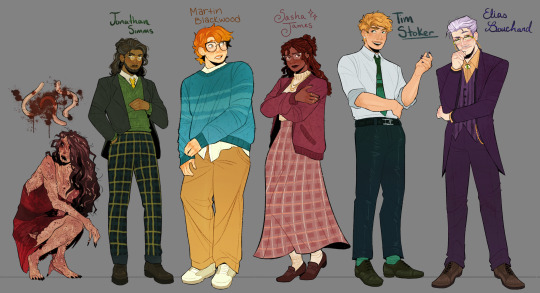

Hello everyone! Let me introduce myself- I'm Tilda (or Tilde), and I'm want to be a production designer.
Production designers create the overall look of a piece of media. From costumes, lighting, environments, props, etc., these designers make sure that everything looks cohesive and sets the mood.
So, I thought it would be fun to put my skills to the test by designing season one of The Magnus Archives. My winter break started as soon as I became interested in the show. Needless to say, a new obsession and an abundance of free time go well together.
You may have seen these illustrations posted separately, this is a master post of the whole project. My thoughts, processes, and critiques are all included under the cut. If you read them, I hope you enjoy! If, not, thank you for supporting my work regardless.
The Characters
When designing these characters, I tried to avoid being influenced by fan interpretations. Though, that was a challenge (especially with Jon and Sasha). I found that I looked to my friends for inspiration. Certain elements (Jon's glasses) were based off of what they wore.
Pinterest was also useful for finding clothing and pose references. Some looks were based off of different actors- in particular, Tim was inspired by Nicholas Galitzine and Elias inspired by Matthew Lillard.
Jane was the most fun to design! I believe in making terrifying characters actually terrifying.
Elias's design needs the most work. Having now finished the show, I see that it doesn't fit him. The purple is overly saturated, especially compared to the set. He looks out of place! I'd reverse the color palette to mostly green/yellow with purple accents instead. Although, I will forever defend the purple tint in his gray hair.
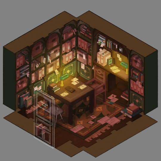
The Set
Jonathan's office was a treat to design! Balancing the color and clutter was especially important. This room is meant to be claustrophobic and uncomfortable, but not overbearingly so.
The wood looks to be full of splinters, but not so worn that it can be thrown out. The chairs offer no back support, and the shelves make the room smaller. The goal was to represented Jon's mind. Intricate, messy, and suffocating (Note: that is more of a season two description).
One goal was to capture the look of an actual archive. Valuable times was spent researching the different kinds of storage, files, paper, etc. The texture and color had to be accurate.
A split-complementary color palette of blue-green, yellow-green, and red was used. Of course, I had to get green in there, and the varying hues and desaturated reds worked well for the wood and filing supplies.
Jane's ashes and the Web lighter on the desk place this set at the end of season one. I find details like this to be important, it's one of my favorite parts of design. There is much needed abundance of eye imagery as well. Most obviously in the carpet, but eyes are carved into the table and watch from the shelves.
My main critique is the lighting- the filters used could be adjusted as to not distort the colors of the boxes. They look inconsistent. The Web lighter could also be more obvious, yet it is small and pixelated.
The Props
I designed these as I re-listened to season one, and it is the most recent piece I finished. Combining the details described in the show with what the objects would have realistically looked like was interesting. That was most useful for the clown, the Ming vase, and Ex Altiora.
Each of these objects came from a specific time with a specific look. Ex Altiora was bound in calf leather from the 1800s, so those books were referenced. Same with the frills on the clown's outfit.
The Ming vase was especially interesting, as it is from the Jiajing period. When looking at photographs of Jiajing vases, I found that many of them lacked handles and had an hourglass shape. That was fascinating to me, as many artists depict a standard oval-shaped vase. Also, the vase's design is described as straight lines that create distorted patterns when looking at it. That effect was achieved using chromatic aberration and the liquify tool (chromatic aberration was used to create a vertigo effect on Ex Altiora).
My critiques are... nitpicky. minimal. The shading on top of the garbage bag is unnatural. The thickness of the gold engraving on Ex Altiora is uneven. The "I" in "Immediate Consideration" is not capitalized. Other than that, I'm happy with how the props look.
Conclusion
First off, if you read everything, thank you!! It is a lot, I know.
My greatest takeaways are that 1) ask for critique, always 2) research skills are necessary for design 3) references are your friend! Seriously guys, use your references.
I hope you enjoyed this project and I'm excited to share more of my work in the future!
#and before anyone asks#i am not doing this for any other season#feel free to ask any questions about this project!#tma#the magnus archives#tma season one#production design#tildexart#tilda rambles
3K notes
·
View notes
Photo
Ep. 7 Ruined Meee
Spent days agonizing over this image. First time doing a comic in procreate so there are errors, still, I did enjoy it!
Hope you all like!
Commission Prices/Info Here
#destinymade#murder drones#murderdrones#nuzi#nxuzi#serial designation n#serialdesignationn#uzi doorman#uzidoorman#murderdrones fanart#murder drones fanart#glitch productions#biscuitbites
1K notes
·
View notes
Text
Happy N
#murder drones n#serial designation n#glitch productions#murder drones#murder drones fanart#murderdrones#n murder drones
1K notes
·
View notes
Text
MURDER DRONES EPISODE 8 LEAK (VERY REAL)
#/j#murder drones#murder drones nuzi#nuzi#serial designation n#uzi doorman#wall e#glitch productions
1K notes
·
View notes
Text
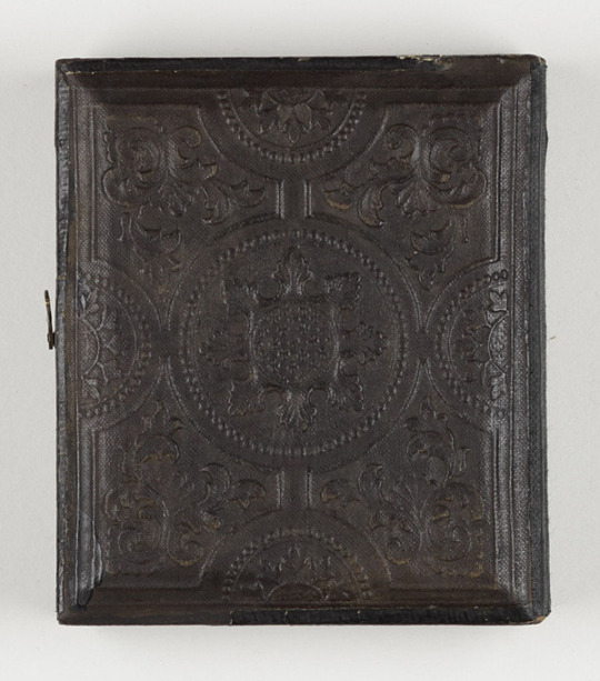


Daguerreotype portrait of Winona Ryder from Bram Stoker's Dracula (1992)
#bram stoker's dracula#dracula#winona ryder#daguerreotype#francis ford coppola#mina murray#production design#*
3K notes
·
View notes
Text
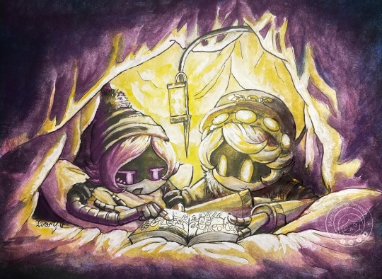
Uzi reads manga with N
V Bonus under cut V

Uzi: “and then they like…. Kissed”
#murder drones#n x uzi#nuzi#art#serial designation n#glitch productions#glitch#n murder drones#uzi murder drones#uzi doorman#murder drones uzi#murder drones n#artist#illustration#illustrator#fanart#murder drones fanart#murder drones art#traditional art#traditionalart
2K notes
·
View notes
Last Seen Blogs