#ps tutorials
Text
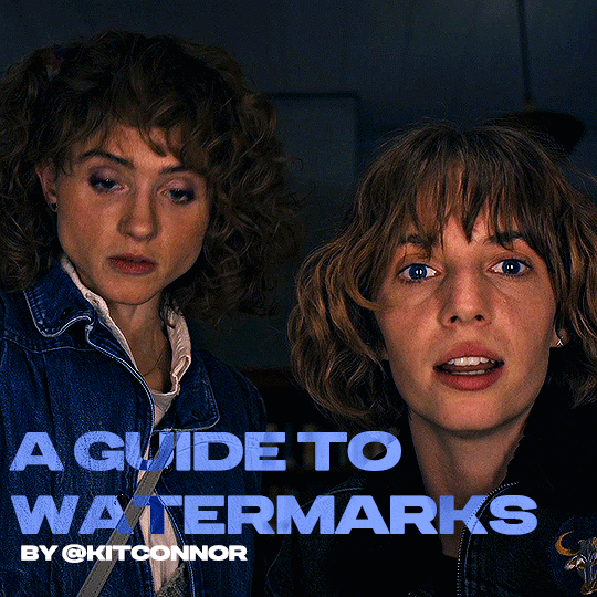
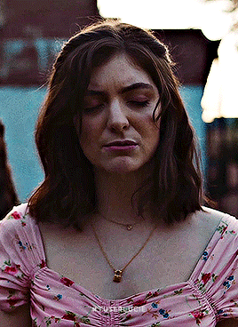
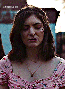
recently, a lot of people have been losing their gifs to reposters, whether that be a whole set stolen or just one gif taken for a textpost. which leads to a lot of us turning towards watermarks to not lose our work. it's not everyone's first choice, particularly because of aesthetics, but it's the best way to keep what you own.
of course, it might seem silly to do a whole "tutorial" on watermarks, but there's a lot of different ways to watermark in a subtle way that still protects your work. i've also seen a lot of people incredibly hesitant to move to watermarks because they believe it marrs their work, which may be true, but there are definitely ways around that. anyway, let's begin !
WATERMARK 1: URL/TRACKED TAG
the most common watermark for people is usually 'thisismyurl.tumblr.com', 'thisismyurl | tumblr', 'thisismyurl' - at least, this is assumed for most people as the best way to watermark.
but if you're like me and constantly want to change your url, you know that there's a good chance a watermark on a gif 3 months ago could be completely different to one now. this is why people are turning to tracking tags.
tracked tags change less frequently, if at all. it's smaller, which makes it more subtle. if you want to go the extra mile like me, you can create a blog under your tracked tag (eg. i track tuserlucie) which means you can reblog anything with your watermark to the blog, showing that it is yours.
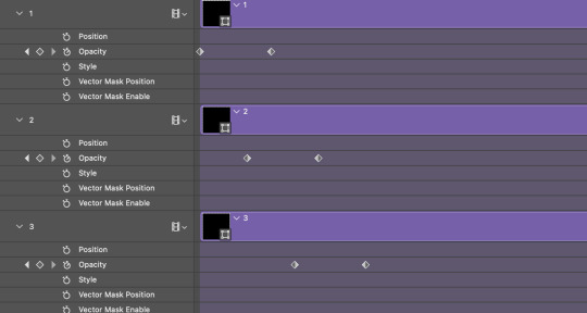
placement is key though ! here's 3 different ways you can place it.


NOTE: opacity has not been altered on any of these. depending on how it looks with your gif, opacity looks best at 10-30%.
Font settings: Momcake, thin, 10pt, #ededed.
each of these placements have different advantages.
the first placement (top left) is the one i personally use. it's centered right on the middle but not too high up.
the second placement (top right) is probably the most popular. corners mean people can kind of tuck the watermark away where it doesn't seem obvious. the fourth (bottom right) effectively does the same.
the third placement (bottom left) is 100% the most effective. it sits in a point exactly where it's noticeable, making it less desirable for reposters. on the right opacity too, you hardly notice it.
WATERMARK 2: ICONS/SIGILS
this is an idea that i've seen used mostly by nik @cal-kestis , but is a great and creative way to do it !
an icon or sigil makes your gif totally unique to you. and it's something cute on there which is different to having to put text on there.

(i've put it in orange for the purpose of seeing it)
but you can see here, it doesn't need to be anything special. i've just used an oval shape plus the initials of my url and that's it !
but a sigil can be anything. it doesn't need to have text; it could just be an image. it could just be your icon. either way, it's a cute little alternative to using text.
here's the different options that i preference in action.
SIGIL - bottom right corner

URL - bottom middle

TRACKED TAG - face/body

RESOURCES
here's some resources to use if you want to start watermarking !
FONTS:
Momcake (this one was used throughout all the text watermarks !)
Cocogoose
Lemon milk
Bebas
Quicksand
PSD
you can access a psd of editable watermarks here.
#tutorials#ps tutorials#resources#**l.myeditss#mine: resources#photoshop tutorials#idk who to tag so sorry 😭#usersmia#usercats#usernorah#userrsun
219 notes
·
View notes
Text

SCHAFER’S GIFFING TUTORIAL
hello guys! since im doing followers celebration and i think “why not make a gif tutorial too?” i started making gifs around this time last year, and here’s my giffing tutorial!
this tutorial will have basic giffing + coloring tutorials!
BEFORE YOU START:
make sure your video is at least 1080p, i always use 1080p video for my gifs, i think mkv works better than mp4, but it works either way.
filesize can be really big like almost 30gb if you’re giffing from a movie, so it’d be better if you have an external drive to save your files.
i use potplayer to screencap, pls download it from their official site, you dont want to get virus on your laptop.
i use photoshop cc 2019
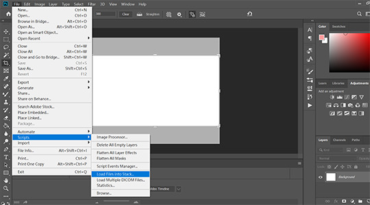
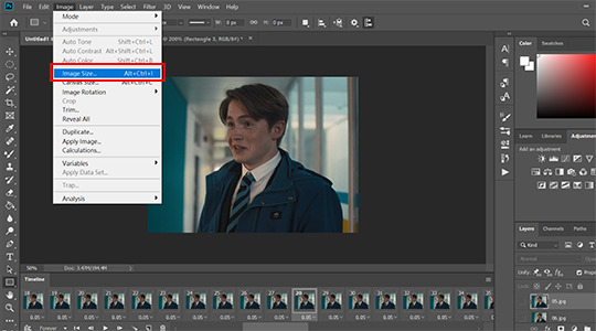
STEP 1: LOAD YOUR SCREENCAPS IN
go to File > Scripts > Load Files Into Stack then a window will show up tell you to choose your files
STEP 2: CONVERT VIDEO TIMELINE
click “Convert video timeline” then click three little boxes on the left corner in the pic.

STEP 3: REVERSE YOUR SCREENCAPS
once you converted to video timeline,
1. click three little lines highlighted by red box, then click “make frames from layers”
2. click three little lines again then click “select all frames”
3. click three little lines again then click “reverse frames” (cause when you converted your screencaps to video timeline, it’s reverse, so you need to do this step to reverse it back)

STEP 4: CHANGE YOUR GIF SPEED
i think .05 works the best since .04 is too fast and .06 is too slow.

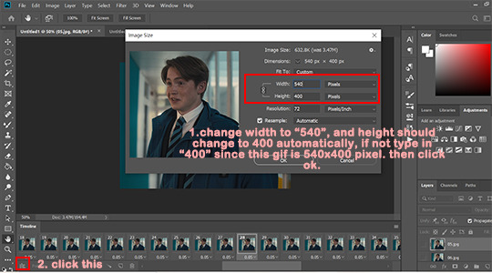
STEP 5: CROP AND RESIZE
most of my gifs are 540x610px or 540x400px, but sometimes i do 540x540px too. whatever you choose, pls make sure that width is 540px. in this tutorial, i go with 540x400px.

once you cropped your gif, go to Image > Image size > set width to 540 pixels and height to 400pixels, it should change to 400px automatically when you typed 540 into width but if not type 400px manually.
then click okay and click three little boxes on the left corner.
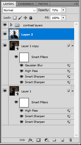
STEP 6: SHARPENING
go to Select > All Layers, and click three little lines on the right > convert to smart object.
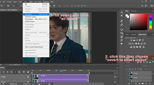
after you converted your gif to smart object, go to Filter > Sharpen > Smart sharpen.
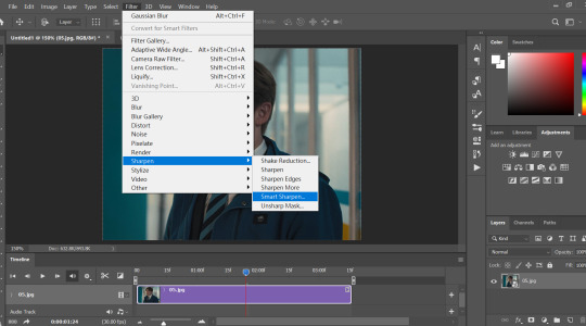
my personal sharpening setting has six layers in total, we’ll be adding two smart sharpen layers first.
layer one: amount: 500%, radius: 0.4px, remove: gaussian blur
then click okay and add another smart sharpen layer.
layer two: amount: 10%, radius: 10px, remove: gaussian blur
then click okay
next, go to Filter > Blur > Gaussian Blur > set radius to: 0.3px then click okay.
then add two more smart sharpen layers and one more gaussian blur layer
layer 3: amount: 500%, radius: 0.3px, remove: gaussian blur
layer 4: amount: 5%, radius: 5px, remove: gaussian blur
blur layer 2: radius: 0.3px
i ususally do step 1 to 6 with action so it saves me a lot of time since once you made an action, you only need to click play action.
STEP 7: COLORING
before we start, i wanted to say that there is no correct way to color gifs, so my coloring process may not be suitable for everyone. and i dont use psd, i color every single gif by hand since every gif has different lightning.
i ususally go from 1 to 5
1. Brightness/Contrast
i usually only adjust contrast unless the gif is super dark, my contrast is usually around 20-40 depending on the gifs.

2. Levels
levels is basically lifesaver and where you make most dramatic change here, like if the gifs is super dark or yellow, this is where you fix them.
i use black dropper to click on the darkest part in the gif and white dropper to click on the lightest part in the gif.
and remember that some scenes are just really dark, don’t over do it, it’ll make your gif look terrible.

before/after Levels:
you can see that we remove the ugly yellow and brighten it.
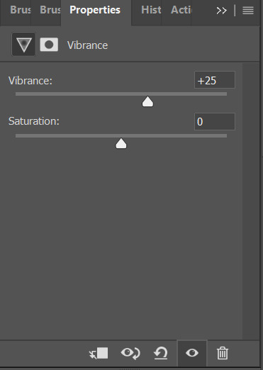
3. Vibrance
i only adjust Vibrance, usually around 20-35, sometimes i’d adjust saturation too. and pls DO NOT OVER SATURATE IT, over-saturated gif will look lousy and terrible if youre not making smaller gifs like 268x268px
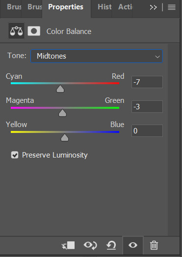
4. Color balance
i like my gifs look white/blue/cold ish, and here is where i cast the spell i mean make adjustment.

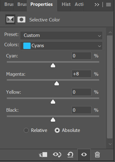
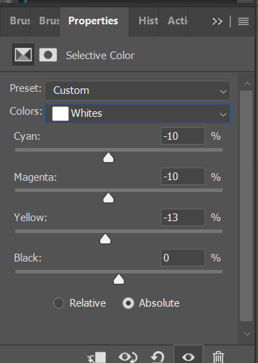
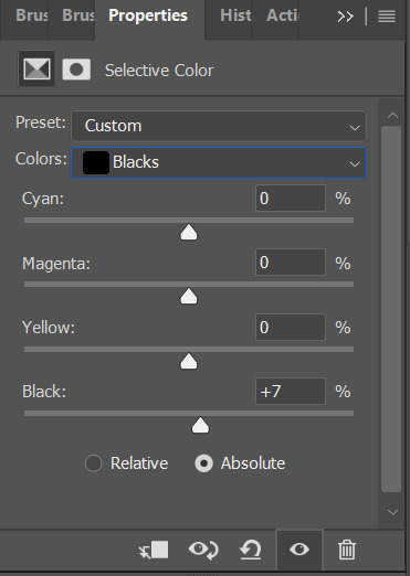
5. Seletive color
most of the time i only mess around with color black and white here, black: to add more contrast, white: to make white even brighter. sometimes i’d adjust color red too, if a charater’s face is too red, adjust color red’ cyan.
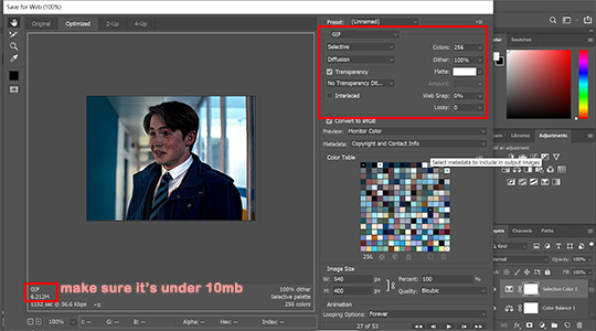
STEP 8: EXPORT YOUR GIF
go to File > Export > Save for Web (legacy)

make sure your gif is under 10mb since 10mb it’s tumblr’s gif size limit, and you can only post ten gifs in a post.
my save settings is usually Selective and Diffusion, and make sure transparency is checked.
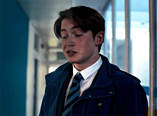
here’s the result:
that’s all! if you have any question pls don’t hesitate to send me an ask!!
#gif tutorial#ps tutorials#coloring tutorial#tuserkay#userrlucie#userrsun#usermarcy#userhers#userkarlo#userannalise#olivialook#userkosmos#userkarolina#userkraina#tuserheidi#userauden#usersem#***#*tutorial
283 notes
·
View notes
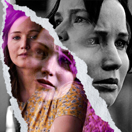
Note
Hi! I adore your gifsets! Could you please tell me if there’s any tutorial I could follow for the ripped book page effect like on your Rhaenyra and Alicent gifset?
hi thank you so much!! <3
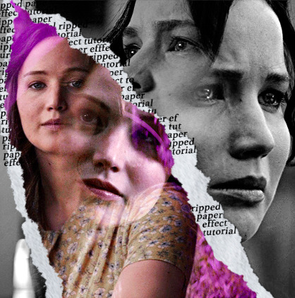
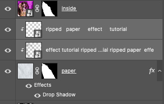
i don't know if there's a tutorial for it but it's fairly easy if you're familiar with photoshop. all you need is a texture that resembles old paper (or you can just use a white layer) & a ripped paper edge brush. (link to the gifset)
1, first you'll type out your text to know how big your texture needs to be, then put the texture you choose under the text layer
2, create a group of the text layer & your texture and add a layer mask to the group
3, make sure your layer mask is selected, click on the brush tool (B) pick one of the ripped edge brushes and with black click on where you want the ripped effect to be. repeat this on every side, it should look something like this:
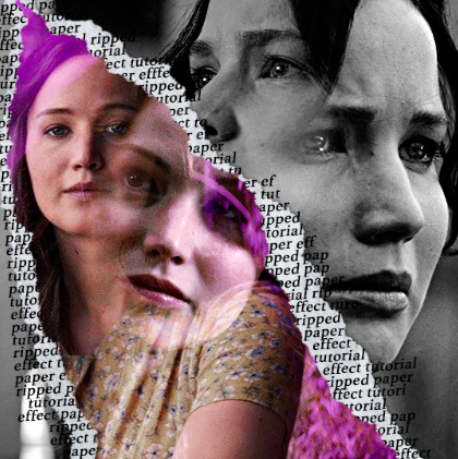
4. now comes the most important step in my opinion. you’re going to right click on the group, select blending options then inner shadow. this is going to give it depth. play around with the opacity & the angle to find what you like most

click okay and you’re done! i hope it was clear and i could help, if you have any more questions feel free to ask <3
18 notes
·
View notes
Video
youtube
Check Out This Unusual Blending Mode That Photoshop Pros Are Loving
#youtube#Check Out This Unusual Blending Mode That Photoshop Pros Are Loving#graphic design tutorial#photoshop tutorial#Blending Mode in Photoshop#free photoshop tutorials#ps tutorials#awesome tutorials
1 note
·
View note
Note
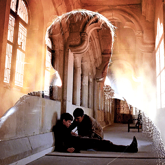
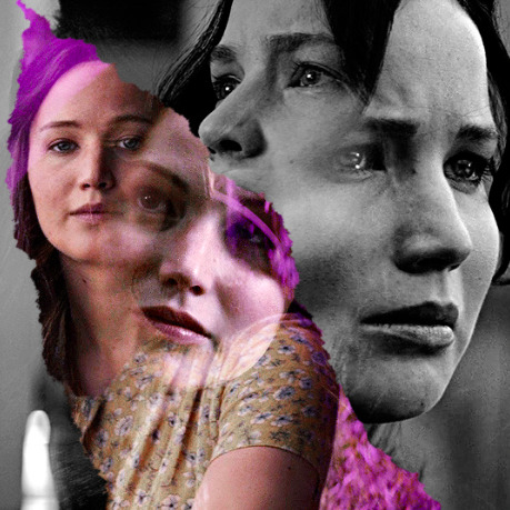
Hi! Can I ask how you did the double exposure gifs for your merlin set? They're beautiful btw!
heyy, thank you!! of course!
it's actually not very hard, the trick is to find the right shots for this. here's how i did it (reference gifset), under the cut.

for this tutorial i will be:
— using photoshop cs5 on windows
— assuming you know how to make gifs using the timeline
— have basic coloring, sharpening, groups, and layer masks knowledge
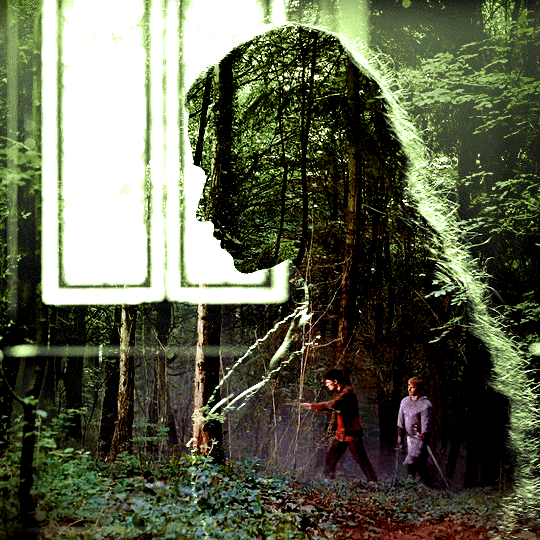
I. CHOOSING THE RIGHT SHOTS
the ultimate trick to pull this off is to choose the right image. in order to do the double exposure, you need a silhouette shot that has these:
a defined and dark silhouette with a background that is not too busy
enough contrast between the silhouette and the background
the silhouette should take at least 50% of the space
not too much movement
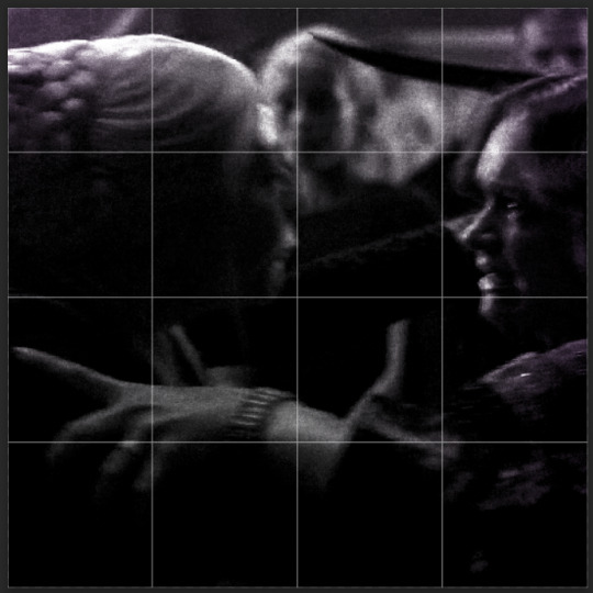
here are a few examples of why they work and why they won't:
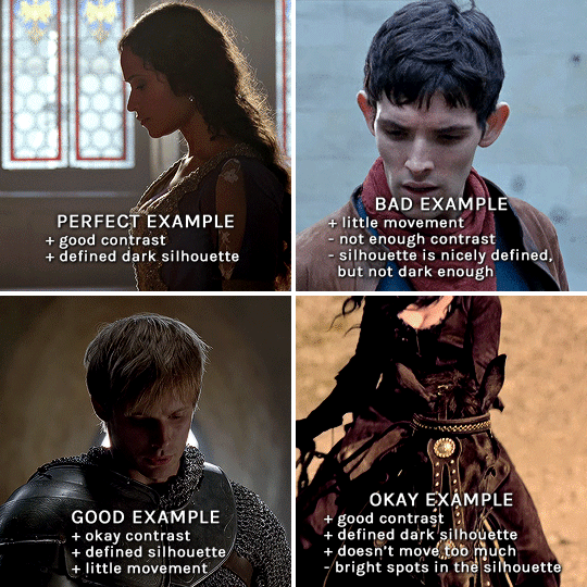
gwen: perfect example since this shot is already quite contrasted with a defined silhouette. there won't be a lot of work needed to make this one work.
merlin: not a great example because even tho there's a somewhat good contrast between him and the background, the silhouette is just too bright, not dark enough.
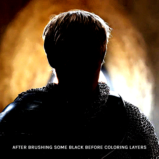
arthur: another good example, even if there are some bright spots on his face and armor. since he's not moving too much, you can definitely brush some black over him to make his silhouette darker (i'll explain/show later)
morgana: this one could work because the contrast is great, but of course her skintone is very bright against the black clothing. that being said, since the movement is not too bad, it could be possible to brush some black over her and move these layers with keyframes (as mentioned for arthur's example). i haven't tried it tho, but i think it would work well enough.
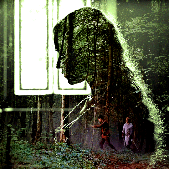
once you have your silhouette shot, you need another gif for the double exposure. what works best, in my opinion, are:
wide, large shots
shots with no to little camera movement (no pan, zoom, etc), but the subjects in the shot can have little movement of course
pretty cinematography/scenery shots
i find these are easier to find and make it work, it's not as "precise" as with silhouette shots. it's mostly just trial and error to see what works best with the silhouettes.
II. PREPPING THE SILHOUETTE
for the effect to work, we want a silhouette that's dark as possible. i'm gonna use the gwen and arthur shots as examples.
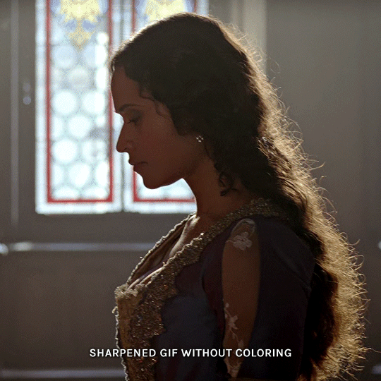
for the gwen gif, i started by sharpening, and then upped the contrast by quite a lot so her silhouette is mostly black, while retaining some nice details. i've used only 3 layers here:

selective color layer: in the blacks tab, playing with the black slider (value: +10)
brightness/contrast layer: added a lot of contrast (+61) and a bit of brightness (+10)
black and white layer: on top, its blending mode set to soft light and at 20% opacity. gives a bit more depth and contrast

then for the arthur example, i've also sharpened it first, and added contrast layers in this order (the skintone looks horrible, but it won't matter soon lol):
levels layer: black slider at 0, grey slider at 0.76, white slider at 104
selective color layer: in the blacks tab, black slider at +10
brightness/contrast layer: brightness at +1-, contrast at +47
black and white layer: on top, its blending mode set to soft light and at 20% opacity. gives a bit more depth and contrast
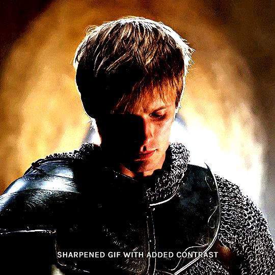
as you can see, half of his face is still quite bright. to correct that, create a new empty layer and put it between the gif and the coloring layers.
using a really soft brush and the black color, brush some black over his face and body on that new empty layer. you can edit the layer's opacity if you want, i've set mine to 71%. since arthur doesn't move much here, there's no need to keyframe this layer's position. for the morgana example, this is where you'd need to play with keyframes to make it work. here's where i'm at now after this:
you can always edit this layer later if you need, after doing the double exposure blending.
once the silhouette is all ready, you can put all layers in a group and rename it (i've renamed mine silhouette).
III. BLENDING
now the fun part! import the wide/scenery shot in photoshop, then resize it to the same height of your silhouette gif. make sure the gif is a smart object layer, and sharpen it. finally, bring this gif onto the silhouette canvas (by right clicking the smart object > duplicate layer). once you have both gifs onto your canvas, put the wide shot gif layer in a group, and set this group's blending option to screen.

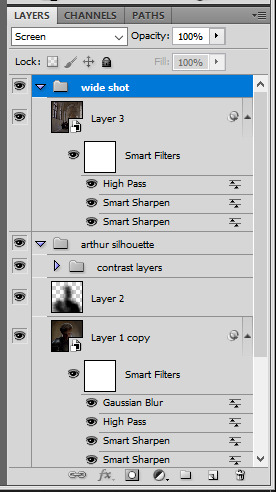
you can then position the wide/scenery gif the way you like it in the canvas. this is how it looks for both examples after i've done that:

if the blending mode screen doesn't give you the best result, so you can play around with other blending modes (such as lighten and linear dodge in these particular cases), but generally speaking, screen is the real mvp here haha.
IV. COLORING
now that the double exposure effect is done, we need to color the gifs to bring them together. i went with simple coloring here, simply enhancing the colors that were already there. just make sure that the coloring layers for each gif are in their respective groups. here's how i've colored both examples:
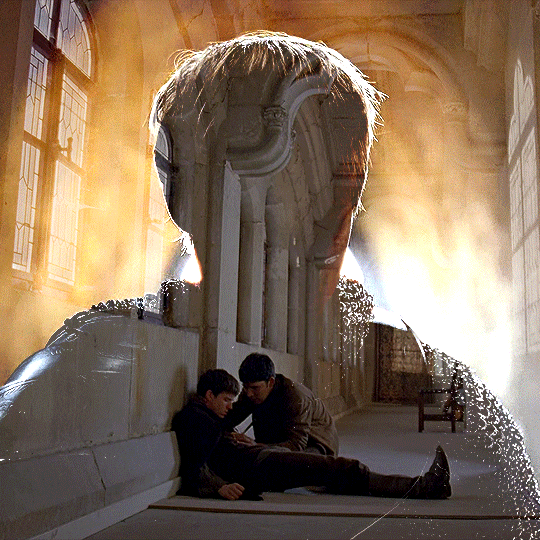
gwen silhouette group: i added a gradient map layer on top of the contrast layers in black to green and set the blending mode to color
scenery shot group: multiple coloring layers, with a green color fill layer (blending mode set to color), with a layer mask so it only affects the top half of the gif
for the arthur gif, i did something very similar but with warmer colors. i didn't use a gradient map for arthur though:
arthur silhouette group: i made the yellow warmer, closer to orange/red, with a hue/saturation layer, and added more vibrance. didn't feel like it needed a gradient map layer here though.
wide shot group: basic coloring layers to enhance colors from the merlin & daegal shot, and an orange color fill layer set to the color blending mode.
at this point you're pretty much done. just need to add some final touches and typography (if you want).
V. FINAL TOUCHES
a small and completely optional detail, but i wanted to soften the edges of the wide gifs. to do so i've duplicated the smart object gif layer and removed the sharpening filters (right click on smart filter > clear smart filters). put this layer on top of the other smart object layers (but still below the coloring).
then with this same layer still selected, go to filter > blur > gaussian blur... > 10px. this will give you a very blurry gif, but we only want the edges of the canvas to be softer. so add a layer mask to this layer. with a very large and soft brush (mine was at 0% hardness and about 800px size), brush some black onto the layer mask to remove the blur in the middle of the gif.

you can play with this layer's opacity or gaussian blur amount if you want (by double clicking on the gaussian blur smart layer filter). here how both examples look with this gaussian blur layer:

you can also mask some of wide/scenery gifs if you'd prefer, so it shows less outside of the silhouette. just put a layer mask on that whole wide shot group and brush some black or grey on the layer mask. it's what i did for the gwen gif, with a very soft brush and i set the mask density to 72% (i kept the arthur one as is tho):

and that's how i did it! hopefully that was clear enough :)
#alie replies#*ps help#resource#tutorial#allresources#*gfx#usercats#usersmia#userrobin#userfaiths#usertina#usermoonchild#userchibi#uservivaldi#usertreena#userraffa#userriel#userelio#usermadita#usersmblmn
962 notes
·
View notes
Text
Hello!! A couple years ago I posted this tutorial for making gifs with a moving overlay effect. In the two and a half years since I made that tutorial, I've learned some new tricks for this gif effect but most importantly I've learned how to explain things better.
For that reason, I've created this new and improved tutorial for my overlay gif effect. The basics are the same but it's simpler, I go into more detail, give better explanations, and have more comprehensive instructions.
The easiest way to do this effect with this method is to use smart objects and work in timeline. For this tutorial, I’m assuming you know the basics of giffing like cropping, resizing, colouring, etc. If you need help with this I’d suggest you look at some other tutorials and guides!!
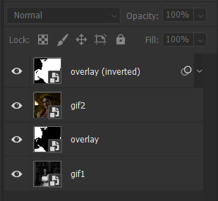
First, we’re going to start off with three things.
1. A completed gif converted into a smart object that is going to be the base gif. I'm going to call this "gif1". You’ll want this gif to be at least 3 seconds because it needs to last as long as the overlay plus a little bit of extra time in the beginning.
This is the base gif I’ll be using in the example (except I trimmed it so that I could meet the size limit).
2. A second completed gif converted into a smart object that is going to go over the base gif. We’re going to call this "gif2". This gif should be at least 2 seconds but I’ve made it work with shorter. Gif2 needs to be the same dimensions or bigger than gif1.
This is the gif I'll be using in the example (except I trimmed it so that I could meet the size limit).

3. An overlay in video form. These can be found on tumblr and youtube by search for overlay or transition packs. For this example, I'll be using an ink drop overlay I found on youtube.
Step 1: Turning the overlay video into an overlay gif
Most overlays aren’t going to instantly fit the gif effect you’re trying to achieve right away. This is the overlay I got from youtube and as you can see it’s too slow and needs a crop/resize to be usable.

To fix it, I sped the frame rate up, cropped the overlay, and resized the overlay so it fits over my base gif. I also sharpened the overlay (500% amount, 0.3px radius) so that the edges were smooth. This is the new overlay gif and the one I’ll be using for the gif effect.

A tip: I also like to add a brightness/contrast layer to get rid of the grey on the overlay gif. Because we’re working with blending modes to achieve this effect, any parts of the overlay that are grey will be a blended mix of gif1 and gif2. If you think this will look good for your gif effect then don't worry about it!
Another tip: try to get the entire overlay movement to fit into a 2-3 second window. Anything longer than that will likely be cut off when you have to trim your gif to meet the upload size limit and it would suck to only have half of the overlay.
Step 2: Creating the gif effect
Drag a copy of gif2 and a copy of the overlay gif onto the gif1 canvas. I like to use Ctrl+Shift+V so that the layers are pasted in the same position as they were on the previous canvas. MAKE SURE that both overlay layers are in the same position on the canvas. If one of the overlay layers is higher/lower/etc. than the other then the effect won't work properly.
Then, make a second copy of the overlay and invert it (Ctrl+i). These are the layers you should have:

Before you go any further, trim gif2 and both overlay layers so they are all the same length.
Now, we need to rearrange the layers and set blending modes. The top layer should be whichever overlay goes from black to white. This is because when we change the blending modes, the white part of this layer will disappear and look like its being replaced by gif2. In this case, that is the overlay (inverted) layer. Then we want gif2, the other overlay layer, and then gif1.
A tip: this process can be done the other way where the top layer is the overlay that goes from white > black however, you are much more likely to have an error where there is a grey/black line around the overlay effect in your final gif. In order to avoid that, I always use the black > white layer on top.
Next, set the top overlay layer to darken. You should only see the black part from the overlay and gif2 should fill in the white part. Here’s how that looks in my example.
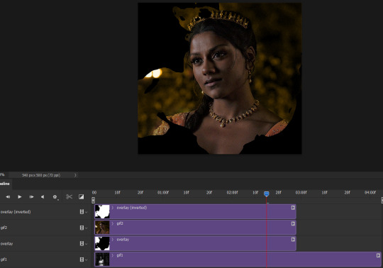
Next, select the top overlay layer and gif2 and convert both layers into one smart object. Your layers tab should look like this now.

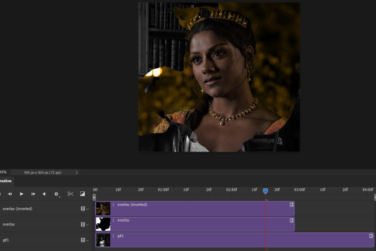
Now, set the new layer’s blending mode to lighten and the overlay layer’s blending mode to darken. Once you do this, you should be able to see gif1 as well as the overlay gif.
Step 3: Timeline and exporting
At the moment, gif1 is still significantly longer than the overlay gifs. Since this gif is just over 10 mb (which is pretty small for this effect) I’m going to trim about 1/4 of a second off the end of gif1 and then drag the overlay layers so they all end at the same time.

Now you’re free to export the gif! This is the finished effect for the example gif!

A tip: sometimes, when I convert to from timeline to frames, the gif becomes a little longer and slower. It has to do with different frame rates across the videos and photoshop but I'm not smart enough to understand it. If that happens, just set all the frames with the overlay layers to 0.04 speed instead of 0.05.
And we're finished! I hope that was helpful and made sense. If you have any questions feel free to drop them in my inbox or send me a message!! <3
#gif tutorial#allresources#completeresources#dailyresources#chaoticresources#ps tutorial#photoshop tutorial#usertreena#tuserssam#usernik#tuserabbie#tuserace#userk8#usershreyu#uservalentina#useryoshi#userannalise#userrobin#usersalty#uservivaldi
1K notes
·
View notes
Text

FALLING LETTERS ANIMATION tutorial
hello! @kimmomi asked for a tutorial on how i made the letters "fall" in this gifset and so i figured i would make it and post here! this effect isn't hard to achieve but it might get a little tedious if you have a lot of letters.
note: you will need photoshop with a timeline!
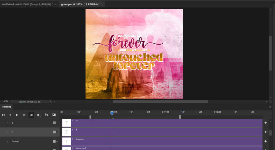
STEP ONE: create your base gif! be mindful of number of frames in your gif. the number of frames doesn't really matter here, altho the longer the gif the better the effect. i'd say try to limit it to 60-70 frames, depending on how big your final gif will be.
STEP TWO: make your text the way you want it to look. this effect is basically the last step of your gif making process. (i will be using the typography from my set as an example as i already have that psd saved)
this is what my typography looks like now.

STEP THREE: i would recommend that the word at the bottom be the word that "falls". for me that is forever.
now, you will have to duplicate the "forever" layer and make your non-copy forever invisible.
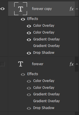
what you will want to do now is delete all the letters but the first one in the duplicated layer. for me that is f. then you just duplicate the f layer and write your second letter instead of it, in my case o. you will have to do this for all letters. also as you do that make sure to move them a bit away from each other.

now, what helps to align those letters where they start off, is making your non-copy layer to be visible again.

after you've aligned your letters, make the non-copy layer invisible again.
STEP FOUR: so now we come to a bit of a tedious part.
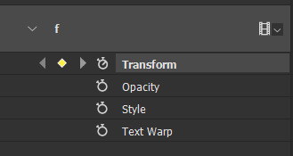
what you will do now is move the playhead (blue timeline arrow) a bit further from the beginning of the gif (this allows for the text to stay still a bit before it starts "falling") and click on the first letter.
next step is to click on the little arrow next to your letter and clicking on the stopwatch next to Transform.

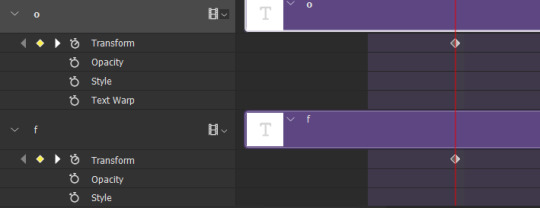
then, you will take the playhead and drag it to the end of the gif where you will start with transforming your letter with Free Transform tool (shortcut ctrl+T on windows). and what you will do is, while in Free Transform mode, drag your letter to the bottom of your gif while also rotating it a bit. when you're happy with your placement of the letter, hit enter. see below gif for how i did it.

you will have to do this for every letter, but make sure to rotate some in the other direction. also make sure that the beginning of the stopwatch mark is the same for every letter.
and that is basically it! after you transform every letter, you can go and save your gif.
this is my final result:

for some extra dramatic look, you can duplicate your initial layer with the whole word on it, drag it above all layers, clear layer style and add a stroke and make sure its FIll is at 0% where you will get the outline text that stays behind.

i hope this was helpful and understandable. if you have any questions, feel free to send me an ask or dm me <33
#usergif#completeresources#allresources#gif tutorial#ps help#userkimchi#uservivaldi#userraffa#tusermona#userelio#usercats#tuserheidi#usershreyu#userhallie#userroza#userdean#userisaiah#thingschanged#tusercasey#usertj#userwwz
513 notes
·
View notes
Text
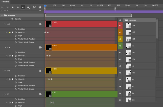
TILE TRANSITION TUTORIAL
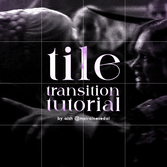
a couple of people have asked me for a tutorial on how I did the penultimate gif in this set, so here goes! this is my first tutorial, so please feel free to reach out with further questions if anything's unclear.
note: this tutorial assumes you know the basics of gifmaking, can create the base gifs, and are familiar with timeline mode.
STEP ONE: create the base gifs! I'd recommend staying between 25-40 frames for each gif, since the transitions we'll use later tend to increase gif sizes. these are the ones I'll be using for this tutorial:


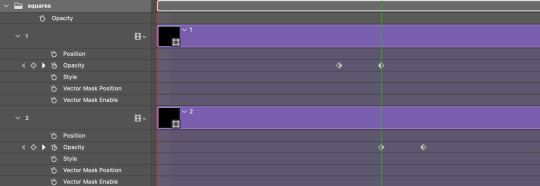
STEP TWO: create the guide layouts for both base gifs. for this panel, I chose a 4x4 grid — I would recommend keeping the number of "tiles" low because it can get tedious, but have a minimum of 9 (3x3 grid).

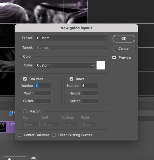
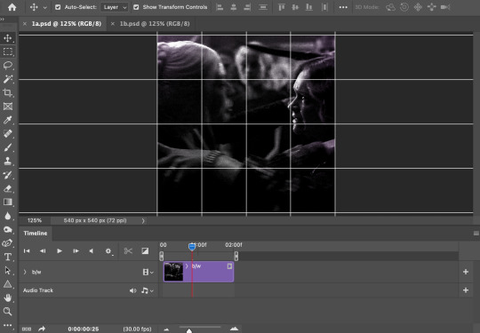
now your canvas should look like this:
STEP THREE: create the tiles. this is where the going gets rough; there might be easier ways to do this that I couldn't think of 😭 if there are any please send me an ask!
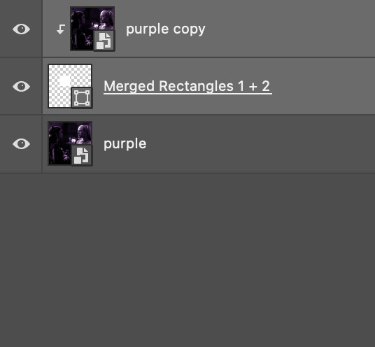
essentially, in this step we'll cut up the base gifs into smaller squares so that each tile can be manipulated separately when we put both gifs together. to do this, first create a square using the rectangle tool and the guides. then duplicate the base gif, move it above the square, apply a clipping mask, and then convert the clipped gif and square (selected in the image below) into one smart object.
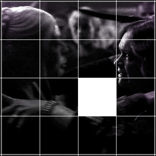

ALTERNATELY: you could duplicate the original base gif and use layer masks to isolate tiles. create a layer mask for the duplicated gif layer and, with the layer mask selected, drag your mouse over a square (using the guide layout) and press delete. then press ctrl/cmd + i to invert the layer mask so that the gif only shows in the square of your choosing.
now repeat until you've got the entire gif in tiles, and do the same for the other gif!
since the transition effect is achieved by staggering the crossfades for each tile of the final gif, you can cheat by having multiple tiles "flip" at a time, ideally no more than four. this means you need to cut the base gif up into fewer pieces. to do this, simply draw multiple squares instead of one and then merge the shapes, before duplicating and clipping the gif onto them.
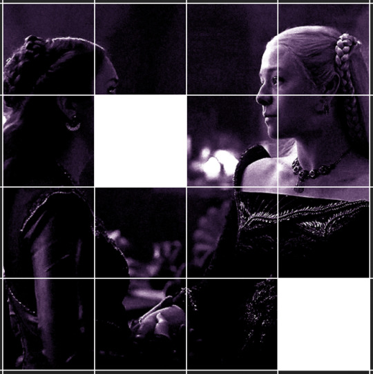
if you do this, it's essential to remember that you have to divide both gifs up in the exact same way. each piece of the b/w gif has to correspond to a piece of the purple gif!
this is what the layers look like for each gif once I'm done:

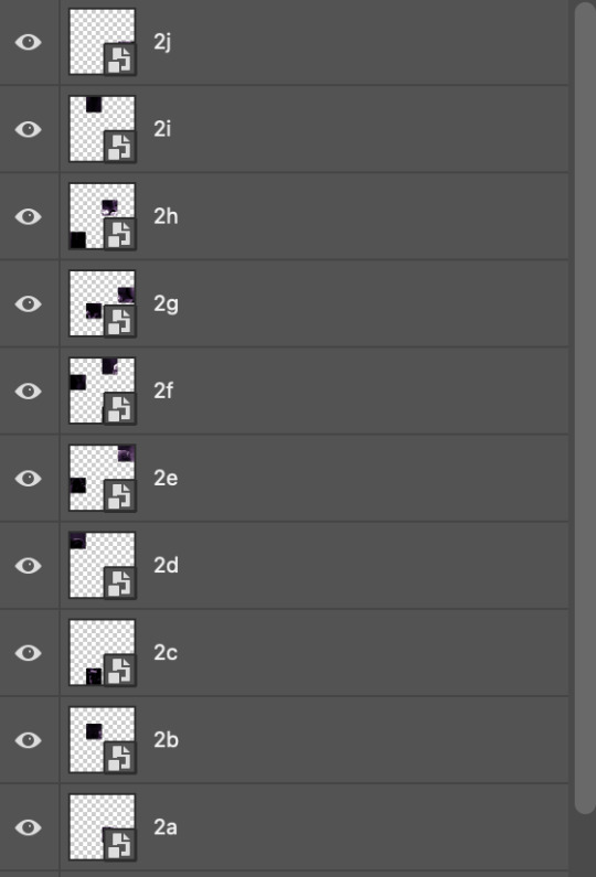
I have them lettered so that it'll be easier to match them up in the next step.
STEP FOUR: this is the complicated bit that took me two days to figure out. I'll do my best to explain but don't hesitate to reach out if something isn't clear!
to begin, open up a new psd and import both base gifs into it. (remember to click "create video timeline" and ensure that your gifs are all in order before proceeding.)
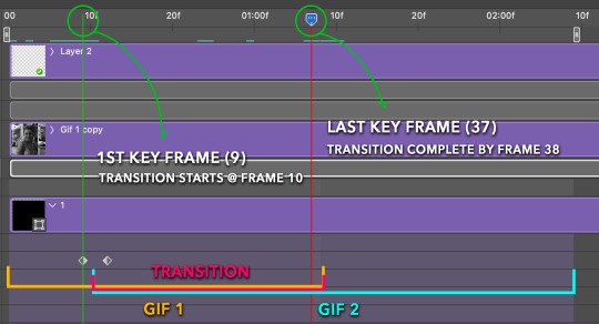
now, the trickiest part about this transition is ensuring that all the little tiles sync up so that the larger gif is coherent. so first we'll create some markers (just empty layers) to ensure that everything lines up as it should.
— marker 1: at about halfway through the first gif (b/w in this case)
— marker 2: at about a quarter of the gif length
— marker 3: close to the end of the gifs
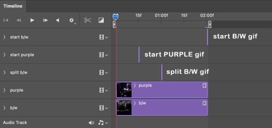
at this point we're ready to start bringing in the tiles. I'm going to delete the base gifs from this new psd just to keep things cleaner!
first thing to do is import my b/w tile. move the timeline slider over to marker 1 and split the first gif. (if it helps, rename the split gifs and add (start) and (end) to the two halves.) then, move the (end) half to the beginning of the timeline, and the (start) half to line up with marker 3.
the purple tile is easier to manage. simply import it into the psd and line it up with marker 2.
your timeline should now look like this:
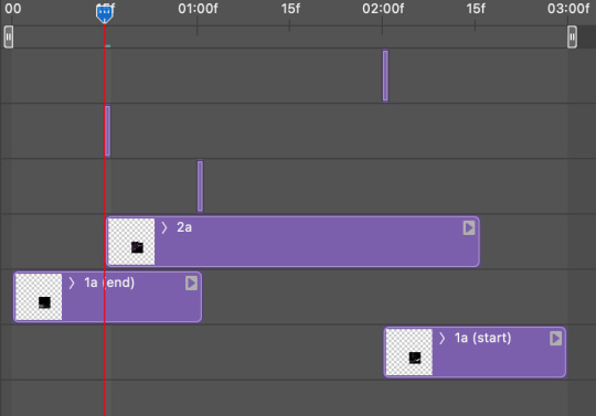
notice the overlap between the gifs at their beginnings and ends — this is where you'll be able to cascade the tiles flipping, so it helps to have a significant amount of overlap.
crop the three gifs for this tile as you see fit! since this is the first tile I want to flip from b/w to purple, I'll crop gif 1a (end) all the way to the current position of the timeline slider (red line with blue tip) and leave the beginning of gif 2a uncropped. for the flip from purple to b/w, I'll crop both gifs a bit.
once that's done, drag all three gifs onto the same level in timeline so they form a video group. your timeline should look something like this:

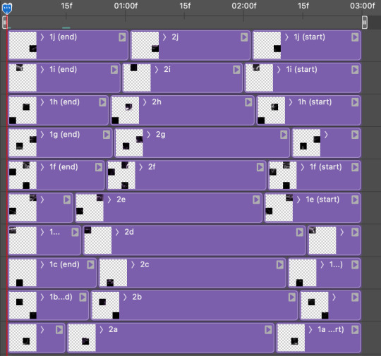
now you just repeat the process for all the other tiles! as long as you made sure that all the tiles in one gif correspond with tiles in the other gif in step three, this should be a fairly painless process. make sure to crop the starts/ends of the gifs separately so that they don't all flip together.
this is what my layers look once I've done all the tiles:
and the gif!
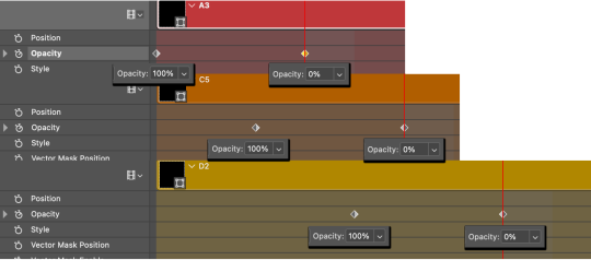
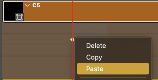
STEP FIVE: transitions! click on the half-white square (top right of the left column in the timeline, beside the scissors) and select the crossfade transition, then drag it between two gifs in a video group. it should create a two-triangle symbol and shorten the overall length of the video group.

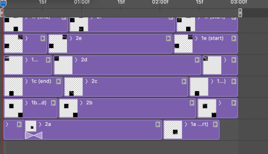
apply the transition to all the tile flips, ensuring that the duration of all transitions is constant. this can sometimes be tricky because ps likes to change the duration of each transition, so right click on the transition symbol and manually change all your transition durations to be the same.
your layers should now look something like this:
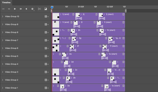
STEP SIX: draw the grid. bring back the guide layout from step two and using the line tool (I like 2px thickness), trace the grid. adjust opacity as you see fit (50-80% is usually a good idea), so that the canvas looks like this:
STEP SEVEN: export and celebrate! you're done!
I hope this tutorial made sense and was easy to follow, and happy giffing! my inbox is always open for any questions <3
#tutorial#ps help#ps tutorial#userace#alielook#userabs#usercats#userhella#userfaiths#tuserabbie#usershreyu#usertreena#tuserlucie#uservivaldi#usertj#usergiu#userroza
598 notes
·
View notes
Text

COLORING + SHARPENING TUTORIAL
someone asked for a coloring tutorial and my sharpening settings, so here it is! there are also a few tips to achieve more HQ gifs. :)
tutorial under the cut!
FOR HIGH-QUALITY GIFS
FILE SIZES
it doesn’t matter what your sharpening settings are if the file you’re using to gif is too low quality, so i tend to look for the best that i can get when downloading stuff.
usually, movies (+2h) look better if they’re 5GB or more, while an episode (40 min/1h) can look good with even 1GB. the minimum definition i try to find is 1080p, but i gif with 2160p (4k) when available. unfortunately, not every computer can handle 4k, but don’t worry, you can gif with 1080p files just fine if they are big enough. contrary to popular belief, size does matter! which means sometimes a bigger 1080p file is better than a smaller 2160p one, for example.
SCREENCAPPING METHOD
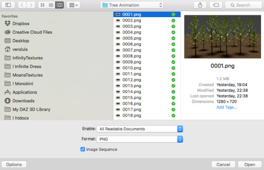
this can too influence the quality of your gifs. as a gifmaker, i’ve tried it all: video frames to layers, directly opening video clips, loading files into stack, and i’ve finally settled down with opening screencaps as an image sequence. with bigger files, it doesn’t matter much what technique you use, but i’ve noticed with smaller files you can do wonders if you screencap (either by loading files into stack or opening as an image sequence) instead of using video clips. for example, this gif’s original video file was only 4GB (so smaller than i’ve usually go for), if you can believe it!
here’s a tutorial for setting up and screencapping with MPV, the media player i use to screencap. again, you can keep using video clips for bigger files, but you’ll find this useful when dealing with dire causes. i don't file loads into stack, though, like the video does. i open as an image sequence (open > screencap folder > select any image > click the image sequence button). just select OK for the speed. this will open your screencaps as a video clip (blue bar) in timeline mode (i'm a timeline gifmaker, i don't know about you). you will need this action pack to convert the clip into frames if you're a frames gifmaker. i suggest you convert them into frames even if you're a timeline gifmaker, just convert them into a timeline again at the end. that way you can delete the screencaps right away, otherwise you will delete the screencaps and get a static image as a "gif".
ATTENTION if you’re a Mac Sonoma user, MPV won’t be an option for you unless you downgrade your system. that is, if you have an Intel chip. if you have M1 Max chip (or even a better one), here’s a fix for MPV you can try while keeping that MacOS, because nowadays MPV is skipping frames in its latest build. or you can use MPlayer instead for less hassle. here are two tutorials for setting and using MPlayer. Windows users are fine, you can use MPV without trouble.
FOR EVEN MORE QUALITY
ADD NOISE
here’s a tutorial for adding noise as a way to achieve more HQ gifs if your original material is too low quality.
REDUCE NOISE WITH CAMERA RAW
instead of adding noise, you can reduce it, especially if your gif is very noisy as it is.
the path is filter > camera raw > detail > nose reduction. i do this before sharpening, but only my video file isn't great to begin with. because it’s a smart filter, you can reduce or increase its opacity by clicking the bars next to its name in the layers panel.
TOPAZ AI
i use Topaz Photo AI to increase the quality of my screencaps when i need to. it’s paid software, but there are… ways to find it for free, usually on t0rrent websites. if someone’s interested, i can make a tutorial solely about it in the future.
SHARPENING SETTINGS
here are my sharpening settings (filter > sharpen > smart sharpen). i sharpen things twice: 500% 0.4px + 10% 10px. here's an action for it, for more convenience. here's a tutorial on how to use Photoshop actions. for animated stuff, i use this action pack.

COLORING
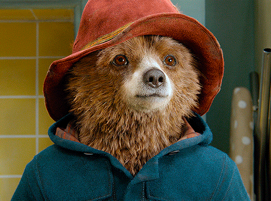
here’s the gif i'm gonna use as a base. it’s already sharpened like the way i always do it.

LIGHTNING THE SHOTS
half of the secret of a good coloring is good lightning. i always useCurves (layers > new adjustment layer > curves) and Brightness & Contrast (layers > new adjustment layer > brightness & contrast). the settings depend on the scene you’re giffing, but i always try make my gifs bright and with high contrast to make the colors pop.
CURVES
besides lighting your scene, the Curves adjustment layer has four automatic options that will color-correct it for you. it’s not always perfect and it doesn’t mean you won’t need to do further coloring, but it’s a great start. it’s a lifesaver for most ridiculously yellow scenes. look at the difference! this gif uses the 3rd automatic option (the screenshot below isn't mine btw so that's why the fourth option is the chosen one), from top to bottom. what automatic option you need to choose depends on the gif.

sometimes i like to tweak my Curves layer. not everybody does that, it’s not that necessary and if you’re not careful, it can screw your gif up. to modify your layer by hand, you will need to click and drag points of that straight line in the position you desire. this is the concept behind it:

basically, the lower part of the line handles the shadows, while the upper part handles the highlights of the image. if you pull a highlight point up, the image’s highlights will be brighter. if you pull it down, it will make them darker. same thing for the shadow points. you should play with it to get a grasp of it, that’s what i did when i first started giffing.
BRIGHTNESS & CONTRAST
then i added a bit of brightness and contrast.

CHANNEL MIXER
the scene looked a bit too yellow, so i used the Channel Mixer (layer > new adjustment layer > channel mixer) adjustment layer. here’s a tutorial of how it works. not every scene needs the Channel Mixer layer though, i mostly use it to remove heavy overall tints. in this particular case, the Curves layer got rid of most of the yellow, but i wanted the gif to be just a bit more blue so the Channel Mixer tweaks are very minimal.

SELECTIVE COLOR
now, this adjustment layer i always use: Selective Color (layer > new adjustment layer > selective color). this is THE adjustment layer to me, alongside the Curves one. this is how it works:

ie, you can separately edit a color this way, giving it tints. for this gif, i wanted to make the colors more vibrant. to achieve that, i edited the selected colors this way:
for the reds, i added even more red in them by moving the first slider to the right, making the color more vibrant. for his hat to have a more warm tint, i added yellow to the reds (third slider, moving it to the right). finally, to make the reds stronger, i moved the last slider to the right (more black).
for the yellows, i made them brighter by adding white to them, thus making the tile wall and Paddington more bright as well.
for the cyans and the blues, i just added the maximum (+100) of black that i could.
i wanted for Paddington's nose to be brighter, so i added more white to the whites.
lastly, i added depth to the blacks by increasing their own blackness.
you should always play with the Selective Colors sliders for a bit, before deciding what you want or need. with time, you will automatically know what to change to correct the color grading. it all takes practice!
HUE/SATURATION
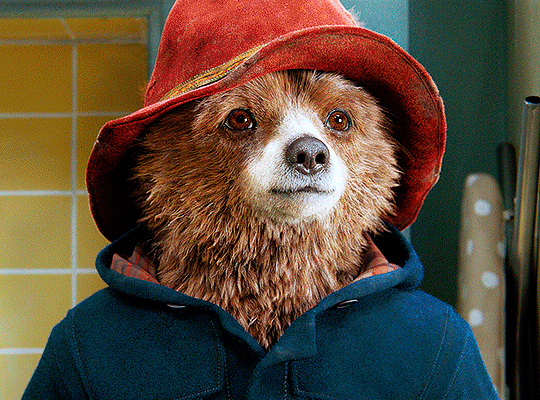
i don’t know if you noticed, but there are some green spots on the blue wall behind Paddington. to correct that, i added a Hue/Saturation adjustment layer (layer > new adjustment layer > hue/saturation) and made the saturation of the greens 0%, making that unwanted green disappear from the background.

while the green spots on the wall are specific for this gif, i use hue/saturation a lot to tweak, well, hue and saturation. sometimes someone’s skin is too yellow, i made it redder by tweaking the reds and the yellows, or vice-versa. the hue bar follows the rainbow bar, so the maximum settings (+100 and -100) give the selected color to change its hue to something more red or pink (the rainbow extremities). changing hue can give pretty whacky results, like turning someone’s skin tone to green, so you will need to play with it to get the hang of it. you can also tweak the opacity of your hue/saturation layer to further improve your gif’s coloring. i didn’t do it in this case, the opacity is still 100%. the reds and the blues had their saturation increased to make them pop just a bit more, without affecting the other colors.
COLOR BALANCE
the highlights of the gif still had a green tint to it due to the automatic correction of the Curves layer, so i used Color Balance. this is how it works: instead of giving specific colors some tints, you can give them to the shadows, highlights, and mid-tones. if your shadows are too blue, you counterbalance them with the opposite color, yellow. same thing with the cyan-red and magenta-green pairings. in my case, i added a bit of magenta.


B&W GRADIENT MAP
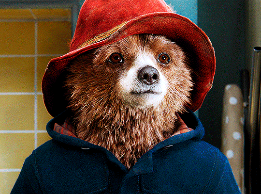
now, if this gif was a dish, it’s time for the salt and pepper. i always add a Gradient Map (layer > new adjustment layer > gradient map) (black to white gradient) with the Soft Light blending mode, thus giving my shadows more depth without messing with the mid-tones and highlights. it also doesn’t “deep fry” (you know those memes?) the gif too much by adding even more contrast. usually, the opacity of the layer is between 30% to 70%, it all depends on the gif. it always does wonders, though!
COLOR FILTER
finally, i like to add Color Filters (layer > new adjustment layer > color filter) to my gifs. it’s very handy when giving different scenes for the same minimalistic set because it makes them kind of match despite having completely different colors. in this gif’s case, i added a “deep blue” filter, opacity 50% density 25. you can change the density and the opacity of the layer for further editing, again, it all depends on the gif.

VIBRANCE
if i feel like it, i add a vibrance layer (layer > new adjustment layer > vibrance) to make the colors pop. this can ruin your coloring sometimes, especially when regarding skin color, so be careful. i didn't do it in this gif because i felt i didn't need it.
TA-DA! 🥳
AN OTHER EXAMPLE
the color grading of the original scene it’s pretty good as it is, to be honest. let’s see a worse scenario, a VERY yellow one:
no channel mixer this time because the automatic curves option dealt with the yellowness, but you can see it made the gif too green. i needed to correct that with the following adjustment layers:
curves (automatic option) (gif 2) >> same curves layer (tweaks) (gif 3) >> brightness & contrast (gif 4) >> hue/saturation (tweaked cyan+blue+green) >> selective color >> color balance (gif 5) >> b&w gradient map >> (sepia) filter >> vibrance (gif 6)
i added a hue/saturation layer to remove the blues & greens before my selective color layer because i thought that was more urgent than tweaking the tint of all colors. color balance (gif 4) was the real hero here, though, by removing the green tint. the selective color layer was meant to make the red pop more than anything else, because the rest looked pretty good, especially her skin tone (despite the green tint). you can notice that tweaking the curves layer (small gif 3) also helped A LOT with the green problem.
tl;dr 😵💫😵💫😵💫
here's a list of my go-to's while coloring and lightning gifs. it's not a rule, just a guide. there are gifs in which i don't use all these adjustment layers, or use them in a different order. it all depends!
1. curves (automatic option + tweaks)
2. brightness & contrast
3. channel mixer
4. selective color
5. hue/saturation
6. color balance
7. b&w gradient map
8. color filter
9. vibrance
i'll suggest that you study each adjustment layer listed for more info, either with other Tumblr tutorials or YouTube ones. the YouTube ones focus on images, but you can translate what they teach to gif making very easily. you can ask me to further explain any adjustment layer, too! i was brief to keep this short (which i kinda failed lol).
feel free to ask me for clarification or something else about gifmaking wise, i always like to help. ❤️
#*#*tutorial#gifmaker tag#resources#resource: tutorials#ps help#uservivaldi#tuserjen#userrin#userelio#useralien#userzaynab#userchibi#userbuckleys#usertj#userbess#tuserlucie#useraljoscha#userdavid#usershreyu#usernolan#userhallie#userisaiah#tusergio#tusergeo#userjesslynn
196 notes
·
View notes
Text
Someone asked me how I created the fade transition in this gifset which I’ll try to explain in the most comprehensive way that I can. If you've never done something like this before, I suggest reading through the full tutorial before attempting it so you know what you'll need to plan for.
To follow, you should have:
basic knowledge of how to make gifs in photoshop
some familiarity with the concept of how keyframes work
patience
Difficulty level: Moderate/advanced
Prep + overview
First and foremost, make the two gifs you'll be using. Both will need to have about the same amount of frames.
For ref the gif in my example is 540x540.
I recommend around 60-70 frames max total for a big gif, which can be pushing it if both are in color, then I would aim for 50-60. My gif has a total of 74 frames which I finessed using lossy and this will be explained in Part 4.
⚠️ IMPORTANT: when overlaying two or more gifs and when using key frames, you MUST set your frame delay to 0.03 fps for each gif, which can be changed to 0.05 fps or anything else that you want after converting the combined canvas back into frames. But both gifs have to be set to 0.03 before you convert them to timeline to avoid duplicated frames that don't match up, resulting in an unpleasantly choppy finish.
Part 1: Getting Started
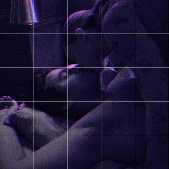
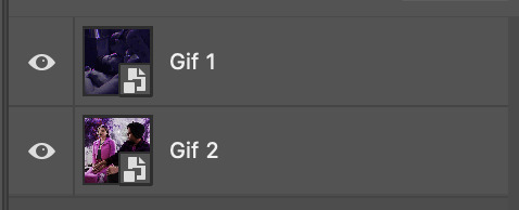
Drag one of your gifs onto the other so they're both on the same canvas.
The gif that your canvas is fading FROM (Gif 1) should be on top of the gif it is fading INTO (Gif 2).
And here's a visual of the order in which your layers should appear by the end of this tutorial, so you know what you're working toward achieving:

Part 2: Creating the grid
Go to: View > Guides > New guide layout
I chose 5 columns and 5 rows to get the result of 25 squares.
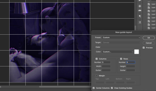
The more rows and columns you choose, the more work you'll have to do, and the faster your squares will have to fade out so keep that in mind. I wouldn't recommend any more than 25 squares for this type of transition.

To save time, duplicate the line you've created 3 more times, or as many times as needed (key shortcut: CMD +J) and move each one to align with the guides both horizontally and vertically. You won't need to recreate the lines on the edges of the canvas, only the ones that will show.
After you complete this step, you will no longer need the guides so you can go back in and clear them.

Follow the same duplicating process for the squares with the rectangle tool using the lines you've created.
Align the squares inside the grid lines. The squares should not overlap the lines but fit precisely inside them.
This might take a few tries for each because although to the eye, the squares look all exactly the same size, you'll notice that if you try to use the same duplicated square for every single one without alterations, many of them will be a few pixels off and you'll have to transform the paths to fit.
To do this go to edit > transform path and hold down the command key with the control key as you move one edge to fill the space.
Once you're done, put all the squares in their separate group, which needs to be sandwiched between Gif 1 and Gif 2.

Right click Gif 1 and choose "create clipping mask" from the drop down to mask it to the squares group. This step is super important.
After this point, I also took the opacity of the line groups down to about 40% so the lines wouldn't be so bold. Doing this revealed some squares that needed fixing so even if you aren't going dim the lines, I recommend clicking off the visibility of the lines for a moment to make sure everything is covered properly.

Part 3A: Prep For Key framing
I wanted my squares to fade out in a random-like fashion and if you want the same effect, you will have to decide which squares you want to fade out first, or reversely, which parts of Gif 2 you want to be revealed first.
In order to see what's going on underneath, I made Gif 1 invisible and turned down the opacity of the squares group.

If you want text underneath to be revealed when the squares fade away, I would add that now, and place the text group above Gif 2, but under the squares group.

Make a mental note that where your text is placed and the order in which it will be revealed is also something you will have to plan for.
With the move tool, click on the first square you want to fade out. Every time you click on a square, it will reveal itself in your layers.
I chose A3 to be the first square to fade and I'm gonna move this one to the very top of all the other square layers.
So if I click on D2 next, that layer would need to be moved under the A3 layer and so on. You'll go back and forth between doing this and adding key frames to each one. As you go along, it's crucial that you put them in order from top to bottom and highly suggested that you rename the layers (numerically for example) which will make it easier to see where you've left off as your dragging the layers into place.

Part 3B: Adding the Keyframes
This is where we enter the gates of hell things become tedious.
Open up the squares group in the timeline panel so you can see all the clips.
Here is my example of the general pattern that's followed and its corresponding layers of what you want to achieve when you're finished:
So let’s try it!
Expand the control time magnification all the way to the right so you can see every frame per second.

As shown in Part 3A, select your first chosen square.
Where you place the time-indicator on the panel will indicate the placement of the keyframe. Click on the clock next to opacity to place your first keyframe.

Move the time-indicator over 3 frames and place the next key frame.

Things to consider before moving forward:
Where you place your very first keyframe will be detrimental. If you're using a lot of squares like I did, you may have to start the transition sooner than preferred.
If you're doing 25 squares, the key frames will have to be more condensed which means more overlapping because more frames are required to finish the transition, verses if you're only using a 9-squared grid. See Part 4 for more detailed examples of this.
The opacity will remain at 100% for every initial key frame, and the second one will be at 0%.
Instead of creating two keyframes like this and changing the opacities for every single clip, you can copy the keyframes and paste them onto the other clips by click-dragging your mouse over both of them and they'll both turn yellow. Then right click one of the keyframes and hit copy.
Now drop down to your next clip, move your time-indicator if necessary to the spot where the first keyframe will start and click the clock to create one. Then right click it and hit "paste".

Tip: When you have both keyframes selected, you can also move them side to side by click-dragging one of them while both are highlighted.
Your full repetitive process in steps will go as follows:
click on square of choice on the canvas
drag that square layer to the top under the last renamed
in timeline panel: drop down to next clip, move time-indicator tick to your chosen spot for the next keyframe
create new keyframe
right click new keyframe & paste copied keyframes
repeat until you've done this with every square in the group
Now you can change the opacity of your squares layer group back to 100% and turn on the visibility of Gif 1. Then hit play to see the magic happen.
PART 4: Finished examples
Example 1
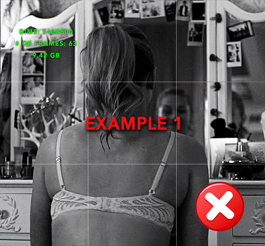
the transition starts too soon
Cause: initial keyframe was placed at frame 0
the squares fade away too quickly
Cause: overlapping keyframes, seen below.
(this may be the ideal way to go with more squares, but for only 9, it's too fast)
Example 2
more frame time for first gif
transition wraps up at a good point
Cause: in this instance, the first keyframe was placed 9 frames in, and the keyframes are not overlapping. The sequential pair starts where the last pair ended, creating a slower fade of each square.
Part 5: Final Tips and Saving
You can dl my save action here which will convert everything back into frames, change the frame rate to 0.05 and open the export window so you can see the size of the gif immediately.
If it's over 10gb, one way to finesse this is by use of lossy. By definition, lossy “compresses by removing background data” and therefore quality can be lost when pushed too far. But for most gifs, I have not noticed a deterioration in quality at all when saving with lossy until you start getting into 15-20 or higher, then it will start eating away at your gif so keep it minimal.

If you've done this and your gif is losing a noticeable amount of quality and you still haven’t gotten it below 10gb, you will have no choice but to start deleting frames.
When it comes to transitions like this one, sometimes you can't spare a single frame and if this is the case, you will have to return to the timeline state in your history and condense the key frames to fade out quicker so you can shorten the gif. You should always save a history point before converting so you have a bookmark to go back to in case this happens.
That's pretty much it, free to shoot me an ask on here or on @jugheadjones with any questions.
#gif tutorial#photoshop tutorial#transition tutorial#grid tutorial#usergif#ps help#tutorials#tutorials*#requested
210 notes
·
View notes
Text
☆ UPSCALING LOW QUALITY FOOTAGE
what i used:
• 2021 macbook pro with m1 chip (390/500gb storage used she's hanging in there)
• photoshop 2020
• mpv (for screencaps but this isn't needed!)
• handbrake (available for linux, mac and windows here)
• video source to gif
what is handbrake?
basically its a software that helps you change the format of videos, such as for certain devices or screens, or in the case that we're going to utilise, quality and frame rate!
disclaimer:
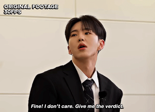
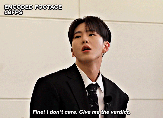
handbrake is super easy to use and very beginner friendly for this procedure and it can make a video go from 30fps to 60fps however it does not replace the quality of true 4k/blue/master-pro res files. in the gif below, this is the level of detail in a master pro-res file.

getting started
it's easiest first to note the timestamps of the video you want to encode, and keep in mind that unless your computer is incredibly powerful, i wouldn't try to encode an hour worth of footage in one run! my laptop could handle about 30 seconds in one go before she started toasting.
using handbrake:
once you've downloaded the software, open the software and it will come up with a pop up window asking you to open the video source (that is presumably saved within your folders) and go ahead and do so!
in the range section, use the drop down button to navigate to seconds and enter your timestamp. the duration on the side will show how long of the footage you're gonna encode is!

then go down to the save as, and give your footage 'to be snipped' a name. this isn't necessary but useful because if you're planning to say, encode 3 or 4 small parts of footage in one sitting, each encoding instance will overwrite the previous one. so i just call mine 'cut 1', 'cut 2' and so on.

next go to preset, and there you'll see such a wide variety of options that you can play around with, with differing qualities, frame rates, sound options, and so on. for the sake of this tutorial, i'm using 'superhq 2160p60 4k av1 surround' and i've used the drop down menu to select it! then go ahead and press start! the time taken to complete depends on the duration of footage that you sent to encode! you'll find your encoded video as an .mp4 file in your designated folder (which you can change via browse at the bottom)
what next?
• if you prefer to open footage directly into photoshop (my ps can't handle it), then go for it!
• if you screencap as i do, then just use mpv or whatever screencapping program you prefer to make the screencaps and open in ps in your usual manner.
• you can use the timestamps to further process the video through vapoursynth to denoise, but i've yet to try that!
the results
for this first set of example footage, i used footage from the be the sun concert file, which is almost 2 hours in length and 4gb in file size.


you can see the difference in the smooth frame rate of the footage, as well as the quality of the sharpening!
and to utilise the bane of gifmaking, a gose episode, notorious for dodgy pixelated frames and less hd quality in 1080p on youtube, i ran it through the same settings!
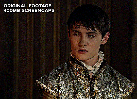
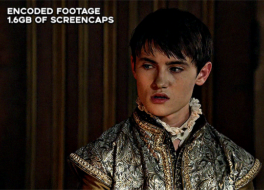
these are the exact same files, downloaded using 4k video downloader and with the same sharpening, but see how on the original file, the sharpening looks a bit more harsh and 'outlined' while it seems to sit softer on the encoded 4k version!
so i mainly use handbrake for dvd files, or not-so-hd 1080p youtube videos or videos that seem a bit clunkier but i had never tried them on a tv/film file so take a look below! i used a 1gb (so not very good quality) of a show (as compared to its 4gb files).
as i said at the start in the disclaimer, handbrake can't replicate true file quality, as you'd expect to see in a proper hd bluray/t*rrent file of a show but there's an interesting difference in the frame rate. personally it's not something i would utilise much there but its all up to individual preference on how someone prefers to have their gifs <3
this is a very basic run-through of how i used handbrake, as i haven't really explored all its features and i use this as a quick process when i'm running through seventeen dvd/dl files but i feel like it would work well on general youtube videos (such as interviews, episodes, behind the scenes) and feel free to send an ask/message for any help/clarification! <33
#ps help#usergif#gif tutorial#kpop gif tutorial#seventeen#completeresources#2605#userace#niniblr#emification#usershreyu#heymax#arieslofi#tusermlee#userbloomingwarrior#uservivaldi#userzil#userfanni#userrozza#usermoonchild#userraffa#tuserjen#usernik
283 notes
·
View notes
Note
https://www.tumblr.com/kitconnor/738913211394473984/usergif-new-year-new-fonts-day-1-layer absolutely loved this set 🩷 how did you make the second gif where it goes from color to b&w?
hello, and thank u !! it's a pretty basic process to follow but it can be effective if you're trying to add depth to something.
this is the gif, but this is the effect we're hoping to achieve:
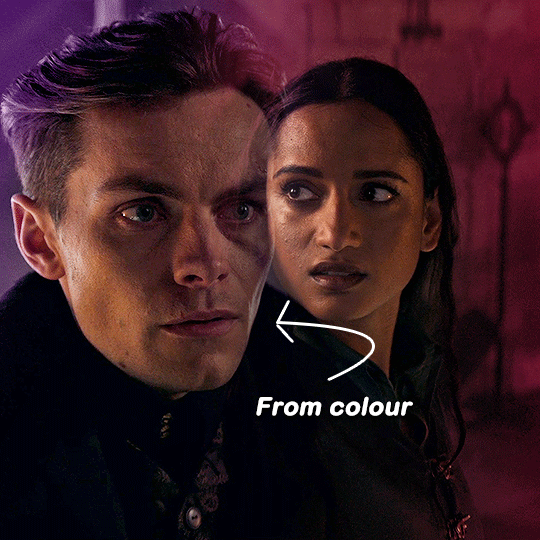
i'm not going to cover every part of the process (ie. colouring, cropping, setting up your gif and blending skills) simply because i'm just trying to achieve the colour to b&w effect ! if you want a guide on anything else, please feel free to ask :)
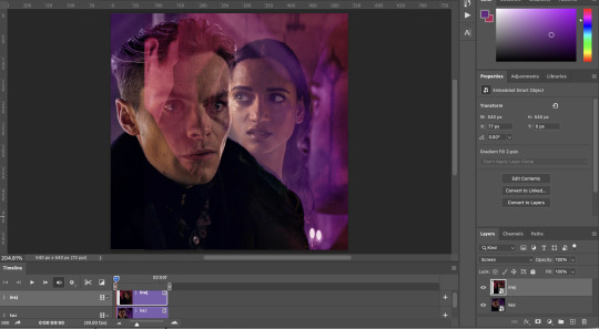
please note this will guide you through timeline and not frames !
start by doing your basic crop and colouring and then duplicate one gif onto the other for blending. here you can see i'm about to use the layer mask + brush tool to achieve a smooth blend. the top layer (inej) is set on screen.
so after getting everything into position, i'll add a layer mask and then use both the gradient tool (set to black) and the brush tool (also set to black) to get the right blend.
(note: i went back and re-cropped my kaz layer and reordered my layers. try and blend on empty space and not overtop of the subjects faces !)
depending on which gif you choose for b&w, you may need to clip the black and white layer. for instance in the gif that was in the set:

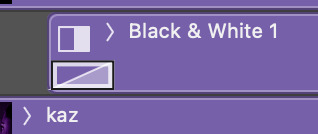
lucy gray is the top layer, and i only needed to clip it to her. to get a clipping mask, right click on a layer and there should be an option called 'create clipping mask', like below !

but back to the main guide 😭 now that i've blended and decided which gif will go to b&w, add that layer above whichever gif you chose. kaz is the bottom layer in this gif so i don't need to worry about the clipping mask.
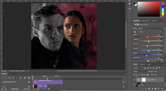
at this point now (yes i've added different layers here and there, but that's natural) you need to move your b&w to whatever point you need it to come in. however, don't move it to the very end. somewhere around halfway or 3/4 will work best.

after moving the b&w layer, it comes in halfway, but it's clunky. to fix that you'll use a fade transition. fade transitions are found in this little button (a half grey half white box cut diagonally)

then you'll click and drag the fade transition over the b&w layer and drag on the fade transition (NOT the gif) to alter the duration. that's the transition itself below:
and then it looks like this :)
it might take a few tries to get it into the right timing where it's not too quick or too slow. also note that the transition bumps up the gif size, so keep the gif around 30-40 frames if you're cropping at 540x540 like me !
8 notes
·
View notes
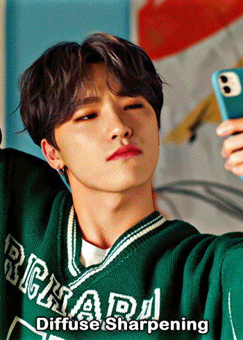
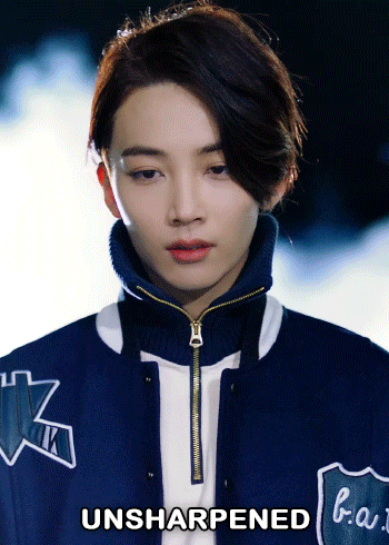
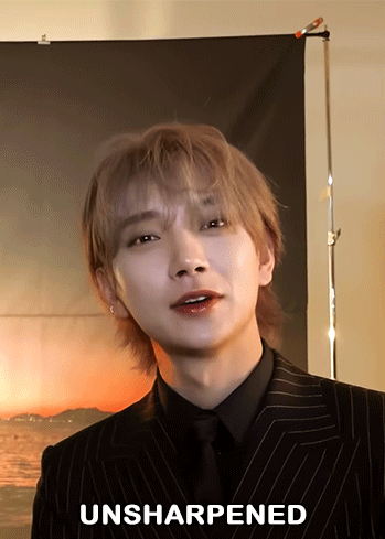
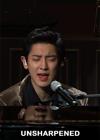
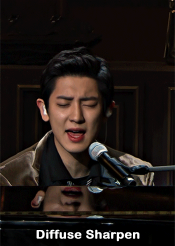
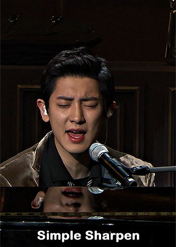
Text

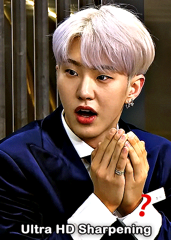
— i've been asked abt sharpening a few times but i thought that i would just share my actual actions i use but with some guidelines because it can really differ between different video sources and no sharpening is always exactly the same

— i've included different examples of video sources that i use for gifs alongside each type of sharpening action because not all actions will work for every gif. while it's always a matter of preference (whether u prefer a softer/more sharpened gif) some sharpenings can whitewash a gif so i added a little question mark as a warning to be mindful of that and make adjustments!
— there are three (technically four) different actions. one is ultra hd sharp and works best on really good quality footage such as master mvs or good film/show footage! the second is a simple sharpening that can be used on all videos and the third is a softer sharpening that utilises the diffuse setting and it has a glowy option w blur as well!
— take a look below at how the sharpenings look on different videos 💙
💌 MASTER/BUGS/BLU-RAY VIDEOS
video source: here (gdrive)
file size: 2gb


💌 4K YOUTUBE VIDEO
video source: here (yt)
file size: 470mb
💌 1080HD OR LESS VIDEO
video source: here (yt)
file size: 77mb


💌 TS FILE
video source: here (k24hrs + dm for password!)
file size: 3.21gb
video specifications: qtgmc 60fps preprocesser + bm3d denoise (2)

💌 GOING SEVENTEEN
because it varies so much it requires an example of its own
video source: here (yt)
file size: 606mb


YOU CAN FIND THE SHARPENINGS HERE <3
if you ever need any help or clarification feel free to ask!! no need for credit if you use, but of course please don't claim the actions as your own <3
#allresources#yeahps#photoshop tutorial#gif action#kpop resources#ps help#creations#creations: action#userace#usershreyu#userjoanna#tuserose#useraashna#usernik#useratz#useraurore#usernanda#userkaison#userngocchi
500 notes
·
View notes
Note
hi, your latest edit for thgweek24 is absulutely stunning and i thought if i can ask if you can make a tutorial about the ripped gifs/paper effect? if not, that's okay! have a nice day <3
RIPPED PAPER EFFECT TUTORIAL
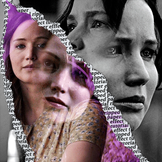
hi! thank u :D (thgweek set referenced)
below the cut are the steps that i took to create this effect. this tutorial is very screenshot heavy and assumes some basic knowledge of photoshop and giffing.
i do my best to try and explain my process so hopefully this is helpful! if you have any questions, please don't hesitate to ask.
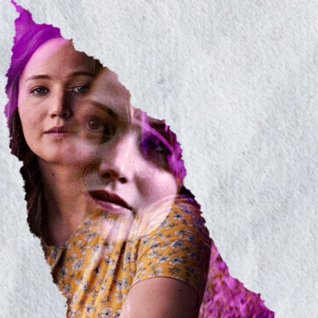
STEP 1: Choose and arrange your two gifs
with this specific use of the ripped paper effect, there's one gif on the "outside" of the rip and one on the "inside." in this example, the outside is the b&w and the inside gif is the colored:
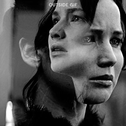
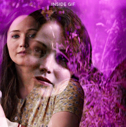
for me, the outside gif determined the positioning of the inside gif and the position/direction of the rip. as can be seen, outside gif has a lot of space on the left. therefore, i knew i was going to position the subject of the inside gif more on the right so i could create the rip without hiding too much of the b&w gif.
next, you want to arrange the inside gif on TOP of the outside gif. your layers panel should look like this:
STEP 2: Creating the ripped effect
here comes the fun part! in order to create this effect, you're going to need torn paper brushes. here and here are some packs you can download (w credit to owner).
next, create a layer mask on your inside gif. you're going to use the brush of your choosing as an ERASER. then, you can play around with the size and angle of the eraser to create the look you want. this is what the gif and the layers panel now look like:
STEP 3: Adding the paper
in order to add the paper around the edges of the inside gif (where the text goes), you now need to download a paper texture. i found mine on google by searching "paper texture png."
place the paper png IN BETWEEN your outside and your inside gif. this is what everything should look like:
now, similarly to what you did in the previous step with the inside gif, you are going to create a layer mask on the paper layer. using an torn paper brush as an eraser, you will erase the paper, creating the shape you want.
be sure to leave enough room for whatever text you want to be on the paper. also, i suggest making the rips of the paper different from the rips of the inside gif so it looks more organic.
here is what my gif looks like after erasing the paper:
optional: add a drop shadow on the paper layer (right click -> blending options... -> drop shadow)
STEP 4: Adding the text
first, you want to identify the space where you will have room to place your full quote within the paper. if there are no spaces, you can always use your brush/eraser to modify the layer masks.

next, add a layer on top of the paper layer (and below the inside gif). select the text tool and start typing your repeated text!
because you can see which text is hidden by the inside gif and what is on top of the paper, a shortcut i use is the "tab" button and only type words that will be seen.
type the repeated words around the quote you want highlighted:
now, in order to contain the text within the paper, convert the text layers into smart objects. then, create a clipping mask on both layers (right click –> create clipping mask). this is what your layer panels should look like:
with that, your gif should now look something like this, with the text contained inside the paper:
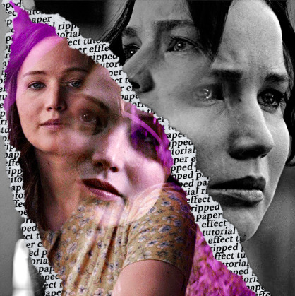
STEP 5: Highlighting the quote
as you can see, it just looked like a bunch of words. so, in order to highlight the quote you carved out in the previous step, add a new layer below the layer of the quote you want highlighted:
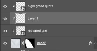
now, use a round brush (softness around 10-15% and opacity at 70-80%) with the color of your choice to highlight the words you want.
and there you have it!
i hope that this made sense and was helpful! if you have any questions or clarifications, please don't hesitate to ask :)
141 notes
·
View notes
Note
i went to reread some of the first rop strips and i just wanna say im so proud of how much you improved your art since then! your anatomy and understanding of the turtles' designs is so much better! good job ☺️
lol, thank you! I feel like it took a really long time to figure out how to draw them, though I won’t claim I draw them perfect now, I think I’ve at least become happy with the way they look in the comic 🤣

Some comparison of November last year compared to now 😂
I think as much as I don’t really like the difference in quality between the new stuff and the old stuff, it’s a visual representation of what hard work and determination can achieve and how no one starts out amazing, so I’ll leave it the way it is :] (plus I’m too lazy to re-draw the first like, five chapters, lol)
#tmnt#q&a#rise of the parallel#art progress#remember the 4 Ps guys#Practice patience perseverance and Pinterest tutorials 🤣
190 notes
·
View notes
Note
Hi! Would it be possible to post a tutorial of how you created the white text in this set /post/695221752725422080/buckpendragon-911-verse-coc-week-day-1 thank you :)
hiii! you mean the text in the first gif, right? it's actually a pale green so i hope that's what you meant 😅
i somehow still have that psd so i was able to go grab the exact settings for the two text layers used here:
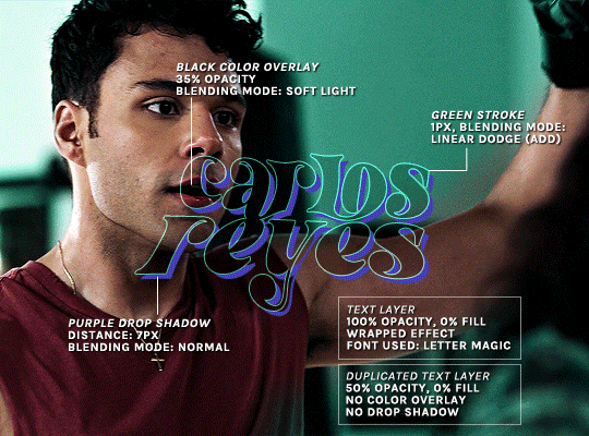
(if you meant the little white text, it's simply the font candara with different values of tracking/letter spacing)
the font i used is called letter magic, and i've given my bare text a bit of warp (right click ont the text layer > warp text > style: twist). by the way, the color of the text doesn't matter, so no need to pick one.
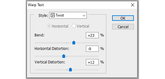
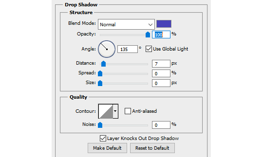
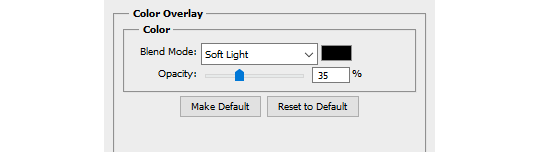
BASE LAYER
first, put the text layer's opacity to 100%, and the fill to 0%. the text will become transparent, it's what we want. then double click on the layer to get to the layer style options. you'll want to add a drop shadow, a color overlay, and a thin stroke:
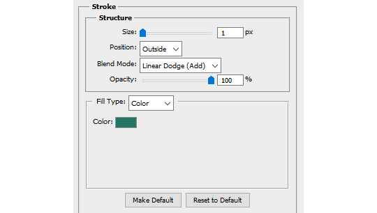
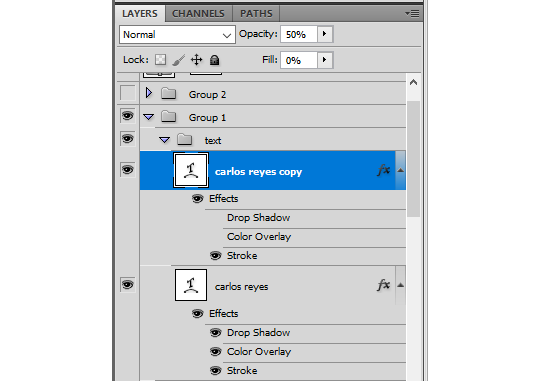
DUPLICATED LAYER
i found the stroke a bit too thin on my gif, so i duplicated the base layer (right click on the layer > duplicate layer > destination should be the same canvas), put its opacity to 50% and kept to 0% fill. and disable the drop shadow and color overlay by clicking on the little eyes on the layer:
voilà :)
#alie replies#Anonymous#*ps help#photoshop#tutorial#resource#photoshop tutorial#typography#mialook#tuserzee#userabs#usertj#userchibi#userhella#userkarolina#usertina#quicklings#userraffa#usercats
290 notes
·
View notes
Last Seen Blogs
browijhebbenonzeeigenblog
Andres&Ianthe
exitiumhq
exitiumhq.
snzyidiot
c h i r o
itsgarfi
Garfunki
cherrymothling
Cherry/Moth