#recolourising
Text
happy doctor who day everyone!!!!!!
#at 17:15 60 years ago today the first unearthly child episode aired <3#doctor who#doctor who 60th anniversary#bbc’s got the recolourised version of the daleks plus also an adventure in space and time from the 50th#on tonight in celebration
3 notes
·
View notes
Photo
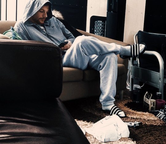
Louis in a writing session in Nov/Dec 2021 - colourised version of this photo by recolourise
#king of lounging#he looks so comfy#louis#in the studio#nov 2021#dec 2021#david sneddon#posted:#18.11.22#edit#colourised#cropped
431 notes
·
View notes
Photo


JEONGHAN + recolourised
for Spur Magazine (Oct’ 22)
#seventeen#yoon jeonghan#svtsource#svtcreations#kpopco#jeonghan#cheytermelon#shuaria#hanatonin#uservince#userjoanna#userkitty#userfairy#Dokyelvblr#usermeeseung#creations#creations: svt
275 notes
·
View notes
Text
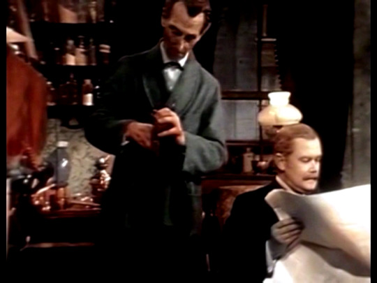
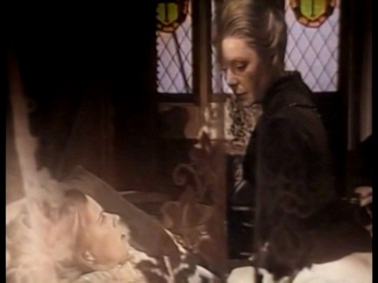


from september to december of 1968, the second series of sherlock holmes was broadcasted on BBC2.
starring peter cushing and nigel stock and originally made in colour, the second series ran for sixteen episodes. sadly, while six episodes are complete in the bbc archive on their original 625 line colour videotapes, ten remain missing, having been junked by the bbc during the mid 70s, and no black and white film recordings are known to exist of the remaining episodes.
in 2019, four extended excerpts from four missing episodes were found on 16mm film from a tv archive in flanders, the dutch speaking side of belgium by the british tv archive finders, kaleidoscope. they were shown as part of a weekly entertainment programme which translated was called "do you like what you see?" which shows previews of programmes in the coming week. two more clips were found on the same programme the following year. Rather then dubbed, the programme had Dutch subtitles.
the clips were from the six episodes that are missing:
the second stain
the dancing men
the navel treaty
black peter
the musgrove ritual
and the solitary cyclist.
the six clips were restored, remastered and recolourised by jonathan coley and were released on youtube and dvd.
a short off air recording from the solitary cyclist was also found via the youtube channel "audio only".
youtube
2 notes
·
View notes
Text
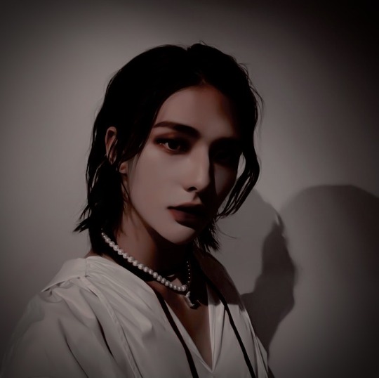
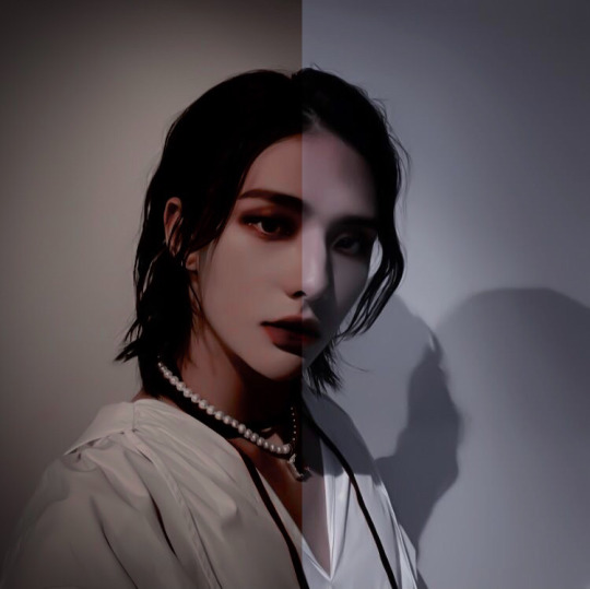
The recolourised/edited picture of hyunjin from my Vampire!Hyunjin moodboard
Bonus: Before vs After
#skz#stray kids#hwang hyunjin#hyunjin edits#skz edits#stray kids edits#kpop#aesthetic#stray kids aesthetic#skz vampire au#vampire!hyunjin#stray kids vampire au#missyedits
18 notes
·
View notes
Note
Stop every time we talk about Dream's face, I am reminded that we are actually going to see it one day. That doesn't even sound REAL it's almost unbelievable
do you ever see fanart that lets you imagine what he actually looks like for a brief moment and it makes your heart stop
or like. the recolourised suit photos that black out the mask and somehow make it even more clear that there's a Guy there. fucks me up every time
18 notes
·
View notes
Video
WIP - test re-colourising black an white video - original iphone footage, black and white version, recolourised version (using https://colab.research.google.com/github/jantic/DeOldify/blob/master/VideoColorizerColab.ipynb#scrollTo=LwmCX-d20W1E)
0 notes
Photo


Happy Birthday Elio! 🥰🥰🥰 [Recolorisation edit. Please reblog, dont repost]
#timothee chalamet#cmbynedit#elio#elio perlman#cmbyn fandom#oliver#oliver x elio#elio x oliver#cmbyn#fan art#estellaestella#estellaestellaestella#recolorisation#recolourisation#recolorization#recolorized#recolorizing#recolourised#recolourising
111 notes
·
View notes
Text
The Mind of Evil
This one has everything: mind invasion, the Master, and my favourite dragon prop design I’ve ever seen
just another day out in Bessie to visit the Dracula prison
I love Three’s absolute lack of respect for the keller machine presentation
you see a bin fire and you know it’s set in London
the big question though: when would the Master pop up?
“I am a scientist and I have been for several thousand -”
now I’m no expert but something tells me that post mortem reports shouldn’t be this speedy
I made the note Mr Keller aka Mr Killer aka the Master pretty early on and needless to say I was delighted when he showed up
it’s interesting how you can tell it’s been recolourised - it’s very well done but there was just something slightly off and I had to look it up
Three talking about seeing a world go up in flames has a real new who vibe to it
and there he is, Master of Disguise!
we honestly need more Very Obvious Masks in new who
I may be wrong but is this the first time we’ve seen the Doctor speak another language? maybe One spoke French at one point...
I wonder how good the Hokkien and Cantonese in the show actually is
lmao the dragon design is just. incredible. I love it
Jo got a gun!
me while the Master drove to Stanmore: wouldn’t it be funny if the sinister background music was actually what he was listening to
the Master: *turns off the car radio, stopping the music*
me: :D :D
the Master’s got that dramatic chair turn down
the Master: I shall kill you doctor
the Master 5 min later: literally restarting one of the doctor’s hearts
The Master’s greatest fear being the doctor winning... oh the drama of it all!
the fade directly from the Doctor’s face to the Master’s... OH THE DRAMA OF IT ALL!!
Jo is such a sweetheart I feel like I’ve not talked about her enough
I love that pretty much every cliffhanger is a variation on people clutching their heads with questionable overlaid effects
Jo beating the doctor at draughts <3
“It’s very complicated and will need lots of equipment”
the equipment: a coil of wire and a power source
the dynamic of the Master as the Doctor’s assistant is great
the Doctor recounting adventures in the Tower of London with Sir Walter Raleigh to Jo - when do we think he could have done this?
“Apart from losing the master and the missile you’re doing very well Brigadier” I can see why this is a beloved dynamic
“It would take an atomic explosion or an enormous charge of electricity to destroy that” ah yes definitely two equivalents
the Master: you won’t be seeing me for quite some time
me, knowing he is in every story this season: >:) farewell
22 notes
·
View notes
Text
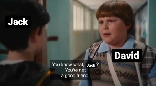
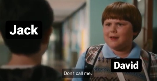
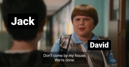
David to Jack after he scabs during the strike, 1899 recolourised :
#this is so dumb i'm sorry#haha 5am tingz#newsies#diary of a wimpy kid#read this in rowley's voice cowards#jack kelly#92sies#newsies 1992#spot conlon#racetrack higgins#race higgins#david jacobs#racetrack newsies#sarah jacobs#livesies#newsies live#javid
87 notes
·
View notes
Text

Turgon, creating the hidden city of Gondolin, 126 FA, recolourised
132 notes
·
View notes
Text
me after Change Your Mind, 2019 recolourised
62 notes
·
View notes
Text
Week 3
4 colour palettes + 4 emotions
Emotion 1: Amused

Monochromatic:

Analogous:

Complimentary:

Emotion 2: Peckish
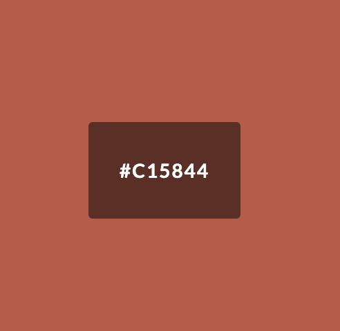
Monochromatic:

Analogous:

Complimentary: (this one is starting to like smoked salmon and greens to me and is making me hungrier right now >:C)

Emotion 3: Frazzled

Monochromatic:

Analogous:

Complimentary: I didn’t realise how similar this colour palette was to the complimentary colour palette for the emotion of amused - I can’t exactly say that frazzled and amused are complimentary emotions but both definitely lay on opposite ends of the spectrum. Maybe they may be more similar than I thought to take notice of

Emotion 4: Sentimental
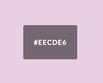
Monochromatic:

Analogous:

Complimentary:

I find it interesting that the complimentary colours of these 3/4 emotions gravitate towards a yellow-green. Peckish, frazzled and sentimental I can’t necessarily attribute as being similar on an emotional level - nor attribute them to a positive or negative valence. I find it interesting how the colour palette of the emotion frazzled is particularly vibrant also.
Pixel Art activity
Original image:

For this activity, I recoloured the image of the girl to have the complimentary colour palette of the emotion frazzled. The first thing I noticed was that she definitely looks like she belongs in the show ‘Monster High’ now which is funny because I believe the show is about zombies and undead dolls which makes sense because the after recolourisation how she definitely looks more sickly, her complexion off and unoxygenated. In regards to colour congruencies and health also, she seems a lot more unnatural and making her seem undead also.


Personally, for me, the purple tones also amplify her sickly appearance. As for association to emotion, the emotion opposite to frazzled would be somewhere near tirelessness or being inexhaustible which I personally think juxtaposes her appearance completely.
Infographic activity
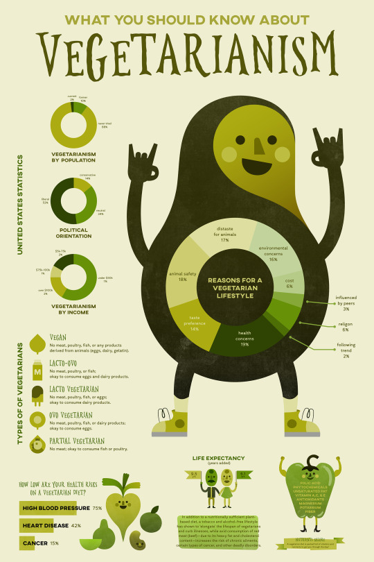
https://www.behance.net/gallery/59893615/What-You-Should-Know-About-Vegetarianism-(Infographic)/modules/462262171
My first impression of this infographic is that it is monochromatic and utilising green to portray its topic on vegetarianism is quite fitting. Important text also seems to be in a darker green/near black. Some of the text on green is a little bit illegible however i.e. taste preference category on the pie chart
The infographic’s colour palette:

Pretend you are now the designer working up some new colour choices in the face of having to accommodate new contextual factors, how might you colour this project if…
1. You had to demonstrate the worst possible data visualisation colour practices
I feel like the essence of green is essential to the infographic and its theme so colours to strip away the vegetarianism aspect of the infographic i.e. maybe using pinks and browns (specific to this infographic that could also suggest the colours of meat and create incongruences so to demonstrate the worst possible data visualisation that could be something to consider)
Something similar to this colour palette mayhaps:

2. You had to force yourself to use as few different colours as possible? (around 3 or 4)
To create a sound visual I think the monochromatic green colour scheme is visually salient however, they aren’t necessarily eye-catching so maybe including pops of orange or yellow here and there (for pieces of information deemed interesting or important). Therefore I think shifting to an analogous colour scheme leaves more room for colour interpretation without shifting visual salience too drastically.

0 notes
Photo
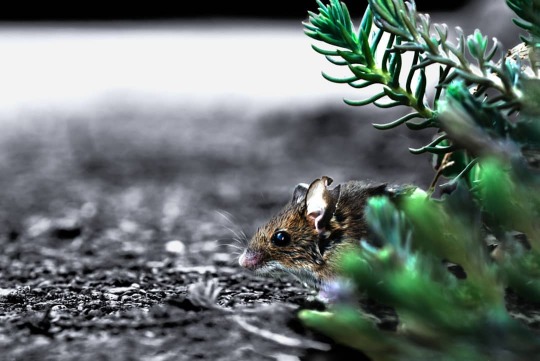
This mouse had a lucky escape from our cat! I found it afterwards hiding in the bushes around the road. 🐀 I tried to capture how scared it must have been. It still has wet patches from its time in our cat's mouth, and it looks like that's not this mouse's first fight because part of it's ear is missing, too 👂🏻! 🐀 Taking macro photos is so much fun. The world looks so different from this perspective. 🐀 I meant to post the all black and white edit to the @iwpa_2020, but unfortunately it wasn't finished in time 😅. Since I missed the deadline anyway, I decided to keep editing and recolourised part of the scene to add to the moody effect. Let me know how it turned out and swipe 👉🏻 for the raw! 🐀 🐀 🐀 🐀 🐀 #Mouse #doormouse #woodmouse #wildlife #rodent #amazing #small #smol #road #bushes #undergrowth #edited #blackandwhite #blackandwhitephotography #nikond3400 #sigma105mm #macro #green #plant #beautiful #nature #fight #longpost #lockdown #SocialDistancing #home #fluffy #cute #moodygrams #bleak (at Watford, United Kingdom) https://www.instagram.com/p/CBgKvsIjAYe/?igshid=evhuh0noccd3
#mouse#doormouse#woodmouse#wildlife#rodent#amazing#small#smol#road#bushes#undergrowth#edited#blackandwhite#blackandwhitephotography#nikond3400#sigma105mm#macro#green#plant#beautiful#nature#fight#longpost#lockdown#socialdistancing#home#fluffy#cute#moodygrams#bleak
0 notes
Text
Reflective Writing Commentary - Photoshop Re-colourisation
Recolourisation in photoshop is mostly used as a way to restore and bring life into old photographs. There is a community who work on adding colour to old photos and they believe it allows people to connect with the photos more than the original black and white. Some people, however, think that this work is wrong. They believe that colourising photos is vandalising art, messing with history and that these photos should be left alone.
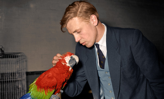
My favourite piece of colourisation is this photo. I love how vibrant the photo looks, the parrot instantly draws your eye, from there, you notice little details like the pattern on Sir Attenborough’s tie that you may never notice in the black and white original. The skin tone in this piece is also fantastic, something I wish I could have replicated better in my own work.
I chose my photo as I felt that it could better help people understand and relate to the men who fought in the war.. I also thought the idea of the two men, friends or strangers stood alone together in the trench was very powerful.
Creatively, I had two main options: Make it as realistic as possible or take an abstract approach. My choice was for realism as I thought it would help you understand the struggle better and be more respectful of the photo.
The main challenge was skin. It was hard to get right as discovered that a single light pink doesn’t look very real, I needed to layer several colours on top.
I do think that my piece has come out well. It is convincingly realistic, accurate and well detailed. The research I did into the colours of the uniforms helped and I like how well the dirt on the soldiers came out. Should I try this again, I’d like to improve on the skin, making it more realistic, I’d also like to add more detail to the background
My peers suggested that the mud could use work to make it less monotone and how the skin seems a little un-natural however they suggest that the piece was powerful and accurate which tells me that I achieved mostly what I set out to do.
1 note
·
View note
