#registration page
Text
I'm not sure if it's too early to mention it...but have any of you heard of Sheezy?
(Not the early 2000s site, but the revival project from 2020-2022)
#Becaaause it's coming back soon~#and yours truly is going to be a moderator on it heehee!#It might be a bit early to mention it because it's still being built/currently in a supporter-only beta while it's being put back together#but if you had an account in the 2020-2022 revival project youll be able to return to your account in a few weeks when the beta opens up to#all returning users!#and then after that registration for the site will open in chunks#For those who don't know! Sheezy is an art community site!#I was on it in 2021-2022 for a few months before it shut down and it was genuinely one of the most pleasant experiences ive had as an onlin#artist#The focus isn't numbers so much as community and discovering new people#and I'm honored to be a part of bringing it back now that the team has a proper foundation and time to dedicate to our little project C:#exli speaks#Im just so excited for it!#It isnt perfect and we're fleshing things out as we go and the website will improve exponentially over time#but AAHH#I might link the subcription page in the comments if people are interested ($3 gets you into the supporter beta while the website is built#and the bugs these supporters discover are fixed for the official launch)#but honestly it might be more exciting to join for the official launch too...
7 notes
·
View notes
Text
GET OFF MY POST. I'M NOT GONNA "REGISTER TO BE SCAMMED" BY YOUR FAKE GAMBLING CRAP.
THEY'RE LEAVING COMMENTS ON POSTS NOW.
STAFF PLEASE I AM BEGGING YOU. THIS IS NOT A SUGGESTION. FIX. THIS.
11 notes
·
View notes
Text
Hello! I don't know who needs to hear this, and most modern websites thankfully won't even give you the option to anyway, but DO NOT USE YOUR SOCIAL SECURITY NUMBER AS YOUR PASSWORD.
also there are companies that use employees' SSNs as their employee IDs, and they REALLY need to cut that shit out expeditiously! (In the meantime, if you work at one such company, try to get a claim or reference number when working with third parties so you can give that instead of having to give strangers your literal SSN every time you need help.)
#why and HOW are people?!?#i had another one of those 'this person has so thoroughly failed to comprehend a basic internet task that I have to go sit outside' moments#how are you with your birth year 1987 taking screenshots of a registration guide turning it to a PDF editing yr answers OVER SCREENSHOTS-#and emailing it to the company as an attachment?? How did you even get here?? YOU WERE LITERALLY ON THE INSTRUCTIONS PAGE!#READ IT AND FOLLOW IT! MY GOD! WHO DID I WRONG IN A PAST LIFE THAT THIS IS MY FATE TO DEAL WITH PEOPLE LIKE THIS ALL THE TIME?!
2 notes
·
View notes
Text
Actually cannot believe I spent the last couple of hours migrating my side blog to a new separate horny main, only for it to be shadowbanned within 45mins of creation despite having no flagged content or anything I hadn't already reblogged on the existing side blog. Contacted tumblr support because this is like the 4 time it's happened to me and Luna combined and they're always just like "oops glitch in the system tehe" but like... 45mins... on a new blog... that wasn't even blank and actually being filled out??? literally how? I swear to g-d this site is held together with fucking digital duct tape.
#saskia screaming into the void#rant#tumblr support is probably gonna take forever to get back to me tho#fucking typical#i honestly just would have stuck with the hassle of a side blog if i'd known it'd be this fucking dysfuntional#especially ridiculous since i followed their help page's recommendations on how to migrate#by changing the url to free it up before registring it for the new blog#and yet instantly no messaging#no replies#and invisible in other people's notes#this site is such a joke but we're all stuck here because the rest of the circuses are on fire
4 notes
·
View notes
Text
almost started angry crying trying to register my sim 🙃
#they should invent a passport photo id page that is easier to take a picture of#yes i did wait until the day before the deadline#i hate you sim card registration law#personal#not blog related
5 notes
·
View notes
Text

Gift art for a friend.
#squibbyart#furry#furry art#i am still looking for his furafinity page but can't find it and the registrations are closed so i can't make an account either :s
11 notes
·
View notes
Text
what is even going on at artfight right now they said that early team registrations would be out a few days before the fight. well its the 28th and theyre still not there. Hello
#maybe my memory just sucks but i feel like in past years they had already started early team registration by now.#and before the theme reveal they had disabled the teams from the year before and switched everyone over to spectator#which they havent even done yet everyone is still on the team they were on last year ?#at this point im just refreshing the page every few hours until my username isnt green anymore#like im not trying to hate on the mods or anything i know organizing an event like this is difficult and time consuming#but i feel like setting up team registrations would be one of the easier thigns?#and waiting so long to put them up just feels a bit. disorganized i guess#i hope early registrations arent gonna get cancelled or something#because if the random team assigner thing leaves me stuck on the team i dont want after ive been waiting for this theme for so long#im becoming the joker for real#also its just nice to be able to see what team a lot of people are gonna be on....#makes it easier to pick out some characters youd like to draw because its always a good idea to save some in advance#with the site barely working on the first day and all
5 notes
·
View notes
Note
Hi, should we register for those new shows or does my registration from June covers these as well?
you cannot register for those shows so I think it's safe to say that the registration from last week covers it!
#the link on taylor's website just leads to an eventim page which says registration closed on June 23rd#what that means for the codes idk#i'm hoping eventim will tweet sth today or tomorrow#asks#anon
2 notes
·
View notes
Text
i'm gonna design a web page and it's going to look so cool!!!!!!!!!!!!!!! it's going to be a fun job because i enjoy doing this thing!!!!!!!!!!!!!!!!!!!!!!!!!!!
#i need to design a new web page for my job and i've been putting it off all evening#the registration for this program was supposed to open last week#but my coworker got stuck on some weird set-up nonsense in our registration system trying to get it functional#and i believe she was supposed to make the web page too#and she was generally swamped too#so now it's my job#and it needs to be done like. tomorrow at the latest alfha;dighaifdha#and i have a bunch of other shit to do tomorrow#and it should only take like 1-1.5 hours#i just gotta DO IT!!!!!!!!!!!!#JUST DO IT#personal
5 notes
·
View notes
Text
I want to go to Momocon this year! I need to pluck up the guts to go! Ahhhh!!
#the registration page has been open forever I just need to do it!#I am a big brave person and can go by myself!#I’ll just have to stay somewhere I can actually afford for one person 🙃 rip#wurm.txt
2 notes
·
View notes
Text
nomad has decided to let me in again. weird
#tütensuppe#i tried looking up if this is like a known issue but got no results#when this error happens i always get a split second popup where the only thing i can read before its gone is 'forbidden'#then it reloads to the registration page.
0 notes
Text
hey why can't i go peep in lofter anymore
0 notes
Text
just realized I missed reading a textbook chapter...after taking the test 😭
#the teacher said it didn't matter what edition of the text book#just the chapter names so it's all out of whack when im reading the syllabus / blackboard assignment for the week#anddddd in the syllabus it has chapter numbers and i thought (stupidly) that it was for the up to date of the edition recommended during#registration soooo i trusted it#crammed 80 pages in less than 12 hrs only to take the test and get hit with (thankfully) only 2 questions that i had no idea about#thinking it was something i missed by not watching the optional lectures of the chapters or powerpoints#until i reread the weeks assignment chapters & compared to the syllabus numbered chapters then to my book 😭😭😭#'chapter 14' that was listed in the syllabus is actually chapter 15 in my book 🫠#on top of that i didnt end up reading an extra chapter...so that would've added another 32 pages to the 80 💀#overall it was my fault for not double checking 🥴 i almost did it again for this weeks reading before double checking the titles#i missed 7 questions 😭 its out of 50 but still!!! i hate them and theres still 5 tests left that i can only miss another 117 points from#so far the total is 9 after adding in last weeks missed points#make that 115 left 😶#and if i fail to keep a 75% average from the tests + whatever other assignments in the next 5 weeks i basically wasted $780
0 notes
Text
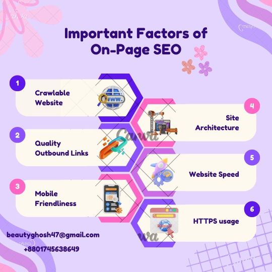
#digitalmarketing#seo expert#socialmediamarketing#twitter#socialmedia#facebook#digitalmarketingtips#marketing#domainresearch#domain registration#keyword research#on page seo
1 note
·
View note
Text
What happened to shit being like 5-7 steps or whatever i just wanna reregister my car dawg
#i gotta find a title number but i dont have the registration page from when i first bought it#now i gotta search for that and THEN pay my property tax AND THEN i can get pre-registration#THEN i can get insured again and THEN i can officially get my car reregistered fr#i just wanna drive without the cops on my assssassssssssss#mag.txt
0 notes
Text
Unbounce for Webinars: Registration Page Best Practices
Key Components of a High-Converting Registration Page:
A. Compelling Headline and Subheading: The headline and subheading should grab the visitor's attention and clearly communicate the value of the webinar. Use language that resonates with your target audience and highlights the benefits of attending.
B. Clear and Concise Event Details: Provide essential details about the webinar, including the date, time, and a brief overview of what participants can expect. Clearly communicate the value proposition to encourage registrations.
C. Engaging Visual Elements - Imagery and Graphics: Incorporate visually appealing elements that complement the webinar's theme. High-quality images, relevant graphics, and even a preview of the webinar content can capture the audience's interest and increase registrations.
D. User-Friendly Registration Form: Streamline the registration process with a well-designed form. Keep it concise by asking for essential information, such as name and email address. Use Unbounce's drag-and-drop builder to create a visually appealing and user-friendly form.
IV. A/B Testing Strategies for Webinar Registration
Webinar registration pages play a crucial role in attracting and converting potential attendees. To ensure success, it's essential to understand the key components that make a registration page effective.
A compelling headline and subheading are the first elements visitors encounter, setting the tone for the webinar. These should clearly convey the value of the event and encourage users to register. Alongside this, providing clear and concise event details is crucial. Attendees want to know what to expect, so ensure the date, time, and agenda are easily accessible.
Engaging visual elements, such as relevant imagery and graphics, can capture attention and create a visually appealing page. Balance is key—too much can overwhelm, while too little can result in a lack of interest.
The registration form is the gateway to attendance. Keep it user-friendly by minimizing fields and asking for essential information. Forms that are too lengthy can deter potential attendees, so strike a balance between gathering necessary details and respecting users' time.
Unbounce offers features specifically designed for webinar success. Customization options allow for brand consistency, ensuring the page aligns with the webinar's visual identity. Countdown timers and urgency elements create a sense of excitement and encourage immediate action. Additionally, integration with calendar apps enables attendees to set reminders conveniently.
A/B testing is a powerful strategy for optimizing webinar registration pages. Experiment with different headlines and copy to identify what resonates best with your audience. Vary form length and fields to find the optimal balance between collecting essential information and reducing friction. Analyzing the impact of visual elements through A/B testing helps refine the page for maximum conversion rates.
By implementing these best practices and leveraging Unbounce's tailored features, webinar registration pages can become powerful tools for attracting and converting attendees. Regularly test and iterate based on insights from A/B testing to continually enhance the effectiveness of your webinar registration strategy.
V. Leveraging Unbounce Analytics for Webinar Success
Webinars are powerful tools for engagement and lead generation, and an effective registration page is crucial for maximizing attendance. In this post, we'll delve into key components that make a registration page highly converting. A compelling headline and subheading set the tone, while clear event details provide transparency. Engaging visual elements, such as high-quality imagery and graphics, capture attention and convey professionalism.
Unbounce offers specific features tailored for webinar success. Customization options ensure brand consistency, creating a seamless experience for potential attendees. Countdown timers and urgency elements generate excitement, encouraging swift registrations. Integration with calendar apps adds convenience, sending timely reminders to registrants and boosting attendance rates.
Optimizing registration forms is a critical step in the process. Minimizing form fields reduces friction and increases conversions, as lengthy forms can deter potential attendees. Leveraging conditional logic for dynamic forms ensures a personalized experience, showing only relevant fields based on user inputs. Integrating social media sign-up options streamlines the registration process, tapping into users' existing accounts for a seamless experience.
To measure the effectiveness of your webinar strategy, it's essential to leverage Unbounce analytics. Tracking registration metrics and user behavior provides valuable insights. Analyzing this data helps refine marketing strategies, allowing you to focus on channels that drive registrations and optimize your promotional efforts.
In conclusion, mastering the art of webinar registration pages involves a combination of compelling design, strategic feature utilization, and data-driven refinement. By implementing these best practices and harnessing Unbounce's capabilities, you can create a registration experience that not only attracts attendees but also sets the stage for a successful webinar.
Mobile Responsiveness in Webinar Registration Pages: Enhancing User Experience
In the dynamic landscape of digital events, ensuring an optimal user experience across various devices is paramount for the success of your webinars. In this post, we delve into the importance of mobile responsiveness in Unbounce webinar registration pages and strategies for cross-device compatibility.
A. Importance of Mobile-Optimized Registration Pages
As mobile usage continues to surge, a significant portion of webinar registrants accesses registration pages through smartphones and tablets. Failing to provide a seamless experience on these devices can result in a loss of potential participants. Mobile-optimized pages not only accommodate diverse user preferences but also contribute to higher conversion rates.
Imagine a prospective attendee discovering your webinar on their mobile device but encountering a registration page with distorted layouts and cumbersome forms. The frustration might lead them to abandon the registration process altogether. To avoid such scenarios, prioritizing mobile responsiveness is essential.
B. Testing and Ensuring Cross-Device Compatibility
Creating a mobile-responsive registration page is not a one-size-fits-all task. Rigorous testing across multiple devices and screen sizes is crucial to identify and rectify any issues. Unbounce provides tools for easy previewing and testing, allowing you to simulate the user experience on various devices.
Check the functionality of registration forms, buttons, and multimedia elements on different screens. Ensure that text remains readable, images are appropriately sized, and the registration process flows smoothly. This meticulous testing process guarantees a consistent and user-friendly registration experience, regardless of the device attendees use.
In conclusion, prioritizing mobile responsiveness in Unbounce webinar registration pages is a strategic move to accommodate the diverse habits of today's digital audience. By embracing a mobile-first approach, you not only enhance user satisfaction but also increase the likelihood of capturing a broader audience for your webinars.
In the realm of webinar marketing, understanding and leveraging Unbounce analytics can be a game-changer for optimizing registration pages and enhancing the overall user experience.
A. Tracking User Behavior on Registration Pages
Unbounce provides robust analytics tools that empower marketers to delve deep into user interactions on webinar registration pages. Monitoring metrics such as click-through rates, scroll depth, and time spent on the page offers invaluable insights into user engagement. By analyzing this data, marketers can identify which elements resonate most with their audience, allowing for strategic adjustments to be made.
Examining the click patterns on registration forms provides a nuanced understanding of user intent. Identifying drop-off points or areas causing hesitation enables marketers to refine the registration process for smoother user navigation. Additionally, tracking the sources of traffic through Unbounce analytics helps in recognizing the most effective channels, allowing marketers to allocate resources efficiently.
B. Utilizing Analytics to Enhance User Experience
Unbounce's analytics are not just about numbers; they're a treasure trove of actionable insights. Armed with this data, marketers can make informed decisions to enhance the user experience on webinar registration pages.
Implementing A/B testing based on analytics findings allows marketers to experiment with different elements and layouts. Whether it's testing variations of the registration form or tweaking the visual hierarchy, these experiments can lead to significant improvements in conversion rates.
Furthermore, utilizing heatmaps can visually represent user interactions, highlighting areas of interest and potential friction. Armed with this knowledge, marketers can optimize the placement of crucial information and calls-to-action, ensuring a more intuitive and user-friendly experience.
In conclusion, Unbounce analytics for webinar registration pages offer a comprehensive toolkit for understanding user behavior and optimizing the overall journey. By continuously refining and tailoring the registration process based on these insights, marketers can significantly enhance the effectiveness of their webinar marketing campaigns.
VII. Unbounce Analytics for Webinar Registration
A. Tracking User Behavior on Registration Pages
In the realm of webinar marketing, understanding user behavior is paramount for optimizing registration pages. Unbounce Analytics provides valuable insights into how visitors interact with your registration page. Track metrics such as click-through rates, time spent on the page, and form completion rates. Analyzing this data helps identify pain points and areas for improvement, enabling a data-driven approach to enhance overall user engagement.
B. Utilizing Analytics to Enhance User Experience
Harness the power of Unbounce Analytics to refine and elevate the user experience on your webinar registration pages. Identify drop-off points in the registration process and implement strategic improvements to streamline the journey. Leverage A/B testing to experiment with different elements and layouts, relying on data-driven decisions to refine your approach continually. By tapping into Unbounce Analytics, marketers can make informed adjustments that result in more seamless, user-friendly registration experiences, ultimately boosting webinar attendance and engagement.
Certainly! Here's a glossary of thirty less-known terms related to Unbounce for Webinars: Registration Page Best Practices:
Above-the-Fold: The content visible on a webpage without scrolling, crucial for capturing attention.
Lead Magnet: An incentive offered to potential registrants in exchange for their contact information.
Perceived Value: The perceived benefit of registering for a webinar, influencing user decisions.
Exit-Intent Popup: A popup displayed when users show intent to leave the registration page.
CSS Framework: A pre-prepared library of CSS code to streamline webpage styling.
Parallax Scrolling: A web design technique where background images move slower than foreground images, creating a 3D effect.
Above-the-Fold Content: The content visible on a webpage without scrolling.
Microinteractions: Small, subtle animations or design elements that enhance user experience.
Social Proof: Demonstrating others have registered, boosting credibility and encouraging sign-ups.
Whitespace: Blank space in design, enhancing readability and focus.
FOMO (Fear of Missing Out): Creating urgency by suggesting limited availability or time-sensitive offers.
Hero Image: A large, attention-grabbing image at the top of a webpage.
Conversion Funnel: The journey users take from arriving on the page to completing the registration.
Cohesive Branding: Maintaining a consistent look and feel across all elements of the registration page.
AIDA Model: Attention, Interest, Desire, Action - a framework for effective advertising.
Heatmap: Visual representation showing where users interact most on a webpage.
Kerning: Adjusting the spacing between characters in typography.
Hamburger Menu: A collapsible menu often represented by three horizontal lines.
Sticky Navigation: A fixed navigation bar that remains visible as users scroll down the page.
UX/UI: User Experience/User Interface - disciplines focusing on enhancing user satisfaction and interaction.
Zigzag Pattern: An eye-tracking pattern users naturally follow, influencing content placement.
Session Recording: Capturing user interactions on the page for analysis.
Split Testing: Comparing two versions of a webpage to determine which performs better.
Semantic HTML: Using HTML tags to convey the meaning of content, aiding accessibility.
Retargeting: Displaying ads to users who have previously visited the registration page.
Typography Hierarchy: Organizing text based on importance for better visual flow.
Whitelabeling: Removing branding elements for a more generic appearance.
Conversion Rate: The percentage of visitors who complete the desired action, like registration.
Standalone Landing Page: A single webpage designed for a specific marketing campaign.
Multivariate Testing: Simultaneously testing multiple variations of different elements on a page for optimization.

#Unbounce#Webinars#Registration Pages#Webinar Best Practices#Conversion Optimization#A/B Testing#Mobile Responsiveness#Analytics#Integration#User Experience#Troubleshooting
0 notes
Last Seen Blogs

animation-alexander
Alexander Bollinger

angrycollectivecollectorr
A Bad Egg

andreseugirdor
Andre Seugirdor

jockbomb
bomb ur brain bruh

fitnessketocapsules
Fitness Keto Capsules