#rendering tutorial
Text
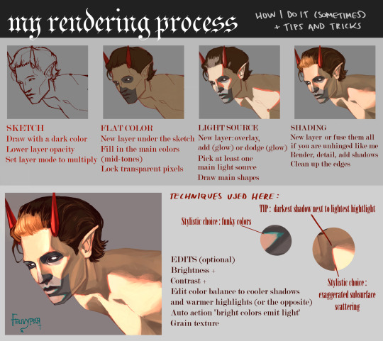
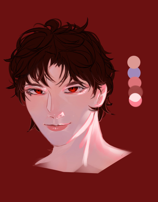
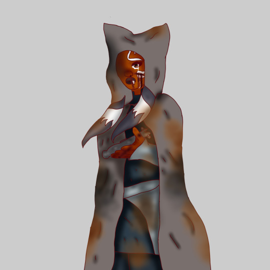
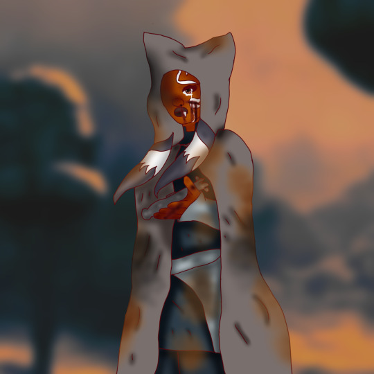
using the sketch i did for the phantom ghoul design, here is a rendering tutorial as requested by @planett-marss.
please keep in mind that this is just how I personally do things and it may not fit everyone. just have fun with it !
if you’d like more info, please let me know.
363 notes
·
View notes
Text
art tutorial slideshow!!
spent about 2 hrs making this askdjsjkcskjckhsc
also posted on my tiktok!
the link to the shadow method
if yall like it im thinking of making a traditional art version. if you try these and they work tag me in the art i wanna see em!!!
#nics stuff#my art#art tutorial#digital art#digital fanart#art tut#art tutorials#shadow tutorial#sketching tutorial#rendering tutorial#how to draw#rrcenic
39 notes
·
View notes
Note
uh hi can you give some shading tips? pls?
Sure! :DD
I think the easier way to give some tips is by showing my own process.
(I won't explain here the basics of shading, but if you want I linked a tutorial down at the end of this.)
First off, the program I use is Krita (but any program is ok 👍✨)
And here's the brushes I use:

I'd say use at least two brushes. A soft one and a harder one.
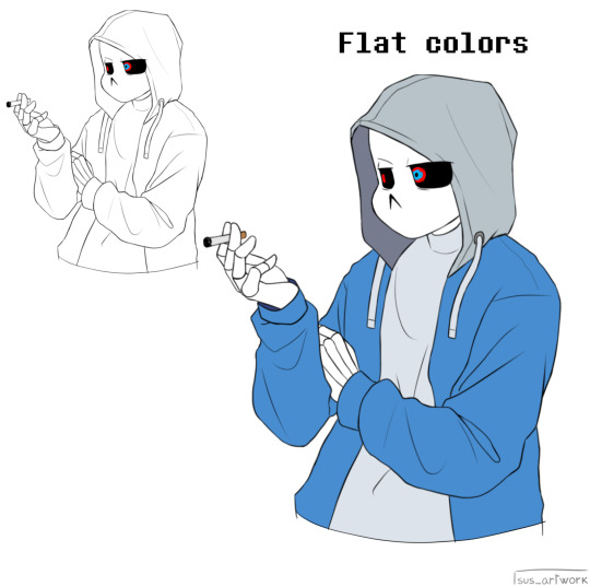
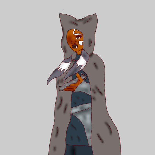
To show you I'll use this doodle I did of Murder!Sans (by @/ask-dusttale)
First, flat colors.
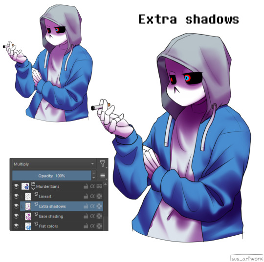
Then start shading on a new layer and put it in Multiply mode, then change the opacity at your liking.
Don't use black for the shadows! Use a dark color.
I usually use a purple or a brown.

Now with the same color, go on a new layer (Multiply mode), and add extra shadows where light has trouble reaching.
This gives more depth to the drawing.
(To make this process easier I use the Select Opaque option, by right clicking on the Base Shading layer, down in the menu, and then paint on the new layer)
Now fill the canvas with the light's color (or do like me and duplicate the Flat Colors layer, and recolor it if you want the light to be only on the subject).
I'm using yellow since it makes a nice contrast with the purple.
Put it in Pin Light mode and change the opacity at your liking.

Aaaand
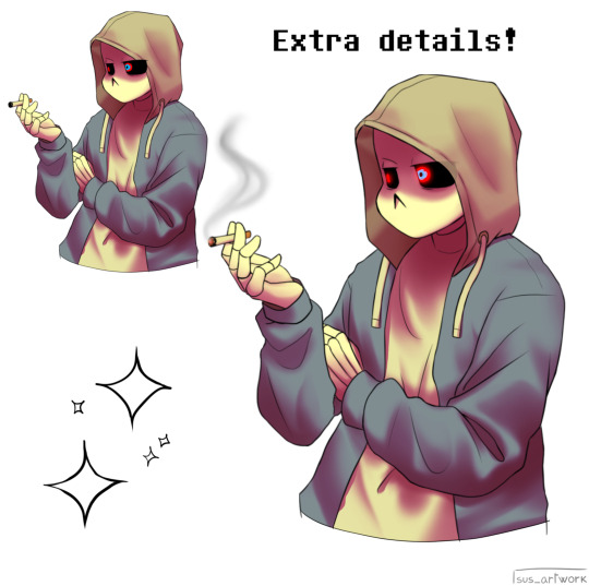
You could say finished!
We could stop here, but if you want some extras, go under the cut:
-EXTRA-
Now I-
I can't explain what "Bouncing Lights" and "Sub-Surface Scattering" are, so... go see on internet :''D
Basically slap some red and blue over the shadows layer in Overlay mode and voilà
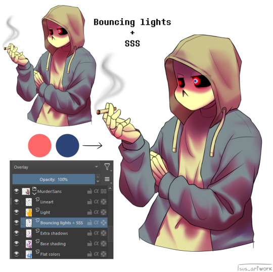
It'd be more noticeable with less light but trust me, it's good
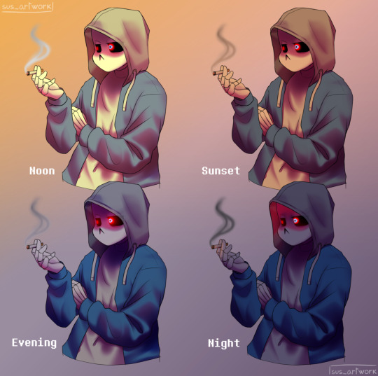
Now let's talk about ambience.
We can create many different scenes just by playing with the light and shadow layers!
Change their colors, change the blending mode, play with 'em and see what you get:

Also I suggest studying how color schemes work (I'll link you a video down below).
I uhh actually kinda suck at color schemes XD but having at least a basic understanding of them it's useful.
And, here's some tutorials that personally helped me a lot:
Shadows and lights tutorial/tips <- great for learning the basics of shading
Time saving shading solutions
This great rendering tutorial by @/licollisa
Different color schemes
For any questions don't hesitate to ask me (^w^)
#ask answered#miramoonli#undertale#undertale au#dusttale#sans#murder!sans#dust!sans#art tutorial#drawing tutorial#art tips#drawing tips#shading tutorial#coloring tutorial#rendering tutorial#This was oddly fun to do :D#maybe cause I LOVE shading. It's my fav part of drawing#Also Murder is fun to draw-#You know whose fault it is XD#This doodle was to practice drawing hoods tbh.
118 notes
·
View notes
Note
How do you render hands realistically like that? My hands look like potatoes.
Step 1: Question your sanity
Step 2: Form a Covenant with the Devil to comprehend these weird meat sticks
Step 3: Scream into a pillow
Step 4: FIND. A. REFERENCE. Doesn't have to be lit the way you want it to be, but you need somewhere to start to comprehend these phalanges little shits.
Step 5: Love thy box, become thy box, sketch out thine boxes
Lengthier explanation under the cut
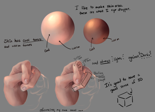
I like to make skin orbs... need a better term for it, but it is what it's called. I showed that it's possible to do this with all skin types by swatching out my own, and looking up gorgeous pictures of Beyonce on the beach.
ALL Skin has cool tones and warm tones. Cool town will include Blue, Pink, Purple. "But Aer!" You cry in anguish with your eyedropper "They aren't anywhere near those colors in the color wheel!" They're all in the same color groups, but in sections that make them appear what they aren't because they're next to brighter warmer tones. These are Grey color Families. SUPER important for defining skin.
Loosely sketch out your hand with your skin color of choice, I hate myself so picked bright ass peach to now buff the fuck out of when I have to place a dark along that line. AND NOW GET PLACING COLORS. If you understand how a cube works, treat EVERYTHING like a cube and swatch accordingly. If you made a flesh orb (now the name is worse), you likely already know the properties of a sphere. So areas where the muscle bulge is the sphere, areas where it's the cube, it's the cube.
Lights against darks, Darks against lights. This really is about Observing and acknowledging traits about the hand. Where there's more pink would be near the nails, where the color tone evens out is in the palm, where the blue's shine through is where you're cutting off circulation from holding the pose for too long; etc.
You won't be magically good at rendering hands, but with practice and determination, You too can make a pact with the mannequin hand devil and over come your worse adversary... the hands.
24 notes
·
View notes
Text


I've been working on a digital painting and I wanted to share some tips on how I'm rendering some things like shiny balloons!
#art#illustration#artists on tumblr#art tutorial#rendering tutorial#2d render#shiny#tutorial#how do i tag this#digital art#digital painting#digital art tutorials
6 notes
·
View notes
Photo

Tutorial sheet. One of my personal methods I use to color over greyscale. Just thought I'd share.
Patreon: https://www.patreon.com/JaeHaruArt?fan_landing=true
Link Tree: https://linktr.ee/jaeharuart
#art tutorial#drawing tutorial#painting tutorial#rendering tutorial#semi realism#semi realistic#jaeharuart#how to color#how to color greyscale#tutorial#digital art#how to draw digitally
35 notes
·
View notes
Note
RENDERING TUTORIAL? PLEASE?
Sure! Although idk if the steps will make sense 😭
Draw a sketch and give a main bg color, the skin will be influenced by the bg. Take the skin tone of ur character and overlay ur bg color or lower to opacity of the skin layer by like 10%(or whatever looks good tbh)

Use a soft brush to add the reds and blue undertones to the face. Blue near the chin and neck red near the eyes, nose, lips, cheeks, and ears. I like making my charecters very flushed but that’s just personal preference. For lighter skinned characters the red will lean more towards light pink while darker skinned chars will look more natural with a deep red purple.

Add ur lighting! Follow the shape/curve of the face. If it’s light exposure then flush out all the details in the light bits, If it’s shadow exposure make the dark parts undetailed
Add a saturated color around ur light source (pink in this case). Add more in in thinner parts of the skin to show the light coming though. Color ur lineart and fill in the eyes. (If ur going for the look of my usual art render over the lineart and redo it neater on top)
Hair, highlights, details, and liquify fixes! And it’s done :) (I FORGOT TO ADD HIGHLIGHTS TO THE EYES SRY😭)
I use a custom edited brush on ibis paint X, but it’s very similar to “dip pen fade” for all my rendering!
Sorry if it was a bit rambly or unclear, I tried to explain my shitshow of a process the best I could 😭
Also if u want clothes or rendering darker skin I could do one of those too! Just give me another ask or reply to this post! :3
#rendering#art#tutorial#art tutorial#rendering tutorial#i forgot to add highlights to the eyes but it’s fine he can just be a little bit dead inside 😭
8 notes
·
View notes
Photo
If you want to know how I render hair, you can watch this video to understand how I do it. There is also a post linked in the description that has a downloadable zip file.
#speedpaint#speed#paint#speedpainting#digital art#digital#art#tutorial#art tutorial#rendering tutorial#rendering#render#hair rendering#hair#hair tutorial#render tutorial#example#step by step#steps#clip studio paint
10 notes
·
View notes
Note
hi thank you so so much for this account! it has honestly been so helpful and I am learning a lot. I was wondering if you maybe had a tutorial on how to use blender jewelry? and how to go about using them on the sim in blender? sorry if this is a little confusing, but I really appreciate it!
Hi Hi! Thank you for visiting!
As for blender only jewelry, the process is similar to adding any other blend file to a project, but I’ll show a quick demonstration in case it helps others!
Here, I’ll be using @cocoelleansims’ Dior Necklace, available on her Patreon!
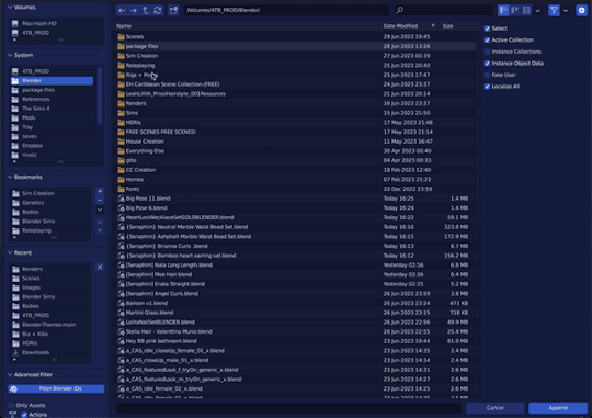
First, you’ll need to append the item. Go into File > Append, then double click the item. You’ll be brought to a bunch of folders. Select the Object folder and double click the mesh.
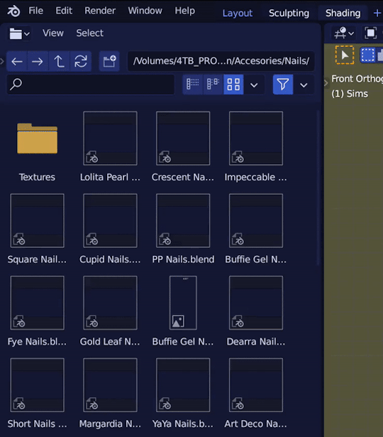
Most blender creators are nice enough to name the item(s) as what you’ll be looking for, or make it the only item in the file. If you’re confused on what the item is, I personally just select all of the items and delete the ones that aren’t what I’m looking for ¯\_(ツ)_/¯
When the object appears, click the name in your menu, and in Object Modifiers (wrench icon), you should find the armature modifier already added. Change the “Object” location to the name of your rig (in my case, BiaRig)

After that, you can do whatever you need to do to fit it to your sim. It’s important to note that with .blend file exclusive items, symmetry is not guaranteed, so using elastic deform to symmetrically sculpt may not come out the way you intend. Here, I’m scaling and rotating the necklace in edit mode
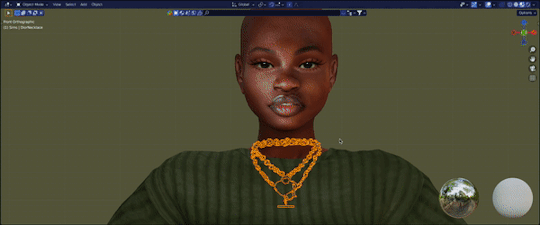
And TADA! You’re done!
Troubleshooting under the cut
Problem 1: Item doesn’t move with sim
Check your weights in Object Data Properties. If it’s blank, that means none were assigned. For items like jewelry, this is a minor setback. You’ll instead have to move the item into the posed position using G. For items like nails and clothing, that will be a different matter that I will have to address separately. In the meantime, contact the creator if possible.
Problem 2: Item is weirdly deformed
There are two causes to this problem:
1. The way it was weighted.
For items like jewelry, this is a minor setback. You’ll instead have to move the item into the posed position using G. For items like nails and clothing, I have yet to figure out a fix, so I’d advise contacting the creator if possible about the issue.
2. Your object is in a different position than your rig. (Most common)
If you’ve moved your rig in object mode at all, any objects not parented to the rig object must match the EXACT location, rotation, and/or scale of the rig. To prevent this in the future, I recommend dressing your sim first, parenting it to your rig and THEN add/create the pose.
11 notes
·
View notes
Text

Before and after rendering
#artist#art#artists on tumblr#artist on tumblr#patreon artist#cute#aesthetic#digital artist#queer artist#painting#rendering#rendering painting#rendering tutorial#fully rendered#artists on twitter#small artist
6 notes
·
View notes
Text
@rainbowdelicsunshine tut for you!! It’s not very helpful but basically i have my set colors and i color pick the mid tones and mix them in. I also use a brush on a lower opacity!! also also!! don’t use the blur tool,, it is your worst enemy, use an airbrush instead!! i’ll probably post the speedpaint so maybe it’ll help more?
#twyz#also color theory#but not really#just pick colors that look good really!!#wip#tutorial#rendering tutorial#chucky#bride of chucky#charles lee ray#tiffany valentine#digital art#made in ibis paint
19 notes
·
View notes
Text
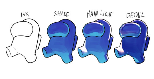
HOW I SHADE & RENDER
First I start off with my base colors.

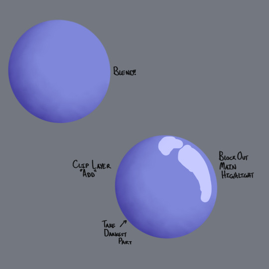
After adding my base colors I go up and add a layer clip it to the base color and set the blending mode to multiply. Or add for a shine effect on metal. Then I color pick from the color I'm shading. I shade only what that color would be shaded with for no outside factors. Ex: folds on clothes
After the base shading I go back and add more shading on top of the base shading. Using the same shading tactic as before I add the shadows of the other pieces. I also add extra details to the skin.

After shading the shadows I consider the environment/scene the character is in and add in any extra details.
Then I add my background and foreground (For this drawing I just edited a screenshot of tcw because I can't do backgrounds)
Then I shade my entire character in a low saturated purple, once again setting my blending mode to multiply. I add shadows to my character based off the positioning of everything in the scene. (If you wanted to use lighting I recommend a low saturated bright yellow set to a screen blending mode.)

After all that's been done feel free to add any effects/details to your drawing and you're done!

(the drawing)
8 notes
·
View notes
Text
#hinata hyuga#someone asked for rendering tutorial so I drew hinata#stay tuned for tutorial!#hinata#naruto fanart#naruto#sasha arts
1K notes
·
View notes
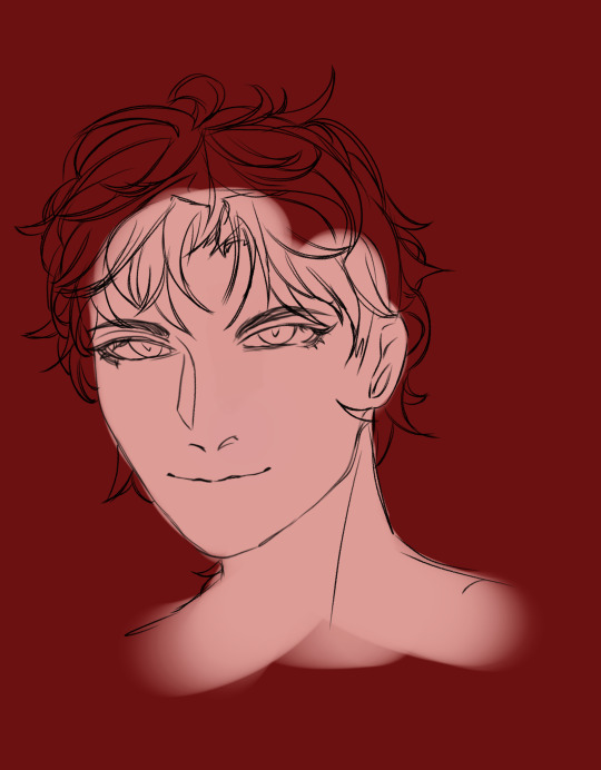
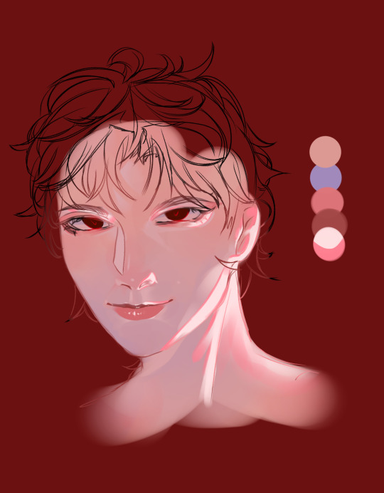
Text
BREAKING DOWN MY ART
The artwork I'm breaking down.
(Added text descriptions to the images (I did my best) in case you don't understand my handwriting)
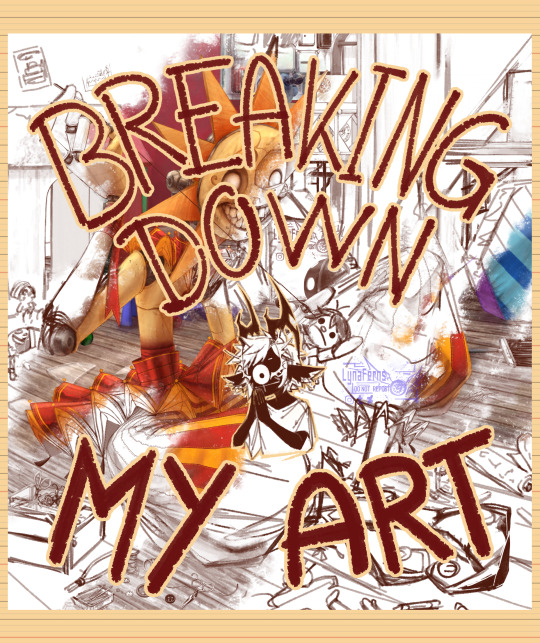
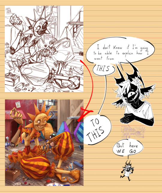
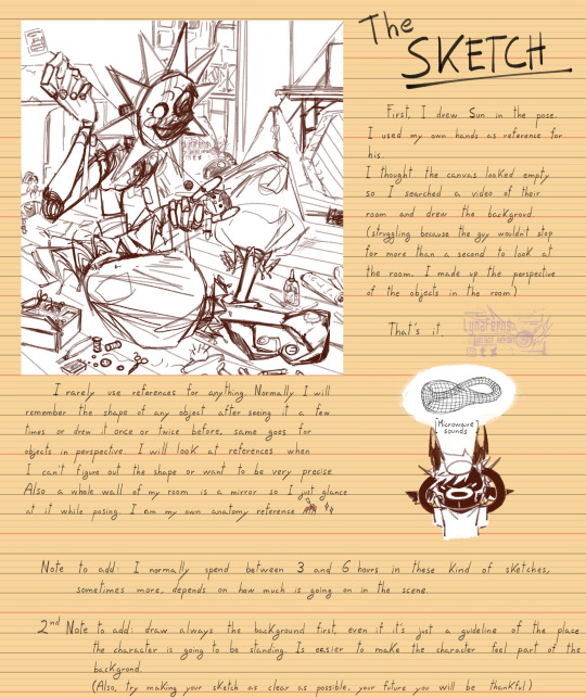
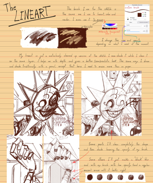
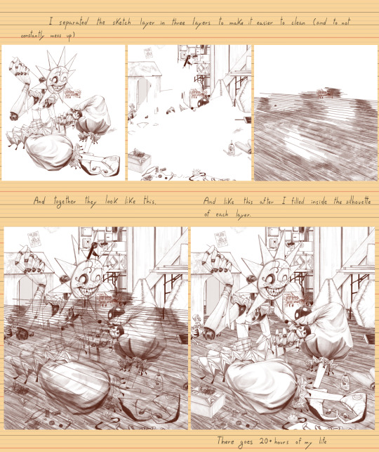
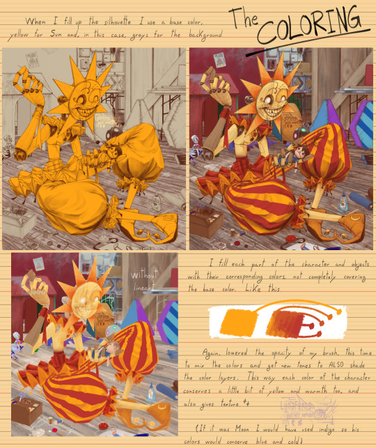
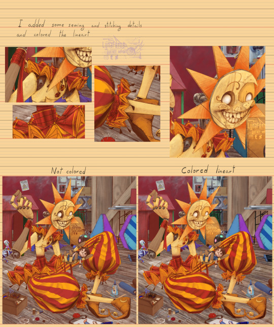
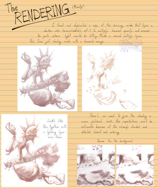
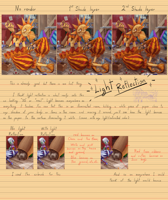
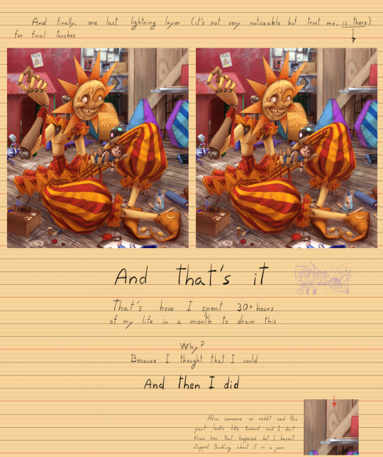
Basically my rendering process and art techniques for all of my artworks. There is more to it of course but this post was centered on this whole drawing specifically and had to keep each description brief or this would have gotten excessively long. Besides, I've improved since this drawing and I do some things a bit diferently than before.
I can make more of these kind of post in the future explaining how I get to figure out the shapes and colors of things, basically how I draw.
A time span
BONUS
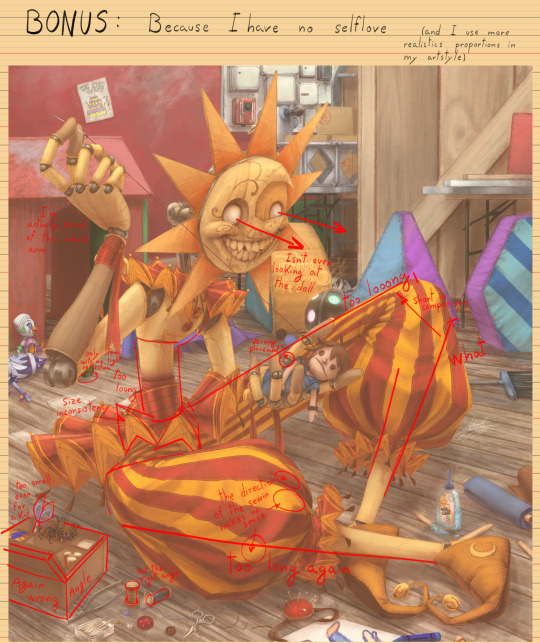
Don't take this last image as if now the artwork is completely wrong because of "bad proportions". This is a self critique, by the estandars I put to myself. Putting that aside, it's still a good artwork, I did a pretty good job on this one and I hope one day to find the same motivation to surpass it.
#funny cus what motivated me to do the whole piece was the main character on it lol#but I guess after a year that motivation dropped a bit#One day I should take a break from DCA and come back later more fresh#my art#digital art#art study#art tutorial#fnaf dca#fnaf daycare attendant#fnaf sun#sundrop#2d art#2d illustration#breaking down my art#art break down#sketch#render art
1K notes
·
View notes
Text

That one Calvin Klein ad but make it Lucien Vanserra
I got some new rendering brushes today and I’m really enjoying trying them out! Figuring out my art style is such a journey but I kind of like where this is going so far ☀️

#Lucien VanCalvinKlein#it’s not perfect but progress is progress LOL#i keep watching these youtube tutorials where artists say rendering is the most enjoyable part#meanwhile I am in hell#anyway one day I’ll be consistent with an art style I promise#lucien vanserra#lucien acotar#sorry for this random rant LOL#acotar#a court of thorns and roses#myart#velidedraws
348 notes
·
View notes
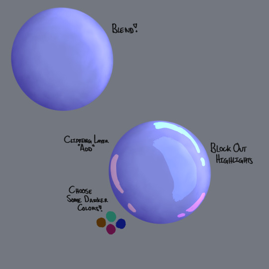
Text
how 2 render
393 notes
·
View notes
Last Seen Blogs
stanakin96
stars around my scars
nicolas627
WASTED TEEN
lezbian-lena
cheers luv! the calvary's queer

thatdailyday
That Daily Day