#research architecture
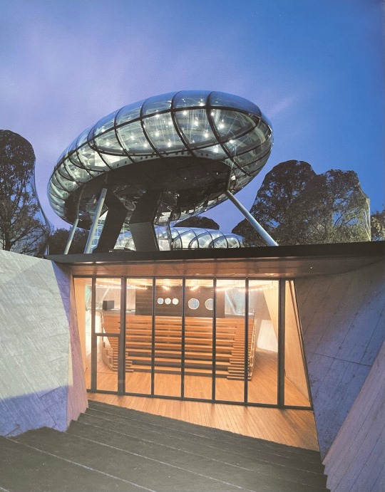
Photo


youtube
youtube
youtube
youtube
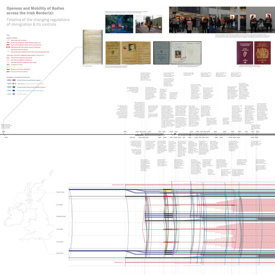
A Body, A Borderland: the Biopolitics of the Irish Border(s), 2019-2020 The Irish border is a political question, but also a spatial one.
Cartography is an instrument of power. The border spatialises state power, and in Ireland, embodies long-running conflicts over self-determination. Despite its openness, it remains a limit of jurisdiction, and for marginalised bodies, such as women seeking abortions or transgender people, a source of systemic violence. The Irish border's spatial site is not only on the map, the territory, but in fact is carried by each body.
“Sovereign territory” is idealised fiction. The 1924 Irish Boundary Commission’s failed attempt to redraw the border demonstrably exemplified problematics of dividing interconnected peoples, economies, geographies, with a line. Mapping Ireland was inherently colonial, and the Irish Boundary Commission’s arbitrary interpretation of “wishes of inhabitants” continues legacies of the cartographic gaze’s power, vested in few, imposed on bodies of many.
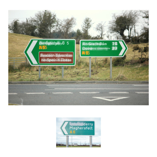
When territory as an idea engenders violence, this project proposes deterritorialising sovereignty, basing it on the space of an individual body as a provocation. In Derry/Londonderry, where its bipartisan names are part of the conflict, what becomes of urban life if our association with a state is not based on territorial coincidence, but the body’s choice? May urban flows of people become new maps of the nation, with architecture as the boundary treaty? When the nation is built on the body, how may the body rebuild our understanding of the conflict, and the nation?
This research was featured as an article on e-Flux, Inscribing Borders on Bodies. This work was also part of a Feminist Constitutions symposium on using methods of arts and design in reimagining new processes of 'constitution-ing'. Calvin has also spoken at the London Migration Film Festival about ideas from this work.
#Youtube#cartography#geography#research architecture#forensic architecture#architectural association#architecture theory#archtecture#politics#conflict#nationalism#unionism#territory#irish border#borders#e-flux#writing#critical theory
4 notes
·
View notes
Text
Fantasy Guide to Interiors

As a followup to the very popular post on architecture, I decided to add onto it by exploring the interior of each movement and the different design techniques and tastes of each era. This post at be helpful for historical fiction, fantasy or just a long read when you're bored.
Interior Design Terms
Reeding and fluting: Fluting is a technique that consists a continuous pattern of concave grooves in a flat surface across a surface. Reeding is it's opposite.
Embossing: stamping, carving or moulding a symbol to make it stand out on a surface.
Paneling: Panels of carved wood or fabric a fixed to a wall in a continuous pattern.
Gilding: the use of gold to highlight features.
Glazed Tile: Ceramic or porcelain tiles coated with liquid coloured glass or enamel.
Column: A column is a pillar of stone or wood built to support a ceiling. We will see more of columns later on.
Bay Window: The Bay Window is a window projecting outward from a building.
Frescos: A design element of painting images upon wet plaster.
Mosaic: Mosaics are a design element that involves using pieces of coloured glass and fitted them together upon the floor or wall to form images.
Mouldings: ornate strips of carved wood along the top of a wall.
Wainscoting: paneling along the lower portion of a wall.
Chinoiserie: A European take on East Asian art. Usually seen in wallpaper.
Clerestory: A series of eye-level windows.
Sconces: A light fixture supported on a wall.
Niche: A sunken area within a wall.
Monochromatic: Focusing on a single colour within a scheme.
Ceiling rose: A moulding fashioned on the ceiling in the shape of a rose usually supporting a light fixture.
Baluster: the vertical bars of a railing.
Façade: front portion of a building
Lintel: Top of a door or window.
Portico: a covered structure over a door supported by columns
Eaves: the part of the roof overhanging from the building
Skirting: border around lower length of a wall
Ancient Greece
Houses were made of either sun-dried clay bricks or stone which were painted when they dried. Ground floors were decorated with coloured stones and tiles called Mosaics. Upper level floors were made from wood. Homes were furnished with tapestries and furniture, and in grand homes statues and grand altars would be found. Furniture was very skillfully crafted in Ancient Greece, much attention was paid to the carving and decoration of such things. Of course, Ancient Greece is ancient so I won't be going through all the movements but I will talk a little about columns.
Doric: Doric is the oldest of the orders and some argue it is the simplest. The columns of this style are set close together, without bases and carved with concave curves called flutes. The capitals (the top of the column) are plain often built with a curve at the base called an echinus and are topped by a square at the apex called an abacus. The entablature is marked by frieze of vertical channels/triglyphs. In between the channels would be detail of carved marble. The Parthenon in Athens is your best example of Doric architecture.
Ionic: The Ionic style was used for smaller buildings and the interiors. The columns had twin volutes, scroll-like designs on its capital. Between these scrolls, there was a carved curve known as an egg and in this style the entablature is much narrower and the frieze is thick with carvings. The example of Ionic Architecture is the Temple to Athena Nike at the Athens Acropolis.
Corinthian: The Corinthian style has some similarities with the Ionic order, the bases, entablature and columns almost the same but the capital is more ornate its base, column, and entablature, but its capital is far more ornate, commonly carved with depictions of acanthus leaves. The style was more slender than the others on this list, used less for bearing weight but more for decoration. Corinthian style can be found along the top levels of the Colosseum in Rome.
Tuscan: The Tuscan order shares much with the Doric order, but the columns are un-fluted and smooth. The entablature is far simpler, formed without triglyphs or guttae. The columns are capped with round capitals.
Composite: This style is mixed. It features the volutes of the Ionic order and the capitals of the Corinthian order. The volutes are larger in these columns and often more ornate. The column's capital is rather plain. for the capital, with no consistent differences to that above or below the capital.
Ancient Rome
Rome is well known for its outward architectural styles. However the Romans did know how to add that rizz to the interior. Ceilings were either vaulted or made from exploded beams that could be painted. The Romans were big into design. Moasics were a common interior sight, the use of little pieces of coloured glass or stone to create a larger image. Frescoes were used to add colour to the home, depicting mythical figures and beasts and also different textures such as stonework or brick. The Romans loved their furniture. Dining tables were low and the Romans ate on couches. Weaving was a popular pastime so there would be tapestries and wall hangings in the house. Rich households could even afford to import fine rugs from across the Empire. Glass was also a feature in Roman interior but windows were usually not paned as large panes were hard to make. Doors were usually treated with panels that were carved or in lain with bronze.
Ancient Egypt
Egypt was one of the first great civilisations, known for its immense and grand structures. Wealthy Egyptians had grand homes. The walls were painted or plastered usually with bright colours and hues. The Egyptians are cool because they mapped out their buildings in such a way to adhere to astrological movements meaning on special days if the calendar the temple or monuments were in the right place always. The columns of Egyptian where thicker, more bulbous and often had capitals shaped like bundles of papyrus reeds. Woven mats and tapestries were popular decor. Motifs from the river such as palms, papyrus and reeds were popular symbols used.
Ancient Africa
African Architecture is a very mixed bag and more structurally different and impressive than Hollywood would have you believe. Far beyond the common depictions of primitive buildings, the African nations were among the giants of their time in architecture, no style quite the same as the last but just as breathtaking.
Rwandan Architecture: The Rwandans commonly built of hardened clay with thatched roofs of dried grass or reeds. Mats of woven reeds carpeted the floors of royal abodes. These residences folded about a large public area known as a karubanda and were often so large that they became almost like a maze, connecting different chambers/huts of all kinds of uses be they residential or for other purposes.
Ashanti Architecture: The Ashanti style can be found in present day Ghana. The style incorporates walls of plaster formed of mud and designed with bright paint and buildings with a courtyard at the heart, not unlike another examples on this post. The Ashanti also formed their buildings of the favourite method of wattle and daub.
Nubian Architecture: Nubia, in modern day Ethiopia, was home to the Nubians who were one of the world's most impressive architects at the beginning of the architecture world and probably would be more talked about if it weren't for the Egyptians building monuments only up the road. The Nubians were famous for building the speos, tall tower-like spires carved of stone. The Nubians used a variety of materials and skills to build, for example wattle and daub and mudbrick. The Kingdom of Kush, the people who took over the Nubian Empire was a fan of Egyptian works even if they didn't like them very much. The Kushites began building pyramid-like structures such at the sight of Gebel Barkal
Japanese Interiors
Japenese interior design rests upon 7 principles. Kanso (簡素)- Simplicity, Fukinsei (不均整)- Asymmetry, Shizen (自然)- Natural, Shibumi (渋味) – Simple beauty, Yugen (幽玄)- subtle grace, Datsuzoku (脱俗) – freedom from habitual behaviour, Seijaku (静寂)- tranquillity.
Common features of Japanese Interior Design:
Shoji walls: these are the screens you think of when you think of the traditional Japanese homes. They are made of wooden frames, rice paper and used to partition
Tatami: Tatami mats are used within Japanese households to blanket the floors. They were made of rice straw and rush straw, laid down to cushion the floor.
Genkan: The Genkan was a sunken space between the front door and the rest of the house. This area is meant to separate the home from the outside and is where shoes are discarded before entering.
Japanese furniture: often lowest, close to the ground. These include tables and chairs but often tanked are replaced by zabuton, large cushions. Furniture is usually carved of wood in a minimalist design.
Nature: As both the Shinto and Buddhist beliefs are great influences upon architecture, there is a strong presence of nature with the architecture. Wood is used for this reason and natural light is prevalent with in the home. The orientation is meant to reflect the best view of the world.
Islamic World Interior
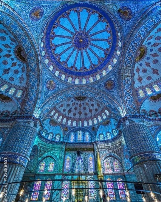
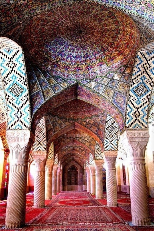
The Islamic world has one of the most beautiful and impressive interior design styles across the world. Colour and detail are absolute staples in the movement. Windows are usually not paned with glass but covered in ornate lattices known as jali. The jali give ventilation, light and privacy to the home. Islamic Interiors are ornate and colourful, using coloured ceramic tiles. The upper parts of walls and ceilings are usually flat decorated with arabesques (foliate ornamentation), while the lower wall areas were usually tiled. Features such as honeycombed ceilings, horseshoe arches, stalactite-fringed arches and stalactite vaults (Muqarnas) are prevalent among many famous Islamic buildings such as the Alhambra and the Blue Mosque.
Byzantine (330/395–1453 A. D)
The Byzantine Empire or Eastern Roman Empire was where eat met west, leading to a melting pot of different interior designs based on early Christian styles and Persian influences. Mosaics are probably what you think of when you think of the Byzantine Empire. Ivory was also a popular feature in the Interiors, with carved ivory or the use of it in inlay. The use of gold as a decorative feature usually by way of repoussé (decorating metals by hammering in the design from the backside of the metal). Fabrics from Persia, heavily embroidered and intricately woven along with silks from afar a field as China, would also be used to upholster furniture or be used as wall hangings. The Byzantines favoured natural light, usually from the use of copolas.
Indian Interiors
India is of course, the font of all intricate designs. India's history is sectioned into many eras but we will focus on a few to give you an idea of prevalent techniques and tastes.
The Gupta Empire (320 – 650 CE): The Gupta era was a time of stone carving. As impressive as the outside of these buildings are, the Interiors are just as amazing. Gupta era buildings featured many details such as ogee (circular or horseshoe arch), gavaksha/chandrashala (the motif centred these arches), ashlar masonry (built of squared stone blocks) with ceilings of plain, flat slabs of stone.
Delhi Sultanate (1206–1526): Another period of beautifully carved stone. The Delhi sultanate had influence from the Islamic world, with heavy uses of mosaics, brackets, intricate mouldings, columns and and hypostyle halls.
Mughal Empire (1526–1857): Stonework was also important on the Mughal Empire. Intricately carved stonework was seen in the pillars, low relief panels depicting nature images and jalis (marble screens). Stonework was also decorated in a stye known as pietra dura/parchin kari with inscriptions and geometric designs using colored stones to create images. Tilework was also popular during this period. Moasic tiles were cut and fitted together to create larger patters while cuerda seca tiles were coloured tiles outlined with black.
Chinese Interiors
Common features of Chinese Interiors
Use of Colours: Colour in Chinese Interior is usually vibrant and bold. Red and Black are are traditional colours, meant to bring luck, happiness, power, knowledge and stability to the household.
Latticework: Lattices are a staple in Chinese interiors most often seen on shutters, screens, doors of cabinets snf even traditional beds.
Lacquer: Multiple coats of lacquer are applied to furniture or cabinets (now walls) and then carved. The skill is called Diaoqi (雕漆).
Decorative Screens: Screens are used to partition off part of a room. They are usually of carved wood, pained with very intricate murals.
Shrines: Spaces were reserved on the home to honour ancestors, usually consisting of an altar where offerings could be made.
Of course, Chinese Interiors are not all the same through the different eras. While some details and techniques were interchangeable through different dynasties, usually a dynasty had a notable style or deviation. These aren't all the dynasties of course but a few interesting examples.
Song Dynasty (960–1279): The Song Dynasty is known for its stonework. Sculpture was an important part of Song Dynasty interior. It was in this period than brick and stone work became the most used material. The Song Dynasty was also known for its very intricate attention to detail, paintings, and used tiles.
Ming Dynasty(1368–1644): Ceilings were adorned with cloisons usually featuring yellow reed work. The floors would be of flagstones usually of deep tones, mostly black. The Ming Dynasty favoured richly coloured silk hangings, tapestries and furnishings. Furniture was usually carved of darker woods, arrayed in a certain way to bring peace to the dwelling.
Han Dynasty (206 BC-220 AD): Interior walls were plastered and painted to show important figures and scenes. Lacquer, though it was discovered earlier, came into greater prominence with better skill in this era.
Tang Dynasty (618–907) : The colour palette is restrained, reserved. But the Tang dynasty is not without it's beauty. Earthenware reached it's peak in this era, many homes would display fine examples as well. The Tang dynasty is famous for its upturned eaves, the ceilings supported by timber columns mounted with metal or stone bases. Glazed tiles were popular in this era, either a fixed to the roof or decorating a screen wall.
Romanesque (6th -11th century/12th)
Romanesque Architecture is a span between the end of Roman Empire to the Gothic style. Taking inspiration from the Roman and Byzantine Empires, the Romanesque period incorporates many of the styles. The most common details are carved floral and foliage symbols with the stonework of the Romanesque buildings. Cable mouldings or twisted rope-like carvings would have framed doorways. As per the name, Romansque Interiors relied heavily on its love and admiration for Rome. The Romanesque style uses geometric shapes as statements using curves, circles snf arches. The colours would be clean and warm, focusing on minimal ornamentation.
Gothic Architecture (12th Century - 16th Century)
The Gothic style is what you think of when you think of old European cathedrals and probably one of the beautiful of the styles on this list and one of most recognisable. The Gothic style is a dramatic, opposing sight and one of the easiest to describe. Decoration in this era became more ornate, stonework began to sport carving and modelling in a way it did not before. The ceilings moved away from barreled vaults to quadripartite and sexpartite vaulting. Columns slimmed as other supportive structures were invented. Intricate stained glass windows began their popularity here. In Gothic structures, everything is very symmetrical and even.
Mediaeval (500 AD to 1500)
Interiors of mediaeval homes are not quite as drab as Hollywood likes to make out. Building materials may be hidden by plaster in rich homes, sometimes even painted. Floors were either dirt strewn with rushes or flagstones in larger homes. Stonework was popular, especially around fireplaces. Grand homes would be decorated with intricate woodwork, carved heraldic beasts and wall hangings of fine fabrics.
Renaissance (late 1300s-1600s)
The Renaissance was a period of great artistry and splendor. The revival of old styles injected symmetry and colour into the homes. Frescoes were back. Painted mouldings adorned the ceilings and walls. Furniture became more ornate, fixed with luxurious upholstery and fine carvings. Caryatids (pillars in the shape of women), grotesques, Roman and Greek images were used to spruce up the place. Floors began to become more intricate, with coloured stone and marble. Modelled stucco, sgraffiti arabesques (made by cutting lines through a layer of plaster or stucco to reveal an underlayer), and fine wall painting were used in brilliant combinations in the early part of the 16th century.
Tudor Interior (1485-1603)
The Tudor period is a starkly unique style within England and very recognisable. Windows were fixed with lattice work, usually casement. Stained glass was also in in this period, usually depicting figures and heraldic beasts. Rooms would be panelled with wood or plastered. Walls would be adorned with tapestries or embroidered hangings. Windows and furniture would be furnished with fine fabrics such as brocade. Floors would typically be of wood, sometimes strewn with rush matting mixed with fresh herbs and flowers to freshen the room.
Baroque (1600 to 1750)
The Baroque period was a time for splendor and for splashing the cash. The interior of a baroque room was usually intricate, usually of a light palette, featuring a very high ceiling heavy with detail. Furniture would choke the room, ornately carved and stitched with very high quality fabrics. The rooms would be full of art not limited to just paintings but also sculptures of marble or bronze, large intricate mirrors, moldings along the walls which may be heavily gilded, chandeliers and detailed paneling.
Victorian (1837-1901)
We think of the interiors of Victorian homes as dowdy and dark but that isn't true. The Victorians favoured tapestries, intricate rugs, decorated wallpaper, exquisitely furniture, and surprisingly, bright colour. Dyes were more widely available to people of all stations and the Victorians did not want for colour. Patterns and details were usually nature inspired, usually floral or vines. Walls could also be painted to mimic a building material such as wood or marble and most likely painted in rich tones. The Victorians were suckers for furniture, preferring them grandly carved with fine fabric usually embroidered or buttoned. And they did not believe in minimalism. If you could fit another piece of furniture in a room, it was going in there. Floors were almost eclusively wood laid with the previously mentioned rugs. But the Victorians did enjoy tiled floors but restricted them to entrances. The Victorians were quite in touch with their green thumbs so expect a lot of flowers and greenery inside. with various elaborately decorated patterned rugs. And remember, the Victorians loved to display as much wealth as they could. Every shelf, cabinet, case and ledge would be chocked full of ornaments and antiques.
Edwardian/The Gilded Age/Belle Epoque (1880s-1914)
This period (I've lumped them together for simplicity) began to move away from the deep tones and ornate patterns of the Victorian period. Colour became more neutral. Nature still had a place in design. Stained glass began to become popular, especially on lampshades and light fixtures. Embossing started to gain popularity and tile work began to expand from the entrance halls to other parts of the house. Furniture began to move away from dark wood, some families favouring breathable woods like wicker. The rooms would be less cluttered.
Art Deco (1920s-1930s)
The 1920s was a time of buzz and change. Gone were the refined tastes of the pre-war era and now the wow factor was in. Walls were smoother, buildings were sharper and more jagged, doorways and windows were decorated with reeding and fluting. Pastels were in, as was the heavy use of black and white, along with gold. Mirrors and glass were in, injecting light into rooms. Gold, silver, steel and chrome were used in furnishings and decor. Geometric shapes were a favourite design choice. Again, high quality and bold fabrics were used such as animal skins or colourful velvet. It was all a rejection of the Art Noveau movement, away from nature focusing on the man made.
Modernism (1930 - 1965)
Modernism came after the Art Deco movement. Fuss and feathers were out the door and now, practicality was in. Materials used are shown as they are, wood is not painted, metal is not coated. Bright colours were acceptable but neutral palettes were favoured. Interiors were open and favoured large windows. Furniture was practical, for use rather than the ornamentation, featuring plain details of any and geometric shapes. Away from Art Deco, everything is straight, linear and streamlined.
#This took forever#I'm very tired#But enjoy#I covered as much as I could find#Fantasy Guide to interiors#interior design#Architecture#writings#writing resources#Writing reference#Writing advice#Writer's research#writing research#Writer's rescources#Writing help#Mediaeval#Renaissance#Chinese Interiors#Japanese Interiors#Indian interiors#writing#writeblr#writing reference#writing advice#writer#spilled words#writers
3K notes
·
View notes
Text
I was thinking about Ingo’s home both in my Hilda crossover and just the Hisui pokemon canon. Taking heavy inspiration from Ainu people architecture and what else i could find regarding ancient houses on Hokkaido
People hc a lot that Ingo must have a cabin near Sneasler’s home, and that’s kinda what I wanted to explore here
#submas#subway boss ingo#art#architecture#concept art#ainu people#hokkaido#this topic is super interesting#i had a good time researching
423 notes
·
View notes
Text
tbh I headcanon percy to eventually land on an environmental science major in college after a lot of experimenting around and not because of his dad but because of *grover* and his belief in finding pan, because of knowing how much the mortal and mythical world have been hurting the earth itself, and because if there's one thing that could convince percy jackson to study, it's justice. plus I think he and annabeth would totally geek out over sustainability as restorative and regenerative design. this is your "build something that lasts" couple. your "ur system is broken fix it rn" couple. if the mythical world EVER left them alone they would 100% be pursuing justice at any other stop they found themselves in anyway
#let them cause more real world trouble bffr#show me percabeth at protests and show me percy helping annabeth at her firm oh i beg#percy jackson#pjo#annabeth chase#heroes of olympus#chalice of the gods#sorry but the marine biology major for percy as a joke sucks#my boy would be at the front lines of climate justice#also while Im here ranting um annabeth wouldnt double enroll at berkley lol. they dont have an accredited architecture program#which is the only reason she would need a special degree in the mortal world#but i digress#when have we ever expected rr to do research lol
350 notes
·
View notes
Text
Ukrainian Institute of Scientific and Technological Research and Development, Kiev, Ukraine, 1971.
Architects: Lev Novikov, Florian Turiev
Photography: Johansen Krause
#architecture#modernism#Lev Novikov#Florian Turiev#Ukrainian Institute of Scientific and Technological Research and Development#Johansen Krause#Kiev#Ukraine#USSR#1971
267 notes
·
View notes
Text
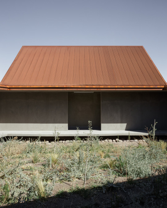
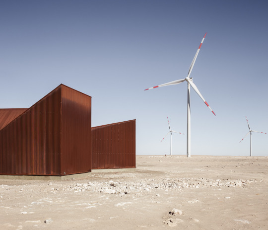
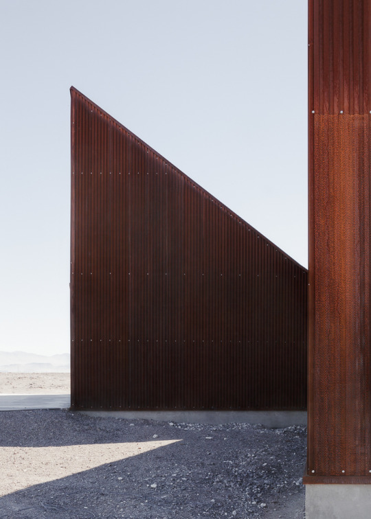


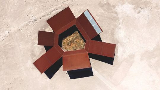

Desert Interpretation Centre, Antofagasta, Chile - Emilio Marín & Juan Carlos López
#Emilio Marín & Juan Carlos López#architecture#design#building#modern architecture#interiors#minimal#concrete#metal cladding#corrugated#rust#desert#landscape#research centre#plywood#wind turbines#chile#south america#cool architecture
172 notes
·
View notes
Text

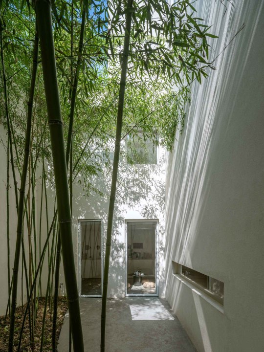
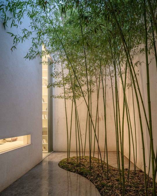
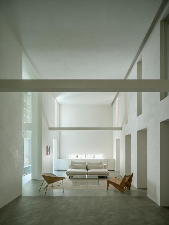
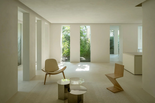


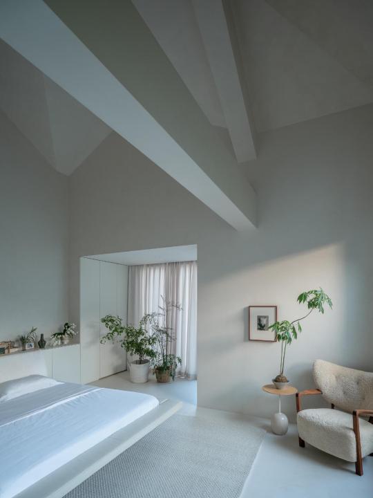
Forest Villa, Hefei China,
HAS Design And Research
#art#design#architecture#luxury house#luxury home#luxury lifestyle#gardens#forest#landscaping#china#white#hefei#has design and research
138 notes
·
View notes
Text
Research and Multimedia Center (2004) Located: Bassano del Grappa, Italy
1K notes
·
View notes
Text
Tucker Carlson on architecture 🤔
#pay attention#educate yourselves#educate yourself#knowledge is power#reeducate yourself#reeducate yourselves#think about it#think for yourselves#think for yourself#do your homework#do some research#do your own research#ask yourself questions#question everything#tucker carlson#news#architecture#history lesson#american history#world history
65 notes
·
View notes
Text
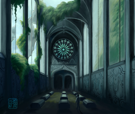
25 June, Jonathan Harker's journal:
"At last I [...] found myself in an old, ruined chapel, which had evidently been used as a graveyard. The roof was broken, and in two places were steps leading to vaults, but the ground had recently been dug over, and the earth placed in great wooden boxes [...]"
#my art#dracula daily#dracula#jonathan harker#finally done!! ive never really done environmental artworks like this before im so proud of this#this scene was stuck in my mind for so long like i really wanted to capture that sense of awe and mystery#inspired heavily by uncharted new devon which is appropriate because jonathans parkour reminded me of it#ngl it was kind of fun to research references for this gothic architecture is gorgeous. recently went to a Notre Dame exhibition#and they had a VR experience of it!! using the same model the assassins creed ppl made!!! it was Extremely Cool... gosh the atmosphere
1K notes
·
View notes
Photo

Waiting for the storm in Villa Belza, Biarritz (Lapurdi).
Pic source
#iparralde#euskal herria#basque country#pais vasco#pays basque#biarritz#lapurdi#architecture#photography#seascape#scenery#research#storm#travel#places#wanderlust
707 notes
·
View notes
Photo

207 notes
·
View notes
Text

things I’m excited for (in no particular order):
exterior wall-mounted AC units, squat toilets, the hard plastic chair
the water heater (yes it feels like this belongs in a City Living refresh but I can’t deny my feelings for her! 🥵)
hopscotch and marbles and sky lanterns 🥹
the rice cooker and new functional tea pot and all the delicious looking new foods (all the new foods look so good lately!)
Cringe trait and the elder-specific Wise trait 🫶🏻
deco tuk tuks
the real estate sign and new communal mailboxes (with indoor and outdoor options!)
the glimmer of hope I’m keeping alive for angled gable options in build mode — am I dreaming or is the building in the bottom right (with the kind of roofline I’m talking about) not a deco building? you can see through the windows…

#this list is very build mode focused#the tenant / landlord gameplay mechanics seem fun as well#even if some of the elements feel very city living refresh 🥲#genuinely excited to explore this pack#and to learn a bunch about thai architecture from build planning and research 🥰#but also to make the landgraabs shitty landlords 😀
72 notes
·
View notes
Text

🦅🪶👀they're gossiping?? today I humble offer you a very massive chonk hawk I ever drawn lmao
#oc#original character#my art#artists on tumblr#illustration#hawk#im finally start researching abt architecture to build architecture things god help me
70 notes
·
View notes
Photo

Richard Rogers & Partners, Patscentre Research Laboratory, Melbourn, England, 1976-83.
187 notes
·
View notes
Note
What would your video essais be about if you get to do videos?
I have a dream research project about the way the architecture of places of worship influence the mind and reflect the view of God (a là Ficthe's ''religion is reverse anthropology'' and Weber's sociology of religion but specifically about architecture) and what that means for the current era of megachurches in America, and I have longed for that to be a video essay for a full year now but I can't commit to making it
#essentially it would be philosophy mixed with history and social sciences#Philosophytube... 2 (this is a joke I am nowhere near as good as Abigale in any field related to video essaying)#I do have a growing bibliography about this very topic I mention tbf but in order to do it justice I'd have to make interviews to people#and ask them about their own feelings about their architecture and their god(s)#and. That is a full research project and I am 1. in college and 2. Busy and 3. not experienced enough for it#[.asks]#anonymous#(I wish I could- idk. reach out to one of the better known video essayist and ask how they started out and dip my feet in with other topics#(and then get to this one. The Big One.)
44 notes
·
View notes
Last Seen Blogs

zendqyas
GAY FOR TAY.

uwizeye
无标题

karllion
all i know is when you hold me i still feel lonely


enchanted--realm
people are good