#rossana taormina
Text

Rossana Taormina, flight #7, tecnica mista (acquerello e penna bic) su vecchie carte nautiche
70 notes
·
View notes
Photo
Rossana Taormina.
https://www.instagram.com/rossana.taormina/?hl=en
23 notes
·
View notes
Text


GIBELLINA PHOTOROAD OPEN AIR & SITE-SPECIFIC FESTIVAL
IV EDITION 28.07 - 30.09.2023
presso FONDAZIONE ORESTIADI
ROSSANA TAORMINA (IT) Imprinting
Dopo il terremoto del 1968, le persone abitarono a lungo nelle baraccopoli. L’artista durante l’adolescenza assiste ad una profonda trasformazione dei luoghi amati nell’infanzia, che ha avuto un profondo impatto sulla sua sensibilità e identità. L’artista ha sperimentato un sentimento di perdita tale da far maturare una sorta di ossessione per la memoria, affascinata da archivi immaginari, dal confine tra memoria personale e memoria collettiva.
After the earthquake in 1968, for a long time people lived in temporary accommodation. Growing up as she did during this time of urban redesign, she witnessed the scenery change dramatically, which impacted on her sensitivity and identity. The artist experienced the sentiment of loss and developed a kind of obsession with memory, she is fascinated by archives of imagery, by the border between personal memory and collective memory.
#rossana taormina#art#contemporaryart#rossanataormina#gibellinaphotoroadfestival#2023#Gibellina#fondazioneorestiadi#ariannacatania#gibellinaphotoroadopenair&sitespecificfestival#sitespecific#gibellinaphotoroad2023#gibellinaphotoroad#photofestival#artist on tumblr#objettrouve#photography
4 notes
·
View notes
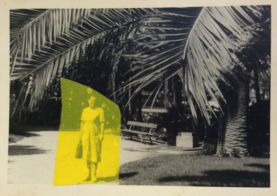
Photo

By Rossana Taormina, un'estate - 2018
assemblage: acrylic on found photograph, anti-mosquito plates used in June, July and August 2013
9 notes
·
View notes
Photo

Rossana Taormina
0 notes
Photo


works
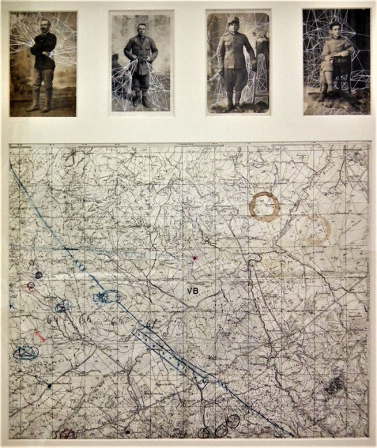
Rossana Taormina War #5, 2012
(thread, vintage photograph, letters of a mother to the son in war; 29 x 28 cm. Private collection)
Rossana Taormina, War #4, 2012
(thread, vintage photograph; 13,5 x 8,5 cm. Private collection)
Rossana Taormina, War #7, 2012
(thread, vintage photographs, old map; 53 x 44 cm)
Artist Statement:
There are no winners in a war.
We all lose something: the identity, affections, landscapes, dreams ...
The mother loses her son, the soldier his humanity.
The war generates ruins, constructs cemeteries, destroys cities.
The pain doesn't recognise uniforms and maps.
Only the mutual respect can defeats the war, every men are equal and have the same emotions.
Donate: Click the link below to donate to the ACLU
https://action.aclu.org/secure/donate-to-aclu
Do not delete captions.
181 notes
·
View notes
Text
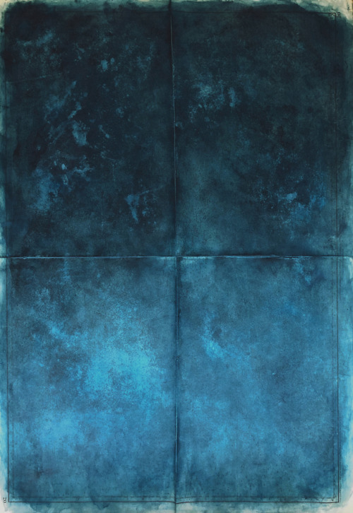
Rossana Taormina, deriva #9, 2018, acrylic on nautical chart; 103, 5 x 71 cm.
1 note
·
View note
Photo
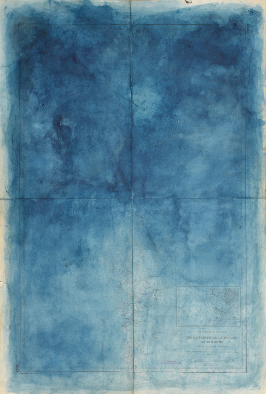
Rossana Taormina, deriva #1 - 2018 (private collection; photo by Franco Noto)
acrylic on nautical chart; 105 x 75 cm
rossanataormina.tumblr.com
232 notes
·
View notes
Text
Reasurch:


Rossana Taormina is an Italian artist who uses vintage photos and thread combined to create works, that like ‘the red string of fate’ from Japanese myth also uses thread to visually represent love and attraction.
The threads are used to slice through the empty spaces between figures. interactions between persons and threads are a focal points that highlights the relationship of love in individual designs.
~~~~~~~~~~~~~~~~~~~~~~~~~
Analysing artwork:
The viewer can interpret these as the individual lines that connect people through strong feelings/emotions.
This connection of endearment can range from loved ones to family members to friends to even sexual tension. They even trace romantic interactions and facial expressions. As well as capturing one’s self love.
The simplistic designs are emotionally charged and can influence the watcher to think of their own loved ones, making these works incredibly sentimental.
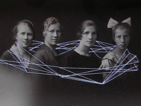
The image below for example showcases two twin girls standing side-by-side, the threads binding them are incredibly dense like tight rope. Alluding to the strong connection they share as siblings. The thick thread connecting them forms into one, Further showing that their connection is so close that they are on the same wavelength.

1 note
·
View note
Text
Katrien De Slauwer
Combinations of two images only
Minimal/ effective
Open to interpretation
Juxtaposition
Consideration of combination and placement of imagery
Narratives, stories
Memories
Timelines intercepting
John Stezeker
Portals, wormholes
Simple, highly considered
Unnerving, unsettling
Isabel Reitmeyer
Dream/ Nightmare like
Two images
Surreal, strange
Dada Movement
Art for the masses
Frang Fallkenhaus
Simple combinations
Open to interpretaitons
Annegret Soltan
Geometric overstitching
Connecting
Symmetry/ assymetry
Technological curves/ connections
Maurizio Anzeri

Stitch, found imagery
flea market finds
Publication
Images have second meaning
Hides identities, creates masks
Hinke Schrouders
Geometric
Dot to dot
Constellation
Surreal
Shaun Cardinal

Geometric
Gates to other dimensions
Floating structures
Rossana Taormina
Stitch over old photos
Connecting negative space
0 notes
Text
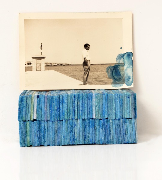
Rossana Taormina, un’estate, 2018 acrylic on found photograph, anti-mosquito plates used in June, July and August 2013, photo by Franco Noto
16 notes
·
View notes
Text
Evaluation-Multiverse
For this term our overall theme was Multiverse. Our final goal was to create six A3 postcards using words and quotes from our penguin books that we were given and then finally to animate 1 of them (This will be done when we return to college). Personally i found this terms work more difficult as it was a lot of graphic/ photoshop work which is not my favourite as i am more of a fine artist. On the other hand, i had never used photoshop before and i have enjoyed playing around with it and learning how to make my work look more professional, clean and sleek. I have researched various artists who specialise in many different techniques and are all very unique, however, there are 3 artists that influenced my final outcomes in particular. Marc Lawrence is an abstract artist whose screen prints are a particular favourite of mine. His distinctive style involves building up lines, shapes and marks, with much consideration for placement. His work impacted my ideas/ art because of its bold and eye-catching colours. Lawrence uses contrasting and complimentary colours and tends to change the hue of his imagery to fit the theme.
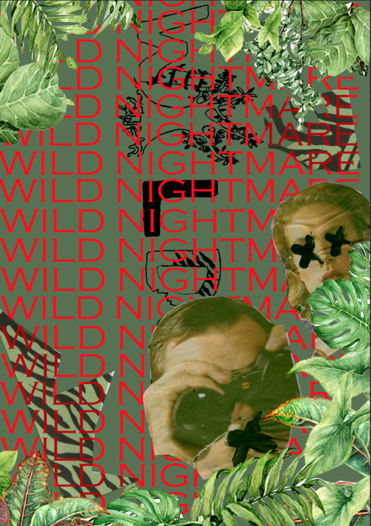
This inspired me to use complimentary colours on my final outcomes as i used red&green, blue&orange etc. I love using bold colours within my art and so, much like Lawrence, i altered the hue of my imagery to fit with the them of each postcard. Like here, i have altered the colours of the people and the zebra stripes to fit with the recurring green theme.
Another artist that has impacted my ideas and outcomes is Peter Bankov. He is a graphic designer whose work is bold and busy.

Before i discovered Bankov's work, i was very much reluctant to play around with background shapes and was very set on making my work look perfect. However, he helped me to find a style that i liked working in, creating organised chaos with thick lines effortlessly drawn over the background, breaking up the plain space.

And finally, Rossana Taormina who is a textile artist, has influenced my latest work in Thursday's lesson. She does stitched geometric shapes on top of old photos that she has accumulated through time.
I absolutely love textile work such as sewing and would say that this lesson has been one of my favourites all term. Her work is minimal but effective and in that lesson i created simple collages (based on words from our books) from images found in magazines and then used coloured thread to create connections between each image and to elevate/develop my work. I then incorporated these final outcomes into my digital postcards.
Our six postcards had to be based on words from our penguin books so on our first few lessons this term, we spent time carefully selecting our favourite words and quotes. My book was based a lot on travel and adventure which i was pleased about because it is something i am passionate about. Some quotes i selected to base my final outcomes on were "enchanted isles", "dusky shells", "moon shadow", "magnificent decay", "eternal ocean", "the wind was light; the waves languid", "wild nightmare", "ravenous race" etc. However, i decided to go with "wild nightmare", "magnificent decay", "old-fashioned", "it was after sunset when the adventurers returned", "voyages around the world" and finally " discovered by man." I tried to choose quotes that could potentially be very visual which means i could tell a narrative through each postcard. My favourite quote to use was "old fashioned" because it meant that i could go with a vintage theme which i loved. I really enjoyed finding antique imagery and creating my polaroid screen prints because i got to use bright and vivid colours, much like the 70's and 80's.
Throughout this term we experimented with materials, processes and techniques such as collaging, screen printing, stop motion animation, photoshop, typography, sewing, painting etc. We had to create our own mini stop motion animation which would later help us to gain an idea of what sort of animation we wanted to create for our final outcome.
I loved the more practical lessons where we got to create art for the photoshop lessons as that was when we could be more creative and experimental, allowing us to try out various techniques. Furthermore, i have really enjoyed Thursdays lessons as it has allowed us to go out of our comfort zones and do art that we probably wouldn't have thought of doing ourselves. My favourite lessons in particular were when we did layered atmospheric tracing paper illustrations and stitched collages. We created surreal and strange misty landscapes/settings with drawings on multiple pieces of tracing paper to give the illusion of a foreground and background and used various mediums such as pen, watercolour, pencil, wax crayons etc.

For the sewing we made simple collages using magazine cut outs and then stitched on top with colourful thread, allowing us to use our imagination and artistic skills. I love using textiles as it adds texture to a minimal piece.

On average, i would say i have spent around 3-4 hours working each offsite day, developing my skills and techniques and refining my work/blog allowing myself to experiment and make mistakes. I have recently acquired a new art room/work space so i can work at a proper desk and leave all my work out overnight without having to move it. This work space means i can focus more without distractions and have all my art materials/resources at arms reach.
When we first began this term, i was apprehensive of how to approach this topic due to the fact that it was going to be a lot of digital/photoshop work which i was not use to, however, i would say that after a few lessons on how to use photoshop, i was able to use it to its full potential to create my final outcomes. This is one of my biggest achievements this term as i am always looking to acquire and develop new skills, even if it wasn't particularly to my liking, it is still a useful skill to have as it could become useful in the future. Furthermore, i am very much used to putting all my research and work into my book, but this year we have had to adapt to putting everything onto online blogs, which can have its difficulties at times, so i am happy that i have kept up to date with the work and presented everything clearly. If i were to set myself a target to improve on for next term it would be to do more developmental work at home. Once i have done the work at college i need to experiment more and create new outcomes to push my work even further.
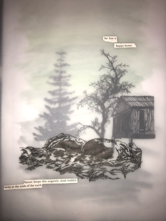
I am very pleased with my final outcomes (final postcards analysed on post below) because they're very eye-catching and bold with great use of colour. I am very much a colourful artist and love to create work that is vivid, busy and striking to draw the viewer in. I would say that all my postcards are very different as i don't like to repeat imagery and love to try out different styles on each piece, however, they all have the same reocurring theme of travel and adventure which is based off of my penguin book "the Maldive shark" in which the author reminisces on his own adventures at sea, with repeated themes of courage, danger and hope. I have attempted to show this through the use of colour, shape, format/layout, imagery and text and believe that my outcomes have reached the brief.
final word count= 1,257
0 notes
Text


ARTE FIERA
Bologna, 3-5 febbraio 2023
LOMAGNO artecontemporanea
Pad. 25 _ Booth A105
@artefiera_bologna
@lomagnoartecontemporanea
@rossana.taormina
#rossana taormina#rossanataormina#art#contemporary art#artists on tumblr#artfair#artefiera2023#artefierabologna#2023#Bologna#artist on tumblr#mixed media#photography#found photographs#assemblage#collage#maps#found#group exhibition#lomagnoartecontemporanea#contemporaryart#contemporaryartgallery
6 notes
·
View notes
Text
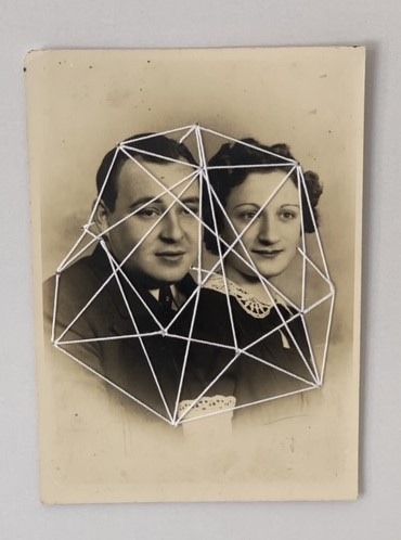
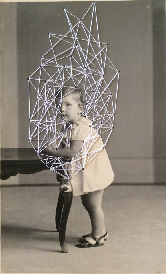
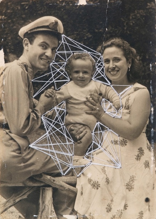
Rossana Taormina
Rossana is an Italian artist who also works in stitch. She is one of the main inspirations for my stitch work as it looks very similar. She has stitched small geometric shapes between the two photos , joining them together with no real reason behind it.
1 note
·
View note
Text
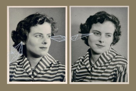
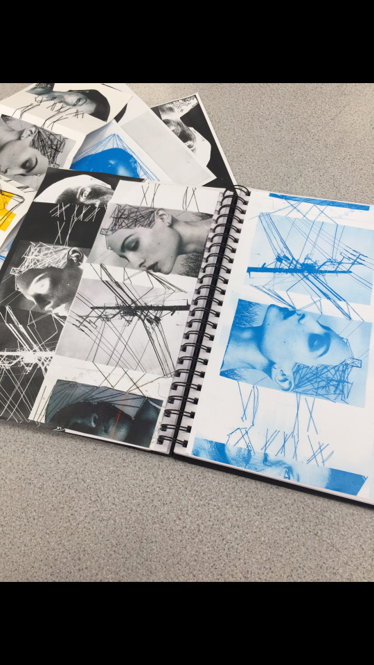
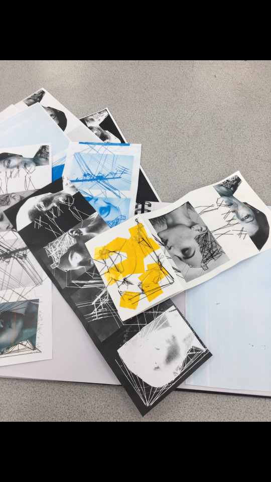
15/10
In today’s lesson we explored the theme of communication via digital means by combining collage and stitch to create a series of portraits all connected by thread. The portrait are inspired by Maurizio Anzeri, Rossana Taormina, Jenny Robinson and Annegret Soltau, who all use stich within their work, as well as May Xiong, who digitally adds geometric shapes to portraits. The geometric shapes are inspired by pylons and telegraph wires which allow us all to communicate in a digital form. We then added imagery of pylons and maps to give us lots of textures and shapes to work with when illustrating our work later on. The photocopiers were used to create further compositions before we made black and white illustrations of out outcomes using fineliners.
Maurizio Anzeri
Maurizio Anzeri is an artist who uses thread to repurpose old portraits and found imagery. The shapes created with the thread are very geometric and this inspired me very much in the body of work I created today as seeing the triangular shapes and straight lines in their work made me consider using them in my own.
Typically the thread used adds some colour to a black and white images, possibly to represent the affects of modernity on history. The choice to use colours like this make have been to add a new life to an old forgotten photograph, as by embellishing it in this way Anzeri has given it new interest not only to themselves but also to the audiences who come across their work. It could be an attempt of making the unimportant important once again.

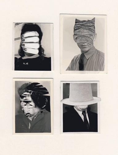
The choice of obstructing the face so heavily such as in the image above completely hides the identity of the person who it was, communicating to the audience that who they are doesn’t matter and the patterns above their face do much more. This has made me think about my placement of thread in my own work, as by obstructing the face very much I make the portraits unimportant and the thread a focal point, but if I keep the people’s identities visible I communicate that people are important to the message I am expressing.
I really like how in the piece below collage is also used along with stitch as it creates a very vibrant outcome and creates new textures in the portrait which wouldn’t have been able to be added without this new element and dimension in the art. The collage also has created opportunity to isolate areas of the face and create a new composition, for example in the piece below the eye is the only element of the right side of the face visible, which I find very intriguing and it gives the whole piece a eerie feeling surrounding it of being watched.
The isolation of the eye in this way and the lines which come from it remind me of A Clockwork Orange, in which imagery similar to this is used, in both the film and the book. In the film it is done with extremely large fake eyelashes on one eye, so this makes me wonder if the stitching has been placed in this way to display eyelashes from the isolated eye and to draw the audience’s gaze to it.

I also really like how a strip of collage has been used to splice up the image further as it works in a really effective way to break up the monotony of the black and white portrait below. This is something I should think about in my own work as I shall need to break up the white background at some point and this is a way in which I could do this. From looking at Anzeri’s work I have thought about the placement of my stitching and what it could mean as well as how I could use collage to add textures and break up the background of my portraits.
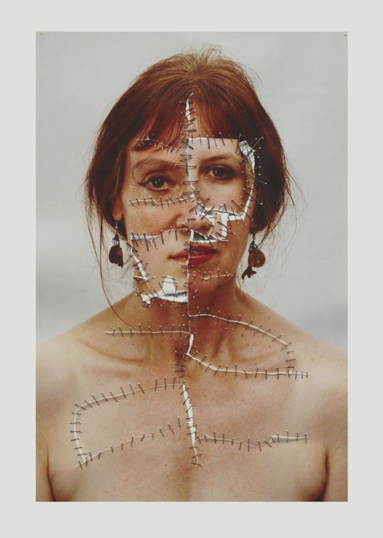
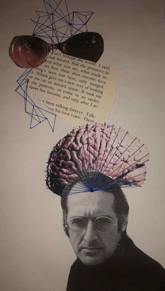
Rossana Taormina
Rossana Taormina works in a very similar way to Maurizio Anzeri as she also embroiders over found photographs. Her stitches and compositions rely much less on geometric and instead create warped shapes to obstruct and disfigure the face of the person. The interaction between the face and the stitching are the focal point of the page.
In this piece Taormina has done a very similar thing to Anzeri as she has left the eye exposed surrounded by stitches. The difference, however, is that Taormina’s stitches are extremely close together and overlapping to create solid shapes of stitches which can’t be seen through at all, whereas Anzeri uses singular stitches which are much more spaced out.

The way that the stitches wrap around eachother remind me of a mummy and therefore bandages. They are positioned in such a way over the woman’s heart that i believe that Taormina could’ve been trying to imply that this person’s heart has been broken, since the heart is commonly associated with love. The bandage like stitching around her eye also makes me wonder if there are implications that whatever she is seeing is what is breaking her heart.
By researching Taormina and analysing her work I have realised that the placement of my stitching could tell a story and portray a message. I also realise that the style of stitch I choose will make a large difference in how my work is interpreted and that it is just as important as the placement.
Jenny Robinson
Jenny Robinson is artist who is heavily influenced by architecture and the broader imagery of urban built environments. The reason her work is relevant to today’s lesson is because of her subject matter and how she chooses to portray it. Her choice to make art concerning architecture has many links to what we are doing today as we are going to be including pylons and telegraph poles in our portraits in a similar way to how she does. The way she uses lines and symmetry is very influential to how I chose to work in today’s lesson.
I really like the use of line and shape in Robinson’s prints and the geometric way that she creates her compositions. I am going to use this in my own work when I add in the imagery of pylons as I will keep my lines very straight and only choose to use shapes such as triangles. This choice could also inform my choice to use triangles as the main shape in my embroidery later on in the piece.
I also really like how she limits herself to black and white as it makes for very striking compositions which the audience can find themselves sucked into due to the layout of the prints and how they are symmetrical, giving them a natural focus to the middle.
Her way of working is another thing which really intrigues me concerning her work, as she prints on very large scale, and she has developed her own way of printing using non toxic materials and aluminium sheets to give herself the freedom to scale up and be able to work in whichever way she so desires. Every time I find out about how artists create their very own way of creating it inspires me to want to do the same at some point.

By looking at this work I’ve really considered the balance of my work and how one side of it shouldn’t be more full than the other. In Robinson’s work balance is created easily as there is symmetry, but in my work there will not be symmetry so I need to think about how I can create balance in my composition. The way I think I will do this is by having figures come from the top and bottom of the page and avoid the page being too full on one edge and not the other.
Annegret Soltau
Annegret Soltau is an artist who questions personal identity by removing the face from portraits and replacing them with different imagery, to give the image a completely new meaning. The repurposing of and image is very important to what we are doing today as they images of people that we are starting with will have no relevance to the topic we are visually discussing and therefore we will be changing their purpose and giving them a new meaning.
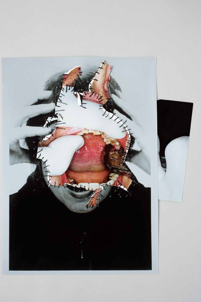
The piece above was made as a cryptic response to the 9/11 terrorist attack on the twin towers. They are composed of a passport photo with some close ups of dental photography sewn into them. The passport photo is to represent travel and therefore planes and maybe linking to Soltau’s own travels to New York, and the dental records were chosen as the mouth is a very important part of the body when it comes to displaying pain and violence, and therefore it was important for it to be a focal point of this series. On the reverse side of these pieces there were articles about the attack attached to further emphasise the link between the art and the attack.
I really like the use of colour within a black and white image in this piece and I think it draws more attention to the mouth and also the pain which was caused by these events. The choice to position her hands in that way also portrays pain and anger and it could even imply that she was screaming in that passport photograph, highlighting pain even more.
The careful choice of images and positions makes me consider how the positions that the people I choose to use in my work will affect the outcome and how if I choose the wrong image my message could be portrayed inaccurately. To counteract this issue I should pick very simple pictures to then develop on in whichever direction I desire.

This piece is from a series concerning self identity in the modern age of technology and how technology can affect our identity. The series started with an image spliced with her birth certificate and is to end with an image containing a section of her death certificate. I think this series is especially interesting to me due to how personal it is and how it interprets the digital age’s affect on us and our personalities. The implication in my opinion is that it affects us a lot, completely changing us in the way it completely changes and disfigures the original photo.
Soltau’s work differs from Taormina’s, Anzeri’s and my own as it uses photography taken specifically for the art, whereas my work as well Taormina and Anzeri all use found photography which we have to then manipulate in our own way to fit the themes and messages we are showing.
May Xiong
May Xiong is a photographer who began to experiment with adding digital elements to her work in geometrical shapes and patterns. Her work relates to the work we produced today due to the shapes she uses and how they are placed over portraits. The shapes obstruct the face but are placed in such a way that the photography beneath them is still visible. Her work is similar to Soltau in the sense that it uses photography that she took herself specifically for these images, unlike Taormina and Anzeri.
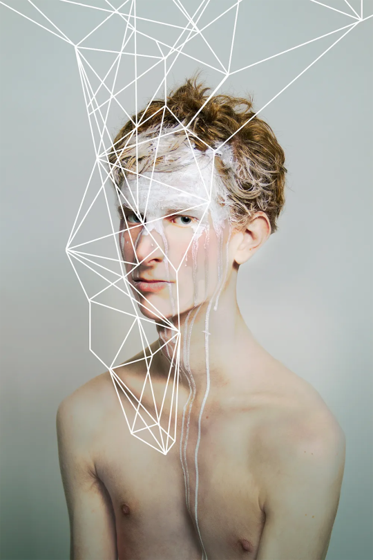
The shapes seen are very similar to that which Robinson and Anzeri use as they are very geometric and triangular, which I used a lot of in my own work as I think they complimented the imagery of pylons extremely well to create a cohesive composition.
Xiong also sticks to a very limited colour palette throughout her work, as there is white makeup on the model’s face and then she matches this with the colour of the digitally added lines over the face. The fact that the lines are added on a digital platform allows them to be very uniform and sleek, which could be achieved in my work possibly if I managed to pull the thread tight enough. It could definitely be achieved in the illustrative element of this body of work as I could use a ruler and make my lines very straight and all the same weight.
My work
When beginning my work I picked 4 photographs of people which complimented each other very well as they are all from the same series of pictures and therefore meant to be seen as a set, I was very lucky in finding these images as they all have similar tones and lighting so they were very easy to develop onto since they don’t contain too many colours, meaning I could do what I liked with them.
I then ripped some paper which I found that had a similar colour scheme to the face I found and collaged them together. When cutting the faces out I chose to remove one of the eyes of each face, in a way which opposes the work of Anzeri and Taormina. I really like the effect this gave as it removed these people from their identity slightly as their faces are now disfigured. By doing this I also created clear places to work from later when embroidering as there were now spaces to fill where eyes should be. The ripped texture is something I really enjoy as it creates a break from smooth cuts on the page and adds some rough edges.
When positioning the faces and the textured areas on the page I wanted to created a balance as mentioned before, so I made sure every face had a shape to go with it, and I also placed them in such a way that the piece became something which didn’t matter the way up it was placed. This, in my opinion. is a clear sign of balance and therefore was a success.
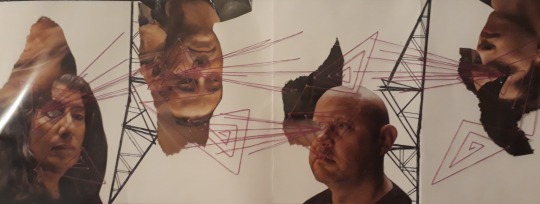
I then added some imagery of pylons to the composition. I drew them out of fineliners and made the design very geometric and linear in preparation to have them fit the way I planned to do the thread. I really enjoy how the pylons look and the fact that they are black makes them match the dark colours on the faces and therefore overall creates a very monotone image, despite actually containing colour. The fact that it is all very muted gave me the opportunity to create a pop of colour with the stitching
I decided to use pink as I felt it complimented the browns very well. The vibrancy of it also works successfully to create breaks from the natural tones throughout and the plain white background. I really like the way it ties in with the compositions. The shapes I chose to make with the stitching were picked to compliment the shapes in the pylons.
I positioned some spiralling triangles over where the missing eyes are on the peoples faces to draw attention to that area and also to replace where the eye should be. I really like the outcome this created as I think it filled quite a dark dull area of the piece with some interest. I also used these spirals to connect the people together with a pattern The eyes also have some lines radiating from them. These connections between the people could represent wires and how digital technology can keep us all connected. The repetitive lines coming from the eyes could also communicate the way that digital platforms can be negative since we always feel a need to share what we are doing as if we always have an audience and everyone’s eyes on us.

After finishing the original design to a degree of which I am happy, I went on to create new compositions using the photocopier. I photocopied it a few times in pink, green and the original colours to splice together and make new images. For the first one I cut up green areas in sharp lines and placed them over the pink one in a way which just completely replaces the pink and makes the faces half and half. I really like the way these colours look together and the way in which I chose to cut the segments makes for a very interesting look which compliments the shapes already seen within the image due to the angles and lines at which I chose to cut them.
The collage element of this reminds me of Maurizio Anzeri as they include collage in their art to add new colours and change the composition so when I did this I was inspired by that. The shapes I chose to make are also heavily inspired by May Xiong since she uses many angles on her work over her portraits in a similar way to which I have tried to create.

For the second composition I used a normal coloured photocopy and a pink one to display together. I cut the normal coloured photocopy in half following some of the lines and contours of the faces found in the imagery and placed them at the top and bottom of the pink photocopy to make it look as though the pink is breaking out of the regular coloured heads. i really like this composition and I think it is my favourite out of all the ones I made due to the way the 2 images are interacting with one another.
I think this composition does a really effective job of visually representing the disconnect between who we are online and who we are in real life, as it looks as though the pink imagery could be the real version of us that is breaking out of our fake personas which we use online. I also really like how the bright pink looks paired next to the less vibrant pink in the photocopy of the stitching.

In my final composition I added green to a normal coloured photocopy. The way I decided to place it was in a way so the green areas were a mirrored reflection of what the regularly coloured areas were. This could be to represent how the digital age has affected us as people and how maybe we have become fragments of what we were as the green areas are very cut up and fragmented.
I really like the outcome of placing the green areas in this way as it makes the whole composition fit together in a similar way to how a puzzle does. The green areas also compliment the pink thread in a similar way to how the first photocopy composition compliments eachother. The fragmented look also reminds me of Annegret Soltau and how she puts images together in odd shapes and unlikely matches.

Finally, I created my illustration from my original composition. To do this, I used a black and white photocopy of the original composition and used a lightbox to trace the areas which I believe worked best. I then added new elements to it to create some deep dark areas and new patterns. I added shading to the figure’s faces with some very loose hatching so that it wasn’t just a plain outline and they had some depth and different tones.
I also added some new triangle spirals to fill some more of the white space but still fit them themes I have created. Personally I don’t like how these spirals turned out as I should’ve taken more consideration into where I placed them and also I should’ve used a ruler to make sure the lines are straight like the rest of them. They clutter the entire illustration and I should have just not included them altogether.
A part which I added that I do like is the black and white alternating patterns coming from behind the men. The way it did this was to extend the patterns from the edges of the ripped areas in the collage and colour in every other stripe. I believe this gave the illustration some great textures and it produced the deep dark areas which it was lacking in before. The patterns also could replicate those seen in maps which represent rivers and imagery similar to that. I think this illustration was overall successful and that the wrongs with it are so minute that the rest of it makes up for it, for example the triangular areas which I don’t like.
0 notes
Text

in our thursday lesson we created four pieces of thick paper and we stitched into it with black thread. We sewed into It to create attachment between each picture. We also used maps and pictures of pylons to create more of a picture underneath the portrait’s. We used inspiration from artists, Jenny robinson, annegret soltau, maurizio anzeri and rossana Taormina, I will be doing Separate posts on each artist.
1 note
·
View note
Last Seen Blogs
aerikalacerda-blog
PENSE E REALIZE.
noctisstar
Noctis

nationalhoranleague
hello, lovers
nefkyology
Nefkyo²
untilyouseethem
Until you see them.