#scarecrow doll
Text
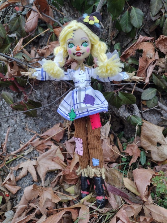
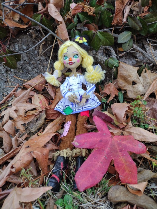
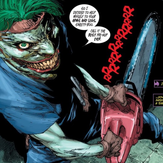
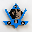
Here's my latest custom Sherry crow unless I find a better name for her


22 notes
·
View notes
Text
2.) Doll hair: feathers 8-9inch
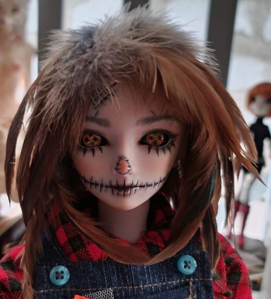
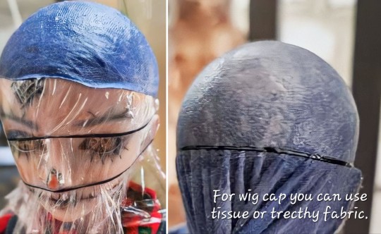
#articulated doll#Ye luoli doll#Night lolita doll#hinged joint#60cm doll#scarecrow doll#scarecrow wig#feather wig#bjd wig#diy doll wig
2 notes
·
View notes
Text
#that which could not be included:#scarecrow#sci-fi (aliens‚ robots‚ mad scientists. my mind seems to separate sci-fi and horror as concepts so it just lumps these all together lol)#pirate apparently#the headless horseman. just a smidge to specific and singular#generic 'monster' that isn't an alien but is physically weird as if it were#technically haunted dolls but veering a bit less ''conventional''#i wouldn't count folklore like Medusa or the minotaur cause then this list would be endless. plus feels weird to level those as 'spooky'#I'm thinking too much now I'm done lol#Halloween
2K notes
·
View notes
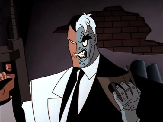
Text

Bat fight by Dan Hipp
#dan hipp#batman#the joker#harley quinn#poison ivy#bane#killer croc#two-face#man-bat#clayface#catwoman#mister freeze#scarecrow#baby doll#the ventriloquist and scarface#batman villains#batman rogues#batman the animated series#btas#the new batman adventures#tnba#dcau#dc#violence tw#tw violence#violence cw#cw violence
389 notes
·
View notes
Text

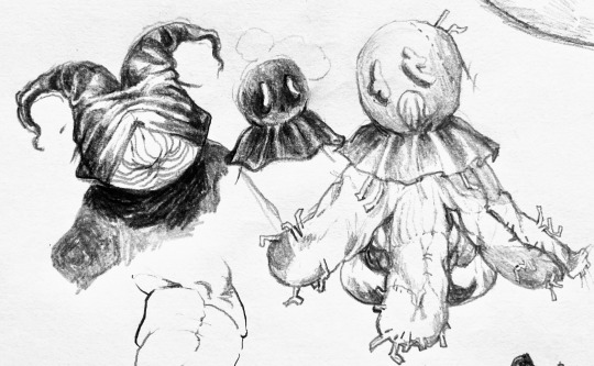

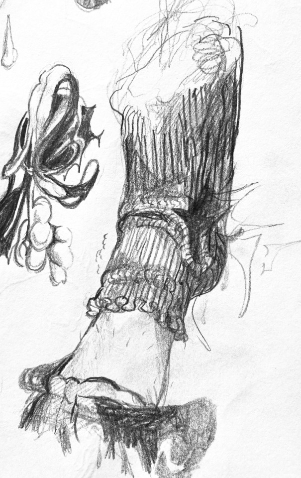
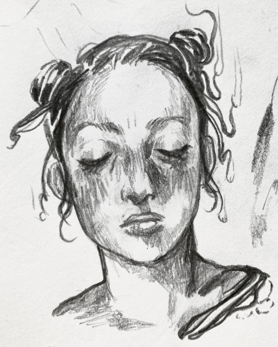
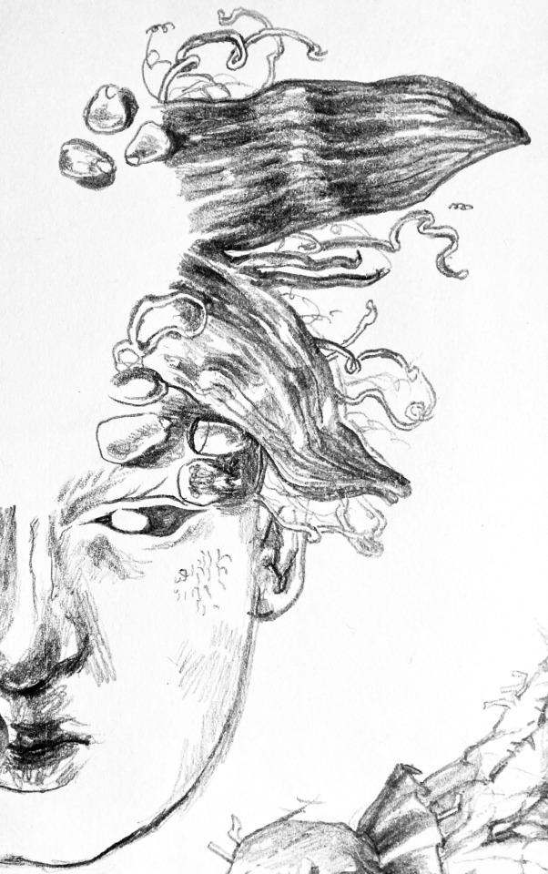
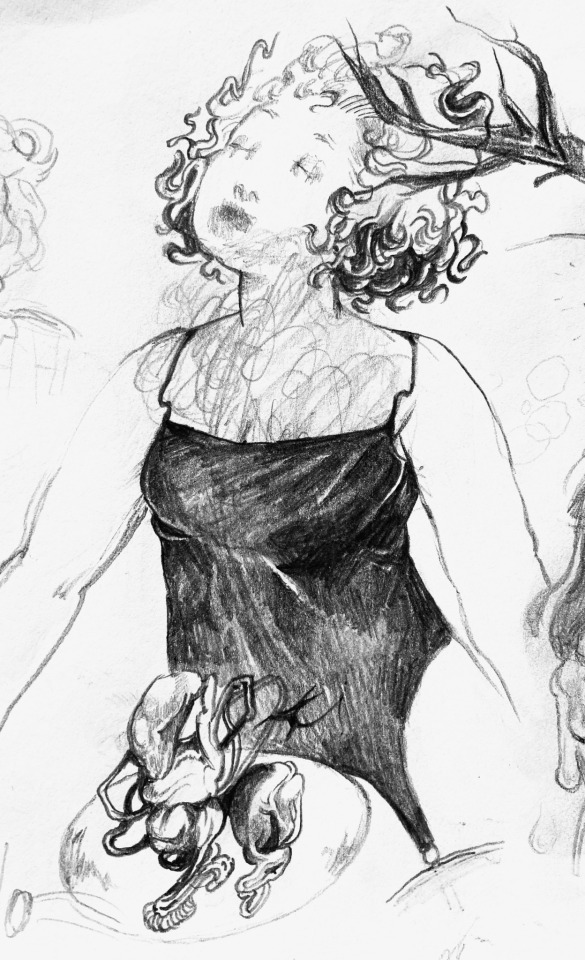
pretty phallic I think
#pencil#corn#abstract#black and white#my doodles#plushies#dolls#scarecrow#soggy#stuffed animals#demon horns#hay#ghosts#portrait#rough sketch#little guys#demon
478 notes
·
View notes
Text
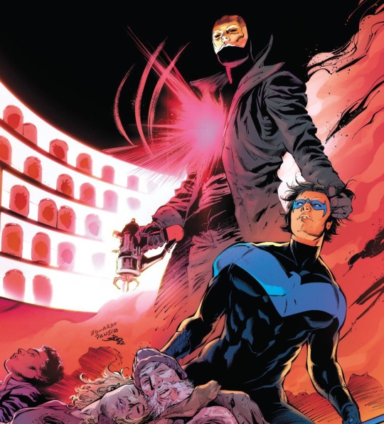
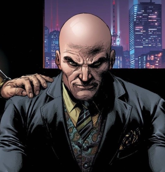


#honestly i almost cryed when playing professor pyg mission in Batman Arkham Knight#wonder woman#superman#green lantern#batman#nightwing#sandman#professor pyg#doll maker#joker#scarecrow#heartless#lex luthor#starro#kryb#yellow lantern#upside down man#the corinthian#dc poll#dc#detective comics#dc comics
85 notes
·
View notes
Text

little doodles of my rouges designs. these are more-or-less set in stone, since i actually understand these characters this time around.
my joker, two face and penguin designs are in the workshop rn keep your eyes peeled
#harley quinn#harleen quinzel#poison ivy#pamela isley#the riddler#edward nygma#scarecrow#jonathan crane#mad hatter#jervis tetch#harleys contacts are scaring me but yknow thats the point#her opponents take psychological damage#(she got this idea from jon he had the BLUEST eyes ever it was actually scary like haunted doll levels scary)#btw i will do a high quality version of this eventually#gotham rouges#batman#dc#my art#digital art#dc fanart#holds them... in my hands.... kisses their evil foreheads..... my little sweethearts....
70 notes
·
View notes
Text
As a kid, I fucking loved Batman and ate up all his cartoons. As an adult, I still love him BUT now I'm hyper-aware that most of his Rogues gallery are villains because of a physical or mental condition. If his villains got proper therapy or surgery early on in life, they'd be pretty decent people. Now they spend their days getting knocked around by a rich kid dressed up as a bat with childhood trauma.
#btas#batman the animated series#btas baby doll#btas killer croc#killer croc#penguin#scarecrow#batman#batman poison ivy#harley quinn#rogues gallery#two-face#batman two-face#mad hatter#the hatter#batman the hatter
117 notes
·
View notes
Text
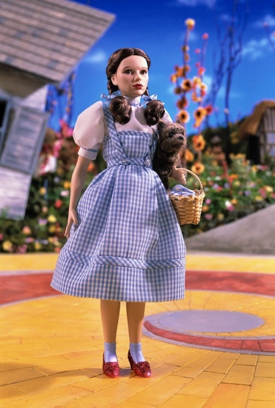

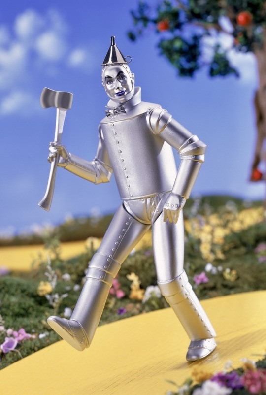
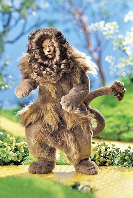
The Wizard Of Oz
Porcelain dolls
58 notes
·
View notes
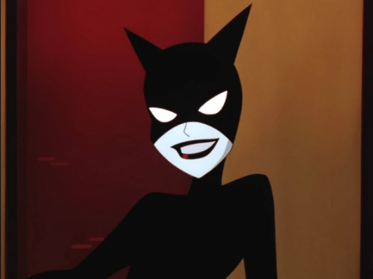
Text
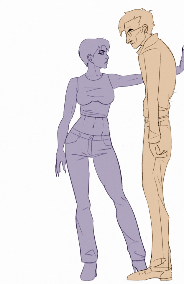
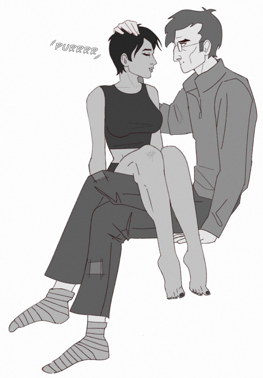
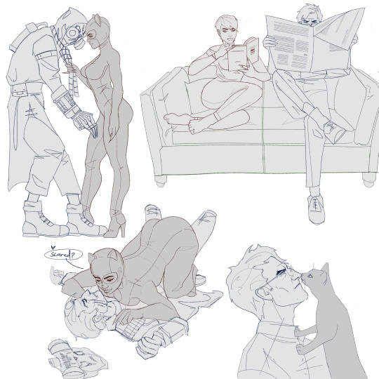
Woman bullies old man
#batman#catwoman#scarecrow#selina kyle#jonathan crane#batman rogues#scaredycat#?#i love this duo#mashing my faves together like barbie dolls
216 notes
·
View notes
Text
got distracted.................

#spooky month#spooky month oc#spooky month bob velseb#dexter erotoph#mr scarecrow the mailman#art#digital art#my art#ill do the other stuff i owe soon im just sore rn lol#first time drawing dexter doll im pretty proud of myself
20 notes
·
View notes
Text
Riddler and Scarecrow are officially sold out! I’m going to admit this was a little unexpected 😂
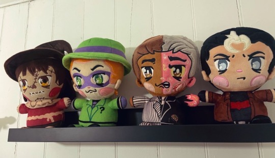
Guess I need to get a move on in listing Two-Face and Red Hood!
#batman#riddler plushie#rogues gallery plushies#plush doll#riddler#scarecrow#Jonathan crane#Edward Nygma#red hood#two face#Harvey dent#Jason Todd#Gotham#plushies#dc comics#fanart#edward nashton#dc
73 notes
·
View notes
Text
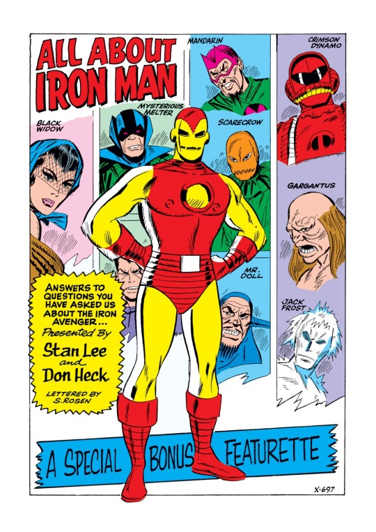
Tony's many rouges!
#iron man#black widow#marvel#jack frost#mr. doll#gargantus#the melter#melter#scarecrow#mandarin#crimson dynamo
127 notes
·
View notes
Text
Rating Every TNBA Redesign Cos Why Not
The New Batman Adventures was the last season of the infamous Batman the Animated Series, although it moved to another less strict network. Because the producers wanted to do crossovers with the Superman animated series, they gave the series and its characters a more streamlined style to it. Now I dont wanna blame Bruce Timm entirely since there were many artists on staff back then who did the redesigns but because I hate this coomer, Im going to anyway. In BTAS, you can tell each character apart and they have their own unique outfits and looks to them. But here, these are some of the most unimaginative superhero/villain designs Ive ever seen. Although some did surprise me and were not that bad. So, for a bit of fun, here's my look at each Batman character's redesign in the final (and worst) season of the show.
(Not counting Robin cos he's a different character to Dick Grayson or characters that had very little changes like Clayface or Harley Quinn)
Batman
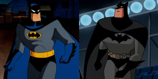
The big emo rodent himself. For his redesign, I like the more sleek look to Batman's cape...thats it. His original design is really hard to perfect. Its got everything. Why tamper with perfection?
Batgirl

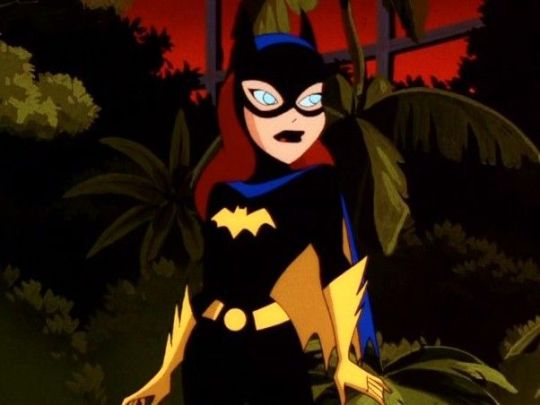
I actually kinda like Batgirl's redesign. The yellow gloves and boots really help her stand out and its the one of the few times the darker toned outfits actually accentuate a design rather than ruin it. Too bad Bruce Timm couldn't stop salivating over her and the rest of the women in this show.
So next time you see someone consider Bruce Timm this legendary storyteller of Batman, give them a healthy reminder that he shipped this college girl character with her mentor/surrogate uncle figure FOR YEARS.
Alfred
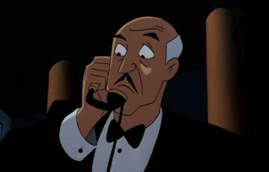
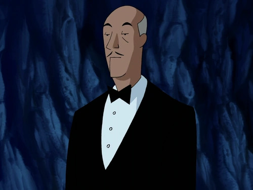
Its like they sucked away all of Alfred's snark and replaced it with a cardboard cutout. Literally, he looks so sterile and empty. Who had the idea of making Alfred look more bored and done with everything? Also whats wrong with his chin??
Commissioner Gordon
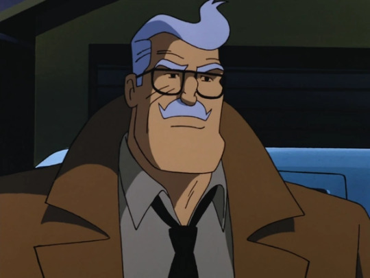

Good ole Commissioner Pringle got off pretty much unscathed but I think they made him a touch too old considering they gave him a more lanky body, which makes him look more feeble and weak. Dude looks old enough to be Babs' grandad
Joker

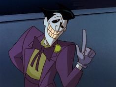
Ohhhhh boy. So Joker's redesign is infamously considered by fans as one of the show's worst redesigns, to a point even the showrunners were like yeahh. And thats not unwarranted. He looks like an inverted Dr Draken and im so glad they redesigned him again for Batman Beyond and onward.
Seriously he's A CLOWN WHERES THE MAKE UP?!!
Two-Face
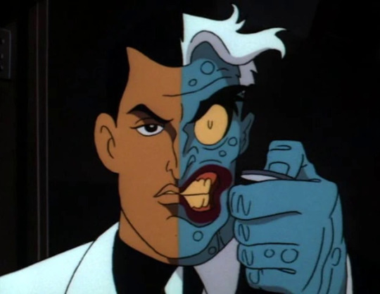
I know Two Face is just a redrawn version of the original design with the TNBA streamlined art style but I want to draw special attention to the monster side of Dent's face. Notice in the original it looks more manic and feral? Heavily contrasted with the conflicted, guilty look on Dent's normal side? But here, in the redesign the monster side is less scary and Dent looks way too bored and angry. The overuse of black lines doesnt help.
Catwoman

She looks like Harley Quinn or Barbara wearing a catsuit. Starting to see a pattern here?
Baby Doll

Its a tough call cos they both look very good but Im gonna lean towards the redesign cos shes got that creepy doll look down to a T (Annabelle would be proud) whereas her original design looked more like a Tiny Toons character.
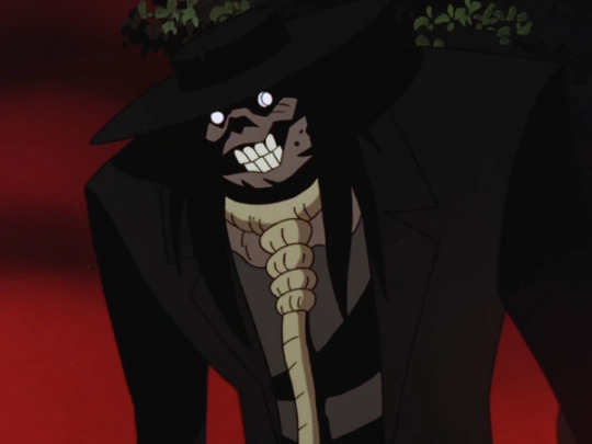
Scarface and the Ventriloquist
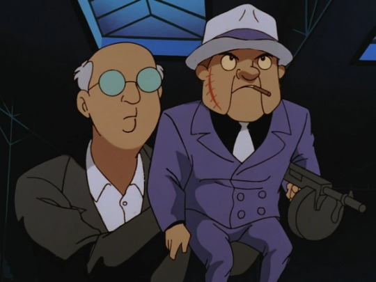
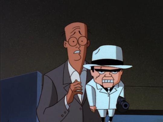
I like the redesign cos of the exaggerated style of the rest of the show perfectly captures Scarface since he's, yknow, a puppet and having the Ventriloquist be shown to be scared and submissive really does show how the puppet is ironically the puppetmaster.
Penguin
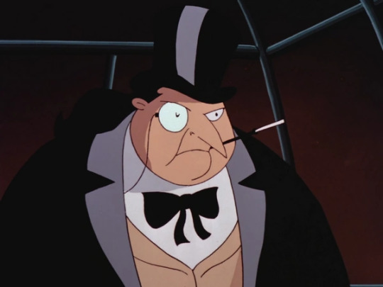

Actually I like both of them. They both give off that sophisticated element Penguin is known for and after so many reiterations of him being this crass Scouse-talking crime boss, its nice to see versions of him going back to his rich asshole roots.
Bane

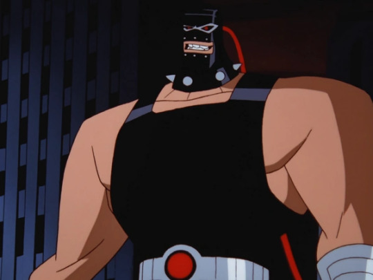
In the original, he has a luchador-style mask and wrestling suit fitting his Spanish roots. Here, he straight up looks like a gimp. Its really bad. Embrace your heritage, Bane!
Riddler
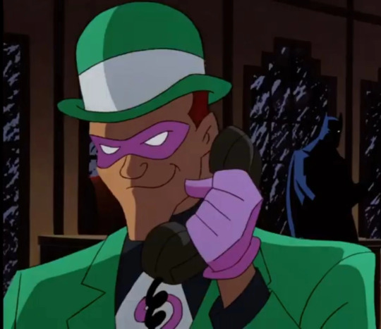

They went from Frank Gorshin to Jim Carrey for Riddler (fitting cos Batman Forever came during TNBA's development) and I love that. So I love both of them. Nice to see a villain with some fucking colour in TNBA cos im tired of seeing all this black outfits. Also his cane being an extended question mark instead of a question mark on top of a regular cane is genius.
Mad Hatter


Both of them fit Hatter's deranged stalker vibes perfectly, but I wish they kept the colour scheme for the redesign cos Hatter's new colour scheme looks too rounded and doesnt stand out.
Poison Ivy
Killer Croc
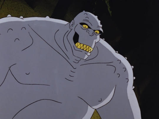

Finally, now he looks like an actual crocodile instead of whatever the hell he was supposed to be!
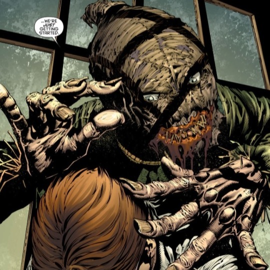
Scarecrow
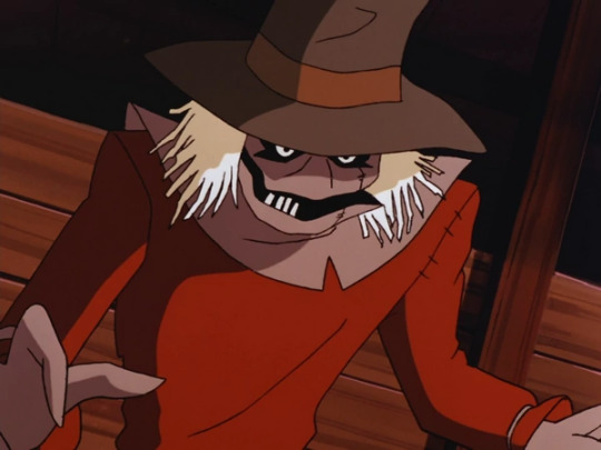
Okay, who the fuck decided to make Scarecrow look like the Babadook? Cos I want to give them a raise. Holy mother of piss, that is terrifying. That shit belongs in the Arkham games. I still prefer the old design cos it has that perfect blend of goofy and gothic. He looks like a Cacturne now that I think about it.
Mr Freeze
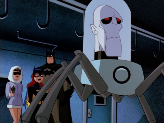
HONEY WHAT HAVE THEY DONE TO YOU?!! WHY DO YOU LOOK LIKE A FUCKING FUTURAMA HEAD?!! WHAT IN THE ACTUAL FUCK?! YOU HURT MY HUSBAND, TIMM, NOW ITS PERSONAL
#batman#batman animated series#btas#the new batman adventures#tnba#batgirl#commissioner gordon#catwoman#joker#riddler#two face#penguin#the scarecrow#mad hatter#ventriloquist and scarface#baby doll#poison ivy#bane#killer croc#redesigns#mr freeze#also freeze's suit looks so robotic and lifeless which I know that was the intention but it still looks boring as fuck
137 notes
·
View notes
Text

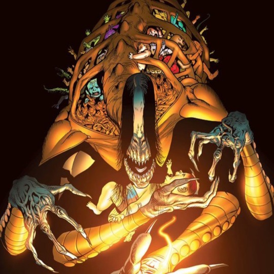
Batman: White Knight
Volume: 1
Issue: 8
Writers: Sean Murphy
Pencils: Sean Murphy
Inks: Sean Murphy
Colours: Matt Hollingsworth
Covers: : Sean Murphy, Matt Hollingsworth
DC
#Batman: White Knight#Batman#Sean Murphy#Matt Hollingsworth#DC#Harley Quinn#Jack Napier#Joker#Batgirl#Duke Thomas#Nightwing#Mister FreezeNeo Joker#Baby Doll#Bane#Clayface#Killer Croc#Mad Hatter#Poison Ivy#Riddler#Roxy Rocket#Scarecrow#Two-Face#Ventriloquist#Scarface
19 notes
·
View notes
Text

Very sketchy piece i made make a comic out of
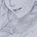
#silly lil sketches#btas jonathan crane#btas jervis tetch#btas mad hatter#btas scarecrow#he looks like a rag doll lol
29 notes
·
View notes
Last Seen Blogs
dyoungv
Untitled
frozengiantess-blog
Untitled

gleason10
Paulina Gleason

ask-the-purple-matsu-blog
Ask Ichimatsu

mk-technology-society
Design, Technology & Society