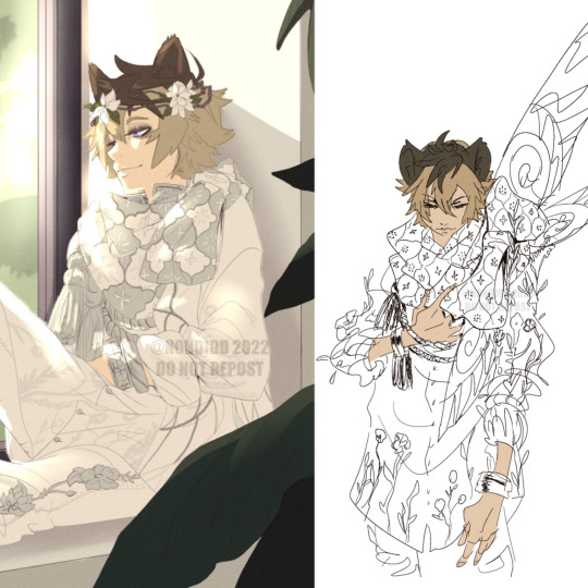
#so I’m just coloring my traditional sketches now
Note
heya!!! so excited to see you use tumblr. i have a question: what’s a painting you used to dislike but now find joy in? a lot of my old art i used to dislike and tried to think of all of the ways of fixing it, but now in the present i’m starting to grow really fond of it. kinda like a “wow i’ve actually improved so much but i still like the way i did this work” if that makes sense? have you ever had an experience like that?
Hi. Great question.
I think this piece of Marion from Raiders of the Lost Ark that I did for my friend Charlie back in 2002.
I had pretty much given up on traditional art at this time. I hated my art. I hated colored pencils. I literally took 10 years off (away from traditional art) after this piece.
Charlie was a good friend and he loved Indiana Jones. So... I slapped some watercolors down on bristol paper and did a REALLY quick sketch of Marion for him... and... never thought of it again.
For the next 10 years, I worked mainly in 3D/Digital doing my webcomic The Dreamland Chronicles. I didn't touch traditional art until 2011 when I decided to learn watercolors.
I look back on it now with a sense of nostalgia as this was the last colored pencil illustration I did before that long 10 year break and even though it was just a quick little sketch for a friend... it's not that bad.

#art#traditional art#artists on tumblr#watercolor art#watercolor#drawing#art advice#colored pencil#colored pencil art#indiana jones#raiders of the lost ark#marion jones#marion ravenwood#margot kidder
394 notes
·
View notes
Text
I am having a lot of fun making my own rewrite of Wish right now. It is a sandbox for me to do whatever I please <3
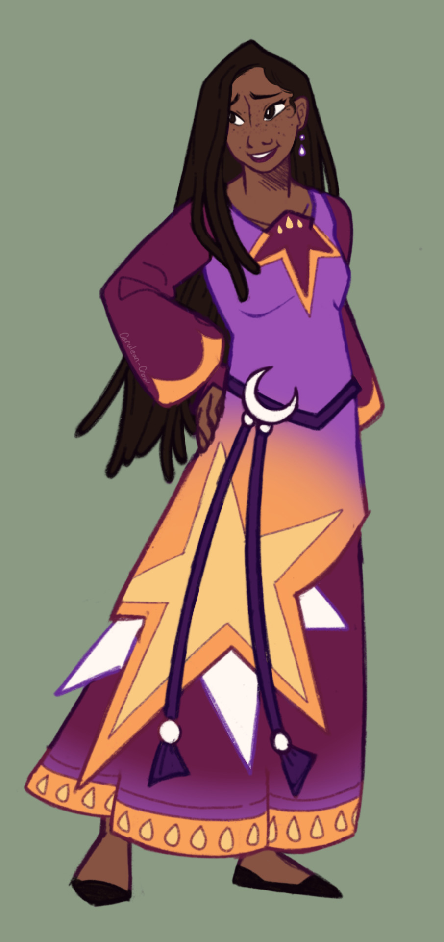
Sketched out a redesign for Asha to better fit my own spin of things- for narrative purposes I think she’s going to be the adopted daughter of Magnifico and Amaya. She’s a bit more anxious but very optimistic and just wants to do her best and feel like a worthy heir to Rosas’ throne and magic.
I wanted her have a bit more a moon motif along with stars, but I really struggled to get those crescent shapes into her design. I also changed up her colors a bit to be a more reminiscent of the sky at dusk and dawn. I like the idea of Magnifico and Amaya being more sun themed also!
Just getting some ideas on paper and out of my head. Wish has quickly become one of those medias where I actually love the ideas presented but was ultimately disappointed by the execution. But I’m a creative who can do whatever I want so I can just make my own fun little au all for myself <3
I might try to throw together some designs for human Star tomorrow. I’ll be honest, I’ve never felt so disappointed looking at a story’s concept art before. I know that ideas get cut for one reason or another- but everything with a more traditional fairy tale, a villain couple, and Star and Asha being soulmates was the making of a story tailor made for me- and I’m kinda sad it never saw the light of day.
#wish 2023#disney wish#wish#wish asha#asha redesign#wish rewrite#wish disney#wish movie#crow.art#character design#wish au#wish critical#wish.retold#a wish worth making
269 notes
·
View notes
Text

My title that I came up for this is Huntlow Victory Kiss.
My very first TOH fan art.
The original line art was by the very talented @kristalldroppar
I love Huntlow with all my heart.
Now I’m more of a traditional colorist (color pencils, markers, etc.) so I hope it’s not too messy.
Also I tried to match the original colors as close as I could.
I will soon have my own TOH fan art and concepts soon.
I hope you’ll stay tuned.
Thanks again @kristalldroppar for letting me color this.
And if anyone else has any other TOH fan art sketches/line arts they would let me color just send me a DM.
PS: It’s a total coincidence that I posted this on the anniversary of ASIAS (Any Sport In A Storm aka the first Huntlow meeting)
88 notes
·
View notes
Text
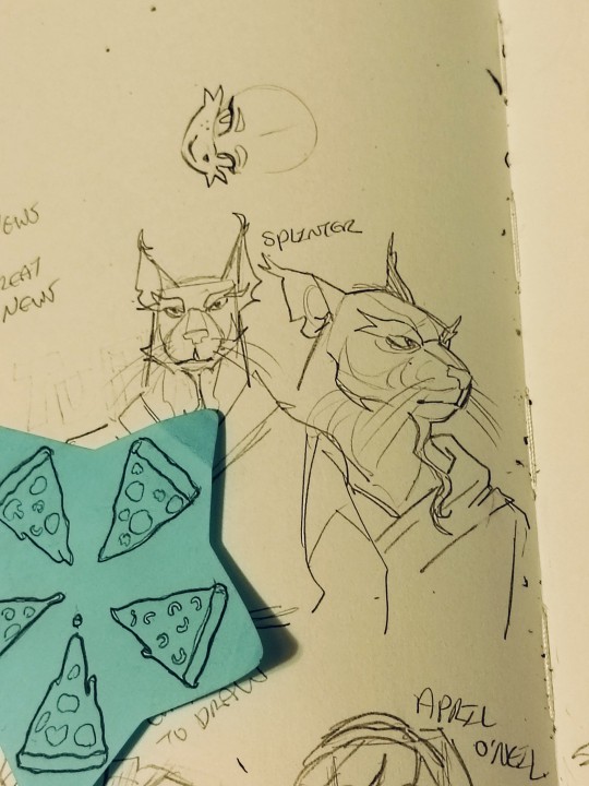
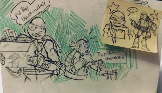
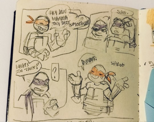
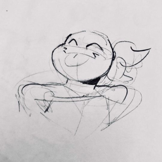
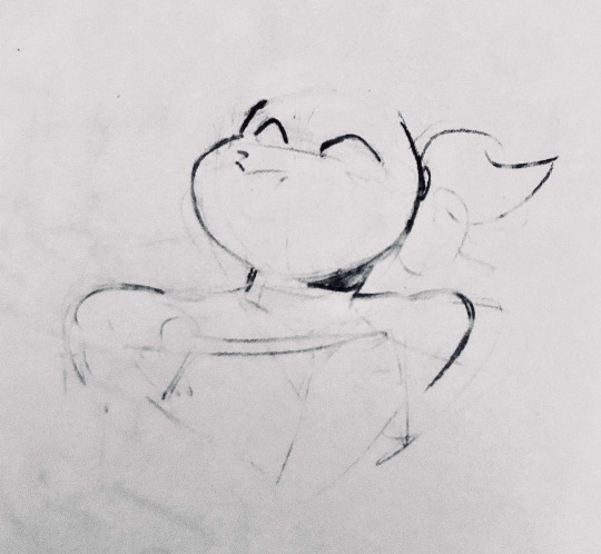
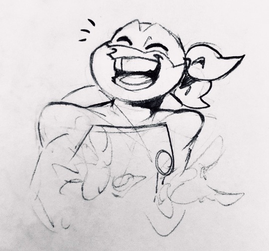
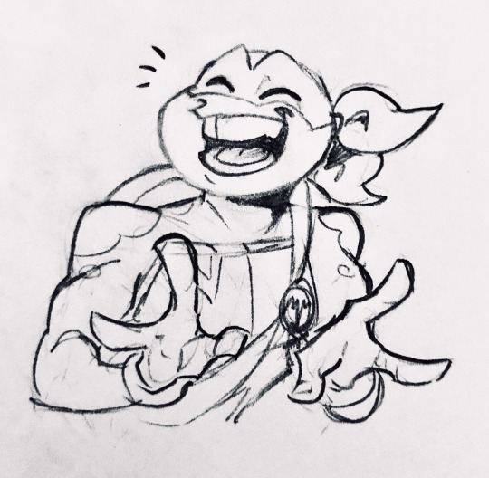
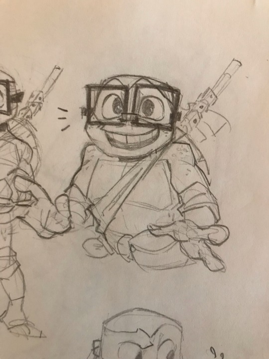
BACK WITH ANOTHER TMNT POST HI
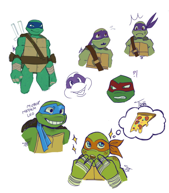
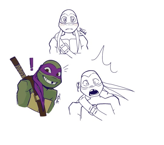
FEELING SO NORMAL ABOUT THEM
I am getting better at drawing them which I am really excited about! Lots of Donatello this time around. Usually Mikey has been my favorite to draw but Donnie has been making his way up the list! Experimenting with drawing the Mutant Mayhem turtles as well because I just adore them so much 🥺
I’m currently on season 4 of the 2012 series now and omg it is so nuts, so much has happened!! I love these turtles with my whole heart I swear
Traditional sketches/doodles!
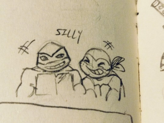
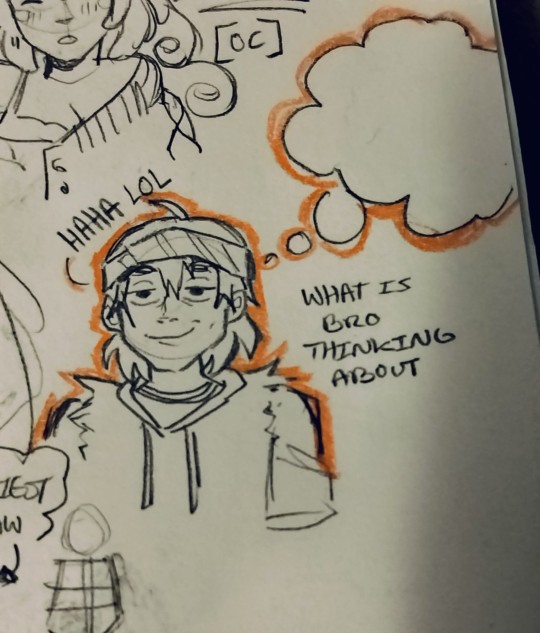


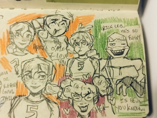
I just think my trad drawings are so much more fun to look at!! Also so much quicker to do omg
Got lots of silly doodles here, some sketches, short comic page ideas, fun colors!!
Drawing them is so fun and I definitely want to maybe further flesh out some of these sketchier ideas
#i cant ever just make a short post bro 😭#my art style remains as ever changing and inconsistent as always! love that#i really wanna make more comic type drawings its just that making them digitally takes SO long 💔💔#those are jelly beans on Mikey's thought bubble pizza btw!!#i really really love them#tmnt#tmnt michelangelo#tmnt leonardo#tmnt raphael#tmnt donatello#tmnt 2012#tmnt fanart#rise of the tmnt#tmnt casey jones#tmnt april#tmnt splinter#mutant mayhem#rottmnt leo#what other tags do i put omg 😭
80 notes
·
View notes
Text
A very long post of doodles relating to @theminecraftbee ‘s smallishsona AU (sorry for the tag again). I think of this AU while wandering Tartarus, so, I’ve had a lot of time to think. This post is really long and has a lot of rambling so, I’m putting it all under the cut. I’m sorry world I have too many words and rambles in me
First up, character designs!
I used primarily their mc skins for design, with only a few rl things thrown in. But, I didn’t bring them up so the colors are off a bit.
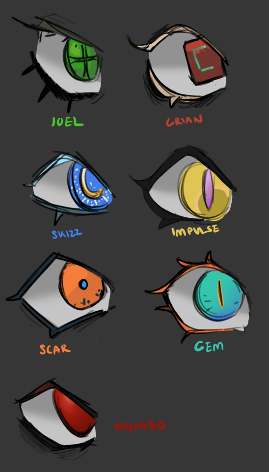
Starting off with Joel:

He’s following the persona protagonist tradition of mostly wearing the school uniform correctly, but with some minor embellishments. I’m still debating whether or not to add more, but w/e. His signature color is green.
Then Skizz and Impulse:
The greatest dichotomy of time to design, Impulse I knocked out on the second go, but I’ve done many iterations of Skizz and I still am not satisfied with this design. The ripped sleeves looked too out there (to me, at least) but nothing else seems to work so I settled for the shirt under uniform shirt look. Something I struggled with that these two emphasize is making them look like teenagers, and what they look like, and also keep to the anime style, and also my own incompetence with drawing facial features so It’s something all of these lack in. Impulse is yellow, and Skizz is blue.

Scar and Grian are next up, Scar’s facial Scar is from summoning his persona, because he stabbed himself in the face lol. Not much to say about these guys, I settled on orange for Scar and red for grian, which I am still struggling with beacause mumbo:
is ALSO red. So I guess they are just, both? red? If you look at the party select screens in persona though, the characters have pretty strong color coding, so I guess I’ll figure something out. If anyone is still reading: help. Anyway, mumbo wins the award for wearing the uniform the most normal (except for the tie)
Last but not least, Gem!
She’s wearing a longer skirt than the usual uniforms and also some big-ass boots. Also, she’s a sea monster thing? So, I was thinking, staring at SEES cool new uniform things and thinking about the Phantom Thieves and how cool their outfits are and realized the persona games have at least some design change to separate their daily looks from shadow hunting. Even if it is only glasses in p4 lol. So, I thought maybe weapon holsters? but, that seemed a little too generic. So! I decided to combine how I normally draw the hermits (and a lot of the fandom does) as having non-human traits as the big things setting their combat looks apart. It is both a) fun to draw, b) creates an eye catching and distinctive design for combat and c) is really funny. I thought it was funny so I drew a comic about it:
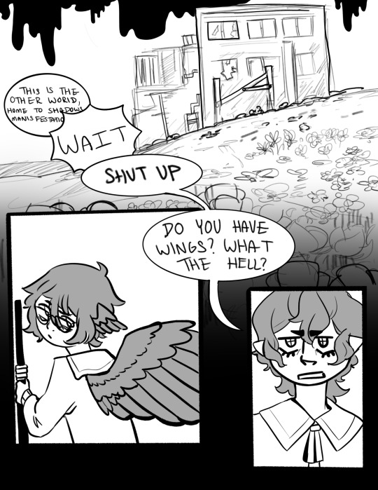
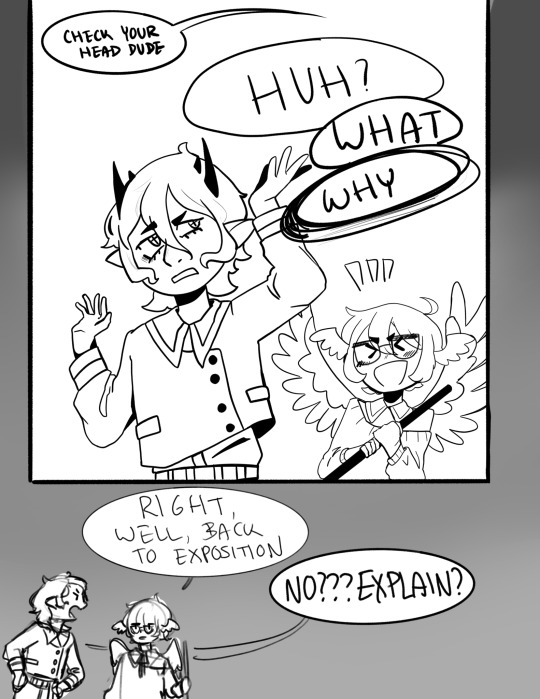
and here’s a sketch of what everyone looks like and also the transformation gives them very distinct eyes, for no reason other than I think it looks cool:
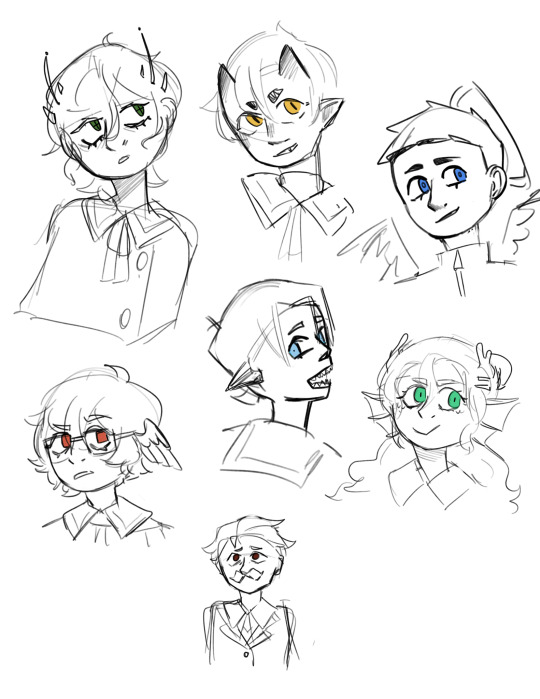
mumbo is a normal human btw (or at least, he appears to be)
Welp,that’s all I got. If I look at these drawings any longer I will hate them so here they are, yippee. Also, Bee/OP, sorry for exploding; I am into persona and hermitcraft right now so this AU is like a perfect storm to give me brain rot.
#hermitcraft#persona#my art#smallishbeans#smallishsona#i have other comic ideas but i dont want to be annoying ahhh *explodes*
94 notes
·
View notes
Note
I gotta ask (of you're okay with answering of course!!) How do you get your traditional sketches- that are on paper- I'm assuming, so clean?
I'm totally envious of how pretty it is and how vibrant and clear it turns out in pictures!
I was wondering maybe what your process is or simply how you edit your art to look so pretty! 💜💜
Ahhh thank you!! I’m happy to help!
I’ll use Mikey for this demonstration :>
When traditionally sketching, I first start out with really light lines, then after getting a rough sketch down, I come in with darker lines, then I erase the lighter ones
The darker lines may also get partially erased, but because they’re darker and pressed into the paper more, they remain and I can still see them, so I can just go over them again without keeping my rougher light lines I’d done before

I rinse and repeat until I feel satisfied with my drawing!
Now for the editing, I just use my phone’s camera app editing settings
If this went by a bit too fast, (I’m so used to doing this at this point lol)
In short, what I did was turn the contrast up 100%, then brilliance up to 80% (this varies, it depends on the lighting I took the photo in,) and then I adjust the rest from there. With “highlights” being turned up pretty high, and “shadows” turned pretty low.
Then for the coloring I turned the saturation down to 0%, (for a crisper black and white look, I don’t do this all the way if I used color,) and then I put the “dramatic” filter on it, I like how the filter makes darker hues sharper and how it evens out lighter ones.
Also!! The “sharpness” setting is really nice for making your lines less blurry!! I turn that up to around 15-25%
The cropping is just a matter of framing the main subject well, then taking out unwanted space. I usually adjust angles before cropping, otherwise I might crop out something I wanted in
Here’s the before + after

I hope this wasn’t too confusing, lmk if you want any clarification!
#I’m notoriously bad at explaining things#there’s probably better ways of taking and editing photos of traditional art#but this works for me!#oh yeah also having even lighting when taking the photo really helps
596 notes
·
View notes
Note
would you consider dropping some tips on how you color? your art always has such a nice feeling to it
Thank you so much, and yes, absolutely!
So... I have been agonizing over how to answer this question for over a week because I tend to make a lot of my major decisions based on what looks and feels good to me in the moment. It’s sort of hard to explain. Then I started getting philosophical with it (“how does one color? How do I explain aesthetic?”), and I started rambling, and had to cut the answer way, way, way down lol.
But here’s what I can help with right now. I think the most important part of how I color is my tools and what they allow me to do. These are currently my favorite brushes to use:

From top to bottom, I use Kyle T’s Gouache for just about everything. A lot of my recent pieces are done entirely in that– I love the chunky texture and how the pressure mimics traditional gouache. It’s great for children’s book illustrations, and filling linework, and realistic portraits. She is my soft wife and I love her.
I practically never use the default hard round. Ignore that.
The roller brush is another one I use for painting. It was my go-to before KT’s gouache, so you’ll find it a lot in my older work (and as a big texture thing in my current works). The “Sampled Tip” below that one I usually use for children’s book styled illustrations. It’s like a really dense, waxy crayon, so it’s fun for textured lines and details.
I always paint in my own shadows and highlights, but I like to use the soft round if I want to blow the shadow or highlight out. It’s for extra large areas.
And finally my pencil. I use it for sketching as well as linework, if I plan on doing a linework-centric piece. I don’t think there’s much of a difference between the two there… one is probably smoother than the other.
______________
The reason why I like textured, pressure-sensitive brushes so much is because they’re important to how I paint. When I blend, I don’t use a blender brush or a smudge tool. What I do is layer two colors– lightly– then use the eyedropper to select the color between them and continue painting with it. That’s probably the key to most of my work. I’ve gotten pretty fast at it, so I’m constantly selecting colors from the painting and reusing it throughout my painting.
I still use the color-wheel to hand-pick what I think will look best, though. This is probably going to be a really frustrating answer, but I choose color palettes based on basic color/lighting theory combined with personal aesthetic preference. It can take some studying (of both theory and other artists’ work). If you’re ever looking for a really great reference on the former subjects, I highly recommend Color and Light by James Gurny. Even if you’re not into watercolor or dinosaurs or realism, the guy is a master at explaining all that different stuff in depth.
Shape and negative space are also pretty important to me, but that's a whole other thing. And as a side-note, I recommend following more children’s book illustrators. Their work may look simple, but a lot of intention goes into how they use color, shape, space, and texture.
Also, on texture, I hand-draw most of mine. I love to add little scratches and drops and splashes when the painting is almost over. It's one of my favorite things to do :')
____
Now, the other most important tip:
Once I’m happy with the sketch/linework, and once I’ve laid down the basic colors of my piece, I do a Really Terrible Thing. I become a graphic designer’s worst nightmare and collapse everything onto one layer.
Then I paint directly on top of it, linework and all.
I do this for a lot of reasons, but mostly because 1) my tiny brain is overwhelmed by the clutter of too many layers, and 2) it forces me to approach a piece as if it was traditional media– a process which I find a lot more comfortable and rewarding. I paint right on top of the base colors, and right on top of the linework, effectively redoing and cleaning up what I already have there. Even if I'm working with a blank background, I'll paint a new blank one on top because it gives the feeling of a more unified piece, if that makes sense.
Basically, I approach my drawings as if I’m using traditional media. I like chunky brushes, utilizing (what I personally think are) interesting color combinations and textures, and smashing everything down onto one page so I can just paint.
Anyway, please let me know if there’s anything specific you’d like me to go into detail on, any pieces of mine you’d like to know how exactly I went about it, etc etc etc. I’m happy to answer ^^
113 notes
·
View notes
Text
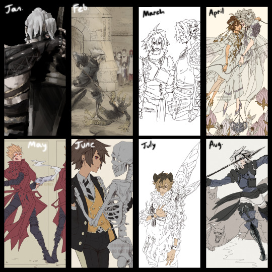
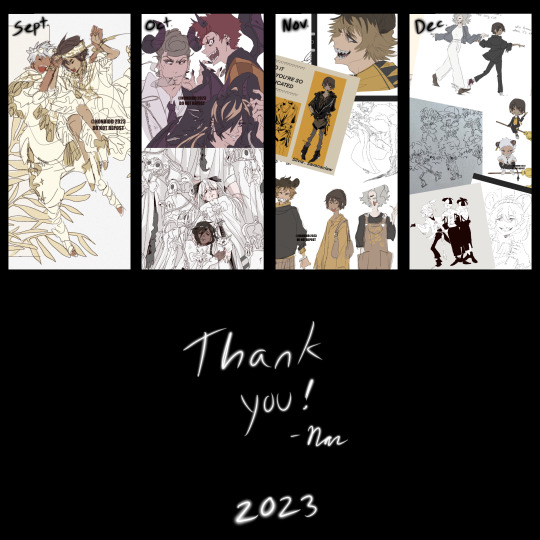
2023 Art Summary 🥳
January remains my most emotional piece. I was processing grief during the one year anniversary of losing a close family member. And it’s apparently the only painting I did this year LOL
After that is where I went back to studying fairytale art. February being a NieR recreation of Arthur Rackham’s The Romance Of King Arthur artwork
Then as for march, that’s where I started to study Henry Clarke and essentially lost my mind for the rest of the year with linework ✌️😩
I had two favs from October so they both go in 🫶
And as for November and December I’ve hit my burnout + busy with health and holidays LOL. Not forcing an illustration just to have one so there’s all my silly little doodles ✌️
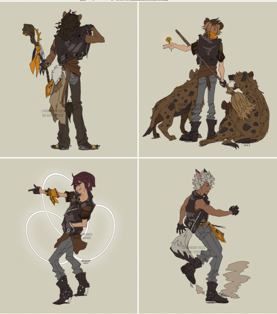
Honorable mention is the savanaclaw set I did this year! Wasn’t something I planned on but I had fun making it and it think it’s my most popular set this year. I was surprised so many people liked it 😆
The next photo is a comparison of how I drew FG Ruggie last year compared to this year. I wanted to show the comparison to explain my shift in focus in my illustrations. After studying Clarke’s work I realized I was having fun creating again. Not to say I’m not satisfied with how the older Ruggie piece came out but I found myself often frustrated with it trying to make sure everything was “drawn right” for lack of a better explanation. It was a chore. I’ve come to find I enjoy making illustrations now with the mindset of “how do I want to convey this” rather than “how accurate can I make these details”. Drawing the newer Ruggie was enjoyable the entire time. My focus wasn’t accurate details or semi realistic but rather what emotion could I convey with just these lines and limited color. And that’s how I’ve been moving forward with my art as of late. It’s been fun again
Because of my newfound confidence and enjoyment of creating again I’ve gone back to traditional sketching too. It used to feel so constricted for me but now with loose lines and a loose mindset I’ve been scribbling all over notebooks again 😆
All this ramble to say I’m satisfied with what I’ve done this year. My health needs to start taking priority come 2024 but I hope to still create and share in the new year ✌️ If you took the time to read all this, thank you 🙏
45 notes
·
View notes
Note
What program do you use to make your fanart? Is it on just an average ipad or is there special ones just for art? Your work looks so good! I’m wanting to try digital art but unsure where to start :)
I use the Procreate app for all of my digital art! ✨
It should be available on any iPad 💗 I personally invested for my birthday this past year and I have the 12.9" M2 iPad Pro, but I'll even occasionally use my fiancé's iPad Mini and the Procreate app on there in a pinch since it's so small and portable~
The only real difference is that performance might suffer a bit, the larger an art piece is or how many layers your work has, depending on the iPad. But if you're just starting out, I probably wouldn't find that to be much of an issue!
(More rambling about digital art origins under cut ✨)
There's definitely a learning curve, especially if you're more used to drawing traditionally! It can help to still sketch traditionally (if that's what you're used to) and then upload a photo of your drawing to your tablet to work over digitally (this is personally how I started out and I used to just make little digital doodles by tracing and coloring over my traditional sketches.)
A small doodle from my sketchbook that I traced and colored digitally, from around 2011-2012, I think? Uh, happy Doctor Who day today!
My very first digital art set up was actually a tiny Wacom Bamboo tablet where the drawing space probably wasn't even bigger than my hand, and a super old bootleg version of Photoshop CS2 which was already a version that was 7 years too old for the time (CS5/CS6 was the most updated version by the time I had started on digital art).
Everyone else in my class had the bigger/fancier/professional-grade Wacom Intuos and I remember my professor taking one look at my baby tablet and just going like "how tf are you drawing on that" lmao.
But still! Experimenting and doing little exercises can get you a long way – I would say to approach it with similar exercises you would do as if you were learning to draw traditionally for the first time.
Shade in circles/nail down basic lighting. Gesture drawings. Random scribbles. Just things that help you get used to the feel of digital art!
Test out different textures you can achieve with one brush, then expand it to see how other different types of brushes can behave and add to the experience.
For proof that even just one brush and not the best/most updated tools can work: these are two of my first more "serious" digital art projects I did in college (with my tiny tablet and mega outdated version of Photoshop) and 99% of the rendering was just done with the "soft airbrush" brush.
But even then, we were taught to create our base sketches traditionally and upload them to the program to work over.
Then one day I decided I wanted to just be able to also do all my sketches digitally and just worked on getting used to sketching straight on my digital program. It was then that besides the all-powerful undo-redo buttons, I started to really make use of the transform/canvas flip/liquify features which I don't think I can live without now lol.
(Caveat: I'm now a little too dependent on those features so I keep a traditional sketchbook to do silly doodles in occasionally to exercise my hand because sketching traditionally without the buffer of those digital tools is pretty difficult for me now lol.)
That was a little long-winded, I'm so sorry hahaha. I hope something in this rambling could be taken as somewhat helpful for starting out on digital art!! 💗
34 notes
·
View notes
Note
if I’ve already sent this ask before I’m so sorry, I’ve got adhd, but how did you find your art? (I’m in my questioning phase)
hihi!!! no problem! i think i have some kind of glitch with asks bc when i go look for them it says i have 3, but when i check it, there isn’t any so im sorry if any of u have ever sent asks and i havent answered them it’s probably bc of that😭
but anyways lets get on it!
finding you art style is not smth simple at ALL. ive been drawing my entire life!!! and ive had a bunch of different styles until now, they kinda used to change every few months or so, i was always happy with them but it never really lasted??? and i always had at least one part of the process of it to dread doing, for example, coloring.
it wasn’t until recently i FINALLLYYY found a style im 100% comfortable in.
it really takes experimenting and finding what elements of creating art you love and enjoy the most. for me, i used to mostly do traditional art, just pencil or ink sketching and i would OCCASIONALLY color them. so i really used to enjoy kinda the messiness of the pencil on trad mediums and stuff? and i never rlly found a way to translate that element to digital art which is the one i enjoy the most now.
brushes are very important! it depends on the look you like. since i like that pencil feel, i use a pencil looking brush! (softy from esbenlash’s procreate brush set) and i also got a paper feel screen protector for my ipad to enhance the experience🔥
i found i mostly enjoyed doing lineart and didnt rlly look forward to coloring, i didnt find my past styles enjoyable bc they kind of felt restricting in that area? since i didnt find a way to make it more abt the lineart and less abt coloring that i liked (ofc theres plenty! i just didnt find one for me)
so tbh i think what mostly influenced the style i enjoy the most now is film, and baroque art!
i had recently seen:
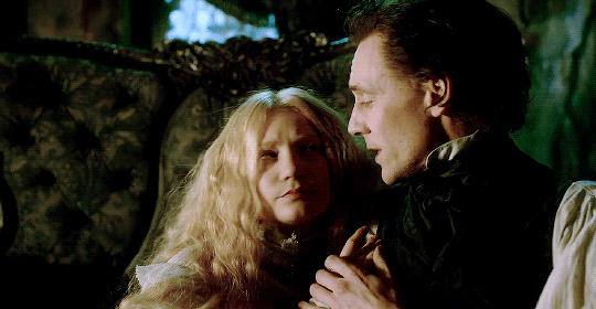
Crimson Peak (2015)

The Shape of Water (2017)
and ofc


Stranger Things DUHHHHH
and i fell in love with the way the lightning was, heavy dark shadows and moody lights, and tried to match my style to it and found that it highlighted all the things i enjoy doing the most while drawing! so thats where i am now
special mention to the one movie im obsessed with currently


The Crow (1994)
also has the similar style
all that + experimenting, studying other’s art i liked and finding elements to integrate to my art, ANDDD music also played a huge part in it. so as you can see for me its about kind of combining aspects of every single piece of media i like 😭
its not gonna be the same for everyone, but its always good to have a guide so i hope this was useful for you and anyone else! im always willing answer any art questions :)
don’t worry too much about speeding up finding your style, it’ll come to you eventually, so focus on enjoying the moment and learning, take mental notes of what you like and don’t like!
sorry this is kinda long as hell… but i like rambling
#perfect opportunity to show off these shots from my fav movies teehee#art truly is all one!#i love getting inspired from multiple medias and combining it into drawing#ari answers asks
18 notes
·
View notes
Text
◇ a/n ◇ @thestarsofenkanomiya happy birthday haku!! 'tis but a small little present but i hope it brought you just a little bit of joy <3
oh, and here's a handy tool if you need it!
◇ characters ◇ albedo, heizou, ??? (cyoa style)
◇ tags ◇ fluff
𝑚𝑎𝑠𝑡𝑒𝑟𝑙𝑖𝑠𝑡 ⬙ 𝑡𝑎𝑔𝑙𝑖𝑠𝑡

the morning sun rouses you from sleep, and the birds outside the window insistently chirp as you struggle to gather your consciousness. with a stretch and a sigh, you rub the sleep out of your eyes before glancing lazily at your side table.
.... hmm?
you squint and examine the foreign object that was definitely not there before you went to bed last night.
curious and intrigued, you reach out to take the item, which is…
▷ 𝑖. a thin rectangular package wrapped in brown paper, sealed with a star sticker.
▷ 𝑖𝑖. a simple envelope sealed with a maroon-colored wax stamp.
▷ 𝑖𝑖𝑖. a medium-sized, bulky package in black, with a somewhat familiar crest on it.

▶ 𝑖. a thin rectangular package wrapped in brown paper, sealed with a star sticker.
To my dearest [name],
Thank you for being born and for coming into my life.
I hope that was not too straightforward. I truly wish I can be with you on this very special day, but alas, my responsibility as the Knights of Favonius’ Chief of Alchemist had to intrude at the most inopportune time. Rest assured, however, that I have scheduled the rest of my afternoon and evening off, so I will be by your side soon enough.
In the meantime, I believe Klee will be wanting to spend some time with you. Please refrain from getting into too much trouble. We would not want to have you locked in the timeout room along with Klee on your birthday. I believe she mentioned she wanted to make flower crowns with you, along with some ‘secret project’ she refused to tell me. I have a feeling she wants to tap into her artistic skill to create a little something for you.
They say siblings think alike. I believe the saying must be close to the truth.
My gift to you is enclosed in this envelope. As you can tell at a glance, it’s a sketchbook. But it is not just a new sketchbook for you, my dearest. You should be able to see that it looks used. And if you flip through the pages you will see that they’re filled with my sketches for the past year.
I know you have been studying watercolor painting for some time now, and as I have repeatedly stated, I am quite enamored by your works. Thus, I would like to offer a collaboration. Will you peruse the sketchbook and paint over my sketches? I’m looking forward to seeing the beautiful works that sprout from your beautiful hands.
Happy birthday, my starlight. May your loveliness stay eternal - and while the notion of me making a wish here might not be an appropriate birthday tradition, please indulge my selfish desire (as you always so kindly do):
𝑰 𝒘𝒊𝒔𝒉 𝒚𝒐𝒖 𝒘𝒊𝒍𝒍 𝒔𝒑𝒆𝒏𝒅 𝒂𝒏𝒐𝒕𝒉𝒆𝒓 𝒚𝒆𝒂𝒓 (𝒂𝒏𝒅 𝒎𝒂𝒏𝒚 𝒎𝒐𝒓𝒆 𝒚𝒆𝒂𝒓𝒔) 𝒐𝒇 𝒚𝒐𝒖𝒓 𝒍𝒊𝒇𝒆 𝒂𝒉𝒆𝒂𝒅, 𝒘𝒊𝒕𝒉 𝒎𝒆 𝒃𝒚 𝒚𝒐𝒖𝒓 𝒔𝒊𝒅𝒆.
Will you help me fulfill my wish, as i swear to do my very best to do the same with yours?
Your stardust, Albedo Kreideprinz.
▶ 𝑖𝑖. a simple envelope sealed with a maroon-colored wax stamp.
Hey partner!
Not much time to write so I’ll get straight to the point: HAPPY BIRTHDAY!!!
I’m sending you the greatest present of all, which should arrive in the afternoon at the day of your birthday! Hmm? What’s the present, you ask? Well…
𝚈𝚘𝚞𝚛 𝚙𝚛𝚎𝚜𝚎𝚗𝚝 𝚒𝚜: c2hpa2Fub2luIGhlaXpvdQ==
Haha, it’s not fun to just get the answer straightaway, right? Now, I hope you managed to solve the puzzle before it arrives! I wonder how you’ll react when you see it… Ah, I can only wish I can see your expression directly ;)
Heizou 🔎
▶ 𝑖𝑖𝑖. a medium-sized, bulky package in black, with a somewhat familiar crest on it.
Pet ー
I have a new and very special 𝔢𝔵𝔭𝔢𝔯𝔦𝔪𝔢𝔫𝔱 waiting for you today. Wear what I sent you. You know where to find me.
Don’t be late, now. Or else.
ー 𝕯

© zhongrin | 2022 ◆ no repost. reblogs much appreciated. feel free to reach out to submit suggestions, feedback, comments, or if you just want to talk!
◇ taglist ◇ @thestarsofenkanomiya | @genshinparty | @abyssmal-skies | @hamdehlesmis | @depressivecomforts | @sophiethewitch1 | @why-am-i-here-someone-save-me | @sunnshineflxwer | @heartonthemoon | @yuutasbabe | @percyval-archives | @carbs-need-more-love | @rebeccka | @queen-belial | @stygianoir | @niverine | @silentmoths | @niktwazny303 | @dustofthedailylife | @herdrops | @clovcly | @marina-and-the-memes
ps. if you want to be removed/added from the taglist, just send an ask!
#genshin impact#genshin impact x reader#rin writes#albedo#albedo kreideprinz#heizou#il dottore#albedo x reader#heizou x reader#dottore x reader
232 notes
·
View notes
Text
tips/resources that taught me how to Art as an Adult - a masterlist
Four years ago I decided that “I’m too old to learn how to draw” is a pointless lie I’d believed for too long and you’re never too old to learn something new. I still definitely consider myself a novice and a learner but I’m at a very happy place with my art and I’m having a ton of fun so I thought I’d pass along the tips/resources that helped me get started and kept me motivated.
I’ll get into resources under the cut, but here are personal tips I lined up for myself that helped during the early stages of frustration and wanting to give up. obviously they won’t work for everyone, but they really kept me going
fill 14 sketchbooks. if you still want to give up after that you can (I’m currently at 13 sketchbooks and could not imagine ever letting it go)
what specifically do you want to be able to draw? For me my goal has always been characters and cats. I’ve added things to it here and there, but starting out overwhelmed with how much you don’t know isn’t great. find a handful of things you really want to draw and see where it takes you.
get yourself a sketchbook fancy enough that you feel cool as heck but cheap enough that you don’t mind absolutely destroying it. Personally, I love EXCEED bullet journals. the dotted paper keeps me from being too picky but are less intrusive than lined paper. From my experience, EXCEED bullet journals takes acrylic and ink like a champ, and they’ve got nice covers that just make you “feel” cool. confidence is important!
acrylic paint and post-it notes are great ways to cover mistakes. I personally love anything that makes my sketchbooks feel “sketchbooky” so this is super fun.
it is okay to “waste”/”ruin” pages. one time I was in “I’m a failure” artblock and so I poured black coffee onto my sketchbook. (it was gonna get dumped out anyway and I was Very frustrated with my art.) then when the pages dried I just kept right along using it. taught me a lot about not being perfect. sketchbooks are about learning and love, not about perfection.
try drawing in pen. seriously, draw in pen. it’s scary as frick to not be able to go back on mistakes but that’s what the post-it acrylic-paint tip is for, and it’ll help with all sorts of stuff like lineweight and line confidence. it takes some of the stress off too because, you screw up? oh well! Try again! it encourages “try again” over “meticulously nitpick until it’s perfect” and has done wonders for me. I started out my first two sketchbooks in pencil before making the switch and I’ve never gone back.
(also sketching in highlighter and lining with pen is super fun and cool and satisfying!)
the first page doesn’t matter. I usually just use the first page of the sketchbook to write my favorite songs at the time and then do the same thing on the last page. first page jitters begone.
(starting in the middle of the sketchbook also gets rid of those jitters pretty nicely. I tried this a couple times and personally still prefer the linear front-to-back but it was fun for a while.)
picking a color theme for your sketchbook can make it feel more “sketchbooky” too. I usually go with blue or orange- blue acrylic paint, blue post-it notes, those cheap blue BIC pens, etc. I like this bc it makes the sketchbook feel like a sketchbook and is very satisfying.
And figure out why you’re doing it. I did it because I always wanted to make cool art and draw my characters, but if you’re doing it for a career then obviously the path to that looks much different. Don’t compare yourself to others. Be inspired by people who are better than you. Acknowledge where you need to grow and where you’re strongest. Lean into those strengths. Adapt to those weaknesses. Be proud of being a beginner- you won’t be one for long.
Now: some of my favorite creatives and resources!
///
CREATORS:
"Kasey Golden"
Mostly traditional art, mostly watercolor, cartoonist, art challenges
"DrawingWiffWaffles"
Mostly traditional art, alcohol markers & pens, semi-realism
"LavenderTowne"
Digital art, art tips/tutorials, cartoonist
"ABD Illustrates"
Digital art, speedpaints, semi-realism
"Proko" (or "Stan Prokopenko")
Realism, anatomy tutorials, free complete "Anatomy For Artists" series- basically as hogwild as you can get learning hyper-realistic anatomy
"Ethan Becker"
Digital art, ex-DreamWorks employee, tips/tutorials, "Perfect Practice"
"Sinix Design"
Digital art, anatomy tips/tutorials, general tips/tutorials, realist
"Oliver's Antics"
Digital and traditional art, tips/tutorials, speedpaints, semi-realistic style
“Nerdforge”
Traditional art, painting, metalwork, woodwork, bookbinding, building, seriously these people do everything they’re incredible
///
FOR GESTURE DRAWING:
Line of Action
Gesture drawing, figure drawing, optional timed practice sessions
AdorkaStock
fantastic line of unique reference poses
///
Aaand that’s about all I’ve got! there are so many resources out there and so many amazing artists to be inspired by. just have fun with art! art is freedom. be proud to be a beginner and be excited for how you’ll grow. I hope these tips are helpful for someone out there! <3
Here’s my first digital artwork (April 2019) up against my latest (August 2022)
April 2019:
August 2022:
best of luck to you all. I believe in each and every one of you. <3 happy drawing!
#art#resources#cloud rambles#masterlist#obviously this isn't TOTALLY comprehensive#but I've been talking to a lot of friends lately who preemptively give up on art bc they're 'too old'#and I just felt like making this#i believe in all of us
330 notes
·
View notes
Photo

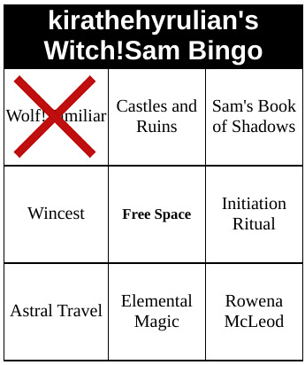
🔮Witch!Sam Bingo🔮
🚘🐺Friday Drive🐺🚘
(Please do not edit/alter. Feel free to reblog, but please do not repost. At the very least please give me credit.)
Square Filled: wolf!familiar
Event: @witchsambingo
For more art from me please check out my “myart” tag here on Tumblr.
👇(Art Notes and sketch below the cut) 👇
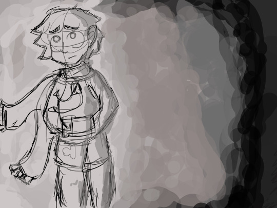
Art Notes: I finally finished my first square for the Witch!Sam Bingo!🙌 I’ve been trying to do that for a year now, but I couldn’t settle on an idea for any of the squares. Finally, last month I had sketched out this on cardstock paper, thinking I should try again at another traditional ink and marker drawing:
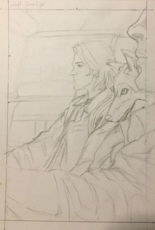
And I like where this sketch was heading. I was like what’s not to love with mixing classical spn with witch!Sam elements? But, I knew I should just take it over to digital instead of risking me screwing up the inking process with traditional mediums. So I took a picture of it and traced, adjusted, and fixed stuff in Sai. But, it took me so long to get it all done because I kept procrastinating with it. I was just, for some reason, struggling to work on it. Eventually, when I got to the end of the shading and all of the lighting stages I mainly just slapped it all down just to get it done. I wanted to be finished. It’s been hard to art lately. I can get spurts of art in every once in a while but it is not reliable.
The background was an image of a cornfield I found on google that I took to Ps elements 15 to motion blur and change the coloration, lighting, and shading. I really could not be bothered to do a hand drawn background here. And tbh, I don’t think it would have turned out as well if I did. I’m actually pretty happy with how the background turned out.
I probably should have Gaussian blurred Dean but, I didn’t want to take the time. The me right now is satisfied enough with it.
References that I used for Sam and Dean: For Sam’s face I referenced a flipped 7x06. Sam and Dean’s outfits/body’s and inside of Baby I referred to both 1x02 and 1x05 where Sam and Dean are in the car. For the wolf I referenced two google images of an orange-ish wolf that I thought looked pretty. (One that was just a side profile of the head. The other a full body side profile)
I have no idea how to approach the other eight squares, but I’m hopeful that I’ll get some ideas eventually. It’s a lucky thing for me that the bingo decided to drop the deadline. Otherwise none of this would have happened.
But, for now I can at least cross one off the grid.
I didn’t really listen to anything specific for this....well I did keep relistening/rewatching electricmonk’s vid for a little bit towards the end so that kind of counts. Too gorgeous of a vid not to rec anyways.
youtube
And, I think that’s it.
Enjoy, if you can!♥♥♥
#sam winchester#witch!sam#witchsambingo#gencest#gencest art#sam winchester appreciation#dean winchester appreciation#impala 67#myart
189 notes
·
View notes
Text
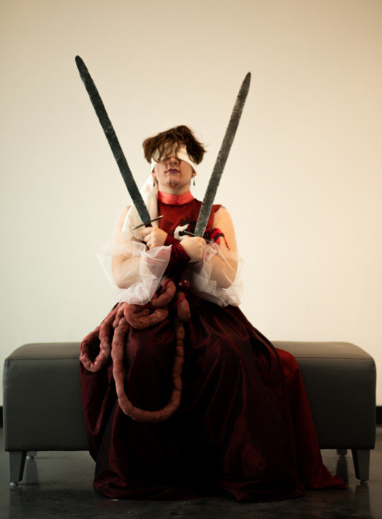
The Flesh Dress


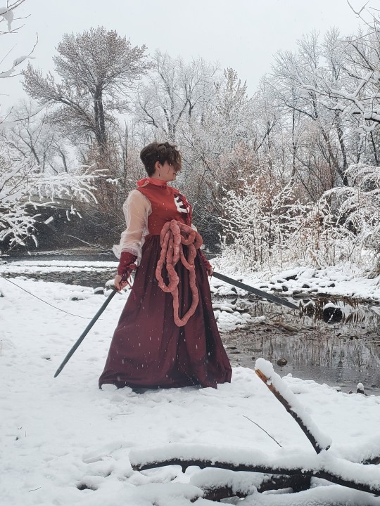
All of the fabric for this was reclaimed from curtains, scraps, tights, discarded tule from a local highschool prom that I snatched up like a horrible little vulture. The boning in the bodice was done with huge zip-ties but I’m not convinced getting real sewable boning wouldn’t have been worth it. The channels on the reinforcement were a bit of a bitch. The swords I also forged myself, but this ain’t about them. A lot of (mostly fake) blood, sweat and tears went into this one and I’m super pleased with the results.
Huge shout out to @spoonbendersanonymous who was kind enough to lend me the fake blood, their anatomical text book, and had me sit down to watch Bride of Reanimator for inspiration.
Process photos and bonus photoshoot pictures below the cut!
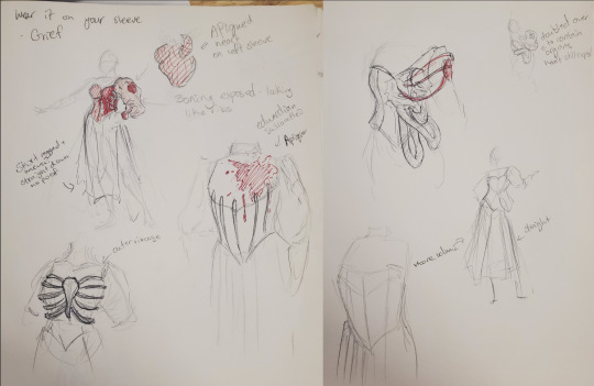
Original sketches! A lot of me trying to figure out how to make boning look like bones while maintaining a classic shape. I said edwardian on the sketch but it honestly might be Victorian I'm really not sure.
This was a combined art project for one of my classes, the idea was using old fashioned mourning traditions and clothes in a modern and campy way, to complain about how much capitalism erodes our time to mourn. At least that’s what I told the professor, It’s really about making a weird and off putting dress first and foremost.

Tape pattern and paper pattern! This was my first time doing this so don't take thus as any sort of guide.
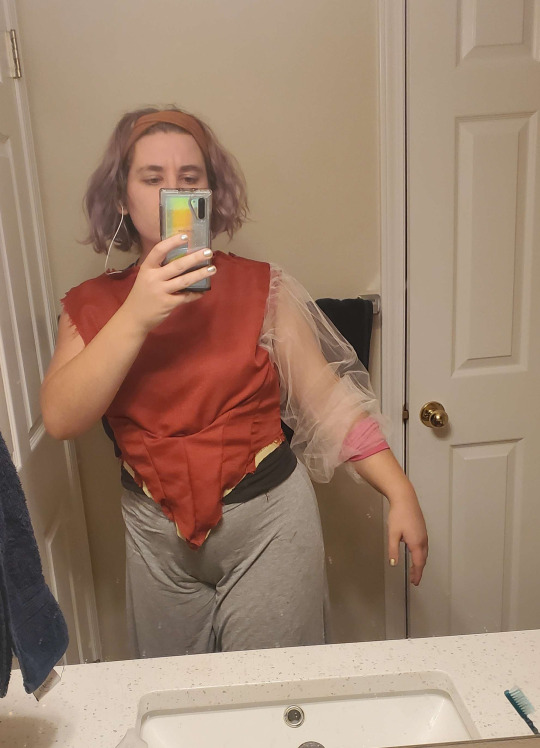
It worked though, as shown by the world’s worst corset fitting - the pink thing on my arm was where I was planning on putting the upper sleeve, I was trying to see if my poof was good since my sleeves were a lot thinner and a lot longer than what would have been optimal for the amount of poof I wanted, I had to do some work around with the fabric I had

Now I’m just bragging about getting eyelets to look clean and good for once in my life. If I was going to do anything different about this though, I would ad more eases in the back, because I need to contort horribly to get out of the bodice, I fit it too well

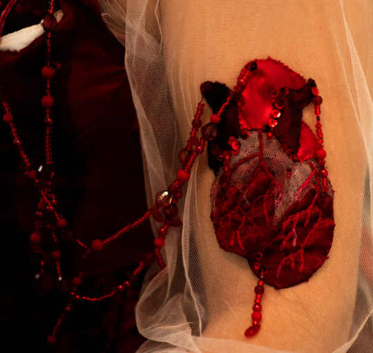
This bad boy was really the crux of the whole project. The entire thing was a pun so I could applique an anatomically accurate heart on a sheer sleeve.

This was was it’s intermediary stage, where I was suddenly very much out of time for the first deadline and had to put off adding all of the gore I wanted to, so the simple applique heart had to do.
The skirt itself was way less poofy than I would have liked, and didn’t quite give the silhouette I wanted. I ended up going with the train because the under skirt isn’t actually connected in the back. Thus is the nature of working with weird panels of curtains you’ve already cut into for a few other projects. God bless the thrift store curtain section.

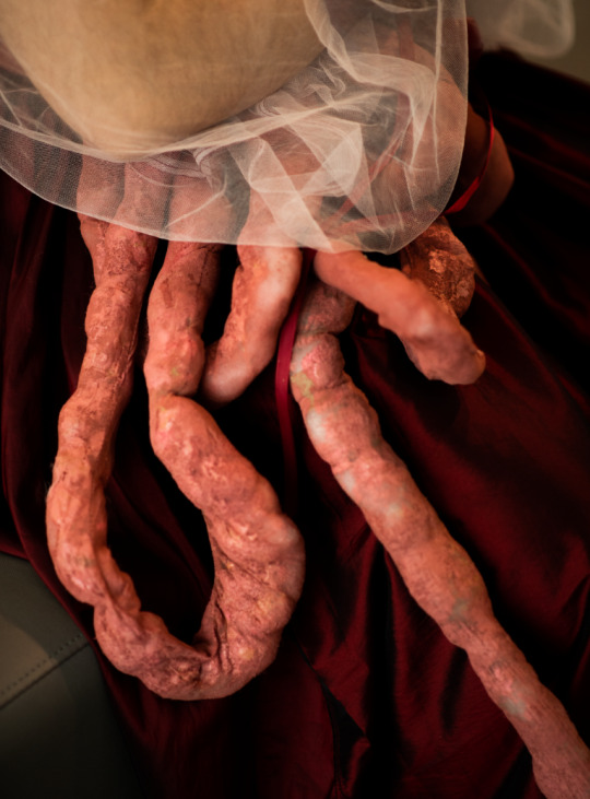
The guts were made by sewing together sheer tights, and filling them with polyfill. Here they are, before they were stippled with liquid flesh colored latex and soaked in fabric paint - and after where you can see all that extra TEXTURE

I was able to use it for another project though, and I was very happy with the beading work here, although I did end up losing my biggest strand at some point.

Here’s my makeup test! I played around with doing some blood red lips but decided the blueish corpse look was better. Fun fact! I drove home wearing a sweatshirt that says “I heart corpse desecration” on it through the snow storm, and pulled over to offer some guy a hand with his car, forgetting I still looked like this. He turned me down.

The face of someone who can definitely be trusted for road side assistance. - Also I was posing as the two of swords tarot illustration for the final gallery exhibit.
#art#fashion#sewing#I'm finally getting around to putting this out there so I can find it again#I have so many pictures but I'm afraid tumbler won't let me show them all#Maybe I'll make another post about the swords#but those are decidedly less well made#turns out forging is very hard and I never tempered them or sharpened them properly#I lost one of my pomels in the forge and gave up which is why the hilts are resin cast#but I made a couple of shitty ass swords though! Which I think is more swords than most people have ever made so I'll take it#This dress also specificly got me told that I couldn't come to a wedding as a reanimated corpse#which is very funny and only slightly homophobic
69 notes
·
View notes
Text
#mortallychaoticdtiys
Alright friends, grab a snack and take a seat because I have some rules to explain and I clearly don't have the gift of synthesis eheh~
As you can see (actually you can’t because I probably wrote one of my longest posts, I’m sorryy) there are two different prompts! I made them to give a little win to the artists who preferred to have some freedom and also to make this little contest accessible to everyone!
However let's finally talk about rules:
-Anyone can join regardless of their skill, this is only a silly thing to have fun together, don't overthink about it! 💕
-Both traditional and digital drawings are welcomed! There are no particular limits about the media used
-The drawing doesn't have to be completed or meticulously realized, even a quick sketch made in a couple of minutes will be loved and appreciated! ✨
-blatantly traced artworks are not allowed tho (referencing is fine!) and same thing goes for AI art, every drawing that falls under these categories will be "disqualified"!
- You can choose the prompt you like most! I guess you can do both... if you want to (?) But it's not necessary and most importantly it will not be "valued" as a bonus when I'll pick the winners
-You're free to make changes to the composition, color palette, poses ect. of the drawing! The only requirement is that the "original" prompt must still be recognizable!
-Once your pwetty drawing is ready just post it as you normaly would tagging me in the description and adding the hashtag #mortallychaoticdtiys. Feel free to dm me if you notice that I might have missed your post!
-The deadline for this dtiys will be a month from now so for the 7th of February! The winners will be announced after a couple of days and I'll begin working on the prizes from the 17th/18th trying to deliver everything (comic chapter included) in about a month!
-After the winners will be announced I'll contact them privately to get references and everything about the character they would like to be featured in the chapter and/or about the drawing commissions!
-as last, most importantly, have fun!!! 💕 💕 💕
-
-
-
Wow... I really wasn't expecting that many rules :oo I hope I didn't forget anything! (also if you have any doubt always feel free to dm me!)
HOWEVER I'd say I bothered you enough with boring information so you're free to go! Big thanks in advance to the artists who'll join and I really can't wait to see your beautiful artworks! 💕

Little thing i forgot, in case you missed the last post here's the prizes:
-First place: a 50$ worth art commission that can include two characters (full body/full color) with no background OR one (full body, full color) character + background
-Second place: a 25$ worth art commission that can include two full color characters (bust) OR one full body full color character (both without background)
-Third place: a 10$ worth commission, one character full color bust OR one character full body sketch
(the only requirement is that it must be at least vaguely related to the pl fandom, au, oc, crazy crossovers are absolutely fine just don't ask me to make a portrait of your grandma AHAH)
And since this wasn't enough there will be 5 more extra winners that as a prize will have their characters (or even themselves if they want) featured as a bg character in the upcoming chapter of my fancomic Artemis: Behind the Legacy.
#pl#desmond sycamore#professor layton oc#Artemis#mortallychaoticdtiys#dtiys#rules#drawing contest#I'm so hyped JYGJYJYGUK#thank you again for your support <3
60 notes
·
View notes
Note
Would you be willing to explain or just talk a bit about your process in making art? There’s something so soft and captivating about your art style, and I’m just very interested in your thought process for creating your art; especially the Homura piece! :3 (I just found your account and all of your work is absolutely lovely, I would love to learn more about it!)
aaaaaaaaaaaaa im surprised im being asked (ιº o º)! i feel as though it would be better explained through a video maybe but for now here is my best attempt! ( *˙ω˙*)و nearly all of my art is first sketched traditionally using mechanical pencil. i tend to only use very faint or light sketches (mainly out of bad habit) i personally love drawing both very cutesy anime doodles and also more detailed pieces. when i do want to fully finish a piece ill take a picture of my sketch. using ibspaint on my phone i do lineart with a hard pencil brush. i sometimes use a basic soft brush to fill in colors or blend. to make a piece look softer or even more interesting i sometimes use gradients using an airbrush. im far better at traditional... ive only recently really started trying to do digital heheh. pastels and black and white would be my strong suit. im sorry if this was a bit messy but ill do a better explanation soon! promise *.☆⸜(⑉˙ᗜ˙⑉)⸝♡.*

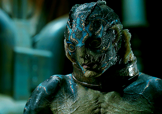
#art examples#artists on tumblr#art possess#artist#fanart#tetsuo#tetsuo the iron man#body horror#black and white#sketch#otakuart#otaku stuff#disturbing media#animecore#art commisions#artwork#art#art commissions#fan drawing#fan artist#japan#japanese#japanese horror#disturbing#disturbing movies
26 notes
·
View notes
Last Seen Blogs
helloharuiro
Vivi.

kidneyoffice17
The Love of Mills 295
joaofelix70
aléxia.

1u8bd0-blog
- 1u8bd0.tumblr.com
elenahigh03
Elena high