#so here's some low quality grayscale instead!
Photo

Creating a manifesto for an at Home Studio Work Place
Above you will see the completed A3 poster which includes an at home studio manifesto. I have used various softwares such as photoshop and illustrator to create this.
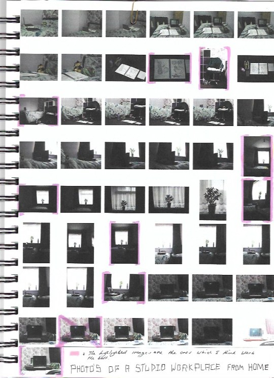
Contact Sheet
I thought it would be good to include a contact sheet as I was working with a digital camera to capture these photos. I have highlighted the images which I found to be the most eye-catching in composition. A main problem I faced when taking the images is when I realised some of these images were set to a low exposure. This in turn lead to some of the images appearing dull even though the room was well lit.
Editing the Chosen Image in Photoshop
I didn't mind too much about this issue as I would be importing the images into my laptop to edit them in photoshop. After importing the image into photoshop to brighten up the image I clicked on the tab where it says:
Image - Adjustments - Brightness/Contrast
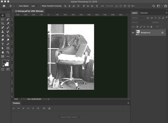
From this point on I was experimenting with the image in photoshop, from these screenshots you will see that I have turned the image into a bitmap, to do this I had to first make sure that the images mode was set to 8 Bits/Channel and to have the image set to grayscale. Now that I have the image ready I am able to save it as a PDF. I prefer to save image documents as a PDF as it still maintains its image quality. On photoshop you are able to change the PDFs file size while saving the image.
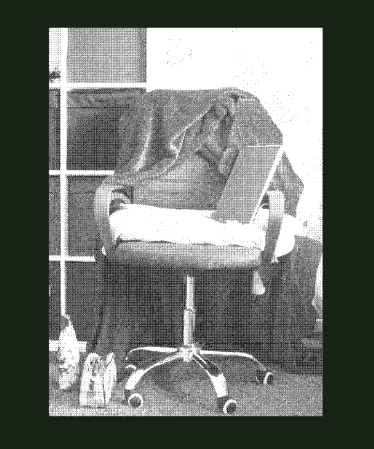
I wanted to create a bitmap image because I was originally going for a digital look for the outcome, however later on I decided a bitmap isn't the best choice to use for the final posters. The bitmap gets rid of the natural feeling of texture you gain from the original image.
After creating a bitmap of this image I have also decided to create versions using the duotone feature in photoshop.For using the Duotone feature you also have to make sure the image is set to 8 Bits/Channel and that it is converted to grayscale. Below is a tab showing Duotone options. Where it says Type there is a drop down menu which allows you to select the duotone option. This allows you to blend two halftone colours together.
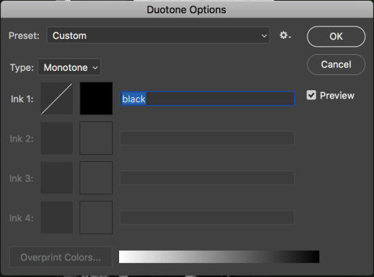
In photoshop I have used the colour picker to select colours which work well together in contrast The main colours I have chosen include black, magenta and a dark red. Using the duotone options I was able to see which colours suit best together.
From there on I created multiple pdf files of both monotone and duotone versions this image. The plan now is to import all the images into Adobe Illustrator where I am able to experiment with the blending modes in the transparency panel. For all the images I set the blending mode to multiply.
I have tried overlaying the bitmap image over the images here, however I found the bitmap image to distract the viewers eyes away from the text to the pint where it becomes unreadable.
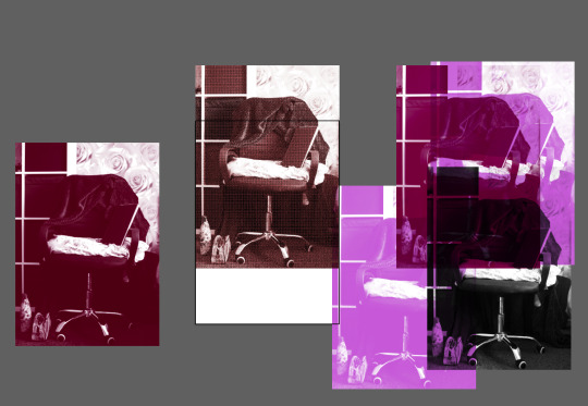
Instead of using the bitmap image I have overlaid these two images instead, for these images I have used the monotone option so the images are made up of one colour. Blending these two images together has made up the final image I used for the A3 poster.


This is Some notes I have been taking from this lesson, the top of the page is notes of what is expected of the outcome.
On the middle of the page I have noted down a suggestion from my tutor to look into the old type foundry; This suggestion was mainly for individuals in the studio who were working on a typeface for their brief. Even if I don't create a typeface for this brief it was a good idea to take a note of it as something to consider researching for a future project.
At the bottom of this page shows some examples of manifestos I thought would work well for an at home studio workplace.
1 note
·
View note
Text
His good girl

word count: 2,678
genre: fluff, smut
Often times you wished your boyfriend were a little more anonymous. And yet his social standing was also part of his appeal. Jaehyun the jock he was, basketball team captain and also a member of a respected fraternity—they have everything, all had led to the impossibility of concealing himself from the glory being showered with. So how the hell did you end up with the almighty himself? Call it fate or luck, you both were the high school sweethearts—he happened to squeeze himself a place in your heart with his self invented pick-up lines. That scene of Jaehyun pursuing you, wooing you and winning you over itself would always be funny to you and him, as well as among the rest of the boys. And speaking about the boys, they treated you as though the lady boss since you’re the only girl in the clique. It was enjoyable.
However college itself hadn’t been the case. You were rather excited on the first day but soon you realized otherwise. People were more realistic about life and you found yourself having a hard time making friends just because you didn’t “fit in” to the so-called societies’ beauty ideals. Girls your age were adorned in makeup and form-fitting clothing, whereas you only wore plain T-shirts with jeans other than switching between white and black time to time. Though it was quite wrong of you to wonder why Jaehyun still stuck out his hand to you all the time when you’re undecorated and boring, while he soared to the top with outstanding visuals and qualities that every girl deeply wished to own him to themselves. And because of that, your presence as Jaehyun’s girlfriend was overlooked and never taken seriously by anyone else. They simply took you as that side chick who’s about to deal with being dumped any time, or that introverted cousin who clung to her big brother that was a star himself. Regardless, the attention that was occurring around Jaehyun didn’t seem to faze him in the least. There was no breakup and no debris of shattered heart. He still loved you a lot.
Three months had gone by in this manner and the boys decided to throw a huge party as soon as finals ended. You knew you were just not a social butterfly or party person, but since the celebration was being held at the fraternity’s property, you decided to give yourself the opportunity to let loose after major stress from studies, and a dress-up once in awhile. First, you abandoned your thick-framed glasses and freed your messy bun to soft romantic curls. Then you switched out your grayscale clothing to a floral crisscross halter dress that welcomes the approaching spring season.
While you were having a dilemma picking out accessories to accentuate your outfit, Jaehyun stepped out from the shower bared with still a towel wrapped low on his hips. His feet padded on the timber flooring across the closet and immediately made a stop at the vanity where you were still occupied.
You shot him a timid smile as he continued to watch you through the mirror working magic on your already-perfect appearance. The blusher seemed a little too much over your redden complexion.
“What?”
“You’re so pretty,” he said with twinkling eyes.
“Just pretty?”
“Pretty good enough to eat.” Jaehyun loves flirting—sometimes to the point where he couldn’t help himself. But the majority of them all he was the gentleman who deposits appreciative kisses on your knuckles.
You shoved him away in the chest and he dissolved into fits of laughter seeing your flustered expression.
“On second thought, let’s just ditch the guys and have a party of our own. I can steal the pizza and some drinks, hm?” he suggested.
It wasn’t a bad idea actually. “Go get yourself ready!”
“C’mon, help me,” he grabbed your hand and pulled you to your feet, “We can play dress-up, I’ll be your Ken doll!”
So much so you were messing around in the closet. You had him tried out horrendous mismatching of clothing and still managed to look good in them. Eventually you picked out a shirt matching the blue of your dress and a pair of black ankle pants. And to top it all, you helped to style his hair in a lovely disheveled look.
“All done, handsome.” Your eyes flitted around his body and then finally rested on his face. You had no shame in yourself as you checked him out blatantly. “Let’s go!”
“After you, my lady,” he made a dramatic gesture towards the door, waving his hand about so you would step outside first.
The backyard was already filled with people; Doyoung was mingling with the other guests in attendance; Yuta was drinking straight from the beer dispenser; Jungwoo was hogging the food table; and the twin towers being Johnny and Lucas were engaged in games of beer pong.
“This wasn’t so bad…” you let your eyes roam around the room with obvious curiosity, everything about the party was new and you couldn’t seem to pull your gaze away from the sea of people submerging themselves as fish in water.
“Nudge me if you don’t feel like staying. The offer still stands,” he wriggled his eyebrows at you, causing you to giggle. “Do you want something to drink? Like, juice, soda or water?”
You rolled your eyes at his mindful self. Drinking alcohol is a common practice at parties and you weren’t hesitant to give it a try, as much as the after-effects would be deadly. “I can drink, Jae.”
“Are you sure?”
“I’ll be fine. Besides, I have a goonda with me for the whole night,” you assured him.
“Are you seriously calling me a thug?”
“Quick!” you dodged his inquiry, “Make me a drink maybe, baby.”
Veins strained and popped against the skin in his forearms as he strived to impress you with his bartending skills. To fuel his ego, you squealed with delight at his antics and he laughed and blew you a kiss.
“I call this the ‘Sand in the Crack’,” he spoke proudly, perhaps too proudly and you snorted at the odd sounding name.
You rubbed away some of the condensation fogging the glass, but the icy cold moisture numbed the tips of your fingers and you took a sip of the drink. “Mm, this tastes like summer.” It was a mix of pineapple juice, cranberry juice and some alcohol that you could hardly put a name to but it made you long for warm weather and deserted beaches.
“So, pretty girl,” Jaehyun began with the comment out of his role-playing: the breathtaking bartender and a lone girl. “Do you have a boyfriend?”
He was probably fishing for compliments again.
“No, baby, I do not,” you shrugged, leaning forward, arms on the table.
Though it was only pretense, your comeback had him squinting his eyes at you, as if he was genuinely offended by it. He leaned forward, as well, bracing himself against the table’s edge. It put your faces only inches away, the russet-brown of his eyes so clear that you could see the subtle shading of the irises. He smelled of expensive cologne and soap, and the scent of him was very alluring.
“If that’s the case then, can I like, maybe, get your number so I can take you on a date?”
“You don’t sound so confident.”
“Oh, do I?” he raised a brow, “What if I-” he didn’t finish his sentence because he bent his head and kissed you on the lips, “Like this?” and a few fat smooches on your forehead, nose, cheeks and everywhere, “Hm?”
His lips dotted on your face like butterfly flitting and fluttering around made you giggle uncontrollably, “It tickles!” but you didn’t try to pull away and you didn’t want him to stop. You gently cupped his jaw in your palms and kissed him on the mouth, so lightly, so tenderly, he melted under your touch as he released a long sigh through his nose. Never did he want the moment to end.
“Let’s head out and play,” the endearment ended reluctantly, you slipped your hands in his again and dragged him to where the whoopee was happening. “I haven’t got a full experience on this yet.”
A huge part of you regretted what you had said. As soon as you made it to the yard, the girls who had their own groupies were looking at you with terrible, stern, mocking, hateful faces. You still wondered how they got invited in the first place. They were always giggling like hyenas, a bunch of half-starved hyenas about to pounce on your boyfriend too.
Your grip on his hand tightened when a skinny-little girl with big dark eyes and long chestnut hair—a little shorter than you and was a complete stranger, walking straight in your direction with no hesitation. Oh, you may have forgotten Jaehyun was exposed now and she was one of the braver girls.
“Hey, Jae!” your insides churned at how easily she called him by the name with fondness or familiarity. Her perfume was so strong and floral, it gave you an instant headache. Her cheeks were accented with rose-colored blush that didn’t quite match her pale skin tone. But you had to admit she was cute.
“Yerim, what brings you here?” Jaehyun had always been friendly, kind and attentive to others.
“I came to see how you’re doing. Plus, I can’t miss out on a party like this.”
You swallowed down a moment of awkwardness, your head tipped to the side as you chewed your lips. Nothing would ease the endless ripple of agony eating through your body. Yerim seemed to have no intention of leaving or perhaps talking to you. She ignored you and held a very long drawn out conversation about her everyday things with Jaehyun only. You learned that she was the varsity cheerleader and they worked closely with the basketball team. When her eyes flicked, for a split second, to you, and perceived a slightly annoyed expression on her face, you decided that your presence was unwelcomed. So you excused yourself from Jaehyun and chose to make your exit instead.
Watching the festivity from the elevated floor above, they all had smiles on their faces and were having a great time meanwhile you were wearing a poker face, almost sad, that didn’t fit in to the mood downstairs. Just before you thought you were getting the hang of it when you had fun with Jaehyun but then you decided you weren’t, you told yourself, you weren’t made for parties.
And from the incident prior, you kind of hated yourself for being that way. You hated yourself for being weak, hated yourself for not being able to control those people you considered as powerful. It wasn’t that you didn’t want to stand up for yourself, but that you understood you were a weak girl. All these thoughts were circling in your head and then you were twirling around mindlessly on the swivel chair.
“Found you,” the door cracked open just a little. Jaehyun poked his head through before slipping in his room, and quietly shut the door behind.
“You found me,” a hint of dejection creeping into your voice despite your earnest endeavour to sound unaffected.
Jaehyun was quick to figure that there was something else, “What’s wrong?” One of his hands curved around your head, gently rubbing your hair.
“I’m just tired,” you slipped your arms around his waist and buried your face into his chest, thankful for the touch.
You pulled away at arm’s length and looked into his face. Slid your hands over those muscled shoulders, lifted on your toes, and kissed him. He immediately returned your kiss, moved his lips tenderly against yours. You opened your mouth and his tongue swept in, probing. Promising. His body was hard, throbbing against you. Your arms wound around his neck and you lifted higher on your toes. You needed to get closer. With that, you walked forward, making him back up towards the bed.
Jaehyun stiffened with surprise when you pulled back and sank to the floor, reaching for his crotch and removing his belt and tossing it to the side. Timidly you ran your hand over his crotch, the pressure firm enough to make his eyes roll. Never had he imagined his good girl would voluntarily offer herself. He was getting harder.
“Baby,” he whispered when you brushed your fingers along the seam of his zipper, then caressed him, feeling the unmistakable swell of his response beneath your hand.
“Baby,” he managed gruffly, but didn’t stop you as you undid the snap at his waist and slowly lowered his zipper.
He groaned your name when you freed him, when you took the long, hard length of him in your hands, then traced the tip of your tongue over the engorged head of his pulsating shaft.
His head fell back, pleasure zooming from one corner of his body to the other. The temptation to pull you back into his arms—to rake his fingers through your hair, to feel your mouth opening beneath his—was overpoweringly strong. He fought back the urge, knuckles turning white as his hands fisted on the sheets.
Figuring that this was your first time, he let you take your time, letting you feel every inch of him, experiencing and exploring ways that brought out deep animalistic groans from him.
You lashed your tongue along his length, gliding up and nibbled so gently at the reddened, wide head of him. A sticky sweet droplet pearled at his tip, and you licked it off then sucked him in a tantalizing frequency. The extent of your inexperience and now tainted innocence did nothing but turn him on further.

Johnny nudged the guy beside him with his elbow, looking up at the second-story window in amusement.
“Someone’s finally lost her shit,” Taeyong commented, equally amused by your change of attitude.
Even though they had no idea what it’s like behind closed doors between you and Jaehyun, whether you had actually done it before or not, however this side of you displayed was never to their expectations.
And through the large windows, you were hoping those girls were observing attentively at how this man, forged from muscles and determination, was at your mercy.
Mayhap, you left the blinds opened, intentionally.
Teasing your teeth along the thick vein that lined his length summoned a hissing curse from him. You hadn't hurt him. He's enjoying this too much, enjoying your aggressiveness aside your usual soft and gentle manner.
You had complete control over him. He could not utter more than a word.
His bones shivered inside his skin. He had grown so hard and thick within your mouth you could barely encompass the head of him, but you did so, offering what you could that sent him to a dreamy-eyed heaven.
“Babyㅡ I'm cumㅡ I'm cummingㅡ” he gasped.
His torso arced forward as his body curved in an exquisite bend, moving his groin to the motions of your head, begging for release.
Your mouth closed over his head, with your thumb and forefinger edging the base of his manhood pushed him into a forceful climax that spilled down your throat. A guttural groan that came from his core released and he straightened his arms, coming forward in a stretch, gliding his hands down through your hair. His body shuddered, hips jerking subtly as he rode the wave. Each breath came in a heavy pant, his chest rising and falling.
“That was mind blowing,” he whispered as he cradled you into his arms, bruising your lips with his hungry kiss. And he realized his erection had not gone away.
How could you underestimate the dominance you had over him?
“But baby,” he called through, voice croaked out of a dry throat, “Everyone probably saw us.”
You hummed low in agreement, bit down on your lower lip and a cheeky grin on your face as you observed closely—his eyes grew wide with realization.
“Oh, fuck.”
577 notes
·
View notes
Text
FAQs
This is a very, very long post. FAQs are consolidated after the cut!
Feel free to send in more enquiries via the askbox. This FAQ will be constantly updated.
About this anthology
This will be a PG-13 anthology comprising of comics and short stories with illustrations.
The cover is in full colour, and the interior of the anthology will be in gray scale. We’re looking to have a book of maximum 144 pages of content. It could very well be smaller, if we end up having drop-outs.
How are we going to do this?
The running theme of the anthology would be “that moment when Shiro and Lance think “I love him”. This is open to various interpretations, it could be pre-relationship or while they’re already a couple. The only criteria is that Shance is in mutual love.
We’re open to any variation of Shance: Svance / Luro / Luron / Pikashi / Pyro, in any world / AU / timeline, as long as it has a self-contained plot and includes Shance being in love.
Stories can be submitted in 2 formats:
Comic - Page counts must be in even numbers, up to a maximum 8 pages.
Short story with illustrations - 1-3k words, that fits about a maximum of 8 pages. Minimum amount of artwork for stories should include 1 cover art, and as many insert artwork as you like. Story illustrations can be 1 page or half a page.
What are the zine specs?
7” x 10” - B5 size, 132-144 pages, content will be grayscale.
How many participants will the anthology have?
We’re looking at about an estimate of maximum 16 stories for the anthology.
Stories can be authored by an individual or a collaboration between a writer and artist.
Participants can sign up as an individual comic artist or a writer-artist pair. Writers and artists can sign up individually and we will try to form teams for comics or illustrated short stories.
That would mean potentially anywhere between 16-32 content creators, and 1 cover artist.
What if you don’t get enough people to sign up?
Well, if that happens, then we’ll have a smaller zine, depending on how many pages the people who signed up would like to contribute. We’ll play by ear then.
Who is behind all this?
I will probably be the main and sole mod for this entire project. I understand that there’s a chance people don’t trust zines anymore, given how much zine drama the fandom has been through, but this zine will be kept small and minimal in scale so that it can be seen through production no matter what.
Hello, I’m Seki, @rustdust and mousousousou on Twitter. I haven’t organised any group zines before but I’ve helped out with the I love you Shance wedding zine, made some personal zines and some fan merch of my own.
I understand that it’s hard to trust fanzines these days, and all I can offer is to be as up-front and accountable as possible. The DMs and askbox are always open and I will do my best to answer any queries.
I just really want an anthology for the shance community, and I welcome any suggestion, tips or advice on how to run this project better :)
How will sales proceeds of the zine be used?
This will be a for-profit project. Participants will be given USD10 as a base sum, and if there is any surplus after production costs are accounted for, the net profit will be divided equally among all participants.
Having the zine break even would include production costs of the zine, extras for the pre-order bundles, and enough to cover paying the participants as well as shipping of the participant copies.
How will participants get paid?
Here’s how payment will go so that it can be fair to everyone participating:
$10 will be paid out to all participants via PayPal on the final submission deadline.
A final breakdown of profit/loss will be provided through email and discord when the pre-orders and contributor copies are ready for shipping. By that time, we would know how much total shipping is going to cost as well. That’s when we’ll know if there will be a second pay-out.
If we’re not in the red, a final sum will be paid out after the leftover sales period.
Can you tell us how participants will be selected?
Participants will be selected with these in mind:
The plot can be told within the zine itself. You can have it as an introduction to a world that you are building if you like, but it should be able to be read on its own without context.
Variety of content. This is to avoid having multiple stories that are too similar in plot.
Quality and a cohesive standard for the zine as a whole.
This zine has very limited spaces and I just wanted to say that it is not a slight at anyone’s quality of work if you don’t get selected. Also, I’d be more than happy if someone wanted to take the idea of this zine and made another Shance stories zine so that more people would get the chance to do the same if they so wish. I will never say no to more zines for Shance.
Great! How do I sign up?
Sign-up period starts 03 June - 07 July. Applications can be edited up till the deadline, so take your time to think it through! We will require idea pitches for the comic and writing applications.
There are 4 ways to participate in the anthology:
1. Pitch a comic idea:
You can sign up as an individual comic artist or a writer/artist team-up
We will require you to briefly describe at least 2 story ideas you have in mind.
APPLY HERE
2. Pitch a short story idea:
You can sign up as an individual writer.
We will require you to briefly describe at least 2 story ideas you have in mind.
We will find an artist to collaborate and draw for your story.
APPLY HERE
3. Sign up as an artist partner:
This is for individual artists who want to work with a writer partner to draw insert illustrations for their story.
We will do our best to match you up with content that are to your interests!
APPLY HERE
4. Sign up as the cover artist:
This is for artists who would like to draw the cover of the anthology. This will be a front-to-back spread, full colour.
(Form will be linked here on 10 June).
How do I apply if I’m a writer who is already working with an artist?
The team application only applies for comics only, but if you’re a writer who already has an artist to work with, and would like to apply for short stories instead of comics, please do this:
- As the writer half, fill in the solo writer’s application.
- As the artist half, fill in the solo artist’s application.
- In the last question about feedback, please indicate that you have an artist / writer partner already and let us know who they are.
Will there be merchandise?
In line with keeping production costs low, we won’t be making fancy merchandise like pins or charms for this zine. There will be a free print that comes with pre-orders.
We’ve included in the applications to see if applicants are willing to contribute for more print merch. Extra merch like stickers can be up for discussion if participants are keen.
20 notes
·
View notes
Text
Day 9 - Unity & DoozyUI - Practicing Menus
So today, I opened Unity and most likely lost all my work more than once.
Please forgive me.
First things first, I noticed that Unity had yet another version out. Unity 2019.2.8f1. Of course, being the junkie that I am I immediately decided to upgrade the project and supersede the previous one. Something I shouldn’t be doing, but will likely continue doing until major progress is made on the project. Or so I tell myself.
Upgrading
Upgrading is just the click of the button. While I waited for this process, I moved onto to working on the projects GDD, also known as a Game Design Document. This is because you’d be surprised how much functionality you just ‘assume’ will work a certain way. It’s always better to plan these things and see the problem ahead of time.

When Unity finally did open, it opened on a very empty scene. The menu and menu scene I had created previously, was not there. (I later realised it was probably on a different branch that through my own dumbness was also destroyed.)
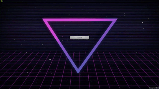
For reference, above is the last simple menu I implemented. I managed to learn about canvases, and buttons and played around with them being responsive. It was actually relatively simple.
Fixing the broke
I noticed some packages I had were now out of date. These were default packages that the project just happened to have. The Test Framework Package and the Rider Editor Package. I assumed the best thing to do was make sure everything I had was now up to date, whether I needed it or not. You never know.
Of course, the first thing I did once this was all done was try and build it. It was now an empty scene, but the project would not build. Strange.
And a little scary.
The debug log showed me that the Rider Editor was causing a lot of issues. I had no idea what I needed it for, so I searched it up. It was a package that allowed a better workflow between the Rider IDE. I don’t use this, and probably never will. So it’s now gone. With that out of the way I installed DOTween and DoozyUI 3.
The game finally built. Sure it was an empty blue screen, but at least all the errors were out of the way.
I updated the .gitattributes and .gitignore files to stop giving me crlf to lf errors and allow me to submit onto github, and I drew up a main menu mockup that ended up being a little too spooky.

Placement wise though, I think it’ll be okay. For the title font, in this placeholder at least, I wanted something a little quirky and ended up going for the font Pacifico. It’s a free google font, meaning its good for both commercial and personal use.
Next I changed my Master Canvas to be relative to screen size and set its anchors to the center. This means whatever screen size you’re viewing on, it should scale to the right dimensions instead of trying to stay in a fixed place and look awful. To make my life easier, I’ll be creating this project in a 4K resolution, so I only have to deal with scaling down instead of scaling up - to preserve quality. I really have a problem with wanting everything to be the best quality it could possibly be.

Then I reopened Github, and saw a lot of conflicting files. Was I on the right branch? I don’t know, it was all a terrible mistake.
Of course, after trying to fix up this mess something broke and things won’t build. I managed to restore the main menu set up from the bin, but was going to have to set up the connections again.
I reimported all my external assets (DoozyUI and Discourse) just to be on the safe side of things.
Then it broke again. By broke I mean I messed up by switching branches, mid project, while it was open and it became a real mess full of conflicts. I should know better.
The solution here is probably to not work on something so infrequently you forget about another branch and potentially lose all your work. So my new approach, is now that I’ve got this out of the way. To make every fortnightly build, its own branch moving forward. Originally, i wanted to split branches up by features, but I imagine I will wait until the very base of the game’s functionality is complete, and all that’s left to implement is the content heavy events. Such as dialogue and art. Those can be split into event specific branches.
Needless to say, if you do it wrong. Version control can be a real fickle bitch.
On the other hand, it’s probably my saving grace. I can recreate the menu much cleaner now, and have some better ideas on how I would do things. I also really could have rolled back to a previous version.
Reviewing the build
I checked out the build, the framerate was perfectly fine, but it felt a little slow. I probably needed the transitions to come in a lot faster. 1-2 seconds can feel awfully slow when you’re used to an immediate response.
The last unity build was only 83 MB. This might be a lot to some, considering all I put in was a fancy menu, but I appreciate how Unity strips out everything it feels isn’t being used. Somehow my previous build was actually bigger at 90 MB. I’ll have to see how it runs on other machines, and make use of loading screens. I’ll also have to get familiar with the Unity Profiler, but this may be a Unity Pro only option - something I’ll have to look into.
The unity documentation does have a few guides to optimising for mobile, which while not a goal currently -it’s not something I want to rule out just yet.
What’s Next?
Next on my To Do List for build 0.1.2 is:
Complete more UI visual concept.
Including an about/social media toggle button on the main menu.
Re-do the main menus in grayscale, so it doesn’t impact the design choices. Right now I’m focusing on placement, not colours.
Main Menu
Settings
Gallery
Remove menu/slide backgrounds and keep all main menu transitions on a low opacity alpha.
Remove button text from heart, possibly change it to an exit menu.
Implement a windowed mode, and include choices for this in the settings menu.
Allow options to change screen resolution
A help tutorial when you press play, and a help button to access it at anytime from then on.
Set up Graphics Quality toggles
Add in a splash screen scene (other than the Unity opening screen).
Add a Do you want to Quit? Popup, and code it in so it’s functional.
Toggle this so the popup comes up when you press escape, rather than ESC leading straight to quitting the application.
Do some research on existing GUIs from things like visual novels. Iv’e received recommendations such as:
Will: A Wonderful World
My Only Sunshine
The Shadows That Run Alongside Our Car.
Which should be due on the 19/20 of this month. See you then!
1 note
·
View note
Text
Epson Home Cinema 5050UB review: Superb projector for serious home theaters
New Post has been published on https://appradab.com/epson-home-cinema-5050ub-review-superb-projector-for-serious-home-theaters-2/
Epson Home Cinema 5050UB review: Superb projector for serious home theaters

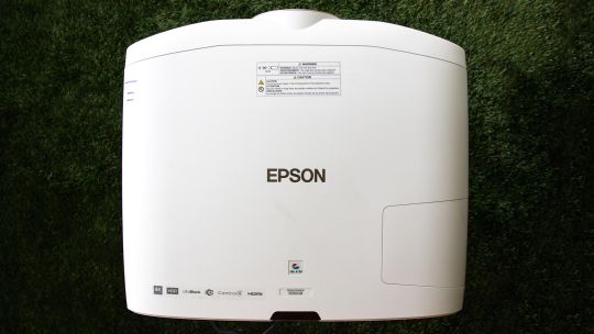
The Epson Home Cinema 5050UB is a serious home theater projector for serious home theater enthusiasts. It features a motorized lens with horizontal and vertical lens shift, plus ample zoom. Its 4K enhancement technology offers lots of detail. Its biggest benefit over less expensive 4K projectors, however, is an excellent contrast ratio for deep, dark shadows and bright, popping highlights.
Like
Superb overall picture quality
Excellent contrast ratio
Motorized lens
Ample lens shift and motorized zoom
There are only a few disappointments, and they’re minor. It doesn’t quite have the color or razor-sharp detail of its direct competitor, the LG HU810P. That’s not to say the 5050 isn’t sharp and colorful. It is, just a bit less so — although I liked the Epson’s overall picture quality a lot more than that of the LG. The 5050UB is also an absolute unit, several times larger than any of the projectors I’ve reviewed in the last year (including the LG).
In sum, the Home Cinema 5050UB is an excellent all-around projector that looks fantastic with all content. It offers a significant step up in picture quality over less expensive projectors, like the Optoma UHD35, while offering anyone with a dedicated home theater a projector worthy of the space.

Geoffrey Morrison/CNET
Specs 4(K) days
Native resolution: 4K enhancement (1920×1080 x2)
HDR-compatible: Yes
4K-compatible: Yes
3D-compatible: Yes
Lumens spec: 2,600
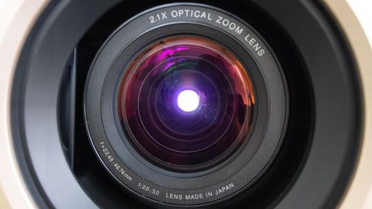
Zoom: Motorized (2.1x)
Lens shift: Motorized H/V
Lamp life (Medium mode): 4,000 hours
The 5050UB is a 4K- and HDR-compatible projector. As such, it can accept 4K and HDR signals, though keep in mind that no projector can do HDR very well.
Like all Epson projectors the 5050UB uses an LCD light engine, not the DLP that’s found in most other projectors. The ones used on the 5050UB are not technically 4K native resolution. Instead, they’re a technology called “4K enhancement” that “shifts each pixel diagonally to double Full HD resolution,” according to Epson. This is done very quickly, so it’s just a higher-resolution image to the eye. Here’s a deeper dive into the technology. The short version: It looked plenty sharp to me, if not quite as razor-like as the DLP-powered LG; see below for details.
One of the 5050’s most notable features that sets it apart from less expensive projectors is a motorized lens. This offers ±96.3% vertical and ±47.1% horizontal movement, which should be enough to let the 5050 fit in just about any home. There’s also a significant motorized zoom of 2.1x.
Now playing:
Watch this:
Six things to know about home theater projectors
2:33
Epson claims the 5050UB can produce 2,600 lumens. I actually measured slightly more than that… in the less accurate Dynamic color mode. In the more accurate Bright Cinema mode I measured roughly 192 nits, or about 1,732 lumens. This puts it among the brightest projectors we’ve ever measured.
Lamp life is on the low side. Even in the Eco mode, Epson rates it at up to 5,000 hours. Some projectors of similar brightness we’ve reviewed in the last year were capable of upward of 15,000 hours in their most lamp-conserving modes. That said, 5,000 hours is still over three years of use at four hours a night.

Geoffrey Morrison/CNET
Connectability
HDMI inputs: two HDMI 2.0
PC input: Analog RGB
USB ports: two
Audio input and output: No
Digital audio output: No
Internet: LAN
12v trigger: Yes
RS-232 remote port: Yes
Remote: Backlit
Both HDMI inputs are HDMI 2.0 and can accept up to 4K60. As you might expect from its intended use as a projector for a dedicated theater, it lacks an audio out. Epson assumes, rightly in my opinion, that anyone getting a 5050 would have a traditional projector arrangement with either a receiver or at least a soundbar for audio.
Along the same lines, there are lots of control options for home automation systems, including a 12v trigger, RS-232 and a LAN port.
The remote is a big boy (just like the projector it controls) and has a pleasant amber backlight. If you have a 2.35:1 screen, as I do, you might reach for this remote for more than just on and off, since you can zoom the projector and fill the screen with 2.35:1 content without getting off the couch. That’s always a bonus.
Geoffrey Morrison/CNET
Picture quality comparisons
LG HU810P
The LG HU810P is the most notable competition for the 5050. They’re the same price but the HU810P uses newer technology, namely two lasers and a phosphor instead of the 5050’s more traditional lamp. I connected both using a Monoprice 1×4 distribution amplifier, and viewed them side-by-side on a 12-foot-wide 1.0-gain screen.
Right off the bat, both are great projectors, but their strengths and weaknesses are almost polar opposites.
As far as light output goes, they’re very similar. In their respective most accurate modes, the LG can do 166.3 nits to the Epson’s 192. Objectively, that’s a fair bit of difference, but subjectively, side-by-side, they both just look bright. So we’ll call that more or less a tie.
Color, though, goes to the LG. The lasers, with help from a phosphor, are absolutely deeper and richer. Throw on some HDR content and the deep crimson reds and vibrant purples are far beyond what the 5050UB can produce. This is sort of like saying a Porsche is slower than a Ferrari, however, since the 5050UB is no slouch in the color department. On its own it looks great, the LG in this regard looks better.
Geoffrey Morrison/CNET
It’s a similar story with detail. The LG uses a 4K DLP chip to create an image, and detail is that technology’s main strength compared to LCD with pixel shifting, which is what Epson uses. The image just looks a little sharper, especially with motion. However, if you’re not watching them side by side, I’m not sure you’d notice. The 5050UB certainly doesn’t look soft, it’s definitely 4K to my eye.
The next aspect of picture quality is where the tide turns toward the Epson by a lot. In a word, or technically two: contrast ratio. Even without using its iris, the native contrast of the 5050UB’s three LCD chips is significantly higher than the LG — 10 times higher. So the image has significantly more punch and is less washed out. Even if you dial the LG’s lasers and iris back as much as possible, it only just matches the Epson’s black level while that projector is in its brightest and most color temperature-accurate mode.
Which is to say, the Epson’s black levels are roughly the same while at the same time (in the same mode) it is capable of having highlights or bright parts of the same image that are seven times brighter than when the LG’s lasers are dialed all the way down and the iris is closed. Flipping that around, if you match their light outputs, the Epson’s black levels in the same mode are nine times darker.

Geoffrey Morrison/CNET
What does this look like? An easy example is watching any movie with letterbox bars. If I set the projectors to be roughly the same brightness overall, the letterbox bars on the LG are gray. If I match their letterbox bars by reducing the LG’s laser power and closing its iris, it ends up looking dim compared to the Epson.
So when watching any content, the deep blacks of the 5050UB, while maintaining bright highlights, make for an extremely pleasing image.
Charge your friends admission
The Home Cinema 5050UB is an excellent projector. At $3,000 it’s certainly not cheap, but for those looking to buy a PJ for a dedicated home theater or a light-controlled living room that can do its black levels justice, the image quality is definitely a step above less expensive projectors. Is it, say, over twice as good as the $1,300 Optoma UHD35? Perhaps. The Optoma is very good for the price, but that’s certainly the caveat: “for the price.” It holds its own, but it has a way worse contrast ratio and doesn’t handle HDR nearly as well as the Epson.
I think most people would be perfectly content with the UHD35. But for enthusiasts looking for a more “home cinema” experience the… oh wait, I just said the name of the thing in the thing. Let me try that again. For those looking for a more “home theater” experience, the Epson Home Cinema 5050UB does just about everything right and looks fantastic.
Geek Box
Test Result Score Black luminance (0%) 0.046 Average Peak white luminance (100%) 192.3 Good Derived lumens 1732 Good Avg. grayscale error (10-100%) 7.624 Poor Dark gray error (20%) 6.223 Average Bright gray error (70%) 7.432 Poor Avg. color error 3.636 Average Red error 3.527 Average Green error 2.199 Good Blue error 4.345 Average Cyan error 5.111 Average Magenta error 2.461 Good Yellow error 4.173 Average Avg. saturations error 8.34 Poor Avg. color checker error 8.5 Poor Input lag (Game mode) 28.4 Good
Measurement Notes
I found the Bright Cinema color mode offered the best combination of light output and accuracy. In the six-color temperature mode, the 5050UB was pretty spot on D65 across the grayscale range. In addition, all primary and secondary colors were spot on their Rec. 709 targets. This is one of the most accurate projectors we’ve reviewed in the last year.
The native contrast ratio was excellent for a projector, with an average of 5,203:1 across various modes. For comparison, the second best contrast ratio we’ve measured recently was the BenQ HT2050A with a native contrast ratio of 2,094:1.
With the lamp mode (called Power Consumption) set to High and the iris off, the 5050UB puts out an impressive 192.3 nits, or roughly 1,732 lumens. The Eco mode drops the light output by about 30%. If you turn on the iris, which opens with bright images and closes with dark images, the dynamic contrast ratio rockets up beyond 100,000:1.
While the Bright Cinema mode looked better overall, the Cinema mode offered wider colors for HDR content. However, it was also much dimmer. I didn’t find the ~10% greater color gamut for ~60% less light to be a worthy trade-off, but feel free to check it out. The contrast ratio was about 40% better in this mode as well, which was only slightly noticeable.
If you need even more light, the Dynamic color mode puts out an impressive 323.6 nits, roughly 2,914 lumens, though the overall image isn’t as good or accurate.
0 notes
Text
Razer Book 13 Core i7 Laptop Review: Like an XPS 13, But Faster
At first glance, one might assume that the Razer Book 13 is simply a Mercury White Blade Stealth rebranded for professionals and productivity. In reality, it's actually a brand new chassis and 16:10 form factor found nowhere else in the Blade series. Razer is rightfully dedicating a distinct new family of laptops for professionals separate from the Blade name so that the Blade series can continue focusing on gamers.
Of course, the Book 13 naturally inherits more than a few features from the Blade Stealth which we will go over in detail for this review. SKUs start with the Core i5-1135G7 CPU, 1200p matte display, 8 GB of LPDDR4x RAM, and 256 GB PCIe storage for $1200 USD up to the Core i7-1165G7, 2400p glossy touchscreen, 16 GB RAM, and 512 GB SSD for $2000. Our unit is the middle option in the table below.
Competitors to the Book 13 include other 13-inch "prosumer" subnotebooks or office-centric laptops like the Dell XPS 13, HP Spectre 13, Huawei MateBook X Pro, Asus ZenBook S, Microsoft Surface Laptop 3 13, or the Lenovo ThinkBook series.
Case
From a quality, texture, and rigidity perspective, the Book 13 is essentially identical to the Blade Stealth since they use the same metal materials. If you love the feel and design of the Blade, then the Book 13 isn't going to disappoint.
The biggest chassis difference between the Book 13 and Blade Stealth lies in the new hinges. Razer had to redesign them for the new display aspect ratio without increasing the thickness of the bottom bezel. The end result is similar to the ZenBook S where the hinges are tucked underneath the base and the base itself will lift slightly when opened. Hinge rigidity doesn't feel any better or worse than on the Blade Stealth, though we noticed slight creaking when adjusting the angles on our unit. The 140-degree maximum angle is a bit shallow as well for our tastes.
The Blade Stealth is already one of the smallest 13-inch laptops in the market and the Book 13 continues the trend by being even smaller without needing to reduce screen size. Dimensions are very close to the XPS 13 to be just a tad thicker (15.2 mm vs 14.8 mm) and heavier (1.3 kg vs. 1.4 kg).
Connectivity
Port options are better than most subnotebooks as the Book 13 integrates USB-C, Thunderbolt, full-size HDMI, 3.5 mm audio, MicroSD reader, and USB-A with no strings attached. Many competing subnotebooks lack one or more to push owners into using dongles or adapters. Even the Blade Stealth doesn't have HDMI or a MicroSD reader as Razer knows Book 13 owners are more likely to be transferring photos and videos from cameras.
Communication
The Intel AX201 comes standard for Wi-Fi 6 which is one of the requirements for being an Intel Evo laptop. We experienced no connectivity issues when paired to our Netgear RAX200 test router.
Maintenance
The bottom panel requires a T5 Torx wrench to remove. However, there isn't much to upgrade or service other than the battery and M.2 SSD.
Accessories and Warranty
The retail box includes a small velvet wipe and a Razer logo sticker in addition to the usual AC adapter and paperwork. The manufacturer promises full compatibility with the Razer Core eGPU docking station as well.
A one-year warranty comes standard compared to three years on more traditional business laptops.
Input Devices
Keyboard
The Book 13 keyboard is identical to the Blade Stealth in terms of overall size and key feedback. Even the per-key RGB Chroma backlight is present to make this the only productivity subnotebook we know of with such a feature. On one hand, this is excellent for existing Blade Stealth owners as typing on the Book 13 will feel natural and familiar. On the other hand, we're not fans of the shallow travel and weak key feedback. The HP Spectre, EliteBook, ThinkPad, and MateBook X Pro all have firmer keys that we prefer for long typing sessions.
Touchpad
The clickpad is the same as on the Blade Stealth meaning it inherits all the same pros and cons. In short, we like the spacious surface (~11.1 x 7 cm) for such a small form factor while the weak and spongy click feedback could use some work. More traditional business laptops like the ThinkPad T490 or HP EliteBook 735 G6 still integrate dedicated mouse buttons which we find to be easier and more accurate to use if an external mouse is not available.
Display
As we predicted, the Book 13 uses the same or very similar Sharp LQ134N1 IPS panel as found on the Dell XPS 13 9300/9310. In fact, both laptops share almost the same maximum brightness levels and even the same pulse-width modulation frequency when at low brightness settings. This isn't a bad thing, however, as this display is a highlight of the XPS 13 and now also the Book 13. Colors pop, text is crisp, and contrast is high for great first impressions.
The display is also a big reason why the Book 13 doesn't work so well as a gaming laptop. Black-white and gray-gray response times are slower than the display on the Blade Stealth despite the excellent attributes mentioned above. Thus, ghosting is more noticeable when gaming even if the Book 13 is more powerful on paper than some older Ice Lake or GeForce MX-powered Blade Stealth SKUs.
Color space covers almost all of sRGB and approximately 66 percent of AdobeRGB not unlike the Blade Stealth or most flagship Ultrabooks. Nonetheless, the MacBook Pro 13 is able to offer deeper colors covering 77 percent of AdobeRGB while certain larger 4K panels as found on the HP Spectre 15 or XPS 15 can cover all of AdobeRGB. It's worth noting that the 4K option on the Book 13 does not offer wider color coverage than the FHD option.
X-Rite colorimeter measurements show that the display is already well-calibrated out of the box as promised in the advertisements with average grayscale and color DeltaE values of just 1.3 and 1.39, respectively, and a perfect gamma of 2.2. Attempting to calibrate the panel ourselves would result in essentially no changes.
Outdoor visibility is a bit better than the Blade Stealth due to the brighter display on the Book 13. Nonetheless, this is negated somewhat by the glossy overlay of the touchscreen. The less expensive matte SKU may fare better in this regard.
Performance
The Book 13 comes with the Intel 11th gen Tiger Lake Core i7-1165G7 CPU or, for the first time ever on a Razer laptop, a lesser Core i5 option as well. The i7-1185G7 or Iris Xe Max, which would have made the laptop even faster, are not available.
RAM is soldered at up to 16 GB of LPDDR4X running at 4267 MHz. Both CPU-Z and HWiNFO report quad-channel memory while Razer's own specifications claim dual-channel only. We'll update this once we've double-checked with Razer.
We set our system to Performance mode via Razer Synapse prior to running any performance benchmarks below. We recommend becoming familiar with Synapse since key system settings can be found here.
Processor
Multi-thread performance is higher than the average Core i7-1165G7 in our database by about 20 percent to edge out even the Core i7-1185G7 in the MSI Prestige 14 Evo. The wide delta can be attributed to the decent Turbo Boost sustainability of the Book 13 as shown by our CineBench R15 xT loop graph below. Interestingly, the recent Blade Stealth with the same Core i7-1165G7 CPU returns lower scores than our Book 13 by about 10 to 15 percent.
Opting for the less expensive Core i5-1135G7 SKU will entail a 15 to 25 percent performance deficit by our estimates. It's too bad that there are no AMD options as the Ryzen 5 4500U, Ryzen 7 4700U, or Ryzen 7 4800U could have been excellent alternatives without needing to sacrifice multi-thread performance.
See our dedicated page on the Core i7-1165G7 for more technical information and benchmark comparisons.
System Performance
PCMark results are slightly higher than the average laptop with the same CPU to edge out the XPS 13 9310 by just a few percentage points. We didn't experience any issues on our test unit save for a Razer Synapse bug where the application would always freeze if disconnected from the Internet after a system boot.
Storage Devices
Most Razer laptops ship with Samsung SSDs while a select few SKUs ship with slower Lite-On SSDs instead. Our unit comes with the Samsung PM981a for much faster performance than the mid-range Intel 660p of similar capacity.
GPU Performance
3DMark results are higher than the average Iris Xe in our database at the moment by about 10 percent. Scores are even higher than the GeForce MX250 or MX350, but actual performance in most games will vary greatly as detailed here.
See our dedicated page on Iris Xe for more technical information and benchmark comparisons.
Emissions
System Noise
The system remains silent when browsing or video streaming with no noticeable pulsing behavior. At worse, fan noise would top out at just 29 dB(A) against a background of 27 dB(A) to be essentially inaudible in a typical office or conference room. We're able to record 33 dB(A) when running higher loads like Witcher 3.
If the fan is manually set to maximum via the Synapse software, then fan noise can jump as high as 45 dB(A) to be louder than most other subnotebooks with integrated GPUs. However, we never reached this maximum even whilst benchmarking unless if the fan was manually set this way meaning the internal fans will rarely reach their maximum RPMs when on the default automatic mode.
Temperature
Surface temperatures are slightly warmer than what we recorded on the Ice Lake Blade Stealth. When running high loads for extended periods, hot spots on the top and bottom can be as warm as 34 C to 38 C and 40 C to 43 C, respectively. Temperature gradient is otherwise symmetrical much like on the Blade Stealth. The warmth is noticeable but not distracting since the hot spots are toward the rear away from the palm rests and most of the keyboard keys.
Stress Test
When stressed with Prime95, the CPU would boost to 3.8 GHz for the first few seconds until hitting a core temperature of 79 C. Thereafter, clock rates would drop and stabilize at the 2.5 to 2.7 GHz range in order to maintain a cooler core temperature of 60 C. In comparison, running this same test on the Core i7 XPS 13 9310 would cause clock rates to fall and cycle to as low as 1.9 GHz with even warmer core temperatures reaching 78 C. In other words, the Book 13 is able to run both faster than cooler than on the XPS 13 when the processor is stressed which backs up our CineBench R15 xT loop test results from above.
Core temperature appears to plateau at 60 C when running high loads similar to what we recorded on the recent Asus ZenBook UX425 equipped with the same CPU.
CPU performance drops slightly if running on battery power. A 3DMark 11 test on batteries would return Physics and Graphics scores of 10608 and 6973 points, respectively, compared to 12384 and 6812 points when on mains. Note that the Synapse "Performance" power profile becomes grayed out when not on mains.
Energy Management
Power Consumption
Idling on desktop consumes just 3 W on the minimum brightness level up to 7 W if brightness is set to maximum. The high performance-per-watt of Tiger Lake becomes obvious when comparing power consumption to the GeForce MX150-powered Blade Stealth. Gaming, for example, consumes about 37 W on the Book 13 compared to 64 W on the GeForce MX Blade Stealth even though the Book 13 offers both faster CPU and GPU performance.
We're able to measure a maximum consumption of 53.7 W from the small (~10.8 x 3.5 x 2.7 cm) 65 W AC adapter. This rate lasts for only 20 seconds when Turbo Boost clock rates are highest before they both eventually fall due to thermal soak. This can also be observed during our Prime95 stress test as noted above.
Battery Life
Though battery capacity is almost the same as on the Blade Stealth (55 Wh vs. 53 Wh), runtimes are much longer on the Book 13. We were able to squeeze almost 15 hours of WLAN use from a full charge to be a few hours more than what we recorded on both of the XPS 13 or Blade Stealth when under similar WLAN conditions.
Charging from empty to full capacity takes about 1.5 hours with the included AC adapter. We appreciate the fact that there are USB-C ports along both edges of the laptop meaning you can recharge from either side as opposed to most other Ultrabooks.
Verdict
Slap the 16:10 display from the Dell XPS 13 onto a Razer Blade Stealth and you'll essentially have the Book 13. The new Razer laptop incorporates the best of both worlds and with a stronger emphasis on performance and visual style than the Dell alternative. The fact that it uses the same Core i7-1165G7 processor as the XPS 13 and is able to run it 20 to 30 percent faster shows how well Razer has optimized the chassis for Intel's new 11th gen platform. It's slightly heavier and thicker than the Dell, but the extra horsepower, additional ports, and stronger design might be worth it to many users.
On the flip side, the Book 13 skips over a handful of common security features including support for a fingerprint reader and a Kensington lock. You're also not going to find any advanced vPro or handsfree sign-in options that are available on the Latitude 7400 or HP EliteBook x360 1030 G7. The RGB-lit keys, while visually appealing, have weaker feedback than the keys on most other business-class subnotebooks. Call us old school, but dedicated mouse buttons and wider hinge angles like on most Lenovo ThinkPads ultimately feel more ergonomic when on the road. If your priorities are to have the best-looking and fastest 13-inch laptop in the office over such auxiliary features, however, then the Book 13 proudly fulfills that niche.
0 notes
Text
10 Tips for Designing Logos That Don’t Suck
So you’re designing a logo. It sounds like an easy enough task, right? Draw a circle, type in the company name and you’re done (I’ve literally heard a designer suggest that very process). Unfortunately, if you’re really worth the money the client is paying you, there’s a lot more to it than that.
There are a million people in the logo design industry today dishing out crappy logos in bulk for crowdsourcing sites. How do you as a serious professional stand out from the crowd and produce quality logos that don’t suck? Read on to find out.
Are you in the middle of a logo design project? Don’t forget to check out our in-depth guide on how to design a logo!
Pro Tip: Use a Logo Template
If you’re looking for a quick start with a logo design, experimenting with a logo template can be a great initial step. It can help give you a starting point for your logo design, on which you can build and adapt.
Envato Elements has a collection of over 6,000 logo templates that you can access for a low monthly price of $17 (as well as icons, photos, graphic templates, and more). Here are a few of our favorites!
1. Use a Visual Double Entendre
Some of my favorite logos in the world utilize a technique that I like to call a visual double entendre, which is an overly fancy way to say that it has two pictures wrapped into one through clever interpretation of a concept or idea.
The WinePlace logo below is a perfect example.
This logo takes on the shape of a thumbtack, which suggests “location” or “place,” but it also clearly looks like an upside down wine glass. Logo designs that use this technique come off as clever and memorable. Viewers love the little mind game that you’re playing and are more prone to appreciate a design because of it.
In the past, we’ve put together a post of clever negative space logos like the one below. Check it out if you love this type of logo design as much as I do!
2. Color is Vitally Important
One of the most important considerations for logo design is the color palette. This is not a superficial decision, color carries meanings and communicates ideas.
Sometimes you’re pegged to the colors of a brand, but other times you’ll have the freedom to explore. I love the rich palette used in the Zion logo below.
The colors here grab you and pull you in, they bring life to the illustration and give further context to the shape of the landscape. That being said, remember that a good logo is versatile and will still function well in grayscale:
Beyond a grayscale version, I like to also provide clients with a true single color version, using only black and negative space. This would be a little tricky with the logo above, but definitely possible.
Always consider what it is that the logo will be used for and whether or not the various use cases require different versions.
3. Avoid the Cliché
Every few years or so, some new fads come along in logo design. I personally love to study design trends and you might even find me suggesting jumping onto a few bandwagons to keep up with the times, but with logos, I just hate it when a bunch of designers use the same idea over and over.
The basic archetype above is being used again and again in logo design right now and it’s getting old fast. Why not use a design that you actually thought up yourself rather than ripping off what everyone else is doing?
We have an entire article dedicated to showcasing logo design clichés, be sure to check it out to make sure you’re not guilty of uninspired logo design.
4. Make it Ownable
I don’t believe that “ownable” is a real word, but you nevertheless hear it quite a bit in marketing (marketers love to make up words). The concept is definitely an important one that ties closely to the previous tip.
Rather than following the herd and using a cliché design, you should instead strive for something that is uniquely recognizable. I’ve always appreciated the Evernote logo in this regard:
It’s really just an elephant head, which doesn’t sound like a very unique concept. However, the way it’s drawn with the curled trunk and page fold in the ear makes it instantly recognizable.
As you’re designing logos, consider whether or not your design is generic or unique. Is it likely that others will produce something similar? Remember, your first idea is typically your most generic (it’s also everyone else’s first idea). Try filling a notebook page or two with some rough sketches before choosing which ideas to pursue further.
5. Everybody Loves Custom Type
While we’re on the subject of being unique, there’s almost nothing that can give your logo a unique feel quite like some awesome custom lettering.
Too often we see logo design as simply a trip to the font menu to see which typeface makes the company name look best. If someone is paying you to “design” their logo, they probably expect you to put a little more effort into it.
Too often we see logo design as simply a trip to the font menu.
Custom type helps to ensure that your unique logo will stay that way. Lowlife designers will rip off your work in a heartbeat if they discover which typeface you’re using, but it takes some real skill to mimic custom hand-drawn type!
Keep in mind though that if your logo is famous enough, people will always try to rip it off. This certainly holds true for my favorite script logo:
The awesome Coca-Cola script has been stolen countless times in awkward parodies throughout the last few decades.
6. Keep it Simple Stupid
Let’s face it, not everyone can bust out a beautiful, hand-drawn script on a whim. Just because you’re a designer doesn’t mean you’re an awesome illustrator or typographer (though it helps). If you fit this description, fear not, there’s nothing preventing you from making awesome logos.
In this situation, remember these four powerful words: keep it simple stupid! Simple but powerful logos permeate the business world and always prove to be the best icons for standing the test of time.
In considering how to construct one of these types of logos, let’s discuss the Apple logo. The silhouette of an apple is nothing special or memorable:
It’s that missing bite that takes it to the next level. It gives the logo character, makes it unique, and drives the meaning deeper (computers and bytes, get it?). Without the bite, the apple is boring, with it, the apple is suddenly iconic.
Always think about how you can go that extra mile and turn your boring logos into unmistakable brand marks.
7. Consider Proportion & Symmetry
Some people can get carried away with discussions of proportion and symmetry (see the new Pepsi logo pitch), but if we strip out the crazy, there’s still some important lessons here. Consider the new Twitter logo as an example:
Here circles aren’t used to convince you of some strange cosmic tale that makes no sense, they’re simply used as a guide to create a well balanced logo with consistent curves and arcs.
Despite the fact that the bite seems to violate the symmetry of the Apple logo above, if we dig deeper we can see that there was still a lot of through put into proportion and symmetry here (image source):
8. Think About Negative Space
Along the same vein as a double entendre is the age-old trick of utilizing the negative space in a logo in some clever way. The industry standard example of this technique is the FedEx logo and its hidden arrow.
Don’t see it yet? Keep looking, it’s there. That’s what I love about this logo, the use of negative space is so subtle. Most people in the U.S. see the FedEx logo daily or weekly for years as it drives by on the side of countless trucks and they never even notice the arrow.
Logopond is chock full of great logo designs that utilize negative space in a cool way. Check out the example below, which blends together the idea of bull horns and a wine glass.
9. Passive vs. Active
One interesting facet of logo design that I’ve been considering a lot lately is the concept of instilling motion or a sense of activity into a logo. This isn’t always appropriate (such as with the Apple logo), but sometimes it can really give a logo the boost it needs, both from a visual and conceptual standpoint.
As an example, let’s look again to the Twitter logo. Way back in the early days, the bird went from sitting perched and passive to becoming active and taking flight.
In the most recent iteration, they took this concept even further by pointing the bird in an upward direction to indicate that it’s climbing into the air rather than floating along the same old trajectory.
A sense of motion is especially important when it comes to logos with mascots. The image of the marlin below doesn’t depict the fish merely lying still, instead, it’s leaping into the air in a victorious pose.
This concept even extends to typically inanimate objects. Consider how much better the logo below portrays the concept of “rough house” by instilling a sense of motion.
10. Know What it Means
It’s great when you as a designer can show a client how much thought and reasoning went into the logo that you produced for them.
Every good logo has a story. Far beyond simply a pretty sketch, strong logos are filled with meaning, both obvious and hidden. We discussed this in several cases above. The FedEx logo’s arrow indicates moving forward and making deliveries, the Apple logo has a “byte” missing, and the Twitter bird is flying in an upward trajectory.
Half the time I wonder if logo designers don’t come up with the meaning after the logo is already produced, but regardless, it’s great when you as a designer can show a client how much thought and reasoning went into the logo that you produced for them.
Clients might think that all they want is something fresh and cool, but if you instead provide a logo that ties into the company’s core values and mission, you’ll blow their minds and they’ll love you for it.
If you’re into hidden logo meanings, check out our post titled “Five Fascinating Things You Didn’t Know About Famous Car Logos.”
Do Your Logos Suck?
Now that you’ve read our tips for designing logos that don’t suck, leave a comment below and let us know what you think of your own work in this area.
Are you an awesome logo designer or is it something that you struggle with? Which of the tips above are useful to you and what tips can you offer to other designers?
from Design Shack https://ift.tt/1Uc2yYW
10 Tips for Designing Logos That Don’t Suck was first published on https://ift.tt/2TTUXBP
from https://ift.tt/2XDeOHZ
0 notes
Text
Cheap Canvas Art Prints Online
Style your home with Cheap Canvas Art Prints Online
youtube
Are you thinking of ways to style your home especially the living room? Consider using cheap canvas art prints online to style your home. There are affordable canvas prints that can effectively transform your living room to a paradise that you love living in. Whatever the case, whether your printer has packed up on you, or you are away from home, or you are simply in need of a cheap printing service near you, you do have options.
Cheap canvas printing by 55printing.com are a cheaper option to painting the house or buying hand paintings that sometimes cost a fortune. It is also long lasting and does not require lots of care except for occasional wiping to prevent dust buildup. Here are ways to go about styling your living room with low cost canvas prints. Perhaps you have considered the cost of printing something bulky by yourself and would require a cheap printing service. For one thing, the presence of cloud technologies has made “printing on the go” much easier.
Identify the Canvas Design theme
Usually, any decoration follows a given theme. The theme is the main idea behind certain style. The theme can be your love for nature (bring nature prints), travel, flowers, football and so forth. You can also have more than a single theme for use in creating pieces of art.
cheap canvas art prints online
Have the pieces of art created
Talk to your creative designer to look for images that match your theme. It always good to leave the selection of the images to be printed on your canvas to a professional designer. A professional designer has the tools and access to quality digital images that will produce quality prints for your living room.
You can have quality but cheap photos as well as cost-effective canvas prints that are of great quality. Work with a professional designer from the very first step to have quality at a very low cost.
Think of something that matches with your overall style
While you can contrast your canvas print with the general style of your home, matching with the style of your living room brings a profound effect of amplifying the effect that you need to be felt by your clients.
You can go simple on the cheap canvas art prints online
Grays, blacks and whites are lovely when professionally designed and arranged. You can have grayscale images, black writings on a white surface or vise versa or partially grayscale images with color on areas that you would like to highlight.
A splash of colors also works well
Use the cheap canvas art prints online to bring your living room to life. Play with several hues and colors across your room to bring about more light or brightness to the room. You can go on the opposite and play with aqua and green hues to bring about a feeling of coolness and relaxation.
Think out of the box
You do not have to have flower prints all the time, you can think the sea, the galaxy, abstract ideas, cartoon characters and many more. Consider something different from the norm for your house will look amazing.
Canvas is the next frontier in styling living spaces. It is easy to create and lasts long. You can get cheap canvas prints for your living room. A shoestring budget is not a reason not to style your living room according to your preference. Consider several canvas designs in the market. Order, have it designed, printed on the canvas and displayed on your living room. It is a piece of priceless beauty to behold.
Tips for effective canvas banner marketing
The use of cheap canvas art prints online banners is an effective tool for marketing your services and products at events and trade shows. Since banners are big, they are easily noticed from a far. Banner printing is very affordable and has the lowest cost per impression. Here are basic tips to getting the very best from your banner marketing campaign.
Feature a targeted message
Start developing a message for your promotional campaign. When creating your message, consider your clients. What do they want? How does the brand fulfill their desires? Do they know that the brand has the capability? How can the message give them hope and trust in the capabilities of the brand?
Your banners should tell the customers what you have for them. Moreover, it should tell them what to do next. The action could be to visit your site, call, stop and walk into your business premises. You should have something that entices them to do the action. For example, a discount, a free offers and so forth.
Keep the message simple and memorable
To maximize the effectiveness of your banner marketing campaign keep the message short, bold, and straight to the point. Use humor and rhyme to enhance recall. People who are seeing your banner are not there for the sake of your marketing campaign. They either saw it when looking for a product or as they were passing by. Therefore make it visually compelling so that they will pause and see what is on offer.
Take time with the design
The design of your cheap canvas banner must top notch in order to get clients to read the message. With the advertising noise all over the place, your banner must stand out for it to grab attention. Some of the ways that you can command attention include
Use of contrasting colors
Using bold and also headlines that are too large
Use unique images that are not expected
Have lots of value texts, dollar signs, percentage symbol and much more
Use numbers to explain figures instead words
You do not have to use each of these tips on a single banner. Sometimes a simple text based banner produces as many results as banner that have intricately included some works of art.
Place the economic printed canvas in a strategic location
Targeted placement produces effective results on your banner marketing campaign, as you are visible in the right audience. If you are targeting shoppers always consider placing your economic canvas banners in shopping districts, traffic intersections during community events. Ensure that the location of the banner is place where it will get maximum exposure to the targeted audience. You can have several banners in different locations to maximize exposure to your targeted audience.
Quality canvas banners are not expensive
You can get quality canvas banners at very low prices. Economically printed cheapest canvas will not dig a hole into your marketing budget. Shop around for quality cheap banner designers. It is good to see some of the work that they have done before and looking at the print quality before signing the contract. It gives you confidence in their work.
The post Cheap Canvas Art Prints Online appeared first on Cheap 55 Printing.
from Cheap 55 Printing https://www.cheap55printing.com/blog/cheap-canvas-art-prints-online/
from Cheap 55 Printing https://cheap55printing.tumblr.com/post/176194979392
0 notes
Text
Cheap Canvas Art Prints Online
Style your home with Cheap Canvas Art Prints Online
youtube
Are you thinking of ways to style your home especially the living room? Consider using cheap canvas art prints online to style your home. There are affordable canvas prints that can effectively transform your living room to a paradise that you love living in. Whatever the case, whether your printer has packed up on you, or you are away from home, or you are simply in need of a cheap printing service near you, you do have options.
Cheap canvas printing by 55printing.com are a cheaper option to painting the house or buying hand paintings that sometimes cost a fortune. It is also long lasting and does not require lots of care except for occasional wiping to prevent dust buildup. Here are ways to go about styling your living room with low cost canvas prints. Perhaps you have considered the cost of printing something bulky by yourself and would require a cheap printing service. For one thing, the presence of cloud technologies has made “printing on the go” much easier.
Identify the Canvas Design theme
Usually, any decoration follows a given theme. The theme is the main idea behind certain style. The theme can be your love for nature (bring nature prints), travel, flowers, football and so forth. You can also have more than a single theme for use in creating pieces of art.
cheap canvas art prints online
Have the pieces of art created
Talk to your creative designer to look for images that match your theme. It always good to leave the selection of the images to be printed on your canvas to a professional designer. A professional designer has the tools and access to quality digital images that will produce quality prints for your living room.
You can have quality but cheap photos as well as cost-effective canvas prints that are of great quality. Work with a professional designer from the very first step to have quality at a very low cost.
Think of something that matches with your overall style
While you can contrast your canvas print with the general style of your home, matching with the style of your living room brings a profound effect of amplifying the effect that you need to be felt by your clients.
You can go simple on the cheap canvas art prints online
Grays, blacks and whites are lovely when professionally designed and arranged. You can have grayscale images, black writings on a white surface or vise versa or partially grayscale images with color on areas that you would like to highlight.
A splash of colors also works well
Use the cheap canvas art prints online to bring your living room to life. Play with several hues and colors across your room to bring about more light or brightness to the room. You can go on the opposite and play with aqua and green hues to bring about a feeling of coolness and relaxation.
Think out of the box
You do not have to have flower prints all the time, you can think the sea, the galaxy, abstract ideas, cartoon characters and many more. Consider something different from the norm for your house will look amazing.
Canvas is the next frontier in styling living spaces. It is easy to create and lasts long. You can get cheap canvas prints for your living room. A shoestring budget is not a reason not to style your living room according to your preference. Consider several canvas designs in the market. Order, have it designed, printed on the canvas and displayed on your living room. It is a piece of priceless beauty to behold.
Tips for effective canvas banner marketing
The use of cheap canvas art prints online banners is an effective tool for marketing your services and products at events and trade shows. Since banners are big, they are easily noticed from a far. Banner printing is very affordable and has the lowest cost per impression. Here are basic tips to getting the very best from your banner marketing campaign.
Feature a targeted message
Start developing a message for your promotional campaign. When creating your message, consider your clients. What do they want? How does the brand fulfill their desires? Do they know that the brand has the capability? How can the message give them hope and trust in the capabilities of the brand?
Your banners should tell the customers what you have for them. Moreover, it should tell them what to do next. The action could be to visit your site, call, stop and walk into your business premises. You should have something that entices them to do the action. For example, a discount, a free offers and so forth.
Keep the message simple and memorable
To maximize the effectiveness of your banner marketing campaign keep the message short, bold, and straight to the point. Use humor and rhyme to enhance recall. People who are seeing your banner are not there for the sake of your marketing campaign. They either saw it when looking for a product or as they were passing by. Therefore make it visually compelling so that they will pause and see what is on offer.
Take time with the design
The design of your cheap canvas banner must top notch in order to get clients to read the message. With the advertising noise all over the place, your banner must stand out for it to grab attention. Some of the ways that you can command attention include
Use of contrasting colors
Using bold and also headlines that are too large
Use unique images that are not expected
Have lots of value texts, dollar signs, percentage symbol and much more
Use numbers to explain figures instead words
You do not have to use each of these tips on a single banner. Sometimes a simple text based banner produces as many results as banner that have intricately included some works of art.
Place the economic printed canvas in a strategic location
Targeted placement produces effective results on your banner marketing campaign, as you are visible in the right audience. If you are targeting shoppers always consider placing your economic canvas banners in shopping districts, traffic intersections during community events. Ensure that the location of the banner is place where it will get maximum exposure to the targeted audience. You can have several banners in different locations to maximize exposure to your targeted audience.
Quality canvas banners are not expensive
You can get quality canvas banners at very low prices. Economically printed cheapest canvas will not dig a hole into your marketing budget. Shop around for quality cheap banner designers. It is good to see some of the work that they have done before and looking at the print quality before signing the contract. It gives you confidence in their work.
The post Cheap Canvas Art Prints Online appeared first on Cheap 55 Printing.
from Cheap 55 Printing https://www.cheap55printing.com/blog/cheap-canvas-art-prints-online/
0 notes
Text
Cheap Canvas Art Prints Online
Style your home with Cheap Canvas Art Prints Online
Are you thinking of ways to style your home especially the living room? Consider using cheap canvas art prints online to style your home. There are affordable canvas prints that can effectively transform your living room to a paradise that you love living in. Whatever the case, whether your printer has packed up on you, or you are away from home, or you are simply in need of a cheap printing service near you, you do have options.
Cheap canvas printing by 55printing.com are a cheaper option to painting the house or buying hand paintings that sometimes cost a fortune. It is also long lasting and does not require lots of care except for occasional wiping to prevent dust buildup. Here are ways to go about styling your living room with low cost canvas prints. Perhaps you have considered the cost of printing something bulky by yourself and would require a cheap printing service. For one thing, the presence of cloud technologies has made “printing on the go” much easier.
Identify the Canvas Design theme
Usually, any decoration follows a given theme. The theme is the main idea behind certain style. The theme can be your love for nature (bring nature prints), travel, flowers, football and so forth. You can also have more than a single theme for use in creating pieces of art.
cheap canvas art prints online
Have the pieces of art created
Talk to your creative designer to look for images that match your theme. It always good to leave the selection of the images to be printed on your canvas to a professional designer. A professional designer has the tools and access to quality digital images that will produce quality prints for your living room.
You can have quality but cheap photos as well as cost-effective canvas prints that are of great quality. Work with a professional designer from the very first step to have quality at a very low cost.
Think of something that matches with your overall style
While you can contrast your canvas print with the general style of your home, matching with the style of your living room brings a profound effect of amplifying the effect that you need to be felt by your clients.
You can go simple on the cheap canvas art prints online
Grays, blacks and whites are lovely when professionally designed and arranged. You can have grayscale images, black writings on a white surface or vise versa or partially grayscale images with color on areas that you would like to highlight.
A splash of colors also works well
Use the cheap canvas art prints online to bring your living room to life. Play with several hues and colors across your room to bring about more light or brightness to the room. You can go on the opposite and play with aqua and green hues to bring about a feeling of coolness and relaxation.
Think out of the box
You do not have to have flower prints all the time, you can think the sea, the galaxy, abstract ideas, cartoon characters and many more. Consider something different from the norm for your house will look amazing.
Canvas is the next frontier in styling living spaces. It is easy to create and lasts long. You can get cheap canvas prints for your living room. A shoestring budget is not a reason not to style your living room according to your preference. Consider several canvas designs in the market. Order, have it designed, printed on the canvas and displayed on your living room. It is a piece of priceless beauty to behold.
Tips for effective canvas banner marketing
The use of cheap canvas art prints online banners is an effective tool for marketing your services and products at events and trade shows. Since banners are big, they are easily noticed from a far. Banner printing is very affordable and has the lowest cost per impression. Here are basic tips to getting the very best from your banner marketing campaign.
Feature a targeted message
Start developing a message for your promotional campaign. When creating your message, consider your clients. What do they want? How does the brand fulfill their desires? Do they know that the brand has the capability? How can the message give them hope and trust in the capabilities of the brand?
Your banners should tell the customers what you have for them. Moreover, it should tell them what to do next. The action could be to visit your site, call, stop and walk into your business premises. You should have something that entices them to do the action. For example, a discount, a free offers and so forth.
Keep the message simple and memorable
To maximize the effectiveness of your banner marketing campaign keep the message short, bold, and straight to the point. Use humor and rhyme to enhance recall. People who are seeing your banner are not there for the sake of your marketing campaign. They either saw it when looking for a product or as they were passing by. Therefore make it visually compelling so that they will pause and see what is on offer.
Take time with the design
The design of your cheap canvas banner must top notch in order to get clients to read the message. With the advertising noise all over the place, your banner must stand out for it to grab attention. Some of the ways that you can command attention include
Use of contrasting colors
Using bold and also headlines that are too large
Use unique images that are not expected
Have lots of value texts, dollar signs, percentage symbol and much more
Use numbers to explain figures instead words
You do not have to use each of these tips on a single banner. Sometimes a simple text based banner produces as many results as banner that have intricately included some works of art.
Place the economic printed canvas in a strategic location
Targeted placement produces effective results on your banner marketing campaign, as you are visible in the right audience. If you are targeting shoppers always consider placing your economic canvas banners in shopping districts, traffic intersections during community events. Ensure that the location of the banner is place where it will get maximum exposure to the targeted audience. You can have several banners in different locations to maximize exposure to your targeted audience.
Quality canvas banners are not expensive
You can get quality canvas banners at very low prices. Economically printed cheapest canvas will not dig a hole into your marketing budget. Shop around for quality cheap banner designers. It is good to see some of the work that they have done before and looking at the print quality before signing the contract. It gives you confidence in their work.
The post Cheap Canvas Art Prints Online appeared first on Cheap 55 Printing.
from
https://www.cheap55printing.com/blog/cheap-canvas-art-prints-online/
from Cheap 55 Printing - Blog http://cheap55printing.weebly.com/blog/cheap-canvas-art-prints-online8399047
0 notes
Text
Cheap Canvas Art Prints Online
Style your home with Cheap Canvas Art Prints Online
youtube
Are you thinking of ways to style your home especially the living room? Consider using cheap canvas art prints online to style your home. There are affordable canvas prints that can effectively transform your living room to a paradise that you love living in.
Cheap canvas printing by 55printing.com are a cheaper option to painting the house or buying hand paintings that sometimes cost a fortune. It is also long lasting and does not require lots of care except for occasional wiping to prevent dust buildup. Here are ways to go about styling your living room with low cost canvas prints
Identify the Canvas Design theme
Usually, any decoration follows a given theme. The theme is the main idea behind certain style. The theme can be your love for nature (bring nature prints), travel, flowers, football and so forth. You can also have more than a single theme for use in creating pieces of art.
cheap canvas art prints online
Have the pieces of art created
Talk to your creative designer to look for images that match your theme. It always good to leave the selection of the images to be printed on your canvas to a professional designer. A professional designer has the tools and access to quality digital images that will produce quality prints for your living room.
You can have quality but cheap photos as well as cost-effective canvas prints that are of great quality. Work with a professional designer from the very first step to have quality at a very low cost.
Think of something that matches with your overall style
While you can contrast your canvas print with the general style of your home, matching with the style of your living room brings a profound effect of amplifying the effect that you need to be felt by your clients.
You can go simple on the cheap canvas art prints online
Grays, blacks and whites are lovely when professionally designed and arranged. You can have grayscale images, black writings on a white surface or vise versa or partially grayscale images with color on areas that you would like to highlight.
A splash of colors also works well
Use the cheap canvas art prints online to bring your living room to life. Play with several hues and colors across your room to bring about more light or brightness to the room. You can go on the opposite and play with aqua and green hues to bring about a feeling of coolness and relaxation.
Think out of the box
You do not have to have flower prints all the time, you can think the sea, the galaxy, abstract ideas, cartoon characters and many more. Consider something different from the norm for your house will look amazing.
Canvas is the next frontier in styling living spaces. It is easy to create and lasts long. You can get cheap canvas prints for your living room. A shoestring budget is not a reason not to style your living room according to your preference. Consider several canvas designs in the market. Order, have it designed, printed on the canvas and displayed on your living room. It is a piece of priceless beauty to behold.
Tips for effective canvas banner marketing
The use of cheap canvas art prints online banners is an effective tool for marketing your services and products at events and trade shows. Since banners are big, they are easily noticed from a far. Banner printing is very affordable and has the lowest cost per impression. Here are basic tips to getting the very best from your banner marketing campaign.
Feature a targeted message
Start developing a message for your promotional campaign. When creating your message, consider your clients. What do they want? How does the brand fulfill their desires? Do they know that the brand has the capability? How can the message give them hope and trust in the capabilities of the brand?
Your banners should tell the customers what you have for them. Moreover, it should tell them what to do next. The action could be to visit your site, call, stop and walk into your business premises. You should have something that entices them to do the action. For example, a discount, a free offers and so forth.
Keep the message simple and memorable
To maximize the effectiveness of your banner marketing campaign keep the message short, bold, and straight to the point. Use humor and rhyme to enhance recall. People who are seeing your banner are not there for the sake of your marketing campaign. They either saw it when looking for a product or as they were passing by. Therefore make it visually compelling so that they will pause and see what is on offer.
Take time with the design
The design of your cheap canvas banner must top notch in order to get clients to read the message. With the advertising noise all over the place, your banner must stand out for it to grab attention. Some of the ways that you can command attention include
Use of contrasting colors
Using bold and also headlines that are too large
Use unique images that are not expected
Have lots of value texts, dollar signs, percentage symbol and much more
Use numbers to explain figures instead words
You do not have to use each of these tips on a single banner. Sometimes a simple text based banner produces as many results as banner that have intricately included some works of art.
Place the economic printed canvas in a strategic location
Targeted placement produces effective results on your banner marketing campaign, as you are visible in the right audience. If you are targeting shoppers always consider placing your economic canvas banners in shopping districts, traffic intersections during community events. Ensure that the location of the banner is place where it will get maximum exposure to the targeted audience. You can have several banners in different locations to maximize exposure to your targeted audience.
Quality canvas banners are not expensive
You can get quality canvas banners at very low prices. Economically printed cheapest canvas will not dig a hole into your marketing budget. Shop around for quality cheap banner designers. It is good to see some of the work that they have done before and looking at the print quality before signing the contract. It gives you confidence in their work.
The post Cheap Canvas Art Prints Online appeared first on Cheap 55 Printing.
Source: https://www.cheap55printing.com/blog/cheap-canvas-art-prints-online/
from Cheap 55 Printing https://cheap55printing.wordpress.com/2017/05/23/cheap-canvas-art-prints-online/
0 notes
Link
(Via: Hacker News)
Why I wrote this tutorial
In attempting to understand the inner workings of JPEG compression, I was unable to find any real details on the net for how Huffman coding is used in the context of JPEG image compression. There are many sites that describe the generic huffman coding scheme, but none that describe how it will appear in a JPEG image, after factoring in the DHT tables, interleaved chroma subsampling components, etc. While it is relatively easy to understand the JPEG marker extraction, the Start of Scan data segment is the least understood and most important part of the image data. Therefore, I decided to create a page to walk through a decompression example. Hopefully others will find this useful!
The relevant sections in the JPEG Standard are quite obscure -- enough so that I set out to analyze several JPEG images to reverse-engineer how the huffman coding was being applied in a JPEG JFIF file.
Latest Update:
[09/22/2009]: Corrected Table 5 (added entry for DC 00 code).
[09/19/2008]: Corrected Table 1 (added entry for codes of length 9 bits).
[12/03/2007]: Corrected typo in text near Table 5 (code 00101). Added JPEGsnoop output (at end of Tutorial).
[01/27/2007]: Added section describing how to expand DHT into bit strings.
The Goal
The goal of this tutorial is to take a simple JPEG image and try to decode the compressed image data by hand, learning how the Huffman compression scheme works in the process.
Simplest JPEG Example
Most digital photos are full-color natural/organic images, which means that all three image components (one luminance and two color channels) will all have both low and high-frequency content. In addition, nearly all digital photos use chroma subsampling, which makes the extraction process a little more complicated. For the purposes of showing the basic huffman extraction, we will start with the simplest of all JPEG images:
Grayscale - no content in the two color channels
Solid color in each MCU - By making all pixels in an 8x8 block the same color, there will be no AC components.
No chroma subsampling - Makes scan data extraction simpler: Y, Cb, Cr, Y, Cb, Cr, etc.
Small Image - Total image size is 16x8 = two MCUs or blocks. This makes the extraction in this tutorial shorter.
Creating the Image
For the purposes of this tutorial, my working image will simply be a 16x8 pixel image, with two solid color blocks: one black and the other white. Note that each block is 8x8 pixels in size. The actual image is here: . If you want to download it, right-click and select Save Picture As...
Creating the sample image was trivial, working at 1600% view. Important that dimensions and any changes in the content are on 8-pixel boundaries. Overall image dimensions should be a multiple of 8 pixels as well, in both directions. The image below is a magnified version with a grid overlayed.
Once the image was created, it was saved with Photoshop CS2's Save for Web... command. This kept the file size down as it discards other extraneous file information (metadata, etc.) that is not relevant to this tutorial. Some other important points:
Use Save for Web - Reduces total file content to minimal subset.
Use Quality level 51+ - This ensures that there is no chroma subsampling enabled in the JPEG encoding process, according to the way that Photoshop Save for Web operates. I used quality 80 for this example.
Turn Optimized Off - For the purposes of this example, I think it is important to work with realistic huffman tables, not degenerate single-entry tables. Therefore I recommend that JPEG Huffman Table Optimization is left off.
Other settings: Blur off, Progressive off, ICC profile off.
Grayscale Photoshop Images
It should be noted that when you save a JPEG image from within Photoshop it always contains three components (Y, Cb, Cr). If you change the mode to grayscale (via Mode->Grayscale), the three components are still saved, even though the JPEG standard supports an image with only one component (which would be assumed to be grayscale).
What is Huffman Coding / Entropy Coding?
Huffman coding is a method that takes symbols (e.g. bytes, DCT coefficients, etc.) and encodes them with variable length codes that are assigned according to statistical probabilities. A frequently-used symbol will be encoded with a code that takes up only a couple bits, while symbols that are rarely used are represented by symbols that take more bits to encode.
A JPEG file contains up to 4 huffman tables that define the mapping between these variable-length codes (which take between 1 and 16 bits) and the code values (which is an 8-bit byte). Creating these tables generally involves counting how frequently each symbol (DCT code word) appears in an image, and allocating the bit strings accordingly. But, most JPEG encoders simply use the huffman tables presented in the JPEG standard. Some encoders allow one to optimize these tables, which means that an optimal binary tree is created which allows a more efficient huffman table to be generated.
For a reasonable explanation of how it works, please see this example of Huffman coding an ASCII string and the overview from Wikipedia.
For more details, please see my article on Optimized JPEGs - optimizing the huffman tables, particularly the first introductory sections and the section near the end titled "Standard Huffman Tables".
Decoding the JPEG Scan Data
Using JPEGsnoop
For those who are trying to understand the complex huffman decoding in a JPEG image, I'm happy to report that JPEGsnoop can now report all of the variable length code decoding for each MCU (use the Detailed Decode option). For the sample output, scroll to the bottom of this tutorial.
Decoding by Hand
The following is the decode method done by hand, which is obviously impractical for most images, but is shown here in detail to help one learn the process involved.
The above hex dump datastream shows the beginning of the Start of Scan (SOS marker 0xFFDA) marked in yellow, followed by some additional details in green and then the actual scan data selected in dark blue. Finally, the image is terminated with an End of Image (EOI marker 0xFFD9). So, the huffman-coded data content is only 9 bytes long.
Comparison of Compression File Sizes
For the sake of comparison, the original image (16 pixels by 8 pixels) contains a total of 128 pixels (2 MCUs). With 8 bits per channel (RGB), this corresponds to an uncompressed image size of 384 bytes (128 pixels x 8 bits/channel x 3 channels x 1 byte/8 bits). Clearly, using a run-length encoded format such as GIF would have produced even more image compression in examples like this (although GIF actually takes 22 bytes to code the stream because there are 16 separate runs). JPEG is not really designed to be optimized for this type of synthetic (non-organic) image.
If one uses optimized JPEG encoding, it is possible to reduce the image content size even further. In the example image, the optimized version has much smaller huffman tables (DHT) and shorter bitstrings to represent the same codewords. The net effect is that the image content size is reduced even further (to 7 bytes).
File Format Total Size Overhead Size Image Content Size BMP (Uncompressed) 440 Bytes 56 Bytes 384 Bytes JPEG 653 Bytes 644 Bytes 9 Bytes JPEG (Optimized) 304 Bytes 297 Bytes 7 Bytes GIF 60 Bytes 38 Bytes 22 Bytes
Scan Data Decode
The scan data is:
FC FF 00 E2 AF EF F3 15 7F
To help resiliency in the case of data corruption, the JPEG standard allows JPEG markers to appear in the huffman-coded scan data segment. Therefore, a JPEG decoder must watch out for any marker (as indicated by the 0xFF byte, followed by a non-zero byte). If the huffman coding scheme needed to write a 0xFF byte, then it writes a 0xFF followed by a 0x00 -- a process known as adding a stuff byte.
For our extraction purposes, we will replaceme any padding bytes (0xFF00 with 0xFF):
FC FF E2 AF EF F3 15 7F
The expectation is that image content is 3 components (Y, Cb, Cr). Within each component, the sequence is always one DC value followed by 63 AC values.
For each MCU, with no chroma subsampling, we would expect the following data to be encoded:
Section 1 2 3 4 5 6 Component Y Cb Cr AC / DC DC AC DC AC DC AC
Note that some people get the order of the chrominance channels mixed up, and assume that it is YCrCb instead.
The figure below shows what the DCT matrix from a single MCU (8x8 pixel square) in a digital photo typically looks like. These are the entries after quantization, which has caused many of the higher-frequency components (towards the bottom-right corner of the matrix) to become zero. By the distribution of values in the frequency-domain matrix representation, it is possible to determine that the 8x8 pixel square had very little high-frequency content (i.e. it had only a gradual intensity / color change).
The DC component represents the average value of all pixels in the 8x8 MCU. Since we have deliberately created an image where all pixels in the 8x8 block are the same, we expect this value to represent either the black or white "color". The code provided in the DC entry (#0) indicates a huffman-encoded size (e.g. 1-10 bits) which is the number of bits needed to represent the average value for the MCU (eg. -511...+511).
Note that the DC component is encoded as a relative value with respect to the DC component of the previous block. The first block in the JPEG image is assumed to have a previous block value of zero.
Following the single DC component entry, one or more entries are used to describe the remaining 63 entries in the MCU. These entries (1..63) represent the low and high-frequency AC coefficients after DCT transformation and quantization. The earlier entries represent low-frequency content, while the later entries represent high-frequency image content. Since the JPEG compression algorithm uses quantization to reduce many of these high-frequency values to zero, one typically has a number of non-zero entries in the earlier coefficients and a long run of zero coefficients to the end of the matrix.
For the purposes of this tutorial, I have deliberately created an image that has constant color across all 8x8 pixels in each of the two MCU. Because there are no changes in value across each 8x8 pixel region, there is no AC (or higher frequency content) within the block. As a result, all 63 entries in the AC portion are expected to be zero (unlike the figure above). This allows us to focus on the DC component, which we do expect to change from MCU to MCU block.
The hex string shown earlier (after removal of padding bytes) can be represented in binary as the following:
1111 1100 1111 1111 1110 0010 1010 1111 1110 1111 1111 0011 0001 0101 0111 1111
Extract Huffman Code Tables
Using a utility such as JPEGsnoop, you can extract the Huffman tables from the JPEG image file. Often, you will find four huffman table entries (tagged with a DHT marker):
DHT Class=0 ID=0 - Used for DC component of Luminance (Y)
DHT Class=1 ID=0 - Used for AC component of Luminance (Y)
DHT Class=0 ID=1 - Used for DC component of Chrominance (Cb & Cr)
DHT Class=1 ID=1 - Used for AC component of Chrominance (Cb & Cr)
The huffman compression tables are encoded in a somewhat confusing manner. Although you can draw out the binary tree by hand, it will be easier if you rely on a tool such as JPEGsnoop to generate all of the binary comparison strings for each huffman code in all four DHT sections.
The following four tables were extracted from the JPEG file that was created by Photoshop for the purposes of this tutorial. Other JPEG images may be reliant on different DHT tables, so it is important to extract them prior to analyzing the file. Note that turning on JPEG Optimization will create vastly different Huffman tables, with far fewer entries. For a point of comparison, the image described in this tutorial would only need optimized huffman tables of one entry each to represent our image content.
NOTE: It is important to realize that in each case the DHT entries in the JPEG file only list the Length and Code values, not the actual Bit String mapping. It is up to you to rebuild the binary tree representation of the DHT table to derive the bit strings! Please see the DHT Expansion section near the end of this tutorial for more details.
Table 1 - Huffman - Luminance (Y) - DC
Length Bits Code 3 bits 000
001
010
011
100
101
110 04
05
03
02
06
01
00 (End of Block) 4 bits 1110 07 5 bits 1111 0 08 6 bits 1111 10 09 7 bits 1111 110 0A 8 bits 1111 1110 0B
Table 2 - Huffman - Luminance (Y) - AC
Length Bits Code 2 bits 00
01 01
02 3 bits 100 03 4 bits 1010
1011
1100 11
04
00 (End of Block) 5 bits 1101 0
1101 1
1110 0 05
21
12 6 bits 1110 10
1110 11 31
41 ... ... ... 12 bits ...
1111 1111 0011
... ...
F0 (ZRL)
... ... ... ... 16 bits ...
1111 1111 1111 1110 ...
FA
Table 3 - Huffman - Chrominance (Cb & Cr) - DC
Length Bits Code 2 bits 00
01 01
00 (End of Block) 3 bits 100
101 02
03 4 bits 1100
1101
1110 04
05
06 5 bits 1111 0 07 6 bits 1111 10 08 7 bits 1111 110 09 8 bits 1111 1110 0A 9 bits 1111 1111 0 0B
Table 4 - Huffman - Chrominance (Cb & Cr) - AC
Length Bits Code 2 bits 00
01 01
00 (End of Block) 3 bits 100
101 02
11 4 bits 1100 03 5 bits
1101 0
1101 1
04
21 6 bits 1110 00
1110 01
1110 10 12
31
41 ... ... ... 9 bits ...
1111 1100 0
... ...
F0 (ZRL)
... ... ... ... 16 bits ...
1111 1111 1111 1110 ...
FA
Table 5 - Huffman DC Value Encoding
The following table shows how the bit fields that follow a DC entry can be converted into their signed decimal equivalent. To use this table, start with the DC code value and then extract "Size" number of bits after the code. These "Additional Bits" will represent a signed "DC Value" which becomes the DC value for that block. Note that this table applies to any JPEG file -- this table is not written anywhere in the JPEG file itself.
For example, let's assume that one was about to decompress a chrominance DC entry. If the previously-decoded "DC Code" was 05, then we must extract 5 bits following the code bits. If the next 5 bits were 00101, then this can be interpreted as decimal -26. The bits 10001 would be +17 and 11110 would be +30.
DC Code Size Additional Bits DC Value 00 0 0 01 1 0 1 -1 1 02 2 00,01 10,11 -3,-2 2,3 03 3 000,001,010,011 100,101,110,111 -7,-6,-5,-4 4,5,6,7 04 4 0000,...,0111 1000,...,1111 -15,...,-8 8,...,15 05 5 0 0000,... ...,1 1111 -31,...,-16 16,...,31 06 6 00 0000,... ...,11 1111 -63,...,-32 32,...,63 07 7 000 0000,... ...,111 1111 -127,...,-64 64,...,127 08 8 0000 0000,... ...,1111 1111 -255,...,-128 128,...,255 09 9 0 0000 0000,... ...,1 1111 1111 -511,...,-256 256,...,511 0A 10 00 0000 0000,... ...,11 1111 1111 -1023,...,-512 512,...,1023 0B 11 000 0000 0000,... ...,111 1111 1111 -2047,...,-1024 1024,...,2047
Block 1 - Luminance
Luminance (Y) - DC
Referring to the Y(DC) table (Table 1), we start with the first few bits of the coded stream (1111 1100 1111...) and recognize that code x0A matches the bit string 1111 110.
1111 1100 1111 1111 1110 0010 1010 1111 1110 1111 1111 0011 0001 0101 0111 1111
=> Code: 0A
This code implies that hex A (10) additional bits follow to represent the signed value of the DC component. The next ten bits after this code is 0 1111 1111 1. Table 5 above shows the DC values represented by these "additional bits" -- in this case, the bit string corresponds to a value of -512.
1111 1100 1111 1111 1110 0010 1010 1111 1110 1111 1111 0011 0001 0101 0111 1111
=> Value: -512
Our progress so far:
Bits 1111 1100 1111 1111 1 110 0010 1010 1111 1110 1111 1111 0011 0001 0101 0111 1111 MCU 1 ??? Component Y ??? AC/DC DC ??? Value -512 ???
Luminance (Y) - AC
After the DC component, we begin the 63-entry AC matrix for the Y Luminance. This uses a different Huffman table (Table 2).
1111 1100 1111 1111 1110 0010 1010 1111 1110 1111 1111 0011 0001 0101 0111 1111
=> Code: 00 (EOB)
In the above huffman code table, the code 1100 corresponds to an EOB (End of Block). Therefore, the AC components was cut short early (no other codes). This means that all 63 entries of the matrix (all entries except the 1st entry, which is the DC component) are zeros. Since we have finished the luminance component, we then move on to the chrominance components (Cb and Cr).
Bits 1111 1100 1111 1111 1 1100 010 1010 1111 1110 1111 1111 0011 0001 0101 0111 1111 MCU 1 ??? Component Y ??? AC/DC DC AC ??? Value -512 0 ???
Block 1 - Chrominance
Chrominance (Cb) - DC
1111 1100 1111 1111 1110 0010 1010 1111 1110 1111 1111 0011 0001 0101 0111 1111
=> Code: 00 (EOB)
End of chrominance DC, start on AC.
Chrominance (Cb) - AC
1111 1100 1111 1111 1110 0010 1010 1111 1110 1111 1111 0011 0001 0101 0111 1111
=> Code: 00 (EOB)
Again, the AC is terminated right away. Now, we move on to the second chrominance channel, Cr.
Bits 1111 1100 1111 1111 1 1100 01 01 010 1111 1110 1111 1111 0011 0001 0101 0111 1111 MCU 1 ??? Component Y Cb ??? AC/DC DC AC DC AC ??? Value -512 0 0 0 ???
Chrominance (Cr) - DC
Refer to Table 3 for the relevant Huffman codes.
1111 1100 1111 1111 1110 0010 1010 1111 1110 1111 1111 0011 0001 0101 0111 1111
=> Code: 00 (EOB)
This marks the end of the DC.
Chrominance (Cr) - AC
Refer to Table 4 for the relevant Huffman codes.
1111 1100 1111 1111 1110 0010 1010 1111 1110 1111 1111 0011 0001 0101 0111 1111
=> Code: 00 (EOB)
This marks the end of the AC.
Bits 1111 1100 1111 1111 1 1100 01 01 01 01 111 1110 1111 1111 0011 0001 0101 0111 1111 MCU 1 ??? Component Y Cb Cr ??? AC / DC DC AC DC AC DC AC ??? Value -512 0 0 0 0 0 ???
Block 2 - Luminance
Luminance (Y) - DC
1111 1100 1111 1111 1110 0010 1010 1111 1110 1111 1111 0011 0001 0101 0111 1111
=> CODE: 0A
This code indicates that the value is stored in the next ten bits (A in hex is 10 in decimal):
1111 1100 1111 1111 1110 0010 1010 1111 1110 1111 1111 0011 0001 0101 0111 1111
=> Value: +1020
Bits 1111 1100 1111 1111 1 1100 01 01 01 01 111 1110 1111 1111 00 11 0001 0101 0111 1111 MCU 1 2 ??? Component Y Cb Cr Y ??? AC / DC DC AC DC AC DC AC DC ??? Value -512 0 0 0 0 0 +1020 ???
Luminance (Y) - AC
1111 1100 1111 1111 1110 0010 1010 1111 1110 1111 1111 0011 0001 0101 0111 1111
=> CODE: EOB
The end-of-block indicator means that all remaining values are zero. Since we haven't even started with the first value, all 63 values can be interpreted as zero. This means that there is no non-DC image content, which is to be expected since all 64 pixels (8x8) in the block are the same color.
Bits 1111 1100 1111 1111 1 1100 01 01 01 01 111 1110 1111 1111 00 1100 01 0101 0111 1111 MCU 1 2 ??? Component Y Cb Cr Y ??? AC / DC DC AC DC AC DC AC DC AC ??? Value -512 0 0 0 0 0 +1020 0 ???
Block 2 - Chrominance
Chrominance (Cb) - DC
1111 1100 1111 1111 1110 0010 1010 1111 1110 1111 1111 0011 0001 0101 0111 1111
=> CODE: 00 (EOB)
Chrominance (Cb) - AC
1111 1100 1111 1111 1110 0010 1010 1111 1110 1111 1111 0011 0001 0101 0111 1111
=> CODE: 00 (EOB)
Chrominance (Cr) - DC
1111 1100 1111 1111 1110 0010 1010 1111 1110 1111 1111 0011 0001 0101 0111 1111
=> CODE: 00 (EOB)
Chrominance (Cr) - AC
1111 1100 1111 1111 1110 0010 1010 1111 1110 1111 1111 0011 0001 0101 0111 1111
=> CODE: 00 (EOB)
Bits 1111 1100 1111 1111 1 1100 01 01 01 01 111 1110 1111 1111 00 1100 01 01 01 01 11 1111 MCU 1 2 X Component Y Cb Cr Y Cb Cr X AC / DC DC AC DC AC DC AC DC AC DC AC DC AC X Value -512 0 0 0 0 0 +1020 0 0 0 0 0 X
Remainder
Because the scan data must end on a byte boundary, there may be a remainder of bits that will simply be tossed. In this case we see 6 bits (all-1's) that will be discarded.
1111 1100 1111 1111 1110 0010 1010 1111 1110 1111 1111 0011 0001 0101 0111 1111
Conversion to Spatial Domain
Now that we have the DCT (Discrete Cosine Transform) values, we can try to determine what the content of the image was in the spatial domain. Remember that the DC & AC values that we decompressed from the huffman coding are the frequency-domain representation of the image, not the real YCbCr values.
Given that all of the values in the Cb and Cr channels (chrominance) are zero, we can assume that the image is grayscale and instaed focus on the luminance values (brightness).
Second, all of the AC component values are zero, which means that there is no higher frequency content in the images -- in fact, we can determine that all of the image data in each 8x8 block is of the same color & intensity (i.e. only the DC component remains).
We can determine the following:
Block Encoded (Relative) DC Value 1 Y = -512 2 Y = +1020
Relative DC to Absolute DC
Note that the DC components are encoded as a difference from the previous block (with the first block assumed to start relative to zero). Therefore, we know that block 1 has a DC value of -512, but that block 2 has a DC value of +1020 relative to block 1. So, we now know:
Block Actual (Absolute) DC Value 1 Y = -512 2 Y = +508
DCT to RGB
Finally, we want to convert the DCT DC value to an RGB value. Assuming that the gain of the DCT transform is 4, we divide the values by 4 to get block1 = -128, block2 = +127.
Now, we have to convert between YCbCr and RGB. Please refer to the formulae provided on the JPEG color conversion page. There, you will see that we require a level shift of +128 to get input values in the range (0..255).
Color conversion yields RGB values of:
Block RGB Value (hex) RGB Value (decimal) 1 (0x00,0x00,0x00) (0,0,0) 2 (0xFF,0xFF,0xFF) (255,255,255)
... and these are the original values that were used to create the JPEG image!
Expansion of DHT Table into binary bit strings
Note that the DHT tables that appear in the JPEG file only define the number of codes for each bitstring length, followed by a sequence of all the code words. The bit strings that are used to represent each of these code words is not included! It is the job of the JPEG decoder to derive these bit strings from the little information that is provided.
There are many methods in which the generation of the binary strings is performed in a decoder, and most of them are heavily optimized for performance (e.g. the djpeg huffman routines). These implementations are quite difficult to learn from. I find it much more instructive to generate these bit sequences by drawing out the huffman binary tree by hand.
In an extreme simplification, binary trees are composed of a root node which has a left and right branch to other nodes. Each of these nodes can either be a leaf node (the end of a branch) or split further into two more nodes.
The actual DHT in the JPEG file:
The following was extracted directly from the DHT (Define Huffman Table, shown above in Table 2: Luminance AC) in the JPEG file using JPEGsnoop.
Class = 1 (AC Table) Destination ID = 0 Codes of length 01 bits (000 total): Codes of length 02 bits (002 total): 01 02 Codes of length 03 bits (001 total): 03 Codes of length 04 bits (003 total): 11 04 00 Codes of length 05 bits (003 total): 05 21 12 Codes of length 06 bits (002 total): 31 41 Codes of length 07 bits (004 total): 51 06 13 61 Codes of length 08 bits (002 total): 22 71 Codes of length 09 bits (006 total): 81 14 32 91 A1 07 Codes of length 10 bits (007 total): 15 B1 42 23 C1 52 D1 Codes of length 11 bits (003 total): E1 33 16 Codes of length 12 bits (004 total): 62 F0 24 72 Codes of length 13 bits (002 total): 82 F1 Codes of length 14 bits (006 total): 25 43 34 53 92 A2 Codes of length 15 bits (002 total): B2 63 Codes of length 16 bits (115 total): 73 C2 35 44 27 93 A3 B3 36 17 54 64 74 C3 D2 E2 08 26 83 09 0A 18 19 84 94 45 46 A4 B4 56 D3 55 28 1A F2 E3 F3 C4 D4 E4 F4 65 75 85 95 A5 B5 C5 D5 E5 F5 66 76 86 96 A6 B6 C6 D6 E6 F6 37 47 57 67 77 87 97 A7 B7 C7 D7 E7 F7 38 48 58 68 78 88 98 A8 B8 C8 D8 E8 F8 29 39 49 59 69 79 89 99 A9 B9 C9 D9 E9 F9 2A 3A 4A 5A 6A 7A 8A 9A AA BA CA DA EA FA Total number of codes: 162
So, how do we create the binary bit-strings for each of these codes?
Well, we start to build a binary tree, creating new branches and putting the code words into leaf nodes of the tree. Row 1 of the tree contains code words that only require 1 bit to encode, row 2 contains code words (leaf nodes) that only require 2 bits to encode and so on.
We first start with row 0:
Row 0 (the root node) is almost always a parent node, creating a left and a right branch down to the next row. We label the left branch 0 and the right branch 1.
At row 1, we try to fill in any of the nodes (there are 2 at this level) with code words that take 1 bit to encode. We see from the DHT that there are no codes of length 1 bit. So, for each of the two nodes we spawn off a left and right node below (on row 2), creating a total of 4 nodes. Again, for these branches, we label the left one 0 and the right one 1.
At row 2, we will try to fill in any codes of length 2 bits, starting from left to right. This time we see in the DHT that there are two codes that can be encoded with bit strings of length 2. So, we take the first code value x01 (hex) and place this in the first node, making it a leaf node (no further branches will come from it). We then take the second code value x02 and place this in the second node, making it too a leaf node. At this point we have two more nodes left in this row of the tree but no more codewords listed in the DHT for this bitstring length. Therefore, we create two branches for each of the remaining nodes of this row. Since two nodes are left, this will create a total of 4 branches, meaning that there will be again 4 nodes in the third row of the binary tree.
At row 3, we have four nodes available, but the DHT indicates only one codeword uses 3 bits to encode. So, we place x03 at the leftmost of these nodes, and we create branches for each of the remaining three nodes (making 6 nodes for row 4).
At row 4, we have six nodes available, but the DHT indicates only three codewords use 4 bits to encode. This time we terminate three nodes (making them leaf nodes) and we further extend the other three down to row 5.
This process continues until we have used all of the codewords defined in the DHT table. The diagram below shows the expansion of the first four rows of the above DHT.
Binary Tree Expansion of DHT
NOTE: I understand from VG that the above representation may be "right-oriented" rather than "left-oriented"
Once the binary tree has been completed, you can read off the bit strings for each code word by combining the bit labels of each branch on the path down from the root node. For example, code word 0x04 is encoded by the binary bit string 1011 because we need to take branch 1 from the root node, 0 from the node on row 1, 1 from the node on row 2 and branch 1 from the node on row 3.
This process can be quite laborious, and the binary tree often takes on a shape that would be difficult to draw through to completion. To make this easier, I have added a feature, DHT Expand, to JPEGsnoop that determines the binary bit strings for each of the code words appearing in the DHT table.
Below is the expansion of the first few rows of the table, using JPEGsnoop with the DHT Expand mode enabled.
Expanded Form of Codes: Codes of length 02 bits: 00 = 01 01 = 02 Codes of length 03 bits: 100 = 03 Codes of length 04 bits: 1010 = 11 1011 = 04 1100 = 00 (EOB) Codes of length 05 bits: 11010 = 05 11011 = 21 11100 = 12 Codes of length 06 bits: 111010 = 31 111011 = 41 Codes of length 07 bits: 1111000 = 51 ... Codes of length 15 bits: 111111111000100 = B2 111111111000101 = 63 Codes of length 16 bits: 1111111110001100 = 73 1111111110001101 = C2 ... 1111111111111100 = DA 1111111111111101 = EA 1111111111111110 = FA
Implementations in real JPEG decoders optimize this mechanism heavily as the bitstring search / parsing process is not a trivial task in processors designed to work with 32-bit words or bytes. Most of them end up creating large lookup tables that define lower and upper bounds for a match of a particular bitstring / code.
More Realistic JPEG Images
Obviously the above is an extremely simple example JPEG image. However, real images will have some other characteristics that you will encounter:
Chroma subsampling - You can expect that most photos will have 2x1 chroma subsampling, which will mean that the decoding sequence per MCU will be Y1 Y2 Cb Cr instead of Y Cb Cr.
AC components - You most certainly will have non-zero AC coefficients, unlike the above. In such a case, you will generally have a few non-zero values, which will eventually be terminated with a ZRL (code word 0xF0) which indicates a run of 16 zeros and then probably a EOB (code word 0x00).
Some more detail regarding Huffman coding with chroma subsampling and other factors are described in the JPEG decoder page.
JPEGsnoop Detailed Decode Output
Running JPEGsnoop on the image shown above, with the Scan Segment->Detailed Decode option enabled, the following output is shown:
*** Decoding SCAN Data *** OFFSET: 0x00000282 Scan Decode Mode: Full IDCT (AC + DC) Lum (Tbl #0), MCU=[0,0] [0x00000282.0]: ZRL=[ 0] Val=[ -512] Coef=[00= DC] Data=[0x FC FF 00 E2 = 0b (11111100 11111111 1------- --------)] [0x00000285.1]: ZRL=[ 0] Val=[ 0] Coef=[01..01] Data=[0x E2 AF EF F3 = 0b (-1100--- -------- -------- --------)] EOB DCT Matrix=[-1024 0 0 0 0 0 0 0] [ 0 0 0 0 0 0 0 0] [ 0 0 0 0 0 0 0 0] [ 0 0 0 0 0 0 0 0] [ 0 0 0 0 0 0 0 0] [ 0 0 0 0 0 0 0 0] [ 0 0 0 0 0 0 0 0] [ 0 0 0 0 0 0 0 0] Chr(0) (Tbl #1), MCU=[0,0] [0x00000285.5]: ZRL=[ 0] Val=[ 0] Coef=[00= DC] Data=[0x E2 AF EF F3 = 0b (-----01- -------- -------- --------)] EOB [0x00000285.7]: ZRL=[ 0] Val=[ 0] Coef=[01..01] Data=[0x E2 AF EF F3 = 0b (-------0 1------- -------- --------)] EOB DCT Matrix=[ 0 0 0 0 0 0 0 0] [ 0 0 0 0 0 0 0 0] [ 0 0 0 0 0 0 0 0] [ 0 0 0 0 0 0 0 0] [ 0 0 0 0 0 0 0 0] [ 0 0 0 0 0 0 0 0] [ 0 0 0 0 0 0 0 0] [ 0 0 0 0 0 0 0 0] Chr(0) (Tbl #1), MCU=[0,0] [0x00000286.1]: ZRL=[ 0] Val=[ 0] Coef=[00= DC] Data=[0x AF EF F3 15 = 0b (-01----- -------- -------- --------)] EOB [0x00000286.3]: ZRL=[ 0] Val=[ 0] Coef=[01..01] Data=[0x AF EF F3 15 = 0b (---01--- -------- -------- --------)] EOB DCT Matrix=[ 0 0 0 0 0 0 0 0] [ 0 0 0 0 0 0 0 0] [ 0 0 0 0 0 0 0 0] [ 0 0 0 0 0 0 0 0] [ 0 0 0 0 0 0 0 0] [ 0 0 0 0 0 0 0 0] [ 0 0 0 0 0 0 0 0] [ 0 0 0 0 0 0 0 0] Lum (Tbl #0), MCU=[1,0] [0x00000286.5]: ZRL=[ 0] Val=[ 1020] Coef=[00= DC] Data=[0x AF EF F3 15 = 0b (-----111 11101111 111100-- --------)] [0x00000288.6]: ZRL=[ 0] Val=[ 0] Coef=[01..01] Data=[0x F3 15 7F FF = 0b (------11 00------ -------- --------)] EOB DCT Matrix=[ 2040 0 0 0 0 0 0 0] [ 0 0 0 0 0 0 0 0] [ 0 0 0 0 0 0 0 0] [ 0 0 0 0 0 0 0 0] [ 0 0 0 0 0 0 0 0] [ 0 0 0 0 0 0 0 0] [ 0 0 0 0 0 0 0 0] [ 0 0 0 0 0 0 0 0] Chr(0) (Tbl #1), MCU=[1,0] [0x00000289.2]: ZRL=[ 0] Val=[ 0] Coef=[00= DC] Data=[0x 15 7F FF D9 = 0b (--01---- -------- -------- --------)] EOB [0x00000289.4]: ZRL=[ 0] Val=[ 0] Coef=[01..01] Data=[0x 15 7F FF D9 = 0b (----01-- -------- -------- --------)] EOB DCT Matrix=[ 0 0 0 0 0 0 0 0] [ 0 0 0 0 0 0 0 0] [ 0 0 0 0 0 0 0 0] [ 0 0 0 0 0 0 0 0] [ 0 0 0 0 0 0 0 0] [ 0 0 0 0 0 0 0 0] [ 0 0 0 0 0 0 0 0] [ 0 0 0 0 0 0 0 0] Chr(0) (Tbl #1), MCU=[1,0] [0x00000289.6]: ZRL=[ 0] Val=[ 0] Coef=[00= DC] Data=[0x 15 7F FF D9 = 0b (------01 -------- -------- --------)] EOB [0x0000028A.0]: ZRL=[ 0] Val=[ 0] Coef=[01..01] Data=[0x 7F FF D9 00 = 0b (01------ -------- -------- --------)] EOB DCT Matrix=[ 0 0 0 0 0 0 0 0] [ 0 0 0 0 0 0 0 0] [ 0 0 0 0 0 0 0 0] [ 0 0 0 0 0 0 0 0] [ 0 0 0 0 0 0 0 0] [ 0 0 0 0 0 0 0 0] [ 0 0 0 0 0 0 0 0] [ 0 0 0 0 0 0 0 0]
0 notes
Text
Epson Home Cinema 5050UB review: Superb projector for serious home theaters
New Post has been published on https://appradab.com/epson-home-cinema-5050ub-review-superb-projector-for-serious-home-theaters/
Epson Home Cinema 5050UB review: Superb projector for serious home theaters
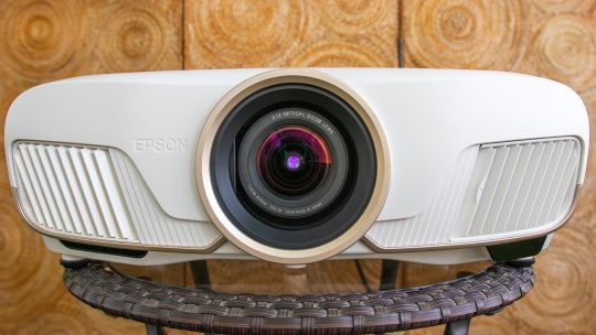
The Epson Home Cinema 5050UB is a serious home theater projector for serious home theater enthusiasts. It features a motorized lens with horizontal and vertical lens shift, plus ample zoom. Its 4K enhancement technology offers lots of detail. Its biggest benefit over less expensive 4K projectors, however, is an excellent contrast ratio for deep, dark shadows and bright, popping highlights.
Like
Superb overall picture quality
Excellent contrast ratio
Motorized lens
Ample lens shift and motorized zoom
There are only a few disappointments, and they’re minor. It doesn’t quite have the color or razor-sharp detail of its direct competitor, the LG HU810P. That’s not to say the 5050 isn’t sharp and colorful. It is, just a bit less so — although I liked the Epson’s overall picture quality a lot more than that of the LG. The 5050UB is also an absolute unit, several times larger than any of the projectors I’ve reviewed in the last year (including the LG).
In sum, the Home Cinema 5050UB is an excellent all-around projector that looks fantastic with all content. It offers a significant step up in picture quality over less expensive projectors, like the Optoma UHD35, while offering anyone with a dedicated home theater a projector worthy of the space.

Geoffrey Morrison/CNET
Specs 4(K) days
Native resolution: 4K enhancement (1920×1080 x2)
HDR-compatible: Yes
4K-compatible: Yes
3D-compatible: Yes
Lumens spec: 2,600
Zoom: Motorized (2.1x)
Lens shift: Motorized H/V
Lamp life (Medium mode): 4,000 hours
The 5050UB is a 4K- and HDR-compatible projector. As such, it can accept 4K and HDR signals, though keep in mind that no projector can do HDR very well.
Like all Epson projectors the 5050UB uses an LCD light engine, not the DLP that’s found in most other projectors. The ones used on the 5050UB are not technically 4K native resolution. Instead, they’re a technology called “4K enhancement” that “shifts each pixel diagonally to double Full HD resolution,” according to Epson. This is done very quickly, so it’s just a higher-resolution image to the eye. Here’s a deeper dive into the technology. The short version: It looked plenty sharp to me, if not quite as razor-like as the DLP-powered LG; see below for details.
One of the 5050’s most notable features that sets it apart from less expensive projectors is a motorized lens. This offers ±96.3% vertical and ±47.1% horizontal movement, which should be enough to let the 5050 fit in just about any home. There’s also a significant motorized zoom of 2.1x.
Now playing:
Watch this:
Six things to know about home theater projectors
2:33
Epson claims the 5050UB can produce 2,600 lumens. I actually measured slightly more than that… in the less accurate Dynamic color mode. In the more accurate Bright Cinema mode I measured roughly 192 nits, or about 1,732 lumens. This puts it among the brightest projectors we’ve ever measured.
Lamp life is on the low side. Even in the Eco mode, Epson rates it at up to 5,000 hours. Some projectors of similar brightness we’ve reviewed in the last year were capable of upward of 15,000 hours in their most lamp-conserving modes. That said, 5,000 hours is still over three years of use at four hours a night.

Geoffrey Morrison/CNET
Connectability
HDMI inputs: two HDMI 2.0
PC input: Analog RGB
USB ports: two
Audio input and output: No
Digital audio output: No
Internet: LAN
12v trigger: Yes
RS-232 remote port: Yes
Remote: Backlit
Both HDMI inputs are HDMI 2.0 and can accept up to 4K60. As you might expect from its intended use as a projector for a dedicated theater, it lacks an audio out. Epson assumes, rightly in my opinion, that anyone getting a 5050 would have a traditional projector arrangement with either a receiver or at least a soundbar for audio.
Along the same lines, there are lots of control options for home automation systems, including a 12v trigger, RS-232 and a LAN port.
The remote is a big boy (just like the projector it controls) and has a pleasant amber backlight. If you have a 2.35:1 screen, as I do, you might reach for this remote for more than just on and off, since you can zoom the projector and fill the screen with 2.35:1 content without getting off the couch. That’s always a bonus.

Geoffrey Morrison/CNET
Picture quality comparisons
LG HU810P
The LG HU810P is the most notable competition for the 5050. They’re the same price but the HU810P uses newer technology, namely two lasers and a phosphor instead of the 5050’s more traditional lamp. I connected both using a Monoprice 1×4 distribution amplifier, and viewed them side-by-side on a 12-foot-wide 1.0-gain screen.
Right off the bat, both are great projectors, but their strengths and weaknesses are almost polar opposites.
As far as light output goes, they’re very similar. In their respective most accurate modes, the LG can do 166.3 nits to the Epson’s 192. Objectively, that’s a fair bit of difference, but subjectively, side-by-side, they both just look bright. So we’ll call that more or less a tie.
Color, though, goes to the LG. The lasers, with help from a phosphor, are absolutely deeper and richer. Throw on some HDR content and the deep crimson reds and vibrant purples are far beyond what the 5050UB can produce. This is sort of like saying a Porsche is slower than a Ferrari, however, since the 5050UB is no slouch in the color department. On its own it looks great, the LG in this regard looks better.

Geoffrey Morrison/CNET
It’s a similar story with detail. The LG uses a 4K DLP chip to create an image, and detail is that technology’s main strength compared to LCD with pixel shifting, which is what Epson uses. The image just looks a little sharper, especially with motion. However, if you’re not watching them side by side, I’m not sure you’d notice. The 5050UB certainly doesn’t look soft, it’s definitely 4K to my eye.
The next aspect of picture quality is where the tide turns toward the Epson by a lot. In a word, or technically two: contrast ratio. Even without using its iris, the native contrast of the 5050UB’s three LCD chips is significantly higher than the LG — 10 times higher. So the image has significantly more punch and is less washed out. Even if you dial the LG’s lasers and iris back as much as possible, it only just matches the Epson’s black level while that projector is in its brightest and most color temperature-accurate mode.
Which is to say, the Epson’s black levels are roughly the same while at the same time (in the same mode) it is capable of having highlights or bright parts of the same image that are seven times brighter than when the LG’s lasers are dialed all the way down and the iris is closed. Flipping that around, if you match their light outputs, the Epson’s black levels in the same mode are nine times darker.
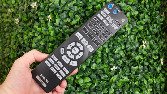
Geoffrey Morrison/CNET
What does this look like? An easy example is watching any movie with letterbox bars. If I set the projectors to be roughly the same brightness overall, the letterbox bars on the LG are gray. If I match their letterbox bars by reducing the LG’s laser power and closing its iris, it ends up looking dim compared to the Epson.
So when watching any content, the deep blacks of the 5050UB, while maintaining bright highlights, make for an extremely pleasing image.
Charge your friends admission
The Home Cinema 5050UB is an excellent projector. At $3,000 it’s certainly not cheap, but for those looking to buy a PJ for a dedicated home theater or a light-controlled living room that can do its black levels justice, the image quality is definitely a step above less expensive projectors. Is it, say, over twice as good as the $1,300 Optoma UHD35? Perhaps. The Optoma is very good for the price, but that’s certainly the caveat: “for the price.” It holds its own, but it has a way worse contrast ratio and doesn’t handle HDR nearly as well as the Epson.
I think most people would be perfectly content with the UHD35. But for enthusiasts looking for a more “home cinema” experience the… oh wait, I just said the name of the thing in the thing. Let me try that again. For those looking for a more “home theater” experience, the Epson Home Cinema 5050UB does just about everything right and looks fantastic.
Geek Box
Test Result Score Black luminance (0%) 0.046 Average Peak white luminance (100%) 192.3 Good Derived lumens 1732 Good Avg. grayscale error (10-100%) 7.624 Poor Dark gray error (20%) 6.223 Average Bright gray error (70%) 7.432 Poor Avg. color error 3.636 Average Red error 3.527 Average Green error 2.199 Good Blue error 4.345 Average Cyan error 5.111 Average Magenta error 2.461 Good Yellow error 4.173 Average Avg. saturations error 8.34 Poor Avg. color checker error 8.5 Poor Input lag (Game mode) 28.4 Good
Measurement Notes
I found the Bright Cinema color mode offered the best combination of light output and accuracy. In the six-color temperature mode, the 5050UB was pretty spot on D65 across the grayscale range. In addition, all primary and secondary colors were spot on their Rec. 709 targets. This is one of the most accurate projectors we’ve reviewed in the last year.
The native contrast ratio was excellent for a projector, with an average of 5,203:1 across various modes. For comparison, the second best contrast ratio we’ve measured recently was the BenQ HT2050A with a native contrast ratio of 2,094:1.
With the lamp mode (called Power Consumption) set to High and the iris off, the 5050UB puts out an impressive 192.3 nits, or roughly 1,732 lumens. The Eco mode drops the light output by about 30%. If you turn on the iris, which opens with bright images and closes with dark images, the dynamic contrast ratio rockets up beyond 100,000:1.
While the Bright Cinema mode looked better overall, the Cinema mode offered wider colors for HDR content. However, it was also much dimmer. I didn’t find the ~10% greater color gamut for ~60% less light to be a worthy trade-off, but feel free to check it out. The contrast ratio was about 40% better in this mode as well, which was only slightly noticeable.
If you need even more light, the Dynamic color mode puts out an impressive 323.6 nits, roughly 2,914 lumens, though the overall image isn’t as good or accurate.
0 notes
Last Seen Blogs