#so it looks like i might have to change how the video is rendered which will impact performance 😩
Text
Updating... The Tattooer (ver. 3.4)!
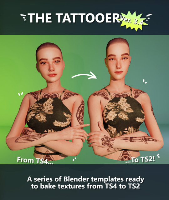
Finally! Took me a while, huh. This is the updated version of the Tattooer project. It skips some steps, making the workflow much, much faster! Huge thanks to @applewatersugar for his
suggestion on how to bake textures while preserving the transparency. This is kind of a repost of the original Tattooer post, but it actually has some new stuff and a few changes here and there, so please take a look if you want to learn how to use this new version.
This is a series of Blender template files already set up to quickly bake textures from The Sims 4 to The Sims 2. The different Blender files will allow you to:
-Bake body textures from TS4 to TS2 (Female)
-Bake body textures from TS4 to TS2 (Male)
-Bake body textures from TS4 (Female) to TS2 (Male)
-Bake body textures from TS2 (Female) to TS2 (Male) [Bonus!]
-New! Bake face textures from TS4 to TS2 (Unisex) [Bonus!]
-Bake head textures from TS4 to TS2 (Face + Scalp) (Unisex) [Still experimental]
Check the file names to see which one is which, and the resolution of the baked texture it will give.
Everything you see in the render above was 100% converted using those Blender files.
Download here! SFS / GD
Update: Version 3.4.1 (27/08/2023) Fixed some issues on the shoulders for the AF-body-4t2-1024 and AF-body-4t2-2048 templates. Now the top straps on most converted underwear/swimwear should look right.
Update: Same version (13/12/2023) As requested, added a new spanish version of the included pdf guide!
These templates were made mainly to bake and convert tattoos, but there’s more you can do with them if you get creative. I have to say, these are NOT perfect. Results may vary depending on what you are trying to convert, so! With that in mind, this is all the stuff you will be able to convert almost seamlessly from TS4 to TS2:
-Tattoos.
-Other body details such as body hair, scars, freckles, supernatural/occult details…
-Body painted underwear and swimwear, as well as some other clothing that’s mostly painted on the body.
-Socks, stockings and maybe leggings.
-Even skintones! In some areas they will look weird, so I recommend editing and blending them with other existing TS2 skins.
-Makeup, eyebrows and beards. In the old version this was just a proof of concept, but now I’ve added a new Face file template which gives some pretty decent results!
-Hair scalps. Very useful when converting some hairs! Although keep in mind part of that texture might also need to be baked on the face mesh, you know, that hairline makeup stuff.
Got your attention? Nice! Editing some of the textures from TS4 to match the UV mapping in TS2 using a 2D editing program can be incredibly hard. That’s where texture baking in Blender comes to the rescue!
You will need to download Blender, at least version 3.4, but you could always use a newer version. It is only incompatible with versions older than 3.4.
-You can download Blender for free here.
-You will also need Sims 4 Studio to extract the original Sims 4 CC textures you want.
In the first version of these Blender files, there was a necessary step using Photoshop, but that’s no longer needed. However, there’s still a tiny extra step which requires resizing the newly baked texture on some of the high resolution templates, so you might need a 2D editing program like Photoshop. More on that later.
So, before we begin, let’s clear out some questions you might have. What the heck is this texture baking thing and what does it do? Well, let’s imagine you have a video projector and point an image into a blank wall. Then you pick up some brushes and start painting and copying that projected image in that wall. Texture baking is kinda like that when it comes to 3D models. You align two models and match them as closely as you can in shape and form, and once you adjust some parameters and values, Blender does the rest for you: it will give you a new texture for a new model with a different UV map. These files I’m sharing have everything already set up, so it’s a matter of plopping in that Sims 4 texture and you will get that new texture for TS2 in just a few clicks.
This tutorial assumes you know literally nothing about how to use Blender, so if you feel uncomfortable with it, worry no more! This will guide you with pictures showing where you need to click and explaining what is happening. For Sims 4 Studio and Photoshop the process might be a bit less detailed, but still this should be pretty beginner friendly. For this tutorial, I will use some tattoos as an example (properly credited at the end of the post). Alright, enough with the rambling. Let’s get started!
·EXTRACTING TEXTURES IN SIMS 4 STUDIO:
First things first, you will need to extract as pngs all the textures you want to convert from TS4 using Sims 4 Studio. It should be pretty straightforward. Just open the packages and export the Diffuse textures. Keep them organized in a folder for easy access.
·BAKING THE TEXTURES IN BLENDER:
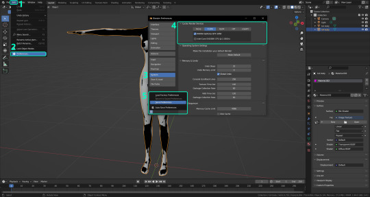
PRELIMINARY STEP 1: CONFIGURING BLENDER’S GRAPHICS SETTINGS:
Open your preferred Blender file depending on what you’re going to bake and the desired resolution (in this example I’m going to use the AF-body-4t2-1024 file). Before we start messing around in Blender, there’s one thing you should set up. It is a onetime step, and once it’s done, you won’t need to do it again. So, does your computer have a dedicated graphics card? If you don’t know or you’re not sure, just skip to the next step. Configuring Blender so it uses your graphics card instead of your CPU will make the baking render much faster, so it is recommended you set it up correctly.
If your computer has a dedicated graphics card, click File (1) > Preferences (2) > and on the window that pops up click System (3) > and select CUDA and make sure your graphics card is there and tick it (4). I have an Nvidia Graphics card but your case may vary. Once you’re done, click on the tiny button on the bottom left corner and Save Preferences (5).
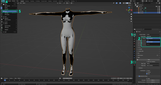
PRELIMINARY STEP 2: CHOOSING THE RENDERING DEVICE:
Click on the tiny camera button on the right, called Render Properties (1), and on Device (2) select GPU Compute if it’s not already selected. If you’re not sure if you have a graphics card or not, just select CPU. Then select the Material Properties tab (3) and Save your changes, either by pressing Ctrl + S, or clicking File (4) > Save (5). You might need to do this second step with the other Blender files, but once you have it done and saved, you won’t need to do this again. Okay, time to get into the good stuff!
·STEP 1: LOADING YOUR TS4 BASE TEXTURE:
In the Material Properties tab, click the folder icon that says Open (1) and on the window that pops up, navigate through your folders and select your first texture. To navigate easily, the 3 buttons on the top right (2) are for the display mode. They will show your files in list mode, vertical and horizontal, and the one on the right will display the file thumbnails, pretty useful if you want to easily preview your textures here. The icons on the left side (3) will let you go one folder back and forward, go to the parent directory, and refresh the folder in case you just dropped something new in there. Double click on the image you need and that will load the texture into the Sims 4 body model, named “ts4 body”.
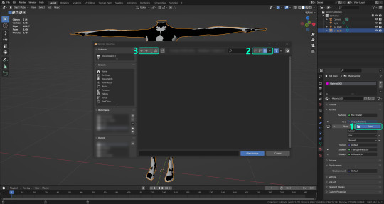
·STEP 2: SETTING UP YOUR SELECTION AND BAKING THE TEXTURE:
On the top right of the screen, you will see the names of the 2 models in the scene. Hold the Ctrl key in your keyboard and left click on the “ts2 body” model (1). If you did it correctly, you should see “ts2 body” in a yellowish orange color, and right down below, “ts4 body” should look more like a red orange. If not, try again by clicking first on ts4 body, and then while holding Ctrl click again on ts2 body. Then switch to the Render Properties tab by clicking the tiny camera icon (2) and click Bake (3). Depending on your screen resolution, you might need to scroll down a bit with your mouse to see the Bake button. Wait a few seconds for it to finish. You will see the progress percentage down on the bottom of your screen. Don’t panic if you notice your computer fans start ramping up, that’s completely normal! As I said in the beginning, using your GPU will bake the textures much faster than the CPU.

·STEP 3: SAVING YOUR NEW TS2 TEXTURE:
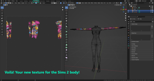
Once it’s finished, switch to the UV Editing Mode by clicking “UV Editing” on the top of your screen. And there it is: your new texture! You might have to scroll up your mouse wheel a bit to zoom in and see it in all its glory on the left side of the screen. We’re still not done yet though. You need to save it to yet another new folder (always try to keep your stuff organized!).
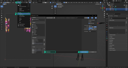
You can save it by pressing Shift + Alt + S, or clicking on Image* (1) and then Save As… (2). That will pop a window where you’ll need to navigate again and save it somewhere. Give it a proper name (3) and hit Enter to save it… well, Enter doesn’t always work for me for some reason, so if that happens just click Save As Image (4). And that’s it! You’ve successfully converted your baked texture. Congrats!
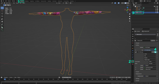
·STEP 4: GOING BACK TO STEP 1:
Alright! If you’re done with your textures, you can close Blender without saving and call it a day. But let’s say you want to keep baking other swatches. In order to go back to step 1 and start the process once again, click Layout (1), go back to the Material Properties tab (2), select “ts4 body” (3) and click on the folder icon (4) to open and load your next swatch.
Then it’s just a matter of repeating the process from step 2. When you’re ready to move on, close Blender without saving. If you see a small check telling you it will save some images, make sure you uncheck it, so you will be able to use it again in the future from the starting point with no issues. I don’t think it really matters if you accidentally save your progress in these files, but I like to keep it clean and fresh so I can do the process where I left it from the beginning next time I open it. And in case you mess up and save somewhere, you can always just delete the .blend file and download the template files again.
In case you’d like a video tutorial on how to use these files, the amazing @platinumaspiration recorded this fantastic video showcasing the process! You can watch it here.
One final note: some of the baking .blend files save the textures with a resolution of 2048x2048 pixels, as clearly stated at the end of their file name. That’s way too overkill, because TS2 only properly supports up to 1024x1024 for most of its textures and you should always resize your final product to that max resolution (or lower if needed). I just made those 2048 versions because there might be some really tiny and slim details on some tattoos that might look a little too blurry when baked into a 1024 resolution texture, so for those cases use that if you want and then resize them using your 2D editing software of choice.
In Photoshop, in the Resample mode of the Image Size menu, there are a few options to choose. For the fine details, I like the Nearest Neighbor (hard edges) option, which, even if it looks a bit pixelated, it still preserves most of the texture and quality.

For anything else, I would just directly bake them using the 1024 versions in Blender (512 for the face and scalp).
And for the folks who feel comfortable playing around in Blender, this is just the beginning! Texture baking opens a LOT of possibilities, so feel free to move stuff around and edit the models to your liking! If you notice the baked textures look warped or stretched somewhere, or don’t like where some textures are placed in the S2 body, poke around that area moving stuff and then give it another try. The main objective of the baking process is keeping both overlapping models as close in shape as possible. You may also edit and save new copies of the templates, or make new ones from scratch using mine as a reference (keep a close look on those Baking settings and values, I think they work pretty well) and share them if you want to. Go ham, do whatever you want with them! I still have plans on making templates to convert body textures from Sims 3 to Sims 2, but for now it’s not on my priorities, so we’ll see when that happens.
Whew! Hope none of this was too confusing. Need help or have any issues with these? Please ask/message me here and I’ll be glad to help when I’m able to!
Credits for the CC used in the render demonstration:
-Skin by Sims3Melancholic.
-Eyes by Northern Siberia Winds.
-Eyebrows by PeachyFaerie.
-Tattoos by xtc.
-Top by SerenityCC.
And the Tattoo I used for the tutorial can be found here, by ValhallanSim.
Last but not least, a huge thanks to all the people who somehow contributed to make this project and update possible, either by doing initial testing, finding issues to fix, or teaching me new Blender tricks to make the workflow way faster and easier. So thanks again to @elvisgrace @moyokeansimblr and @applewatersugar on Tumblr! <3
And thank you for reading! Hope you have fun playing with this (not so) new toy hehe.
#tattooer project#tattooer update#ts2 tutorial#ts2 resources#ts2 blender#ts2 overlays#ts2 texture baking#4t2 conversion tutorial#this took me so LONG to update#im really sorry for the delay :(
286 notes
·
View notes
Text
making character sprites as a one-person indie game developer
(huh. turns out this post on cohost didnt have a “read me” section”. o well. i will put the read me section Here, before any of da actual text. click it if u dare !!)
so, i've been meaning on making a Big post talkin all about how i actually Make my games and my processes n such ,but also ive been procrastinating on making it for so long that i thought i might as well just make One part of that post now .. and its about making the Character Sprites for my games .
So. these images are the (mostly) full sprite sheets of the three characters from my game UNITRES Dreams, taken directly from the big giant 'charactersprites.png' image that i used for nearly every sprite for Most of the game's development. some quick things to make note of: First off, Trees (the first one) was one of the earliest things i made for the game, and had their sprite sheet redone Twice since then.. this first picture doesnt contain the latest sprite sheet as the new sprites were done on aesprite and im too lazy to make a sprite sheet out of them right now.
Secondly, the Second character (the pink one), had two different designs, being completely redesigned as i didnt like their first design all too much. their redesign's animations was done in aesprite, but i made a sprite sheet out of em before so i was able to just put them here. Lastly, the Third character (the blue one with the big silly hat) remained mostly unchanged as their original sprites and design were pretty good, but they needed to be cleaned up and given better colors so i ended up polishing all of their sprites.
Anyways. it's going to be hard for me to explain my actual process, as i am Bad With Words, but i will try my best.. So. for Most of my time as a game dev, I've used Paint.NET for Everything. This includes backgrounds, tilesets, and every animation ever in all of my games. For my character sprites specifically, i usually start with making the color palette (which is a whole different process where i mess around with the RGB values until i get a specific color that i think looks pretty ... its hard to describe). When making a new character, i usaully start with an Idle animation, just so i have a good base to make all the other sprites on. I just make a sketch of the character, then i do the flat colors (as my games dont have line art), and once i have the colors i start doing the rendering , where i try to pull off a sort of Sonic CD-esque , celshaded style while Also including a bit of anti-aliasing and other modern pixel art techniques to give the sprites more Depth and make them look Sharp. Idk. it's hard to describe my process in words ... i Did make a video Years ago showing off my process, but its old and my editing in that video isnt the Greatest.
So., that's my process Lol . the only thing thats really changed is that Now i use Aesprite for making the Actual Animations , as making animations with Paint.NET is Really Difficult and Annoying , as i have No Idea how the animation will Look until it actually appears ingame .. which results in the early versions of each character's animations looking a little weird (such as Trees' first two versions, the first version of the Pink character, and the Blue character's animations.. .though the blue character isnt as bad as the other two and i kept their animations mostly the same in the final game LOL).
Something that people have kind of criticized about UNITRES Dreams' animations is that some of em dont exactly ... Look Good. a lot of animations are pretty Inconsistent , with characters like Trees having inconsistent sizes in some animations and the movement in animations such as the Pink character's walking animation and various other animations (Especially the ones made in Paint.NET) looking Unnatural.
And Well .. here's the thing about making animations and sprites for something like this. When you're the Main person making an indie game, you have Tons of different parts of the game that need to be worked on while having Very little time to work on others. On Top of making every single animation for UNITRES , i had to make every single Tileset and background for every single level, On Top of making the Level Layouts , Programming , and even making sprites for things like the UI. And you have to constantly Test the game to make sure everything works and things Look good.
So. i had very little time to work on the sprites, and i Knew this. Something you have to consider is that, not only are you making the animations for the main character , you Also have to make Tons of animations and sprites for Literally Every Other Aspect of The Game . this includes Enemies , Level Gimmicks , NPCs, And the UI .. so you end up having to work on Thousands of sprites by yourself in such a short time.
I ain't the best animator , nor the best sprite artist . But , for this game I chose an art style which is Kinda simple and comfortable for me, which made making things like tilesets and backgrounds so much easier for me. The character sprites specificially only use a few amount of colors ,but also i tried my best to give them as much depth and make them as Colorful looking as i could. Also , something you might notice is that all of the playable characters dont actually have a whole lot of animations .. each of the characters only have the Exact amount of frames and animations necessary for them to Look Good moving around the levels. Aside from a few Gimmick Specific animations that arent in the sprite sheets i posted , there arent many Extra animations or animations with Tons of Frames that i wish i could have added .. and it Kind Of Sucks . Having to split my time across Three Different Characters , i had no time to make any animations Too Crazy or Too Smooth , and i couldnt include any extra animations that could add a bit of personality to the characters ... In Fact ,the Idle "animation" isnt an animation , its just a still frame. I didnt have time to even make a simple waiting animation !!
It Is What It Is. For what its worth , Ithink Im pretty proud of the animations i did for UNITRES Dreams. while i think ive become a much better artist and animator since then, i still think some animations and some of the frames look really good ..just looking at some of the still frames is really nice .. so i think i did a good job, especially for a game that was made in 2 years and is Free. And Hey, while the animations in UNITRES Dreams may not be the best or have the most smooth animations , i Did get to experiment with making more smooth animations for TREES' ADVENTURE. while ,now, i think some stuff could use some work, i am Really Proud of how some of the animations look .. ididnt get to make Too Many extra animations (there still isnt even an Idle animation), i Did get to make some cool extra animations , such as individual animations for your Jump that are based on how fast you're moving . (the original post on cohost had a buncha gifs of da animations but im Too Fuckin Tired 2 post em here LOL !!!)
So Yea . the moral of the story: making video games is kind of hard and time consuming , Especially when you're like , the Only one working on them. just make sure to plan ahead and try not to overwork urself .. make what you can and do it when you can. Thats what i think , anyways.
#TreesThinks#UNITRES#UNITRES Dreams#art#artists on tumblr#artwork#pixel art#pixelart#pixelartist#pixel artist#game dev#gamedev#game development#game developer#indie game#indiegame#indie developer#indie game development#indiedev#indie dev
56 notes
·
View notes
Text
Did a Potential Overhaul in the Post-Timeskip Cutscenes mess up with 3H's Development? - Development Mystery/Theory
Back in 2021, Nintendo released a video called Fire Emblem : Vol 1 to celebrate the franchise's 30th anniversary. And around 30:35, the video shows the 3H Movie "Rematch", used for Chapter 17 of the Azure Moon and Verdant Wind routes.
With a catch.
It's not the same one that ended up on the final game:
A glimpse into an alternate reality?
People went wild back when they noticed Edelgard and Claude in this version are using the outfits of their Emperor & Barbsrossa classes rather than the Armored Lord and Wyvern Master ones seen in the game we got, leading to much speculation surrounding what this meant for Three Houses. And it goes without saying that, while unseen, fans suspect that Dimitri uses his Great Lord outfit rather than the High Lord's in this version. So... The heck is up with this movie???
Well, as uncovered by VincentASM from sereneforest.net, it's highly likely this take of the movie shown in the promotional Nintendo/FE video is from an early build of the game. A build so early, that Edelgard skin and eyes were more saturated, and characters still didn't use unique palettes when using generic classes (which was incidentally used in February's JP Nintendo Direct of 2019).
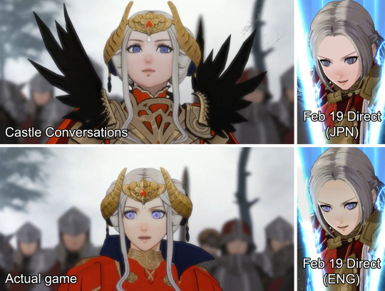
Your call as for which version looks better.
It doesn't just end there though; if Three Houses' datamine is anything to go by - namely, the internal order the classes have in the code - we can find evidence that can answer why the endgame lord classes were used in this variation rather than the "middle ones" early on: simply put, Armored Lord, High Lord, and Wyvern Master did not exist during most of 3H' development. In turn, this explains why the Flame Emperor Class - Edelgard's enemy-only class for Part 1 - is internally, a model swap of her Emperor class rather than Armored Lord's: the latter didn't exist during development of Part 1, so Emperor was used as a base instead.
With this evidence uncovered and the answer giving resolution to the promotional footage shown, hopes waned down for the future of 3H, and everyone moved on.
This raises two questions I haven’t seen anyone point out before, though.
How much (if any) did this change mess up the post-timeskip movies? Is it the reason why the Silver Snow Theorem happened?
To explain these inquiries further, I'll go into greater detail about each one:
1. Two Types of Animated Movies.

Corporate needs you to find the differences between these two pictures.
Three Houses uses 2 types of animated movies for important scenes. The first one (see the one on the left), was done in-house by KT through pre-rendering shenanigans with the 3H engine. Meanwhile, the second one (on the right) was outsourced to SANZIGEN.
The distinction between both is relevant because the movie showcased in the FE Castle Conversations video - as well its final version - belong to the former category. Meaning that, should the character designs get tweaked during development, in the best case scenario, as far IS & KT were concerned, swapping models should be enough to keep things up to date, which might as well be what happened with the "Rematch" movie once the House Leader's main post-timeskip designs were swapped.
But what about tweaking the other type of movies, though? The ones commissioned to the animation studio? I can't imagine the whole process being cheap in their case, more so given that 8 out of the 11 movies commissioned to SANZIGEN feature the 3H lords post-timeskip:
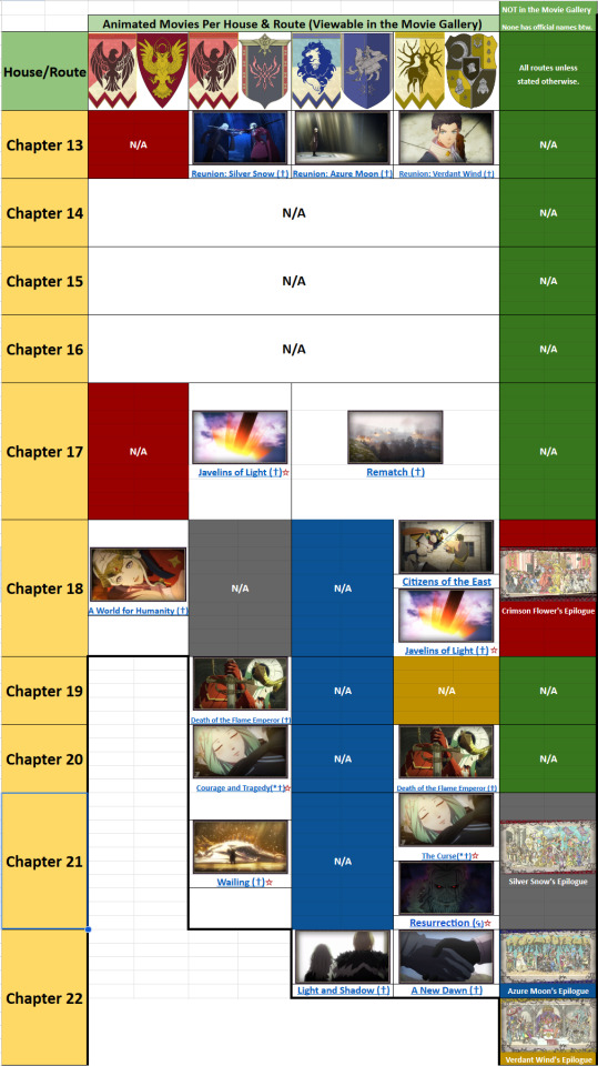
What's important here is that ☆ = Doesn't feature any 3H lord in any capacity.
Granted, the smartest course of action in this instance would've been to simply commission the post-timeskip movies near the end of development to avoid consistency/revision issues, for which there is a plausible chance that’s the case. After all, in the E3 2018 trailer for the game - which was the first instance we ever saw footage of it - the only animated movie outsourced seen was the one from the intro.
But... What if that’s not the case?
Call me paranoid if you want, but I raise this worry for a reason-
2. "The Theorem of What?????"
Love this banner so much.
A few months ago I did a breakdown on how 3H distributes it's movies across routes, and if there's anything that stood up a ton besides the predictable stuff, is that the game followed a clear pattern which determined which routes would get the most movies, versus which ones would get screwed instead. In my breakdown, I coined this pattern "The Silver Snow Theorem" which proposes the following:
"The amount of movies and fullscreen CGs present in a route’s main story by Part 2, is directly and inversely proportional respectively, to how much the narrative follows Silver Snow’s story beats."
And as a refresher, Silver Snow matters to the development of Three Houses because: A. That's the first route the developers worked on; and B. was used as the basis for the other 3:
Which route specifically did you create in the beginning to establish the world-building?
Kusakihara: It was one of the two paths in the Empire route—the one fans refer to as the “church route”: “Silver Snow” [...] afterwards, we had Koei Tecmo’s scripting team start work on the nitty-gritty of the other house leaders and the story of their respective routes.
While Silver Snow having this much influence over the Part 2 movies is noticeable in hindsight, truth be told, I did initially brush it off as just a side effect of being used as a template for development. Looking back now though, a part of me now wonders if the Part 2 movies were first commissioned once Silver Snow was late into development and AM and VW had been already decided to borrow a ton from the route’s first half. Because if that’s the case, then there might have been cutscenes outsourced to SANZIGEN that did feature Edelgard, Dimitri and Claude with their second post-timeskip lord classes rather than one ones fans are most familiar with.
But then, it was decided during development that the house leaders would rather use different outfits instead. And this might have caused problems with budget since changing those outsourced cutscenes ain’t an easy task compared to the ones KT made in-house.
Like, seriously.
Goes without saying that all this is merely conjecture. But I feel it’s worth making the question because, to reiterate, the Silver Snow Theorem highlights that the more a route follows Silver Snow’s story beats to a tee, the more animated cutscenes (and less CGs) it gets. And given evidence points out the lord’s main post-timeskip classes fans are familiar with were a late addition… I guess y’all know where I’m going by now.
I usually don’t make threads focusing on fan theories and stuff, but this has been in my mind for a long while so I wanted to see what you guys think about it. Do you think more movies with the lord’s 2nd classes got made before the outfit swap was made? Or perhaps the issue the devs ran with that caused the Silver Snow Threorem might be due to something else entirely…? Also, what's y'all's opinion on SANZIGEN's movies compared to the ones done by KT?
#fire emblem#fe3h#fire emblem 3 houses#fire emblem: three houses#theory#fan theory#development#trivia#crimson flower#azure moon#verdant wind#silver snow#edelgard von hresvelg#dimitri alexandre blaiddyd#claude von riegan#khalid
22 notes
·
View notes
Note
hi! can i ask what software you use to make gifs and how you make them? thank u!
Hello!
Oooh it's tutorial time!~~ Disclaimer: I am fairly new to GIF making so it might not be perfect, and there might be easier ways out there, but this works for me and I enjoy DaVinci more than other softwares, and is actually easy once you practise a bit :)
I use DaVinci Resolve which is 100% free.
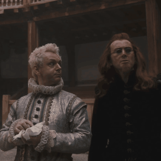
Here's my post about obtaining clips for Amazon & Netflix shows. For this example let's make a nice Aziracrow gif :)
Make a new project and go to File > Project Settings.
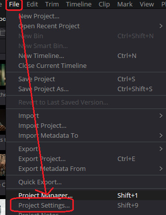
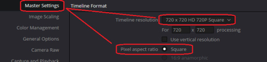
2. Under Master Settings we're going to change our resolution to 720P Square then Save.
(Once you get more confidence with it, play around with different ones, I just think square gifs looks nice)
3. Drag your clips into DaVinci (don't judge my clip labelling system)

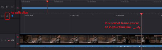
4. Drag the clip you want into the timeline. You can use your arrow keys (<- ->) on the keyboard or just drag/click along the timeline to move it, then to cut your clip up, use the little scissors. I'm going to make a gif of the little smile Azi gives Crowley when he sees him because it's so cute
I'm going to cut the clip right when Azi looks at Crowley and then delete the first bit I don't want, then delete the grey empty block it leaves behind. Now the section I just created boops to the front of my video.
5. I'm going to right click my clip, then Change Clip Duration > then under Frames change it Duration box to '60' > click Change to save it
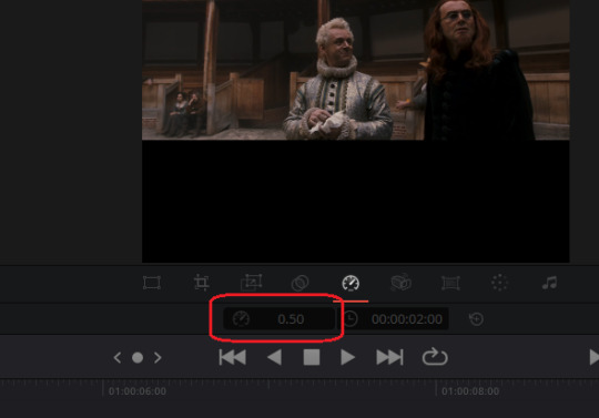
I usually make my GIFs anywhere from 50 frames to 70 frames (depending on the quality I want, more on that later). For this GIF I'm going with 60 frames, feel free to experiment with it once you get the hang of it.

7. Most GIFs are slowed down a bit. I like it slow my GIFs to 0.5 speed. To do that, I go to the little mixer icon > the speed dial icon > then type 0.50 in the box (3rd image)


8. Now we gotta make the image actually fit the square nicely. We're going to the 3rd tab.
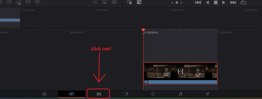
Then we're going to click on our clip and under Transform, adjust the Zoom. We're going to change Zoom to from 1.000 to 2.400 as that fits nicely in this square.
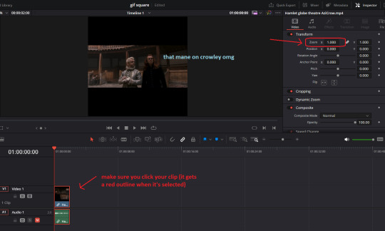

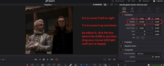
9. Let's make them a bit more centre by adjusting the Position, just play with it until you're happy.

10. I'm pretty happy I'm done. Obviously once you get more confidence, play around on the tabs with the different effects and adding text and such, but for now we're going basic.
Let's go to the rocket ship icon.
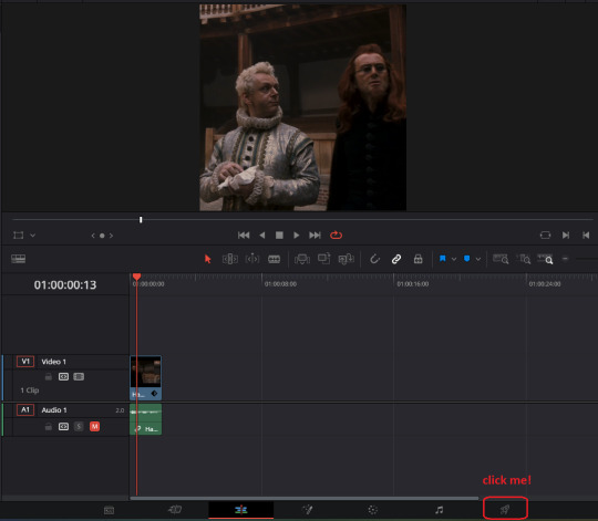
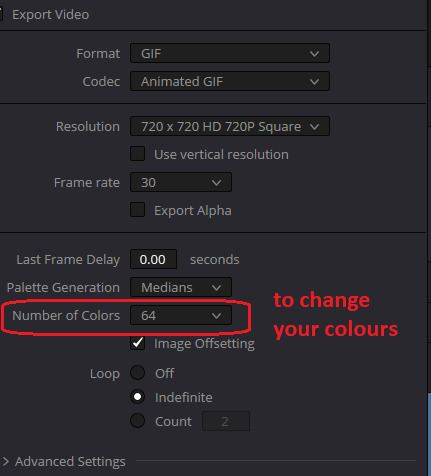
We're just going to double check our settings look good. It's a GIF and it's 720 square.

11. Then we'll Add to Render Queue > Render All

12. Now we have our GIF saved to our computer, we need to check the file size to make sure it's under 10MG. If it's over 10MG, Tumblr and most other sites will say it's too big.
Find your GIF > right click it > Properties
Darn my file is too big...

13. We have two choices to make it smaller. Either we:
a) make the GIF shorter (see step 5).
b) make the quality lower. I usually do this by lowering my colours - at the minute it's at 128 so I'm changing it to 64.
When you're happy, Add to Render Queue again (if it asks about replacing the file just select Replace), then Render All
Let's check my GIF size again. Yay - it's under 10MB!

It might take some playing around - it's ok, take your time, ask other GIF makers for advice, watch youtube tutorials. You'll get the hang of it really quickly :)
22 notes
·
View notes
Note
Hello! Do you have any advice with painting? Every time I start I end up just doing lineart with colours underneath, and when I do kindles art it looks kind of like plastic. Am I supposed to merge the two layers and then start shading? What would you recommend?
Hey anon!! I actually do have some advice for that!! I'll shove it under a cut because it got way longer than I thought it would, sorry for the infodump everyone _(:3 」∠)_
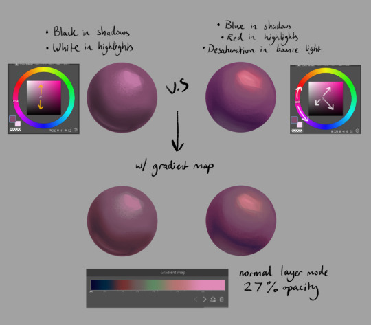
quick tl;dr: painting process should consider both personal taste & the desired aesthetic of a painting, & to avoid plastic-y colours, make sure your hues vary within your values (and layer modes are ur friend) ♥
there's a million ways to start paintings & its all down to personal preference -- the end goal for the illustration can often influence the approach you take; a crisp digital painting might call for meticulous layering & sharp edged flats, but if you want something to look like an oil painting, you should try and mimic that process as close as you can! here's some examples:
this is the sketch for my FYR zine piece from last year; i intentionally approached it in a way that looks like traditional underpaintings so that when I worked directly on top, those orange tones would peek through like this:

after doing that undersketch, i manually painted everything -- no fancy layer modes, just me, one layer, and screaming ಥ_ಥ it was hard but it worked for the vibe i wanted!!
now v.s something like this:
simple shapes, roughly blocked in shading that just gets merged and painted over, as well as lots of layer modes on top for those colour changes! this is by far the easier one & the one i'd probably recommend, solely because it lets you keep more control. i go more in depth here on that -- but to quickly answer, i personally block everything (including shading) in before I merge & render!
for the other thing you mentioned, a lot of the times that 'plastic' feeling can come from either a lack of transitional shades or only using white/black for your value tones. this tweet thread (direct image links 1, 2 & 3) by frozensoba demonstrates it incredibly well -- by adding certain colour shifts in your values, it can create extra depth which is what makes stuff look more alive!! don't be afraid to really push it and get wacky
an easy way to add it while you're learning is using gradient maps to add richness in your midtones. It's not perfect since different surfaces & materials diffuse light differently, but adding one at the end of a drawing can help tie everything together. If you can do both at once though it always looks best; here's some very quick 2 minute orbs as an example:
ok I'm almost done (and im so sorry for how long this got... special interest moment TM) -- one last thing is to try varying your brush strokes & adding textures if you want. using only an airbrush or heavily relying on blurring brushes can make things look plastic too; sometimes you want that, but for the times you don't, adding some texture & leaving brush marks in can do a lot!!
lastly, since this is just me rambling, here are some artists that are incredibly talented & i highly recommend looking at for their advice & processes because it will be much more coherent than this:
Marco Bucci -- amazing educational content. if you check out any of these artists, he's the one to look at first imo. his 10 minutes to better painting series is a great place to start
Sinix Design has some amazing tutorials on anatomy & the mechanics of painting! This video & the intermediate part 2 are super
Dao Trong Le -- a veritable goldmine of speedpaints
Bo Chen & any of the riot splash artists. If that's the vibe you're after, you can't go wrong with the LoL splashes as reference
i hope that helps!!!
#tutorial#any time i have the opportunity to barf out art talk i will do it#tysm for the question too ♥#not art#asks
91 notes
·
View notes
Note
hii!! i was wondering if I could ask what is your usual colouring process? how much time one fully coloured piece and doodle take! I adore your ocs so much they inspire me to draw more myself:3 they feel so alive!
hi anon! thank you vey much, i'm very happy to hear that you feel inspired!
i wrote up a little something for your questions under the cut:
so, first of all, the way i color things ranges from drawing to drawing, especially if i feel like playing around in the process. sometimes i decide to try something out (palette, filter, technique, brush etc) and if i really like how it looks i may recolor the entire drawing lol. point is, there's a lot of sidetracks to my process (especially now, since i'm trying to get used to a different art program than the one i used previously) but the very basics of it are as follows:
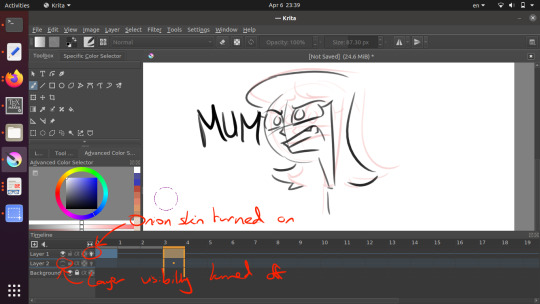
1. i sketch and line whatever it is that i want to draw (this might take a while depending on whether i have a solid idea right away or not; in the latter case i might do some thumbnails first to figure out how i want the drawing to look. you can't really see here, but when i line things i usually draw on the same layer as the sketch, and after i'm done i adjust the brightness/contrast settings of the layer to get rid of the sketch underneath. it might seem like i'm just making my life harder this way, especially since this method only works if you sketch with a lighter color (or make it lighter in settings before starting lineart) and your lineart is drawn with a solid opaque brush (which is how i always draw), but it helps me to not get caught up on trying to make the lineart precisely follow the sketch. it also makes changing things on the go much easier, since i only have to erase on one layer.
2. after i'm done lining, i underpaint with a solid color (usually the skin color, but sometimes something random), then block the alpha channel and color over it with flats;
3. i don't color everything at once, instead going piece by piece, which helps to keep the drawing balanced color and contrast wise. i pick a desired area with magic wand and then go about rendering it properly (which usually involves adding some value variance with an airbrush and then laying down shadows/highlights/etc). you can't see this here either, because for some reason i forgot to do it this once, but i also usually lower the opacity of the lineart layer halfway when i color. it helps me concentrate on colors and how they look together better;
4. when i'm satisfied with color, i recolor the lineart to be whatever color i think fits the piece better and change lineart layer settings to either multiply, color burn, or linear burn. after that i just play around with filters, add decorative details, and clean everything up. it's also worth noting that sometimes i starts trying out filters/effects directly while coloring because i want to explore some alternative colors or palettes; i also have a tendency to pick very pale & unsaturated colors so messing around with HSB (hue/saturation/brightness) & depth/contrast settings while coloring helps a lot.
5. cropping it & there you go!
this one took me 1,2 hours. depending on how complex the drawing is it might take me much longer (especially if im working on a commission) so i'd say my average time drawing is somewhere between 2-6 hours. if a drawing takes longer than that i break it apart into several days of work. don't draw for too long! it's bad for your health.
as for sketches, as i mentioned previously, it all depends on whether i know what i want to draw or not, and if i do, i usually just go straight at it:

this one took me 20 minutes. on average, a doodle can take anywhere from 10 to 40 minutes, more if i want to make it look fancy, but at that point it enters the vast limbo between sketch and finished piece.

that's it! sorry the gif quality is really bad, it's the best i could do. here's a video of the same stuff, hopefully in somewhat better resolution
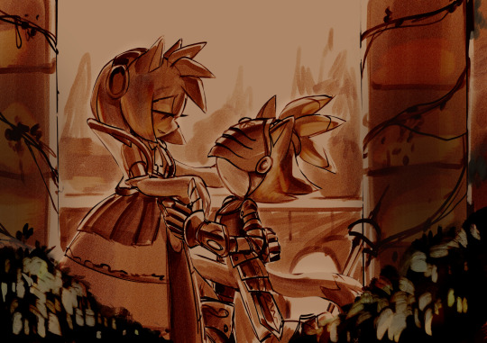
#character: kotya#character: shurik#setting: robot#artist: cbge#askbox#had to cut out footage of me playing with filters bc it was flashing rly bad
27 notes
·
View notes
Note
Krita? KRITA?! Teach me your ways 🙏
Krita is the only program i know and i don't know how to animate in it for shit 😭
Sure! Bear in mind I have no real idea what I'm doing either, but here's what I figured out so far while I was working on this animation.
I use Linux, but I'm going to assume Krita is the same for Windows and Mac users. Crash course under the break.
First, change your workspace to Animation, by selecting Window > Workspace > Animation.
It might look a bit intimidating, but don't worry, it's basically exactly the same as the default Krita workspace, it's just a bunch of panels have moved and you've got some extra ones for animation stuff. Here's where the stuff you already use if you do any drawing on Krita is:

Now to get to animation.
Create a layer in the layer panel (it's on the left now), like you normally do when drawing.
Double click the bar saying "Timeline" down the bottom to expand the timeline panel. (It might cover up some stuff, but you can just double click it again to shrink it. You'll see that your new layer has appeared in the timeline. Right click on timestep 0 for that layer and select "Create blank frame". This will turn it into an animation layer.
(Animation layers will change every timestep-- you animate on these, as opposed to normal layers which will just look the same throughout your entire animation)

The main thing to remember here is that you have layers, which stack on top of each other just like they do when drawing, and frames, which are how each layer changes over time. That's basically all you need to know to get some moving pictures going.
Keyframes are frames with unique drawings in them. Every time you want to draw something new, click either "Create blank frame" or "Create duplicate frame" to make a new keyframe. Your keyframes will be bright blue (if they have anything in them) or a blue outline (if they're blank). Other frames will look the same as the last keyframe and will have a blue line through them. You can click and drag keyframes to move them along the timeline.
Here, for example, I've drawn a picture in the 0th and 3rd frames (my keyframes) on layers 1 and 2. The 1st and 2nd frames are going to look identical to the 0th, as they are not keyframes. The 4th frame onwards will look identical to the 3rd, as they are not keyframes.

You can turn on onion skinning by clicking the lightbulb on the layer here. You can have onion skinning on or off for any and as many layers as you'd like. Here I've enabled onion skinning on layer 1, and made layer 2 invisible.
I've put the timeline panel back down by double-clicking on it. On the left here you have a little control where you can play your animation. You can select the start frame, end frame, play speed, frames per second (frame rate), and change the settings of your onion skin.
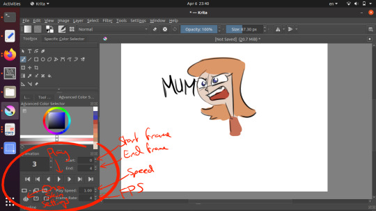
When you're done, export your animation through File > Render Animation. Make sure you select "Video" and whatever settings are appropriate.
I've heard that Krita also has functionality for tweening, but I have no idea how to do this yet. Early days.
Just give it a play and try to get something moving, that's the most important part. Everything else is just fancy stuff for fancy people. I found Krita's animation functionality very user-friendly after I figured out where everything was.
It's worth mentioning that Krita only supports raster drawing (not vector) and I've heard it might have performance issues if you do long animations on it. That wasn't an issue for my 12-frame animation there, but if you plan on making a short film or something with hundreds or thousands of frames, it might be a good idea to do each shot separately, or use dedicated animation software.
32 notes
·
View notes
Text
LSAD Seminar 01: Colour Theory with Sylvia Shortall
What is Colour Theory?
In it's most basic form, colour theory is the study of how colours relate to one another and how this, in turn, affects our perception of them. The feeling or emotion evoked by a colour or combination thereof is of particular interest this field of study.
Above: An old RTE test card from 1978 recorded by Andrew Walmsley on Youtube.
The Medium Affects the Message
An important consideration when discussing clour and colour theory is through what medium the colour is being perceived. For instance I have two desktop monitors; A pen display for digital art and an old Dell monitor from a million years ago. Due to differences in technical specifications and calibration they display colour slightly differently. The pen display is marketed toward artists for its colour accuracy, whereas the Dell monitor was basically made to for looking at spreadsheets. If I slide a picture across from one monitor to the other, I can observe the colours change in real time. In this sense, the accuracy of colours is something we can take for granted.
youtube
Above: A video which explains digital colour and how images are projected onto monitors.
Enter PANTONE
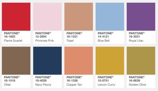
So if we can't even trust a colour to look the same between two different monitors, how on earth can brands like Coca-Cola or Starbucks slap their logo on every conceivable product under the sun with one recognisable colour?
Well for better or worse the answer is Pantone LLC and their proprietary Pantone Matching System (PMS). Basically Pantone have a specific formula to render any given colour in any given format. For instance an average computer monitor recreates colour through backlighting hundreds of tiny pixels varying shades of red, green and blue. This is known as the RGB colour model, which is considered "additive" as the colours "add" together to create their intended effect. Print media on the other hand, uses the CMYK colour model. The is a "subtractive" colour model, where the cyan, magenta, yellow, and black (K) mask one another out gradually until the desired tone is created. Pantone somehow they were able to copyright this process and have people pay them for it. If it's not obvious, I hate Pantone and here's a video that should explain why:
youtube
Above: A good video about a bad company.
Janine Antoni - Loving Care, 1993
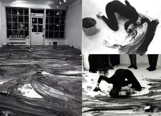
Sylvia actually recommended I research Janine Antoni for my project, so I was happy too see her work show up in this seminar. Personally I feel colour is one of the less important aspects of this particular piece, but all the same, it's roll can't be diminished either.
The use of commercial hair dye, Antoni's long hair and the act of mopping play into stereotypes of women and their gender defined "roles" in life. The gallery floor becoming covered in dye and the audience being gradually forced back out the door they came in can be seen as an act of reclamation. In this sense Antoni is challenging gender roles by using the traditionally feminine to accomplish the traditionally masculine. For me, it brings to mind the contrast between how men and women sit in public spaces, the phenomenon of "Man-spreading". Something that is seen as a faux pas for women but normalised for men. Antoni makes the viewer confront this kind of everyday sexism.
I think she choose a monochrome colour palette here for the contrast. The deep black on the brilliant white. The Yin and Yang of those shades is often said to represent men and women. I'm gonna move on now cause I'm really just rambling about a piece of art I enjoy.
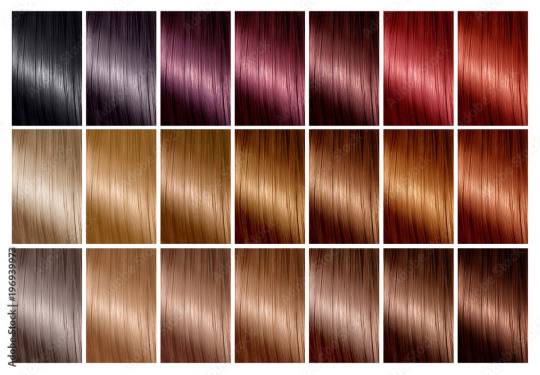
Above: Hair dye charts bear a striking resemblance to Pantone swatch booklets.
Colour for Legibility
Many maps, such as the famous London Underground map designed by Harry Beck, use abstracted visuals and colour to distinguish between and make clear what might otherwise appear as confusing and arbitrary.
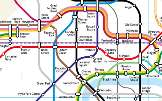
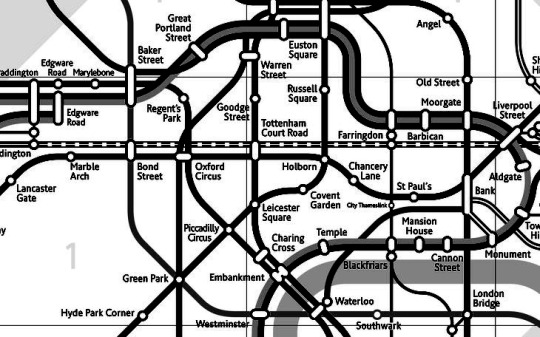
Above: You can tell me which one of these two maps is more legible...
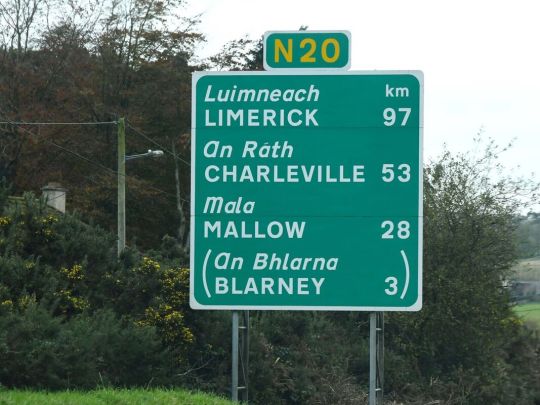
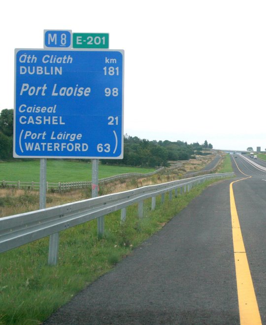
Similarly road signs are specifically engineered in such a way as to be legible under any given time of day or weather condition, regardless of colour.
The Politics of Colour
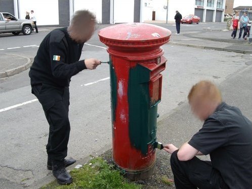
Colour can mean a lot more than simple aesthetics. As Sylvia points out in the lecture, there can be strong political associations with specific colours. A powerful example of this is how our public post boxes in Ireland were mandated to be painted green after the country achieved independence from British colonial rule. In fact the shade of green was entirely arbitrary, one could argue the act was more about the removal of the distinctly British-associated shade of red, which itself speaks volumes of the power of colour.
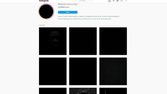
A similar example of the political power of colour was the #Blackout campaign to protest against racism and police brutality following the killing of George Floyd.
Copyright and Colour
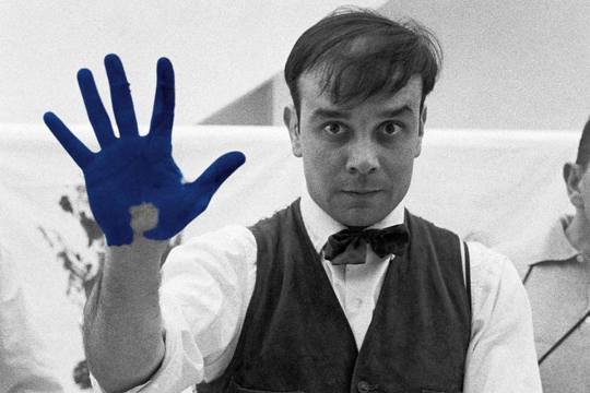
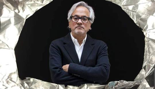
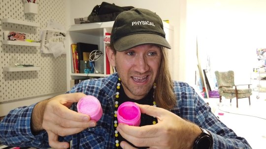
Left: Yves Klein, Center: Anish Kapoor, Right: Stuart Semple
A bit similar to Pantone and their patented method of matching colour, a number of artist have gained infamy for their roles in legal ownership and exclusive use of colour.
Yves Klein, an influential french artist and pioneer of performance art. Klein, in collaboration with Edouard Adam, created a vibrant blue, reminiscent of the lapis lazuli used in medieval paintings of the Virgin Mary. This shade was dubbed International Klein Blue or IKB. Klein registered this process with the French patent institute in 1960 but never formally patented it.
Renowned British-Indian artist Anish Kapoor, known for sculptures such as "The Bean" and Sky Mirror, was granted exclusive artistic use of the super-black coating Vantablack by it's creator Surrey NanoSystems in 2014. This provoked widespread criticism across the art world.
Kapoor drew particular criticism from Biritsh artist Stuart Semple. Semple, in retaliation to Kapoor's exclusive licensing of Vantablack released a shade of pink paint called "PINK – the world's pinkest pink paint" with the specific legal caveat that it could not be purchased by or for Anish Kapoor. This spurred him on toward a movement of democratising colour, creating affordable alternatives to patented shades such as the aforementioned Vantablack but also to Yves Klein's IKB and even an alternative to Pantone's matching system.
If it's not obvious I think artists have legal exclusivity to materials of any kind is an affront to art itself, and I'm happy to see people like Semple challenging the practice.
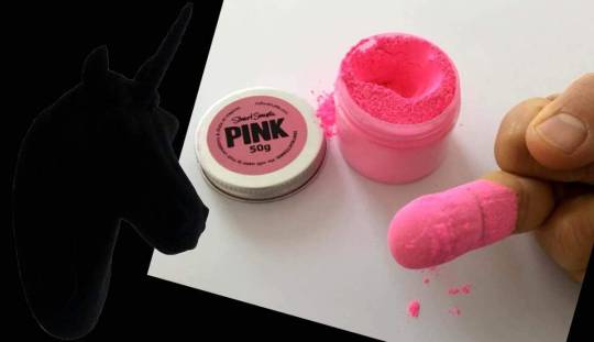
Above: Anish Kapoor's now iconic reply to Stuart Semple after getting his hands on PINK.
Stanley Whitney and Colour
youtube
Stanley Whitney is an American painter known for his use of colour and politically motivated art. I included a video above where he talks both about important political causes like contraceptive rights and also his feelings on colour.
What I admire specifically about Whitney's work is his persistent use of a loose grid as a composition. It highlights just how much emphasis he places on colour. What speaks to the viewer in a Stanley Whitney painting are the colours and their relationships between one another.
7 notes
·
View notes
Text
art youtube is overwhelming AF.
sifting through all the art advice available on youtube (and other sources!) can be overwhelming AF. an ocean of voices screaming DO THIS! DON'T DO THAT! YOU MUST DO THIS!
i feel like no one ever really talks about that.
also: some ways i cut through some of this noise to find signal, below the cut.
i mean, some of these videos are legitimately helpful! and many are drama about the latest outrageous, racist thing some artist *cough cough* kooleen *ahem* did or said in a 'how to draw X' tutorial just noise. still more of them contain outright bad advice, or advice that can't easily be personalized.
(i can tell you right now that 'you must draw everyday!!!' is terrible fucking advice. not everyone can set aside time to do that, and guilt is the world's worst motivator for enjoyment. ever. just stop)
and almost all of it hides behind titles designed to raise your anxiety levels and get you to click. sadly, this is the nature of the platform. emotional engagement drives traffic, and every YT creator is trying to maximize that as best as they can. i don't fault anyone for that; people's livelihoods depend on these streams.
i have advised novice artists to try to narrow things down as much as possible, to 'get granular' about what they want to learn: painting skin. drawing hands, or noses, or faces, or feet, or poses. drawing more expressive lines. workflow, for traditional art or the raster graphics editor of their choice. it doesn't always help: for every subject i've listed, there exists a veritable firehose of videos about it.
so might i suggest a ruthless pruning here?
just go with whatever thumbnail looks interesting and is the least shouty/dogmatic about what it promises to teach you. you will probably miss out on some good advice, but the effect of all the preaching is cumulative. and your sanity is worth it. i promise.
if you don't have the time or patience for hour-long videos, either watch at 1.5-2x speed or skip ahead for the content you want.
look for specific solutions for your specific frustrations. and emphasize the process. how does this artist accomplish what you want to do? how do they lay out lineart, begin the rendering process, and why? can they explain that in a way that makes sense for you (if this is something you need)? if not, don't waste your time watching.
i remember breathing the world's biggest sigh of relief on hearing a professional animator confess that shadows don't always have to make sense for a piece of work to look right.
look for ideas on how to break what you see into scaffolding. by this i mean 3D approximations on a 2D surface, on which you can draw guidelines for proportions. ultimately, this is the key to 'drawing from imagination' and even to successfully working with reference photos. videos on how an artist draws eyes from one specific angle will not necessarily help you draw eyes from other angles. not unless they also touch on eyeball shape and position on the head. and how perspective changes the shapes you see. and...
lastly, how do you feel about the video you're watching? if the creator's voice or sense of humor annoys you, or you don't love the stereotypical way they draw female bodies, or they're actually kinda racist/ableist, or whatever–you're allowed to nope out and look for another source of info. there is a lot to be said for the skill of picking diamonds out of manure... but you can find diamonds of similar quality that aren't coated in shit, too.
#drawing#art advice#artists on tumblr#vent#solutions#intermediate visual artist#professional graphic designer#the best resource is one you'll actually use
6 notes
·
View notes
Text
Console Design- Can I have my cake and eat it too?
Recently I spilled the beans that I have a little hobby project slowly brewing away where I am designing a new game console. I'm still not ready to really properly pitch the whole thing, but between sharing that, explaining computer architecture, and seeing people's feedback, it keeps pushing itself towards the front burners over more practical projects I SHOULD be giving my focus to, and while people are paying attention, I might as well try to crowdsource answers to some questions I'm getting hung up on.
So... a lot of what I'm doing here is, I'll be honest, rooted in nostalgia for 16-bit consoles. There's a certain retro appeal to the look, speed, and general immediacy of 8-bit games, and more than plenty of support for making games that evoke that feel, and even recently made free dev tools for people to just make new games for older systems, and as I'm writing this, there is this massive renaissance going on with indie devs restricting them to the constraints of early polygonal-graphics-focused consoles, but we mostly skipped right past that 16-bit period, and all its hallmarks:
youtube
2D graphics with more color-depth than people really knew what to do with. All sorts of hardware-level flashy effects like transparency, resolution changes, neat little raster effects. A soundscape of crunchy FM synth and sparingly used sampling with distortion effects. Just a little taste of support for polygonal graphics. Not enough to go all-in, but enough to make a nice spice here and there. A general push to show off with fancy jointed paper doll sprites, 3D effects from sprite-scaling, just... clear ambitions all over to make low res 2D eye candy. Plus everything was cartridge based, allowing people to add extra custom chips for things they really wanted that they didn't quite have the power for.
youtube
So that's basically what I want to deliver here. A platform where you have more toys and tricks than you know what to do with if you're coming from 8-bit style stuff, but a real tricky set of restrictions to work around from a more modern approach, hopefully with its own look and sound. To that end I've been doing a ton of research into how some of those work... and a lot of it involves fun little tricks between scanlines. In particular, if you look at that mode 7 video above, right around 7:50, we've got this real eye-popping barrel distortion background. What's going on here, on a hardware level, is we have the ability to, essentially, apply one single image as a texture to a single parallelogram, which in this case is just taking a rectangular background and squishing it in towards the center then out towards its regular dimensions... but where doing that squishing and stretching between individual scan lines as we send the video out to the screen. Several changes to the shape before we've even finished rendering out one frame of the video, and tada, weird barrel.
Being able to support tricks like THAT, specifically, is a must-have feature for what I'm working on, and I'm pretty confident I can design the hardware with that exact capability... but the original hardware doing that was, to my understanding, very much working with the peculiarities of how a CRT worked and the exact number of operations it could get done while the beam was swiping back to the left to draw the next line, and I legitimately have no idea if tricks like this are even really possible if I slap together a similar chipset and send video out an HDMI cord to a modern display.
Like, I know I can fake that. I've got a Retron 5 hooked to a cheap flat panel TV with Castlevania 4 plugged in, but my understanding is that's actually emulating an SNES in software on some very-much-overkill for this sort of thing modern processor. What I would LIKE to do is build this with a chipset you really can push to its limits, hooked to modern display, and get this sort of effect. Because while I realize a big chunk of the audience for this sort of thing totally have nice well-maintained CRTs, I don't want to be married to hardware people no longer manufacture. And I'd rather not have some way more capable sub-processor wedged in here just to get the video output of whatever cheap fast legit 16-bit chipset I use otherwise to play nice with HDMI standards.
I'm still sort of in the dark about HDMI and modern display options, to be clear. And you know in a perfect world I'd like to have support built into this if you want to hook it to a CRT, but at the end of the day I need to pick an aspect ratio, and it's probably gonna be 16:9.
A similar fork in the road I may need to pick a lane for before I can really get going is looking at ASIC chips. What I'd really love is to be able to just point people at a design files for the casing and PCBs, and a warehouse of old mass-produced chips that sell for pennies, make the whole thing a neat little home electronics kit where the total price of everything is like, maybe $10 or $20 or something, you get out a soldering iron, and assemble it all yourself. But, I might need to custom design a chip or two in the end, and there's a chance it ends up being cheaper to just build literally the whole system on one chip. Simpler, easier to make a portable version of the whole thing, but it loses that DIY feel.
And of course there's also the risk that the overall architecture and chipset I'm looking at isn't going to have the oomph to do what I want it to do at a nice steady 60 FPS (maybe 120?) I'm just kind of assuming once I commit to a path I'll be able to find a dirt cheap chipset covering all the bases I need it to that'll hold up at a faster clock speed than consoles really ran at in the mid-90s. I want people to be able to do things smoothly that historically really had some slowdown, and you know, I AM planning to have a higher base resolution than the systems I'm taking inspiration from (maybe the same height but clearly more width).
And of course the real pain is going to be prototyping all this since none of it's going to work without hooking display AND something popped into a cartridge slot. I'm at least saving myself some headache starting with a controller I can at least test in other things, but wow there's gonna be so many different potential failure points to worry about at one step in here.
5 notes
·
View notes
Text
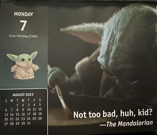
Here we go again. The Mandalorian had not been talking about soup. Or stew. Or chowder. Nope. He’d been talking about the fancy flying it had taken to protect Greef and Cara from Tie fighters. More stinking Tie fighters.
Grogu was not having it. He was going to call his agent and ask them to make sure that in future merch deals he got final say on the content. He couldn’t keep covering for these people and their odd choices. His fans expected better and he was willing to take the time and make sure that they got it.
His dad pointed out there was nothing he could do about a product that had already been launched. They’d both promised the production company that they wouldn’t use the Force or any other force to compel changes to things they didn’t like. They would use words. Nice, safe, contractually obligated words.
Grogu understood all that. It still didn’t make him happy. They could have used a vid of Din and he in the cockpit of the Razor Crest when it was upside down and he had his hands in the air cheering his dad on. Or it could have been a vid of him just sitting in the Razor Crest, all buckled up, looking impressed. It even could have been that one they used already showing how he’d thrown up.
It didn’t matter that they had used it already. Whoever made this calendar reused certain vids a lot. That would have been no different. Now that was the question. Considering the fact that the calendar used content from two whole seasons of Grogu’s show, which encompassed six hundred and thirty minutes video, you’d think that it would be that hard to 365, or wait, 313 unique stills to use.
He knew there were vids that the fans really wished had been in the calendar, and they were not all the one where Din Djarin leans back against a building in Mos Pelgo on Tatooine. Nope.
What about the one where Grogu was walking down the ramp from the Razor Crest and he looked super sad and the fans just cried about that scene because they wanted him to be happy? That would have been great. He could have a very sad story that just tore away at your heart strings and made you cry. But no. They didn’t include that one.
What about the one where his dad was with IG-11 on Arvala-7 and actually said “There’s too many!”. That sounded absurd, right? When did Din Djarin, Mandalorian bounty hunter, best in the Outer Rim, ever say there were too many bad guys? Never. That’s when. He would have said something like ‘I like those odds’. Now, that would have been a great vid.
Or the one where the IG-11 and the Mandalorian were walking through the door they had just destroyed and where in silhouette with the bright blue sky of Arvala-7 behind them. That looked really cool. Taika had even commented on that scene when he saw it.
But no. The merch people did not include that vid. They did include a lot of concept art, which was great. Grogu loved the artists who made all the sketches and paintings and renderings of the adventures as he and Dad explained them to Jon. They were really good at paying attention and putting the in the details. So why was it so hard to have unique images?
“Maybe the studio constrained them,” Din had commented when he heard Grogu grumbling under his breath about it.
Grogu shook his head emphatically. Why would the studio do that? It was to their benefit that all the merch generate the royalties that they charged for the use of the images for commercial purposes. Plus, the more images in use the more people felt like the product represented the show and the happier the fans would be to buy the next one. Wasn’t that what it was really all about? Happy fans?
“I don’t think you understand how their system works, buddy.”
That was probably true. There were a lot of things about how this planet worked and did things that Grogu did not understand. He supposed he would figure it all out eventually. His mom told him that it would take time to learn about cultural differences and that some fans might like the repetition.
He had snorted at that. Who liked repetition? It was boring. He wanted new stuff for entertainment purposes as well as for storytelling prompts.
“Is that why you’ve watched all of the episodes three times at least?” She had asked him while he was dictating this story.
Another snort. Re-watching the show was all about getting the details right. Making sure that his stories fit the narrative that the show covered. Otherwise, he’d get all mixed up and would start talking about how funny Pedro and Amy were on set and that would break the forth wall again and people might figure out that he’d been visiting Earth for a while with his parents and did they really want that? No, they did not.
Better for everyone to think this was all Watsonian, even when a good chunk of it was Doylist. If they knew he was here they’d come looking for him and he’d never get a moments peace, or be able to just sit with his mom and dad and have soup again without people realizing that he wasn’t just a cute piece of merch himself. And he didn’t want that. Even for the sake of the fans. He just liked frog soup too much.
13 notes
·
View notes
Note
Let's say, hypothetically, for the sake of argument, that someone wanted the benefits of upgrading their computer but Fucking Hates Hardware, and is also frustrated that lots of major guides hedge everything by saying to Check For Yourself (reasonably! there is a lot of variability), but not how to sift through and synthesize the technical stats gained by Checking For Yourself to get an answer, and also has an eye-glaze-over reaction to the gobbledygook names of different computer parts and cannot trust themselves to remember such a name for even a few seconds. Let's also say this hypothetical person is an idiot partly in denial about their usage patterns but mostly completely ignorant of how to assess what they need, what counts as heavy usage and what counts as dicking about, whether what will count as dicking about in several years will be commensurate with what is considered heavy now, or what the bottlenecks in their current system are. What would you recommend to this person I made up?
You mentioned a few things that get to the heart of the Upgrade Question which is: what do I actually need?
Ultimately, the first thing you must ask is "Does my current system do everything I want to do." In my experience, future proofing is mostly a fool's errand, and I could write a lot about why that is, but let's just say don't worry too much about what you might be doing in five years, don't really look more than a year forward for performance estimates. Whatever you're doing now plus whatever you want to do but can't because of your current system.
(The other question is "where am I putting this", if you live in a tiny Tokyo apartment or you don't want to dedicate permanent desk space to a desktop, or this is going to be your only computer, a good laptop may be a better choice even though you're sacrificing some performance. If you live in a bigger apartment or suburban house, you can probably find space for a desktop. Hell, laptops come with a screen and keyboard built in, that's a cost a lot of people don't price into buying a new desktop for the first time.)
If your current system is doing everything you want it to do at an acceptable speed and noise level, you're done, no upgrade required. If, say, you edit video and you notice that since you moved from HD to 4k it's starting to take forever to render out, or you picked up Elden Ring and it's not running as smoothly as you would like, then it's time to upgrade.
Knowing what to upgrade, especially in-place on an existing system, is unfortunately pretty much impossible without getting into the weeds of performance and hardware, so your best bet if you are dissatisfied with your current setup is probably getting some kind of mid-range prebuilt system from a reputable company within your budget and performance constraints.
In general, most people will be moving from an old mid-range system to a new mid-range system every 3-6 years. You dont want to be upgrading with every new release, and really not even for every second release, unless if the actual tasks you need to do have changed since you got your system. In that case, you'll have to step up a budget increment since you need something faster than you use to have by a significant amount.
Budget-wise in USD, you kind of have these steps and the tasks the correlate with.
$2000: professional, "this is for my dayjob" workstations, performance machines for doing heavy compute
$1500: amateur workstations, high end gaming machines.
$1000: sensibly balanced gaming-optimized machines that'll handle most light workstation tasks, an hobbyist machine.
$500: utility laptops, for handling basic desktop and document handling tasks, programming, image editing, very light workstation tasks.
ABS out of NewEgg and Skytech from I forget who owns them make reasonably priced performance machines with all-new hardware, and while I know people who have had machines arrive with issues, the majority of the stories I hear are positive. The quality of various prebuilt manufacturers varies wildly in terms of cost to performance and level of customer service, but absolutely sight-unseen if I had to recommend some desktops and a laptop for a stranger I've never talked to I would say get one of these and it'll handle almost anything you can throw at it well enough not to annoy you.
These are not the best options per se, even in their own budget ranges, but what they are is solid all-rounders that I would not be mad about if someone told me to use them as the only computer I had for the next five years.
This is the summary of my advice on buying a new computer for people who don't like shopping for computers. The biggest weakness is the price:performance list up there, whcih assumes that you're getting fair pricing on the hardware. Lots of prebuilt companies charge super high markups on old hardware, which is an easy way to get screwed, so I'd advise checking what the latest generation of hardware available is and only using that if you're upgrading.
Annoyingly there's a new CPU release cycle happening right now, so the two things I recommended above will be one generation out of date by the end of October.
16 notes
·
View notes
Text
Timothée Chalamet Questions - Updated
I saw this tag game here and decided to update this.
When did you become a Timothée Chalamet fan?
September 17th, 2020. It's been two years that this man changed my life and now I can't imagine my life without being a fan of his. I have never been in love with an actor like him.
What was the first movie of his that you watched?
A Rainy Day In New York. I know it's a bad movie (in my opinion) and I barely remember the story at this point. The only thing I remember is the "Everything Happens to Me" scene.
Favorite movies of his?
Dune, The King, The French Dispatch, Little Women and Miss Stevens, Call Me By Your Name (I love the movie, despite, you know who.)
What are your least favorite movies of his?
Hot Summer Nights, Don't Look Up and I didn't like Entergalactic that much ("What? You didn't like Entergalactic??"). To be honest about Entergalactic, it's good? Yeah, just not my favorite movie of his. I also don't like A Rainy Day In New York.
Favorite red carpet event in general?
Cannes 2021 was my first ever red carpet I've watched, so this one will always have a special place in my heart. Venice 2021 and 2022 were awesome, I remember them fondly, LFF was amazing and the Bones & All red carpet in Milan was exciting as heck.
I also have to mention Oscars 2022 and the 2021 Met Gala.
Have you watched his whole filmography so far?
No. I have to watch Bones and All ASAP.
Have you ever dreamed of him? If you remember the dream, tell about it below:
Many times, and dreaming about Timothée is the best thing ever. Here are some of my most cherished dreams:
1. Timothée was wearing a white shirt on a Zoom video call, playing “Quand tu M'aimes” by Charles Aznavour on his guitar.
2. Timothée and I were recreating the music video for “Shape of My Heart” by Backstreet Boys. The music video was exactly at the 2:37 mark of the song, and in this part, I stroked his hair while the camera panned down on his bare feet. We were dressed like the couple in the music video: I wore a gray shirt and blue jeans, with some black sneakers, while Timmy was entirely clad in black, barefoot.
3. Feeling extremely homesick, Timothée caught a bus and started writing a text message to his mom, telling her how much he missed her. Then, he looked out the window and tears streamed down his cheeks.
4. A channel was broadcasting an incomplete cut of Bones and All. The intro scene had nothing to do with the book (The movie wasn't out when I had this dream, so the only things I knew about were from the book), since it involved a man fighting against a woman with an explanation about how that man became the first person with the cannibal curse. The reason why he has become the first cannibal was because he lost the fight and went on a transformation that rendered his hair white and his eyes pink (My subconscious mixed Bones and All with Dune). The rest of the scenes were more faithful to the book. Maren as a kid, Lee and Maren going to sleep, Lee’s crying scene, it was nonsensical, yet awesome.
5. I met Timmy on a "secret mission" in which I had to interview him. I was wearing a black suit, and I couldn't go to the movie theater he was attending because I had no tickets. Then, Jennifer Aniston of all people helped me get them, then I entered the movie theater and I asked: "Have you seen a man with brown hair and green eyes?", to which people answered: "He's in the bathroom." Timmy came into the room, with his Oscars 2022 outfit and his LFF hair. I took a selfie with him, but when I took another one to show to my friends, I woke up.
What movie of his are you most excited to see?
Bones and All, which I'll be finally able to watch because I've found a link to it, followed by Wonka and Dune: Part Two.
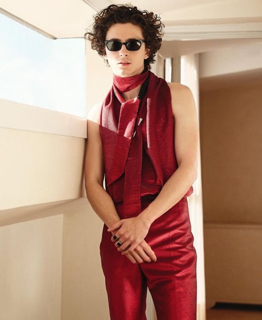
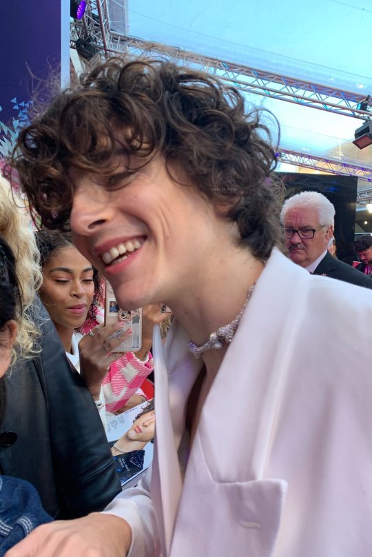
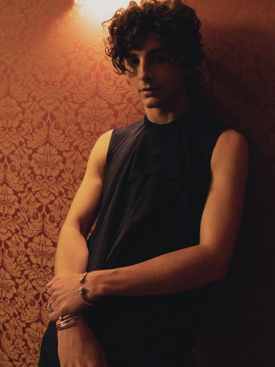
Favorite outfits/pictures?
These:
Tagging: @softhecreator @soymilkmocha @visionsofsweettea @the-poets-might-disagree and whoever wants to do this.
8 notes
·
View notes
Text
How to make a Crossplay Minecraft SMP | Tutorial | Java and Bedrock
When I was first starting out making my SMP, I looked long and hard to try to find information on how people were making Crossplay MC SMPs so I wanted to make this guide to help out people like me!
First off, if you’re looking for a server hosting company, I would recommend Bisect Hosting. I’ve used a lot of server companies and I genuinely believe they have the kindest customer service out there. Running a Minecraft server is stressful at times and knowing someone has got your back and will respond kindly with a helpful message takes so much stress away. (These are all my own words and thoughts, but the link is affiliated)
First of all, there are two, maybe three plugins that you will need to allow bedrock connections: geyser, floodgate and maybe ViaVersion/ViaBackwards.
Geyser is the bridge between Bedrock and Java, and it "translates" the Java information ("packets") to packets that bedrock users can read.
Floodgate is a plugin that lets Bedrock editions join a Java server through Geyser without needing a Java account. This allows your server to stay as an online mode server which is safer and is required to be on if you need help in the Geyser Discord Server.
ViaVersion allows newer clients to join on older server versions. This is what they use on Hypixel and other servers to let you join a game that is hosted on 1.8.9 on later versions. (optional but would recommend)
You can even add ViaBackwards to allow for backwards compatibility, which would let you join a 1.19 server on 1.18 and it works by substitution. For example, the warden would show up as the iron golem with a warden name tag. (optional but would recommend)
Ok, so now that we've went through that brief rundown on the plugins we will need, let's work on installing them. First of all, download them off the website, making sure to download the Spigot versions of all of the plugins. Second of all, go to your "File Manager" or "FTP access" area, open your plugin folder and upload them there. Wait until they are uploaded (while watching my Youtube videos of course), then restart the server.
In the plugins folder, there now should be a Floodgate folder, a Geyser-Spigot server and a ViaVersion/ViaBackwards folder if you chose to install those options. If you want, I have uploaded my Geyser config here and you could just download mine and then upload it through the Geyser Config Editor to make the required changes or use it as an example while making yours.
Here's what you HAVE TO CHANGE in the config so it works on your server, just use command + F to find these.
Port - Change it to your Minecraft server's port. If you have none, just use 19132 as your port. If you do not have a dedicated IP, just use your regular port.
MOTD1 - I would assume and hope that your server is not called The FIRE SMP so you can go ahead and place your server name here.
MOTD2 - just put something kind of slick here, while MOTD1 might be the server name, MOTD2 is a short phrase that represents the server.
Server Name - pretty self-explanatory, don't you think...
Port- Yes, this is here twice and it's because you have to put the Java port here.
My Opinions on Certain Items (do Command + F to find these lines)
Command Suggestions - I have it at true in my provided config file but it might make bedrock players freeze if they have access to a lot of commands
Disable Bedrock Scaffolding - I have it at true (to disable) however, it is glitchy and players can get around this. Just put it to whatever you prefer.
Emote Offhand Workaround- allows bedrock players to emote to place a main hand item in their offhand. I personally have it enabled.
Enable Custom Skulls - leave this on IMO, but if there are problems, lower the block distance or number of skulls allowed to be rendered.
Above Bedrock Nether Building - allows bedrock players to go above the bedrock ceiling and build like Java players can, it just prevents them from seeing the blue fog of the soul sand biomes. I have it enabled.
Ok, now that Geyser is set up, save the file on the server, and go to the Floodgate file which is also located in the plugins folder. I wouldn't worry about the Floodgate config but you can change the default prefix from "." to something else there.
What is a prefix? Due to Geyser and floodgate, Bedrock users will ALWAYS have a "." (or whatever you choose) in front of their name to avoid naming conflicts. If I am a bedrock user, my username will appear as .Firecrackled and if I am on java, it will show up as Firecrackled. If you took away the prefix, it could cause problems for the admins when kicking a player with a duplicate name, or there could be worse problems and can open the server up to malicious actors.
ViaVersion and ViaRewind are plug and play, no config editing required. However, after every update to Minecraft, you will need to make sure that your version is up to date.
6 notes
·
View notes
Text
Such Sights to Show You...
As a Canadian, and especially as a Québécois, my experience with the Haunted House tour would probably strike most Americans as being excessively tame. We're only just starting to see venues that sort of progress past the basic conceit of people looking unsettling while occasionally shrieking at you or going "Boo!", but the local legal framework makes anything extreme fairly difficult to imagine. I've seen some interesting twists on the formula, like a night marathon in an open field that's presented as your attempting to slink past and run away from a horde of zombies, or the now-defunct La Maison Hantée restaurant on De Bleury, in Montreal, which tended to veer towards the darker ends of Burlesque and Cabaret. Waiters could elicit vague jolts out of you, actors cloud slip under the tablecloth and make it very clear that they were touching your legs - but you explictly paid to be served a grotesque twist on middle-to-high-end dining. There were enough lulls and changes in the emotional registry to let you get your food and drink down, essentially.
Today, most high-end haunts are more a question of prop-work than any serious effort to be intense, and the more overt outlets like Malefycia - also in Montreal - are strictly regimented. You might be touched or prodded or even pushed, but all actors are informed of the participants' limitations. It's a bit more of an Escape Room setup, in a sense, than a torture gauntlet.
Having watched Monster Inside after catching a referral on here, I was reminded of a particular October night from a few years back...
Halloween's right around the corner, so you know the gist: You're feeling spooky, what starts as you OD'ing on Danny Elfman soundtracks and your good old shitty laserdisc transfers of seasonal soundbanks and hokey atmospheric music turns into your deciding that you're up for something juicy, especially something from the less sanitized ends of Hollywood horror. As much as I love my Freddy Kruegers and my Jason Vorheeses and my Pinheads, I've also just started to get into Damian Leone's output. So I watch Terrifier, the outlandish kill setups amuse me, Art the Clown steals the show - and I settle in for a chaser of The Halloween Tree or Hocus Pocus.
And then, looking around YouTube, I come across the bevy of promotional videos for American haunts.
I'm hooked. One of them really catches my eye, what with the showman's bravura that he exudes, the smarm that oozes out of every pore, the self-satisfaction at the sight of people who signed up to be dehumanized endure things I doubt many POWs even experience. My first thought is fairly expeditious, considering: Guy's gotta be some fuckin' sociopath.
That man is Russ McKamey, and his attraction is the elusive McKamey Manor. I slam the entirety of the Manor's YouTube content in one night. Red flags keep lighting up as I go along.
If you're reading this, you're probably aware of how safewords can be vital in kink communities. Consenting adults can consent to all sorts of things, but they also have the right to withdraw that consent by providing a clear and unmistakable signal that the party's over. As in, you're expected to respect them. You don't even need to be part of a kink community to understand that fact, much less a lawyer.
Well, I've seen dozens of instances where McKamey made it obvious that he didn't give a shit. The safeword is something he treats like a threshold for the upper limit, which means that you're going to be subjected to a fair bit of added pain. Legally, he's at fault - especially considering how some parts of the experience involve gagging the participants, which obviously renders safewords null and void.
Then, there's the forty-page waiver contestants sign, which apparently flies in the face of what you could consider plausible levels of the waiving of criminal liability - in a way that's sort of reminiscent of OceanGate's own waiver. If you need a reminder on them, Google for Stockton Rush...
As a haunt organizer, the last thing you need is for your guests to outright die on-premises. Yet here is Russ, absolving himself of all responsibility in the case of an event that he entirely would've triggered. Not only that, but the waiver seems to be treated like some integral part of the pre-show theatrics! There's no line of separation even as you're handed the thing, apparently!
Through it all, you're left thinking Hulu produced this thing for the shock factor - which is cripplingly obvious. Three former participants out of hundreds, now, with Facebook groups mentioned where other former attendees band together to commiserate over their lack of judgement, and that are also taken as targets by trollish supporters of the man.
You're left thinking "Who is this for, exactly?" The former US Army soldier with two tours under his belt and one tour in the Manor which was apparently worse than watching comrades-in-arms die under fire? The would-be Scream Queen who reached her upper limit? Or is it for the disaffected youth looking to experience thrills unrelated to parental abuse? Is it pointing a finger at the showman or indirectly goading the viewer into giving it a shot?
The one good shot is near the very end, where the documentary decides to counterpoint the Manor with an experience titled Miasma, run under much clearer directorial guidelines by a man called Justin, who displays a deliberately careful level of attention and who consistently checks for informed consent. One of the Manor's survivors breaks down in tears after officially dropping their role and speaking their safeword - leading to Justin carefully leading them out of the experience personally - and hugging them.
They're given time enough to decompress, and the lights soon come back on.
Seeking extreme experiences can be cathartic for some. The thing is catharsis requires a sense of release, which Russ McKamey never seems to grant. It's always bigger, louder, harder; with his visibly being convinced that he'll spot the right moment to stop. According to the interviewed contestants, release was never properly granted. No one's died yet, but this level of sensory and physical assault can't possibly leave good memories.
If you're in my shoes, you realize that there's a seam between Russ McKamey's project and the participants' experience of it. You'd think a better showman would've paid attention.
#The Monster Inside#Russ McKamey#McKamey Manor#Haunted Houses#Haunted attractions#Extreme haunted houses#abuse#PTSD#Horror#Halloween#Malefycia#La Maison Hantée#Montreal#thoughts
1 note
·
View note
Text
Written Reflective essay
Essay on concept art
So if there were to be a specific part of the industry I would like to work in the animation industry, it would be to work as an concept artist, as it is what I am mostly passionate about.
What is an concept artist ? and what does a concept artist do
An concept artist is an visual art used to convey an idea for the use of a film, video game, animation, comic books, television shows other any other media before it is put into the final production
A concept artist is a person who creates works like character design, environmental design, creature design, prop design, vehicle design, and many other assets that can be used for a any medium from videos games to movies
These designs are more over the things you see in the environment as well as the characters depending on the medium. And it is the finalized version of the concept artists design.
And these designs that the concept artist creates are used to visualize ideas for the modelers, animators and VFX teams, so these ideas can be used in production.
So since we know what a concept artist is and what they do I would more over like to talk about the things an person who is looking to become a concept artist must do, in order to become a concept artist.
Concept artist need to know design how to create these designs that will blend with the project they are working on.
Not only is creativity important, but also an proper attention for detail, which will allow them to work in different styles, different styles of characters, creatures , environment and anything else needed for the project.
It is important to understand there are many moving parts in the your team and your only one part of the whole piece, so it is also important to have proper communication with the team you are working with.
The type of work flow you will face when you’re a concept artist, will probably be something like this, an art director will give you a brief, to the (artist which is you) and in this brief, lets say your suppose to design a character for a game, the brief will probably describe the type of character that you supposed to create, the brief might talk about things like (visual features, personality and anything relevant to the design)
So after you get the brief, the concept artist will have to start thumbnailing rough ideas, and the concept artist might have to do around 2 to 200 of these rough sketches, and it is also important to note that the exploration face is the most important phase.
After the concept artist is done with this phase they will have to make a choice and the choice is to chose, some of the concept art the concept artist has been working, and then after the concept artist has chosen the sketches, he will fully render it digitally, most likely front and back renders if its an object or some sort of a prop, but if it were to be a character it would have to be done in a profile view of the character meaning you would have create it in all angles for the design.
Some times the concept artist might draw some actions for a character like shots of the character jumping, lunging forward, or swinging a weapon. The finished pieces will go to the art director to be reviewed and critiqued, and if the director requests to change something it is to be updated.
And after the design is complete it will be used to as reference for every one else in the team to use.
Some thing to note is being a concept artist is a very competitive Job, so It will talk about the requirements when becoming a concept artist.
An concept artist needs expert level of art fundamentals which include perspective, anatomy, composition, lighting and tone, ( among other thing).
Another thing is you need to practice from life in order to capture realistic details.
And to become a great concept artist you need to first become a good artist. Meaning practicing fundamentals every day. And also you need to have good tastes for design work.
One thing to keep in mind is to pick a concept art specialty and stick to it, meaning if you want to do concept art for character design then it is best to stick to that, or maybe you might want to be a concept artist for environment design and if that is so concentrate on that, and by doing this it will make your portfolio have a higher chance to stand out .
0 notes
Last Seen Blogs
louloudouce
Keep calm and watch what you like
dasiar01-blog
Dasia (Day-see-uh) 🖤
a-rainbowmess
*idk what to write*
eduedamtew-blog
Eden