#so this is technically a redraw oops
Text
md's fun silly little top 10(ish) arts of the 2023!*
*pretend there's a fun cute doodled banner here (i was going to make one earlier and then i forgor)
doing a lil recap of my top 10 15 (it was supposed to be 10 and i could not narrow it down oops) best(? this is subjective as fuck i guess it's more like my personal faves) drawings of the year! *the crowd cheers* (it’s me I’m the crowd)
15: paradise by the dashboard light! i hate to rank her so low bc i spent ages on her but it seems i don't love the result that much anymore so :/ a for effort for me tho this was ambitious
14: cheer girl loml <33 not my best art technically by far but i went way out of my comfort zone for the background and the art style (for no good reason really) (i just wanted to do a comic book thing bc superhero vibes or whatever) (it did not come out the way i was hoping it would bc i think i got too frustrated) and we simply must acknowledge that. atog did things to me that i cannot explain
13: barbie meme brittana! not my best britt but truly sooo fun to work on. there's nothing quite like finding a fun rendering process and then never using it again (i don't even remember how i coloured this but i like it)
12: cowboy barbie brittana <3 they look good, they're about to kiss, cute outfits, pretty sunset, probably went overboard with the rim lighting, what's not to love? a banger, i think
11: i say a little prayer! i think the background is. questionable at best. but this is still really fun! i think i got possessed when i got to the uniforms bc goddamn they look good
10: klaine?? on this blog???? almost unheard of lmao i truly did not think i would like this one as much as i did. i'd consider ranking it higher if i wasn't constantly Unwell over brittana but again, i'm biased, and no one here should be surprised about that
9: pre-wedding kiss my beloved! with how insane i've been over this kiss it could perhaps be higher. i am gnawing on my desk as we speak i'm not even sitting at a desk rn
8: rutherchang x black swan!! ohhh u guys i don't talk about this one enough i think it's so pretty i don't even remember how i did the colours for it but rhgfdkngd?? love her, love pushing the glee x bts agenda, if any of u gifmakers are interested in making a mike chang x black swan lyric gifset i will love u forever
7: colour wheel challenge! busted my whole tiddies and ass for this one fellas. labour of love etc etc i think staring at the bright colours for so long made my eyesight worse and i'm ok with that
6: mistletoe brittana <33 easily the best instalment of this series by a long shot! recency bias (and also just. regular bias) made me rank her much higher originally but technically she is not the most intricate piece so she must sit down here
5: prom queen kurt! dare i say a girlslay on my behalf? i think i dare. every time i see it i think i should do more glosters (glee posters) and then i don't. i could tho they would be really cool (source: dude trust me)
4: churro kiss redraw!!! genuinely Not Sane over this! never have been, never will be! redraws are like crack to me and so is this kiss
3: furtana!! i neglected them for far too long this year but if neglecting them results in art like this i may have to do it again
2: heart kiss <3 if we're being really honest and vulnerable in the chat tonight i think this is technically my best of the brittana kiss screencap redraw things i've done this year? which i did not see coming but i guess practice means refining the process etc etc so. it makes sense ig. mwah to them <3
1: black or white gcv animation <3 it's not what i would call my best drawing (bc it's, yknow, not just one drawing) but it is what i would call the product of a very obsessive thought and some frantic art sessions. objectively it's the coolest thing i've done this year so it deserves the top spot. i'm proud of it i hope to glanimate more next year. also this isn't art but it's a relevant post that i still stand by months later
#md rambles#idk what this is kdfghk i'm so sorry it's 5am and i've spent the past hour ranking these and just saying shit#if i were more awake i would be more specific about actual art things i'm proud of. but i am not. so#sth sth made a lot of bangers this year i think sth sth vv proud of myself sth sth fun list bc i feel like it
21 notes
·
View notes
Text
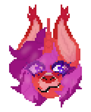
Sire redo badge!
Yeah, you heard right, this is a redo badge! What do I mean by this? Back in 2021 I started doing badges of my characters, and now I am doing them again, so, this is technically a redraw! I'll show a side by side of the massive improvement later! Also, finally I drew a biblically actuate Sire. Oop. OC: toyhou.se/10420800.sire
#furry#furry art#anthro#anthro art#furry oc#furries#personal art#headshot#furry anthro#fursona#pixelated#pixel#pixel art#pony#pony oc#my little pony oc#mlp oc#pony art#ponysona#my little pony art
0 notes
Text

i dont know what he canonically looks like and i dont want to know either. he SHOULD look like a nightmare half-dead twink & in this house we draw him accordingly
#warcraft#grommash hellscream#grom#fanart#my art#orc#i was looking around for stuff to put in my next portfolio (obv didnt get into mome bc nobody gets into mome so now we try other places)#&i found a bunch of warcraft stuff i didnt post bc i wanted to dump them at once; however i never finished like half of it#so this is technically a redraw oops#hold on i'll post the comparison
4 notes
·
View notes
Text
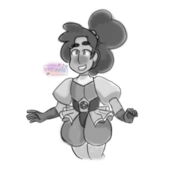

5th january 2019 -> 5th january 2020
my art developed a lot over 2019, esp since at the start of the year i was using my phone, and then i got my first tablet! and then my 2nd tablet! i learnt a lot and i figured doing a redraw would help show how much i've improved, and honestly i'm super happy with my progress hSDKFHDKDKDHDJF
pls click for better quality!
#my art#redraw#steven universe#stevonnie#okay so technically it's the 6th of january rn bc it's like 12 minutes past midnight#which i am ANNOYED about#HOWEVER. it's fine i finished this at like 11pm i just forgot to post oops#but DAMNNN bro it's been a whole year since that drawing???#like i remember doing it and being super proud of it at the time lmao#i still think it's pretty good considering i was drawing on my phone tbh but like#brooo i just. i feel like my art has improved so much#idk if it's super noticeable to y'all but to me it's like. a HUGE leap in 1 year#OH YEAH REMEMBER WHEN MY BLOG WAS KKEVAMIE. I WAS A KEVAMIE FAN BLOG
71 notes
·
View notes
Photo

Finished my Jiang Sect inspired wrap cape this afternoon! Thanks again to @piyo-13 for writing Emergency Help Wanted, which gave me this idea. Re-read the fic in between stages and it is just as fun the second time around :D Made the collar contrast light blue in homage to Lan Xichen’s design in the fic.

The cape did end up being reversible! Success! I’m very much looking forward to wearing it in slightly warmer weather.
I’ll include a few more technical sewing notes/narration/thoughts on the process after the cut for anyone interested.
These notes are points that I found particularly important/entertaining while making the AD 1910 wrap cape. There are many YouTube videos out there on making this particular pattern, each with it’s own fantastic advice (I watched many of them before getting started and they were very helpful!) and are far more comprehensive than the notes below.
Resizing: Looking at the pattern as originally drafted, I decided that a mock up was critical: my shoulders are broader than the pattern allowed for, so I knew I’d have to make some adjustments to the shoulders, back, and length of the wrap pieces. I ended up adding width to the pattern at the shoulders instead of the center back (thus avoiding having to redraw the neckline and collar). I altered the front pleats by redrawing the angles, keeping the top points at the same height, but shifting them to be equally spaced across the added width of the piece. I also extended the pleats to their original width at the bottom of my longer wrap pieces (marked in red below). Luckily, these adjustments worked well and I was able to move on to the pretty fabric (one layer is cotton, the other is polyester crepe-backed satin).
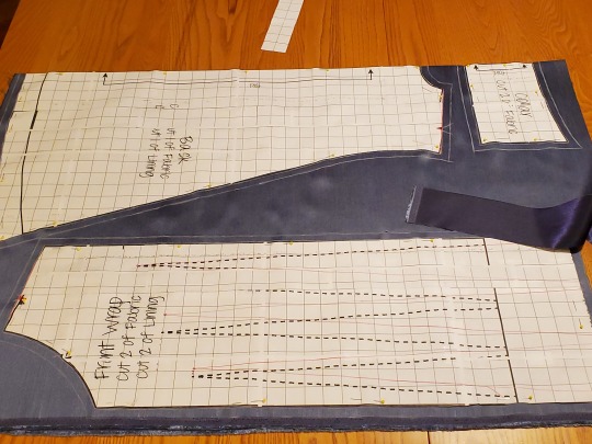
Top stitching: Top stitching is listed as a possible finishing touch in the pattern directions. I highly recommend it; it makes the cape look much more polished and feel more stable. I pressed and pinned the whole cape to make sure that my edges were clean before I started to sew. I also used this as the opportunity to sew the ribbon ties into the ends of the front wrap pieces and close the five inch gap that I’d left in order to turn the cape right-side out.
I don’t want to know how many pins I actually used at this stage... all I know is that I stabbed myself a few times while doing it...

Almost oops: My last piece of advice is one of those things that is blatantly obvious in retrospect: make sure you have enough of the correct color of thread! I apparently picked up a small spool of thread (only 100 meters) and only realized that this might be a problem as I watched it dwindle as I top-stitched...

Thankfully I did make it (just barely!), with less than two feet of thread to spare on the spool.
115 notes
·
View notes
Text
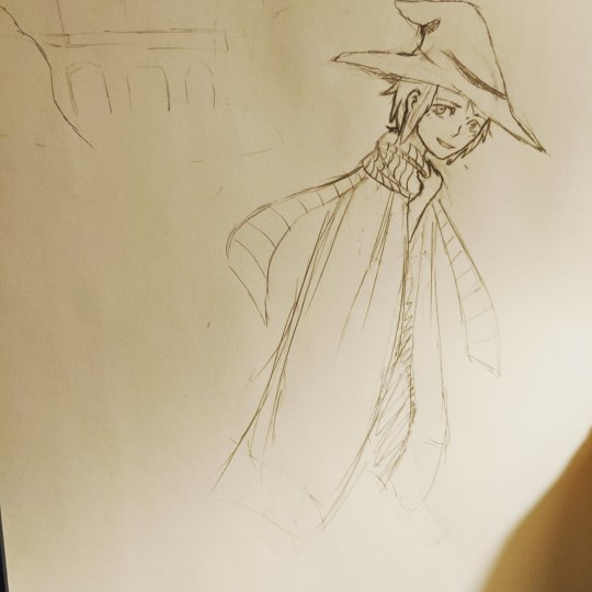
Oh shit it a sketch! It's Scorpius. Technically was a redraw but uh... I can't find the original so oops. Cross posted to Instagram @escha_511 and I'll probably put it on Twitter later @escha511
#scorpius hyperion malfoy#scorpius malfoy#albus severus potter#scorpius malfoy x albus potter#harry potter and the cursed child#harry potter series#fanart#harry potter#harry potter fanart
16 notes
·
View notes
Video
youtube
Republicans Get Smacked Down By Judges For Gerrymandering North Carolina
A panel of judges in North Carolina has warned the state’s Republicans that they have grossly gerrymandered the state’s district maps and they have to redraw them before the 2020 election. This is great news, as the state of North Carolina is becoming increasingly more diverse and isn’t a slam dunk state for Republicans anymore.
Well folks, we actually got some good news from the court system this week. We're a, a judicial panel in the state of North Carolina ruled that the district maps drawn by the Republican controlled legislature were so grossly gerrymandered that Democrats in the state would never have a chance in another election all because of the way the Republicans had drawn these districts. And so now this judicial panel told these Republicans in the legislature that, hey, um, this is gross. This is awful. You've got two weeks to draw them like a normal person and to stop gerrymandering, all of the Democrats into heavily Republican districts. I want to read a little bit here from the actual ruling from this panel itself. This is from the ruling. The effect of these carefully crafted partisan maps is that in all but the most unusual election scenarios, the Republican Party will control a majority of both chambers of the General Assembly.
In other words, the court finds that in many election environments, it is the carefully crafted maps and not the will of the voters that dictate the election outcomes in a significant number of legislative districts. And ultimately the majority control of the General Assembly. Now I know a lot of people out there thinking, okay, well yeah, Republicans are just going to appeal this ruling. They can't, I mean they can but it's not going to do them any good. The Supreme Court actually already ruled that, hey yeah, federal courts, we really have no say in uh, you know, district drawing here. That's a thing that state courts have to decide and, oops, this was a state court and the supreme court already said that they're the law of the land when it comes to districting. So these Republicans are forced to redraw their districts within the next two weeks and resubmit them because they can't use their disgusting maps in 2020.
Obviously this is good because North Carolina is shifting. North Carolina is no longer seen as a solidly Red Republican stronghold. The demographics of the state are changing and they're changing in a way that doesn't benefit Republicans. And that is why Republicans are trying to Gerrymander the hell out of all the districts because they know if it was a fair election, they'd be gone. And that's the problem because it's not just North Carolina. We've seen it in Pennsylvania, in Ohio. We see it in Texas. Have you taken a look at Dan Crenshaw's district? I, I hope we have a picture of this to put up because Dan Crenshaw's district looks like a fricking boomerang. There's nothing straight about it. It's just the weirdest little thing. And they did that. They carved out that little niche for him so that he could be elected. If we had honest maps down there in the state of Texas, Dan Crenshaw wouldn't exist.
Well mean technically, obviously he would exist as a human being. He wouldn't exist as a law maker though. And the same goes for lots of Republicans sitting in the House of Representatives today and in their own state houses, they wouldn't be there if it weren't for gerrymandering. This country would be a lot different today if it weren't for Republican gerrymandering. And I know in the past Democrats have done it too, but they've lost power for so long, been without power for so long. They haven't even had the chance to Gerrymander anything in about 20 years. So yeah, right now it is all of the Republicans who are doing this....
3 notes
·
View notes
Photo
holy shamoly there are so many things to play with here AAA (also Gladstone doesn’t have friends like OOF anon ouch right in the kokoro)- imma waffle about possibilities for a bit so feel free to read or ignore
Oh man I’m super into this thank you anon whoever you were.
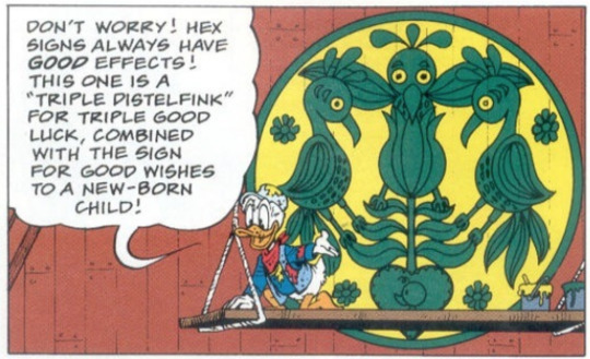
This is the original from the comic scan! Regarding your observation of it not relating to marriage, I think that’s covered by the Don Rosa original explanation in Sign of the Triple Distelfink that it was designed specifically for the coming of a new child. Taking that packaged on top of the fact that it was in fact his mother who received that particular hex effect, and that Gladstone inherited it after the fact, I suspect there’s room for a shift in how the luck functions. Also this is like, happy fun duck comics land so I’m not gonna get too bogged down in technicalities (also going to talk about the theme of isolation in this later).
I do like that you pointed out it has stuff to do with familial love and is different from the symbol for friendship- that works all too well! Gladstone loves his family a lot, but even then his actual friendships with and within the family aren’t all that great! He loves Scrooge, and doubtless (deep down) Scrooge loves him, but they don’t always see eye to eye and in terms of ‘friendship’ it isn’t easy to say that they have a good relationship. Same with Donald; ultimately, they’re cousins, and would never hurt each other seriously in any way, but they fight all the time! Donald in particular is very open about the fact that he hates Gladstone, and while I don’t believe I’ve ever read Gladstone saying he hates Donald, he certainly enjoys being his rival and getting on his nerves!
The one-instead-of-three tulips is particularly laden with possibilities; with how you described them, I would say it fits Gladstone very well! Gladstone has absolute faith in his luck; in fact it’s when he doesn’t that it sometimes stops working for a time. If we take that as ‘faith in what one does’, that erases ‘faith in oneself’ and ‘faith in ones fellow man’- which half works, because he doesn’t trust others (perhaps with the exception of his family, but even then in O Lucky Man we see he was suspicious of Donald using him too), but then Gladstone is very arrogant and confident, so does that negate the first? So perhaps we have to cancel out ‘faith in what one does’ and THAT fits in the sense that, even if it always benefits him, he doesn’t have any control over his luck and effectively is hostage to its whims. Moreover, as in this particular comic, it’s suggested that he feels frustrated and guilty that it doesn’t matter whether or not he tries to achieve something good, it just happens to him. Basically, the thing that he lacks is faith in his worth as an individual: however, is that ‘faith in oneself’ or ‘faith in what one does’? I’m not actually sure! But he certainly doesn’t have faith in all of those three aspects, so one tulip sounds just right.
In terms of the birds, that is to say the ‘distelfinks’, there are several ways to interpret their positions and behaviour, but I can only make these guesses as an outsider based on what you’ve said and other symbolisms I’m more familiar with (there are so many little tie-ins to heraldic, alchemic and tarot symbolism with this image but I’ll try not to deviate).
From your statement it’s unusual for them to be facing each other, and hex signs are usually applied to households, marriages, or friendships; i.e. situations that involve multiple people. This along with ‘inward facing’ creatures to me implies a statement on inwardness, and an inward channeling of the power it is meant to summon. Gladstone’s luck may have a slight umbrella effect, but what is repeatedly enforced in the comics is that it only benefits him. There’s some amount of his luck ‘rubbing off’ on people, whether by literal touch or simple proximity, but the hex only affects him to the absurd degree we’re used to (which makes it entertaining as a character feature, but has proven to be distressing both for him and others).
We can, again, take this imagery as a depiction/description of Gladstone’s selfishness, or it could be a conscious decision on the part of the hex maker to restrict such a high level of supernatural luck to one entity only. Imagine if that level of luck happened to everyone who was within shouting distance of Gladstone, or everyone who happened to walk past that particular barn, or stayed with people who’d made contact with him etc. The results would be impossible! Dangerously so. With inward facing distelfinks, it leads to a supposition that the only beneficiary of the hex is someone who it explicitly refers to; it worked for Daphne, obviously, as she was the person it was made for and was born directly in front of that symbol, and it works for her son who was born on her birthday. My redraw excludes that specification of the ‘newborn child’ image in the heart, and I’m starting to think that I’ll have to fix that! Because this is so obviously an inherently important aspect of the symbol- this hex can only be received as a birthright. In this sense, the spell is purposefully isolating itself from outsiders, and that reflects perfectly with how Gladstone has done the same to himself; in that vein, it could be said that Gladstone’s self centred personality is not only inevitable as a side effect of being so lucky, but is a necessary form of self-defence to cope with the mechanics of his luck.
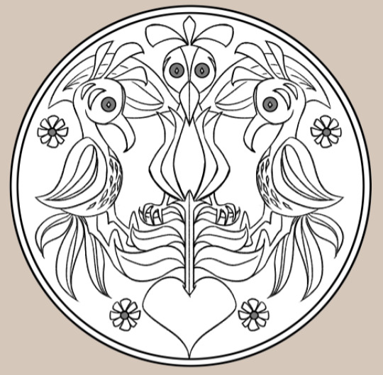
As for ‘staring down’ at the tulip and the heart (which I take to be a symbol of the hex’s receiver), it could again be seen as a literal depiction of the distelfinks having a position of superiority and control over the subject. In my redraw I attempted to keep it close to the original, but I took the liberty of making it look even more like the tulip is viscerally connected to the heart. It could be seen either as a tulip growing out of the heart, or being forcibly inserted into it by the distelfink- either way it is a slightly uncomfortable concept. It also struck me that the birds were clearly holding onto the tulip, and the centermost bird is in a slightly aggressive stance- leaning over the flower, looking right out at the viewer. In other symbol language, a symmetrical creature gazing front on to the viewer is often a warning or a confrontational statement; again, a form of exclusion, and a statement of something that should not be interfered with. I wish I knew what the four flowers in the design were, and whether they have some inherent symbolism too...
SO yeah that’s my little analysis. It has to be said all of this is complete speculation on my part! Whether Don Rosa had any of this in mind when he was making the design is anyone’s guess, but he has a long history of depicting very accurate research and I strongly suppose that he knows a lot more on distelfinks than I ever will. Whatever the case this sign is certainly one that could stand more exploration in the canon! There’s just so much to play with!
Anyway, this was fun- now I have to work. Oops.
#TL:DR uhhhhhhhhhHHHH THERE'S A LOT ACTUALLY#Gladstone Gander#the sign of the triple distelfink#Don Rosa#I got wayyyy carried away whoops#THANK YOU ANON
326 notes
·
View notes
Text
therefore you and me post-production notes
(or: murphy’s law as a project that has been two years in the making)
ive had this idea for ‘therefore you and me’ and Fritz ever since i first played CindPhenon. nothing ever fell into place until i played Evermore though, so here we are!
drafting this project was pretty easy tbh (see: hubris). the parallel imagery and everything about the lyrics was right up my alley aha.
fun thing with the lyrics: TadanoCo uses ‘要る (iru)’ in the line ‘Which do you want (iru)? Or do you want neither (iranai; aka negative form of ‘iru’)?’
‘ 要る ‘ as a verb can mean ‘to be wanted’ or ‘to be needed’.
hence, the line can also be read: ‘Which do you need? Or do you need neither?” or any other variation of the verb’s usage.
it’s halfway through drawing the lineart that murphy’s law began. 1) i drew ~15 panels on the wrong dimensions, and had to redraw them all (lol), re-grey tone (LOL), and re-ink (LOLOL). it was not a fun three days.
then i lost momentum because of lunar new year (happy late lunar new year btw! happy year of the ox :”) )
anyway: the moment i regained momentum for the project again, i hit a roadblock in the form of overconfident, sloppy drafting (see: hubris is my downfall).
because of the lack of clear drafting for certain panels (and changes to previous panels), i had to redraft two different sections of the PV while keeping in mind that there was the bridge still to be drafted. fun !
i decided to simplify the bridge. can you believe it was supposed to be another animation. i can’t. so i scrapped it.
(slight tangent. Evermore’s release honestly cleared up a lot of uncertainty regarding the direction of the PV and whether or not to include Fritz’s mother (who I still fondly call Beatrice). im really happy the PV never came to fruition before Evermore’s release, as im not sure i would have done half as good a job without Evermore’s content.)
back to the hubris of proceeding with a messy draft - there was a lot of push and pull internally for me as to how much i should keep to the original PV and how much i should just put my spin on things. i ended up doing a bit of half-and-half, i think.
but really, it only delayed things as i ended up redrafting and having multiple drafts of certain panels haha//
the last two choruses were honestly my favourite parts to draw. the shift from Varg’s clothes and colours to Fritz, Fritz’s acceptance of Varg and the soft way Varg looks at Fritz (and no one else). there’s something cathartic about acceptance and acknowledgement. i think that’s what i aimed to really capture.
also: in between drawing all the panels, murphy’s law 2) my Evermore itchio game file ? got deleted off my computer ?
it’s a very old, barely functional brick so im lowkey unsurprised but at the same time it was a crazy experience and setback when i needed to reference certain scenes. oh, and Steam decided to not download Evermore too. i still haven’t fixed that one. haha. ha.
i have screenshot posters to thank for uploads of certain CGs, although im still pretty sure its best not to post a ton of those publicly at one shot?
also, i had to scrap the recreation of the famous ‘did you love Varg’ scene because of this aha. looking back now, i think it worked out.
(another tangent: using referencing as an excuse, i actually took the opportunity to replay Fritz’s route for the third time. i ended up checking nothing at all and falling in love with the masquerade scene again.)
up till the very end, im still not sure if everyone got that the line “You are love itself.” was meant to be said by Lucette to Fritz. i colour-coded Lucette with her own unique blue for the PV, which was the same hue as the line. i hope that it got across, aha.
with that said, video production was a whole entanglement in and of itself. i think murphy’s law really took up a hammer and swung hard at this stage.
timing was actual hell. im usually not this bad at it, but this project in particular was tricky bc TadanoCo uses a lot of background beats that aren’t overt, which his PV also matches - i think? or maybe im just not good at recognising beats from lack of video/music production haha//
hence there were certain scenes i was stuck at and kept revising because i wasnt clear where the beat was meant to be, what transitions i should use, and when the transitions should be.
subtitling was actually really fun! until i rendered my first version and realised all the subtitles were completely off and blurry.
turns out my project properties were different from my video properties, hence the off-alignment. huh. didnt know those were Actual Things(tm).
also, quick tip to all vid-making amateurs like me out there: you may have to double the dimensions of the font’s media properties if you dont want them to come out fuzzy. another thing i didnt know lol.
anyway all this lead to: me needing to spend another evening to redo subtitles. haha. it was not a fun two back-to-back 3am nights + extra evening afterward.
in between all this was countless rendering tests to guess-and-check what’s causing numerous errors in the video btw.
and with those rendering tests came: glaring mistakes in the panel art that i only now spotted and had to fix, and refix, and refix again. then reimport into sony vegas, put it into the video, render and double check if it’s alright. rinse and repeat countless times ! haha ! PV making is fun !
i think i nearly redid a certain scene with the exact same panels once. like i said: not a fun two 3am nights.
that said: i dont know how all this technical issues (and more) popped up and were resolved over two 3am nights and one evening. im not about to question it either.
at this point: panel art - fixed ! subtitling all redone ! render works fine, everything checks out.
i make the mistake of uploading it directly to yt instead of leaving it unlisted first.
murphy’s law 3) when im watching the vid on yt, the yellow parts in the second verse were completely unable to be seen.
panic put it on unlisted. people are already watching it and leaving (very sweet) comments. panic delete it.
btw if you’re one of the first three commenters reading this: thank you for the quick response !! it means a lot and made me really flustered in a good way :”))
cue me re-colouring those scenes, redo-ing the section and oops, is that a panel in the masquerade scene where Fritz literally is missing his mask ???
i think i lost my mind entirely at this point. from then on i was fueled by spite to complete this cursed project.
at thereforeFINAL.mp4, (version five of the full PV, version maybe 10-11 of all the rendered videos, including tests) finally. finally it is done.
i upload it.
the end !
(except, not really. because here you are at post-production notes detailing the worst luck i’ve ever had with PV making.
i learnt a lot from this though, and honestly on hindsight i should have learnt all these from my first PV but nothing went wrong at this magnitude so i kinda just...shelved it aha//
but really, im relieved it turned out well, and that i took the time to redo scenes until i was satisfied. for a PV that’s been waiting in the background for two years now, i think this is the least it deserves.
if the comic about Fritz and Varg (which i referenced in one of the last choruses, i wonder if anyone caught that?) was meant to be a love letter to Fritz’s route, i think this PV ought to be a tribute to the character himself.
although - hm, this isn’t quite as good a tribute to Fritz as it is to his route, maybe? i don’t know, haha ! maybe it’s just myself wanting to make excuses to create more for him//
i was thinking of continuing on about the PV and it’s significance to Fritz and Varg, but hm. maybe not on this post. maybe some other one, some other time.
but at it’s core, at it’s simplest, most raw - i think i just wanted to explore what it means to Fritz to ‘want’ and to ‘need’ with this PV.
thank you for watching the PV, and thank you for reading this.
- blu.)
0 notes
Photo

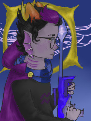

so for some reason last year I decided to redraw the piece i drew in 2015 (bottom left) so i redrew it again this year!! it’s technically two months early cause it was drawn in october (oops) but hey. here it is. kids with guns
#eridan#eridan ampora#hs#homestuck#eridan hs#hs eridan#its been a long time huh#dont worry i havent forgotten this kid#i got super lazy this year and didnt draw the chain / buttons lmao#ughhhh the more i look at it the more i dislike the texture of the velvet cause i was too fuckin lazy to do it properly#also for 2016 i put a LOT of effort into it but the proportions were wrong so it looked gross#also i put kids with guns cause the original was inspired by the gorillaz song!
24 notes
·
View notes
Last Seen Blogs

tiraam
... & exhale ❣

turnitalltomoonlight
Untitled

georgemathewsme
Cobblestone Catering

annachristinamay
Schwimmen in Rastern Grundlagen der Zeichnung