#someone please explain how halftone work
Text
Someone please explain how to draw with halftones
It's all I want
I have no idea how this shit works
0 notes
Text
a Red Son? in these trying times?
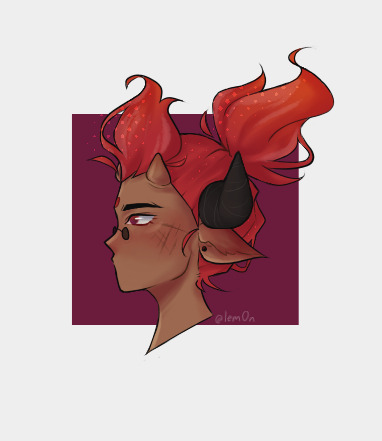
#he can have both pairs of horns.. as a treat#idek I can't draw rn#someone please explain how halftone work#I have no idea help-#lego monkie kid#lmk#red son monkie kid#lmk red son#red son#lem0n draws#my art#i have now decided that PIF's horns are real and not hair like that POSER spider queen#she deserves it <3#(also her son)#if you couldn't tell he's my favorite
75 notes
·
View notes
Text
EVALUATION !
This project is called MULTIVERSE, and my task was to create a zine using a collection of words linking to this topic that was given to use on google classroom. With these words, I were asked to pick out a minimum of 12 words and did so, but I only dedicate my zine to four words out the 12, and those four words were PARALLEL, REALITY, TIME AND ELEMENT, all the work I create during this project was created using the programs of adobe photoshop, illustrator, Lightroom, InDesign and procreate.
A zine is a small looking magazine that norThis project is called MULTIVERSE, and my task was to create a zine using a collection of words linking to this topic that was given to use on google classroom. With these words, I were asked to pick out a minimum of 12 words and did so, but I only dedicate my zine to four words out the 12, and those four words were PARALLEL, REALITY, TIME AND ELEMENT, all the work I create during this project was created using the programs of adobe photoshop, illustrator, Lightroom, InDesign and procreate.
A zine is a small looking magazine that normally is used for advertisement or to spread the word about something, In my case, it was to show artwork that portrays word that I have chosen.
A big part of this project was researching because I need to first research about zines as I didn't really know what they were I also need to research how to make one and how they work so I was able to create mockups and outcome that are the right size after doing this it helped me a lot to understand zine, and I was able to get on with creating, but then I knew it was time to create the outcome to go in my zine so I had to research and look up a lot of artist and designers for inspiration the pain website I used for inspiration was Pinterest due to me being able to create a board that I could go back to and inspire me.
The artist that I research that helped me a lot would probably be Ranganath krishnamani because he enables me to find a style that I like and help me open my mind to think or outcomes that I create this artist help me with the topic of reality as he a series of outcomes called a shift in the playing field and before I found him I knew I wanted to use social media and technology in my outcome, but didn't know how to do it so when I found his work it inspired me and I was able to think of loads of different ideas.
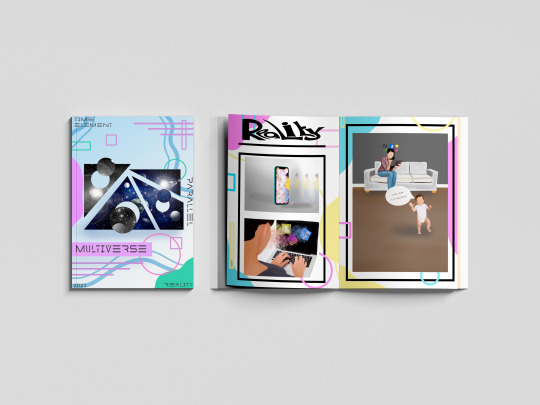
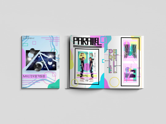
Each page in my zine is dedicated to a topic of my choice and the target was to show that word through artwork, for example, the word PARALLEL I used images such a building and shapes line and by doing this I put art together that represented parallel another page in my zine was about time so I used a lot of clocks to show that topic, the big part of this project is the MARS side or it MATHS ART RELIGION AND SCIENCES so another thing I had to have it mind was making sure I was showing this throughout the project and in my outcomes.
With me creating my zine I thought they would be a load of different problems doing it but in fact, there wasn't that many the main problem that I came across was one finding artist that had focused on the word time as I was really struggling with inspiration I need someone to inspire me but after a lot of searching on Pinterest and Google I finally came across outcomes that inspired me but was still unable to find an artist that focused on the topic time another struggle and I think the last struggle I had was trying to keep a team throughout my project and in my case, it was a colour pallet I wanted to use my colour pallet through but sometimes it would fit with the aesthetic so I have to think and think until I come you with and outcome using the colour pallet that I choose but overall the journey of my project had many ups as i was creating consatly but had some down fulls exspesaly went I have a brain block on ideas but came over quickly due to looking at pintrest the that got the ball rolling so a smooth journey i would say with this project.
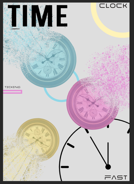
As this project had a task that was very different from the other projects that I have done there was a lot of learning involved and learning new skills and techniques including different programs to learn such as in design and new techniques on photoshop the main skill that I learn that I’m really pleased with was the dissolve effect/liquefy effect on photoshop that is used in my time poster in my zine another new technique that I approached was a log print/rubbing this was another technique that I used on my time pages for my zine and it was interesting to learn a new skill and in the future, I may want to learn about wood printing similar to linocuts and screenprinting but using wood. Are used a lot of old skills that I have collected over my time at college including collage thing halftoning and just my way of laying out my artwork and also a big part of graphics and getting my topic out there was using typography and I learnt a lot about how important typography is and I learn every day when creating new outcomes.
My favourite skill overall that I have learnt would be the liquefying effect on photoshop and also photography. I knew a lot about photography as I have grown up in a photographers household but I learn a lot more about capturing the topic of something through a photograph and I also learn a lot about Lightroom as that is where I edited the photos. With photoshop I watched many videos on how to do the liquefying effect and now I have that skill which I’m really happy about. I mentioned in my blog that I wanted to learn the program in design and I’m learning as I go along and I’m still figuring out the program watching videos but hopefully, I will be able to use that throughout my time at college and after and hopefully mastering it similar to illustrator and photoshop.
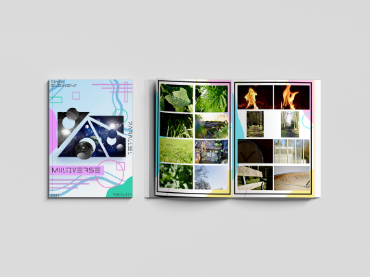
Due to us being a national lockdown the college isn’t open so we have been having to work from home and to present our work we have been using the website Tumblr I created account name is multi-verse and was adding all my outcomes and journey throughout this project onto my blog I really do prefer doing it a digital way rather than writing in a journal and sticking stuff in a sketchbook as one it gives you better quality pictures and it also allows you to choose statics and have a theme of your whole website page. Are used different ways to show my work and the journey of here the most common way was doing screenshots of how I got to an outcome and explaining step-by-step how I did it I also uploaded videos on my blog for me drawing on my iPad which is a cool way of seeing the development of an outcome. By doing all this work in this type of way I feel that I have displayed multi-verse and the project brief well on my blog and I feel that if someone was to look at it they would get an understanding of what it’s about and know what it’s about. Because especially at the beginning of my blog by explains a lot about space the multi-verse and theories delving into the more science and maths side of it and then as you go along through my blog you see research in me developing outcomes and by doing this I was able to develop outcomes to the best of my ability and be pleased with the outcome is at the end and then look well done.
With my blog I started off with a brain block I didn’t know what to do so the first thing I did to plan for this project was create spider diagrams that I could put all different connotations of my chosen word onto and search pictures on Pinterest and add them to the board by doing this I was able to refer back to them when I had another brain block further into the project. I also created a layout of how I wanted my zine to look and this helped me have a strict approach onto the scene as I knew that I wanted it to look like that so I stuck with that and as it was on my blog I knew that that’s what I showed that I wanted to be like so I wanted my outcome to show that I had followed my planning. And there are many different ways once I finish my outcomes that I evaluated them but normally I would just put my outcome on my blog and explain what my intentions were and what context I wanted to show and talk a little about the piece of artwork. One thing that I find it’s really important with any project is you try and see your work from someone else if you and try and give yourself critical feedback so you can push yourself and work harder I always do this on every topic are normally I get my family members to look at my artwork and say things about them and things that I need to change and things that are good so I work on it until I’m happy and pleased with everything on the page.

With this project a big part to me was the context as I wanted to show the words well through using artwork I feel the best piece of our that does show context is my reality pieces because you can see many different feelings and emotions through that piece of artwork and people can link personally to it where is with the other ones they do show context but not as deeply as the reality pages. But overall this project has worked really well and I’m really happy with how my final mock ups came out each page portrays a word in a good way and you know what the theme of the pages I’ve used many different skills and techniques including digital drawings typography log prints etc, but there are weaknesses to my outcomes and I would like to work on them in the future if I had the time and that would be maybe changing the theme of the background within the project as that was one thing that I was wary about and was concerned but the reason I chose are quite bold and colourful background with me looking at the word multi-verse and focusing on the word multi and thinking of loads of different colours so I had different approaches to the topic and they link back to everything which I think is a good thing to have but I play to my strengths which is always a good thing as you know that there will be a good outcome at the end by also worked on my weaknesses and learn new skills which I will use in further projects.
#MULTIVERSE#END#OF#PROJECT#EVALUATION#HAPPY#ZINE#PARALLEL#TIME#REALITY#ELEMENT#SKILLS#LEARNT#PHOTGRAPHS
0 notes
Text
Evaluation
· Explain the process you went through to create your final piece.
The process I went through to come up with this idea and create the final piece was that I chose one of the subjects – Post-Modernism, Feminism, Marxism or Capitalism. I decided on Feminism due to me understanding it more than the others and tried to come up with ideas based on Feminism. I came up with some ideas that were based in the collage studio, however sorting everything out such as the models, props, and light assistances would be a nightmare to sort out, so I decided to try and come up with an idea that was simple but still effective. Since I am pregnant I came up with the idea based on it, showing the difference between the male’s role and how it has changed over time. I hope I have communicated this with just one photo, hopefully showing the bond between the male and the baby/bump. I went through different ideas in my mind to take this photo and did some of them until I took a one that I was pleased with. I then went onto Photoshop and edited the photo with the different ways I chose to and chose the one I thought looked best.
· Which two new techniques did you use during this project?
I chose to do a halftone image for one of the edits so it looked a bit old fashioned, making it look like it was taken in the era that someone would have never been seen doing that (no male).
With my second technique I used I started from the original image and used the geometric pattern technique so that the image looked a bit distorted, as if it wasn’t real, again, to show that men wouldn’t have done it in the past necessarily.
I didn’t put these two techniques together on my final photo because I tried it/ experimented with it to see the outcome and it didn’t look good at all and wasn’t clear so I discarded it.
· What could you do with them that you didn’t try?
I could have used a coloured gradient while doing the halftone technique to make it colourful. I could have chosen to shoot the photos on film, to make the image seem old/ that it was taken a long time ago, and jotted down the settings. I could have shot it in the studio using the different lighting techniques I learnt.
· How did you experiment during the process of making your final piece? What experiments did you undertake?
The experiments I undertook were some with lighting, some with background and others with what photos I would actually take and choose for my final piece. I experimented with different lighting, but they were just day light or artificial light from the ceiling because I wanted the photo to seem/ be as natural as possible. I also experimented with the background because all though you couldn’t see the backgrounds that clear because of its being out of focus, again I wanted it to look and seem as natural as possible. I experimented with which photo I would choose for my final because although I may have been able to make a series I didn’t have the software on my computer or the time. I wanted to pic a picture that showed my point as much as possible but didn’t make it completely obvious.
· Which critical theory was your final piece inspired by? More specifically, what aspect of these theories did you focus on?
My final piece was inspired by the critical theory Feminism. I tried to focus on the whole abortion (pro-life/ pro-abortion) situation at first the I shifted on to focusing on the roles of parenthood, and how stereo-typically males were tougher, made the money, whereas the females were nurturing, stay at home, and how that was changing/ has changed over time. Then I came to my final base of the photo were stereo-typically the males didn’t show affection to the child much or even at all in the past.
· What exactly are you trying to say with your final piece? What message are you trying to communicate? Why do you feel that this is important?
The message I am trying to communicate is that times have changed drastically from 20 to 40 years ago, roles are being changed around, and stereotypes are just that. Fathers tend to try and be there for their child/ children as much as possible, even though they usually are the person that bring in the income, it is knows for the father to stay at home and the mother to work or for both parent to work because the mother also wants a career. Fathers tend to show more affection and love for their young. I feel this is important because it is breaking those barriers between stereotypes and reality, it is more acceptable for males/ fathers to show affection toward things in life such as their children and show love for the people they care for instead of being the “affectionless, emotionless man”.
· Critique your final piece from the perspective of your chosen critical theory. What would a Feminist say about your work? From their perspective, what does it tell us about the world?
I think a feminist would say that it has nothing to do with feminism because it isn’t based on a woman and her rights, however I think other feminists would say that it represents that men can be loving and caring to the child there for equalling women and men more by showing that we can show the same emotions and put the same amount of love into a baby proving we can do it within other daily thing (be equal to one another).
· Evaluate your final shoot thoroughly. What aspects of it are you happy with and why? What are its strengths and what could be improved?
I aspects of the Halftone one that I am happy with is hard to say because I don’t think it turned out as god as I would have liked it to have looked. It could be down to the fact that the Photoshop I have on my computer is older than the one I am used to using at college and there for has less features that I can use such as using the actual raw image instead of the jpeg. I also did try the “frequency” several times to different numbers up to 100 to see what looked best and I chose this one because it came out better than the rest.
The aspects of the geometric patterned image I did are that it looks quite distorted, pixelated, making it look quite unreal. I really like the fade I put on it where my belly is in focus/ looks normal whereas as soon as it gets to my boyfriend lips it starts to fade in to the geometric patter I chose for this image, making him look like he’s not real. I managed to put the fade in by having the original image on the bottom layer and the edited geometric pattern image on the top layer. I then added a mask to the geometric pattern image and pressed on the gradient button on the left hand side while having the mask selected. I then drew a line in the image with the gradient tool and it made the bottom clear mage come up. I made sure that the gradient was in black and white otherwise this wouldn’t have worked due to it being on a mask layer (black conceals, white reveals rule).
0 notes