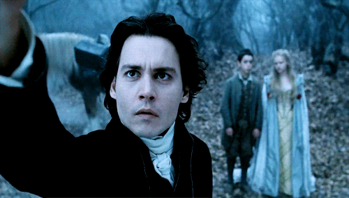
#such a beatifully made movie
Text
EUROVISION ABSOLUTE FUCKING BRAIN DUMP
Tonight, the night where... some... of Europe comes together and sings in an ..... something way, is the night I am willing to barf my brain out onto a page and commentate on the entire thing start to finish. THIS IS JUST MY OPINION!! Strap in motherfuckers....
We started the evening with the performance of last year's winner Ukraine (MWAH) starring Kate Middleton for some reason and Sam Ryder stood on top of some building in Liverpool. I had totally forgotten how earwormy that song was. I literally can't get it out of my head even now. We saw the countries come out onto stage to a very random compilation it seemed. I think Australia stole Germany's flag though.
PERFORMANCE 1 : ALBANIA- WHO THE HELL IS EDGAR? - TEYA & SALENA
I'm not lying here when I say I LOVED this song. I loved how it took so much inspiration from Michael Jackson in the dance moves. The girl with the black hair was mind-blowing. Like, she was unbelievably gorgeous. I'm not saying the other one wasn't- they were both incredible. I loved how much colour and enthusiasm they seemed to have. IT WAS SO RANDOM AND I FREAKING LOVED IT.
Rank no.5
PERFORMANCE 2 : PORTUGAL- AI CORAÇÃO- MIMICAT
The dress. Oh my god that dress was DIVINE. I loved how like bright it was to be honest. It was just so dramatic and it felt like it had a lot of variety. I don't really know why it just really appealed to me. Her voice is DIVINE too.
Rank no.6
PERFORMANCE 3 : SWITZERLAND- WATERGUN- REMO FORRER
I'm not lying when I say that this song brought a tear to my eye. It was so moving but god, that guy needed to put a few more clothes on. I really liked it. Remo Forrer can sing so beatifully and yet I didn't know who he was before tonight. That low note made my jaw drop. Powerful. All I can say really. The guy also reminded me of Noah Schnapp for some goddamn insane reason.
Rank no.7
PERFORMANCE 4 : POLAND- SOLO- BLANKA
I had to rewatch it cause it was kind of forgettable. Felt like it had been done so much before. I don't mean any hate by this but I just didn't like it. I wasn't as WOW as other songs have been. It gave me the vibe of the Stuck In The Middle theme mixed with Despacito. It just didn't feel if you know what I mean.
Rank no.23
PERFORMANCE 5 : SERBIA- SAMO MI SE SPAVA- LUKE BLACK
Perfection. It was so.... I don't have words for it. It was just fantastic. It showed so much talent and I loved the Graham Norton description of the nerdiness and that definitely came across so incredibly in the performance. It was just like smoke sweat and tears. I LOVED THE VIDEO GAME BIT. It's a great song, it's a wonderful performance. It's the best. Also, take a moment to consider how fit the guy was. This was no doubt the best act in my opinion but I know not many people have the same opinions as me so I'm accepting the fact that he's probably not gonna win.
Rank no.1
PERFORMANCE 6 : FRANCE- LA ZARRA- Évidement
It had such a french vibe to it for some reason. It's stuck in my head. I really enjoyed it to be honest. The outfit was genuinely on point and the vocals were stunning. The chorus kinda gave me Dua Lipa vibes but there's nothing wrong with that is there. The lyrics were kinda dramatic. Overall, I ate it up. Freaking glorious song there was just a lot of good competition.
Rank no.10
PERFORMANCE 7 : CYPRUS- BREAK A BROKEN HEART- ANDREW LAMBROU
Not memorable. It was quite sad. He's got a good voice, there were just better songs to be honest. It was quite repetetitive. I didn't enjoy it particularly it was just there. A few more layers would be nice. He sung quite high and it wasn't necessarilly appealing. THE FIRE THO. That arena must have been so hot. His voice at the end was beautiful, fight me.
Rank no.16
PERFORMANCE 8 : SPAIN- EAEA- BLANCA PALOMA
The bit at the beginning with the vocalisations (I think that's what they're called) was incredible. It gave off quite a middle eastern movie vibe which I wasn't expecting from Spain. Her top genuinely looked like it had been melted by heat which made me laugh. It gave off a Satanic ritual vibe. I liked the song but the electronic parts really didn't fit her talented and gorgeous voice.
Rank no.22
PERFORMANCE 9 : SWEDEN- TATTOO- LOREEN
I loved the vibes she gave off espescially in the introduction bit to the song, she looked like a batty pintrest witch which is a look I adore. Her hair was just stunning but for some reason it didn't look real, I don't know. THE NAILS!! God, they were so long. Her whole set was just tattooine(hmm maybe she thought about that) to me. It gave Wrecking Ball by Miley Cyrus. I really liked it. The whole song was so nice. There's not really any other way to say it than that. I really liked it though. I'm happy it was her that won.
Rank no.12
PERFORMANCE 10 : ALBANIA- DUJE- ALBINA & FAMILJA KELMENDI
I really looked forward to this one because it was a family quite like me and my siblings but I felt quite sorry because only one of the girls really got to sing in it. You could tell who was the favourite child. I loved the sister's outfits and the bit where it basically turned into the parents' love song was great. It was a good performance but it wasn't anything special.
Rank no.15
10 down, 16 to go!
PERFORMANCE 11 : ITALY- DUE VITA- MARCO MENGONI
I liked the top, make me one. He has a gorgeous voice. It was quite moving in some ways but I did get distracted by the trampoline guys in the back. I LOVED THEM. The lyrics were a bit random, I had it on translating subtitles. It was okay, I didn't think it was anything special though. It was a sway with your arms in the air type of song. He's such a good singer, I swear, I just didn't love the song.
Rank no.19
PERFORMANCE 12 : ESTONIA- BRIDGES- ALIKA
It was a magical song. I really enjoyed how it gave off fairy Elsa vibes for some reason. I don't really have many words it was just lovely. She has such an incredible voice. I loved her outfit as well it was fabulous. It was just a gorgeous song, I really liked it. She has such a powerful voice. It was divine.
Rank no.8
PERFORMANCE 13 : FINLAND- CHA CHA CHA- KÄÄRIJÄ
If you're here for a specific song, it's probably gonna be this one. The hulk forgets to put on his chestpiece and he's on the stage at Eurovision singing a heavy-metal-techno-pop number. I still can't understand what the fuck this song was about. It's really confusing but it's a bop. I'm just blasting out CHA CHA CHA CHA CHA CHA CHA in my brain the whole time. I really liked it. It was a proper random Eurovision song and I LIVE for em. The guy's got a good voice on him though, the prolonged shouting must have been hard.
Rank no.9
PERFORMANCE 14 : CZECHIA- MY SISTER'S CROWN- VESNA
It gave ballet recital gone wrong for me. It sounded a bit too like the winning song from last year for my liking but it was incredible with the harmonies. I didn't really get the hair message. They were doing feminism stuff but sticking directly to the gender roles traditionally set which I didn't understand. It was powerful and I did like it.
Rank no.18
PERFORMANCE 15 : AUSTRALIA- PROMISE- VOYAGER
I love watching forty odd year olds dance around on stage like they're twenty one. It felt like someone had gone through my playlist, taken the best bits from each song and melted them into a pot together. It is an anthem and I adore that. I loved the woman on guitar. She was so good. I loved the vibes it sounded like it could be in a video game and honest to god it was one of my favourites of the night.
Rank no.3
PERFORMANCE 16 : BELGIUM- BECAUSE OF YOU- GUSTAPH
The Boy George vibes were real. His outfit gave rich man goes on safari but there's been an incident with a red sock. It was a BOP like literally. I just wanted to do the macerena the whole time. The start bit reminded me of a musical I can't remember the name of. It was kind of repetetive which I didn't like. It was okay to be honest. Shoutout to the guy who was willing to be a furry stripper for this.
Rank no.17
PERFORMANCE 17 : ARMENIA- FUTURE LOVER- BRUNETTE
The singer gave me Ariana Grande vibes. It was average. It was a bit like an I'm not like other girls. She has a lovely voice but it did get quite lost in the other countries amazingnesses. It didn't really stick in my head so I had to rewatch the full thing whereas with most of the others I either don't have to watch it or I only need a memory jog. The getup was stunning. The boots should have had black laces though, it would've fit do much better. She's incredibly talented but there were better songs.
Rank no.21
PERFORMANCE 18 : MOLDOVA- SOARELE ŞI LUNA- PASHA PARFENI
Welcome to the stage... satanic yoga teacher. I liked it. It was so European. It was a great watch. It reminded me of the Mandolorian theme which is a massive compliment in my book. The horny women were great. (They had horns in their hair.) It was very Eurovision esque and I really liked it. It was quite funny and my little brother voted for it. Great song.
Rank no.13
PERFORMANCE 19 : UKRAINE- HEART OF STEEL- TVORCHI
After last year, I had very high hopes for Ukraine. I enjoyed it. I really liked all the staging it was stunning but it didn't stand out to me very much. The phantom of the opera guy got the night off though! It was a great song. It would be great at a festival, I can see it now. I don't have a ton to say about it. It was good but not mind-blowing.
Rank no.14
PERFORMANCE 20 : NORWAY- QUEEN OF THE KINGS- ALESSANDRA
This whole song makes make me want to yell with happiness. It just like scratches my brain for some reason. It was the only song this year that I had heard before and even though I had, it did not disappoint. I swear it was a whole vibe. Her outfit was literally straight from SIX, bite me. I loved it. I loved every second of it but there were better songs. The high note showed talent. I mean, I can do it but, but it still shows years of effort and training.
Rank no.11
Only 6 left!
PERFORMANCE 21 : GERMANY- BLOOD & GLITTER- LORD OF THE LOST
HUGE SLAY. I loved it. In my honest opinion, I would've loved it to be in German but I do speak German so it wouldn't be that hard to understand. They really reminded me of Ghost with the whole red satan type vibe and the song itself. The makeup was FINE! I mean that in an attractive way. The start was so INCREDIBLE. He looked and sounded quite like Bowie and if you know me, you know I love Bowie. The heavy metal singing was on point. I'm suprised that they came last because they were pretty much tied with Serbia in my book I decided the ranks at like 1 am and my 1 am thoughts are always the best.
Rank no.2
PERFORMANCE 22 : LITHUANIA- STAY- MONIKA LINKYTÉ
The start made me think of the Lion King- just getting that off my chest before I dive into this one. It was lovely, it was beautiful but that's not really the winning characteristics. It was incredible. It gave off the sort of 2014 'Fight Song' vibe which I feel has been done so much already. I want to be able to mark this one higher but I feel I can't because of how high rated the other songs are.
Rank no.20
PERFORMANCE 23 : ISRAEL- UNICORN- NOA KIREL
Before I say anything, this is just me putting my opinions out there to get them off my head. I really didn't like this song. It was weird and it wasn't a song that I enjoyed watching. It's started off okay with a slight Melanie Martinez vibe but honestly shit hit the fan pretty quickly. It turned into a feminine anthem and, to me, all those songs sound the same. The worst bit was the bit where she said watch me dance and stripped off and basically became a stripper in her dance moves. There were children watching. You can't do that.
Rank no.26
PERFORMANCE 24 : SLOVENIA- CARPE DIEM- JOKER OUT
This was one of my favourite songs of the night. I adored the whole performance. It was like a step back into the past when Eurovision wasn't as big of an event and they didn't have all the feathers and glitter. It felt quite wholesome to me for an unknown reason. Personally, I don't think it was Eurovision standard. It was a lot more indie than all the other songs and it popped out of the page because of that. It had a very different view and appearance to the viewers. I have listened to this song about five times this morning I like it so much. Special mention to the guitarist because you look fantabulous. Like, you're so good-looking I can't understand wether it's gender envy or attraction. I loved the fits by the way.
Rank no.4
PERFORMANCE 25 : CROATIA- MAMA ŠČ- Let 3
This performance made me really uncomfortable. They looked like a rip off of the YMCA and the song wasn't that good to be honest. It was just a bunch of people's grandads singing a dumb army style song and then stripping off. It wasn't enjoyable, it was very mildly funny and I just really didn't like it. It wasn't as bad as Israel or the UK though.
Rank no.24
PERFORMANCE 26 : UK- I WROTE A SONG- MAE MULLER
It was really just a mid song. She doesn't have the nicest voice and the song choice emphasised that. It was really repetetive and definately deserved the ranking it got. I do feel sorry for Mae though, she must have tried so hard. The staging wasn't that appealing and her outfit didn't fit the set. I would probably rate it 5/10 if I was doing that but I'm not. There was a lot of good competition and it simply wasn't as good.
Rank no.25
AND THAT'S A WRAP MY DUDES!!
I think Tattoo winning was a great descision. It isn't one I would've made but it really stood out. I do think Germany deserved a lot more than it was given and I feel extremely sorry for Spain who only got 5 points for the public because that must've hurt.
Shoutout to Sam Ryder with his really nice song at the end, I though it was great. Also, they managed to get ROGER TAYLOR for it. FREAKING ROGER TAYLOR!!!
Have a nice day/night reader and I hope you return next year for another unnecessarily long Eurovision rant.
#eurovision#eurovision 2023#eurovision song contest#esc23#serbia#germany#australia#slovenia#austria#portugal#switzerland#estonia#finland#france#norway#sweden#moldova#ukraine#albania#cyprus#belgium#czechia#italy#lithuania#armenia#spain#poland#croatia#uk#israel
8 notes
·
View notes
Text
Okay, I watched 'Only Yesterday' a couple of days ago. And it was indeed quite the movie. I don't even really know how to talk about it from an emotional standpoint. So i'll start more technical.
The animation was top notch as is to be expected. It was never confusing if you where in present day or in flashback due to how the colours change in the past. Making them more 'dull' and fading at the edges of the frame to indicate the fragility of memories. But even when memory, fantasy and present day start melting together it was never in question what was what. And man, those moments of pure fantasy where utterly beatiful.
The music was also great, it doesn't stand out as much as it does in other ghibli flics, like in Totoro or in Howl, where the melodies remain stuck in my mind for days after. I can't quite recall a single track but the mood was always perfectly set and not a single note was out of place.
But let's not forget to mention that the movie also made perfect use of silence. Moments without music or talking to help perfectly set the tone for a scene or create tension. These moments stayed with me just as much if not sometimes more than some of the other scenes.
The characters where once again so, so, human. Such beatifully ordinary people. You could walk across these characters in a busy street without giving them a second glance. And I'm so grateful i got the privilage to be focused in on their lives for a bit.
The scene where the family just sits together to cut and eat a full pineapple for the first time will stick with me maybe forever. But not just because it was written so perfectly (realistic). Back when i was a kid there was this old series of animated series. Maybe ya'll know it. "Once upon a time..."
And i watchad and rewatch a good handfull of those in my time. But my favourite was "Once upon a time... man." Which told the history of mankind from caveman days all up to and beyond modern day. One of the later episodes takes place early 20th century, don't remember exactly when. But the family it was following that episode saw and bought the newly imported bananas for the first time.
And that was something so profound to little 8 y/o me. The idea of something that I'm so used to enjoying arriving here for the first time. Globalisation at work before it was all encompassing yet. Nowaday i can hardly imagine not being able to get something created in another, distand part of the world. But watching that, and now also these pineapple scenes, I can experience what it was like for the world to get smaller and the options for the 'normal' people to get 'bigger' all at the same time.
That was kind of a side tangent but it was something I deeply experienced while watching this. A kind of themathic sequel for something I experienced in childhood.
Back to Only Yesterday.
I did not expect this story to be a love story as much as it ended up being. It was a pleasant surprise though, because the chemistry between the 2 leads was quite pleasant. And them getting closer trough sharing their own experiences growing up, while going on the car rides was interesting both writing- and cinematografy-wise.
Also I would absolutely delight watching the people who got their panties in a twist over 'Turning Red' react to this film. They'd go absolutely feral. (If you know, you know...)
I highly recommend watching this film. Especially when you feel you're on a turning point in your own life. It'll leave you inspired if not at least deeply moved.
A perfectly made slice of life in the truest sense of the phrase.
Next I'll be watching 'Porco Rosso' (which i'm actually already halfway trough as I'm finishing writing this) which promises to be great fun.
The previous and first post in this "review series" can be found: here
9 notes
·
View notes
Text
Films I watched (26.10-01.11.2019)
Van Helsing (2004), dir. Stephen Sommers
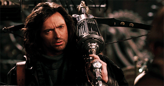
Action fantasy film that inventively combines several popular monster stories turned out to be an enjoyable flick. Hugh Jackman was on point :) I liked the wild, fast-paced but well-made action sequences.
Valerian and the City of a Thousand Planets (2017), dir. Luc Besson
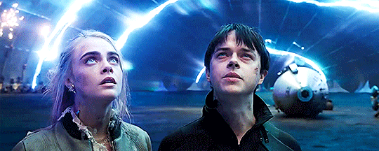
As a scifi lover, I immensely enjoyed the world-building and gorgeous futuristic scenery of this film. The plot was also good, as well as pacing. The only mahor problem of this movie is that Dane DeHaan was miscast and his portrayal of the main character didn’t work well for me. However, I’d love to return for another adventure to the wonderful world of Valerian.
El Camino: A Breaking Bad Movie (2019), dir. Vince Gilligan
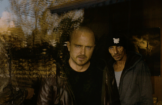
Finally, years after the end of Breaking Bad, Jesse Pinkman’s story also reaches its own satisfying conclusion. It’s a somber, in places grim tale of a man grappling with terrible trauma as he struggles to get a fresh start. But besides unimaginable cruelty, there’s also real human kindness and decency.
Noah (2014), dir. Darren Aronofsky
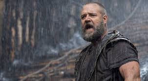
A modern interpretation of the biblical story, Noah is a compelling piece. I was taken in by the mythical atmosphere of the movie. It speaks to us through allegory about poignant philosophical and moral dilemmas, which makes it a universal tale. Noah’s portrayal, while controversial, is quite intriguing and thought-provoking.
Sleepy Hollow (1999), dir. Tim Burton
Thoroughly enjoyable tale of investigation into a series of murders by decapitation committed by the headless rider in a remote village. Tight, riveting plot, magic, likeable characters and excellent cast (this film has both Christopher Lee and Ian McDiarmid in minor roles!).
Dark Shadows (2012), dir. Tim Burton

A dark comedy about a vampire’s conflict with a witch that cursed him and his family. Hell hath no fury like the woman scorned, indeed! Johnny Depp as Barnabas is majestically hilarious and Eva Green is amazingly, beatifully diabolical in a role of Angelique. Wha stood out to me is the plot structure which is a variation on the vampire’s life’s story presented in the beginning sequence.
The Whole Nine Yards (2000), dir. Jonathan Lynn
A comedy about a friendly dentist and his neighbouring hitman played by Bruce Willis. When Jimmy Tulip moves in next door, Oz is pushed by his hellish wife into dealings with Jimmy’s former gang, all to collect money for a price on his head, however there’s a lot of changing targets and plot twists. Deftly amusing :)
Alright, so that’s it for now, let me know if you like this format of short summaries for films or if I should just make separate reviews for each one in the future.
#my review#movies#van helsing 2004#el camino#noah 2014#sleepy hollow#dark shadows 2012#the whole nine yards#valerian and the city of a thousand planets
26 notes
·
View notes
Text
Junji Ito: The Fear of the Unknown
From Edgar Allan Poe to H.P Lovecraft, from John Carpenter to Shinji Mikami, and from H.R Giger to Trevor Henderson, the horror genre has a long-running career that goes from movies, comics, videogames, music and art. The japanese Manga, in particular, isn't strange to this kind of stories. One of its biggest exponents is, without a doubt, Junji Ito, from the fame of works like Tomie, Uzumaki or Gyo.
The works of Mister Ito revolves around common people, which, without prior notice, are cast in extremely bad situations against eldritch beings or situations of bizarre nature and a context often surreal (like a town cursed with spirals, a women apparently made completely of metallic extendable stilts, or even a disease that transform children into wooden dolls). Junji Ito himself has admitted to having been inspired by the work of the previously mentioned Lovecraft, which dealt with the same topics (Normal people going against the horrors of a unexplored universe, weirds places and bizarre creatures... Oh, and also love for cats), but, despite not being inspired by this author, they can also compared to the likes of Stephen King (Modern day people in a seemingly awful and terrifying paranormal experience without any logical reason to its context).
The art in the works of Junji Ito are "Beatifully Grotesque", with every detail drawn in the most shocking manner possible, every page is a new level of horror to the protagonists (and the reader), the monsters or events surely will make anyone to sleep with the lights on for the rest of the week ¿Don't believe me? Try to read this manga of his: "Layers of Fear" if you dare...
In my personal opinion, I love the works of Junji Ito, every story of his is a new journey in his weird and bizarrely created world, if you also like horror, try to give it a read, it surely will be something to not sleep to... :)
- Diego Gutiérrez Orellana

1 note
·
View note
Text
The Ultimate Guide To Color Contrast.
The colors you choose while designing a website, poster or any other type of image will have a huge impact on whether or not the overall design is successful. After all, there is a lot of psychology behind the colors that people are attracted to, and designers need to incorporate this into everything they do.
Color contrast plays a very valuable role, but it is often overlooked, undervalued and misunderstood. To avoid this problem, you must learn more about color contrast, including how and why you should use it. Once you go beyond the basics of knowing that red and orange aren’t good colors to create contrast but black and white are, you can begin to develop an enhanced aesthetic that will please clients and viewers.
Why is Color Contrast So Useful?
Color contrast, in a nutshell, provides visual intrigue and keeps viewers interested. Consider for a moment how boring it would be if an entire poster was made from one color or only included shades from the same color family. Although there are some instances when this does work from an artistic perspective, it’s not an approach that is likely to grab someone’s attention when they’re perusing store shelves, looking at movie posters or surfing the web. Therefore, it’s wise to use contrasting colors whenever appropriate.
For example, think about the classic Coca-Cola can. If the entire thing was red, it wouldn’t stand out nearly as much as it does. The white writing truly pops off of the red background, which grabs attention and is instantly recognizable. This contrast is visually stunning, and it stands out from its competitors.
How to Best Use Color Contrast
The color choices you make must depend largely on the format that you’re using. The Coca-Cola can provides a great way to explain this process. In a physical product such as a can of soda, the red background works. It also stands out well in print advertising, on TV commercials and much more. But what if you were to attempt to design a website with these same colors?
To put it as bluntly as possible, a solid red website page background with white text on top would be atrocious. A full red background will work, though, if you put a text box on top of it that has a lighter color such as white or tan. From there, you’d most likely want to use black text in the text box to create another layer of contrast. Not only will this approach be more eye-catching but it will also enable people to read the text. Remember: black text on red is very difficult to read.
Other examples of contrasting color combinations that won’t work well on the web and may also be almost indecipherable in other formats include light green on medium green, green on red and red on blue. Instead, consider using white on green and yellow or white on blue. If you must put text on a solid red background, it’s best to use white just like Coca-Cola.
Of course, color contrast isn’t always used to call attention to text. If you’re looking to put two different contrasting colors together to draw the eye to something specific on the page, you can choose between dramatically different colors and the more subtle contrast that is caused by changes in shade, tint and saturation.
Trip Advisor does a nice job of using contrasting colors and white space to direct each user’s eyes to the most important aspects of their search results. The mixture of green and yellow is pleasing to the eye, and they kept the classic blue hyperlink color to make it easy for people to know where to click to learn more. Even better, they chose a bold yellow with black text for their “show prices” button, which stands out so much that people are virtually certain to engage with this call-to-action.
Color-Blindness: What Every Designer Needs to Know
Approximately 8 percent of men worldwide suffer from some form of color-blindness. This condition is much rarer in women, but 1 out of every 17 people with color-blindness is female. In total, 4.5 percent of the world’s population does not see all colors as the rest of the world does.
This may seem like a small enough percentage that you wouldn’t cater to their needs. However, the reality is that in the U.K. alone, 2.7 million people are colorblind. This is something designers really need to consider, especially if they’re creating something that is targeted at men.
Red/green blindness is the most common version of color-blindness. What this means is that the red and green elements of any color will not have their true appearance to these individuals. For instance, a person with red/green blindness will perceive purple as blue. This happens because they’re unable to see the red tone that helps differentiate purple from blue.
As you can imagine, this makes the process of choosing the perfect color contrast even more difficult. If you were to choose green as your primary background color or even as a font color, 4.5 percent of your intended viewing audience may not be able to accurately see everything. They may not even be able to read the words very well depending on the hue you chose and how severe their color-blindness is.
The Bottom Line
Ultimately, a color contrast should make both elements stand out, but especially the element that is most important. In other words, if you’re putting text on a colorful background or image, make sure that the words are easy to see and read. Keep your audience in mind and try to steer clear of color combinations that would make the final result difficult for people with color-blindness.
As always, take the time to check your designs from different browsers and devices. Additionally, don’t hesitate to ask a friend, colleague or family member to look at your work with fresh eyes and provide feedback.
For some color contrast inspiration, check out this list of beatifully designed landign pages.
https://webdesignledger.com/19-best-designed-app-landing-pages/
Read More at The Ultimate Guide To Color Contrast.
from IT Feed https://webdesignledger.com/color-contrast-whys-hows/
0 notes
Link
The colors you choose while designing a website, poster or any other type of image will have a huge impact on whether or not the overall design is successful. After all, there is a lot of psychology behind the colors that people are attracted to, and designers need to incorporate this into everything they do.
Color contrast plays a very valuable role, but it is often overlooked, undervalued and misunderstood. To avoid this problem, you must learn more about color contrast, including how and why you should use it. Once you go beyond the basics of knowing that red and orange aren’t good colors to create contrast but black and white are, you can begin to develop an enhanced aesthetic that will please clients and viewers.
Why is Color Contrast So Useful?
Color contrast, in a nutshell, provides visual intrigue and keeps viewers interested. Consider for a moment how boring it would be if an entire poster was made from one color or only included shades from the same color family. Although there are some instances when this does work from an artistic perspective, it’s not an approach that is likely to grab someone’s attention when they’re perusing store shelves, looking at movie posters or surfing the web. Therefore, it’s wise to use contrasting colors whenever appropriate.
For example, think about the classic Coca-Cola can. If the entire thing was red, it wouldn’t stand out nearly as much as it does. The white writing truly pops off of the red background, which grabs attention and is instantly recognizable. This contrast is visually stunning, and it stands out from its competitors.
How to Best Use Color Contrast
The color choices you make must depend largely on the format that you’re using. The Coca-Cola can provides a great way to explain this process. In a physical product such as a can of soda, the red background works. It also stands out well in print advertising, on TV commercials and much more. But what if you were to attempt to design a website with these same colors?
To put it as bluntly as possible, a solid red website page background with white text on top would be atrocious. A full red background will work, though, if you put a text box on top of it that has a lighter color such as white or tan. From there, you’d most likely want to use black text in the text box to create another layer of contrast. Not only will this approach be more eye-catching but it will also enable people to read the text. Remember: black text on red is very difficult to read.
Other examples of contrasting color combinations that won’t work well on the web and may also be almost indecipherable in other formats include light green on medium green, green on red and red on blue. Instead, consider using white on green and yellow or white on blue. If you must put text on a solid red background, it’s best to use white just like Coca-Cola.
Of course, color contrast isn’t always used to call attention to text. If you’re looking to put two different contrasting colors together to draw the eye to something specific on the page, you can choose between dramatically different colors and the more subtle contrast that is caused by changes in shade, tint and saturation.
Trip Advisor does a nice job of using contrasting colors and white space to direct each user’s eyes to the most important aspects of their search results. The mixture of green and yellow is pleasing to the eye, and they kept the classic blue hyperlink color to make it easy for people to know where to click to learn more. Even better, they chose a bold yellow with black text for their “show prices” button, which stands out so much that people are virtually certain to engage with this call-to-action.
Color-Blindness: What Every Designer Needs to Know
Approximately 8 percent of men worldwide suffer from some form of color-blindness. This condition is much rarer in women, but 1 out of every 17 people with color-blindness is female. In total, 4.5 percent of the world’s population does not see all colors as the rest of the world does.
This may seem like a small enough percentage that you wouldn’t cater to their needs. However, the reality is that in the U.K. alone, 2.7 million people are colorblind. This is something designers really need to consider, especially if they’re creating something that is targeted at men.
Red/green blindness is the most common version of color-blindness. What this means is that the red and green elements of any color will not have their true appearance to these individuals. For instance, a person with red/green blindness will perceive purple as blue. This happens because they’re unable to see the red tone that helps differentiate purple from blue.
As you can imagine, this makes the process of choosing the perfect color contrast even more difficult. If you were to choose green as your primary background color or even as a font color, 4.5 percent of your intended viewing audience may not be able to accurately see everything. They may not even be able to read the words very well depending on the hue you chose and how severe their color-blindness is.
The Bottom Line
Ultimately, a color contrast should make both elements stand out, but especially the element that is most important. In other words, if you’re putting text on a colorful background or image, make sure that the words are easy to see and read. Keep your audience in mind and try to steer clear of color combinations that would make the final result difficult for people with color-blindness.
As always, take the time to check your designs from different browsers and devices. Additionally, don’t hesitate to ask a friend, colleague or family member to look at your work with fresh eyes and provide feedback.
For some color contrast inspiration, check out this list of beatifully designed landign pages.
http://ift.tt/2iHH7QZ
Read More at The Ultimate Guide To Color Contrast.
0 notes
Text
The Ultimate Guide To Color Contrast. How to Best Use Color Contrast.
The colors you choose while designing a website, poster or any other type of image will have a huge impact on whether or not the overall design is successful. After all, there is a lot of psychology behind the colors that people are attracted to, and designers need to incorporate this into everything they do. Color contrast plays a very valuable role, but it is often overlooked, undervalued and misunderstood. To avoid this problem, you must learn more about color contrast, including how and why you should use it. Once you go beyond the basics of knowing that red and orange aren’t good colors to create contrast but black and white are, you can begin to develop an enhanced aesthetic that will please clients and viewers. Why is Color Contrast So Useful? Color contrast, in a nutshell, provides visual intrigue and keeps viewers interested. Consider for a moment how boring it would be if an entire poster was made from one color or only included shades from the same color family. Although there are some instances when this does work from an artistic perspective, it’s not an approach that is likely to grab someone’s attention when they’re perusing store shelves, looking at movie posters or surfing the web. Therefore, it’s wise to use contrasting colors whenever appropriate. For example, think about the classic Coca-Cola can. If the entire thing was red, it wouldn’t stand out nearly as much as it does. The white writing truly pops off of the red background, which grabs attention and is instantly recognizable. This contrast is visually stunning, and it stands out from its competitors. How to Best Use Color Contrast The color choices you make must depend largely on the format that you’re using. The Coca-Cola can provides a great way to explain this process. In a physical product such as a can of soda, the red background works. It also stands out well in print advertising, on TV commercials and much more. But what if you were to attempt to design a website with these same colors? To put it as bluntly as possible, a solid red website page background with white text on top would be atrocious. A full red background will work, though, if you put a text box on top of it that has a lighter color such as white or tan. From there, you’d most likely want to use black text in the text box to create another layer of contrast. Not only will this approach be more eye-catching but it will also enable people to read the text. Remember: black text on red is very difficult to read. Other examples of contrasting color combinations that won’t work well on the web and may also be almost indecipherable in other formats include light green on medium green, green on red and red on blue. Instead, consider using white on green and yellow or white on blue. If you must put text on a solid red background, it’s best to use white just like Coca-Cola. Of course, color contrast isn’t always used to call attention to text. If you’re looking to put two different contrasting colors together to draw the eye to something specific on the page, you can choose between dramatically different colors and the more subtle contrast that is caused by changes in shade, tint and saturation. Trip Advisor does a nice job of using contrasting colors and white space to direct each user’s eyes to the most important aspects of their search results. The mixture of green and yellow is pleasing to the eye, and they kept the classic blue hyperlink color to make it easy for people to know where to click to learn more. Even better, they chose a bold yellow with black text for their “show prices” button, which stands out so much that people are virtually certain to engage with this call-to-action. Color-Blindness: What Every Designer Needs to Know Approximately 8 percent of men worldwide suffer from some form of color-blindness. This condition is much rarer in women, but 1 out of every 17 people with color-blindness is female. In total, 4.5 percent of the world’s population does not see all colors as the rest of the world does. This may seem like a small enough percentage that you wouldn’t cater to their needs. However, the reality is that in the U.K. alone, 2.7 million people are colorblind. This is something designers really need to consider, especially if they’re creating something that is targeted at men. Red/green blindness is the most common version of color-blindness. What this means is that the red and green elements of any color will not have their true appearance to these individuals. For instance, a person with red/green blindness will perceive purple as blue. This happens because they’re unable to see the red tone that helps differentiate purple from blue. As you can imagine, this makes the process of choosing the perfect color contrast even more difficult. If you were to choose green as your primary background color or even as a font color, 4.5 percent of your intended viewing audience may not be able to accurately see everything. They may not even be able to read the words very well depending on the hue you chose and how severe their color-blindness is. The Bottom Line Ultimately, a color contrast should make both elements stand out, but especially the element that is most important. In other words, if you’re putting text on a colorful background or image, make sure that the words are easy to see and read. Keep your audience in mind and try to steer clear of color combinations that would make the final result difficult for people with color-blindness. As always, take the time to check your designs from different browsers and devices. Additionally, don’t hesitate to ask a friend, colleague or family member to look at your work with fresh eyes and provide feedback. For some color contrast inspiration, check out this list of beatifully designed landign pages. https://webdesignledger.com/19-best-designed-app-landing-pages/ Read More at The Ultimate Guide To Color Contrast. How to Best Use Color Contrast. http://dlvr.it/NMg3R2 www.regulardomainname.com
0 notes
Last Seen Blogs

skirtsandbattleaxes
Skirts and Battleaxes

hometoursandotherstuff
Home Tours & Other Stuff

spawnofvulcan-knits
Untitled

finalfantasyxiii-2-screenshots
Screencaps of FFXIII-2

lunaloudvectors
Luna Loud Vectors