#take soft photos with a painterly palette
Note
Hi! I was looking at some of your painterly stuff, and I am in awe of the emotion, softness, and texture of the pieces. I wanted to ask what your general process of making painterly artwork is? Do you freehand without a sketch, how long it takes you to finish a piece like that, how you utilize layering, etc!
You are, of course, not obligated to share about your process or answer questions! If these questions are too invasive on your work, I completely understand. Thank you!
My process for those particular pieces is super loose! I try to use art fights as an excuse to try new color combos and try to get fast and comfy with painting bc I rarely do it it any more. But basically it looks like this!
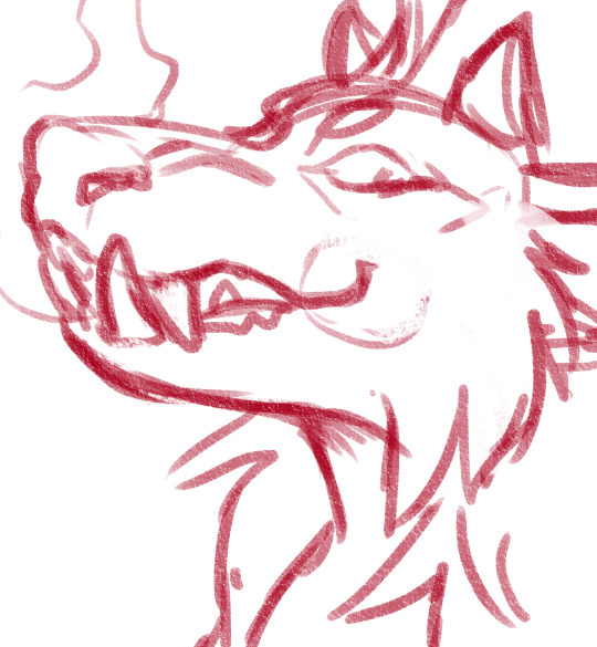
Loose sketch, I think this was the second or third sketch that I thought looked the best :)

2. I normally start with the complementary color to the character's main color (which was red here) unless I have a specific lighting goal or color palette in mind

3. I block in colors under the sketch layer! In this case I was just picking whatever colors but if I'm not feeling too confident I do color pick from photos or palettes I find on google images.

4. My emotional support overlay layer, of course <3. Not much thought process here, just trying to make it look good + more contrasty!
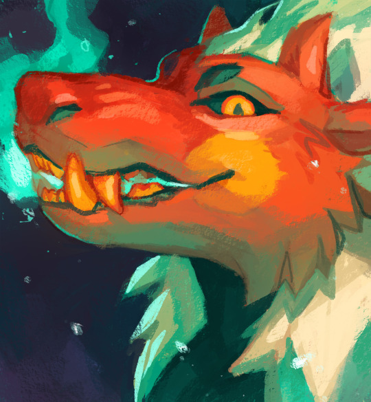
5. Then I make a layer on top of the sketch and just go ham! Try to separate the light and shadow, detail the teeth and stuff. I start with big blendy brushes and then scale down to smaller brushes towards the end.

All of my art fights take like 45 min-3 hrs (I definitely struggle on people faces so much). I think this one took a bit over an hour, which is where most of them fall! The one below was closer to 3, you can see I used a second sketch layer and did a lot of tweaks.
And finally, especially if you're focused on improving your skills, always collect inspiration pictures from artists who you want to emulate! My art fights draw LOADS of inspiration from @ikrutt + @polararts for example. I hope this gives you some insight to my process! As always, if you want to fuck with my brushes msg me, I can email you them :)
134 notes
·
View notes
Photo


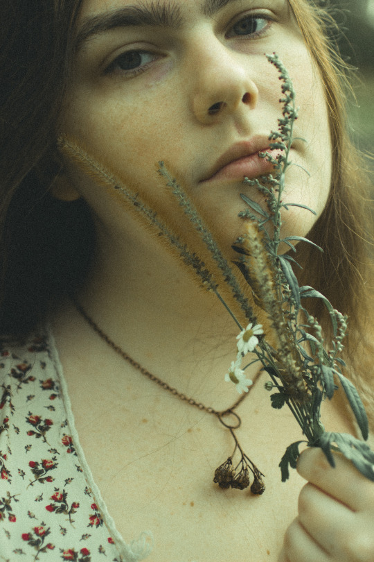
Experimented for the first time this week with electroplating organic stuff - which is half the reason I decided to learn how to do this in the first place! I thought it was fitting to start with some of the dried Yarrow stalks I’ve had sitting on my shelf for a year.
I’m going to keep this one because the bail isn’t affixed with anything and I suspect a stiff breeze will break it off the stem, but I’m really looking forward to the opportunity to incorporate these elements into future pieces, when I feel like making more elaborate art pieces!
#cottagecore#yarrow#grandmacore#witchy fashion#naturecore#also experimenting obviously with actually taking pictures of my face which is a horrifying thing for me but#i think I need to learn to do it if I'm ever gonna heal#please be nice lol#i was just looking at a bunch of jw waterhouse paintings yesterday and had this urge to#take soft photos with a painterly palette#scopo tw#scopo cw#the suddenness of my human face trigger warning content warning idk let me know if you need it tagged
199 notes
·
View notes
Text
Inspired by Travel | How to Bring the Colors of Marrakesh Home
Photo courtesy of Jon Chica / Shutterstock Inc
Bahia Palace. Majorelle Gardens. The Koutoubia Mosque. From kaleidoscopic zellige tilework to rainbow-hued spice souks, every turn in the ancient kingdom of Marrakesh is a veritable feast for the senses, blooming with color. Below, how to bring home the opulence and elegance of Marrakesh, inspired by the myriad colors to be found in the caravan city.
Pink and Coral
Photo courtesy of OldskoolDesign / Shutterstock Inc
With dusty rose sunsets and thick walls of beaten clay, this desert city makes liberal use of pink and coral tones.
Gateway, Colorado | Kerry Endsley, LIV Sotheby’s International Realty
To capture the far-flung appeal of a traditional Moroccan riad, mimic the rosy tones in your home’s exterior. This Colorado ranch house takes on a particularly romantic appeal when washed in the glow of dusk.
Red
Photo courtesy of Jon Chica / Shutterstock Inc
From spice souks teeming with saffron to the vast expanses of clay buildings, it’s no surprise that Marrakesh has long been referred to as the Red City.
Singapore | Veniz KWONG, List Sotheby’s International Realty
A perfect choice for décor that makes an impact, red can be incorporated in small doses—or liberally applied for a bold burst of warmth. Consider punctuating a neutral space with a strong graphic print as in this Singaporean bungalow to add vigor and zest into any room.
Orange
Photo courtesy of Todamo / Shutterstock Inc
Whether infused in tea or adding vibrancy to a tagine, the color orange can be found virtually everywhere inside the thousand-year-old walls of the medina.
Riverside, Connecticut | Steve Archino, Sotheby’s International Realty – Greenwich Brokerage
Give your home a dose of Vitamin C by combining this citrusy hue with shades of green to create a palette bursting with cheery optimism, like this Connecticut foyer. On the warmer side of the spectrum, a persimmon velvet sofa in this Cote d’Azur living room adds texture and richness, reminiscent of the glow of a desert sunset
Yellow
Photo courtesy of KajzrPhotography / Shutterstock Inc
From the gilded tones of the Hassan II Mosque to the golden gates of the Palais Royale, the color yellow in Moroccan architecture often accompanies wealth and influence.
Harbour Island, Bahamas | James Malcolm, Damianos Sotheby’s International Realty
To recreate the shining glow of the desert, opt for side paneling and exterior finishes in sunny shades to bring brightness to your home: for inspiration, see the cheerful façade of this Bahamian abode. Alternatively, select lighter washes of yellow, as chosen for this Texas home’s entryway, to add an authentic appeal in any space.
Purple
Photo courtesy of FuGazi images / Shutterstock Inc
Moroccan sunsets can range from fiery reds to burnished golden, and you’ll often see shades of plum, violet, and eggplant swirling around the painterly desert skies. When it comes to the color purple, lighter shades tend to have a soothing effect on the mind, while darker hues can often trigger creativity and introspection.
Cayman Islands | Patty Nugent, Cayman Islands Sotheby’s International Realty
Keep things subdued with soft washes of lilac—perfect for a relaxing bedroom—or go bold like this Cayman Islands beach house with bright punches of magenta to add bohemian flair.
Moroccan Blue
Majorelle Garden in Marrakesh, photo courtesy of Ser Borakovskyy / Shutterstock Inc
As embodied by the electric blue villa gifted to the city by Yves Saint Laurent, the color blue is comparatively rare inside the walls of the medina—but is arguably the most striking shade to set against the desert tones of North Africa.
Highland Park, Texas | Alex Trusler & Karla Trusler, Briggs Freeman Sotheby’s International Realty
To capture the oasis-like enchantment of the Jardin Majorelle, consider using pops of blue to add contrast to a neutral space like this Texas living room.
Green
Photo courtesy of Todamo / Shutterstock Inc
While lush gardens may not be the first thing to come to mind when pondering the tawny tones of the desert or heady aromas of the hazy souks, some of Marrakesh’s top destinations are beautifully manicured gardens where greenery thrives in full bloom. Symbolizing prosperity, fertility, and paradise, green is often used to cover the shrines of saints in Morocco in order to seek their blessings.
Ulster, Ireland | David Ashmore, Ireland Sotheby’s International Realty
With this tradition in mind, consider opting for a vibrant shade of emerald like this doorway in Ireland to invite good spirits in the home.
When making the pilgrimage to Marrakesh, you’re bound to come home with more than a few souvenirs. Let the complexity of colors and historic allure of this desert city inspire your next redecorating project.
On the hunt for more design inspiration? The colors of Hong Kong await you.
The post Inspired by Travel | How to Bring the Colors of Marrakesh Home appeared first on Sotheby's International Realty | Blog.
Source
Crocodile Bag Authentic Crocodile Skin Bag
from WordPress http://www.amansions.com/inspired-by-travel-how-to-bring-the-colors-of-marrakesh-home/
0 notes
Text
RENOVATION STORIES – A FOREVER AUTUMN BEDROOM
This is an unpaid but gifted collaborative post with the lovely Cassandra of Atelier Ellis paint and a competition at the end for you to win some beautiful paint by creating your own Pinterest mood board for your next renovation project!
I started on a new colour journey last year when I discovered this paint range created by Cassandra Ellis. Cassandra asked if we’d like to try out some of her colours and also share the story of our home and in her Portrait series and we said yes, please!We have been living with the cool greys forever now and although we love them, the bright Southern light and dark North light at either end of our house call for something fresher in some places and more cosy in others. We have always loved white so we will be introducing more of that back in the living space, but before that, we have been painting some of our walls with warmer tones, starting in our bedroom. This cosy colour journey began when we repainted the bedroom with – Warm Mud Brown. We were looking for a snug and relaxing feel and chose this soft, deep dusky pinky brown for cosying up, reading and sleeping in. Inspired by the old painting hanging above the bed that we bought at a yard sale for £10 – it is our version of forever autumn in here. All the seasons unfold with their own magic to me but Autumn is my favourite season by far. I really wanted to create a hibernating space for us that would be restful all year round, filled with warmth, nature and layers of delicate interest and inspiration. The images here are at different times of the day so we can see how the colour changes in the light. In the rest of the room, the furniture is mostly antique, some pieces from India – I have had a bit of a crush on the fairtrade vintage pieces from Ian Snow for ages and have now bought four of their cupboards. Two for in here and two in our living room and we have re-painted them all in deep browns and muddy greens. The antique optician’s desk was a birthday present from Dean when we lived in our apartment in Hastings and the small chest was another junk shop find that has had many repaints. We love to burn woodsy incense in here in the day to cleanse the space for the evening. Our clothes are stored in another room, meaning this space is kept quite calm with just a few decorative items, places to house the books we are currently reading, skincare products and spare bedding.The bedside lights I pieced together from flex and fittings we have been hoarding up in the loft since we moved, and the twig is from our favourite birch tree in the garden. Dean made the bedside shelves from a piece of elm with hidden brackets. I made the little paper lampshade on the table opposite the bed from tissue paper and some favourite grasses that run wild in our garden. The ‘new’ bed was a bit of a bold move as we’d had enough of the giant mid-century headboard towering above us on our bed, but couldn’t afford a new frame – so we plunge sawed the top off!We have used a mix of cream, white and muted pink bedding in different textures with ivory curtains. Everything is linen or wool and can be washed in the machine after a muddy trampling by Marlo after she’s been out on one of her rainy day adventures. You might be able to spot her under the covers in some of the pictures, as she tucks herself away to sleep like this every day and refused to get up when I was taking my photos.So, now for the exciting bit – are you planning a room redecoration this year? Cassandra and Atelier Ellis have kindly offered 10L of their amazing paint in any colour and type of paint to one of my lovely readers. It can be all emulsion, Eggshell, wood paint or a mixture. Depending on what the winner prefers and what you have planned, they will send sample pots/colour charts etc to you first so you can try out the colour. For more painterly colour inspiration you can also catch up with these lovely peeps on Instagram here.
Years ago when I first started blogging, I won a mood board contest on Decor8 and I had a ball putting it together, so thought it would be fun to ask you to make a Pinterest board inspired by your favourite Atelier Ellis colour. Planning a room by making a mood board full of your hopes for the style and atmosphere you are hoping to create, is such a great help when designing a room.
Pin your favourite colour from the beautiful Atelier Ellis palette and then lots of other images (these can be from anywhere) that would make up your dream room? This is the kind of thing I mean here I made this board to channel my colour dreams for 2019 and all my other pins are all hanging out here and Atelier Ellis’s here – if you need a little more inspiration!
Atelier Ellis are intensely pigmented paints, they are quiet and painterly, but also hard-wearing and washable – essential round here with muddy cats paw prints on EVERYTHING. We are really pleased with how easy this paint is to work with, two coats are plenty for a perfectly chalky matt finish. Elsewhere here I have used Tea Rose to jolly up the Tea Shed and we have also invested in the crisp Tabula Rasa white for our kitchen/living space and Sabi Grey for our hallway.
To enter – just pop a link to your Pinterest mood board in the comments here with the name of your favourite colour and the room you hope to decorate and we will pick a winner in two weeks on Friday the 1st of March.
Happy weekend adventures and have fun Pinning and planning!
0 notes
Photo

THE DIRTY TRUTH ABOUT SKINCARE ... Products to AVOID!

youtube
Moving in to the New Year I’ve been taking a closer look at what I’m putting on my skin to improve it. xo’s ~ Tati
😇 HALO Before & After PHOTOS HERE » » » https://halobeauty.com/pages/halo-glow
✔ P R O D U C T S M E N T I O N E D
Frank Body Anti-Drama Face Mask // Get To Know Me
Dior Prestige La Mousse Micellaire
Dior Prestige Le Sucre De Gommage
Dior Prestige Le Baume Demaquillant
Perricone MD Pre:Empt Series Daily Foaming Cleanse
Perricone MD Intensive Pore Minimizer
Perricone MD Vitamin C Ester Citrus Brightening Cleanser
Peter Thomas Roth Water Drench Cloud Cream Cleanser
Peter Thomas Roth Hungarian Thermal Water Moisturizer
Peter Thomas Roth Water Drench Hyaluronic Cloud Cream
Laneige Essential Power Skin Toner
Laneige Water Bank Essence
Laneige Cleansing Perfect Pore Cleansing Oil
Radical Skincare Express Delivery Enzyme Peel
Kate Somerville Wrinkle Warrior Pink Plumping Mask
Laura Mercier Flawless Skin
✔ M A K E U P W O R N
FACE:
Dr. Barbara Sturm Anti-Aging Primer
Beauty Blender Bounce Liquid Whip Long Wear Foundation // 3.25
Stellar Beauty Limitless Concealer // L02
Patrick Starrr Setting Powder // Patrick’s Powder
MAC Studio Fix Sculpt And Shape Contour Palette // Light/Medium
100% Pure Cocoa Pigmented Bronzer // Cocoa Kissed
Patrick Starrr MSF // Baby Its Gold Outside
Col-Lab Soft Spot Sheer Blush // Meet Cute
Becky G x Colourpop Luster Dust Loose Powder Highlighter // Chisme
EYES:
MAC Pro Longwear Paint Pot // Painterly
BH Cosmetics x Sylvia Gani 22 Color Shadow Palette
Becky G x Colourpop Salvaje Pressed Powder Palette
Linda Hallberg Crayon // Daring Mood
Col-Lab Wow Effect All-In-One Mascara // The Works
Duo Brush-On Adhesive Eyelash Glue
Wynk Luxury Lashes // The Kelsey
BROWS:
Kat Von D Signature Brow Precision Pencil // Light Brown
LIPS:
Mellow Lip Pencil // Rose
Patrick Starrr Matte Lipstick // Peachy Peter
Patrick Starrr Dazzleglass // Twerk For Gifts
NAILS:
KL Polish // Winter Is Coming
KL Polish // Unfortunate Souls
KL Polish // Mother Of Dragons
✔ S N A P C H A T
https://www.snapchat.com/add/TatiWestbrook
✔ I N S T A G R A M
http://instagram.com/glamlifeguru
✔ T W I T T E R
http://twitter.com/#!/glamlifeguru
✔ F A C E B O O K
http://facebook.com/GlamLifeGuru
✔ E M A I L
[email protected]
FTC DISCLAIMER: This video is Not Sponsored and there are no affiliate links.
✔ WRITE TO ME HERE
Tati Westbrook
1905 Wilcox Ave
Suite #111
Los Angeles, CA 90068
All Rights Reserved © 2018, Tati Westbrook
Hi I’m Tati from GlamLifeGuru, thank you for watching my video, please be sure to check out my collection of makeup videos where you’ll find my best beauty tips, tricks and favorites on everything from top luxury cosmetics to my favorite drugstore makeup. Whether you’re looking for a new product review, tutorial, beauty tip, haul or perhaps even a giveaway, I hope you enjoy watching.
being published on http://mybecause.com/the-dirty-truth-about-skincare-products-to-avoid/
#beauty#beauty expert#best#blogger#Cosmetics#drugstore#favorites#GlamLifeGuru#Haul#how to#luxury#makeup#Makeup Tutorial#POPULAR SKINCARE#Products to avoid#review#tati#THE DIRTY TRUTH#THE DIRTY TRUTH ABOUT POPULAR SKINCARE#tutorial#vlogger#Westbrook#worst#youtube#Howto &amp; Style
0 notes
Text
Stylist Spotlight: Celine Griscom
By Melina Hammer
Photo by Nathan Kraxberger
Celine is our intrepid founder, the reason we are all here. She wants to see creatives bolstering one another, a direct push-back to the increasingly winner-take-all industry, and has a vision to create a platform where stylists in all genres could share and grow their spheres by being great at what they do and not making photography sets more complicated than they already are.
Celine's styling work is sharp and yet playful, smart, and very much of-the-moment. Which makes a world of sense because she is no-nonsense and won't stop until she gets the job done right.
Full Portfolio: celinegriscom.com
Instagram: @celine_machine
Photo by Rob Mandolene
- How did you become a stylist?
I moved to New York after having lived in England for 5 years where I had started a Political Theatre company for which I produced and directed original plays. Styling was really not on my radar as a possible career, which back in 2000, most people didn’t know it was even a job. But I had an old high school friend who was a photographer and nudged me in that direction because she saw my creativity with clothing, props, scenery, etc. So I started working in her studio, and found that it actually wasn’t too far a leap from Theatre really!
Photo by Monica Stevenson
- As you know, I am passionate about the environment and it plays into my work. I hear you have your own angle... what is that?
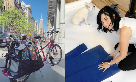
My bike!! I have been biking in the city for about 15 years, but only a few years ago now did I finally get my cargo bike, an xtracycle edgerunner11i. It’s a “longtail” bike with a very low long rack at the back that is rated to hold 400 lbs! And so, yes, I prep all my jobs on my bike. I have found that it is actually so much faster than other modes of transportation. I have saved clients so much money on taxis, which also allows me to spend that budget on props instead! #thegreenstylist #morepropslesstaxis
- What are you like on-set?
Attitude is so important in this business. Once I accept a job from a client, I am all-in: “challenge accepted!”, and with a smile. So when I arrive and I am given my marching orders, I will put my everything into accomplishing what is needed, and in the most efficient way possible. In short, I care. I care that the work looks the best it can be. I care that we get all the shots done that we had agreed to do. I take responsibility for my part, as well as the overall job. That being said, I really enjoy a good laugh and banter with the crew. I will guffaw loudly at puns and inappropriate humor, like a good sneeze, I cannot help it. In the freelance world we often get to choose who we want to work with, both for talent and professionalism, but also for a good hang. I love becoming friends with the team.
I also really love the process of creativity in a team. My favorite jobs are ones where I can have a good dialogue going with the art director and the photographer to achieve beautiful work that speaks to the message the client needs to communicate. I love when we can spitball ideas, and pontificate on the implied meanings of a particular prop, or outfit, or composition. I think the best work comes with a great meeting of the minds.

Photo by Nathan Kraxberger
- What is the biggest or most frequent problem that clients have that you can help solve?
The most common problem I encounter is when the creative team has big ideas and the production team doesn’t have the budget to cover it all. I find that I am often monkey-in-the-middle in these situations, needing to please both teams who have very opposing needs, albeit a common goal. I am very keen to please them both equally. I often love the ideas the creative team has, and I respect their need to cover off on all the shots on their list. So I will take it upon myself to be as creative as possible when it comes to sourcing props, clothing, sets, within the budget allowed. I will bike, I will find inexpensive sources, and I will make or borrow what I can. On-set, at the beginning of the job, I look at the totality of what needs to be accomplished, and then work closely with the photographer to make a plan for the most efficient way to get it done. So much time can be wasted changing sets or trying to replicate an earlier shot, when a bit of forethought and planning can mitigate those issues and keep the ship moving at a good clip. In the end, I hope that we achieve the most ambitious creative, while sliding in under budget and on-time.

left Photo by Nathan Kraxberger, right photo by Scott McKay
- Do you have any hobbies, and do they cross-over into your work?
If I had my way, I would spend all day in an art studio making things. I also love to explore new methods to create (on my list to try next are: resin, worbla, and pottery!). Painting was my first love many years ago, but I now feel that I have more of an affinity for sculpture. I love to mold things into shape, and have done so with clay, papier mâché, and even wax carving original jewelry pieces. All of this definitely plays into my workand is a driving force to what I do for a living. I create three-dimensional works akin to sculpting when I mold the soft leather of a bag, or gently lay a curl in a ribbon, all while remaining connected to the two-dimensional image that lives in the eye of the camera. And when I work in cosmetics I dive back into my painterly roots, mixing colors and smearing textures with the stroke of a brush or the edge of a palette knife. But the very best moments are when I get to create the perfect prop to bring into a shoot. I have made a few large scale paintings for room sets, and crafted exacting fabric-covered boxes for tabletop sets.

left Photo by Nathan Kraxberger, right photo by In Kim
- How did you get the nickname “Machine”?
I was given that name by photographer, Liam Goodman, during a particularly long stint of e-comm. I would like to think it refers to my nerdiness about efficiency, as well as my analytical problem-solving brain that likes to figure out how to engineer a bag or item to sit just so. And then to repeat repeat repeat, like a machine, with precision, accuracy, and speed. I come from a family of both scientists and artists (both painters and sculptors), so I really do bring both aspects to set every day. I like to call myself a perfectionartist!

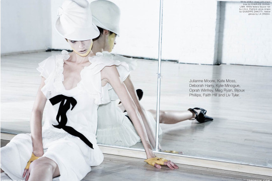
Photo by Justin William Lin
0 notes
Last Seen Blogs

worlds-inside
Screw Reality

the-bespectacled
Do You Want To Know A Secret?

beautiful-collection
A Collection of Beautiful Things

thepetrichorgirl
Show me the stars

happilykrispypirate
Imagines