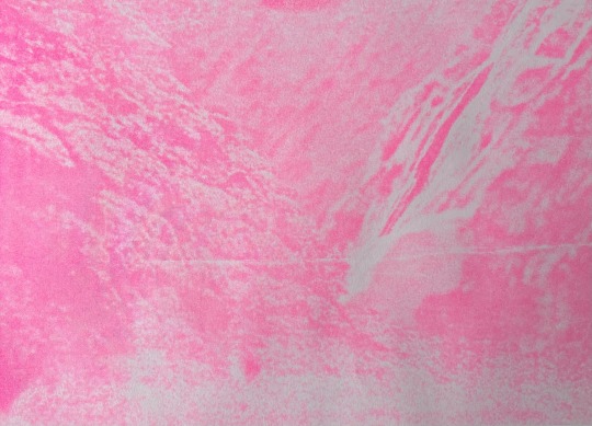
#test for some riso printing! :]
Photo
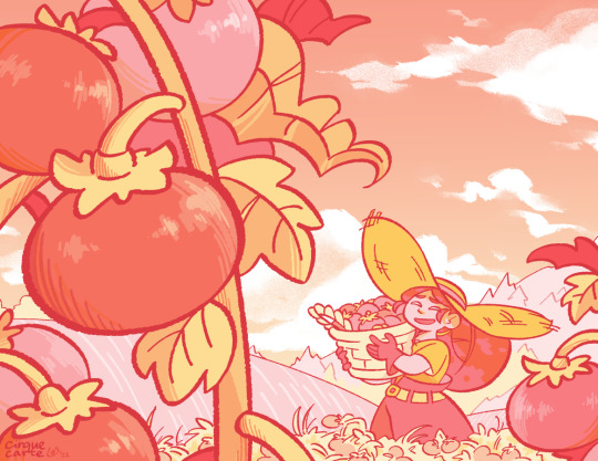
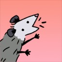
bountiful harvest
#artists on tumblr#illustration#original character#oc#original#hazel#overgrown#test for some riso printing! :]
601 notes
·
View notes
Text
issuu
Major Project - Final Digital Book and Final Evaluation
The overall process has been very nerve-racking, worrying I was going to do something wrong I created numerous test prints. However, this has helped develop my project and gain an understanding of two mediums I was not very aware of before: risograph machine and creating physical work that is printed and completed by hand.
This whole process means I now have a greater understanding of pagination. Another process that was very difficult was making sure both spreads on a double-sided page were aligned when put through the risograph machine. If they were not aligned it would mean I wouldn’t be able to fold my book. I had to move the alinement up 6.5 mm to get this correct which took a lot of tests to get to that point. Some pages did not print as expected and some test prints worked better showing the different shades I wanted however that is the nature of riso.
A major part of this project has been time management. This is very important in case of problems with the riso machine and to allow time for drying before printing on the other side of the paper and before cutting.
The colours created from the riso have added more life and vibrancy to the illustration that I would not get elsewhere which was an exciting part of the printing. The colours were quite striking and complemented each other well being contrasting colours. I was very pleased with the overall colours and the vibrancy of them.
An issue I found with my riso prints was printing the masters for the risograph as the shades of the colours did not print the way I wanted for all the prints due to the printer printing the masters slightly lighter. I found this annoying, but it did not make too much of a difference to the overall print.
Something that I spent much time debating over was the font, whether to do handwriting or a font. Originally I did like the idea of handwriting but when I wrote it out I felt it did not look cohesive enough. Then the font I made still felt a bit digital and computer made. Therefore, if I had more time I would focus on the handwriting, writing it all out by hand with a fine thin ink pen. I feel this would have made the illustrations and writing feel more connected, I was just too concerned with time issues and did not want to put it into something that would be rushed and not finished to a high standard.
When the book was cut down and stitched, it was very satisfying, to see it come together. I decided to bind the book using a sewing machine. Originally I was not sure if it would go through the sewing machine or if the machine might eat the paper slightly but this turned out much better than I thought. It produced a neat thin continuous line going down my book that does not distract from any of the illustrations with thread hanging from either side to create a free-flowing movement and a feeling of acceptance.
Overall, I am proud of my achievement and feel excited about having completed this project.
2 notes
·
View notes
Text
WEEK 20: Upset Tummy & OXO prep

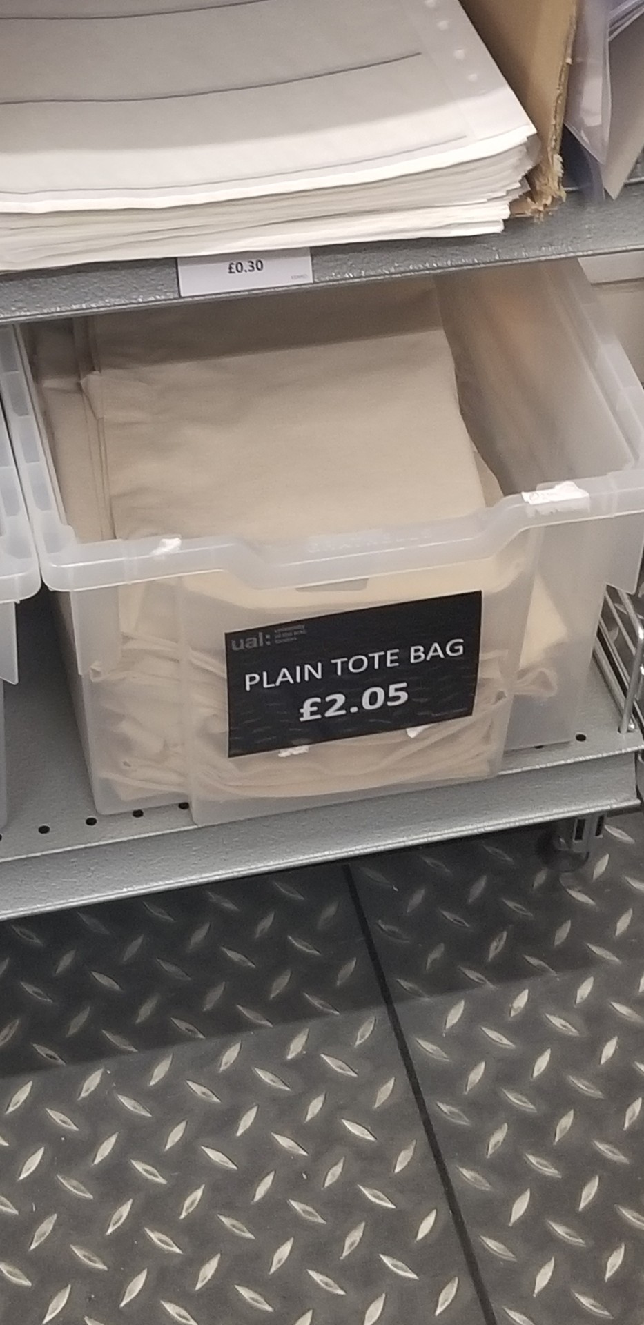
I forgot to add these pics to the last post. This is a picture of the stack of paper Tony said I could use for printing the business cards and the other two images show the boxes of white T-shirts they're selling in the uni shop.
Now to this week.
My weird stomach issues continued. I called my GP and when I mentioned to them I was also experiencing heartburn and a tightness in my chest with every cramp in my abdomen, they said I would have to go to the ER because it could be a stroke or heart attack or smth serious. That scared me. My friend drove me to a walk in clinic and the entire time we were in the waiting room I was fine. It was weird. Like now they someone was about to check it out, the pain had stopped. They took a urine sample, my blood pressure and gave my tummy a good feel test but couldn't determine the cause. The lady prescribed me some pills to take for the next week and said I should go to my GP if it continued. I can tell you right now that this kept up despite the meds for another 9 days but I didn't bother going to the GP again. (My GP has a Google rating of 1.2 stars...)
Very odd sickness that slowed the week down and had me reschedule my tissue printing appointment with Tony for next week but apart from that I was just glad it was over eventually.
This is where I should mention that the work I was giving to be exhibited at the OXO Tower was framed by an old UAL alumni named Roy. It was pretty pricey to have all 3 pieces framed (3x A3 prints = £75 for frames), despite the tutors reassuring us it's a better deal than we can get anywhere else but now I have 3 quality frames that will last me a long time. If I look at them as an investment the 75 pounds sting less. Also, Roy was a lovely person who clearly loves his job and knows his worth so I won't beat myself up over spending that much for his work.
These pictures are from the way to the OXO Tower to drop off my work.

There was a long queue of students checking in their work. You can see me in the back towards the window standing crouched with my terrible posture haha!
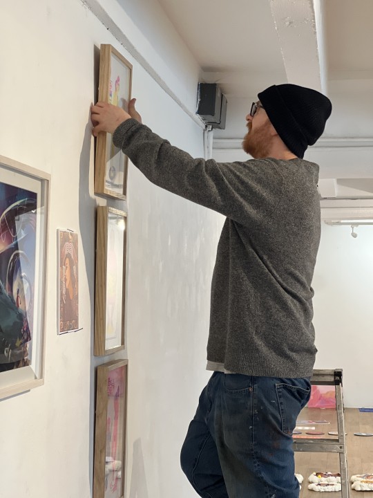
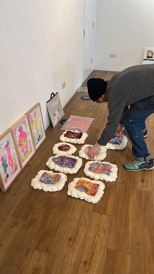

I wasn't personally there when they hung the work but someone took pictures of it all and made them available to us. The neon pink of the riso prints makes them really easy to spot among the rest. And here you can see the frames too.
#student life#ual#university of the arts london#studyblr#london college of communication#illustration and visual media#lcc#uni life#OXO Tower#OXO Exhibition#exhibition
2 notes
·
View notes
Text
Review of pre production
Overall, I’ve really enjoyed the pre production process and feel like the planning and concept of my film has developed really well into a much stronger and more interesting concept. I started this process with an existing narrative that I followed pretty closely, however through reflection and discussion of the film early in pre production this had evolved with more moments added or changed to work well for animation and to tell the story more effectively. These changes aimed to centre the hunter as the protagonist and the character from whose perspective the audience sees the story. In order for him to be more personally involved and to have more stakes in the tale a prior experience of seeing the selkies in human form was added as well as a nightmare sequence establishing his distress at having wounded the selkie queen. Throughout pre production I heavily focused on establishing a technique I wanted to use to create this film, I looked into classical 2D digital with full colour and background designs, the idea of using riso printing for the piece and the idea of using digital 2D to emulate a Lino cut look. In the end, however, I was instead drawn to mono printing with the raw and textured look fitting well with the atmosphere of the piece whilst also being more possible to complete in a limited time frame than other printmaking techniques. I’m extremely happy with the rough test of a still boil I created using mono printing and although I believe tweaks to the registration system I used would greatly improve the look even more, it gives me confidence that this method is realistic and will give a great look to the piece. I really enjoyed developing the character designs and am very happy with how they’ve come along - I’m particularly happy with the design of the hunter as I originally struggled with creating such a large masculine character without him appearing to be too rigid or boxy in the design. One thing I still need to further improve is my animatic - I think in its current iteration it gives a great sense of the film and of the world the film is set in however there are definitely still some minor changes that could be made to timings and to the emotionally driven scenes in the film. Although I’ve not been able to change these bits so far I am going to do so before predoction starts in January and in general I’m happy with the animatic overall. In general I’ve enjoyed the pre production process and am happy with how everything is, ready to start production in January
0 notes
Text
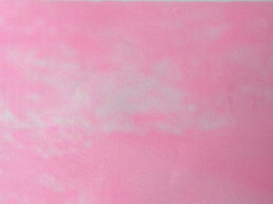
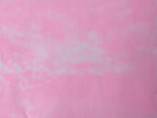
Prototype Printing
I printed the prototype on creamy paper and the cover on pink paper. I need to get thicker paper to print this on because at the moment it's 80gsm and it is a lot thinner than the inside pages. I also want the cover to be more durable.


I printed through the laser printer first and then ran them through the riso. Printing this prototype through the riso this time was a lot easier because I've had more practise with the riso and I also had more time to print and so I was able to take my time to run up the ink properly.
I ran all the inserts through the riso with printer with thicker pink paper. I really like how these look and I want to print the covers on this paper.

I used this print to test different ways of printing the scribbles over photographs. I tried knocking out the background and then aligning the scribbles over the top versus just printing directly on the photographs.
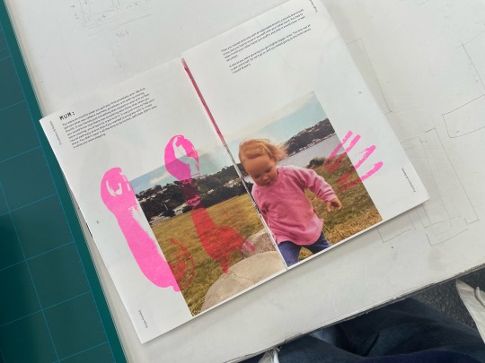
Most places the knockout was really hard to align so it left this white background and the riso print is really offset. This looks really strange and I don't think this is working well. But also some of the direct prints, it's hard to see the pink because the riso doesn't print well on dark backgrounds. I need to get feedback on this.
full flip through
0 notes
Text
Today we did Riso graphic design printing. This is a Riso printer it uses soy ink and is very sustainable and usually it is used to make posters.

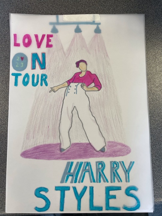
We were then given a brief of a summer concert or festival and to create a poster advertising it. We brainstormed our ideas in a mind map coming up with words we associate with the concert. I chose Harry Styles as he had a concert recently and I like his music.

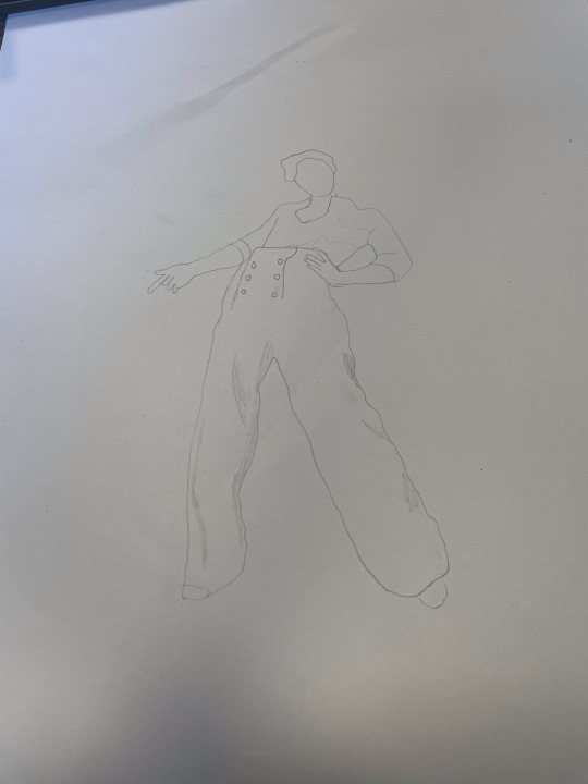
I then made little thumbnails of different drawings associated with Harry Styles to help come up with the finished design.

We did a test run with the printer to see how the colours look based on shading and how pigmented they are on the paper

We then did some peer assessment and showed our work to the group. My group liked the idea of Harry’s figure being the central point of my poster. Some suggestions by my peers were to put Harry on a stage with lights shining down on him.
The process was done using a sheet of A3 paper and tracing paper. The two sheets were placed on top of each other and aligned in the top left coner. My A3 sheet was used for blue and the tracing paper was used for the pink. This allows for shadows and contrast by overlaying the colours. This was my two sheets before going into the printer.
This is the result of the Riso printer the sheets came out very fast as you can see in this video below 👇
My final piece: I think these colours work well together as Harry Styles is very feminine and the pink emphasis how men can wear pink. I like the contrast between the dark blue and pink as it is very appealing to the eye.

0 notes
Text
MP: Iceland Project - Poster 2 test prints
These are some of the test prints for Poster 2. Once I achieved a result I was happy with, I replaced the paper with thicker stock to make my final prints. Riso inks print differently on different papers so I had to make sure I had multiple sheets on hand for trial and error.
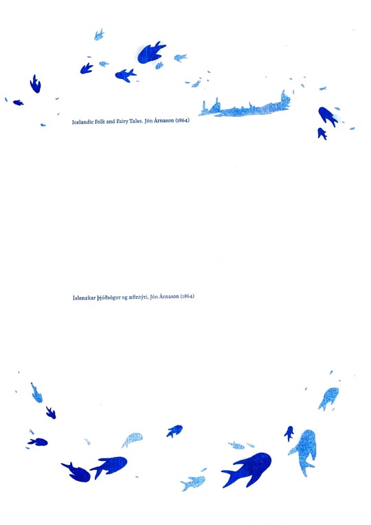
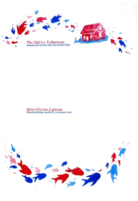
While I favour riso for its inconsistencies in texture and offset nature, I wanted to avoid the “halo effect” on my final prints. This happens when the ink smudges around the master and creates a sort of glow. To avoid this, its important to let the printer run through several test prints until the masters come out clean. Issues like these are especially important when it comes to text, as it can compromise its legibility.


1 note
·
View note
Text


I met up with Laura Bowie to trial and troubleshoot turning my photograph into printed risograph panels.
Because the image has a lot of midtones and areas saturated with darkness, the risoprinter may have difficulty translating the image into print. We did a couple of tries of what Laura thought would be the worst culprits, and compared the print to the digital image and it was quite interesting what was and wasn't picked up. The first one we did in black barely showed any distinguishing detail from the original image and basically made some up. So Laura suggested decreasing the opacity of each image to 70% in editing so as to avoid oversaturation of ink in the risoprinter, and to give it a chance to pick up those textures.
Areas that have a balance of light and dark work better because of differentiation, so we then tested another section with lighter bits and it was far more successful. True to image, but not as bold as the digital because of the limitations of riso and incompatibility of the photograph for this technique. There are ways around this though, what we will be trying next is increasing the contrast in my images to increase that differentiation, my only worry is veering off into Pop Art territory again so I'll need to be wary of how it reads.
I also still haven't decided between fluro pink, black, or red.
The black would accentuate the texture most optimally and would be quite forboding at that scale. It's neutral, and maybe best at denoting the sense of natural power and deep time. The tiny dotted texture riso lends would also be better perceived.
The red is powerful and bold, and gives that Socialist, anti-capitalist presence. It has that wow-factor, but in order to get that red I can only use the digital printer.
The fluorescent pink is also bold but could maybe be conceptually confusing. That pink is most like one of the colours picked out from the tin-can palette and so it's on-theme from that perspective. I also quite like that it's almost a synthesised colour in the sense that you have blue low frequency light waves on one end of the visible light spectrum and high frequency red lightwaves on the opposite end, and you have you combine these two to get a bright magenta.
I still can't decide what will be the right choice for printing.
0 notes
Text
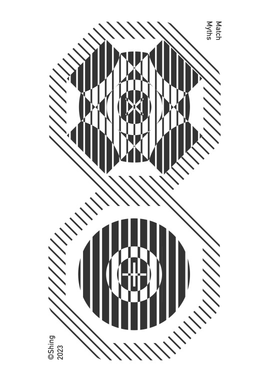
Research Narratives #019
After visual organization and coordination, the following are clear signs for each topic category:
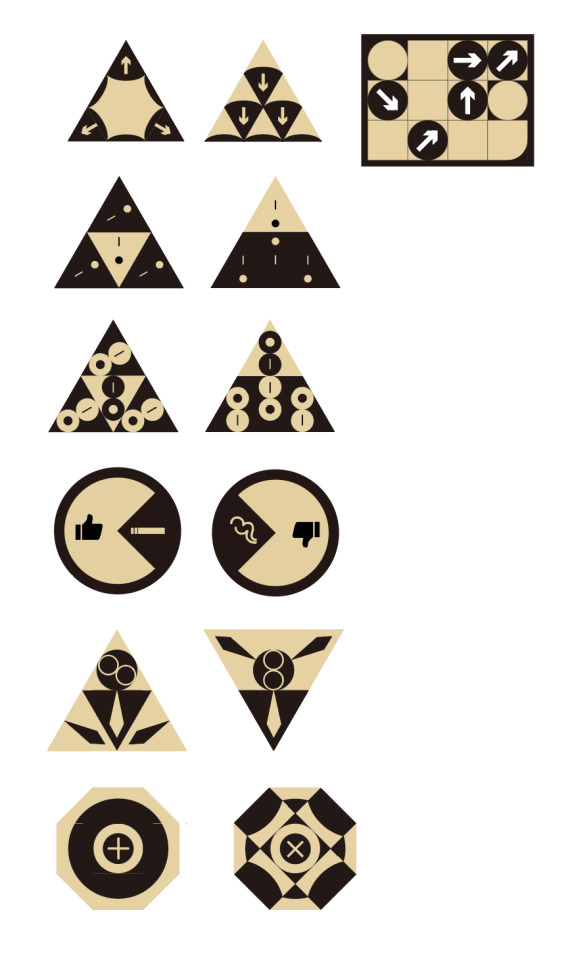

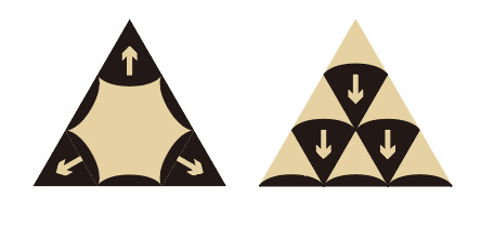
Each Sign is composed of fragments representing opposite connotations (yin and yang), forming meanings with internal tension through different combinations. (For example, in the first logo pair, "arrow" represents order and oppression, while "arc" represents a soothing possibility. Different combinations can form completely different image meanings, such as the left representing an outward expansion and the right representing orderly, top-to-bottom gravity.)
——————————————
Print media test: I arranged these logos in a specific order, made some posters, and tried RISO printing with different color combinations to feel how these graphics look on paper.


0 notes
Text
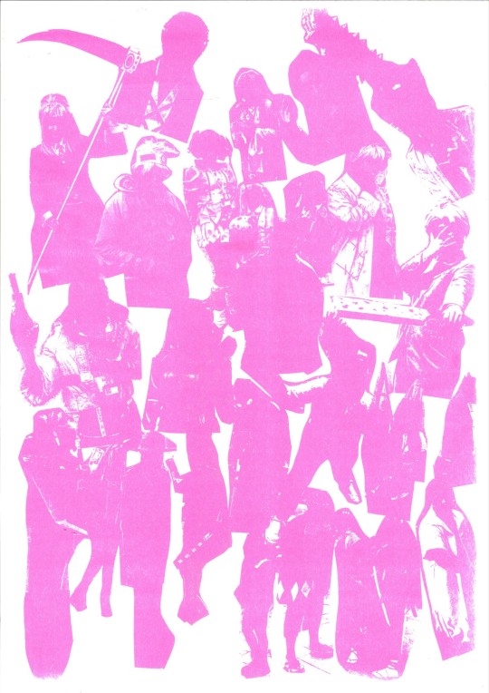
P2 Cosplay Collage Riso experimentation.
From the test collage, I put them through the riso machine to see how it would come out. The result was that most of them were colour blocked and you could only see the silhouette of the figure. Others came out with white highlights that although vague still looked unique so it turned out to be an happy accident. From the ones which you could see I handpicked them and did even more experimentation but with photoshop to even distrupt the colours even more. This Riso experiment gave me another learning curve I realised that the image has to have some form of a white balance so it could stand out that's why most of the images with the riso start with black & white that way it can stand out more when printed with colours.


0 notes
Photo

After some time our studio got the Riso printer installed with 2 colours; blue and black. This is great as it was discussed in the past that I may do colour prints when the riso is here and blue was a colour I wanted to use. It’s a colour that just seems to work for this as it contrasts well with off white colours and gives off the right calm tones to fit my brand.
Due to this I made a load of vase versions testing one and two colours to see how they look and even made some art boards to prepare the two master layers.
0 notes
Text
Session 2: People and Publishing
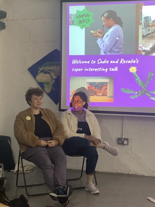


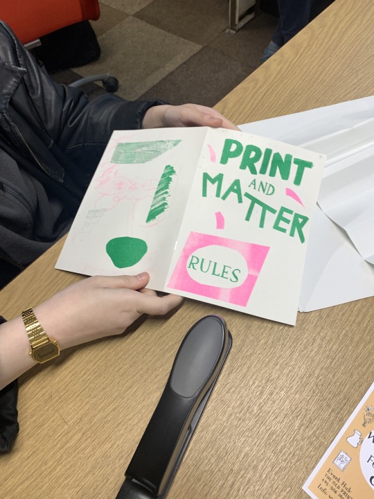
This week, Rosalie and Sadie kicked off the Print and Matter Talks Series with a very generous and inspiring presentation of their work. They discussed how they met, the types of projects they've done together and separately, how their approaches have evolved and also stayed the same over the years and what role publishing played in their work. The Talk Series is open to the public so it was very nice to be joined by about 7 people from outside Print and Matter. The talk was serious but silly and everyone had lots of questions at the end. Some comments that stood out to me were 'You're creating bubbles of freedom where people and not being judged' and 'It's so wonderful that you're making people happy'. Rosalie and Sadie both have a joyful, energetic and yet deeply thoughtful approach to making art and working with people. We could all see the value that play and testing things had in building people's confidence, I particularly liked the idea of Sadie and Ben's Bad Drawing Club where members have to take on a new identity (complete with ID card) when entering the club to make their art.
In the afternoon, we went around and discussed what projects/ideas we'd each like to develop during the course of Print and Matter. I loved hearing from everyone, I think we all did, there were so many different ideas and approaches and everyone made room for each other but people were also keen to chime in and give advice/insights where relevant. Developing ideas can be so challenging so it's reassuring that we're all in a similar position where we have a lot of ideas but can begin to identify where we might need support.
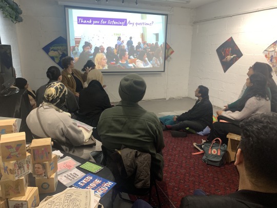
In the afternoon we learned how to make a book using an unconventional and playful book format. The assignment was to do some visual research exploring the questions 'what was The Old Print Works used for and what is the currently used for?' There will be some time to print these next session for anyone who wants to do that. It would be great to see what everyone did and how each person approached the task.
Towards the end of the session, we went in groups to my studio and I showed everyone how to riso print their rules from the pervious session. I think some of the pages came out a bit too light but it was all part of the induction so hopefully everyone can see how their original artworks translate to riso and how they might adjust their artwork in the future to get better results. One of the rules were in Urdu and I couldn't read it all so I need to find out what it says next session. I really like the rule book, I read it today, I think it's a lovely collection! Let's see what everyone else's feedback is next session inshAllah...
0 notes
Text
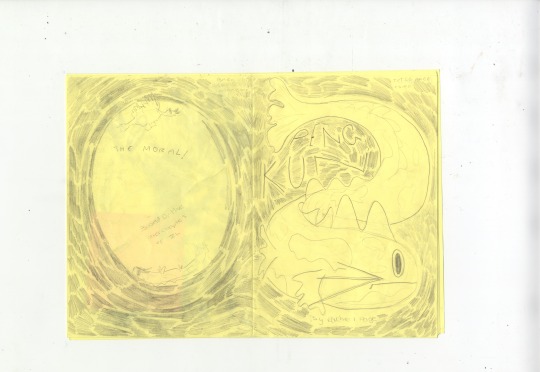
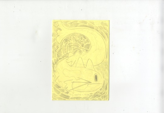
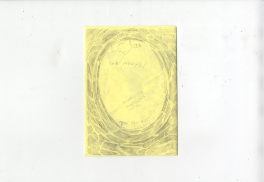
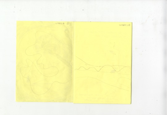
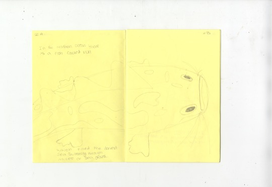
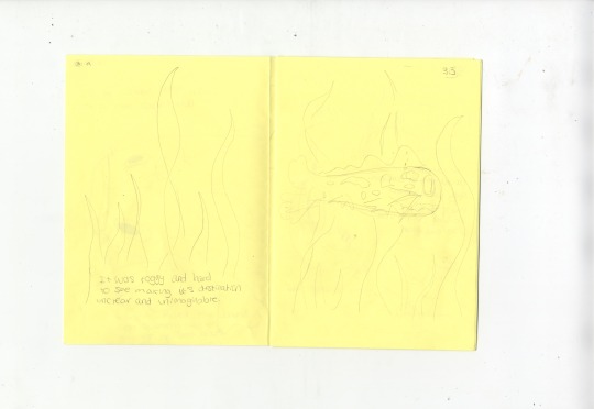
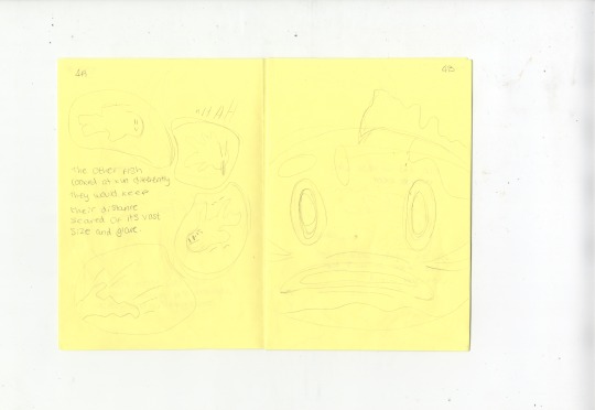
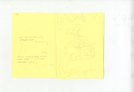


Major Project -
Sketched version of Comic and Test Risos with Test Text Page
Here I have the scans from my hand-sketched comic and the testing of different fonts that could be used for the narrative.
I decided to sketch the narrative to get an idea of how it is currently flowing with the illustrations. This will help for future reference when digitally paginating my book.
For the font, I have decided to use Galvji in 17pt, as I feel it is the cleanest, not detracting from the illustrations whilst still having curved points.
In the last two prints are some test layouts using the risograph. This is the first time I have seen the outcome of the bird in riso print. I am happy with the shape of the bird and the scale of its wings. However, the pattern on the bird needs further development as it does not relate to feathers.
0 notes
Text

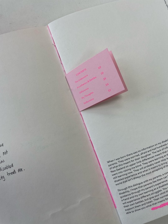
These are the riso printed devider pages. These are all the tests and samples however I didn’t end up using these as I found the tabs stuck out to much on the book and look out of place
So I removed the tabs and fix some of my design mistakes in the layout or the body copy and the Title
And final prints were done on a cream card of 250gsm
0 notes
Text


Some print tests on different paper stocks before I get too carried away with my little baby design system. I wanted to establish which paper stocks interacted with the yellow riso ink the best - the kraft paper, drawing/kmart paper and the eco 90 are the ones that show off the yellow the best. I also tried printing riso THEN on the uni printers and that helped seal the ink in.
0 notes
Text
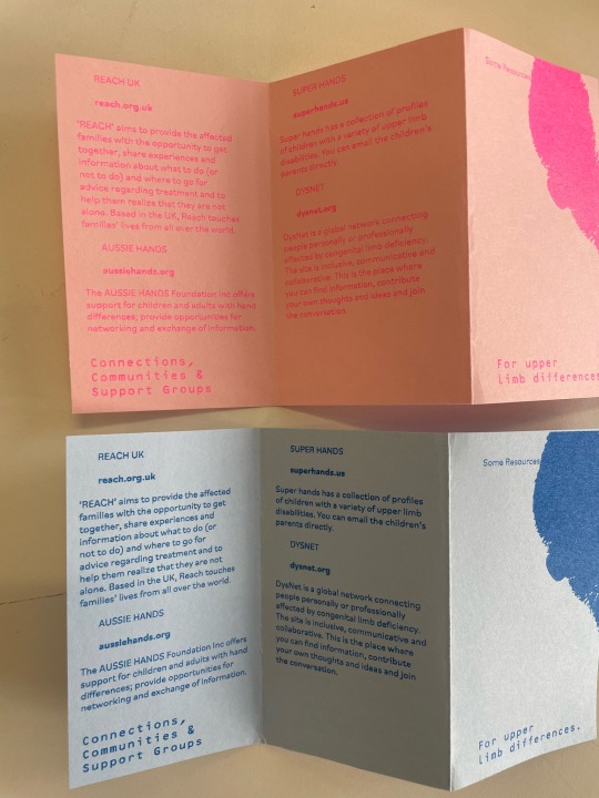
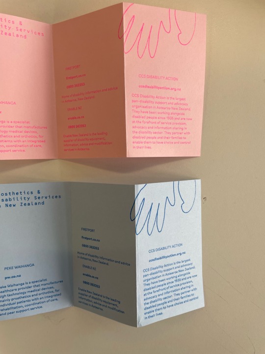
Printed Resource Pamphlet & Wrap
I wanted to test out the pamphlet and wrap idea I had on some different coloured papers that I had.

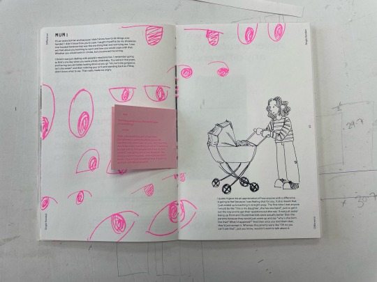
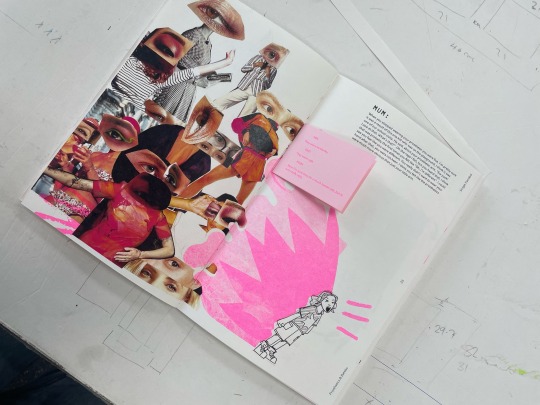
I really love how the print for the wrap/sleeve turned out. The overlay of text and image looks really cool and feels like a scrapbook/journal entry. It matches with the aesthetic that I'm trying to achieve inside the publication and the pink riso on this creamy paper is really nice.

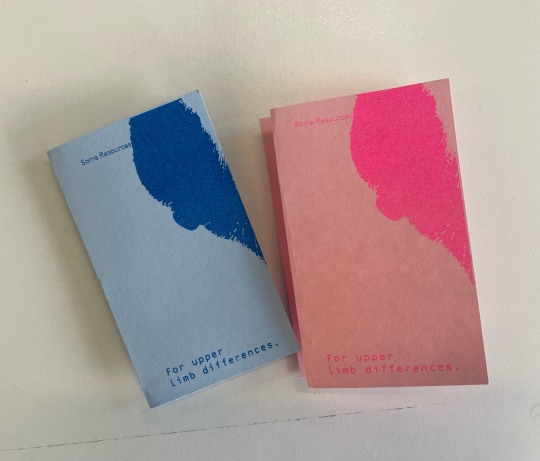
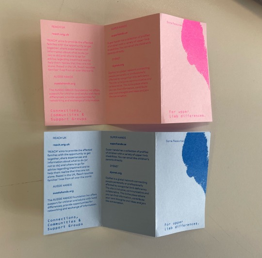

I tested the resource pamphlets in pink and blue because originally my colour scheme focused on blue, pink & black. I wanted each collateral (notebook, resource pamphlet & publication) to have a different colour but now that I'm changing to have pink as the main accent colour, blue doesn't really make sense anymore. I really like the pink riso on pink paper as well and this matches the inserts inside the book.

1 note
·
View note
Last Seen Blogs
simsong6108
Favorite Photo
possumpaints
Possumpaints
notanilustrator-blog
Sin título

ronnieliang
Singer/Actor/Model
@ronnieliang