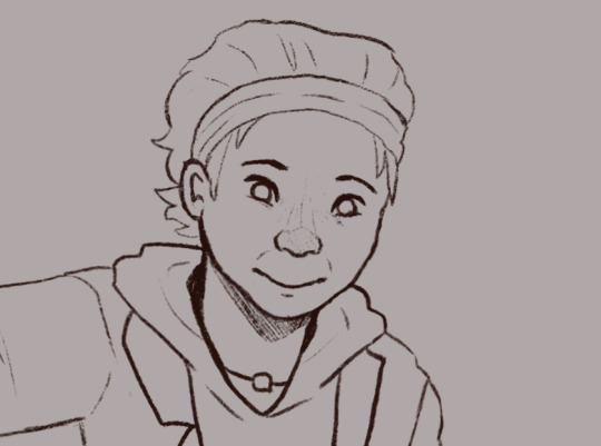
#the artstyle keeps changing oops
Text
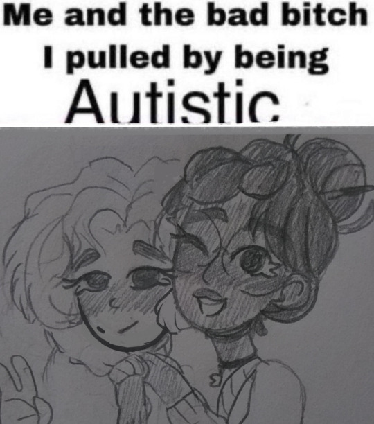
#Oops my artstyle changed again#FUCK#cant keep that shit consistent for longer than 3 seconds#star stable#star stable online#sso#ssoblr#linda chanda#lucy x linda#also character headcanon stuff!!#UwU
26 notes
·
View notes
Text
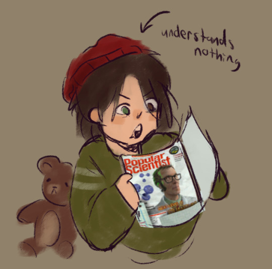
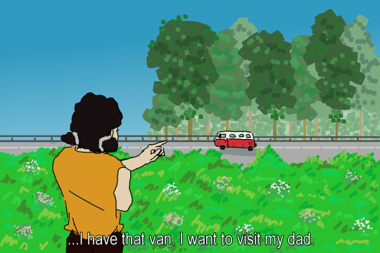
Pizza Tower: The Series Episode Concept
Title: "A Well-Deserved Rest! Noisette The Magical Girl?!"
Season: 4
Summary: After being forced to take a break after clearly overworking herself at her cafe, Noisette has dreams of being a magical girl, complete with art style change! Can she use her magical powers to save her boyfriend? (This episode is half-length but gets shown again immediately afterwards with the Japanese dub and subtitles)
Notes: Would you believe this still isn't the weirdest episode? In all seriousness I know this sort of idea has been done in the PT fandom before but I wanted to do it with Noisette because she's perfect for this lmao
In Noisette's dream, illustrated in anime style, she wakes up on a rooftop with Clove. She looks out and sees a giant monster attacking the town. She then gets a call from Maria and Vigi, telling her that the monster has captured The Noise, and begins transforming into a magical girl. Clove joins her and transforms himself.
They head right towards the monster, who is holding The Noise in its hand as it destroys the city. Noisette begins to use her magical wand to attack the monster, but it has no effect! Clove's staff is also useless. Maria theorises this must be because of the several pizza shields coating its body.
Noisette and Clove then realise that can only mean it was created by the Pizzas!
Clove then approaches Peppino, who's watching the whole thing unfold, and asks him to explain the ingredients of the pizzas coating the monster's body.
Noisette is in a pinch... She keeps trying to fight the monster and save her boyfriend, but it's useless...
Clove then casts a powerful beam from below, explaining that he's breaking the pizza shields down into their original ingredients to weaken it!
As he does, however, The Noise falls out of the monster's hand. Right before he hits the ground, however, he wishes to help Noisette and Clove... and then HE becomes a magical boy as well!
The trio then defeat the monster using a classic Magical Girl Finisher and it disappears into light...
...And then Noisette wakes up in her cafe. The artstyle is back to normal, and she looks around to see that she's knocked out Vigi in her sleep. Oops!
#pizza tower#concept: pizza tower the series#character: noisette#this episode was... something.#just “surprise it's an anime for one episode” lmao#if the plot sounds stupid that's because it is
56 notes
·
View notes
Text
youtube
Watch the American Climate Leadership Awards 2024 now: https://youtu.be/bWiW4Rp8vF0?feature=shared
The American Climate Leadership Awards 2024 broadcast recording is now available on ecoAmerica's YouTube channel for viewers to be inspired by active climate leaders. Watch to find out which finalist received the $50,000 grand prize! Hosted by Vanessa Hauc and featuring Bill McKibben and Katharine Hayhoe!
#ACLA24#ACLA24Leaders#youtube#youtube video#climate leaders#climate solutions#climate action#climate and environment#climate#climate change#climate and health#climate blog#climate justice#climate news#weather and climate#environmental news#environment#environmental awareness#environment and health#environmental#environmental issues#environmental justice#environment protection#environmental health#Youtube
5K notes
·
View notes
Note
First off I wanna preface this by saying I haven’t been in the CP2077 fandom for very long and I’ve been following you for even less time but I absolutely adore your ocs, and seeing them cross my dash makes me smile every time I also love reading the tidbits of lore around them..I truly love them and everything you do and I cannot wait to see more 🖤 -ps do you think you could maybe do a up close of gabby’s tattoos? I’m real curious about them
Welcome to the fandom and thanks so much for your kind words! It means a lot to me!!!! 💜💜💜💜💜
And sure! I can do that, but keep in mind that I can't focus on modding more than like, an hour, so all their tattoos are rushed! Well, Gabby only has one technically, the other marks on their body are either supposed to be a birthmark or scars (I'll get around to make them into real scars eventually but... y'know...)
And hope you don't mind me rambling a little either! So here's a Keep Reading!
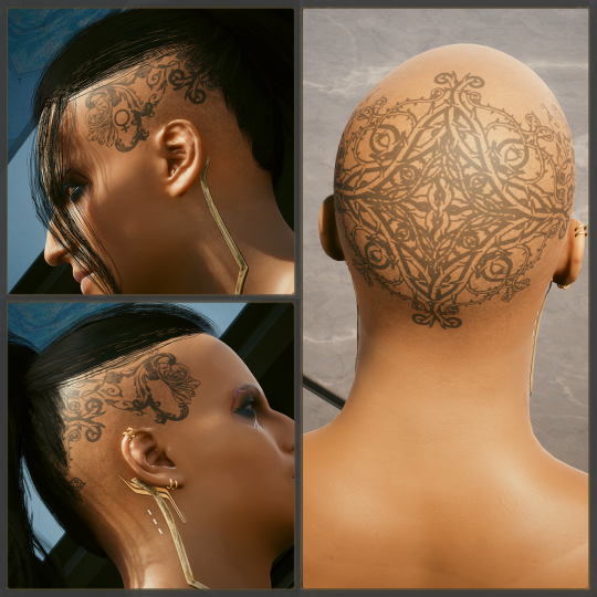
Oops, had to make Gabby bald for that one hehe 🤭
I'm gonna preface this by saying I can't draw, all these were taken from free vector sites. These are four different filigree images I put together, plus the sign of Venus (♀).
The thorns filigrees are a reference to Jesus' crown. Gabby got their tattoo after being fired from Militech for blowing their cover as a double agent and left for dead by Arasaka assassins. It's a symbol of their rebirth, but also a symbol they rejected their father's power (he's a descendant of the founder of Militech) to join the "mortals", the lower class.
The two other filigrees I used are inspired by rococco art, which is known to be a pastel and irregular artstyle with too many details. It suits Gabby's personnality.
The sign of Venus is both a nod at their gender (they partially identify as a woman) and their essence as a cambion (half-succubus). Lucifer is the former name of the planet Venus. Their stage name is Venere di Luce, Venus of Light.

Gabby has other markings on their body. Two scars and a birthmark.
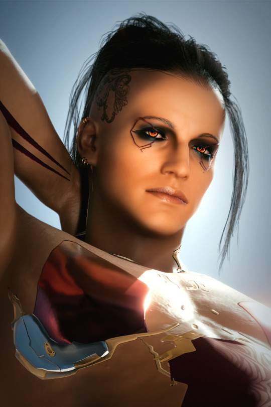
Gabby's birthmark is a reference to the number of the Beast. I was inspired by The Omen. So, in some occult beliefs, the term "Antichrist" refers to all children born from a demon and a human, not just Satan. It's just another sign that Gabby isn't fully human.
Their scars are both branding marks made from hot iron and Holy Water. The one on their neck isn't as visible usually, I used Photoshop tools to make it clearer. It's the symbol for the Death's-Head Moth, a XBD "studio" who hired Gabby after they were fired from Militech since they cannot die, making them the "perfect doll" for them to play with.
It was applied to them shortly after they started hanging more and more with Maelstrom. Gabby had agreed for the scene, since they thought the mark would fade away pretty quickly. They didn't know the DHM's leader knew about their demonic nature. It's just there now. Forever. It'll always hurt a little bit.
The second branding scar is a symbol of Maelstrom. Gabby eventually broke their contract from the Death's-Head Moth to work with Maelstrom instead. They didn't want an initiation cause they like their face a little too much for that, so they chose a different approach to make themself an official associate of the gang.
They were publically branded by Royce, and yes, it was extremely painful. The scar looks right on some angles only. I'll make them into real scars eventually!
Also, I'm using your nice ask to say that I've changed Gabby's eyes to give them a more unnatural look! They're literally the goat now 🤭
#thank you thank you thank you#and sorry for all the rambling it needed to get out 🤣#welcome again!!!!#cyberpunk 2077#oc: gabby luccessi
9 notes
·
View notes
Text
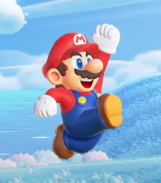
Year In Review: Viddy Game Pt 4 (Happy Mario Day!!!)
Oops! All Mario! To prepare for the release of Super Mario Wonder, I wanted to play through as many of the Mario games I never played before as I could. There are a few wayward titles I missed, but I’m sure I’ll end up playing those sometime in the distant year of 2024. Damn that sounds like a fake year. I hinted in earlier reviews that this was something of a nightmare to accomplish, but that was just me being silly. They’re Mario games! All of these were pretty fun.
Mario and Luigi: Superstar Saga
I started out my Mariothon with the story-driven series I had never actually touched. I’ve played all the (good) Paper Mario games, but I’ve never touched the other side of the plumber’s rpgs. The combat was a refreshing change of pace after all those Final Fantasy games. It’s almost as much of a rhythm game as it is turn based, which makes it very engaging. I also like what it adds to the Mario World. Luigi has been characterized in several of the RPGs and his own spin off series, but having him along for the entire ride in this story driven game makes him somehow more endearing to me than he was before. I like to imagine this takes place right after Super Paper Mario, and Mario is making sure his best bro is safely right next to him after the shit he went through.
The Bean Bean Kingdom feels like a suitable alternative to the Mushroom one we’ve grown familiar with. A lot of the older games had introduced other Themed Kingdoms, like the Jewelry Kingdom in Yoshi’s Safari or Sarasaland in Mario Land, which is based on types of tea. And Mario Odyssey would assert the entire world being organized into these Kingdoms, so Bean Bean fits right in! It’s super fun to explore the fresh areas with a familiar aesthetic. I only wish these Bean characters would make more appearances outside of this game. I guess they show up in the other Mario and Luigis, but Reggie knows what I mean. Put Prince Peasley in Mario Kart, coward!
New Super Mario Bros
When this game released I had no idea that 2D Mario had been put on hold for ten whole years. From my perspective Super Mario World had only been released earlier that year in 2006, on Nintendo’s brand new console, the hand-me-down Game Boy Advance I got from my cousin. So when my friend showed me New Super Mario Bros. on his Fancy DS Lite in 2009, I wasn’t that impressed. This one didn’t even have the cape, or the Tanooki suit from Mario 3! I was not impressed. What it did have was a fun as hell competitive mode that I could play with my friend via DS download play (which is an awesome system they should bring back), so I never felt the need to seek out a copy.
Playing it now, the game is a lot more distinctive than I gave it credit for. While the world themes are based around the generic grass, ice, fire, etc. themes the Mario games always recycle in some way, the level designs give a good sense of cohesiveness, and the new power-ups: the tiny mushroom, Mega Mushroom, and Blue Shell significantly alter how you approach the level. When you’re tiny, you get a higher jump and can get into hidden paths, but touching Anything Will You, while Mega Mario can ignore everything and cause as much carnage as possible. The Blue Shell lets Mario continuously slide and kill anything in your path provided you keep whatever initial momentum you started with, making this game the singular moment the red plumber stole something from the blue hedgehog. The low-res 3D artstyle felt dated when I first saw this game, since I wasn’t enjoying the industry norm of changing every franchise to 3D. “Give me my pixels, damn you!” said 8-year-old Kitch. I now find it really charming, especially compared to the later entries in the “New” series. There are a lot of original enemies in this game that never show up again. I need everyone to look at the Snailicorn immediately.

Super Mario 64 DS

I was always told this was the inferior version of Mario 64 due to the limited control scheme. Instead of full 360 movement, you are now cut down to 8 directional movements cycled on the d-pad. However, I played this game on the 3DS, and the analogue stick made those 8 directions flow seamlessly. The other change is the addition of a Run Button, one that I was not aware of until futilely trying to race against Koopa the Quick. That’s right, for the entire fight against King Bob-omb, I had just assumed this game ran like shit, or that Yoshi was intentionally designed to be extremely slow until I happened to hold down the b-button as if this was some kind of. 2D MARIO GAME? In 3D??? It’s a sensible change, but one that is only communicated by experimenting with the controls, which someone who has already beaten the original game 3 times wouldn’t really think to try. And since there’s little need to ever Not Run, holding that button down for the ENTIRE GAME started to get annoying towards the end.
Otherwise, it was really nice returning to this classic. The calm atmosphere in exploring the Mushroom Castle and revealing its little secrets makes it genuinely unmatched as a hubworld, and the levels, while mostly generically themed, cram tons of personality into such small areas. Realizing how tiny levels like Cool, Cool Mountain and Big Boo’s Haunt are actually startled me, since I spent so much time as a kid exploring the nooks and crannies of those areas. There are also a lot of new stuff hidden across these levels that either unlock or are accessed by the new playable characters. Each of them have their own movement speeds and abilities, but none of them really play as well as the Mario Himself, so changing into them was mostly situational. I loved the new boss fights that unlocked them, though. Adding Goomboss from Paper Mario into the OG 3D Mario made me really happy. I’ve still never 100% this game, but if I go back, I might actually make sure it’s this version I complete.
Mario & Luigi: Partners in Time
The awaited sequel to the GBA game, I hear absolute jackshit about this game when people talk about the Mario and Luigi series. I assumed it was the runt that came between the beloved classics of Superstar and Bowser’s Inside Story, but that isn’t true at all. In fact, I think I like this game more than Superstar. Since it’s on the DS, there’s a naturally higher fidelity with the pixel art, the premise is more interesting, and it adds a new layer to both the combat and overworld movement in the form of the BA-BIES. Since there are two new X and Y buttons, you get Baby Mario and Baby Luigi as additions to your playable characters, meaning at any one time you are juggling Four Whole Mario Bros. all for the price of One! The game is noticeably more difficult than Superstars, nothing too crazy, but I did die a lot more. Or I am just Bad At Games.
Like the previous entry, this game is oozing charm out of every bodily orifice it has. Mario and Luigi are characterized extremely well as they step up as babysitters. It warmed my heart everytime Luigi purposefully goofed up to make the babies laugh or whenever Mario shouted “BA-BIES” in concern whenever they were in trouble. It may be the most overt personality he’s ever really shown. The time travel mechanic isn’t super in-depth, the present time basically acts as a hub world, but we get some more of that Sweet Mario Lore as they explore the Days of Mushroom Past. Autocorrect wants me to say Pasta. We get to see Baby Peach and Younger Toadsworth at some point after Yoshi’s Island, an E Gad pre-ghost fascination, and also these alien freaks who look suspiciously like Fucked Up Toads. What does this mean for them? Are Toads themselves descended from aliens, or vice versa? Will we ever get to see “Toads In Space?!” Some kind of… “MARIO GALAXY???” Only the future can tell.
Super Mario 3D Land

Nintendo was able to put a 3D Mario on a handheld in the last generation, so I guess the new hurdle was an ORIGINAL 3D Mario on the Three Dee Ess. This serves that purpose well. I could honestly end it there. The level design is well executed around the controls that are based on Galaxy, and it translates really well. They brought back the Highly Acclaimed Tanooki Suit that lends itself nicely to 3D platforming, and also seemed to be a selling point of the game? A lot of the Goombas and Koopas are now wearing the tanooki suit, and even Peach gets to show off the fit at the end of the game. You can’t play as her though, it’s just there to tease you. Luigi is an unlockable character with his own set of remixed levels, but that’s really it.
And that’s the thing, this game is fun, but it’s also kind of… Nothing? If you’ve played 3D Land, tell me: Where does it take place? The Mushroom Kingdom? That’s probably a good guess, but there’s nothing that really shows that, is there? There’s little to no cohesion between the levels. The level select is a linear screen with a multicolor background. You’ll be playing a water level immediately following some weird toy-themed level with absolutely zero context. Where are we? What’s happening? No one really looks for a story in a Super Mario game, but the lack of any real context makes this game super forgettable to me. It’s just a selection of random levels, and a Lot of the levels are repeated with slight differences. Why? TELL ME REGGIE. At the very least we get these cute letters from Peach showing her own adventure escaping Bowser. That would’ve been a fun to play, but this game won’t let you go Girl Mode. Oh well.
Super Mario Land 2: 6 Golden Coins

This is one of those “underrated Mario gems.” Maybe the only one. Super Mario Land is pretty mediocre, so I’m not surprised its sequel fell by the wayside. It’s super creative for a GB game, and because of the power of Cool Internet People, I got to play this in color! Lucky me :) The whole game takes place in a magical theme park that was maybe created at the end of one of the Mario Parties. Did anyone else make that connection? I know one guy did. They go ham on the level designs: an area that makes you tiny so Mario is battling ants, a bubble ride that takes you into space to fight Pig Creatures, a mechanical Mario; at one point you go inside a whale. It’s wacky! The enemy design reflects this too, there’s a bunch of Weirdos, like the Pig Creature:
The goal is to find those 6 Golden Coins in each world to unlock the Mario Castle, with the caveat that Mario will lose all his coins upon a game over and have to track them down again. You only have to repeat the boss fights however, so it’s not a complete wipe. My Boy Wario is introduced in this game, and he really does come across as this supernatural, corrupted parody of our portly performer that the commercials for this game made him out to be. But the official word is he’s just Mario’s childhood rival that was upset they didn’t name a castle after him. Don’t worry, Wario! I’m sure you’ll get yours soon.
Super Mario 3D World pt 1
This one is just stellar all around. It makes 3D Land look like a tech demo in comparison. Every level showcases a degree of creativity on par with Galaxy while keeping 3D Land’s linear design. Every part of this experience is just so damn satisfying, the new power ups, targeting the tops of the flagpoles, riding on Yobbo the Swimming Yoshi, and you can go GIRL MODE. My biggest complaint about 3D land is that they teased a playable Princess Peach without actually ever giving it to you, and now I refuse to play this game as any other character. Except when the game makes me play as Mario or Toad to get all the Green Stars. Also the GREEN STARS.
The secondary collectables have never felt as necessary as it does in 3D World. They add an incentive to explore the levels or find an extra challenge that are actually Worth searching for. I don’t remember if they really gave you anything, but I still liked finding them.
Also the MUSIC, the ost slaps so hard in this game. We’re moved to a new setting in 3D World, and the soundtrack and aesthetics match that vibe. It’s unique, it’s bOMBASTIC. There are two new power ups in the form of CAT and CHERRIES. The cat can run up walls, while the cherries can make a double of your character. The former is generally the best playstyle for most of the game a la the Tanooki suit, while the latter works as a fun challenge that gets really creative with its limits as you control two or three or six characters with one controller. There’s even a bonus mode at the end based on Galaxy where you can. Guess What? GO GIRL MODE EVEN HARDER. I haven’t done it yet but hey. I Am Going To.
Bowser’s Fury
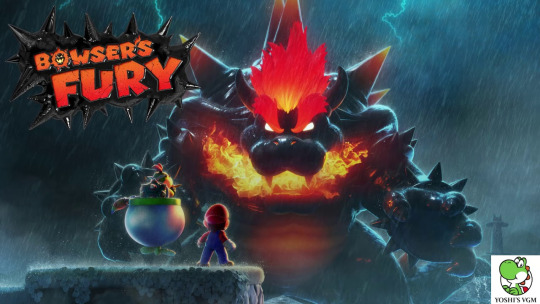
This is one of the few I actually 100% completed. I was on a Dollywood trip with some friends and after the festivities ended at Guy Fieri’s Shitty Arcade and Ripley’s Wacky Wonderworks we stayed in the cabin and chilled out. I didn’t have a ton else to do while everyone was resting so I got really into Bowser’s Fury. Our first taste of what may be Open World Mario. It’s fun! Mario is stranded in the middle of a lake with wildly clashing aesthetics that somehow just works. Light blue dominates the eyes hampered by the slimy black of the magic ink polluting the water around you. There are small yellow islands dotting the lake and floating in the air. And when you get to these islands? Cats! They’re all cats! There are cats on the ground, cat ears on the goombas, Cat Koopas, Kitty Boombooms, everything is a cat!! Even the grass is cat fur! You have cat to be kitten me, right meow! It’s a place so suitably weird for the Mario universe, I could easily see Lake Lapcat being introduced in one of the earlier Paper Marios.
Gameplay wise this is just a big Mario Oddysey world with more… direction? The lack of a real swimming mechanic in Bowser’s Fury makes the ocean a fun place for movement and little else, though there are occasional challenges for Yobbo the Swimming Yoshi to run through. It makes Lapcat feel like a massive hubworld of sorts, with no divide between it and the level, It’s as if in Mario Galaxy you could walk straight from Rosalina’s Observatory directly onto a new planet without going through the Domes, if that makes sense. It’s short, but super fun for what it is. You get all the power ups from 3D World to play around in less linearly designed levels, and it lets you stock up on them through an inventory system. Bowser Jr. follows you around and acts cute! Mario and Bowser turn into Kaijus and you have a Godzilla vs King Kong style boss fight. I guess Mario would be King Kong in that analogy… Nintendo may need the help of John Kirby once more…
Super Mario Sunshine
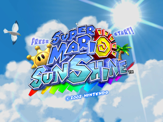
I had never heard about this game’s existence until I was like 15. My friend told me it was one of her favorite Gamecube games growing up, and I did not believe her. Every description she gave about Super Mario Sunshine sounded like she was messing with me. “Oh yea it’s the game where Mario goes on vacation and he like, gets framed for vandalism? And you have a water gun and you clean paint.” Fuck off with that, you’re not getting me! I thought it was a running joke she had until I looked closely at Mario's trophy in Brawl that referenced the same name. Huh!
Anyways this is my first time actually playing it on the 3D All-Stars collection. I started it when it was released, but I reached a point where I had no idea what I was supposed to do until my cousin who grew up with it told me I needed almost every shinesprite to beat the game. ALSO WEIRD. The other 3D Marios let you go at your own pace and pick and choose which levels you want, but here all but the last levels are required. I guess this is because Sunshine is more “narratively driven” and they want you to watch how each world changes through your actions. I can appreciate that! Mario 64 experimented with that a bit, like the tower appearing at the top of Whomp fortress in Star 2 or King Bo-bomb’s corpse appearing at the bottom of his battlefield after you coup de tated that fucker. Sunshine, however, has levels like Noki Bay where each level has Mario tackle the source of the pollution, or Gelato beach where you make sure a hotel is suitable for reopening and even get to celebrate at the end.
The controls on the other hand. My cousin described them as “lovably janky.” Mario no longer has the long jump, which startled me every time I tried to long jump, which was a lot cause I have the memory of a housefly. Wall jumping is harder to pull off as Mario does not automatically turn towards the wall like other Mario games, so you have to time it perfectly, and Mario’s overall movement is very awkward. I never felt like he jumps the exact distance I expect him to go. This is probably to make the player more reliant on Fludd, the aforementioned water gun that can let you hover as well as two other fun, but useless abilities. Fludd is very fun to use, but they take it away from you during the platform challenges and it reveals just how janky Mario is in this game. I guess it also makes them more satisfying to complete. Still, since these levels are required, I probably would have given up ever beating the game if I played it as a kid.
New Super Mario Bros 2
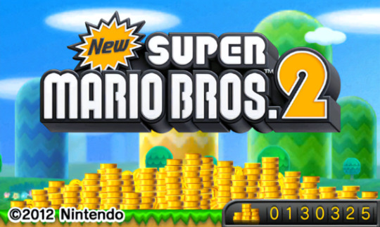
This is a similar case to 3D Land. It seems the goal of this entry was “put a 2D Mario on the 3DS,” which was a less impressive goal given the OG New Super Mario was already playable on the 3DS. It’s much prettier, I guess. The big name of this game is “Coins.” Coins are everywhere in this game. There’s a new power-up, the Golden Flower, that lets you turn blocks and enemies into coins. Another power-up that gives Mario a coin every step he makes. There are Golden Koopas that produce coins when thrown. There’s a counter on the home screen that shows how many total coins you’ve got, and the game notifies you every time you reach a “Coin milestone.”
Yea I’ve never cared about collecting coins in Mario games. It’s not like they unlock anything that matters in this one, they just congratulate you every three minutes and if you get One Million coins you get a new title screen. That’s kind of cool, but not something I would actually care to try and get. What I’m left with is the most standard 2D Mario game to exist. The Tanooki suit is here, but like 3D Land, you still can’t go Girl Mode. Unless you count Luigi. Genderfluïd King. Despite this, I do find myself coming back to this one quite a bit to carve out some of the bonus worlds. It’s slightly harder than the other games in the “New” series. Maybe if they leaned into that, like the OG Mario 2, it would be more memorable. Wait, this is the 3rd New Super Mario game. Why is it called 2? The hell?
New Super Mario Bros U Deluxe

As the final entry in the “New” series, it makes sense that this is the most polished version of that game style. The world designs are still based on the tried and exhausted Grass, Desert, Snow, etc. aesthetics, but here there are a lot more unique level designs or some that are SO COOL aesthetically, like the level based around a Van Gogh painting. I wish there were more levels like that, but in THE LEAST, this is the first New Super Mario game to introduce CONTEXTUALIZATION. This is something I’ve been complaining about with these new mario games. Super Mario World (the best one) has a beautiful map level-select. When you’re in Donut Plains on the map, the level reflects that design, taking place on a field, and when you go in a cave, THE LEVEL TAKES PLACE IN A CAVE. Imagine that. It’s such a simple thing that adds so much to the experience. You are actually traveling through a world, not just choosing random shit off a menu. U Deluxe’s map isn’t as cool as World’s, but it was still immensely fun to discover all its little secrets, and made me realize how much I missed World’s map design. Maybe I should play that game instead.
There is one unforgivable sin in Mario U specific to Deluxe. There’s an original playable female character in the form of Toadette! Girl Mode! Finally! And it SUCKS! It’s not actually that bad, but playing as Toadette gives you access to Peachette, whose existence replaces all power-ups in the game while playing as her. So Girl Mode is actively worse to play than any other mode, except funny rabbit mode. But that’s only if you want to be a funny rabbit. She’s meant to be “easy mode,” which is a bit demeaning given she’s the only female character, but I get the desire for an easier way for kids to play the game, I just wish it didn’t lock you out of all of the power-ups. Speaking of which, there are a Lot of power-ups in this game, but a lot of them are hidden for some reason, like the Propellor Hat and Penguin suit, which I found 1 and None of, respectively. Why are they in the game if I can’t use them? These aren’t collectors items, they’re funny little costumes that are supposed to be FUN. WE’RE ALL HAVING FUN HERE.
Super Mario Bros. Wonder

FINALLY they’re letting Mario be WEIRD AGAIN. The artstyle of the New Super Mario Bros. games got heavily criticized after this one was announced for being “soulless” and “boring,” but I wouldn’t say that. Because I don’t think it’s true! They’re vibrant and colorful games with an obvious ton of talent and heart put into them. I would, however, describe them more as “corporate.” Homogenized and Marketable. Mario and Gang have been kept to their models in every game since the DS and everyone has clearly been exhausted by it. Wonder is breaking the trend, and Mario looks fucking Weird.
He’s so much rounder, his clothes have a different texture, and his eyes are bigger and brighter. His eyebrows are clipping through his hat! He looks like a plastic toy brought to life, which is not an insult. All of the characters are brilliantly animated to pull off this new look, and I refuse to try out embedding videos in Tumblr so you just have to trust me. It’s not that I want Mario to stay like this, but I DEFINITELY want them to Keep Being Weird Like This.
The weirdness doesn’t end at the artstyle. There are three new power-ups, the Elephant Apple, Bubble Flower, and the Drill Shroom, the last of which is carried over from Mario Galaxy 2’s Spin Drill in terms of gameplay. The Bubble Flower lets you capture things in Bubbles and lets you jump on them for extra air time, and the Elephant Flower turns you into a Fucking Ele Phant. Twice as big, can swipe things with your trunk, can carry WATER in your trunk. Truly the Mario experience we’ve been missing. There are also the most playable characters than there have ever been in a mainline Mario game. Peach, Toadette, AND Daisy in her first playable appearance. THREE FORMS OF GIRL MODE. Nintendo knew what my main Mario complaint was before I ever thought of it.
The main draw of this game, however, are the additions of the Wonder Flowers. There are no levels that stand out against the other, more standard levels like the New Super games, because literally every level in this game is FANTASTIC. The Wonder Flowers are an extra challenge midway through any level that changes it into something WEIRD AS HELL. Maybe the level speeds up and slows down rapidly, maybe you have to dodge walking Piranha Plants as they sing an acapella stage performance, maybe you turn into a Goomba yourself and have to avoid being eaten by a predator. It can be literally ANYTHING. Every level is exciting to go through because you want to see what NONSENSE those crazy bastards have come up with.
Not to mention the world design. The Flower Kingdom is BEAUTIFUL and similar to the Beanbean Kingdom in terms of cohesion. There’s another country right next to the Mushroom Kingdom with a new botanical aesthetic we’ve never heard of before? That makes sense! It feels perfectly natural for it to be part of this universe. This is another of the three I went to the effort of 100% completing, and some of those last levels are HARD. I gave myself a migraine on the final badge challenge. Also BADGES. They’re cool. Some provide an extra movement option and others make movement actively worse as a way to challenge yourself. Some are just fun! It adds a neat level of replayability to the game as you experiment with them all.
You also get a fantastic reward for completing all the levels. It is. SO Stupid. Extremely dumb. And I have never been more satisfied with a completion reward in a Mario game.
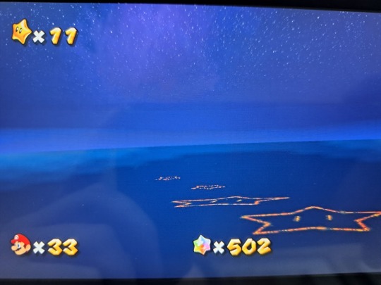
Super Mario Galaxy

To end out my Mariothon, I celebrated with another playthrough of my favorite game featuring a space-faring plumber, Super Mario Galaxy. This was the game that made me fall in love with the series, and in my eyes, still has not been beaten by other Mario titles in terms of atmosphere (PUN). It is just so fun to exist in the levels in these games in a way I can’t say about other Mario titles, except maybe Odyssey and 64. I could follow the objective, climb on the honey walls as Bee Mario, or hop across apples and pears so large they’ve become planetoids and have a great time, fantastic even. But I could also walk around Honeyhive and Deep Dark and look around the scenery and play around with the controls, which are restrained, but refined compared to the previous 3D Marios. Most of the purple coin levels are designed to do exactly that. Galaxy is by no means a sandbox game, but it retains those elements from Sunshine and 64.
Maybe that feeling just comes out of nostalgia. This was at one point the only game I would play on my wii for months on end. It’s like comfort food to me. One time I heard a local cafe play the Galaxy main theme on the speaker as I was walking by and I just. Paused for a bit, leaned against the brick exterior and soaked in the vibes. Listening to that pristine orchestral track whilst watching people come home from a full day of work, or following the actions of a cat decided whether or not to eat a bug running for its life. There’s probably a copyright issue they were violating, but who cares, Fuck Nintendo.
There is one thing that I know isn’t just nostalgia. The older I get the more I appreciate the storybook section of Galaxy. Every few worlds you complete, you’ll get a notification that Rosalina has a story to tell you, and you’ll hear a chapter out of her children’s book detailing her past. It has a melancholy vibe and it’s a genuinely beautiful and heartfelt story with a gorgeous handpainted artstyle:
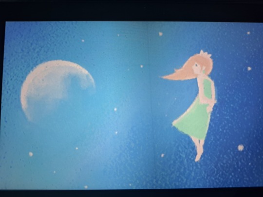
Supposedly, Koizumi (co-director on the game) snuck this feature in without Miyomoto’s knowledge, and he hated it. When he discovered it after the game was released, he was upset enough that to this day Nintendo has not let Koizumi direct a big release. Apparently, he thought it ruined the game’s tone. I don’t know if I believe that, and I don’t feel like fact checking that shit, but if so, I’m glad Koizumi got it past the guy. It elevates the game’s overall story to an absurd degree in my eyes, providing Galaxy with one of the best endings in any video game I have played.
My ONE criticism. MY singular gripe. Is the title itself. “Galaxy” has always bothered me. “Battlerock GALAXY?” “Loop de Loop GALAXY???” Miyomoto sir, those are SOLAR SYSTEMS. And tiny ass solar systems at best. Sometimes just singular planetoids. But obviously Super Mario System or Super Mario Tiny Ass Planet isn’t as Marketable as- What the fuck was that? Wait, hold on. Sorry guys. Computer, ENHANCE.
What the fuck is this? I’ve always noticed it there in the background, but… I’ve never considered… is this Earth??? The surface of the Mario Planet? Are you telling me all of these “galaxies” are simply a collection of stylized MOONS??? Do we ever actually leave the outer atmosphere? Well, maybe. Looking at the skyboxes of a few more worlds, it seems we do actually bounce around a few other planets, but they’re nearly always there, holding our bee-themed satellites in rotation of itself. That makes more cosmological sense, I suppose, but I’ll stand by that Super Mario Satellite wouldn’t have been too horrible of a name if Nintendo wanted some fucKING ACCURACY WITH THEIR TITLES.
HAPPY MARIO DAY EVERYONE. The big MAR10. I totally planned for this to release exactly today, and it’s not just because I put this whole project on the backburner while I focused on my Real Life Job. Thank you to everyone who has been reading these (I see you). I’ve repeated before that these reviews are mostly for me, but the few people that have been leaving likes did motivate me to keep going. I’ll be posting more things on this blog in the future, but I’m not sure I’ll do the Year in Review thing in this manner again. Look forward to more of my ramblings! Or don’t! Skim them in mild interest! Don’t read them at all! Either way, wahoo! Yippee! Yahaha! And Have A Blessed Mario Day.
#mario#mario day#mar10#okay here we go#super mario 64#mario & luigi#mario and luigi#superstar saga#partners in time#new super mario bros#ds#wii#new super mario bros 2#super mario wonder#super mario 3d land#super mario land 2#super mario 3d world#bowsers fury#super mario sunshine#my post#video game#reviews#year in review
2 notes
·
View notes
Text

my artstyle keeps changing oops
heres some doodles of my oc (august) + alyx
12 notes
·
View notes
Note
OMG YOUR ART IS SO COOL I LOVE IT😭
Can you explain me how was your process to find your drawing style? And good afternoon 😊
-Layla/stupid mizutsune :D

Waaah thank you!! :D
Anyway there's been quite a few artstyles that have influenced my own throughout the years, at this point I feel like my current art is a mix of both western and japanese art styles. My first big influence was from when I was around 10 and I was constantly borrowing those How To Draw Anime books from the library lmao (the girls who get it get it).
I started being more active on the internet and in fandoms around age 12, and there's so much art on here that my own style was changing a lot during this time. Basically, whenever I found a drawing or an artist that I liked I would try to copy that style, which led to my own art being a bit inconsistent during this period haha. Which is fine btw, I think it's good for newer artists to experiment with their art.
Some of the main influences during my teens though were from all the art tutorials I found on Youtube and uhhh....... the hamilton fandom...... NOT JUST THat though ya'll know all those bazillion musical animatics on Youtube back in the late 2010s!?!? Yeah those specifically had such an impact on my artstyle lmaoooo (THE GIRLS WHO GET IT GET IT!!!)
In my late teens though I feel like I finally developed more of my own art style..... I mean it's still pretty inconsistent hehe and of course I still take inspiration from other people's styles but there hasn't been any big influences aside from ONE thing! I mentioned it in this ask a couple of weeks ago but the show Arcane has had such a big impact on my art it's not even funny.
Regardless like I said, my current style is a bit of a mix between both western and japanese art (best of both worlds!) that being said I feel like the japanese influences are more obvious in the way I draw comics. Manga have affected me a lot in this aspect (not that ya'll would know that since I haven't really posted any comics on here oops.) I also like having a healthy mix of both semi-realism as well as more cartoony influences. I feel like I would have gravitated more towards realism if it weren't for my love of comics, it's easier to draw comics when you keep it a bit more cartoony.
This is kind of a ramble man idk how to explain these things, hopefully you got something out of this haha 👍
7 notes
·
View notes
Text
Part 6! Of rereading Lore Olympus. Ep 51-60
On these next few parts i really just kept ranting oops. Also I just keep getting busier and forgetting to read more, but I haven't caught up with what I've read yet and that's the only thing keeping me going. Does anyone read these? Last part:
Ep 51
“What about my brother” artemis please its kinda clear at this point
So did hermes question anything or
“ i have no right to be jealous” yeah also theyre just friends dude
“Oh but hermes liked persephone” no hes a gay man argue with the wall(/j)
Why they got eels
I love how tall and slender hecate is seeing as like eventually everyone dissolves into one shape
Yes im over exaggerating what about it
Who are the fire people i love them
Bro imagine dying and like “finally free from this hell where i have to work all the time” only to be put to work when you die
“Everyone should get a fair trial with the king of the underworld” i agree but wouldnt that take forever too like there are so many deaths all the time
I literally get so tired of hades in this episode mfer has such a lack of control in his emotions
like . are you physically unable to have a conversation with her without losing it so you gotta ice her out??
“I cant accept gifts from employees” i mean yeah if they are trying to bribe you its just fuckin food man
Also this part minthe keep it in ur pants ur at work
Ep 52
Wow all women hate persephone bc shes so gorgeous so they treat her bad and like make out with her crush
My point got lost there but you get what i mean like women cant just exist they either are used to compare persephone and show how good she is or uplift her
Im not saying you cant have mean women please do but the way it all comes together just. :/
Persephone is like trying to hard to be nice and friendly and hades just kinda sits there like an idiot smh
Hermes my beloved
I want bakalava now
How would she have a driver's license demeter kept her in the mortal realm you think she would let her get that
Why do they want a car thanatos you have wings my guy
I mean. Did you die hades?
Also smth to ask before hand lmao thats on you
Hecate, agent of chaos, my wife, my everything, my-
Ep 53
I know hecate has reasons to do things but i like to believe she doesnt and she does what she wants
Theres no way minthe sounds happy on the phone when she knows its just hecate
Nah nvm shes probably scared of her
How. how does anything get done at this place
Hades can you. Can you treat her like a friend or even a worker instead of a crush its not that hard youre a big guy
I love the eels
The moment when the artstyle changes randomly and you have to get adjusted to a new one
Hecate is now a different shade of blue what
Fuck you hades putting all your emotions on a 19 y/o
Unfortunately he does treat her like any other of his employees hes just. A shitty boss
“Oh no she thinks im mad at her” yeah dude ur acting like a dick
Sorry this just pisses me off
“Shes like me” she just like me fr
Why is the building confusing what do they gain from that
Its actually so rachel doesnt have to remember the layout
Ep 54
“Is she angry” no shes tired wtf do you think
I know rachel tried so hard on the “please dont grab me” panel girl was sweating
Personally id just leave if i was the reporter but ig he needs smth
Asking for a statement isnt the bad thing its the grabbing and like pressuring yknow
Do they have close ties
I know its supposed to be casual but i wouldnt hold my mothers friend/ business partner. Whatever their lie was, like that
Idk how i would actually im going to be thinking of that
I do like how she has a trigger but im gonna be real i dont think its ever brought up again
Sure you could say she is just good at avoiding it but idk
“I dont always get to do what i want” you literally do unless it doesnt help the story
Rereading has made me see how many things are in place for the story that disappear when not needed
“Man im a lousy tour guide” and a lousy boss :D
I do just want to make sure you guys know how much i hate hades as a boss
Ep 55
Its a lobby. Thats funny ill laugh at that
“That not exactly what we do here” what do you do
I havent read greek mythology in so long
“They may become hysterical” please explain psyche i saw i reply talking about how we didnt see her reactions to phone
They were so right that mustve been fucking bonkers
How do they ease them into it? Do they go through all the years of technological advancements just quickly??
Who is hecate talking to
Let her get the jacket make hades pay the designer to make another one
Also only 3? Like 20 id get but 3? Nah
“Why is she employed here?” you were there yesterday minthe remember she got an introduction
I think hades needs an HR department yknow what
“ a coveted position” PLEASE JUST EXPLAIN THE JOBS AND THE WORK LADDER
I agree with hecate except no one treats it like a work place
Not even you really lmao
If they are scared of her why would they go bitch to her esp if they know she doesnt care
Small medium cause shes so petite but she has curves bc shes gorgeous and-
Rachel smythe sniped me :/
How did she put that on
Ep 56
Whose the green person in the back poseidon idk
Also glasses again :)
“Stop staring at me with them big ol eyes”
Yes i already made the joke its funny tho
meg/persophone is my otp /j
Seriously its already more healthy than hades gotta be honest
So nice of her to let her borrow it how is she gonna return it. They talked more im sure but its funny to think that she actually doesnt know who meg is
Why does his hair get longer in the mortal realm get up
Omg does he have extensions that would be so funny
“I have to have control” yeah you do its gross
I love persephone fury look tho
Wait why did her hair grow
I get like thats the style in that time or whatever but
“I for one find you terrifying” is such a cute line not gonna lie
Persephone why do you look like youre trying to kiss him
“How can she be doing better than me” because zeus is married
I feel like thats obvious
Blue nymph obviously evil she has to be shes a woman and-
But also i forgot her name. Tha. no uh
Its thetis :)
Ep 57
“My visions arent always correct. But they are most of the time” is such a sloppy line
Omg i forgot that hera was the reporter
Also idk how her visions work but couldnt it have been literally anyone? How does she think shell narrow it down
Persephone you are wearing a skirt thing be careful
Also. dont push off people chest just generally
Her hair got much longer but i can excuse this one bc shes using her powers and they tend to coincide
“I gotta inspect that volcano” yep. Sure is a volcano
“But once they die theyre all in service to the underworld for the rest of the eternity” is there a way to die after death bc that sounds awful
Ok but why do they have to wait how does that earn you money
Like no i get the like immediate ride for a obol or whatever but why 100 years. You lose out on so many laborers for a while that way
I love Styx hand in marriage
Haha why is she bald in the last panel
Ep 58
“Reminds me of a younger me” is supposed be like a red flag but was zeus not chill during his formative years
Why does he get so mad a her vision genuinely
Also like why he get mad about her guessing apollo
I know i know “reputation ruined and so is ours” people change yknow also i do second guess your ability to choose olympians
Spit on him queen
This is one of the spots where i feel like rachel was just pushing to make zeus a bad guy. Not like a dick but actually antagonistic qualities
“I prefer the financial benefits of ongoing unpaid labor” haha so funny /s go fuck yourself
Yeah theyre dead and have nothing else to do but damn
“Why would my mom hide it from me” i mean. Thats fair but youre the one that calls her like hovering so i doubt she wants people trying to sex you
I mean fertility doesnt have to mean sex its more than that also one second
Nvm i googled it i was gonna say hestia was a goddess of fertility but shes the goddess of home a stuff my bad
Arnold reaction meme
Oh why is it dangerous
No i know why lmao
Persephones jaw goes from ) to ] in a matter of seconds
“Just stay away from tower 4 until we get to the” THE WHAT??? THE WHAT
Thats not a joke the sentence ends there
“OH you said yes!’ to you helping her like friends do
Ok but how will he know its her
Ep 59
Yes persephone you communicate clearly!! Be healthy!!
I love the flower nymphs personally i know everyone says we dont see persephone be close with them but its the little things i think
“I literally have no idea why you want to be here” me either hades
Haha flower nymphs are dumb! Village people! Haha racism
No i know thats not what shes saying but the racism of nymphs is overlooked
Me, everytime she was handed something pomegranates: :OOOO ITS THE!! ITS THE THING
No minthe has a right to be upset id be pissed if id have to change someones entire schedule
Not the snapchat filter
Why is his name big spenda thats so funny
Ep 60
As someone who has been jealous before i have to say this isnt healthy
Like duh but so intense for someone you barely know
Hades, watching her in silence: wtf is happening
Im glad she realizes its unhealthy
Ok i know i said they dont ever bring up the “any time any place” question but they do here which reminds me that that deal should no longer exist now that hes her boss
I dont think hooking up is bad esp when they werent in a relationship tbh
Like now she is in a relationship so yeah its bad
I love snarky chat that is the most real thing in this comic
“ we need to do smth about persephone” or yall could do your jobs. Kooky idea i know
She is still flirting with thanatos which is bad
Yknow assuming the boundaries her and hades set was monogamy and no flirting
And yeah hes flirting too thats also bad
3 notes
·
View notes
Photo
long time no update.. focusing on personal projects is hard for me but i really want to tell this story.
846 notes
·
View notes
Text
wait wait hold up i am actually seething about the reveal
ya boi's not a dabi stan. at all. the only reason i'm remotely interested in his character is if he's actually related to shouto and how that would affect hero society in general. i remember reading the training camp arc, seeing him being one of the villains there, him saying todoroki's full name, and thinking "SIBLINGS?????" because agshdfjlk their EYES are SO SIMILAR!! i really want to give credit to horikoshi being able to portray their similarities from artstyle alone because that's talent.
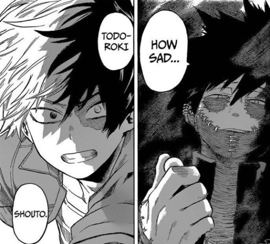
(it's more apparent in the anime since you see the eye color— but appearance-wise, shouto takes after rei and dabi takes after enji the most, so this definitely isn't the best photo to prove my point...)
anyways,,,, dabi's ideals of heroics fall in line with stain's ideals and so we all already theorized how if he was the long lost big brother touya, it would be because of the fact that his father really wasn't a hero. this makes sense. and so, we're all fucking right. props to us, really, and props to horikoshi for all the foreshadowing because i had fun :)) in terms of story and plot, i think this reveal is fantastic.
alright, on to why dabi is a dick
(i'm assuming this was his choice and no one pressured him after all)
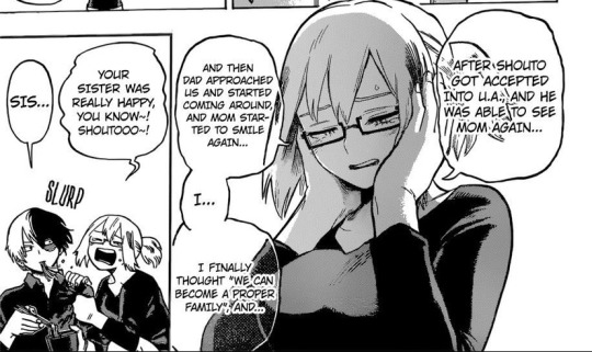
the todoroki family is on the road to recovery!!
- shouto finally visits his mother back in season 2 and visits her every chance he gets. you see the effort he makes and it's nice to see him change from season 1 to 2 (early-roki!!)

(guys he even sends her letters- look at that sparkle by his face!! he's sweet :)) and rei's smile!!!!)
- enji (whether we wanted it or not, i don't mind much personally) is trying to atone for everything he's done to his family
- natsuo, who originally wasn't fond of shouto because he had their father's attention (although he does come to the horrible realization that shouto was one of the most unfortunate) and mother's attention (because she wanted to protect shouto), has a closer relationship with his little brother now (can you believe he didn't even know shouto's favorite food was cold soba until ch. 192?? i was sobbing). he really regrets the prejudice he had against shouto and he's trying to be an actual brother to him now.
- rei's almost recovered enough to be released from the hospital!!
- fuyumi and her idyllic "happy family"– wHICH, BY THE WAY, ALMOST CAME TO FRUITION. their mother coming home, shouto connecting with his siblings, and enji being not-the-way-he-was-before is the best outcome they could have hoped for. and it was happening.
and i realize that all of that setup is for this very moment
this? this. this. this is being broadcasted. to everyone. that means the citizens know that their new #1 hero is directly related to a member of a really bad villain organization (i almost called it a terrorist group oop-).

by ruining endeavor, the citizens faith in heroes will collapse. this also affects shouto's reputation as an upcoming hero, and i am so terrified of what this could mean for him. imagine your career ending before it even started, just when you found your passion for being a hero again. all that progress he's made for himself since starting UA could be seen as pointless to him and i would hate for him to retrogress like that because it's not his fault. i would absolutely hate it if the media starts bashing shouto for being related to a villain, when he was also a victim of abuse.
seeing this look on shouto's face is making me dehydrated istg i'm fucking SOBBING— he doesn't even look angry!! in the last few chapters he was angry and worried for his friends, teachers, father maybe, other heroes... but he just looks sad. and the fact that the panel chooses to show the left side of his face is.... there's so much to unpack.
but yeah, this is being broadcasted. does fuyumi know? the cameo she had showed her working so maybe not. natsuo's cameo showed that he was at a lecture, so he also probably didn't see.
but rei did. that's like- that's the person i would want to keep this from the most.
the effects of this entire reveal genuinely scare me. how will this affect rei's mental state? she'll realize that what enji did is actually so much worse. their first child being a villain?? i'm terrified for how she'll react, she's doing much better in recent chapters after all. her kids are visiting her, shouto sends her letters to keep in touch, and enji sends her flowers and respectfully keeps his distance. i really don't want this reveal to result in a relapse. and if she does relapse, then fuyumi's ideal of a happy family is once again out of arms reach. the future of their mother finally coming back home is so far away again and it's genuinely so heart-breaking.
:(
plus— how will fuyumi's little elementary school students react to her being related to a villain? will the school fire her because of her connection to a villain and how that might cause concerns for students and parents????
it's also hard to say exactly how this will affect shouto and natsuo. natsuo was the closest to touya when they were kids so what would his whole opinion be of what touya's become? will he have a moral crisis?
in terms of moral crisises, i guess i'm more concerned about shouto. the boy knows he wants to forgive his father, but this is just making it so much harder. and after this, will he still want to? and finding out that his own sibling is a villain... remember the stain arc? there were some parallels between midoriya's, iida's, and todoroki's positions in the last chapter and i'm worried about what that could foreshadow. from that arc alone, we know that shouto doesn't agree with stain's views at all [i forgot what he said but it was really compelling]. we know that dabi's a stain follower though, so will this disrupt shouto's sense of justice? i hope not.
but family has always been kind of a weak spot for shouto, hasn't it? i hope this doesn't affect his resolve to be a hero because i do think that there's a way to– somehow– not have a corrupt hero society and i want him to fight for that.
touya being a villain is perfectly valid though, i don't doubt that. it's just disheartening to address that while every other todoroki was working hard to become a normal family, here's their oldest brother, who's not really dead. what's going to become of that altar at their house now?
learning the extent to touya's hatred towards endeavor is truly terrifying. we know enji is or was a horrible person and his redemption arc is based on the very fact that he can't be forgiven, despite some of his family trying their best to do so or at least get over it. but the fact that touya has even thought about killing shouto? that's just. ouch. touya's definitely gone through too much abuse, and all of the todoroki family problems are because of enji's bad parenting. but this does not justify murder and especially that of his younger brother, who also got the brunt of the abuse.
needless to say, i am a fool. i don't know if anything i just said will ever be true, but the important thing to take from whatever the heck i just shat out is that all of this is/could be a result of this reveal. it's the fact that dabi seems to have no sympathy. it's the fact that he doesn't care if his blood related family crashes and burns. really, if this is solely about endeavor and what he did, there's no need to bring the rest of the family into this. rei was sent to a hospital for god's sake. shouto has a scar. it's excessive and unmoral and although questionable ethics and values are key traits of a villain, it doesn't justify how much he's hurting the todorokis.

(look at this shit eating grin he has. no remorse. he really doesn't give a shit about the others but I DO and I'M so SAD)
and assuming that the whole "endeavor's wife admitted into hospital" was swept under the rug in terms of media, will that suddenly come back to light? because it shouldn't. maybe it should be known that she's in the hospital because of marital abuse but either way rei should not be dragged back into this disaster, and neither should the rest of them. there's also a chance that the media will accuse rei of having abused her kids too, which is messed up for different reasons. they're trying so hard to have any semblance of a normal family, and if dabi's way of revealing this to the world ruins that in any way then i hATE THIS REVEAL ASDFGHJKL—
#tw: abuse#this is just a rant for myself i'm so sorry for those who have this on their dash#how the fuck do you add those ''under the cut'' things on mobile??#and this is a long ass post#i wrote too much#and i was redundant#and i wrote this at 4 in the morning#many many typos...#i needed to let this out though#bnha 290#bnha spoilers#mha spoilers#notey
398 notes
·
View notes
Text
Some sorta artblock breakthrough rambleing
I think I've just had a mini break through actualy. Since I've moved I havent seen alot of my old art, most of it was on paper or on my old laptop at my moms place and I think I've been trying to emulate or mimic the artstyles of artist I follow rather than leaning Into or using my own artstyle, and that's been making alot of problems me thinks. I look at alot of my old highschool art and I'm like "omg this fucking rules what the hell happend" then I realise oh its cuz I'm not doing my own thing anymore lol.
My artstyle is super personalised because I had to work around my impatience, adhd, and other issues like that. like my super messy lines for example? I dont have the patience to clean all of that it drive me crazy. But I think I hit an invisible brick wall when I tryed to change it or at least when I sorta lost toutch with my old artistic processes, I didnt really realise how many safety nets were in place keep me able to draw in the first place.
And to add on to that, I'm just generaly a super slow artist my pfp took me like 2 days. I usually take two days to make one complete drawing because I'm so slow I do the lines one day and the colors the next. And having a job now is definitely slowing it down more :/
I really cant deal with strict character designs in most cases. I rlly need room to fuck up anatomy and make bodies weird and scribbly and just generaly be inconsistent.
Anyways tldr. My arts weird cuz I'm mentaly I'll and I should probably keep it weird like that on purpose. Or I cant draw. Oops.
4 notes
·
View notes
Note
In complete curiosity, can you tell me what your favorite Smash reveal trailer of all time was?
Like, actually, real shit, stuff that’s already happened in this timeline?
Nothing will ever top Smash 4’s reveal for me. I was really into Brawl as a kid, and after Brawl came out a lot of people spread the idea online that it would be the last smash game (hilarious in hindsight, I know). Me, being the dumb kid I was, took that at face value. I also wasn’t really into following leaks at the time. I was also 12, almost 13 when 4 was revealed, keep in mind. I just sort of accepted that smash was done.
I vividly remember when I first saw that reveal trailer. We were in the middle of bumfuck nowhere for my sister’s soccer game. I was sweaty, hungry, and my phone was running out of battery. I managed to convince my mom to let me stay in the car for the rest of the game, where I promptly began charging my phone and went onto YouTube to pull up some music to listen to (knowing me at the time, it probably would’ve been an Evanescence song). And there, at the top of my recommended feed, was that trailer.
It almost didn’t feel real. I was so convinced that Smash was over, I almost thought that the video would’ve been a fake. Some shitty mod or whatever. But I clicked on it anyways, because, y’know, Smash Bros! Boy am I glad I did. Instantly, I was enthralled by the idea of Smash on the go. I didn’t have a 3DS at the time, but I played on my DS like I was getting paid for every second the screen was on. Having a portable smash game was a dream come true! And when they got to the Wii U part of the trailer, I was drawn in by the visual upgrade compared to Brawl. I was a dumb kid who didn’t know anything about graphics watching this trailer in 480p on a shitty Windows phone, and even I could tell how much of a graphics upgrade it was compared to Brawl. I didn’t have a Wii U at the time either, but I was still excited.
The new characters announced were just the icing on the cake. I love Animal Crossing, but I never expected an Animal Crossing rep in smash because I read that Sakurai had previously said that Animal Crossing characters were unsuited for battle. So when that trailer opened up on a shot of the Villager opening the now iconic envelope, my hype levels instantly shot through the roof of the car. Really, I should consider myself lucky that I was watching this trailer in the middle of an empty parking lot in the middle of nowhere and not, say, on the bus ride home from school, because after that point, I was visibly freaking out throughout. I would’ve been perfectly satisfied with just Villager, but then the trailer continued. The videos online right now show these two as separate videos, but I definitely remember watching them as one big trailer.
NEW CHALLENGER APPROACHING!
Oh boy, who could it be? The gang looked up at a cliff to see a boy with distinct spiky hair.
“No. There’s no way it could be him. There’s just no way! I read online that he couldn’t get in, so it’s not him.”
Blip!
“OH MY GOD IT IS HIM HOLY SHIT IT’S MEGA MAN FUCKING MEGA MAN HOLY S H I T!”
It didn’t feel real. It felt like a dream. But I was loving every second of it. And even better, the next video in my recommended feed was the trailer for Wii Fit Trainer. What? Why? Who asked for this? I was dumbfounded, but all for it.
I think that those three characters made for the perfect holy trinity of character reveals. The anticipated first party/character Sakurai previously said no to, the third party, and the character that nobody saw coming. Smash 4’s initial reveal had it all. I probably rewatched that trailer for the rest of the soccer game. I texted all my friends about it, and they were all nearly as excited as I was. I would’ve told my mom and sister all about it when they got back in the car, but I wasn’t supposed to be using data at the time, so if they knew that I had used it to watch a silly reveal trailer over and over again, mom probably would’ve had a heart attack (this was before unlimited data was more standard). But you better believe that I exploded on about it as soon as I figured it was safe to.
Even after all these years (and all of the timelines I’ve looked into), no Smash trailer...no, more like no trailer period has ever gotten close to capturing the pure excitement that I felt when I first saw the Smash 4 trailer, and I doubt that there ever will be one. I’m a jaded adult now, and everything is more exciting through the rose-tinted glass of adolescence. The “Everyone is Here!” trailer for Ultimate came close, though. Smash 4’s development was also something of a turning point for me when I became more active in following the development of new games online. I think it was for a lot of people, I think that a lot of that can be attributed to Brawl’s success (and the Wii as a whole) at capturing a wider demographic of gamers compared to Melee and 64. Smash 4 feels almost laughable to go back and play now, but I can’t deny the impact it had on me.
As far as other individual reveal trailers go, here are my favorites:
Little Mac and Palutena-both for the same reason: THAT ART STYLE. Their trailers also convinced me to play their respective games. Uprising was one of my first 3DS games and Punch Out is the last game I remember renting from Blockbuster.
Greninja-As laughable as this sounds now, getting a new Pokémon rep was really hype for me back then. I was beginning to get into competitive, so seeing the ninja frog that had taken over the competitive scene at the time get into smash was cool, even if I was Team Fennekin. Confirmation that at least Charizard had survived the cut was also really cool.
Robin and Lucina-I didn’t know anything about Fire Emblem at the time, but Robin looked cool and I was digging the 3D anime artstyle from Awakening that the trailer was rendered in. Another trailer that convinced me to buy the game that they were from, and good god now I’m an insufferable Fire Emblem fan good lord I was so innocent back then. “Girl Marth” jokes were rampant amongst my friends. Also, CAPTAIN FALCON!!!
Lucas-Funny story, my sister absolutely despises video games with a burning, visceral passion now, but back when we played Brawl together, her mains were Lucas and Snake. You can imagine the pain and agony she felt when Smash 4 initially came out. Lucas’ DLC came out around my birthday, so her gift to me that year was a $10 eShop card. She just told me: “you know what to spend it on.”
Cloud-“Hey guys, you know what would’ve been awesome? In Brawl, if, like, they put in Cloud from Final Fantasy 7?”
Corrin-At this point I was a big Fire Emblem fan riding hot on the hype train for Fates, so I was very excited for Corrin. The dragon-inspired moveset also seemed really cool. Funny how times have changed, and when Byleth was added in I was very lukewarm compared to when my reaction to Corrin.
Inkling-Similar story to the Smash 4 reveal trailer, I was absolutely not expecting a Smash announcement that day and I saw the video was in my YouTube recommended feed while I was at my internship of all places. Unfortunately, none of the other people there were gamers (let alone Smash fans), so they couldn’t share in my hype.
Everyone is Here/Ridley-I can’t properly give this one the justice it deserves in a short amount of words and this post is already getting really long, so I’ll save this one for a later day if you guys are interested. To keep it short, let’s just say that I was very much a part of the Ridley gang and I was very happy to see him in.
Belmonts and K. Rool-I got up at 7 in the morning to watch that trailer and loved every second of it. Keep in mind that I am not a morning person by any stretch of the imagination. The only thing that sort of spoiled it for me was that the Smash teams themselves leaked it the night before by releasing a track titled Bloody Tears/Monster Dance
Ken and Incineroar-Nothing against these two, but at the time I was crushed when I realized the Grinch leak was fake. Now I can look back on it and laugh at Little Mac getting yeeted through the billboard and Villager’s stance at the end of the trailer.
Sans Mii Costume-Pretty sure I’ve already mentioned this, but when I first saw that trailer I legit fell out of my chair laughing. I’m not even an Undertale fan, but seeing funny skeleton man on my screen just broke me. The fact that Toby went to Sakurai’s house and beat him in Smash made it even better.
Banjo-I’ve never actually played a Banjo Kazooie game before, but I’ve seen enough videos about them over the years that I almost feel like I have. They’re ingrained in my childhood due to that in a weird way. Plus, it felt so good to have a victory over the Steve fans. I felt the weight of that Jiggy that bounced on the floor.
And that’s about it! If you guys want to hear my thoughts on the Everyone is Here trailer, please let me know and I’ll do another post like this.
...Upon rereading this post for spelling errors, I realized that you probably were more asking about my favorite reveal trailers throughout multiple timelines. Oops. Let me know if that’s what you wanted and I’ll answer with my thoughts on my favorite future reveal trailers.
20 notes
·
View notes
Note
11, 15, 17, 18
One of my projects is actually a collab between me and @denny-nutmeg , and the other is just mine, so i’ll answer for both.
11. What are 5 things you love about your WIP?
The project with Denny is very early devloppment so i’m not sure yet
For my own i’d say: I really like the artstyle i’m building up for it, it’s really vibing with me and if feels satisfying, i like the animals i have planned for featuring in it, and, uh, i can’t think of much beyond that, i guess there’s also an idea for a gameplay mode i had that i really enjoy.
15. What’s the weirdest thing you’ve had to google for your WIP?
“[insert name of animator] [insert name of a type of animal]” and “Theropod ankle rotation”, which, btw, i did not find any good results for and i’m still looking for how much theropod ankles could twist.
17. Describe your favorite character in your WIP?
It’s a tie between Eve, a human character from the project i have with Denny, and the Yutyrannus character i made for my own project.
Eve (cisgender she/her, lesbian) was originally an SCP oc, but became just, an oc of mine because i really liked her, she’s an optimistic middle aged woman from ancient iraq,I might change her name later on to be an actual name somebody from ancient Sumer would have, but for now i’m just keeping her scp oc name. She is 185 cm tall with a dark skin tone and blue eyes (also a relic from being an scp oc).
Scary Monsters (Trans he/him, gay greysexual) is one of a few characters that pre date the final idea for my story, originally the setting was just extinct animals all hanging out in a place called “the haunted museum”, which was a sort of city several stories tall, all enclosed in a building, where speices went to rest after extinction, and the story was about their daily life. Right now the project shifted to something a bit more down to earth as far as dinosaurs scenarios go. Scary monsters, himself, is a large Yutyrannus. huali specimen, who has discovered, to his delight and the dread of anything looking in his general direction, the wonders of using blindingly colorful dyes to look like an acid, furry clown. He constantly wears a Microraptor hand puppet named Murder, who he reffers to as if it was very much alive and sentient, though it is unknown if SM legitimately thinks that, or if it’s an elaborate joke.
18. In 4 sentences or less, give us a plot summary of your WIP.
In both cases a guess a good description would be “humans dinosaurs oh shit”
(update: i read “4 words” not “4 sentences”, oops)
3 notes
·
View notes
Photo

♡ 2019 Art Summary + updates/plans for 2020
(25/01) sorry for the late update,, I meant to post this on the 1st,, but,, stuff happened;; u_u
TLDR: I’m going on hiatus. I’ll also be privating a lot of my posts here if they’re text posts, or art I just don’t like. I really want this blog to look like a proper portfolio for when I come back;; Probably won’t be back until May or even later,, might go fuq off to a new account just to see how well I can do on my own for a bit,, Ty for support + have a nice year~
_______________________________________________________________
*big sigh I have to rewrite a lot of this bc my computer died and I was to stupid to draft this before*
So basically, this year’s art summary is surprisingly better than last year’s. I didn’t really notice since I’ve actually been feelin p shit about my progress until I put this together. Definitely more variation in style compared to 2018 (can’t believe I said that “I got to experiment a lot” that year haha guess I was really grasping). The second half of this is pretty much just me going over my 2019 (not just art), so feel free to stop reading here!! Thanks for all the new support, I hope you all have a good 2020.
_______________________________________________________________
This is just me really wanting to vent/express my thoughts somewhere, and I just find tumblr the most comfortable place to do that since it’s sort of more hidden and people don’t really read personal posts!! So here we gooooo
I can’t really remember most of January - April, just that I was really stressed about not finishing a portfolio for one of my classes hgjfkdls,, I also quit my job near the end of April since management changed for the worse;; Little did I know how it’s harder to get a job while unemployed,, (seriously what’s up with that?? I get that many people need to work 2+ jobs,, but I would like to live too;; qxq) So I gave up on looking for work, since I didn’t think anyone would want to hire me if I would be gone for over a month right in the middle of summer.
May - June consisted of trying to generate enough art pieces to meet my 1 piece per 5 days art schedule. I also started to fall out of the FE fandom while really getting in to Sonic again. I’m pretty sure I wanted to draw a lot of Pokemon and Zelda fanart as well,, but I was (and still am) at the point where I hate my human art, and being able to draw Sonic art — which I'm more comfortable with — was just much more appealing;; uxu I feel more familiar with these characters, and so many creative ideas just come to be (other than memes, like my FE stuff).
From August onward, though,, I just feel like things turned for the worse. I had (what I would assume was) my first panic attack during my exchange program. It’s feels so fucking pathetic that this would happen at 20 years old;; I thought I was so much better off compared to middle/high school when it came to keeping my anxiety in check, bu t guess not,, ahhahhahhahah,,,, and it wouldn’t be the only one this year;; :’)
I still wouldn’t have found a job after my return, but would still have enough money to pay off my first semester with some left over. Unfortunately, due to vet bills, I wouldn’t have enough to pay for a full course load for my second semester. This was also due to some poor planning on my part regarding commissions/adopts,, so oop;; I’m only taking one course this sem, so I’m looking for full-time work, but damn ! ! no job ! ! esp sucks since my mom is the only one paying for things atm;; soooo great
ugh;; I don’t want to talk about this anymore,, so I’ll just go onto plans/bucket list for 2020/2021, since I keep forgetting::
_______________________________________________________________
If you didn’t read the TLDR, basically I’m taking a break from all my art accounts and such. Even though I can see a lot of improval from 2018-2019, I’m still disappointed in my lack of anatomy/technical skills in my art, especially since I believe I told myself I would improve last year;; So I’m going to try avoid going online as much as possible since it’s really just too distracting,, I really want to dedicate all the time I have now to improving/adopting new skills, so my bucket list/new year’s resolutions for 2020 will be:
Improving human anatomy/developing a good artstyle for human art
Developing assets for RPG Maker XP games (???) (I actually forgot about the pkmn one I started in 2018 until I looked through my archive. I don’t think I’m actually going to make any playable games, just some nice things to look at.)
Learning how to use Blender + making many plant assets
Creating designs/inventory to sell at an anime convention for 2021
Saving up for a Canon EOS M50 Mirrorless Camera to document Artist Alley experience
Becoming ~ambidextrous~
That’s all I can remember for now, but I’m sure I’m forgetting some,,, um,, thanks if you read this for far?? I don’t really have much more to say;; ,,,,,, bye :x
21 notes
·
View notes
Text
February 12th-February 18th, 2020 Reader Favorites Archive
The archive for the Reader Favorites chat that occurred from February 12th, 2020 to February 18th, 2020. The chat focused on the following question:
When applicable, what about a creator’s art might convince you to check out their comic?
carcarchu
I like a wide range of art styles so it's hard to pinpoint specifics but if an artist is able to draw very attractive looking characters (recognizable character designs, outfits that don't look like they came out of 2004 gap catalogue, characters that can still be recognized even when they change their hair style) then i find that very appealing. beyond that how well an artist can integrate the characters with the actual space they exist in is something i find very important as well. a bunch of floating heads can only carry a series so far. if the artist can make the characters feel like they properly exist in the space i think it can really elevate the series although in practice this is something very difficult to do.
Deo101 [Millennium]
For me, honestly some art styles are very inspiring to me and that will sometimes get me to read just because I want to see the art more and learn from it. Things like textures, colors, character design... It can draw me in just by exciting me as a learning opportunity
chalcara
For me art‘s the hook and story the line. Come for the art, stay for the story, you know?
Funnily I‘m looking less for pretty art and more for good visual story telling. I want the art to show whats going on without having to rely on dialogue.
Cronaj (Whispers of the Past)
I'm honestly very picky about art styles when it comes to comics, and that's a personal issue It has some to do with art styles being attractive to me, but honestly, the most important aspects of a creator's style to me are (1) consistency of style and anatomy, (2) level of completion, and (3) clear communication of what's happening. When it comes to whether or not I check out the comic initially, the main things that come into play with the promotional materials, covers, and/or thumbnails are contrast of the image and cleanness of the rendering. Of course, obviously, my personal tastes play into it. (I tend to like semi-realistic styles, sort of anime-ish but with a twist, or painted styles that may resemble concept art.) But honestly, probably more important than grabbing me initially to begin reading is readership retention. And that's where the 3 qualities I look for come into play: (1) Consistency of style and anatomy: This is probably the most important part for me as a reader. If I can't tell who is who because the characters change appearance from panel to panel, I'm ducking out, because that affects the clarity of storytelling. I also cringe everytime I see a particularly egregious anatomy error. I know what people look like. I see them every day. If I feel pain from looking at an artist's work, I'm not sticking around. (To be fair, everyone makes some kind of anatomy mistakes, but really it's if the anatomy mistakes are really awful to me and aren't as a result of a deliberate style CHOICE. Keyword, C H O I C E.) (2) Level of completion: This really just means that if it looks like the artist rushed through the panels or they were being lazy, I feel like their comic isn't worth my time. I mean, if an artist themselves doesn't care about their work, why should I?(edited)
. (3) Clear communication of what's happening: Once again clarity of storytelling is absolutely essential. If the composition of a large portion of the panels don't clearly show the actions of the characters, I can't follow the story. Aaaaaand as a bonus: Please, please, for the love of all powers that be, please, make your fonts legible. If I can't read the comic without squinting because your text is too tiny or hard to read, I'm not going to try. I have bad eyesight as it is. Take pity on your readers. I'm not going to suffer for your work. I have dropped far too many comics to count because the creator didn't care enough to make sure that the font was legible. And this applies to both desktop view, mobile view, scrolling format, and page to page format. Just.... Make your fonts big and clear.(edited)
sssfrs (JOE IS DEAD)
That's interesting to think about how recognizable characters are when their hair style changes. I might try to use that as a character building exercise
Deo101 [Millennium]
Solid excercise: can you tell them all apart when they're bald and naked?
Cronaj (Whispers of the Past)
OoooooooOOOOOOOOOOHHHH
I
Might partake that challenge
Deo101 [Millennium]
Also it's really fun to draw characters in all sorts of hair and clothes so idk what id do if I couldn't tell them apart when doing that!!! That's like 40% of my art!
Cronaj (Whispers of the Past)
This just convinces me more and more to do AU art
Deo101 [Millennium]
Yeah aus are another 20% of what i draw LOL
Look im drawing the comic most of the time so I wish to partake in non canon things the rest
carcarchu
@sssfrs (JOE IS DEAD) i've read series before where the character gets a hair cut / dyes it and i'm like WHO ARE YOU? IS THIS A NEW CHARACTER?
Deo101 [Millennium]
Oh another good excercise is drawing your Characters in many different styles and seeing if they remain unique when not in yours.
Cronaj (Whispers of the Past)
I want to do all of this
This is stuff I hardly ever have time for
So I am extra attracted to it
Also, there IS a time later in the comic where a certain character's hair gets partially burned off
And then he cuts it pretty short to get rid of the singed edges
And I feel like his hair is like 80% of his character design
So I'm just a little scared about that
Deo101 [Millennium]
Also, @Cronaj (Whispers of the Past) , I am unsure what you mean by "readership retention" with something that makes you interested in a comic, could you explain?(edited)
Cronaj (Whispers of the Past)
By readership retention, I mean aspects of the art that decide whether I'll continue reading past the first few pages
(obviously story comes into play as well, but I won't pretend that the art in the first few pages of a comic don't contribute)
Deo101 [Millennium]
Oh okay, I thought you meant like how many readers have unfollowed or something
Cronaj (Whispers of the Past)
Nah
More like, "oh cool! Your cover and blurb seem interesting. Lemme check out the comic!"
And then after reading the first few pages/chapter:
"ah... Not for me." Or "Nice, I'll keep reading!"
Deo101 [Millennium]
Gotcha
Capitania do Azar
Ohh I don't feel like dissing particular artsyle choices, but I know a few aren't for me. I'm no big fan of ultra realistic, hyper detailed stuff you usually see in super hero comics (other genres pick that style too sometimes and I still don't really appreciate). I particularly like artstyles that are distinct and recognizable, I have a hard time with stuff from different authors that just looks... Like a carbon copy (sometimes, the style being referenced is waaay too obvious and that is always a big no for me) Good use of color is key. Give me some good values too. I want colors to make sense and I am very tired of pink. I also appreciate consistency. If you give me artwork with a more paintery style but then the comic is cellshaded, that might tip me off. But not necessarily (tho I appreciate inner consistency inside the comic itself). Rushed stuff, like mentioned above, is also not a good look, but only insofar as it distracts me from what's happening in the story. Consistency is a very important word here, because I love seeing a common line that is able to take in all the differences that are necessary in character design and backgrounds, but also make me believe that they all could live in the same world.
Oh! And also: if the artstyle involves using lineart, I am really fond of sharp, clear lines with weight variation
sagaholmgaard
I'm curious about what you guys mean with consistency- do you guys not like if an artist's art style changes over the several years it might take to make a finished webcomic? Is it that it peeves you when the backgrounds are done in, say, a painterly style while the characters are done with lineart? Is it when the artists makes ordinary illustration work in a completely different style from their comic pages? (This is genuine curiosity I hope no one's feeling attacked rn ^^)
carcarchu
i personally really like seeing an artist's skills improve and evolve over the many years it takes to draw a series
even at the expense of a more "consistent" final product
sagaholmgaard
Yeah me too, it's one thing i really like about webcomics
chalcara
Can‘t talk about the others, but I get thrown off when one page is sprite comic, the next painterly, third cell-shaded without having a in-story-reasons for those style changes, like flashbacks or pov-changes. But more commonly, the issue’s the classic „comic‘s usually coloured, but oops, this time you only get the pencils because I had no time to update“. If that happens too often and/or doesn‘t get fixed for the archive I just lose investment in the comic.
Art evolution is natural, both in webcomic and published work with a dedicated artist.
Ah, that‘s another source of inconsistency - people switching colourists or even artists around. Once in a while is fine, but if it happens every month or so, I tend to get annoyed by it. It‘s actually why I killed my first webcomic twenty years ago; it was a collaberation and life kept getting in the way forcing me to switch colourists every five pages or so.
carcarchu
oh actually i have read a webcomic where they changed artist's 18 chapters in. i really fell in love with the magical and dark tone of the original artist and was engrossed in the world that they set up. they had a painterly style and it really set the atmosphere of the entire series but then the new artist had a super clean and cutesy art style and the sudden tonal shift really threw me off. in the long run the new artist was actually extremely consistent and better at actually releasing long chapters and very good quality chapters and the writing actually improved too because of it but it was never able to recapture what it was that i really loved about the original art style. also the new artist changed the character designs a little so the heroine was no longer even recognizable as the same person
since it was relatively early in the series i definitely would have preferred if they just got the new artist to actually redraw the first 18 chapters in the new style just so the change wouldnt be so incredibly jarring
chalcara
Any harsh breaks like that will cause some people to break away from the comic, I found. I dumped one of my favourite-for-years comic because the creator got bored by their main character and completely sidelined her in favour of a group of minor characters I had absolutely no interest in.
Didn‘t mean the comic got worse - by all accounts its still beloved by quite a sizable audience - it just wasn‘t for me anymore.
sagaholmgaard
Ahh that I can relate to. I get super attached to the main character and usually have a hard time getting into any spinoffs with the rest of the cast, even if I want to (and im a hypocrite because i also want to make spinoffs for ever side character in my own comic LOL) i guess if the style changed a LOT from page to page that would throw me off too. that feels like the artist is trying to experiment, maybe making sort comedic comic strips would be more acceptable then? Every style would at least be contained to one strip at least
DanitheCarutor
That's... actually a really good question. I don't really go for a specific aesthetic. Sometimes what's going on in the thumbnail attracts me, or it could be the use of color, the style, a character design. I'll check out a comic with just about any art style. I guess maybe if I have an idea of what the creator is going for with their art? Like, the art may have a lot of kinks, but maybe being able to tell what style they're trying to go for makes me want to check out their work? Honestly, I don't have a really strong art bias, as long as the comic is readable I'll go for almost anything. Maybe I won't check something out if the style looks extremely uninspired... like if it were the most generic, based off Japanese cartoons, style ever then I might give it a pass. But even then I do sometimes check it out anyway, so I really don't know! This question is surprisingly hard to answer! To give my last quip about last week's topic, since I don't want to derail the current one. I feel the creator's personal life is no one's business. I understand if they're a legit bad person, but digging into a creator's life to see if they qualify to be supported is... I dunno. This mindset makes me feel that if someone who liked my work ever tried to get to know me, they would be doing it solely to see if I'm good enough for them, which feels really invasive and predatory. I fully understand most people can't just enjoy something, that's how the world is, it just kinda sucks sometimes. The world kind sucks sometimes. Alright! I'm doing with giving my final thoughts on that subject.(edited)
Deo101 [Millennium]
The question is specifically about what draws you to art, rather than what turns you away so if you don't want to rag on any art styles that's not what it was asking for I think! Though yes it's very closely related (and it's not bad to say what you don't like)
Eilidh (Lady Changeling)
I definitely am more likely to read a comic that has a distinctive style - no particular style preferences, really. Interesting use of colour/value is definitely a bonus. But as long as it's engaging and the composition is good/readable, I don't really mind whether the art is "good" or not.
DanitheCarutor
@Deo101 [Millennium] I wasn't trying to rag on anything. I couldn't specify what about someone's art would draw me to their comic, it was easier to the one thing that might not, but I still said that I may be drawn in regardless. Sorry if I came off like a douchebag, totally not my intention. <_<'
Deo101 [Millennium]
No I know, someone earlier said "I don't feel like dissi g particular styles" I'll be honest I was typing my post as you were and so I didn't even read yours til after I said something(edited)
Just kind of a general thing! Feels like it went to what turns us away instead of what draws us in so just kinda a reminder of the op
sagaholmgaard
Readability is definitely important for me to want to continue following a comic, but what about the art that makes me want to read something...? I definitely have a preference toward cartoony styles overall. A solid character design will make me wanna check out a comic. If the main character has a recognizable silhouette and interesting shape language. I also love really bold lineart, especially if it's used to create shadow and contrast. Interesting color schemes too. I think how the background is drawn can really make me want to read something as well. I know BGs aren't people's favorite thing to draw but to me if the setting looks very well though out and designed, that definitely motivates me to check something out. And awe-inspiring sceneries are always hella cool! I read a lot of things outside of my artistic preferences though, but I think these are the things that might make me pick something up based only on the art itself.
keii4ii
I think I tend to find more appeal in certain compositions, which is a more subtle aspect of style. I am a major sucker for evocative use of backshots/ not-showing-the-(whole)-face, for one thing. Compositions that make full use of the three dimensional space around the figure(s) is another (this doesn't necessarily mean putting a lot of stuff around the character; you can have a mostly empty space and still make it feel very 3D).
(I hope both of those things show in my own works... I just love those things soooo much )
Deo101 [Millennium]
Oh I LOVE when a panel like... Cuts a face. Something about it makes me lose my mind every time
DanitheCarutor
@Deo101 [Millennium] Ooh! Lol sorry about that! I was so caught up with off computer stuff that I didn't notice anything else typing while I was. I haven't read the whole conversation yet, but I can see how it would turn to that. "What draws you in" is a hard topic to stay on. At least I imagine it would be since it's hard for me to talk about.
Ah! I admit I really like shots focused on scale, specifically ones were you can feel how tiny the MC is compared to what the camera is focused on. Does that make sense? Like the panel shows this ginormous thing, and it has the MC in it to show how massive it really is. That's awesome when done right.
Deo101 [Millennium]
Tiny little person. Yes. Very good
DanitheCarutor
Tiny people in giant worlds are the best!
keii4ii
I love those too!
DanitheCarutor
Oh, also this isn't a webcomic, but I've been interested in reading Vinland Saga after seeing this page on Twitter.(edited)
Something about extremely hideous expressions on semi-realistic faces jives with me.
FeatherNotes(Krispy)
What draws me in easiest is the design aspect of characters, environment and the webcomic title! It's a bit of a turn off when the title doesn't look polished. That's one of the main draws for me is an intriguingly designed logo with a catchy name that follows through their chosen aesthetic. I've seen many comics that stand apart from the title image they chose and it's a bit jarring to see! Great examples of wonderful execution of these aesthetics are BlackOut City, O'Sarilho, Sink Your HookTeeth and Shadrunners(obvs there are many more) I have to agree with @sagaholmgaard about backgrounds! There are quite a few creators who avoid them and stick to simple colours and gradients that just dont keep me in the comic- though my fave genres include a lot of world building, so BGs in a romance may not be emphasized as much. Lastly, dynamic character design!! I love a wonderfully crafted cast that allows me to read the characters easily no matter what setting or outfit they're in. Also it's really random but i do love an artist who can draw really good shoes?? That is always a draw in for me (edited)
Capitania do Azar
Oh I meant it in the way that if you spend a lot of time experimenting with different styles and techniques, you'll never be good at any of them. Style and approach changing over time is, imo, inevitable and good :) @sagaholmgaard(edited)
@@FeatherNotes(Krispy) I constantly think my logo looks like crap next to other webcomics', so thank you (edited)
DanitheCarutor
Oh god, @FeatherNotes(Krispy). Titles and logos are legit my weakest point, that part of the comic creation process is the worst! I have this cosmic-horror/fantasy comic I've been developing since 2005, and it took me till just last year to come up with a decent title. It'll probably take another 14 years to come up with a passable logo. Lmao!
FeatherNotes(Krispy)
It is really hard! Because that image/logo and name represents the body of work so firmly, its also got to stand strong with what it's representing and stand up to other titles too! Basically, i like to think of something that will help generate top results when i search on google for the title, which to me helps it stand on its own on the web, and sound catchy enough for pitches in person! I don't want to steer the convo away too much from the prompt, but there is definitely more to discuss about titles and their chosen aesthetics
varethane
@DanitheCarutor have you read Golden Kamuy? If you love hilariously hideous expressions in manga, it seems like it may be your jam lol
(it's also set in a specific historical period and contains a lot of really interesting material about the time/place it takes place in)
Also I feel like I have never, even one time in my life, come up with a good title for anything-- both Chirault and Wychwood are placeholder titles that I used just to kinda name the story for myself, which I initially intended to change when something better came along, and then nothing ever did
LadyLazuli (Phantomarine)
I know I'm generally drawn into a comic if it's just... generally a visual feast? And it doesn't even have to be a beautiful feast - just... a feast! A super intriguing artstyle, beautiful or not, is something for my brain to pick apart and enjoy. Detailed backgrounds, intricate costumes, fascinating presentation/layout... all the way to crazy expressions and fun asides, and even some gory or scary bits to make me go EEK. Basically, if I'm reading it, and my hand is twitching with the prospect of drawing fan art, then I'm in for good.
DanitheCarutor
@FeatherNotes(Krispy) Urg that is such a nightmare! And there are only so many different styles you can do for a logo, and so many variations of words, it's like how there aren't any truly original stories anymore. I got lucky with the title for my current comic, it's the most generic thing ever, but fits in a tongue-in-cheek way. @varethane I've never heard of it, but the face compilations I'm seeing are intriguing! Man, I love stupid facial expressions.
Capitania do Azar
@varethane golden kamuy, I see you are a fellow of taste as well
varethane
(I love it so much)
Capitania do Azar
@DanitheCarutor oh idk about the "only so many things you can do with logos", I've seen amazing things in this world, if there's a limit I'm not seeing it
varethane
(I can always tell exactly when I was binging it because there's a big chunk of my phone's photo gallery that's all screencaps of Asirpa making dumb faces)
Capitania do Azar
@varethane guys shooting each other in the woods? I'm always in for that
DanitheCarutor
@Capitania do Azar Lol I guess? I can't see how you can have an infinite number of designs for writing, while still trying to keep it vaguely readable. But I really don't like lettering, so my imagination is hardcore lacking in that department.
Capitania do Azar
Lettering and logo design are their own fields of expertise, it's ok
meek
Hmm I'm similar to a lot of previous responses where I can't pinpoint a specific style or trend of art work that draws me in because the styles of comics I read differ incredibly. That being said, there are some things that I do look for to keep me coming back: 1) Consistency of style/anatomy: unless there's a specific reason for the general art style to change (not including semi-deformed or chibi versions of characters), I appreciate characters staying proportionate or just otherwise consistent throughout the comic. And art evolution isn't something that's at odds with consistency, it can actually help that by making characters more distinct and easier to distinguish from each other. 2) Potential for art evolution: Almost the opposite of the previous point lmao but if I find a new comic and I see the latest page is of a much higher skill level than the first page, I'm immediately hooked. I want to see the journey. And I want to see how far that journey goes, even past the point where the art "gets good". There's at least one comic that I can think of where once it hit the style that it wanted to, the art has stayed consistent for the past several years but so much so it's almost plateaued and become stagnant. It's still good art, by all means! But I want to see it grow and evolve more. 3) Good panel/speech layout: Okay it's not quite art in the same sense but someone else mentioned this above and I think it's important too? There are so many comics I can think of that I couldn't read or I dropped off at a point because reading was a chore, either because of giant or unsightly speech bubbles, tiny or ill-fitting font, a combination of the two, etc. Sure, graphic design and layout is a skillset completely different from pure illustration, but it's one worth knowing because otherwise you could do a disservice to your art and your story.
Cronaj (Whispers of the Past)
@meek Seriously, the text is so important to me, and I consider it a large part of page layout and design
meek
Agreed!! It's something that bothers me with printed comics all the time. I've tried to read so many "classic" graphic novels and I just.. I can't get past the giant text boxes with small font with miniscule kerning and ESPECIALLY if they then add color to it. Please, keep in mind your readers with reading difficulties But to turn this into a positive One of my favorite things that also helps make a comic feel more personal is when the creator turns their handwriting into a font or otherwise have FUN with the speech bubbles
Cronaj (Whispers of the Past)
YES. As someone with bad eyesight, typography is one of my favorite aspects of finishing a comic page.
Deo101 [Millennium]
It also is super important for me with ADHD, reading is hard enough as is! so bubble layout and clarity can really bring the whole thing together and elevate a comic
Eightfish (Puppeteer)
I tried that but got the feedback that my text is hard to read and the way i format my speech bubbles is distracting (: But some people have said they really like it so ¯\_(ツ)_/¯ Though I do think I could have done better with the font. I have good eyesight and bad handwriting do I think i have a much easier time reading weird text than many. Since you guys care so much about text, would you mind taking a quick glance at my comic and telling me how readable it is? It'd be nice getting feedback from random people as opposed to only my readers who felt strongly enough to leave a comment unprompted
meek
Oh man I have this specific panel in mind from some early 2006 Avengers comic of like.. what not to do Basically it was a bright yellow text box with this white/light blue font. It was just. It was a nightmare to read Oh sure!! Definitely send me a link
Cronaj (Whispers of the Past)
Yep! Send me a link too! I'd love to help you out
I also have a good typography book to recommend if you're interested. I can drop it into #art_resources(edited)
Eightfish (Puppeteer)
Here is link: https://www.webtoons.comen/challenge/puppeteer/list?title_no=290620
Thanks for taking the time to give me critique!
Cronaj (Whispers of the Past)
The link's not working, but I can probably find it on Webtoon
Eightfish (Puppeteer)
And I think i dould find a typography book interesting, so yes please do send the link
Sorry, i think the link is missing a slash
Did we both delete the link
Deo101 [Millennium]
did we both delete a
yah
i got it
Eightfish (Puppeteer)
Lol
Deo101 [Millennium]
https://www.webtoons.com/en/challenge/puppeteer/list?title_no=290620
Eightfish (Puppeteer)
Thanks
Cronaj (Whispers of the Past)
I found it
(The font is a bit small on mobile, but the font is fine?)
Eightfish (Puppeteer)
Wait can we move to shop talk?
FeatherNotes(Krispy)
(maybe we can have this discussion on shop talk channel? )
Cronaj (Whispers of the Past)
Sure
FeatherNotes(Krispy)
OH LOL
DanitheCarutor
@Capitania do Azar Oh god, they so are! I envy anyone who enjoys that craft, I'm a lot better than I was, but lettering is still so hard. ;v; At least the fancy stuff is hard, regular speechbubble lettering is easy as long as my hand cooperates.
Cronaj (Whispers of the Past)
There's a book I had to read for a web design course I took, and it is seriously a life saver
It put text in a whole new perspective
DanitheCarutor
I do all my lettering traditionally, but maybe that book would be helpful, I legit hate doing it no matter what medium I use. (sorry for continuing to derail the channel.)
Capitania do Azar
@DanitheCarutor i used a website that converts handwriting to fonts + font forge for tweaks to get personalised fonts
DanitheCarutor
I used to type bubbles out, and I've thought about it for my current comic but I mix up words and letters really bad, and I forget to add words entirely while typing. It wouldn't be so bad if my brain saw the mistakes while rereading everything, although sometimes it takes a couple days or another set of eyes for me to actually see them. When I write the bubbles in with a pen I make a lot less mistakes since it takes more effort to write out each letter, also my brain can keep better track of the ones I do make. I feel like that's an excuse that makes no sense.
Deo101 [Millennium]
no it totally makes sense
snuffysam (Super Galaxy Knights)
I can't say I'm ever especially drawn in by art? Besides the sense of "it looks like a lighthearted action story and I like lighthearted action stories", not much catches my eye. Though, I will drop a comic if I'm put off by the art. Like I can forgive if some things look janky at the start of the comic, but if that jankiness doesn't improve over time, I'll drop the comic. I'll also drop the comic if the character designs are bad (i.e. indistinguishable from each other, or in rare cases just too gross to look at). But again, I can't exactly say "good character designs draw me into the comic" because a lot of comic banners/thumbnails don't really show off full character designs.
chalcara
Varied bodytypes are catnip for me. And I like comics with expressive characters over comics that limit expressiveness to keep the characters pretty.
Eightfish (Puppeteer)
Oh, definitely agree with that second part. Comics where it looks like everyone has had a ton of Botox is a huge pet peeve of mine
Like, eyebrows are not the only part of the face that can move.
Do more
renieplayerone
Yeah i agree with the janky art thought. I think it helps me follow through the jank if i see that the later pages, the artist has shown growth, and i dont want to force anyone into a "gotta redraw it" loop if thats not something they want (of course everyone has their reasons and theyre also valid af) Ill tend to be more forgiving about the jank if i know its someones first webcomic or first comic in general, because you cant learn how to make comics without actually sitting down and making the dang thing. So yeah, the jank can be a double edged sword(edited)
What super draws me in is comics with a great sense of color. While i love anything vibrant, if the softer watercolors are done well, they're chefs kiss. Prime example of that is Stand Still Stay Silent
mariah (rainy day dreams)
I've been thinking about this question all week and I think I finally boiled my answer down to something short, sweet, and to the point. It's gotta be some kind of spooky and some kind of cute I have a pretty broad range of art styles I like and I definitely also read stuff that doesn't fall under those categories, but I think my favorite stories or artists are some blend of those two things. I don't really have a preference between color and greyscale. Like I definitely love a good color feast comic, but if you know how to use your grey tones or even just black and white well it's just as good for me. Maybe that's also just me trying to justify being mostly a greyscale artist to myself TuT
FeatherNotes(Krispy)
@mariah (rainy day dreams) devils candy would def be up your alley then!
mariah (rainy day dreams)
Devil's candy v good
renieplayerone
Devils Candy is amazing
mariah (rainy day dreams)
I love to combination of cute monsters and action also.
DanitheCarutor
@renieplayerone I'm not sure if it fits totally with your preference, but if you're looking for watercolor Lost Honey is gorgeous! https://www.losthoney.com/
mariah (rainy day dreams)
Lost Honey is another great comic great to look at, really interesting world
DanitheCarutor
It's one of my faves! ;v; There is another comic that was half watercolor half digital that I used to love reading (if I remember right pages set in the current time were digital, and backstory stuff was in watercolor.), but it has been discontinued for years now. It was called Toilet Genie/D00R, a comic about a genie who was locked in a public toilet and was awakened by a pug that got thrown out by her owners. It was so pretty, with such an interesting style!
mariah (rainy day dreams)
Oh wow I haven't thought about that comic in 5 years! X'D I didn't read much of it, because I don't think there was much of it available at the time, but yeah, that one was also very pretty (edited)
renieplayerone
Oh those colors are really pretty!!
DanitheCarutor
Right? Lost Honey is total eye candy. @mariah (rainy day dreams) Yeah, it's sad the creator never got to finish it. I think about it every so often since it's one of the extremely rare (semi)watercolor webcomics out there.
Also I'm extra attached to traditional mediums since I work in a traditional medium myself.
mariah (rainy day dreams)
Same. Got that ink wash/watercolor bias.
Eilidh (Lady Changeling)
My current comic is marker shaded but I so want to do something with ink wash after this one...
DanitheCarutor
Yeah, right now I'm working with color pencils since they're cheap but I want to give gouache or acrylic a try for my next project, depending on which story I do.
Kabocha
Hm, the question is... a lil' challenging to answer. I think in a lot of cases, the art isn't necessarily what gets me, but when it does -- Sometimes it's when someone uses a resource I like/made and I can go "OOOH! I know that thing you used!" Screentones are another one that gets my attention pretty quick. Sparkles... And probably effective spot color use. As much as I enjoy many full color webcomics, there are many that get tiring to try to read for one reason or another (usually it's either a font or a saturation issue - too many similarly saturated colors near one another gets tiring to read). Also, soft coloring. Oooh, just... when the art feels like it ought to be printed on those soft-touch covers... Yeah, that gets my attention. ...and watercolor/inkwash, too. ... okay that's a lot of things that grab my attention, but tl;dr: oh hey look at all that cool stuff that people can do!
mariah (rainy day dreams)
That was part of what was so hard for me thinking about this question cuz really, a lot of things get my attention X') and the more I thought about it the more I was like "I like when a comic is like X, but oh also Y is great and I do really enjoy Z as well!" I just ... like so many things. But I think that's better than being really picky. I've meet some folks that are super picky about art and basically only like one style and I'm just like... you're missing out on so many amazing things!
Kabocha
Right? And heck, even in some comics where the style would normally be unappealing (to me), there's just something about the art and the aesthetic that clicks to make it all work together for that project.(edited)
I do think, though, that there's always going to be a special place in my heart for greyscale or screentoned comics. There's just something about art that knows how to effectively make use of shading and contrast to make their work... well, work for me.
kayotics
Art is probably the first thing that draws me in to read a comic. The top, top tier thing that gets me to pay attention to a comic is really strong inks. I love inking, and unusual inking styles. To those who know me, that's probably incredibly unsurprising. I also love really angular styles. Some other stuff I gravitate towards: cartoony styles, expressive faces, and kind of ugly characters. I enjoy seeing characters that might be described as plain or are drawn in a bit of an ugly way. The last thing that draws me in? Hands. If an art style pays attention to hands, then I'm all for it.
mariah (rainy day dreams)
Does a comic have characters with big, crooked, toothy grins? I'm down for the count X'D https://media.tenor.com/images/618576ebcc4f6d2a12438624be77c54f/tenor.gif
varethane
oh hey, did someone mention webcomics done in ink wash/marker?
Chirault was that!
1367 pages of..... ink with greyscale marker..........
FeatherNotes(Krispy)
honestly blows me away that you toned it traditionally like, all of GJS is inked trad, but to ink AND tone in marker is just.....damn
sssfrs (JOE IS DEAD)
I love ugly characters
RebelVampire
When it comes to art, I'd say there are about four factors that will draw me in.
First, readability. Can I visually follow wtf is going on in the comic? I have no interest in the visuals if I can't understand what action characters are taking. So the first point is always for if that is true.
Second, character distinguishability. Can I tell one character from another? I am notoriously bad even in real life at being able to tell people apart, so when reading for fun, it's super important to me that I don't have to put a lot of effort into telling characters apart (exceptions for identical twins, of course). Third, personal appeal. Do I think the art is pretty or cute? Like, obviously this is subjective so I can't really put into words why I'd find one style appealing and the other not. But ya know, I like stuff I think is pretty to look at. Fourth, backgrounds. If a creator puts a lot of effort into their background scenery, I'm very sold on it. I love beautiful backgrounds, and the effort put into them give me an overall better impression of the comic as a whole. Since it takes some real passion to take care with backgrounds. All this being said, I'm not much of a stickler for art. If a comic is well-written enough, they can fail all these points and I'll still read it. This is just a list of what aspects have to be in the art for it to draw me in.
Eightfish (Puppeteer)
My points are pretty much the same as Rebel's, with the addition of a few things: I adore comics with dramatic facial expressions and consistently excellent anatomy. Also, if the art style is unique? If I feel like I've never seen someone draw that way before? That's ++. So good. I've read comics where I thought the art was good but the story was mediocre, but I've never read a comic where the art met all my points (and Rebel's), where it made me go, "holy fuck," audibly, and then had the story disappoint. Comics where the art made me go "holy fuck" audibly: Excecutioner's Academy: The art is so pointy and colorful and detailed and weird. It's full of personality and life and so are the characters. Warning: hiatus comic ): https://tapas.io/series/Ex-Ac Ava's Demon: You guys know about Ava's Demon, right? With original music and animations ending every chapter, this might be the most effortful comic I've ever seen. https://www.avasdemon.com/pages.php#2611 Sfeer Theory: Everyone looks so different from each other, it's fantastic. Some characters are not conventionally beautiful, yet they're still so appealing. And backgrounds! And a thought-out and unique magic system! https://sfeertheory.com/comic/01-00/ Electric Bones: Backgrounds! Banter! http://electricbonescomic.com/index.php/comic/page-001/ I also loved Prague Race, but unfortunately it was cancelled ):
If anyone else has recommendations for comics with amazing art, I'd love to hear them!
Cap’n Lee (Flowerlark Studios)
For me, it just has to be an art style I like to attract my attention. I generally like realistic art, stylised art, or pretty much any style that hasn’t been done to death (like generic anime art; much as I love manga, I’m really tired of the over-saturation of bland and soulless anime-inspired art). Pretty much anything unique and well executed will grab my attention. I especially like greyscale and limited palettes.(edited)
And just to clarify, I do like anime-style art when it has expression and/or skill behind it; just not when it looks generic and manufactured. Overall, though, it’s the writing that’s ultimately the most important thing to me in a comic, so I’ll enjoy comics for their writing even if I’m not a fan of the art.
#ctparchive#comics#webcomics#indie comics#comic chat#comic discussion#comic tea party#ctp#reader favorites
1 note
·
View note
Note
every artstyle should be freestyle!
Definitely! Everyone draws however they want, but tbh I tend to find it really boring (personal feeling of course!) to keep the same style over and over oops. Thats why I change it drastically from one drawing to another, its much more fun and liberating :^)
3 notes
·
View notes
Last Seen Blogs
lichcng
Poison
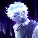
the-arcane-art
Arcana Fan Art Blog
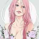
ewli-chan
Sakura Blossom

sachadevoretz
Sacha Devoretz
tapsisstuff
Tapsi