#the bg is lazy because I'm lazy
Text
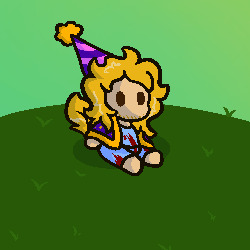
Happy birthday Elijah Volkov! As a present, I have placed him on an empty hill. ::]!
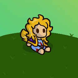
Partyhatless
#chnt#camp here and there#elijah volkov#tem chnt#the elephant man#gart#minor bg practice for the me ::]#anyways. yes he is lacking leaves in hair that's because i got lazy#i plucked them out#also i made the sky green BECAUSE I REMEMBERED!!! REMEMBERED CHNT HAS WEIRD COLOUR SKIES!!! I'M SO SMART#anyways. smiles
23 notes
·
View notes
Photo

marley's dancing in the moonlight
#vhscc#vhs christmas carol#team starkid#jacob marley#reusing a bg from another project because i'm lazy
198 notes
·
View notes
Text

ok here’s a much cleaner version of that one doodle page. also switched neil to abomination coven because he does more work with machines than he does with alchemy i think. maybe he dabbles in potions too for things like the truth serum and voice thing.
still haven’t decided if max should be a human or not, i do have a whole idea where he decided to run away from home, but stumbled upon a somewhat naturally occurring portal to the demon realm and ended up at the BI, in the forest where camp campbell is. and the angst of parent’s day could be that david assumes max is just missing his parents, until he finds out that they just don’t care about max at all.
not going into detail for those who haven’t seen it yet, but imagine the day of unity in this au. if you know you know ;)
the au is still developing so if others want to add on lore and stuff feel free to!! ideas from other people could really help flesh it out
#camp camp#i am not a character designer lol#camp camp au#camp camp toh au#camp camp artstyle but slightly to the left is becoming my specialty#my art looks so much better when my atrocious ink pen skills arent involved#grey bg because i'm lazy#camp camp the owl house au
60 notes
·
View notes
Text
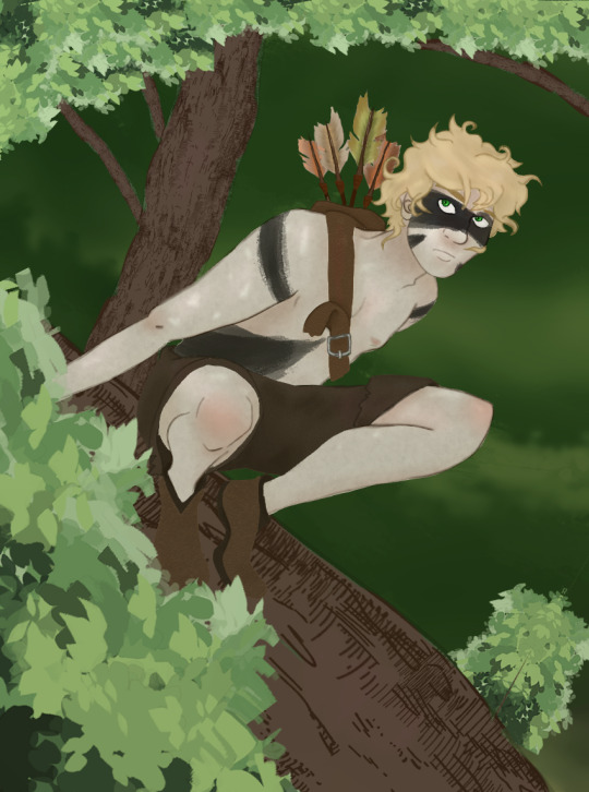
he swears he heard something in the trees
#tweek tweak#barbarian tweek#south park fanart#i put a little bit of effort into a bg this time#i'm trying out new stuff in clipstuido and was trying to go for a painting feel#not sure i really accomplished that but i like this enough#i got really lazy with the shoes because i hate drawing them#i also made a great effort to not draw hands lol
7 notes
·
View notes
Note
omg you're playing fes that's so peak... I hope you enjoy it!!! the game is clunky but it was my intro to p3 and I love it dearly (*˘︶˘*).。*♡
I can see why you love it, the art direction is beautiful 💙💙💙💙
Even though P3P does it best to describe what is happening, it misses lots of small things that only can be seen thanks to the 3D models, so it has been fun 💙
I love how you can use any weapon type even if they're not as useful for ambushes, I'm using a bow because it looks so cute. I wish they had kept that in later games ;o;
#the answer already had some wonderful bgs#so its nice to see the rest of places in 3d#mail#I have been putting it aside for years because I find playing#on my laptop uncomfortable + I'm too used to VNs#but I needed something until I'm able to play Reload#i have had multiple attemps at playing fes; but this is the real one >:3#btw in p5 i barely talked to npcs because im too#used to point and click gameplay lol#i was too lazy to walk around
1 note
·
View note
Text


DIGI-ADVS KIZUNA ~ P r i d e
+ Head-canons
~ MENOA BELLUCCI [from Last Evolution: Kizuna]
Made w/All bases by @izzyizumi / @koushirouizumi
{DO NOT re-post} {ASK TO USE}
{'LIKES' OK}
{Please read my F.A.Q. Before Asking}
My Commentary:
- These are specifically / varying Head-canons for my own
personal {main} Fic-verse{s} (depending on the 'verse),
but I won’t mind if anyone else enjoys these icons/ideas!
(However, please ASK me before using any.)

#koushirouizumi posts#koushirouizumi icon#koushirouizumi kizuna#koushirouizumi menoa#koushirouizumi no rb posts#menoa bellucci#(This is a no rb post for archiving to my blog sorry!!!)#(But someone may still enjoy seeing icons for Menoa)#(So I'm using tag for organizing but also because)#(for Menoa it doesnt really work to tag as 'Bellucci Menoa')#(Anyway~ did you all know Menoa doesnt have any canon sexuality whatsoever noted in canon and thus)#(ALL of these HCs can very much be VALID)#(Well Now You Know!!)#(The middle icon is purely for myself and made out of self indulgence but I won't mind if anyone else likes it either haha)#(I also have some more icon combos for her but I'm saving them for other icon sets in future!)#(Anyway these were Drafted forever because I meant to fix removing the black bg part behind Menoas hair but got too)#(Lazy to fix so until I can take This combo set)
1 note
·
View note
Text
Happy birthday to the number one princess in the world!! 💖
~from her biggest fans :)
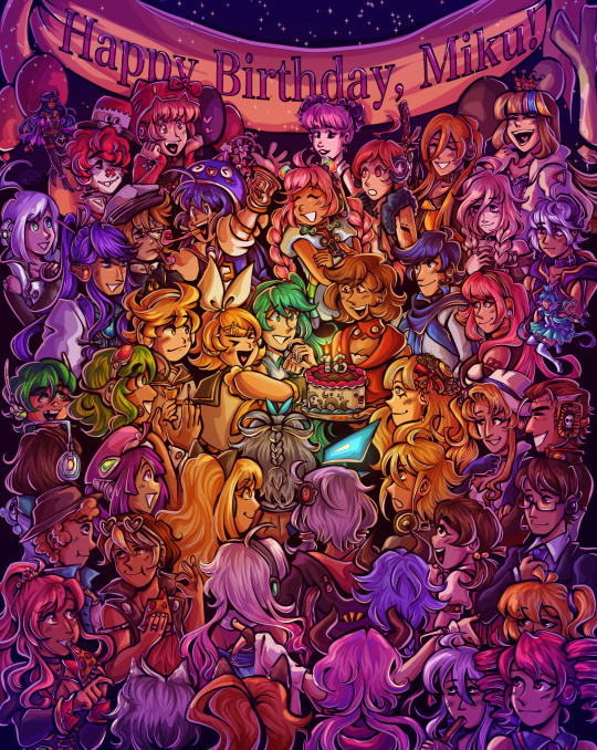
ramble of my scattered thoughts on the piece under cut as usual cuz i love talking 😋
This has been an idea I've been cookin for a while, and it was so cluttered and unlike any other ensemble piece I've made... and I decided I oughta do it anyway. I love Miku, I love Vocaloid, and I wanted to do something really ambitious and crazy for her anniversary. Crazy that she's turning her "canon" age this year TwT
I had the idea floating around since like, May...? And then finally started acting on it around June 18. I'm terrible with deadlines, obvious with how I can never make a silly birthday post in time, so I started wayyyy ahead to make sure I have some room to be lazy lol, especially with an idea as ambitious as this.
This was finished on July 12! So I had to sit on this for an annoying amount of time. Very difficult for someone like me who just wants to talk about everything I'm working on to the masses. But at the very least, that gave me the time to work on the draft for this post.
~~~
Here's some ~behind the scenes~ scribbles leading up to the finished piece!
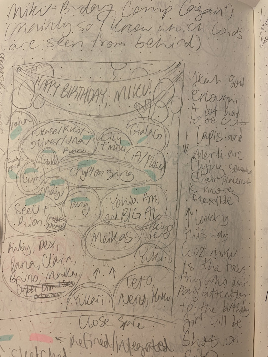
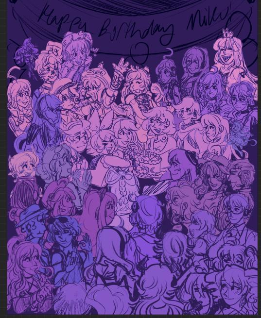
Left is the chicken scratch plan i made in my handy dandy notebook (whenever things are getting real and ambitious, i always made a rough ROUGH plan in there. Usually I'd do a rough pass of the full thing, but this was too complicated for me to do traditionally. I majorly benefited from digital tools to make this possible). CyberDiva and CyberSongman were considered, but I ended up cutting them cuz I just didn't feel like drawing them sorry-- (just pretend they're off to the side. They gave Ruby and Clara the pizza lol).
Right is the "final" completed sketch (before I decided to include Chika mid-way through coloring and VY1 and VY2 near the finish line). I started by drawing the main "groups" separated on a different canvas so I can plop them into the main canvas for easy rearranging and transforming. However I got lazy and ended up drawing everyone in the bottom right corner directly on the canvas since I liked seeing the big picture of everyone's positions. Y'know.
Almost excluded Chika! But I like her design so much that I just felt like including her last-minute. You win this time, Chika fans.
VY1 and VY2 were very close to being cut! I added them when I began doing the banner and thought "eh why not". I figured their non-human designs would be pretty easy to include pushed back in the bg. Ik VY1 is more commonly associated with the fan design, but I referenced the hairpin cuz it was simpler and the fan looked very annoying to draw 😭
Sorry to the fans of many Vocaloids I had to cut because this composition was insane enough as is. I promise I wanted to include fellas like CUL, LUMi and Sachiko 😭 I will admit I was a little biased on who I wanted to include over others. Like, I don't normally care for Bruno and Clara, but I wanted to get some more international 'loids in the mix. Also wanted to stick in the realm of official designs and not fan-designs since, as much as I can appreciate those, are just a whole "wait who is that guy supposed to be" situation I didn't wanna deal with.
I also did wanna include even more character references through the balloons, but they ended up being kind of ugly and overcomplicated the BG :,)
(Oh, and while this was originally planned to be a Vocaloid-only piece, I did end up including Teto, Neru, and Haku 'cuz those are Miku's besties dude!!! They may not be Officially in the club but they're her girls and it would be criminal to not invite them to her birthday).
Anyway, this project marks the first time I've drawn a lot of Vocaloids. Lily, Piko, Rana, Yuki, Yukari, Miki, Maika, and many more lol. All of 'em I've heard or seen in passing, but now I actually drew them, and some have really cool and fun designs!! I got into a habit of drawing Merli after this since I just love her design for example. And I'll probably be drawing more lol!!
Oh and the last thing I'll add for now!! The cake is indeed made up of various song references!! I wanted to reference the "big four" producers, just absolute icons in Vocaloid history. The pink/black checkerboard is "World is Mine" (Ryo), the crescents on the side is "Rolling Girl" (Wowaka), the smiley faces is "Matryoshka" (Hachi), and the three hearts on the side is "The Vampire" (DECO*27, which is sort of a symbol of his whole Mannequin album tbh). I know "The Vampire" is a bit modern but I couldn't think of anything else off the top of my head. I'm a fake DECO fan I know 😔 "Matryoshka" was originally going to be referenced in the colors of the candles but believe me it looked like shit so I just went for something else last minute 😭
That's all I have to say!!! Hope you didn't mind the text wall if you made it here. I hope you like it as much as I do!!!! Happy freakin' birthday Miku!!!!
I have to deal with tagging all these characters now for my page,,, in the drafts my tags got cut off after a certain point so I think I'm massively breaching the tag limit 😭 um... I'll figure that out later...
not losing sleep that i can't tag everyone, even for page organization purposes because some characters have pretty generic names and some are a little hard to see in full yknow. If you're one of those people who tag every character in the art piece you reblog... I am very sorry.
#mayor doidles#fanart#vocaloid#hatsune miku#miku#kagamine rin#kagamine len#rin and len#meiko#kaito#megurine luka#gumi#kamui gakupo#ia#vflower#mayu#kaai yuki#oliver#otomachi una#fukase#sf-a2 miki#utatane piko#yohioloid#big al#sweet an#kasane teto#i literally dont think i can tag everyone. um. so you get the idea right#digital art#cell shaded
2K notes
·
View notes
Text
Ooookkaayyy
I'm too invested in this comic I can't go without making fanart
This comic is a White Diamond AU comic and this is totally the best au out there
You should totally check it out,the tumblr is right here -> @ask-whitepearl-and-steven
The story is well thought out,the art is good, it's deadly addictive,and the creator is very cool
Here is a small comic I made because I find it funny that Blue and Yellow might not even know White is kinda dead (maybe)

First comic ever,got lazy with the bg (and the app I used didn't work properly)
#wdau fanart#fanart#white diamond au#awesome#steven universe#steven universe fanart#su blue diamond#su yellow diamond#su white diamond
568 notes
·
View notes
Text

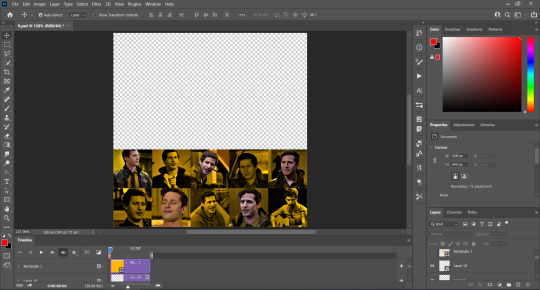
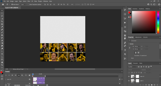
GRID + TORN PAPER + RAINBOW LAYOUT TUTORIAL
(yeah, i'm sorry, but that is the title i came up with)
Hi everyone! This tutorial was requested by an anon, and we're going to make a gifset like this. You need, as usual, basic gifmaking skills and basic photoshop knowledge, but i'll try to explain this as easily as possible!
You'll also need a torn paper brush, which you can download here.
And here are the links to download the fonts used in my gifset: x, x
Okay let's start!
→ First you're going to create a new canvas, and it will be 540x540 px. Make sure to click on create video timeline (if you dont have a timeline, go to window > timeline. We'll leave this canvas there waiting for us :)

Then, onto our first gif. We're going to make the small square gifs first. All i do is resize the image and make it 120 px high, and you'll see why in a moment.
Make sure to remember the number of frames of this gif!! All the gifs we're going to put in the same canvas should have the same amount of frames.
Okay, so we have our first small gif:
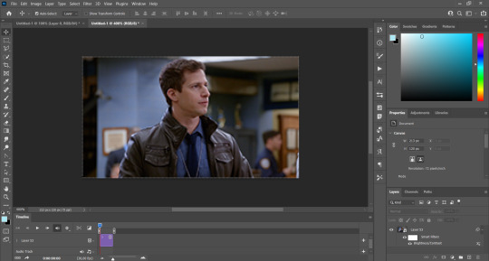
As you can see it's a smart object, and I added some brightness, but so far that's all. You can sharpen it, but i like to sharpen until i've colored it. Now onto the important part:
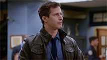
Most of the gifs i worked with were mostly blue (aside from the skin color), which is recommendable, because you can create lots of colors starting from blue, using the hue/saturation adjustment, or camera raw filter. I also recommend you to use a gif that doesn't move a lot, so it'll be easier to color the background:
For the tutorial, we have our predominantly blue gif, but we are going to make it yellow, which is the opposite color, so it's the hardest to get. I hope you can see how i manipulate colors, and do it yourself :)
Here, you can use camera raw filter (filter > camera raw filter) to turn the blues and purples greener, like this:
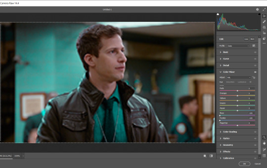
And click ok to exit the camera raw filter. Then, we're going to use hue/saturation (image > adjustments > hue/saturation) to turn it yellow:

Since it was cyan, i changed the cyans, but if you got a much greener result you'll have to use green (duh, right? i dont know i just dont want anyone to get confused akjsdhs)
And you can also add a selective color adjustment to make those yellows more yellow:

The reason i don't directly use hue/saturation is cause it might look ugly and lose quality, or it wont pick up all the colors i want it to but they're also very small gifs so if you wanna do that, do it :)
I sharpen it until this point, but if you already have that's okay.
Now we're going to color the background! For that, you just add a new layer, and set the blending mode to color.
Then you'll use your brush, set it to 20px and 0% hardness, and pick the color you're using for this gif, you can use the eyedropper tool. This is why it's important that the gif doesn't move a lot, so you can color the bg like this:
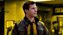
I colored carefully around the edges, and that's the result. In some gifs from my gif set I colored Jake's jacket too because i was too lazy, but this looks cleaner :)
You might want to select the color layer and the gif layer to convert them both to a smart object, just to make everything easier. So, be careful, because after that you won't be able to change anything!
But let's say you have a scene that you want to include, and it moves too much and has no blue and it's going to be a nightmare to color it.
Well, don't worry, you can! Simply, instead of manually coloring everything, you can just choose to add a gradient map to it (image > adjustments > gradient map), like this:
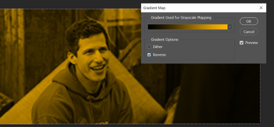
And this is the result:

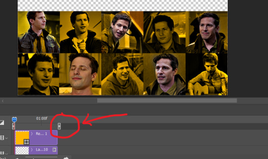
Just remember, it has to be the same amount of frames as the other ones!
You repeat the process, until you have 10 small gifs. I made around 5 manually colored gifs, and 5 gifs with gradient for each gif. That's a confusing sentence but i hope you get it.
We are going to start pasting the small gifs on our first canvas.
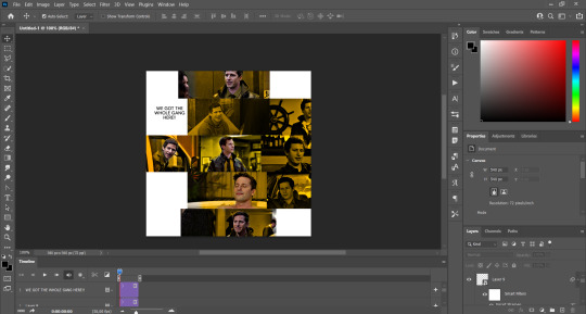
(You can paste them one by one but i did this so you can see my 10 gifs)
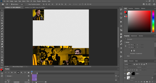
You're going to create a square that has to be 108x108 px, using the rectangle tool. You can remove the default white background.

And you may be wondering, why did we not just crop the small gifs into those dimensions? Well, you can do that, but to me it's much easier this way, because sometimes cropping isn't accurate, or it's tedious.
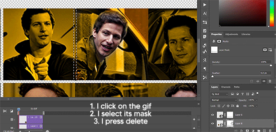
Place the small square on top the gif you're going to crop, right where the face of the character is (or whatever objects you're giffing), and while holding ctrl, click on the square. It will select it:

You're going to create a layer mask:

And then drag that layer mask to the gif:

And voila! It's now the same size as the small square. Once that's done, right click on the layer and convert it to a smart object, because we have to remove that mask. Make the square layer invisible, and start placing your gifs where you want them:
You're going to repeat that process with the rest of the gifs, and then place them all together. Don't forget that if you're making the first gif, they will all be at the bottom of the canvas, if it's one of the middle gifs, one row should be at the top and the other one at the bottom, and when you're making the last gif, they should all be at the top. Here we're making the first one, so they will all be at the bottom:
If you forgot to check that all the gifs had the same amount of frames, you can fix it here, just make sure no gif is past this little guy:
Okay! Now, to create the gutter, we're going to add a layer mask to each small gif, so that we can cut some of it.
The gutter has to be 4 pixels, (i recommend you to REALLY zoom in). What i do is make sure the width of the gutter takes 2 pixels from the edges of the gifs, since they are all together. As you can see in the image above, there's no a single empty pixel between the gifs.

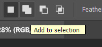
This is a close-up of what i'm talking about. I select two pixels from each gif, and go all the way down to create the gutter:
(I hope I'm not over or underexplaining)
I usually use this tool when i have to make so many selections:
But that was just an example :)
(Another way you can do this, is by changing the size of the small square from the beginning and make it be 104x104 px, but i don't know why that seems more complicated to me ajsdks)
Anyway, this is what we have so far:
Now we're going to create the big gif. Its normal dimensions are usually around 1920x1080, unless you have different dimensions and have to crop it, but whatever it is, we're going to resize it and crop it to be around 550 px wide, and 400 px high:

We'll do the same thing of adding an adjustment of gradient to it to make it the color we're using. For this, i usually add a brightness layer before, because sometimes the gradient is a bit dark.
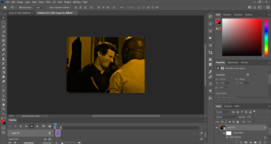
And using a 600px brush with 0% hardness, you can add some "light" on a new layer, like this:

Selecting all the layers, right-click on them and convert them to a smart object. Again, be careful, because once its a smart object, you wont be able to change any of it!
Then we paste our big gif on the canvas with small gifs, and add a layer mask to it. Using the torn paper brush at 600px, remove some of the gif to shape it like the torn paper. Make sure you're using black, otherwise it won't work correctly:
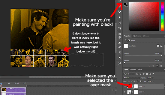
To make the effect better, add a layer UNDER the big gif, and using the torn paper brush, with the same size, you can paint under it:
Yeah, I covered some of jake's face, but that's how it supposed to look so the effect works!
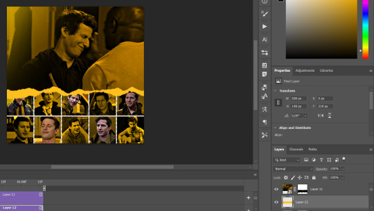
And finally for the text! I used Granesta, at 150 px, and at -10.00º to make it a bit askew.
We're going to double click on it and give it a color overlay, set to normal, and give it a solid shadow if you want, then place it right here on the corner:
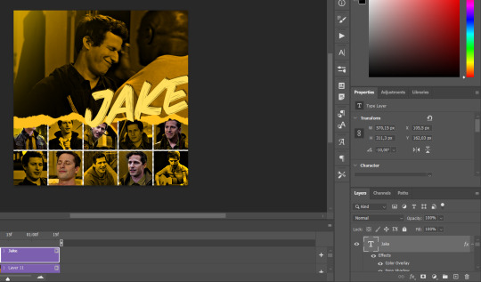
But as you can see, it's too big for the gif. So we're going to add a layer mask to it, and again, shape it the same way that we did with the gif. Make sure they're exactly the same shape, like this:

And that's it! This is our final result:

As always I'm sure there are easier ways to do many of these things, this is just how i do it but if you know an easier way to do it, go ahead. I hope this was at least understandable enough so you can apply the logic of it any way you want :)
If you have any questions you can send me an ask and i'll clarify!
If you found this helpful i'd really appreciate it if you left a tip on my ko-fi!
Happy giffing!
#will i ever learn how to properly explain things 😭#tutorials#uservivaldi#userraffa#userbuckleys#userhallie#tuserheidi#usertina#userfern#usersole#usercera#userzaynab#userisaiah#usernik#userpriyas#usertj
202 notes
·
View notes
Text
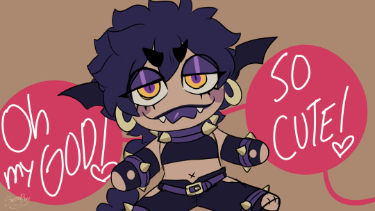
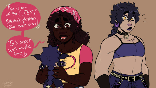

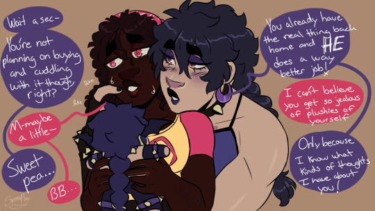
I haven't drawn Amara and Ace (Sweetheart and Bitterbat's civilian identities) in a bit so I fixed that.
I'm lazy with BGs but imagine they're at some con or something (because villain merch is only allowed if fanmade)
569 notes
·
View notes
Text

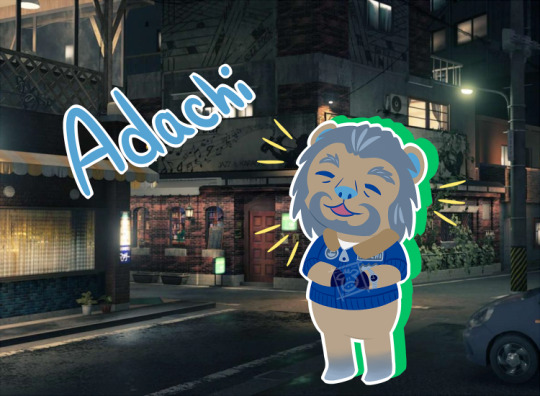
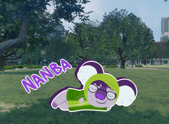

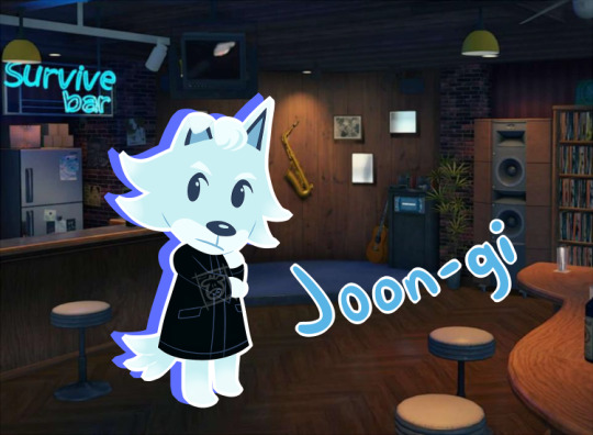
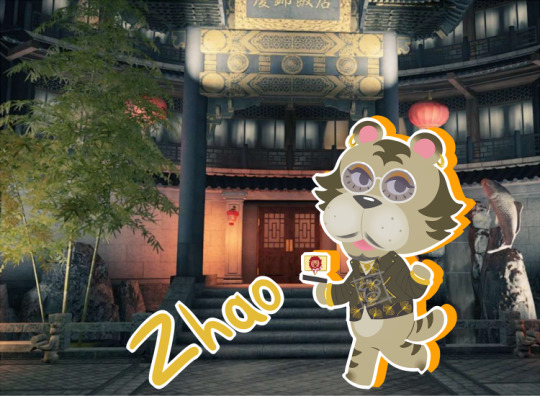
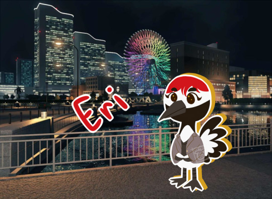
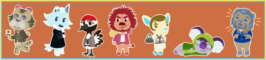
Been working on this for a few months now but I finally got it done! I've seen a few Yakuza/Like a Dragon x Animal Crossing crossovers and really wanted to do one too, and I'm super happy with how it turned out:) Seeing all of the Dondoko Island comparisons to AC right before I finished this was HILARIOUS though😂 Gonna put some loose notes under a read more if you want behind the scenes stuff. Let me know who your favorite design is if you want:)
Adding what animal everyone is (just in case it's hard to tell and because I want to talk about why I made some of them certain animals)
Ichiban: Lion (he has a very loud personality and very loud hair)
Adachi: Bear (I will restrain myself from making any bear jokes but he does look like he'd give great bear hugs)
Nanba: Koala (okay, weird reason, but my sister used to have this webkinz koala named Snoozer (he was the mayor of our imaginary town but that's not important) and he was obvs always sleepy, and Nanba is the KING of convenient naps in battle)
Saeko: Deer (i really just thought she'd love to paint her hooves)
Joon-gi: Wolf (typical lone-wolf-type with white hair who is dragged into the found family). He also gets the bar bg because he never got his own karaoke song and he deserves to have fun:)
Zhao: Tiger (i specifically remember him having a tiger in his restaurant that kicked my ass, and I also wanted to base him off of one of his martial arts moves. Since Snake and Mantis aren't AC types, and Crane was already being used, I thought Tiger was fitting. Also his shirt was a pain to make!! I couldn't replicate the actual pattern, so I went with ginkgo leaves for something that was still gold and sort of ornate)
Eri: Crane (inspired by her move (called 'Flying Crane' or something like that; i'm too lazy to boot up the game and check lol) Plus I think birds would really enjoy the crackers her company sells:)
#sorry if the quality looks awful for these#first time trying low res bc i genuinely love these and would cry if i saw them floating around somewhere#hopefully they still look alright#thank you again vi for giving me the idea for backgrounds even if I did get it mixed upXD#yakuza 7#yakuza like a dragon#ylad#like a dragon#ryu ga gotoku#rgg#ichiban kasuga#koichi adachi#yu nanba#saeko mukoda#joon gi han#tianyou zhao#eri kamataki#animal crossing#howw draws#my art
156 notes
·
View notes
Note
I see a lot of people start with grays calendar for their art and then color it in, and I wanted to ask how you do that?
i do it manually! i use the lasso fill tool in clip studio paint and fill in figures and other important details as I finish the linework. everything in a panel gets a separate grey tone based on foreground, middleground and background. Unless I'm lazy, I usually try to match the tones to the value structure I actually want for the panel in the end, ie whether the figure or the BG is the darkest thing in frame.
i do this to make my job easier when I have to color, because I can clip all my flat colors and shading to the base layer, and I don't have to worry about being precise. I actually made an auto-action in clip studio recently that automatically creates and clips the shade/light layers to the base for me, it looks like this:
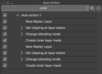
it saves so much time. if ur making a comic where u have to do the same things 1 million times I highly recommend looking into auto-actions
#ask#bonus content#directors commentary#i could probably even use an auto action to fill things for me too but my linework is too sketchy sometimes for it to work properly#so I do it myself#also all the auto action does is make the layers themselves I still have to like. draw in them lol
125 notes
·
View notes
Note
Well I really love your art, may I ask how do u color? I struggle with coloring turtles and I wasn't to know how do u do that?
Hi anon! That's a very broad question, so you've given me a great excuse to ramble anything I want about my coloring, eehehehee~!
This will be in two parts and I'll start with talking about my simpler coloring style.
As in, when I color characters on a white background, with a limited or light palette.
The driving force behind this style is me being lazy. My time, energy, and attention span are pretty limited, so if I want to finish anything, I gotta do it fast. And with fanart, I'm usually just doing it for fun and relaxation, so there's no need to push myself to polish it too much.
Despite that, I rarely post just black and white sketches or line arts. I always try to add at least a little bit of toning or shading, because that makes the image easier to read. The characters and their shapes pop out and catch the eye of the viewer better.
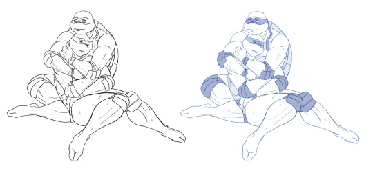
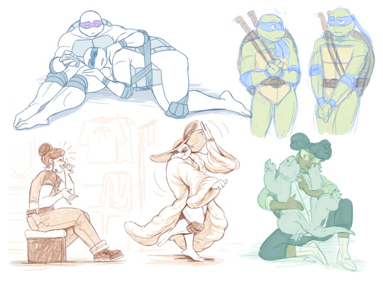
However, in this particular example, just the couple toning colors don't quite do the job. The way Don and Leo are entangled makes the center area of this illustration very busy and hard to read.
As a comparison; this pic has only one tone + mask colors, and it works. This is because all the characters are standing separately and their poses are very stationary and simple.
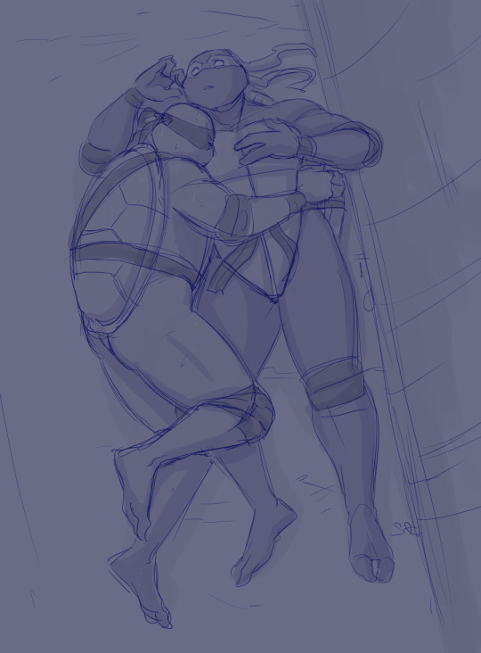
So for the Don + Leo pic, adding some shadows helps in bringing out shapes and depths. Also in general, if you don't feel like drawing BGs, it's good to at least add a shadow below the characters. It grounds them and makes them feel like they exist within a space.
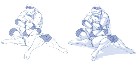
Sometimes if the posing looks too complex and busy, it might just be best to color in the characters fully.
However, even if I do full flat colors, I tend to use a lighter palette. Putting characters in their neutral/default color on a white BG can look a bit jarring as if they're floating in a void. It feels less immersive and like the picture is unfinished.
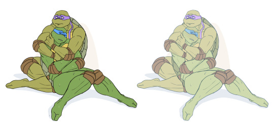
Using lighter colors makes the image more cohesive, and fits the characters into the white environment a bit more naturally.
If I'm too lazy to draw a BG, I prefer using stylized and limited colors. It feels deliberate and that the whiteness is just part of the palette, whereas the character-accurate colors on white don't match as well, even if they're more pastel.
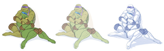
That being said, there's nothing wrong with just slapping the flat-colored characters on a white background. As you know, I do it too. I'm just exposing my 'fancy coloring style' for what it is; me being lazy, hah!
Limited and monochromatic palettes are a nice shortcut even when you do actual backgrounds. It's faster and you don't have to worry about clashing colors. And you can still convey atmosphere and mood.
Also, on the topic of conserving your time and efforts; I think it's very common among younger/less experienced artists to think that the amount of time you spend on your art piece = how good and well received that piece will be.
Which has some merit to it of course, but it can lead to putting too much effort into areas where it's not necessary. E.g. filling the piece with tons of details and clutter that don't serve an actual purpose, but rather make the image hard to read. Or doing really complicated shading for a meme/comic, where simplicity would deliver the joke better.
So whenever I'm drawing something I intend to publish, whether it's a quick doodle or a more polished piece, I try to follow these two principles:
Make it easily readable and do the bare minimum that needs to be done to convey what I want to convey.
Putting time into practice is important, but if you draw for work, it's also crucial that you know how to prioritize and use your time efficiently!
Anyway, thanks for reading! In the next part I'll go into how I do my fully colored pieces, so stay tuned for that!
139 notes
·
View notes
Note
any tips or stuff youve learned along the way on making a headworld "series bible" of sorts?
discord categories & channels (ft. the old working title of Where Hate Rules because i forgot to change it). i have a discord server with just me in it where I have a channel category for each writing project.
scroll down for a spreadsheet data blast
General - image dump, place to throw in new ideas so I don't forget them, plot points, etc
Worldbuilding - this is for stuff that's set in stone, not vague concepts. maps, diagrams, etc (i have a lot of diesel engine block diagrams and celestial illustrations in there as well as every holy beast)
Character log - literally just a list of characters. put in every character in the same format (i.e Name, Age, Profession, Physical Description, Hometown)
Writing Place - for prose. I write in libreoffice but when I'm out of the house on mobile or just doing test paragraphs they go here because I'd rather kill myself than use google docs ever. Each new piece of writing has an easily-searched title.
After this I have a channel for every main character. In here I put art relating to them, backstory, motivations, any random thoughts I have about them and so on. You don't wanna see how many of these I have for my Inver channel category lmaoo.
No, there are better ways to visualise Inver's absolutely massive series bible!
Discord is obviously only useful if you're online and I don't like storing so much shit in the cloud. And what if I need rows AND columns?
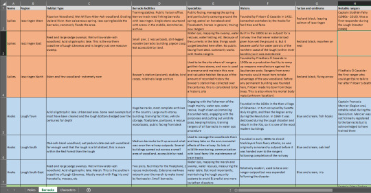
man i love spreadsheets. zoom in and get a load of that sweet sweet fossit guide.
this is me kissing microsoft excel with tongue to produce a datasheet about the modern-day ranger barracks in Inver (year 2017, Pascal's time) but any spreadsheet program will do. Even (gag) google sheets. I made this because in the modern era, rangers are ecologists! They participate in land management as well as faery relations.
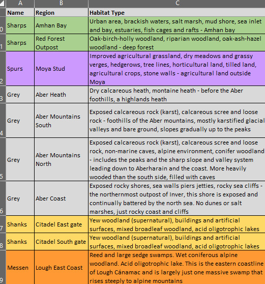
Okay so. First thing you want to do is freeze the top row so that it remains in place when you scroll. Then populate the boxes. Here, each ranger organisation (column 1) is given its own bg colour based on its main tartan colour so visual reference is easy. The characters tab is similar - frozen top row with basic categories, then a colour-coded list of rangers.
I have one of these for 1800s Inver as well! Luckily I only had to do the habitats once since they didn't change much over the years.
Hopefully that helps?? Basically: if you're lazy and need to generate ideas and data on the go, pick discord. If you want to be more specific, make a spreadsheet or 6.
168 notes
·
View notes
Text

Chance encounter
Edited Greenpath background for the bg because I'm lazy 👍
247 notes
·
View notes
Text
Bhaal's errant progeny and BG3.
Hey all, just some witterings from me that I really wanted to post about a particular encounter because it just super irked me. This post contains spoilers for Act 3 and specifically the serial murders quest.
My overall view is that most of the returning cast from the original BGs have been treated fairly respectfully and consistent with their character arcs in BG1/2 however, there is one unfortunately that I just don't like and that's Sarevok. Yep he's back for a brief encounter where he's revealed to Orin's granddaddy and he's going to smack your butt for funsies. Now while I enjoyed the fight itself the overall conversation / plot points were kind of disappointing for the following reasons:
1.) No Kevin Michael Richardson. Given the guy recently starred in Baldur's Gate: Siege of Dragonspear and is a fairly prolific voice actor I have no idea why they didn't ask him to do this role and given his distinctive voice, it's really noticeable. I appreciate with the other returning characters haven't got their original VAs either but I think Jaheria and Minsc's VAs do a good impression of originals and in some ways can hide behind the accents of the characters.
2.) Ignores the impact of Imoen's soul. It's referenced in the conversation that the fairest Bhaalspawn resurrected him so that implies that BG3 assumes it was Imoen who gave a bit of their soul to revive him in Throne of Bhaal. Now there were a few conversations that touched upon the fact that Sarevok was actually mildly influenced by this (he has cravings for sweet things and other strange things etc.). I'm not saying that this would have completely turned him overnight into a good guy but his re-embracing of Bhaal seems contrary to this.
3.) Inconsistent with conversations with Sarevok in BG1/Throne of Bhaal. In my view, the game is fairly clear that Sarevok's goal was never to serve the Lord of Murder but to become him. Furthermore, in TOB he actually seems pretty accepting of the fact that he failed to achieve that and is almost regretful in places, particularly in relation to Tamoko's fate. Why has he gone back to serve the Lord of Murder no less in BG3 when he wasn't really a true believer in the first place.
4.) Inconsistent with Sarevok's epilogue at the end of Throne of Bhaal. Sarevok's arc in TOB revolved around the nature versus nurture argument. One of the big challenges the Bhaalspawn faces is the revelation that Gorion had the opportunity to take either you or Sarevok and it was pure luck that you were chosen instead of him. The question for the Bhaalspawn is: would you have turned out exactly the same as Sarevok had you not lived in the relative safety of Candlekeep? Sarevok is given an opportunity to do things differently at the end of TOB. His epilogue notes that he never settled in one place for too long, routing an army of orcs before he conquered an entire city by himself only to then mysteriously vanish. The epilogue concludes that he actually returned to Kara-Tur to bury Tamoko and never returned, which ultimately suggests that Sarevok is a changed man at the end of TOB.
So yeah it seemed really lazy to me that he's just back as another mook of Bhaal for you to mow down. Now I've been playing a fairly neutral drow wizard who turned down the offer of becoming an assassin of Bhaal so maybe this comes across better if you have more time to talk to him but yeah was left feeling a bit sad by how he ended up in BG3.
139 notes
·
View notes
Last Seen Blogs
prvtocol
complicit.

dressedincotton
Untitled
noxfallenstar
The-girl-who-lived

iamwhatyoulike
Untitled
yacophok
YACO PH