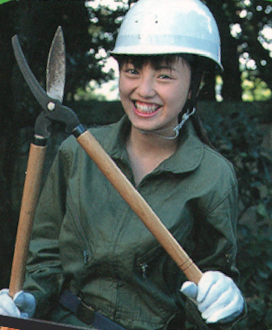
#the designs are pretty but i'm missing a lot of colours
Text
I decided to have a go at doing my own redesigns because these three are my favourites and I love them very much. further notes + sources under the readmore (warning: lots of text). I did my best with the research, but if there's anything I overlooked, I'd really appreciate people letting me know :)
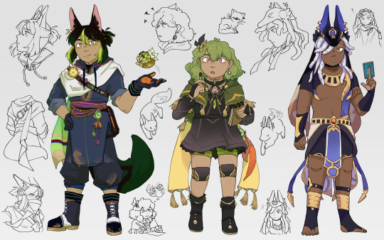
Tighnari:
My main source for Tighnari was this excellent thread, from which I looked up each item of clothing individually. Since djellabas tend to be quite long, and Tighnari needs mobility for forest ranger activities, I figured he would cut and re-hem the lower half. He also has a lot of clothing pieces that are traditionally multicoloured, but to keep his design cohesive I decided to use the same colours across different items, but using a larger palette of colours than I would usually. I like the bright colours on him a lot though!
There are also some minor details I just changed because I wanted to. The flower on his chest is now a nilotpala lotus, because I thought it was nice to include his acension material/the material he asks you to help gather. The dirt stains/scuff marks are because rainforests are muddy and I wanted the design to emphasise Tighnari being very practical and hands-on with his work (see also, the specimen belt).
Finally, I shrunk the magnifying glass on his back (because I'm pretty sure it's meant to be his first magnifying glass toy and that thing is very large for a child to handle) and gave him an undercut because it seemed right. Also, I merged his front and back trailing cloths into a scarf type of thing that he could wrap around his nose and mouth to prevent inhaling spores from mushrooms.
Collei:
COLLEI my beloved. I had a mild nightmare trying to figure out a specific source culture for her design, but nobody seemed to know specifics and her outfit wasn't matching with any traditional dress I looked up, so in the end decided to keep the overall look the same. Just in case I assigned her something else, but then it turned out I missed her actual inspiration.
Anyway, I made her shoes simpler (no fur, heels, and open toes in the rainforest seemed reasonable to me), and gave her shorts. I liked the green colour because it's pretty unique under a dark dress, and pairs nicely with Nahida's white dress + green undersides. Amber's tie stays, but I made most of her jewellery smaller since it felt a little clunky for a trainee ranger.
Her earring and necklace(?) are allusions to the Evil Eye and the Khmissa/Hamsa, both symbols of protection. Especially considering the fact they're meant to ward off evil, and very common across multiple MENA cultures, it seemed fitting for Collei to have them. Also, she has Eleazar scars, and I used the design for her stockings as inspiration for the combination knee braces (similar to those used for arthritis, since Eleazar also causes stiff limbs and I HC that people affected would probably still need some recovery support)/knee pads (in the case of a fall). I like the idea that Kaveh would have helped make them for her (tangent but the fic Here is the House explores similar ideas; it's really really good, I heavily recommend it). Finally, she has curly hair because I thought it would be cute.
Cyno:
Here's the thread I found for Cyno. The main critique was to do with the eras from which each aspect of his clothing drew inspiration, but I admittedly wouldn't be able to do much about this without a lot of research. One thing I did try and verify was the small strip of cloth on the left of his chest, and I found a few wall murals where the people seem to be wearing similar strips of cloth? (example here; rightmost figure) Therefore, I didn't remove it, but if someone wants to explain Ancient Egyptian clothing history to me I'd be really interested to hear it 6.6
I might iterate on the design in the future, but for now the changes are mostly HC territory. Cyno wearing his hair in locs (a protective hairstyle) makes sense for someone who does a lot of hiking after rogue scholars, and I also gave him quite old and faded top surgery scars because healthcare is canonically free in Sumeru (thanks for that information, al-Haitham)(though tbf Cyno makes bank anyway). I also adjusted the colours a bit, since Genshin tends to use desaturated shades for metallic elements.
I also considered giving Cyno more scars, but figured that it could indicate Hermanubis' presence that someone you'd expect to get injured a lot is relatively scar-free (i.e. some sort of godly healing factor/resistance to damage). However, we know next to nothing about Hermanubis, so Cyno having a lot of scars also makes sense. This paragraph is mostly just a cry for help cyno story quest 2 literally any more elaboration about the nature of Hermanubis' pact and the Temple of Silence.
Conclusion
I wasn't intending to write one when I started the explanations but this got REALLY long so if you made it this far, thank you so so much ToT please check out the links; the threads especially were a great resource, and I'm grateful that people take the time to make them <3 genshin's character design department are cowards but I'm glad I learned some new things through the redesign process
#FINALLY#IT'S DONE#I don't know why this took so long. maybe because I was trying new art style stuff#anyway I like how this came out!! my favourite guys#my main thoughts for each of them were like. tighnari <- kind of a chad. collei <- should get to wear shorts. cyno <- gap moe#<- i say having written 9 paragraphs about the development thoughts under the readmore. wahey#big shoutout to everyone who draws the archers ripped. you guys are inspirational#genshin impact#tighnari#collei#cyno#my art
333 notes
·
View notes
Text
⊹˚.⋆ 𝐁𝐎𝐘𝐅𝐑𝐈𝐄𝐍𝐃 𝐇𝐄𝐀𝐃𝐂𝐀𝐍𝐎𝐍𝐒 - NANAMI KENTO
℘. flora's notes : y'all know I'm a simp 4 this angel daddy so obviously i had to do that, totally self indulgent, I need him in my life
℘. female, gn, male reader 💓
m.list | comment or reblog if you enjoyed !

℘. he doesn't fall in love easily but when he does, it's forever. he will do it all with you : getaway weekends, expensive dates, engagement, marriage, honeymoon to your dream destination... everything you've ever dreamt of, he gets it for you.
▪︎
℘. he adores 80's romantic music and has a whole playlist that he listens to on his way to and back from work. it makes him think of you, it encourages him to go through his day and it gets him excited to go home to you in the evening.
▪︎
℘. he's the kind of boyfriend who remembers the little things about you and he doesn't need to write them down, he just has good memory. he keeps good care of everything related to you, little things included. sometimes he will come up to you like "I remembered you liked silk pyjamas so I bought you a pair darling" AND YOU'RE LIKE "HOW DOES HE KNOW ???" and he listens to you with such great care and intense attention 🥲🥲 HIS TIME IS DEDICATED TO U
▪︎
℘. you're always his plus one at his events. he chooses your outfit and he never misses cuz he knows your tastes perfectly. also what colours suits you and what type of attire fits you the best. if you're okay with it and if your hair is long enough, he will braid your hair and put flowers in it, rapunzel style yk. he loves to touch your hair and try hairstyles on you<3 (i headcanon that he doesn't have any socials but facebook and he saves the hair tutorials he sees on his feed to try them on you)
▪︎
℘. he looks at bedsheets and spreads a lot because he wants your shared bedroom to be as comfortable as possible for you. he will choose one w ur fav color or a design that would match the aesthetic of your room. the bedroom is his safe place and he wants it to be yours too
▪︎
℘. loves having you on his lap while he reads in his home office. and he kisses your forehead and cheeks every now and then. he reads you the story/article aloud when you get sleepy so he gets to have you sleep on his chest or shoulder
▪︎
℘. one of his favourite things is to get in the shower with you after a long day at work. nothing sexual, just him hugging you from behind while he softly rubs soap on your body. it just calms him down to have your skin touch his with the warmth of the water surrounding you
▪︎
℘. YOU ARE A PRETTY PASSENGER, he drives you everywhere even if that means dropping you off 3 hours away and he has to do the drive back to get u home
▪︎
℘. insists on getting heaters that can be started from a phone so that he's sure you always come to a warm home in the winter. he cannot stand the thought of you alone and cold in the house while he's working. your shared home has to be your safe haven, it must be warm and cosy !
▪︎
℘. makes time 4 you whatever the reason. feeling sick at work ? he has his afternoon off now. there's this TV show you really want to watch ? let's watch it together. a new restaurant opened in town ? he's taking you on a date.
▪︎
℘. after a long day, he will lay you down in the couch in front of ur fav tv show and run you a bath
▪︎
℘. wants you to visit him at work because he loves eating with you (eating the bento you made him). he will always welcome you with a smile as he sees you enter his office and he often signals you to come sit on his lap. he secures an arm around your waist and kisses your forehead then lips and gives u the most sincere smile i have to stop there before i start smiling like an idiot at my screen
▪︎
℘. SPOILS U !!! 'nami has so much love to give it's insane, he will grant any of your wishes right then and there ! he needs to be assured that he makes you happy and fulfills your dream life, it's important to him that you are comfortable with him as your partner. plus, he will never get bored of that smile and blush you get whenever he gets you a little something

© izukuisbaby. comments appreciated ! although do not modify, translate, copy, claim as your own or repost on any app/platform/social media (this applies to all of my content)
#jjk fluff#jjk x reader#jjk#jujutsu kaisen#jjk nanami#nanami x reader#nanami fluff#nanami#nanami kento#kento#kento nanami#nanami x y/n#nanami kento x reader#gojo satoru#gojo#gojo x reader#jujutsu nanami#jjk fanfic#jujutsu kaisen fanfic#jjk fanfiction
1K notes
·
View notes
Note
Can I ask a question? I like your sanders sides a lot and you give them a lot of personality in their designs! How do you make them like that? Or I guess I mean, what inspires you to make them the way that you do? I want to draw the sides but I'm not sure how to start other than their canon designs!
Oh my goodness I LOVE this question! For me, it's all about the feelings you get when you see them and the vibes I want to express. The Sides embody, to me, more than an aesthetic it should also encompass personality, role, and intention. In other words, I match their aesthetics to their function and the intent of what I feel like Thomas originally intended for them for their first short videos before they were actual sides.
Let us pick Roman, because even though people say he's not, he tends to be everyone's favourite to reblog fro me because he's pretty.
So I started by drawing him exactly as he was and to me he felt flat- in the show he's exactly as he should be but I am an artist and to me he feels more than what he looks like- it's dreamy, it's romantic, it's like he's giving childhood favouritre Disney Prince vibes, you know?
Inspiration 1: Prince Phillip
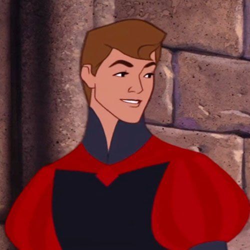
Hands down the biggest inspiration comes from him because he IS my favourite disney prince. Just looks a the hair swoop and the eyelashes- perfect. So I went ok my favourite Disney Prince is Phillip, let's start here. Before the CGI movies, there was such a romantic feeling about classic Disney princess movies and I've always loved the romantic feeling of Sleeping Beauty. The backgrounds are stunning, the way she's animated makes my bi ass give heart eyes and I loved that he was the only prince at the time who had a personality (until Beast but that's a whole other can of worms because he started out as an asshole/grumpy). I feel like modern Disney movies miss a lot of the romantic dreamy feeling of the older 2d movies because there was such care into the painted backgrounds being LESS realistic and more a fabulous idea of what a background should be and AHA! MORE INSPIRATION~! Let's make Roman a fabulous romantic idea of what a prince should be!
Inspiration 2: Faerietale Knights in Shining Armour
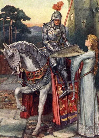
Our ideas of medieval knights are nothing like actual knights which are more reminiscent of hired military and enforcers. Our ideas of faerietale knights in shining armour are brave knights who would go off to kill a dragon to show their devotion to the one they love. Sword fighting heroes- is that not Roman if not an idealized romantic "royal knight wants to win the heart of the love with courageous deeds, acts of chivalry, selfless devotion" etc. Prince Phillip is a good model of this. Defeats a dragon and true love's kiss saves the day. A perfect romantic dream isn't it? Realistic? No of course not, but Roman isn't realistic he's creativity and romance which absolutely ignores practicality for the dream.
So we have this culmination of dreamy romantic disney prince and faerietale influence.
Now it's about aesthetics- Roman is reds and golds and whites, all royal colours typically associated with bravery, lineage, and strength and purity etc.
Inspiration 3: Media referencing
So let's find some movie or media equivalence I can reference. They came mostly in the forms of Narnia and Once Upon a Time.


So some aesthetic inspirations for belts and textures, missing the epaulets.... so to military garb!
Inspiration 4: Russian royals


Let's face it no one does embellishments like this any more <3
Inspiration 5: Lions
Roman's colours being red gold and white give me lion inspiration too so I looked up royal lion iconography as well (which ended up with a lot of lion king in the search because this was before AI but like.... it's not incorrect and the wavy flowy mane acted like hair. If Hamlet with lions is inspiring then use it, right? that have some AMAZING lion king-style artists on deviantart to get inspired by, it's a whole thing, mad respect) But ANYWAYS it gave me some cool stuff to be inspired by too.
Inspiration 6: Classic Golden Age Hollysood Leading Ladies (Note that this isn't femme fatales, because for Janus I used femme fatales as inspiration)
I knew that I just HAD to give Roman that Marilyn Monroe beauty mark, yes he paints it on every day yes it's in the same spot every day yes it's necessary.
Ultimately this culminated in a checklist of things that I wanted for him:
He must give the feeling of Prince Phillip in disney prince style
I wanted him to have flowey hair that makes him look softer and romantic and can be pulled up into a ponytail if necessary.
Must have a beauty mark and eyelashes that go on for ages reminiscent of old hollywood ladies, and let's throw in nail polish too.
I wanted him to have an outfit that would be his original but embellished to hell that can be like Narnia or OUaT in terms of texture and added stuff. It needed more gold, 100% needed epaulets (the shoulder things with the dangly rstuff), and it needed a belt where a sword could be attached. Danglies not always necessary, but look really good when done and is reminiscent of old fashioned military garb and Russian royalty.
He needed to look like he's used to wearing this outfit every single day and going out of his way to do so.
Ended up with this:
So yeah that's how I got to his design!
93 notes
·
View notes
Text
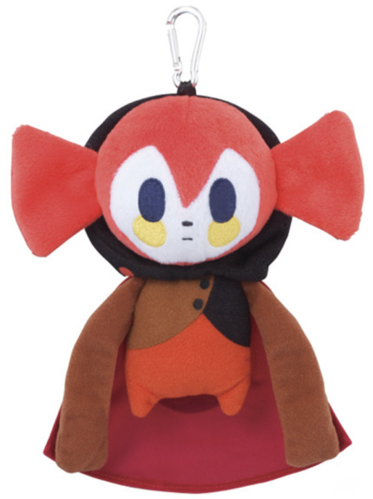
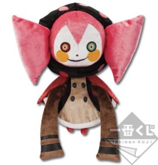
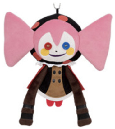
I saw someone ranking Madoka plushies so I thought I'd rank Charlotte/Bebe ones for funsies! I'm not including pouches, bags or head plushes here
First up is the Charlotte transforming plush. Cute and pretty accurate. Also has the bonus of having a use and featuring both Charlottes. Her hair looks too light in the promotional pic but it's better irl from what I've seen. Sadly has the early Charlotte mistake of missing the dark right side of her jacket top. Sadly seems very rare and expensive nowadays. 4.5/5
The Wormlotte Ichiban Kuji prize plush. Wins points for looking dumb but in a cute, scrungly way. Works best from the front, it's a little bit of a shame she's so flat from the side so looks a bit odd. 3/5
Ichiban Kuji plush from the same set as Wormlotte. This one has already felt a little not great to me. The hair is too bright and you can see it goes under her chin which clearly isn't right. Her trousers are too red as well and she's missing the lining of her cloak. Makes sense she's less detailed because she's a prize plush but you could at least get the colours right. Also loses points cause I always see this one going for so much online and... she's not that great AND she's tiny... 2/5

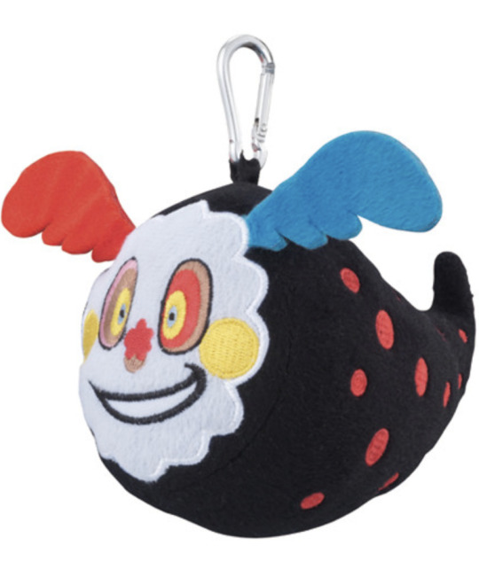
The SCARF! She's great, so silly and such a good idea. Hair is too light and eyes are too teal but otherwise she's great and scrungly. 4/5
Another Banpresto prize plush. The colours are slightly better than the previous, especially the hair. 3/5
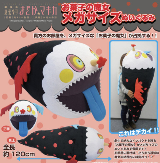
The HUUUGEE wormlotte. Who wouldn't love her?! She's amazing but very expensive, originally at around £150 and I'm sure she'd be lots more now. 4.5/5

Another Banpresto prize and another that's barely changed. It kinda feels like a step back... Green eyes??!! 2/5

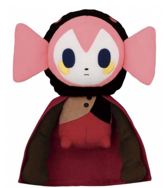
The first Bebe plush, another Banpresto gig. She's very cute and silly but her hair looks wonky?? And it doesn't just seem to be the prototype. She's never shown with wonky hair so it just feels like they misunderstood the art... Her cape is missing the black inside too... Otherwise she's decent. 3/5
Banpresto prize but smaller. It has the same issues as before... 3/5

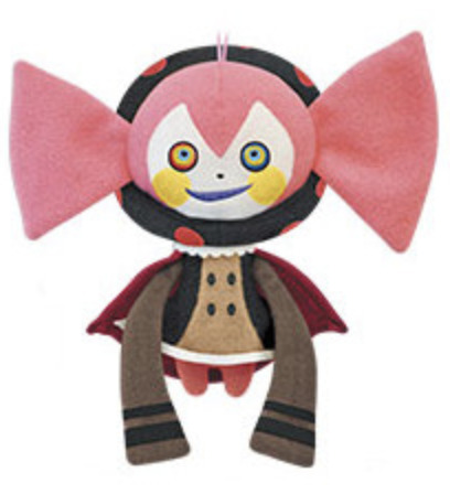
Same as the last but the unique pose and expression is very cute. You get bonus points. 4/5
An Ichiban Kuji Premium plush so she's a bit better looking now. Fixed the symmetry but I don't think she has the cape lining (it's hard to see in pictures). I like the velvet look but I know some people don't like that texture. Her fringe looks too triangular honestly, moreso than the last few. 3.5/5

WHY IS HER HAIR STILL WONKY?? Her hair ISNT wonky in official/concept art her head is just tilted, how are the designers so stupid??
See how it's tilted on the right BECAUSE her head is tilted but from her back view her hair is completely straight. Sigh. It's similar to the first few Bebe plushes. 3/5
Another Banpresto prize plush. Hair is back to being fixed, thank fuck. I really like how the lace around her collar looks like actual lace. Makes me notice the last few are mostly missing the lace... hmm... I don't like the way the fabric is cut off around the black bits of her sleeves. Makes it look bad. Also I think with the button eyes you're either gonna really like it or really not. I was scarred by Coraline when I was younger so it irks me, I wouldn't get her myself. Improved some bits but fell on others so the score hasn't improved... 3/5

Wormlotte's button version. Bonus points for making a plush of Bebe-Wormlotte cause I kinda love how unique she is. But.... this one's a bit shit... it has such a handmade quality and not in a good way. I don't get why the spots look like they're badly painted on. It's too flat as well and the circular shapes of the body are so badly defined. I like the face details but that's it. Perhaps shouldn't have relied so hard on the artwork. 1/5

Mochi Kororin Wormlotte. This is the kind of plush that I just feel I've seen far too much of... I'm so bored of it. But... she does look silly and I kinda like that. The blue wing is too teal (though it seems it took more from the art than the anime) and her left eye is red instead of pink (which is another art mistake) so it kinda throws off the colours when there's too much red in her face. 3/5

A Movic plush, this certainly feels more obscure. I love her stupid face and the unique pose. The eyes are the wrong colours in numerous places which is a shame but I'm glad the nose is 3D. (actually looking at a non-sample photo they got the eyes right! Must've just been the prototype) I like how the wings are drooped like she's bashful, it's very cute. No complaints! 5/5

I'm so surprised to see this one on My Figure Collection because she looks SO bootleg and this is what the popular bootlegs are based on. The fact they misspelled height really doesn't make me trust it. But at least I can shit on it! Eyes and cheeks are wrong (taking from the incorrect first anime screening), black hood is a weird flower shape, spots are too small, top is too light yellow, buttons are far too far across and cape goes around the front. If I could get her for like, less than £5 I would but otherwise I wouldn't bother. 1/5
How come the first Charlotte was the best and the rest were just kinda downhill? It seems like Wormlotte is harder to screw up. At least they're both pretty simple so you can always make her yourself. I was surprised my top pick was a Wormlotte since I overall just prefer Charlotte but like I said, she wasn't doing too well, even with the Bebes... a shame... let's hope they release better plushies in the future.
#madoka magica#puella magi madoka magica#pmmm#witch#madoka magica witch#charlotte#bebe#merchandise#plush
60 notes
·
View notes
Text
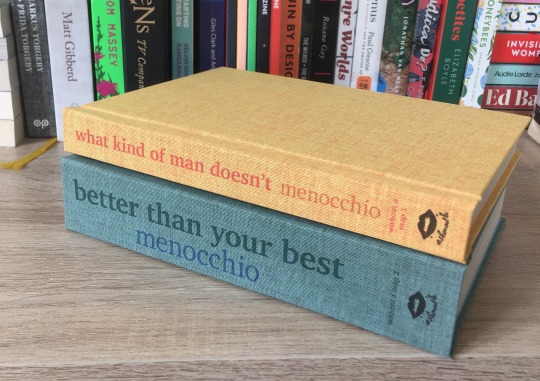
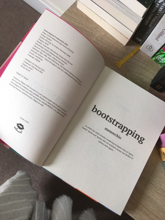
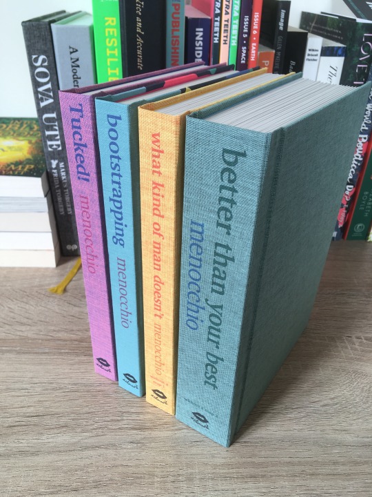
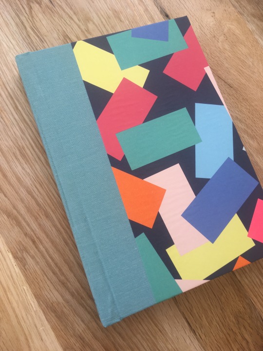
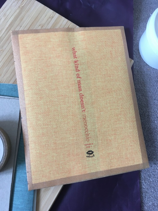
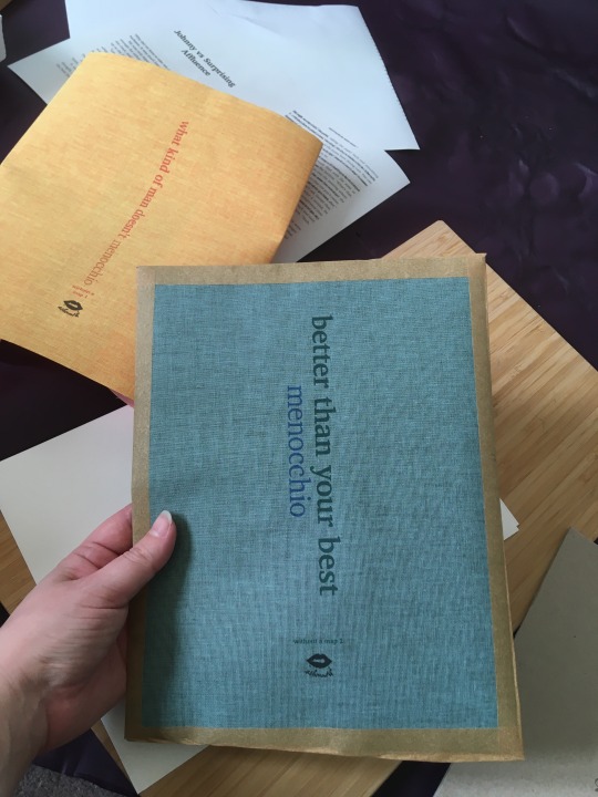
what kind of man doesn't & better than your best by menocchio, also known as 'road boys' (or it was when it was being posted and I was reading!).
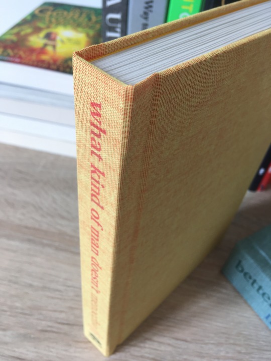
I decided to continue down the design path I took with Tucked!, printing titles directly onto book cloth and using single-colour endpapers. My second project was actually bootstrapping, but I messed up that binding so much I didn't want to share it at first - one day I might cut the text block out of the case, re-do the case and case it in again, to fix all the problems I had. I do console myself with the fact my colour and cover paper choices were on point, at least. check out the mad 80s/90s energy of this, I'm in love. (I'm pretty sure I had a tracksuit in the early 90s in those exact colours.)
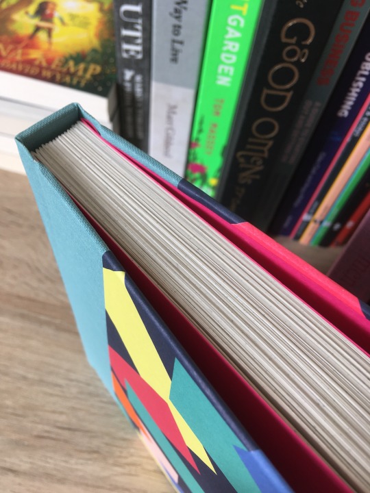
what kind of man doesn't and better than your best are a series so I wanted them to match. I chose yellow/orange as the colours for wkomd because of how when I started reading it, the image seared into my mind was that of a hot and golden California sun. for btyb I went with a dark green and blue because it's a kk3 rewrite, and I associate it very strongly with bonsai so I wanted a more down-to-earth colour palette for it. as it happened I had Dubletta (same brand bookcloth as for Tucked!) in those colours so it was an easy choice.


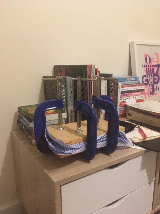
specs and process photos under cut
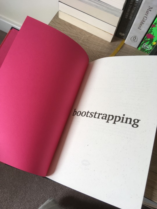
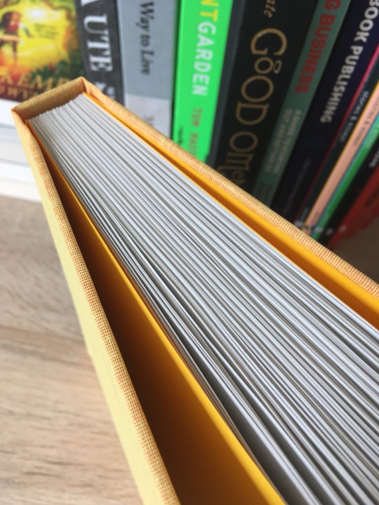
bootstrapping
Typeset in Charter. Printed on 100gsm 100% recycled eco-craft oatmeal paper and bound in seafoam blue bookcloth of dubious origin (possibly Windsor, a tissue-backed rayon) and paper from designed by Kelly Hyatt 2019 and sold by LAGOM DESIGN, over 2mm boards with Daler-Rowney Canford Fuchsia 150gsm as ends. 254 pages
what kind of man doesn't
Typeset in Charter. Printed on 80gsm 100% recycled Context Natural 80 paper and bound in Dubletta Yellow Orange 3272, a woven cotton on acid-free paper backing, over 2mm boards with Daler-Rowney Canford Buttercup 150gsm as ends. 360 pages
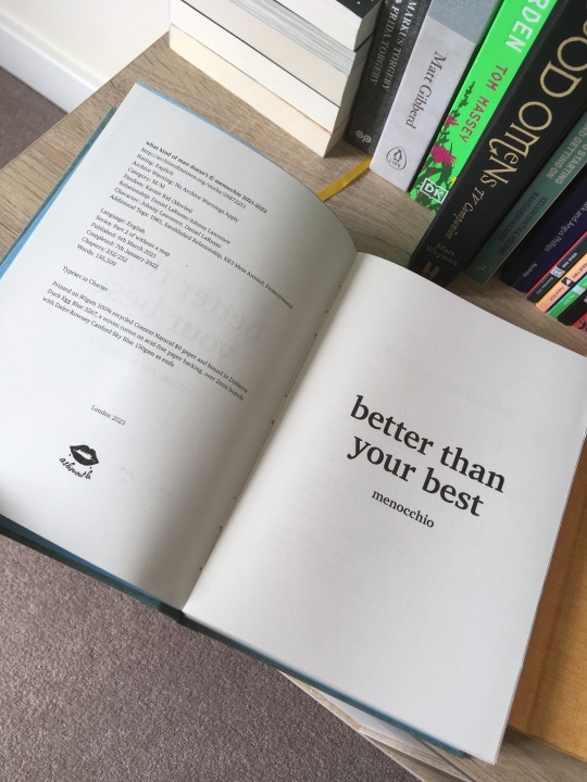
better than your best
Typeset in Charter. Printed on 80gsm 100% recycled Context Natural 80 paper and bound in Dubletta Duck Egg Blue 3267, a woven cotton on acid-free paper backing, over 2mm boards with Daler-Rowney Canford Sky Blue 150gsm as ends. 744 pages
so many things went wrong with the bootstrapping binding, starting with...my printer deciding to do an adjustment thing and me forgetting about this, so when I put in the carefully cut and measured book cloth sheet in, it printed...like this:

I should've recognised it for the Omen it was.
I redid it, and then between measuring and cutting the boards for the case and casing in, the textblock swelled (or I measured wrong?) which meant the textblock was pressing against the insides of the hinges, making them look bulky and gross instead of crisp and square. and also, the cover paper I used didn't take the moisture from the PVA well AT ALL so it instantly wrinkled and could not be smoothed out hard as I tried, so the cover is just. wrinkled now. I also somehow managed to lay it down askew so the cover paper is not parallel (notice the overlap differences between the bottom and top of the front cover).
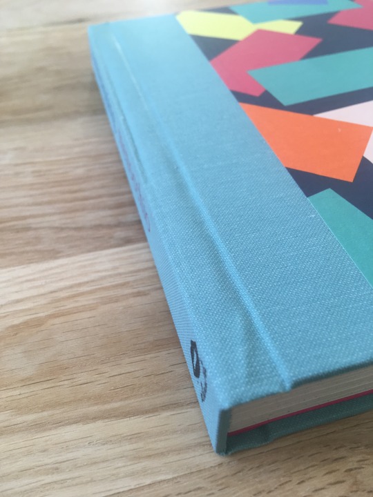
as if that wasn't enough, the logo on the spine is off centre too! sheesh. not to mention the endpapers! I somehow missed an edge curling over and so it...glued in place like this. and the corresponding corner has a starch paste stain now.


I was so mad about it all that when I put it in to press, I faced it away from me. think about what you did, asshole
in beautiful contrast, almost* nothing went wrong with wkomd and btyb!

*I accidentally glued the spine piece down to wkomd incorrectly so I had to reprint that book cloth and cut a new spine piece. I tried to gently cut the spine piece off the original book cloth to see if I could re-use the book cloth, but I just cut through the cloth and also left a layer of board on it in places so, no, lol. I did salvage the back and front parts of the cloth to use in other projects and only discarded the spine piece. it could've been a lot worse.
207 notes
·
View notes
Text
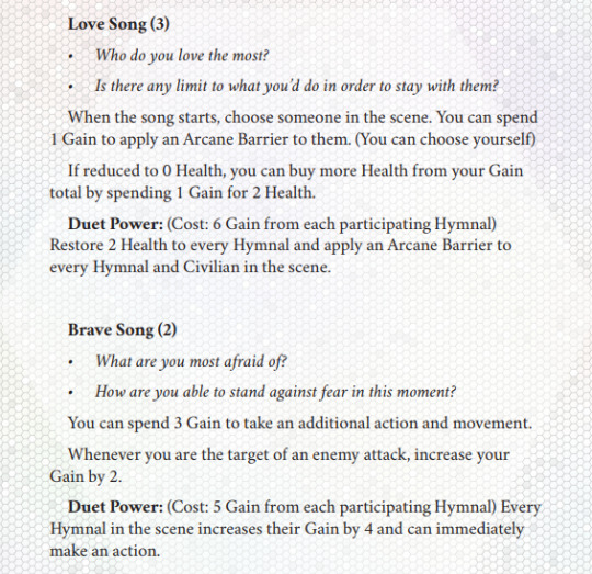
bundletober #13: blazing hymn
alright i've fallen behind on bundletober (the series of blog posts where i review and talk about a ttrpg i got in a bundle every day) and am hoping to make up the difference by putting out two entries today. this is the first one, and i'm looking at the mecha-piloting, synthetic-armour wearing, blaspheming-against-God-and-his-angels game blazing hymn by peach garden games.
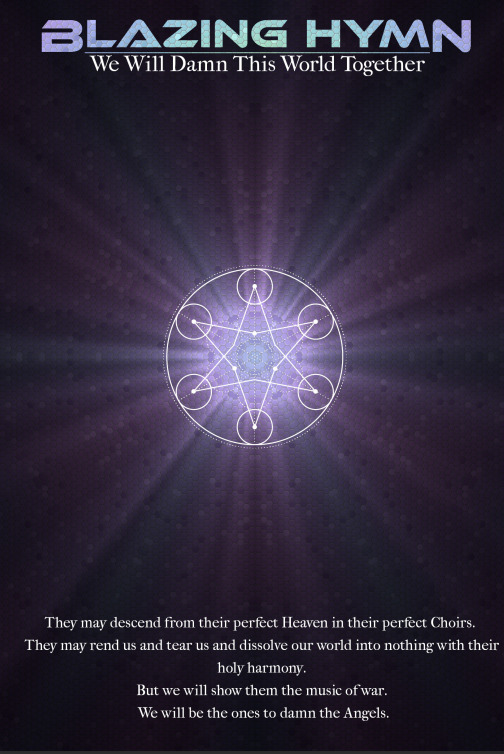
now sadly this game is not a lyric/blackout poetry game about rewriting church hymns to be about gay sex. someone should make that btw. no it's just about wearing highly advanced battlesuits powered by the song of your heart to kill aliens with weapons of pure energy. which is about as cool.
first off, the layout of this game is unique and stylish. there are hexagons everywhere:
the game puts sparse splashes of dreamy pastel colours amid a constantly shifting set of black and white hexagons. it gives the book a visual identity that is at once both visually distinct and also changing massively from page to page. it's a really cool way to mix things up and keep you wanting to turn the page if just to keep seeing what the next one even looks like.
what's the game about? simple. angels have come to earth to destroy it badly. with the power of song, young people can power specially designed battlesuits, called Hymnals, that when not activated collapse down into crystal necklaces. it's a pretty anime concept--the game is pretty open about being inspired by Evangelion and Symphogear, neither of which i've actually seen--but it's cool as hell. the aesthetics of the layout really help bring the aesthetics of the game itself, of technology and ethereal mysticism merged into one thing, to life.
the game uses a pretty simple three-stat system where you build dice pools with a state relevant to an action and can get a full success, mixed success, or failure, depending on what you roll. your characters have two resources, Health, which is what it sounds like, and Gain, which is essentially magical power. because you can swap Health for Gain and Gain for Health at a 1-1 ratio with no restrictions, i'm not really sure why they're separate things--seems like a missed opportunity to not only simplify the mechanics but also create a strong mechanical narrative element by making Gain the only thing that keeps you going--once your song is silenced, you're out.
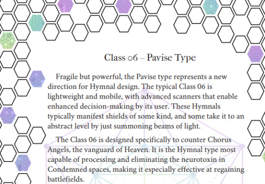
to create a character, you pick from one of six unit classes--here's where i'd describe the six classes, but honestly, they don't quite feel distinct enough. a lot of the powers you can pick for each hymnal class feel very similar, or are outright overlapping in a lot of cases. this isn't necessarily a bad thing, but the descriptions of the hymnals, while trying to clarify their combat roles, all end up seeming to repeat themselves or say contradictory things. i think some direct ties between those descriptions and their mechanics would have helped--i'd find it a lot easier to remember that, for example, the 05 Xyston type "brutal in combat" if that flavour text was followed by a direct reference to one or more of its abilities. they do all have pretty different stats--which, in a game with a very simple and elegant combat system, means i'm confident they play very differently once you hit the table. but just looking at them, as a prospective player, i struggle to tell the difference.
i don't have that problem with the next character creation mechanic, though, which is choosing the songs you sing to power your hymnal. each song, as well as a thematically appropriate set of stat boosts, also prompts a pair of revealing character questions. they're the kind of mechanic that i want to get my hands on because they make it fun to create characters, giving real mechanical expression to the emotional fundamentals of who they are.
the combat system itself seems really, really good. it's astoundingly simple--you're encouraged to use a map, but there's no fiddly grid or distance tracking, just the ability to move between being Close, Near, or Far from an enemy. it keeps the numbers low to keep it getting silly and doesn't bother with any of the unecessary bookkeeping and fiddliness that plagues TTRPG combat as a whole. no initiative, no separate turns--there's a 'player' turn and a GM turn, and during the GM turn the GM picks from enemy's listed actions until they've done two for each player. players can use their abilities on the GM turn, and the game encourages the GM to take enemy actions that wil lforce them to--so nobody's ever standing around twiddling their thumbs waiting for the whole table to rotate back to them, and having a lot of enemies doesn't mean the players listen to the GM talk for fifteen minutes.
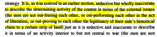
there's two unique mechanics that i think are very interesting-- Civilians and Condemnation. Civilians are--well, exactly what they sound like. on their turn, players can use an action to evacutate up to 5 of them. this extremely small and simple mechanic is fucking genius. so many games tell you they're about saving innocent people, but yet the only mechanical verbs you have to interact with anyone are violent ones. as elaine scarry says in the body in pain:
so in a way i think blazing hymn puts its money where its mouth is in a way very few combat rpgs with emancipatory or heroic aspirations bother. angels are said to attack populated areas--you're sent to preserve life as well as destroy the enemy. it makes the game feel fundamentally different, like despite the questionable ethics of hymnals (after all, they only work on young people, who then have to be sent into deadly combat situations) there is something heroic you can do.
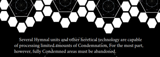
the second cool mechanic is condemnation, a reality-warping toxin that angels use to destroy the places they're sent to. this rocks because it adds a ticking timer to the battlefield, a passive threat that forces the player characters to be proactive. if condemnation gets too high, not only is the fight going to get harder, but civilians are going to die en masse. it's a great piece of game design that gives the GM a great lever to pull for pacing and urgency.
i also really like that one of the steps of the GM turn is to 'change the situation', whether that means something happens in the narrative or something on the map changes (a train arriving is the example the book gives) or more angels attack. in general, one of my biggest complaitns about d&d is that unless a DM takes it upon themselves to design additional mechanics and encounters outside of anything the game actually gives them, combat inevitably turns into two lines of people hitting each other with sticks until one of them dies. i love dynamic, progressing combat, combat where the stakes change moment to moment. and blazing hymn delivers.
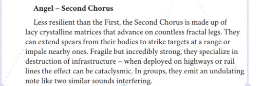
anything else? oh yeah, the angel designs are cool as fuck.
god damn. anyway despite a few minor issues with the hymnals themselves, the core of blazing hymnal is fucking good, a nice tight and razor-sharp combat system wrapped up in pulsing pastel crystalline aesthetics. if you like cool anime fights and like having the rules to back it up but hate complexity, crunch, and tedium, this might be the perfect game for you. it's certainly given me a lot of cool design ideas to take foreward into my own projects.
blazing hymn is available for purchase as a digital download through itch.io
85 notes
·
View notes
Text

GREY CAT DRAWING CHALLENGE 👍👍👍 except with my favourites instead because i'm a rebel *\0/*
design notes and transparents under the cut!!!!! <3

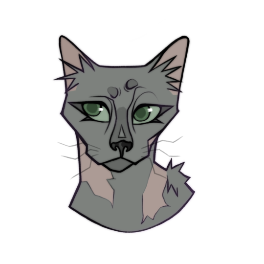
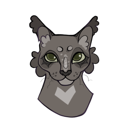
IVYPOOL AND DOVEWING MY BELOVEDS <333 i think they both got done so dirty with their characterisation past just their main arc (and even within that arc tbh) but i can't help but love them
ivypool to me is the smaller of the two (they are both giant though) and a lot less fluffy, but when they were younger they had basically the same huge ass eyes and looked suuuper similar apart from colour- then they both had crazy growth spurts and dovewing got fluffy! i wanted to keep them sharing a couple of design elements to reflect this, so their eyes are both rounded and i kept ivy's ear scars and fluff round too. this is her after the great battle, but i ignore all of her writing after that because. no <3
ashfur is so hard to visualise for me!! i wanted him to be real spiky and this is how i see him looking as a young warrior, before anything happened with squilf. i also give him a dark leader's star- i visualise my leaders with a white/lighter mark on their forehead so it feels like foreshadowing to me to give him that blaze.
needletail is another favourite!! my design has alopecia and is missing quite a few patches of fur so her pelt looks quite spiky, and her tail has lost most of its fur as well. in general i see her having not a lot of fur anyway, kinda like a lykoi?
dovewing's design is pretty conventional but i've always been so mad at how the books treated her, especially in terms of her leaving thunderclan and later joining shadowclan?? i love that she makes choices she knows are right for herself and i just wanted her to look happy and confident :)
26 notes
·
View notes
Note
Could I request a review of the Cybunny? They're my personal favourite, I have a tattoo of one! Would love to hear your thoughts 🐰
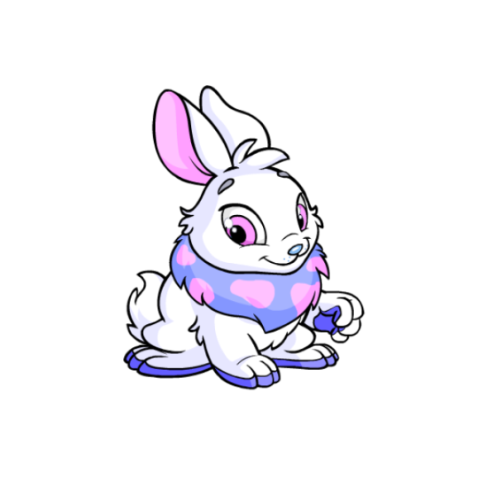

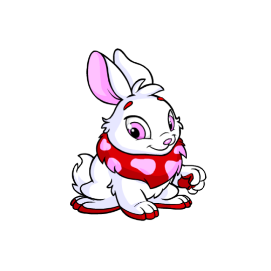

The Cybunny is... drumroll please... a bunny. Strictly speaking it's fairly standard for a rabbit, but the face and proportions make it super cute. The addition of a colorful mane with uneven splotches also adds a lot to the design and gives it almost a permanent Easter-esq vibe. I also like the addition of colored paw paws that extend up onto the base of each foot, which match the primary mane color. Meanwhile, the pink accents in the ears, spots, eyes, and nose add a nice secondary touch of color that's not too overwhelming or distracting (unlike, say, the base color Wockies). Overall, these are some aesthetically pleasing, well-balanced bunnies.
As a side note, my only nitpick is that Cybunnies have these super subtle whisker dots around their noses which are so hard to see that I literally never noticed them until writing this review. Those definitely should've just been dropped.
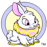
While the raised paw looks a bit weird, I think Cybunnies as a whole were improved with customization. The original art was starting to look slightly dated, and something about the head size and position looks better to my eye, even if it's hard to place why—it's like the original was hunched over a bit, if that makes sense. I also think the ears look quite a bit better.
Favorite Colours:

Halloween: Vampires are a pretty obvious pick for Halloween and this is by no means a fancy design, but man does it look good. I'm a sucker for a good black/white/red palette, and the fangs, red eye shadow, red tail tip, and black cape and ears really all come together to make a great design.

My only nitpick with the conversion of this one is that the cape shape got a bit lost in customization (originally it looked more like bat wings), and also we lost one of the all-time best Battledome poses (above). Also, there was a missed opportunity to make the mane spots look like bats or blood splatters or something.
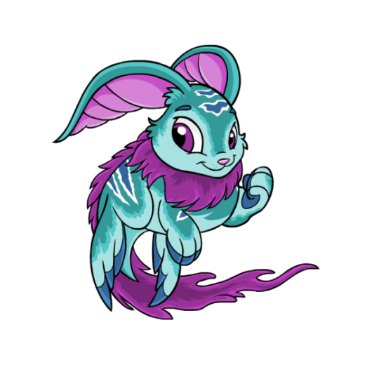
Maraquan: "What if a rabbit was a fish" is a valid question that has to be asked sometimes on Neopets.com, and TNT delivered with this one. The teal and magenta come together really well, as do the long fur and striped markings. The ears also have a really nice shape to them and are much longer than Cybunnies usually are allowed to have.
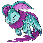
Like the Halloween Cybunny, I do have one nitpick about the converted version, which is that it inexplicably lost the hair on top of its head. Why??

8-bit: I went over this in my 8-bit colour review so I won't spend too much time on it here, but this is just a really nice colour. While not technically "correct" from a pixel art standpoint, something about the pose is super cute and it has a great retro feeling to it.

BONUS: The woodland Cybunny is nice enough that I had to give it its own spot on this list. The flower accents on the mane are lovely and mimic the spots they usually sport, and the wood itself looks great—the grain contours correctly with the body shape and little details like the knothole in the ears really bring the whole thing together. (An honorary mention goes to camoflauge and Christmas, which didn't quite make the cut but I still like quite a bit.)
41 notes
·
View notes
Text
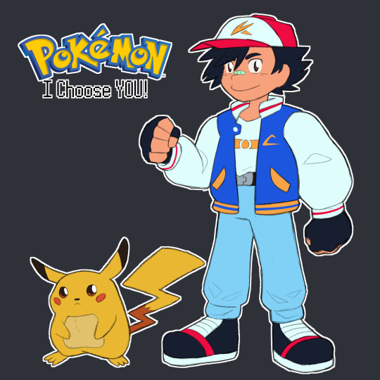
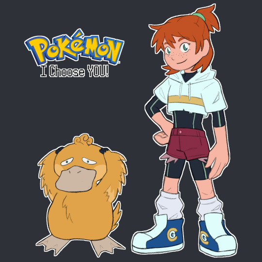


the gang's all here!!
now we're just missing team rocket 👀
inspired by kianamai's redesigns!!
design notes and lil musings under the cut!
Ash takes a lot from Pokespe in terms of his proportions (at least how the early chapters look in my head) and some cues from the newer movie designs bc i LOVE those, especially the one from Power of Us. So ya I also wanted to give him a big poofy jacket bc of i remember seeing an interpretation of Red's original sprite as a big jacket as well and i think it suits Ash a lot. The style was kinda early One Piece inspired at first, so there's just a big of Luffy in Ash's design, but I think it ended up more Digimon Adventure in the end lmaoo. The nose bandaid's to just elevate that rookie protagonist feel a lil bit + I spent way too long figuring out a new hat symbol lmaoo. He's also 11 in this world to match Red's age in RBY.
Pikachu I just wanted to draw him like Red's Pikachu in Special and give him the lighter coloured tummy from early artwork.
Misty's the biggest departure obvs but I knew I wanted to give her a crop hoodie and take inspo from Kiana Khansmith's Misty and give her the wetsuit as an undersuit. Then the chunky shoes were carried over from Ash with big scrumpled socks bc I thought it made her look a lil more unkempt. The whole goal was the make her more scrappy looking and focus in on the whole "Tomyboyish Mermaid" thing from the games. Also combined her RBY hair with her GSC do by making it a half-up ponytail that I think is very cute. OH and her shoes are Cerulean Gym branded, bc I imagine in this world there's merch for each Gym that the leader wear, so the wet suit and hoodie would be branded too. The hoodie's just cropped above the logo and the wet suit's logo's covered by clothes. She's about 12, so a lil older than Ash and does not let him forget it.
For Psyduck, I wanted to make him a lil fluffier and ugly-duckling + incorporate the three lil sprout hairs he's got a lil more to suit the style. He also has a neck now, you just can't see it super well here. He's just a fluffy lil duck who hurt a lot. Poor lil guy :((
Brock was pretty straight forward, I kinda wanted to reference his Sygna Suit from Masters with pants and a tank top, but made the pants into cargo pants that can be unzipped into shorts (he's thinks its the coolest thing in the world. He wears hiking boots to go over rougher terrain as a Rock-type Leader and hunt for fossils bc I like that aspect of his game characterization so I carried it over here, and he wears an armband with Pewter Gym branding. His tiny lil facial hairs are all he can grow at the moment bc he's still like 15 as usual, but he thinks it makes him look ~Older, Maturer & More Sophisticated~ so refuses to shave it.
I wanted to incorporate a lil more Geode Dude into Geodude so I changed his colours a bit and added parts where the outer layers of the rock have kinda chipped away in battles to reveal the crystal underneath + added the eyebrows from Alolan Geodude. I imagine it's like, the more outer layer gets chipped away from a Geodude, the closer they get to evolution. I do not at all know what this world's Graveller or Golem would look like but I think I'd canonise the theory of Machoke and Graveller taking aspects of the other when traded and make them kinda like Karrablast and Shelmet in a way.
Broad plot strokes are just these guys would exist in a version of the indigo league w an expanded kanto dex to include all related mons + variants, so stuff like Electivire and Annihilape and Alolan Exeggcutor would exist in there without much fanfare of ~Woahhhh Newly Discovered Pokemon~. Regional variants would be found on the Sevii Islands. Maybe there'd be small type changes too idk. Like pure Rock Geodude that gain Ground on evolution bc Gravel-ler. idk who knows I'm just spitballin. Essentially just a lil more closely following the Game's story, I guess. Less wacky loose adaptation stuff from Indigo League. Not bc I don't like that stuff, just bc it's not what I'd do.
I figure like, there'd be an interlude short arc that takes place in the Sevii Islands just after the Vermillion Gym where Ash would catch a Galarian Farfetch'd and all forms of Paldean Tauros instead of like, 100 Kantonian Tauros, and be introduced to Legendary Pokemon through a quest to track down the Galarian Legendary birds (then find out others can be found back in Kanto). Naturally he'd use the PC system (maybe adapted as some kind of daycare or something, or maybe just a teleporter to Oak's lab like the main anime) and have a couple more than 6 team members to rotate out as needed. Also. Mega Evolution would be a factor bc I think it'd be cool, so Ash gets to Mega Evolve Charizard into Mega Charizard Y.
OH also just for funsies, I'd split the starters across the trio, so Ash gets Charmander, Misty gets Squirtle and Brock gets Bulbasaur.
Basically Ash would end up with more or less the same team from the original series, but with added Annihilape, Sirfetch'd, Paldean Tauros and Mega Charizard Y. I also think I'd add Dragonite from Journeys and make his Gengar the Haunter he befriended that would follow him in secret after helping him beat Sabrina and evolve in the Cinnabar Mansion + officially join his team there.
Squirtle would evolve into Wartortle with Misty and Bulbasaur would stay in the same stage with Brock like Ash's.
I'll come up with and probably draw everyone's main teams at some point later but. ya. that's my piece!
#pokemon#pokeani#ash ketchum#pokemon anime#misty#brock#pikachu#psyduck#geodude#i say we're just missing tr but i'll probably also do gary and prof oak and delia and stuff hehe#my art
54 notes
·
View notes
Note
I really love Y/N's look, what led you to add things like double rows of teeth? What led you to that design? Was there another one design before?
bonks my head against yours like a cat!! thenks :3
i repurposed an old self insert oc i had as a teenager bc i wanted to be self indulgent! some edgy gothic white haired girl with a fringe over one eye lmao😋 i miss her...
their colour palette is pale and greyish as a nod to the grey Y/Ns in this community, their hair is white bc mine used to be white, and their hairstyle is one i used to wear swimming! i was also inspired by futuristic white aesthetics and Suichu Niso underwater modelling shoots.
i pretty much immediately settled on Y/N as they are here including webbed feet and finger scarring, and then built on more alien features later. the 4th image down is actually the first time i drew them. i think i got the idea for the teeth about a month into writing, prior to the first chapter going up. mostly i decide on things by daydreaming a funny or angsty scenario based on their alien heritage, and then seeing if i can work it into the story without it seeming clumsy or overcomplicating matters for myself. i overcomplicate things a lot😅 for example i'm regretting having two suits. and two subs. why did i do that?? lol
there's a scene coming up soon after chapter 12 involving the teeth and Vanessa - that's the scenario that inspired Y/N's lil shark teeth. i was also thinking that if i met a mermaid i would totally want a scale as a souvenir, but what would be the mermaid equivalent? hair? a fingernail makes me shiver. but teeth, when losing a row is a semi-regular affair, would be cool. even humans collect teeth!
i don't have a concrete image in mind yet for the natives of Y/N's home planet, but it's something in the realm of humanoid-fish-person, scaly, they have hair but it's not human-grade. an alien unfamiliar with humanoids would easily mistake them for regular humans (they got four legs and a little round head, right?) whereas humans and the fish people would be very offended to be lumped in together lmao. as a result i got a lot of freedom with what Y/N gets to inherit! their human-ness is bit of a disappointment to their guardian tho, so they don't get the full deck of fishy cards.
this might be tmi, some rambling about MEEE!! at first the evidence of having alien features removed was going to be more drastic - i thought over flippers surgically mutated into human feet, a missing tail, scales laser-removed - but decided against those. i was having a really tough time with my disability and chronic pain, and i wanted to live vicariously through Y/N, so they pass as able-bodied. i can't run or swim anymore so it's nice that they can. i think the missing finger webbing counts as a disability, esp when taking into account their issues with managing the discomfort from the scar tissue, and having to actively maintain their health to avoid the drawbacks that would arise from this kind of amputation. Y/N should be grateful i wanted to cosplay as able-bodied, otherwise they'd be far worse off😌🫰
26 notes
·
View notes
Text
Rewatching Coraline and here are some things I've noticed so far:
-When Coraline goes to visit Mrs. Spink and Mrs. Forcable, the card on the top of the pile on the table is the five of hearts, but then the pot of candy is removed, it's a four of spades.
-The vehicle The Other Father is driving is a praying mantis, (pretty sure) which is ironic, considering he is killed by his 'wife' in technicality
-The 'Soul' Ring is shown during the performance scene when Coraline is picked up from the crowd
-The Other Mother's red outfit can be slightly seen under her normal clothes when asking Coraline to sew in buttons, possibly representing how her true colours are showing
-Coraline's Other Father has different glasses to her actual father
-The Mouse circus has a 'R' on the 'walls'
-The set of draws shown mere seconds into the film is the bug that blocks Coraline from the Door
-By the mirror where Coraline gets trapped, there is a painting of (I think) her house
-The mask Wybie uses when he pulls Coraline out of the mirror is the chicken oven glove used earlier by the Other Mother
-Coraline naturally has brown hair, shown in a photo after she realises her parents are missing and visits Spink & Forcible
-When Coraline's parents are shown in the mirror, her father is wearing glasses, even though Coraline used his glasses when making her fake parents. They are different types of glasses, though, so it's possible he just has two pairs.
-when Coraline goes through the portal, it's no longer blue and purple, possibly showing how the illusion has been broken.
-The wallpaper in the normal world is vaguely floral, whereas in the other world, it's of beetles.
-When the other mother's creations are destroyed, a sand like substance spills out. It could be a reference to how dry clay crumbles when broken as a link to the book
-Before the whole plot, the snow globe had two figures by the fountain, but when they 'break out' the figures are gone
-The thing holding up Coraline's picture of her friends is a preying mantis
-Coraline's trousers are patched up with the fabric from the star shirt she got from the Other Mother
-The well is designed to look a lot like the tunnel portal
-Coraline has a pinkish mark around her throat when they throw the Other Mother's hand into the well, but it is gone in the next scene, which is funny because a lot of characters have some kind of red 'ring' on them, like the dog's red collars and a bunch of other examples
That is all! I am fully aware that I'm probably wrong with multiple observations and that is okay :)
52 notes
·
View notes
Text

INTRODUCING:
The Elemental Serpentine AU!
In this AU, each Serpentine species is getting reworked! They're all getting new, more varied designs, and I'll be making a lot of new species to align with each elemental power in the show!
I'm also reworking much of the lore surrounding Serpentine, since what we are given is inconsistent, and quite vague.
As of now, I have new designs for each of the Serpentine species that appear in the show! Designs for new species to go with the missing elements will come later.
Please note that this AU is a work in progress; the designs I have here are subject to change!
Details about each species are included under the cut~~~
GENERAL AU STUFF
I decided that I want all of my Serpentine to have tails, instead of just the generals. If they have legs, they end up looking more like anthro lizards than anthro snakes. I'll let them keep the arms, though.
In the show, the Serpentine are covered in intricate details. As nice as these details are, they make it difficult to draw Serpentine in 2D. So, more for my own sanity than anything else, the patterns are getting toned down.
CONSTRICTAI - EARTH
I genuinely hate a lot of aspects of the canon design for the Constrictai. Their non-existent necks and random spikes make them look more like horrible little dinosaur gnomes than snakes. For my design, I let them keep the spikes, but moved them so they weren't sticking straight up out of their head. Most important of all, I gave them necks.
Inspiration: Boa constrictor
HYPNOBRAI - MIND
In spite of how it may seem, I did not remove this species' hood! Real snakes with hoods only 'hood up' as a threat display. I decided to incorporate this into my AU. It's not visible here, but my design has false eyes on the back of the hood. I noticed that the original design has snakes in the patterns, so I've incorporated that in a few places. I think I may have gone too far with simplifying their design, so we'll see how it changes as I continue to iterate.
Inspiration: Spectacled cobra
VENOMARI - POISON
This one has received some of the biggest changes in the AU. I felt the Venomari's extra eyes looked quite out of place in my new lineup, since it would be the only one out of a now larger number of species to have four eyes, so I lowered the number to two. I don't like the original colour scheme all that much, so I decided to take a page out of the poison dart frog book and make them bright and varied in colour. They can have a variety of colours and patterns. Like the Hypnobrai, the Venomari have a hood that can't be seen in this image.
Inspiration: African bush viper
FANGPYRE - FORM
I changed the shape of the head pretty drastically, but the colours are the same, even if the pattern is different.
Inspiration: Coral snake
ANACONDRAI - LIGHT
The colour-changing ability of the Anacondrai is so underutilized that I literally forgot about it until I started rewatching the show with my brother, so I've decided to make it more prominent. In this AU, Anacondrai change colour as a method of communication and expression. They can also change their colour to disappear, just like in the show.
Inspiration: Green anaconda, RainWings from the book series Wings of Fire
VERMILLION - FUSION
Each of the Serpentine are born or hatched without visible limbs, appearing as ordinary snakes to the untrained eye. While most species undergo a metamorphosis at a young age, emerging with two limbs, Vermillion do not, and remain in a larval state for their entire lives.
Inspiration: Garter snake, axolotl
MAARAY - WATER
According to the fan wiki for Ninjago, these guys are supposed to be eels, but I thought they were Serpentine when watching the show, and they have the same head model as some of Aspheera's lackeys, so I've made the executive decision to make them Serpentine in this AU.
Inspiration: Yellow-lipped sea krait
#ninjago#ninjago serpentine#ninjago constrictai#ninjago hypnobrai#ninjago venomari#ninjago fangpyre#ninjago anacondrai#ninjago vermillion#ninjago maaray#ninjago elemental serpentine au#crying over art#btw PLEASE google some of the snakes i used as inspo they are so beautiful#especially the african bush viper and yellow-lipped sea krait
25 notes
·
View notes
Text
Capt. Medic Ila "Bruise" Woods

Mainly going by Bruise, but Ila by close friends, she's the Medic of TF Arach, and Captain Medic to other medics in the field.
NONE OF THIS INFORMATION IS OF ACTUAL PEOPLE, SOME DETAILS ARE TAKEN FROM MYSELF BUT IT IS NOT BASED ON ME!!!
TF Arach Masterlist
DOB: October 6th, 1990. [33 years old]
Relationships: ↓
Merils Woods- Husband <alive> {She took his last name}
Janiel "Jani" Woods- Daughter <alive>
Bucky Woods- Son <dead> {miscarriage :'(}
June Morial - Mother <alive>
Simon Morial- Father <dead>
Jack ////////-Uncle (Father's side) <alive>
//////// Bensick- Uncle (Mother's side) <alive>
Alice /////////- Aunt (Mother's side) <alive>
Lucy Morial- Sister <alive>
Quinn Potis- Sister <alive> {used to be married, partner died}
Evelyn "Vely" Morial- Sister <alive>
Ben Bensick- Cousin <alive>
Harold Morial- Cousin <alive>
Lilian ////////- Goddaughter <alive>
Physical details: ↓
Head: Blonde, ear length, relatively curly (2C-3A) hair. One green(left) and one with cataracts(right), round and medium-set eyes. Snub-like nose with a visible upturn. She has thick lips with a thicker upper lip and a circular, slightly chubby face shape.
Body: Ectomorph but slightly thicker, Kite(?) shape. Large bust small hips, she's got tig ol' bitties tho 😫(I'm a sucker for women like that)
Marks (scars, birthmarks, tattoos, missing limbs, etc.): Her abdomen has a tattoo all around it with flower designs. She has no birthmarks. She's got some scarring from a poison dart on her back from trying to escape a captor(it looks like a dark fluid spreading on her back), one from her hairline to her eye from stray shrapnel, resulted in cataracts and ~25% blindness in that eye. And frostbite scars across hands and calves from an incident..(ooh~~). Her missing limbs include her left pinky and ring fingers, and her right leg (mid-thigh and lower gone) from torture while held captive. She also has a tongue piercing.
Other (height & weight stuff, skintone, nationality, etc.): Her skintone is tan, lots of freckles cover her skin. She lives in Australia but has an origin in Las Almas, her parents and other family live there, she moved to Australia. She is 5'11" (1.79m) and weighs 188lbs (85.2 kg). She tends to wear 2000s type clothes, sports bras, torn or worn cargo pants, colourful jackets, etc, and she loves her crown-like jewelry, makes her feel pretty.
Personality details: ↓
She's an open Bisexual to friends but not family, she's on the romantic or sexual spectrum as polyamorous(her and her husband are ready to add a plus-1). She is a Demi-girl and struggles with gender dysphoria very occasionally. She finds nature-like colors like forest green or mushroom brown quite pretty but will not admit that if there's a cool psychedelic neon yellow shirt, she will try it on. Outside people describe her as loud, rude and annoying. People she knows well however, describe her as still loud, but just reserved and distant, quoting something I imagine one of them saying: "she's rude when you first meet her but she warms up quickly as soon as you know her name". She is an ambivert, she uses social interaction to avoid her mental health but sometimes shuts down and can't even leave her room (Arach has a hitch that something's wrong but hasn't caught on fully yet). She's got no sensory issues that are prominent. And She does have mental disorders, including PTSD (ofc), Speration anxiety and rhotacism (she has difficulties in pronouncing the letter r).
And Military info!: ↓
She joined in 2009 at 19 years old, and was transferred to be in the SNS 3 years after joining. She has skills in basic, and advanced medical aid including field operations, Undercover missions, close range combat and some long range, and hostage rescue. But she has difficulties in keeping her emotions in check when in the field, along with using drugs (like morphine or adrenaline bc of being poisoned in the past).
Basic picture using gacha (I use it to visualize what they will look like with color)

Pls don't mind the leg next to her arm 😭 I had to get rid of it somehow
And I will insert a photo I drew below (it will not have color)
I will add the picture as soon as I draw her.
I'm sorry if it's too long, read if you want but you really don't have to, she will be basically described in the fic.
#call of duty modern warfare#call of duty mwii#call of duty#call of duty oc#call of duty original character#cod mwii#cod mw2#cod#cod oc art#cod ocs#cod original character#cod oc#mw2#mw2 oc#mwii#mwii oc#Trill's OCs!
12 notes
·
View notes
Text
Sometimes I wanna draw and then I realise I can't draw
Anyway. WIP! I feel like this'll be fun if I keep going but I have a tendency to lose all motivation if I leave it so I usually do things in one shot. However, I need to go to bed.

I feel like this is a lot of research that people will never see unless they themselves are Mexican but one of the reasons I make/draw things like this is so people feel seen. I looked over a couple things for this, quite fun! This is supposed to be a chiapaneca dress, but I am not used to this more "realistic" style so the dress actually needs to spread out more. It's so pretty though! Will either be very fun or very torturous to colour
This is Paloma! I haven't started on her wings and at this point I'm not sure how to add them in. She's Mexican and was a fashion designer. I'm using that as an excuse to continue putting eyeliner on Alexis, who she is friends (?) with. She's older than him.
I have seen somewhere that Spanish Spanish and Mexican Spanish are slightly different, the two should still be able to communicate. I don't know what you call a "big sister/miss" in Spanish, or if that's even something you do. I guess Senorita would be it? I'm trying to convey that Alexis is showing respect to her though, so that feels like it's not it.
I'm debating between wing styles also. I think colourful wings (Like a parrot) would be pretty, and not as common as dove wings (Which are her namesake). Also it was while I was looking those up that I found out the Mexican flag has an eagle on it! The golden eagle wings sound pretty interesting, if a little bit drab, but having her be tied to the national bird would be fun I think. And lastly, wood pigeon wings, which are also her namesake, only in Latin.
#If any Mexicans stumble across this and don't mind sharing things about your culture feel free to dm me or send an ask#I have many questions.#I prefer to have someone to directly ask since looking stuff up on Google can be a little bit. You know#Have to scroll down so far to find the wiki article now#Honestly anyone can just dm me about this#Learning about cultures is fun and having accurate representation is awesome#If you are Spanish please please please give me outfit ideas#Alexis is probably my favourite boy and I still don't got an outfit for him#I wanna dress him up like a Genshin character.#Say what you will about Genshin and representation (Not good) but#I really love seeing those posts where they can point out exactly what the character is wearing and the history behind it#Like I wanna make something like that!!!#sweetmountainseeds#plagues blessings and journeys#my art#wip#work in progress#mexican
25 notes
·
View notes
Text
10 (Mostly) Spoiler-Free Reasons to Watch Pretty Guardian Sailor Moon 2003 Live Action
A countdown to the 20th anniversary of Act 1 air date!
Reason 4: The Costumes!
Yes, I'm serious. No, I'm not necessarily talking about the Senshi costume, though they aren't bad especially once you can appreciate the bulkiness is due to the necessity to protect the cast wearing them - let's be honest, wearing a skimpy sailor fuku isn't that realistic for battles (yes, I said it). And they get points for being more faithful to the manga material than ��90s anime was.
Thematic, colour-coded, stylistic choices for the Senshi
Many fans know that Takeuchi Naoko is a fan of high fashion, just look at many of her official art that uses runway fashion! While the live-action isn't about that, the costumes team was certainly phenomenal in providing the Senshi with a stylish and thematic selection of everyday clothes that speak to their respective personalities. And frankly, the girls' daily wear feels pretty timeless for a series that's 20 years old.
Their costume choices were even explored in the "PGSM Complete Edition Memorial Book". As a treat, I translated the comments here:


In addition to this, generally speaking, Usagi, Ami and Minako's outfits are pretty feminine, next is Rei's which is a bit more of a mix of feminine and unisex, and Makoto's is mostly unisex, though I wouldn't go as far as say it feels masculine.
Symbolism in colour!
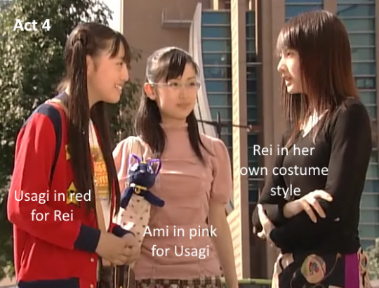
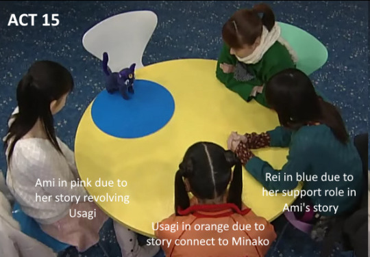
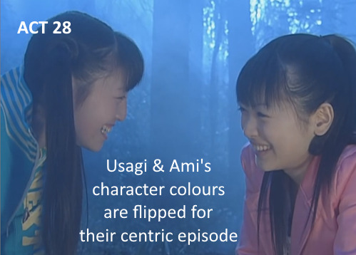
While the girls supposedly are matched with their own signature colour and stylistic choices for casual wear, they do switch up the colours often. The girls' costume per episode is occasionally symbolic of their dynamic and relationship when there's significant character interaction in the episode's plot. Some examples:

I’d also say that Minako's general style of black and white is quite symbolic as well given her character story in PGSM. But I'll leave that for another time when I introduce PGSM's spin to Minako's character later.
Seriously, this show is one where you can rewatch time after time, and you'd still find MORE symbolistic things slipped into the product, either subtly shown right in front of your face or hidden in the background. It brings me much joy when I feel like I caught another glimpse of symbolism in costume choices.
Past life Earth Kingdom style(?)
The Shitennou, Queen Beryl and Prince Endymion's costumes all got a huge upgrade in their design. The overall designs are a lot more ornate with golden or silver trims, and the intricacies seem to be of the same design, suggesting that royalties and guards of the Earth's Kingdom from the past life get their uniforms designed by the same designer?

I truly love that they colour-coded the Shitennou! The original manga/anime design was so plain it almost makes me think they feel more like foot soldier's uniform, only Kunzite had a cape to be fancy. In the live-action, all of them have capes and they are well-used! There are many mighty and flashy cape-flicking in the series!
I especially appreciate Beryl's costume, the ornate design just seems a lot more befitting of the queen. They managed to make the costume sensual but not sexual and also found ways to make the random horn on her shoulders stylish without making it seem like she's grown horns. Honestly, it was an amazing casting choice too!
Fun random costumes:
Similar to Usagi's gadgets allow her to transform into different costumes and personnel for sneaking into situations in the manga/anime, all Senshi have the means to copy any costume/clothing for situations as needed.
This leads to some hilarious and generally awesome scenes with the ladies dressing up in all sorts of random clothes. Some examples:

Like I said, the show doesn't take itself too seriously, despite some twists and turns they added to the storyline!
You can watch the subbed versions of the series at:
Miss Dream Fansubs
Sea of Serenity Fansubs
The series is also on other online streaming sites, but be cautious to only visit them with good adware and firewall installed.
7 days till the 20th anniversary of Act 1 air date!
Part 1 | 2 | 3 | 4 | 5 | 6 | 7 | 8 | 9 | 10
#pretty guardian sailor moon#pgsm#reasons to watch pgsm#bishoujo senshi sailor moon#sailor moon live action#bssm#pgsm 20th anniversary countdown#pgsm appreciation#pgsm costume#khmyh translates#khmyh's fansub & translations
31 notes
·
View notes
Note
How do you feel about the upcoming DCTL graphic novel?
Cautiously optimistic!
When I first heard the rumours, before Adrienne’s announcement, I had pretty mixed feelings. My background is in comics, like that’s what I went to school for and worked on semi-professionally for years, and I love it as a storytelling medium, so I’m really intrigued to see how they handle the adaptation…and I also really, really don’t envy whoever has to make decisions on how to depict these characters.
But the announcement is encouraging! I haven’t kept up with Chris Hastings’ more recent work, but I remember enjoying Dr. McNinja back in the day, so I have to admit there’s something exciting about seeing a name I recognise and can be hopeful about to do a good job with the adaptation. Checking out the artist’s work, I’m gonna put a lot of my poker chips on “Sammy will look really normal actually,” but I don’t think that’s a dealbreaker – like, Dober’s Sammy is a big fav as far as Sammy designs go, and I think he’s a good example of how you can still get great Sammy vibes in a more conventionally attractive face. (though i also think there’s a chance of “the artist will lean fully into his unhinged vibes and make Sammy look like a batman villain” so wE’LL SEE!!) Genuinely, the artist’s portfolio seems well-suited to this. I would’ve pictured DCTL with a rougher, more indie look if you asked me to pick a fitting style, but I think this artist's slick Western-Comic-Book style with its strong spot blacks could be a REAL good fit for the inky vibes this story demands, and they don’t have the level of “sameface” that I’d usually be concerned about with these kinds of styles; there’s enough solid variation in their character art that I believe they can handle all the characters needed, and also do a cool ink demon.
DCTL does have some design questions that are genuinely pretty fraught, in that there's no perfect way to handle it (Norman’s a great example; do you take someone that 80% of the fandom has been drawing as a black man for years and make him canonically white, or do you present the Weirdo Creeping Around In The Shadows Who Mysteriously Gives The Protags Supernatural Info And Then Dies At The End And Nobody Misses Him as canonically a person of colour??? ROUGH CHOICE I DO NOT ENVY), but I'm still so curious to see designs for these guys, and my big hope is that the fandom will be understanding of the huge task the creators have been given and that this won't be regarded with the pressure of getting “The Official Canon Design That I'll Be Mad If It Josses My Interpretation” – like, getting an official Henry & non-old-man Joey in BatDR just felt like, y’know, seeing anyone in the fandom make a new set of designs. It feels like drawing fanart of the BatDR AU; it doesn’t mean my henry and joey designs are Obsolete. And I hope these designs are enjoyed from that perspective, as a new DCTL Comic AU, and that the fandom takes whatever we get as less THIS HAS TO MATCH MY PERCEPTION OF SAMMY B/C ITS THE OFFICIAL REAL SAMMY and more just, a take on a design for Sammy Lawrence.
Though of course I can’t help but be a little more anxious about Sammy specifically, haha. He is my big fav after all, and as embarrassing as he is in DCTL it has become a part of his story I’m quite attached to. A lot of humanity could be added to him or taken away depending on how he’s drawn… I don’t want to get my hopes up, but it’s hard not to hope that he’ll have Good Sammy Vibes that Resonate With Me Specifically.
And in general, my expectations are still tempered – the comic could certainly turn out to be very mediocre, especially depending on how well the artist is paid and how much time the creators can afford to put into it – but tbh I’m super interested in how this turns out. I can’t wait to see Joey in this style and it’ll be SURREAL to see a comic of like……. BatIM humans…… I’ve wanted sincere visual content about the humans for a long time and I’m stunned we’re actually getting it, so I’m feeling kinda cautiously eager!! I’m also curious if the comic will make an effort to preserve Buddy’s “voice” from the original novel, and how that will be handled – like, the whole book is really strongly framed as being written by Buddy, and that’s not just an incidental detail; it fleshes out his feelings about Dot, ambiguously gives us info on Boris without directly revealing the ending, and shapes the way he presents some moments as unreliable and time jumping strangely – he even talks about the frustration of not being able to just draw these things and having to describe them! (RELATABLE) – but at the same time, just filling a whole comic with tons of narration boxes is not usually a great artistic choice. It’s a really interesting challenge for the adaptation, and I’m curious if they’ll shift away from the framing device altogether or look for a balance to keep it.
Anyway TL;DR I’m keeping my expectations low but I’m really intrigued!! I don’t know if I’ll, like, actually acquire it; I usually don’t buy JDS Inc. stuff, but I feel more wibbly about the books in general b/c of how strongly I appreciate Adrienne Kress specifically, so we’ll see how I’m feeling when it comes out, haha.
49 notes
·
View notes
Last Seen Blogs
slugspoon
alivia horsley

andyreynad-blog
Sin título
frostbranch-blog
Thane of Cats

icy-rogers
steve rogers is a punk ass bitch
ninapop
Perfect time