#the pattern repeats and also features objects from all of them
Text
Ashley, please do not send me anymore sweet hearts with symmetry objectively probably mini Sweeney S. faces and you’re still expecting me NOT to grab her/them/others by both wrists and take them to Sam Heaven; I am having such eleven raised eyebrows and wide eyes at you and also me for having such loyalty to your face. When you’re sending angels down from Heaven still to ?!?!? Show me ‘support’ from attractive privileged whites AND blondes at that. More Ashy sillyness like it’s written on the syllabus of you’re wAy to Star heart mind connection to BE STILL testing me //us?! with. Can we( mostly YOU) forget this pattern ever existed.
My sweet dumbdumb Ashy candy …acquire a lollipop like feature if u must to CASTAway this weirdness out of your heart. I will still love you and want to have all the romance and all the family fun times with you. Only you. Boring times for a Sam who can bearly stomach any kind of stupidity repeats going on from my All-time #1 love of my life. Astonishing.
#shezus christ#slow learning alert#bad bitch who still does not know she is the badder symmetry in the relationship#hand1#also will not allow me to be better at her in intellect#ashley frangipane#weirdo#art kids are the worst
4 notes
·
View notes
Text
Thinking of How Memory Works: I have a very selective memory
I can memorize full names from sight, even with unique or complicated spellings. In my mind the spelling is barely separable from the name itself, so jaden, jaadyn, etc. are basically separate names to me.
This doesn´t always translate to regular words though (I almost spelled ¨regular¨, ¨reglar¨ for example. There have been times when I was very tired that I would end up writing ¨ove¨ instead of ¨of¨)
I once reminded my mom what the maiden name of her childhood best friend was because I saw it on the backs of old photographs
I used to have my library card number memorized. I can learn how to memorize strings of numbers by their ¨rhythm¨. Kind of like when you hear a familiar song and your brain has to finish what comes next.
If I don´t quite have a number memorized, I can try and figure it out by the pattern. To give a non-number example, ¨ferret¨ is symmetrical to me, like a mirror image. There are two ¨r¨s in the middle, an ¨e¨ to either end, and a long letter capping either side. For another example, (with the numbers changed of course, but keeping the pattern), my own phone number: 271-888-7811. 2 is a non-repeated number, but 7 and 1 are. Of course the middle is just three 8s which is easy, but for the last four digits it almost repeats 71 but instead takes an 8 from the middle after the 7 and repeats the last number twice. The first three numbers are the hardest for me to learn because my old phone number had a different but similar area code, 723 lets say, so my brain keeps trying to flip the first two numbers.
I hate rote memorizing things and I am not very good at on-the-spot recall. Once I was in a play, besides rehearsals I did not try memorizing my lines. So when it was performance time, I barely remembered anything about my lines, it was all blank. However, they would come to me through context clues. How much time had passed, where I was standing, what people were saying. The same would happen in choir, where before performance, I would doubt whether I remembered my lines, but as soon as the music played it was as if it possessed me. (I remember watching The Music Never Stopped, and there are real life examples too, where even people with amnesia can gain back memories through listening to music)
I learned that I have object permanence issues. If, for some reason, a roommate took a dirty dish of mine that they saw and washed it and put it away, I might not be able to find or recognize it out of context unless it is very distinctive looking. This may also contribute to who I tend to prefer distinctive looking people (alt styles, people with distinct features, etc.).
Once while riding in a van to a field trip, I found out that the person I was sitting next to was not only my classmate for the last two quarters, but was in my first class when I started college. They gushed about me, and how thoughtful I was in class. As far as I knew, I was basically in a van full of strangers. I didn´t know any of their names or have any association with seeing them before.
However, I don´t have face-blindness, I can actually be excellent in pattern recognition. I have recognized classmates from high school totally out of context: Once 8 years later while cashiering and the person was wearing a mask, they didn´t even recognize me; once in a Starbucks in a big city out of context of the small town I met them at; once in a grocery store, the person had totally transed their gender since I last saw them, grew facial hair an everything. I totally won this real life ¨where´s Waldo?¨ without even trying.
There have been times in middle school where I would consistently get 100% on my science homework even though I didn´t finish my homework or completely recognize the material on the quiz, it would be a surprise every time. I just needed to be exposed to the topic´s ideas just enough to reason it out.
My memory often feels like a void that pulls things out when I need them, the more connections I have to the subject the better. I often need to understand knowledge in order to use it
I am not very good with procedural knowledge. One of the reasons I can only tie my shoes the ¨bunny ears¨ way, even though I have been shown the other way multiple times throughout my life. I don´t really learn recipes, but I can learn how ingredients are supposed to fit together, I can improvise a cookie like or soup like thing or cook noodles in different ways (like in a microwave using V8 as water), or figure out substitutions (living with a mother with allergies is what I can thank for that).
Sometimes I easily forget what I did earlier in a day, or yesterday, or what my last meal was. I notice that the degree to which I remember a day doesn´t totally correspond to how much happened but how much I processed it. I am a fairly slow processor so a leisurely paced day might be more vivid to me. Or if a lot of things happened I may need time to reflect to remember it.
For example, I could spend a month abroad, but as soon as I come back I start losing memories because they are not applicable to every day life. But over time I could remember it in some ways more than I did when I first came back if things happen in my life that reminds me of it (having a professor who does research in Borneo, a classmate that knows some Indonesian, etc.)
Sometimes I notice changes, but I don´t remember what they looked like before. Like I can recognize if someone got a haircut, but my memory instantly updated so I actually don´t remember what the old hair cut looked like. Same if a room changed (furnature, walls painted, etc.).
I have a poor sense of smell, so descriptions I have heard before about smells triggering memories doesn´t resonate very well with me. The strongest examples are the smell of baked potatoes reminding me of an old friend and cigarette smoke reminds me of hugging my dad.
My sense of direction is again more of an instinctive process of cues than a deliberate process. So sometimes I have a very poor sense of direction, like not remembering where my classes are after a whole quarter. Or I may know how to get somewhere, but I don´t know how I know. This works better in forests than in streets, where the cues and orientation are more unconscious, and I end up finding out where I am through wandering and process of elimination as I make connections of where things are in relation to each other.
Ergo, my memory is very relational, and relies on pattern recognition and understanding underlying processes. For example, I remember more the personalities of people or characters than what they actually look like. In my mind they are more of a ¨presence¨ than an actual physically person at times. When I was a kid, I drew my best friend with red hair not because she had red hair but because that was her favorite color, so in my mind that ¨was¨ her. When she changed her favorite color, I felt like I didn´t know her anymore.
My mind doesn´t make a strong distinguishment between my memories and other people´s. If friends or family tell me memories from before I met them, it is almost like I was actually there and knew them at that point in time. A passing trans man told me memories of his family and childhood, over time there was a preteen to teenage girl´s presence in my head that created her face and voice who would talk to me. I didn´t want that association, but I had an overlap of two images for the same person, one not even being a version of them that I met. In some ways, I feel like I almost learn more from other people´s experiences than my own (ex. stories about teenage drinking would discourage me from teen drinking or even having the curiosity to try, I tend to make mistakes other people have not accounted for because I don´t have a frame of reference to know ¨why not?¨ if no one i know has experienced it)
I used to recognize family members by their footsteps, breath, and even their cough without even seeing them.
At least twice I have predicted things friends would say, like once I somehow already prepared a conversation the year before of how to respond if my guy friend asked ¨what it is like to have breasts?¨, because he seemed like the kind of person who would ask something weird like that. Another time I wrote a whole story about a high school friend using a tree to crawl into my bedroom window, and later the first thing she mentioned visiting my room is that they could climb that tree to get to the second story
I have often remembered very oddly specific details of how I met a close friend. Once example being that years before I met a middle school best friend, I looked at a list of students and noticed there was one person in my grade that I never met and who never came in, and I asked the teacher why (her parents taught them mostly at home even though she were enrolled into the alternative school).
#memory#how memory works#my memory#I like comparing this stuff with people#sometimes there are similarities but other times people´s answers have surprised me
1 note
·
View note
Text
Reflection (A Short Horror Story)
Hey all! I've got another short horror story for you all, this one is in my opinion one of the best I've written, so let me know what you think!
Have you ever taken time to look at yourself in the mirror? I don’t mean to glance at the mirror to fix up your hair or to shave while looking in the mirror. What I’m asking is if you’ve ever really looked at yourself in the mirror, examined your features, the pores in your skin, the colours in your eyes.
I find that there is something so ethereal about mirrors, something brilliant that everybody takes for granted. I also find that there is something unsettling about them, and from what I’ve read online, other people experience this feeling too. Maybe it’s that the image is reversed and that’s why it doesn’t look quite right, or it could be that the mind becomes confused when it sees itself.
In my case, the reason I find mirrors unsettling is not any of the guesses I have made thus far. I am unsettled by mirrors because of an experience I had as a child, an experience that has never repeated itself, but that scarred me nonetheless.
I was around nine years old at the time, and I was living with my Mum and Dad, my younger brother wasn’t born yet for another two years after this event so I was an only child. We’d only recently moved into a new house and even after a couple of months were still working on unpacking our things.
My Dad came into my room one day, a little before lunchtime and placed a couple of boxes on the ground, he told me that this was the last of my possessions and told me that I should unpack them. I told him I would and once he’d left my room I got to work on unpacking my things.
The majority of the contents of the boxes were the ordinary things any nine-year-old would own, toys and children's books, the latter of which I put on my shelf with little regard for organisation and the first I spent more time playing with than I did unpacking the boxes.
After a long while I had nearly finished unpacking the boxes, I reached into the box and felt the last object that I needed to pack away. It felt cold to the touch like it had just been removed from a freezer, and I couldn’t imagine what it might be, as it didn’t feel like any of my toys, and it certainly wasn’t a book.
I pulled the object out of the box and to my surprise, what I held in my hands was a handheld mirror. It looked old, I’d go so far as to say Victorian-era old, but despite the apparent age, it was clean, not a speck of dust could be found on the thing.
The handle and outer rim were made out of a bluish-white metal and had beautiful, swirling patterns engraved into it that I couldn’t take my eyes off of. I looked into the mirror at my reflection, at first I noticed nothing out of the ordinary, but after looking at it for a few seconds I had a feeling that something was terribly wrong with what I was seeing in the mirror, although I couldn’t quite put my finger on it.
Feeling freaked out, I put the mirror away. For some reason I didn’t want to leave the mirror where my parents might find it, I was worried that they might tell me that the mirror wasn’t for me, and take it away. I didn’t want them to take the mirror. Not one bit, so I hid the mirror underneath my mattress.
After I hid the mirror I mostly forgot that it was there for at least a few weeks. One night, however, I woke up in the middle of the night after I had a nightmare, I don’t remember the exact context of the nightmare, but I remember that it had something to do with my reflection.
Instead of crying and running to my Mum and Dad’s room like I usually would at that age after having a nightmare, I found myself digging around under my mattress and pulling out the strange mirror I had found weeks earlier.
The mirror was still cold to the touch, and although I felt the patterns I’d been so entranced by previously engraved into it, I could not see them in the dark. That’s what I found most strange about it, although I could barely see my hands in front of me in the darkness, when I looked into the mirror the room was illuminated perfectly. Strangely this did not strike me as odd, it made sense in my mind that the mirror would show me my reflection, not caring whether or not there was light.
As I stared into the mirror, I felt that same feeling I had when I first looked into it, that something was terribly wrong, this time however, I did not put the mirror away. I wanted to keep looking, to try and figure out what was wrong with the reflection in the mirror.
I moved my head from side to side, examining every object in my room through the reflection shown in the mirror, and it was as I did so that I realised why the mirror had unsettled me so much.
Mirrors reverse the image that is shown in them, if you were to look into one and move your head left to right it would show you moving it right to left, because it isn’t showing what is in front of you, it’s showing what is behind you. But as I moved my head left to right, the mirror too, moved left to right.
As this realisation dawned on me my mouth opened in surprise, but instead of doing what it was supposed to and open its mouth, the reflection in the mirror smiled at me. It smiled at me.
The reflection in the mirror was smiling at me, and it was not a kind smile, it was the most cruel smile I have ever laid eye upon. The smiling face in the mirror that resembled me continued to widen until it was at an impossible length. The face began to warp as the smile stretched and wrapped itself around the reflection.
I could have screamed, but I didn’t feel the need to. What was going on in front of me had the same normality in my mind as the room in the reflection being lit up. I knew it was wrong, I knew I should have been terrified, I’m even terrified recalling it now. Despite this, I did not scream, I did not put down the mirror, and I didn’t throw it across the room and run to my mother and father.
I sat there as the face in the mirror continued to warp. I sat there as the once cold metal began to glow red hot and burn my hand. I sat there throughout the night, in more pain than I’ve ever felt as the mirror burnt my hand. I sat there as my parents screamed at me to snap out of whatever daze I was in and tried to pry the thing from my hands to no avail as I sat there with a death grip around it and a need to stay there and to observe the reflection. It was only when my father took a baseball bat and smashed the horrid thing to pieces that I dropped it.
The mirror lay there on the ground as my parents tried to tend to my hand, ultimately to no avail, the mirror had burnt it to the point that it would never be usable again, it had to be amputated.
I sat there, dazed and in pain, and I smiled.
#author#self publishing#writing#writeblr#authors of tumblr#writer#fiction#horror#horror story#horror stories#short stories#short story
0 notes
Text

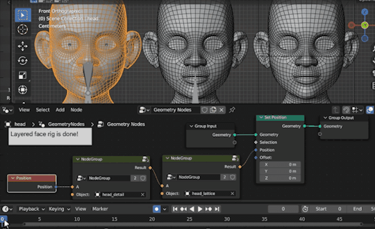
Layered Face Rigging In Blender
Live shape keys in geometry nodes
Live blendshapes in Maya or morph targets in Max have been a common rigging practice for long time. Live updates on shape targets allows riggers to create more complex and flexible rigs by layering rigs. It means you can rig each shape target independently and combine them as one facial rig on main face mesh, all without needing complex setup typically required when working on a single mesh.
Unfortunately blender shape keys doesn’t support live update from source shape targets. It only stores 3d coordinates of each shape key inside the main object. But with the recent geometry nodes feature, we can now add different meshes as live sources and create rig layers.
Basic Setup
We’ll try to create 3 layer face rig. On the original mesh, we will control general areas of face and go into details on second mesh and have lattice on third one. You can find tutorial files here. See gif below to get the idea.

Geometry Nodes
We add a geometry node modifier to main mesh from modifiers tab then create first layer as shown below image.
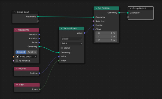
It’s a simple graph, we get vertex positions of second mesh from ‘Object Info’ node and set to original mesh. See the result gif below.

We repeat same steps for second layer for getting its vertex positions. Then we use ‘Mix Color’ node to add those two source mesh vertex positions together. But there is one caveat, since we add both positions together, main mesh will be twice as big. To prevent this we subtract original mesh vertex positions at the end. So we only receive changed positions from source meshes. Check graph below.

Second layer result well be as in the gif below.

Done! We successfully added 2 layers to our face rig. Some of you may see a pattern here. Instead of creating and connecting all those nodes for each layer, we can make it modular by grouping layer nodes. See gif below.
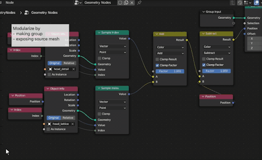
After grouping layer nodes, we can expose the object input so we can easily assign layer meshes from group node.
Now its ready for chaining. We replace first layer nodes with the group by cloning our first group and assign firt source mesh. Then we connect each layer starting from original mesh. See gif below.

Almost perfect, see results below.
As bonus we can also add blending factor for changing influence each layer. To do this we simply expose ‘factor’ from add and subtract nodes.

That’s it. Hope you find this useful for your rigging projects. You can find tutorial files here.
0 notes
Text
HOW TO MAKE THE MOST OF 2D DRAFTING IN VECTORWORKS FUNDAMENTALS
HOW TO MAKE THE MOST OF 2D DRAFTING IN VECTORWORKS FUNDAMENTALS
Traditionally, 2D drafting has been the most common way for creators to design. But, in the past couple decades, 3D modeling has become more and more effective. To get more news about 2d drafting, you can visit shine news official website.
So, it begs the question: What's better — 2D drafting or 3D modeling?
Luckily, Vectorworks’ hybrid drawing environment means you never have to choose, and you can design without limits! You can seamlessly toggle between 2D and 3D views, meaning you can freely create 2D documentation and expressive 3D models in the same software.
KEEPING YOUR DRAWINGS IN ORDER
Fundamentals’ versatile design layers help you draw to scale on a wide-open canvas, accommodating projects large and small. Design layers enable you to keep various design options or multiple iterations of a design well organized.
MAKE YOUR BEST DRAWINGS
You’ll be able to impress clients and consultants with top-quality graphic attributes in Fundamentals. And when creating your next design, consider starting in the attributes palette. Here, setting and adjusting line weights, fill types and colors, object opacities, drop shadows, and more can be done with ease.
If you want to keep these attributes consistent throughout your file automatically, you can use classes. Classes let you assign attributes to similarly classed items.
You can also seamlessly add external media like PDFs, DWGs, and other image files to your designs. The files can be used as background materials or even offer additional detail and information to consultants.
After you have your geometry sketched out and your design layers organized, you can start adding greater detail to your 2D plans by adding resources. Resources in Fundamentals consist of many kinds of reusable, repeated objects such as symbols, hatches, tile patterns, and even annotation items like title blocks or drawing labels. By being able to repeatedly use the same symbols, your design process will become more personal and efficient.
You can use existing resources, or you can modify them to suit your needs. You can also build your own resources from scratch to meet the specific demands of a project.
TAKE YOUR DESIGNS EVEN FURTHER
While we’ve mainly focused on creating stunning 2D drawings in this post, it’s worth mentioning once again that you can effortly switch between 2D drawings and 3D models, letting you ideate, express, and take your designs even further. Simply put, you may not be getting the most out of your 2D drafts if you're not also exploring your designs in 3D.
Commands and features like, Extrude, Deform, Offset Edge, Push/Pull and more will allow you to sculpt and articulate your geometry in seconds. And, if you get overwhelmed in a 3D view, don't worry! You can simply toggle back to your 2D view and Vectorworks will inteligently show you the geometry you need to see!
Fundamentals hosts a suite of versatile 3D modeling options for you to use, such as solid modeling, meshes, NURBS, and subdivision modeling. There's no need to go back and forth between other software, all of your modeling can take place in Fundamentals.
And as you grow more and more comfortable exploring 3D modeling, you can start to lighten your 2D workload with 2D components for hybrid objects. Watch the video below to learn more about fully integrating 2D and 3D workflows:
0 notes
Text
Ridiculous Situations And Funny Punchlines 22 New Comics By This Artist
Ridiculous Situations And Funny Punchlines 22 New Comics By This Artist
We occasionally experience days when it appears as though our entire world is crumbling, therefore we sometimes need a break. Many people use reading comics as a coping mechanism for the extremely stressful world we live in. With that being said, we're rather confident that "Cheddar Bacon Studios" will brighten your day.

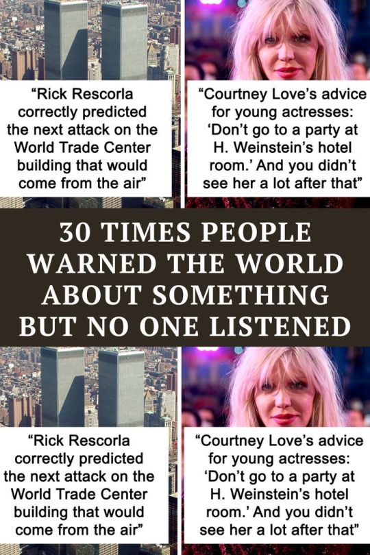
30 Times People Warned The World About Something But No One Listened
There have been many instances in our history where someone warned us about something, but we didn't listen at all. It seems that before almost any major event, a doctor, scientist, or politician already knew the outcome, but was simply ignored. It seems to be a repeating pattern, so the question this Redditor asked sparked a lot of interest from internet users.
50 funny yard signs people have posted in their yard
That's one way to make people laugh.

Artist Paints Home Interior In An Unusual Way To Create A 2D Illusion, And Here Are 33 Pictures Of
Anastasia Parmson, an award-winning artist from Estonia, perceives both living areas and objects in an unusual way. She turns each object into the art piece itself and then arranges them in a way to represent a normal room.

The Brain Dump -- An Overthinker’s Secret Weapon | Filling the Jars
Here’s how to do an effective brain dump and create a productive action plan. Grab a printable ‘brain dump page’ -- the perfect tool for overwhelmed overthinkers.
83points FacebookPinterestTwitter We occasionally experience days when it appears as though our entire world is crumbling, therefore we sometimes need a break. Many people use reading comics as a coping mechanism for the extremely stressful world we live in. With that being said, we're rather confident that "Cheddar Bacon Studios" will brighten your day.Jared, the artist behind the comics, has been previously featured on Bored Panda and you can find more of his comics by clicking here!More info: Facebook | Instagram cheddarbaconstudios ReportJust like last time, Bored Panda reached out to Jared with some new questions! First, we asked the artist if he has any upcoming series of works we should be looking forward to."I have several ideas for a series that I will (hopefully!) begin developing shortly. I would LOVE to try my hand at animation or cartoons. I have so many stories to tell of my family growing up that I believe many people would find, well, unbelievable. While comics are a fun way to tell these stories, I feel that the only justifiable way to share these humorous events is through animation with narration. Something along the lines of Jaiden Animations or Ice Cream Sandwich on YouTube." cheddarbaconstudios Report cheddarbaconstudios ReportWe also wanted to know if the artist had a comic he was proud of, and we thought it was only fair if he'd share his thoughts with us!"My favorite comic that I have made and that I am most proud of is my 'Dentists' comic. We've all been to the dentist, and they tend to be a little rough when it comes to flossing our mouths. Even I, a dedicated flosser, come away from the dentist with some sore gums afterward. But for those who do not floss, it can sometimes be a literal bloodbath! Of course, the more we floss our teeth, the less likely it is we will bleed! But it's still fun to think that some dentists are simply out for blood." cheddarbaconstudios Report cheddarbaconstudios ReportArtists go through a few art phases trying to find the art style they could call their own, one of the things that can help with that is expanding beyond your comfort zone, as stated by Jared himself."I would love to develop my skills as an artist in general. The brushes I use for my comics are fairly basic, so I would like to expand my expertise and incorporate brushes and techniques that yield more detailed comics. There are some truly talented comic artists out there, such as Zipfreeman, who can craft beautiful watercolor comics. One of my favorite comics that uses watercolor brushes is my 'Lord of the Rings' comic. I love the way that one turned out!" cheddarbaconstudios Report cheddarbaconstudios ReportStarting out with comics (or art in general) isn't easy, so we asked the artist if he had any tips to share."My advice for other comic creators is that they should take the extra time to improve their comics as much as possible. Too often we look at our creations and think, 'good enough' and post them without giving them a second thought. Sometimes I will finish a comic and want to post it right away, but I take a step back, maybe even sleep on it, and come back to the comic with a fresh mindset to see how I feel about the comic. Sometimes it's good to go! But other times I will find a mistake, or I rewrite the comic to help it flow better. Just take that extra time and make it the best comic that it can be." cheddarbaconstudios Report cheddarbaconstudios ReportWhen we look at a piece of art, what happens is that we usually perceive some sort of emotion, whether it's positive or negative is entirely up to us, but in the end, the artist still has achieved a certain goal - a reaction. We asked Jared to share with us what he'd like for people to take away when looking at his comics."The main idea that I would like my audience to take away from my comics is that life can be very difficult, but we can always look on the bright side even when times are hard. It's imperative that we look back on those trying times and laugh at them or learn from them. Like a baby having an accident on your face, or a dog, well, also having an accident on your face! It's terrible at the moment, but now you have such a funny story to share with family and friends. It can be challenging to have this mindset, but if we can find a way to focus on the positive aspects of our lives, then we will be much happier in the end." cheddarbaconstudios Report cheddarbaconstudios ReportFor some people, art is not only a hobby, but something way more, and it seems that Jared certainly has his own goals he wants (or hopes) to accomplish when it comes to his comics."My goal is to make a career out of making comics and animations. Drawing has always been a passion of mine, but it can be tough to put food on the table while being an artist. I currently work full-time in a job that is manageable and I enjoy it, but it is not my ideal career path. On top of this, I am going to school to receive my master's degree in humanities, and I am a reservist in the United States Army, so finding free time to draw comics can be difficult. I would love to get to the point where I can support my family with my creations while also being able to provide my audience with more comics and animations." cheddarbaconstudios Report cheddarbaconstudios ReportMost creators tend to receive some type of comments about their work pretty much every day, but sometimes some of them stand out more so than others."One of my favorite comments is from an older comic of mine, which shows what it feels like to be tested for Covid. In the comic, the medical personnel administering the Covid test gets a little too carried away with how deep he pushes the cotton swab into a person's nose to the point where his whole hand is up in there. Someone commented, 'Can confirm, felt like the worker was trying change my mind manually.' Comments like these come once in a blue moon and I'm always jealous of a comment that is funnier than the comic itself." cheddarbaconstudios Report cheddarbaconstudios ReportLastly, we were curious to find out if Jared had any other hobbies besides making art!"One of the new hobbies that I have been getting into lately is board games! I always knew about the standard board games like Monopoly or Life, but once I was introduced to Settlers of Catan I became obsessed! I bought expansion after expansion and would bring them with me to family gatherings and force everyone to play. I eventually expanded beyond Catan and started researching other board games that fit my interests to the point where we have an entire wall dedicated to board games. Some of my favorites include King of Tokyo, Forbidden Island (or Desert), and Here to Slay, just to name a few. If you come over to my house, be prepared to play a few board games.;) I've made it a personal goal to one day work with a team of board game creators to illustrate and design a new board game that I would enjoy playing with my family." cheddarbaconstudios Report cheddarbaconstudios Report cheddarbaconstudios Report cheddarbaconstudios Report cheddarbaconstudios Report cheddarbaconstudios Report cheddarbaconstudios ReportAdd New Image Add Your Photo To This ListPlease use high-res photos without watermarksUpload PhotoNot your original work? Add sourcePublish Like what you're reading? Please enter email address Also on Bored Panda "You Are So Beaut-OHGOD!": 40 Hilarious Before-And-After Pictures, As Shared By These Women With A Sense Of Humor (New Pics) "False Frugalities": 45 Examples Of People Trying To Save But Actually Losing Money This Online Group Is Dedicated To Things That Are Inexplicably Satisfying, Here Are 50 Of The Best Ones (New Pics) Clueless Director Calls For A Meeting Over Mass Resignation After Company Cancels WFH, Employee Explains It In A Way He Would Understand “I Felt So Shaken Up”: Woman Leaves Family Trip After Eavesdropping On Husband’s Conversation With Mother-In-Law Dad Overhears A Conversation Between His New Wife And His Son, Cancels The Mother’s Day Celebration He’d Planned 30 Informative And Fun Food Charts For Anyone Trying To Eat Smarter 50 Frightening Pics That Make Us Want To Stay As Far Away From The Ocean As Possible (New Pics) The Best And Worst Transformations Seen During School Reunions, As Shared By These 30 Internet Users Woman Wears Red Dress To Cousin's Wedding To Show That She Slept With The Groom First, But The Bride Outsmarts Her “AITA? I Went On Vacation With My Friend And Her Family, They Kicked Me Out So I Got My Own Room And Stayed On” 30 Of The Best ‘It Doesn’t Work Like That’ Tales Shared By Representatives Of Different Professions Woman Buys Ex-Hoarder's Home With All Of Their Belongings, Spends 4 Years Cleaning When Relatives Start Demanding Heirlooms They Didn't Want "He's A Douchebag": 50 People Share What Schoolmates-Turned-Celebrities Were Like Before Fame 50 Times Signs Were So Funny, People Had To Share Them On This Facebook Page "An Entitled Mother Insists That I 'Share' My Nintendo Switch With Her Child On My Flight" Guy Puts In His "Notice Of Immediate Resignation" After Boss Disregards Their Verbal Agreement, Warns Others To Always Write Things Down Someone Asks "What Makes You Not Want To Have Kids?" And 30 People Deliver Sincere Answers "Lost In History": 50 Pictures That Might Change Your Perspective On The 20th Century (New Pics) Storage Company Charges Client For Something That Never Existed, So She Pretends Like It Does And Now They Have To Find It ‘Old Photos In Real Life’: 35 Pics That Show How Much Time Affects Everything (New Pics) 50 Times People Had A Beautiful Tattoo Idea And It Got Executed Perfectly "Can't Approve Overtime? Ok": Employee Leaves Work During An Emergency Because Manager Wouldn't Approve His Overtime 30 Of The Most Spine-Chilling Things Kids Have Ever Said, As Shared In This Viral Twitter Thread Also on Bored Panda The Best And Worst Transformations Seen During School Reunions, As Shared By These 30 Internet Users Storage Company Charges Client For Something That Never Existed, So She Pretends Like It Does And Now They Have To Find It 30 Of The Best ‘It Doesn’t Work Like That’ Tales Shared By Representatives Of Different Professions ‘Old Photos In Real Life’: 35 Pics That Show How Much Time Affects Everything (New Pics) This Online Group Is Dedicated To Things That Are Inexplicably Satisfying, Here Are 50 Of The Best Ones (New Pics) 50 Times People Had A Beautiful Tattoo Idea And It Got Executed Perfectly "Lost In History": 50 Pictures That Might Change Your Perspective On The 20th Century (New Pics) "False Frugalities": 45 Examples Of People Trying To Save But Actually Losing Money “AITA? I Went On Vacation With My Friend And Her Family, They Kicked Me Out So I Got My Own Room And Stayed On” “I Felt So Shaken Up”: Woman Leaves Family Trip After Eavesdropping On Husband’s Conversation With Mother-In-Law Guy Puts In His "Notice Of Immediate Resignation" After Boss Disregards Their Verbal Agreement, Warns Others To Always Write Things Down Dad Overhears A Conversation Between His New Wife And His Son, Cancels The Mother’s Day Celebration He’d Planned Someone Asks "What Makes You Not Want To Have Kids?" And 30 People Deliver Sincere Answers Couple's Plan To Outwit Another Passenger Before Takeoff Backfires As The Stranger Ends Up With A Whole Free Row In Return 50 Times Signs Were So Funny, People Had To Share Them On This Facebook Page "He's A Douchebag": 50 People Share What Schoolmates-Turned-Celebrities Were Like Before Fame Woman Buys Ex-Hoarder's Home With All Of Their Belongings, Spends 4 Years Cleaning When Relatives Start Demanding Heirlooms They Didn't Want "You Are So Beaut-OHGOD!": 40 Hilarious Before-And-After Pictures, As Shared By These Women With A Sense Of Humor (New Pics) "Can't Approve Overtime? Ok": Employee Leaves Work During An Emergency Because Manager Wouldn't Approve His Overtime Clueless Director Calls For A Meeting Over Mass Resignation After Company Cancels WFH, Employee Explains It In A Way He Would Understand "An Entitled Mother Insists That I 'Share' My Nintendo Switch With Her Child On My Flight" Woman Wears Red Dress To Cousin's Wedding To Show That She Slept With The Groom First, But The Bride Outsmarts Her 30 Informative And Fun Food Charts For Anyone Trying To Eat Smarter 30 Of The Most Spine-Chilling Things Kids Have Ever Said, As Shared In This Viral Twitter Thread
0 notes
Text
Week 3
Layout and Composition
line/ proximity /eye movement/ geometry/ perspective/space/ contrast/ colour/ hierarchy/ repetition
Proximity = the nearness in space, time or relationship
What is related to each other should be sitting near to each other.
Grouped in chunks, easy to follow, easy to digest, easy to understand.Once you understand one, you can understand the others.Placing them in a certain distance, it dived how the eye moves around the work.
Micheal Markiewicz - a designer to have a further look at for his work.
How grids can help us piece information together. We need to understand what information needs to sit together.
Space = breathing space, negative space
Helps us isolate information, guides our line of vision. how we can arrange this information so it is easy to read. Helps to guide our eyes. White space is your friend.
Five British graphic designers, Studio Coppola Milano, Italy 1969.
Using the number 5 as a design feature, using it as a flag, creating a pattern that becomes a stronger visual
*best awards, NZ design institute* check this out
Design Craft Project = The Battle
All the negative space around the page can help text or other imagery stand out.
*Ask yourself, why does a certain design look goo? Analysis it so you can learn from it and bring it into your own work*
Two restrained colours - relating to the context of the publication
Lo Siento. Design Museum of Barcelona
Contrast = the state of being strikingly different from something else in juxtaposition or close association.
Large typefaces that are contrasting with smaller text, difference between the two. Typesize contrast. Can create playfulness and tension. Contrast in scale.
Beside magazine as an example. How these concept's can make the work look tighter.
Contrast between typefaces, serif vs sans serif, display with body.
Creates horizontal breaks, geometric pattern.
Hierarchy = which information do you want the reader to see first, what you want them to decode first.
What is happening, when is it happening, where is happening, who is coming. Formating, paragraph styles, text sizes, typography (display to body font).
Repetition = the action of repeating something that has already been said or written.
Name, what they do, when they are speaking, bio about them.
Repeat with objects, scale, type, colour, contrast of colour and scale. how can I make this functional, make it easier for people to understand.
*Erika Choi* - look at her fold brochure
contrast in colour but also a refined colour scheme
used the folds as vertical guides
No lost opportunities.
It is important to show designers in the industry to show how good you are at working with type, to be able to make something functional, legible and to make it easier for people to read and understand. Create work that become opportunities, not lost opportunities.
Paragraph styles:
The use of paragraph style is one of the core functionality that will save you time, guarantees consistency.
Shift + return = will take it to the next line without paragraph rule applied
Nigel french = graphic designer who has good tutorials on Linkden learning, composition, layout, typography

Shift + Tab = push characters to the right eg the prices
Paragraph styles used to stylise- coloured type and change typography
We moved on to creating grids within Indesign. We moved a table of text from word into Indesign. We then altered this and applied it to a table. We edited the table, changing the stroke, fixing errors, and learning how to adjust the table to do what we are wanting to achieve.
0 notes
Text
Neuroprotective Effect of DNA about the Nigrostriatal Pathway in the 6-Hydroxydopmine-Induced Rat Label of Parkinson's Illness is Mediated through α7-Nicotinic Receptors
The particular studies incorporate self-reported and target organic condition indicators involving all forms of diabetes in addition to signals regarding significant risks regarding all forms of diabetes which include anthropometric procedures involving Body mass index, peak and also waist circumference. Results Your more mature American populace features greater rates regarding all forms of diabetes compared to the English population-a differential not yet explained, however this human population even offers larger stomach area at each and every a higher level Body mass index than does the equal class in England. By simply handling for this sort of midsection circumference differences along with enabling distinct results of waistline in all forms of diabetes in each land, roughly three-quarters of the united states distinctions for women and also 38% amid guys might be described. Conclusions Increased costs involving diabetes in the usa old-age human population when compared to The united kingdom had been mainly accounted for by lifted midsection circumference and not Body mass index distinctions, specially between women. Additionally, elevated all forms of diabetes risk linked to increased midsection circumference in the USA instead of England can come up on account of a number of different elements. Analysis from the comparable significance of this kind of components is a vital subject for more study.Your E3 ubiquitin ligase RNF4 (Diamond ring hand proteins Several) contains a number of combination SIM [SUMO (small ubiquitin-like modifier)conversation motif] repeats with regard to frugal discussion along with poly-SUMO-modified healthy proteins, so it objectives for destruction. All of us utilized a new multi-faceted method of characterize the framework with the RNF4-SIMs domain along with the tetra-SUMO2 archipelago to elucidate the conversation between them. Throughout option, the particular Sim card website ended up being inherently disordered and the linkers in the tetra-SUMO2 were very versatile. Personal SIMs of the RNF4-SIMs internet domain names situation in order to SUMO2 from the pattern relating to the try out Encorafenib supplier 2-strand along with the alpha dog 1-helix simultaneous towards the beta 2-strand. SIM2 as well as SIM3 certain to SUMO with a higher love as well as with each other Gemcitabine concentration constituted nice component needed for SUMO joining. SIM4 by yourself certain to SUMO using lower affinity; even so, it's share to tetra-SUMO2 presenting avidity is the identical with this regarding SIM3 while in the RNF4-SIMs website. The SAXS files of the tetra-SUMO2 RNF4-SIMs site complicated reveal DNA it is available as a possible bought composition. The particular HADDOCK style indicated that your conjunction RNF4-SIMs website certain antiparallel on the tetra-SUMO2 string orientation and twisted across the SUMO protamers within a superhelical turn with no upon steric burden in either chemical.Plant pollen cereals regarding three Brazil type of Passiflora (G. elegans, S. suberosa and also S. haematostigma) owned by different subgenera were researched with regards to the walls and cytoplasm. Fresh information have been obtained about plant pollen wall structure histochemistry, cytoplasm items and organelle monetary gift. The dwelling from the pollen wall membrane tiers differed in all of the varieties; P.
0 notes
Text
5 Advantages of ServiceNow Digital Transformation in Banking in 2023!

Digitalization is the requirement of 2023 as everyone across the globe wants ease and convenience with all tasks. And ServiceNow Digital transformation is the best solution for it.
You can manage your entire organization from top to bottom with just one platform, regardless of the industry and company size. ServiceNow has a lot of solutions, and implementing them can ease all the tracking, management, and other required work. Even the banking sector can get countless benefits with ServiceNow digital transformation. Do you want to know them?
Here is a comprehensive list of advantages you can get by implementing ServiceNow.
1.Enhanced Customers Experience with Fast-Paced Online Banking Solutions!
With an online banking solution, your audience will be able to connect, manage, and make all the transactions with a perfect and fast-paced platformer. No more old, slow, and cumbersome traditional banking processes! You can even get the ServiceNow CSM to detect repeatable problems, examine the patterns, and automate customer and financial service. Hence, you can create a completely unique and specialized experience with chatbots, mobile apps, voice assistants, portals, and so on. Your customers can get the simplified and individualized finance service management process.
2.A More Efficient, Straightforward, & Faster Banking Process!
ServiceNow Digitalization can be helpful in making a quick, efficient, and straightforward experience for your customers. They can get countless features as follows:
Customers can get an easy process for deposit and transfer with a mobile responsive app and software.
There is no need to take out physical prints of any document as they can use the electronic signature.
Clients do not have to visit the loan office often. They can simply apply online and get easy approvals.
Even everyone can pay all their bills on time and online with the automation process.
3.Get a Governance, Risk, & Compliance (GRC) Management Process!
ServiceNow GRC is a versatile and interconnected framework that helps financial organizations manage regulatory obligations & upgrade their governance, risk, and compliance management systems. 5 Reasons the banking sector can choose ServiceNow GRC are the Selection of appropriate assets, Management of policies, Identification of risks, Development of controls, and Performance of audits.
You can get a lot of ease with ServiceNow GRC, Such as:
More effective and well-organized compliance experts
Instant detailed views on risk and compliance activities
Speed up and make improved strategic decisions
4.Possesses a Full-Proof Security Stack and End-to-End Encryption!
The banking sector needs end-to-end security for its complete system. That’s why ServiceNow SecOps minimizes the risk and allows you to immediately identify, prioritize, and respond to dangers. It has an in-built, bulletproof security heap and high-grade encryption. Hence, you can anticipate and prepare for potential threats in advance with the help of AI technology that helps detect risks early and patch vulnerabilities rapidly.
5.Makes More Data-driven Decisions to Best Meets Customer Needs!
ServiceNow will provide you with accurate real-time data. It can be helpful in understanding what your clients really want so that you can decide what exactly can fulfill their needs. So, you can use all these performance analytics in planning, assessing, reviewing, and modifying KPIs to re-strategize your efforts with ServiceNow to fulfill the objectives.
So, these are the various benefits you can get if banking takes ServiceNow digital transformation. They can make it easy for the staff and customers to track, manage and even handle different department silos. This way, you can create a better experience not only for your customers but also for your employees.
What are you waiting for? Reach Aelum consulting today and get the best service delivery!
For More Details And Blogs : Aelum Consulting Blogs
For ServiceNow Implementations and ServiceNow Consulting Visit our website: https://aelumconsulting.com/servicenow/
0 notes
Text
All about patterns

Whether chic and elegant or wild and punk rock, animal skin prints are seemingly always on-trend. In fact, it’s almost as if our affinity toward them is in our collective DNA. Animal skins and hides were used around the world to clothe people for hundreds of years out of necessity. Some cultures even believed the skin gave the hunter the power of the animal. Think cheetah for speed. Eventually, humans began primarily using fiber to clothe themselves. Yet we are still drawn to the beauty of animal patterns.
Animal Skin patterns
Animal print is a clothing and fashion style in which the garment is made to resemble the pattern of the skin and fur, feathers or scales of animals such as a leopard, zebra, giraffe, tiger or cow. Animal print is also used for room decoration, handbags and footwear and even some jewelry.[1] A major difference between animal prints and fur clothing is that animal prints today very often use fake fur instead of animal coat.
Pattern images
Natural patterns and textures will add a natural look and feel to your design pattern. All of this, while also maintaining the beauty of your creativity. The primary goal of using patterns and texture to infuse organic life to your design is to create a warm, welcoming, and attention-grabbing look.
Patterns create a glossy attraction that can attract the attention of your viewers. Besides describing the physical surface of an object, patterns and textures often create a certain feel, which often draws the physical and mental attention of the viewers toward the design.
print and patterns
You don’t need just colors and images to create compelling backgrounds. You can use patterns and textures, too. The goal of using patterns and textures as backgrounds is not to replace images or colors but to improve designs by adding a great look and feel to an already existing model.
Fine print and dark patterns are certainly ways of making the work work — of getting people to do the thing you’d like them to do.
But it also creates frustration, it creates problems, it hurts people; it’s not work that anyone deserves.
us on the other hand relies less on fine print or dark patterns, and instead prides itself in its ability to retain customers through a high quality of service.
we makes the work work all the same, and the people they want to engage people happily engage when they come back and buy shoes.
There is a lot of ways to make the work work, the question is: do you want to make things better or worse for others in the process?
Pattern and print
Adding a bold pattern or print into your look is the easiest way to show that you’ve put real thought into your outfit. A pattern is any repeated design, whereas a print is a design that has been printed onto fabric, rather than woven or embroidered. The words are often used interchangeably to talk about any non-solid-color clothing. Some of the most popular patterns and prints include:
1. Gingham is a fabric made from dyed cotton yarn woven into a checkered pattern, usually white and one other color.
2. Stripes come in all different styles, from pinstripes (very narrow vertical stripes that often appear on dark-colored suits) to the classic French marinière T-shirt with its distinctive blue and white horizontal stripes.
3. Animal prints mimic the stripes, spots, and scales of wild animals. Snake, zebra, and leopard prints make a bold statement, but there are ways to incorporate them subtly.
4. Plaid, also known as tartan, is a woven fabric traditionally made from wool that is now a common pattern for flannel shirts. Multicolor plaid features repeating vertical and horizontal stripes of varying thicknesses.
5. Floral patterns feature flowers of all kinds. Floral prints can be tiny (aka ditsy) or large and detailed. They can be multicolor or monochrome. They are fun patterns to work with since they offer so much variety.
6. Polka-dots are a pattern of repeating circles of the same size. They can be big or small; smaller dots tend to look more neutral, while larger dots make more of a statement.
1 note
·
View note
Text
Minecraft Optifine HD 1.17.1/1.16.5 Download
OptiFine HD mod 1.17.1/1.16.5 (FPS Boost, Shaders) is a Minecraft optimization mod. This allows you to tweak Minecraft efficiently. It makes Minecraft run more smoothly and use less resources. Usually, it can double or triple your FPS.
The most well-known version is OptiFine Ultra, which is very important.
For the most part OptiFine Ultra has the most options and optimizations that can increase FPS. The Standard version of OptiFine, particularly it is in a subtle manner more compatible with other mods.
OptiFine Light is more appropriate for notebooks and laptops with weaker processors than it is for notebooks and laptops that have powerful processors. However, it does not have advanced capabilities and is not compatible with ModLoader or Forge.
The full support for HD textures and a multitude of setting options, makes Minecraft run much more efficiently and appear much better. For all intents and purposes it is the Minecraft Optifine HD Mod will allow users to run a collection of HD resources (textures pack) without having to install any other significant modifications. It will also essentially allow your pretty personal computer to for all purposes run the game with greater fluidity which allows you to play your Minecraft in an enjoyable way.
A great choice for personal computers that for all intents and purposes need to run Mincracraft more smoothly. This is a must-have mod for anybody playing Minecraft with features such as FPS increase, HD Texture support, Render Distance Variable, Antialiasing, and Connected Textures, to name several.
Screenshots:
Features:
FPS boost - Typically the FPS is increased by a factor of. minecraft servers This reduces lag spikes and smoothes gameplay
Support for HD Textures - HD textures and HD fonts (MCPatcher not required)
Shader Support Based on Shaders Modified by Karyonix
Dynamic Lights - Allows handheld and dropped light emitting items to illuminate the objects that surround them
Variable render distance - Tiny to Extreme (2x Far) in 16m steps. Moon, sun and stars visible in Tiny and Short distances
Configurable Smooth Lighting - From 1 % - smooth lighting without shadows, up to 100% - flawless lighting with full shadows
Performance VSync synchronizes framerate as well as monitor refresh rate in order to eliminate split frames.
Smart Advanced OpenGL – More efficient, less artifacts. Fancy - Slower, avoids visual artifacts
Mipmaps ( - Visual effect that makes distant objects appear better by smoothing the texture details - Mipmap level Off, 1, 2 3, Max Mipmap type - Nearest, Linear
Anisotropic Filtering- Restores details in the mipmapped texture - AF level - Off, 2, 4 8 16, (depends upon hardware support).
Antialiasing – Smooth sharp lines and sharp transitions Level AA OFF 2, 4, 6, 8, 12, 16, (depends upon hardware support).
Better Grass repairs grass blocks with side texture that match the surrounding grass terrain
Better Snow Fixes ' transparent snow blocks textures to match surrounding terrain
Clear Water Clear, transparent water with excellent visibility underwater
Random Mobs Use random mob textures if available in the texture pack
Connected Textures connect textures of glass, sandstone, and bookshelf blocks that are next to each other.
Natural Textures: Removes grid-like patterns created by repeating blocks from the same type. It uses rotated and flipped variations of the basic block texture.
1 note
·
View note
Text
Formal Analysis
For my formal analysis, I chose a painting done by Eric Drooker. His work was frequently featured on the covers of The New Yorker’s magazines. This one was specifically was featured on March 25, 1995. The topic of the work deals with themes of pollution and industrialization; using a contemporary art work style.
We can start off by looking at the shape of the building in the background and notice how the buildings that are sharp and squared are smaller, whereas the buildings with rounder more soft edges have smoke coming out of them. The smoke coming out of the tall buildings are shaped like a tornado and have a squiggly organic form, although it does not appear welcoming at all, especially with the colour choice. The yellow and orange sky give a more worrying anxious feeling, especially when the tornadoes are complementary to the sky. Drooker also uses principles of design in this work. The character rowing in the boat, is coloured red and its size is it significantly smaller in contrast to the rest of the drawing. As you take the character in your eyes move directly above the character, to the tall industrial buildings all the way to the top of them where you see movement from the squiggly lines of the tornado. The repeated buildings create pattern and a sense of unity, and completeness, and when comparing the main character with these buildings, the differences in proportionality is quite significant. Drooker uses variety in his paintings to keep his viewers attention and let their eyes move from object to object. With the man in the boat, to the tall buildings, tornadoes and back down again, to take in smaller details like the objects floating around the lake, the viewer is easily able to decipher meaning from the art.
The shapes of the round buildings can be seen as how companies that seem good and nice can possibly just be a façade, a cover for what they actually do to the world. Maybe they are the problem. They may seem good on the outside but are ugly on the inside. And vice versa with the smaller, more rough-edged buildings. The buildings taller buildings are in the background, but they definitely have more power which proves my statement from before to be true. They demonstrate power. They have so much power they can release so many harmful things into our world. At the bottom is a river that looks like it is not supposed to be there and the smaller buildings are more at risk than the bigger buildings. The water is also filled with junk, a broken television, a dead fish bone, a glass bottle, and a 6-pack yoke. These objects signify it is highly polluted water, as there is a literal bone of a dead fish, but also 3 of the four items don’t belong in the waters. The character rowing in the boat doesn’t seem like he’s supposed to the there. The boat he rows is also shaped like a moon, which reminds me of the Dreamworks boy, who sits on the moon and fishes for stars I suppose. I like to theorize that he had to come down from his usual spot in outer space because the tornadoes and pollution were something he couldn’t put up with anymore and it ruined his home, so he had to come down and live where the air wasn’t as polluted. Eric Drooker also worked for Dreamworks Animation later on in his life, so I suspect maybe my theory isn’t as far-fetched as it seems.
1 note
·
View note
Text
Download CorelDraw X7 keygen (serial key) latest version MII2?

💾 ►►► DOWNLOAD FILE 🔥🔥🔥
Top 5 reasons to upgrade 1. They have simplified the tools and settings to reflect the natural workflow. Choose from space Lite, Classic or default to start small and work, then uses the new Personalization feature to quickly adapt the toolbox and bars properties to your needs. New workspaces Page Layout and Illustration to help you organize all your favorite tools and keep them close at hand are available. Users of Adobe Creative Suite may also configure your workspace to recreate the Illustrator or Photoshop , and facilitating the transition. Full control over fills and transparencies You have unlimited possibilities with patterns! We have created our engine filler and more effective to date to give transparency and complete control over your gradient and pattern fills. Create filled elliptical and rectangular gradients, controls the transparency of individual colors in a gradient fill, a gradient fill repeats within an object and more. Browse and search vector and bitmap created by other members of the user community in the new Integrated Content Center or share your own fillings. Photo Editing 4. Previewing fonts simple and advanced character options Find the perfect font for any project with the new experiments feature sources. When you choose an OpenType, Experiments sources also shows you advanced OpenType features that can be applied to the sample text. The Insert Character docker renewed automatically displays all characters, symbols and glyphs associated with a specific font, which makes it easier than ever to find and insertion of these elements in your project. The new alignment guides help you quickly and appear to place objects dynamically with alignment suggestions regarding other nearby objects. New options let you position contour specify whether a contour is located within the object, foreign object or if it is a combination of equal parts of both. Add text, images and color to your QR codes to highlight or integrate them: you have endless options! Design tools and precise drawing Why use CorelDraw 1. Complete professional solution for graphic design Fully integrated applications and supplements this comprehensive solution encompassing everything from vector illustration and page layout to photo editing , converting bitmap images into vector and website design. Find content quickly with Corel CONNECT , our integrated search tool that helps you, first, to search, browse and select your content and then to organize and group them by type and project. Create websites and manage web content without the need to learn programming by Corel Website Creator. Start creating just open the application New fully customizable interface. Start working immediately selecting space Lite, Classic or default work and then uses the new Personalization feature to quickly adapt the toolbox and bars properties to your needs. Works more quickly and efficiently Ends memory intensive tasks quickly, work uninterrupted while running multiple applications at once and processes files and large images with native support for bit and multicore processors. In addition, all applications are optimized solution for high-resolution displays and multi-monitor configurations for everything look crisp and perfectly legible with comfort. Designs with creativity and confidence Create compelling visual effects and optimizes even the smallest detail of your designs with a complete range of versatile design tools. Whether you design logos, such as brochures, newsletters, Web graphics, billboards, signs or other vehicles totally new materials, all-encompassing solution. We have also included our engine filler and more effective to date to give transparency and complete control over your pattern fills bitmap and vector. Corel x7 new patterns screen 5. Share your experiences and expands Discover a world of new content. Inspired, displays your designs and vote for who they like more. We have also included a growing library of dynamic learning materials such as video tutorials and techniques of expert designers, who are perfect when you need quick help or just want to learn something new.
1 note
·
View note
Text
Virtual SketchBook 2

Unity And Variety : A principle that aesthetic value or beauty in art depends on the fusion of various elements into an organic whole that produces a single impression.

Balance:
Balance in Art refers to the use of artistic elements such as line, texture, color, and form in the creation of artworks in a way that renders visual stability.
Emphasis and subordination
Subordination is used to describe the secondary or accent elements of the artwork. While artists emphasize the focal point, they can also de-emphasize the other elements to ensure the main subject stands out.

Directional Forces
Directional movement is any visual movement in an art work created by a line or by the alignment of shapes or color or value contrast. The classic is the triangle on which artists depend for giving both balance and dynamics to their work.

Repetition and rhythm:To create rhythm in art, artists also use repetition and pattern. Repetition is when an object, shape, form, color, or pattern is repeated over and over again to create a rhythm. It helps unify an artwork.

Scale and Proportion:The difference between scale and proportion in art is that proportion refers to the relation between parts of a whole, and scale refers to the size of figures or objects in a composition.
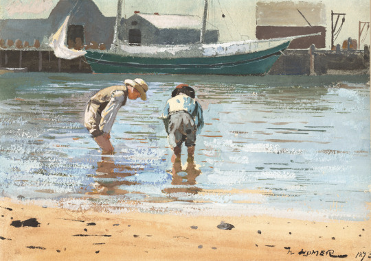
2. This recipe for Boy's Wading includes- Asymmetrical balance, Implied lines, emphasis on the Boys wading, Rhythm in the water, neutral colors/ earth tones, Geometric shapes in the background, and unity.
3. I moved to Central America for 10 years. The hue that would signify the genesis of our journey was an ambitious Purple hue. The value was dark and the intensity was Red: Excitement, energy, passion, love, desire. This came from leaving a life of a Yellow hue and an intensity of the Green color of harmony, balance, and security. Being a new experience the saturation was and is strong. Coming back to the States the process has begun again. Starting with Purple.

4. Turquoise-browed Motmot on wood: Mike Brown
From my time in a 3rd world country, I found some beauty in a country that I have detested but grown to love. I choose to see the beauty in life and not the death all around me.

Genre- Portrait
This is a portrait captured by: Lee Jeffries. This particular portrait was of a homeless gentleman whose name was not stated. I am a proponent of looking someone in the eyes when communicating. The eyes tell the story of a life lived, secrets, joy, love, and loss. This gentleman's eyes tell me that he is compassionate, humble, and filled with joy regardless of his circumstance. I study his gaze and see my life of serving the homeless and the reward of just calling them friends. I lock eyes to let them know how valuable they are to me and they are worth my full attention.
Genre- Landscape
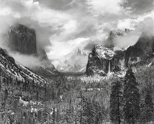
by: Ansel Adams, CLEARING WINTER STORM, YOSEMITE NATIONAL PARK, CALIFORNIA. This has to be my zen. This is where I want to live and discover. The landscape offers the same features but every second offers a different perspective.

Genre- Still life
Credit: Wendy van Zyl : Bowl Of Cherries. This is a bowl of vibrant cherries. The contrast between deep dark red and green leaves is bold, beautiful, and rich. The message is childhood. I spent summers picking cherries and selling them along the road. I remember cherry fights and laughter. The picture tells a story beyond its appearance.
Blaze
0 notes
Text
7 Inspiring Packaging Design Trends in 2021
When it comes to selling your products, the packaging is quite important. This is because consumers judge a product’s quality by looking at its packaging. They are more inclined to purchase a product if the packaging design makes a positive first impression on them. As a result, the purpose of a product label isn’t merely to provide basic details and legal information. There’s a lot more to it! It aids consumers in making purchasing decisions.
Businesses rely heavily on packaging design to leave a lasting impression on customers about their product’s quality. Even though customers’ loyalty to a brand is mostly influenced by its utility and quality, they are first captivated by the packaging design of a product.
This leads us to the significance of packaging design as well as current design trends. Packaging design trends, like other trends, are continuously changing, and we should be informed of what colors, forms, symbols, lines, and other elements are now in use. As a creative designer, you want to be able to express yourself. Trends, on the other hand, provide you an idea of what is currently popular in the business and which design elements will be valuable to incorporate into your packaging.
Here are 7 Inspirational Packaging Design Trends For 2021
Simple, Clear And Bold
Packaging designers have emphasized the need of producing simple and clear designs that customers can grasp right away. Such simple designs are effective in communicating a brand message to a target audience.
The designers recognize that a packaging design with minimum elements will elevate the product. In today’s fast-paced world, shoppers don’t have much time. So, with the help of an appealing packaging design that people view initially while choosing a product, you just have a few seconds to leave an impression on their minds. A simple design will undoubtedly communicate a clear brand message.
Splashing Colors
Another rapidly emerging trend in packaging design is the use of vibrant colors. We all know that colors elicit emotions and influence shopping decisions to some extent. Colors have been used in unusual ways by packaging designers recently. To make the packaging appealing to buyers, they are using bright colors with lively tones.
Colors are frequently used by designers to differentiate between product versions. Customers may quickly identify a certain variety of a product without having to look through the entire range.
Creating a Narrative
Colors and elements should not be used sparingly in packaging design. Instead, it should tell a story or convey a message about the brand so that people can easily identify with it. Graphic designers have begun to include pictures into narratives for this reason.
Some designers utilize artwork as a narrative tool to tell a brand’s story. The image is content-rich and provides a taste of lost stories to the customer.
Custom Lettering
Designers turned out to use custom lettering in 2021 to convey a sense of warmth and raw vitality. Uneven lines and natural texture are common features of custom lettering.
This form of one-of-a-kind lettering makes a product stand out while also bucking the trend of employing digital graphics. Because hand lettering evokes a sense of wholesomeness and a homemade product, it evokes a sense of nostalgia. We anticipate that the hand-lettering trend will continue to be popular in label design for a long time.
Repetition
In the creation of stunning graphic designs, repetition has its own role. This pattern can be found in a variety of designs from the past and present. Repetition of gorgeous patterns has become fashionable in commercial packaging design. The objective of repeating a visual pattern is to create a strong brand message.
As a result, depending on the personality of the brand, designers develop bold or fun patterns to build a powerful brand identity.
Eccentric Shapes
Although such a packaging design may appear harsh, it is a new trend that is attracting people’s attention. These kinds of designs make the goods stand out loud and clear. All you have to do now is add your company’s logo. Customers will immediately learn about the brand and the products it sells.
Pastel Colors
Calming colors have already made a reappearance in 2021. The new trend is famine and peaceful package design, which implies pastel colors will make a comeback. Soft hues create a sense of neutrality and are the polar opposite of bright and dramatic colors.
Designers of packaging have continued to use strong and brilliant colors thus far. They now aim to stand out by using a pale color scheme on the product package. This also contributes to the product’s warm and honest atmosphere. A design like this might send a message of friendliness to potential clients.
So, these were the most important packaging design trends to watch in 2021. Many of these trends have been around for a while and are still going strong. Keep looking out for such brands who have incorporated these packaging trends.
0 notes
Text
Consider the Best Uses for Glass Ready Cabinet Doors
The addition of Glass Ready Cabinet Doors to any kitchen design is a welcome one. Glass doors not only break up the monotony of solid cabinet faces, but they also provide both aesthetic and practical value. Let's look at several glass-front door applications to see how you might combine them into your kitchen's layout and decor.
Glass paned cabinet doors have recently been more of a fad in kitchen design than a standard. Among the many advantages of glass-front cabinets are: • Allowing for splashes of color and seasonal décor to be exhibited behind glass-front cabinets to help make tiny areas feel larger • Adding reflected interest to the entire design by utilizing available light.

Ultimately, depending on what's within, glass cabinet doors provide both utilitarian and aesthetic appeal. Glass-front cabinets are a great alternative to entirely exposed shelves since they keep your valuables safe and secure.
Textures for Kitchen Cabinet Doors with Popular Glass Fronts
While shaker cabinet doors with glass come in a number of textures, while working with customers on their kitchen renovation product selections, we've found three distinct trends.
Glass Panel Cabinet Doors have one little flaw: you can see straight through them. So, if you're going to put them in cabinets to hold beautiful dishes or seasonal décor, they're fantastic. Clear glass, on the other hand, may terrify some homes since, while there is storage, there are less places to hide a jumble of household objects. Reeded textured glass panels are a smart choice in situations like these. They have all of the advantages of glass doors but are less expensive.
This design is characterized by vertical lines that repeat in a regular rhythm. Keep that in mind as you examine how it will blend in with the other textures and patterns you want to use in your kitchen. If your backsplash or flooring, for example, have a directional design, you might want to try the following trend on our list.
Another common alternative is cabinet door panels made of water glass. They feature a more complicated, non-linear pattern that looks well in both modern and classic kitchens. This design, however, is significantly more translucent than the reeded variant, so bear that in mind when determining what to put behind them.
If you have a more complicated pattern on your floors, countertops, or backsplash, you might prefer the more basic texture of water glass. A streamlined contemporary kitchen, on the other hand, can benefit from the vitality that water glass designs can bring. Consider glass-door appliances to suit your new kitchen's glass-front cabinets, such as this built-in wine cooler:
Clear glass is a tried-and-true classic that most renovation homeowners choose. The glass cabinet doors can be seen in farmhouse, classic, transitional, and even modern kitchens. With transparent glass, the emphasis is on showcasing what's inside as well as the willingness to keep them clean so they're not obscured by smudges and fingerprints.
A Style Guide for White Kitchen Cabinets and Countertops
Do you think popular white kitchen cabinets have a lot of oomph? If you're thinking of using white to reface your current kitchen cabinets or to replace them entirely, you're not alone.
A kitchen centered with flexible white cabinets provides a bright, fresh appearance to a number of design styles, from classic to modern, rustic farmhouse, shaker, or sleek and streamlined transitional aesthetics. White also helps reflect available light and enlarges the appearance of a room, which is beneficial in prep areas. Plus, especially in a kitchen area, ageing eyes will welcome the added dose of light.
White Kitchen Cabinetry Countertop Options
The first stage in creating a color palette is deciding whether you want warm or cold tones. However, the overall style and feel you want to achieve, as well as the practical preferences of your family, are equally vital, such as countertop upkeep, eco-friendly materials, seamless finishes, textural features, heat and scratch resistance, and so on. However, here's a quick guide to picking the right countertop for your white kitchen cabinets:
1. Whether you're refacing, buying new cabinets or going custom, pick an overall design concept and a cabinet door type and color.
2. Choose your color scheme and if you want warm or cold tones. This will make choosing a countertop color and considering complementing or contrasting your design much easier.
3. Then, depending on the performance that best matches your personal use and wants, conclude your budget alternatives and pick a countertop material that best suits your personal use and needs. A style with a combination of countertops is also popular.
#interior design#cabinet design#home design#home improvement#home decors#cabinetdoor#house design#cabinets fronts#cabinet door#cabinet#interior services#interior home decor#decoration#decor#rooms#interior decorating#living room#interior architecture#interior ministry
0 notes
Last Seen Blogs

justavim22
فِرْمَنْدَهْ رَمَضَانْ

amethyst-artemis
Practically Magical

halcyon54
halcyon's tumblr
harley-michaels-main
Harley

cinema-x-bollywood
Mohabbatein