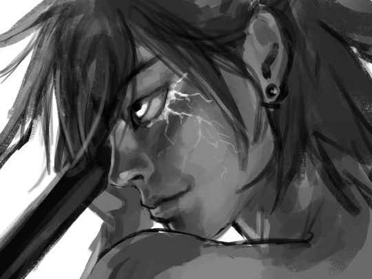
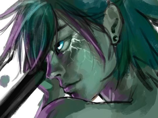
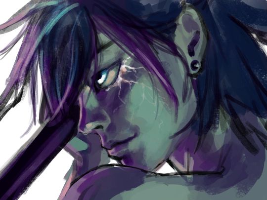
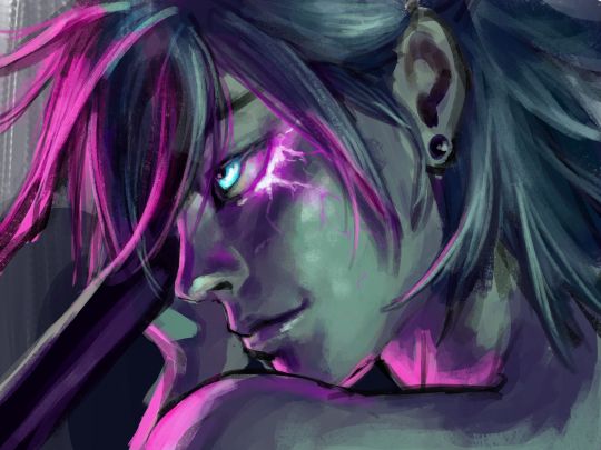
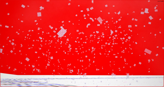
#these images all had a blue overlay light filter over it but i liked the original colors more...oops!
Note
Do you have any tips for someone who is trying a more realistic aproach for their art style? your painting and lighting are so good that I had to ask 🤠
Thank you!
So this question is actually pretty hard to answer, mostly because I still consider myself a beginner/hobbyist, and I'm pretty sure a lot of my technique comes from the ~5 years of classical art training I received in middle school and high school, and that's so fuzzy I can't tell what's intuition or muscle memory! I can go over some of my workflow/thoughts though and hopefully some of it is useful!
The first thing is that for realism, You. Need. References. It is impossible to replicate the level of detail in a realistic painting without a reference. I usually pick a reference, try to draw that reference exactly, and once I have the proportions correct, I'll change it to match the character/scene I'm drawing (move an arm, tilt the head, add a hand, make the eyes bigger, add anime hair etc. haha). Over time you'll get more comfortable moving away from a specific reference and piecing together a bunch of references into something more unique.
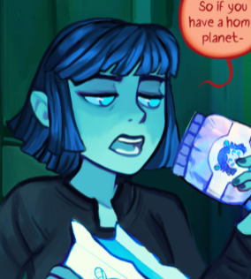
Here is an example of a recent post that was fairly simple. I take the reference image (link to reference here) and try to match it, and then I change it to match the character details, in this case, Kashimo.

As for the lighting, when I first started, my colors were a mess! I already know basic color theory which helps, but it didn't help enough haha. What I think helped me learn the quickest was color picking - in krita you can select a color directly from an imported reference figure. So I'd find a reference that I really liked the lighting on, and color picked from it while paying attention to the actual color I was grabbing (how warm it was, gray it was, what the typical skin tones were, etc).
Later on as I started to learn what types of color palettes I really liked working with, I'd open the reference photo in Krita and tweak the image's contrast and sometimes completely change the lighting and colors. However, at some point I started using it as a crutch and my skills stagnated, so you need to be careful! However, now I've progressed to the point of doing a painting in black and white and adding the colors later (with no color picking!), sometimes even without a reference for the color. This was a slow and painful process, so don't expect things to make sense overnight!
Also, don't forget that you don't have to make the colors perfect in one shot. Usually I'll color things using a color layer with minimal detail and basic color tone (Itadori's hair is soft pink, his hoodie is bright red, etc), and then create shadows and lighting with multiply and overlay layers (blues and purples for night, etc.). Eventually I'll build up the color and merge all the layers together, and then add details in full color. I can color pick from other parts of the painting to maintain consistency. Then to finish things off, I almost always tweak the colors and contrast using filter layers.
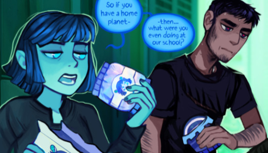
Here is an example from that same Kashimo painting, going from black and white to full colors using color, multiply, and overlay layers, and then ending with full color details.

As a side note, starting out in black and white can make things so much easier. When you're only worried about values, you can really focus on shadow depth and the shapes of things. It's so much easier to explore rendering when you're not trying to do color on top of everything! Don't try to do everything at once.
The rendering style I use is based heavily on trying to replicate the feeling of actual oil painting. I use the (free!) art program Krita, and my favorite, most used brush is from a free pack I downloaded from deviant art (here). I use the brush called R T Masked4 (shown below) for basically 90% of any painting I do. I use about 4 brushes total on a typical painting (R T Masked4, that same brush but tweaked to be narrower for hair details, a smudge brush that I discovered maybe 10 days ago that I'm now obsessed with, and sometimes a scratchy brush for additional texture).

One last thing - don't be afraid to use tracing! Block in a reference photo to get the head and shoulders in the right place!! Trace a few hands to see how it feels!!! Obviously don't trace somebody's art and present it as your own, and it should only be rough approximations of shapes so you learn how to break down the body into parts. Otherwise, it won't be helpful at all. I only use photographs for tracing, including pictures I've taken of myself. One of the more helpful things I'll do is free hand my drawing and try to make it match the reference as closely as possible. Then, on a separate layer, I'll trace the reference photo (again, no details, just general positioning/shapes), and compare it to my original drawing. I can immediately see the issues, and I'll use the liquify tool to get things in the right place. I've learned that my horizontal spacing is usually pretty good, but I struggle with vertical spacing, especially on faces. So now I triple check my work for those specific things!
This kinda turned into a book, I'm sorry! I hope some of this is helpful and doesn't sound like the 10:30pm ramblings of someone who didn't get enough sleep haha.
77 notes
·
View notes
Text
Crab Nebula (WIP)
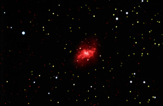
This is a work in progress image of the Crab Nebula. This product derived from four black and white images taken through filters which allowed for different colors of light through (red, green, blue, and all luminance) that were edited together in Adobe Photoshop. Photoshop, while most often used to tune photos or create basic images, is a powerful tool that can be used to make amazing high-resolution works of art including astrophotography. Initially, to all four images, I increased the brightness to a point that emphasized as many stars as possible without blending them too heavily to the background. Then, I edited the contrast with the curve tool - shifting the curve into an 'S' shape - to separate the stars and nebula from the black void of space. When using the curve tool, I like to start with Photoshop’s “auto” option to see what its program thinks is the best option, then adjust it from there. To combine the images, I used the one with the most prominent features as a base then added transparent layers over the first image with the other three. I selectively emphasized interesting features with a "draw select" tool then blended background colors so all the images would seamlessly fit together. To color the image, I created a blank layer over the existing layers and set the blending mode to soft light. Then I set the drawing tool to the overlay blending mode and drew over the image with the colors I found appropriate. I attempted to color them based on research and the sizes of the stars - but due to my colorblindness it may not be "correct". Early in the semester, we learned how the color of stars is determined by temperature and age which caused me to mistakenly associate size with color as well. Some examples of calibrated images I saw seemingly had size-based coloring, so I think the creative liberty I chose is fitting for the image I created. Initially I had difficulty emphasizing the gasses around the nebula, but I re-layered one of the original images on top of my progress and experimented with exposure, contrast and tone (to make the overlay appear as natural as possible without overshadowing my progress) until I had it better defined. Some parts of the image looked unrealistically grainy or sharp, which I solved with a soft gaussian blur. To differentiate between the blur of the nebula and the stars, because I wanted the stars to be more dotted rather than blended, I used the “draw select” tool again to isolate the nebula. When the blurred spot looked unnatural in the center of the image, I used a blend tool to smoothen out the transition between the nebula and the stars.
I am particularly happy with how it turned out so far, especially the nebula itself. I like how I managed to maintain the small details in the middle. As I continue to work on the image, I would like to improve on emphasizing more stars on the left-middle portion of the image. Overall, I’m impressed with what I’ve achieved so far and I’m curious about whether I will be able to improve upon it.
1 note
·
View note
Video
youtube

Figure 91. Figure 92.
After finishing all the line art, I went back through and began the colouring process with Photoshop’s basic round brush. As I’m making a PMV and as such was dealing with 16 full illustrations, I decided to keep the colouring simple with only block colours. I felt that it would have taken too long to include detail and shading in so many illustrations.
To keep things consistent throughout the PMV, I chose to reuse colours wherever I could. Most of the time I kept the same ‘grass’, ‘wood’ & ‘leaf’ colours throughout the scenes, and made sure to refer back to my character sheets to sample the correct colours using the eyedropper tool. Once I had coloured in each scene I then decided on type of lighting they had, and filled a new layer with either a block yellow or blue colour set to a lowered opacity and either the ‘hard light’ or ‘soft light’ blending mode. This made all the colours in the scene fit together better for a more unified feeling, while also helping to give a better impression of the weather/time of day.
As I’d decided much earlier on in the project, I also gave each of the illustrations a textured overlay with a leaf textured brush that comes with the basic Photoshop brush pack. I made this by setting the layer to the ‘soft light’ blend mode at around 30% opacity, and going over the whole image with multiple alternating layers of black and white with the leaf brush. On the two scenes with the wolf ‘demons’ I also created a second overlay like this to add an extra texture that was meant to emulate dappled light through a canopy of leaves, while on a few other scenes I created layers of coloured versions in specific areas to create the effect of more direct lighting - i.e. the glow from a moon, lantern, or campfire.
Once I’d finished and saved all the illustrations, making sure to save each aspect of a scene separately, I transferred them all over into the video editing software I was using (Shotcut) along with an audio recording of the song I’m using: Wayfaring Stranger. First, I needed to line them all up with the lyrics of the song, making sure they all lasted for the correct duration and that all layers for scenes were on the correct video tracks. Then I used keyframes to set up the blur and movement/resize filters anywhere I needed them, so that I could time the movement/blurring with the lyrics.
In the end, I think the PMV achieved its goal to tell a trailer-esque version of Eidar and Dante’s story. I’m pleased with a lot of the backgrounds and the way my line art & colouring/texturing style hints at the stained glass windows that inspired it. However, I do still think I could have improved my character art - especially the expressions - if I’d had more time for practice and trial & error. Given more time, I’d also have liked to see what the PMV looked like if I managed to add a lot more detail and shading to the illustrations.
0 notes
Text
Mod Log - September
Howdy! I thought this might be a fun little thing to do, both for my own desire to document, and for anyone who wants to tune in.
I’m counting on this to be a lax “series”(?) which serves as a catalog of minor experiments, mod progress, and bloopers that occured during a set period of recreational modding.
And maybe it is also a little bit self-indulgent - but gosh darnit, I will be enthusiastic about my dorky hobby! :p
Item 1: Tests and Tribulations
Question: What happens when a Sim dies on a lot on which there is no physical place for a tombstone to spawn?
Answer: A tombstone... is not spawned! Verified by forcing an error and scouring the lot dump. This may lead to a Sim being in a “dead, linked, but no tombstone” state, without any mods (although the set up is a bit tedious - fill every tile with a diagonal wall or impassable object). Kinda neat!
Also, I made a statue out of Grim Reapers, pictured above.
Question: hey build/buy thumbnails are tiny can we like enlarge those
Answer: Yes!...ish.
Unfortunately I was unable to find the parameter (singular? 🤞) that influence/s the grid layout within the UIScripts, meaning that (a) I just can’t see (b) It’s multiple variables making it more difficult to narrow down [c] This behaviour (that is, the automatic management of the geometry and populating of the grid) is exclusively executable-based so because of this all items overlap. :/
Pretty cool though how the actual thumbnails themselves adjust automagically to increased... ‘thumbnail... holder’... size. Also, I think the black transparency issue could be resolved with a properly sized UI images of the border to match. don’t mind the blue tearing that’s just me being silly
Item 2: Modunkles Spelunkles
This mod... is actually almost fully functional! Here is a video of it in action. Permitting your one-household Sims have a pool, they should no longer be doomed to a Death By Fire if noone extinguishes them... assuming they get there in time, and they’re happy with the risk of spreading the fire as they go :p
youtube
It’s not released yet, though, as I would like to add showers to the mix also, but that’s... tricky and likely to conflict with other mods out there. I also need to add compatibility for custom pool portals, and I still haven’t figured out the non-Destination version of this mod.
By the way - it seems to be impossible to add new functioning destination objects - I had to override a Maxis one! >:( (though this also seems like an excellent candidate for a plug-in framework to allow for multiple user mods. along with maybe showers).
Check out these bloopers though lol.
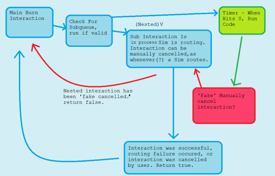
And dang, look at this Actual Flowchart I Made to try and figure out the code beforehand. It looks better than my thumbnails fafasfafsa
Speaking of a Plug-In Framework - I am working on one, at least for the mailbox, to make it easier for modders to do cool cross-compatible stuff with it. Planning to make something pretty in-depth with it!...eventually. Sims getting actually paid by the hour was a good start, but before I knew it I was rewriting half of CareerGlobals
so uh that’s on the backburner ._.;;
Did you know that there is a lot of redunancy concerning road textures in the game? It seems as though Maxis had more ambitious plans than what we received, likely due to being rushed [speculation]. With this we have quackery such as separate road textures/overlays being possible for different weather conditions, such as snow and hail, but in the full game this only being applied on road corners, but also almost none of the special textures are used.
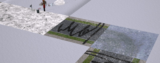
With some tweaking of the shader, though, I manage to make it possible to have separate road textures for light snow/heavy snow weather [pictured heavy snow overlay below]:
This is not a road texture default - well, actually, for private testing purposes, I used textures from this creator’s defaults - but I have Voille’s True Neighbourhood Grass installed in the above screenshots, which comes with a road default. I also increased the fidelity of the appearance of the snow on the roads because it looks blurry af (no idea who thought 4 was a good value for number of passes over a cumulative <200 tiles in the unmodded game).
It is not yet released, though, because I want to (a) ensure compatibility with other popular shader mods and (b) create my own textures to redistribute. (although if anybody wants to create textures, feel free?? 😳) and [c] ‘c’ what can I do to make the neighbourhood coordinated with this system.
Really cool how this stub of a feature was just... there, though!
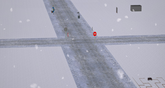
Oh, and a blooper from this set of tests.
Nothing more Christmassy than a blood-red sky. Then again, I suppose it is October :p
Item 3: Fin
At the end of this draft now, and dang, this was really fun to put together actually! Even if this documentation is largely insignificant in the grand scheme of things I might do more of these in the future. Would be fun if other creators tried it too, I think!
If you want to filter this tag, I will be using ‘bstu mod log’ for these sorts of post. Maybe I’ll make a dedicated page to these and post future ones privately? 🤔
Happy Simming! <>
77 notes
·
View notes
Text
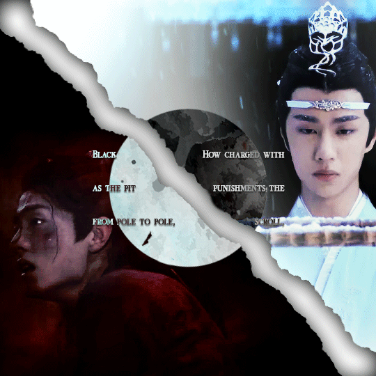
(You can find the set that this gif belongs to here 💙)
From planning to posting, share your process for making creative content!
To continue supporting content makers, this tag game is meant to show the entire process of making creative content: this can be for any creation.
RULES: When your work is tagged, show the process of its creation from planning to posting, then tag 5 people with a specific link to one of their creative works you’d like to see the process of. Use the tag #showyourprocess so we can find yours
I was tagged by @aheartfullofjolllly. thank you so much Pat! it was really fun to reflect about my own process 💗 You can find her post here and @lan-xichens' post that started it all here :)
Also thank you @huigusu 🥰 (who tagged me for my nie brothers set) I'll get to that one in a few days!
Now Pat gave me two sets to chose from to show my process, so obviously I chose the more complicated one :P
I only work in Photoshop CC 2018. I know that there are programs out there for easier cutting and sharpening but I have only just figured out how to do that in PS and I am too lazy to figure out any other programs right now xD
1. Idea and Planning
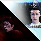
This set, like most of my sets with lyrics started with me reading the poem, clutching my heart and going "oh shit this fits my favourite characters!!". The idea actually started with me thinking that the first stanza of the poem would go really well with wwx during the burial mounds arc. Then I realized that the last stanza fits lwj better than him and from there came the idea to contrast the both of them next to each other. This is when I realized I wanted to do a dark-light contrast set, though I did not know that I would go with red and blue at that time. My idea in the beginning was just to do a black and white set
I was really impressed by how Pat said that she plans her sets around exact timestamps. Because I don't do that at all ^^ I just get ideas for which scenes would fit (in this case the wwx burial mounds scenes and lwj's kneeling and punishments scene) and then I watch the scenes to narrow them down.
Back when I made this set, I still used a screenrecorder (AceThinker Screen Grabber Pro to be precise. They have a test version that allows you to record up to 3 minutes) and recorded the scenes I needed from Netflix. This worked well enough but now I have the entire show saved on an external drive and it makes a world of difference when it comes to gif sharpness
Now, in this case I had to repeat this step once because when I was almost finished, I realized that I wanted a gif for the lwj corner but let's pretend I didn't do that and that's the way this gif was always going to look because otherwise this post will be way too long ^^
2. Creation
Short disclaimer: The creation process for this gifset was anything but linear. Multiple effects I used here were things I had never tried before. I just had a vague idea and tried to realize it through trial and error. So whenever I say "then I did xyz", it is implied that I ultimately went back to that step several times and changed stuff ^^
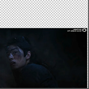
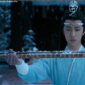
I started with the Wei Wuxian part of the gif. I usually use a frame rate of 0,06 (with some variation depending on gif length and size). I work in timeline so I converted all the layers to a smart layer. Then I resized the gif into a square, leaving big chunks of the gif empty (as can be seen below.) I flipped the gif horizontally, so he is looking inwards. This was simple because I felt it fitted the composition better. Then I imported the Lan Wangji part of the gif, again with a frame rate of 0,06. (Image 2)
After that I created a layer for masking in a separate PS document by rotating a square until it was point down (is that a rhombus?). I sized it to match my gif (540x540 pxl) and copied it over. (Image 3) a bit of masking magic and ta da! There's the basic layout (Image 4)
I put a layer of solid black behind wwx to get rid of the transparent bits (Image 5) and then started adding more white and black to both sides by adding solid whit and black layers that i put masks on and changed the opacity as i needed (Image 6)
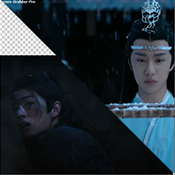
("reading" direction: from the upper left to the lower right corner)
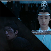
Then I fiddled with the colours a bit. The first thing I always do is using the curves layer to get more contrast. Then I use the colour balance tool and the selective colouring tool to get rid of that cql-typical cyan tint after that it's just trying to have it look "natural" while the colours still fit the overall scheme. This was difficult here because wei Wuxian’s side of the gif was very dark and when i turned up the saturation to see which colour dominated it was a very weird mixture of multiple colours. That's when i decided that I'd just go with red on his side, since lwj's side was already so blue and those to look great as contrasts.
After that just came a lot of fiddling with selective colour layers and brightness and contrast unti I has happy. There really wasn't much to it ^^. (Image 1)
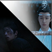
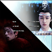
After that I added the text. I knew I wanted the two lines to for a square of some kind. So I tried different fonds until I arrived at the one below. The two lines are in seperate layers so I could move them around and change the spacing between the letters until I was happy with the layout. I also changed the layer mode for the text to "difference" (is that what it's called in english? my PS is set to german sorry ^^), keeping their colour white. (Image 2)
I originally hadn't planned adding anything else but I felt like the gifs (plural because I switched between the gifs of this set) was still kind of empty and lacking, so I added the tear down the middle (a tutorial for that is either coming up later or already posted. I recently got an ask for this :)) (Image 3)
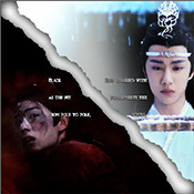
It still felt empty after that, so I tried different overlays. Okay no, first I wasted a lot of time on different free image sides but then I tried out different ones until I chose the one you can see in the finished gif. I liked that one because a) I felt the round shape was a nice contrast to all the straight lines already there and b) because once I applied a black and white filter to it and switched the layer setting to "difference" (again, i hope this is the correct translation) it looked a bit like a moon. (Gif at the top)
("reading" direction: from left to right)
And that's it! :)
Although in general, these gifs took so much fiddling! I went back and forth between them a lot and sometimes almost redid the entire thing because I had no idea what I was doing in the beginning and by the time I noticed an error, the only way to fix it was ti redo everything. So yeah, this set definitely is the the one that took me the longest out of all the ones I've posted so far.
3. Posting
I save all my gifs to my drafts first to see what they look like put together and to check if they look any different on mobile. Usually i do this several times and change stuff until I'm happd enough with it to hit post. Once i am happy enough, i can't hold back. Doesn't matter if it's at a time when nobody is online, i hit post 😅
And that's it!
Tagging:
@lanwuxiann for this gifset (I adore it so much. I've looked at it and read it severat times since you posted it and the poem just kills me every time!)
@suibianjie for this gifset (The combination of static images and gifs in your gifs is always absolutely perfect! This one is only my favourite of yours because the light coming from behind wwx is just so pretty!!! ^^)
@sweetlittlevampire for this piece (It was soooo hard to pick a piece of yours because I have so many favourites! But this one is just so out if this world, I want to know how you worked that magic :D)
@wei-gege for this set (sparkling shijie! 😭 that set is so incredibly beautiful! I love how you matched the colour of the overlay with her dress!)
@purplexedhuman for this set (your gifs are always incredible! I chise this one because it showcases both your colouring skills and some really intricate effects)
If any of you have already been tagged or don't have the time or energy for this, obviously no pressure to do this at all! 🥰
(btw, I originally tried to place the actual text of this under a "read more" cut but somehow it always messed with the order of the images, so this ended up as a rather long post. sorry!)
39 notes
·
View notes
Note
Can you walk us through the prossess you go through when drawing backgrounds?
yes but i talk too much all the time so click the readmore if u want bad advice :)
hmm im not entirely sure that im the best person to go to for advice on this lol. i consider myself a character artist first and foremost, hence why a lot of my art doesn’t have real backgrounds.
when i draw backgrounds, i’m always thinking mostly about how they affect the character, who is usually the focal point of the drawing in my case. how am i planning to light the character? would this lighting make sense with my background, or do i have to adjust it to allow for the affect i’m going for? I also try to think about composition, which usually involves arranging the background so it leads the viewer’s eye to the focal point of the drawing. a lot of this comes naturally to me now, but if you’re having trouble with background composition i would recommend reading up on the elements of composition. i had them drilled into me in 8th grade and my art is definitely better because of it!
when i sketch out backgrounds, they are usually only gestural lines to give me the idea of the space. where the character needs to be fully rendered to be recognizable, i can easily fill in details that aren’t in my sketch with color later, and since the background is usually secondary to the character anyway I don’t need to go into as much detail with it. i don’t have any examples at the moment because i usually delete my sai files to save space once theyre finished, but hopefully you get the idea. after that it’s just a matter of defining the space with color. I work very sequentially which every art teacher in the world will tell you is Wrong And Bad, so don’t take this as the best way to do things in any way, but i usually fully color my backgrounds before moving on to the character on top of them. this tends to help me because with the background fully rendered i can see how light and shadows would fall on the characters more easily, but some people find it easier to block in flat colors and then shadows for the whole drawing at once.
like i said, i rely on color a lot to make my backgrounds look less like messes. I usually use a LOT of references for both color and light, because coming up with pleasing color schemes is not really something i can do on my own yet lol. I also abuse the hell out of sai’s filter tools to adjust the color until it meets my qualifications. once i have the whole drawing colored, I adjust the colors of the lines with clipping groups so that they seem more seamless with the background. at this stage, i usually merge all my layers, which is a bad habit i picked up when i was first doing digital art and my shitty pc couldn’t run with a sai file open that had more than 5 layers. you really don’t need to merge all your layers. then i choose what i call the Extreme Highlight Color, usually white or a very light yellow or blue, and, using the same brush i used to sketch, I add a few especially bright hard highlight lines over my soft shading. if there’s anything I want to highlight in the drawing at this point that isn’t standing out the way I want it to, I can use these highlights to draw the eye to it, because they’re the lightest color in the drawing so they’re what the viewer will be inclined to focus on. the extreme highlights can also be used to seperate background elements that are blurring together, etc.
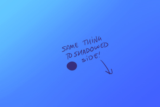
the final step for me is to overlay! i choose my light color, almost always yellow but occasionally a blue or pink. always very light and not super saturated. on a new layer, I create a gradient from whichever direction the light is coming from in the drawing and fade the light color out to transparency. then i go to the layer’s mode and change it to overlay, and adjust the color and opacity until i get the desired effect. I do the same from the shadowed edge of the drawing, but with a dark color, usually a blue or purple. That explanation barely made any sense so here’s my best image reenactment:


and that’s pretty much it! i realize this probably wasn’t super helpful but that’s how i do it lol
56 notes
·
View notes
Text
7. The Rivers Dream of Rain (text version)
I.
We follow every road, cross every field
our maps coated in finger oil
the stains of generations
We keep all names new and old,
on small wooden plaques
or old dominos
threaded on twine or twisted fishing line
carried on the belt
and around the neck
Among our people, the sound of these names -
they brush and click against one another
is our most Sacred sound.
We like it when you hear our approach
when you hear us on your road
You quicken, you liquidize
your memory hears us before your self
begins to boil
to foam and rise
We do not sell answers
this is forbidden to us
We freely give any name in our mind
ancient or weeks old –
the histories bestowed on us, our heavy burden
is also free
You offer, and we accept
the night of rest
warm nourishment
a few small wooden plaques
or old dominos
On our noisesome belts we carry
towns, cities, roads, mountains, rivers
objects strange and mundane
process and plans
plants and creatures
favorite dishes passed down through generations
The only names we do not carry are human
this too is forbidden
Your names, our names
temporal or permanent
these may be written
only on the inside of an onion skin
We are cherished and hunted
sought everywhere
Some bring us within their walls
celebrate us, bestow upon us
names newly made, or old stories newly learned
They make us heavier.
They give us more noise.
Others seek us to silence us
to cut names from our belts
to burn or bury
They have many good reasons
reasons we understand
But we do not comply
We go to great lengths
We protect ourselves
We were born the day the old net fell
dissipated in distrust
fragmented and cloistered
As the age of paper unfolded we quickly earned a natural trust
and right to cross gates
wander in and out of walls
and gathered friends to walk with us
to watch our backs against those who would lighten us
It did not take long for our numbers to grow
As new waters came into the valley
we walked along canals
balances on the little walls
met with carriers of salt
rode with Fivers the length of their Way
In the days when paper cracked and peeled
it is said one fourth of every other hold
came to walk with us
New cultures bubble and foam across the plain
Old paper blows and washes out to sea
fresh skin glistens in the sun
green and gold and pulsing
Our flow across fields
the lines we draw between
walled cities, far towers, open circles, wide farmsteads
we acquire weight and thickness
and shine into the glass eyes above
dead and living
bound to old nets
and new gardens
In this way we speak
The names we carry are tiny
The names we carve into the earth reach for hundreds of miles
Words that stretch across the land
these are the names of countries, cities, rivers, and mountains
in our own secret tongue
Forever unknown even to us
none of us has ever seen them
Glass eye above, you hold us.
Liquid eye on the other side,
we wait for you.
II.
It was March when she fell into the Vision
The first March of the liquid days
When the remnants of the fakery
Still wet in the streets
Waiting to be washed away
Or dried into dust and carried off by winds
In April came the days of Seperation
The waves of dreams from the east
The flow over and under the Sierra
Her Vision was a rock in the stream
Vortices shed behind her
By May the formalities had fallen apart
Concrete and sands shifting under the feet
A shift quicker than anyone had anticipated
The turning of some hidden mechanis
Or opening of a door
You looked behind you and it was already done
These were days of bright colors
Of opening
Unguided masses of the east
Pulled through and into the searing valley
This has happened again and again
But those who had crossed the sands
Or walked the ridges and ravines
Now floating just above every surface they crossed
Tongues bound, silenced by the strength of that first pull
She was the first to greet them
The current were strong in those days
She took position in the center of the valey
In the beginning it was only her senses
With expert use of Overlay
From the edge of her fields
Alone under the sky
Then she sent her people unto the land
To gather stones, the width of the circle
And with this built her tower
Rising from the middle of the San Joaquin
Those who came to her
Learned to breathe that sacred water
Soon word travelled on those currents
And seekers came from all direction
The wild marches of the north
The communes and bastides of the valley
Even the glistening shapes of the Bubble
And then word spread to the mirror cults of the Southland
In those months of heat and haze
She was visible only to those far wanderers
Selected by her watchers
Allies waiting at crossroads
Or within the webs of aid that sprang up in those days
Words and deeds sent to her
By crow and bee
With Autumn came visiblity
In other lands this is a time of darker skies
Rain and turning leaf and cold wind
Here it is the time of burning
A new and focused heat
But distance is distance
And light is light
So here too we have that clarity
That sharpness of season
And so she began to glow
Blue and violent spillig across fields
Winding through canyons
Crossing the horizon
Eyes awoke and turned to face her all at once
They came for her – at first small and local groups
The Bubblers to record and categorize
To steal and mock and recreate
The Christkeepers to silence and burn
To meld and reshape and funnel
And then the air changed, the Southlanders came
High ranking channelers of the miror cults
in shining capes and glittering tights
Envoys from the realms of Glendale, Cessna, Orange, Pasadean, Waterworld, and the Citadel, naked and direct, covered in shifting and confused signs
Wanderers of the desert communes and priestesses of Salton, come with flowers , vines, and warnings
Overwhelmed and ever weary, she took from this widening flow
And spun an elaborate filter
A circle five miles around her tower
Sinking into both sides of the river
Any who would approach her, the Source of San Joaquin
Must carry a living plant, one year of age or older
Not yet found within her Circle
Thus was born her famous garden
By December she had become fully real
The flow into her Circle narrow, slow, intense
The return into the world bright, jagged, searing
They came with palm, succulent, and vine
They left wrapped in currents and winds
Eyes glowing, tears streaming
In January came the days of new accord
When flowers turned to signs and letters
Were wound over the gates of cities
When Mia Marisol, in person, approached
Bearing citrus micrantha
And left with a map of ways to slip
Between every mirror of the Southland
It was February when the waters around the tower
Began to froth and rise as mist
Unsnapped from the grid
She divided and dissipated
The line of her circle wound back up around its spool
The tendrils of her garden, still bound to her
Reaching for the sea.
III.
Those who cover themselves in empty signs
And piecemeal tongues
Those who live in loudness
Wrapped in fragile image
Snared and stretched and caught in the gaps
Become as paint and pasetel
Smeared gradient and shining dust
This is your service and your bridge
Become rose, become ultramarine, become lime, become magenta, become iris, become azure, become sienna, become canary, become puce, become mustard, become sea foam, become umber. become crimson, become ochre, become gold, become vermilloin, become feldspar, become violet, become sage...
6 notes
·
View notes
Note
I really like how you color things! Do you think you could make a tutorial, maybe? I'm trying to get better and I'd really like to learn from you :D
Thank you! I’ve never made a tutorial before, but I’ll try. I experiment A LOT with every piece, so I don’t have a 100% set in stone process. (Always experiment! You might find something new that works for you!)
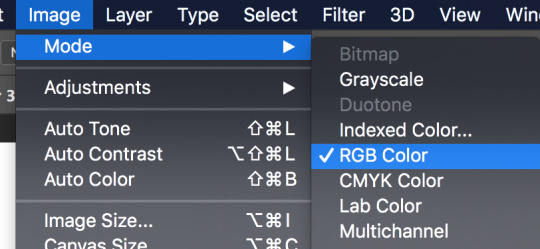
First off, make sure you’re working in RGB color mode. This is so you can abuse Camera Raw Filter later, and you really should be in RGB mode anyway unless you plan to make prints.
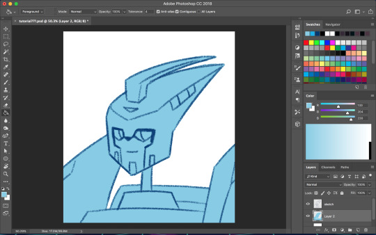
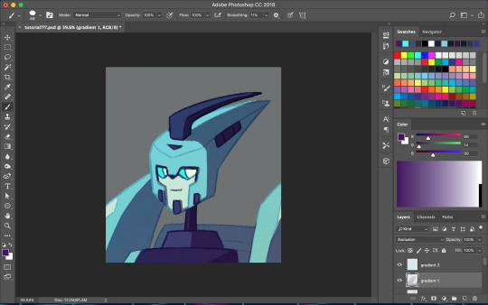
So start with your line/sketch on a multiply layer, or even just a normal layer mode if you want. My lines are usually dark blue but I often change them later on.
Use the wand tool (w) to select the negative space around your lines, invert your selection (command>shift>i), and on a new layer use the bucket tool (g) to create your base layer. On this layer, go to (filter>other>maximum) and set the radius to one or two pixels. This will clean up the base a bit so you don’t get a weird halo around your lines.
Before you start adding colors, change the background color to a mid-tone grayish color. This is to better judge tones and contrast. This doesn’t have to be the end color of your background; you can change that towards the end. If you actually are drawing a background, you might want to choose the general color of that background instead, but checking your colors against a gray background periodically can still help.
Now is when you start using clipping masks. Make a new layer directly above your base. Make this layer a clipping mask by right clicking on it and selecting “create clipping mask” from the pop up menu. Do this for every base color.
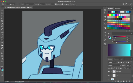
As you choose your colors, try to visualize what you want the end result to be. If you want a warmer or cooler piece choose colors accordingly. I do this mostly by eye, so I don’t have a specific process. You can play with each color by going to image>adjustments>hue/saturation.

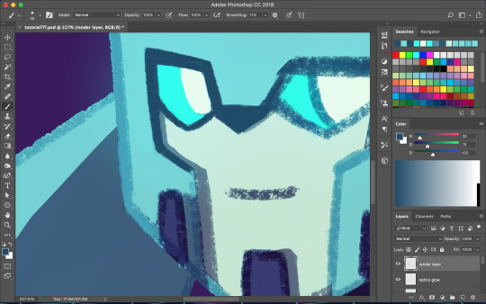
Once you’re happy with your base colors, create another clipping layer over all the base color layers (except for glowey bits like optics/biolights), and set it to multiply (sometimes another layer mode will be better but I usually go with multiply). This will be the shading layer, so now is the time to figure out where your light source is. You can add your shading using the brush tool, but I tend to visualize lighting better by erasing where the highlights are, so I just fill in the entire layer with the bucket tool and start erasing. Change the opacity of the layer to whatever you think is best. A higher opacity creates more dramatic lighting and a lower opacity makes softer lighting. For the shading color I usually choose a darker, desaturated color, like purple or brown, but again you can just play around with the hue/saturation until it looks right. Sometimes I will make a second shading layer to add even darker shading in areas.
So now the shading is done! If you want, you can make another layer for highlights but I don’t always do this. I don’t have a specific way I do highlights except that I usually add them only in the most intense lighting or on the most reflective areas, but do whatever works best for YOU. If the subject is backlit, adding highlights around their silhouette can add a dramatic effect.
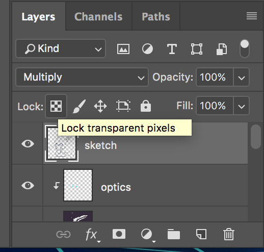
I usually leave my lines as a single color, but sometimes I will use multiple colors over each base color. I did that for my last piece of idw Blurr. To color your lines, lock the transparency of the layer using this button, or make another clipping mask over it. A lot of the time changing the layer mode to overlay will make the new colored lines look nicer. You may need to touch up some of the darker colors though.
Next is when we start getting really experimental, by which I mean I have no idea what the fuck I’m doing. I make one or twenty new layers with various gradients over all the colors and play with layer styles. These layers are to soften the shading, bring colors together, etc. Something fun I do a lot is set the gradient tool mode to dissolve and then play with the layer mode and opacity on that to get a textured effect. If you still have a gray background switch to your actual desired bg color. Upon doing this you might want to make even more adjustments. If you have any glowey bits like optics, make a new layer for that. I usually use the gradient tool or a blurry brush at a low opacity around the glowing parts and set the layer mode to screen, but again experiment. You can also add reflected light from these secondary, less intense light sources onto the surrounding surfaces.

I don’t always work with clean lines and end up having to render and clean up a lot towards the end. I do this on a new layer above everything. Rendering is tedious but can make the end result look a lot softer and painterly, or sharper and more defined, depending on how you do it. Make use of the dropper tool (alt+left click) here to grab colors as you go and define shapes. This step is only necessary if you are going for a painterly look (or you were lazy with the lines and now regret it like I often do). This step must be done only when you are as certain of your color choices as you can be, because after having used the dropper tool to color grab, you will not be able to adjust the layers individually.
So hopefully, you’ve chosen colors that work well and you are happy with how they look at this step. If not (like I usually am), you’re going to cheat with Camera Raw filter. It’s like hue/saturation adjustments but better. Make sure you’re happy with how everything other than color looks here because we’re going to do the thing where we suddenly work deconstructively and probably regret it later. You might even want to do this step on an entirely new canvas so if you fuck up you still have the version with all your layers. There’s always control+z, but if you end up playing around a lot it could be annoying to go back.
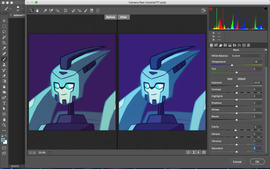
Flatten your image. You can do this by right clicking any layer and selecting the option from the pop up menu. Now that everything is merged into one layer, go to filter>camera raw filter (or command+shift+a). There is a lot you can do here. You can change the temperature of the whole piece and play with values and clarity until things look nicer. You can even go into HSL adjustments and tweak individual hues. I also use camera raw filter to add grain or a vignette sometimes (not color-related but still nice to mention). Also, when I want the piece to look really soft, I lower the clarity to give it a soft, glowing look. I did this for the idw Blurr also.
So now hopefully the colors you weren’t happy with look better, but you can still play with gradients even after this step. Sometimes this last step barely changes anything and other times the colors will be wildly different from what you originally had planned.
So to be honest, my colors are mostly all experimental. I’m constantly changing and adjusting colors as I go along. Try to put thought into your initial color choices, but also it’s fine to change things if you need. I mostly go on instinct, so I’m sorry if this is a lackluster explanation.
If you have any specific questions or don’t understand something I said here feel free to ask! I’ll try my best to clear things up!
#Anonymous#tutorial#my art#it's also like 6 am so this probably is confusing im sorry lol#my art process is mostly me doing something and being pleasantly surprised it worked lmao#the images look like shit on desktop but fine on mobile????#ok tungle thanks
20 notes
·
View notes
Note
In that case I'd specificly like to request a tutorial on your redraw edits, like Titan Follower Ava!
that’s fair. sorry this took a bit, depression is real and it kicks my ass
also I use photoshop, that’s an important note, but here we go
first get the frame you want to tinker with, and slap the reference on there (if you have one)

fantastic. same, ava.
next, we’re gonna select ava in ur basic chunky setup. yknow. just grab the girl
using with image->hue/saturation or photofilter, you can tinker with her colorations a bit, but since I’ve been at this a long time I just jump directly into filter -> camera raw filter, as its got all the tinkering and hue shifts that I need
hmm. closer... not quite, though, bc she’s so red and orange, her base color ends up a maroon
lets tinker with a bit of photofilter blue and make her more of a plastic
fantastic. a bit on the green side, but I’ll work with it.
lets clean up those edges

good, now no more weird blue chunks for the background. now she just looks like she’s from an eiffel 65 video. you know the one
anyway lets move onto the hair
this was a bit more complicated. I ended up chopping out her hair and going through a few more filters to darken its luster, basing it more on a deep blue than a cerulean, and I also copypasted and curved some of her other locks to make a set of alright bangs as well as painting a lot to give her those flat edge bangs. from there I outlined her bangs a little to make em distinct

I also outlined along her original hair where I wanted it to be chopped off, so it would look a bit more natural than if i had just freehanded attempted to redraw her hair completely
actually who cares about hair when we can make ava look like an asshole

colorpicking from ava’s new palette and using the follower head for reference (thanks six) I thin her brows, flatten her teeth, change her expression via eyebrows from confused to skeptical, and round her ears
fantastic. she’s on her way to being a real asshat. let’s continue
bam
hair’s chopped. I ended up painting the sections in the bg where her hair used to be and also repainting a few of her locks around her ears, so it wasn’t so obvious I was just painting over preexisting hair. Give it a bit of a shade and texture difference to separate them.
from there I just used the pic to colorpick and eyeball the cut of her follower shirt
nice T-neck, nerd
from here, I fix the color of the snacks and also give her a lighting outline, same as Odin’s color, to better stick her in the scene and straighten out some lines
she’s here to be passive aggressive and eat all ur snacks. its what six would’ve wanted
speaking of six, I take about a billion refs of them
wrow
and just cookie cutter their basic gear onto ava with some color changing and smoothing and repainting

I just ended up painting the gloves on, tbh, and I also forgot about the follower ear mods until 30 seconds before posting, so that was annoying
Also just use some Overlay + Soft Light blue colors over the speechbubbles if you want that blue
there’s my tootarolls. guitar solo
80 notes
·
View notes
Text
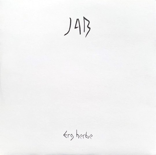
Reviews 240: JAB
Over the last few weeks, I have become increasingly entranced by Erg Herbe, an album of interior reflection, spiritual tranquility, and meditative beauty composed and performed by JAB, otherwise known as John Also Bennett. Bennett is a long-standing figure within the US’s avant-rock, noise, and synth-drone scenes and had a particularly strong showing in 2018 with the release of Forma’s Semblance and a few stunning collaborations with Christina Vantzou. But throughout his career, Bennett has shied away from solo releases, preferring instead to work in private while patiently establishing a unique sonic language, one whose goal is to “create nice, strange, and thoughtful music that reflects a genuine inner vision of self.” During spare moments throughout 2017 and 2018, Bennett distilled his years of study and sonic experimentation into Erg Herbe, a mystical journey released on Shelter Press and constructed from justly intoned FM synthesis, analog oscillator radiance, rainbow-hued Farfisa drones, and multi-layered woodwind exotics. I could float away on this music forever, letting my spirit be eternally immersed within JAB’s ethereal colorations and crystal healing soundbaths. And throughout the album, I am continually reminded of some of the music I love most, whether it’s the psychedelic minimalism of Bitchin Bajas, the fourth-world rainforest rituals of Ariel Kalma, the hallucinatory river treks of Finis Africæ, or the captivating environmental ambiance of Hiroshi Yoshimura and Satoshi Ashikawa, especially in Bennett’s use of space and in the way his synthesizers and flutes drift untethered like clouds in the sky or leaves on a stream.
JAB - Erg Herbe (Shelter Press, 2019)
“Planner’s Beauty” sets the soul afloat on dark pools of ether while rainbow streaks swirl slowly beneath the surface. Oscillators and synthesizers create hovering drones and vocal mysticisms…like deep chants flowing forth from the center of the universe. The mind and body form a focal point for lapping waves of electronic magic while gaseous currents of filter-sweeping feedback arc through the air. And as soft resonances overlap and decay tails merge, they generate harmonies that are sometimes dissonant, other times rapturous. In “A Little Breeze,” slow motion vortices of feedback and oscillator buzz move through asymmetrical rotations and purposeful tape malfunctions…a sort of gentle and repeated skipping effect, with everything bending low then rushing upwards in pitch. Bennett’s flutes enter and paint meditative arabesques in the sky while reveling in breathy warmth and spacious stretches of silence. The peaceful woodwind flutters, short melodic bursts, and birdsong evocations splash across the spectrum and flow through sky-blue slapback layers while being continually surrounded by evolving layers of psychedelic mesmerism. And as we build towards a relaxed climax, Farfisa organs wash into the mix with heavenly chordscapes and aquaeous drone swells.

“Jacob’s House” comes to life on a bouncing springtide sequence, with airs of pastoral prog and kosmische intertwining. Glassy mirage shimmers and melting crystal fractals are generated by synthesizers and Bennett’s ecstatic flute refrains rush through sun-soaked minimalist patterns before blending into dreamy FM pianos and liquid oscillator descents. Underneath float alien steel drum dances, interlocking bubble motions, and Reich-ian mallet patterns sourced from microtonal electronics and occasionally, the woodwinds break free and trace pastel color spirals high in the sky. “Menu Music for Video Game” is a gorgeous synth soliloquy wherein Bennett conjures shadow spells and hazes of purple whose overlapping delay tails generate soft pulsations, resonant oscillations, and smeared our distortions. The song’s patient beauty and airs of sleep-induced hallucination align with the work of Stars of the Lid and Kyle Bobby Dunn, while also recalling Haruomi Hosono’s “BGM”…just emotionally pure and spiritually immersive music for closed eyelids and interior reflection. And as the title suggests, the sonics invoke 90s video game music, though I believe Bennett is reaching for something slightly deeper…a feeling known to certain generations of late nights, cathode ray TVs, and falling asleep to looping menu lullabies and ultraviolet light-baths as the mind dreams of fantasy kingdoms and cloudland adventures.
“Distant Patterns” opens with a mystical conversation of panning synth drones, with bass buzz in one ear and alien brass in the other. Colorburst swells move in and out of the mix while feathery sonics and LSD refractions work themselves into a shimmering body of feedback ecstacy. These melting tone washes and fever dream hazes form a prismatic rainbow soundworld through which Bennett weaves exotic threads of flute. Fast-motion runs blend into rainforest drones, polychromatic woodwind spirals settle into heavy-lidded ethereality, and psychoactive delay fx creating the feeling of overlapping universes sitting just out of phase, so that Bennett’s single flute sounds as if it possesses an extra-dimensional shadow. Oscillators waver and rotate though the mix with spiritual washes of light that move in wide arcs…all while melting threads of silver stretch out then vaporize. Towards the end, there is a subtle transition as the buzzing filter motions, resonant electro-weavings, and polysynth mutations take on darker shades. At the same time, Bennett’s flute seems to grow freer and more desperate before backing into long-form atmospherics…his methodical woodwind soundbaths merging seamlessly with the dreamworld raga layerings.

Though the preceding tracks were recorded at Bennett’s The Schoolhouse in New York, the final two pieces see him traveling to magically imbued locales within Europe. “Chanterai pour mon courage,” which was recorded in the French countryside at Les Mouilins de Paillard and based around a 13th century troubadour song, exudes a glowing aura of spiritual healing as subterranean bass oscillators chant an eternal om…their tones of universal strength wrapping together and creating gentle space-time phase vibrations. Over top, Bennet employs the conceptual technique of tracking two flute solos independently, then overlaying them to create soul-floating harmonizations and spontaneous melodic dances. The result is a mystical incantation for the rising sun, with chirping crickets and birdsong flutters floating deep within the solar sonic miasma and lilting woodwinds occasionally pushing past pastoral majesty into all out overblown euphoria. Closing track “Erg Herbe” was partially recorded in Germany, specifically inside a sculpture titled Tilapia by Katsuhito Nishikawa. Heatwave mirages and psychedelic loops are sourced from wailing and sliding woodwind desperations. Atonal drone layers create alien landscapes and banging chords sound like pianos floating underwater while piercing electro bell tones swim all around. And as the track progresses, oceanic waves wash in and subsume the mix for one final expanse of meditation and tranquility…one last realization of the infinitely expanding and gently rolling grass dunes evoked by the song’s (and the album’s) title.
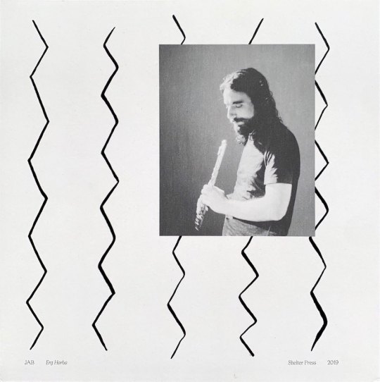
(images from my personal copy)
#JAB#john also bennett#erg herbe#shelter press#mystical drone#flute#dizi flute#john m. bennett#modular synth#oscillator drone#fm synthesis#yamaha DX7II-D#just intonation#psychedelic minimalism#minimalism#environmental music#spiritual#new age#peaceful#meditative#soundbath#album reviews#healing#vinyl reviews#music reviews#vinyl#2019#sun lounge#octagon eyes
1 note
·
View note
Note
Do you have any coloring tips for beginner digital artists?
asdhjf I forgot to post this earlier smh I’m not sure if this will be covering everything you want to know, but here are a few tips I learned as I was starting out + habits I picked up along the way, hopefully they help! ^^
Colour PalettesThese are a great way to find colours that work together, and keep everything looking consistent. Some good resources that are easy to use for finding nice colour palettes are colorhunt and coolors. Overall most important thing is to use colours that you enjoy! Don’t be afraid to experiment!
Neutral BackgroundsSomething I do a lot, which is working on backgrounds that have a tint to them, so that they aren’t pure white. Working on a tinted background makes it easier to see how dark your colours actually are, and overall make the colouring process go smoother. This also applies to putting down your background colours first, so that you can coordinate what darks and lights to use for the rest of your drawing. A light, warm grey background is usually my go-to!
Using Off-WhiteThis is just a matter of preference, but I usually tend to stay away from using “pure white” in my art, unless its in very small quantities, like a tiny highlight in the eye. I go for a cream colour, a very light pink, or very light orange (I love warm tones ahaha). Using an off-white can make colouring seem more natural, while using pure white give a more “cartoon-y” look (again, a matter of preference).
Use of ColourOne of the most common pieces of advice I would always hear is to “avoid using black and gray to shade” since it will make your art look more dull. which I somewhat agree with, however, don’t feel like you have to follow these rules! If you feel more comfortable making art that way, more power to you! (I dabble with using grays to shade sometimes as well - gives a different look).
On the other hand, focusing more on using colour to shade can make your art look more lively and dynamic! You can give your art more dimension by using shades of multiple colours and moving around the colour wheel, instead of staying with the same colour. I tend to use oranges, pinks, purples, and blues when I shade. For highlights I do the same thing, going for colours instead of pure white. For example, highlighting something red with a light yellow/orange, or green with a light blue/purple, etc. (I tend to keep warm colours together, and vice versa).
This also applies to using black and gray; by using a slightly more tinted black or grey, it helps tone down the harshness of pure black or gray, and makes your colours look softer/ more muted.
Gradients!!A great way to add dimension to your art, I use gradients all the time (they’re my life tbh). The key to using gradients is to use them in moderation, and adjusting their opacity (applying layer styles as well which I’ll talk about later*). I like putting down gradients on a separate clipping layer above my flat colours before I start shading; it helps make your art look less flat (even after shading) and really makes it pop! I like using pink, purple, and orange for my gradients with a large airbrush tool; I usually focus on the top of the head, the chin & up the face, and from the bottom of the canvas going up. I then play with different layer styles like linear burn or multiply to make the colour darker, and colour dodge or pin light to make it lighter (these are different from piece to piece, I don’t stick with one set; experiment!)
*Layer styles are basically like filters that you can apply to the layer you’re on and change the overall look, so multiply will darken everything on the layer, while colour dodge will lighten everything, etc. You can find them in a little drop down menu that usually says “normal”. (This is how it is in SAI, Clip Studio Paint, and Photoshop, not sure about other programs).
OverlaysSimilar to gradients, using an overlay on top of your art can make all the colours look more cohesive. The way I use this is adding a colour layer on top of everything (ex. I’ll make an entirely pink layer), and applying a layer style to it so that it overlays on top of the image below it; this can make the colours you used look drastically different, and easily add some cool effects that would’ve been difficult to do manually.
Locking transparency/ Clipping LayersKinda hard to understand at first, but really useful once you get the hang of it! Locking transparency is when you have something down on the canvas, and you want to change the colour of it without having to redraw it, or painstakingly go over it. This is really useful for things like changing the colour of something, or, how I like to use it, is for adjusting the colour of my lineart. I always draw my lines using a darker version of colours that I’ll be using in the piece, and later recolour the lines to help them blend in more (ex. the folds of a shirt). To lock the transparency of a layer, you need to click a little symbol above the layers panel that will say “lock transparent pixel” or “preserve opacity” if you hover over it.
Clipping layers allow you to draw on another layer, while being restricted to the content of the layer that is below it. So if I have my flat colour layer all done, I’ll make a new layer, apply a clipping mask to said layer, and it’ll let me shade on top of my colour layer without going outside the lines (so its restricted to only the parts that are coloured on the layer below - super useful!). On SAI there is a little box above the layer panel that says “clipping group”, while for Clip Studio Paint you need to right click your layer, go to “layer settings”, and choose “clip at layer below” (p sure its the same for photoshop).
Man that was a wall of text haha;; but yeah, hopefully I helped answer any questions you might’ve had, or anything you didn’t understand! Let me know if there’s anything else you want me to give advice on/talk about; I’m happy to answer any questions! ^u^ (to the best of my ability lol)
85 notes
·
View notes
Text
Inner Space - Process 1
Shoes - Illustrator

To create my inner space piece I began by tracing over an image of men's formal shoes, I did this using the paintbrush tool in Illustrator and a touchpad. I could've used a tablet to have more control and smoother lines, but with the grungy sci-fi style I'm going for, the naturally jagged lines from using the touchpad are perfect. I wanted the illustration to be balanced between messy and clear, so once I was happy with it I grouped all the objects together into one. Next I opened this into 'effect > 3D > extrude & bevel' which allowed me to adjust/experiment with the options, here I set the surface to 'wireframe', increased the extrude depth, re-angled all 3 dimensions etc. Once finished I exported the piece as a PNG with a high resolution, I also set the background as transparent so only the drawing is saved.
Grid Landscape - Illustrator

The other aspect of the outcome is a grid landscape which I created using the perspective grid tool, this displayed a temporary grid but not with the correct perspective I needed. To change this I went into 'view > perspective grid' and selected 'one point perspective', a more corridor like perspective.
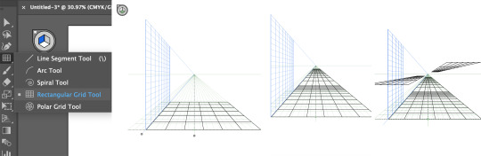
Next I used the rectangular grid tool to draw out the surfaces, doing so I varied the size and placement of these grids to keep it more interesting. I really like how some of these platforms look like they're floating, because it adds sci-fi and mysterious aspects to the piece.

I then used the rectangle tool to draw out more floating shapes on the sides, I think this looks more interesting than if they were solid walls on the ground because it defies reality. With the same tool I replaced the fill with bright red and laid them over the black shapes, depending on the placement I rearranged some of them to the back. This adds colour to the piece rather than covering it, especially important for the grid pattern to show through.

Last but not least I incorporated shadows to create a more realistic look, although the landscape is very surreal, by adding realistic features, the piece comes to life as we can relate our reality to it. To do this I used the pen tool the draw the shapes of the shadows accurately, with this I opened the 'gaussian blur' effect which softened the edges as a shadow doesn't usually have clear, crisp edges. I then set the opacity to 50% so they only affected the colours, not covered them. The placements of these shadows were carefully decided, I imagined light coming from the left which helped me see where they must go. Once I was happy I again exported it as a PNG, with no background and a high resolution.
Editing - Photoshop

Having created both the shoes and landscape in Illustrator, I brought them both into Photoshop which had a background fill of rich blue. I placed the shoes on top of the platform so it looked like somebody's standing on it, I also added a duplicate with a white colour overlay because of the darker colours behind. I think having the black version of the drawing slightly offset behind, is a subtle but effective way to enhance the contrast and clearness even more.

Next I created a shadow for the shoes by duplicating and flipping it vertically, I then selected 'edit > transform > perspective' which allowed me to drag/slant the object sideways. When doing this I kept in mind the direction of light, so like the previous shadows it would cast to the right. Because it's a shadow you would only see it on a platform, therefore I used the polygonal lasso tool to delete any of the shadow outside of the floor.
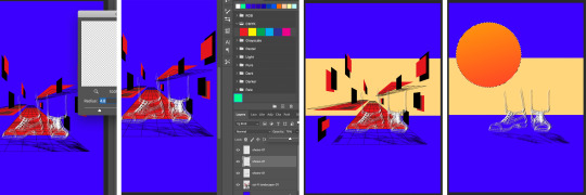
For a more realistic shadow I then softened it using the 'gaussian blur' filter and opacity, this made it stand out less as it's important but not the main focal point. I also incorporated a strip of light colour through the middle of the canvas, bringing in contrast as I think the background looked too boring/plain. Next I drew a circle with the ellipse tool and filled it with a gradient, this represented the sun and source of light which form the shadows.

After this I felt that the piece had too many dark and rich colours, which resulted in looking too busy, messy and unclear. Therefore I selected all the red with the magic wand tool and filled it with light turquoise, however where the shadows were already made on the landscape it didn't select this section. Therefore I selected around these shapes with the polygonal lasso tool, filling them in with the same turquoise as shapes. I then blended it using the 'soft light' option, so it remains a darker shadow. Because this and the beige strip is a light colour, I has to swap the black shoes to lie on top of the white to make it clearer.

0 notes
Text
Double Exposure, Two Colour Workshop
For this double exposure technique, the process involves completely removing a colour channel from an image. The difference between removing a colour and removing a colour channel is that colour channels exist in every image. If you think of any image, black and white or otherwise, imagine it being split into 3. One is made from shades of blue, one of red and one of green. Separately there is a lack of detail, but when they are all overlapped they can produce something like the image you see below. This therefore means that removing a colour channel would actually allow colour to show through.
1.
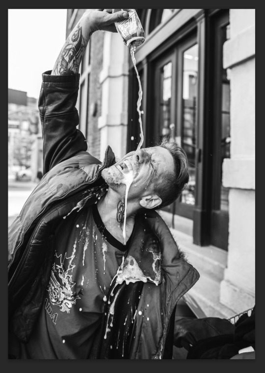
The first step for this design was to bring in this photo I found on Pexels. The document size I brought it into was A4 with the colour mode set to RGB. To bring the photo in I pressed CTRL+SHIFT+P and selected the image.
When researching craft beer, I discovered various citrusy beers. Following this, I decided to overlay the previous image with one of some lemons I found on Pexels. I brought this in using CTRL+SHIFT+P and selecting the image. I then right clicked both images in the layers panel and clicked Rasterize. I did this on each image seperately.
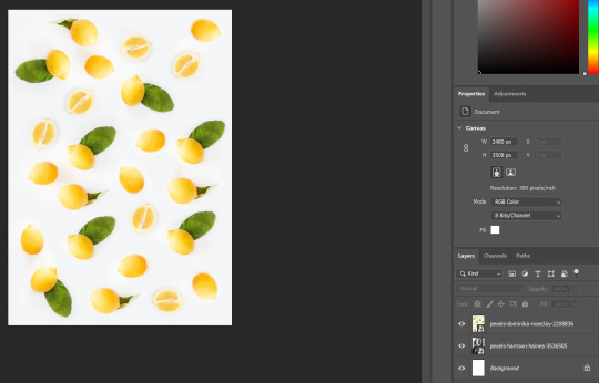
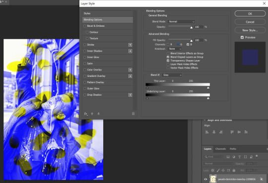
I then right double clicked the thumbnail of the lemon image which opened up the Layer Style window, which automatically is opened on the Blending Options tab. Under Advanced Blending, I unchecked the Red channel which removed all elements of red shading from the image.
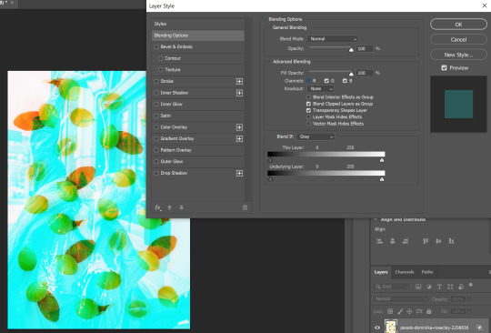
I didn’t like the effect of removing just one channel from the image so decided to experiment with removing two. The image you see below is the result of removing both red and green channels. I liked this one because the lemons remained yellow and the rest of the image had a blue tint to it.
For this step I made a Levels adjustment layer. I did this by clicking the half filled circle icon in the layers panel and selecting Levels from the list. With this done, I am able to adjust the shadows, midtones and highlights within the image. You can see the difference of applying this adjustment layer by comparing the image above to the one below.
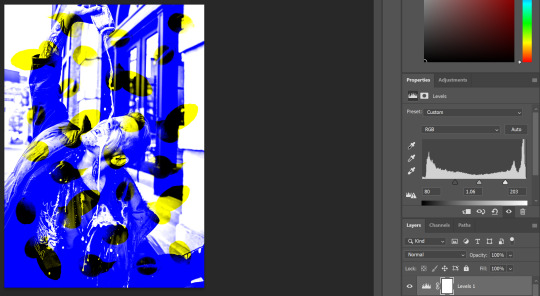
Next I made another adjustment layer, this one being Selective Colour. This can be located in the same list as the Levels adjustment layer. This layer allows me to pick a colour from a list and change the hue of just that colour. Firstly I adjusted the yellows of the image, which I did by removing any other colours within the yellow and increased how bright the yellow was. However this yellow was hard to see on the white, so I partially increased the black in the yellow also.

Next I adjusted the blue in the image using the Selective Colour adjustment layer again. I reduced the cyan and increased the magenta and the black. This changed the blue to a purple, which I thought worked better with the yellow. This is because they are colour opposites.

This is the final outcome of my first attempt of this double exposure workshop. I do like the overall aesthetic and I think I made a good decision with the use of colour. However, I do think that it is slightly hard to see they are lemons at first glance. If I was to do this again, I may use slightly more distinctively shaped lemons.

2.
For this collage, I decided to use the same image again. I did this because I liked the image and wanted to try a different double exposure technique. I brought this in using CTRL+SHIFT+P and selecting the file. With this done, I was able to pick the Quick Selection tool from the Tool Panel and press Select Subject from the top of the screen. This put a selection line around the subject of the image, which is the man in this case.
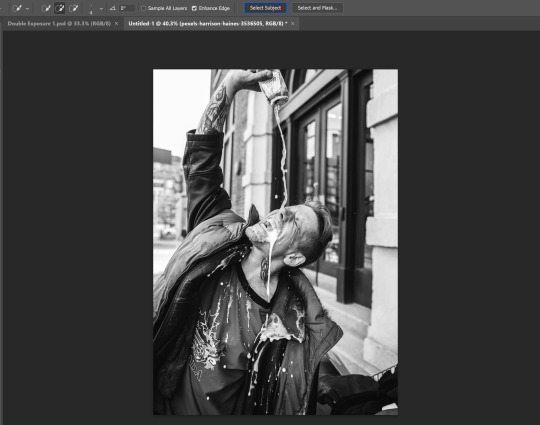
For a more refined selection, I clicked Select and Mask which could be found next to the Select Subject button. This allowed me to go around the image with a brush, which I did over parts of the image that weren’t selected very well. I did this more around the man’s hair in the image.

With this done, I pressed CTRL+SHIFT+I which inverted the selection. This meant that the selection was on every part of the image other than the man. I then deleted this with DEL, which left me with what you see below.

For this double exposure experiment, I wanted to use the same image again but mirrored. To do this, I first pressed CTRL+J with the image layer selected. This duplicated the image and placed this copy in the exact same place as the original. To mirror the image, I pressed CTRL+T to transform the image and then right clicked on the artboard. This opened a list from which I was able to select Flip Horizontal from. Flipping the duplicated image horizontally produced what you see in the screenshot below.

Following the same process as before, I double clicked the thumbnail of the duplicated image to open up the Layer Style window. Unlike before however, I only needed to remove one channel in order to keep enough detail. As you can see below, I unchecked the Red Channel.

Here you can see where the design is starting to come together as a double exposure piece of art.

The next step was to begin adjusting the tones of the image. To me the image appeared a bit washed out, but I didn’t want to darken the reds. To achieve this, I first produced a Levels adjustment layer. To make this, I clicked the half-filled circle in the Layers Panel and clicked on Levels. With the Levels window open, I selected Blue from the drop down in order to only adjust that colour. As you can see below, I made the blues much darker which made the design look more dynamic.
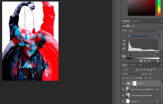
I also decided I wanted to make the cyan within the image more of a turquoise. To do this, I needed to use a Selective Colour layer which can be found in the same list as the Levels layer. With this layer produced, I selected Cyan from the colour list. I then increased the Cyan to 100%, brought the Magenta to -30, the Yellow to +28 and the Black to 100%. This produced the green tint you can see below.

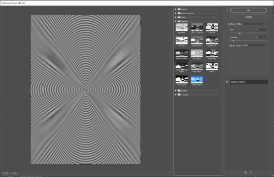
For the next step, I wanted to add a ripple effect to the design. The first thing I needed to do was produce something to apply this effect to. Using the Rectangle Tool, I made a white rectangle over the entire image. In the Layers Panel, I then right-clicked and rasterized this layer. With this completed, I then went to Effects > Filter Gallery > Sketch > Halftone Pattern. In this window, I set the pattern type to Circle, the Size to 4 and the Contrast to 5. This produced the circle effect I was looking for so I then pressed OK.
To allow the design beneath to show through the ripple effect, I needed to adjust the Blending Mode. For the result you see below, I used Colour Dodge.

This is the final outcome of this double exposure design. I am very happy with the result, and I think there is a good contrast between the brighter colours and the darker elements of the design. I also think adding the ripple effect was a great way of adding texture without compromising the design.

3.
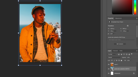
Following the same process as for, I first brought in image I found on Pexels into an A4 artboard. I did this using CTRL+SHIFT+P and selecting the image from the file explorer.
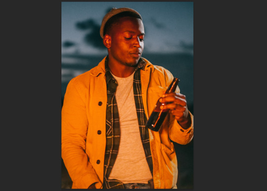
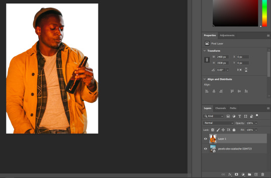
Next I picked the Quick Selection tool from the toolbar and pressed Select Subject from the top of the screen. This puts a selection line around the subject of the image, which in this case is a man holding a beer bottle.

Because I wanted to keep the man within the image and delete the background, I pressed CTRL+SHIFT+I. This inverts the selection so everything other than the man is selected. You can see the selection lines around the background in the image below.
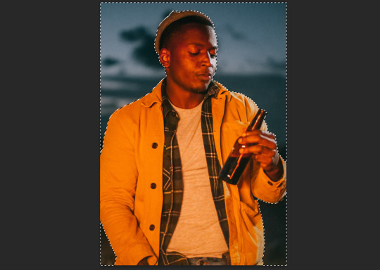
I then pressed DEL on my keyboard to delete the background of the image, leaving just a white background.

Next I brought in an image of a town in Greece I found on Pexels. I did this to represent the beer being something you can drink on holiday, or in warm weather. I brought in the image using the same command as before; CTRL+SHIFT+P. I then dragged this layer down below the image of the man in the Layers Panel.
For this step I realised I no longer needed the white background on the image. So I unlocked it by clicking the padlock icon next to the white background layer and deleted it by pressing DEL.
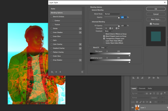
For this step, it was time to start applying the double exposure effect. I did this by double-clicking the thumbnail of the image in the Layers Panel to open up the Layer Style window. Within this I was able to hide the Red Channel of the image, which produced the effect that you see below.
With the previous step done, it was time to start toning up the image. The first thing I used to do this was the Colour Balance adjustment layer. I set this to modify the highlights of the image. I put the colours to 4 towards cyan, 30 towards green and 27 towards blue. You can see the dynamic difference this made by comparing the image above to the one below.

I didn’t feel there was enough emphasis on the beer bottle so I decided to remove the Colour Balance around the beer bottle using a clipping mask. When an adjustment layer is created, a clipping mask is automatically created. This can be easily edited by selecting the clipping mask (the white square) next to the adjustment layer in the Layers Panel. Then with a 0% hardness black brush, I went around the area which contained the beer bottle. This made the bottle appear to be glowing like you see below.
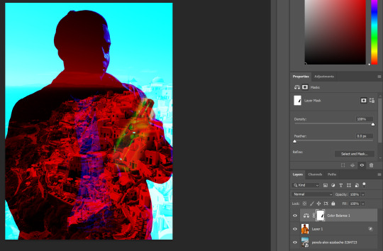
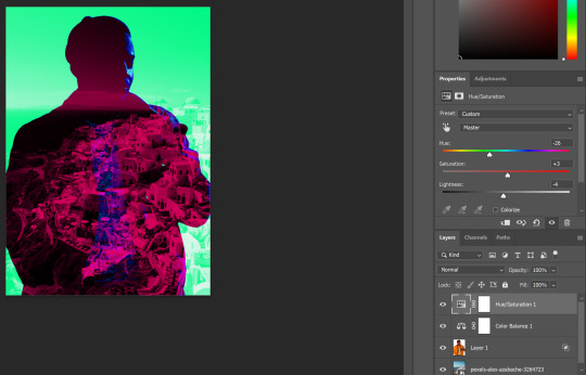
I then decided I didn’t like the previous effect so I cleared the clipping mask using a 100% hardness white brush. But whilst I was looking at the image, I realised I found the red a bit harsh on the eyes. To combat this, I decided to alter the hue of the image using the Hue/Saturation adjustment layer that could be found in the same list as the Colour Balance. I brought the Hue to -26 and increased the Saturation by 3. I also reduced the Lightness by 4, which concluded the alterations to the image.
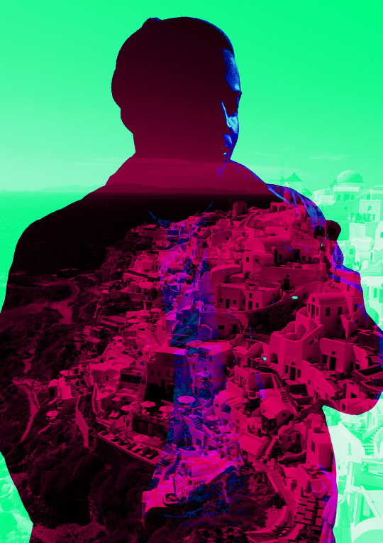
This is the final outcome of my third experiment with double exposure. I think this image is the most typical to what people think of double exposure as, but I don’t think this is a bad thing. I enjoyed experimenting with variations of the technique over this workshop, but I do feel that this particularly design was lacking more in quality. For example, I lost the subject of the image in exchange for a better effect. Although I think the overall design is fine aesthetically, this was definitely a compromise.
0 notes
Text
Edits using Procreate (part 3)
This is a continuation of the edits from the same photograph from the last post.

This is another edit from the curves effect, i dont know how i made the slide bar do that. As I have done so many of these edits they are all starting to look the same to me and as they are of the same picture there is only so many things I can say about the colours that is different. I like how the red of the background of the sky and the red of the bottom of the lamp post is the same and that the red is on the top of the clouds, as the red is so vibrant it makes the lamp post stand out much more almost like it is edited in over the top. I love the pale pink and white colour in the bottom right of the edit. I love the darkness of the clouds with the deep rich green colour. Then you have the deep purple part as the shade on the right hand side. I love how the background goes from a orange to red. I love the pale pink that blends into the red colour of the colour of the window pane area. I like that there is a overlay of a yellow strip over the top so the colours don’t blend, the colour is the yellow seems to mix with the red of the window area making it green instead of yellow.

This is the last curve edit of this picture. I like how dark the clouds are and that they are red and black, I like that the black is at the front and then the red is at the back creating the shadow and the colour at the bottom under the clouds on the right side. I like how in the bottom right the blend of the light green to the light blue is really nice and then the colours are repeated on the top left but it goes blue then green. The green takes up most of the black of the window pane area. I love that the colour of the lamp post is the same colour as the green from the edges. I like the orange background sky colour.
These are all edits of the last edited picture so all the colours are of those colours will be changed instead of the original. I decided to change and edit an edit image so I had different colours and having the different brighter colours would make what I wanted to do with the editing either better or worse.
Gradient map

This is gradient map filter again, I wanted to see how changing the colours from the original will change again with the gradient map. I love the colours of this edit, I love that it looks like something you would see in a coffee poster or something for calm vibes. I love how the gradients have worked on this, it seems like each different section has been gradiated separately but it all seems to still work cohesively.
Glitch effect
This is the glitch effect again, I love this effect, this is the artifact selection. I love the way that the blocks look in this edit, the effect is on there enough to so u can see it but then it isn’t on there too much that it ruins the whole image completely, that is because I kept the percentages small on the zoom and the block size and the amount so then the block are spread out.
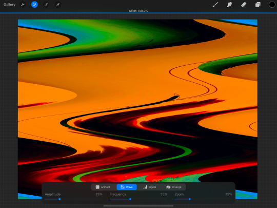
This is the wave selection of this edit. I still kept the percentages on the slides at the bottom below 50% but I changed the top slide to 100%. This made sure that the effect was on but then changing the bottom slides made it better to control the amount waves and how close or far apart they are. With this effect if you had seen the original image you can still tell what the picture is but the colours being the same but without the original edit you wouldn’t really know what it is or trying to portray. I don’t like that there is so much orange in this edit, the original edit with the orange didn’t bother me but having it all moved around and with the colours pushed and warped, i think that there is too much orange.

This is the signal effect, this effect can be very detailed and it can make the edit look very busy. I kept the top slide on 100% changed the amount to above 50% but kept the others below 30. I like that this edit seems to split the picture up in to horizontal sections and moves them all left and right changing the layout. Then along with that the edit also adds lots of small pixel dots to add detail. I love the addition of the small purple bars that is spread throughout the piece.

This is my favourite edit from this section. I love all the bars and the way that the colours are glitching out and also creating multiple additions to parts like the lamp post and adding to the texture of the clouds. The orange background doesn’t bother me as this edit adds flecks of red and green in to it. I love the pink and purple at the bottom right corner of the edit.
These next edits are all edits of this last glitch effect edit. I really liked this edit and wanted to know what it would look like in other colours and brightnesses.
Hue, saturation, brightness

This is me just changing the colour and the brightness of the colours. So the colours are inverted. This creates a completely different vibe to the edit.
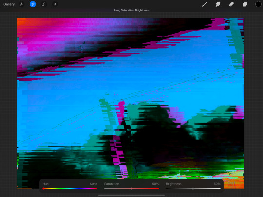
This edit was me taking the brightness down to tone down the white of the clouds and the blue of the background.
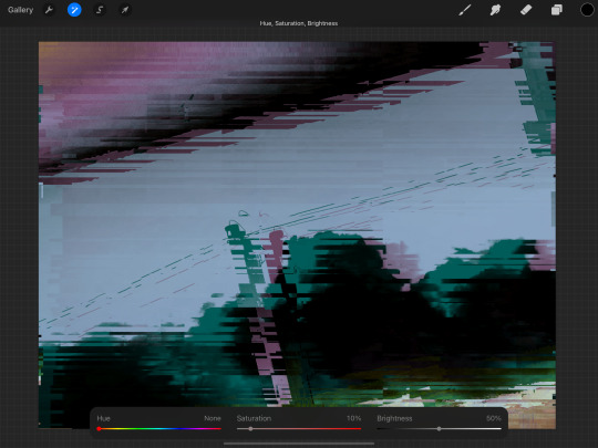
This edit is me taking out almost all the saturation of the colours so muted. I love the greys and the greens. This one is my favourite of these edits that I did.
Because of the change in the colours and the brightness each of the pictures look compleatly different.
0 notes
Text
Glitch Imagery Of Buildings
Here, my task was to create glitch imagery (on Photoshop) using different techniques to show the glitch effect. The techniques included, corrupting files, repeating information, distortion and colour overlays. Before I started creating my own work, I had a quick look at the artwork of Karbon and David Szauder, who are both illustrators that take information and change it.
I captured this building because I was interested in the white wooden structure that was connected to the brick building. The two colours and textures work so well too. I think even the details around the window is engaging. As well as this the lighting in this photo makes the structure even more striking.
Below, I chose to start cutting out the wooden structure using the ‘polygon lasso tool’ because that was the the most interesting part to me. I then duplicated this (CMD J), where I selected one of them and went into ‘filter’, ‘distort’ and ‘wave’. This then brings up a control panel where you can change the wave length, amplitude and scale. This means you can decompose the image as much as you like. I then went back to the other wooden structure as slightly edited the colour. Next I added a few more of these edits over the top and underneath the wooden structures. I then went back to the original image and edited out a part of the brick wall which I then edited to make cover most of the page. The colour theme I went for was an icy blue as it works so well with the off-white wood.
Here, you can now see I have added a triangular shape from the wall again. Although this time I will keep it in its original form but duplicate the same one and arrange it around the page. I made the colour blue again. However there was something about this piece that I wasn't a fan of.

I then experimented with this colour that is quite similar to the original brick colour but I think this colour wasn't bright enough and dint contrast enough with the dark grey.
I then tried purple which I preferred. This purple I chose isn't a very bright purple so I then stared experimenting even more with what I already had but to improve it.
After a few more details, I finally got to the point where I thought it was effective. I have added another wooden structure to the piece where I have rotated it 180 degrees and placed it next to the original. I also arranged some more glitched parts from the photograph which I tried to make spread across the page to fill in some of the negative space. I decided I had too many triangular walls as well but ended up keeping two because I felt it added to the piece. Lastly I changed the colour of all the layers. I experimented and tried out all the settings in the side panel to what was the most effective. In the end, I finally found this combination as was drawn by this straight away.

Overall, I think this is my most successful piece.
0 notes
Text
Moving Video Call Backgrounds
Animated Backgrounds in Video Calls & Virtual Meetings
Overview
Coworkers have been asking me how I get animated and moving backgrounds (and foregrounds) in my video conference calls and virtual meetings. So, I’ve created this article to give an overview of the process and tools. For this article’s background example I chose a video that won’t get me into copyright trouble. Its background is a recording of the city gates of Amnoon. And its a scene I recorded while playing the game Guild Wars 2.
The method to create this effect is layering. In oversimplified terms, the background is the bottom layer. In my example I used a video instead of a static image. Layered on top of the background is the output from my webcam. And finally, the very top layer is a graphic with some text. I combined all these layers using the free software tool OBS (Open Broadcaster Software) and output that as a single video feed.
Since I’m not actually “broadcasting” or streaming (OBS is primarily for Twitch, YouTube, Facebook Live, etc.), I need something to convert the broadcast into a useable format. Therefore, I’ve installed the OBS plugin VirtualCam, which makes the OBS output look like a webcam to other programs. Instead of selecting my actual webcam as the input for my video-conferencing software, I set it to the virtual device named “OBS-Camera.” This technique works for Microsoft Teams, Zoom, Skype, Jitsi, and GotoMeeting. I’ve done so much testing that some of the results are fading into a memory fog. So, I’m only “mostly positive” that it will work with Google Hangouts, Google Meet, and Discord. The only “failure” I distinctly remember is for my doctor’s tele-medicine product, and that was because it would not let you choose an input device.
OBS is just one “link” in the chain of tools used to create my desired output, and each software tool runs on a fairly beefy computer (see the end of article for details). Below is more detail on each link in this chain of tools. They are presented in a logical sequence: from the source to the destination. Along the way I’ll also mention some alternative tools that I’ve experimented with, since they may suit your needs better. And at the end of the article is a collection of miscellaneous notes, tips, and tricks.
The Chain of Tools
Environment
I’ve arranged my environment to improve the image and audio quality I can produce. I’ve added lamps and baffles to diffuse, bounce, direct and control the temperature (color) of the lighting. Not only of my face but also of the background (so it’s easier for the computer to cleanly “remove” my real background). For audio I do the same to optimize conditions: I set the timer on my air conditioner so it cools the room beforehand, and automatically turns off just prior to the start of the next meeting. I then turn down fans and other background noise. I’ve also covered the glass (bordering our front door) with a decorative overlay so the dog is oblivious to the comings and goings in our neighborhood. And finally, I close the office door if the grandchildren are visiting.
Audio hardware
My primary microphone is a dynamic mic with a cardriod sensitivity pattern (i.e., it minimizes off-axis and extraneous background sounds and focuses on just my voice). It’s a Samson Q2U in a Rycote InVision USM shock mount on a Gator Frameworks boom and stand. The mic can be connected via USB, but I’m using an XLR cable to a Zoom H6 acting as my computer’s Audio Interface. The Zoom H6 lets me mix multiple audio inputs, directly monitoring the mic, control gain, enhance the audio (e.g., volume compression), etc.
video hardware
Built-in webcams typically produce terrible video (grainy, choppy, dark, and low resolution) and at the wrong angle. Dell is notorious for their “nostril” cameras, which are mounted below the screen. Therefore, I began my journey with equipment already at hand. For video I used an iPhone XS Max because it has an awesome camera. To make my iPhone act as a webcam, I used Kinoni’s EpocCam app and PC software. To hold the phone at the proper height and angle, I used a Ram Mount X-grip with an extension arm and custom base (a glass brick filled with decorative river stones). A wireless Qi charging pad from Anker was stuck to the back of the X-grip to supply continuous power.
Although the iPhone was a high-quality solution, I wanted a dedicated webcam because I kept forgetting it was still mounted above and behind my monitor. Not only did I keep leaving it behind, it was also inconvenient to use the phone, as a phone, in this configuration. Although the cameras on iPads and Touch iPods are not as good as recent iPhones, they could be a dramatic improvement over the built-in webcams you’re using. And EpocCam works with Android devices and on macOS as well, as well as other competitors that I’ve heard of from other users.
Before for buying a dedicated webcam, I also experimented with other “normal” cameras configured to work as webcams. One option was using the HAYOX capture device to convert HDMI output to USB input (e.g., when connecting a GoPro HERO8 Black in a Media Mod “cage”). But the latency and low-light performance was poor. I also converted a security camera I had on hand (the Wyze Pan Cam) into a webcam by applying a special firmware change. This was purely out of curiosity since the camera has an extremely large field of view that makes it undesirable except for the most desperate of users. You also lose the Pan/Tilt/Zoom controls and Infrared features, so it’s now restored back to its “security camera” configuration. And I can feed it into OBS as a secondary camera view using an iPad connected with an Apple HDMI adapter—it’s pretty cool, but not particularly useful for virtual meetings.
None of the above experiments compared to the performance of a dedicated webcam like the Logitech Brio (which is what I’m currently using). The less expensive Logitech C920s, C922, and StreamCam are also great alternatives. And I’ve craved pricer upgrades such as the HuddleCam HD or an Alpha-series Sony mirrorless camera (e.g., the wallet-busting a7S III). But those are more suited to professional streamers and media influencers that broadcast for a living.
The final piece of hardware equipment I have is a “green screen” (for chroma keying). I would NOT recommend it for most users, and I only use it for special situations. A lot of the software that I mention below can be used without it. Green screens can be tricky to set up because they must be evenly lighted (no shadows or brighter areas) and can “splash” a green glow onto the subject if the light angles or distance are wrong. And when the screen is far enough back from your position, then it has to be humongous to still fill the camera’s FOV (field of view)! I use the Valera Explorer 90 and even at this size it is a challenge to position so that it fills my webcam’s FOV. I wish it came with other color screens (chroma blue, neutral gray, and white), and I may make some by hand if the vendor doesn’t add them. I had originally contemplated a retractable ceiling-mounted backdrop that pulls down like a movie-projector screen. But I went with the Valera since it collapses easily and is small enough to store out-of-sight in a closet corner. If I were a professional streamer, and had a larger office/studio, then I’d probably go for a fixed screen (like this massive 8x8 foot backdrop) or perhaps a wall covered with special chroma green paint.
Software
I use multiple software programs to create the video feed used in virtual meetings. And the combination changes based on the look to be achieved. If I’m using a static image as my background, then no additional software is needed. Both Microsoft Teams and Zoom include excellent features that do background replacement.
A more complex composition, like my example video above, uses a few more tools. Let’s look at the layers (from front to back) and the tools used for each. In the foreground is a graphic with text that provides additional information. The broadcast industry calls this a “Lower Third” (or L3) since it typically appears at the bottom of the screen. In my example video above, my L3 is actually positioned in the upper right corner. It was created using the free art program Paint.NET but any graphics software (CorelDraw, Photoshop, Procreate, etc.) could be used. I save my L3 graphics in the PNG format since it lets me save images with transparent backgrounds. But also because PNG does a superior job of compressing mostly solid, non-gradient colored shapes and text, which is what most L3s are.
Both L3 examples above have a section for a ticker (scrolling text). This text is layered over the L3 and comes from, and is configured in, OBS. The ticker is a “Text” layer with a “Scroll” filter added. Below is a screen shot from OBS for an AFK (Away From Keyboard) screen. At the bottom (second pane from the left) is the SOURCES pane and it shows the two layers that make up the preview being displayed. The bottom layer is named “Please Stand By TV” and it pulls in the background image. On top of that is the ticker: a layer named “AFK Text” which contains the “I will be back in just a moment” message (including settings for placement, color, font, size, speed, opacity, etc.).
For my example video at the top of this article there is a middle layer, which is me via the webcam. In OBS this is a “Video Capture Device” layer type. However, there is a software component that sits between the Logitech Brio and OBS. The “Logitech Camera Settings” application lets me adjust and optimize the camera’s video. I adjust saturation, white balance, contrast, etc. to match the background (whether moving or static). For example, if it’s a sunny beach scene then I would set the white balance to a warmer golden cast, increase the contrast, and bump up the brightness so it matches the scene. I also adjust my office lighting so that the shadows fall in the same direction as in the background. If the background is of a thunderstorm at sea, then I would match my image with a cooler white balance (i.e., a subtle blue cast), a darker exposure, and less contrast. I’ve also taken the opposite approach, and selected backgrounds that already match the lighting in my office. With more believable backgrounds (like a photo of an office or kitchen versus the cockpit of a spaceship), the matched lighting has been realistic enough to cause people to think I was actually in those locations!
In addition to the camera’s utility software, OBS can also apply filters, and adjustments, and LUTs (adjustment Look Up Tables). A LUT is customized to both your specific camera and to your specific lighting conditions. To create a LUT, you first capture an image from your camera, which is taken under set lighting conditions. Then use a photo (or video) editing program to make adjustments to the captured image until it looks best. The adjustments are not applied directly to the captured image. Instead they are put on a separate layer, and you’re viewing your image through the adjustment layer. (Think of it as if you were painting on a pane of glass that is sitting on top of a photo.) Next, you replace, cover, or hide your captured image with a LUT reference table (original and unmodified). The LUT table is now sitting below those same adjustments. The results are flattened (the layers combined) and saved to a PNG image. This file is a custom LUT that can be applied to your camera’s output so all video gets the enhancements. Below is the before-and-after for a Wyze Pan Cam, a camera that’s optimized for security monitoring, not image quality. As you can see it adds a terrible yellow cast to the video, but with a custom LUT applied, the colors are much more natural.
For an animated, moving background I’ve been using YouTube videos. Yep, it’s just that simple! In OBS this is a “Browser” layer and would be positioned at the bottom. If your videoing or photographing your own (or when choosing someone else’s) backgrounds, be mindful of the angle. In a meeting, your webcam is at eye-level while seated! So choose/take photos at that same height to create more natural backgrounds.
Picking a good background is a balancing act. If it’s too plain, then the artificial outline—the edge where the computer cut you out from your real background—will be very noticeable. A bit of detail and texture in the background helps to hide that outline. If the scene is too busy and detailed, it becomes distracting and you blend with it instead of being in front of the background. In real TV studios they use a “hair light” to ensure distinction and depth—to make the person stand out from, instead of blend into, the background.
When removing and replacing your actual real-life background, you want it to be plain and as uniform as possible. A blank wall would be excellent. This helps the computer distinguish your outline from the background. Angle your lights and use baffles (I use foam core boards) so that the light falls on your face and shoulders but not on the wall behind you which are slightly darker. To prevent “hot spots” and deep shadows on your face, bounce the light off the walls instead of pointing lights directly on yourself. This will soften and diffuse the lighting and create a more appealing appearance.
While on the topic of texture and detail in background images, it’s important to not go overboard. Some software cannot cope with an image that is too intricate. I had a photo of the interior of the NASA space station. The original was too complicated for Microsoft Teams to even display. Also, you don’t want to overload the software by having it to constantly downscale large images. And photos from modern cameras and phones are massively oversized compared to a computer screen. They are so large they can crash your software. To prevent big images from slowing down or crashing my software, I proactively resize my backgrounds to “Full HD” size—that is, 1920 pixels wide by 1080 pixels tall. (This is also the size that MS Teams would reduce a background image to, so it saves the time and effort required to convert it every time,) And while I’m cropping, sizing, and enhancing backgrounds, I will also flip them so the incoming light in the image matches my actual lighting. For example, a background photo may have a window (with incoming light) that is on the left. I will flip that photo so the window is on the right-hand side, like my real-life window.
While we’re discussing software limits, don’t load too many backgrounds into your meeting software! I learned the hard way that MS Teams will crash if you have over 100 custom backgrounds. I now keep all my custom backgrounds in their own folder and only copy about 75 to MS Teams at a time. Below is a script I use to replace old custom backgrounds with a set of fresh “finished” images.
DEL /Q C:\Users\Craig\AppData\Roaming\Microsoft\Teams\Backgrounds\Uploads\*.jpg COPY /Y C:\Backgrounds\Finished\*.jpg C:\Users\Craig\AppData\Roaming\Microsoft\Teams\Backgrounds\Uploads\
Tips, Tricks, & Notes
Use a wired ethernet connection when video conferencing. It’s not only faster, but also more reliable and stable than WiFi.
The Zoom H6 can be used with an iPhone/iPad, even without AA batteries! When the H6 boots up, select PC (instead of iPAD) as the connected device.
Video processing can be intensive and requires a computer with sufficient capabilities. My Windows 10 PC has a Core i7-7700K at 4.2GHz, 32GB of RAM, a Samsung 850 Pro 512 SSD, 4 Toshiba 7200RPM 500GB drives in a RAID 5 array, an ASUS Prime Z270-AR motherboard, an Anker 10-port powered USB3.0 hub, a 1000 watt Corsair power supply feeding dual video cards, and a Corsair Hydro H100i liquid cooling system to supplement two case fans to keep the whole thing from burning itself out. This computer sits next to a window air conditioner that counters all the heat coming from this PC, the monitors, and accessories. Before the AC was installed the office could reach 80°F even in the dead of winter with all the heating vents closed.
0 notes
Last Seen Blogs