#this is actually the first time i've posted a color palette set
Text
And they're done!!

first post about these socks
second post about these socks
What an intensely enjoyable knit! I've never done so much colorwork before, and certainly never with 3 strands! What a challenge, but also highly engaging. These socks felt like they took no time at all! They're also quite soft and pretty darn warm, so I'm very excited to add these to my closet come fall & winter. Thank you to Oakwood Knits for a fantastic sock design!
Like the first attempt, I tracked my daily progress, but I started doing so after I caught up to where I stopped from my first attempt, which took half the time to do this attempt!


These still need to be blocked, and I have a set of sock blockers on the way, but I didn't want to wait to share because I just am so pleased with them. I learned a handful of new things making these, namely continental, to hold the secondary color, and how to better tension strands of color. I knit these both at the same time across two circulars, and the little onion* skeins of Palette actually made it so I could use only one skein at a time for both socks! I did make a little ball for each sock for the third color rows, however. But ultimately, it worked out great. I also did Eye of the Partridge heels and toes, because I know my feet and those are the spots that need the most reinforcing, and I also added in a single row of purls on the top at the toes because I like how it looks on socks.
Bonus: the start of the spring socks, since I missed the KAL for them and was so jazzed by the summer socks I want to knit more!

*I don't know of they're really called onion skeins, but I can't remember if they have an official name and they look like onions to me, so there you go
pattern: Oakwood Knits
yarn: Knit Picks Palette
#handmade#knitting#yarnblr#fiber art#fiber arts#fiber artist#sock#sock knitting#wool socks#stardew valley#stardew valley socks#stardew summer kal#knit#knitters of tumblr
749 notes
·
View notes
Text
Icarus Part 3
Hello! If you haven't seen it yet, I've got a set schedule for what story posts on what days now (as seen here) and this one as well as Well Met By Moonlight, Batshit Soulmates, and Never Hold Back Your Step... will still be posting just on rotation until I can finish some of my WIPs. (I may be stretching myself a bit thin having six going at the same time.)
In this one we have the concert. Eddie stumbles on something big and doesn't know how to deal with it all. And Uncle Wayne is bestest as always.
@emly03 @redfreckledwolf @itsall-taken @rozzieroos @mira-jadeamethyst
Part 1 Part 2

The day of the concert dawned abhorrently cheerful and bright. Not a cloud in the sky or any accidents that would prevent Eddie from having to take Dustin to this event. He wouldn’t deign to call it a concert. He had heard the album and seen their posters, but he refused to wander over to YouTube and watch videos of their concerts, interviews, their music videos.
He didn’t want to be even more disappointed that they were all flash and no substance then he was sure he was going to be for the next two hours.
Dustin rolled his eyes when Eddie parked in the huge concert parking lot.
“You’re just salty because I like them as much as I like Corroded Coffin,” he huffed getting out the car. “You have to concede that Abaddon’s vocals are killer.”
Eddie scoffed. “Do not. I haven’t heard them live. Way too many artists use autotune too much these days.”
“You sound like that meme,” he sneered, “‘Old Man Yells at Cloud’.”
Eddie swatted at him playfully. “Am not.” Dustin raised his eyebrow skeptically and he threw his arms in the air. “I’m not. I am a very serious musician, Dusty. The last thing metal needs is some band that can’t write or even play their own instruments. This isn’t pop.”
“You are such an asshole,” he said and turned toward the entrance, leaving Eddie to jog to catch up with him.
Eddie sighed and put his arm around Dustin’s shoulder. “I’m sorry. You’re right. I am being an asshole. I turned into the person I swore I would never be. Those shit for brains critics that hated Corroded Coffin when we first got on the scene. And that was wrong of me.”
Dustin sighed, too. “I just want you to like them too. They are so good if you’d just give them a chance.”
Eddie breathed out through his nose. “Yeah. I can at least give them that.”
They got to their seats and Eddie was a little impressed at Claudia Henderson’s Ticket Master foo. They weren’t front row, but they were only a couple of rows back so you could actually see the stage without having to strain their necks and smack dab in the center of the row.
Dustin would have the best time. And now it was up to Eddie not ruin it for the kid. Because yes, he was still a kid as far as Eddie was concerned. Twenty-one was so fucking young. That was how old most of the band was when they got their record deal, after all. They weren’t prepared for what came next, that’s for sure.
They got settled into their seats and Eddie watched as the rest of the crowd shuffled in. They were all about Dustin’s age with very few exceptions in either direction.
There seemed to be a color theme going on with the girls in the audience though. They were grouped in clumps of red, black, blue, or white. Which made sense if each band member stuck to a certain color palette.
Well he was about to find out, he supposed.
The lights dimmed. The crowd quieted down. The spotlight lit up the drumkit first. And Eddie knew that Gareth would be drooling over it. It was all black with black metal fittings. The kit seemed to collect light almost like a blackhole.
Then from the ceiling, a man dressed all in black being lowered onto the stage with large black raven wings on his back. He wore a black hooded coat over what, Eddie couldn’t tell. It was all black. The shirt, the pants, the boots. Even his mask was all black with even the eyes appearing closed. His feet touched the ground and the crowd went wild.
“Azrael!” the announcer called out.
Azrael settled on the throne and picked up black drum sticks.He counted time above his head and played a wicked solo to the adoring crowd’s absolute delight.
Dustin jumped up and down, screaming.
The spotlight moved to the right side of stage and the next band member descended from the ceiling. Large bat wings adorned his back and he was dressed in red leather fetish gear. Complete with tight leather pants that looked painted on and a matching harness highlighting his bare chest, peeking out from the red leather hooded coat.
His guitar was fucking gorgeous, though. A Warlock, much like Eddie’s own. It was custom painted red with black flames licking up the neck.
Eddie rolled his eyes, but it seemed he was the only one who thought the whole thing was over the top judging from the screams from the girls in the audience.
He didn’t just land gently on the stage like the drummer did, oh no. He fucking stomped onto the stage with a howl.
His wings, like the drummer’s ascended back into the rafters as the announcer shouted, “Asmodeus!”
And then Eddie really did roll his eyes. The demon of lust. Of course he was.
But seconds later Eddie’s jaw dropped to the floor as the man wailed on his guitar driving the crowd further into the frenzy.
Once he finished his solo the crowd quieted again and he could see why. Because just then, descending on gossamer wings that shimmered like starlight, was their bassist.
Everything about him was midnight blue and shimmering like the night. His mask was the face of the moon. He had his own hooded coat, but it was like the night sky, with some kind of crystal or gem sewn in to make the coat glimmer like stars.
His bass was something that Brian would have sold his own mother for and they were as thick as thieves. Eddie didn’t know much about basses considering his sweetheart was an electric guitar, but he could tell it wasn’t expensive but was perfect for his style. A style he showed off with gusto to the audience’s obvious delight.
“Astraeus!” the announcer cried.
Eddie decided that this one was his favorite. It played up the whole mysterious thing without the over the top flash of the guitarist or the sheer void of the drummer.
The audience hushed as the three members of the band began to play what was clearly the lead singer’s entrance music.
And holy fuck was Eddie screwed. This man was descending like a fucking angel sent from God, Jesus pose and all.
He was all in white with an opaque lace mask that had his mouth and chin cut out for him to sing. That surprised Eddie somewhat. He figured that the guy would have his whole face covered like everyone else in the band and that he could lip sync.
But nope. Apparently no one in this band did anything by halves.
The lead singer was wearing a sheer mesh crop top under the hooded floor length coats the whole band was wearing. Only his was white with a silk powder blue lining.
Eddie winced in sympathy. They must get boiling under the lights with those things on.
A few feet from the stage floor there was an explosive pop! And the feathers from his wings flew out into the crowd who was now screaming as if their life depended on the sheer volume coming out them. He looked over at Dustin who was no different.
When Eddie could see the stage again, this angel’s wings were now skeletal and gothic.
He landed in front of microphone whose stand had been decorated with a scarf in each of of the band members’ signature colors.
“Abbadon!” the announcer yelled for the final time.
And Eddie was in love. He couldn’t believe what he was seeing.
Dustin must have seen his expression because he was suddenly tugging on Eddie’s arm and screaming, “I told you!!”
“Indy!” Abbadon growled, grabbing the mic. “Thank you so much for having us! Let’s get this started.”
Then he began to sing and yeah, Eddie knew that the guy had charm, but this was a whole new level of epic. He was enthralled.
He didn’t utter a fucking word for several songs. But then it happened. Eddie couldn’t believe it. He hurried to snap a picture to make sure he wasn’t dreaming.
But there it was it in living color. He turned to Dustin to see if he saw it too, but the kid was too busy screaming and jumping up and down.
Eddie’s jaw fell.
That couldn’t be right, couldn’t it? That Dustin didn’t know? Eddie looked back up on stage and a lot of the puzzle pieces started slotting in place. His heart sank a little.
He shook his head to clear it of dark thoughts. He didn’t know the reason for any of this and leaping to conclusions would only get a shit ton of people hurt. Especially the boy next to him.
Eddie let the music wash over him. Let the magic of metal soothe his soul. Soon he was jumping up and down and headbanging with the rest of the crowd. Right hand flashing the devil’s horns, left hand out to steady himself he let himself enjoy the band’s stage presence.
To say that Eddie’s mind was fucking blown would be an understatement. He pestered Dustin all the way home with rapid fire questions. Where did the band tour last time? What was their schedule this time? Was it a six month tour or an eighteen month tour last time?
Dustin answered each question with growing excitement, thinking that Eddie had finally grown to love this band as much as he had.
Eddie on the other hand felt a growing sense of dread. Well... maybe dread was the wrong word. It was certainly a sinking feeling. One he really had to exam closely.
At least he could honestly say that he fell in love with the music before he found out his little secret.
And fuck what a secret it was.
He dropped Dustin off at home and drove out to the ranch that he had gifted to Wayne when Corroded Coffin first made it big. It was a beautiful, sprawled out home surrounded by acres of land and Eddie loved it even more than Wayne did.
Eddie stumbled through the door and was surprised to see Wayne drinking hot chocolate and reading a sports magazine in his expensive recliner. And yet, at the same time, not really that surprised.
“You do realize I’m no longer that fucked up kid with anger issues,” Eddie huffed on his way to the kitchen to grab a beer, “that were almost as bad as the troubles with the law, right?”
Wayne chuckled. “Maybe so. But you’re still my boy and I’ll keep worrying about you until the day I die.”
Eddie popped open the can of beer and sat down on the sofa. He leaned his head back on the back cushion with a heavy sigh.
Wayne raised an eyebrow. “What’s stewing around in that head of yours?”
Eddie slowly raised his head. “What would you do if you accidentally found out something about a friend that they were keeping from everyone they knew?”
Wayne set down his magazine. “That would depend on the secret. Is it hurting anyone?”
“Is what hurting anyone?” Eddie asked. “The secret?” Wayne nodded and Eddie frowned, really thinking about it.
“Maybe some feelings,” he said after a moment. “But it’s not dangerous like they committed a crime or anything. It’s not even about their sexuality.”
Wayne hummed thoughtfully. “And is it a big secret or a little one?”
Again Eddie was forced to think hard about what that meant. “I guess it depends on the person, but in my eyes it’s pretty big.”
The elder Munson nodded. “Do you feel hurt by this secret?”
“Yeah, yeah. I guess I do.” He bowed his head and let out a shuddering breath.
“Is there a reason you think he wouldn’t have told you?” Wayne pressed.
“Of course no–” Eddie stopped as his brain caught up to his mouth. “Shit.”
Wayne raised a questioning eyebrow.
“Yeah,” Eddie admitted shyly. “There’s a pretty good reason why he wouldn’t have told me. And now I feel like the shit friend.”
Wayne stood up and pulled Eddie into a big hug. “Maybe so, but you have the time to course correct and show this friend that you are worthy of his secret.”
Eddie nodded. “Thanks, Uncle Wayne,” he mumbled into Wayne’s neck.
“I’m just glad I could help.”
Part 4 Part 5 Part 6 Part 7 Part 8
Tag List: @spectrum-spectre @estrellami-1 @zerokrox-blog @gregre369 @a-little-unsteddie @chaosgremlinmunson @messrs-weasley @danili666 @chaoticlovingdreamer @maya-custodios-dionach @val-from-lawrence @goodolefashionedloverboi @i-must-potato @carlyv @wonderland-girl143-blog @justforthedead89 @vecnuthy @irregular-child @yikes-a-bee @bookbinderbitch @bookworm0690 @anne-bennett-cosplayer @awkwardgravity1 @littlewildflowerkitten @genderless-spoon @cinnamon-mushroomabomination @dragonmama76 @scheodingers-muppet @ellietheasexylibrarian @thedragonsaunt @useless-nb-bisexual @disrespectedgoatman @eyehartart @dawners @y4r3luv @cryptid-system @thespaceantwhowrites @tinyplanet95
#my writing#stranger things#steddie#ladykailtiha writes#rockstar steve harrington#rockstar eddie munson#the fallen
197 notes
·
View notes
Note
Hi! I saw a post where you had a game made in godot with old school rendering, do you maybe have any tips on how to make godot render a game like that instead of its normal rendering method?
I'd be right happy to!
I'll try to make this concise lol, I always end up overexplaining and then getting lost in the weeds. Buckle up, it's a loooooot of little little things that all add up.
First off, you should decide which look you're going for. N64 and PS1, the two consoles I'm emulating, both had drastically different specs. (plus, there's plenty of other early 3D systems I've not even touched!)
The N64 had texture filtering (textures were interpolated aka "blurry"), it had floating point vertex precision (points moved correctly), it had perspective correction on its textures (no warping)
The PS1 had no texture filtering, no floating point vertex precision (vertices snap and pop around), affine texture mapping (textures warp weird). I also think the color space they operate in is different? Don't quote me
So you can go hard one way or another or pick and choose what you think looks good! We don't have anywhere near the hardware restrictions they did in the 90s so go nuts.
RESOLUTION
To get a low resolution window, I set the window size of the game and the window override size to different amounts

In green is actually how big the window is on my screen (4k monitor) and in red is the retro resolution I want. If you set the stretch mode correctly (an option a little further down the Window tab) then it'll make the pixels big
COLORS
Now the PS1 had the capability of showing you over 16 million different colors, but it could only display 50,000-150,000 at a time, so in order to get more fidelity out of it, the engineers implemented a dithering effect to better blend the otherwise sharp edges between colors.
I used this shader to achieve the dithering effect. If you don't understand shader languages, that's fine. There are a few different pre-built ones for looking like the PlayStation 1 out there.
TEXTURES
Textures for the PS1 could be as big as 256x256, but they were typically 128x128. And they would squish everything a model needed into there usually, at least with like player models and objects and such.
As mentioned, if you're not good with shader language don't worry. There are countless resources out there that people will either let you use or teach you how it works. But I'm gonna touch on it a little bit here.
PS1 textures had no pixel filtering, so you could see individual pixels.
This is what determines that in the shader code. If you want it to look like the N64 (blurry lol), the proper hint is "filter_linear". Note that it won't be 1:1 with N64, cuz they used bilinear filtering (which kinda sucks and causes weird quirks) whereas now you'll only find linear or trilinear filtering. It's a negligible difference imo.
PS1 textures also were only saved using 15 bit color. I'm told that Photoshop's "Posterize" filter set to 32 can achieve this, but don't use photoshop if you can help it. I use GIMP, and while a newer version might have a posterize filter, or there may be a plugin out there, my version doesn't so I cluge it a little.

Change your color mode to "indexed", set color dithering to how you like it, and the number of colors in the palette to a number to get a good result. Usually I'll do 16, 8, 32, but occasionally I'll cheat and do a non-multiple-of-8 teehee >:3c
You can change it back to RGB after to make further editing easier.
LIGHTING
N64 and PS1 both implemented vertex lighting, as opposed to the more modern and (now) ubiquitous per-pixel lighting. Godot as it is right now (4.2 i think?) claims it has vertex lighting that you can set as a shader property but they're lying and it doesn't work yet.
The old consoles could only handle like, 2 lights though so it doesn't matter much.
The real star of the show, and in my opinion the one thing that makes a game most look like the 90s is the inclusion of vertex colors.
By multiplying the color of your texture by its stored vertex color, you can do all the shading yourself!
Plus you can reuse textures like crazy just by coloring them differently. The N64 also made heavy use of vertex colors by forgoing a texture on models entirely and just painting them using verticies. The only textures on SM64 Mario are his eyes, stache, hat emblem, buttons, and sideburns. Everything else is done with vertex colors.


Here you can see this level from my Crock Land with no vertex coloring, with some of the vertex colors only, and then with the two combined.
Rare loved this. Look at how colorful that cliffside is in Jungle Japes. It makes it so much more interesting than just a brown cliff face. Plus you can see the vertex coloration instead of textures at work on DK and the Gnawty.
My go-to example for PS1 is always Spyro, what a gorgeous game. All of those colors there are not made by a light or an environment. They're hand painted babey! Also! With spyro! The skyboxes are actually just huge domes made up of vertices that are colored in different ways! That's how they can look so colorful and "hi-res".
There's plenty more you can do, like adding a CRT filter or a little bit of chromatic aberration which I haven't gotten into yet.
The way I've learned all this is just by being curious as to how the old consoles did their thing, and slowly accruing the knowledge over time. There's still infinite stuff I don't know too.
I hope that helped! And wasn't too longwinded or confusing! Like I said, it's all about piling up tons and tons of little things, small details, weird graphical quirks that really bring out the retro 3D feel for me.
And I didn't even get into the modeling side of things! That's an entirely different "color-of-the-sky"-sized post though.
I'd be happy to re-explain or explain more about any of this!
135 notes
·
View notes
Text
Sometimes I get defensive about those house decor posts I see going around where people say that the neutral colors/black & white sleek look is "soulless" and they want to bite, kill, rend, and destroy for getting rid of the color in their homes.
Setting aside that people should be allowed to do whatever they want in their own homes, let me tell you what "color" means to me: Everything in my life was a different color. Every room had every color crammed into it.
Which sounds like, oh, that must have been a pretty rainbow effect! It wasn't, none of these colors were meant to go together, it's a hot pink plastic shoebox set on top of a dark brown folding table holding three wildly different shades of brown hand towels, some cornflower blue notebooks, and orange pens.
It's burnt orange shag carpeting in the living room and hallway, with slate blue chairs, and a white tv tray loaded up with bright yellow pill and cornflower blue bottles and pale wood bookshelf next to dark brown folding table next to pine-colored dresser next to medium dark wood nightstand, all of those that fake material with the sticker made to look like wood, not actual wood.
It's lime green countertops and dark beige flooring with one faded yellow wall, one off-white wall, and one faded mint green wall. It's a pine wood mimicking kitchen table with gold trim that's a sticker not actual wood, combined with one black rolling chair, one maroon and oak chair (not actual wood), and one gray upholstered chair.
It's a robin's egg blue frayed blanket tossed over the red-and-black walker in the corner, which is also loaded up with the dark green and dark blue exercise bands. It's white and beige pieces of paper plopped everywhere.
And all of these colors are faded so they're not really even pretty on their own, it's just a mishmash everywhere. All of this together in one house and that's just a fraction of it, it's a constant clashing of colors and, if there was a foot of space against the wall available, it had another dresser, nightstand, or bookshelf shoved into it.
I look at some of these colorful homes that people love and I think they're beautiful and I get so much joy out of people in their homes loving their surroundings!
But I will never be able to live in that kind of color for myself again without being heartsore about it. I've gone for a neutral palette now that I'm making the design decisions, I'm choosing white walls (admittedly with a little bit of a blue undertone that you only notice when it's picking up other things' colors), black trim, and gray/white/black/brown reclaimed wood flooring. I picked out a gray/white/black comforter to throw over the bed with a black headboard and black + gray pillows. I'm getting some subtle green accents to put in the room, the guest room has been going with a pale yellow theme (to accent the black/white/gray/grown colors), I'm not eschewing color all together, but those bright, overwhelming colors are not what makes my soul sing.
Neutral colors are not a soulless choice on my part, it's the first time in my life that I feel like it's finally clean, that I can breathe properly.
You could scrub down a room with seafoam and forest green colors and have it so clean you could lick the walls and I would still have to go outside and take a moment to gather myself together if I had to live in it, because for me "color" means messy and I've had an entire lifetime of mess.
I love when people put bright orange or bright green on their walls, that rocks and I will come over and genuinely tell you how beautiful it is, because I understand that it makes your soul sing. But understand that, in turn, having sleek, subtle colors makes my soul sing in a way that's just as genuine.
63 notes
·
View notes
Text
Magnolia Road is Moving + Exciting Projects!
Hi there - Rizu here! It's been about a year since I last posted an update here. Life got really busy and pulled me away from Petz. As life calmed down I had the itch to return to some unfinished petz projects! Here's a look at some of the things I've been working on. The major one being the launch of my new home - Magnolia Road on Neocities! Keep reading for more details!

When I first launched this tumblr blog, I wanted a platform that didn't require a whole lot of set-up to get started. While it has served its usefulness as my first home in the Petz community, I need more room for the amount of content that I'm planning on making.
So I've been quietly working on a complete website overhaul and it's been such a blast. I think it will serve me better as a home for my crew and petz content. For the foreseeable future I am planning on keeping this tumblr for long-form write-ups on Petz things.
Without further ado, check it out here.
Not everything on the website is finished but I've put the 'good enough' stamp on it for now. I'm looking forward to fleshing out the pages more with some exciting content.
On that note...
Projects!
Something that I've wanted to do for a while is to create more custom content for Petz 5. Though Petz 4 is the community favorite, I feel Petz 5 has a lot of nostalgic charm and a lot of potential for quality of life upgrades. Despite Petz 5's glitches and bugs, I've by and large have learned to live around them without too much trouble and largely prefer some aspects of Petz 5 over Petz 4, such as the expanded color palette for playscenes, weather, day/night cycles, being able to carry all the toyz with you, etc.
With the new content that I am working on, I hope to inspire some more love for Petz 5 and make it a more welcoming home for your Petz!
So what am I working on? I've been working on a MASSIVE rework of the Petz 5 playscenes. They are quite dated and an eye-store in some instances.
So here's a sneak peek of what I've got going so far. These are not finished yet so these may change a bit!
I'm going for a Luxury Living theme based off of neutral beiges, greys, and gold, with a touch of rococo. I've painstakingly fixed the window sprites (they're a pixelized mess in the original), replaced the garden backdrop with my renovated back yard (see below), and gave the night scene some gentle spot lighting. No more ugly orange floor and yellow fridge.
Continuing on the Luxury Living theme, the family room gets an upgrade.
This one definitely needs more work before it is done but here's my Cozy Cabin themed room.

I've always disliked the original snow scene in that all the trees look like lifeless lumpy snow blobs. I wanted to bring back some greenery and make the scene look more vibrant. I replaced the really bland skyboxes with more realistic skies, with the night scene featuring an aurora borealis.
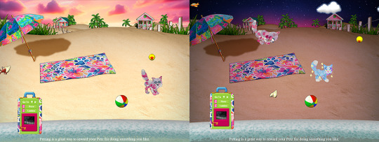
Inspired by my love for Lilly Pulitzer prints, this beach remodel is a more colorful upgrade over the original. I've recolored the sand to look more like....sand and less like this weird ugly yellow sand the original had. I'm planning to make a daytime one as well.
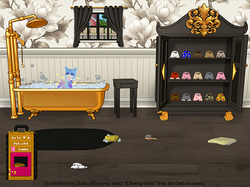
Salon upgrade. This one is very incomplete, so expect this one to change a bit. The original dresser is so hideous that it's hard to make it look "better".
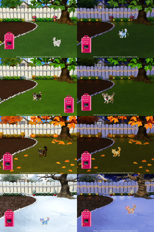
And finally, perhaps my pièce de résistance and my most time consuming overhaul was the backyard. The original looks so junky with its broken fence, muted colors, and lack of landscaping. It definitely needed some more life to it. I hope I achieved that with my 4 seasons remake of the back yard. To say it was a challenge is an understatement. I had to make 3 versions for EACH season. Day, night, and stormy versions. So 12 BMPs along with the edited leaf sprites. The fall leaves are not stills - they are recolors of the original animated sprites and move in the actual playscene! I was excited to be able to pull this one off and I'm happy with how it turned out.
And lastly I've reworked the Petz 5 carrying case skin with a template that makes it easy to come up with new carrying case skins quickly.
Here's just one of the many carrying case skins that I have planned. This one matches the pattern featured in the beach remodel.
And there you have it! These are all works in progress and I can't wait to share more updates with you all. As always, thank you for stopping by!
24 notes
·
View notes
Text
for mari 🌼
a soft-sad rainy night remix of 10 gorgeously written fics (including tomarry, harry & tom°), recced in parallel with lines from the poem ‘Into the Breach’ by ocean vuong

To the Hilt | M, 36k | @duplicitywrites
It’s simple: I just don’t know / how to love a man / gently.
Featuring an epic, human-AI romance between gamer Tom and garden bot Harry, To the Hilt is mind-blowing, deliciously sci-fi, and has a distinct, grim palette that feels almost dystopian. The story offers a fresh take on the android trope that diverts its plot-line from the traditional cautionary narrative, and the bittersweet ending gives me the worst, the best, you know what I mean, hangover. So please, do proceed with caution.
Lost in London° | T, 7k | @take-the-unknow-road-now
Tenderness / a thing to be beaten / into. Fireflies strung / through sapphired air.
It's impossible not to adore a tiny feral Tom who runs around in the streets of London and sets litter bins on fire. His friendship with Harry in this fic is so pure, so so pure. I still get ridiculously emotional thinking about them, and their chaotic little day trip feels a bit like a childhood memory I hold very close to my heart, now, after my third reread.

Dead Leaves on a Wet October Day | T, 29k | @trelloreads
You’re so quiet you’re almost / tomorrow.
In the beginning, Trello's writing vividly portrays Tom as an evil ghost that kills and wreaks havoc for funsies. He’s grumpy, he's dramatic, he’s hilarious. But you know the kind of fics that'd have you giggling out loud, just generally embarrassing yourself in public until they rip your heart out without a warning so that you'd have to go lie down for a while to recover?
Friendly advice: tissues at the ready....

Kings of Flowers and Skulls | T, 20k | @merrinpippy
The body was made soft / to keep us / from loneliness.
A soft, soft fic in which our two boys – two kings, in this instance, Harry of the eternally sleeping and Tom of the dead – find themselves gravitating towards one another after their first, curious encounter. Intimately written in a melancholic, fairytale-esque tone, there's just the right amount of fluff and comfort to counterbalance the pervasive loneliness in their daily lives.

In Dreams We Speak | T, 6.9k | @a-sentimental-man
You said that / as if the car were filling / with river water. / Don’t worry. / There’s no water. / Only your eyes / closing.
Philosophical at times and wonderfully trippy, this fic is an entire experience. It's a Sandman crossover – the first and only one I've read, actually. There's just something so eye-opening about the prose, and the casting certainly promises tension: Tom as Lord Dream and Harry the Master of Death. Whilst the cherry-of-top – Death herself as a supporting character – is what gives the story an unique, elegant aftertaste.

Alive Really Isn’t Your Color | T, 5.5k | merrivale
I never wanted / the flesh. / How it never fails / to fail / so accurately.
A deep dive into Harry’s post-war state of mind. Merrivale's writing captures depression in its raw, simplest manifestations, where living as the Master of Death (not really alive but unable to just die either) seems more and more like a curse Harry can't shake off. An understated, heartbreaking character study, this fic also closes with a scene that never fails to fuck me up (in a powerfully emo way).
The Care and Keeping of Tom Riddle’s Diary | T, 7.9k | @wynnefic
But what if I broke through / the skin’s thin page / anyway / & found the heart
With several unexpected turns along the way, this fic hits me right in my soft spot. It's so heartbreaking to see Diary Tom bonding with Harry over a sense of loneliness. Both shaped by chronic isolation, their protectiveness towards one another feels integral to their dynamic.
Jump right in – if you don't mind being turned into a puddle of goo by Harry, an adorable little bean who should be protected at all costs, and his adorable interactions with Tom.
Made of Clay° | E, 100k | @phantomato
To love another / man—is to leave / no one behind / to forgive me. / I want to leave / no one behind.
When Thoros Nott inserts himself and his son Theo into the lovely domestic equation of the Riddle household, the past is bound to catch up with Tom – retired Dark Lord, father of one – and impact his life with his 'adopted' son, Harry Riddle (oh yes the subtlety, I love that silly silly man) (Thoros: *coughs* abducted *cough*).
Phantomato’s handling of complex dynamics between complex characters is nuanced, graceful, as always. If you ever find yourself craving a good comfort fic or stories with the found family trope ... or if you think you might enjoy Tom being a suburban dilf for 100k – and no, this is absolutely not a logic trap😉 – here it is!
The Eyes in the Bramblebush | T, 12k | @relic--crown
To keep / & be kept. / The way a field turns / its secrets / into peonies.
Brought before readers by rich imagery and well-crafted moods, the high school setting in Bramblebush imparts a nostalgic note to the story. The dark vulnerability in Tom's character makes him an intriguing study in contrast, especially when Harry gets to be the one to dislocate him from his perfect, preppy, First Violin persona (which, don't get me wrong, is a 10/10 in its own right).

But You Promised?° | Not Rated, 1.2k | @whotooklortan
The way light / keeps its shadow / by swallowing it.
Cast against the backdrop of WW2 and the Blitz, the bond between Tom and his guardian seems especially precious as he grows from a bitter, disenchanted child to someone secure enough to trust, to rely on Harry. The slow disintegration of his mental barriers, however, only foregrounds the angst when it all to leads to one crushingly realistic twist at the end.
-
dear @onbeinganangel, happy birthday. i hope this little weave could, maybe, at some point in the future, give you the hug and/or the good cry you need – the same way these fics have comforted me in the past few difficult months; and of course, the same way your company and your writing have always sustained me emotionally. 😌💛
#tomarry#tom & harry#tom riddle#tmrhp#mari 🧵#these are fics that gave me lots and lots of feels#that all fall somewhere on the spectrum between hurt and comfort#their one common thing is that#i would like to reread them on rainy nights#with many cups of tea#but i think in terms of vibe that says a lot#opal's library
88 notes
·
View notes
Text
here's something i've been meaning to make a post about for, oh, like five years now:
QUANTUM BREAK COLOR PALETTES!
specifically, i wanna talk about how i associate color palettes with characters and their narratives, and what better example is there than quantum break? (i've drawn these character so much, lmao)
first, let's talk about MONARCH.

(look, i even made some fun little graphics!)
anyway, as you can see here, monarch has actual color branding. according to The Secret History Of Time Travel (the behind-the-scenes, making-of book about quantum break), remedy hired a company that designs branding for actual irl companies to do this. the color hexes i have listed in that first group of four squares are taken straight from the book.
the main color that i focus on when picking colors for characters from monarch is the yellowy orange. even if i don't use that color, i want monarch characters to have colors that contrast nicely with it. the bluish grey from the official branding contrasts with it in a very subtle way, but because monarch is very modern and sleek and futuristic, i prefer to pick greys that are even cooler toned than the official ones, and thus increase that contrast. I have some examples in the second set of squares, with greys that are slightly more in the range of deep blues and purples.
(when drawing paul specifically, i tend to lean pretty heavy on the purpley greys, because i like the way they contrast with the warmer blues i use for jack, hehe. i also just think that bluish purples work well with the way i draw paul: usually quite pale and unwell-looking.)
hatch's colors are also very cool-toned, so if you wanted to play around with color symbolism, you could yoink some deeper purpley greys from the same range as his colors and use those as your contrast grey against the monarch yellow. i feel like this would work especially well the further along in the story you get, as paul falls apart and hatch's influence on monarch becomes more apparent.
next up, jack and co!
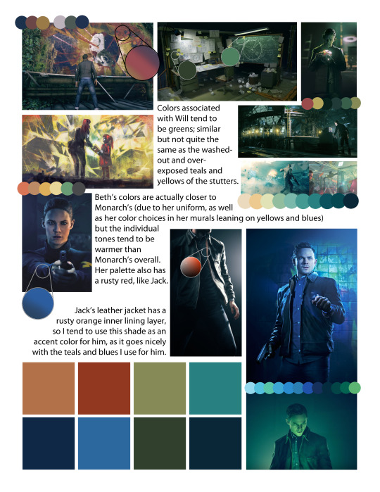
so, let's start with beth. beth's colors are influenced by monarch's, for obvious reasons (her uniform being only one of them), but i prefer to skew her colors warmer than those i use for characters that are more directly affiliated with monarch. i make her blues warmer and more saturated, usually, and add reddish and orangeish tones, both because of her hair and skin tone and because i like the way the orange ties her palette to jack, who i also use a rusty orange for sometimes.
will's colors are primarily greens, and quite warm ones at that. i usually pull these from the places associated with will, such as the machine at bradbury hall (which has quite greenish lighting in some scenes) and his chalkboard setup at ground zero. these also lean nicely into the washed-out greenish teals that are often found in scenes where time is stopped, which is a clever way of tying will (and jack, obviously) to the fracture visually.
jack, as the main character, is the hardest to pin down a palette for, in my opinion. i tend to use teals and blues for him, and pull from the color palette of the stutters quite a bit, like i just mentioned. his shirt is also a shade of warm bluish teal, so it works out nicely. he also has a kind of rusty reddish lining in his jacket, which i associate with him quite a bit. i find it very narratively satisfying to make jack's colors the closest of all the characters to those of stutters and the fracture itself, as he is the one who has to navigate and ultimately fix them.
anyway, i hope that all made sense! i can elaborate or explain further if anyone has questions, but mostly i just wanted to make a little post about color palettes in quantum break because i like color symbolism!
35 notes
·
View notes
Text
Color Grading in Stranger Things
Soooo I wanted to make this post because I'm someone going into the field and I've been seeing some debate on the topic. Mostly around "production errors." I think the term "production error" is kind of misused in a lot of cases? For me things boil down to one of four things: 1. actual production errors, 2. intentional details, 3. coincidences, or 4. things that just happen and/or are normal in the production process.
The fourth one is the category I see most with the color grading "errors" in the show. I think there's an inclination to apply real world logic to film/tv a lot of the time, but you have to remember that that doesn't necessarily extend to things like color grading and lighting. Lighting and color grading are both things that can change slightly between shots in the same scene. And this isn't an error (most of the time.)
Making these subtle changes usually is done with the intention of making the viewer subconsciously feel something. You can get away with quite a bit because viewers will not notice these subtle changes on their first watch; there's just so much new information that your eyes are absorbing that the color or lighting set up being slightly different isn't usually something you'll immediately notice (unless maybe you have some expertise in the topic/work in the field.)
The reason for these changes can vary. Each lighting setup and color palette has a different feeling, emotion, symbolic meaning. I'd say a lot of the time they're based in color science but they can also have a more narrative based meaning (example: director deciding that in the film he makes that the color yellow = danger. They start to associate the color with every precarious scene. Subconsciously the viewer begins to become fearful whenever the color yellow is on screen.)
I think showing actual examples from the show would help kind of demonstrate what I'm talking about so let's get into it!
Exhibit A:
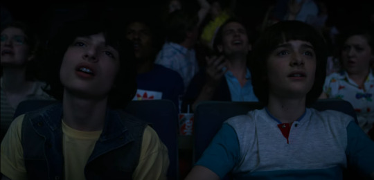

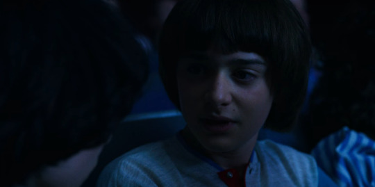
Image one: Around 10 minutes 30 seconds into the episode
Images two and three: Around 13 minutes into the episode
So I noticed that this shot became more blue in time when I was making my movie theatre blush analysis (see that here) But actually, rewatching the scene, the shot of Mike only looks slightly more blue than the previous shot of them. The shot with Will looks very noticeably more blue, though. These shots were obviously filmed on the same day, maybe even at the same time with multiple cameras rolling. They also have the same lighting set up (split lighting.)
So, is this a production error? No. If the intention was to make the shots of Mike and Will have the same color grading, you would literally have to be the most incompetent person alive to mess that up. Copying the same color grade from one shot to another is the easiest thing ever. You will not be hired as a colorist if you don't know how to do this.
Why make these shots slightly different, then? I'm not the guy who did this grading so I can't tell you with 100% certainty, but I have a couple ideas: The one I see the most is tying this to Will's visions in S2. The bottom two images are after Will has another vision. We see this blue color grading when Will is in the upside down and having visions. Blue also has a cold connotation, and we see Will get goosebumps, shiver and tremble in this scene.
Exhibit B:

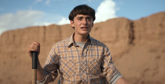


Okay this one is a lot more subtle. Also this one has to deal more with lighting than color grading though I'm sure both play a part in this.
So in the scene where they bury the body, the light setup is extremely bright and high contrast. If you look at their shadows in particular you can see how dark they are. There's almost no fall of on the shadows in the first picture. I think the whole set of scenes has a yellow filter to imply a hot, arid environment, but it's more noticeable in the first and last image. The first two images also have a lighting set up where the main light is right in front of them, putting Will specifically in a Rembrandt lighting setup. This lighting is meant to kind of represent the sun beating down on you, it's hot. Will and Jonathan are also really sweating, so it's obvious that this is what the intention was with this lighting setup.
When Mike and Will sit down to have their heart to heart, the lighting very subtly changes. The main light is now a back light, though there's also a light above them as indicated by where the shadows lay. But the lighting is also a lot softer. The shadows have more fall of, which leads me to believe they either used a soft light or a reflector. Softer light can be an indication of a more romantic scene. When they're broken out of their moment, the lighting grows less soft and everything starts to get more yellow.
Exhibit C:

So I think this whole thing was confirmed to be recorded in one take, so I'm operating on the idea that they didn't change the lighting in this scene in between shots. But they possibly could have? The fill light on our right looks slightly dimmer than in the shot before.
But I mostly think this is a difference in color grading. Mike's face is darker and has more contrast. Once again, not a mistake but an intentional decision. This is the scene where he's trying to desperately get El to fight Vecna. I think the contrast was accentuated to add more drama to the scene. Mike's cries of "Fight!" grow more desperate, his voice is cracking, he's clearly scared. High contrast lighting is more dramatic, more cinematic, more high stakes.
A discussion on the more technical side of things:
So not every one of these things is explainable by them intentionally wanting to set the mood or having a narrative reason behind the slight changes. Color grading is one of the final parts of the production process, so the footage you have to work with is all you're gonna get. And mistakes do happen in some footage. Some scenes are shot on different days, sometimes a light breaks or is set too dim, etc, etc. The colorist is responsible for helping to match these shots together in a way where the error isn't noticeable and doesn't break the immersion of the viewer. But you have to work with what you have!
Also, I did mention copying the grade from one shot to the next, but please don't think that that is like "oh i just have to grade one shot, copy it to all of the other ones and then I can be done!" because that's not really correct either. You'll still want to tweak the grade slightly for each new shot. Each shot probably has different lighting, a different set of people or objects, and other things you have to consider.
But I hope this was a helpful break down of the process! Honestly if I went back and rewatched more scenes I could probably find more examples of this, I only really have Mike and Will scenes because I've analyzed those the most, lol. Just know that not everything is as linear as in real life, film/tv is an artistic medium so it's gonna break some rules occasionally.
36 notes
·
View notes
Text
Presenting the project that made me heterophobic:
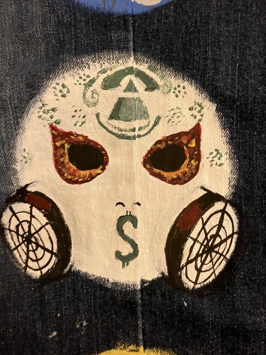
Yep! I am the dork that painted the masks of our current five boys over the course of three-four days (easier to space than six would be and lets face it, I do not care for kurlzz). I chose the Notes from the Underground masks because I've realized that it's the album that most of my favorite songs thus far come from. I quickly began regretting my decision at the point where I realized exactly how limited my paint options were and how many cool colors I would need. More details for each mask below (going bottom to top).
Danny's mask looks almost nothing like the actual one mostly because I painted the circles first and did not realize the mask was more angular than I initially thought. I also had no gold, so we've got a lovely yellow mixed with tan for the base color. The bullets are rough but also smaller than you'd think and a basic brush set from Michaels does not, as I have learned, have super tiny brushes, so I did the best I could on the casings. I am proud of the fact that I tried to make the rust work as best as I could, and if you look really closely, you can even see the mesh in the eyes (looks a little clearer on the left eye). The smirk is present on the right side and I do think it's decently recognizable.
This one made me cry. Any criticism of the fire around the eyes will be met with the response to suck dick because, to be quite frank, I challenge anyone to do better at 1 am and remain disturbingly proud of them. I'm kinda sad that my green (mixed from blue and yellow, because my budget is two pennies and all previous supplies) dried up early cause I was hoping to get more of the Louis Vuitton-style details, but still pretty damn good. I think the pyramid and the canisters turned out nice. Also, a little bit of a cat-eye shape for the eyeholes and the fire, but that was deliberate and I will not be ashamed of it in my moment of pride (I will undoubtedly feel the shame within five minutes of posting, but that is a problem for future me).

A fun an interesting fact is that this is the second time I've done this particular mask of J3T, and both times I have realized I love doing the butterfly. It's super fun because as long as we get the basic swirls in, it's alright if they don't match length perfectly. The cracks are slightly off because the very first ones were free-handed, but I did my best to get the rest of them proper, and they even work to form the nose. Apparently the orange looks more yellow than I thought.
This one was a welcome relief after crying over the detailing of J-Dog's mask. Again, no metallic colors, so our silver is grey. The little black lines are there to add texture to the edges (as it turns out, none of my brushes added it in a sufficiently noticeable way), and this one looks the cleanest imo.

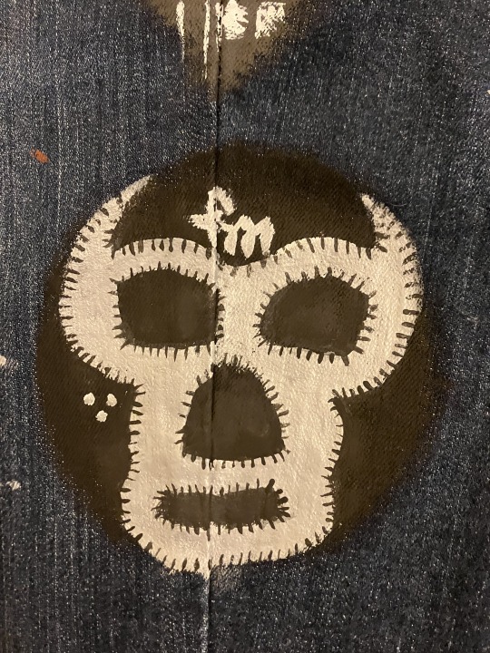
Last but not least, Charlie's bandanna (sunglasses painted over because, as it turns out, I continue to suck at painting and drawing glasses). The buildings are likely not accurate to the actual picture, but my reference photo did not show the actual city on the bandana so I just did some buildings, a fancy lil' LA and we're calling it an artistic interpretation. Also, check out that S. Coolest S I will ever draw in my life, got it right on the first try.
Anyways sorry that I didn't post this sooner cause I technically finished all of this yesterday evening, I have a flight soon so I am typing this up at 4:30 am at the airport.
(Tagging @vampswillhurtyou and @cutelittlenightmarethings cause both of you said you were interested and I have no idea whether or not this will show up in the main tags.)

Final pic to show what it looks like at a slight distance and with other object to provide scale. Note the paint palette thingy having 3 shades of grey in it because, again, shoestring budget and persistence substitute everything for us.
#anachronistic falsehood/whiskey you follow me so I'm assuming you'll see this drift on your dash without me tagging you#hollywood undead#danny (hu)#jdog#johnny 3 tears#j3t#funnyman#funny man#fm#charlie scene#I will continue to remain overly proud of this for a while#wearing these jeans at the airport rn btw#I am so tired and so awake I slept 2 hours and I have a production meeting tomorrow
13 notes
·
View notes
Text
The 2023 retro has been completed, so let's get to the 2024 kickoff!
Things I'm working on this year below the cut! This is mainly a tool for me to keep track of what I want to accomplish this year, but if I post it, then I've also got some form of accountability built in.
Storytelling in posework - what it says on the tin. My stuff is entirely 'moment in time' based, which can make some really cool action shots, but definitely also contributes to the feeling where Makhali is a deserted theme park - the colors and action are all baked into the design, but it's empty because there's no actual life in it. I think if I make myself think more in sequences of events, it will make her story more real to me.
Color theory - I've never really put much thought into the color palettes my shots get outside of very general vibe feelings. I would like to dive more into why certain colors fit certain moods, and I would also just like to play with palettes in general. Maybe find a preset that isn't Cyane Prism (or my other favorite, Cyane Prism With Some Sliders Jiggled For My Purposes, but that's a mouthful so I just say the first part).
Live multi-actor shots - I've done a few of these, and they're always a challenge. I'm fairly good at setting these up async, but I had a lot of difficulty when I tried to do it live with two friends of mine - there's just not enough time in explorer mode to set up three poses AND get good angles on them AND get good lighting for all actors AND find a preset that fits. I'd like to find a workable solution for this because it's the primary blocker for why I haven't gone to or organized any gpose meetups.
Gifs - this is easily a bonus item. I'll get to it if I feel my other objectives have been met or at least are proceeding at an acceptable pace. Once the images start moving, I call wizardry and hide in the cupboard. Maybe I can stop doing that.
As an overhang to all of this, I'm trying to be more outgoing and more present in the xiv community, and although that's not art-specific, it's something I hope will be noticeable this year.
Alright! That's it! Happy 2024 Y'all!
#the mun speaks#yoinked this because it's an excellent idea!#that way a year from now i can look and see if i've accomplished what i wanted to#rather than the nebulous thing I've got going now that is more accurately an indicator of my mood than of any kind of progress#anyway I'm hoping to experiment more this year - i feel like a lot of my problems are because i stopped doing that as much#so everything i did was something that i ostensibly was supposed to be 'good at'#which made the pressure insurmountable bc I went into every session expecting a two hour perfectionist run#and like. i only got there because 'ffxiv screenshots IV' and it's prior ilk are all over 1gb in size#that's a lot of experimenting!!! it didn't really occur to me until the 2023 wrapped post.
5 notes
·
View notes
Text
Because I am an impatient fool, i posted my color palettes and collages separately, first the Palettes with explanations and then the collages, which I made later. So here is all of them together in one grand master-post because I can't stop obsessing over these fucking things. I've made tweaks and changes, edited, re-edited and now I think I've finally got them all nailed down.
Bella
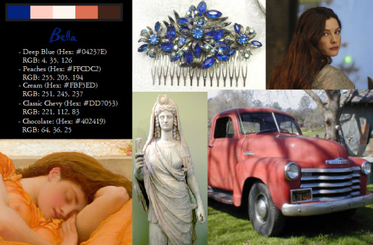
Bella's palette is actually one of my favorites because it seems the most cohesive. There's a bunch more colors I could have included but i wanted to stick with five for every character, so these are the essentials.
(Left to right)
- Deep Blue (Hex: #04237E) RGB: 4, 35, 126
- Peaches (Hex: #FFCDC2) RGB: 255, 205, 194
- Cream (Hex: #FBF5ED) RGB: 251, 245, 257
- Classic Chevy (Hex: #DD7053) RGB: 221, 112, 83
- Chocolate (Hex: #402419) RGB: 64, 36, 25
Deep Blue is sort of Bella's theme color for me. I mean it would probably be brown since it's her favorite, but I like blue better and I definitely understand why Edward likes it on her. On top of which, sapphire is her birthstone. The pale pink (matched from the blush of the subject in Flaming June) and cream, which compliment the blue, are obviously representing her human skin tone. The chocolate brown is for her eyes and hair, and the red, as the name says, is for her Chevy, which I love, and which just really went well with the rest of the palette.
Edward
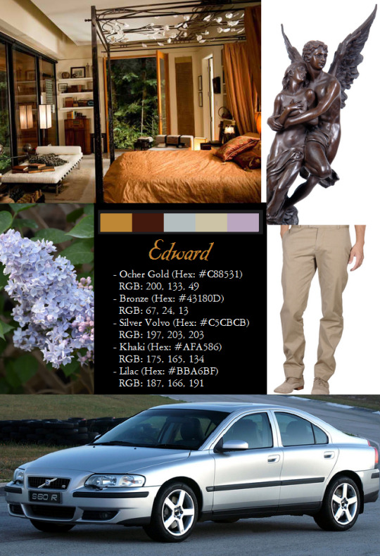
- Ocher Gold (Hex: #C88531) RGB: 200, 133, 49
- Bronze (Hex: #43180D) RGB: 67, 24, 13
- Silver Volvo (Hex: #C5CBCB) RGB: 197, 203, 203
- Khaki (Hex: #AFA586) RGB: 175, 165, 134
- Lilac (Hex: #BBA6BF) RGB: 187, 166, 191
Edward's palette is very muted because he's allergic to color, but it turned out nicer than I thought it would. It features (left to right)
Gold is the eye color of all the Cullens, of course, so it isn't unique to Edward, except that it's the theme color for his bedroom, and is probably a favorite of his. The bronze obviously signifies his hair, and Silver volvo is very self-explanatory--as is the khaki, which as we all know is Edward's real favorite color. Lilac is a bit more abstract--I decided to include it because Bella's description of Edward's scent (post-turning, when she can pick out all the notes) is Honey, lilac and sun.
[Featured images and reference pictures used for color matching: photo from the set of Eclipse (2010) of Edward's bedroom (Gold theme color), Bronze miniature of Eros and Psyche (edward's hair), Lilac cluster (references edward's scent as described by bella), Khaki pants, 2003 Silver Volvo S60R]
Carlisle
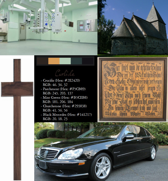
Carlisle was a little tough to decide on. It started out very... boring. Carlisle's not a particularly colorful person, but I made some tweaks and I like it rather a lot.
- Crucifix (Hex: #2E2420) RGB: 46, 36, 32
- Parchment (Hex: #D99D5A) RGB: 217, 157, 90
- Mint Green (Hex: #B5CEB8) RGB: 181, 206, 184
- Churchstone (Hex: #293838) RGB: 41, 56, 56
- Black Mercedes (Hex: #141217) RGB: 20, 18, 23
The one color I was certain I wanted in this palette is this brown. This is my theme color for Carlisle--it's the dark brown color of his crucifix, and the paneling in his office. I love how much Carlisle likes to evoke the time period he lived in in his personal spaces. Esme has free reign over the whole house, but Carlisle's office is starkly different and it's all dark stained wood and dusty books, which is so authentically 17th century it just makes my heart sing.
Churchstone represents the houses of worship that Carlisle loves to visit and finds comfort in, Along the same lines, the second color is parchment, which is matched from an extant frakturschriften work from the Historic Ephrata Cloister in Ephrata, Pennsylvania. The site's unique religious history makes me certain that Carlisle must have visited it at some point in the last several decades.
The mint is a little nod to Carlisle's profession, because cool greens are commonly used in hospitals, and the black (rather superficially) is for his Mercedes.
Esme
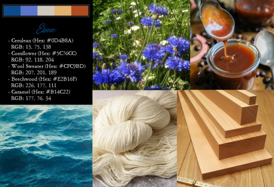
Esme's palette was a delight for me, and I think it, like Bella's, is very cohesive and just really pretty.
(Left to right)
- Cerulean (Hex: #0D4B8A) RGB: 13, 75, 138
- Cornflower (Hex: #5C76CC) RGB: 92, 118, 204
- Wool Sweater (Hex: #CFC9BD) RGB: 207, 201, 189
- Beechwood (Hex: #E2B16F) RGB: 226, 177, 111
- Caramel (Hex: #B14C22) RGB: 177, 76, 34
Cerulean has just been my go to color for Esme pretty much since I first read the book. I have no idea why? I think Elizabeth Reaser was wearing it in the promo stills for the first film and it just stuck, but whatever the reason, I still hold that Esme looks great in Cerulean. Perhaps it's representative of the water around Isle Esme. Or maybe just because I think it would look nice with her Caramel hair.
Beechwood, because unless I'm mistaken that's the "honey-colored" wood that is her go-to for flooring and paneling in her interior design. Ivory was originally my choice because it's quite evocative of her life-time. But after some nagging constructive criticism from my sister I made some slight changes with both the ivory and the next color. Robin's egg blue was originally the second color. It was a place holder initially, because I asked my sister what color she most associated with Esme, and I thought, well it's a very fitting, motherly color. With hindsight, though, she proposed cornflower blue, instead, and although I still do like the original palette with Robins egg and ivory, I think this version is superior.
Alice
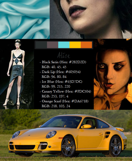
Alice was a head-scratcher. I only had two colors that I really associate with her, but I think it turned out okay.
- Black Satin (Hex: #282D2D) RGB: 40, 45, 45
- Dark Lip (Hex: #605054) RGB: 96, 80, 84
- Ice Blue (Hex: #96DDE0) RGB: 150, 221, 224
- Canary Yellow (Hex: #FDC504) RGB: 253, 197, 4
- Orange Scarf (Hex: #DA6718) RGB: 218, 103, 24
Black was the first color I had chosen for Alice, and I color-matched this to a picture of the Cerruti gown that Meyer used as inspiration for her prom dress.
The dusty purple was rather clever of me, if I say it myself. I took a screen cap of Alice from Twilight and color matched her lip-stick under the blue-tint, and I just loved it. It's a dark shade of mauve, the theme color for Bella's wedding in Breaking Dawn Pt. 1 (ironic, since mauve is a mourning color), but I think it also suits the morose side of Alice's back-story.
Ice blue was a choice I made because the ice blue dress she puts on Bella for her newborn awakening always really stuck out to me, but also because I think it suits Alice, since, for a very extroverted person, she has this very chilly side.
The canary yellow was the other color I picked of the top of my head--it goes well with black and it's also the color of her beloved Porsche 911.
Originally the last color was a light mauve, taken from Alice's bridesmaid's dress, but I've since altered it to a shade of orange, color-matched from Tamara De Lempicka's "The Orange Scarf" (1927), because the model for the main figure of that painting reminded me strikingly of Alice. The work, oil on wood, was painted for the cover of an edition of the German fashion magazine, Die Dame; the second work de Lempicka executed for the publication (the first being her famous self portrait "Tamara in the Green Bugatti"). The association with fashion seemed a fitting motif to add to Alice's palette.
Jasper
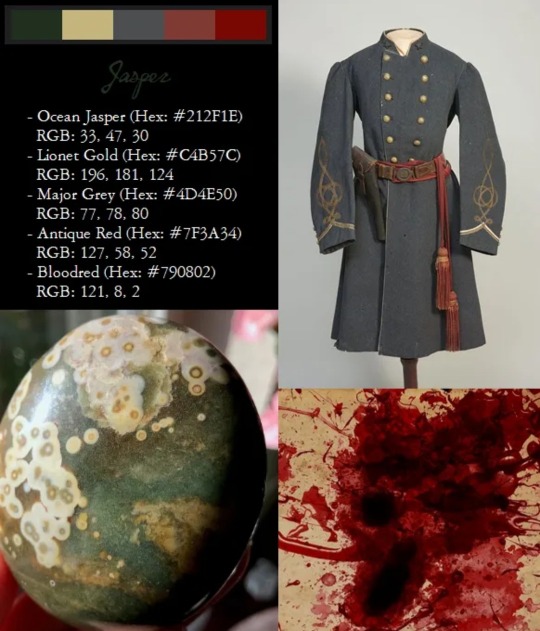
Left to right
- Ocean Jasper (Hex: #212F1E) RGB: 33, 47, 30
- Lionet Gold (Hex: ##B1914D) RGB: 177, 145, 77
- Major Grey (Hex: #4D4E50) RGB: 77, 78, 80
- Antique Red (Hex: #7F3A34) RGB: 127, 58, 52
- Bloodred (Hex: #790802) RGB: 121, 8, 2
Blood red was the first color I thought of when I sat down to do Jasper's palette, especially after reading Midnight Sun, which is the only time you get a glimpse of Jasper in action.
The other was the murky green, which I color matched to an ocean jasper, because duh. This became my theme color for Jasper. Paired with that, also matched from the same ocean jasper I got the green from is a lionet gold, which reminded me of Jasper's being described by Bella in Twilight as "Tall and leonine".
The gray is color matched from a picture of an extant Confederate Major's frock coat, and the faded red is matched from the sash of the same.
Rosalie
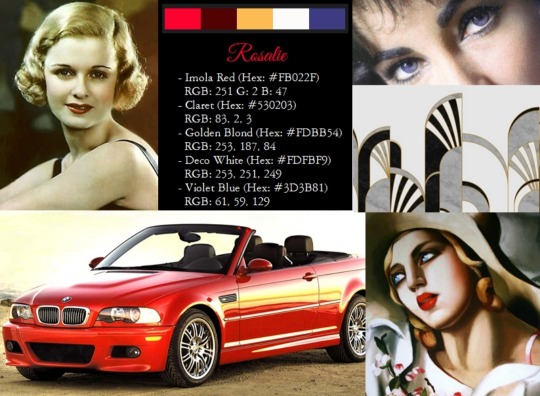
- Imola Red (Hex: #FB022F) RGB: 251 G: 2 B: 47
- Claret (Hex: #530203) RGB: 83, 2, 3
- Golden Blond (Hex: #FDBB54) RGB: 253, 187, 84
- Deco White (Hex: #FDFBF9) RGB: 253, 251, 249
- Violet Blue (Hex: #3D3B81) RGB: 61, 59, 129
The first shade of rosy red here is actually color-matched to the "Imola Red" paint of Rosalie's BMW M3, and the darker claret red is matched to the lipstick in a color picture of Joan Bennett. Joan Bennett is pretty much how I imagine Rosalie. Rosalie;s style of beauty doesn't really match the beauty standards of the time in which she lived, and she doesn't match any of the iconic actresses of her time--the exception being Joan Bennett.
The blonde shade was color matched from the model in another Tamara de Lempicka work, "The Straw Hat" (1930), which depicts a beautiful blond girl with bright red lips in a straw summer hat, holding a spray of pale pink flowers.
The violet blue is Rosalie's human eye color, and it's matched from a picture of Elizabeth Taylor, who was famed for her uncommon violet eye-color, and her beauty which was commonly considered to be near-perfect.
I feel like Rosalie loves white. Her bedroom, in supplemental sources is described as a "large, white room" and white and red were popular color combinations in the Art Deco interior design of the 1930's.
Emmett
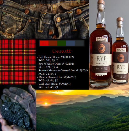
I loved doing Emmett's color palette. I'm realizing how much their backstories influence my color associations with the Cullens as I'm writing this and the same holds true for Emmett.
- Red Flannel (Hex: #CE0D02) RGB: 206, 13, 2
- Rye Whiskey (Hex: #792104) RGB: 121, 33, 4
- Smokey Mountain Green (Hex: #183F01) RGB: 24, 63, 1
- Miner's Denim (Hex: #31425C) RGB: 49, 66, 92
- Coal Dust (Hex: #292E31) RGB: 41, 46, 49
Emmett's Jeep is red of course, and he shares the association with red with his wife. But all the other colors are inspired from his origins in the Smokey Mountains of Tennessee, present in the deep forest green, the coal dust gray; and my personal favorite color matches, the red brown of rye whiskey and, the first color I thought of for Emmett after red: denim blue. This blue is color matched from extant miner's jeans from the late 20's.
~~~~~~~~~~~~~~~~~~~
Now for the palletes for my OC's, Ada and Cem
Ada
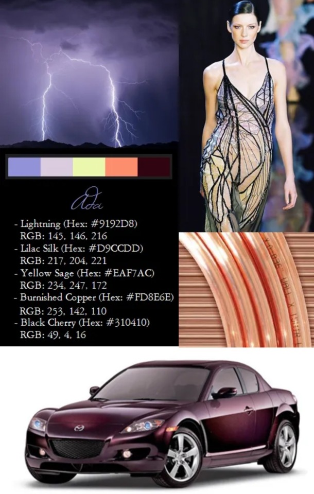
Lightning (Hex: #9192D8) RGB: 145, 146, 216
Lilac Silk (Hex: #D9CCDD) RGB: 217, 204, 221
Yellow Sage (Hex: #EAF7AC) RGB: 234, 247, 172
Burnished Copper (Hex: #D48973) RGB: 212, 137, 115
Black Cherry (Hex: #310410) RGB: 49, 4, 16
So the first color here, this light lavender-gray, is frankly just my favorite color, but it's also one I think would look really good on Ada. I think it contrasts interestingly with the pinkish, burnished copper red of her hair. I color matched the purple from a picture of clouds illuminated by lightning, and the copper from a picture of copper wire. The pale sage green/yellow and lilac are color-matched from the Valentino gown I used as inspiration for Ada's prom dress.
The Black Cherry is the color of Ada's Mazda RX-8. Only the Shinka limited edition of that car came in this shade of Black Cherry, and it's a very distinctive color that I wound up moulding her whole color palette around.
Cem
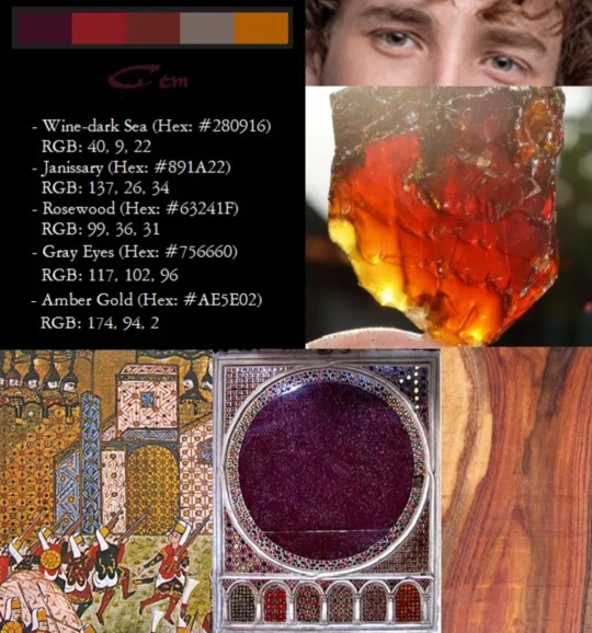
Cem, Ada's mate (who she meets while abroad in Greece following the Cullen exodus from forks in New Moon), has a palette that is primarily inspired by his human life as a Janissary under Sultan Mehmed II.
- Wine-dark Sea (Hex: #280916) RGB: 40, 9, 22
- Janissary (Hex: #891A22) RGB: 137, 26, 34
- Rosewood (Hex: #63241F) RGB: 99, 36, 31
- Gray Eyes (Hex: #756660) RGB: 117, 102, 96
- Amber Gold (Hex: #AE5E02) RGB: 174, 94, 2
The purple, which is Cem's primary theme color, is matched from Phoenecian purple dye.
The red color was color-matched to period drawings of Janissaries (albeit from a century later than Cem lived). The rosewood shade is representative of Cem's hair color, which is a light brown with faint hints of red.
The gray is his human eye color (I color matched it from a picture of Turkish actor Cem Yiğit Uzumoğlu, who was a visual inspiration for Cem--I had already named Cem before I drew inspiration from the actor its just a very common Turkish name), and the dark amber-gold is the transitional shade of Cem's eyes as they turn from red to gold after joining the Cullens.
#twilight saga#twilight renaissance#edward cullen#bella swan#carlisle cullen#esme cullen#alice cullen#jasper hale#rosalie hale#emmett cullen#ada cullen#cem aydinlisoy cullen#cullen palettes
40 notes
·
View notes
Text

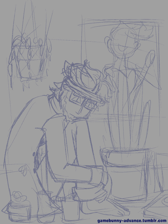
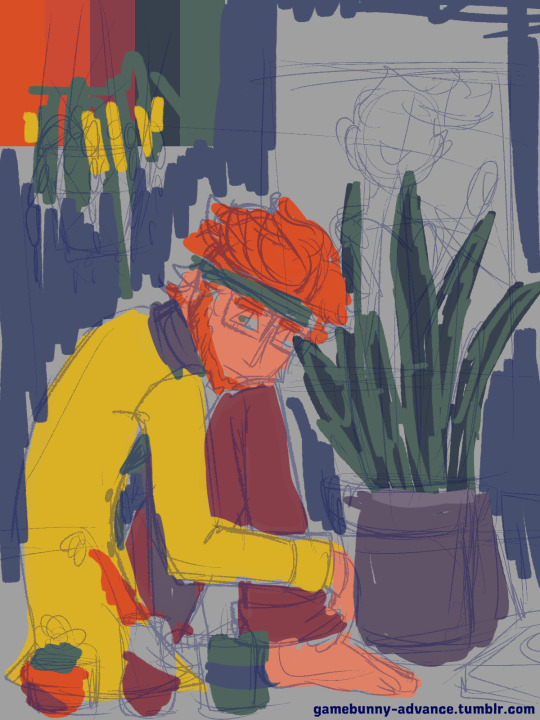

"Plants" Process (Initial Sketch | Layers)
Sure, might as well talk about this one, because I actually have a bit to say about it.
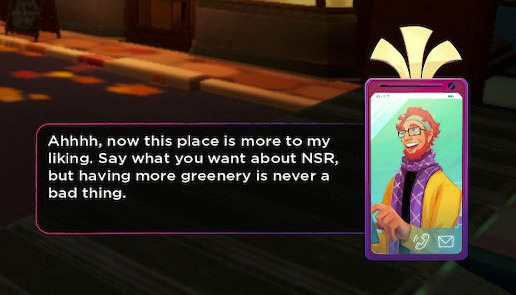
So the title I uploaded this with, "Say you will about NSR..." was originally a (*mis)quote he says in the game when you fully unlock the Natura district. The line isn't especially significant, but I've always thought of it as surprisingly "quaint." It's very small, but it serves to humanize him just a little bit when up to and after this point he's dipped into cartoon-style villainy. These brief moments of honesty within his duplicitous nature is a part of why I find him to be an endearing character.
*The actual quote is, "Say what you want about NSR..." but I mistyped it when posting it. The meaning of the line is basically the same, though.
Due to this line, I've had the idea of drawing him surrounded by plants for a while. My first iterations of this idea usually involved him on an apartment balcony adorned with plants and overlooking the city. Sadly, my visions for the scene exceeded my artistic ability, so it's an idea that's been on the back burner for a while.
[A sketch I did last year based on the idea.]
It wasn't until I just randomly thought to come back to this idea that I sketched this piece.
But tbh, I don't think my vision was very clear. There's no sense that he exists in a real place (why in the world would a hanging planter be hung so low, XP). All I knew was that I wanted to draw him surrounded by plants, and that originally I wanted the color palette to be very limited.
Very recently, the SiIvagunner channel had uploaded a parody video of the Yona Yona Dance MV, which led me to listening/watching the original video (which I somehow managed to never see up to that point).
youtube
I found the limited color pallet of the video to be very striking, and I wanted to make something inspired by it combined with the experiment I did with my recent Kliff x Tati piece, which also only used about 4 colors.
However, I am abysmal at color picking, so I grabbed a color palette from @/color-palletes (link) to help the process along. In the end, I couldn't keep myself from trying to use all possible colors. Strictly speaking, there's a shade of every color in the rainbow in the final piece, which is about as far from a "limited palette" as it could be. Nonetheless, I think the darker tones of the colors do help to tie everything together, so it feels more limited than it actually is.
To return to discussing the sketch itself, there were a few ideas that changed and evolved throughout the process.
Besides moving some of the plants around, an idea I had that didn't get fully realized was that the three smaller plants in front of him were supposed to represent the game's rockstars: Mayday, Zuke and Tatiana. I had difficulty making that happen with the limited palette: since May, Kliff, and Tati share a lot of colors (notably red), and one of Zuke's main colors is green, the same color for the plants, it was difficult to main the references while still having them all not blend into each other. Perhaps with more time to think through the idea I could have reached a compromise, but as things are, that reference was more or less lost.
To get it out of the way: there isn't any real symbolism behind the plants chosen. They were picked strictly on their aesthetic value/ease of drawing them. If you wanna stretch, the Zuke vase is holding red flowers (poppies), so it's kinda referencing that time his hair was set on fire, but that's totally incidental~ However, I will say that originally that vase was supposed to hold orchids since it's apparently a flower common in Malaysia, but I had difficulty drawing them and settled on poppies. Hibiscus plants were also considered for similar reasons, but as someone who's actually grown up around hibiscus flowers, I knew I didn't really have another place to put them since those plants actually get really friggin' big.
Something else that was lost was the poster behind the snake plant. Originally I had thought to put a poster of Kul Fyra on the wall, but I honestly got pretty lazy about adding the details. That and Kul Fyra's colors would have blended into Kliff hair since she's a combination of reds and yellows. But that space felt so empty without *something* there, so I messed around with random shapes and eventually just landed on putting up some records. It's a generic detail, but I do feel like they add a "pop art" quality to the piece.
To conclude, this was very fun to work on and the turnaround on it was fairly fast. Usually for pieces like this, the process takes me a few days, but I sketched and finished this all in the same day. Had I given myself more time to sleep on this, I might have worked a little harder to incorporate some of my other ideas and clean it up a little more. That said, this is still one of my favorite pieces as of late, and I hope that I'm able to make more things like it.
#gbunny draws#nsr#kliff#gif#should i main tag this again?#i don't think so#y'all are the only ones that really benefit from hearing me ramble#if you can even call it a benefit#something i didn't mention is that i actually struggled with the face a bit#i didn't like the initial expression that much#it was a little soft for my tastes#the triangular eyes are just something i borrowed from the 'anniversary' piece i did a while back#i dunno why i did that in either case since his eyes are typically downturned#but they helped him to look sharper#so i'm okay with it
11 notes
·
View notes
Text
Animated Films of 2023
November 12th 2023 (Blog #6)
I should probably preface this by saying these are the only animated films released in 2023 that I've seen (though there have been 4 or 5 others released in theaters). From the wisdom of Guillermo del Toro, animation is cinema, and I believe we deserve more animated films! After the master pieces that are the Spider-Verse films, as well as del Toro's own version of Pinocchio released last year, we have seen time and time again that this medium is not only for children, and is a legitimate art form deserving of more legitimate attention. But back to your regularly scheduled program...
#3 The Super Mario Bros. Movie
Despite the indescribable success of the Mario Bros. games since their initial release in 1983, no successful film adaptation had ever been made about the series. There was an adaptation, released in 1993, simply and similarly titled Super Mario Bros., though it was... not exactly the same quality as the games were. This long-awaited animated film adaptation did exactly what it set out to do: it had cute 3D animated versions of the iconic Mario characters as they fought against Bowser. It wasn’t spectacular, but it also was not a bad movie. It just wasn’t revolutionary. I do believe that such a beloved franchise deserved a movie that had the same level of cutesy animation that the games provided, and this did just that. This film is a great choice to watch with your family.
#2 Elemental
Disney-Pixar’s newest film did not disappoint. Elemental follows a fire-girl who falls in love with a water-boy. The love story is enticing, but there is a lot going on in the underlying society: Many believe that bad things will happen if different elements “mix”, and the city is informally segregated because of this belief. After the two fall in love, they decide to test it out- how bad could it really be?- and, lo and behold, literally nothing happens. The inability for different elements to mix was based on nothing but fear. The fire-people are the most feared because others believe they could cause damage to other elements, and thus faced intense discrimination and were kicked from their lands. This doesn’t really get a conclusion, but the element-mixing leads to people setting aside their fears for a more integrated city. I think that movies like Elemental are great ways for children to learn about the prejudices all around them. Sometimes, these things are just too difficult for young minds to understand at face-value, so putting it into an analogy like elements helps them understand. There are absolutely some issues to be had with the fact that the elements, which are stand-ins for race, actually are different, but that’s a different critique for a different post!
#1 Spider-Man: Across the Spider-Verse
Comparing this film to the two previous films kind of feels like "hydrogen bomb vs. coughing baby". The Spider-Verse films are not only the greatest super hero films ever made in my opinion, but also the greatest animated films. They are so, so gorgeous, it is hard to put into words. Many films have moved away from using any intense color palettes, and are opting for more subdued colors, but these films completely ignore this trend and make what are probably the most colorful movies I’ve ever seen in my life. They look just like a comic book, but not in a tacky way, and not in a way that will age badly, I don’t think. They are simply the perfect comic book movies. This addition to the series not only lived up to expectations set by the previous release (in 2018), but completely blew its predecessor out of the water. Where the first film was inventive, colorful, emotional, and perfectly-comic-book-y, this film did it all 10x better. The only bad thing about this one is that it doesn’t have any kind of conclusion, as it is the first part of a story to-be-continued and resolved in the next release, the end of the trilogy. Into the Spider-Verse (2018) created this world, introduced Miles Morales, showed us what this trilogy set out to do, and introduced the idea of the multi-verse. Across the Spider-Verse (2023) takes the idea of the multi-verse and dives right in, displaying a world of not only 6 or so Spider Men, but an infinite number of them from an infinite number of universes, all in need of protection from collapsing the space-time continuum. I cannot recommend any other animated films as much as I recommend these! (Though I don’t blame anyone for wanting to wait until the finale of the trilogy is released. Its such a cliffhanger!)
#across the spiderverse#into the spider verse#spiderman#peter parker#miles morales#gwen stacy#spider gwen#atsv#mario bros#super mario#mario#mario and luigi#super mario bros#elemental#disney#disney pixar#pixar#pixar elemental
6 notes
·
View notes
Text
YEAR OF THE GRUB - PROJECT 2: WATERCOLOR
Date completed: 3/3/2023
Craft store trips: 0
I'm a person who really values control and polish in my work, so media where you have to "let go" of your vision for a piece because of the way it works really scares me!
Watercolor is like sticking my foot into those media for later because it's close enough to creative processes I'm already familiar with (pencil, pen and ink, marker, etc) but still has a lot of ground I've never even touched.
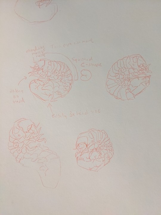
First, obviously, I started with sketches from reference and iterating on them until I got some shapes and looks I was satisfied with. My last project didn't quite capture the annulations in the way I'd hoped, and the legs were too long once I looked at reference again.
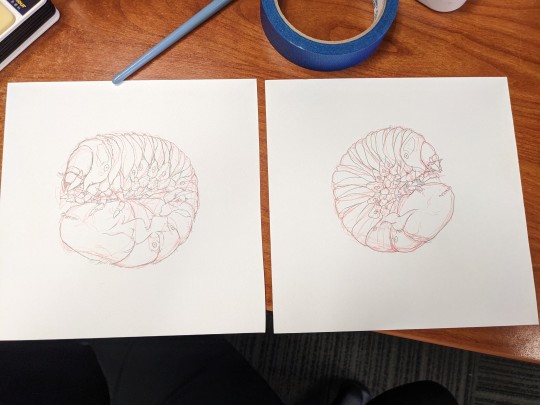
I ended up with two sketches to paint, one as a backup in case I totally fucked up the first one. It went okay, and I think I'll still paint and show the second one later with what I learned from painting this one, but I think I'll just do it on my own time rather than as a YotG post project.
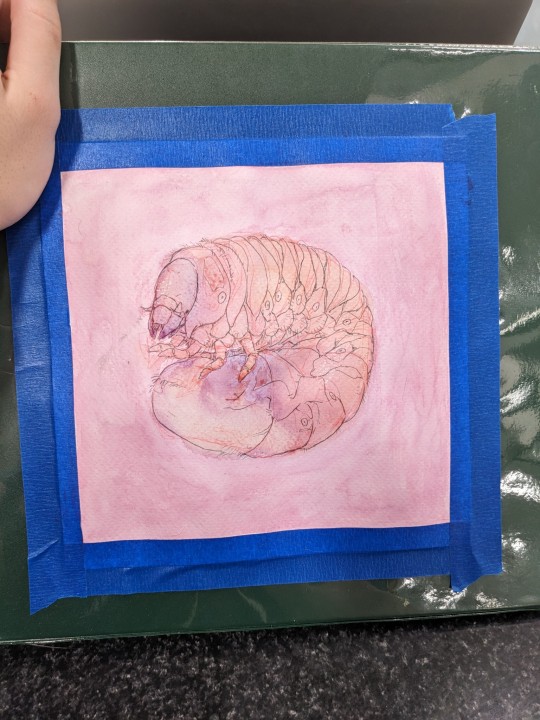
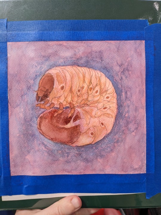
Like I said, I'm not used to painting, so this part was a lot of guesswork. I started with a wash because I'd heard and seen that it's a good idea and sets the tone for your piece, but I don't think I understood well enough and will need to go back and learn more. I probably didn't even stretch the paper right, haha! I had a lot of problems with paint pooling in wrinkles.
I don't have a lot to say about how it went from here, but I probably should have done all my painting in consistent lighting. I think this coloration would be perfect for painting a pupa, but it's not at all the beautiful milky color of a grub. I rushed this a little out of my own impatience as well as running late yet again, but you know and I know that's not a big deal. I'll take the second grub a little slower and apply everything I've learned doing this one.
THOUGHTS AND IDEAS:
I need to go back and review some basics of watercolor, including how to treat the paper so I don't run into pooling problems.
I need to use better brushes. I ran into a lot of trouble with the cheapo Artist's Loft brushes shedding hairs into my watercolors and onto my piece, making it difficult to control some of my finer strokes and generally making the process feel less pleasant.
I should work looking at reference for more than just the sketching process. I felt like by now I understood what a grub looks like, but it turns out that I was still preoccupied with how I THOUGHT it should look than what the colors actually express as.
I need to work in consistent lighting. Watercolor is an iterative process that you need to come back to a bunch of times to lay down rich color layer by layer, and if the light changes you may accidentally make a color WAY too dark and be too far gone by the time you realize to fix it.
I really struggle with color, so practicing this can only help. I want to start learning to mix palettes from a more limited selection of paints for a more cohesive color story.
Next month (this month) I'm learning a completely new set of skills, which should be ok since I have a whole week off on my own to work on it. Hopefully I'll be back here at the end of March with my next project:
USING BLENDER TO CREATE A MODEL FOR 3D PRINTING
18 notes
·
View notes
Text
100 Palette Challenge // Palette #10 // Lady Dahlia
I know I'm late again this week. I'm in the midst of a lot of school stuff. I've mentioned, I think, but I've gone back to school to get a graphic design certification. I started last Fall and it was my hope to be done by this summer because the certification programs are designed for adults with careers who want to expand their skill sets and so are pared down to only the classes that are directly relevant to the subject matter. In my case that's only 9 classes, so 3 per semester. But unfortunately I had to withdraw in the Spring because of some health issues. So now I'm trying to pick up where I left off after the school went and changed a bunch of their online systems. So now I get to try and recover my old accounts on their new system and deal with class requirements that don't exist for my program, but apparently exist now for individual classes that are required.
And on top of that we're prepping our toddler to go to daycare, which comes with A LOT of paperwork and supplies lists and doctor signatures and also EMOTIONS.
Anyway.
Today's palette comes from a poster that appears to have been an activist piece of art. I've tried not to go into too much detail here about the posters since the bulk of this book is the palettes and the pieces they were picked from. I'm already posting every single palette in the book, so I'd rather not include the posters also. But I just love this one so much, I have to at least share the information so you can look it up yourselves. It's called "Dig" by Sadie Wendell Mitchell, it's part of a series she did called "Girls Will Be Girls". It depicts a young woman perched on a chair engrossed in a book, and also surrounded by stacks of books. Only a few of the books have visible titles, "The Study of Bugology", "The Psychology of the Male Human", and "Economy" (the one she's reading). And on the wall you can see part of a poster that says "DO IT NOW".
It feels like a very pointed protestation as a poster designed in 1909.
I struggled with this palette a lot. It's not only very similar to a lot of the previous palettes, the values are just so similar, particular with the green and teal. It works fine in the original poster because Mitchell used a heavy black outline, but the author of the book chose not to include that in the palette.
I actually started a completely different piece that going to be a face study, but I just didn't like the way the colors were playing together. So I ended up scrapping it.
So I pulled back a bit. Our dahlias have started blooming and the first ones to pop were these gorgeous red and yellow blooms, and I've wanted to draw a fairy for one of these for several palettes so far, so I did it.
The dahlias were SO much easier and more fun to draw than the peony was. They're so geometric, I really just enjoyed layering the petals and the colors.
I attempted to give the fairy some petal clothes, but it just wasn't doing what I wanted it to do. And I think the form is distinct enough to make her out. I do really like the effect of the teal on the green; the heavy similarities of them both make the fairy and flowers pop more. I do wish I'd filled in some more greenery in the background, but honestly I'd spent so much time on this palette already I didn't have it in me.
I'm really pleased with the final result, though, and I doubt this will be the last fairy piece in this series.
I want to shout out Fat Photo Ref again. I used them for the pose and the hair for the fairy and I remain exceptionally pleased with the range of references available and the easy navigation.
2 notes
·
View notes
Note
you made baekhyun look grainy and washed out and like he had been left sitting in a puddle of muddy water for a very long time, you made him grey and ugly and i really wondered how you managed to make this pretty a video look so grimey
again, criticism is welcomed but maybe ease up on the vitriol a little, idkw you're talking like we're having a fight
anyways, i don't consider myself that good at making gifs, i personally think i am very lacking compared to other ccs on here so please, i invite you to follow anyone else should you feel so offended by the quality of my content. there's plenty of very talented ppl who gif for bbh/exo, i'll be more than happy to provide you with a list if you want
now to address your grievances. if you don't like grain, well i do. simple as that. when it comes to me ruining the video? i guess?... sure, serving its intended purpose: to be youtube content, the video gets the job done well enough but you obviously have no concept of what constitutes nice source material for gifs — which is fine — but don't get on your high horses with me as if you know better. by all means, if you could do a better job than me: be my guest, i'd be the first to reblog it
the video was shot dimly lit, it's underexposed, they filter the hell out of his skin which kills the resolution, not to mention youtube's horrendous compression. the original video itself is washed out. this is a raw screengrab as it appears in ps after encoding:
to compare with my grimey coloring:

it's not the coloring job i'm most proud of, far from that. actually in the tags of my post i clearly stated that i was unsatisfied with the quality of these myself so. not teaching me anything new here. but ok, too grainy, too dull, too grey, perhaps something like this would be more to your taste:

i am well aware that this kind of coloring is way more attractive than the one i settled on and that, chances are, my post would've gotten more engagement had i chosen this coloring for my post but i've let go of that mentality long ago
everyone approaches giffing differently and with different intentions. i'm personally not someone with a road map, i just go with the flow of whatever i feel like doing that day, my general ethos is to flatter the source material and/or its subject as much as possible, but i also like to experiment and try different things. to me, this coloring hereinabove strays too far from the original palette which makes the colors too unnatural and adds to the already considerable amount of artifact even with minimal sharpening. it's also very generic looking
it's funny to me that you picked that muddy puddle analogy, in an effort to upset me i presume, but I like that image actually. wasn't that the concept of the video to begin with? kyoong radio to cheer you up on a bleak, rainy day? i think that's why they made the artistic choice of filming in soft lighting, and going with the under-saturated, low contrast, "washed out" look. or at least, that's my interpretation of it. so even if it's not to your preference, i think i somewhat hit the mark with what i was originally trying to do
i personally don't think my gifs look too grey. i'm most disappointed that i couldn't recover more of baekhyun's skintone in the gifs that i posted, trust me i am, but i tried smth a little experimental and i'm still happy with how they came out, they remind me of old camcorder footage. i know that it is among my worst performing sets but like i said idc, i like them
also they're literally just gifs &baekhyun loves me
5 notes
·
View notes
Last Seen Blogs
punkpandapatrixk
PunkPandaPatrixk
severefriendoperatorhairdo
Senza titolo

hatmanpaulvarcent-blog
The Hatstand

darko-art
Colorful creations!