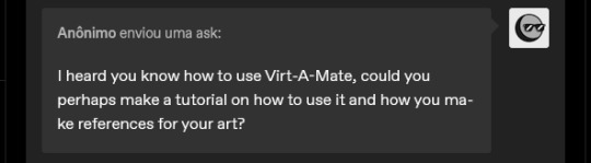
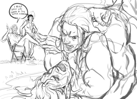
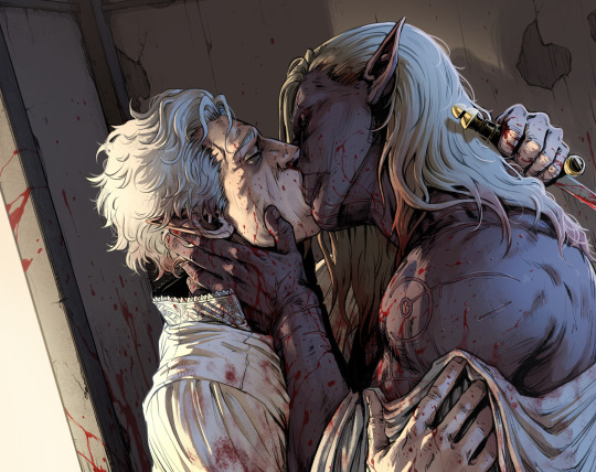
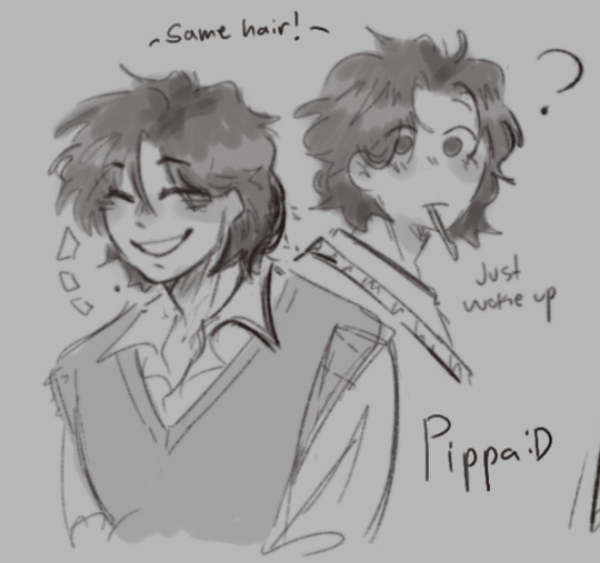
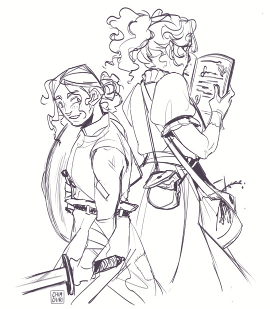
#this isn't a sketch but it is also not a proper piece
Text
How to give good feedback on art (from an artist)
I often see people talk about how they want to leave good comments on art, but don’t know how/don’t know what to say. As an artist, here’s what I often look for to have something to say to other people!
The composition of the art – how different elements of the piece guide your eye, how certain parts are brighter against darker backdrop/darker against a bright backdrop. What catches your attention? How have they put the piece together to make this happen?
The lighting/shading – how have they rendered the piece? Do you like how the lighting is bright, harsh lines, or how it’s gently blended in? Do the shadows add extra depth that makes the whole piece look more 3D? Did they use funky, unconventional colours to shade?
The lineart – is it smooth? Sketchy? Are the lines thick or thin? Do they use lines at all? Are they in a colour other than black? How does it add to the piece? Do they just outline a piece, or add texture with lineart as well?
The colours – have they used a pallet of complimentary colours? Do they remind you of something specific – perhaps to the fandom, or to a season, an aesthetic, etc? Do they only use one colour? Do they use unconventional colours? Do they have one pop of contrasting colours against a monochrome background?
The anatomy – do they stick to exact proportions? Do they lean towards a more cartoon sizing? Is it like Powerpuff Girls, or like Tim Burton? 90s anime, or modern day anime? Do they make things very angular, or really smooth? What about it do you like specifically?
The texture – in the frame of digital art especially, have they used a specific brush to create a certain effect? Do you like how sketchy it all looks, or how they’ve blended the colours together? Does it look like watercolours bleeding, or a stamp/print made over the entire piece? Is it all rough, or super smooth?
The details – talk about how you love the tiny pattern on a blanket, or the multiple earrings in the characters ear. Talk about how you like how they’ve done the hair, or the little glint of light against a ring. Talk about the celtic patterns in the body, or the crooked teeth in their smile. Little things that jump out to you.
How it makes you feel – anything at all, but try to explain what in the piece evokes it strongest. Are you hit with isolation by the lonely figure in a wind-swept hill? Or joy, does that bright smile make your heart swell? Try and pick something out and babble about that.
Any meaning you can pick out – a little more tricky and often quite personal, but if you can pick something out that you think you can interpret, talk about it! I don’t think people ever get offended, even if you’re wrong – it’s interesting to see how other peoples brains work, and what they take away from something you’ve made.
Anything that stands out to you as a signature of Their Art – typically for artists you’ve followed for a long time – when you look at a piece, do you think ‘oh, this is by X’. How do you know? Is it how they draw the mouths? How they shade? The anatomy? The details? The colours? The composition? The expressions? Tell them!
I try to mix and match a few of these, focusing on things specific to the piece. Talking in depth about a piece helps an artist to know you haven’t just glanced it over and gone ‘oo cool!’ and moved on. If you want Tumblr to continue having a thriving art community, it’s beneficial to engage in and spread art around, as well as letting the artist know their work was seen and appreciated. They put the work out there for you to see for free! What can take you a few minutes of your day can make their entire week. Go support your artist friends!
#art#artist#artist on tumblr#feedback#art feedback#digital art#original art#traditional art#tumblr artist#tumblr advice#advice#yeah okay that's enough now I think#this isn't me saying 'you have to tell these things to artist every time'#god knows sometimes I see a piece and just reblog it cause I think it's cool but don't have the energy to give proper feedback on it#it's more a guide in case you WANT to do that but don't know how or don't know what's effective yknow#also as a disclaimer you really. Don't have to do this to me at all. I don't want to make ti seem like I'm annoyed people don't do that#I'm not! I'm not. Don't worry. thumbs up for you#also massive one - don't??? critique??? Pieces???? Unless specifically asked to????#I have an artist friend and we share our sketches and doodles and pieces together and we tend to just froth over them#sometimes we might go 'oh this looks a little wonky?' or ask for specific feedback but like. even with both of us doing art. we don't just.#insert out critiques into pieces. it's rude. it saps motivation. don't do that innit
128 notes
·
View notes
Text
Oh boy, VaM is kind of a trial and error experience LOL I couldn't really show you how to use the interface and stuff without a whole video or something, but it's not THAT difficult to get a hang of if you just give yourself a day or two to play around, not to mention the number of tutorials you find out there. Luckily, if you only want to use it as a reference software that makes the process far easier (to this day I have no idea how to animate on that thing, since that's not what I use it for)
As for how I use it, it's pretty self explanatory - if there's a complicated pose I want to draw but I'm either having trouble with it, or just want to double-check angles/anatomy, I will use it as a resource! I use for most of my "proper" pieces (y'know, the nicer looking ones) and every once in a while for my silly comics if I'm having trouble with a pose.
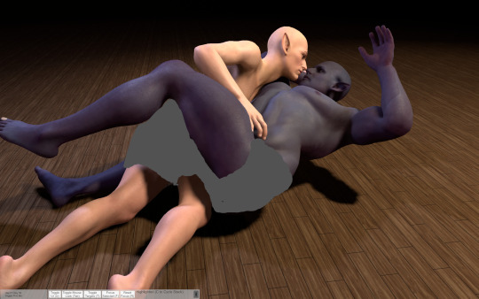
Lets use this drawing for example (the character on top of DU drow belongs to @namespara )
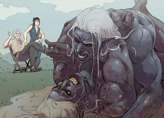
I don't draw a lot of mud-wrestling (shocking, I know) but I had an idea of the kind of pose I wanted them to be in. So the very first thing I did was make a rough sketch of what I was envisioning:
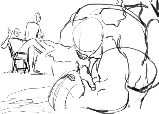
I often do a rough sketch first, even If I know I'm going to be pulling the program up because A) It's less tedious than adjusting the models over and over again until I pick a pose and B) because sometimes I'll decide I don't need the reference, after all, and so that's 30 minutes I'll have spared myself of playing around on the software.
Now, this is a pretty complicated pose! It's in a weird angle and the bodies are making contact in ways I'm not used to depicting, so I did choose to whip out VaM for this one. I went into the program and after some messing around, I flopped my little dolls together like this:
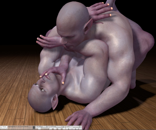
Now something really cool about VaM is that you can completely customize your models, and if you have the patience, I would definitely encourage you to do so! Obviously, you don't have to make picture perfect replicas of every single character you have, but as you can see here I have made a DU drow "decoy" to help me better understand some of his features when I draw him: he has a strong brow, a short nose, a square jawline - these are all going to look a very specific way from certain angles, and I might not always be sure of how to draw it right! So it's useful to have models that bear SOME semblance to the character so you can better understand how different viewpoints will affect their bone structure and mass.
Also thank fucking god for the elf-ear slider. Figuring out how to draw those shits from certain angles was a huge pain in the ass when I started drawing DnD races.
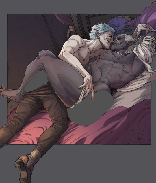
So, with the reference in hand, I go over the sketch again:
Now you may notice that I don't stick to the reference 100%. There's three reasons for this:
posing on VaM is tedious as hell. You can get something incredibly natural looking and picture-perfect to reference from if you wish, but it's going to take you hours to do. So, for the most part I just slap guys together until the results are "close enough" and use that.
In my opinion, you should always aim to ENHANCE your reference material, not replicate it exactly!
While VaM is a PRETTY DANG GOOD source of anatomical reference, it isn't perfect, I often supplement it with further reference from real life resources or make tweaks based on my own knowledge where I catch it falling short (and, antithetical to what I just said, I sometimes fuck the anatomy up further on purpose if I think it looks better that way LOL it's all jazz baby).
Then lines, color, yada yada. I don't have a tutorial on that and I don't think I could make one, because my process is chaotic as hell, but I do at times use Virt-a-mate as loose reference for lighting too when coloring - waaaaayyyy less so however, because that process is even more tedious and I feel like I often get better results by just winging it. It is a feature of the program though, and I'm sure it would be helpful for someone who has a difficult time visualizing lights and shadows. I only started using this program a few months ago, so I happened to already have a pretty good understanding of that kind of thing and just don't personally feel like I get much out of that particular mechanic.
Here's a few other examples of pieces that I made reference for (WARNING: Suggestive)
Now, for the question many of you may want to ask:
"Can I trace this junk?"
And to that, I say: Buddy, you can do whatever the hell you want with the reference material you created.
However,
If your goal is to learn and improve your art, and to recreate realistic proportions and anatomy from memory, tracing won't help you.
Developing your own style, your muscle memory, and personal technique will all be hindered by choosing to trace instead of drawing from observation, so I would encourage against it. Hell - even when tracing is employed as a technique, it's usually by high-skill realism & concept artists who are looking to either cut some corners, save time, or just double-check their own proportions in order to improve further - if you try tracing as a beginner, you will most definitely find the result to still look stiff and "off".
So trust me, there is so much more to be gained from drawing from observation. Make note of tangents, compare proportions, use all the elements of the picture to dictate where and how things should go - it will be a far more rewarding experience.
Hopefully this has been helpful! VaM is a really cheap program (you get it on the guys' patreon for I think 8 dollars, just google it!) and it's definitely been worth my money as an artist since I found it. Learning to use it can be a little intimidating at first glance, but as I said above you only really need a day plus one or two tutorials to get a hang of the interface.
A fair warning though, IT IS A SOFTWARE MADE FOR VIRTUAL SEX/ADULT ANIMATION So when looking it up expect to see a some spicy content.
#Funfact THIS is the post that got me flagged last time so i'm really tempting fate right now LOL#ask#art#tutorial#resource
569 notes
·
View notes
Text
[Click image for better quality]
I FIGURED OUT A WAY TO FUCKING MAKE THE IMAGE SMALLER FOR POSTING ON TUMBLR WITHOUT SACRIFICING THE ACTUAL QUALITY OF THE IMAGE OH MY GOD
Ok so, what I did is go into the clip studio paint file, make a new file, copy and paste the group in the original file, merge everything, get rid of the extra stuff outside of the canvas, and then make the flattened image smaller and crop the canvas. Once you have that, export it and you're done. This helps maintain the actual quality of the image and also helps shrink the file size down to something actually postable (if anyone has a better way of doing this please tell me)
[Edit]: Ok I guess posting something to Tumblr just naturally compresses the image a bit more somehow because I'm looking at it now and zooming in too much makes it a bit blurry so I'm still gonna have to futz around with image quality for future pieces oof
Artist's Note:
I'm so glad I figured out a way to do this because I like working on a big canvas so I can get as much detail in as I possibly can. Only problems are how laggy it gets while drawing lol.
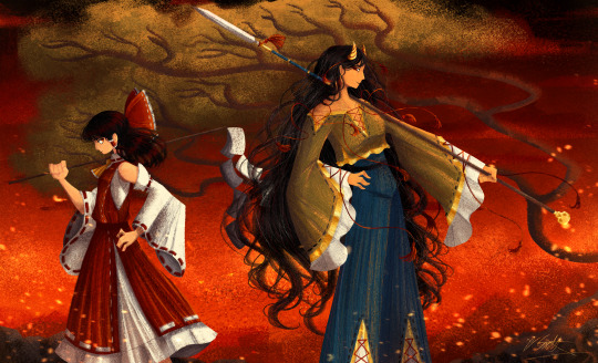
I had an idea for a drawing with Reimu and Zanmu because I really like thinking about their potential dynamic a lot. I also wanted an excuse to draw Zanmu again but in my normal rendering style because last time I drew her she was in my more sketchy style with generally flat colours so I wanted to draw her again. Speaking of, looking at the sketch for this is a jumpscare that I never enjoy seeing, like, man am I glad I didn't use those for my final piece.
Also about her spear. I was originally gonna make it like the ones she had in game, but it kinda threw off the whole piece. It was too big, too blue, and too flat, so I just went "fuck it" and gave her a different one instead. My headcanon justifying this is that the ones she uses in game are for danmaku battles whereas in any other fight she just uses a proper yari, or she still uses the yari and just makes it all glowy to power it up, maybe both lol. I pulled as much inspiration as I could from Sengoku era spears, and even put in some blue into the decorative part of the spear and also added a little skull to pay tribute to the original spear. Also, in my research I saw some art of izanami and izanagi making japan and saw that the yari izanagi has had a little decorative tassley thingy on it so I took some inspo from that and just made it one of Zanmu's tassles (Idk when that art was from or if the spear was still accurate to Sengoku period Japan but hey, probably the same reasons Eirin puts little bow ties on her arrows, it's just for personalization purposes).
I love rendering hair and clothes so much omg, while I like the super curly hair Zanmu, the longer, wavier hair suits her better for this drawing (I imagine it only does that like how Ghibli characters hair moves when they feel angry lol). I love making Zanmu's hair all messy and crazy, as well as giving her grey hairs, this woman has aged like a fine wine. Also, if the hem on the ends of her sleeves, top of her shirt, and her pants look like gold to you, that's because it is! It's fairly light so she's not collapsing under the weight, but it's gold! (I don't care how impractical it is, it's just cool). Not the undershirt though, it's made of a gold fabric. I had a cute idea with Reimu's hair to make it have a red shine to it. I also changed up Reimu's outfit so it isn't just a blob of red. I like it a lot when Reimu's skirt and outfit is segmented into different layers, so I wanted to incorporate that.
I tried to draw their hands differently as well, but IDK how noticeable that is. Also, I am super happy with how the side profiles for the two of them turned out, I used to struggle a lot with how to make the side profile of a character actually look like the character, so I'm really happy that they actually look like themselves.
Also added in the tree and rocks in the background as an homage to Zanmu's character art in Touhou 19, just because I was getting kinda stumped on what to do with the background lol.
In terms of a story idea with Reimu and Zanmu, idk why but the potential plotline of Zanmu wanting to ascend to godhood is so fascinating to me. Like, it is very possible that if she just convinced everyone she was a god (which would be very easy for her to do), she would become one in a heartbeat. Also, if she were to become a god, with her ability to return stuff to nothing, could she hypothetically get similar abilities to (Jojo Part 5 spoiler btw) GER? Like, idk about the death timeloop stuff, but the concept has been haunting me every night as I have been trying to find loopholes in GER's ability for a while now ( for no reason in particular). Back to the main topic, I imagine that she would probably tell Reimu that if she were to become a god she would take over the Hakurei shrine since the god there might as well be dead, and Reimu just says to her, "Over my dead body bitch." Like, I have no idea how to summarize their dynamic but like, it's the type of hero-villain dynamic where the phrase "We're not so different, you and I" would definitely be a phrase said during a fight. I think that if another IN style game were to release, Reimu and Zanmu would be in a team together. They could also have an interesting mentor and pupil kind of dynamic. Can you tell that Zanmu has been charging my mind rent these part few months? Like, instead of living in my head rent free, she kinda just uno reversed the whole situation and now she's the one charging me rent. What happens if I get evicted from my own brain? Actually, scratch that, I don't think I wanna know.
#touhou project#art#fanart#touhou fanart#touhou 19#touhou#東方project#zanmu nippaku#unfinished dream of all living ghost#reimu hakurei#東方
258 notes
·
View notes
Text

a return to the monsters and mommies au designs, this time properly lined and in color! :D posted in the middle of the night just like last time though because i have problems <3 there are some small changes to these designs, but for the most part i was pretty happy with them so this was mostly just to give myself a color reference for them all lol
gonna ramble about small decisions i made below the cut, but its not necessary at all to understanding the designs! just wanna dump my thoughts somewhere :P
for the most part, the kids' designs are the same as i do them for normal canon, but there are some small differences. i've never really done a proper reference for their kid designs either though, so i guess no one would even notice LOL
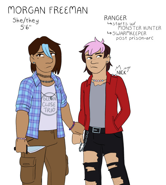
freeman family: well, firstly - nick's last name is freeman in this au LOL but its easier to refer to him as nick close so people know who i mean as opposed to nicholas foster. usually, i draw nick close with blue hair (i think he goes through a range of colors, but blue is my default), but i do this because he does it to honor morgan. since she is alive here, instead, his default is pink because thats his favorite color to dye it! morgan and nick both have various bead jewelry because i like to have the headcanon that morgan is really into pony bead jewelry; this is also why all of my nick and nicholas designs have the same trans pride necklace, morgan made it for him :] both nick and morgan wear glenn's old clothes, both of them are wearing his shirts in this piece. aaand morgan has subtle heterochromia as a reference to the split timeline! she always has it, it doesnt just magically happen or anything, but its just a small nod to that.
wilson family: its real important to me that grant got his dad's exact coloration except for his gray eyes, which are all carol. why is this important? i dunno! its just interesting to me. also, carol doesnt usually leave her top buttons undone, but upon entering the forgotten realms, she unbuttons it because otherwise her shirt will pop open while she's doing things (to be honest, as a person with a larger chest myself, her shirt probably still pops open but it does help-!). usually i draw grant with a gay pride necklace, but since he doesnt come out pre-forgotten realms in this au, i tragically had to drop it. i miss my rainbow grant. please come home, baby.
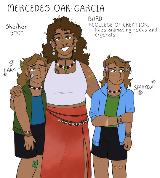
oak-garcia family: i always forget to do mercedes's tattoos in my sketches because tbh i never know exactly what to give her. but! but. this time i just went for it. these tattoos arent necessarily set in stone, but i think theyre cute. the tattoo hidden by her skirt is an oak leaf for henry :] her gem necklace is also the same color as his eyes! her skirt is supposed to be, like, tie-dye or maybe more bleach washed, but i dunno how to draw that so whatever. the twins are, like, 100% the same as usual, i just gave sparrow a pink bead necklace instead of the multi-colored necklace i use for my default canon design lol. also, i think i drew the twins slightly too tall here, which is funny because theyre the only ones who are notably shorter than their mom HDFJKGHK
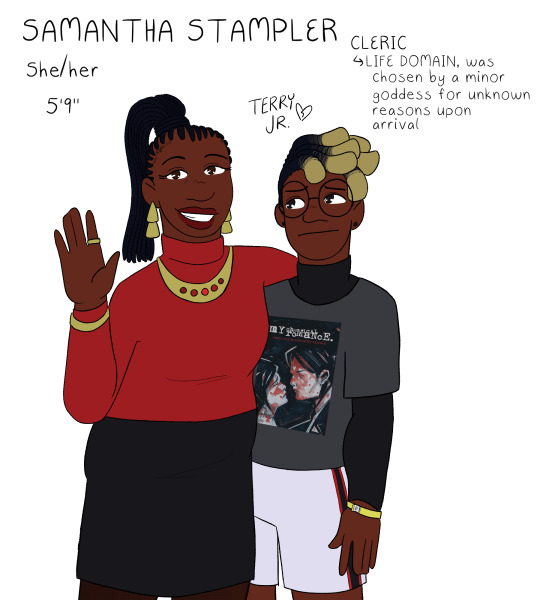
stampler family: i struggled a lot with what colors to give samantha, because i wanted her to have a bright color palette but not anything garish or patterned. originally she was gonna have a white shirt, but then i realized that would make it so all the moms had white shirts and i just couldn't have that LOL so i ended up landing on red for her! it matches with terry junior, so i thought that'd be cute :] terry's design is probably the most different from my default for him? which still isn't a lot but i swapped his dark blue flannel for a black undershirt instead. i cannot explain why i did this. it just felt right in the moment. i gave him a sweet revenge shirt instead of the usual black parade shirt i give him because... well. if you know, you know. and finally, terry gets a little concert admission bracelet!! i always do that, but i just wanted to point it out because i think continuing to wear an admission bracelet for ages after a concert is a very teen thing to do. i always felt so cool doing that in high school hehe
#monsters and mommies au#dungeons and daddies#dndads#morgan freeman dndads#carol wilson#mercedes oak garcia#samantha stampler#nick close#grant wilson#lark oak garcia#sparrow oak garcia#terry jr stampler
198 notes
·
View notes
Text
Ghost and Soap tattoo headcanons because the brain worms demand it right now!
In my mind at least Ghost has a lot more tattoos than just his sleeve, it's just not common knowledge because until he gets together with Soap no one ever really sees him undressed except maybe for medical staff.
The sleeve was the beginning but he's adding to them whenever leave allows, on his chest and back, on his legs and his other arms and even his hands. Ghost is also the kind of guy that is very stoic while getting tattoos, the pain doesn't really bother him, he's been through so much worse, but he's not the guy who's chatting with the artist either. He just sits through it. Similarly afterwards he's pretty disciplined about the aftercare required. Sun rarely is an issue with the way he dresses and he plans his leave times around the appointments so he can take it easy for a while.
When the inevitable itching starts he just glares at the spot, never actually touching it, but he gets fucking irritated for a few days.
And while he's not the best at taking care of himself in many aspects of his life I can actually see him take good care of his tattoos in the long run, because I imagine him getting them to cover up scars, especially those left by Roba and his men. It's his way of reclaiming his body. The motive itself often isn't as important as the fact that he chose to have it put at that spot. The meaning isn't in the design either it's in the fact that it was his decision to wear it, unlike the scars that were forced upon him.
And then there's Soap, he's only got the one tattoo that we know, at least when he meets Ghost.
Its faded from sunlight exposure and because he never took proper care of it while it healed, even caught himself scratching it once or twice when the itching started. Its always exposed and he rarely thinks of putting sunscreen on, so naturally the tattoo has a hard time and the colour fades quick.
So at some point Ghost asks him if he wants it touched up. He's making an appointment with the artist he trusts anyways and he'd be happy to bring him along. Ghost knows that for Soap his tattoo does have meaning, that he's fucking proud to have made it into the SAS and that he got kinda sad comparing the crisp lines of Ghost's tattoos to his own.
Soap ends up agreeing although he's wary since he can't see it go better than it did last time. But if anything the fact that Ghost is allowing him to come along for this is such a huge sign of trust that he just can't refuse it.
And Ghost's tattoo artist is going to have to recover for a moment because Soap is so fucking chatty compared to Ghost, the pain is kinda exciting to him so he talks more and more and the artist hears more words out of Ghost in response to Johnny than he ever did before. Would wonder if it was the same man if they weren't literally continuing work on a tattoo they had started.
Once they are both done Ghost makes sure Soap takes proper care of the new ink. Threatens to tie him to the bed if he starts scratching at night (something Soap finds entirely too exciting). Shares his care products with him and makes him wrap it up for the first weeks and months. Is always at hand with some sun screen, at least for the arm, even when they are in the middle of nowhere. It's worth the trouble to squeeze some sun screen in his pack when he gets to see Johnny so happy about how good his tattoo looks again.
And once he sees how a properly taken care of piece will look Soap wants more. Ends up accompanying Ghost to the studio whenever he goes.
He's creative, most of what ends up on him is based on his own sketches, always with meaning behind it for him. The next thing he gets is a certain skull based on a specific mask that he wears close to his heart (making Ghost go through emotions he wasn't aware he was capable of having). He also helps Ghost with giving some of his ideas form often redrawing endless variations to make sure Simon doesn't just pick one that seems okay and fitting for its purpose but one he really likes to look at too. Poor man almost loses it when he sees one of his sketches inked on Ghost for the first time and its a good thing they are on leave because he's not gonna let him out of their bed any time soon. Purely to protect the new ink from the sun of course.
#ghostsoap#simon ghost riley#soapghost#cod mwii#john soap mactavish#johnny soap mactavish#cod#cod mw2#cod hc#this hc has nothing to do with the fact that i just got a new tattoo#not at all#also i'm lying#tattoos
313 notes
·
View notes
Text
So the only way I could see Shidou being into someone that doesn't play soccer is if they demonstrate a similar passion and talent/skill like what he and Sae have for soccer. You WILL have to put up with many metaphors and explanations that your thing is JUST LIKE soccer in this way and that, but for the first time he's turned on seeing you engage in your talent...and he's low-key confused as to why for once, he has an erection and there isn't a soccer ball involved. This is a new concept for him.
Obviously it's easier for him to relate if it's another sport, even if he doesn't value it as much as soccer. He also insists that you could use your own sports' skills and apply them to soccer, and he'll likely force you to play at least once just to watch you in action. His dick is diamonds the entire time because you, his Darling, are playing FUCKING SOCCER. You score a goal and he's liable to fuck you right then and there on the field.
If you draw, he wants to watch you and also wants you to sketch or paint him on the field. He is a VERY eager model and he'll have you redo a piece over and over until you capture how he looks and feels. If you write in any language that isn't Japanese, he gets upset because he wants to hear and understand your passion but can't because of the language barrier. So he insists you read everything out loud so he can understand it through you. If you cook, then congrats, you're cooking every single one of his meals and snacks for practice from now on. He feels how much skill flows through your fingers just by eating what you've touched, and yes, that DOES mean he gets a boner most of the time when he eats your food.
If you play an instrument, he constantly wants to hear your music. And if you compose, he wants you to make a song that can make him feel the same way soccer does---but like...in his ears. His parameters make no sense and he's such a bad commissioner that he doesn't even pay you. Unless you count sex as proper commission pay, in which case he's a pretty good patron comparatively speaking.
#.blue lock#yandere blue lock#.shidou#yandere shidou#.myshit#thots#ik i just met him five minutes ago but still
108 notes
·
View notes
Note
I really love your paintings! I was curious if you wouldn't mind, could you show your process and tips for oil painting?
Thanks for asking! I had gone and taken progress photos while working on my recent painting of Hickey: hopefully this is enough to walk you through a general idea of how I complete a painting, or at least an Alla Prima (single ~3 hour session) portrait. It's a chaotic process, especially in the beginning, but a lot of fun.
I want to start first by saying that this isn't exactly a tutorial, just a showing of how I work. I also want to say that if you are starting out with oil painting, you should be painting from LIFE when possible, rather than from photos. Only thing is, in my case, I cannot wrangle Adam Nagaitis into my room, so photos it is, when it comes to fandom work.
Anyways...
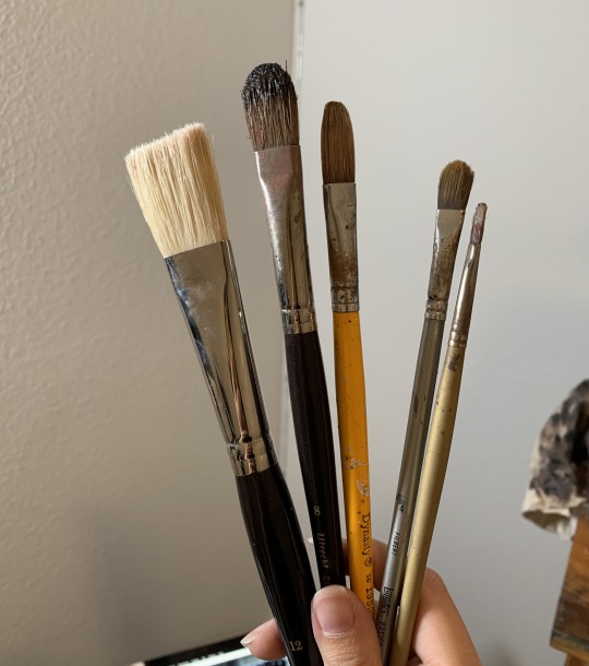
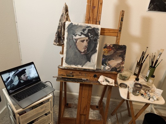
Step 0. Brushes, paints, etc. I use sizes between 12-4, though I usually stick to 8 and 4 for most of my painting. Boar bristle brushes are great. For the paints, I'm using the Zorne palette: cadmium red, yellow ochre, titanium white, mars black. That's it. I don't bother to clean my palette between paintings, I usually mix new paint over what's there. Bad habit? Probably.
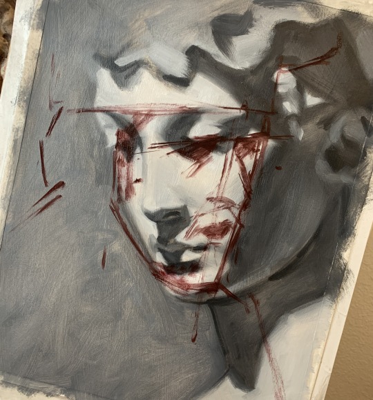
Step 1. Sketching over another sketch you don't like (clean canvas who??) Yes, this looks like a nightmare. Yes, you aren't really supposed to do this. Typically, I start my paintings on a clean TONED canvas, meaning solvent + a neutral transparent paint so it's not just a pure-white ground. In my next process post I'll show this.
However, if I'm lazy and forgot to prepare surfaces, then I'll paint over an older piece I don't like. This was a failed cast study (on primed paper, so I can cut it later) that is now being repurposed into a cold boy. Can you see Hickey?
My sketching is usually done with a transparent dark (in this case, alizarin crimson + mars black) and solvent to thin it out. This is slightly more sketching than I would typically do. Main structure lines to focus on are the angles for the eyes and nose, and then the centerline for the face as a whole. You can use a caliper to check proportions at this stage.
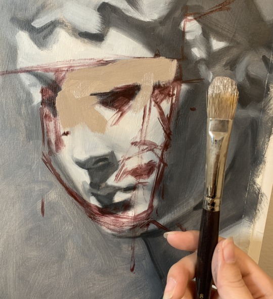
Step 2. Block in! With some paintings I'll block in the darks first, others I do the lights first. In this case, I started with the lights. The block-in stage for me consists of 2-3 values only. Dark and light. He looks scary. Goofy, even. You can see that the anatomy of the block-in is pretty bad, but that slowly gets corrected as the painting progresses.
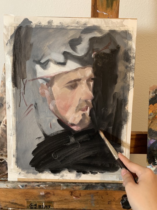
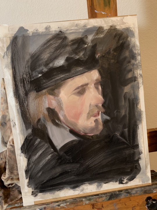
Step 3. Added in the dark background, because it was getting difficult for me to judge the values of the painting with that pesky cast portrait in the background. Typically this isn't an issue when you're painting on a proper surface, lol.
I also added his rosy cheeks in on this stage. I love painting from those outdoor scenes, because everyone has bright pink cheeks :)
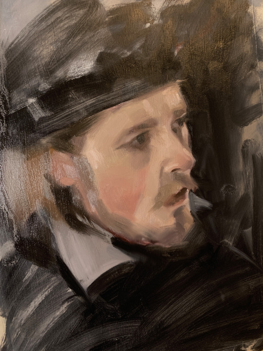
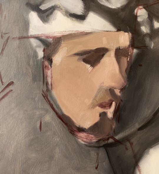
Step 4. "Oh thank god, he has eyes now." I continue modeling the portrait by using intermediate values and highlights to round out the "planes" of the face. These planes are not that obvious in this particular painting, as the reference photo had very soft, ambient lighting. Always squint when looking at your reference to make sure you don't overstate shadows, especially in a case like this.
I've also decided to leave the periphery of the face (hair, clothes, etc) very unfinished, almost untouched. Personal preference!
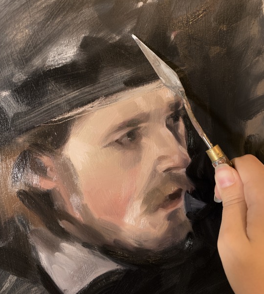
Step 5. Take care of some drawing mistakes. Here I am scraping away some paint from the forehead, since I realized the hat was up too high. A palette knife is excellent for taking care of this.
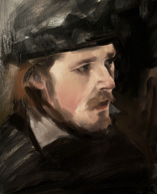
Step 6. Call it quits before you start overworking it too much :) I'll varnish this in a few weeks.
Thanks for getting through to the end! I'll post more progress timelines in the future, as my process looks a little different depending on what I'm working on. Feel free to reach out if y'all have any questions.
125 notes
·
View notes
Text
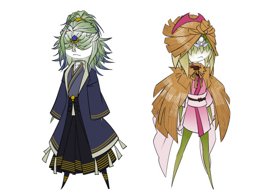
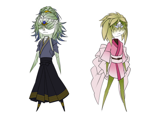
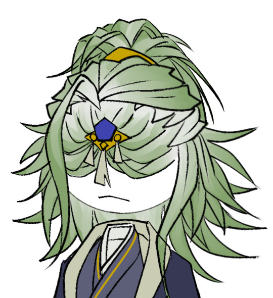
Made these designs very late at night, but I figured I'd try designing the clan leaders as Sapioflores.
Adaman is based on the Japanese iris (Iris laevigata), since it's a flower that grows in water/wet soil and the Diamond Clan lives in a marsh. The ornament he wears on his face is not only a traditional accessory (for Sapioflores), it also acts as a glorified hairclip to hold his long face leaves together. He wears a tasuki if he isn't wearing his coat both so he can get more sunlight and also to hold his sleeves out of the way when working. Speaking of, similar to Ingo, he prefers thick dark clothes to retain heat/moisture (and to mimic the muddy water he spends much of his time in).

Irida is based on the winter peony (Kan-botan), since it blooms in freezing cold winters like the Pearl Clan would see in the icelands. Her face ornament was originally a larger set of accessories, but the stones were removed and put together into one piece instead. The mino and hat she wears are based on the straw tents used to protect winter peonies from snow. Since it's the snow and ice bothering her rather than the temperature, she still dresses pretty light underneath. Her obi is tied to have multiple bows on either side, as a way to mimic the appearance of the actual peony (like a sort of way to say she's constantly in bloom/at her best). Her clothes are cropped at the sleeves and bottom to leave more access for light.

uhhhh other design notes:
I was trying to figure out how to get Adaman's hair to be more blue because without any colour it looks like the left image and I wasn't sure how to feel about it. The current running joke with the writing team is that he drinks dyed water/dyes his hair to be prettier/cooler. Anyways dyed water looks like the right image

The cover on Irida felt like armour when I was sketching it and honestly I kinda want to see her beat someone into the ground with it on (particularly cause while I was trying to look up Kan-botan, I stumbled on Hanakotoba and peonies are supposed to represent bravery according to that)
I ditched Irida's bracelets and anklet in favour of the ornament sorry. They felt a bit clunky and I couldn't figure out how to reasonably fit them on the design so for now they're just not present. If I make a proper battle outfit for her then I might bring them back as limb guards
Adaman is probably soggy a lot of the time since he'll just go chill in the water. Likely just quickly scrubs off any major clumps of silt/mud and heads out if someone calls him during swamp time
Fun fact Volo was gonna be in this design set but I'm too tired. He's likely going to be white spider lily (Lycoris albiflora) mostly because of the whole "death to the universe" plot and also cause he's allies with Giratina. He's probably not gonna be too interesting anyways so it's fine.
Hope you like the art, let me know if you have any thoughts. Have a good night and see you guys later.
#pokemon legends arceus#clan leader adaman#pokemon adaman#diamond clan#clan leader irida#pokemon irida#pearl clan#pokemon au#au#fanart#digital art#Adaman probably used to blow his leaves out of the way when he was younger since he didn't have them clipped#and you're not supposed to cut them‚ but his leaves are long as fuck so it's like having foot long bangs#finally being allowed to wear the ornament was probably a massive relief for him#Also Irida probably sleeps in the snow/outside in the cold#I haven't fully outlined/posted how Sapioflores do daily activities but she seems like she'd be chill with it#anyways that's as much as I can write with what energy I have left#have a good night :)
20 notes
·
View notes
Text
Obligated commissions post, hello gang!
Here to commission me? well here are my prices and examples :) More examples of commissions can be seen in the tag #commission work !!


Busts: 15-25$ (sketches -> colored)


half body! 25-35$ (Sketches -> colored) *can be from hips to above
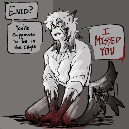
also if the lineart looks a lil different for the colored trans enid, its bc i didn't do that. I sketched it, a mutual lined it then I colored it!


Fullbody 35-45$ (sketches -> colored)
Note! Prices can change and vary depending on what is being commissioned! None of these are concrete
+10-15 usd per person
+5-10 usd depending on the background
There can be additional charges due to paypal fees
Can Draw!
Fanart
oc's/humanoids
pngtuber models
character sheets
horror, gore (not excessive)
Chibi
NSfW
Might Draw (We'll need to talk about these requests)
full on furries (not so experienced)
excessive gore/horror (same excuse as above)
comics
honestly, if it isn't in the Can Draw, let's talk about it.
Will not:
hate art
anything political
if it crosses my boundaries
Terms and Service! (this is a long one)
The client may ask for progress updates every 2-4 days, if not longer, should the commissionee not be in contact.
The art may take longer than the estimated time the artist gives. Should that be an issue or concern, the client must tell the artist.
In commissioning the artist, the client acknowledges that the artist is a student and that this is not the artist's full time job, and the client should not expect the artist to be able to treat it as such.
IMAGE RIGHTS
The client may not, in any way shape or form, use the art in a commission product for NFTs, no matter how much they offer to pay the artist. Should NFTs be made of the art without consent, the client gives full consent for the artist to take legal action against them.
The client may make minor edits to the completed commission (e.g. cropping, adding text/borders, changing brightness/contrast/hue/saturation...
The client may use/reupload the commission for personal/non-commercial use, but only if proper credit to the artist and a linkback to any of the artist's social media is provided.
If the commission includes characters that do not belong the client, additional credit to the owner(s)/creator(s) of said characters must be provided when using/reuploading for personal/non-commercial use.
The client may not use the commission for any commercial use unless discussed with the artist beforehand.
^ Should the client use the art for commercial use, provided the artist's consent, the artist will receive an agreed-upon percentage of the sales profits.
The client MUST credit the artist for any usage of the art on any platform.
The client MUST ask the artist if they want to use their art as a reference, and proceed to credit each time the reference is used.
REVISION POLICIES
Once the coloring stage begins, the only major revisions permitted are details that the artist may have missed and was specified by the client in the order while the commission was still in the sketching/lineart stage (e.g. a missing tattoo that's essential to the character's design).
If the client is unsatisfied with the commission, the artist is willing to discuss and make minor edits as stated prior (e.g. adjusting colors). However, the artist will not redraw the piece and expects full payment, as the client should have specified in the sketch stage changes they wanted to be made.
The client may not hire another artist to adjust the image without the commissionee's consent.
The artist is willing to edit the image post commission for the commissioner, but may charge a small fee depending on what is being asked of them.
Upon commissioning the artist, the client automatically agrees to the terms of service provided, as it is assumed they have read them.
-
...and that's about it? Just don't expect me to be obligated to draw something. Depending on how much commissions i'm getting and how busy i am, the art will take atleast a few days to a week!
If you got references, provide them! It'll help alot. You can also ask for progress updates, just don't mind me accidentally not seeing the message bc this is tumblr and I don't get notifs for some reason.
as of rn, im accepting payment through ko-fi and paypal
But ye! That's about it, thanks for seeing this yall
71 notes
·
View notes
Note
Are you okay with people using, reposting or editing your art with proper credits? :3
(I'm sorry if this has been asked, I can't find anything mentioning this!)
Thank you for asking 🧡
Hmmm I think it depends a bit of the case? I think you here have good intentions, but since "using" is very broad term I'm going to answer kind of broadly here and not just yes/no in case someone else would refer to this ask at another context.
So, all of my works are copyrighted under Finnish/EEA copyright laws. The copyright is created and valid automatically from the moment of creation of the art piece (and it also includes sketches I've posted on Patreon, for example). My answers are based on those copyright laws and on my personal preferences within those.
(under cut as this got long)
USING:
I'm ok with most personal use. That is, for example, printing out a single image for personal use or using a picture on your blog header or as personal playlist (spotify etc) cover art AS LONG as it is not a piece commissioned by someone else.
If you own a print you have ordered from me, you have also right to display it publicly (i.e. posting a photo of it). Owning a print doesn't however mean that you get right to print more copies for sale.
I'm not ok with my art used in buyable products or copies of my art sold by others than those I've individually authorized. I have copyright even to commissioned pieces, so even those cannot be used in products without my consent. If you'd like to use my art on products/covers or otherwise do some kind of collaboration, send me an email at artharakka(at)gmail.com and we can discuss prices and royalties.
REPOSTING (public display):
Usually I'd say I prefer people reblogging (through the little arrows at the bottom of the post) rather than reposting it (meaning making your own original post with it). If you'd like to post it on other social media sites besides tumblr, I do have Instagram (also @ artharakka) where I post my art and I'd prefer if no new art of mine ends up on twitter/x/whatever.
However, if you'd like to do a collab of my art or with my art, to do reference/shoutout post or a moodboard for your characters etc., I'm ok with reposting as long as I'm mentioned as the artist. Though here you are also bound by the laws' moral obligations which means no putting my art "in context that could be offensive to the artist" (very broad and case by case point but I bet mocking me is not your intention)
I'm also ok with using my art in noncommercial contexts i.e. as figures in articles or school projects.
EDITING:
I'm ok with most edits, again, as long as it isn't offensive to me. (And offensive meaning mostly not aiming to mock me or use in contexts that would show me in bad light, but also don't draw smut of my characters without asking). Im ok with, for example, removing a background from some piece, but in that case you have to remember that I still own the copyright. If the edit / modification of the idea is original enough, it might become it's own piece with own copyrights (again, I don't own themes or ideas and sometimes I also borrow compositions/themes from older art).
TLDR: I'm ok with most things not offensive and that you don't aim to earn money with. Credit is welcome and I prefer as direct link as you can provide. Commissioned pieces are off limits without the commissioner's consent.
For individual case questions you can send me message, email or another ask!
22 notes
·
View notes
Note
Just out of curiouse, do you have any tips for beginner artists? I would really appreciate one
Of course! ^-^ I'm more than happy to help!
Let's see...without the ability to have a conversation, I'm not sure where exactly you are in skill level, so I guess I'll start with some basic quality-of-life tips.
General:
You don't have to go to college to get good at art. I didn't go to art school!
Watch youtube videos from good artists, or those you admire!
What kind of art do you ultimately want to produce? This isn't an instance of "I can only pick one thing", it's more like...each type of art requires different skills, and if you know ahead of time what you want to do FIRST, you can narrow down what you have to learn.
learn proper sketching and use of circles and other shapes to build the figure, don't just jump in making the final lines right away! It's not a "cheat", it's proper technique. It's "caring about your work".
Same for references. Google up some images of what you want to draw and look at them while you draw your own picture. It's not only okay, it's what professionals do. You need to train your EYE as well as your hand.
It's okay to mimic styles you like! But be aware that each artist may stretch or squish or exaggerate proportions to fit what they personally like to see. This is why it's IMPERATIVE that you learn realism alongside any manga style you want to try. Once you learn where the eyes sit on the face, the different facial planes and what bones they relate to, and different sizes and builds for the face, you can then manga them up to any style you want!
For real paper:
Use a protector sheet, or wear a glove on your drawing hand. You want to make sure you don't get graphite or colored pencil on the side of your hand, and then smear it on your drawing. Placing a piece of paper under your hand will protect your work!
Don't touch your art with your fingertips. Fingertips have oil and gunk on them, and will smudge your drawing. (If you're working with charcoal, this could work to your advantage! But you're probably not using charcoal. It's messy and usually limited to college art students.)
Get the right tools! You can buy a small eraser set in the art section of Wal-Mart for like $3 -- it has a polymer eraser, a smaller white eraser, and the all-important KNEADED ERASER. This thing can be squished and torn apart and it'll pick up graphite like a champ! Do not bother with hard pink erasers, they're trash.
You don't need special paper to learn. I used to draw on the backs of my dad's extra math photocopy papers. Copy paper is smooth and not too fussy and I like it. "Sketch pads" usually have a rougher grain, and I hate the way the paper feels. Also there's a lot of ugly white spots when you try to shade or use colored pencils. Only use that if you're keeping a cute little book or using pastel crayons or something (or it's all you have). Don't fuss over it too much while you're learning. It won't make much difference until you're ready to specialize!
Blending stumps are cool and even pros use them.
Get a small electric pencil sharpener. They're less than $10 at places like Dollar General, and those stores are literally everywhere.
If you get a manual sharpener in an "art set", that's fine, too, but it hurts my hand to do it manually. I like the ones that have little covers.
It DOES matter what kind of ink pen you use. Gel pens will smear. Most markers are washable, and you better believe they will run at the first hint of moisture. India Ink also smears and runs with water. I recommend Sakura Micron pens, Zig Mangaka pens, or my favorite --- the Kuretaki Bimoji felt tip brush pen. You can get all that on Amazon, and it's like $6. I got the superfine tip.
LET YOUR INK DRY BEFORE YOU PUT MARKERS OR WATERCOLOR OR ANYTHING AT ALL OVER IT. It takes maybe 20 minutes.
If you don't plan to color it, you CAN draw with a ball point pen and it'll look just fine.
Do a tiny little water streak test with any markers you plan to use with watercolor. Just brush a tiny bit of water over the mark after it's dry to see if it bleeds. I use that bleed to my advantage sometimes, but you just gotta be aware of what's what.
Digital:
You can buy a small, cheap tablet from HUION for less than $40. MAKE THE INVESTMENT. IT'S WORTH IT.
Clip Studio Paint is EXCELLENT. Well worth the $50-$60 price tag. I think you can try it before you buy it, too. It gives you access to the Asset Store -- which is the single greatest artistic sharing tool I have EVER seen, and I've used SAI for ...probably a decade... I've used dozens of custom brushes and even made my own, and I just can't even believe what is available with CSP. Do yourself a favor and get it.
"But I can't use a tablet! I can't look at a screen while I draw!" Yes you can. YES you can. Yes you can, if you'll just try it. "but I tried once and it didn't work" Well YEAH, if you only tried a handful of times, OF COURSE it didn't work. Do you know what practice is? HUION screen tablets are over $300!!!!! Do you have that kind of disposable income lyin around? (plz donate some to me if you do lololjk =u=; )
Start saving a folder full of refs.
Ask people to tell you what to draw. Let them request something for free. This makes you draw things you wouldn't normally draw, and there is INCREDIBLE value in stepping outside of your comfort zone. You will level up in no time.
Whew...that covers most of the basics, I think. If you have something specific you want me to go into more detail on, please let me know! I love helping ;w;
22 notes
·
View notes
Text
Eddie Munson Bookworm Headcanon
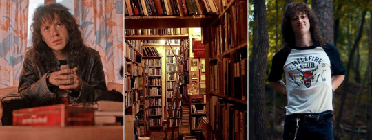
Summary - Just a headcanon about my new favorite bookworm Eddie Munson and his books
A/N - Yes he is a bookworm I refuse to accept anything else
Masterlist - Taglist - Requests are open

Eddie Munson is a massive bookworm, you cannot change my mind about this
You do not play dungeons and dragons and quote lord of the rings if you aren't a massive book nerd
Especially when he was younger Eddie would get most of his books second hand, as books are quite expensive
And also, he is not one to care about the condition of a book as long as it is readable
"Books are meant to be enjoyed and read! So why does it matter what it looks like?"
That is his philosophy about it
His books go through some proper wear and tear, as well as their fair share of abuse
Eddie does not own a single bookmark, anything and everything is a bookmark in his opinion
Random pieces of paper, receipts, a necklace, leaves, a ruler, random piece of string? Bookmark
The man also dog ears his books with absolutely no sense of conscience about it
If he cannot find something to work as a makeshift bookmark, he will just fold over that page
He also cracks the spines of his books; it does not matter to him what the condition of his books are in
A couple of them most definitely have some water damage to them
And covers are ripped, scratched, torn
While Eddie has a bookshelf, it is tiny and only holds a couple
The rest of his books are stacked on the floor in various piles
He doesn't own a ton of books, but he is very proud of the collection he does have
Eddie does not own collectors’ editions of books, they are too expensive and do not serve a greater purpose than the original
Because he got so many of his first books second hand through thrift stores or garage sales, he has read a lot of very different books
But he does have his favourite genera that he will always gravitate towards
Mainly being fantasy, science fiction and classical horrors or thrillers
An obvious is The Hobbit and Lord of the Rings
The Hobbit was absolutely the first book that made Eddie totally fall in love with fantasy as a genera and concept
Which of course was followed up by The Lord of the Rings
And even the Silmarillion
Eddie is a massive Tolkien fan
He has begrudgingly read all the books mandated by his high school English classes, and while he would never admit it out loud, he loved reading Jane Austen
Particularly he really enjoyed Pride and Prejudice, it has enough drama and flair while being well written enough that Eddie found it to be a good read
He had read at least the first five Dune books
When he was younger, he absolutely adored all of the Sherlock Holmes books and the mystery genera has a very special place in his heart because of it
When he was in his mystery book phase, he absolutely read his fair share of Agatha Christie books
He really enjoys a big fantastical and well thought out world that he can simply just lose himself to for hours
Something he can draw inspiration from for campaigns or for his own personal writing
Because Eddie Munson is absolutely an aspiring writer, he already has a lot of practice writing songs
And there are countless overstuffed notebooks filled to the absolute brim with notes of fantasy worlds and random sketches strewn about his room
He isn't picky when it comes to fantasy, anything to tidy him over for a couple of hours
Eddie does prefer the vaster high fantasy settings, but also greatly enjoys comic fantasy and he has a stack of Discworld books gathering in his room
However, Eddie can also appreciate the more classic literature books such as the Bronte sisters
But also, the classical nerdy books, Dracula, Frankenstein, Carmilla
His type of comedy books is quite specific, but he did absolutely love The Hitchhikers Guide to the Galaxy
Eddie owns a library card, it is always in his wallet and it has been used a lot throughout the years
The problem is that he just forgets to return his books
And he enjoys being able to scribble in the margins of his books
Or highlight his favourite passages
In conclusion, Eddie Munson is a bookworm and I love him <3
Taglist - @pastel-abyss-x @fayetheenthusiastast @obi-wanakenobi @starbemo @chloebeansack @a-villain-vying-for-attention @meganjm @prettytoxix @magicalxdaydream @ghoulsandgraveyards @munchabunch @kaydencegilr0y @eateraa @satorix @xbreezymeadowsxsx @hunnybunimdundun @eddiemunsfuturewife
Mutuals - @uglypastels @catastrofhe
#eddie munson#eddie munson fanfic#eddie muntion x reader#eddie munson x female reader#eddie#eddie munson x fem!reader#eddie x reader#eddie munson fanfiction#eddie munson headcanon#eddie munson blurb#eddie munson drabble#eddie munson fluff#eddie munson headcanons#eddie the freak munson#stranger things#stranger things season 4#eddie munson angst#angst#fluff#friends to lovers#eddie munson x reader#reader x Eddie Munson#eddie munson imagine#eddie munson smut#stranger things season four#reader x stranger things#stranger things x reader#stranger things imagine#st eddie munson#eddie Munson st
239 notes
·
View notes
Note
Hiii chim, I'm sorry that you're going through a rough time, and I hope that things get better for you soon ;^;
also this is kind of entirely random but I've been following you for some months now, but it was only JUST NOW when I was clicking on your blog trying to think of a question, that I took proper notice of the sticker shop banner you have on your pinned (despite, seeing it all the time orz) AND SAW THAT YOU HAD SALLY FACE STICKERS ON THERE!! I didn't know that was something you like/liked!! :D But that's really awesome to see to me ahhhh it's one of my favorite games
also also I absolutely ADORE the design you made for Gilda, it goes SO HARD and it just looks so good I have to do a double take whenever I see her because, gosh, what she does to my heart is unfair >A<
I'm not great at coming up with questions, but, you mentioned in I think the last poll for Randy and Imani about the trope of fretting over ruining the friendship you have with someone when you catch feelings for them, so my first question is: who would have worse anxeity over their feelings for the other screwing up their friendship, between the two of them?
second question, of all the art you've done for The Tenderness She Gives (which, is a wonderful name for it honestly, it hits me in the heart so strongly), which has been your favorite? :3c
Ohh my god that's such a sweet message, thank you... <3
Funnily, the shop still isn't open. I wanna finish 2-3 more stickers before opening up again. But yes, I do love Sally Face and will definitely play when the second game comes out. I actually also drew a lot of fanart for it and probably will again once the next game comes out. The general tag list is here if you're curious.
And thank you regarding Gilda <3 as mentioned, I am really surprised she got such a positive feedback. I like her design but didn't anticipate people going nuts over her lmao. I saw way more tags/comments about her compared to other art.
Regarding Randy and Imani and that trope - god I'm such a huuuuuuge sucker for it... I imagine Imani as very curious and experimental in nature so I don't see her being that anxious about it. But then again, I think I love Randy falling for her pretty early on in their teenage years and covering it with jokes and over-the-top and thus not serious flirting. I can see Randy being anxious for years to not advance anything in their friendship because she can tell Imani doesn't have feeling for her. Yet - because I like to think Imani starts to get flustered once Randy is well-known secure in her job as deputy captain. Honestly I could see Imani need a nudge into the right direction from all other women fawning over Randy. As in, she probably only starts to see Randy's romantic potential once she actually starts paying attention outside of their friendly banter. (I imagine her head is always all over the place so she just doesn't see Randy in any intimate/romantic way before).
But after that, she definitely also has anxiety over making a move. Not as much as Randy though.
As for the fave pieces.... I actually adooooore the two butches and have been cursing myself for not drawing them more.

For Imani and Randy I really like the teenage doodle I made for the poll here. I just like their younger versions in the sketch <3
#thank you so much#also thanks for asking about the OCs <3#I really really want more from the butches....#ask chim#the tenderness she gives#my ocs
7 notes
·
View notes
Text
Trying to unlearn the thought processes that caused me to go into mental health spirals with my therapist hasn't been easy.
Besides commissions (of which I am literally being paid for, so those will always be my priority) she's trying to help me be okay with just starting 'fuck-it' pieces and abandoning and coming back to them whenever I want and posting whatever of it whenever I want.
It's rough because my brain keeps sliding into that mentality of 'this isn't finished the way I thought of so I can't post it, but I have this other project on the back burner that I really wanted to finish before this holiday, but I also wanna do the sketch for this one funny ask someone sent me, but I need to post SOMETHING because I haven't posted art in DAYS oh god I'm behind I'm letting people down I'll never be a proper or popular artist I should just never post again I'm nothing like these better artist who have regular schedules for posti--'
STOP. I need to stop. Art is supposed to be fun. I'm under no obligations besides my commissions. I can do whatever I want whenever I want. I need to stop taking all of this so seriously. I can't keep letting myself be stressed out about the things I love.
12 notes
·
View notes
Note
What do you mean by "mostly rendering" on your new drawing of your PC? I'm a little confused aaa- It looks good just a drastic change over a couple months ^^;
Happy to see you back though! :3
"I just realized it sounded rude I'm so sorry!!! No offense meant omg, I'm just curious >O<; "
/
Ah you didn't sound rude at all no worries my friend!! 💕 It is a drastic change ahah, but frankly it's just me actually spending more time on art. After my IvoryxRiley piece I kinda realized I liked the results of going over the piece a couple of times and spending more hours on pieces.
So i've been experimenting a bit more, and another piece that isn't even finished, nor DOL related, sort of sealed for me that this was the direction I wanted to take in art albeit it taking more time and energy!
But im gonna attach the speed paint here for a visual of how it works, for this one I made a copy of the original art file so there’s also the sketch of how I made that one original lay back in January.. but otherwise step by step of how my art works now is like
Sketch, sometimes rough color or straight to either second sketch or lineart, more proper color, and then thats where I would usually slap a signature on and call it done, but nowadays I go over it, and basically "paint" over areas, refining it until I like it better. This can be all from just cleaning it up, to redrawing certain areas. But it always takes way over the time the original art took. The example of this Riley drawing, the original was at 2 hours and 16 minutes, meanwhile the rendering then took around 6 hours and 14 minutes. (Pure drawing time, not including me staring endlessly at the canvas LMAO)
I hope that makes sense? Otherwise always feel free to ask again or dm me! 💕💕💕
#I picked the 30 sec speedpaint because otherwise it’s like 8 minutes dhfrfjfdni#but if people want that one I’ll upload that too happily#dol#dol fanart#riwoogaart#dol pc#riley my boyyy#speedpaint#but yeah that’s also why art is taking a long time these days!
7 notes
·
View notes
Text

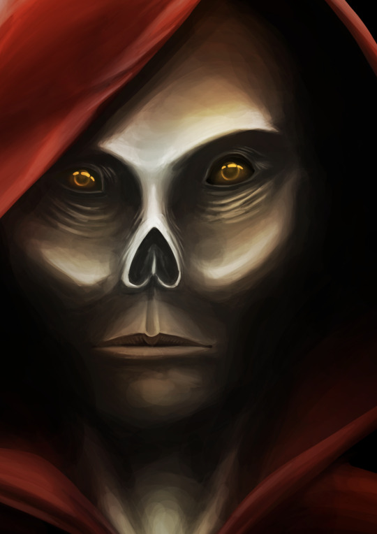
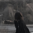
[ Image ID: Image 1 - Lineless digital painting of a portrait of a person in a red hood and cloak. His face has a skull-like appearance with no nose and eyes that glow faintly orange. The background is black and the lighting is limited.
Image 2 - A cropped version of the first image focusing closer on the face. End ID ]
Maybe this will end up only a work in progress or maybe I'll leave this as it is. There are certainly issues with it but I never started this with the intention of it being a proper piece. It went much better than expected.
I've been practising both digital art and drawing faces over my Easter holidays. I also recently read The Phantom of the Opera by Gaston Leroux (the original story that the Andrew Lloyd Weber musical is based on) and it is full of some really great imagery that I would like to, eventually, have a go at doing some illustration style paintings of.
This isn't that, because I didn't go back to double check any of the passages and descriptions or research any fashion from the time or reference images, and, once again, I didn't plan this to be anything but a rough sketch for practise. Instead I'll call this roughly inspired by Leroux's descriptions of the Phantom (which is very different from the popular image of the character created by the musical adaptation).
#not sure how to tag this#digital art#digital painting#art#le fantome de l'opera#no way I'm putting this in the main phantom tag#i think the cropped version is better
3 notes
·
View notes
Last Seen Blogs

strongerthantears-blog
Tempesta di ricordi
dailyteardrop
every day

okulusus
Unbetitelt
courtne-yy
Courtney ;)