#this was mainly me just trying to remember how to do lineart since I don’t do it as often as I used to
Note
Just saw your sketchbook post and I am amazed at how clean it all looks O_O /pos
So I was wondering, what materials do you use for your traditional drawings (all the stuff from sketch to final piece)?
BOY AM I GLAD YOU ASKED THIS *ahem*
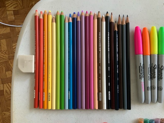
Behold 😌
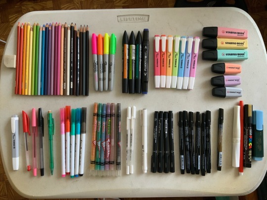
For the sketchbook pages, I mainly stuck to these materials though ^^ these guys are my…
PRIMARY MATERIALS
The green mechanical pencil on the picture on the left has 0.7mm colored lead in it! I alternate between blue and pink colored leads depending on what fits the overall color of the piece better.
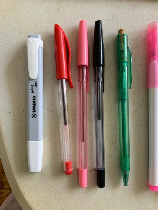
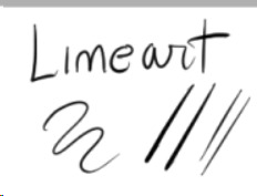
Once I finish up the sketch, I line it with the black pilot ballpoint pen! I really like the control and feel of ballpoint pens for traditional lineart, because it gives a sort of variety in pressure I can’t seem to achieve with normal fineliners. I like to switch up the colors of the lineart too sometimes, hence the pink and red ballpens.
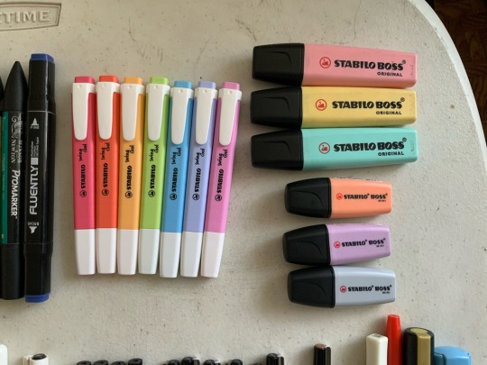
Then once the linearts done, I color them in with the stabilo highlighters, as pictured on the right! These guys are my FAVORITES. Sometimes when I’m just freely sketching I use the grey or peach mini stabilos. Although, they do tend to be a bit runny, ‘cause they’re meant for quick highlights and not multiple strokes over an area ^^; so you do have to be careful and quick when coloring with them to get an even coat of color!
Sometimes, though, when there are other colors or textures I want in a drawing, I use my…
SECONDARY MATERIALS
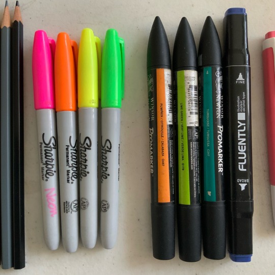
Pictured above are all my alcohol based markers! The four on the left are neon sharpies for when I need that extra eyestrainy kick. The three promarkers with the pointy cap were from when I was a freshman in uni and wanted to collect a full set of alcohol markers, but these were the only colors they had in stock and the college supply store ✌️ I’ve since given up on that dream because they were really expensive ;; they’re really good for sunny grassy scenes though! The last dark blue marker was from a set of other blue markers, but the others have since dried out… I use it when I really wanna darken up a page, like for night scenes!
This is my prismacolor set! I like to pair these with the markers, going in after the initial layer of color to give a bit of variety or shine. Some examples of when I use them would be for adding blush or giving hair a glossy sheen 👍
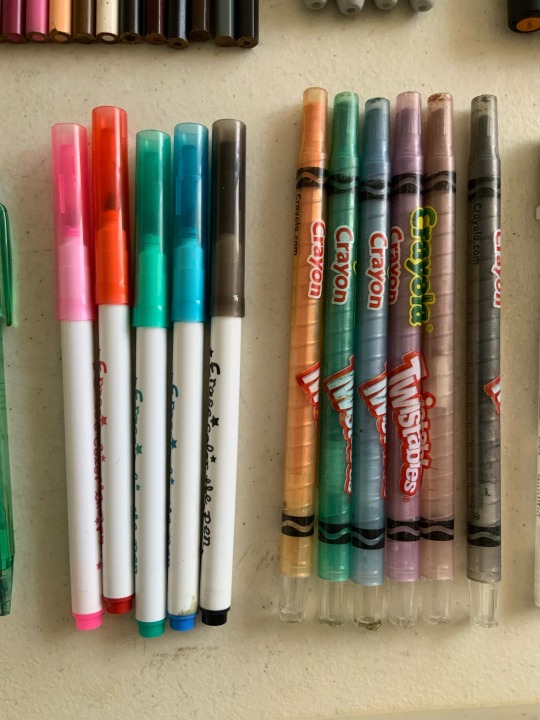
These ones are my “fuck it” materials lmao
I use these when I really just wanna scribble something down wildly. I had these since I was in gradeschool and its quite frankly a miracle they still work? Oh, and the red and yellow twistable crayolas are missing because I vaguely remember giving them to some childhood friends for some reason 🤔
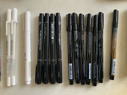
My fineliners and gellyrolls! Haven’t used these much recently tbh. I’d used them for class before, but I never really likes how flat the thickness tends to be :/ the brush tips and chisel tips are cool though. I used them for that one yellow bdubs doodle to try and see if my opinion of them has changed ^^ it hasn’t. Moving on…
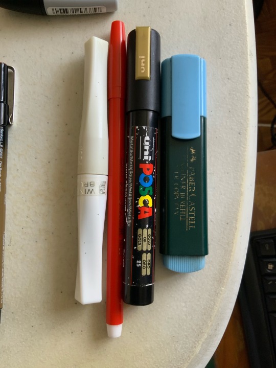
Lastly, we have the special materials! The ones that don’t really go into any sets, or have nice applications. In order from left to right:
Wink of Stella - A brush pen that applies glitter through some sort of black magic. No idea how she works but I love her
Red Marvy Art Director 1400 - A red fine tip marker. Can’t go wrong with a bright red marker 👍
Golden Posca - My only posca marker. Figured if I should get one it might as well be something special.
Faber Castell Blue Highlighter - I use this alongside the stabilos. It has a really nice deep blue color ^^
And well! That should be everything! ^^ Thanks for giving me an avenue to gush about my materials lmao 🥰
85 notes
·
View notes
Text
The Furies Master OC Index

Created This to keep track of all my OC and published volumes
Vol 1 | Vol 2 | Vol 3 | vol 4 | Vol 5 | Vol 6 | Vol 7 | Vol 8
The Furies is an ever expanding series, with no true end in sight. I started this series while in High School. At first, the series only had Kida. In the end, we decided to add the character Gilgamesh, and then history was made. In this series, my brother helped me quite a bit. I drew the linearts, and I pitched some of the raw dialogue. When the drawings where finished, they where scanned and made into perfect line arts in the photoshop. With that concluded, he puts the shading and the dialogue boxes. It is a bit of a bother to always try to do dialogues boxes on the manga. I feel that it distracts from the overall composition. The first version of The Furies manga was like a complete mess. We had to go back to square one, and start all over. Even when the new Volume 1 was completed, we had to go back and add more pages. Mainly, I added the origin story of both Gilgamesh and this Kida. I also added how Gilgamesh ran into Brahma, or Krishna. When I got to University, I took a bunch of religious classes. Of all the Gods I studied, I developed an affinity for Krishna. He just seemed like a fun, yogurt loving type of God. Since I also like Yogurt, I ended up putting him on the Manga as a supporting character. Krishna has played a supportive role in a lot of Hindu legends. So, the role fits him like a shoe. Aside from Kida, there are 3 other furies as well. They start by being a bother to Gil, and eventually the manga focuses on Kida more. The manga has a huge cast that rivals that of One Piece. I try not to have too many folks on the same page, at the same time. Still, I acknowledge that they exist from time to time. For those that do not know, The Furies are a revenge type of Goddesses. They are known as the Kindly Ones. The represent the past order. They are what life was all about, before the Jury system was implemented in Greece. In their titular story, Orestes committed matricide. Gil killed his father, and did not get punished because he was royalty. It is for this reason that the Furies started bothering Gilgamesh. When I say Gilgamesh, you must take his name with a grain of salt. It is like being named Jesus or something. This Gilgamesh happens to have a friend named Enkiku, which is very close to the name Enkidu. From a normal type of setting, Gilgamesh and Kida get into some crazy adventures in their fight against the Abandons. The human leader of the Abandons is a man named, Gates. He steals the suns from Solar Systems. This makes him a step more evil than Galactus. I can empathize with Galactus. When I get hungry, I feel like I could eat a whole planet. Have you ever been that hungry? I certainly have. Anyhow, the core of the show is the relationship between Gilgamesh and Kida, as it grows as the manga progresses. Before you think this is a sappy romance manga, let me assure it is not. I don’t even think I remember drawing them kissing. The show is an action, comedy. As the manga progresses, I lean more towards comedy, but I am not afraid to throw a bit of action in the mix just for giggles. I also do musical numbers. Every so often, I do little song parodies, or reference songs that nobody seems to remember. I am just trying to keep it fresh as all. If you are not having fun drawing the manga, then how can you expect for the reader to have fun while reading it? Aside from the music, I have like a bunch of paintings and art references. You need to be an art historian to catch all the references I make. I should have marked them when I was making the manga. I eventually forgot most of the names of the works I referenced. Paintings are just easy for arranging scenes in the manga. For now, there is about 11 volumes of the manga. Depending on when you are reading this, there might be more out there. It takes time to publish. I hope you have as much reading the Furies as I had drawing it.
Characters
Gil - Bio
Kida - Bio
Enkiku -Bio
1 note
·
View note
Photo
Progress gif of this: “Would you still recognize me?”
The quality isn’t the best possible, but hopefully you get the idea how things evolved... It’s made from “the preview pics” that I saved in this painting’s draft/wip folder whenever I took a break or wanted to compare/remember something special - and also so that I’d know where I left things and wouldn’t have to open the actual psd file every time, lol. To make the gif size smaller and to have it flow better (and be less eye-hurting), I left some of the frames out.
I admit it, it’s quite fascinating to watch now after everything :D *pats myself on the back*
So that the post doesn’t become too long on the dash, I put some additional notes under the cut, mainly about the refs and wips if you want to take a look! Please, do not repost elsewhere :)
(Btw, you can just read the bolded parts if you want a quick version or get tired of the rambling.)
I want to point out that the main work always happens underneath all kinds of adjustment layers because I like to test things a lot during the process before sticking on something if I don’t quite know yet what I want. Like the colour scheme or where the light comes (or if there are multiple light sources) or if something needs more contrast etc. So I paint with simpler colours first, but already have some ideas/adjustment layers over them, but hidden and waiting until the basics are done. Then I merge things and continue to paint with the “new” colour palette.
I also often test filters to have more texture or bring out some things better - or just to find something interesting to incorporate! Accented edges, crosshatch and watercolor are things that I often test in some way over my sketches and wips at some point when the basics are done or when I need/want some kind of further effect/texture or just something to knit them together better and for balance. And also just for fun!
Then I flatten the things I like (or I am “certain about” at that point) and continue painting over that ...aaaand end up testing something else, keep different versions or parts of things on separate layer groups (to compare or to bring back some earlier things that I liked or alternative lighting solution or object/body part placement, or...) and so on...seriously it’s always a mess controlled chaos! aahahahaha *face palm*
But mainly the things keep building on top of each other instead of having neat groups for sketch, lineart, colours, lighting etc. I mean, I always try to start with that but never have been able to actually keep it very long... And on the other hand I’m too nervous and indecisive to paint with only single layer/canvas from the beginning with (like a traditional painting would be painted). Or with just a few layers for background, character(s), effects on their own and so on... So I have this chaos that swirls towards that something that I had preplanned or wanted to achieve/practise until I’m happy with it.
ANYWAY, BACK TO THE ACTUAL ART :
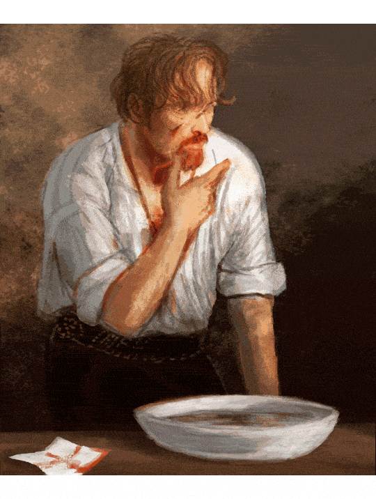
The original “spark” for this work was Flint at the end of the episode 1 with his bloody face and white shirt, and that nice splash of light, which made me think about the aftermath and him cleaning himself in the privacy of his cabin with some nice morning light painting his beard fiery and him lost in thoughts :) At some point that made me think of Henri de Toulouse-Lautrec’s beautiful painting “The Laundress” which I have liked since I was a kid, so I started to steer towards it.
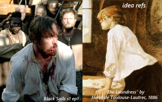
See the resemblance? (˵ ͡~ ͜ʖ ͡°˵)ノ ✧*:・゚✧
Some of the refs for the bowl and Flint. The angle/posture ended up being a bit different and I had more refs for Flint’s face and shirt and hand etc.

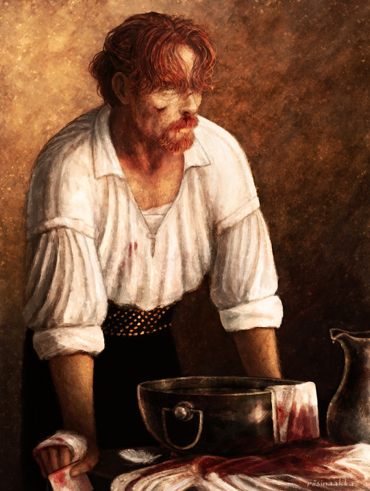
Some wips:
1) basically the idea and items that I wanted to include.
2) after a break (weeks? months?) and after I had searched some more references to help. The eyes were at this point (accidentally) absolutely awful so I censored them for the sake of my own peace of mind here, lol (not sorry!)

More wips along the way, although not much difference can be seen as the pics are quite small.. :
3) I mirrored/flipped the painting constantly, to see the mistakes and also because I couldn’t decide which way I wanted him to be! This stage was aaalmost ready but I got stuck and forgot let it be for several months doing other stuff again.
4) I continued it, fixed lots of things with fresh eyes and experimented more with lighting and texture but nothing too drastic stuck in the end. I have two monitors and either (or both...) are calibrated a bit off atm, so it was quite frustrating to navigate and to know which one had the right colours that I was after... and I still don’t know but it looks nice on both screens so ¯\_(ツ)_/¯ At this stage things were basically nitpicking and a bit too much honing.

The finished piece:
In the end I lost some of the things I actually liked more in the earlier versions (for example some had more of a dreamy feeling or better texture or more emotions/wearyness/anger showing that didn’t quite reach the end result again) and I overworked some other things, but nevertheless! I’m very pleased how this turned out! I reached the vision I wanted and learned a lot again :D
Thanks for reading <3
#black sails#captain flint#tw blood#flashing gif#tw flashing gif#progress gif#or is it process gif?#anyway. here's some notes and refs and ideas again#the gif shows more than the small pics later#but I wanted to point out some things from along the way#ask away if you want to know something specific#OH yeah btw this one sparked 'the first mo(u)rning in Nassau' painting with Flint and Miranda!#that I drew a while ago and finished before this#atleast I have a vague memory that these were connected#and also the one where mr Gates is patching up Flint with dr Howell xD#which I privately call 'HURGH' (because of Flint's reaction lmao)#so you see#it's dangerous to start new things because they end up multiplying and then u end up with shitton of wips#that are like 70-90% ready but just.can't.finish.nggggghhhhhh#at least some of them finally saw the light of day...#also I forgot to draw his collarbones again lol#let's pretend there's enough meat to hide them ;)
93 notes
·
View notes
Note
how do you make your anime edits?
Mm, going to try to reply as clearly as possible lol!! edit: this turned out to be a long reply i’m sorry lol i tried to cover my process in general and this is what you got
I use Photoshop (CC17) and Illustrator (which is a more recent development, I’m still trying to figure out a lot about it). I use AI mainly for 3D shapes and typography, because the end up a lot less blurry than in photoshop (basically I just do the shapes and typography and then place the file in my canvas as an embedded file, which gives me a lot of freedom when it comes to resizing bits and pieces as I go).
Usually the first thing I do is pick a subject (character or infographic mainly, I’ve never edited a specific arc of a manga or an anime yet) and then find stuff. Mainly, this is what I use:
concept art. Concept art is your friend lol. It’s easy to find, it can be storyboards (especially for ghibli, they are a lot of fun to work with) or character sheets. Most of the character sheets can be found on anime wiki or with a quick search, since several studios release them. I used concept art for this totoro edit for example.
promotional art. Movie posters or official art released ahead of the season, stuff like that. A little harder to find in good quality and a bitch to clean, but it can be quite useful. For example I used promo posters on most of my KNY edits like this one. I usually cut the background out, polish it a bit and then apply filters or turn it into lineart.
anime stills. These are literally the worst to clean up and they require a lot of filters and coloring for my style of edit but I have used them before. I used stills in both edits linked above, and in this FMA one. Again, it really depends on what you want to do, but I cut out the background, try to clean up the lines as well as I can without crying and then apply filters, colorings etc. I don’t use any pre-made psd though.
manga panels. I use a lot of manga panels. Usually once I’ve picked a subject I reread/look for some chapters I remember well and choose the scans I might need. I don’t clean all of them (lol), but I save many with different angles and then see what fits my concept. Also just in case, but by cleaning I mean that I erase/remove all the speech bubbles and panel lines, other characters etc. I usually avoid panels where I’d have to redraw like the plague for my own sanity. (idk if anyone needs this but random tip: if a character’s skin in the scan is very gray I’d try to create a layer mask, fill it with 50% gray and set the blending mode to divide)
so now for the actual how (consider that it takes me forever to edit lol): I look for a lot of graphic design posters and you know, actually professional work for inspiration. I like typography (which no one on tumblr seems to like smh) and 3d design and once I’ve found a concept I’m curious to try I just try to translate it to my own aesthetic and style. This is all up to you tbh, I like to mix up smaller and bigger fonts, I use a lot of pastel colors and lineart and, recently, I’ve been into trying to mix more organic elements and 3d shapes (for example a Shinobu edit I haven’t posted yet has a lot of butterfly/3d shape elements).
In general I suggest having a clear(-ish) idea of which aesthetic may fit the character you want to edit and then find a palette (I mostly use shades of the same color tbh, but if you want to find colorful palettes there’s plenty of online resources) and some basic concepts/quotes you want to include. And I’d always remember there’s a lot on PS besides basic functions: blending modes, filters, liquify, pixelate are all useful.
I’m not really sure how useful this is to be honest, but if there’s a particular edit or panel you want to know more about I still have all the files, so I should be able to walk you through the process.
11 notes
·
View notes
Photo

I made a self-analysis of my art progress over the past five years. I feel like I’m at a point where my progress has kinda flat-lined and I want to go through what was my most popular each year and point out what I like and what I don’t like/what I improved on.
This is mainly for my own use so putting the meat of this under the cut.
Also going on a little hiatus for who knows how long because my head is not on straight and I need to take time and get out of my head and this fog.
2015
First year with a tablet. Well, first few months at least. I think I got this tablet around October/November. I think the main thing I like about this is the colorr! The oranges and reds in his hair just make it look so vibrant and inviting. Definitely feel like I need to expand on my color usage and be more carefree about it like in this pic.
I have a whole list of things I don’t like but I’m not gonna get into them since...well this was my first arting experience and I loved every minute of learning the program and using the tablet. So I don’t wanna throw shade on those memories. Mainly, linearttt needs some workk.
2016
Alright here we go. So first thing, THE POSE?!? I honestly am still shocked at how well I pulled off that pose. Yeah the anatomy is wonky, but I feel like I executed it well.
The shading bugs me the most. I was so concerned with having harsh lines in the shading that I blurred everything out. I feel like this makes it lose it’s depth! Yes it looks soft, but I am a HUGE fan of shading that has a rough, painted, look?? Idk how to describe it.
Also the avoidance at doing anything with Roy’s face or anything below both of their shoulders annoys me.
That is probably my main regret about me doing art at this time. It always had to be PERFECT. If I ever drew something and it started seeming like it wasn’t going to turn out how I liked, I pretty much rage-quit and shut down. I still do this now, but I try and hold out a little longer and work on fixing it before I give up. Unfortunately, giving up on a drawing happens more often than I’d like to admit. And, it’s not just giving up, its giving up and DELETING the whole drawing because I get so mad at myself. This is why you all rarely see me post sketchy sketches. I really need to try and kick this habit.
2017
STILL MY FAVORITE PIECE I’VE EVER DONE.
Idk what it is about this drawing. The shading! The lineart! His hair! That AUTOMAIL OMFG. I can’t tell you how many times I have tried to recreate this and nothing seems to compare in my mind.
Nothing to critique. I still love it all.
2018
God this one seems like I literally did it yesterday.
This is where I feel like my progress began to stall out. Most of my stuff now still looks like this and idk how that makes me feel.
This is right about the time I started doing my lineart this way. I used to refer to it as my “soft lines” as I labeled it in my old commissions posts. Now its my standard way to do lineart and I love it so much. I really like the variation of line weight on this and the hatching!! I need to work on incorporating this into future pieces.
Also I remember I did this weird technique of shading on an overlay layer with odd colors?? I think I used like green and red on this one and I still really like how it turned out so I may try that again.
2019
THIS ONE idk what it is about it but I have a love/hate relationship with this one. I love the fact that I did a (sort of) full-body pose and it actually turned out okay! Also the colors and lineart look super dope and work welll!
I hate the hands and the face though. Hands because...well they’re hands and were crafted by satan himself to torture artists with their wonkiness. The fact just looks weird to me. I’m not super comfortable with doing profiles and I always feel like they turn out really strange looking. I’ve looked at a million different profile tutorials, traced over pictures, and Still. Can’t. Do. It.
However, looking from the one from 2015 to this one, I am amazed I have come this far.
#stfusanta#progress#areyouart#i havent been mentally okay since jan of last year when i came about 2 inches from ending it all#i need time to sort out my thoughts and start thinking for me and doing things for me and not to please others#also need to get that dumb little voice in the back of my head tf out#it not surprisingly sounds like my mother and is her opinions of me#so need to get rid of that shit#also clean my apartment#and make actual food for the first time in fucking months
7 notes
·
View notes
Note
hello! i was wondering what program&brush settings you use for your artwork? im new to digital art and i really like the way you colour! Especially those light effects they're so extra cool!
omg Anony you’re such a wonderful being, thank you for liking my art enough to ask me that!
now watch me failing trying to explain things to you lmao. I’m self taught and I’m in no way the best at this, so what I’m going to tell you might still be flawed but this is how I do things o/
hmm it’s gonna be long so I’ll put it under a cut!
1) I’m using Paint Tool Sai for everything in my art but if I still feel the need to, I’ll use Photoshop to correct colors and lighting. for example in this progress gif:

you can see where I decided “no, I don’t like this cold blue feeling” so I went to Photoshop (because it allows changes much easier than Sai when it comes to colors) and I changed it to a warmer purple! you can always play in Photoshop and try to see different versions of your art, different colors will give off different feelings
most of my artworks don’t look the way they do at the end because while drawing I tend to be focused on other things (line, where to place shades, lighting, etc) while when the picture is done I can focus on the feeling I initially wanted it to have!
2) My usual brushes are really basic. also ignore my ugly writing.
Sketch: I use this to sketch because it has a nice and easy flow, I can get messy lines that look good (the latest Brahms Heelshire drawing I did is entirely drawn with this one!)

you can always switch between your brushes depending on what feeling you want your art to have
Lineart: this one has nice, smooth and bold lines. I like to play around with it’s size. I believe it’s the basic one Sai has
little advice: if you’re not happy with your lineart try to alternate heavy lines with tiny ones. for example:
you can see how bold her hair is, but adding thinner lines to the glasses, the folds of her clothes, hair etc. it will create a better dynamic of your picture and will leave the eye of the viewer to run around it! I’m honestly awful at explaining stuff fdkjsnjkfds ofc this is a personal preference but my linework improved since I started to think like this
Base color: this is the color tool sai gives you, I changed my names so I can’t remember its default name. I like it to be bold because when I was little I used to color entire coloring books, so even now digitally I like to color every bit like I’m using crayons haha. time consuming and useless but shhh. basically I put down every base color with this one

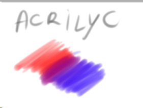
Acrylic: now this one is tricky, when I got it the first time I wanted to use it to shade, but using it I discovered it’s much better for blending. after I put down the main colors and shades I just use this one to blend them together and I sometimes paint with it too

Blending: it’s literally the blur brush Sai provides you xDD
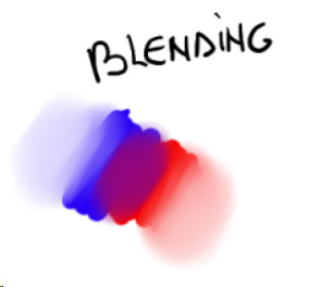
now keep in mind that using its settings (the things near the “Normal” option!) you can get different types of blur! always play around to see what looks good in your art. also remember that not every shadow has to be blurred or blended out, there are many ways shadows can look, using both blurred and heavy (cast) shadows in your art will definitely improve it. using real life references might help
Airbrush: the very brush Sai gives you. I’m using this one mainly for lighting. what I do is basically put down a hard light, like literally take a light color and place it where I see fit on the character, then I give it a bit of glow with the airbrush. one thing I noticed is that depending on the surface, the glow will change!

in this one you can clearly see the light on his cheekbone, but then there is a much weaker light on his face, that’s made with the airbrush and then blended into the structure of the face.the glow on the cheekbone and the ear is made with airbrush, using orange and playing around with the layer modes (overlay and luminosity, these are your best friends when it comes to lighting!)
lastly I want to present another best friend for us artists, the eraser

you can make highlights with the eraser too! you can cut the light in different shapes to give different feels and many other things, the eraser is definitely your best friend and not only in erasing mistakes. try to play around with it sometimes
Other things I learned:
try to use a different color for shading, using the exact color but darker will only make your art look dull, lifeless. the same goes for lighting! there are lots of tutorials on color theories and practices out there to help you with it
don’t be afraid to get wild, use oranges, reds, blues, purples in your skin and play around with the layer modes, you’ll see how much more alive it will feel. also don’t be afraid to try different styles, constancy is not the friend of a creative mind. experiment, try things, go out of your comfort zone. make it fun, make it personal. if you like drawing dogs then keep drawing dogs and enjoy it! don’t let labels and others to influence you and your spirit
ik this is obvious but never compare yourself with others. your journey is yours, you have a different hand, a different brain and a different being. this also goes to drawing things others did already! who cares there’s 0284e4895 other pictures with Kitbull already? draw yours, it will be unique and special because it has something from YOU in it, and no one can replicate that not even with tracing
watch people online! of course when you sit down to draw it will be completely different, but involuntarily you’ll learn and exercising you’ll find your own way of doing things. there might be much better ways for drawing lighting than I do, but this is how I feel good and I like to do it!
I know you hear this everywhere but really, practice, daily if you can! in October 2017 I tried to to the inktober challenge for the first time, I haven’t finished it and I was late anyway but I can tell you that trying to draw daily definitely improved my art. now I’m able to draw a picture per day with not much effort (yesterday I was able to draw three pictures with pretty good quality! o/ always start small and be proud of every step!!)
lastly, don’t be hard on yourself. every picture is a lesson, doesn’t matter how it came out. maybe the anatomy is wonky af, but you learned and your brain will remember what not to do next time. try and try and try and never say “my art sucks”, say “this pic doesn’t look how I wanted, but I still like it. I’ll do better next time!”. the moment you start to like your art you’ll see how much it will start to shine hehe
I might come out with more stuff but this is already really really long xD just be yourself, love your art and enjoy it!! lots of luck for you Anony, I hope I didn’t bore you and this will be helpful for you and others! :D
#ira geneve#art advice#tutorial#sai brushes#art tips#anon ask#ira rambles#wah this was long sorry#but it warms my heart to know some people look up to me for things#and I'll do all I can to help anyone
66 notes
·
View notes
Text
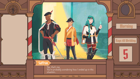
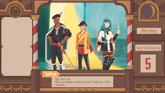
Devlog #34 - Status Update, Character Design, and UI
Hello! It's time for another update on the development status of Brassica. It’s also our first actual devlog purely about Brassica!
After working on separate projects for a while, we are now in the process of getting back on track working on the same game again.
Because of that we're happy to announce that the rest of Brassica's Act 2 will be released in March!
It grew a bit in size from what we originally planned but that just means more game for you~
The exact date will be announced when we can more clearly estimate how long the remaining tasks will take but we're in the process of finishing everything up so it shouldn't be too long.
As for Act 3, our current plan is to release it in April. From now on development should be a lot faster but because we mainly worked on it on the side until now, that is still only a rough estimate. We'll definitely keep you updated on any developments regarding the release dates though!
Well, and that's about it for the status update. Because it's been a while since our devlogs actually described much of our development process (and we haven't shared much about our thought processes behind Brassica), we decided to bring that back with today's devlog.
PECTIN will tell you a bit about Saffron and his design while eZombo describes the development of the UI.
So without further ado, here we go:
Art - PECTIN
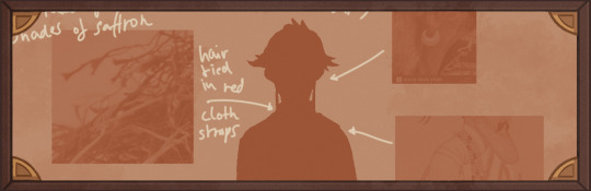
Saffron is the curious prince the player takes control of in Brassica. Before I began concepting him Felix and I defined his character. At this point we already knew he would be one of the princes Sappho tricks into going on the journey. (And would then fall in love with another prince because YaoiJam'18). We soon agreed on naming him Saffron. So I already associated the colours of the spice "saffron" with him here.
We also wanted to make him a protagonist with his own personality. Thinking of the player who role-plays him we thought it would be cool to have his character split into three separate personalities he could have:
- the cunning and a bit wild prince
- the typical goody two-shoes type of hero
- and the soft boi who's overwhelmed by the whole predicament and really needs a hug
Another external influence was, my intention to try and fuse traditional things with modern sportswear. Brassica is a fairytale but it's told in a contemporary voice. That's where the idea came from.
...Okay. So I had his name, colours I could associate with him, the three archetypes and my goal to fuse sportswear with traditional clothing. Having all of these "pointers" I began looking for reference pictures. I browsed through online stores of popular sports brands to find things that would fit the character. Due to Saffron's character ranging from cute to rather untamed (in the sense that he would climb a tree without hesitation) I thought that wearing shorts would be most suitable and comfy. But for the top and the overall outfit I wanted to let myself get inspired by traditional elements. The name "Saffron" reminded me of the spice and then its use in Indian culture. I never designed a character with Indian influences before and thought researching into that would be interesting. I found a lot of stuff I could translate into the design. Even the leggings Saffron wears were intially inspired by my findings about Indian culture.
Here's a visual breakdown of what inspired what (excuse my srawly handwriting >-<):

During the process of drawing out his design, as I always do, I thought about how each component of the outfit would "flow". There're lot's of lines and intersections in his outfit that guide the eyes along the his body:

And here is our boy again as a sprite. Not much different right? Here I put one of his hands in his shorts' pocket, because I think it would suit someone who is either unsure and does that or feels liking hiding something.
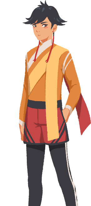
That's it about Saffron! I could go on about his colours but I'll save that for when I explain the general artstyle of Brassica! :3
UI - eZombo
Because Brassica was planned as an entry for Yaoi Jam 2018, we thought about ways to keep the scope small. One idea we came up with was to reduce the size of the screen that shows backgrounds and characters so producing the art is a bit faster than filling a full HD 16:9 canvas. One inspiration for that was Sticky Zeitgeist by Porpentine & Rook but something like the Undertale console version where the graphics at the border of the screen change based on the in-game location was also something we considered.
When it came to actually planning the screen, Undertale's influence came through again, because the main area of the screen actually has an aspect ratio of 4:3. This obviously leaves a lot of unused screen space but one thing we knew we could definitely use to fill this was the text box. Having it separate from the main screen also made sure that it didn't overlap with the characters or backgrounds so the space that was reserved for that could be used to its full potential.
With two elements already on the screen, we still had the sides to fill with content. Just using graphics as borders definitely was an option but because Brassica's story plays out a bit like a road movie, we thought having a map of the game world would definitely add to the feeling of that. And to make the UI visually more balanced again, the last bit of free space was then filled with some information on the time of day and how many days were left for the quest of the princes which basically added all the important context for what is going on in the center of the screen.
A first mock-up of the UI featuring a familiar face and St. Bernard...
Around that time, we also developed the idea of presenting the whole game screen like a paper or puppet theater. This seemed like a good way to bring all these different elements together while still supporting the colorful fantasy-ish look of the game art.
I did a quick sketch of how this could look, which turned the mock-up into this:
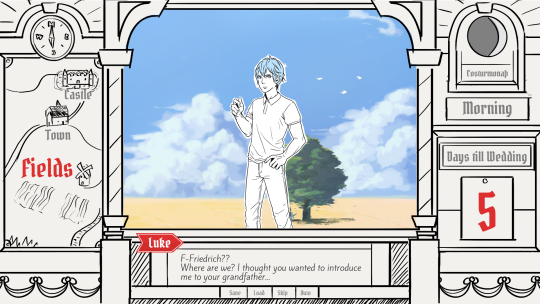
Aside from adding some more purely graphical elements, I adjusted the text box and the flag that showed the name of the character that is currently speaking.
The map was graphical now instead of just a list (which would have given away future locations) and I was overall fairly happy with the direction the UI was going in.
A few of the border elements overlapped with the main screen now but I tried to make sure it only happens in areas where we wouldn't put any focus.
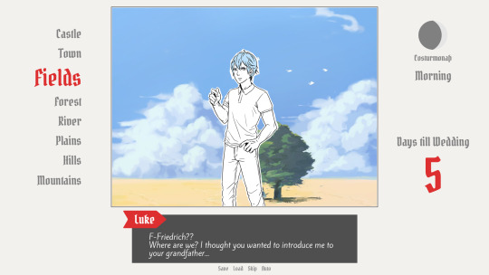
After getting some feedback from PECTIN I then went on to work on the final lineart while also trying to simplify all the shapes. By then, the characters were also being concepted so instead of Luke I could put Ode into the mock-up (along with a reference for a possible background style).

As you can see, some unnecessary lines, elements, and text were removed to simplify the look of the UI and make sure that the important elements aren't overshadowed by anything else. Overall I tried to keep the lines clean without making them look overly sterile, so any round shapes are generally drawn freehand instead of using any vector shapes. Except for the compass, moon, and their enclosing arcs. Those just looked sloppy when they weren't exact. Not using fixed line widths was another way to make the lines more organic even when they were perfectly straight.
The idea to use different colored flags for each character also came into play now, although Ode's color here is actually used by Hans now…
Colors were next on the agenda. First a basic pass, followed by some adjustments and line colors to make the lines fade more into the background. Having the concepts for the three princes was very helpful for this step because it was important that the UI colors fit into the overall color scheme while keeping the focus on the actual game art.
That's why red is only used close to the center and for important UI elements (the current location on the map is also marked in red). The rest of the colors are rather muted and monochrome on purpose with only a little bit of gold to break it up.
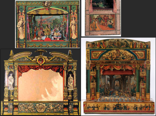
Throughout the whole process my main references were old paper theaters but especially during the coloring process I deviated from these references in favor of using colors that would match with most backgrounds.
Once we were happy with the colors, I did a relatively quick shading pass, just adding shadows with a fairly abstract light source to keep most shadows parallel to the lines. I also added some subtle noise to make everything look a bit more organic.
For the most part it still looked too clean though, so PECTIN suggested overlaying the UI with some watercolor textures.

Which lead to this final mock-up and not only solved the problem but also gave the UI a more painterly look that didn't interfere as much with the general artstyle.
Well, but as always, there are still a few things that changed on the way into the engine.
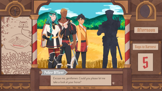
The map was obviously added (which could probably fill a devlog by itself), the text on the side was changed to better reflect the current quest of the princes (although the other sign may or may not return in future acts...), I added a CTC icon and updated the quick menu (although I can't remember why "Load" was removed so maybe that will return again), but most importantly:
The text box was reduced from three to two lines of text. This wasn't as much an active decision as it was caused by the fact that small line spacing in Ren'Py cuts of parts of some letters until all lines of text are displayed. There are some games that still do this but personally I don't really like how it looks while the text appears. Increasing the textbox would have caused a lot of work because I would have had to shift around more elements of the UI to keep a balanced layout so it was simply easier to remove a line of text and increase the line spacing.
This had a pretty strong effect on the writing because sentences have to be fairly short now or if that doesn't work, broken up into multiple lines.
Even if it wasn't exactly planned, it still influenced the writing style of Brassica and further distinguished it from our other games (although there's more to say on that one) and in hindsight, only two lines of text also look a lot cleaner in this layout.
I could go on about the actual implementation of the UI but this has already been a pretty lengthy post so maybe I'll save it for another devlog.
But that's it for now! We'll be back in two weeks with some more development insights and our current status. We also plan to start posting these devlogs regularly again, so stay tuned for that!
As always, thank you so much for reading and we hope you could find a few things of interest in this devlog.
#brassica#fairytale#devlog#gamedev#game#development#otome game#romance#tutorial#visual novel#indiedev#indie#okay
8 notes
·
View notes
Note
Hello, yes, hi, I recently found your art and account and I love what you do. I'm turning 14 in April and I've asked for a drawing pad, but I have no idea how to use one as of yet. Have you got any tips or anything? Because I've wanted to try digital art for a while and your art makes me want to even more lmao. Thanks! - B.A.
BOI OH BOI DO I GOT SOME TIPS FOR U
(I’m not sure what kind of comp you’re going to be using, so I’ll list for both.)
FIRST: Drawing Programs; the free and the great.
-Firealpaca: Lightweight drawing program. I draw Recovery using this! It’s easy on the RAM if you have a weak comp/are paranoid about yours like I am, it is mainly for basic comic making, and has all the basic brushes you need (pen/pencil/airbrush/symmetry/etc). You can add your own brushes as well but they’re p basic settings. Has basic Animation/Gif making as well using Onion Mode! Layout is a piece of cake. Please note that If you leave it open for a week it’ll crash on you, even if you haven’t anything on it at the moment, and sometimes the brush sensitivity just stops working so you just have to close and then open it again. (Also I have no idea how to update it aside from deleting it completely and just downloading the new version from scratch, so thats a thing.) Mac/Windows
-MedibangPaint: This is basically FireAlpaca But Better. Has tons of screen tones, brush patterns, and tools. I don’t use it much because I’m used to FA’s layout and get confused with the the placement of tools in here, so if you can I highly suggest just going with this first. Also has basic animation/gif making! Has storage for the website as well, and you can upload more preset brushes. It’s v anime. This program has waaay more in terms of basically everything, so it just takes more RAM. NBD, you don’t have to have every brush downloaded from the storage ^u^. Mac/Windows
-Clip Studio Paint: Okay this one isn’t free, it’s a pricey one, HOWEVER once a year they take the price way fuckin down by at least 75%. Sign up for the email list and it’ll let you know when that precious day comes. It’s how I got it @u@, around christmastime? This program is basically MedibangPaint On Steroids. I do all of my digital-yet-tradition-style-painting on here! The brushes all have some neat af settings to play with, you can make your own brushes, has tons of screen tones, pre-made panels, and settings. You can save projects as basically anything you need, is a hardy program that almost never crashes, and It’ll take a nice chunk of space on your comp depending on how much memory you have but hey, its worth it. It’s much more complex layout-wise than the other two here, but you get used to it after playing around and watching tutorials haha.
-Mischief: It’s a 25$ app, has like four brushes and five layers only but is vector-based with an endless canvas. Not really worth having unless you like the vector thing. UP TO YOU. I spent forever with this one doing all that homestuck stuff, so it’s not really bad so much as it is a basic bitch. Mac
-MyPaint: I used this a bunch when I still did digital art on my windows laptop before I upgraded to a Mac. It’s easy on the comp and has plenty of brushes and settings. You can also get brush packages if you don’t feel like you have enough that comes with the program! Also has endless canvas; pretty sure you can just select an area and then export as is. I barely remember the rest but It’s pretty great. Windows/MacPorts(which I hate)
-GIMP: I hate this thing. I cannot figure it out for the life of me. It’s got loads of shit though, can handle layers, has plenty of brushes, and can do basic animation/gifs if you ever figure it out. Windows/mac
I’ve heard good things from paint tool SAI and Krita as well, but have never used them myself.
***You can always pay through the nose/use a student discount for the photoshop series and pay that shit monthly, those fuckers have literally everything, but I am a cheap college kid making minimum wage with a car payment; I’d rather just pay once/not at all.
TABLETS: treat that shit like a newborn babe 24/7
-I have literally only ever owned a Wacom Intuos4. It has lasted me six years, and at least five moves across many miles. I broke one of the cord ports the day I opened it by holding it wrong, have one left, and now treat it like it’s going to die if the cord moves badly. Please be aware that if you break both ports, you better either sodder it back together yourself or upgrade to smth else because it costs about as much as the tablet itself was bought at to be fixed. Good news, though, it comes with at least six extra pen nibs, has programable buttons on the side (that I have never bothered to use) and a scroll bar in case you’re too lazy to use the keyboard (…I don’t really use that either unless I’m just scrolling through tumblr LMFAO).
-I would die for a Cintiq.
HOT TIPS: its useful.
-most of the programs listed use the same keyboard shortcuts. MEMORIZE THEM. It’s pretty easy, since you’ll use em a lot. [cntrl/cmmd+T] lets you resize what you just drew on that layer, and [cntrl/cmmd+z] is undo. I use those the most, for obvious reasons.
-vector-based programs are pretty great because when you resize an image it looks prefect. You can’t do that with a program that isn’t, so I just resize the base roughdraft and draw the lineart again on the layer above so I don’t get weird JPEG quality lines.
-You can use a ruler with your tablet, just slap it on and go, but honestly most programs have settings for that. just use those.
-You can also trace stuff on your tablet, so long as the paper isn’t too thick. I just scan/take a photo and then open it up in the program, though. much easier.
-SAVE CONSTANTLY. Art programs like to crash on you, even when they’re hardy and you have a good comp. make it a habit to quick save your work.
-Use a desk and have good posture. You’ll be able to draw a hell of a lot longer if you do. I personally keep fucking up my knees by sitting on my legs as I work out of habit, and don’t actually have a desk chair. Keep your screen at eye level and at a fair distance to prevent eyestrain and also neck-strain haha
-Chances are you won’t be used to the tablet right away. Most places you buy from say it’ll take a couple of months to get used to how weird it is to draw while not looking at your own hand, so don’t be frustrated If your drawings look a bit off at first.
-if you draw at least one thing every day, by the end of the year you’ll have improved exponentially. I literally made this blog to make myself draw once a day.
-don’t be afraid to check out speedpaints and tutorials. It’s always good to get more familiar with the program you’re using and new techniques previously unconsidered.
-get familiar with clipping layers. They are insanely useful; you clip one layer to the one below and then when you draw it only shows up on the drawing of that layer below. Shit is a godsend if you’re bad at coloring in the lines/lazy. The bucket tool is also really useful, and you can adjust the expansion by pixel so you don’t miss anything between the lines.
-experiment with your brushes, shit be fun af
-warmup your wrists before and after drawing. prevent swollen veins and such. dont want hand pain/numbness, its reaaaaally bad.
—basically if your hands hurt stop for the day.
-PNGS are for internet, JPEGS are for printing/fucking with quality (cough hack homestuck)
-resolution doesn’t have to be much more than 350 dpi if its just going to be on a webpage. Maximize that shit if you’re going to be printing, though. Especially if you put stuff on redbubble.
-DeviantArt has this thing called Sta.sh where you can dump art, keep it in perfect quality and just share it with certain people with a link instead of all of the website. Great for storing commission pieces, its the only reason I have DA in the first place.
-you get a different audience depending on what site you use for posting art, so keep that in mind for the kind of feedback you want.
-after awhile of drawing using a tablet, you may lose patience/forget that in traditional art there isn’t an undo button lmfao It’s cool; you don’t have to choose one over the other or anything.
-Honestly you can work around almost anything. You just invent new ways and techniques for yourself and you’ll do just fine.
Aaaaand that’s all I got for today! Thanks for sticking around
277 notes
·
View notes
Text
April 25th-May 1st, 2020 Creator Babble Archive
The archive for the Creator Babble chat that occurred from April 25th, 2020 to May 1st, 2020. The chat focused on the following question:
What is your warm-up routine before you write or draw something related to your story?
Page, Rambler Extraordinaire!
Honestly? I don’t have a formal warm-up, but I definitely like to have my fingers all warmed-up and ready for lots of typing! I really need to get in the mindspace for the particular image/idea being portrayed, though.
LadyLazuli (Phantomarine)
1) Seek out music that matches the energy of the page, 2) Draw some circles/spirals/hatchmarks to loosen up, 3) Pick the easiest thing on the page and finish it first to build momentum, 4) Repeat Ad Infinitum
shadowhood (SunnyxRain)
-listen to music from my playlist -read some fanfics -watch YouTube videos from my subscription -get some tea -stretch/workout -wear my comfiest clothes
CalimonGraal(Fenauriverse)
i'm also another one that listens to music before doing story stuff. (sometimes either is a favorite song/song i'm obsessed with atm or one that matches the current scene)
Eilidh (Lady Changeling)
I usually reread my comic so far and listen to some music I associate with it to get me in the mindset and excited for it
eli [a winged tale]
I have a warm up character to go to! Usually I try for some gestures before getting right back to the panels. It gets the rustiness out of the way for me!
Joichi [Hybrid Dolls]
Ooh I love your warm ups, Eli!
eli [a winged tale]
Thank you! It’s easier for me to get into a routine when I have something fun to draw first (with zero expectations)
keii’ii (Heart of Keol)
I don't always need a warm up, but doing panel borders for HoK makes for an excellent warm up. It gets my brain switch gears to comic mode. Music is great, but I only turn it on for important moments (or illustrations outside of comic). There are certain moods that... recur in important moments in my story, and I have playlists for those. e.g. 'sad emotional intimacy'
eli [a winged tale]
I love how music influences our work! I would love to hear all your playlists if you have them easy to share
shadowhood (SunnyxRain)
ooooh @eli [a winged tale] i like the motion in your warmups! They're very fluid and nice to look at @keii’ii (Heart of Keol) Keii, I agree with separating playlists for moods! I usually just group them all in my favourites and mentally search for them
DanitheCarutor
Gosh I'm one of the most boring people. Lol I don't have a routine, I don't need one since I'm always in comic mode. Like, all I ever draw is comic pages. I don't have a script or anything that requires writing, so no need for a warm-up for that. I just jump right into it.
keii’ii (Heart of Keol)
Sounds like you live on the edge which is the opposite of boring 8)
eli [a winged tale]
^
DanitheCarutor
I dunno, it would be cool to do warm-up drawing. That would sure help for gesture/color/anatomy practice. I just don't have the time, a page takes about 4 days to finish without outside distractions, so I have to get to work right away.
eli [a winged tale]
If you can jump right in, that’s great! For me otherwise I just stare at the inks and wish it would colour itself
DanitheCarutor
Ffff I'm like that with dynamic shots where the perspective points are off the page, and I have to tape scrap paper to it, and sometimes my ruler isn't long enough. Working in a traditional medium can be such a pain in the ass sometimes. Lol
This panel is a good example.
Top view perspective lines went way off the page, I hate it.
Anyways, that's my complaint for the day.
Joichi [Hybrid Dolls]
When I draw warm ups. This was of my 'for practice' comic art. I wanted to practice the vertical scroll storytelling. A lady gets her purse string cut, and the thief runs off. Whenever I want to figure out action scenes, I do little character interactions. It helps me learn more about certain character behavior(edited)
eli [a winged tale]
Nice! Practice comics are great!
shadowhood (SunnyxRain)
yeah it's really good too!
it's also a great way to possibly have new stories/series
kinda like.....brainstorming, but applied
Joichi [Hybrid Dolls]
Thank you Eli, Shadow. I try to combine my knowledge of storyboarding, since vertical scroll sequences, are similar to that in some regards.(edited)
Holmeaa - working on WAYFINDERS
I.... Don't do warm up. I just... Start drawing(edited)
shadowhood (SunnyxRain)
dang Holmea you living the risky life
that's brave
Holmeaa - working on WAYFINDERS
I am pretty sure of my skill. Should I warm up?? Could be super to start warm ups! I check my mail, find out how we are doing online with our comic and just begin to draw. I guess since I have done it professionally as a 2d animator, and there is not really time to warm up, that I have learned to just start
FeatherNotes(Krispy)
I do warm ups for everything! though what I define as warmups depend on each creator. For me, it begins with stretches and sketching, ill doodle things i need to get out of my head so i'm not distracted by those ideas- they usually involve studies, certain character interactions, or thumbing out pieces I want to tackle later! I may sure to draw everyday to flex that too, so its also important to be able to relax those creative muscles with some pre-work!
also! my warm ups vary with what medium i work in. if Im working in watercolours, i practice fine pencil work and get my lines as loose as possible. when it's comic (so mainly inking) i do what I described above with character studies and what not
kayotics
I’m really bad at remembering to do warm ups. I should.... actually do them more, but the time I have dedicated to drawing is usually pretty limited
Deo101 [Millennium]
Because I usually finish off whatever I had been working on the day before, warmups for me are kind of the process of starting a new piece. All the sketching and thumbing to get my next idea out work pretty well for warming me up, and then I feel ready to go by the time I'm needing to do things like lines. I also get music going that fits the mood of what I'm working on, like lots of people seem to do! I also need to remember to do stretches more :/ And I usually get myself some kind of drink, tea or something, to keep me company while I work ;)
Joichi [Hybrid Dolls]
Sounds like you are pretty busy, Kayotic. Yeah warm ups can be a good practice before diving into a big illustration
keii’ii (Heart of Keol)
Weirdly I don't think I've ever done warmups for illustrations. Only comic work!
Probably because illustrations, I just do them whenever I feel like it, so my brain is already ready (i.e. I don't start if my brain isn't ready)
whereas comic... I can't just wait for my brain to get ready. I need to keep updating it.
Page, Rambler Extraordinaire!
Pro-tip: if you decide to not do anything and procrastinate, you don't have to warm-up!
Eightfish (Puppeteer)
hmm, can't say i've really tried warming up for art before, but i've heard it can really help! What are you guys' art warm up routines?
Deo101 [Millennium]
For me it's just kinda mindless sketching til I hit what it is I wanna be doing
keii’ii (Heart of Keol)
Make panel borders (not really a routine though, at least I don't think it is)
Tuyetnhi (Only In Your Dreams!)
When I do watercolor, I usually don't do warm ups unless I'm planning from thumb-> sketch ->color thumbs and figuring out local colors for watercolor then doing my watercolor flats from there
Deo101 [Millennium]
Instead of staring at a blank screen and waiting, making little circles or scribbles or drawing like. Some arms or something til, eventually, my brain thinks we're working and then it's like "ah yes! Here we go!"
Tuyetnhi (Only In Your Dreams!)
but digitalllyyyyy I shoullddddddddd
my brain when looking at my comic: "aight time to do the thingy lmao"
Deo101 [Millennium]
If I've already got a sketch waiting to go I can jump right in though
Tuyetnhi (Only In Your Dreams!)
idk, I should but my time is usually limited so I haven't done a warm up in a while lmao.
now I have the time, I probably would
Eightfish (Puppeteer)
ohh i see
like some quick sketches
i see how that can help- whenever i'm figure drawing or drawing people in a cafe or something my later ones are always better
how is making panel borders a warm up? don't you have to do that anyways?
Deo101 [Millennium]
Lines with intent! Doesn't matter what the purpose is, same kinda thing as drawing a bunch of straight lines in a row or practicing ellipses a bit
keii’ii (Heart of Keol)
It's something I can do with my brain turned off. While I do it, it wakes up the comic-making part of my brain
Tuyetnhi (Only In Your Dreams!)
oh ye
Deo101 [Millennium]
Which I'd encourage doing things like drawing a ton of ellipses or straight lines, it gets your hand into the groove so you can draw stuff right the first time
Do I do it often? No But I do encourage it
Eightfish (Puppeteer)
ah i see keii
keii’ii (Heart of Keol)
So for me, the panel borders can function like a warmup without being a "ritual." Kinda like if you're... say... hiking, walking from your parking spot to the trailhead can be a warmup even if it's not a ritual and is necessary anyway
Tuyetnhi (Only In Your Dreams!)
ooo that's an interesting way of putting it
... man I really should consider warm ups often. I have been touching my sketchbook less and less so lmao
I do find making small thumbs and coloring them in relaxing for me, not sure that count as a warm up but its something I like doing when planning out watercolor illustrations lol
keii’ii (Heart of Keol)
Relaxing/chilling/ "reward after a long day" arting is also an interesting topic, though not 100% suitable for this week's question...
I find it interesting how a lot of people seem to like, make cute ship doodles, whereas I uhhh
Eightfish (Puppeteer)
lineart is the easiest for me to do though. I don't have to think much about it
maybe i should like line a page as warm up?
keii’ii (Heart of Keol)
I'll drop some examples in art share in a bit
Eightfish (Puppeteer)
ooh please do(edited)
keii’ii (Heart of Keol)
That sounds like a good idea! Worth trying
Feather J. Fern
I actually read in a artist self care comic "Draw Stronger: Self Care of Artist" that you are supposed to stretch and stuff before you art so your body is warmed up for long periods of sitting. Things i draw before getting into main art, the one line challenge where you draw something using one line, gesture drawing warm ups, and always becuase it's something I recently been doing, is drawing a thumbs up on a page that I can erase later or keep in a sketchbook as in like "Good job "(edited)
Cap’n Lee (Flowerlark Studios)
I don't have a warm-up routine before I sit down and draw / write comics. Besides making a cup of coffee before I dive right in. (edited)
sssfrs (JOE IS DEAD)
I don't follow rules
snuffysam (Super Galaxy Knights)
i don't really have any warm up routines. it helps that 3d art is less physically demanding than drawing. during/after my work, i try to look away from the screen and relax my eyes every so often, but i can't think of anything i specifically do before working.
Erin Ptah (BICP | Leif & Thorn)
Another dive-right-inner here. I mean, I do loose pencil sketches before putting down lineart, but it's not like a separate warmup drawing before the real one, it's just the start of the real one.
If my brain isn't in "comics mode" and I need to get a page done...I find a nice secluded spot, sit down with the blank sketchbook, and stare at the empty paper until ideas start clicking into place. Unrelated sketches would be a distraction at that point -- same as checking twitter, just one more excuse for my brain to focus on something other than the page.
Used to do the seclusion in local restaurants( whether it's a nice place or just a plastic fast-food table), but obviously that hasn't been an option for a while :/
varethane
My warmup is working eight hours at an unrelated job l-lol
eli [a winged tale]
Haha aw that’s a mood
Miranda
Oh boy do I feel that
shadowhood (SunnyxRain)
oh that got real
#ctparchive#comics#webcomics#indie comics#comic chat#comic discussion#comic tea party#ctp#creator interview#comic creator interview#creator babble
0 notes
Note
any art tips?
Oh. Well, I can try to give tips? I’ve never really done that before honestly. My level of arting is nowhere near professional and I haven’t tried a ton of stuff to have opinions on them, but I can try.
This kinda turned into a supply list, but for my own drawing process look at the bottom of the post!
Paper
Since I am a traditional artist over a digital artist, paper is kinda a big deal. My current personal favorite is the Strathmore 400 Series Sketch 9 x 12″ fine tooth surface sketchbook. The thickness of the pages keeps it from getting ripply as you work with it, hard coloring in with pencil does not cause bubbles, and pens/markers do not bleed onto the next page. However, it will leave an indent on the next page if you press too hard.
I highly advise against standard 70 page spiral notebooks for anything more than little doodles. The pages are much thinner than they used to be, and will ripple, bubble, fall apart under heavy marker use, and indent many pages. Heavier paper is honestly just the way to go, plus no annoying blue lines.
Price-wise, I know the standard spirals are usually extremely cheap and easy to buy in bulk, but I can’t remember the price of my Strathmore. It’s not too terribly expensive though.
Pencils
Honestly? Pencils aren’t a big deal to me. I use a variety ofcheap, basic mechanical pencil brands. My current preference however, seems to be Bic. Any brand should work fine, but if the lead constantly breaks, I’d suggest moving up to a larger lead size, or buying a different, stronger brand of pencil.
Personally, I never use 0.5mm lead. It is far too delicate, and I have never found myself needing such a small point to draw with. I find 0.7mm to be the best, as you can achieve both thick and thin lines easily, and press fairly hard with it. I mainly use 0.9mm, as I can press veryhard for dark lines, sketch large and clearly visible soft lines, and it compliments the exaggerated features of my casual art style.
Pens/Markers
So this one is a doozy. I use a very large range of pen products with varying standards of quality. For black pens, the Pilot Precise V5 was my trusty pen for many years before the ink ran out. Now, I currently use a 3 pack of Sakura Pigma Micron pens (specifically 01 (0.25mm), 03 (0.35mm), and 05 (0.45mm)) and previously also had a 005 (0.20mm) Micron as well. The clarity and ease of lines with Microns in my experience is excellent, but the ink quality itself, not so much. It is quite pale compared to other inks, and can be worn away by an eraser even after fully drying. Overall though, it’s quite nice.
My general rule of thumb with pens is that the point shouldn’t indent the page, and if the ink is black,it should shine black under a light and not purple. (Lower quality inks will shine purple when tilted to face a light).
With colored pens my use isn’t as narrow. My favorite is my Uni-ball Vision red pen (I also have a green one), but I also use Bic intensity pens, Inc R-2 Blast pens (careful with these, they release a ton of ink), and even Sharpie pens.
For markers, I can’t really suggest what to stay away fromand what’s good, but I can tell you what I use. On the higher quality end, I have a trio of Prismacolor Premier markers which I’ve found have excellent color, and cover space quickly, but can spread and bleed easily. But what do I mostly use? Sharpies. You have to be careful with these. Sharpies bleed very easily, and will darken very clearly when you overlap it, so coloring has to be very neat and a one-time thing unless a darker color is desired. The color range of Sharpies from what I’ve seen, also isn’t very diverse if you don’t go hunting for the stranger colors, so if you use them, have something to color over them to adjust to the color you desire. In my case, I often use a mixture of Sharpies as a base color, and colored pencils over it to adjust.
I won’t make it’s own section about it, but the brand I use of colored pencils is also Prismacolor, as they work really well with the Sharpies, and can even solidly color over the marker. The larger the set the better, as it gives you more colors to adjust with. However, they’re not cheap.
Technique?
So this is less tips I guess and more my own personal routine with drawing. Feel free to draw your own way, or if you think the way I do it may help you improve your own art, go ahead and try some of the stuff I do! This by no means is any standard of a good art practice, it’s just personally how I draw.
I always start with a sketch, as many artists do. I make sure it’s very light that I can erase it, but clear and visible even after erasing it. Which is the odd thing I do? I erase a sketch immediately after I finish it. My sketches are less posing and positioning than they are quick, sloppy, simplistic versions of my final product. I do not usually draw basic shapes and lines for anatomy and poses, but I do sometimes. If you struggle with anatomy, I suggest still using basic shapes, as they help a lot.
Here this can go one of two ways. If I decide to ink the piece, I do not erase the sketch, and simply clean it up while doing the new lineart. This can be risky, and can result is messy lines or concave shapes that weren’t intended, so redrawing in pencil first can always be helpful. If I decide to not ink the piece, I erase the sketch, leave it visible, and draw a much darker and more visible clean version.
When it comes to colored pens, I usually only use them to supplement the drawing, blood being the most often example. Coloring large areaswith pens is messy, and a waste of ink, and I advise against it. Coloring in a pencil piece with colored pencils is also a big no-no to me personally, as it will cause the colors to blend with the gray lead, can smudge said lead, and they will pop much less against the lead as opposed to ink.
I hope this means something/helps I guess? I’m not very good at the whole tip thing, sorry!
0 notes
Last Seen Blogs
remedyturtles
tests are easy, it's answers that are hard

blogartphoto
Sans titre
michel004004
Chel

naaddanahid
Untitled
artspotting
Augenweide*