#thus the word 1997 layout
Text
Economy and Thematic Structure: Symphony of the Night's Level Design
[N.B.: This piece was originally featured on Gamasutra. I was inspired to post it here too after watching the Boss Keys YouTube video on Symphony of the Night’s world design and finding the analysis shallow and unoriginal.]
"Why is Castlevania: Symphony of the Night good?" is a question that's been asked countless times over the years since the game's release on the PlayStation in 1997. People seem almost desperate to know the answer to this in the wake of similarly modeled but less acclaimed titles such as Aria of Sorrow and Order of Ecclesia. It seems that no matter how many explicative lists are written, Symphony of the Night (hereafter shortened to SotN or Symphony) is representative of an unplaceable magic; thus, its staying power. That's the typical narrative, anyway. As someone who does think that Symphony is indeed good, I have my own answers -- answers that I think stand out from the usual enumerations -- to that question. I'll attempt to lay some of them out here.

The most common thing you're bound to hear in support of SotN's quality is its maximalism: that the game is so stuffed and gilded with "pointless" details that one comes to adoringly approach it as a curious, jewel-like creature. It's a trait that's perhaps more valued now than ever before, as mainstream game development has become a monstrous, multi-million-dollar endeavor that discourages strangeness and obtuse secrecy partly for fear of lacking recuperative sales. As worn out as it is, this is a good point. Symphony expresses a sort of creative freedom that's all the more reinforced by Koji Igarashi's comments in this video from 2015 -- a freedom that came from the purgatorial point in time in which the game was made, when Konami's direction for the series was vague. What we got was a game made by a small group of people who had little resistance to including every trifle, even if that trifle's inclusion meant several more hours of work.
I'll come right out and say that Symphony's castle is my object of interest as a player and a critic. I've always been entranced by how a wide range of elements -- the backgrounds' incredible rendering, the variety of colorful monsters, Michiru Yamane's indispensable score, and more -- came together to make the castle have a life force that felt like it existed beyond the constraints of a television screen. So what's sort of interesting, in the context of this discussion, is that SotN's castle isn't really maximalist in look or layout. It's certainly eclectic, if you're comparing one of its sectors to another, but it's not defined by excess, and to call it "sprawling" is only half-accurate. In fact, as the series progressed with the return of Igarashi as producer on 2002's Harmony of Dissonance, there came to be a sort of inverse maximalism, relative to SotN, at play in the overall scheme of things. All of the rococo stuff that intertwined with the mechanics (e.g., a familiar spirit being able to tell you where hidden rooms were) got whittled down; meanwhile, the game worlds grew in quantitative size, culminating in 2006's Portrait of Ruin that boasted a 1000% (hey: that's bigger than 200.6%!) completion rate.
"Economy" and "focus" are words you'll pretty much never hear spoken in reference to SotN, but they're nonetheless, and perhaps surprisingly, good words to use when trying to explain what makes its castle stand out from the other so-called Igavanias. I'm going to be speaking in somewhat broad terms here just to avoid getting too entrenched in specifics, but I'm also going to try to avoid cherry-picking comparative material. After all, it's not as if Symphony's qualities were entirely unrecognizable in its progeny. The point I want to make here isn't that SotN is perfect, or that everything went to hell after 1997. I'd rather like to say that Symphony's level design, in general, has a clarity and consistency that never resurfaced with the same potency in the series since its release.
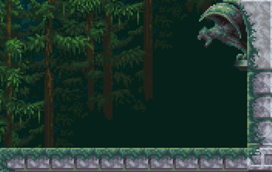
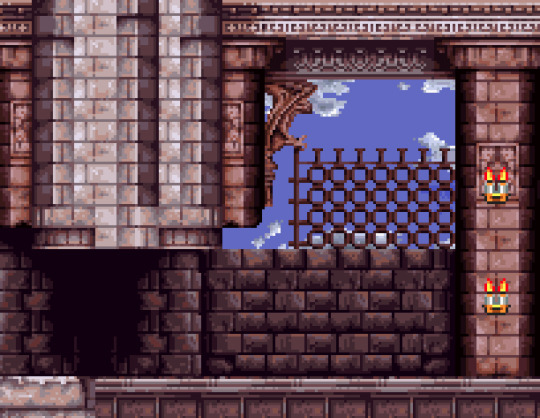
Let's first take a look at the Royal Chapel. This is one of my favorite places in Symphony, and a great example of the qualities I mentioned. Now look at Harmony of Dissonance's equivalent: the coupled Corridor in the Air and Chapel of a Heretic. The difference here is striking. Although there are parallels between the two (for example, the Chapel of a Heretic has several halls that are modeled on those jutting out from the Royal Chapel's towers; note the windows' shape), the Royal Chapel has a cleanliness, even a linearity, to its organization. It's easy to follow with the eye, and there's no mistaking that the navigational theme, starting from the bottom, is ascent. And this sense isn't just something selectively derived from the perspective of seeing the whole map at once. For one, you've got the longest continuous staircase in the game; for another, there's a central tower that's allowed to rise as tall as it wants without any horizontal redirections, and a couple of also unbroken shorter towers thereafter. This ascensional theme is also bolstered by the progression of environmental details you can see beyond the Royal Chapel's borders. A hilly coniferous forest gradually gives way to an indigo sky and a stream of clouds, with the forest now a distant sight.
So, we've got an environment here that directs our movement along a specific main route, and it's complemented by the theme of escalating verticality. When we come to Harmony's Corridor in the Air, though, it's difficult to figure out what the layout is trying to communicate. The spaces are visually unified but structurally disorganized. It's as if the level design is trying to pull off a bunch of stuff at once at the expense of letting any of it develop. Although disorganization can be interesting (and there are arguably other ways, outside of this essay's range, to interpret Harmony's castle), in this case the environment is missing the narrative of progression that's part of what makes the Royal Chapel such a pleasure to go through. A bit of focus is brought in with the Chapel of Heretic, if only because there are no branching paths, but its appearance seems to ask more than ever for a comparison to the Royal Chapel, and it can't favorably compare. You're undeniably ascending, but the majority of the rooms you're traversing are horizontal, and this dulls the actual feeling of ascending.
The top of the Chapel of a Heretic -- that large room with the long staircase -- brings to mind another subject, due to its parallel to the Royal Chapel's staircase, and this is the use of a room as a dramatic device with fulfilled, or unfulfilled, implications. The Royal Chapel's staircase is interesting because it's a dramatic structure (extensive, singular, complemented by richly ornamented recesses, and the way in which you're properly introduced to the Royal Chapel) involved with the navigational theme of descent that produces a sense of anticipation (e.g., "This staircase is so long; I wonder what it's leading to"); and this is fulfilled in the form of the gorgeous chapel sidelined by stained-glass windows and terminating in an altar. In elementary terms, the Royal Chapel's staircase displays a set-up/payoff dynamic.
Rather than compare this to the Chapel of a Heretic's staircase, though, I'd like to pit it against Portrait of Ruin's Great Stairway, whose namesake is a pair of chambers containing long staircases. Comparisons to the Royal Chapel here are perhaps most apt because the Great Stairway's stairs are similarly staffed by Corner/Hill Guards and also have overhanging ledges with collectible items. The problem the Great Stairway runs into is that neither staircase offers anything aside from sheer size and those aforementioned call-backs. The chambers' opposing extremities lead to nondescript transitional rooms with no major or minor drama beyond, and each is side by side, which only calls attention to how similarly structured both chambers are. This is especially bad because these chambers are the largest rooms in the castle (as demonstrated by the game's map), on top of locationally representing its "heart", and yet the take-away is that the designers were more concerned with filling space via copy-pasting than with having the architecture be engaged in any sort of dialogue with itself.
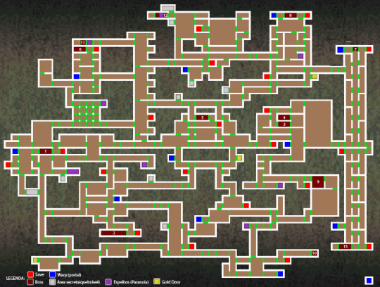
Something else I'd like to talk about is how generous Symphony is with giving its places breathing room. Breathing room is important because it allows environments to better develop on their own terms, helps to thematically distinguish areas, and assists in our ability to mentally organize them individually and in relation to the entire game world (something that is its own form of entertainment). This is a trait that ties back into the visual lucidness of the Royal Chapel's layout. It's illuminating to compare Symphony's map with that of Dawn of Sorrow. It becomes clear here what I'm talking about with breathing room: Dawn's map appears to be on a mission to cover as much space as possible (so much so that the bit of negative space on the top left feels like an oversight), but when we look at Symphony's, it's not too much of a leap to estimate that nearly half of the map is negative space.

This isn't a detail that's only appreciated in the abstraction of a map, either. If we review Dawn of Sorrow's Dark Chapel, we can pick out points of visual continuity and hierarchical structure. For instance, the second boss' room (Malphas) is stacked directly atop the first boss' room (Dmitrii) with the shared visual element of the organ, and Malphas' room is headlined by a corridor that follows the three rooms' progression from the "underworld" to the "heavens." We might also note that the belfry rightly sits at the Chapel's highest point and is situated above a visually unified and equally wide pair of rooms. But the Chapel's upper body is so compressed that architectural decisions such as these fall flat; the literal compression becomes an expressive compression that isn't particularly relevant to the environment. The fact that I, as the player, am in that top corridor, suspended above the distant mountains, is something that's really only communicated by the background. In action, entering the corridor feels abrupt -- I've only ascended two "rooms"' worth (represented by a single square on the map), relative to Dmitrii's room -- and this abruptness is reinforced by looking at the map and seeing how awkwardly squished the corridor's supporting columns are against the roof of Malphas' room.
Does Symphony have no compressed environments? Absolutely not! Let's be attentive here, though. Its castle's two most compressed places, by far, are the Colosseum and the Catacombs. If there is any criticism to be made of this pair in terms of how their parts interlock, it is perhaps the immediate transitions between the bed of lava in the Catacombs' natural halls and its built rooms' foundations. But beyond this slip-up, these are successful instances of compression because that trait feels thematically relevant. It works for the Colosseum both because it renders the macro-structure's hard symmetry as even more explicit, and its smushed quality recalls the cramped quarters of an actual colosseum's hypogeum. Similarly, the Catacombs' compression works because it reinforces the area's claustrophobic associations, and the overall thrust of the environment -- strongly horizontal, and never higher than two "rooms" -- really drives home the sense that this truly is the castle's bedrock.

"Compression", in this context, can also refer to how sectioned an environment is. To this day, in my opinion, Symphony feels like the 2D explorative Castlevania with the largest scope, and I'm more or less convinced that feeling is partly, yet intimately, supported by its castle having relatively more rooms that are allowed to expand to larger extents without transitional splits, as indicated on the map by a lighter or broken line within a room's border. This perhaps sounds counterintuitive; we might rather suppose that more rooms equates to a larger scope. But this isn't necessarily true. The dimensional quality of a space's entirety is not solely communicated by the quantity of its partitions; it's also how willing it is to give us the time and room to dwell on that specific space before it switches to something else. Look at Symphony's map again and notice how the Outer Wall is mostly one vertical block; how the Clock Tower and the Long Library are two large chunks bookending a minority of smaller bits; how the Castle Keep is a big L-shape with a rectangular cluster to its right; or how the Underground Caverns largely are three horizontal rooms and three vertical rooms. In fact, the trend of building subsidiary spaces around dramatically primary spaces is Symphony's rule -- not the exception!
By the time of Harmony of Dissonance, this trend had already become a scarcity; and although things did improve irregularly (Aria of Sorrow is perhaps the closest a title produced by Igarashi ever came to matching Symphony's spatial dynamism), it's a trend that could not be more alien to 2008's Order of Ecclesia. It's curious that the only follow-up to Symphony which did not aggressively slenderize, straighten, and divide its castle's parts was 2001's Circle of the Moon, handled by the Kobe branch of Konami, and I don't think it's a coincidence that, of the GBA and DS Castlevania titles, its castle's scope is the most substantial. One part of me wants to say that things developed as they did because of a vastness of variables: evolving teams, tighter deadlines, an absent concern for the emphases of this article, and so on. Another part of me wants to say that the obsessive-compulsive leanings of these games became guiding principles; which is to say, the toning down of big rooms and the emphatic sectioning came about because it made grinding easier. It's hard to not side with this interpretation when there are moments such as a hall in Ecclesia that's split down the middle for seemingly no other reason than because the hall is long and each section has a different set of enemies.
I want to elaborate on the comment above about "straightening", because it probably isn't clear what I mean (and even if it is, it's worth picking at). When I refer to a castle's parts, or rooms, as "straight", it's a way of saying that their border-lines unite to make a shape that's either a square or rectangle. This is the standard, no matter which Castlevania, starting at Symphony and ending at Ecclesia, we're talking about; yet, like other things we've examined in this article, it's a standard with degrees of prevalence. Scan this map of Symphony's castle I've edited so that all of its irregular rooms -- fourteen total -- are marked by a green star (note how nine are of the primary/large variety, increasing their significance). Now scan this similarly edited map of Harmony's castle. Upon KCET's return as the series' developers, the number of irregular rooms shrank to four, and two were based upon a couple of rooms from Symphony: the Royal Chapel's stairway, and the Marble Gallery's basement chamber. After Harmony, the only map allowing irregular rooms was Aria of Sorrow, with a whopping single room at the castle's pinnacle.
It is again curious that KCEK's Circle of the Moon stands so decisively apart from these other titles: its castle has nearly forty irregular rooms. There's no way to know how Circle's developers approached designing the castle, but the presence of such a dramatically quantifiable characteristic suggests some kind of approach that differed from KCET's developers. How else do we account for that contrast? All things considered, it's my opinion that Symphony's castle is the most dynamic, thanks in large part to how thematically distinguished its areas are; but if we're talking about the varied usage of pure geometric space, Circle comes out on top. You might be wondering where I'm going with any of this, and in response I'd like to quote from a write-up I did of Circle back in 2012: ". . . it’s easy to overlook how a game’s boundaries affect our experience of its places, perhaps because a boundary is treated as the line where the level design ends. But a boundary is really a continuation of the level design. Though it may not be interactive with one’s avatar, it does interact with the enclosed content. It organizes the extent of our movement, and its geometry feeds into all those ineffably subtle reactions we have to the spirit of a place."

What else can be said? A lot, actually! We could discuss how frequently room-types are reused; how precisely and visually segregated an environment's districts are and its link to thematic articulation; or the rough interactive textures that Symphony's inverted castle affords, in spite of how "lazy" the procedure was to create the inverted castle. But I'm satisfied with breaking things off here and saving those ideas for future analyses or -- something that interests me more -- the input of readers. What do you think? Does any of this help you to understand Symphony of the Night in a new light? Have you been thinking these thoughts all along? Do some of the interpretations seem conceptually strained?
Thanks to Revned, Edsword, mephea, TerraEsperZ, Wileee, and Zeric for their hard work on screenshot-mapping Symphony of the Night's castle.
You can support my work on Patreon.
#Castlevania#symphony of the night#metroidvania#level design#videogame analysis#Harmony of Dissonance#Akumajou Dracula#order of ecclesia#portrait of ruin#Gekka no Yasoukyoku
31 notes
·
View notes
Text
Final Project: Personal Brand Guide
Date: 31 Mar-17 Apr 2021, Week 11-13
Brief: Work on brand identity by creating a publication in the form of a brand style guide. You have two options to choose from: 1) Self-Identity OR 2) Department of Communications & New Media. Create a Brand Style Guide that includes 3 collateral: logo, business card, 1-2 page resume.
Introduction:
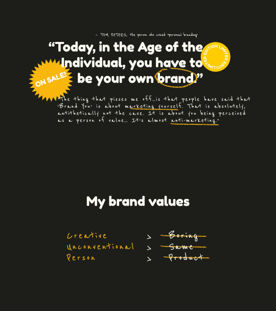
The person who originally coined the term "personal branding" was Tom Peters, who wrote an article called "The Brand Called You" in 1997. In the article, he wrote:
Today, in the Age of the Individual, you have to be your own brand...You’re branded, branded, branded, branded.
However, since Peters wrote that article in 1997, personal branding has evolved, developed and morphed in something wholly different from what he expected. Today, everyone and anyone has a social media page with their own manufactured "brand" or persona. In an interview with AIGA, Peters said:
“The thing that pisses me off about the interpretation of my article is that people have said that ‘Brand You’ is about marketing yourself...That is absolutely, antithetically not the case. It is about you being perceived as a person of value… It’s almost anti-marketing.”
Note: click on the images to enlarge and see in higher resolution if they appear blurry
Thus, inspired by Tom Peter's concept of "personal branding" as well as my own personal values of being creative, unconventional and personal, I wanted to create a personal brand that cheekily subverted how we commonly "package" ourselves to create a manufactured, commoditised and inauthentic image or identity of ourselves.
Developmental process:
Logo
For logo design 1, I was inspired by Sheryl Sandberg, who said: Don't package yourself.
"Products are marketed... But people are not that simple. We're not packaged. And when we are packaged, we are ineffective and inauthentic."
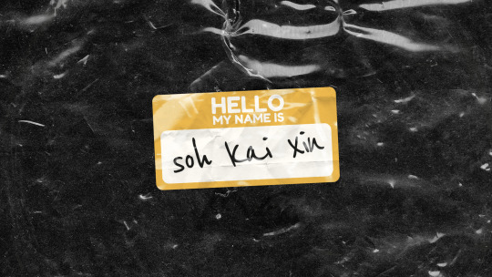
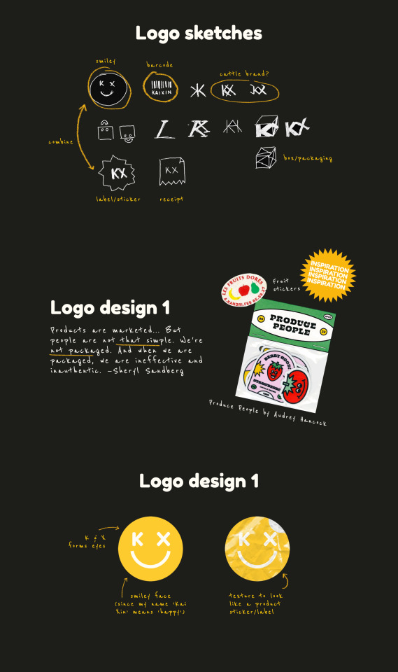
Inspired by stickers and labels pasted on fruits, I thought - why not design my own personal logo as a sticker, as a reference to product labels and stickers? Since my name "Kai Xin" means happiness in Chinese, and my cheerfulness and optimism is one of the most important traits of my personality, I wanted to infuse that same form of cheeky sense of humour and sunniness in my brand. Therefore, I designed a yellow sticker with a smiley face, with the eyes formed by my initials "K" and "X". For the font for the letters "K" and "X", I used Fredoka One, as it was a rounded, modern-looking typeface that conveyed the quirky, friendly and fun personality I have.
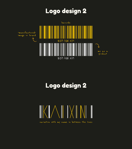
For logo design 2, I wanted to design a barcode for myself, to reinforce the idea of me being a product for sale. (Fun fact: the lines on the barcode actually spell out my name "soh kai xin" if you scanned it with a barcode scanner.)
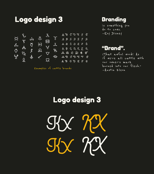
For logo design 3, I was inspired by the following quotes by Roy Disney...
"Branding is something you do to cows...Branding is what you do when there’s nothing original about your product."
...as well as Austin Kleon, who said:
“Brand.” (That awful word! As if we’re all cattle with our owner’s mark burned into our flesh.)
Therefore, after researching on the design of cattle brands used by cow ranchers to brand on their cows, I thought the way that these brands had the initials of the owners was quite interesting, and designed a cattle brand of myself for myself, spelling out my initials "KX".
However, I did think that the concept behind logo design 3 would probably be difficult for people to understand and the design appeared quite simplistic.
"For logo design 3," Sun Yee said, "I couldn't really grasp if there was any concept or quality of yours that you had intended to portray other that it being the initials of your name." Charmaine also added, "I personally feel that logo design 3 would not be in my list."
I agreed with my tutor Aaron, who said, "The barcode logo concept seems to work the best in unifying the ideas that you have for the name cards and resumes."
Iwani said, "Since the barcode plays a crucial part in your logo, you may want to consider imbuing your name in it?" and Ning Zhuang added, "for the barcode, I think your name drowns out compared to the barcode since it's taking up way more space, maybe you can play around with space more."
Based on their feedback, I decided to go with logo design 2 - the barcode logo. I experimented more with different design variations by imbuing my name in the logo (as Iwani suggested) and by playing around with space and making the name more prominent (as Ning Zhuang suggested):
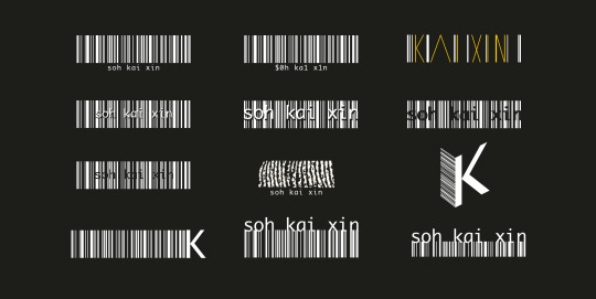
The original three logos are depicted in the 1st row above.
I tried incorporating my name within the barcode (2nd row, above), but found that it was a little difficult to read with all the lines.
I scanned a print of my fingerprint (which symbolises my identity and self) and cut a section out of it to resemble the lines in the barcode (3rd row, centre, above), but I felt that people seeing it might not understand clearly that it was a reference to my fingerprint.
I also experimented with typography, such as by using only a K in the logo (3rd row, right & 4th row, left), but I decided against it as (1) just a single K wouldn't be able to show my name and (2) it didn't resemble a barcode as much.
Finally, I decided to go with a more minimalist approach combining my name and the barcode.
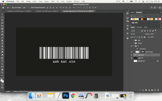
To make my name more prominent (as opposed to the original 1st design, where the name was placed at the bottom and the font size was quite small), I increased the font size of my name and adjusted the kerning such that it fit the width of the barcode exactly. To put emphasis on my name, I shifted it to the top of the barcode. To show that my self was inseparable from me as a product of society, I combined the name and barcode. Using the Rectangle Tool, I drew the lines on the barcode to combine them with the name, such that it looked as if the lines flowed seamlessly from the letters to the barcode. Finally, as the entire barcode looked a little too large and lacked a sense of balance (since the barcode portion was larger than the name portion), I masked the bottom of the barcode such that the height of the barcode portion was exactly the same height as the name.
Name card
I came up with three ideas for the name card.
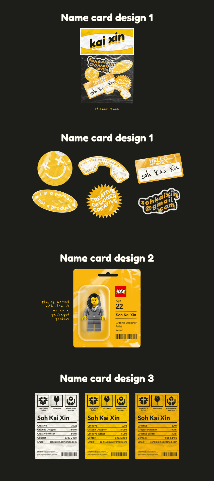
Name card design 1
For name card design 1, based on the initial concept of product stickers for logo design 1, I thought - "Why not use a sticker pack instead of a conventional name card?" I thus created 6 sticker designs that deconstructed the elements of a name card, including a logo, name, contact number, email, what I do etc.
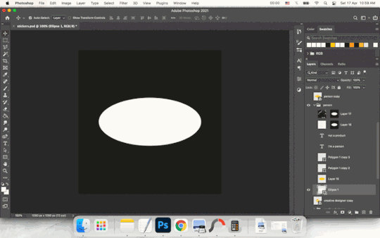
For the stickers, I experimented with a variety of shapes and text styles. For example, for the "I'm a person not a product" sticker, I began with the Ellipse Tool to draw a white ellipse. I then duplicated the shape and made a smaller yellow ellipse, to create an outlined effect. Then, I selected the shape of the ellipse and transformed the Selection to Path. Using the Move Tool, I transformed the Path and made it into a smaller ellipse within the larger yellow ellipse so as to type the text in the shape of the ellipse. I first typed the first half of the message "I am a person" on top, then created a new Type layer for the second half "not a product", using the Path Selection Tool to move the path so that the text would be aligned at the bottom of the ellipse. On top of that, I added a paper texture on Multiply mode and a plastic texture on Screen mode to make it look more realistic.
This was done for the rest of the stickers, such as the phone sticker, where I similarly made a Path from Selection in the shape of the phone and typed my contact number, or the "Creative Designer" sticker, where I began with a Custom Shape layer and adjusted the Live Shape Properties to increase the number of points on the star from 5 to 30 to get a starburst shape. Subsequently, I typed the text and used the Warp Text function to make the shape of the text follow a wave, then added textures on top.
One of my classmates Ning Zhuang commented that "for name card design 1, I do think it'll be quite hard to decipher as a formal business card if it's all going to layout in a sticker pack." Although I really liked the stickers and thought it made sense in terms of my personal branding concept, I agreed with her and thus decided not to use it as a name card, but instead as a separate collateral as a sticker pack.
Name card design 2
For name card design 2, I went with a more creative and unorthodox concept for a name card. Rather than a "card", why not represent me literally as a packaged product, like a toy figurine in a pack?
Name card design 3
For name card design 3, I used a more conventional format of a card, but instead of a regular name card, I designed it to resemble a product label. The name card would be printed with a product description of myself, with the product name (my name), product content, ingredients, as well as my barcode logo. I also used common packaging labels like "Boxed" or "Fragile, handle with care", but instead put a creative twist on them by changing them to "Thinks out of the box", "Anti-fragile" and "Handles things with care".
Ning Zhuang said, "Love the idea of name card design 3" but asked, "is there a meaning behind using the grams and ml?"
The original intention behind putting Creative (100g), Graphic Designer (50ml) and Creative Writer (50ml) was to play with the way nutritional information of products are usually presented, with units of measurements like grams and millilitres. It was meant to convey that I am half a designer (50ml) and half a writer (50ml) - put it together and you get 100% creativity. Based on the feedback, I thus decided to make it clearer by changing it to percentages - 50% Graphic Designer, 50% Creative Writer and 100% Creative.
Resume
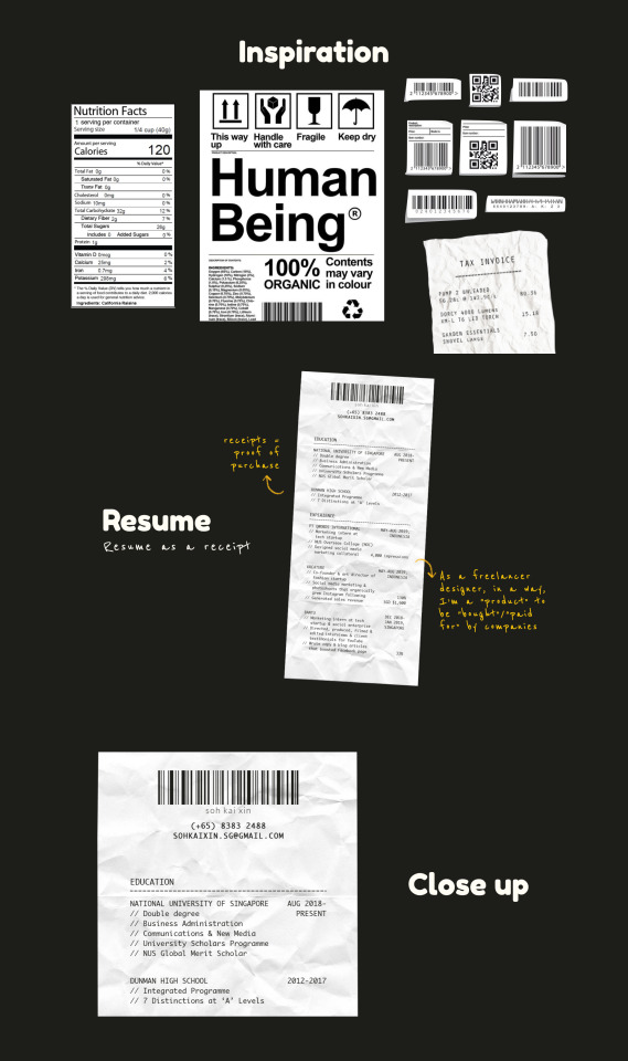
For my resume, I decided to present it in the format of a receipt.
As receipts are used to represent goods that have been bought and sold, and are a proof of purchase, I thought that it would be effective and appropriate to represent my resume as a "proof" of my qualifications. Also, it represents how designers/creatives like myself are often seen as "sell outs" who become commoditised products for sale or for hire by businesses.
To make it look like a receipt, I scanned a crumpled piece of paper and used it as a background. Then, using the Lasso Tool, I cut it to the shape of a receipt. Next, I added my barcode logo on top, along with contact details, like how the details and name of a shop would be on the top of a receipt. Then, I added the list of my education and work experience below and added the dates on the right (like the list of products and prices on a receipt). I chose to use the typeface Monaco, as it was a mono-spaced sans-serif font that resembles the font commonly used for printing on receipts.
Comments raised during the critique:
For the final critique in Week 13, Kai En pointed out, "just one minor thing that I wanted to point your attention to- all along your name has been rendered in lowercase, not sure if you want to keep to the same treatment for your name card that is currently in Title Case?"
Iwani said, "for your resume, you may want to consider bolding the headers/company titles to emphasize the visual hierarchy?"
How the work has improved post-critique:
Based on the feedback, I decided to change the title on my name card into all lowercase, as Kai En pointed out, to keep it consistent with my barcode logo. I also bolded the company titles on the resume to emphasise the subheadings, as Iwani suggested.
Syn Yee had also commented, "while I liked your logo idea as a barcode, I thought maybe your name could be slightly apart from the barcode itself just to make the text look clearer. Because it appeared to me a little cluttered when you put both elements attached to each other". However, as I had previously already played around with different compositions for the barcode logo (see above), and had deliberately combined the name and barcode together as a form of commentary to show how our personal identities and selves couldn't be separated from our identity or image as a product of society, I decided that I would stick with the logo composition.
In addition, even though this wasn't explicitly mentioned in the feedback, I noticed that the handwriting font I had used for captions and sub-body text in my initial presentation, Reenie Beenie, was a bit difficult to read. I had originally chosen the typeface because I wanted to give a sense of authenticity to my personal branding and include a handwritten sort of feel that made it feel as though the brand was created by a person, not a product. However, for my final brand style guide, I decided to remove the Reenie Beenie font and use Monaco for my body text, as it was (1) more in line with my brand identity and (2) more legible.
Finally, this resulted in the final brand style guide.
1 note
·
View note
Text
Avenue south residences condo
Although Riverhead can be considered the virtual end of Long Island, it was only the beginning of the originally intended intermodal rail-and-sea link's traverse of the North Fork toward the eventual cross-sound ferry connection.
Taking its earliest-settlement name of "Head of the River" or "River Head," the ultimately designated, single-word "Riverhead," the ninth of Suffolk County's ten towns, was created out of the west end of Southold on March 13, 1792.
Thus separate and autonomous, it was injected with growth with the arrival of the railroad and the very station, built on July 29, 1844 and serving the South Ferry, Brooklyn, to Greenport line, was constructed on present-day Railroad Avenue. Despite its through-purpose, it channeled its own disembarking passenger to stage coaches, which brought them to Quogue and other south island destinations.
Eastbound trains served the town on Tuesdays, Thursdays, and Saturdays, while westbound ones, back to Brooklyn, did so on Mondays, Wednesdays, and Fridays.
Mercantile, milling, and manufacturing, its prevalent commercial undertakings, catered to a 1,600-strong population in 1875, the community boasting two grist mills, offices, 20 stores, three hotels, and six churches.
Replacing the original train depot, which was transformed into a home for railroad workers, a wood-framed one, designed by Charles Hallett and featuring scalloped trim and elaborate finials, was built west of Griffing Avenue between 1869 and 1870. This was subsequently replaced with a third, this time incorporating brick in its construction, on June 2, 1910.
"In the early 1900s, the east was a place of prosperous potato farms in summer and deep snows in winter," wrote Ron Ziel and George H. Foster in their book, "Steel Rails to the Sunrise: The Long Island Railroad" (Ameron House, 1965, p. 158).
"From the time of its realization that the original reason for its existence had vanished with the building of the New Haven Railroad to Boston (fifty years earlier), the LIRR has played a major role in developing the areas way out east," they continued (p. 158). "... Business and civic organizations all over the island joined with prominent citizens, newspapers, and the railroad to promote travel and settlements on Long Island."
That development, however, was hardly rapid and when rails were later replaced by roads, the Long Island Railroad's re-invented, intermodal transportation purpose had vanished, leaving the bulk of its passengers to commute to Manhattan during the mass morning exodus.
Indeed, by 1963, main line service east of Riverhead had been reduced to a single daily passenger and thrice-weekly freight run, using the track originally laid for the rail-to-sea link in the mid-19th century.
Today's high-level concrete platform, Avenue south residences condo which does not bear a single shoeprint on certain days and in certain seasons, was constructed between 1996 and 1997, but for rail enthusiasts, some of its history has been preserved at the Railroad Museum of Long Island across from it.
"The history of Long Island can be traced in steel rails, which cross its varied landscape-from dark tunnels under New York City to the farms and sand dunes of the East End," according to its website. "The Railroad Museum of Long Island strives to illustrate this history through interpretive displays from its archive of photographs and artifacts, and through the preservation and restoration of vintage railroad equipment at its two locations in Riverhead and Greenport, New York."
The former, consisting of a 70-foot parcel of land now owned by the Metropolitan Transportation Authority, but leased to the museum, once sported a pump house, a water tower, and a turntable that was no longer dimensionally compatible with the larger, more powerful locomotives appearing during World War II. Cornerstone of the complex today is a building hailing from 1885 and used by the Corwin and Vail Lumber Yard, yet now serving as the museum's visitor center with a Lionel model railroad layout sporting Long Island Railroad coaches in various liveries, a cardboard and balsa wood replica of the Riverhead depot, which commemorates its 100th anniversary, and a gift shop.
0 notes
Last Seen Blogs

kaioyuki
Kaio
dramaticfangirling
what a strange constellation they all were
ilovelegsblog
Untitled

tenspontaneite
Celestial Drummer

larkspyrr
unguibus et rostro