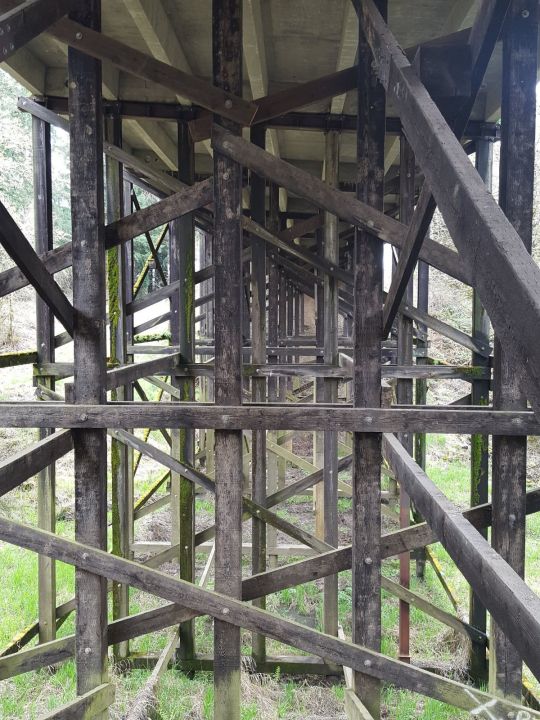
#trestles
Text

Bucket list location
23 notes
·
View notes
Text
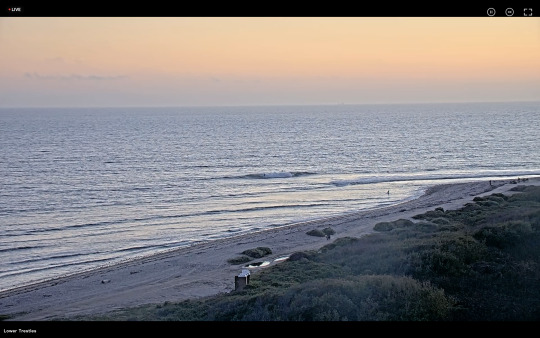
Lower Trestles, San Onofre, CA
9 notes
·
View notes
Text
Wtf. is anybody else seeing this shit
20 notes
·
View notes
Text
Jack Robinson at Lowers
32 notes
·
View notes
Text
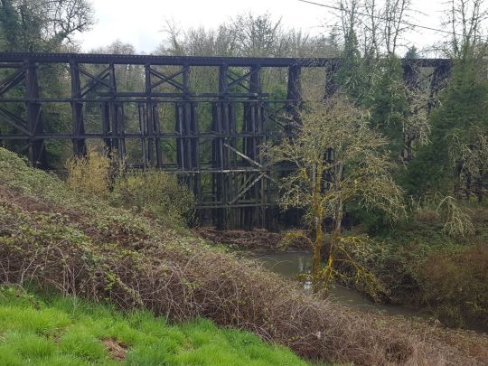
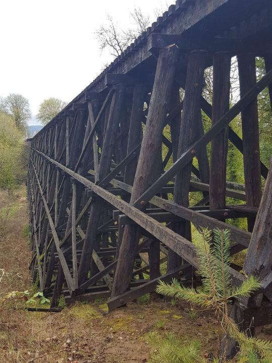
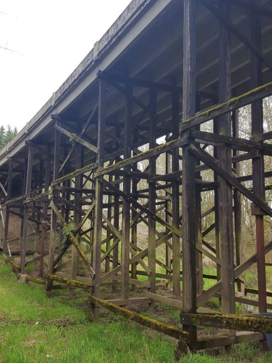
POPE LICK MONSTER

Day 25: Tempting
~~•~~
The Pope Lick Monster is a cryptid reported to live beneath the Pope Lick Train Trestle in Louisville, Kentucky. Some accounts state that the creature uses hypnosis to lure its victims onto the trestle.
Note: A common misconception is that the Pope Lick Trestle is abandoned. In actuality, it is connected to one of Louisville’s most used railways and as many as 25 heavy freight trains cross it daily. Walking along this trestle puts you at risk of either getting hit by a train or falling off its 90-foot drop. I don’t love being super serious but this trestle has claimed over a dozen lives so I feel this needs to be said: DO NOT GO SEEKING THE POPE LICK MONSTER, IT WILL PUT YOU IN SERIOUS DANGER.
#andjocie#art#artists on tumblr#artoftheday#cryptid#inktober#jocieart#traditional art#monster#ink art#pope lick monster#tempting#inktober day 25#this is my dad’s favorite cryptid#he was very happy when I drew it 💖#goatman#goat#train#trestles
24 notes
·
View notes
Text

Dude . . .
7 notes
·
View notes
Text
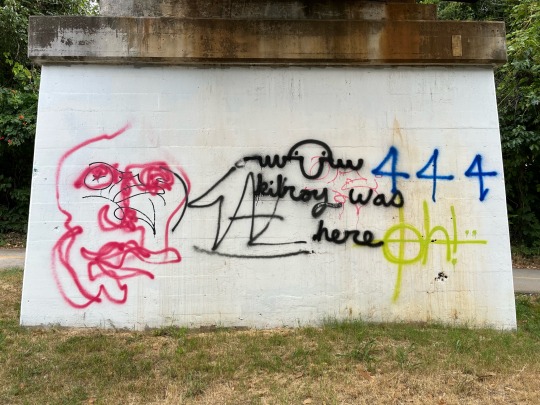


Update from the #centerstreet #friscoline trestle. #444 #kilroywashere in #fayetteville apparently. Squiggly face and #hotalthangout with #arthoe and a stencil #jynx.
#center#collegetowngraphically#friscoline#arkansas#graffiti#444#kilroy was here#trestle#trestles#center street#hotalthangout#arthoe#art hoe
7 notes
·
View notes
Photo
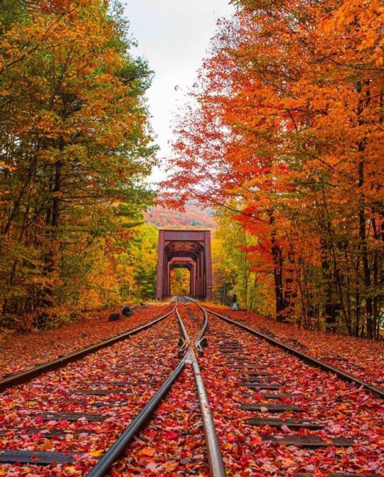
Railroad Tracks and Fall Foliage
#autumn#falling leaves#fall foliage#travel#trains#railroad tracks#trestle#landscape photography#perspective
2K notes
·
View notes
Photo
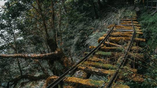
Enchanting Photos Frame Meandering Industrial Relics Along Taipei’s Jianqing Historic Trail
The Taipingshan National Forest Recreation Area in northern Yilan is one of Taipei’s prized ecological destinations for its mist-covered scenery and lush vegetation that thrives in the dewy environment. It’s also home to Jianqing Historic Trail, a winding pathway that follows abandoned sections of railways and crumbling trestles that are relics of the region’s past as a major logging hub. Taiwanese photographer Masuki Rina visited the overgrown tracks to document its ethereal and enchanting atmosphere in a captivating series, which shows fog hanging over the landscape, moss covering wooden ballasts, and foliage sprouting from nearly every inch of the frame.
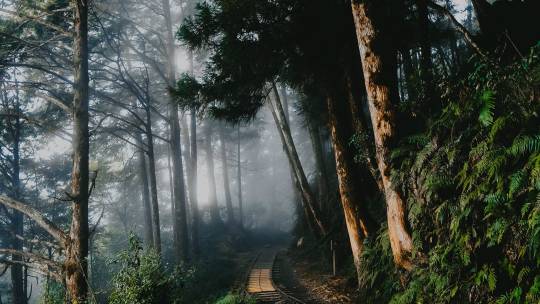
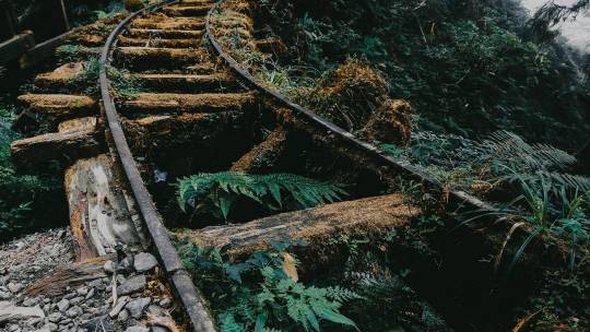
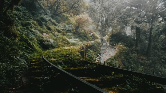

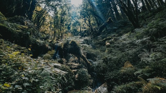
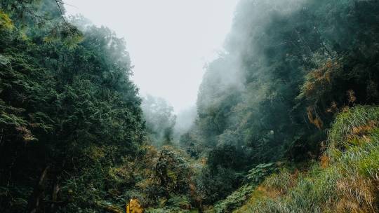
#masuki rina#photographer#taipingshan national forest recreational area#yilan#taiwan#taipei#jianqing historic trail#railways#trestles#photo series
0 notes
Photo

Stoked to feature @abelarts at my gallery! Erik painted new masterpieces for this and we are opening the show with a bang 💥 on Saturday. Thanks to @ripcurl_usa for sponsoring and to @tomcurrenofficial for the music 🎶. And to @805beer for the 🍺🍺🍺. To all my collectors who love surfing 🏄🏼♂️ and art: you’ll dig Erik’s works. DM if you want a preview. His shows always sell out quick - Erik’s originals are highly sought after. DM me or text 949-678-8133 to arrange a VIP collector preview. Details on the show below: 🔥🔥🔥 Repost from @abelarts • Kinda tripping on this whole scenario right now… My art is on the Super Bowl of surfing, the Rip Curl WSL Finals at Trestles, and they are presenting and promoting my art show, and one of surfings legends, Tom Curren is going to be jamming live at my show opening party. Brain go boom. 🤯😎🤘 Shout out to my homie PJ for adding yet another epic notch on my career belt. . I’d be super honored if you made it out to my show. It’s gonna be a good time. This body of new work is coming out next level and I’m excited/nervous to share with you all. So come on out… . WHAT: Happy Place - Art Show - New art by me. WHEN: Sat. Sept 10th, 6-9pm (During the Rip Curl WSL Finals event window 8-16th) WHERE: @brophyartgallery in San Clemente, CA. Text or call 📞 949-678-8133 for a preview of the artworks before opening night. . This is open to the public, there’s gonna be a food truck, delicious beverages and live tunes and a ton of my new art looking for homes. Come cheers my beer 🍺 and shoot the shit! 🍻✌️ . /// #wslfinals #trestles #lowers #sanclemente #ripcurl #wsl #surfcontest #socal #artshow #surfart #surfposter #surfartshow @brophyartgallery #sanclemente #sanclementelife #trestles #surfart #surfingart #brophyartgallery #drewbrophy https://www.instagram.com/p/CiP5-FSLcSb/?igshid=NGJjMDIxMWI=
#wslfinals#trestles#lowers#sanclemente#ripcurl#wsl#surfcontest#socal#artshow#surfart#surfposter#surfartshow#sanclementelife#surfingart#brophyartgallery#drewbrophy
1 note
·
View note
Text

240 notes
·
View notes
Text

Lower Trestles, San Onofre CA
1 note
·
View note
Photo

A Treasury of Great American Houses, 1970
#vintage#vintage interior#1970s#70s#interior design#home decor#living room#fireplace#antique#early American#furniture#Sheraton#cathedral#chair#wingback#trestle table#mural#classical#neoclassical
527 notes
·
View notes

Text

Summer solstice evening
Montpelier, Vermont -- 6/21/13
#fotografía#fotografía original#original photography#photographers on tumblr#artists on tumblr#photography#evening#vermont#solstice#summer solstice#train trestle#railroad#train tracks#bridge
116 notes
·
View notes
Text
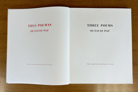
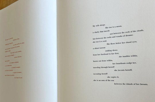
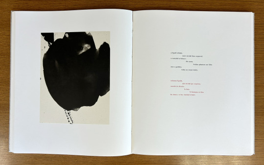
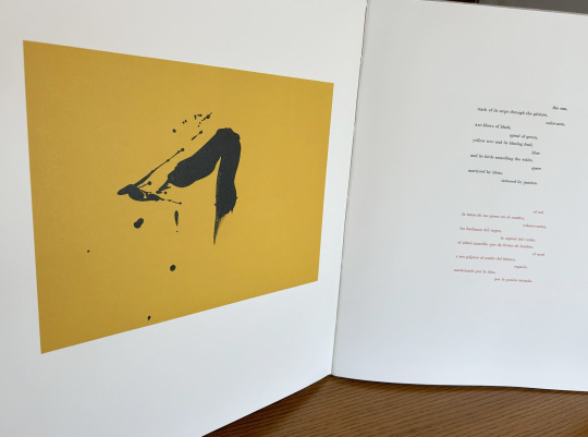
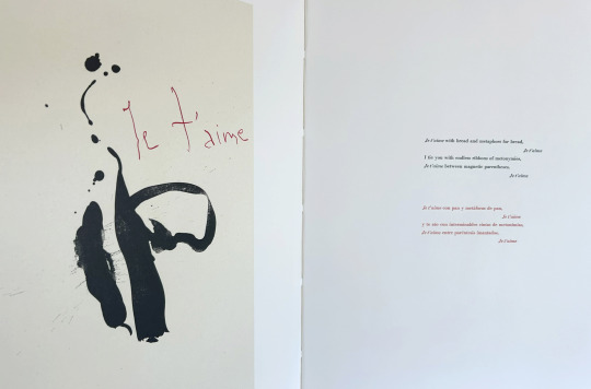
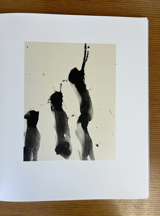
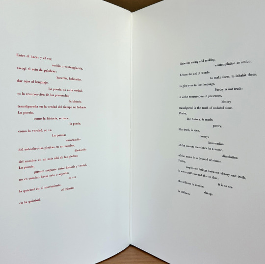
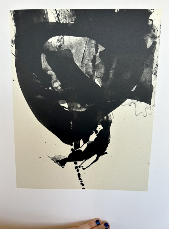
It’s Fine Press Friday!
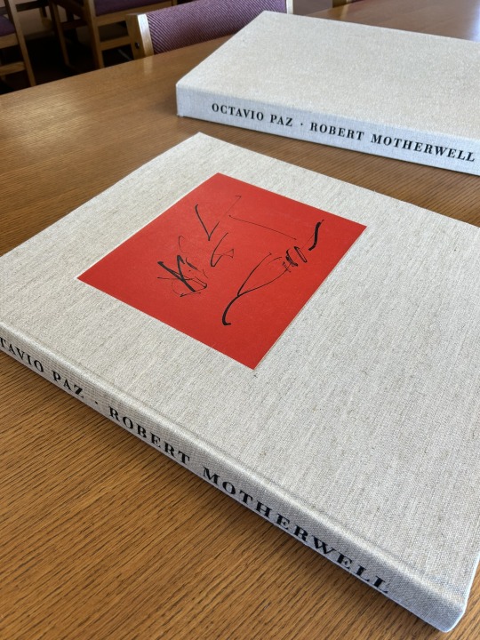
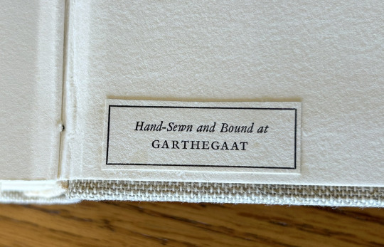
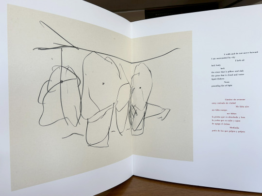
Today we’re taking a look at our 1987 Limited Editions Club release of poet, diplomat, and Nobel laureate Octavio Paz’s (1914–1998) Three Poems. Published as a bilingual Spanish-English edition of selections from The Collected Poems of Octavio Paz, 1957-1987 (translated by Eliot Weinberger, the primary translator of Paz’s work into English), this prodigious publication measures 56 cm and features lithographic illustrations by abstract expressionist painter and printmaker Robert Motherwell (1915-1991). The text was handset at Stamperia Valdonega (Verona, Italy) in Bauer Bodini Bold and Bauer Bodini Bold Italic typefaces, both of which were cast by Fundicíon Tipográfica Neufville (Barcelona, Spain). Lithographs were printed at Trestle Editions on hand-made Japanese papers and text was printed at Wild Carrot Letter Press (Hadley, MA), Stamperia Valdonega, and The Heritage Press on mould made paper from Cartiere Enrico Magnani (Pescia, Italy). It was hand-sewn and bound at the Garthegaat Bindery.
The book was designed by Benjamin Shiff, LEC book designer and son of Sidney Shiff, who had purchased the debt-ridden Limited Editions Club in 1979. Under the leadership of Shiff, a one-time Wall Street broker, the LEC gained a broadened subscription base, increased the quality of their publications, diversified their roster of artists, and returned to profitability.
Though minimal and modern in presentation, the production of this edition plumbed the depths of printing history. The Magnani paper mill was established on the banks of the Pescia river (known for its clear water- a necessity for paper production) in 1404, half a century before Gutenberg’s printing press was first put to commercial use. And the Fundicíon Tipográfica Neufville (operational 1885-1995), also known as Neufville Typefoundry, was the biggest 20th century supplier of the printing industry in Spain. After a number of ownership transfers, the company, alongside Bauersche Gießerei (a German typefoundry, operational 1837-1972), was succeeded by Bauer Types, which would leverage ownership of the rights to many of the original typefaces from both foundries to lead the way from lead type production to digital typography.
--Ana, Special Collections Graduate Intern
View more Limited Editions Club posts
View more lithography posts
View more Cartiere Enrico Magnani posts
View more Stamperia Valdonega posts
#Fine Press Fridays#Fine Press Friday#Limited Editions Club#lithography#Cartiere Enrico Magnani#Stamperia Valdonega#Bauer Types#Magnani paper mill#Bauersche Gießerei#Octavio Paz#Eliot Weinberger#Robert Motherwell#Fundicíon Tipográfica Neufville#Three Poems#Tres Poemas#Wild Carrot Letter Press#Trestle Editions#mould made paper#Garthegaat Bindery#Benjamin Shiff#Ana
22 notes
·
View notes
Last Seen Blogs

writehardwhumpharder
WriteHard WhumpHarder

efflorie
Precious

princesa-pink
Nene ʚïɞ

werashisingh-blog
Untitled
nikatoon
NikaToon