#tried to draw face cartoon style
Note
Please don’t use midjourney it steals art from pretty much every artist out there without any compensation. I didn’t know this at first and tried it but then during the creation process i saw water marks and Getty image logos (though I’m sure they’ve hidden that now) so it’s definitely stealing.
No, it isn't. And you've taken the wrong lesson from the Getty watermark issue.
AI training on public facing, published work is fair use. Any published piece could be located, examined, and learned from by a human artist. This does not require the permission of the owner of said work. A mechanical apparatus does not change this principle.
All we, as artists, own, are specific expressions. We do not own styles, ideas, concepts, plots, or tropes. We do not even own the work we create in a proper sense. All our work flows from the commons, and all of it flows back to it. IP is a limited patent on specific expressions, and what constitutes infringement is the end result of the creative process. What goes into it is irrelevant, and upending that process to put inspiration and reference as infringement is the end of art as we know it.
The Getty watermark issue is an example of overfitting, wherein a repetitive element in the dataset over-emphasizes specific features to the point of disrupting the system's attempts at the creation of novel images.
No one denies that the SD dataset is trained on images Getty claims to own, but Getty has so polluted the image search functions of the internet with their watermarked images that the idea of a getty watermark has been picked up the same way the AI might pick up the idea of an eye or a tree branch. It is a systemic failure that Shutterstock and Getty can be so monopolistic and ubiquitous that a dateset trained on literally everything public facing on the internet would be polluted with their watermarks.
Watermarks that, by the way, they add to public domain images, and that google prioritizes over clean versions.
The lawsuits being brought against Midjourney and Stable Diffusion are copyright overreach being presented as a theft tissue. The facts of the matter are not as the litigants state. The images aren't stored, the SD weights are a 4 gig file trained on 250 terabytes, roughly 4 bytes per image. It runs local, does not reach out to image sources over IP. All you've got are mathematical patterns and ratios. I would go so far as to say that the class action suit is based on outright lies.
But for a moment, let's entertain the idea that what goes into a work, as inspiration, can be copyrighted. That styles can be stolen. That what goes in defines infringement, rather than what comes out. What happens then?
Well, the bad news is that if Stable Diffusion and Midjourney were shut down tomorrow, Stable Diffusion is in the wild. It runs local, it's user-trainable. In short, the genie isn't going back in the bottle. Plus, the way diffusion AI works, there's no way to trace a gen to its sources. The weights don't work like that. The indexing would be larger than the entire set of stored patterns.
Well good news, there's an AI for that. The current version is called CLIP Interrogator And it works on everything. Not just AI generated, but any image. It can find what style it closely matches, reverse engineer a prompt. It's crude now, but it will improve.
Now, you've already established that using the same patterns as another work is infringement. You've already established that inspiration is theft. And now there's a robot that tells lawyers who you draw like.
Sure, you can fight it in court. If it goes go to court. But who's to say they won't just staplegun that AI to a monetization re-direction bot like youtube has going with their content ID? Awesome T-shirt design you uploaded to your print-on-demand shop... too bad your art style resembles that from a cartoon from 1973 that Universal got as part of an acquisition and they've claimed all your cash. Sure you can file a DMCA counter-notice, but we all know how that goes.
And then there's this fantasy that upending the system would help artists. But who would "own" that style? Is that piece stealing the style of Stephen Silver, or Disney's Kim Possible(TM)? When you work for Disney their contracts say everything you make is theirs. Every doodle. Every drawing. If the styles are copyrightable, a company could hire an artist straight out of school, publish their work under work-for-hire, fire them, and then go after them for "stealing" the style they developed while working for said corp.
Not to mention that a handful of companies own so much media that it is going to be impossible to find an artist that hasn't been influenced by something under their control.
Oh, and that stock of source images that companies like Disney and Universal have? These kinds of lawsuits won't stop them from building AIs with that material that they "own". The power goes into corp hands, they can down staff to their heart's content and everyone else is denied the ability to compete with them. Worst of all possible worlds.
Be careful what wishes you make when holding the copyright monkey's paw.
4K notes
·
View notes
Note
How can you describe the facial features/structure of Connor ? ( I tried to draw him but I don’t know how to match his facial structure) tysm if you answer me
Hi!! I’m super super super sorry for the late reply on this one <:,)) but here’s my best approximation on answering this
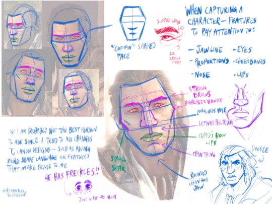
With my art style leaning a bit more animated/cartoon ish, I wanna thank @thou-babbling-brook for extra input and advice since she’s more familiar with a realistic style— but no matter the style, there’s a few key points you can use to ensure he maintains his canon look!
Essentially, the key features you wanna look out for are the shape of the face, and making landmarks of the features on the face. Everyone has kinda unique facial proportions, so nailing that can get you pretty far ahead in terms of likeness.
Key features to look out for include (but aren’t limited to): jawline, eyes, cheeks, nose, and lips.
Details to keep in mind to make Ratonhnhaké:ton resemble his game design would include the pronounced Philtrum (space between the upper lip and bottom of the nose), sloped upper eyelid and the way the lines of his eyes extend out, ‘coffin’ face shape, large nose with a wide base, Cupid’s bow lips, strong brows and strong high cheekbones.
Other extra details are his crows feet by the corner of his eyes (not always pictured), cheek scar, the lil chin thing, and freckles !!

And here’s a big ol slab of pictures of his face to hopefully help since looking at reference first hand is probably more reliable than just my word lmao
Hope this helps!
273 notes
·
View notes
Text
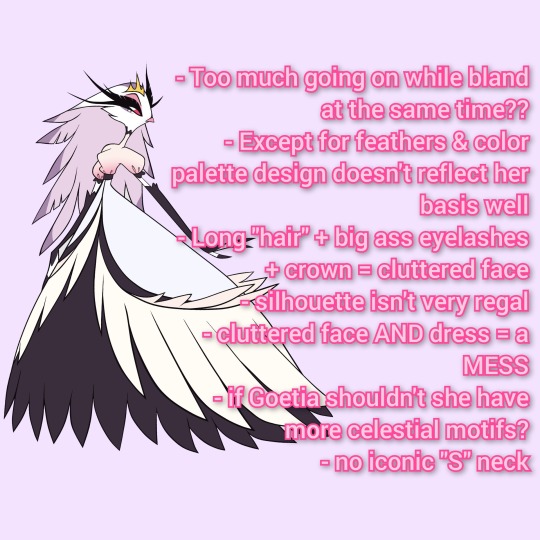
Hazbinverse Salt: Stella
Okay I finally gathered my thoughts about why, as a swan aficionado, I dislike Stella's design so much. I'm also going to point out what I would change.
Too much going on while bland at the same time:
On first glance it looks good enough but the more I think abou the more I start to scream internally
So many feathers, face is cluttered, isn't very regal, even her arms (why not make the gloved full length?)
Dress is TERRIBAD
Honestly the design tries so hard it ends up boring
Except for feathers and color palette her design doesn't reflect her basis very well
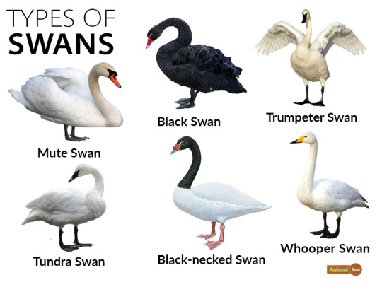
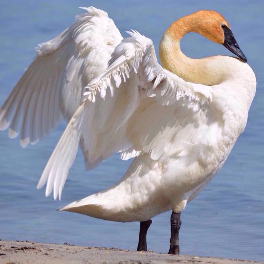
HER NECK IS TOO SHORT
Either make the dress solid with less feathers and keep the "hair"
Or you could keep the feather dress and make her hair shorter in length
Alternatively turn the hair into a bridal train to symbolize her purpose
Also if her (assumedly full-blood) brother is a peacock wouldn't it make more sense for her to be a peahen?
Eh I'd make her a mixed species; and also include peafowl feathers as part of the dress or an accessory
Long hair + big ass lashes + crown = cluttered face
Again I would shorten the hair length or style it differently
SHORTEN THOSE EYELASHES
Somebody pointed out that her lashes are so long they literally blend into to the background
Change the eyes back to pilot's blue to match Andre & pop out from all the pink&purple
Silhouette isn't very regal
For someone groomed to be royalty she doesn't look like it
HER NECK IS TOO SHORT WHERE'S THAT GRACEFUL S SHAPE SWANS ARE KNOWN FOR
Amp up the design to be Victorian/Edwardian inspired: that's when circuses really blew up in popularity; fits the circus theme of Hazbin
Some historical refs I found


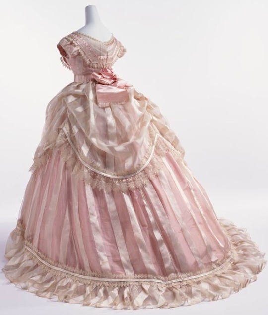
See one of them even has feathers!
Instead of a gradient top make it a solid color and the top layer of skirt the same color; end with a gradient or keep it solid
Change the bottom layer to a lighter purple or pink
Lack of dark colors makes her evil less conspicuous
Probably stripes or a star pattern her name means star after all
Keep the short sleeves
The more evil Stella grows the darker her palette becomes; maybe more plums and maroons with hot pink
Cluttered Face AND hair = mess
See above
Again I'd keep the head hairless and change the eyes to short lashes and blue orbs
If Goetia shouldn't she have celestial motifs?
Have a star shaped crown or jewellery
Make her palette sunset themed
Since Stella means star have her wear solar themed clothing at times
at least SOME heat based power to contrast her brother's ice; since she is demonic royalty I guess she should have some magical power
Having a bit of power shows that she is more of a threat than given credit for; justifies why she's an equal match for Stolas
IT FITS HER PERSONALITY
Adds a sense of tragedy: her power never recognized for their potential due to outdated ideals of hell
Which in turn legitimizes Charlie's crusade; changing Hell for the better would prevent future situations like Stella
Tragically, Stella succumbs to her flaws instead of growing out of them; tragic, complex villain instead of a cartoon caricature for wittle ol' woobie owl to overcome
Aaaand that's about it. I might draw my dream look for Stella. I think as someone who's supposed to be a villain she should've had a way better design. The Pretty Pink Princess turns out to be a total witch. Cool concept, uncool execution.
#stella salt#stella goetia#helluva boss critical#hb critical#helluva boss redesign#helluva boss salt
211 notes
·
View notes
Text
Ninjago Remastered Designs!

THEY'RE DONE! After months of work!!! They are DOOOOOOOOOOONE. WOOOOOOOOOOO! Lol! Welp, these are my Ninjago designs! Basically, this is my take on the Ninja if they were in a 2d animated cartoon! And yes! I will be drawing more characters. Tumblr butchered the quality, so close ups and design notes are below the cut. They're pretty detailed, so I highly recommend checking them out. Feel free to ask questions about the designs! ⬇️⬇️⬇️ - ✒️🐉

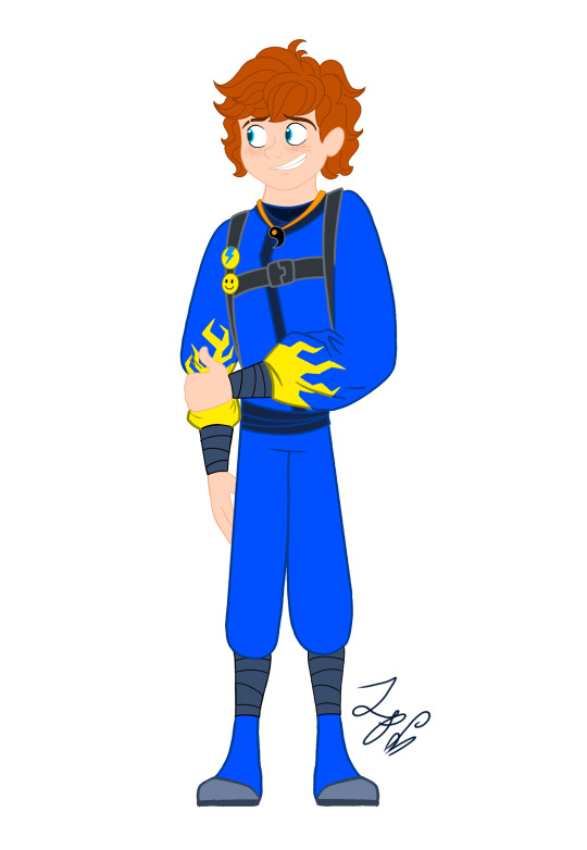


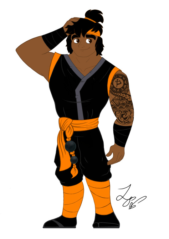
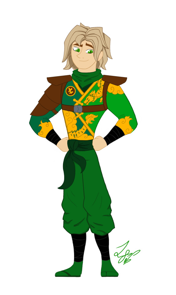
When designing these outfits, I tried to take inspiration from the ones in the show. And in terms of art style, drew inspiration from early 2000s cartoons, (Action Adventure ones specifically,) Anime inspired shows, and even a hint of traditional Disney animation. And while I designed them with a 2d cartoon in mind, most of the designs would most likely have to be simplified for them to be used in animation. So let's get started!
Kai: Kai was a pretty fun to work with. I actually didn't plan on giving him a sleeveless outfit. But it happened! And I like it! If you'll notice, the flame pattern on his vest mirrors the pattern on his sister Nya's outfit. I thought that would be a cool detail to include. It was inspired by their March of The Oni outfits. I also made sure to include his scar and bandaid. And gave him reddish brown eyes to signify his elemental power. Him and sister I imagine being Brazilian/Taiwanese. So I hope I captured their ethnicity properly. I'm pretty happy with this design. Especially his hair, which was hard to replicate.
Jay: Jay was a hard one for sure. I wasn't too sure how to vamp up his outfit. So I started by giving him some lightning patterns on his Gi. (At least I think that's what it's called?) And I decided to make it look a little baggy and soft. It just seemed to suit him. I tried something a little more form fitting and didn't look right. Also! A fun detail I included was his half the Yin Yang pendent around his neck! And of course Nya has her half. I imagine him having Irish ancestry, so I gave him pale, freckled skin. And gorgeous curly red hair. (As a fellow red head, I'm very proud.) Overall, I think he turned out pretty adorable. And his face is spot on.
Nya: Nya I pretty much got right on the first try! I just had a really clear vision of her in my head. I gave her a grey outfit with bright, vibrant blue details. The pattern on her Gi is inspired by Koi Scales. And she has her half of the Yin Yang pendent around her neck. I really like this one, because while it is simple, it's beautiful. And I think it reflects her element nicely. The only thing I missed was to give her a symbol like the rest. But overall, I love it! One more thing is that I wanted to give her and Pixal different hair. So when I finally release my Pixal design, you'll see that while they both have ponytails, I gave them different cut and styled ones. Should be neat!
Zane: Zane was the first one of the Ninjas I redesigned! I love how he turned out. I tried to give him a splintered ice effect on his outfit inspired by his Core minifigure and gave him his faithful falcon companion. Falcon has his old greyish purple feathers, but blue icy eyes to match his owner. I also wanted to give Zane flowing sleeves, that would look very majestic waving about in a blizzard wind. He is also incredibly tall. Taller than Cole even! I was inspired by the giant humanoid robots I'd seen in movies. In his cloaking disguise, I imagine him looking German. With blond hair, blue eyes, and light skin. I also like to think Dr Julian was German. (Was this influenced by my German ancestry? Who knows?)
Cole: You would not believe how many times I had to redraw this man's face. Haha! I just could find that sweet spot! That face that perfectly encapsulated his strong, but gentle personality. But I think I did it! His outfit is based on his Oni Trilogy Gi, with orange detailing. And he has his Island ponytail and bandana. I absolutely loved that hair style on him. So I had to use it! And if you'll notice, he has a beautiful tattoo on his right arm, with his symbol in the center. I imagine him being half Maori, from his mother's side. And the tattoo was inspired by Maori tattoos I saw pictures of. I'm not too sure how accurate those images were. But hopefully I hit the mark.
Lloyd: Finally! Our green Ninja Lloyd! His outfit was inspired by two things. Dragons, and his outfit from the Secrets of Forbidden Spinjitsu seasons. I gave him a beautiful golden dragon and cloud pattern on his clothes, a leather arm guard, and shoulder pads. If you look closer, you'll also see he has cat-like dragon eyes which pays homage to his dragon and Oni heritage. I like to think that depending on his emotions, his eyes will go from slits, to big and wide. So they are good indicators for his mood. I also imagine him being Japanese. But his powers give him his classic blond hair and green eyes. I'm very happy with this design. His hair, eyes, and face all look exactly how I see him in my head.
Well, that's all. I hope you enjoyed these designs and notes! I assure you, you will see more of the them.
Bye! - ✒️🐉
#ninjago#lego ninjago#ninjago lego#ninjago fanart#ninjago lloyd#ninjago jay#ninjago cole#ninjago au#nya smith#lloyd garmadon#lloyd ninjago#lloyd montgomery garmadon#jay ninjago#jay walker#nya ninjago#ninjago nya#cole brookestone#cole ninjago#cole brookstone#ninjago kai#kai jiang#kai ninjago#kai smith#zane ninjago#zane julien#ninjago zane#My art#ink dragon#Ninjago Remastered
76 notes
·
View notes
Text
in this world, it’s just us.
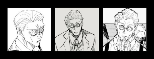
Characters: Nanami Kento x Wife! Reader
Tw: Nothing but tooth rotting fluff! Some suggestive themes.
Synopsis: There are only two people Nanami cares for in his life. His wife and their daughter.
A/n: this song has been stuck in my head for some time now <3

The smell of delicious food is in the air, along with faint sounds of cartoons playing in the living room where your three-year-old daughter sat and watched while painting a picture on the floor.
With one child preoccupied, Nanami has to deal with one more child trying to take his attention away from making dinner.
That child is none other than his wife.
“Darling, please look at me.” The softness of his voice never fails to make your heart race. His large warm hands caressing your cheeks as he gently turns your head to face him. Your cute pouty face meets his soft smile. “Don’t look at me like that; you know how she is.” A chuckle escapes his mouth.
“I don’t get why she has to take your attention away from me! I mean, who does she think she is?” Your dramatic episode only made the blonde man laugh. “She’s our daughter Honey, and she’s only three years old.” He tries to reason with his wife, only to be met by your puff-out cheeks.
Lately, your daughter Mina has taken your husband’s time and attention away from you. Yes, you love your daughter, but at least share the man! You saw him first, after all…
Nanami knows you are upset, but he can’t help that his daughter clings to him like a koala bear. She’s at that age where her dependence is solely on her father. You can say it’s his fault for spoiling her as a baby.
“I get that she’s at that stage where she clings on to us, but I miss you, Kento.” You whine, wrapping your arms around the sorcerer, pressing your body against him while he’s cooking dinner.
“Y/n-“ he’s interrupted by the sudden nip of his earlobe, “I really miss you~” you whisper, smirking at your husbands' reaction.
Nanami can never get over the fact that you and Mina have ways to make him crumble. Like, mother and daughter.
“I guess fucking you dumb last night didn’t cut it, huh?” He bluntly stated, earning a gasp from you, “Kento!” You hit his arm, hiding a blush creeping onto your cheeks into his back, “Mina is in the living room!” You scolded, earning a laugh from the sorcerer.
As if on cue, the little girl ran into the kitchen with a drawing in her hand. She holds it up to you, looking at you with excitement. “Mommy, look what I made for you!” Your little girl bounces up and down, smiling brightly. Yeah, she gets that smile from you.
Your eyes widen slightly but kneel to your daughter’s height. “You made this for mommy?” You ask, taking the artwork carefully. The picture consists of watercolor, which is hard to make out because of the smear, but you can tell they’re lilies.
Your favorite flower..
“Mhm! I made it for you! Do you like it?” The question made her eyes sparkle with anticipation, “sorry for taking daddy away from you..” Your heart swells in happiness, making your eyes water. How can your daughter be so loving and caring?! She must have taken after her father
“I love it, Sweetie~” You smile, picking your daughter up, earning a giggle from her and a smile from Nanami, “look at my two girls getting along now.” He gives you both kisses on your foreheads while he puts food into plates.
“What are you talking about?” You smile, placing Mina onto her highchair. “We do get along! It was merely a misunderstanding.” You laugh, ruffling your daughter's fluffy hair while the little girl laughs.
Looking at his two favorite girls, a soft smile settles on his lips, silently thanking the gods for such blessings in his life.
Cause in his world it’s just his wife and daughter.

© 2022 kanao-kyun

#Spotify#fluff#nanami kento#jujutsu kaisen fluff#jujutsu kaisen#nanami kento x wife reader#nanami kento x reader#Nanami fluff#Nanami kento fluff#family man#mini series#jujutsu Kaisen Nanami#anime#headcanon#harry styles as it was#this song is stuck in my head
992 notes
·
View notes
Note
Whats your art process and what would you reccomend for someone who would like to achieve a style similar to yours? i love this mix of cartoonism and realism. your work is such an inspiration >.<
oh gosh! thank you?! 💞 i'll do my best to explain it, but even I have a difficult time trying to understand my own art process/style because of how inconsistent it is;; (i still have a lot to learn!) this is gonna be a long reply so i'll place it under the cut
process:
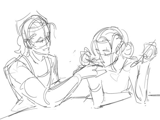

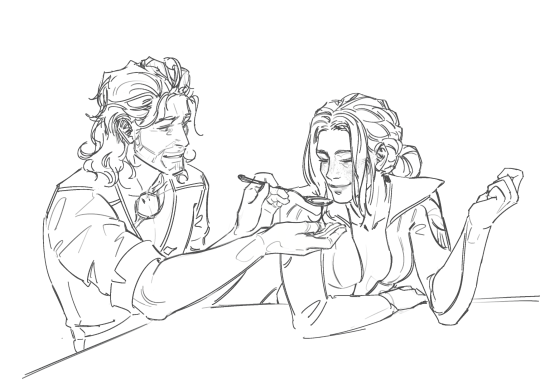
I start loose with a more gesture type rough sketch. I mainly just do lineart in the same layer as my sketch and erase away parts I don't like. Sometimes I'll lower the sketch's opacity and on a new layer do my lineart (which is what i did for the drawing above). But regardless doing that loose gesture sketch helps keep my drawing dynamic even as I refine over top of it!
- I duplicate layers A LOT for safekeeping my previous progress, especially if I'm thinking of making a big change (ex. changing limb position)
If I wanna put colors down underneath it I set my lineart to Multiply. For coloring I'm very inconsistent with the process, but recently I've been using a more subjective coloring style, where I pick my own shadows and highlights to try relying less on blending modes (which is gonna be too long to get into here;;) Finally if I feel like it, I make a layer on top of my lineart layer where I render everything
Oh this is something that helps me a lot for colors! I have 2 layers that are a mid-gray tone placed above all my other layers. One I set to the Color mode (to make the drawing black and white), and the other I set to the Luminosity blending mode (to make the drawing's brightness the same..?not sure)
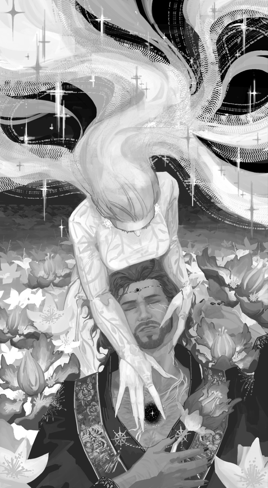
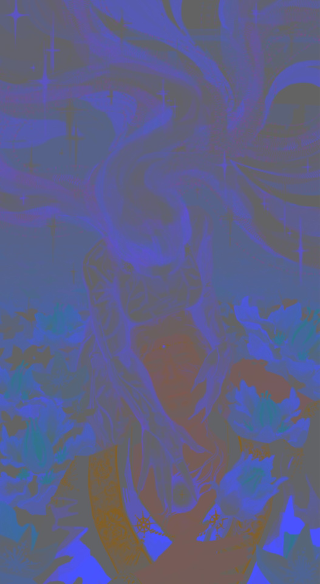
The Color layer helps me check if I have enough contrast in values, and the Luminosity layer helps me check if I have enough contrast in color hue and saturation!
style:
This is really difficult to answer because style encompasses so many different aspects of art, but I'll try to focus my answer on the mix of cartoonism and realism that you mentioned!
I struggled trying to explain what my style is like so I just broke down one of my drawings that exemplifies a lot of my stylizations! Hopefully these can give you some pointers about what I tend to think about when I draw (click for higher quality)
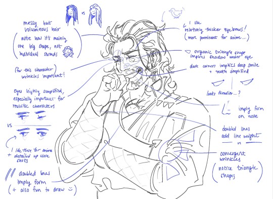
(+to add to this i use a brush with no size pressure, only opacity pressure)
What I recommend for stylizing a realistic character: The way I learned to stylize a more realistic character like this one was to import a reference of his face, then trace over it very deliberately, making sure to stick to big shapes and characterizing details I thought were important to achieve his likeness! Then I'd turn the reference layer off and freehand it over and over, comparing and redrawing until I managed to get the mix of accuracy and stylization I liked!
What I recommend to find a style: I basically ended up with my style subconsciously as an intersection between the things I like to see in art + the things I like to draw! Most of my inspiration comes from anime (😔) and artists online. I'll see a very specific stylization I like in others' art, and try replicating it to see if I like how it fits with my style + if I enjoy drawing it in that way. I did this a lot over the years, accumulating into a big mosaic of inspiration from all the artists whose work I personally enjoy and learn from! I know this isn't exactly answering how to get a style like mine, but I think knowing this general process may help you out in the long run!
ahh i think that's it! i tried to be as comprehensive as i could without being too verbose (my bane). i hope this is the answer you were looking for and that it can help you! 💞 and thank u for the ask! it was a good exercise for myself to analyze my own art
#my asks#anonymous#tutorial#...? art info? not sure what to tag this#i spent a very intense day mulling over this ask#hopefully i answered this correctly...!#art resources
41 notes
·
View notes
Note
Weird thing I’ve noticed:
Rachel seems to be deathly afraid of giving her characters facial hair- even tho that was like, a staple for a lot of male Greek gods and deities
Well, except for the “unattractive” ones
In Rachel's defense on that one, I can attest that it's difficult to give these characters facial hair when they're all painted neon colors LMAO like, I LOOOOVE drawing facial hair, but even I haven't really bothered giving the male cast facial hair because they're so ethereal/non-human looking that if you gave them something like a mustache or beard, it would start to tip them more towards the 'human' look and it could clash with the colors and enter uncanny valley territory. Like, the characters would either have to have full stylized cartoon beards-

-or nothing at all.
(that's how I get away with it with Dionysus, because his beard is basically just a big 'ole berry bush, so it's able to color match his face and not be distracting with its stylization).
That said, I've seen some great edits of LO panels where characters have facial hair, so that's not to say it can't be done! I just don't know if it's something that Rachel is capable of doing.
Because straight up, Rachel also just doesn't know how to draw men. Or rather, she only knows how to draw one type of man. Most of her portfolio pre-LO consists of drawings of women, many sharing the same body types (though there are some variations around 2010-2014). And just like with the women, when she does draw men, they've all got the same facial structures and body types:

(from The Doctor Pepper/Foxglove Show)
Like, you've got 6 guys here, six, and not a single one of them has facial hair or any extremely varied hairstyle. Half of them look like Hades. I get the sense that Rachel basically learned how to draw one "type" of male and one "type" of female and has just been drawing from those same templates ever since while swapping out minor details like nose shape and hair type.
Shit, here's an actual Hades drawing from back when she started doing Hades x Persephone sketches around 2016/2017:
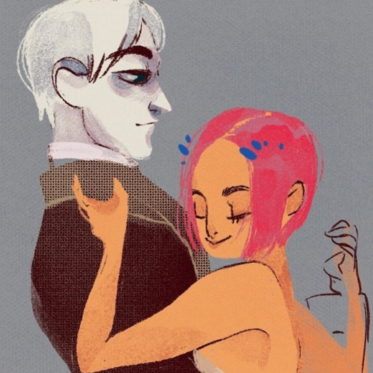
Like, that's just a guy from The Doctor Pepper Show. He looks like a mix of Donovan and Shifty Ricky LMAO And it's not like she doesn't have mortals in LO either who aren't colored with highlighter marker, but I don't think she ever really gives them beards either. The only guy I can think of off the top of my head is Psyche's *future husband:

And that has the exact kind of stylization/structure that I was talking about before that Rachel would likely have to do if she gave the gods facial hair to keep it from looking silly. Case in point, that time Hermes grew a mustache:
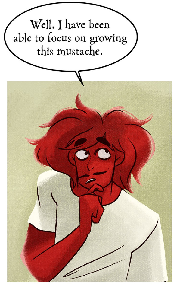
All that said, I do think it's a combination of Rachel not knowing how to draw men (she's even admitted in past AMA's and interviews that she's bad at drawing men and that doesn't seem like something she's tried to improve judging by how the men look in LO) and LO's art style just not mixing well with more human features like beards and body hair. It could wind up looking like a Barbie doll with marker scribbled on it LMAO
(*edited because that's not her dad, that's the man she was married off to , my bad LOL)
#lore olympus critical#lo critical#anti lore olympus#antiloreolympus#ask me anything#ama#anon ama#anon ask me anything
126 notes
·
View notes
Note
not a question but basically any time i remember your art exists im looking it up and down and trying to take inspiration from it. your expression work is always top notch, and the way you depict faces is the perfect balance between cartoony and well defined
oh my god this is such an amazing compliment! thank you so much!
you know, i think this has been a long time coming. im going to take this as a chance to go in depth about how my style works, why i do what i do and how i do it. do keep in mind that none of this is me saying "this is the objectively correct way of doing art" but rather just how my own process works, what I like to see in my own art.
that balance that you speak of comes from a commitment to underlying structures. what im going to call the stylization sandwich
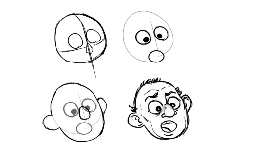
i start with a clear, well defined solid structure, i add whatever wacky cartoony features i want on top of it (none the less strongly tied and guided by the underlying structure) and then i refine by adding as many more realistic, grounding details i want, although you can go too far with it so i gotta be careful or ill end up with those shitty "cartoon character IRL would look scary!" clickbait drawings.

(quick aside, this trend fucking sucks, its obvious the artist went out of their way to make the drawing creepy, this pretension that "actually the character would look scary irl" deliberatly misundertands the principles of stylization, its as creatively bankrupt as jokes about mario eating mushrooms)
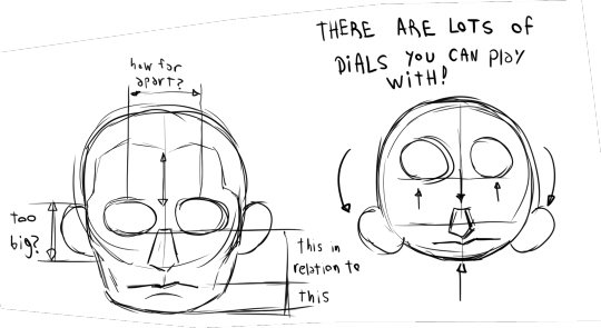
getting back on topic, the point is that, as long as the underlying structures are solid you can build whatever you want on top of them and it will make sense

a key tool here is internalizing the way the proportions on the face work. and i say internalize because obviously i dont actually have the golden ratio memorized inside my head nor do i stop and measure and calculate all the proportions in the features. i just read a lot about drawing, i drew a lot, i tried to always keep a critical eye to what im drawing and see if it "feels" disproportionate. once you get an eye for it then you know how far you can push things before they complitely break
let me give you another example of what i feel is a botched execution of this.
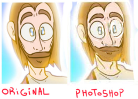
if you look closely at the face on the left there are a lot of things that dont make sense. the corners of the eyebrows dip down into the eyes when usually the eyes are enveloped by the eyebrows, the way the beard grows around the nose is just not how facial hair is distributed, the mouth is too big, etc. on the left i used photoshop to reorganize the factions into something that makes a bit more sense to me
(another quick aside, the real big problem at the heart of the original drawing were not so much the proportions but the tangents, when different lines touch each other like this that is usually a big no no but that is a topic for another day)
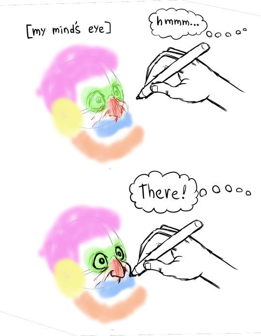
also a lot of it is just me cheating. yeah i cheat. you ever heard how people say there is no innate talent and its all practisce and hard work. well, yeah, that is mostly true, but is also true that some people are born with inherent advantages. either taller or more predisposed to being thin or with better facial structures or better innate hand-eye coordination. i was born with an uncanny capacity to visualize stuff. i have whatever the opposite of aphantasia is. i can borderline hallucinate things if i want to. and that goes coupled with the visual intuitions i developed through practisce and training.
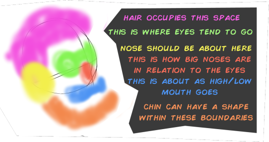
so first come the learned wisdom, and then comes the innate talent that helps me exploit that learned wisdom to its full potential
on top of that is corporeality, i try to draw in such a way that it conveys depth and weight to the things im drawing, certain kinds of stylizations dont care about that and choose instead to have their drawing look flat, a classic one is the UPA style
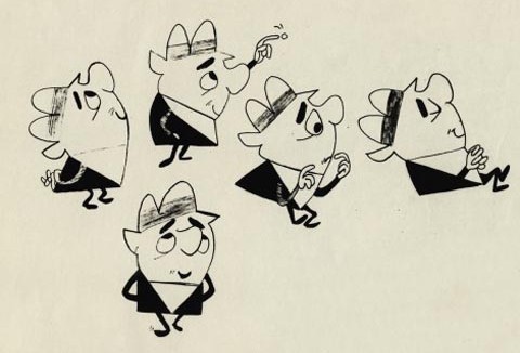
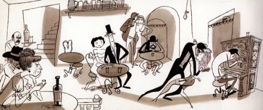

is a very fun style! very cute, very dynamic, very expressive in its simplicity. it became very popular in the 60's and 70's. personally i choose to go in a different direction. i draw in such a way that if one were to turn my drawings into 3d models not a lot would get lost in the process.
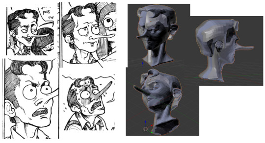
whereas other artists....

...not so much
but yeah, ultimatly it all goes back to underlying structure. any drawing can work
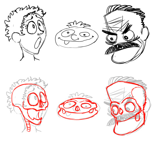
as long as you have a strong foundation underneath.
PS: if you like my style i cannot reccomend enough the art of @rezuaq i feel they follow a lot of the same principles i talked about here but i could be wrong.

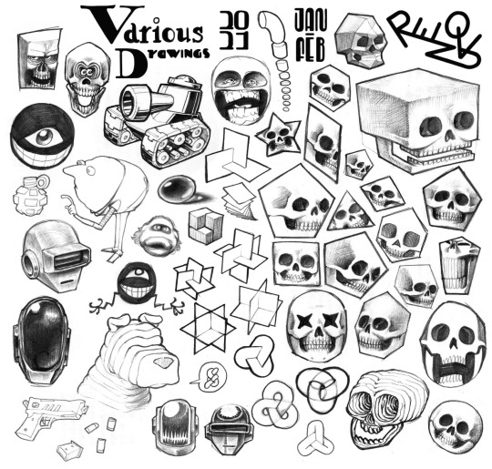
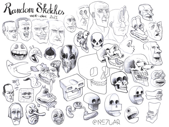
they have been my biggest inspiration as of the last 4 years, i shamelssly stole the design of one of their characters for jennyffer. go to their blog and give them a like
45 notes
·
View notes
Text
The band’s all here! (WIP)


I still haven’t finished their new endoskeletons yet, but I think I have their suits mostly down!
Feel free to ask any questions you may have in the inbox!
EXTRA INFO AND SCREENSHOTS UNDER THE CUT!!!
At first glance, these are obviously inspired by the traditional Chuck E. Cheese x Rockafire Explosion suits, designing them more like sports mascot costumes and having very little of the endoskeleton showing at all times (say for Foxy, of course). This was not only for more realistic world-building, but also to optimize animation, as we now have less moving parts that are actually showing, and therefore, less to render.
You might be wondering “if you wanted a more realistic approach to the suits, why not take a more realistic approach to the masks, like a more ShowBiz Pizza style?” And to that I say: everyone does that.
Okay, that isn’t entirely the reason. I like the idea of basing the designs more off of the canon models than something that already exists, because I like the idea of FazEnt having their own style of making animatronics. The ShowBiz style isn’t the only way to do animatronic masks, and these masks are how FazEnt would go about making them. Even when FazEnt does use the trademark ShowBiz rubber-face masks on the Junior models, they don’t do it the same way that ShowBiz does it.
Something interesting I want to do with Freddy & Friends is to set narrative moments apart from the moments meant to be passed off as real footage. The designs shown above are for the latter, meanwhile the narrative will use more artistically stylized suits textured to more so resemble a comic book, sort of like Into The Spider-Verse (except instead of going for a generalized comic book feel, the Freddy & Friends style is gonna be more reminiscent of the Batman: Year One comic). The designs will be more reminiscent of how I draw them on paper, as opposed to being faithful to the canon.
Here’s some extra info as to how I came up with the designs, as well as some extra renders and concept art!:
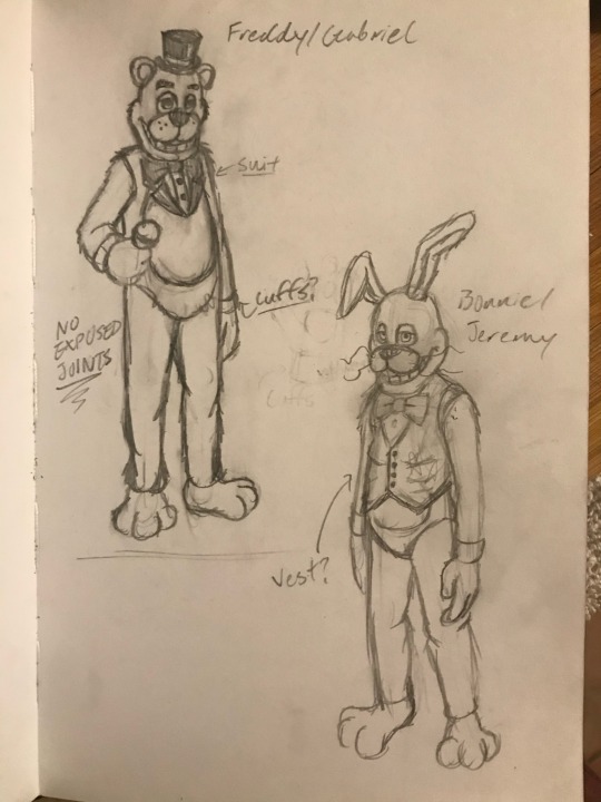
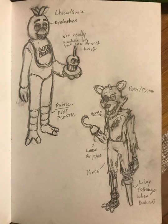
Original concept art from September 30, 2020.
Freddy was a little obvious to design, probably because everyone seems to design him like this when making more cartoonish versions of him. A more defined tuxedo complete with a collar and cuffs with a red stripe around his hat. It just seemed like the right direction to go in.
Bonnie was initially intended to wear a vest, though I was holding out for something else so that he could be differentiated from the evil rabbit (the evil rabbit wears a vest). I asked my friends what I could change it to, and one of them said “Try a cardigan”. Honestly, that fits Bonnie’s personality so much better, both in terms of spirit and cartoon.
You might also notice that Bonnie was supposed to have buck teeth, as well as more squared off teeth. That was originally part of his V1 model, but when I tried applying that to the new models, literally any way I tried to arrange it made Bonnie look like so much like an insufferable asshole that I wanted to punch him in the face. Ultimately, I ended up ditching the buck teeth and just gave him his classic teeth.
Chica was a little hard to do something unique with at first. I initially wasn’t really sure what I wanted to do with her, but when I modeled her V1, her little chef’s hat was a last minute addition to her design. I’m also thinking about changing her bib into an apron, per the toon designs that Henry posted a while back.
Foxy was probably the most fun to design. Obviously, his final model has a lot of details inspired by the FNAF movie, but when I was designing him 4 years ago, I really just wanted to go crazy with his design. I wanted him to have a beard, I wanted him to have a peg leg (I really liked the idea of animating him with a limp). Unfortunately, I don’t know if I’ll keep the peg leg, because it might be a little too hard for Henry to animate with the tech that he has.
As a cheeky little reference to the roots of the FNAF fandom, I wanted Foxy’s hook to resemble the hook seen on the Splinks Foxy model. ;)

Endo01 - Version 4 WIP
I’ve done a few different versions of the endoskeleton. What I’m trying to do for this new one is to assemble him modularly, allowing me to make each component a recognizable component (they’re also actually modeled after real components).
I’m not gonna go into detail about the functionality of this guy, because I eventually plan to make a Freddy & Friends Instructional VHS series centered around being a mechanic for FazEnt. However, what I will say is that these designs are intended to have plausible functionality, especially using the technology of the 1980’s (which is not restricted to pneumatic technology, because making an animatronic walk with pneumatic actuators while maintaining the traditional complexity of animatronic endoskeletons is simply impossible).
EXTRAS:
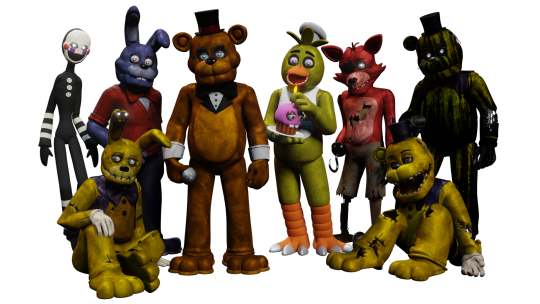
The original Version 1 designs

My failed attempt at giving Bonnie buck teeth (I wanna punch him so bad…)

Fixed Foxy
???
#freddy & friends#freddy and friends#freddy & friends AU#f&f#five nights at freddy's#fnaf#fnaf au#freddy fazbear#bonnie the bunny#chica the chicken#foxy the pirate#work in progress#wip#endo 01#endoskeleton#animatronic#fnaf ask blog#fnaf fanart#fnaf movie#worldbuilding#webcomic#writers on tumblr#writing
24 notes
·
View notes
Note
Did Nezha ever leave MK alone for some time because he felt guilty or because he thought MK was better off without him, only for MK to get really sad and Nezha realizing he was wrong and return? Or did Nezha stay with MK throughout his entire childhood ?
Once Nezha revealed himself to MK, he couldn't help but linger around. His visits getting more and more frequent. He did linger the rest of his childhood.
However, if there was ever a moment for Nezha to doubt himself or what he was doing there, it would probably go like this :D
---------------------------------------
Nezha leaned against the window sill, feeling the cold seep through his back. The drawn curtains kept him hidden from any potential onlookers inside, so he didn't have to worry about being seen as he watched the rain trickling down from the roof shingles.
He strained to listen beyond the barrier of glass and thin material, catching the pitter-patter of tiny feet and the gentle thump of a heart- MK was in his room.
It had been some time since Nezha was last here. Well, not long, per say. A month, a simple 30 days, was nothing to that of an immortal.
To a child, however, it must have been that of a century.
He had made a promise to himself to never come back. How could he, especially after MK had referred to him as "Big Brother"?
A loving term that stirred a flicker of warmth in Nezha's otherwise icey pit of a soul. Despite his initial excitement, he was quickly reminded that he did not deserve such intimacy.
Although he did not disregard the name when he first heard it, he quickly stood up to leave. He knew he had overstayed his welcome and the longer he lingered, the more difficult it would be to say goodbye.
MK's face lit up with a smile as he said goodbye to Nezha, a routine gesture they had repeated many times before. Little did he know it would be their final interaction.
It was supposed to be their final meeting in person. However, that did not mean Nezha would abandon the boy to face his life alone. He held onto a container of tea tightly, aware that the exhaustion would have likely set in for the boy by now.
After MK's light flickered off and the boy settled into bed, Nezha patiently waited. He knew MK was probably reading comics under his covers with a flashlight, so he gave him an hour before making his move. Once the time had passed, Nezha felt it was suitable to proceed.
Silently sliding open the window, Nezha slipped into the room like a shadow. The faint scent of ink and paper lingered in the air as his eyes adjusted to the darkness. He made his way to the small desk by the bed, where MK's latest drawings were scattered haphazardly.
He paused, smiling softly to peer down at them. Pouring MK his cup of tea and putting it where he always did, Nezha paused to a particular page.
He easily recognized himself in MK's characteristic, rounded drawing style. What confused him was that his cartoon replica appeared to be holding hands with MK. However, the drawing of MK was scratched out, as if the boy had impulsively tried to erase it in a fit of emotional anger- in hurt.
Nezha held his breath, lifting the picture with a dropping feeling in his stomach. Noticing a change in MK’s breathing, Nezha quickly his the drawing behind his back, turning to the bed when MK had sat up.
The boy peered at him through the darkness, drowsy at first, then clearing.
“Hello…?” MK’s voice was a soft whisper, a mixture of surprise and confusion. His eyes adjusted to the darkness, and he saw the figure standing by his bedside, holding a steaming cup of tea. MK gasped, “Angel?” He was in a frenzy, tossing and turning as he threw the covers off his legs without care. He became tangled in them as he rolled off the bed and landed on the floor. “Angel!” He rushed to Nezha's side, but stopped abruptly before reaching him. Nezha prepared himself for a hug, desperately craving it, but at the last moment- MK froze. He held his breath as he watched MK's gaze fixed on him.
MK was attempting to read his response, as if he thought he was no longer allowed to show affection towards him. Nezha felt tears forming in his eyes but held them back. He discreetly let go of the picture and knelt down, embracing the boy tightly against his chest.
“I’ve missed you,” Nezha whispered, feeling MK's body tremble in his arms. The tension slowly melted away as MK tentatively wrapped his arms around Nezha, burying his face in the crook of his neck. Nezha closed his eyes, savoring the warmth of the embrace that he had longed for during their time apart.
MK exhaled, the furrow of his brow relaxing, soothed. “Were you busy, Angel?”
Nezha caressed the back of MK’s head, his chest tightening with guilt, “Yes,” he says. It wasn’t a lie, but it was far from the truth. "I was trying to figure things out. I’m… I’m sorry I made you wait so long," Nezha continued softly, his voice barely above a whisper. MK pulled back slightly, his eyes searching Nezha's face for any sign of deception. Finding none, he leaned in again, nuzzling his head to Nezha’s shoulder.
“Okay,” he whispered.
Nezha spoke more, “B-But I'm here now, and I'm not going anywhere," Nezha whispered softly, his voice laced with sincerity. MK clung to him tighter, as if afraid that letting go would make this moment disappear.
“Okay,” he smiled.
20 notes
·
View notes
Text
okok this took longer than i thought but :] funy fan abno time. LOTS of stuff under the cut, lets go <33
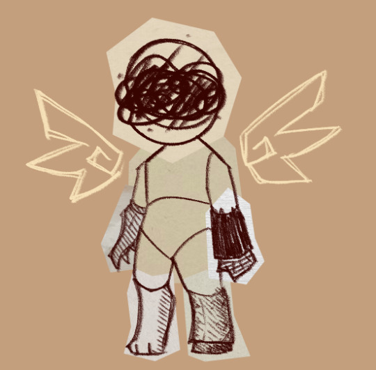
> Whispers of Another Life // O-01-19 // WAW
(I feel it, I feel it-- Can't you hear the horizon calling?)
The ever-present pull of a place you don't know, but desperately need to be. Misplacement and loneliness. The siren's song of a stranger you so badly wish to return to.
Its body is made of a series of collage pieces, each bearing a different artistic style. It has a set of cartoon wings that are naught but a scribbled outline, unsteady but with purpose. In stead of facial features, its face is obscured by what seems to be a messy pencil scratch. It twitches and changes frequently, as if trying to put together the pieces of a puzzle. It can never seem to find the right combination.
(Most to least unstable: hands/wings/mask -> limbs/head -> torso/shape.)
Low Q Counter. Work types Best to Worst:
- Repression ++
(Quelling its desire to search provides a grounding effect, preventing it from growing out of control.)
- Attachment +
(Having something to fill the gaps helps to keep it level, but it can never truly replace what it is looking for.)
- Instinct -
(It tolerates this type of work, but it does nothing to address its nature.)
- Insight --
(Trying to understand or bring out its essence simply destabilizes it further.)
Capable of breaching-- it changes form to become much less humanoid when doing so. While dangerous, it doesn't ever actively attack employees. Rather, it deals passive white damage to anyone in the same corridor as it, as its emotions overflow and tamper with the physicality of its immediate surroundings. It's more of a loss of control than a rampage. It wanders for an exit it can never find, and becomes more and more unstable as it goes. If left unattended, its passive damage steadily increases. It has a high movement speed after breaching, but it proportionally goes down with its damage output.
Agents that panic under the effects of this abnormality are switched to Release behavior, regardless of their typical panic type. Agents afflicted with this state gain a collage-type effect obscuring their eyes, and have a slightly harder time being suppressed due to an increase in movement speed.
Resistances (Highest to Lowest): Red, Black, White, Pale
---
EGO Equipment: Hiraeth
Weapon: A patchwork violin that always sounds nostalgic, a feeling just outside of your periphery. Ranged, white damage. Low damage, but quick output.
Special: A loud screeching note that deals heavy white damage, but has a bit of a recharge period.
Gift: A small, scribbly set of wings by the head. Increases SP, attack speed, and work speed.
[ Snippet of a recording of an Employee account of the subject. ]
Have you ever wondered what it was like to be a shooting star? To travel miles and miles and miles, only to land somewhere unfamiliar, somewhere strange. A place not built for you, unwelcoming to your very essence.
[...]
Hm? The recording? Ah, yes, I'm getting to it. Don't worry, everything I'm saying is very important to the report.
[...]
...Fine, if you insist.
When it arrived, nobody was really sure what to make of it. Many others who had tried to work with it simply did not get any conclusive results. It was "unresponsive," "uncooperative," "difficult." They just didn't know what they were doing. So, they ended up picking me to work on it next; something about being "receptive" and "observant," or something like that. You know, work speak.
It never responded too much, at first. I can't imagine why it would. But I'm nothing if not persistent. I always find a way. Maybe it just needed a little help communicating. So we brought in some basic crafts material. You know; paper, pencils, crayons. I will admit, it may have been at least a little bit for me, too.
I used to draw a lot when I was little, you know. Was a bit of a lonely kid, y'know? I don't do it so much anymore, it just isn't in the cards for me. But back then, at least, it almost felt like--
[...]
...Right. Sorry. The subject.
Surprisingly, it actually moved to join me after some time. Drawing, I mean. I wasn't sure it had the ability, but sure enough, it had picked up the nearest utensil and begun working with purpose. I don't much like prying with this sort of thing, but looking at what it was doing... it was the strangest thing. It was a mess, incomprehensible-- but somehow, it was striking. I knew that place. Or at least, it felt like it. It wasn't clear, but something in it... it felt like home.
But as it went, it got less and less steady, more sporadic-- frustrated, almost-- until eventually, it grew so unstable I was forced to end working with it early. We didn't touch its unit for a while after that, but I couldn't stop thinking about that scene it was drawing. It never spoke, but I could hear it. It whispers, you know? If anyone had taken the time to listen, maybe they'd have noticed.
I know what it's like to be alone first hand, you know. That feeling of listlessness, that incorrectness... I know it all too well. And once, for once in my entire life... it felt like I finally, truly found someone who understood.
[...]
Yes, I know we are not supposed to view the abnormalities as people. Trust me, I remember. You don't have to worry about it. Those rules are just petty precautions anyway.
[...]
Hm? Oh, I don't think you understand. I know exactly what I'm doing. In fact, I think i've done my job quite well.
[ An alarm begins blaring. ]
Ah, there it is. This was nice, but I think that's my cue. Now if you'll excuse me, me and my friend will be going now.
[ A sudden cacophony of noise kicks up, and the recording abruptly ends. ]
#long post#pikocs#projmoon#pikart#um um !!! never written one of these before so dont expect this t be like. balanced or coherent or whatever i just write words here#th snippet at the end i lichrally did just now so um <33 yay (<- girlies who didnt proofread)#ANYWAY. considerin having it interact w fragments. like if it breaches so does whispers. or smthn like that.#ithink theyd interact interestingly. but im not thinking too hard <3 yipy
39 notes
·
View notes
Text
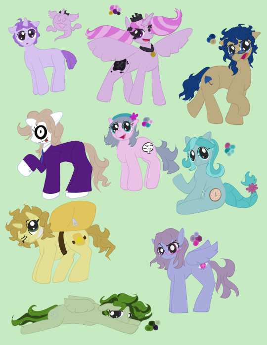
Valentine, you're a
horse
(rain code pony au. design notes under the cut!)
just as a note, i haven't seen my little pony since i was like. 11. and also i don't think i watched beyond twilight becoming an alicorn. my knowledge of later seasons mostly comes from horsecomix. so if i say anything that contradicts the Horse Lore, sorry about that.
ok now for individual designs.
yuma is a unicorn, mostly because mystery labyrinths require him to be able to hold a sword and talk at the same time. in addition to his memories, he lost his cutie mark in the pact, so everyone who sees him is like "damn you're an amnesiac AND a blank flank? pick a struggle". he doesn't have any accessories by default, but he probably gets a little hat in the rain + his cape in the mystery labyrinth. he was the first pony i drew, so his face looks a little janky. i struggled with drawing the ponies from any angle other than a perfect sideview, and the snouts/mouths were the hardest parts by far. the front view i did for yuma was a bit easier than the 3/4 view i did for most of the cast, but it was still tougher than i expected. pony artists who mimic the style of the show have all of my respect.
shinigami's spirit form was changed a little bit, although it was already so abstracted compared to a real human that i didn't feel i needed to change much in order to make her fit into the pony universe. i just swapped her horns out for wings and gave her a horn. i also removed her thumbs and made her colors closer to her human (er, pony) form. she's no longer a "death god" in the traditional sense, now being the "princess of death" in the same way twilight is the princess of friendship or cadence is the princess of love. she was sealed away because she was shit at her job (just killed a fuckton of people for no reason) but anypony who stumbled across the book she was sealed in can make a contract w her just like in rain code canon. obvi this is a little dark for the actual mlp universe, they wouldn't be putting a trigger-happy murder princess in their rated y cartoon, but this is the same fanbase that made fuckin. cupcakes and rainbow factory and a whole slew of others that make the main characters of mlp infinitely more fucked up than canon shinigami ever was. so i feel like we can have a little suspension of disbelief here.
shinigami's true form is an alicorn, obvi. she's a god princess, she's gonna be an alicorn. i tried to refrain from giving the characters too many accessories to better mimic the simpler mane 6 designs, but shinigami looked so naked with just the crown. so she also got her flower and little necklace. i didn't even attempt to put her hair in braids, since drawing her face at that angle was such a challenge already. upon posting this, i also realize i forgot to give her a tail. just imagine any tail you want on her. pin the tail on the shinigami. her cutie mark has the same dark void effect as nightmare moon's, although i can't remember if luna also has it as well. regardless, it's a visual tie-in to nightmare moon, who has a similar "princess banished to an inanimate object" thing going on. the actual cutie mark itself is two bones, representing death in a cutesy cartoony fashion. i was gonna do a skull and crossbones but then i realized. no one knows what a human skull looks like. there's no people. and i am NOT about to draw a fucking horse skull. so, bones it is.
yakou is probably the one i'm proudest of! i feel like i really captured the essence of the background pony in him. i feel like i could see him hanging out with lyra heartstrings and dr. whooves and i wouldn't bat an eyelash. his hair is a little longer than in the original design but i think it looks cute so it's fine. his cutie mark is an umbrella because his calling as a detective leads him to protect others like an umbrella protects you from the rain, plus kanai ward has its whole Thing. and he can be kind of a gloomy person at times, very pessimistic. he's an earth pony because he's just a normal guy, no forte in canon and stuff like that.
makoto was probably the trickiest to actually design. the element of mystery is super important in the original character design, but he was able to still have some skin exposed since almost all of the character designs in that game have a skintone of "homestuck white". in mlp, where coat colors can be any color of the rainbow (and the colors outside of the rainbow), makoto would lose that element of mystery. so, while i generally try to avoid putting the ponies in clothes, makoto kind of needed them. he's got his full suit and a set of gloves and white shoes for his hooves. instead of being a sort of "paper plate" mask, he's got a rubber halloween mask that extends past his neck instead. don't ask how the mane comes out of the mask. we don't ask how canon makoto's mask stays on with no straps, so don't ask about this one. the mask goes over his horn, so it blocks out most powerful magic, but basic spells like levitation are still possible with a bit of effort. the pants of his suit hide his cutie mark, and when asked about what it is, he gives a different answer each time.
kurumi isn't a super complicated or in-depth design. just a cute lil earth pony with a cutie mark of a speech bubble, since she does a lot of information gathering via talking to others. in hindsight, i should've given her freckles in the same color as her body outline. imagine she has freckles please. thank you.
fubuki is the design where i actually got the courage to attempt a braid. no idea if it looks good, i didn't use a reference and my hair is too short to braid it myself. i wanted an earth pony in the core group of nda members, and i was sort of torn between her and desuhiko. however, i'm a personal believer in the "all ponies can use magic on some level" theory, and that theory posits that earth ponies have a tendency to be able to use the intrinsic magic of their planet in subtle ways. applejack can enhance her physical strength without really doing anything consciously, and most importantly, pinkie pie can bend the laws of reality for The Bit. i think time travel is kinda like bending the laws of reality for The Bit. plus, desuhiko's disguise ability is kinda like an illusion, which feels like more of a unicorn ability. her cutie mark is a clock. because. uh. you know.
desuhiko is a unicorn for reasons i mentioned in fubuki's notes. his backpack is worn like a saddle, but he can still use it to disguise himself like in rain code canon. his cutie mark is the bag with a star on it, hinting that there's a superstar (him) in the bag. not much to say about him other than that.
vivia is a pegasus. since his forte allows him to fly, it makes sense for him to be able to fly in his base form as well - he'd get used to the flight powers inherent to his ability a lot quicker if he could already do it. he's definitely more of a fluttershy than a rainbow dash in terms of how he uses his ability to fly. he prefers to walk, but if his legs get tired, he'll switch to flying for a little bit. but then both his legs and his wings get tired and he takes a little nap. that's what the pose is meant to be, altho it does look a bit like he's flying. his cutie mark is a disappearing flash shape, as his spirit form is invisible and he tends to disappear into the background in general. someone in the rain coat server told me he looks like stoney pony and i haven't been able to get that out of my mind.
halara was the last pony i drew, because i love them and wanted to get as much pony-drawing experience as i could before turning them into an equine. can't have my pookie bear looking like shit! they are also a pegasus, but not for forte reasons like vivia. rather, they just do impressive feats of athleticism on the reg, and i feel like they would be a great flyer as a result. imagine the scene where yuma calls for help while being detained by seth and the peacekeepers. a blue and purple bursts onto the scene from the fucking clouds and halara is divebombing the peacekeepers. that'd be sick as fuck. their cutie mark is an eye, because postcognition is all about sight.
erm ok thats everyone!!! i'm bad at pony names so if anyone has any ideas leave them in the comments or the tags ☺️
#rain code#mdarc#yuma kokohead#halara nightmare#vivia twilight#desuhiko thunderbolt#yakou furio#fubuki clockford#kurumi wendy#makoto kagutsuchi#shinigami rain code#my little pony#mlp
40 notes
·
View notes
Note
Sorry if this is a weird question but how long did it take for you to start making art you felt was good enough, at least at the time? I have a lot of ideas for projects I want to make but I'm slowed down by not quite being at a level I'm happy with for professional endeavours. Wondering if I should quit while I'm ahead and just hire an artist I like.
Hoo. Good question.
It's hard to keep track of, honestly. I think every artist is going to feel a degree of "this could be better" about anything they make, and if that's all you're keeping track of it can feel like no progress is being made - but in hindsight, I think "this could be better" means a lot of different things, and what it means for my work has changed over time.
One of my earliest art-related memories is having a very clear image in my head of a pencil sketch I wanted to make (a family portrait of some wizards, a mom and dad flanking a young daughter) and then being immensely frustrated that what I produced was a pale, inexpert shadow of that image. The starting point I was at was "this doesn't look right and I don't know why," and I stayed there for a long time, even as I got overall better.
The first time I remember trying and failing to emulate a specific cartoon style, it was the manga Steam Detectives - I'd mostly been exposed to newspaper comics and scientific illustration, so I had never seen that sharp-angled straight-lined manga style before. There was a liveliness to it I couldn't capture, and that frustrated me. At this point I could see what was wrong, but couldn't yet correct it - my unconfident pencil sketching wasn't going to produce the same kind of three-dimensionality and flow as the brush strokes used in the, in the same way that a traced figure can look strangely odd and off-balance because it's only mimicking the outlines. At this point I'd hit "this doesn't look right and I know why, but I'm not sure how to fix it."
At that point, practice was kind of the only solution - unconfident linework can only be improved by honing the muscle memory and confidence of the artist, which I didn't know at the time or do on purpose but ended up happening anyway, especially once I got going on the channel and was regularly doing dozens to hundreds of drawings per project.
I do remember the first time I thought "oh, that's actually better than I expected" - I had broken my clavicle and my right arm was in a sling, and my art teacher encouraged me to try drawing something with my left instead. I am very much not ambidextrous and my lines were spidery and shaky, but when I stepped back at the end, the thing I'd tried to sketch - a portrait of a regal-looking elf man - actually wasn't too bad. The muscle memory in my right hand was completely absent from my left, but apparently my basic understanding of shapes and shadows had come through and made something that got across the gist of what I wanted. That was the first time I felt "this doesn't look right, but I already knew that, and what it does do is actually pretty solid."
At some point in the process of cranking out channel illustrations, and later chibi character commissions, without even noticing I hit a baseline level of confidence in what I was doing. Certain things got easier because I was doing them a lot more. I stopped thinking about whether a facial expression was communicating exactly what I wanted it to, stopped spending long stretches of time trying to refine poses - because in those specific areas I was no longer experiencing "this doesn't look right and I don't know why." I'd draw a face, realize it could look angrier, redraw the eyes and brows to be angrier, then move on. I'd block out a pose, decide the leg didn't look right, redraw it, line it and move on. It wasn't that I was nailing everything first try, it's that I'd had enough time and practice to quickly diagnose what wasn't working and quickly try something else to correct it.
Instead, I was thinking "this doesn't look right and I don't know why" about other things. Trees, buildings, figure shading, fire, water, metal textures. I still didn't feel ready to do the comic in earnest, but I'd started doing digital illustrations of the characters and mock-up pages/covers, and I kept finding problems in the composition. It didn't look right and I didn't know why. If I didn't know why, I couldn't fix it. A lot of that process boiled down to redrawing stuff until it managed to look right, then trying to reverse-engineer what had worked about that. I'd accidentally draw the most perfect torso and try to figure out what magic combination of lines had made that work. And again, it was a slow process, almost unnoticeable from my perspective, because I just gradually stopped worrying so much about unsolvable artistic problems because the solutions had just arisen with practice and experience. The background looks wack - it's probably under-shaded, darken some corners to make it match the foreground. This texture looks off - probably needs some particle effects to help give it detail. Etc etc.
At present, I very rarely think "this doesn't look right and I don't know why." I still have moments of "this doesn't look right" - almost constantly, probably - but they aren't noteworthy because I've had enough practice improvising solutions that it turns into a brief experimental phase before I fix whatever was bugging me and move on. It doesn't mean it's perfect, it just means whatever problems or places it could be improved are either subjective choices that are fine either way, or small mistakes I don't notice at the time. The process of error-correction and bug-fixing becomes quick and painless enough that I hardly think about how I used to spend ages agonizing over something that was wrong that I couldn't make look right.
The point I eventually got to could probably be best described as "I could make this better if I wanted - do I want to do that?"
Making a comic like this, it's very important for me to consider the value of pouring too much into any one page. If I vastly overdesign anything, I'm going to need to keep up that level of design every time it shows up. If I drew every forest shot by hand-drawing every single tree I'd never get anything done. If something looks off and I know the solution would be more detailing and more texturing, sometimes I'll do that - filigree and particles and all that good sauce - but sometimes I'll just try a few things until I find a shortcut that makes it look fine to my eyes. Art can always be more polished, so that's not really a metric for completeness or ready-ness - I really do think the most helpful metric is whether you're regularly struggling because you can see something is wrong but you can't figure out what. If you consistently know what's wrong - or, more accurately and less judgmentally, what could be polished if you wanted to polish it - you're probably in a pretty good spot.
169 notes
·
View notes
Note
do you have any tips on simplifying a person's facial features into a drawing? i love your art because it is so simple yet so evocative, and though your style is fairly cartoon-y, your characters always look like the people they represent. i've been doing portraits for years, and i have a very difficult time letting go of the details and simplifying. it's one of my biggest challenges. if you have any tips or could go over your process for doing that, i would be super thankful. (and no worries if you're not up for it, i just always think "how?!" when i see your drawings! )
Helloooo!!! Thank you so much! And thank you for the question! I tried doing a step by step thing to show you how I approach drawing a face!
(This goes for anyone I try to draw)
Step 1: Find a ref pic and train your eyes to not complicate stuff!
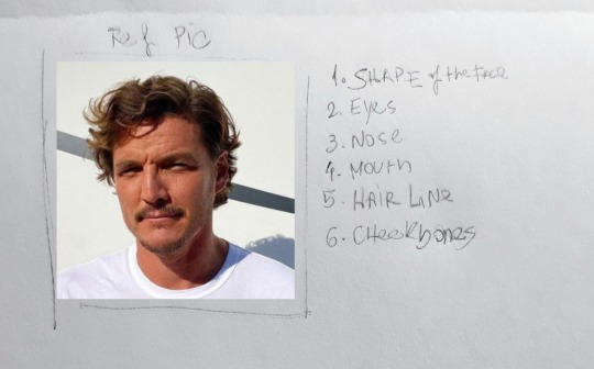
After I have a ref pic I look for what I've decided are the important things in a face that makes it a face (I listed them on the image).
But you may say: well, that's the whole face! Everything on the face is important!
Well, yes. But if you have a list of things you should focus on, makes it simplier!
Continuing!
You must focus on studying the person's:
1. Shape (Face. This also includes the understanding of how the jawline is shaped)
2. Eyes (shape and also placement)
3. Nose (shape of the nostrils, the side lines and placement)
4. Mouth (placement under the nose; the shape of the mustache if they have one; until where the corner of the mouth goes, usually I use the eyes as ref)
5. Hairline (this one is not on number 1, because I usually leave it for last. Drawing the hairline close to what it looks like in the ref, helps you neat the shape of the face, because forehead makes a total difference as I've learned along the years lol)
6. Cheekbones (I do like a good blushing and this could be used as a tool to try saving a doomed drawing lmao *cries*)
Ok! So accessing these elements, let's try drawing it!
Step 2: Doing the drawing.
2.1. It all starts with a ball.
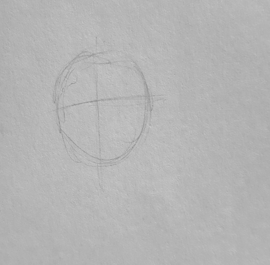
So, like everybody tells you to, I start with a ball.
This helps you not go crazy and limit you area of work! I also devide it in 4 and use the line in horizontal to place the 👀's
2.2. 1st sketch
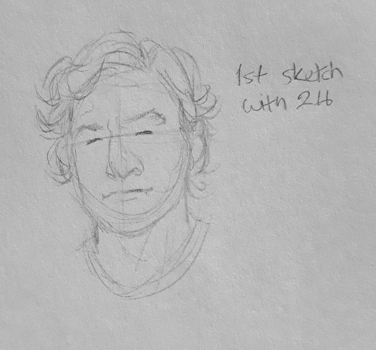
The first sketch is really a moment of trying to control your anger:
- It won't look like anything
- It'll look bad
- You might question life
On the first sketch I use 2H because it's soft and you can work through it on the next steps.
This is where I put all the elements of the list and only them. It's very simple and cartoonish.
(The thing is: I only focus on them and forget the other details you could work on)
2.3. 2nd sketch
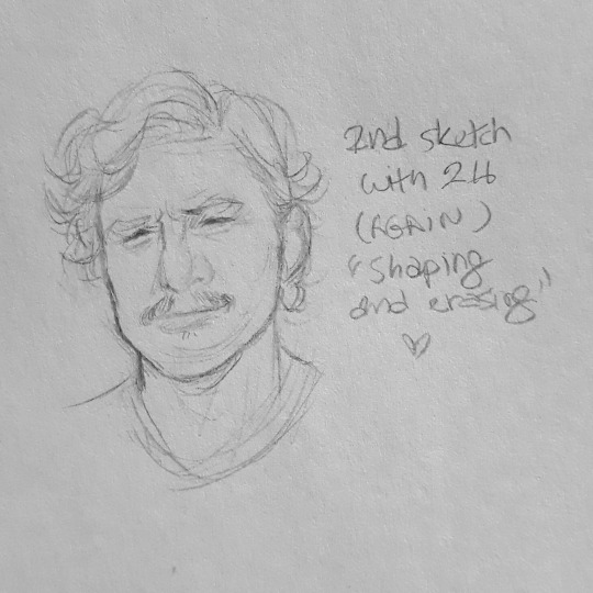
Ok, now things are suppose to look right.
On second sketch, still using 2H, you gotta work more on the same elements, shaping it to look more like the ref pic.
Here is also where I draw eye bags, lines and dimples. But only the ones that are close to the eyes, the nose and the mouth! The ones you can't ignore because they ultimately make the person look like themselves.
2.4. Line art ✨
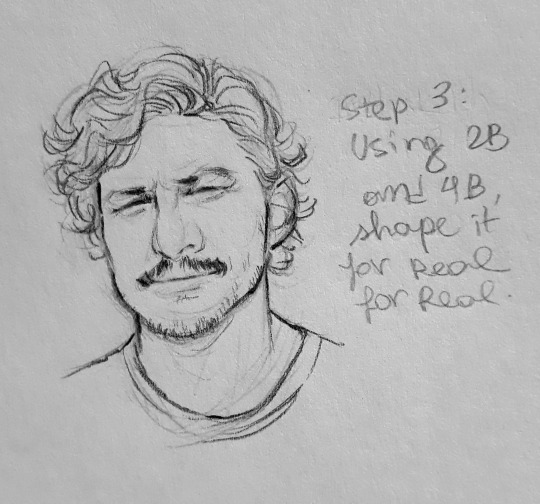
Line art is also where you take a pencil with darker graphite (like 2B/4B) and pray to the gods that you won't ruin everything.
The line art is where you hightlight stuff (imo) and you also give depth!
So focus on places where there is shade... to highlight. (Does this make sense? Absolutely not)
This is also where you gotta work on the hairline.
2.5. Finishing you drawing!
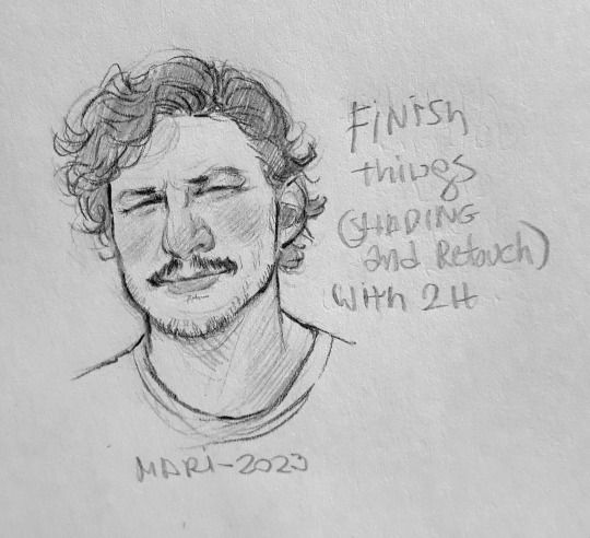
With H2 I just shade during the finishing process.
You shade mouth, under eyebrows, under eyes, nose and cheekbones!!!
So, that's it!
I hope this makes sense and helps you in anyway! This is what I do and what I focus on when I draw faces!
82 notes
·
View notes
Note
Do you know why frisk is that color in game? Because i dont. Putting them next to chara really emphasises the...yellow-ness in a way i never fully realized before.
I will never truly know why Toby made Frisk (and Kris because they share the same color code) this way. Everything I say will only be hypotheses and possibilities.
Firstly, it's not something he ever addressed as far as I am aware. So I feel like it's something he ignores, sweeps under the rug, or is genuinely not aware about (somehow), assuming that people have tried to bring this up with him..?
If I were to speculate, though, I am guessing that (especially because Toby Fox is western/American) it is a few things: the most likely reason is because of the normalization of western cartoons being yellow, especially because of the Simpsons (The Simpsons were made yellow to be eye-catching). So he probably wanted Frisk to be eye-catching. He may have messed around with orange too, but settled for yellow.

I don't find this completely excusable, because of the fact that Frisk is paired with what a lot of people has interpreted as "squinted eyes" or "closed eyes", so it encourages people/fans to draw content of Frisk as yellow-skinned with squinted/closed eyes. That's why there was a strong movement for fan-artists before, to draw the humans as without yellow skin, because it seems like Toby Fox won't be acknowledging this any time soon.
A lot of why this is so frustrating is because while one can argue about Frisk being pixels all day, their pixels will not stop people from making fan art of Frisk with realistic styles and proportions, even if they are cartoon-y, with all these features combined. It's hard to watch.
The second possible reason is to be racially ambiguous, but because Toby Fox never claimed any of this, it's only speculation. I personally think that he might not have even thought that far ahead since UnderTale was meant to be a simple game for him.
Either way, here's a Tumblr post on why racial ambiguity doesn't help anyone even if it's well-intentioned.
The first paragraph of the linked post hurts because the argument being presented to us in the past few days have been "A lot of people HC Frisk as White" which is exactly the point of this frustrating thing, but that is no longer relevant to your question.
Thank you for asking!
Previous post where I put Frisk and Chara's sprite next to each other for reference/context. In this linked post, I put a couple of references for yellow face, yellow peril, and general anti-asian racism. Also that one Dr. Seuss book where he drew a racist caricature of Chinese people.
26 notes
·
View notes
Text
Human Korvo but It's Real Dan Stevens (Made with Stable Diffusion/Photoshop/MTXX)
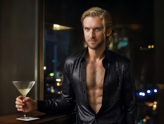
(Here is a screenshot of Solar Opposites S4E11 to compare)

First of all, I understand that there is some controversy on AIGC currently... However, I still decided to post this work here. Yes, I call it “work” because I had spent at least 5 hours to make this image, and I went through hundreds of small steps to achieve this effect. It's not perfect, of course, since I basically know nothing about drawing and photography…but I tried my best.
To make this post more "meaningful", here is the complete detailed workflow (FYI: It's VERY LONG. Here is a 1-minute summary video I made, in case you wanna save some time:)
Preparation stage:
①A base model (or base model+LoRA/Embedding, depending on your need). Normally people use LoRA for a specific person’s face, but I’m not using LoRA for Dan because small models don’t reconstruct his face very well. I’m using a base model (in my case, Serenity V1.0) trained on his photos with Dreambooth. I trained this model 3 weeks ago so it’s ready to use.
(If you’re wondering, “why not using Midjourney to generate celebrities?”, the answer is, Midjourney does a terrible job generating Dan’s face. Also it strictly forbids NSFW. Even just mild NSFW.)
②An OpenPose map and a Scribble image, to use in ControlNet (an extension on SD WebUI). I made a screenshot of the posed dummy from Magic Poser, and used this image to make an OpenPose map, and trace the outline of the dummy on Photoshop to make a Scribble image. Why do I need to make a Scribble? Because from my experience, all SD1.5 base models have a hard time generating “man wearing unbuttoned shirt”. So, only an OpenPose map is not enough. Gotta let it know what shape I want.
Base image making stage:
Step 1: Write a prompt.
I’m not good at writing prompt but it does the job:
Positive prompt:
full color photo of RLDAN, (wearing_unbuttoned_black_long-sleeve_glitter_shirt), BREAK, RLDAN, (long light blond hair), BREAK, RLDAN, (holding a martini glass), in a bar, looking to the right, (flat lighting), sharp focus, raw photo, 8k uhd, high resolution, DSLR, high quality, Fujifilm XT3
Negative prompt:
((woman, 1girl, female)), ((tattoo)), cartoon, 3D, (teeth), (mouth opened), (deformed iris), (deformed pupils), ((poorly drawn)), (extra limbs), (bad anatomy), painting, drawing, weird colors, blurry, watermark, text, high contrast, high saturation, (muscular)
About the prompt, I didn’t use any negative embeddings because sometimes they affect my trigger word; I add “muscular” in negative prompt because if I don’t, it’ll give me super buff man and it’ll look weird; “BREAK” is for separating groups of words.
Step 2: Choose a decent “raw” image
Editing the prompt and adjusting the ControlNet weights according to the results, and cherry-picking the better ones. The style of the clothing is the most important feature to imitate the original animation, so it has to be accurate enough. After cherry-picking the first okay-ish image, I reused its seed, and put this image into Lineart-realistic preprocessor to use the Lineart ControlNet model. The second cherry picked image looked more natural on lighting and background, so I saved this one for future use. I then used ADetailer (an extension) to swap face roughly, not good enough but that’s far from final.
Step 3: Upscale this image
Since SD1.5 was based on 512 resolution, my initial image size was 682 x 512, but that’s too small to make a higher quality face. Hence I used img2img+Tiled Diffusion+ControlNet Tile Resample to upscale x 2. So I get a 1364 x 1024 image to work on. I furthur upscaled it with MTXX, just 3 clicks.
Step 4: Inpaint the hair and face
I wasn’t satisfied with the hairstyle in the previous image. It doesn’t look natural and there’s no tendril near ear, so I gotta fix it. I masked the hair area and edited my prompt, and used a 0.55 denoising to get a better hair, and then used inpaint sketch to draw a blond strand near his ear, and used a 0.75 denoising to add a tendril. There were some artifacts in the image so I used Photoshop to remove those. Finally I used Adetailer again to change the face, this time it looked much more similar to the real Dan.
Post-processing(?) stage:
The Stable Diffusion part was complete. Now the Photoshop time. I changed the background (remove the wall-like thing and replace it with night view), martini glass bottom (it was really messed up), the shirt buttons (there weren’t any before), and of course the hand (I normally use OpenPose hand map to control it but this pose is rather complex, and I don’t like using depth/canny models so…) with Generative Fill. Also plenty of times of remove tool (and patch tool, color replacement tool, burn tool, liquify…yada yada yada). Then I used Neural Filters-Harmonization to match the color tone of the torso to the tone of face. Finally, I used MTXX to make some small adjustments on face and body.
And the picture is done.
Hope you guys like it :)
42 notes
·
View notes