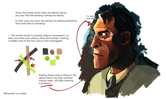
#trying to learn csp paint...
Text

forgor how to fucking draw
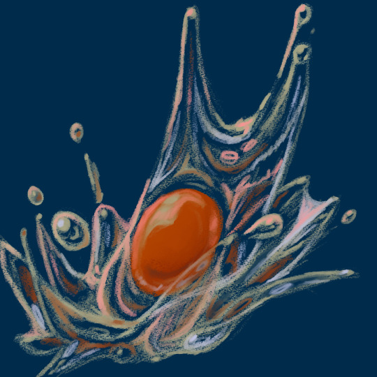
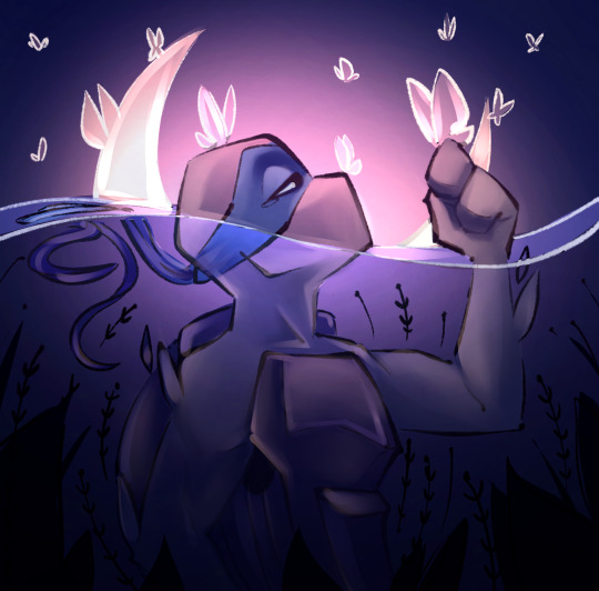
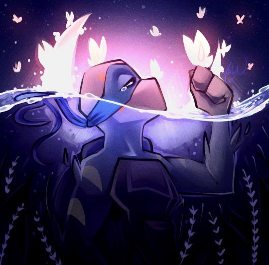
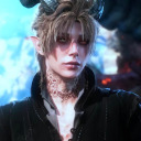
#dont even like these that much but its smth#mostly pose practice#ninjago#nya ninjago#not adding loads of tags for this lol#doodlez#um just trying out a couple new brushes rlly. and painting practice again#im going to try shading w gradient maps next i think. i use literally 2% of the features in csp#become very uncofident in my art.... but im hoping to do more and learn more. i jsut find it hard#i find it hard to do studies LOL bc iidk why i HATE drawing at all realistically it makes me feel. bad IDK why i just HAVE to draw weird#anwyays#artsbotz
149 notes
·
View notes
Text

I hear the walls repeating
The falling of our feet and
It sounds like drumming
And we are not alone
I hear the rocks and stones
Echoing our song
#huehoa17#hoa's art#hoa giang#digital art#arknights#fanart#Specter (arknights)#Skadi (arknights)#Paint tool sai#Csp#Clip studio paint#Color#Shaded#Song is from hadestown's wait for me reprise and i've wanted to draw this for a while now. i'm glad that i can finish this now#Also if your interested. There's another song from hadestown that you can check out called 'doubt comes in'#I just beat wd ex 8 cm and I'm still in shock after all the pain I went to beat it#I guess the lesson here is that just take what you learn and make a plan that works with what you have despite what others have (*E2 team)#Also I worked on this to just focus on something else besides that stage since I needed to get an idea out at least#Maybe in a few months I'll look back and say 'why didn't I add or remove this' but I'll at least try to be nice to myself and say that#I at least done something whether it may be chicken scratch or something in the realm of finished to the brim of your limits#And perhaps just be lazy sometimes if you're not doing well as seen here. Where I didn't do my usual painting(?) style#Instead I used my tried and true method of a thing I don't use anymore which is using the multiply mode for the warmer colors#For cooler colors I used screen#And one more thing! I also tried to make sure that it wasn't to dark or light so I checked it by using the saturation mode filled in black#I'll stop here and as per usual to my ending tags. Take care! And have some food to enjoy for yourself! (and others if that's that)#eyestrain#tw eyestrain#specter the unchained#skadi the corrupting heart
5 notes
·
View notes
Text

my first illustration with clip studio paint, kupo!!
#i didn't look at any references so it's kind of an off model moogle#this is what they look like in my head i guess lmaoo#anyways just trying to learn how to use csp#final fantasy#moogle#my art#fanart#final fantasy fanart#clip studio paint#idk how to tag things i'll be honest
8 notes
·
View notes
Text
at this point i just have to accept that i will never enjoy or be any good at digital art. and that’s fine.
#i gave it the old college try#really tried to learn it and have fun with it but it just sucks for me! sorry!#sure doing traditional art only means my eyes will always be slightly asymmetrical and i have to do everything ‘the long way’. so what#i hate fiddling around with buttons and sensitivity and settings and learning a complex program from the ground up it SUCKS#when i am in the mood to draw or paint i just want to pick up a pen or brush and go#maybe if i had learned how to use CSP when i was a teenager i would enjoy it now but i didn’t so i don’t
0 notes
Text

Daily drawing of a shark, day 1
I’m trying to learn how to paint in csp!
2K notes
·
View notes
Text
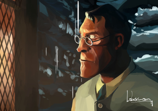
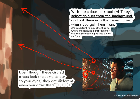
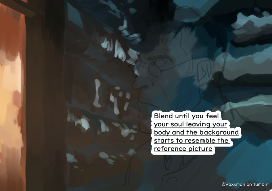
I reached 400 followers, so here's a tutorial on how I redraw screencaps, if anyone is interested💦
ofc it's medic tf2.
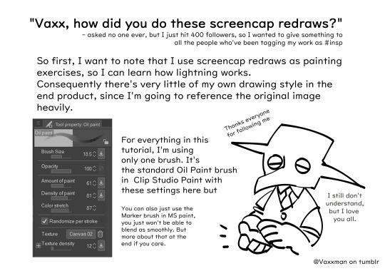


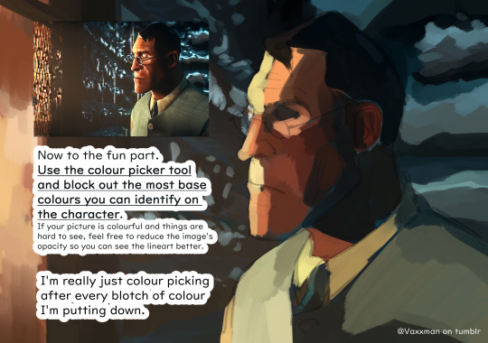

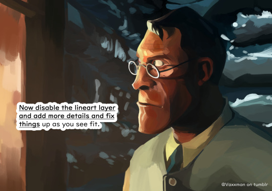
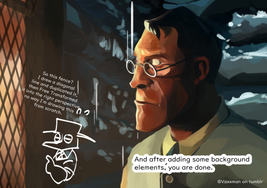
And for all the people who don't have CSP, you can also do this in MS paint, the results will look a bit different but the process and the learning experience is the same ↓↓

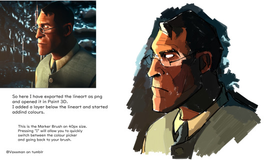

And that's it! It's actually not that hard, I hope everyone gives MS Paint a try if you haven't yet.
Thank you again for being such a fun and engaging group of people, I never thought I'd find such an active community for a game that's so old already.
196 notes
·
View notes
Text
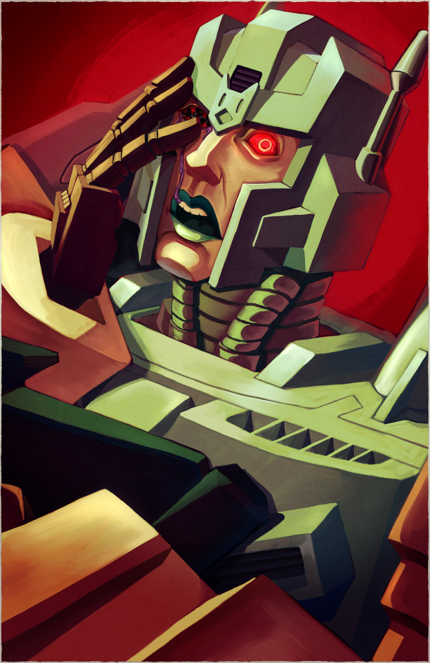
[Image ID: A digital painting of Overlord from the Transformers 2005 IDW comics over a bright red background. He is shown from the shoulders up facing the viewer. The lens of his right eye has been shattered. /.End ID]
Messing with Rebelle! I've been dying to try it out for ages to see how the oil brushes in particular feel. Lots to learn, but I think it'll be fun to use in conjunction with CSP :D
#tf#transformers#maccadam#mtmte#overlord#tf overlord#art.png#also about damn time I start putting in image IDs
173 notes
·
View notes
Text
How To Get Your Character Models Out Of A Game: Tips And Tricks For Bitches That Have Never Used Blender
(it's me, i'm bitches)
(also ignore how messy that lighting is it's 1am and i should have been asleep hours ago. he's there for proof of concept 💕)
a couple people (specifically @forsaken-constellation and @ratasum) asked for a tutorial on how to rip models out of the game. this is not that, but it is a compilation of resources i used to learn about ripping, blender, and 3d modeling in general. i desperately wanted a post like this to exist when i was trying to figure this out, so here we go! all the resources below are completely free, with the exception of a link to the patreon of the person that created ninjaripper.
disclaimers:
there are probably more efficient ways to do the things i am doing. i watched a tutorial to learn shortcuts and then skipped to character models. if you have tips to add, corrections to make, or other thoughts, please feel free to share! i'll link to your post here. ^^
i do not know if any of this will get your account banned. i've ripped several models, so i'm going to assume it's fine as long as you don't try to make money off of it. use your best judgment, be an adult, etc etc etc
last updated: april 2, 2023
PROGRAMS & WEBSITES
ninjaripper 1.7.1 - there's a newer version on the creator's patreon, presumably with support for newer versions of blender and fewer bugs, but i haven't tried that
blender 2.79 - the import addon that comes with ninjaripper 1.7.1 is outdated for the current version of blender (3.5 as of this post), so 2.79 is needed to combine the .RIP files into a .BLEND (blender) file
noesis - ninjaripper saves your textures as .DDS files, noesis lets you view them and export them as .PNGs
blender 3.5 (optional?) - i just like it better than 2.79. if you're completely new it might not matter to you. all of the tutorials linked later are for later versions, though.
mixamo (optional) - rigs your character for you and lets you put them in Situations (like my guy above.) there's a whole library of free animations and poses you can try!
TUTORIALS
how to use ninjaripper - most of what you need to know about actually ripping the files and using ninjaripper is covered here. do not skip this one.
how to use blender 3.5 - full disclosure i haven't finished this series because it's uhhhh many hours long. but if you are a complete newbie to blender, i do recommend at least the first few videos; you'll learn about shortcuts that will make your life easier, how to unfuck your model when it fucks itself for no reason, and different terms that will help you google things you don't know later on. possibly he even covers some of the things i'm about to link! anyway.
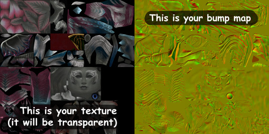
what's a uv map?
how to apply textures
how to apply bump maps (note: for our purposes, you wouldn't add a color ramp node, you would add an image node with your bump map, and attach it to the bump node as the person does in the video)
there should be stuff here about weight painting, cloth physics, emission maps (makes your sylvari glow), and other stuff, but um. i haven't figured those out <3
TIPS
TURN UP YOUR GRAPHICS BEFORE YOU RIP - if you don't, you might end up missing certain textures/glows/etc. HOWEVER, you should turn animations down, because apparently high animation can make your meshes misplace themselves
rip from the character select screen, rather than an instance, because you will have 100 meshes to sort through instead of 1400. i am not exaggerating either of those numbers. if you are new to blender, please love yourself and start with character select.
your textures will be fucked up the first time you try to apply them. this is because the UV maps (the things that tell your textures where to go) of your models are flipped upside down in relation to the texture image. you can flip them back over manually, ooooor you can just flip the entire texture file in something like CSP or photoshop.
for some reason all eyes are red in the texture files. i have not figured out why. i recommend editing the .PNG to have the correct eye color before applying the texture.
mixamo only works for humanoid characters with tight clothing (or without clothing at all). if you try to use it to rig a charr or asura, or someone with a skirt or big sleeves, you will most likely be disappointed.
that's all i can think of for now - if you have other questions, feel free to shoot them my way, although i can't promise i'll have a straight answer ^^;;
information from bookahlogy about character proportions, fixing normals, and other fun tips
447 notes
·
View notes
Text
Eggtober 6th 2023

"Splat" or "Fun with Colors": Raw Egg.
(Clip Studio Paint, Gouache Brush, Pencil brush for details and highlights. 12 colors, I think? 1 Hour.)
I actually really liked the rough version I made, so you're gonna get that one at the end as well, for anyone who also likes the rough one better than the smooth one.
But first... I finally discovered a feature of CSP, so now I am unstoppable and I will NEVER AGAIN have to ask myself "How the fuck did I do that?"
Because now I have EVIDENCE. Now curious friends, followers, and my forgetful ass, can watch the full process of how I made a thing. Including what references I used so it's clear how much is iterative and how much I am drawing directly from the visual reference. Today I had to do a lot from imagination because I couldn't find an exaggerated splashy egg, but sometimes I really am just making a study and trying to do a one-to-one recreation of a reference. So now y'all get to know all my filthy little secrets. I was intending to grab footage starting with Eggtober 1, 2023 but OBS needs a version of an NVIDIA driver that will absolutely wreck my computer with BSODs because I own a junker apparently. But it turns out CSP (or at least V2, IDK if it was in V1) has a way to capture a speedpaint natively when you create the file.
Now I am unstoppable, powerful. No more taking a break from art when life gets busy and coming back to pieces I drew 10 years ago and wondering "How the hell did I manage that?" I can just check. It's over for all of you. Once I practice anatomy again and start being able to draw shapes and volumes perfectly from imagination, I will become all-powerful. I will ascend. Hell, maybe someone might even pay me if I learn to draw anything that isn't an egg or a meme. XD Radical self-confidence, baby. I can art now, and I have evidence. My horizons are infinite!
And now, hopefully, any baby artists that are just starting out can get an idea of how I do it from this and future pieces so I can pull you all up with me in a bid of apotheosis. For the EGGsthetic! (Aesthetic.)
I wonder which version of this egg @lady-quen's breadbugs will snap up?
And I wonder which one @quezify will like best? My money's on the sketchy one.
I can't tell which I like better honestly. The smooth one us much more "My aesthetic" because it matches how I render eggs but... The rough pencil-y gouache lines you get with light pressure really remind me of how the classic modern quezify eggs look, and I of course only started doing eggs because of the first Eggtober so, like. On the one hand, smooth and painterly look that goes with all but one of my previous eggs (Eggtober 1, 2023 was a study from memory of quezify's style, after all). But on the other hand... dramatic color changes! Textrure, shine! Colors that aren't in the actual references! EXPRESSIVENESS.
Two different moods on the same egg art and I really dig both of them honestly.
163 notes
·
View notes
Note
i rlly like ur composition, i wanna know about your process :D
thank uuu !! yeah so like. composing a scene for me generally begins with a vague idea that i want to get down as quickly as possible- and for me that usually starts with finding a setting. I knew that i wanted to draw a) a group of roomates gossiping in a crowded kitchen and i wanted there to be b) one figure in the extreme foreground and c) lots of plants. i do use some tools to figure out perspective, mainly the csp perspective ruler. Usually i start by finding a picture i like similar to the vibe im going for- but instead of referencing anything else- im purely interested in perspective. sorry to anyone who is shocked i dont generate all of my perspective purely by myself- i can draw in perspective fairly well but i struggle to make straight lines and this is easier to make grids with than the line tool lol ^_^ i try to use it kinda more like spellcheck on typos than like something to fully rely on. this is the video i learned this trick from:
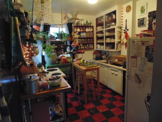
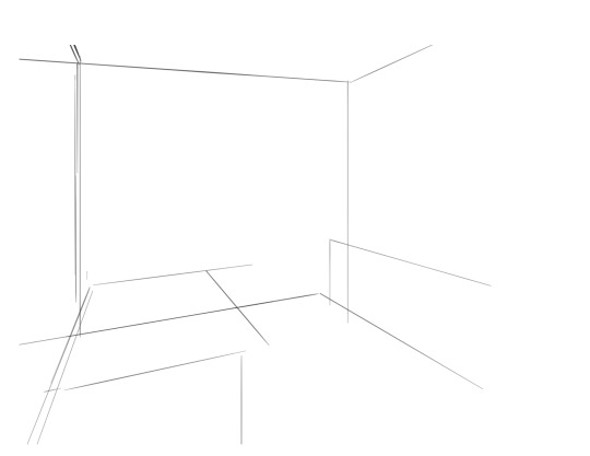
i saw the left photo and realllly loved how the cabinets alligned with the wall- so i used my ruler tool to draw out my inital plotted points from the image- basically the linear movements i was most interested in and then i turned off the image layer and worked with those lines and the ruler tool to move on. eventually i had this:

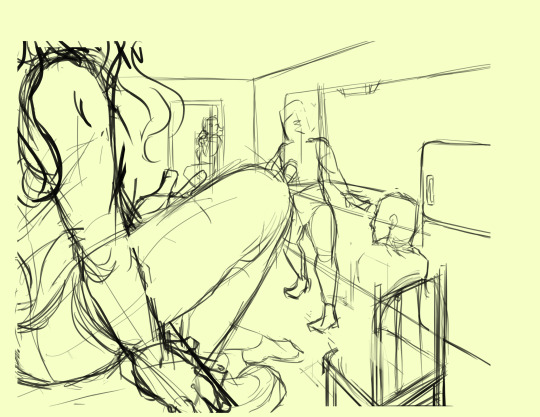
which was enough for me to put my characters in for the inital round. if you notice- i made a looot of further adjustments as i go on. this sketch is not a final layout, its so my characters have somewhere to be! i cannot draw someone standing on a floor if theres no floor, nor leaning on a table that doesnt exist. i can’t draw my characters without a background, but i also cant finish my background without accounting for how my characters can comfortably exist in it!!

this was the like.. very basic start. i knew the positions of two characters- but i needed to change a lot not only to fit them better but to allow for the other two figures i had planned.
okay.. a little better. i widened the kitchen, closed the fridge door.. added a chair and fit in all the figures.. but this is waaay too dramatic. only two figures are actually interacting- and they are at wildly different energy levels!

this is where things started to make a little more sense characterwiss, so i was ready to refine backgrounds and figures and unite the two.
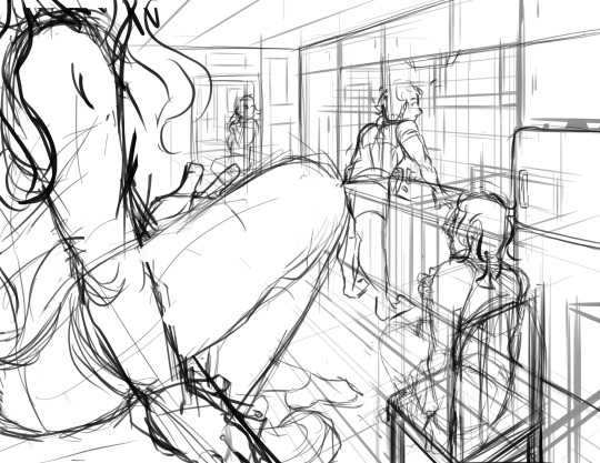
inital base sketch. much better layout.
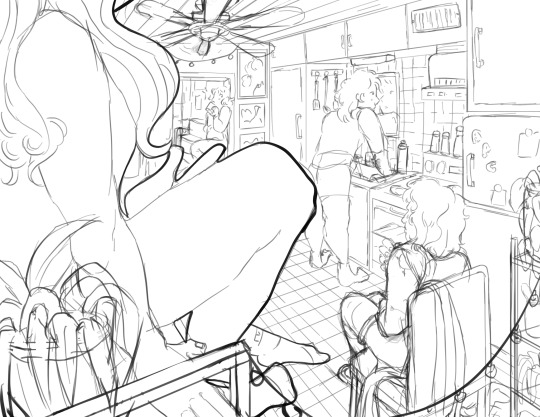
okay- this is where im getting my footing but things seem.. really really off. You can see me working on my framing here- theres some good linear movement from left to right here- but not vertically. It’s hard to notice the figure in the far back, so i need to redirect the viewers eye to move upwards as well!
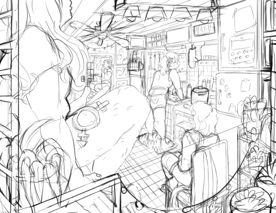
this is where i decided to zoom out, add an interesting vertical element to the left of the image and make it clearer whats happening in the foreground. i had to account for some stuff by adjusting the cropping, but i paid attention to that as well.
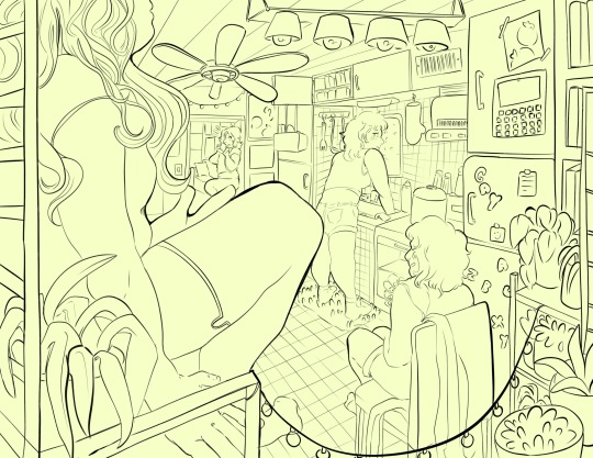
annnd- thats what a clean sketch looks for me! i have all the elements of my scene accounted for, and things are clean enough to read.
the next step for me would be transfer! essentially- I print the image of my sketch out, resizing and taping pages together so my sketch matches the size of the paper i want to paint on, and then i use a lightboard to transfer my sketch with pencil onto my paper. Then i refine the sketch a few times on paper before stretching my watercolor paper (essentially just prepping for painting) and inking with a brush and colored ink before going in with watercolor, gouache and ink, then usually finishing with marker, colored pencil, pastel and ink. it’s a lengthy process but a lot of fun lol. but sketches for me can be like.. 15 layers of different roughs until im happy with just the sketch. there were more images but im on mobile and theres a 10 image limit 😭😭 im a bit masochistic but i believe that if i dont have a good sketch i dont have a good painting!!
58 notes
·
View notes
Note
Thanks for answering! Could you go into how you paint? It's always the trickiest part for me
Hehe sure thing! I even recorded some of it, bc for me personally, i learn a lot easier when it's visualized like that, aha.
So first off, we'll start off with our base!

Personally, I like a lot of gradients and color variations to start off with, but these can be solid base colors of you prefer :3. From this, ALL layers are gonna be merged down into one, no separate layers here yet :D
Going forward, I have a video done here kinda showing what I do :DD. I'll explain below the video in more detail what I do
First the base shadiws and highlights — for the shadows I'll usually pick from the color wheel (a darker, more saturated tone, plus I'll also shift the hue some) and draw right on the canvas. For the base highlights, i'll almost always use a bright orange on whatever adjustment layer makes your color nice and bright and glowy (for PTS it's Luminosity, and for CSP and Procreate I usually use an Add layer).
THEN I DO SOME MESSY BLENDING OUT, nothing pretty yet, just getting some of the colors blended out hehe
Afterwards, the drawing usually looks like this :0 very messy lol
NEXT !!! PAINTING TIME !!! As show in the video, it's allllll about color picking and going over what you've already done. For a lot of it I use a softer brush, letting the colors blend together more softly, and then for other portions I'll use a harder pen for where I want more of the color that I picked to show through. Sometimes I'll draw over the line art all together if I don't think it's needed, or i"ll draw the line art back in after painting over it if I want those lines still :0
And there's just a looooot of drawing over and painting over. The 20 seconds you saw of painting and blending usually goes on for like 3-6 hours, depending on the drawing XD.
After ALLLL of that, I get smth like this

AND this was pretty much just working on leo. Now to work on the background elements >:3c same progress, just for the atmosphere and not the character!

YAY NOW THAT'S DONE !! Now all the paintings done soooooo
Color correction and final touches >:3c no more painting, now there's just a bunch of fun glowy layers we add on top of this heheheeh
AND WE DONE >:DDD
I hope that helped some djejwjww. Tbh, the way I learn the most is if an artist im trying to learn from straight up just streams what they’re doing, but I don't rlly know anywhere i could stream or who would be interested ;w; but I hope this helps enough anyway!
If there are any other questions, I'll be happy to answer! Ive said before I rlly like playing art teacher heheheheh <33
218 notes
·
View notes
Note
What brushes do you use?
i am sorry for the later reply i was out cold.
this is not gona be a satesfying reply though. i just use... one square shaped boy.

you can easely make this one in PS by opening a 500x500px file and you either fill it compleatly in with black, or make it a vary slightly wonky square. (don't think it matters but it gives it your own handtouch)
once you have you square you go to 'Edit' > 'Define Brush Preset' and you get the square boy in your brushes lybrary.
I am sorry I don't know how how to create your own brushes in other drawing softwares.
I usually use the brush size 8px, 10px or 15px. and this boy has never failed me once!
i sometimes try to make myself some other brushes to get a quicker workflow. but then i have to readjust the sizing and angles or i don't like how the shape looks and... i just stick to this one brush and call it a day.
i do change settings though!
Switching on Transfere + Opacity around or below 50% i make fur.

Add scatter effect + colour dynamics: i can like make quck freckles texture or in some cases like sand grain.
(if i lessen the distance between forms and the count on how many get scattered texture also works for stars, water droplets, atmospheric dust)
For details, or jewlery i like to make a seperate layer, adding an effect to it to get a "Contour Lineart".
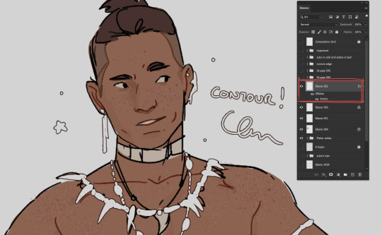
i know this is barly (if even) a tutorial. so if there are more questions i would love to awser them. though i use photoshp (still). and i am just barly scratching and begining to learn and get comfortable with Clip Studio Paint. I will have to save my square boy and move it there but maybe i finally learn to use more then just one brush for once! and by the next time someone asks me "what brushes i use" i have an easyer time explaining because i just have to point at the CSP brush ones.
#chip!ask#photoshop#before anyone comes at me for using Adobe#listen 15 years ago they were eh... but not as catastrophic like they are today!#most of my colouring happens with lasso tool btw#and blush and gradiants with well... gradiant tool#but these wern't anons question
123 notes
·
View notes
Note
Hey, I was wondering if you have a brush recommendation for CSP brushes for Lineart with good line weight? I'm trying to improve the weight of my lines, but I'm having a hard time finding brushes with the flexibility I'm looking for
That's a good question. There are all sorts of ways line weight is used and the right brush is different for each genre and style of drawing, I'd say.
To start: A lot of my lineart brushes are adjusted with slightly LESS brush size dynamics because I always felt like the original default CSP brushes (like the Mapping Pen and G-Pen) gave an unrealistic and uncontrollable amount just based on the their pressure settings.
Some people do use them well for specific styles, so they're not inherently bad. But I definitely think they're not friendly to beginners or people who just wanna pick up a pen and go draw rather than obsess over the precise way they're pushing down on their pen.
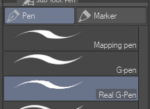
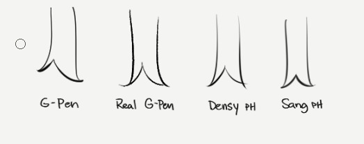
More recent versions of Clip Studio Paint actually came with some new default brushes, including "Real G-Pen", which had pressure settings that felt more right to me. But it's a little noisy so its uses are a bit more specific.
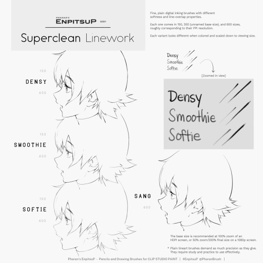
I have a brush set included with EnpitsuP called Superclean Linework. Those are the ones I designed as cleanup brushes for anime-ish looking art. They come in several flavors: Densy, Softie, Smoothy, Sang. I varied them based on how I saw different artists preferred their lines: a bit on the sharp side? Slightly blurry? With a little bit of opacity fade? A little more line variation? Among these, Sang has the largest amount of size response.
Ultimately, it may be a little bit of both a subjective experience and depend on what your hand/tablet/driver settings/style preferences are like. If you're having trouble finding a brush for this purpose, I think you should hone in on if you're not finding the right brush because every brush seemed too difficult to control, or you can't seem to get results you like, or you can't find one with a feel that matches the physical tool you're used to.
I think it's also worth noting that some artist's styles also rely a lot on them just changing their brush size setting depending on what part they're drawing. So you may end up needing a brush that has less pressure-size variation than you expect. My recommendation is always to look very closely when learning from someone else's linework example. Try to achieve it yourself side-by-side and see where it doesn't quite match up and ask yourself why. Or ask others why.
Of course, there are a bunch of other "lineweighty" brushes too outside of this genre of mostly-thin lineart.

#clip studio#clip studio paint#pharanbrush#clip studio brush#clipstudiopaint#clip studio paint brushes#EnpitsuP#KrupukP#csp brushes
67 notes
·
View notes
Text

I made this picture while learning Clip Studio Paint. Well, it was rather part of the process. I took a meaningless sketch that I had around and worked with it, trying to customize all the hotkeys for myself, figure out the brush settings, masks, gradients, checked the perspective guides. At the end, there was a problem with color profiles, because the display color profile was set by default in CSP. It ended up just screwing up all the colors in the picture, making my ass burn. So THIS picture is screenshot :D I don't care.
Well, in the end, I seem to have set up everything I wanted, it remains to get used to it.
85 notes
·
View notes
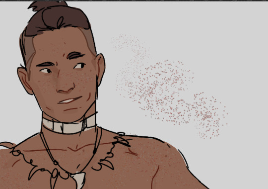
Note
hi Habs! :D i love your art and have seen ppl say they want to eat it and i would also like to partake lol. have you ever explained your methods of doing digital art? i love traditional but i would like to branch out into digital. i've tried different applications like krita, sketchbook, and sketch.io but i don't really vibe with them (if that makes sense). any tips?
Hello ! Haha thank you ! Totally get what you mean about vibes, I’ve used a few different programs, and I like paint tool sai and clip studio paint the most, and mostly use csp now !
Took me a long time to get into digital art, and the biggest breakthrough I had was that I didn’t have to do line art lol, now I only do it when necessary and 99% of my stuff is cleaned up sketches. Changing my process completely changed how I felt about my art for the better. It keeps my work dynamic, and also lessens feeling of the sketch looking better than the linework!
Generally my process is sketch, duplicate the layer and clean it (sometimes put the old layer on a low opacity so I can make sure I’m staying true to the sketch, so it’s like lineart with extra steps lol) then I block in one colour under the lines, either make a new layer with a clipping mask, or lock the opacity and colour on that layer.
For colouring, I usually use a single layer, I put down messy flats and shadows then clean it up and render it, add highlights and funky details and then I’m done. I’ve explained my colouring process here before, and I have a time lapse that shows my sketching/colouring process here.
I have shaky hands, so a lot of my brushes have stabilization turned up, usually I set it at 15 on csp brushes idk how that translates to other programs though.
For my sketches/clean up, I like using brushes that have little to no variation in brush size, and have varying density or opacity. Not for everyone but I like how it makes my work look and I end up liking my stuff a lot more like that. Usually I keep my sketches at the start really light and build up pressure as I clean
In general, I think the best thing to do is try a whole bunch of methods and figure out what works and what doesn’t! Lots of people have very different processes, so looking at how other artists work and trying out how they do stuff for yourself can be great for learning! Good luck with digital art!
94 notes
·
View notes
Note
Your art is so wonderful!! How is it you choose such great colors??? (Like the Lucid painting for example) the colors you choose really help convey the mood of each piece
Thank you so much! Colors are my main approach to communicating emotions visually, since depicting expressions and body language is more difficult for me. I'm very happy to hear that I succeed at doing just that. I've attached the time lapse (thank you CSP) in hopes that it could help clear out some things about this particular painting of mine.
Personally, I enjoy seeking inspiration from traditional art painters! In particular, oil paintings. And, I try to approach digital paintings similarly in terms of paying attention to the relativity and relationship of colors interacting with one another. I'm a completely self-taught artist so I don't even have the exact vocabulary to guide you from, unfortunately..
I wish I was experienced enough to be able to explain the precise art theory principles that I keep in mind while painting, but, I'll attempt to collect some available resources that may help cover the subject in an easy and intuitive way to read and learn:
• https://www.celebratingcolor.com/what-background-color-do-i-paint/
• https://justpaint.org/neutralizing-color/
• https://emptyeasel.com/2008/12/30/the-role-of-color-in-art-how-to-use-color-to-enhance-painting/
• https://art2art.org.uk/blog/how-to-make-yellow-oil-paint-appear-to-glow-part-1
• https://art2art.org.uk/blog/how-to-make-yellow-oil-paint-appear-to-glow-part-2
I sincerely hope that it was able to clear some useful information for you!
27 notes
·
View notes
Last Seen Blogs
miksoft
𝓡𝓪𝓲𝓷 𝓯𝓪𝓵𝓵𝓲𝓷𝓰
lodecaptain
Lodecaptain

wlportfolio
William Lottering Portfolio
solomxdsstuff
solomxdstuff
sole-loved
Happiness