#tumblr palette
Text


#glitzglamfuckery#brandeebleue#coloringbookforme#brandee#ggf#peachology#art#orchid#surreal foodie#blue#tumblr palette#tumblr filter
13 notes
·
View notes
Text
i had to group some together so i combined the light modes because duh
92 notes
·
View notes
Text
Okay, here we go!
I took out "Low-contrast classic" and "Snow Bright" because there are only 10 option on polls and those are my least favourites.
You can toggle palettes on desktop by pressing shift + P or you can find "Change palette" in the sidebar!
5 notes
·
View notes
Text
I need to know
11 notes
·
View notes
Text
Ok I’ve discovered that the Vampire display setting is The Pallet Ever cuz it’s the only one that doesn’t hurt my eyes AND has enough contrast for me to focus & read text. Also:

BLOOD FOR THE BLOOD MOUNTAINS
34 notes
·
View notes
Text
Do other Fallout fans use the Cybernetic palette on Tumblr because it looks like a Pip-Boy, or is that just me?
3 notes
·
View notes
Text
VAMPIRE THEME!!
i just remembered that i can change the color palette on the desktop version so naturally i was going to go with goth rave (like on mobile) BUT THEN I FOUND THIS
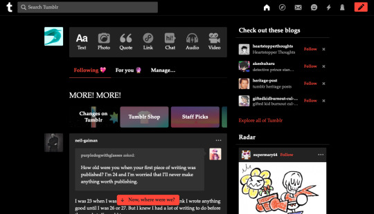
VAMPIRE.
I LOVE THIS SO MUCH IT IS MY FAVORITE THING IN THE WORLD EVER
13 notes
·
View notes
Text

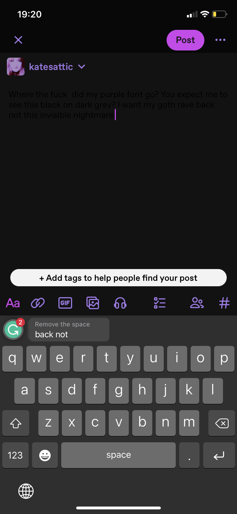
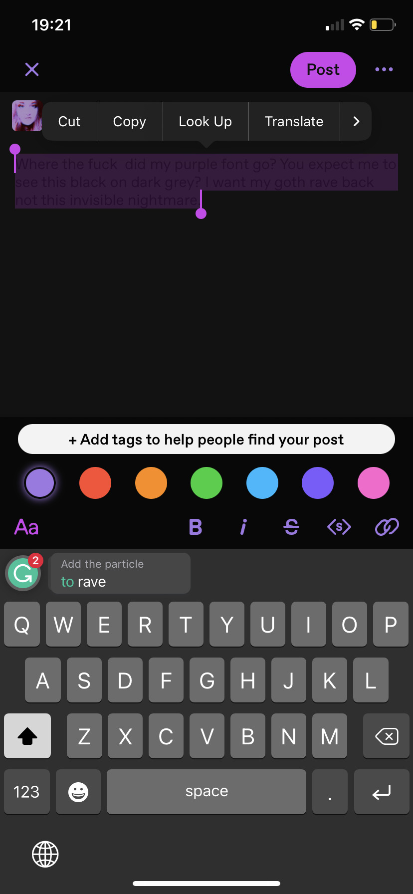
Where the fuck did my purple font go? You expect me to see this black on dark grey? I want my goth rave back not this invisible nightmare.
@staff
2 notes
·
View notes
Text
Did you change your tumblr color palette to Pride, or are you not part of the lgbtqia+ community?
#THIS IS A JOKE#pls have your palette the way you want it !#I just really like how it looks#it’s cute#June IS coming up….#lgbtq+#lgbtq community#lesbian#tumblr palette#pride#pride month#not greek mythology
7 notes
·
View notes
Text
The daily struggle of not knowing which Tumblr palette to choose is so severe. The only thing I know for sure is that I won't be using ghost, snow bright, cement, or pride. Everything else is on the table, even cybernetic.
#tumblr palette#literally why are there so many options#i'm too indecisive this isn't going to end well for me#although I gotta say pumpkin and vampire are looking mighty fine right now#low contrast classic and dark mode are so soothing on the eyes though yk what I mean#fuck this
3 notes
·
View notes
Text
I really like tumblr's Pride palette but I wish the colors weren't so vivid. It's a little hard to look at tbh... A sensory friendly version would be ideal! If only.
3 notes
·
View notes
Text


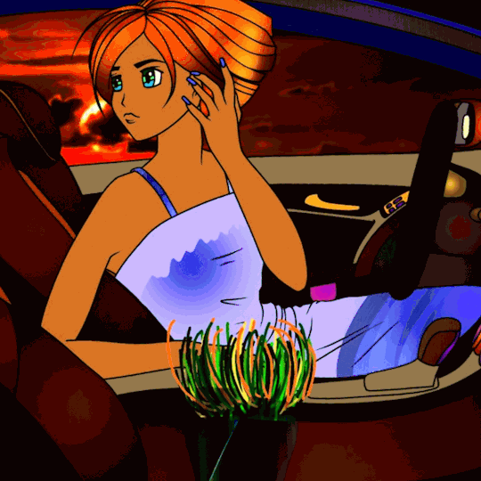

#glitzglamfuckery#brandeebleue#coloringbookforme#brandee#ggf#peachology#art#orchid#blue#driving#night moon#night driving#tumblr palette#tumblr filter
5 notes
·
View notes
Text
WHY THE TUMBLR APP HAS A FRACTION OF THE PALLETTES THAT TUMBLR WEB HAVE? I WANT MY CEMENT AND GHOST!
1 note
·
View note
Note
Hello! Are you still open for requests? If you do, can you draw Connie? Thanks!
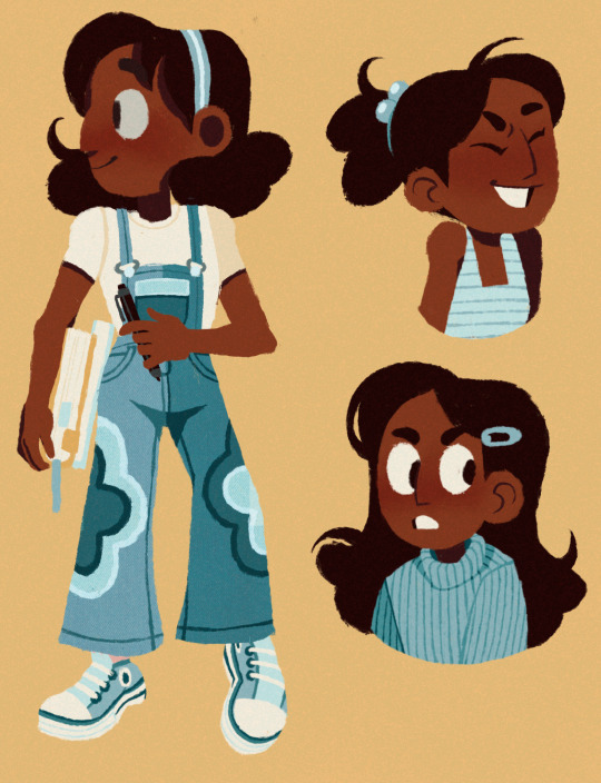
Can you tell I played a lot of dress up games as a kid
#art#my art#artwork#digital art#digital artist#drawing#drawings#digital drawing#illustration#digital illustration#doodle#doodles#digital doodles#linless art#limited color palette#fanart#steven universe#steven universe fanart#connie maheswaran#connie steven universe#steven universe future#ask#tumblr asks#procreate#procreate art
2K notes
·
View notes
Text
rating tumblr palettes because i tried them all today:
true blue - 5/10, tumblr classic points. pass.
dark mode - 100/10 LOML MY ONE AND ONLY
low contrast classic - 4/10, soothing enough but not something i could keep for more than 30 minutes.
cement - 1/10, no.
cybernetic - 7/10, qUiRkY heh i felt like a computer genius typing in green letters like in the movies :D
canary - 1/10, very weird colour choice.
ghost - 0/10, WHY WOULD YOU PUT RED AND WHITE TOGETHER IN SUCH A STARK CONTRAST WTF.
vampire - 10/10, new favorite palette!!!! <33
i'm using it for a week at least!!!!
pumpkin - 5/10, doesnt work for me but i liked the vibe accuracy.
snow bright - -10/10 CURSE ON HUMANITY I AM BLIND
goth rave - 9/10, SOOTHING PURPLE i quite liked it!!!!
pride - 6/10, why is it so pink. points for pride though-
1 note
·
View note
Text
Was thinking of changing my Tumblr color palette on desktop to Vampire because the red is better for sleeping at night. But I don't really like the font that goes with that palette. Also, I tend to browse on the app anyway, where palettes don't make a difference. So I may stick with the current palette I'm on (Canary) or maybe just switch back to the dark theme
0 notes
Last Seen Blogs

truc01
Kuro-kun

qissoqisso3
Unindo a beleza de todo o mundo!
prinsursula
Prins Ursula

bequeerpraisegod
Be Queer, Praise God